jorjathomas
Jorjas Blog
Developing her creavitiy.
94 posts
Don't wanna be here? Send us removal request.
Last Seen Blogs

scrumptiousmentalityhideout
Untitled

ashesdrawn
Welcome!
grizzcore
Escapism As An Artform
somehow-a-moth-like-rat
Uhhh Idk What To Put Here

bettywaste8-blog
最高のブックスキャナー
Text
1 note
·
View note
Text
References
Week 1
Lecture 1 brief available at: https://moodle.bcu.ac.uk/course/view.php?id=78413 (Accessed on 18th March 2021)
Week 2
https://www.polyesterzine.com/ (Accessed on the 22nd March 2021)
https://thegentlewoman.co.uk/magazine (Accessed 22nd March 2021)
https://www.bing.com/search?q=toxic+masculinity&form=ANNTH1&refig=e1ef3f1051824a6a8300f06b93d7abb7&sp=2&qs=LS&pq=toxic+mas&sk=PRES1HS1&sc=8-9&cvid=e1ef3f1051824a6a8300f06b93d7abb7 (Accessed 23rd March 2021)
Easter Holidays (additional weeks)
https://www.mentalhealth.org.uk/statistics/mental-health-statistics-children-and-young-people (Accessed on the 30th March 2021)
https://www.bing.com/search?q=self+help+definition&form=ANNTH1&refig=50308fabcfeb49119a0b9902ddaaf182&sp=2&qs=MT&pq=self+help+de&sk=PRES1AS1&sc=8-12&cvid=50308fabcfeb49119a0b9902ddaaf182 (Accessed 30th March 2021)
https://parentology.com/breaking-news-teen-suicide-rates-rising-in-2020/ (Accessed 30th March 2021)
https://www.mind.org.uk/information-support/types-of-mental-health-problems/mental-health-problems-introduction/causes/ (Accessed 30th March 2021)
http://www.thelajohnson.com/ (Accessed 1st April 2021)
https://www.theperspectiveproject.co.uk/post/eternal-conflict Accessed 1st April 2021)
https://www.gov.uk/government/news/prime-minister-appoints-dr-alex-george-as-youth-mental-health-ambassador (Accessed 3rd April 2021)
https://society6.com/leafandpetal?page=1 (Accessed 3rd April 2021)
https://www.mind.org.uk/information-support/types-of-mental-health-problems/mental-health-problems-introduction/self-care/ (Accessed 5th April 2021)
https://www.bbc.co.uk/music/articles/6dd7d76c-70e0-4871-9c57-88b665718842 (Accessed 7th April 2021)
https://www.forbes.com/sites/janeclairehervey/2018/02/20/15-women-run-indie-magazines-to-read-when-your-newsfeeds-in-flames/?sh=1d22a1e7608b (Accessed 11th April 2021)
https://www.selvabeat.com/ (Accessed 11th April 2021)
https://damnjoan.com/about (Accessed 11th April 2021)
http://www.gotagirlcrush.com/ (Accessed 11th April 2021)
https://www.britannica.com/science/adolescence (Accessed 11th April 2021)
https://teenzonemagazine.co.za/about-us/ (Accessed 11th April 2021)
Week 3
https://issuu.com/gotagirlcrush/docs/girlcrush_issue05_content-final (Accessed on the 13th April 2021)
https://julienpacaud.com/Illustration-1 (Accessed 14th April 2021)
https://docs.google.com/forms/d/1LY7klE_7md9J0aaMblwm9jBx8g04PcmqJ2LaNxBX-qQ/edit (Accessed 16th April 2021)
https://www.pewresearch.org/internet/2018/08/22/how-teens-and-parents-navigate-screen-time-and-device-distractions/ (Accessed 14th April 2021)
https://www.amazon.co.uk/Cut-Paste-paperback-21st-Century-Collage/dp/1780672365 book reference!!!
Week 4
https://eyeondesign.aiga.org/singapores-most-creative-family-meets-its-patriarch-in-the-latest-rubbish-famzine/
https://www.quora.com/Why-are-social-networks-so-addictive (Accessed on the 20th April 2021)
Amy Watson, Jan 2021, Women's lifestyle magazines ranked by sales volume in the United Kingdom (UK) 2018-19, available at https://www.statista.com/statistics/321619/women-s-lifestyle-magazines-ranked-by-sales-volume-uk/#:~:text=Between%20January%20and%20June%202019%2C%20the%20leading%20women%27s,a%20monthly%20reach%20of%20roughly%203.8%20million%20individuals. (Accessed on 22nd April 2021)
Bryony Richardson, Sept 2014, Top of the pops target audience, available at https://gktbryonri.wordpress.com/2014/10/29/top-of-the-pops-target-audience-2/ (Accessed on the 24th April 2021)
James C, 2019 (user edited site), Girl Talk information, available at https://media.info/magazines/titles/girl-talk (Accessed 24th April 2021)
Week 5
Victoria Buchanan, March 2021, How joy scrolling can uplift brand storytelling, available at https://www-lsnglobal-com.ezproxy.bcu.ac.uk/big-ideas/article/26626/how-joyscrolling-can-uplift-brand-storytelling (Accessed 25th April 2021)
Gursharan Panesar, Savannah Scott and Abi Buller, March 2021, Need to know, available at https://www-lsnglobal-com.ezproxy.bcu.ac.uk/news/article/26551/stat-self-care-routines-will-outlast-the-pandemic (Accessed on the 25th April 2021)
Holly Friend, Livvy Houghton, Rhiannon McGregor and Sara Radin, Nov 2018, Anxiety Rebellion, available at https://www-lsnglobal-com.ezproxy.bcu.ac.uk/macro-trends/article/23085/anxiety-rebellion (Accessed 25th April 2021)
Ipsos MORI, July 2018, Generation Z – Beyond Binary: new insights into the next generation, available at- https://www.ipsos.com/ipsos-mori/en-uk/generation-z-beyond-binary-new-insights-next-generation (Accessed 25th April 2021)
Holly Friend and Livvy Houghton, March 2021, Reading Market, available at- https://www-lsnglobal-com.ezproxy.bcu.ac.uk/youth/article/26688/reading-market (Accessed 25th April 2021)
Advertisment Collusion by ASOS, 2018, Coming of age, available at- https://lsn-staging.s3.amazonaws.com/filestorage/videos/5993/my-movie-14.mp4/720p_libx264.mp4 (Accessed 25th April 2021)
Issuu.com, Oct 2014,How to make a zine and identity, available at- https://issuu.com/limurray7/docs/scan (Accessed 26th April 2021)
Andren Tumblr,design everywhere, available at- https://andren.tumblr.com/post/81276120000/designeverywhere-ouverture (Accessed at 26th April 2021)
Cleber Rafael de Campos, 2021, Major Project Submissions, available at- https://weandthecolor.com/major-project-submissions-cleber-rafael-de-campos/46937 (Accessed on 26th April 2021)
Lucy Milligan, July 2019,The Calling, available at- https://thegentlewoman.co.uk/the-calling/nimko-ali (Accessed 28th April 2021)
Nimco Ali, Hornsey and Wood Green, Election 2017, Meet the candidates, available at- https://www.womensequality.org.uk/nimcoge (Accessed 28th April 2021)
Alice Cary, March 2021, Adwoa Aboah’s New Papier Journal Is A Soothing Tool For Self-Reflection, available at- https://www.vogue.co.uk/news/article/adwoa-aboah-papier-international-womens-day (Accessed 28th April 2021)
https://www.papier.com/reflections-34485 (Accessed 28th April 2021)
Wikipedia, February 2021, Amika George, available at-https://en.wikipedia.org/wiki/Amika_George (Accessed 28th April 2021)
Naomi Pike, December 2017, Girl On A Mission: Amika George, available at- https://www.vogue.co.uk/article/amika-george-period-poverty (Accessed 28th April 2021)
Stylist team, 2020, Florence Given: what the feminist illustrator, writer and influencer loves right now, available at- https://www.stylist.co.uk/people/florence-given-book-instagram-interview/397807 (Accessed 28th April 2021)
https://www.amazon.co.uk/Women-Dont-Owe-You-Pretty/dp/1788402111 (Accessed 28th April 2021)
Natalie lee, est 2012, Meet Natalie, available at- https://www.stylemesunday.com/london-style-blog (Accessed 28th April 2021)
Irish times, Jan 2021, 50 people to watch in 2021: The best young talent in Ireland, available at- https://www.irishtimes.com/life-and-style/people/50-people-to-watch-in-2021-the-best-young-talent-in-ireland-1.4440837 (Accessed 28th April 2021)
Angel Arutura,2020, Profile-About me, available at- https://angelarutura.wordpress.com/about/ (Accessed 28th April 2021)
0 notes
Text
Evaluation
To conclude this final project of the foundation year, this was the most enjoyable work by far. I believe this was because I was able to work around a subject which I was able to choose myself, so finding an idea was easier to come up with. I was slightly worried at the beginning when combining the two as I know how this has ended up in previous projects especially since my time management isn't amazing just yet. However, I think becoming strict with the amount of content had helped me achieve a good result in good time. Although I didn't manage to finish a week early to sent of to Mixam, I did print my outcome which I was pleased with. I also think because I aimed to have a scrapbook-like feel in my layouts, collaging took longer than I expected as I had to scan in all the little elements which I had cut out. Considering I didn't have any experience in CAD work, I am proud of my outcome and my ability to produce a little book of visual art. I believe I am starting to work quicker on these software's ready for my degree in comparison to the first project. I relied heavily on the eraser tool to edit certain images however at the end of the previous project, I was introduced to ‘colour range’ which cuts out the shapes for you, speeding up my time significantly. I rely on this now.
Because my work was inspired by scrapbooking, I explored a new area of art. I normally try to perfect things however this time around I kept mistakes, worked around them and loved the outcome. This personified the zine and made it look authentic. I ended up creating 44 pages rather than 50 as this was too much to create in limiting time. I feel as though I did a lot of research regarding my topic more than creating my zine as there was a gap in my process. When going from research to building my zine, I was struggling for inspiration and motivation to start. As I has such high hopes I wanted every page to be executed well and to my desired standard. With the trend research project, where I did work similar to this, I became really stressed towards the end where by I didn't enjoy any of my layout ideas resulting in a burn out. I realised I needed to be strict and not spend too much time on a page despite wanting the outcome to be good as I would begin to overthink. I found that the less I thought about it and went with the first idea that came to mind, enabled a better outcome of each page. This gap was also hindered by my personal life. Although I’m not displeased with my result, my work load wasn't as consistent as I hoped. Originally I aimed to get my work sent off, or receive some paper samples to get an idea of my outcome however this would've took over a week to arrive resulting in my zine going past my deadline. I also added my friends work from her Median page and I would've loved to add a interview into my zine alongside her article just to reach the fullest amount of personality in the zine. Her work is very inspirational and reading her in a interview style, without any editing could've pushed readers to better their self-discovery with her tone of voice.
This time around, despite having some areas which I would like to improve, I am not dissatisfied with my results. I love my message of empowering young women as, based off personal experience, it's hard to understand your purpose in life after not having a the routine of school which you were so used to. I hope with the help of my own personal experiences the reader was able to connect and relate to the problems and become inspired to work on themselves especially in this time frame where it is easily accessible. Eg lockdown. I believe I have met my objective in regards of uplifting the reader and I hope they can learn from it. Overall, this year has aided my enjoyment of my course massively and I have learnt a lot about myself from this project alongside wanting to help others. I am pleased with all my results and the journeys I've overcome in the middle of a global pandemic. Now things are lifting I am exited to work harder with the help of libraries and resources other than the internet. I hope to expand my work further and develop a true sense of working style and routine. I hope people have understood my cover and its idea of creating your own rules in life to be the best version of yourself.
0 notes
Text
Print ideas
While I begin to make my zine, it was important that I scheduled my work time with my print time. Despite having to hand in a digital copy, I want to get this zine printed as a final result. I haven't thought from a business perspective as much as I hoped in regards of selling the zine and how many issues however knowing the printing information would be useful if I wanted a good final outcome.
As my content isn't seasonal, I wouldn't need monthly issues of the zine. My message should always be useful in any point in time as its an inevitable process to go through however, if I were to produce more there would be a couple issues a year. This is so the zine feels more unique to the reader as there isn't loads produced. I think I would also only produce physically because I have tried so hard for it to look physical through photoshop. This would be my pivotal point of success based of the prejudgment of all teens preferences online rather than buying from a book store.
Since I am only producing one issue for this project, I have only researched about the printing ideas rather than unique selling points for magazines. When speaking to one of my tutors, he suggested a website called Mixam.com. This enabled prints and paper samples to be printed and binded for you rather than doing it yourself.

Above is the information I would choose if I used Mixam. I used these size options to produce my zine. I knew I wanted something smaller than A4 which is why I chose the measurement above. This was slightly bigger than A5 and when I took these measurements on a piece a paper, it felt like it suited a journal size the best. The paper type was the most troublesome area of printing as I didn't know much about it. I’m always aiming to be environmentally friendly so I was pleased to see recycled options however on the booklet sections I was unable to use this option. If I were to produce from a businesses perspective, as I am using much more printing, I would strive to be as ethical as I can and find recycled paper resources such as recycled silk etc.
Satin paper is a mixture of gloss and matte finished also known as sheen. I didn't want any reflective properties that gloss paper gives off because I've used a lot of colour within my zine making. I didn't want to go matte either because I still want my zine to feel professional and long using for a reader. It has to be sturdy enough to hold and flick through.
Sadly, my time management isn't great resulting in me not using the Mixam website. I would've had to finish the zine a week earlier to receive it on time of the end of this project. Luckily the university has a printing system so I was able to use this facility to print my zine. I still used the same paper characteristics as I discussed.
0 notes
Text
Personal brief
‘How to be a Proper Lady’
The aim of this project is not in line with my title but quite the opposite. I am exploring the process of growing up in todays society as a young woman. I want to spread the realities of entering a new stage of life and highlight the importance of fun romanticism in your lifestyle routine. Childhood touches everyone in life and is impossible to avoid yet, we all tend to loose aspects of yourself with it. With the help of this zine, I hope to inspire readers to indulge in themselves and potentially discover new areas of themselves. I want to uplift readers and inspire them to live better physically and mentally with the help of nostalgic childhood imagery.
This zine is intended to feel personal to each reader with the help of scrapbooking characteristics. As this will also be personal to me, I will be scanning in elements of my own childhood memories and altering them with the help of digital software such as InDesign and Photoshop. This is aimed for young women, so I wanted to add imagery which is considered as ‘feminine’ when discussing the problems with society growing into a woman.
My Objectives are to:
Produce enough content which highlights my initial intentions of my zine.
Meet expectations of a self-help book with the help of motivational quotes and art.
Reach a sense of nostalgia when exploring my zine with the help of childhood imagery.
To manage my time wisely and not rush the final outcome so all my objectives are reached.
0 notes
Text
Zine process
As I started my zine, I had made a conscious effort to take screen grabs of my process. Although I got lost in creating, below are some of the key moments of the process which I wanted to talk about.

This was the making of my front cover. I decided with using the inspiration of Ariel Levy because I loved the message behind it. I had actually scanned in the scribbles that are on the cover as I felt this is where the most natural work would come from. If I were do do this digitally, I would be too precise. Most of the scanned in objects had to be adjusted to make them as dark as possible which is what I am doing above. I loved this outcome however when feeding back to my tutors they mentioned that they couldn't read the bottom half very well because of the amount of scribbles layer on top of the text. This resulted in my building this process again but with much less pen marks.
The longest process for me was adding all of my written work into InDesign. As the software doesn't have spell check, I had to produce my content in Microsoft Word in order to check for any mistakes I may have not noticed. Transferring this back and forth was difficult as the font styles were different and didn't fit in my sized pages. I had to go back and forth a lot and group different sections of text to make it fit in the document. My tutor suggested creating my own paragraph style rather than changing the styles every time I copied the text through. My style was set to BellMT font, size 9, with a central layout. This saved me a lot of work time and helped my text fit into the given margins of my document. I had to use a readable font for my text as there was a lot of it. Although it doesn't really suit my content, I couldn't use my own writing as this would've been very time consuming and it could slow down reading time. The more the reader struggles to read the text the less engagement and interest they would have with the book. If I were to do this again, I wouldn't put as much pressure in making it look as physical as these areas of work are impossible to create unless I was creating it all physically. I would also have almost double to amount of pages if I were to write my own content with my handwriting.

I wanted to mention this page as it was my favourite. I scanned in images which I had at home and suited my theme of childhood nostalgia. The image on the right is a drawing which my little cousin made where she had written my name alongside her own. I loved this as I found it in my notebook so, I scanned it in and layered it into the image on the left. The was the cover art for the adulthood section of my zine so it was important I brought in colourful characteristics. I want these visuals to remind the reader of their childhood rather than forget it as its such a crucial part in everyone. I also added these with the intentions of reminding my audience that its perfectly fine to stay this ‘fun’ and ‘playful’ in life, it shouldn't feel serious all the time. With the help of the uplifting colours and inspirational messages, this idea can come across within this second area of my zine.
The more pages I produced, the better my outcomes were as my identity got better. I am really pleased with my outcomes and I hope I have got my message across to young girls with the help of these visuals.
0 notes
Text
Process of rendering physical work
This post involves some screengrabs of the process of samples I have currently made.
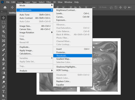
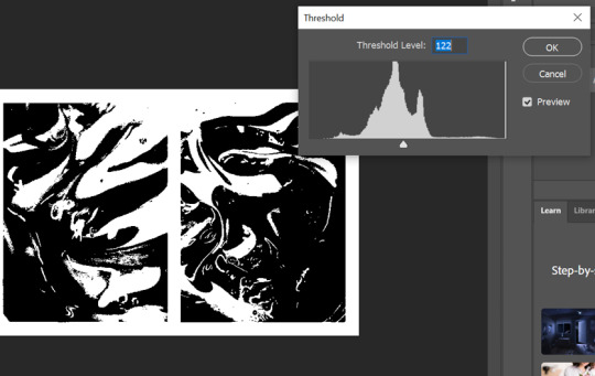
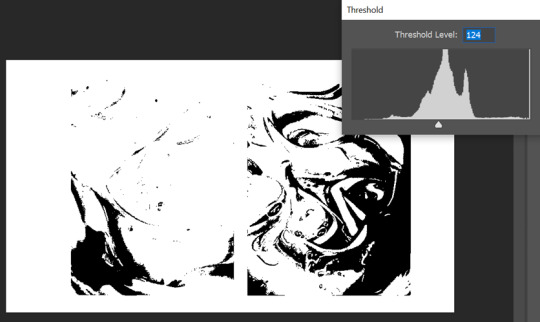
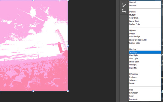
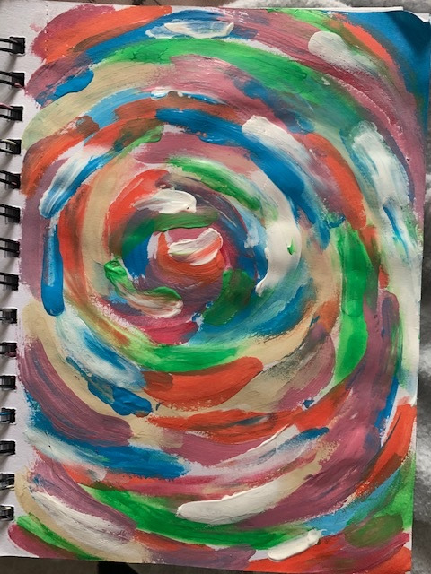
As you can see above, I have began to edit the original image of the paint. Threshold has been used to segment the image into sections. As I wanted the image to be binary, I did this process twice but at different levels. On the left I set the threshold level to 122 however the other image I placed it at 124. This brings out different shaded areas. Before I began the duotone process I had to flatten the image using grayscale so I am able to see the threshold better.
I then used duotone with the two layers I had made with the threshold and set them to the original colours of the picture I took. This was because I wanted to see the difference between the two. Above are the results. This was the most enjoyable process by far as the fact that the paint gave a marble effect so I was able to create to outcomes with the duotone and threshold combination.
This was a screenshot of the art which I had created on the opposite side of the print sample. This was a font which I had downloaded of adobe fonts as I wanted to find the best block like text. This enabled me to liquify it better using the smudge and expand tool. I had done this process already however I loved this outcome more as I began to become more familiar with the technique and the result I wanted.
Here is another outcome of the process above. Again, I went through the combined techniques twice to get different colours within the duotone image. My final outcome is pink and orange however this was originally created with different shaded of pink because I thought it would be beneficial to use in my zine.
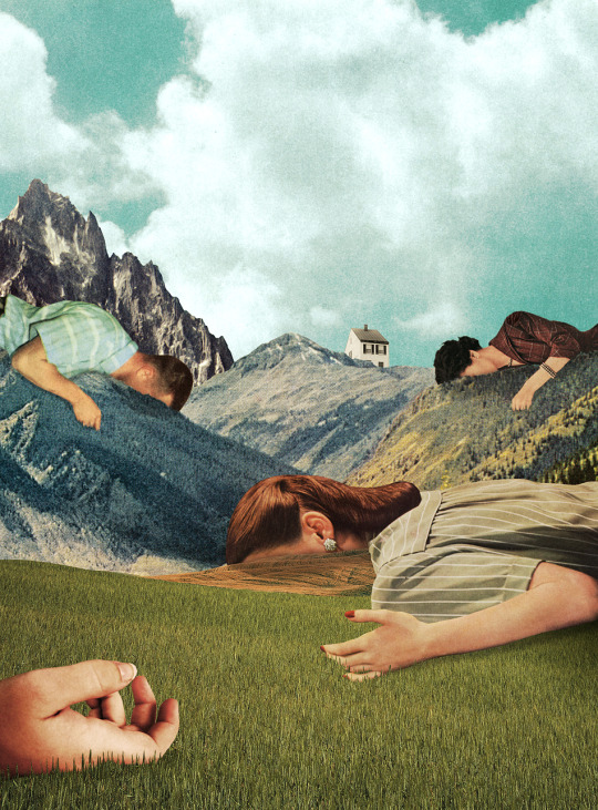
Moving away from the digital comparison samples, I began to look at my aesthetic post where I looked at artists work which had inspired me. I had yet to make many physical samples so I began to look through magazines for any imagery I liked and could cut out. I knew I wanted to make some ‘abnormal’ collages. This means combining multiple objects which aren't normally combined to create this new sense of reality. I wanted this kind of escapism in my work ,with the help of landscapes, to portray the abnormality of stressing over tiny problems. I want the readers to remind themselves of who they are and where they are which I hope eases their worries because its easy to get lost in your own world without acknowledging your the world your living in with others.
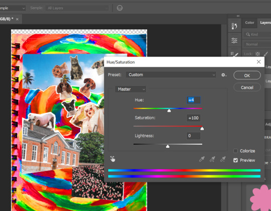
Above was the process of working into the collage once I had scanned it in. I removed its white background, which is formed after scanning, using ‘colour range’ then, I used one of my mixed media art pieces to create its background. I made this using acrylic paint and my fingers. I would normally use a brush to be precise but I didn't want this outcome. I then began to adjust the image using the ‘saturation tool’ to make it appear brighter almost like the collage was spiralling into the page. My previous samples have been looking flat against the backgrounds which is why I created another layer of the background and erased certain areas of the brushstrokes. I then layered this on top of the collage to make the two blend together. I liked this outcome because not only does the collage reflect the common saying ‘ It’s raining cats and dogs outside’, but the outcome doesn't look flat against the page. Keeping the binding of the book I painted on helped bring in the personal elements of the samples aswell. Overall I hope the sample has reflected the meaning behind the saying in visual form to highlight the silliness of life's problems sometimes. This sample is humorous and uplifts me so I am interested in including this style in my work to create the same emotion for the readers.

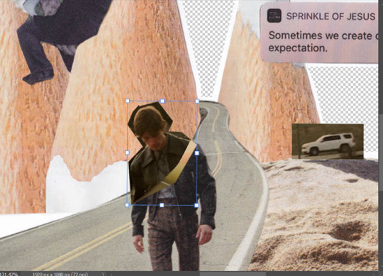
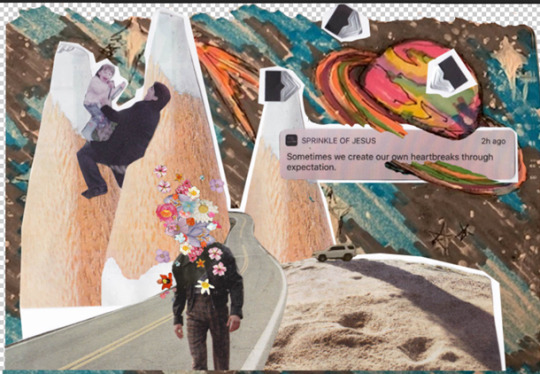
This was the process of another collage sample. This time I wanted to add more personal imagery alongside the magazine cutouts to help portray my story. At first, this collage only had the road in the centre of the pencils, and I was going to edit out the man walking along it as I didn't need it however not only was this difficult to do, but I thought the sample looks empty so it was harmless to leave him in. Luckily, I didn't throw away my cut outs so I found the head of the model to attach back to the body. This didn't look right either. I tried to create a new layer with the man selected and adjusted the image to make it look smooth however this didn't work very well. I think this was because of the angle I scanned in the second cut out. The first collage was scanned in on my printer at home however the second was scanned in through my phone instead. Nevertheless, I worked around this dilemma by adding loads of flowers on the models head. This helps the abnormality become present in the centre of the sample. I also believe this helps portray my message of growth. For example, the pencils in the back symbolises a playground and all aspects of what the noun is associated with which is why I am playing on it as a child with my mom (image on the near left). The road coming out the the pencil mountain portrays the aging of life and abandonment of childhood as you have to grow up. The man in the centre also helps this interpretation with him walking on the road with flower blossoms on his head symbolising the growth of the mind and soul within a person. Aka character development. This is also one of my favourite samples as it holds its message well and feels more personal with my childhood images. It has helped me understand the exact message I want to give to my audience visually.
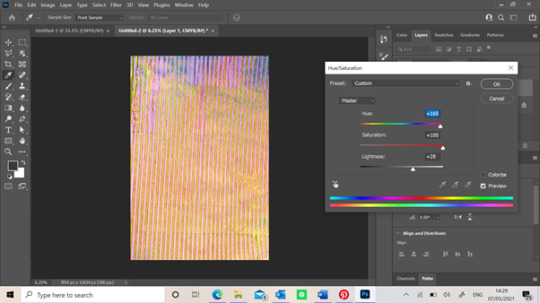
This final screengrab is of the process of the poster sample I had made digitally. Although the collage was made digitally, the background wasn't. The image above is actually a picture of one of the screen prints I made using a stripped generic screen. Originally, it was purple but as you can see above, I changed it’s saturation and hue to create new colours. I loved this outcome because you can see the different textures of the screen print especially since its on paper. When screen printing, the paper obviously got wet so it caused the paper to crimple which is why there are different tons in this adjusted image. This process was before I liquified it and I think I were to do it again, I might have left it like the image before to make the outcome look more authentic.(scrapbook/journal)
1 note
·
View note
Text
Content samples

Above is some examples which I created that may help me begin my layout process. Each one differs from one another because they were each elements I was inspired by. I though created different themes around my content, it should enable me to pick a ongoing theme/ style for the zine. Or even better pick certain aspects within each one.
The first image was an idea for my cover. It is inspired by the exercise books you would receive throughout school however, I added some personal elements to help portray the change in narrative. At the time, I liked this as I knew what the rest of the zine was about however, from a blind eye, they wouldn't and they might not be as interested as the zine doesn't connect with them straight away. The second sample is my idea for my contents page. This is my favourite out of the four and I would love to use this layout in my zine. The left side I created using the pen tool but it was a visualisation of pencil work which I would scan in to make it look personified. Moving onto the right would be a brief description of particular sections of the pages with the help of collaging imagery. Each title would match the sketch colours on the left. These colours will be used as my colour palette thought the zine as I cant stick with feminine colours constantly despite it conveying my narrative better.
The third sample I made would be the ‘about me’ section. This wasn't necessary but I found it common within most books to have this to give an overview of the author and their intentions of the book. I wanted to briefly describe myself and the journey I hope the reader were about to take. I also think its important for me to highlight my awareness of privilege and mention specific women who don't have some of the advantages I have unintentionally. I want to create a zine to help women but I also don't want to limit anyone else's success/ accomplishments just with my privilege in society alone which is why most if my feminist research is based off activists of colour. My final sample would be the first page of content regarding my narrative. This was inspired by my previous style of work I had discovered using duotone. I used a feminist image and used the new technique to create the outcome on the left. I am aiming to include art on at least one page of the double spreads to break of the amount I text I could potentially have.
Overall, these samples took longer than I wished however it was very useful to make the layouts digitally rather than sketching it out because I was able to see the outcomes better. I am defiantly going to use my content sample and I hope to use some of these ideas. At first I was worried of having an ongoing theme as most zines share similarities on each page but, as long as I stick to my colour palette I don't think I should worry about this as there will be so many different sections within the zine it would be hard to stick on one aesthetic.
0 notes
Text
Branding and Layout Examples (front cover)
Sadly people do judge the book by its cover so it is essential that I take extra time on the front of the zine.
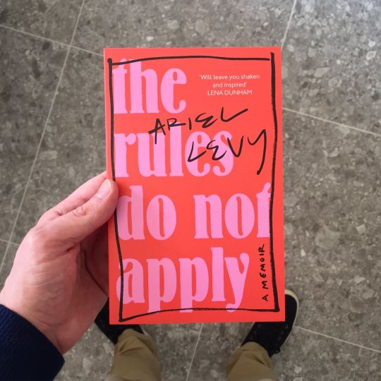
The rules do not apply by Ariel Levy (2017)

Art by @conanthwhore on Instagram.
Above are my main two styles of covers I was conflicted with. One was very simple yet straight to the point which is what I needed to engage a person quickly. The man interest of the first image was the rework with black pen. This was inspiring. I wanted to create a rebellious atmosphere with the black which is what sparked my cover. The idea of having a standard and fairly boring text as the background but then having pen scribbled out over the page symbolise my content and its purpose of rebellion against the standard expectations of young women growing up. I defiantly want to use this book as inspiration for my cover. I also love the second piece and its style. I've mentioned my expectations of the zine feeling like a journal and the features like the paper tech, stickers and written text could potentially give the readers a feel for what they were hopefully about to read.
0 notes
Text
Digital and Physical mood board comparison
In this post, I have began to explore particular artists I've enjoyed and apply them to samples. When looking for inspiration of layouts for the zine, I enjoyed the monochrome aspect of these images below. My tutor told me they would be achievable with a screen printed process. I decided to try this as well as digital outcomes and compare the two and I will be using both physical and digital aspects within my work.

(Singapore’s limited-edition Rubbish FAMzine) available at https://eyeondesign.aiga.org/singapores-most-creative-family-meets-its-patriarch-in-the-latest-rubbish-famzine/
As I begin to move away from research, I found myself feeling slightly confused with my visual works identity. To solve this, I went into the print workshop to create some background samples inspired by the work above. I decided that I should create some screen print examples of particular patterned with the generated screens they had that I could work into potentially. When creating, I decided that I would also create similar samples digitally and see the difference between the two as I will be back and forth between both styles of work. Below was this process.

These are my screen printing outcomes. I hadn't doesn't this process in a while and I was unhappy with the outcome. I think I didn't apply enough pressure to the screed because the paint looked bubbly and thin against the paper. I unsure whether the paper had caused this either because I'm the paints are more suitable for fabrics. Nevertheless, despite not being as florescent as I hoped, I realised that these outcome may be suitable for my aesthetic of the zine. I needed to try to be more creative rather than being really precise with my zines. As this is heavily based of collage work and scanning in, having these base samples can always be useful to keep in case I wanted to layer on top of them or even reworked into them digitally.
I did this this digitally with the help of a new technique within photoshop. When explaining my wants of using this style of work to my tutor, with help of the inspiration above, he suggested a technique called ‘duotone’. In the next post I will explain this process better however, I was able to get the result on the right with this. This image was taken in the print workshop when I was creating the failed samples. I loved the paint consistency and colours so when I was clearing up, I took a few pictures of the paint. Then, I worked into them digitally using duotone as well as ‘threshold’ to make the two contrasting colours, green and pink. I loved this style especially from an outcome I was originally disappointed with.
I knew I wanted a lot of content within this zine and my tutor highlighted the importance of creating breathing room for the zine in order to keep them interested in between the text. This is what sparked my interest in creating some pages with less chaos so the readers were able to focus back on my intentions of the book. The image on the left suits this idea which is why there is only typography work present. I created this with a technique which I had learnt in the previous module. Using a standard font, I matched it with the colours on the right image and then went into liquify to build the warped effect.

These are more samples with the new technique of duotone in photoshop.
As I discussed earlier about having breathing space, I decided to correlate some sample art which I could potentially use in the zine. I thought it would be best if I were to create some pieces which were also interactive to the readers as this was a self-help book. Many self-help book have imagery or note pages where the reader can feel inspired by their personal journey. The image above was created to be used as a poster in the readers room. I wanted this piece to be smaller than the rest and have a removable slit so the reader was able to remove and place wherever they wished. This was to maximise the engagement of my audience. This was also inspired by many children's magazines but with content which I believe would reach my audience a little better than toys. I loved this idea however I'm unsure if this outcome is suits my current theme. It looked fairly flat to me despite the collage in the center. If I were to create this again, I would render the work with more physical aspects like pen marks as the font because this poster is digitally based except for the background. The background is actually one of my screen printing examples which I made in the print workshop. Although they didn't turn out the way I wanted to, I used them to create this piece. I did this by scanning in the image, using the liquify tool to add the warped effect and finally adjusting the saturation to create the orange undertone. I loved the outcome of the background and inspired me to develop these outcomes with other physical work I didn't like.
To conclude this post, although the screen printing examples didn't work out as well as I hoped, I used them to my advantage to create a new style of work which I intend to use in my final outcome. Despite not finding the images which originally inspired me suitable for my theme anymore I will adjust the existing work and layer them to create the contrast of physical and digital work within my zine.
0 notes
Text
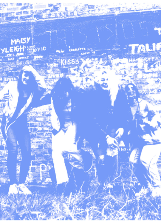
White shirt photoshoot task
Over the Easter holidays, we were asked to carry our a task where by we had to take a picture of someone in a white shirt. The catch was that we had to apply certain scenery and objects into the shoot which would apply to our chosen narrative. This was to help understand the power of visuals in order to achieve our story. I have barely any experience in photography so I was a little anxious to start this. The more I think about what I want to do for this zine that could help a women in any way, the more I want to make it personal. I think adding personal experiences and advice would help a viewer engage more which is why I went through some old images of me. I decided that I would recreate some pictures of me conveniently in a white fabric (which we were asked to be dressed in) and collage into the images. I think this would be the best way for a blind eye to understand what I want to convey in the project as it conveys the growth of me physically. I believe the more I get used the photoshoots and photography ideas, the more I would feel comfortable using new ideas and different scenery to portray my message. Below is the process of this photoshoot and final outcome.
It actually took me two takes to carry this photoshoot the way I wanted. The first set of images I took were on a dull Monday evening. The lighting was not good and I didn't find a good outfit that related to the first images of me as a child. I was also doing this shoot alone on my phone so the angles weren't right. Its safe to say I REALLY didn't like these results, I didn't put any make up on because I thought it would be best if I were to try and resemble my old self as much as possible without a sheet of makeup on. I tried to style my hair in the same way which overall, didn't make me feel comfortable. This made me realise that I think I use my hair and a comfort blanket in terms of having it down often. Prior to this photoshoot I didn't feel insecure however, after seeing my results and not liking what I looked like in them, revealed a new set of thoughts to analyse.

The root of the disappointment from the images was because not only did I have high hopes for the outcome as I thought it was such a suitable idea, I must have built up this idea of what I would look like or what I think I look like. With the help of face rendering filters that are plastered all of the media nowadays, seeing my true self stripped back, tired eyes saddened me. It made me realise I wasn't the girl in the images I was comparing to. She didn't have these insecurities from a unrealistic beauty standard, she was innocent and happy to be trying on her bridesmaid dress for her uncles wedding. I found myself staring at the image for ages thinking about how pretty I looked. Now, I try to smile a certain way that hides my teeth and makes my nose look smaller. I smile from the side rather than from the front, up close and personal. I was really upset with the outcomes and the sadness that glued to me post task so, I didn't have anything to hand in when the task was due. However, when explaining this to the tutors they were kind enough to understand and they actually helped me realise how much this story of process related to my zine. So, I was determined to try again. This time I wanted to find the dress I was in and aim to add a humorous aspect to the images as the dress obviously wouldn't fit. I was so adamant of using the dress but to my luck, my family and I couldn't find it.
This time around, I asked for help from my mom to take the pictures. She was able to compare the two better and get the right angle where by the images were in the same spot, so the viewers could see the changes better. Due to not finding my dress, I had to compromise. I decided to use a dress which I currently love and I thought was similar to the one in the picture. Both were made from similar fabrics and had flowers on. The difference in flowers symbolises the growth of me both physically and mentally. The flowers on the younger me are all the same width shape and colour. This may convey the life I lived learning about the world as a child. I was experiencing everything new first hand and was being taught about everything by everyone. In contrast to the flowers on my dress presently, they vary in different shapes sizes and colour which are littered all across the dress. This conveys the life I've lived up to know. That being all the lessons I've learnt, mistake I've made and paths I've crossed.

I decided to add layers into these images as I wanted to develop my collaging skills physically and scan them in digitally. So I can develop this skill ready for my final outcome. I came up with the idea of adding in texture and other crafts I have at home that could add some personality into these comparing images. Adding things like the letters and squiggles and other art and crafts symbolise the nostalgic of growing up. As this is a lifestyle magazine and not massively fashion orientated, it was important I added in these features into the imagery to get my narrative across.


These were the pictures from the result, the last image was my improved version of the task. Overall, I wasn't expecting this task to impact me the way it did. It has defiantly sparked a change in perspective within me in aspects of how I am perceived. Its made me realise my toxic habits or always caring what others think and how I think looking good means having makeup on and hiding myself. Its ironic how I am aiming to try and teach my target audience not to do this yet, I am doing it to myself. Learning this from the tasks, has sparked my need to change this perception and prioritize the value of loving yourself for you rather that what you think you need to be which society has implanted into you. This task made me understand the value of growing up. The fact that I thought I was capable on carrying out the shoot on my own reflects the perceptions of growing up and the need of being alone to feel independent. This is not the case which is shown by my first set of bad outcomes. In contrast to my second set of images, where I asked for help symbolises the benefits of asking for help and proof that you don't have to isolate in order to feel mature and ‘grown up’. I will defiantly keep this in mind when I am handles with new obstacles in life.
0 notes
Text
Emily Wilcox- Content Research

I thought creating a mood board would help visualise my friend which I will use in my zine. I will add imagery that suits her characteristics within the specific pages. I decided to include her work because despite already being biased, I love her articles and the message she creates with her literature. Her voice matches my aesthetic ironically because I feel as though she writes informally meaning it feels as though I am having a friendly conversation with the rather than reading a blog post. she writes most of her work with the use of metaphors and sarcastic humour which reminds me of the concept of wanting life to be fun and humorous. This slots perfectly into my message and the aspect of enjoying young life before its too late. Most of her posts influence the reader to live freely and fun. As easy as that sounds, its also just as easy to get lost in daily habits and forget to nurture yourself and I believe Emily's work can help remind reading of this subject. Below are some of the articles which she has posted which backs up my overall message for this project.


There's plenty more which follow through with my idea of wanting to calm the readers despite evolving into a new stage of life. I think if i were to include less content, I would've defiantly used more of her work for this projects and I love her overall tone of voice however I have decided to only use two pieces of her work throughout just because I am wary of my work load. Below is the two articles titles I will be using in my zine outcome. I've only added the titles as I thought it would be best to see the final outcome for you to understand her message.
“Forget About Your Life to Find How to Truly Live
Lessons learned from the movie “50 First Dates””
“Imagine ever judging a person- a poem by me”
0 notes
Text
What is Feminism? (understanding my content)
I'm now beginning to finalise the specific content that I’d like to add into the final outcome but prior to this, I thought it would be informative to research some generic feminism alongside my own knowledge. This is so I can make the most use for a learning platform from the book. As I was looking through trends on LSN, I found a article regarding what feminism would look like in the future so it would be helpful to understand what I could add for the zine to fit this prediction. This article was posted in 2018 so it was intriguing to see if there has been any changes in society since this was written.
This article was very beneficial in the way I would like to portray the feminist environment. This topic is very well known but from my survey results, not many people can grasp the true meaning behind it. To me, it seems rather hard to understand based off its perceptions. People assume its about being confident, powerful, growing out all body hair, wearing whatever you want and although this is true, all women are trying to project is the injustice against women and gender inequality within life. I want to describe this in the zine and describe some internalized misogyny that we may pick up on in life. Starting small and easing into the topic is the best way for the readers to feel comfortable and less pressured as this subject leads to activism often. The article states that: ‘According to Mintel, just 29% of UK women describe themselves as feminists. Almost half of all women agree that it’s too difficult to understand what being a feminist means.’ This is similar to my survey results as over 59% said they don't know enough information. I want to inform the reader that there isn't any specific term for the subject its more personal development and identify in the world. Do you want to be treated the same as men? Have you found certain situations more frequent with females then males? I believe the true identification if finding these engrossed events that have been normalised within your life and finding your own self through these injustices. Some people are more vocal about it than others however, I aim to lift peoples awareness and boost their feminist views. Since this article, there is a new platform surrounding the female society and I believe it is growing for the better. White feminists have pathed the way for years and have created a good platform however, as racial inequality is more common to talk about nowadays, its time to prioritize the feminists of colour just as much. I'm trying to find research and influencers who aren't predominantly white so I am able to widen my research and the understand gender and social inequality from a different angle. In my zine I will include current feminists I have found and will produce a ‘feminist of of the month’ which highlights this particular persons achievements and social platform so the readers are able to look up people who I think needs recgonition.
Current feminist influencers I am interesting in including in my zine:
Nimco Ali

Nimco Ali (OBE) is a British social activist who main goal is to end female genital mutilation (FGM) by 2030. She is the co-founder of a non-profitable organisation, ‘Daughters of Eve’ that helps pursue this goal. Despite being a FGM survivor, in her Gentle women interview, (2019) she says ’My editor wanted a book about FGM, but that was just something that happened to me – it doesn’t define me as a woman. I wanted to write about the things that connect women.’ when asked about her book, ‘What were told not to talk about’. She is also looking at creating a book for schools to implement onto children. This would be pivotal moment in activism as I believe the school system in the UK isn't projective the right messages into children and how to behave in society.
Adwoa Aboah
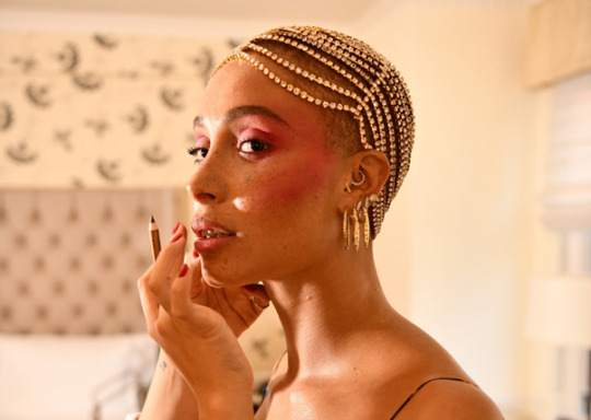
Adwoa is a British fashion model and mental-health activist. She is most common known for many Vogue interviews all around the world. To me, she differs from the standard perceptions of modelling. She uses her platform within fashion brands to speak her views and challenge the modelling industry. Her Instagram his heavy with activist articles and events instead of idealistic standards of looking like most models portray onto teens. She recently did a interview with Vogue where she discussed her new self-reflection journal, ‘Reflections (feelings is what makes life so beautiful)’ She mentioned that ‘For one month, 100 per cent of the profits will be donated to Gurls Talk, a community-led non-profit organisation established by Aboah in 2016 to support and promote the mental health and well-being of gxrls, young womxn and non-binary people, and those exploring their gender.’ Her book is made in three colours which hold content like’ quotes from Serena Williams, Sinéad Burke, Dr. Ciara Dockery, Jorja Smith and Janaya Future Khan, along with prompts that stimulate self-care and checking in on others including: “What’s the one song that always lights up you?” and “Write a letter to your younger self. What did you need to hear then?” Adwoa is really inspiring to me and I am definitely looking to create my book in a similar way.
Amika George
Amika is the youngest feminist I've looked at so far. She is a another British activist whos common goal is to end period poverty in the UK. When she was 17, whilst still in secondary school, she started a petition regarding the poverty around females menstrual time at school. The petition got over 200′000 signatures which sparked protests over the UK for the government in Westminster to provide free sanitary products for school children. She called this the #Free period campaign (2017). In her Vogue interview she states ‘To think that we bleed because of a bodily function we have no control over and have that as an additional obstacle is so unfair! No girl should be missing school because she can’t afford to have a period. No girl should be faced the indignity and constant stress of knowing she’s bled over her uniform in front of her class because she can only afford one tampon or pad, or worse still, no tampon or pad.‘ I love the fact that she did all this while still being in school, it helps girls relate to her on a personal level.
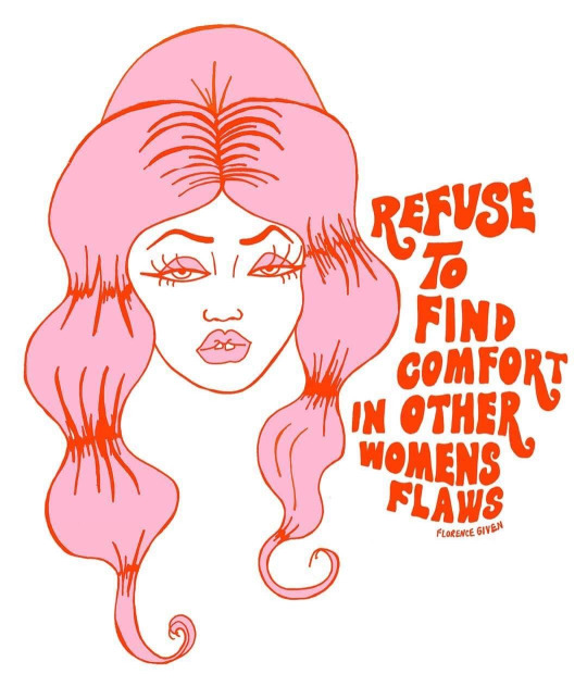
Florence Given

Florence is a illustrator artist and a social activist influencer. Her main achievement would be her book ‘Women don't owe you pretty’ which talks ‘about challenging the out-dated narratives supplied to us by the patriarchy.’ Just in six months of releasing, she received over 100′000 copies bought by the public. She states that “We’re told that if we shave our legs, put on more make-up, curl our hair and do all this stuff, we’ll receive the illusion of basic human respect. But the respect we’re met with as women when we perform these standards is usually objectification, and that also increases our chances of sexual assault and sexual harassment on the street. It’s a double-edged sword.” Her overall message is to educate women on the patriarchy and allow themselves to discover themselves stripped away from the social standards of a female with the help of reding her book.
Natalie Lee

Natalie is a British blog, fashion writer and activist. She is well known for her website ‘Style me Sunday’ which involves her personal journal and advice for women as well as fashion styling advice. Her message is ‘to inspire mums to celebrate their uniqueness, share their struggles and experiences, and to show that there’s no such thing as perfect and anyway perfect is boring. We love curves, wrinkles, realness, anything that doesn’t pretend to fit into a cookie cutter mould. You’ll never see any photoshopping here.’ I found her Instagram very inspiring as she highlights areas which aren't seen as ‘pretty’ breaking the norms of social media and the addition of having to look perfect online.
Angel Arutura

Angel Arutura is a social activist, anti-racist educator and environmentalist from Belfast, Ireland. She uses her blog and social media platform to allow people to relearn certain situations which may not be in the main stream media. Her platform is full of tips and events that have shifted the world. She says in her Irish times interview that ‘Black Lives Matter and environmentalism are “incredibly interlinked,” she says, “because people that are least contributing to the climate crisis are suffering most from it.”
To conclude this research has helped me define what sort of information I’d like to include regarding feminism in society. The last three influencers I chose in this post are similar to my intentions when making the zine as they all seem to write around personal event that could help others relate. The first three females are very powerful to me equally as the last three and I am interested in including them in my zine regarding this subject of empowering young women. Looking for the positivity in the media like these women has uplifted me and encouraged me to believe in this zine and feminism as a whole.
0 notes
Text
What is in a zine? Is it different to a magazine?
Before I delve further into this project, it is important I find a true meaning for zines and why I think its suitable for my idea. Zines are much more free in which a person is able to create anything they please. As a zine is much smaller, they aren't pressured to add loads of content like a magazine would do. Most zines are combined with visual art which is why I chose this idea as I think it would help achieve my goal better than only using text. I researched further into zines and the standard message I convey when I begin to create.
Making a zine will allow me to explore new art techniques and layouts. I think id be more free creeating something like this and it suits my message i want to inflict onto others.

As some of my content will be based of important social events and i would like to convey my perspectives of these particular matters it is import that the reader understands me as a person prior to reading. The image of a zine of the right ignited this interest. I need to tell the readers that these would be matter of opinions and my intentions are pure. I know that I'm not an expect with feminism and I am very privileged in society being a white female. I will create a introduction page explaining this and a little more about myself before I begin my content creating. I am conscious that i put pressure on myself to make work neat however if I want to achieve the right narrative, I mustn't spend too much time perfecting particular pages, this should look like a journal so I am able to be as creative as I wish.
0 notes
Text
Aesthetic Research
At the beginning of this project, I was heavily inspired by the first two artists and wanted to base my zine around them. As I've progress with research, my style plan has changed slightly which is why there is two versions of this post. This is the original aesthetic I wished to use.
Originally, I wanted to have majority of my work made digitally as this was my strong point however, as I began to research other artists, combining some of this work with physical art would help my zine feel nostalgic and personal to the reader. This zine will be playful and humorous to remind the viewer not to take things to seriously. I will also be adding personal imagery alongside these inspirational work techniques. At first, I was fairly worried as I knew I wanted to cover a lot of different subjects within and I felt as though I had to keep the overall aesthetic layout similar on every page but a tutor advised me to do as I please as the more different each page would look the more engaging it would be to read. Below are some inspiring artists who may spark some of my layout ideas.
Florence Given- Women don't owe you pretty
I had read Florence Givens book last year, ‘Women don't owe you pretty’ which actually sparked this idea and learning more about feminism in the first place. She not only wrote this book but she also created all the visual identity behind her work. I love her aesthetic which reminds me a lot of the 70s because of her common curved typography. I enjoy her colour palette also as of course there is pink within her book but she also uses orange, red and yellow to add a fiery and informal side to her art. I've previously talked about colour phycology in our group project and I love the combination of pink and red in visual art. The light pink symbolises the generic stereotypes behind a woman and is very feminine just like we are told to be. The red conveys the opposite despite being close on the colour wheel. The primary colour symbolises the fiery presence and confidence that should be the representation for women. I am most definitely will be using this combination throughout this zine as I think the red alongside doesn’t make it look as girly and soft as the light pink alone will be. When creating a zine around this matter, it is hard not use the stereotypical colours that everyone would know and is associated with a women. Although this would catch attention quicker, feminism doesn't like this attachment which is why I will be aiming to use a lot more colours along side pink to wash out this opinion. I think I will use pinks, red and oranges like Florence but also add blues, greens and purples to add as much euphoria as I can.
Natasha Ahmed- Illustrated Wardrobe


Natasha Ahmed is a social influencer and illustrator. She has recently collaborated with a clothing brand with her motivating art which is what inspired me prior to researching more artists. All of her work is drawn digitally which is was sparked my inspiration originally. As I progress, I think I will use digital illustrations to an extent with typography but I have decided to rely on my collaging ideas to provide the main aesthetic for the zine. I will add digital art over the top of existing work to add personality and a ‘diary like’ feel. For example adding pieces like Natasha's or drawing over a image. Nevertheless, I love Natasha's work as it highlights normal life. A lot of her work consists of trendy objects or pictures of her room. She has made a magazine full of illustrations of famous musicians which I was drawn to. The first image above is what inspired me the most as I like the idea of the cluttered objects placed behind a patterned background. This ignited my idea of making it more personal by adding certain objects and imagery that could make the zine look as though it has been placed on a table without any thought. What I mean by this is imagery within the page such as tea-stains, nail polish, eyelashes, jewellery etc.
Below is some artists I began to research after I knew I wanted to add some collaging techniques into my zine. I was given this book by a tutor. The book is called Cute and Paste.
Julian Pacauld- escapism

I had always liked this persons art as I had found them on Pinterest a few projects ago however, the book helped be find the artists name and look further into his work. I always love the abnormality behind collage work like this and wanted to include it into my work some way. Originally, when you look at Julian's work it feels humorous as he places certain images in particular ways that aren't common .He plays around with size and proportions which is where this personality of art comes from. His pieces remind me a lot about escapism and the functions behind a persons mind. It requires a lot of imagination and playfulness to form this which is why I love it so much. I didn't know how I could tie this sort of technique into my work however, the more I thought about my original message behind the zine, I think Julian work fits in quite well. I’d like readers to feel eased when reading the zine as a lot of my content would involve the importance of living present and not overthinking certain life situations. I will use this technique when I try to explain the small severity behind a persons problem. For example; I have recently stressed about silly problems and I have made a conscious effort to remind myself how amazing life is as a tiny human on a floating rock in space. I could portray this message with abnormal collaging imagery as this could help get my message across better than heavy amounts of confusing text.
James Dawe- adding new stories into existing imagery to help portray messages


I believe James has used collaging digitally as this work seems fairly flat. I am unsure yet whether it would be easier to create my collage this way or to print pictures off. Nevertheless James is another piece of art which has inspired me greatly. What I enjoy so much is the layers within the pieces. I believe he only uses one or two pieces of art but multiple copies of them so he is able to get different outcomes with different cut outs. This is a interesting technique to add a new narrative within a image. I hope to do this slightly to some of my images. I may do this with my own personal images to again add a sense of playful into my work or combine two contrasting images together to create a different aesthetic. I am excited to start this process and see what outcomes I could create with James inspiration.
Craig Atkinson- personal touches

This was the final artist which I liked from the book Cut and Paste. Although Craig's background work is fairly simplistic, what adds character is the additional pen lines and mixed media. This is exactly the aesthetic I am going for. Just like Craig, I hope to create the a narrative that makes the reader feel as though they are snooping through someone's diary yet becoming educated at the same time. Using this sort of technique will make a big impact on particular pages and help portray my fun message for a female's life. I am unsure yet how to execute this process perfectly as I've previously tried this technique with the trend lookbook however, there is a difference between physical lines and digital lines. It would be easier to do this digitally on top of pre-existing collaging work however I don't want it to look too clean and pristine and I think digital sketches give off that look.
To conclude, all of these artist have inspired my visual idea. Despite changing my original aesthetic idea, all of these artists has contributed to my new visual layout of my zine and I will make an conscious effort to keep referring to these artists pieces for inspiration when I finally begin to speak these ideas into creative existence.
0 notes
Text
Lifestyle trends based on my target audience
When research gaps in the market, I began to think of ways I could get as much content in my zine. Although I had my own personal advice and tips, I also need some content that would help enable more engagement. This is why I have began to look at potential lifestyle trends from the website LSN so I could use in my zine. I also looked into my target audience and how they are researched to behave so I can understand my target audience better. My age group will be people aged 16-24 meaning currently, most of these women fall into Generation Z.
Article 1: How Joy scrolling can uplift brand storytelling (March 2021)
The first article I looked into explains the new aesthetic for story telling. As the pandemic hit, there was a lot of bad news surfaced. Artists took a step forward to create uplifting news and advice that can help distract society and focus on the good temporarily. Ives seen this surge of design all over the internet and a lot of news has been produced in an artistic way to make the articles easier to read. This is a less intimidating approach to new which i like and want to follow for the magazine however i am also weary of the dangers of this. I don't want to distract or wash the important information with pretty art but influence it to be more visible. This article helped influence my decision as this way for creating has become popular in society. A lot of this style seems to be digital however I hope to move this movement into physical consumerism to aid the popularity of magazines.
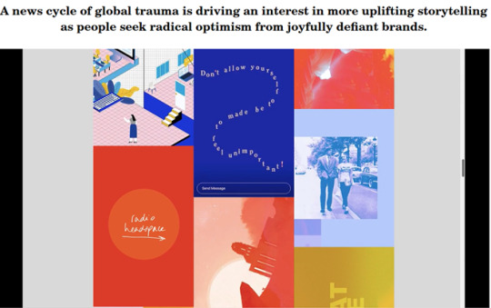
Here are some examples which were published on the LSN article. (March 2021)
Spreading this positivity across social media has created a lifted and conscious internet algorithm and i think has broken the dark internet cycle of having to look perfect and be ‘amazing’ all of the time. Getting rid of this influencer life and spread important events and news that could educate a person is much more important than having to look a certain way to feel accepted. I wish to do this with my zine and these examples validify my urge to change and create a positive society.

When completing trend research, we looked at trends for the summer and there seemed to be a lot more colour plastered onto life. I can see this now coming into action with this new approach to news by adding sketches and other forms of art into important messages and advice. Just like the Trend project, I hope to bring a euphoric feel and uplift a reader with the assistance of bright colours.
Article 2: Need to know (11/02/21)
The second trend article i looked at involved a lot of information which became popular over the new year. The most distinctive article was about post pandemic self-care. As you should know already, this subject is heavy within my concept so I was interested to see what has changes when taking care of yourselves pre and post covid lockdown. This LSN article states that- ‘Many US citizens plan to continue engaging in the self-care routines they've established during the pandemic.’
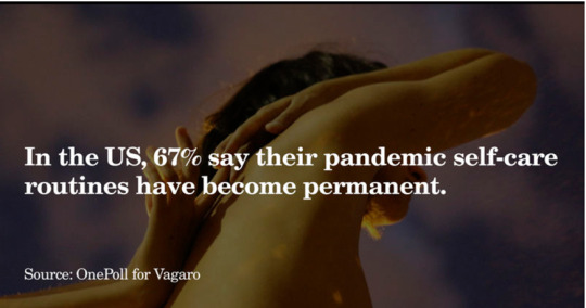
The Need to know article also reports that- ‘According to a recent survey conducted by OnePoll for US wellness software company Vagaro, two-thirds (67%) of people agreed that the routines they developed during the pandemic have become a permanent part of their life. Meanwhile, 69% of respondents say they plan to dedicate more time to self-care in 2021 than they did in the previous year.’
I am happy to see this occurring within peoples life as this is the perfect opportunity to use my zine to spread this awareness. My zine should produce self- care tips that can help them to continue this dedication. Although this is my sole purpose of the zine, I also think I should add personal and education information that can assist the zine in becoming more personal and enjoyable to read as there is more than one category.
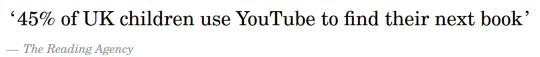
Article 3: Reading Market (March 2021)
This was probably the most informative article from the four I looked at on LSN as I was able to understand how much demand there is for reading. There's a obvious increase in digital media so I am interested to develop ideas that could help these statistics transform into the physical media outlets. The LSN articles says that- ‘According to Nielsen, time spent reading books among UK consumers has nearly doubled – from an average of three-and-a-half hours per week to six hours.’ Knowing that there is a growth in reading eases my worry of my magazine not gaining any recognition especially since I plan to print physical copies. They also state that- ‘As well as offering solace, comfort and helping to bolster knowledge, the reading market is adapting. It's embracing digital acceleration through new interactive formats, while also tuning in to the desires of younger generations, namely their ethical mindsets. For brands, media outlets and publishers, even greater disruption awaits a sector that has long been bound to tradition.’
‘We were expecting possibly to see a spike in comfort reads, like cosy crime or light comic novels,’ says Jess Harrison’
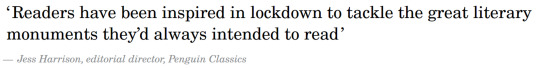
From this information, I can see there is a demand in books and most importantly pivotal media. The drastic change from fiction books decreasing and non-fiction becoming popular, proves the fact that people want to become more educated about world matters which they may not have had to do previously. I must remember to add in important information about specific matters I’d like to cover to aid the increase in monumental reads. My only dilemma is the competition with digital reads as screen time as plummeted this past year. Publishing physical copies carries a lot more problems. For example; when I’d publish I would want the copies to be long term for readers, having content that they can keep referring to rather than quick consumption. This would help reduce the carbon footprint of the magazine. I would defiantly want to be a sustainable zine, having more authentic materials that would not only benefit the planet but also add texture to the brand. The article states that- ‘Publishing house Penguin, meanwhile, is taking an environment-first approach to bookselling, targeting the 65% of readers who prefer the tactile experience of a physical book while addressing the impact on the planet. Its Naked Books are printed on demand, use recycled paper, eschew cover art in favour of a simple manuscript, and are delivered using carbon-neutral transport.’
Following up with the digital competitors this fact proves this point. Despite this I can use technology to my advantage when I would publish the book. For example using YouTube or TikTok to improve new customers with the help of algorithms etc.
Above is a digital book company which would be my competitor along side Audio books and Kindle. These have grown in the past year as there is a wider platform for smaller authors to get their books known.
Article 4: Anxiety Rebellion (2018)
Despite this trend report being slightly older than the others, I thought it would be intriguing to see if this article has come into play in the more recent years or if my magazine could do this instead to make this trend more long lasting. This article was under the macro trend category on the content page of LSN meaning this should still be present within todays society and I can apply it to my work. This article provides a insight on the new generation and how they are more diverse in comparison to Millennials creating a new wave of life. I looked into this survey by IPSOS MORI below to get a better understanding of my target market of gen z’s.
This video was attached to this article and it was brought to my attention quickly as I think it perfectly portrays my ideas and thoughts around my idea which you may not have seen yet. The next post will be the full advertisement of this video which was made by ASOS. This advertises Collusion which is a brand created by ASOS that offers clothing and accessories for the new generation. They spread positivity and urge consumers to invert their own style.
Gen z:
A quote from IPSOS- ‘For previous generations of teens, anxiety could be attributed to teenage angst – a temporary cocktail of the hormones and emotions that come with growing up – but Generation Z are fighting this stereotype. Rather than allowing themselves to become trapped in a web of anxiety, teens are speaking out against practices that cause them unnecessary pressure and turning their worries into productivity. In September 2018, a 15-year-old student tweeted ‘stop forcing students to present in front of the class and give them a choice not to’, garnering more than 130,000 retweets and nearly half a million likes.’
As seen from previous events from the past year, teenagers are becoming more vocal on specific matters important to them. I am pleased by this as I think they are breaking this preformed ways of living, how to behave and creating a new and more expressive society. IPSOS Mori’s recent survey found that, ‘contrary to many clichés about today’s young, our new survey data and analysis reveals a better behaved, more trusting, socially minded and less materialistic generation’. There are many prejudgments about teenagers however, everyone has been one at some stage of their life. The common personality assumptions are laziness, rudeness and anti-social behaviour. Seeing the survey data results and proving these judgments wrong is refreshing. Teenagers actually are more motivated than ever and I hope to give them help. The survey also states that Generation Z are showing new attitudes to their placement in the world. for example, improved self-care solutions, spiritual healing practises, cleaner lifestyles, future-proof financial systems and a new entrepreneurial mindsets. These features have defiantly broke the judgments and are radically different from the actions of the former generations. As you can see in the states on the post- ‘Which noted that illicit drug use by US teenagers, including cocaine and heroin, fell from 22.6% in 2007 to 14% in 2017. The study also found that teenagers are having significantly less sex.’
To conclude this post, researching current lifestyle trends within the current youth market has further developed the urgency for a demand of zines like this. I am excited to begin some creative processes now and really make these ideas come together with the help of this trend research.
0 notes