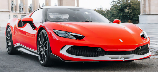
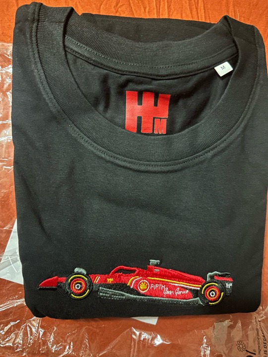
#ferrari 2024 livery
Text
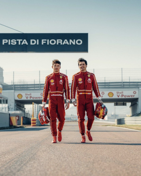


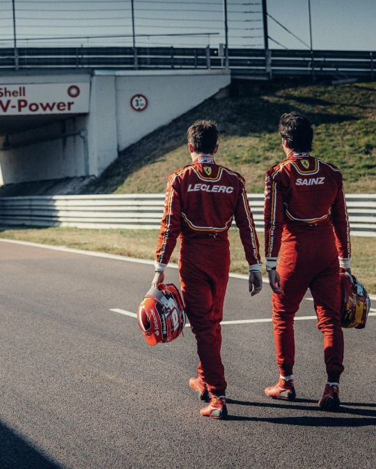
scuderiaferrari We couldn’t resist sharing more filming day pictures 🤩
#formula 1#formula one#formula racing#motor racing#ferrari#charles leclerc#f1#charles lechair#charles lecrelc#carlos sainz 55#carlos sainz f1#carlos#carlos sainz jr#carlos sainz#charlos#ferrari boys#ferrari 2024 livery#ferrari 2024 car launch#cs55#cl16
136 notes
·
View notes
Text


Ferrari 296 GTB Assetto Fiorano, 2024. A new special edition of 5 cars to celebrate the 20th anniversary Scuderia Ferrari’s 1-2 victory at the 2004 Hungarian Grand Prix. The car's livery references that of the F2004 that remains as one of Ferrari’s most successful F1 cars. Created by Ferrari Atelier, the cars are finished in three-layer metallic Rosso F1 shade with Bianco King White accents and come with the the race-focused Asseto Fiorano package that includes a carbon fibre splitter, Multimatic shock absorbers, carbon fibre wheels with Michelin Pilot Sport Cup 2 R tyres, and 4-point safety harnesses inside the cabin. The special edition was unveiled in the Hungarian capital Budapest, all 5 cars have been sold to Hungarian buyers
#Ferrari#Ferrari 296 GTB#Ferrari 296 GTB Assetto Fiorano#racing livery#Ferrari F2004#2024#special edition#limited edition#20th anniversary#Hungarian
222 notes
·
View notes
Text


Y'ALL THE BLUE SUIT?????
#carlos sainz#f1#charles leclerc#charlos#ferrari#c²#carlos sainz 55#charles leclerc 16#ferrari boys#miami gp 2024#THE BLUE LIVERY?????#AAAAAA#SCREAMING
46 notes
·
View notes
Text
instagram
Fucking hell Ferrari were quick to announce this 🤣🤣
21 notes
·
View notes
Text
2024 F1 Livery Ranking and Design Analysis
My ranking(from worst to best) and analysis of the liveries of our 2024 grid! All of the cars we will see on the track have been revealed and I have thoughts.
Liveries in 2024 have been a very mixed bag, there are some improvements, some standouts, and some massive misses. Let's get into it!

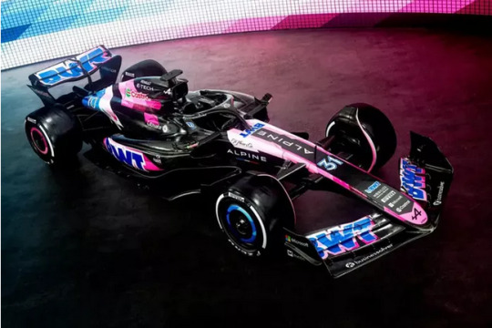
10. Alpine
Alpine is, to put it simply, a disaster. Not only is the car mostly exposed carbon fiber, the color that is there is chaotic and not cohesive at all. It's trying to do way too much with too little space. The pink stripes they were going for might have worked if that motif extended to more of the car, but since they are just snippets it only adds to the discordant appearance of the car.

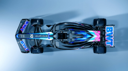
The color at is on the car isn't cohesive, there isn't really a flow to it at all. It's like they just threw color on where they could and gave up.
Obviously the biggest downfall of this year's alpine is the lack of color and the excess of carbon fiber. It doesn't stand out, and the color they did have isn't used in a creative or appealing way.
The one positive I have to say is that I do like the shade of pink they chose as the most dominant pink on the car, it's nice, if there had just been more of it we might have been going somewhere with this design.
I am trying my hardest to ignore the fact that they also lied to us in the teasers for this car. I am ranking based on what we were actually given, and what we were given is extremely lacking in color and design quality.
This livery is trying to do way too much with so little space for actual paint and the result is a very messy appearance that is left looking unfinished.
9. Haas
Haas suffers from a lot of the same issues as Alpine, namely the excess of carbon fiber. However they actually managed to work with what they were given and made a car that isn't so bad to look at, even if it is far from fully painted.
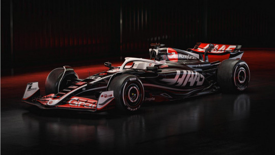
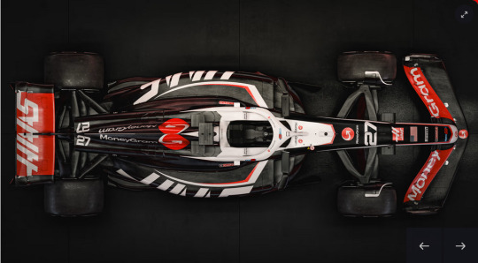
The large logo on the side pod is cool looking and creates forward visual movement. The red/white/black color scheme works with the pops of color nicely distributed. One of the saving graces is the color on the halo. The white and red accents are nice, and you could be tricked into thinking they meant for the car to be all black and the bare carbon wasn't just a weight saving tactic.
The top down view is actually really interesting, it looks like a stingray or something from above, unfortunate we don't get to see it from the angle that much. But this does highlight that there is an overall cohesion to the design. The stripes, the distribution of the red, and the angular logo create pleasing visual momentum across the car. The line-work carries the eye across the design, which helps it feel complete as opposed to unfinished chaos.
My favorite part is the white halo, it actually looks really interesting against the black of the car, almost like a skull. Don't think I've seen that before on an F1 car and I have to say, I like it.
This at least distributed the few colors they had across the car in a way that created a cohesive looking car, even if it is quite bare. I look at this and it isn't just visual chaos. Someone put thought into how they were going to use the limited space, and the results are as good as I could ask.

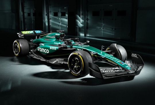
8. Aston Martin
Aston Martin is another victim to carbon fiber. At first glance you get excited to see color, but the way they incorporated the carbon fiber is very noticeable and it detracts a lot.

The colors on this car are great, a nice rich cool green with the lime stripe, no complaints there.
But the issue I have with this car is the way the paint meets the carbon fiber. It is such a jarring transition that it makes the car look like it's slowly drowning in carbon fiber. It's too distracting from the color that is present. It's clunky to the point of being lazy. Just saying "eh we'll paint the top of the car and hope for the best"
The biggest design flaw here is the fact the dark green does not go all the way down to meet the lime line. That lime line should be the division between the paint and the carbon fiber, it's a natural break in the design, but that's not what happened and it looks breaks the flow of the design.
I have very mixed feelings on this one, because I like the color, this livery gets an A+ for actually having some nice color on the car. Unfortunately this is weighed down by the clunky incorporation of the carbon fiber.
There are better ways to get away with bare carbon fiber and still have a nicely flowing design on the car, and Aston Martin stumbled in that department.

7. Stake/Kick/Sauber
I know I didn't think I'd be ranking this above the Aston Martin but here we are. I'll admit I am not the biggest fan of this neon green. However, I have to say that the actual design elements that Stake did are pretty good.
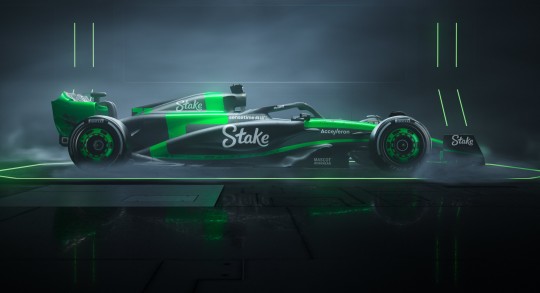
I admit that I have a hard time not thinking this looks like a Minecraft creeper car. The green is different and it is unique, I don't think we've seen a neon green F1 car like this.
This one isn't so much about the exact color but about how it's used. Keeping the green concentrated on the middle and then having the zigzag line swoop under the side-pod carries the color across the car. The only color being this neon green is also a very wise choice, any other color would clash with this bright neon green, so keeping the palette simple green/black/white is essential for this to work at all.
Furthermore this design is actually about as good as it can be with this green. Even if it were possible to be a completely painted car, having the entire thing be bright green would be worse. The line-work highlighting the edges of the car give the illusion of a neon sign, which is exactly what you want to do with a loud color like this, lean into it the natural way, and that's exactly what Stake did.
The green on the front wing is probably my favorite part, it just pops, and looks really cool from the front angle.
A major missed opportunity is the halo really should be neon green, but instead they painted the seat green. That isn't as visible, the halo highlighted in this neon green would be awesome, and I am not sure why they didn't do that.

Now the line work is pretty good, HOWEVER, that zigzag is a bit of a problem. Yes I know i said it creates movement, and it does, but that doesn't mean it's without issues. That line crates harsh 90 degree angles in places on the car where those angles don't exist. It's working against the natural flow of the body of the car not with it. This interrupts the overall look of the car and breaks up and otherwise easy to follow motif of the green lines highlighting the edges of the car.
What set them above Aston for me is the way they had the green spread across the car, with the lines creating flow. Yes there is exposed carbon fiber, but it isn't as glaring because of the color placement and lines. The Aston design almost draws attention to the excess carbon fiber, while this one distracts from it.
All this being said, that doesn't mean this car is the easiest thing to look at. They did the best with what they were given, but this isn't a car that makes me want to look at it for very long.
6. Williams
Williams is fine. It's not amazing, it's not committing any sins either.
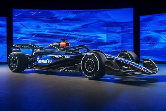
There is more paint on this car than I was expecting and that is a welcome surprise.
This is a good simplification of last year's livery. Only two blues, and minimal line work. It's clean and simple. I like the royal blue they used, that is really pretty, especially on the nose. The navy though is way too dark. In a season with a lot of dark/black cars why would you go with a blue that is so dark on the car? Red Bull does navy too, but it's clear that's what it is. I think this might be a tactic to try to hide where the carbon fiber begins, but it kind of backfired.
Of course they kept the clever and iconic Duracell sponsor placement, I love this little detail because it's just such a fun way to include an advertisement on a car. That and the copper color does work beautifully with William's blue.
I like the criss-cross that the color divide creates mid car, that could have been jarring, but it isn't and it actually brings that little bit of added visual interest.
The gradient at the back to nearly black is the biggest problem with the coloring for me. That navy really needed to be different for this car to stand out.

From the front this car does look great, beautiful blue, fully painted. There are some missteps but they aren't awful. This livery is playing it safe, but it's overall pretty good.
5. Racing Bulls(VCARB)
Probably my most controversial placement. But hear me out, while at first glance this livery is good, it made one massive color design error that I cannot overlook.
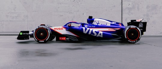
That would be the color of blue they chose as the main blue for the car. Does it look familiar? Well I disliked this as soon as I saw it and there is a reason why.
This VCARB blue is almost identical to the infamous "blue screen of death" This is a blue that has been shown to be upsetting to people because of the negative association. Artists and designers stay away from it because it is jarring and people will dislike it on sight. Never use blue screen of death blue, at least not as the main color, because it's impossible to ignore.


I color sampled so you can see just how close they are. The VCARB blue is only slightly more muted, and it's not enough to save it. If you were wondering why you didn't like this blue, this is probably the reason.
There is a reason you never see this specific blue used in such large amounts.
I might have put this livery in the top 3, but this is a very basic misstep color wise that brands should know.
The other nitpick I have is that the stripes somehow don't create flow. Because they start and stop they create more of a static checkerboard effect when viewed from the front that I am not in love with. I don't think it's terrible though, more of a preference thing. The stripes on the side profile do work nicely, if only that sleekness carried when the car was seen from other angles.
Some highlights about the car: it is bright and fully painted, and the color additions of the red and white are nicely distributed and feel natural. This car does have a fully cohesive design. The white bull on the engine intake is the best part. It stands out beautifully and compliments the directionality of the VISA logo on the side pod.
I also love the color on the halo, the blue and the red really make it pop and that is another standout feature to me. Might be the best halo coloring on the grid if I'm being fair, I really love the use of the two colors on it.
Overall the layout of the car is great, the fact that it's fully painted is fantastic, if it were a different blue this would be an amazing livery.
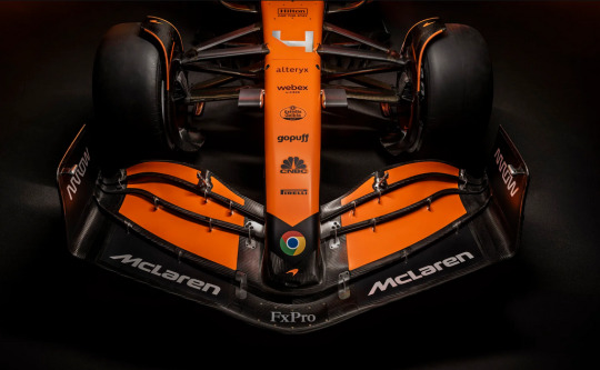
4. Mclaren
Mclaren are going for a clear theme this year and it could have been a disaster, but I think it works!
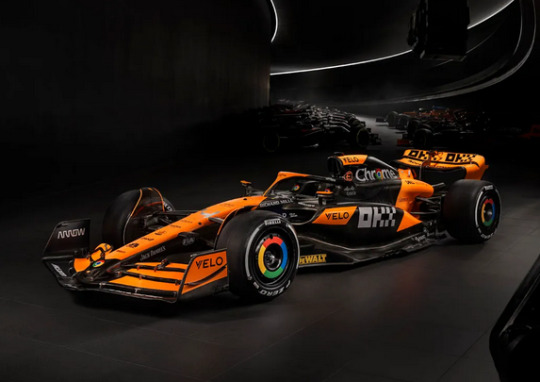
This is the car that incorporates black into the livery color scheme better than any others so far (second only to Mercedes)
Orange is a tricky color to work with. Since they are going with full bright papaya having the black to contrast is the best way to lean heavily into this orange. Of course some of it is carbon fiber, but because the black is worked into the look, and the brightness of the orange is so prominent, it's the least noticeable.
Color on the halo! I do love when the bright colors are on the halo and they went there, which is a nice detail. They also did a similar look to Sauber with the coloring on the front wing, but that ribbing effect looks even better with the orange.
The large black diagonal stripe is actually great. It's angled enough to create that visual momentum we like to see on these cars, and it's not so big that it detracts from the color.
Another reason the black works here is because it helps the sponsors stand out, those would get completely lost if the entire car was that papaya. So this really is the best way to get as much orange, create contrast, while also allowing those sponsors to be clearly visible.
Two details that are great would be the little Mclaren logo on the very tip of the nose, and the orange kiwi on the rear wing. Both nice touches for the brand.
This car does look a little more lacking on color when viewed completely from the side, but that front profile and top and 3/4 profile are bright and they pop.
There are some black spaces that are clunky around the top of the sidepods, part of the halo and a few other small areas where it's clear they couldn't paint more. Just those little areas where it feels like they got 90% of the way done painting it then just stopped are what took this one out of the top 3 for me
3. Red Bull
I really am a little annoyed at having to put Red Bull here because I think if the Mclaren or the Aston had more/better color distribution they would have beat it. However this is a classic and there are some things to discuss.
Yes this livery has been the same for years, but let's get into the details.

It's sleek, painted, the color is clear and nicely distributed. This design hasn't changed much at all but there are some differences from last year.
First the sponsor placements are better, fit more naturally with the changes to the sidepods.
This is also probably the car that does look best with the matte paint, the navy is dark without making it look like it's black, or god forbid carbon fiber.
The reason this livery is so pleasing is the the two rich primaries of the golden yellow and red contrast with the deep navy. It keeps the color palette simple, allows for some very beautiful contrast, and keeps the livery colorful even though the main color is quite dark. The bright yellow nose reflects the yellow on the engine cover, and all of the red details create great pops of color.
The red and the yellow for this year's car are brighter, which is a welcome change, the brightening of the yellow is the most noticeable and the biggest improvement. Really helps bring the car to life.
The only real problem I have with this livery isn't so much the livery as much as the way it fits on the new car. The red bull on the engine cover is a classic part of the design. However since the engine cover and intake was redesigned for this new car, it's lower, so the bull is a little cut off and squished, you can't see all of the bull's legs or part of its face anymore. So in keeping with the same design they have sacrificed a little bit of clarity. This would have been solved by shrinking the size of the bull by a small margin, or moving the bull forward a little. Since it's the main brand I would have expected them to be a little more careful with how it's displayed on the car.
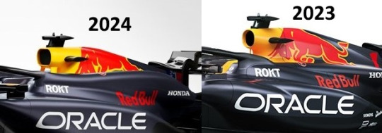
Side by side you can see how the changes to the engine cover drastically altered the way the bull is able to be displayed, and this is a downgrade, especially since that bull is such an important part of the car.
There is carbon fiber on this car. But it is very minimal and discrete. Red Bull does also have the advantage of being able to better hide carbon fiber because they go with such a dark body color to begin with, the places where it goes from paint to bare fiber aren't as noticeable.
If other liveries didn't have so many issues(especially with being fully painted) this would be lower. Unfortunately not this year.
Overall this is a good livery, why change what's working? The colors are brighter, and it's simple.
TOP 2
Okay, from here onward I don't really have any serious issues with the liveries, these are just beautiful and it comes down to small details and some personal preferences.
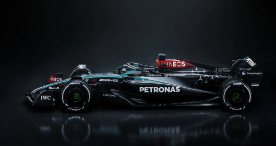
2. Mercedes
I didn't think I was going to love this year's Mercedes livery as much as I do, but here we are.
This is a gorgeous car, maybe one of my favorites from Mercedes. Silver is a tricky color to work with and sometimes they go too far with it, but this is closer to perfect.
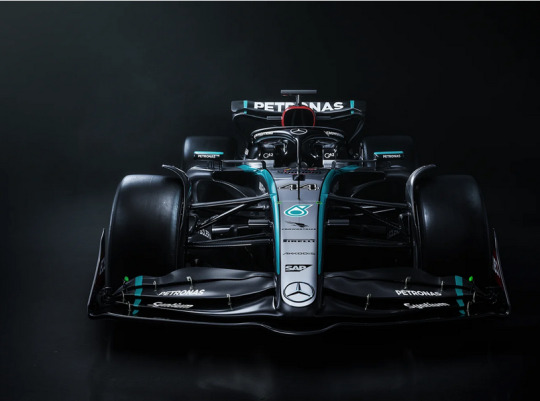
First the nose design is gorgeous, the silver framed by the teal is just stunning. It serves to highlight the body of the car, brings back the "silver arrow"
And then we have the gradient from silver to black on the car. But the black isn't just blank it has the Mercedes logo artistically arranged there, it almost looks like stars. That is so clever and actually makes amazing use of black coloring.
The unbroken teal stripe framing the silver and tapering down the side pod is sleek, it carries the color across the body of the car, that is how you do it. Simple, elegant.
Then we get to that deep cherry red. There is just enough of it in little pops on the rest of the car to work with the main red on the air intake.
These four colors are balanced so nicely against each other, the pops of red, with the teal to frame everything set against the main black and silver of the body.
This car also stands out to me as one that looks different, but amazing from varying angles. The side profile is very different than the front, but in a way that makes you go "ooohhhh that's so cool".
This design probably has my favorite driver number placement and design for the nose of the car. It just fits so perfectly, like I cannot find fault with it.
It's sleek, it's got color, it's brought us back to that Mercedes silver. I think this is a worthy livery for Lewis' last year at Mercedes.
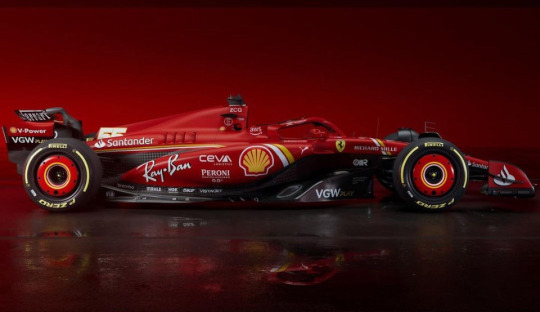
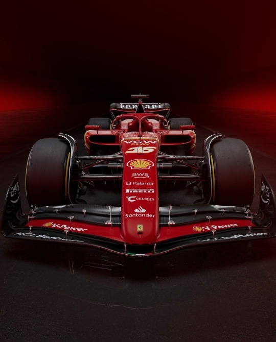
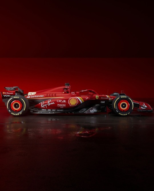
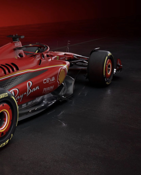
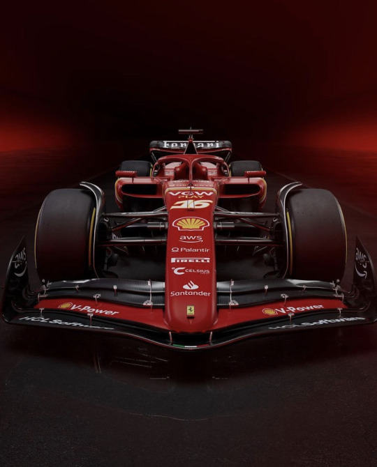
1 . Ferrari
Yes this is a Ferrari blog. Yes I am putting Ferrari at number one. Sue me. But I wouldn't put Ferrari here unless it earned it. This could have been awful, and if it was I would say so. I have my critic's integrity to uphold after all.
To put it simply - she is beautiful.

Ferrari delivered a gorgeous red car that incorporates so many details that celebrate the brand, they added richness to the color, reduced the amount of carbon fiber, and made a car that you WANT to look at.
There is a lot to love here, I want to start with the red. This shade of red is very different than last year, it's warmer, richer, deeper. And it makes the car feel more luxurious. It's a red worthy of the name Ferrari.
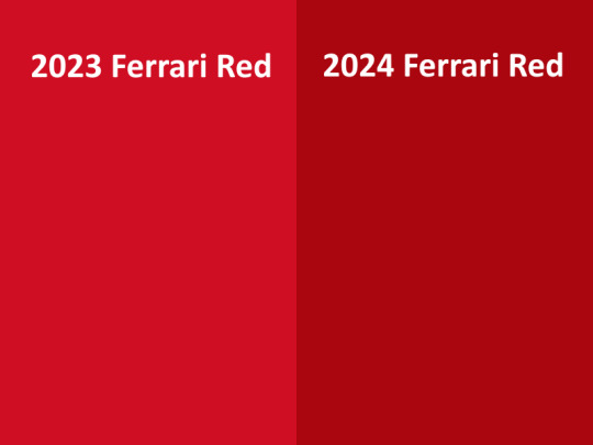
The difference is really noticeable. They deepened it to this gorgeous cherry red.
This red on it's own would be amazing, but the deep color allows for incredible contrast with the yellow and white lines. A brighter red would clash and not contrast well, but this red does it perfectly. It's also a warm red, so when placed along side the golden yellow that warmth is magnified and the whole color palette becomes cohesive.
Enough about the red let's talk about the stripes. Yellow and white, two classic Ferrari colors. Especially the yellow, that is Ferrari and it's nice to see it highlighted a little more on a car that is always classically red. The white adds more pop and highlight to it.
The of course the lines themselves are placed to give a beautiful visual flow across the body of the car. The lines create this pleasing movement for the eye, that wouldn't be there if the car was just one solid color.
And this is how you know the lines are placed well, because they create that movement when the car is viewed from the side AND from above.
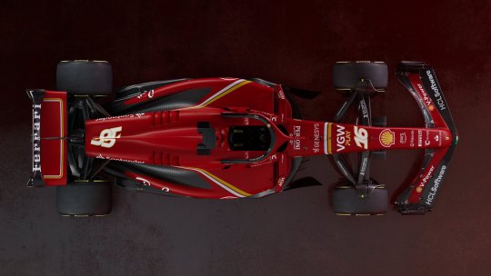

And this brings me to one of my favorite details. The stripes on the rear-wing! It's just such a nice touch to continue the yellow and white line motif and add color to every part of the car. It frames the rear wing beautifully.
And the Ferrari name over that red with the stripes to cap it off, perfection.

Another detail I LOVE is the Italy tricolor on the front of the nose. The tricolor has been on the car before, but it's usually on the side, this one being a little bigger and front and center brings that Italian pride that is an integral part of Ferrari.

Another great front wing detail is the way the red from the body flows seamlessly into that flap is so satisfying. It really makes this look like one whole car that is all red and that is important for a Ferrari.
The carbon fiber on the design is hidden expertly, in the bathtub dips, which follows the natural curves of the car, and is an angle rarely seen. All of the carbon fiber is exposed at points on the car that cast natural shadow, so it would be darker there anyway. It makes the fact that it isn't painted far less noticeable, and thus it doesn't take away from the design by drawing the eye(unlike Aston Martin's approach)
The main reason I put her above the Mercedes is the bright color. This is a car that stands out on the track(Ferrari always does, and 2024 is no different) Also its line work is a little bit better, more three dimensional and it carries it's motif across more of the car.
It's red, it's sleek, it's rich, it's beautifully painted, it is Ferrari.
So those are all my thoughts and my ranking. Disagree? Feel free to let me know your favorite. I think there are details and colors to love on all of these cars.
I cannot wait to see them on the track in Bahrain!
#lucis essays#lucis f1 rankings#2024 liveries#i am a professional artist so I do know what I am talking about at least a little#formula 1#f1#scuderia ferrari
18 notes
·
View notes
Text
we are one full week into february let’s review
FEB 1
rumours circulate that hamilton is leaving mercedes for ferrari . sky sports pick up on this and broadcast it as if official leading to carnage in the f1 community . an emergency mercedes team meeting at 2pm gmt. hamilton signs contract with ferrari that day . it’s announced at 7pm that hamilton will take the 2025 seat for ferrari racing alongside charles leclerc .
carlos sainz is currently unemployed for 2025 .
FEB 2
people start speculating the mercedes seat will go to valterri bottas who had posted an instagram story in brackley a few days prior
redbull is not an option for sainz 2025 seat
rumours circulate of an offer from red bull to alex albon
Haas reveal their 2024 livery
FEB 3
The Albon to red bull rumours were false
suzuka re-signs, japanese grand prix extended until 2029
(nothing rlly happened feb 4 ? )
FEB 5
christian horner is under investigation by red bull
williams drops their livery
stake f1 suits are leaked and they look ugly
stake f1 livery drops
christian horner is allegedly encouraged to resign from RBR
singapore gp has to review its deal with f1 amidst a corruption scandal
sprint rules are tweaked for 2024 season
FEB 6
stake f1 team go under investigation after revealed that title sponsor stake does not have a license to operate in switzerland, home country of sauber
2 fia employees heavily involved with f1 leave the organisation during an alleged exodus of staff
FEB 7
stake were allegedly removed as a sponsor from the sauber team
alpine drop their livery
this is like a whole seasons worth of dts but it’s only noon on the 7th so hold out for more news probably
171 notes
·
View notes


Text


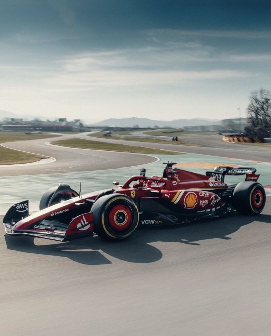
Scuderia Ferrari livery for the 2024 season
source
#our rosso corsa lady is here!!#i love heeeeeer#sexiest car on the grid as usual#the stripes are cool and fun#it's giving lightning mcqueen in the best way#formula 1#ferrari#f1#scuderia ferrari#charles leclerc#carlos sainz#livery#livery reveal#*m
38 notes
·
View notes
Text
Just yesterday I was talking to @scrrjc about how I am so ready for the season to start. And then today, more moving parts than I can keep up with.
• Carlos launches a kart
• Williams launch their 2024 car
• Stake F1 launch their livery
• Red Bull are investigating Christian Horner for an allegation of “inappropriate behaviour”
• F1 have agreed to a change to the Sprint weekend format. Now FP1 and Sprint quali on Friday. Sprint race and Grand Prix quali on Saturday, normal race Sunday
• Rumours Adrian Newey could move to Ferrari
• Rumours the Singapore GP may be cancelled due to corruption allegations
Ok, can I take a break please? Enough for one day.

22 notes
·
View notes
Text


scuderiaferrari The SF-24 in all it’s beauty 😍
#formula 1#formula one#formula racing#motor racing#ferrari#f1#charles leclerc#charles lechair#charles lecrelc#scuderia ferrari#ferrari boys#ferrari 2024 livery#ferrari 2024 car launch#charlos#carlos sainz 55#carlos sainz f1#carlos#carlos sainz#carlos sainz jr#cl16#cs55
112 notes
·
View notes
Text
Get to Know Me - Formula 1 Edition
Who is your favorite driver – Charles Leclerc (but Max comes a close second)
What are your favorite teams – Ferrari, Red Bull, and McLaren
Which track is your favorite – Monza! My car is named after the track as well and it was the first GP I actually watched!
When did you start watching Formula 1 – technically it was Zandvoort 2023 but Monza was the first race that I actually knew what was going on
What are the best races you’ve watched – Singapore 2023 (for obvious reasons) and the Las Vegas GP
Which retired driver was your favorite – Kimi Räikkönen
Who is your favorite team principal – Toto Wolff
What do you think the standings are going to look like for the 2024 season – uhhhh, Red Bull is going to be P1 by the skin of their teeth because McLaren looks so strong (and hopefully Ferrari will come second or third again)
Who is your dream driver line-up – ooooo Max and Charles, 100% even if it’s not possible
Do you have a controversial f1 take – I have a lot…um…one being that (this hurts me) but I’m really doubting that Lando and Charles are WDC material. I could get into a whole rant about this, but just because of either unreliable cars, devotion to a crappy team, and multiple driver mistakes…yeah, imma leave that here (pls do not come for me)
What driver do you wish was on the grid this year – the man who was able to beat Max Verstappen into Q3, the one and only, Liam Lawson
Which driver do you wish wasn’t on the grid this year – CHECO PEREZ
Is there a track that you would get rid of – Miami (3 US GPs is so much – that or Qatar cause it’s so hot and detrimental to the drivers)
Who do you think is the GOAT – Schumacher, definitely
Which f1 driver do you think would win if they went go-karting – Charles, he does the annual Jules fundraiser and wins, so I think he’d be a little more in tune than the drivers who don’t seem to go karting usually
Have I ever been go-karting – no, but there’s an Andretti Karting near my house and I plan to go this summer
Do you think you could drive an f1 car – no, but make it automatic and you’d have to pry my dead body out of the seat
What is your favorite f1-related quote – one I say a lot is “if you have a problem, change your f-ing car” that and “KI-KI-KI- RAH…KI-KI-AYE”
Which livery are you most excited for – McLaren, I LOVED stealth mode
Which team do you think is going to surprise everyone – McLaren and Williams?? (hoping internally that Ferrari actually has built a competitive car)
Which team do you think will disappoint people this year – Ferrari, Mercedes, and maybe Williams (they have a lot on them and I hope they don’t switch Logan out early)
Do you plan on attending a race this year – sadly no…but for 2025 when I graduate, I plan to go to COTA
Which driver would you most like to meet – Logan or Max (I’d be terrified to meet Charles, feel like he’d judge me in french)
Do you watch other motorsports of just f1 – just f1 for now, I’ve actually have watched an irl NASCAR race, and the endurance racing looks so interesting
Do you have any f1 merch – I have lots! (t-shirts, red bull cans [is that merch?], vintage Ferrari bomber jacket, the Lego McLaren f1 car)
#f1#formula 1#get to know me#formula 1 edition#fangirl dot com thots#extras#heart wants Ferrari but the mind wants a winning team
32 notes
·
View notes
Text
2024 circuit map be like...

[I refuse to believe the Ferrari livery will not be predominantly red]
18 notes
·
View notes
Text
How much do you love the 2024 Ferrari Livery?
Me: Yes.
17 notes
·
View notes
Text
Car Livery Reveal Dates 2024
Mclaren - 16th January
Haas - 2nd February
Williams Racing and Stake F1 Team - 5th February
Alpine - 7th February
Visa Cashapp RB - 8th February
Aston Martin - 12th February
Scuderia Ferrari - 13th February
Mercedes - 14th February
Redbull - 15th February
#f1#car livery reveal dates 2024#scuderia ferrari#williams racing#stake f1 team#aston martin f1 team#mercedes amg f1#alpine racing#redbull racing#mclaren racing#haas f1 team#visa cash app rb
23 notes
·
View notes
Text

11 notes
·
View notes
Text
saw the w15...mixed feelings that they only showed the whole thing in instagram but happy to see the team live.
on another note, my two teams' 2024 liveries having that feel of nostalgia like:
ferrari going for that classic red shade with the white and 'jello' lines (they're a timeless team. what did you expect B))
merc keeping the black (their black-themed livery walked so that other 2024 liveries could ran with it ig) and tint of red (it looks like maroon but still looks slick). but most importantly, they brought back that silver (not the whole thing but it's a nice touch tbh for having that silver)
#they really made sure my two drivers get that one last ride with their time#giving that end of an era feeling tbh#... :( damn#i'm gonna miss lewlew wearing black overalls with its hint of teal#and carlos on red#it won't be the same on 25'#let's make 2024 worth the race then...#sir lewis hamilton#lewis hamilton#george russell#britcedes#carlos sainz jr#carlos sainz#charles leclerc#c squared#c2#charlos#mercedes amg f1#mercedes amg petronas#scuderia ferrari#ferrari#f1#formula 1#formula one
18 notes
·
View notes
Last Seen Blogs

yuki-kawatsu
Yuki.Kawatsu illustration
tomahawk-swing
A man's got to make his own path !

sleepdeprivedfyodor
FyodorsArm

musicalkoreasubs
K-Musical Subs
miyao-chunyao
迷药,春药,催情粉,听话水