#digital art drawing tips
Text

#art#artist#arts#digital art#digital artist#digital art tips#art tips#drawing tips#digital art drawing tips#how to draw#how to draw people#anatomy tips#character drawing#character making#character design#character art
12 notes
·
View notes
Text
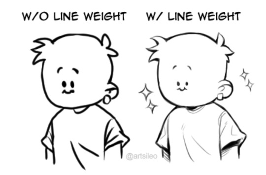


You don’t suck at Lineart, you’re just not familiar with line weight👍🏼!
#tips#artwork#digital art#digital artist#drawing#art tips#artists on tumblr#tutorial#art tutorial#tips and tricks#art tips and tricks
64K notes
·
View notes
Text
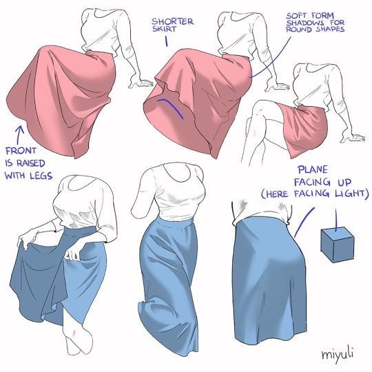
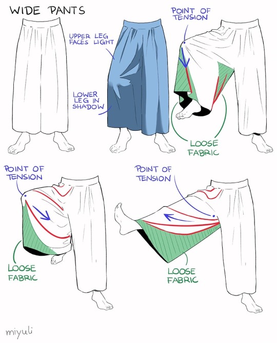
“Notes on skirts and pants”
Source: miyuli on twitter
#art tutorial#digital art#art reference#tutorial#art tips#drawing tips#drawing clothes#drawing pants#drawing skirts#drawing cloth#clothes#pants#skirts#clothing folds#clothing tutorial
47K notes
·
View notes
Text
DEAR ARTISTS, PLEASE READ THIS POST I STUMBLED ACROSS
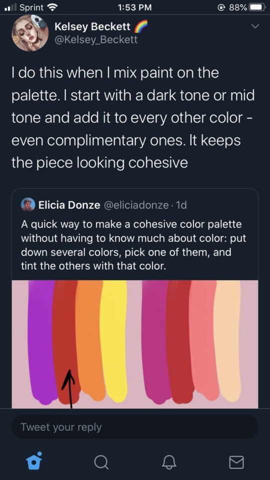
IF YOU ARE NOT DOING THIS ALREADY, YOU SHOULD TRY IT
I even tested it out myself, it works great
#art#artist tips#artist tip#digital art#colors#color pallete tips#color pallete#art tip#art tips#drawing tip#drawing tips#digital art tips#digital art tip
62K notes
·
View notes
Text
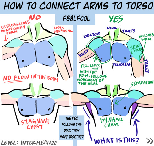
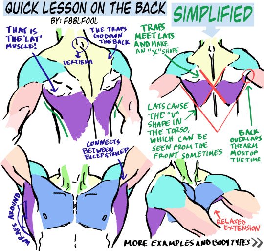
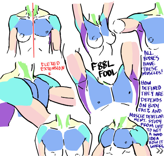
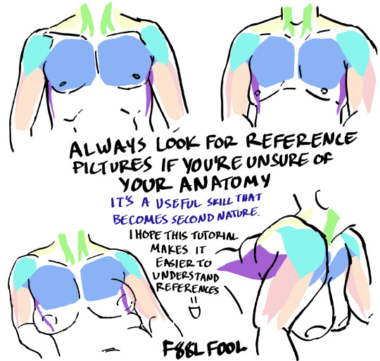
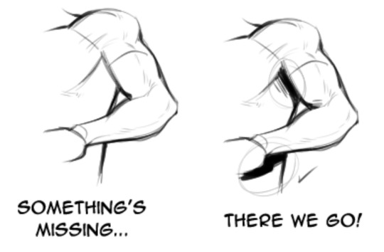
My first anatomy tutorial. How I connect arms to the torso. Simplified the muscles for better comprehension
PS. Pectoral is misspelled as “pectorial” in the picture. Don’t make that mistake haha
And I’d love to see the art made from using these as reference, you can message or tag me.. whatever you want
Edit: The extended names of the muscles:
Neck - Sternocleidomastoideus
Traps - Trapezius
Lats - Latissimus Dorsi
#pec-torial#pec tutorial#there i said it#also keep in mind each body (even the leanest ones) have fat on them#a reblog pointed this out and I thought it was a good reminder#none of these bodies have 0-1% bodyfat#art tutorial#anatomy#anatomy tutorial#drawing tutorial#drawing tips#muscles#muscle tutorial#art study#digital art tips#anatomy tips#art ref#art#reference#tutorial#art references#titorial#f88lfool
27K notes
·
View notes
Text


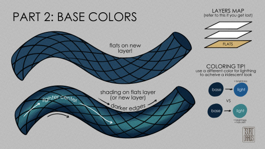
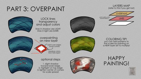
getting back into painting my dragon bois more so a lil tutorial for how i paint scales!
#art tutorial#art tips#snakeskin#art guide#how to draw#how to paint#scales#scale#snakes#dragons#no but have fun this is just how my brain does it#digital art#clip studio paint#tutorial#art resource#tsurudrawsart#tsurutips
11K notes
·
View notes
Text

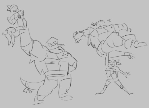
figuring out how to draw my darling angel <3
#art#digital art#sketch#rottmnt#rise of the tmnt#rottmnt raph#rottmnt leo#rottmnt donnie#rottmnt mikey#my art#i love raph but he is So Hard To Draw#idk why#he just doesn't compute in my brain#if anyone has any tips for drawing him pls let me know!!
2K notes
·
View notes
Text

Since season 2 is coming out soon I don’t wanna see any “I just don’t know how to draw fat people” comments 🔪🔪🔪
#good omens#aziraphale#good omens fanart#it’s 2023 we tear fatphobes apart with out teeth#art tips#art advice#digital art#drawing#my art
3K notes
·
View notes
Text
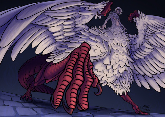
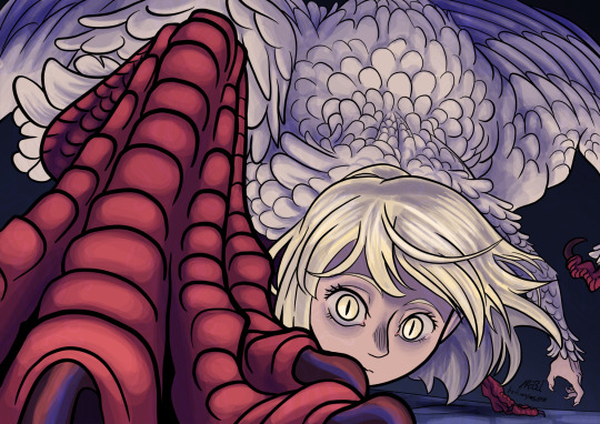
She is so cool
#mebi's art#fanart#dungeon meshi spoilers#delicious in dungeon spoilers#dunmeshi spoilers#dungeon meshi#dungeon meshi art#delicious in dungeon#dunmeshi#falin touden#falin dungeon meshi#falin chimera#faligon#dunmeshi fanart#dunmeshi falin#krita#digital art#that episode was so good I just had to draw her#please dont look too close into the wings feather layers#i also hope my lack of practice drawing humans doesnt show#also if you liked my drawing and read this far into my tags may I humbly request a tip in my kofi page?
526 notes
·
View notes
Text
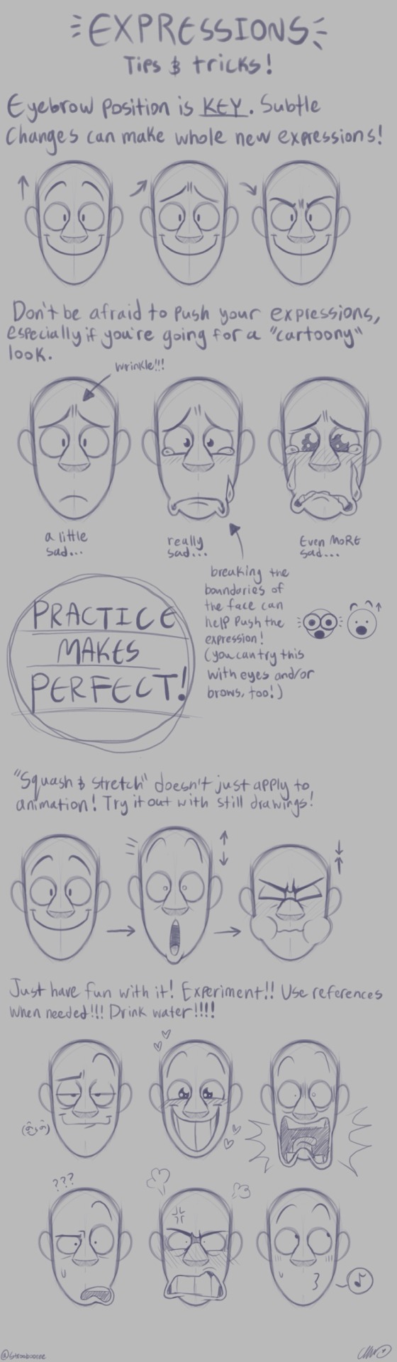
A couple tips for drawing expressions I made just for funsies. Keep in mind that this might not be helpful for people with more “realistic” artstyles, but I hope it’s at least helpful for some people!! :)
#digital art#commisions open#procreate art#cartoonist#fanart#artist#oc stuff#art tips#art help#art advice#oc artist#small artist#digital artist#expression sheet#expression drawing#face expressions#advice#tips for beginning artists#beginner artists
799 notes
·
View notes
Text
HOW I PAINT WITH GRADIENT MAPS

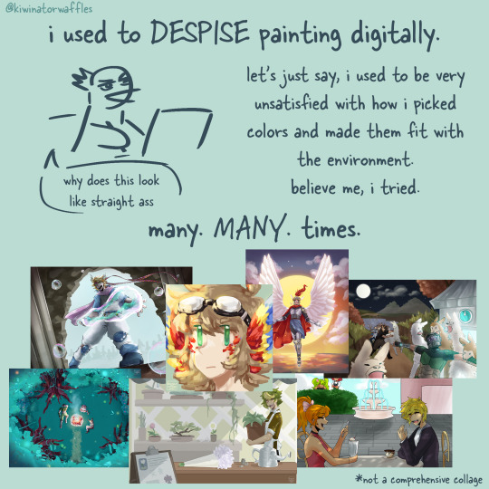
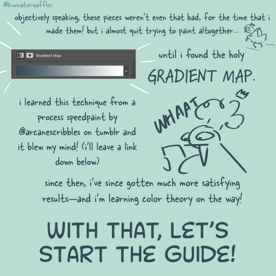
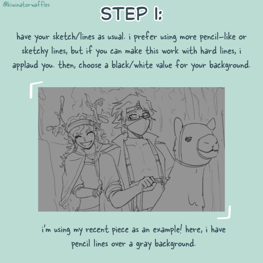
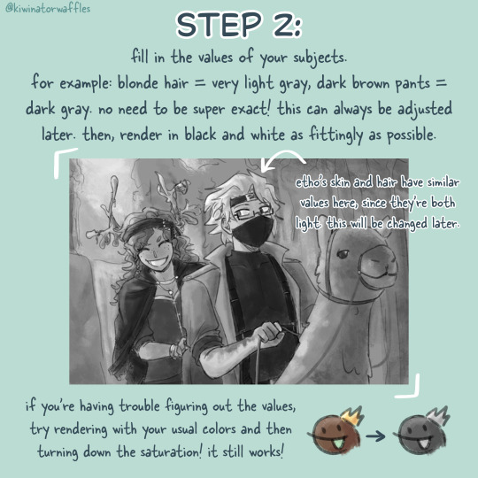
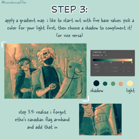

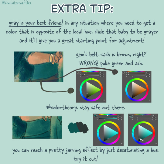
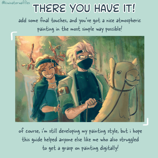
the post by arcanescribbles where i learned this technique! check out their works!
an even simpler version of this is to just lightly brush colors over a base color in the background and then go off of that. otherwise, i hope this can help!
a full version of my example piece here
#congrats to etho for being in all 3 of my gradient map paintings so far#art tip#art tips#art tutorial#painting tutorial#digital art tips#art help#drawing tips#digital art#kiwi’s scribbles#kiwisonator
423 notes
·
View notes
Text
ARTISTS
IF YOURE LOOKING FOR THE PERFECT MANNEQUIN BOY DO I HAVE NEWS FOR YOU!
INTRODUCING
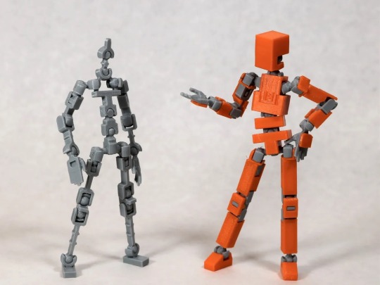
LUCKY 13 BY SOOZAFONE
Lucky 13 is a completely FREE 3d print file available on Printables by Soozafone! If you have access to a 3d printer or can get someone ro print it for you, I 1000% recommend it!
Lucky has the same amount if not more articulation than most artist mannequins and is SO MUCH CHEAPER. While filament is expensive, I was able to print mine at my university’s print lab for 13$. 13!$!!!
This figure is comparable to the Armature 9 models, and in my opinion, BETTER just because of the customizability and free print use! Im currently working on making dragon wings for mine.
Lucky comes with the armature, skin, a stand, 8 different hand poses, and several accessories, but the community has HUNDREDS of remixes and new additions custom made for this little guy.
And the best part is, is that the creator, Soozafone, is ALREADY working on a version 2!! Check him out on reddit at r/Soozafone!
I am so in love with my own figure and am so excited to see all the new updates. If you’re looking for pose reference but dont want to fork over hundreds on a figure, PLEASE! Check out Lucky 13!
Here’s the link to the Printables page:
I literally cant recommend this figure enough, Im already planning on printing a few more because I love it so much.
I hope this gives all the other artists a fun little project, because I certainly had a blast putting mine together!
Happy printing!!
#3d printing#artistsupport#artists tips#art tips#art tricks#art hacks#poseable figure#pose reference#sketch#painting#digital art#3d print#Lucky-13#printables#art reference#drawing reference#drawing tips#drawing hacks#drawing tricks#reference#animation reference
3K notes
·
View notes
Text
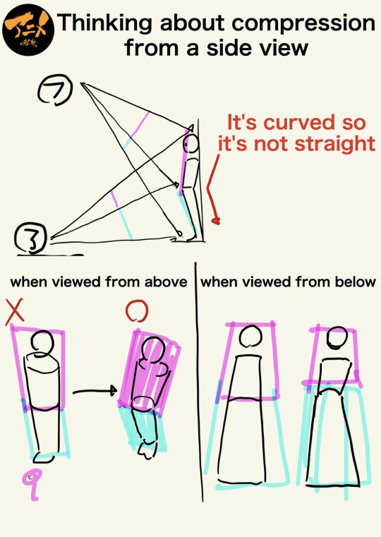

“Thinking about compression from a side view”
Source: Anime Private School on Twitter
#art tutorial#digital art#art reference#tutorial#drawing anatomy#human anatomy#art tips#drawing tips#perspective#perspective tutorial
3K notes
·
View notes
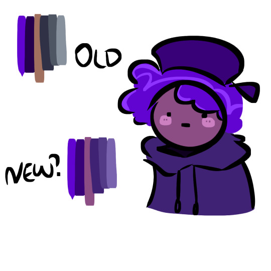
Text
how i make color palettes of my ocs before i pick one, an art tutorial?
hello, whenever i made a new design for myself i found a way to make lots of color palettes and pick one! i see this method more in paintings and rendering but not much on character designs? here are some examples i used that on.
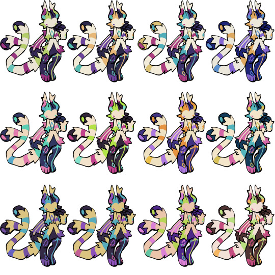
it helps me so much when i feel experimental with colors. here are what you need
a wip character design. sketchy or pixel art works better since the colors can have some anti aliasing issues
a program with gradient maps. i'm using clip studio paint but ik photoshop also has it. like i said this is used more on photos or paintings
and here's what you do!
draw your character. i'm making a new fursona for myself but anything should work.
2. decide on their markings/color placement in grayscale. i recommend doing grayscale so you can easily see the values. split your grays into however colors you want. i like doing 5-6 the most. i reccomend duplicating the color layer if you wanna try multiple palettes.
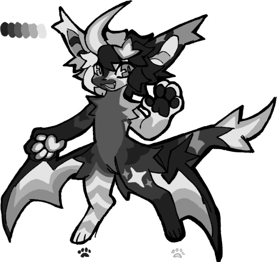
3. this part is program dependent but in csp's case go to edit > tonal correction > gradient map.
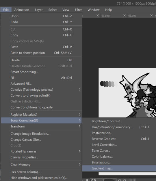
4. i made a few default 5 color gradient maps but if don't use gradients like me i reccomend making the graph like this so they become solid color. split the map into however many colors you used. i'll add a color to the red-orange one bc my character has 6 grays.
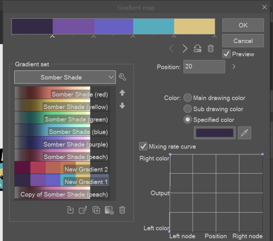
5. replace the colors by clicking below specified color. it all depends on your creativity and what you want. experiment til you like it.
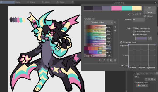
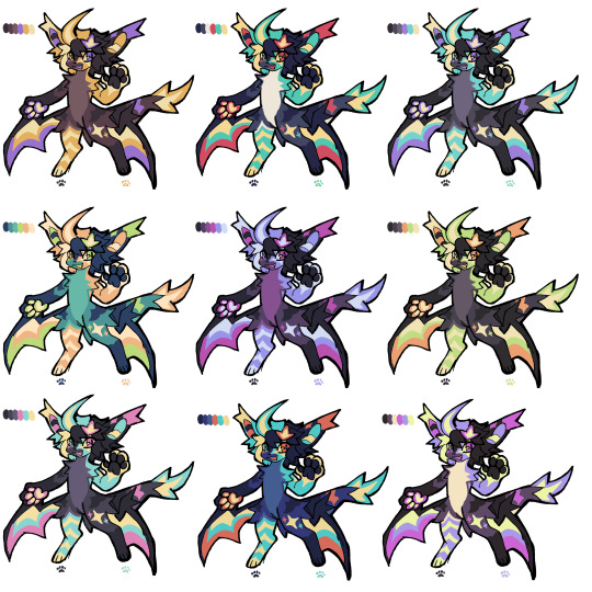
6. fuck around, try stuff, put them together to see if you like any of em. i made 9 to see if i can focus on one of them and i actually ended up loving the bottom right. it really makes them shiny
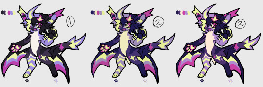
7. (optional) if you like a palette you can further and play with colors while keeping the palette. you can use color balance (in the same menu as gradient map in csp) or layers to mess around, have fun!
also a color tip because people seem to compliment that a lot in my art: digital art has millions of colors! don't be afraid of using wacky tones unless you're going pantone. if you want to get something physical i recommend being open to alternative colors as they tend to be more limited. i know whoever is doing it will try their best to keep the colors close.
color theory is something i don't...care much about mostly because this is something i'm doing for fun. i'll consider it in professional work.
#artists on tumblr#digital art#ika's showtime#ikarnival#art tutorial#art tips#drawing tips#art resources#clip studio paint
348 notes
·
View notes
Text
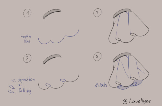
frills tutorial
#art#art tutorial#art guide#drawing tips#resources#drawing resources#drawing resource#drawing tutorial#art tip#art tips#art help#art advice#art resources#artists on tumblr#digital art#digital tutorial#digital#artwork#my art#lave's art
1K notes
·
View notes
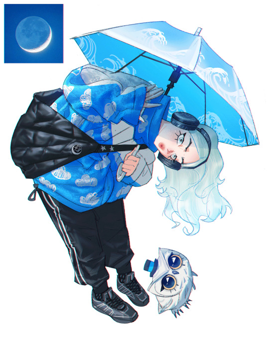
Photo


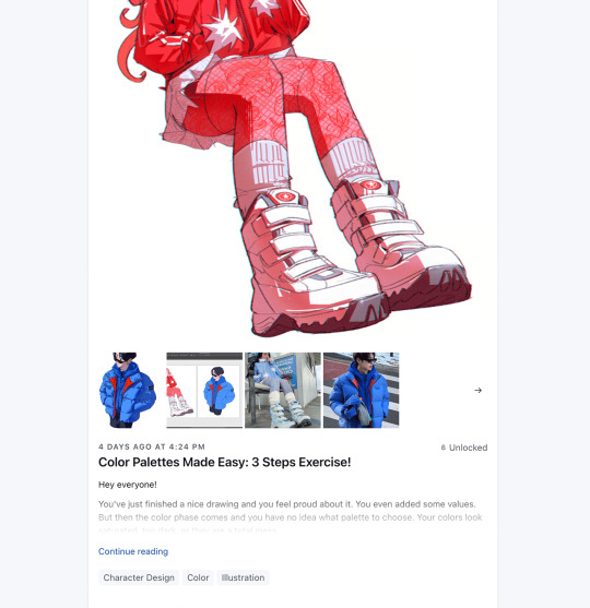
Get access to my brushes, process videos, and files here https://www.patreon.com/ramonn90
#fashion#anime#character design#illustration#color#values#lighting#shadows#art fundamentals#tutorial#digital art#drawing#brushes#photoshop brushes#ramonn90#ramon nunez art#arte#patreon#tips about art#tips about digital art
491 notes
·
View notes
Last Seen Blogs
bruhaintnowway
Horndog
ramzesdelara
Ramzes
ellascreams
You can't spell pain without bread

mofumofuman
なんも分からん

feelgigglethink
FeelGiggleThink