#color clash
Note
Currently in need of brickercup content so I hope you dont mind sharing your headcanons for these two? Pretty please
Hmm. Why not?! Not that many, I'm not a good headcanoner
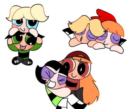
They watch movies together and commentate and criticize the shit out of them. They're basically hecklers.
They started a habit of getting into fist fights for fun as stress relief considering they were in a relationship and have the most anger issues out of their siblings
Buttercup is the one who has to cook if they ever eat something together cause everything Brick makes is inedible, and Buttercup is good enough at cooking (still not the best, though)
Buttercup is slightly taller than Brick. She holds it over his head
Brick plays guitar and Buttercup plays the bass. (Semi-canonical). They started practicing together when they became friends and still do in a relationship.
10 notes
·
View notes
Text
I wanna show more of there relationships with each other more but can't choice on which to show
#butchubbles#blossoomer#brickercup#my art#powerpuff girls#rowdyruff boys#tumblr polls#ppg x rrb#ppg buttercup#ppg blossom#ppg bubbles#rrb boomer#rrb brick#rrb butch#colorclash#color clash#power puff girl fanart
6 notes
·
View notes
Note
color code - blossick, butchercup, boomubbles
color clash - blossoomer, brickercup, butchubbles
color crack - blossutch, boomercup, brickubbles
honestly i rlly like these terms bc it separates each couple grouping clearly, tho i wonder how the terms initially started?
COLOR CRACK
Omg thank you anon thank you 🙏 literally driving me up a wall I could NOT remember!
I also enjoy the terms because with them I don’t have to write out the couples I’m referring to and now that I remember all three of them, I can use them again 😂😂
But yeah I really wonder who/why started them. I bet it was because someone wanted terms to correspond with the color code pairings, and the idea took off. If anyone out there remembers, let me know, but in any event, they’re fun to use and I’m glad we have them
fandom lore for the win 👏
21 notes
·
View notes
Text

alegwen?! jk its brickercup time
#brickercup#color clash#brick x buttercup#brick has essentially the same head as alejandro but they are not similar#gwen and bcup tho? sure
2 notes
·
View notes
Text
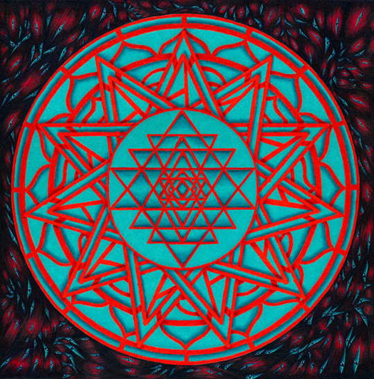
This was commissioned promotional art for my friend Tim Burke, an author of the strange, horrific, and humorous (all at the same time). The novel is called Saints of Flesh, a sequel to his first novel, Flesh Sutra.
For this promotional art, Tim wanted a magical emblem that utilized sacred geometry, but it needed to be "evil" sacred geometry. He provided several designs he liked that were proper geometric diagrams, as well as a traditional yantra design, and said to me, pervert them. He wanted them to be eye-searing, almost painful to look at. They needed to be off; the measurements and shapes tweaked so that they're just a hair out of true.
I'd originally wanted to make all the red linework into bones, but after we played around with designs back and forth, Tim favored a simpler approach. The red and aqua dance in front of my eyes, and tweaked just a little in Photoshop, the design is deliberately almost painful to look at for very long. Tim, of course, has made merchandise out of it, so it can be wrongity-wrongly-wrong on all kinds of stuff, including t-shirts and laptop stickers, and all kinds of cool stuff.
I worked out the geometric design on the computer, printed it out, then colored it with Prismacolors. The dark background is also Prismacolor. I don't know if it shows up well here, but the imagery is comprised entirely of muscle fibers and eyes. Lots of eyes. Oh God, So Many EYES.
#yantra#evil yantra#unholy geometry#not so sacred geometry#don't try this at home kids#aaaah my eyes they burn#color juxtaposition#color clash#muscles#eyes#horror art#weird art#commission art#promotional art#traditional art#traditional media#prismacolor
6 notes
·
View notes
Note
I know a lot of people don’t like the fact that people ship mixed color ppg x rrb ships or whatever but i honestly love that people r branching out and exploring newer dynamics that appeal to their tastes bc this fandom has been latching onto the same 3 ships for YEARS and it gets kinda boring sometimes
#i lowkey kinda agree shsjs#powerpuff girls#color code#color clash#color crack#ppg#anon submission#shipping
9 notes
·
View notes
Text

Last picture of the year~
And if you expected it to be anything other than Brickercup, then you clearly don’t know me. Anyways, just wanted to post my babies again before the 1st.
I still adore them very much, even if they aren’t drawn as often anymore. These two were the ship that got me to joining art sites, so I owe a lot to them! <3 Regardless of new interests, Brickercup is still absolutely precious to me, and I will always come back to them one way or another~
[Anyways, I’m off~ Happy New Year Everyone! ^^]
#brickercup#brickercupmasterx3#bmx3#otp#color clash#brick jojo#brick#rowdyruff boys#rrb#buttercup utonium#buttercup#powerpuff girls#ppg#brickxbuttercup#buttercupxbrick
20 notes
·
View notes
Text
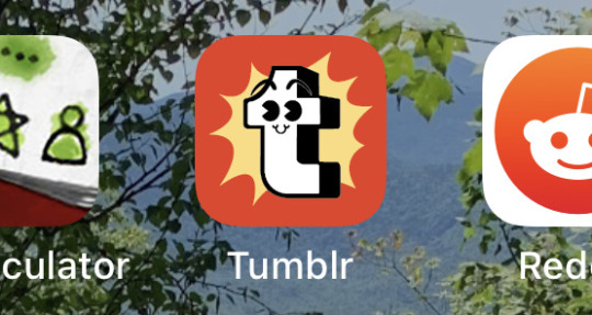
…it’s been dark blue all this time, and now this?
#wth man#now i gotta rearrange my apps#weird design to begin with#but why ORANGE??#tumblr update#tumblr staff#new icon#color clash#where did this come from
6 notes
·
View notes
Text
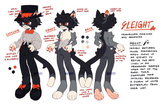
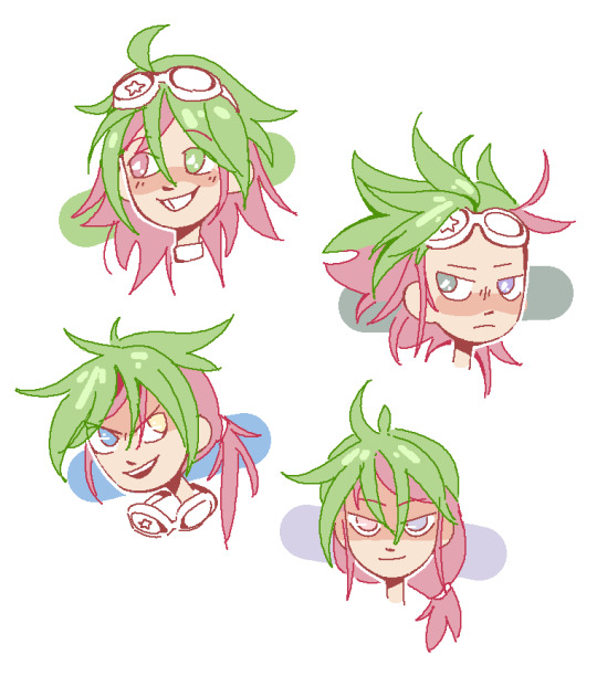
updated Sleight ref!!
#i changed his colors !!#treat this as a suggestion than a solid ref. i spent like 3 hours drawing and redrawing the legs bc i couldnt get the shape right so if u#wanna draw them more planti or digi i do not mind ^_^ get silly with it!! same goes for pelt pattern do whatevr u want with it#the pelt pattern is loosely based on a snowshoe cat which was fun to play with. as u can see they kinda have a butterfly motif going on#if u squint the ear tufts kinda resemble luna moths or swallowtails with the long tail at the end of the wings#i was kinda torn about changing the costume color but it clashed too much with the new color palette so i had to change it#i didnt include the cape here so its easier to see the costume but ill draw it another time if i remember lol#its also a lil hard to see but i put pinstripes on their pants but thats optional. their design is pretty flexible anyway#god im pretty attached to this guy already. hes like semi fan character semi regular character... oc... thing#i should draw more furries. i followed some furry artists for giggles recently and its true what they say. u need furries in your life#btw while i was drawing this i was fooling around while trying to figure out his costume color and colored it as kaito kids suit for fun#and i just stared at it for a solid 5 minutes before saving a picture. maybe ill post it later#my art#myart#my oc#oc#furry art#fur#furry#laika's comet#laika's comet oc#fan character#sleight#ref sheet#oc ref sheet
914 notes
·
View notes
Text

barely contained
#critical role#critical role fanart#ashton greymoore#cr3#bells hells#critical doodles#did NOT expect ashton being the one bells hells member i loved drawing the most#i mean he's a mess of textures and clashing colors but I LOVE IT#love this punk rock <333333#update: added a crop of their face cuz why not im happy with how it came out
2K notes
·
View notes
Text
the ships of all time i think
#powerpuff girls#rowdyruff boys#ppg x rrb#butchubbles#brickercup#blossoomer#brick#boomer#butch#buttercup#blossom#color clash
49 notes
·
View notes
Text
New students
Bro I’m so excited for the new season wowowoow
#I’m very excited to see just what ever they get up to#but I wanted to redesign them#I don’t think their original designs are all that bad I just didn’t like the neon colors and all the clashing patterns#I liked fridas original design the best but the colors and patterns just clashed too much#no idea what was going on with harriets design it was so weird#although I do like the pink hair#her and Joan can be pink hair buddies#I gave Confucius socks and slides instead of a Fanny pack because it’s funny#I tried to keep the colors the same but just make them for a little better and desaturate them a bit#I gave Harriet the boots I wear all the time#woohoo#clone high frida#clone high harriet tubman#clone high confucius#clone high s2#clone high#mind you this is in no way me fixing their designs but rather how I interpreted them
2K notes
·
View notes
Text

day 1
#powerpuff girls#the powerpuff girls#blossoomer#blossom x boomer#color clash#ppg#rrb#blossom#boomer#ms paint
18 notes
·
View notes
Text

This is a vintage 2002 work called Blue Thunder. (The copyright notice was for DeviantArt.) I wanted to play with blue ribbon-wings; that's really what this was all about.
This is one of those pieces to which I'd like to return and do an updated version with more detail, more ribbons, more feathers, and more, generally. The base concept works for me - a stark blue and red contrast (which was definitely by design). But I have upped my skills quite a bit over the last 20 years and I think I could really go wild with this one in my current art-brain state.
I did the fantasy equine thing with Prismacolor pencils, and the black/red background with acrylics. I did the background after the colored pencil work was complete. I used a ver ver smol brush.
#fantasy horse#horsie#unicorn#pegasus sorta#ear wings#early work#mixed media#traditional media#prismacolor#colored pencil#acrylic#color juxtaposition#color clash#artists on tumblr
1 note
·
View note
Text
How to express your individuality when you all have to share the same dumb haircut
#yugioh arc v#ygo arc v#arc v#yuya sakaki#yuto#yugo#yuri arc v#my art#arc v art#their colors clash so bad. but you'll have to pry their heterochromia from my cold dead hands#yuri staring despondently at their wardrobe: we have to bleach our hair. now#(and then they do and they look in the mirror and realize exactly who they look like. and resolve to dye it back immediately)
240 notes
·
View notes
Text

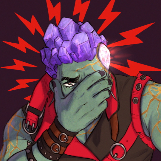
The suffering is inedible :(
#this one was so hard!!! i realized i didn't have any of the right crystal colors and it'd clash hard with the ground#still trying to decide if i like this one or not!#hollow knight#hk lost kin#hk broken vessel#xylocope#put that vessel in situations!!!
234 notes
·
View notes
Last Seen Blogs
theyluvbix
☆♡☆

eroticfbbthoughts
The Sexual Side Of My Passion For FBB's
asmyheartstops
.SamwiseGamgee.23. Dallas.

russelnickson
Ma FaV LinkS..!!
daylight-boyy
*T-boys your swag*