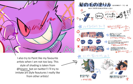
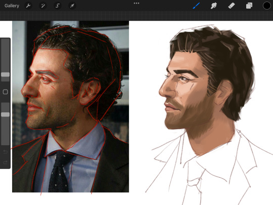
#also i'm trying not to over-render my work so I left the sketch lines there in places
Text
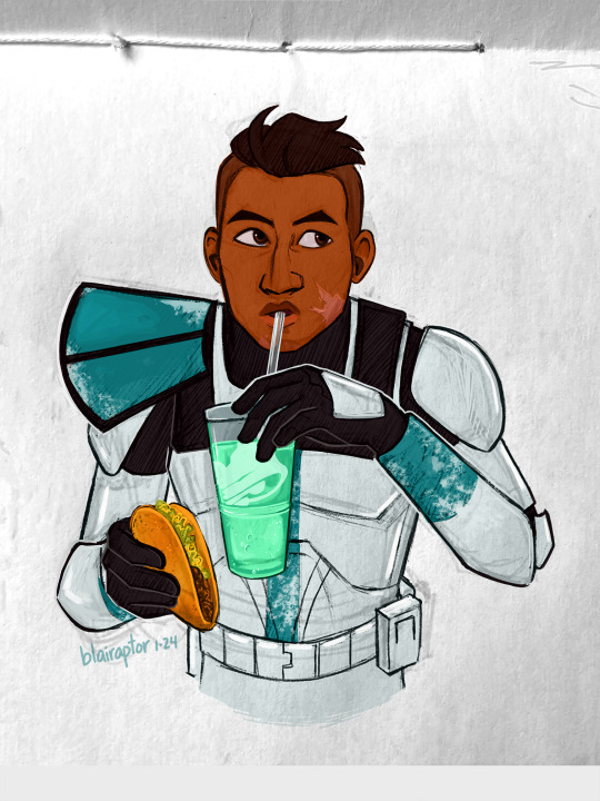
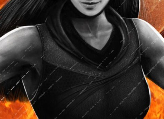
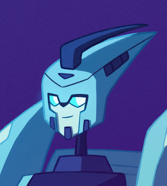
Captain Baja Blast 🥤🌮
#the bad batch#captain howzer#clone captain howzer#my art#y'all i'm really proud of this. i do great work when i'm being silly#anyway i wish him the best in s3 even though things don't bode well for him#also i'm trying not to over-render my work so I left the sketch lines there in places
1K notes
·
View notes
Text
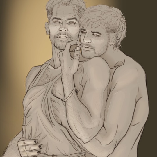
Behind the canvas: Painting 'Finally getting that drink'

This is a post about some of my thoughts while painting Rugan's pin-up for this month. Some technical ideas, rambling and mild nudity below the cut.
Inspo and references
The pin-ups of Gil Elvgren are on the left, and 'Elspeth Resplendent' by Anna Steinbauer is on the right.
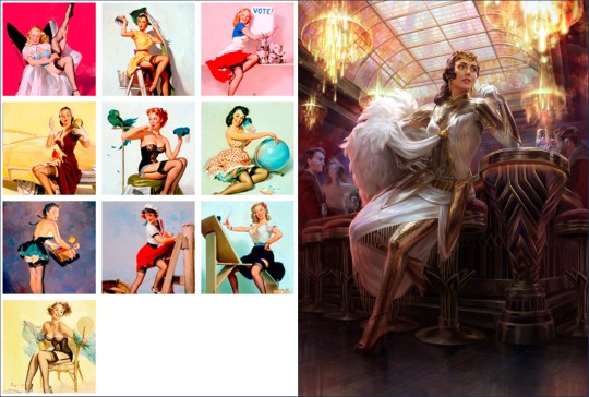
Elvgren is one of my favourite artists and I spent some time looking through a book of his collected work to see what ideas I could take for this pin-up project. The things that jumped out at me were:
The women felt like 'subjects' rather than 'objects'. There's some implication of hobbies, an inner life. They're often in the middle of doing something when they're captured on the canvas.
The subjects know they're being looked at, and they are taking it as an opportunity to flirt (signalled through eye contact, coquettish facial expressions and body language). It feels like a conversation between viewer and viewed.
Parts of the body may be exposed, but the eye is drawn back and forth between the subject's face and more titillating parts of the image.
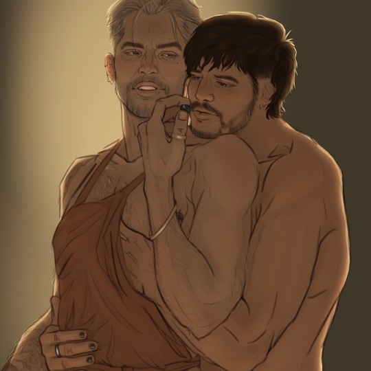
I knew that I wanted to show Rugan in a similar setup, then; in this case, he's halfway through dinner and then catches sight of the viewer. His eye contact and smirk are flirtatious and mirror what you see of him in Act 1.
I initially wanted the pose to mirror Elspeth's in this beautiful Magic the Gathering planeswalker art by Anna Steinbauer, whose work I am obsessed with. Since I started taking art seriously, it's been my goal to paint for MtG, so I often try to study from artists whose illustrations I admire.
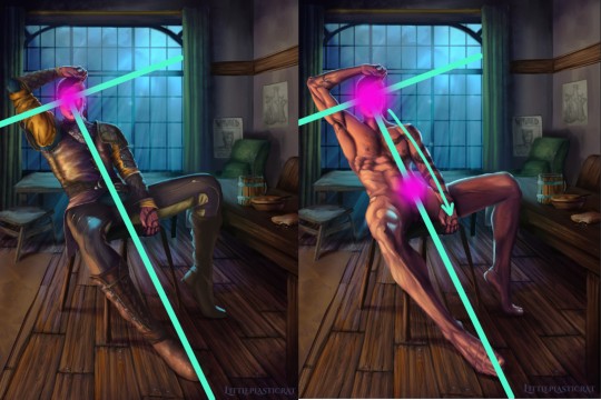
However, I didn't want to copy her pose or the composition of the piece. Don't get me wrong, I'm not above doing this - but I felt it just didn't work with the subject. The horizon line (shown in red) is very low. This is a gnome-level view of Elspeth. And I didn't want to place the viewer at the eye level of Rugan's penis.
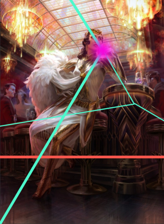
I kept the composition similar in some other aspects though - there's still a T shape (pale green) that draws the eye to the focal point (pink). I did some sketches where Rugan is leaning forwards/sideways in the same way as Elspeth is, but I feel that this final leaning-back pose demonstrates more dominant body language and allows me to paint the musculature of his torso in more detail. This acts almost as a 'ladder' that draws the viewer's eye up and down between the two focal points of the nude variant.
Painting
I've already said quite a lot on a post that was supposed to be short, so I'll keep it brief here and write more about the painting of Gortash and Raphael (February and March respectively).
It's been quite a while since I've tackled such a detailed painting, so I had to do some research/studies to remind myself of some helpful rendering rules:
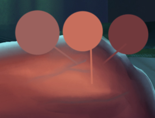
Veins beneath pale skin might look blue, but they're actually just a desaturated version of the same colour. There are other parts of this image where the veins are particularly lovely. I'll leave that to your imagination.
2. Highlights on leather are not as saturated as you'd expect until you get to the most reflective part of the material. Also, a good texture brush can work wonders.

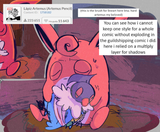
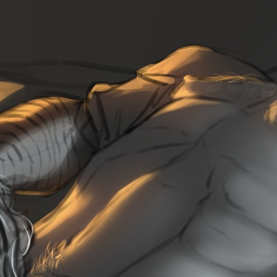
3. I try to use as few layers as possible when painting, but I remembered the importance of putting design detail on a separate Multiply layer. Multiply allows the layer to modify/darken the layers below, so you can more easily add detail that follows the shape of the object. For example, the body hair or the snake's head going over the chest. If I were painting traditionally, I'd have had to put in a lot more effort. With Multiply layers, it's one colour. Nice! I got a great tip from @dustdeepsea about the blue-ish tint that tattoos, particularly older ones, can get. I felt like this massive tat is not something that Rugan has had done recently, so I added a Gaussian blur as well.

Well, if you got this far, thanks for reading! This is a great way for me to reflect and record what I've learned from the painting. I want to paint sexy stuff, but I also want to keep improving as an artist!
Keep an eye out for updates on my next pin-up, who will be Lord Enver Gortash. Time to practice using my hair/fur brushes 🥵🥵
#rugan#digital painting#digital illustration#illustration#pin up#male pinup#bg3 fanart#bg3#painting diary#male pin-up#male pin up
42 notes
·
View notes
Text
Tutorial: How I Render Accents
PART 1: LINES
a quick disclaimer: as stated on the title, this is how I render accents and obviously a lot of it will not apply to whatever style/method/etc that you may use. Another thing is there are some aspects of my style that will seem obvious to me that I may overlook explaining. please consider this a more generalized guide than a step-by-step.
So, first things first: the lines themselves.

I'm going to be making an entry for Brightshine for this tutorial, so it'll be the example i use. I use Clip Studio Paint for all of my accents and I specifically use the asset found in the CSP asset store called SOIPEN for my lines, specifically on a size 3. I feel it does a good job of getting crisp yet soft lines and matches well to the line weight of the dragons line art. I typically do not zoom in very far and try to focus on making the outer silhouette ares bold and the inner lines soft. This gives a crisp edge to the work and a definitive line that makes it easier to color later on.
Something to note if I utilize the line method of going back and forth between opaque and transparent colors. It's a hotkey you can set that effectively turns the same brush you're using into an eraser. It allows me to carve away segments to create that negative space (as seen on the middle of the flower above) rather than trying to perfectly draw in that specific circle shape. Negative space is a huge tool to master that can give a lot of depth to your work. It also helps to sometimes fill in segments or widen out segments that are just Barely touching. The less complications in the lines the better.

For the main feature, the flowers, I will typically find a reference showing a good clear outline of how the flowers look and simplify the shapes. The flowers in question here are Delphiniums and I've decided to render them upside down as if they're hanging. Simplifying the shapes and giving the illusion of the petal bunching is more effective than genuinely drawing each and every petal in a 100% accurate way. (also since it's for Brightshine I've replaced the flower bulbs at the ends with light bulbs)
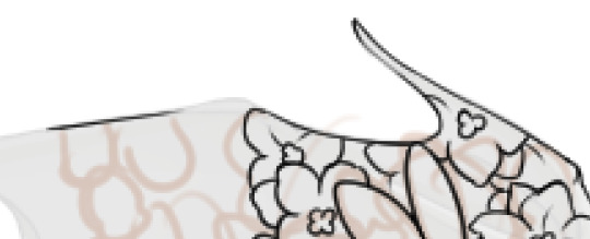
When doing line work that goes right up to the edge of the dragon, I'll typically start with the line for the edge, then build from that. Also when it comes to narrow areas (like the tip of the wing there) I'll leave it blank and typically fill it in with gradients or other small things to not make it too busy.
A very important rule for making accents is: Do Not Invest In Details That Will Get Lost In Resizing. I don't make super small details that don't matter, for example if you look at the innermost part of the flowers they are blocky and somewhat large compared to how they actually are on the flowers. When they get resized they will barely maintain that level of detail.
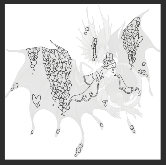
With all of the linework done I'd like to point out how I do composition for my accents. I tend to have 2-3 main focal points (in this case it's the two major draping areas on the wings, and the flowing lace on the arms) and everywhere else is filled in with evenly distributed small bits. Originally the butterfly on the bottom left wing wasn't there in the sketch but when I looked at the accent lines for what I had I noticed an empty spot and filled it in with a matching motif.
Some main points of how I craft my accents include: keeping the main focal points and number of thematic motifs limited and deliberate. I could add a bunch of like, jewelry trinkets or more lace and really clutter the accent but by not doing that it gives the flowers room to breathe and be the star of the show. Also using references for flowers creates a much better image than winging it.
In the next part I'll go over my coloring/rendering process!
27 notes
·
View notes
Note
Do you have a set process for coloring and rendering / adding texture to your art? If so, would it be alright for me to ask what goes into that process? I'd love to learn how an artist I admire goes about their work!
Omg I'm so flattered, I'll try my best to explain it!! ^^
Tho, okayyy, I apologize beforehand for how incoherent this might be, since I don't really have a set process at all and mostly I fake it 'til i make it haha. I'm the first to admit that I don't have a ver consistent method and that shows in how irregular in quality my art can look, even inside the general sketchy look.
(Btw sorry if some of the fanart i use for example doesn't make you comfortable but I've tried to find the best examples for each type of coloring haha)
I'll start with the brushes I rely on the most, tho I admit i made the mistake of downloading too many brushes and textures so I might use others on rare occassions xddd
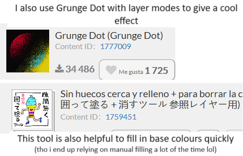
These are basically the brushes I use the most. The "mezclador redondo" is just CSP's default paintbrush and I only tweaked it to find sth I liked and felt comfortable with for both lining and painting
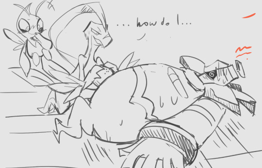
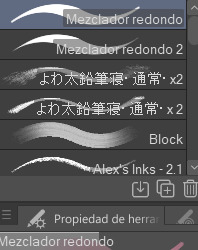
As you can see here I only used one layer for lines and other three for each of the guys' colors. I colored it all with the default brush (tho unfortunately I lost the settings I used for this drawing in particular and haven't found them again rip). In drawings like this I just do a sketch, clean the lines (no lineart) and then paint it. After the base color I start laying out different hues to make the coloring more interesting.
This one was the same. One layer for coloring, manually adding lighter hues (see the more light and yellowish color on grovyle's left leg compared to the shadow) or darker tones. I try to add color to the shadows as well to make them feel less flat, and an airbrush in overlay tends to help with that (tho here I just used a brush).
Here you can see that I often paint over the lines on another layer to correct mistakes in the "lineart" lol. I also applied an airbrush (layer mode overlay) over celebi to make her more bright. I wanted to put this one to show that coloring doesn't have to be detailed to look nice enough. Here Celebi basically has no shadows at all but the tone of the drawing makes her look cute anyways imo ^^
In these two you can see adjustements over the full image again (yellow layer), but I also wanted to show that I don't have a set number of layers either, it depends on how many I feel like using. Again, sorry for the lack of consistency but im too lazy to have a proper method lmao
I will also use harder brushes and tone changes sometimes, instead of blending them with less dense brushes. I am also fond of adding hard lighting in some drawings. You can experiments with it on a top layer and delete it if it doesn't fit, so it's always worth a try.
Another thing I recommend is studying and copying artists you admire or like. Add things from their styles into yours, see how they work with proportions and try to use that in your own art. It has helped me a lot and, without looking to fully copy anyone's style, it does give you some ideas of how you wish your drawing would look, which motivates me (when it doesn't depress me lol)
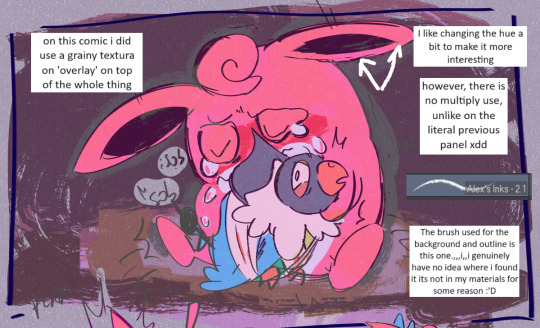
Finally, the texturing isn't consistent either. I use one of CSP's/Downloaded texture packs, put a grainy texture on the canvas, set it to overlay and adjust the opacity until I'm satisfied. In these two images you can see I am not consistent in coloring even in the same comic lmao. But we are doing this for fun, so I think experimentation is always sth worth exploring ^^
And I think that's all I have to say. I don't control color theory at all, so I can't really explain how I choose colors. I look up some tutorials on youtube and pretend I understand lol. Ig the one thing I tend to do a lot is changing hues in a base color to make it look less flat, the same as with shadows.
Anyways I hope this was helpful or that it at least waas what you asked for haha. Thank you for the interest!! :DD
#ask#art process#i guess???#anyways thank you for the ask sofie i hope this was helpful <333#I am KIND OF A BIG MESS IN ORGANIZATION#but hey we have fun hahaha
10 notes
·
View notes
Note
How to draw Elise
Ooo sure!

When starting with any human, I always begin with a basic outline of the figure. Since I draw Elise with Anime proportions versus realistic ones like her original version, I can bend the realism a bit more to get that effect I want.
Just a note, I can mostly eye things at this point due to just drawing so much for so long and having done many studies of realistic and anime figures, that this sort of thing I can whip up thanks to having a trained eye for it. I recommend reading up figure drawing books and tutorials for learning from real life first before studying into anything stylized like Anime. Learn the rules before breaking them!
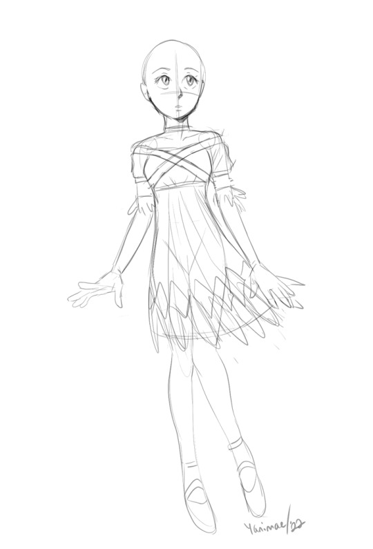
Satisfied with the base figure proportions, I start roughing out the clothing and facial features. Normally I'd do the hair with the face but for the sake of this tutorial, I felt it's easier to see the face without adding it. The base outline helped me know how to fold the clothing around her so it looks believable as to how it drapes on her body. Note that I'm forgoing any details as this is just about charting out how it's functionally going to look before I define things too much.
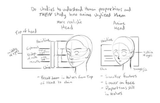
The face is a tougher subject to explain since it's all based on my collected knowledge gained from studying the human figure. I tried to condense it in this little diagram but I strongly recommend doing studies of your own to improve your internal visual library on how faces work. Broadly speaking, this is about how it's broken down from realism to Anime-ish proportions. (I hope this spaghetti makes sense haha)
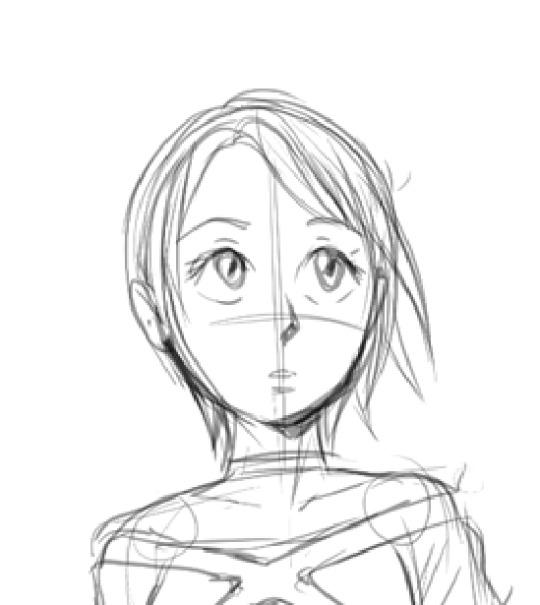
Since I'm pretty satisfied with her face, I'll roughly outline the hair and get that sorted out. Elise is a very dainty character with wispy features so her hair should be close to the head versus having too much volume. It ties well with her overall theme of "feathers" and lightness, like someone who is easily guided around by the wind (aka Sonic).
Thematic things like this are informative because for me the artist, I want to capture that quality of her since it's strongly indicative of how she's presented. Too many harsh, dark lines or clunky details could easily make her appear too heavy which takes away the "airy" aspect she emits, if that makes sense.

With everything now charted out, I can THEN start refining the edges of things with heavier lines where it'll help for eventually rendering this if I choose to do so. For a sketch though, I think this is enough. I changed her left hand to suit the angle her arm was at and to feel daintier/more comfortable.
Her feet and hands are larger than a regular person's simply because that's the Sonic way :^)
I also keep in mind that Elise is a teenager. I'm not a huge fan of how elongated and tall she looks in Sonic 06 because it makes her feel too adult for her age (This is mostly due to how small her head is compared to her body). I gave her more youthful features like a bigger head, slightly shorter figure and large anime eyes to hint that she's quite young without being AS young like Maria.
I'm at a point where I can do most of these things without breaking it down into such specific steps but for a beginner, it helps to try doing things in this way to help you learn how everything is built on top of basic shapes without getting overwhelmed with details and busy work. Build it up a step at a time. Over time you get a feel for how you're doing it!
#Sonic 06#Princess Elise#fanart#tutorial#onlyart#sketch#Sonic the Hedgehog#art help#ask#anon#people#girl#ask and you shall recieve#this was fun!
122 notes
·
View notes
Note
For the artist ask game: #15
Also my own little question, what program and brush do you use to create?
I love you and your art tremendously. You're so incredibly talented💜💕
(PART 2) Edit on my last ask, I just realised you do use procreate too, lol sorry. But what brush do you use for colouring? Your shading and light effects are so soft I'm obsessed
hiii hun!! tysm for the ask ❤️
15. Biggest artist pet peeve?
some people might get mad at me for this but it’s tracing 💀💀 don’t get me wrong - i love tracing FOR PRACTICE AND PERSONAL USE ONLY, I also do that when trying to figure out faces which you can see below!! what i do is i trace to kinda get the feel of the features (on the left) and then draw it from scratch (on the right)
like it’s totally cool and dandy if you’re trying to improve on anatomy or kinda figure out another artists style BUT i really REALLY don’t like it when peeps do tracing and post stuff it just gives me the ick sorry besties
about the brushes - a lil display below

the nadiaxel ones i use for both sketching/line and rendering with differing opacity, round and damp brush and trifection are for rendering too, the jingsketch and fine tip I’ve only just started using so im kinda trying to figure them out!! the last one from sinix I use for the occasional smudge!! I think that the softness is just an illusion since i very much leave the brush strokes visible but the difference in color and hue is just so subtle that it looks smooth lmao but it also depends on what technique im doing - ie more painterly (my recent cobb) or more highly-rendered-american-comic-cover style (pancakes, the dincobb with the pink spotlight etc). also a lot of the softness you’re talking about might be the use of layers - i often do a flat color and then a multiply layer of a warmer grayish color and the work on the lighter and darker parts on that kinda like below (1. flats, 2. what the multiply layer looks like in normal, 3. actual multiply mode, 4. w/ the light)


for stronger light sources like these below i tend to use either add or screen blend modes with additional light sources airbrushed over the bg in the same blend mode most of the time

sorry i went off on quite the tangent lmao but I’m absolutely loving these asks keep them coming guys!! don’t have to be from the ask game im happy to talk abt whatever!!
Artist Asks
10 notes
·
View notes
Text
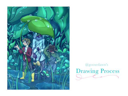
original artwork: [x]
how did i put this together? find out... under the cut!
with a lot of difficulty.
joking aside lets get into it! i... gave up on uploading the speedpaint because both tumblr and youtube werent responding to me but if you would REALLY like to see it i can figure something out ;P
The steps may not entirely be in order, but I tried to keep this as simple and as streamlined as possible because otherwise I will just. Keep Going.
-----
Usually when I start drawing I already have a composition in mind, and would just sketch out something like the image on the right side. Regardless, I started out with a few criteria:
- tiny bench trio in the rain
- leaf umbrellas
- tommy getting distracted by the rain and ending up with tubbo getting dripped on
- teal-blue colour scheme
At first I had planned a longer composition with two umbrellas, but I liked the idea of all 3 of them stuck under one leaf!
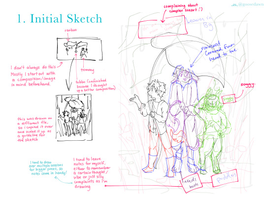
INITIAL SKETCHES
I used the thumbnail sketch I had done to guide my larger sketch, adding in more details and the background.
Since I tend to draw over multiple sessions and/or get distracted by drawing something else while working, I like to leave little notes for myself! I also just use them to lament over difficult things sometimes though shdjfbsjbf
Personally I like to sketch each character on their own layer with a different colour so its easy to identify who's who, and it makes it easier to seperate certain areas if I'm not sure if I want to redraw them (e.g. Tommy's boots, Ranboo's raincoat)
I also tend to do the same when lining characters and/or different items or background layers, as seen in the next image on the left!
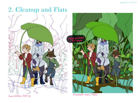
CLEANUP
I ended up filling in the colours for the characters first just because I didn't want to worry about erasing lines behind the characters :'D
Around this point I also added a dark blue background at the very base layer to catch any areas I may miss when colouring!
FLATS
Fill/Bucket tool my beloved. Especially when I use the pixel/digital pen, it is a lifesaver.
When putting down the colours for the background, I kept to using 3 colours/distinct shades so the foliage would have better contrast and be easier to see, while also not varying too far from each other.
I also added small gradients like blushes over faces and hands, and some gradients in the background to add some depth.
I tend to do each colour on a seperate layer, so I can adjust each part until I'm satisfied with it, then I merge them all into one (e.g. Tommy's colours are all on one layer in the end, but his jacket and pants were different initially). The same goes for the plants in the background!
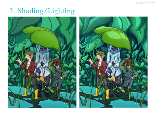
SHADING/LIGHTING
I tend to draw shadows first on a Multiply layer and then go back and do all the lighting in a seperate Add layer.
The lighting, as is everything else was also split into foreground/middle/background. I use one main lighting layer with low opacity, and then go back on another layer with a blurry/soft brush to add some light gradients on both shadow and light layers.
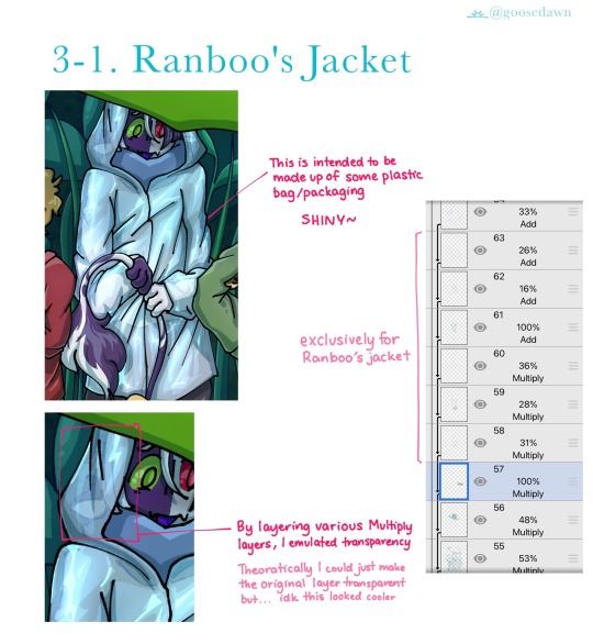
RANBOOS JACKET
When rendering plastic I like to make it Super Shiny. So, I used around 3 layers with cell shading/lighting, all layered on top of each other with various opacities.
For some reason I also decided instead of making the base raincoat transparent, i was just going to draw over the top to emulate transparency...? It worked the way I wanted anyway, so I can't complain ;P
RAINDROPS
Raindrops! Straight up I just searched up "arietty rain" and stared at Ghibli screenshots until I figured out what was going on. I put a lot of thought into where the raindrops would sit (e.g. the leaf at back on the right is bent, and raindrops would gather in that crease) as well as trying not to overwhelm the piece.
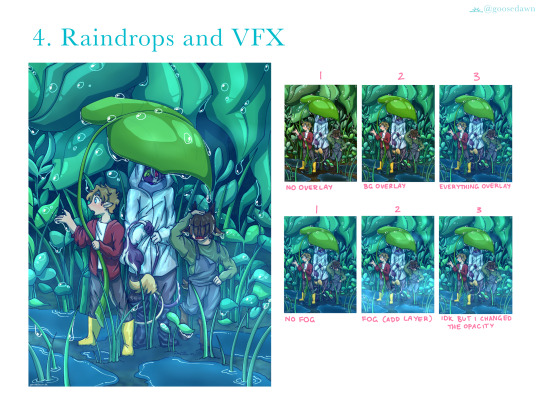
OVERLAYS/VFX
I actually set up the overlays a lot earlier, but this is the best way to showcase the difference they make. There are 2 seperate overlays in images 2 and 3 (marked above), one being just for the background, and another over the entire image.
The overlay shown in 3 was added as soon as I started colouring, so I could get an idea of what everything would look like as I went along.
The fog in the second row of images was done with a blurry/soft brush at low opacity on another Add layer! Some parts of the fog are thicker than others.
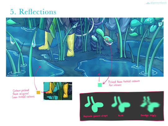
REFLECTIONS
The box in the bottom right explains it all really. I also replicated Ranboo and Tubbo's legs in the puddles, but they are mostly covered up by other leaves. They are still there though!
For the water I also ended up erasing some of the middle, to make it seem deeper/more realistically like water. Once again this can be attributed to Ghibli rain puddles.
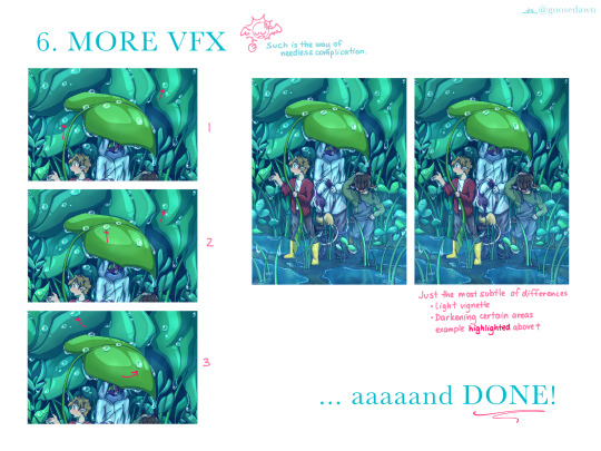
MORE VFX
The left column of images is focused on the raindrops, while the right is just smaller details, adjusting contrasts and adding a slight vignette. In each of the raindrop images I've drawn arrows pointing out particularly clear examples of what I added!
1. The raindrops are ever so slightly opaque, with a highlight opposite to the very shiny white glint.
2. I added shadows (2 Multiply layers) one with sharp cell shading, and that same layer copied and blurred slightly.
3. I went back with a blurry/soft brush and added some shadows INSIDE the drops, just to add some contrast and make them pop a little more. Give them a little more depth.
I... forgot to draw in the highlighted areas. But if you look to the left of Ranboo's head you can see the background is slightly darker in the second/final image! I added areas like that through the background just to give a little extra contrast/depth!
And DONE! :D
-----
After finishing this piece I do think there are some things I want to change/improve on next time (e.g. Tommy's posing/positioning, maybe trying more realistic leaf shape/s, amongst other things) but I'm very happy with how it turned out!! :D
If you read all the way down to here, thank you for taking the time to do so!! Please let me know if you would like to see more of these, and if there is anything in particular you want to see me cover ^^
I've never done this before so if you have any feedback/thoughts they are much appreciated <3
30 notes
·
View notes
Note
not the be THAT kind of person but could you do a quick sketch tutorial and how u do ur hands? been trying out for a while (even looking up) but gosh am i having a hard time🤣
No worries anon! I was a little surprised to get this request since I still feel awkward with hands, but I'm happy to share my way of thinking around them!
Full illustrated response under the cut!
1. Structure!!
To me, anatomy is way easier to get a better grip on when you understand and think of its structure and what it's made of. When I draw hands, I think about the basic structure points: A) All four fingers each have three segments connected by three joints, B) the thumb has only two segments and two joints, C) and the palm is one big chunk. Then ask myself, what parts of the hands move? What can stretch and what remains fairly rigid? If a hand was a machine and its joints were gears connected by metal rods, how would it move?

When I was younger sometimes I would draw circles over each knuckle of my left hand and connect them with lines. As much as it sounds kinda silly, I think it helped me conceptualize the way a hand moves a little better.
2. Proportions!
For proportions (though those change a little for every person), the forefinger and ring finger are roughly the same length, the middle finger is just a little longer, and the pinky finger is much shorter, nearly lining up with the first knuckle of the ring finger. The tip of the thumb sits nearly at the middle of the first segment of the forefinger. On my hands, my middle finger almost the length of my palm, and pretty exactly the width of my palm above my thumb joint. The length of the thumb is nearly the same length as the space between the thumb joint an the bottom of the palm. The thumb joint itself is placed just short of halfway up the palm. I know this is all a little confusing, so hopefully the illustration below helps a bit.
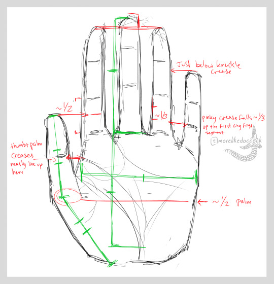
Again, proportions can vary pretty dramatically from person to person, so these are definitely not set in stone, but they can be useful as a baseline at least.
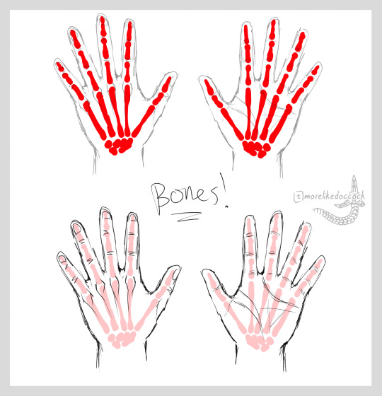
3. Back to structure!
Another way to think about how to draw hands is to think about how the skeleton inside is built, and how it can move. Of course, the skeleton is constrained by muscles and tendons and whatnot, but trying to think of a visual of the bones can be helpful for understanding possible movements. Digging further into muscles and where they sit and how they work also helps!
4. What you actually asked for:
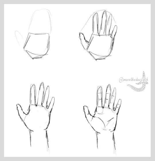
Here’s a super basic thing you’ve probably seen before, just step by step: 1. Palm/mitten shape, sausages, refining, and details.
5. And finally, Practice!!
I’ve said it before, and I’ll say it again, practice is incredibly important. The more you practice drawing stuff, the better you’ll get at it, I promise!!!
Below is just the hands from something I drew last year for a different fandom. It was one of two pieces I did that each involved some ridiculous number of hands. More than half of them I drew without reference, but I did look at my own hands a few times to help with particularly difficult poses.
I have no idea what possessed me to draw these pieces (it was thirst) but after I finished sketching, lining, coloring, and rendering 30+ individual hands, I felt a lot more comfortable and confident with drawing them.

Observe and draw your own hands!! Draw from pictures of hands!! Fill whole pages with just rough sketches of different poses!! Practice, practice, practice!! Eventually you’ll know hands like (ahem, forgive me) the backs of your own hands.
Sorry this was so wordy, I hope it helps a little at least!! 🙌💕
#cerbin answers#asks#anon asks#tutorial#hands#cerbins noodles#if you wanna see the og of that drawing head over to my witcher blog and surf my art tag
24 notes
·
View notes
Note
Something about the way Valkyrie's eyes are drawn and the highly stylistic creases in the front of her suit remind me very strongly of Percival's phase 1 work. I actually think this cover is okay tbh. Also, it ornge.
It would be an alright cover if it was a cover for a normal book. It would have been a great cover for 'Resurrection'
I like how the name of the author is on the brim of skulls head, that looks pretty cool. And he improved how he draws Val's hair compared to the SoW cover.
But, bloody hell, for the cover of the FINAL book it's fucking BORING.
Percival took so long for THIS? He missed his deadline and was almost a month late (cover was meant to be revealed before christmas) for THIS? Bc he took so long I thought they'd go all out and smack a bunch of characters on it MCU style, but nope.
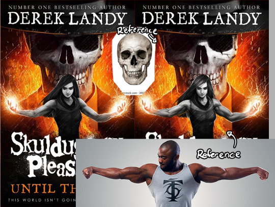
This should have not taken this long since essentially this is just a front-facing headshot of Skul and a halfbody shot of Val just standing there with her hands raised. With what's presumably a stock image of sparks in the background and a few FX brushes smacked on top of it to impress the non-artists.
The characters are also grey scale which is a lot easier and faster than drawing with colours. And knowing Percival the skull is probably a stock image he painted over. By all accounts this shouldn't have taken as long as it did which makes me think my theory about him being busy with his own projects and half-assing SP stuff was right tbh.
On top of that, there are a few things that feel off.
Like, turtle neck Skul returns, tho on this cover it's not as bad as on the DoA cover.
The shading on Skul's skull feels off. I think bc it lacks definition/is too soft and there is this weird shadow on his teeth where light should be.
He still can't draw necks to save his life.
In general, the shading on Valkyrie looks very flat, especially on her hair, face and arms.
The muscles on her arms look like drawn by a n00b. Like, he's ignoring how the muscles 'flow' into each other.
I'm shit at explaining so here's a very quick and sloppy overpaint to show what I mean. Tbh I don't like doing these overpaints, but I feel like people won't understand what I'm trying to say if I don't show them
Too be fair, I'm shit at drawing muscles too, but I ain't the one whose job it is to draw this covers, so-... But you get the idea of what I mean, yeah?
I also feel like Val's head is too small, but it ain't that obvious bc of her hair. To fix that I think I'd rather make the body smaller to fit rather than make the head bigger bc then the head might cover up Skul too much?
He straight up forgot the tattoo on her left arm. Some people think this is Darquesse and not Val bc of it.
Something is off with the hands too I think, but that might be bc Val's magic partially obscures them.
The cover also lacks dynamic poses, perspectives, colours, expressions or an interest composition. It's too symmetrical. Interest is added through asymmetry.

The simplicity worked for the DotL (the one with just Skul's skull on it) bc it was atmospheric and gave the vibe of the-calm-AFTER-the-storm. But this cover seems to be going for the-final-showdown vibe and it kinda has the calm-BEFORE-the-storm vibe going on in regards to the confrontation between Val and Skul that's gonna happen but that doesn't fit with the vibe of the books, I think. Like there is so much stuff set up, storylines to finish and new gods that got introduced that the book is probably going to be a chaotic, fast paced mess and I'd like to see that reflected in the cover, ya know?
Also, once again, a more high res version of the cover has been uploaded to the UK SP website and on that one you can see how detailed Valkyrie has been rendered. Especially her suit is very detailed and you can see the materials that its made off. Meanwhile Skul is at the same time over and under rendered, meaning, he smacked details like cracks on holes on top of the skull eventho you can still see some sketch lines (right eye-socket, upper 'lip'). Yeah, this strikes me as rushed..

TL;DR: The cover is the best out of the phase 2 covers, but it's still not a good cover. It's boring, has flat shading and strikes me as rushed and half-assed
Being an artist in this fandom is awful bc understanding enough about art to see a bunch of mistakes he made makes it impossible to enjoy the canon art :/
6 notes
·
View notes
Note
I really like how you color things! Do you think you could make a tutorial, maybe? I'm trying to get better and I'd really like to learn from you :D
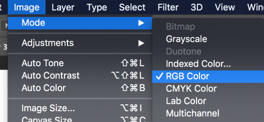
Thank you! I’ve never made a tutorial before, but I’ll try. I experiment A LOT with every piece, so I don’t have a 100% set in stone process. (Always experiment! You might find something new that works for you!)
First off, make sure you’re working in RGB color mode. This is so you can abuse Camera Raw Filter later, and you really should be in RGB mode anyway unless you plan to make prints.
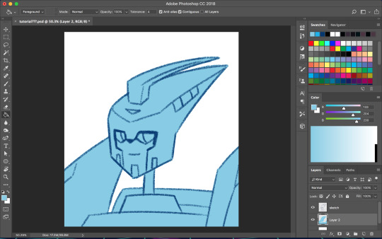
So start with your line/sketch on a multiply layer, or even just a normal layer mode if you want. My lines are usually dark blue but I often change them later on.
Use the wand tool (w) to select the negative space around your lines, invert your selection (command>shift>i), and on a new layer use the bucket tool (g) to create your base layer. On this layer, go to (filter>other>maximum) and set the radius to one or two pixels. This will clean up the base a bit so you don’t get a weird halo around your lines.
Before you start adding colors, change the background color to a mid-tone grayish color. This is to better judge tones and contrast. This doesn’t have to be the end color of your background; you can change that towards the end. If you actually are drawing a background, you might want to choose the general color of that background instead, but checking your colors against a gray background periodically can still help.
Now is when you start using clipping masks. Make a new layer directly above your base. Make this layer a clipping mask by right clicking on it and selecting “create clipping mask” from the pop up menu. Do this for every base color.
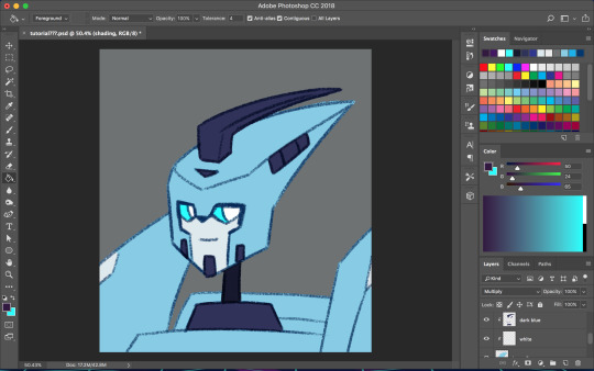
As you choose your colors, try to visualize what you want the end result to be. If you want a warmer or cooler piece choose colors accordingly. I do this mostly by eye, so I don’t have a specific process. You can play with each color by going to image>adjustments>hue/saturation.

Once you’re happy with your base colors, create another clipping layer over all the base color layers (except for glowey bits like optics/biolights), and set it to multiply (sometimes another layer mode will be better but I usually go with multiply). This will be the shading layer, so now is the time to figure out where your light source is. You can add your shading using the brush tool, but I tend to visualize lighting better by erasing where the highlights are, so I just fill in the entire layer with the bucket tool and start erasing. Change the opacity of the layer to whatever you think is best. A higher opacity creates more dramatic lighting and a lower opacity makes softer lighting. For the shading color I usually choose a darker, desaturated color, like purple or brown, but again you can just play around with the hue/saturation until it looks right. Sometimes I will make a second shading layer to add even darker shading in areas.
So now the shading is done! If you want, you can make another layer for highlights but I don’t always do this. I don’t have a specific way I do highlights except that I usually add them only in the most intense lighting or on the most reflective areas, but do whatever works best for YOU. If the subject is backlit, adding highlights around their silhouette can add a dramatic effect.
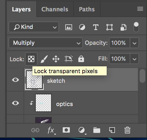
I usually leave my lines as a single color, but sometimes I will use multiple colors over each base color. I did that for my last piece of idw Blurr. To color your lines, lock the transparency of the layer using this button, or make another clipping mask over it. A lot of the time changing the layer mode to overlay will make the new colored lines look nicer. You may need to touch up some of the darker colors though.
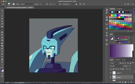
Next is when we start getting really experimental, by which I mean I have no idea what the fuck I’m doing. I make one or twenty new layers with various gradients over all the colors and play with layer styles. These layers are to soften the shading, bring colors together, etc. Something fun I do a lot is set the gradient tool mode to dissolve and then play with the layer mode and opacity on that to get a textured effect. If you still have a gray background switch to your actual desired bg color. Upon doing this you might want to make even more adjustments. If you have any glowey bits like optics, make a new layer for that. I usually use the gradient tool or a blurry brush at a low opacity around the glowing parts and set the layer mode to screen, but again experiment. You can also add reflected light from these secondary, less intense light sources onto the surrounding surfaces.
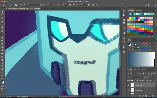

I don’t always work with clean lines and end up having to render and clean up a lot towards the end. I do this on a new layer above everything. Rendering is tedious but can make the end result look a lot softer and painterly, or sharper and more defined, depending on how you do it. Make use of the dropper tool (alt+left click) here to grab colors as you go and define shapes. This step is only necessary if you are going for a painterly look (or you were lazy with the lines and now regret it like I often do). This step must be done only when you are as certain of your color choices as you can be, because after having used the dropper tool to color grab, you will not be able to adjust the layers individually.
So hopefully, you’ve chosen colors that work well and you are happy with how they look at this step. If not (like I usually am), you’re going to cheat with Camera Raw filter. It’s like hue/saturation adjustments but better. Make sure you’re happy with how everything other than color looks here because we’re going to do the thing where we suddenly work deconstructively and probably regret it later. You might even want to do this step on an entirely new canvas so if you fuck up you still have the version with all your layers. There’s always control+z, but if you end up playing around a lot it could be annoying to go back.
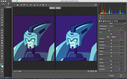
Flatten your image. You can do this by right clicking any layer and selecting the option from the pop up menu. Now that everything is merged into one layer, go to filter>camera raw filter (or command+shift+a). There is a lot you can do here. You can change the temperature of the whole piece and play with values and clarity until things look nicer. You can even go into HSL adjustments and tweak individual hues. I also use camera raw filter to add grain or a vignette sometimes (not color-related but still nice to mention). Also, when I want the piece to look really soft, I lower the clarity to give it a soft, glowing look. I did this for the idw Blurr also.
So now hopefully the colors you weren’t happy with look better, but you can still play with gradients even after this step. Sometimes this last step barely changes anything and other times the colors will be wildly different from what you originally had planned.
So to be honest, my colors are mostly all experimental. I’m constantly changing and adjusting colors as I go along. Try to put thought into your initial color choices, but also it’s fine to change things if you need. I mostly go on instinct, so I’m sorry if this is a lackluster explanation.
If you have any specific questions or don’t understand something I said here feel free to ask! I’ll try my best to clear things up!
#Anonymous#tutorial#my art#it's also like 6 am so this probably is confusing im sorry lol#my art process is mostly me doing something and being pleasantly surprised it worked lmao#the images look like shit on desktop but fine on mobile????#ok tungle thanks
20 notes
·
View notes
Last Seen Blogs

veethebeequeen
vee
princettemiles
idk, uhh...
stellatekintsugi
Constanza

stvcalldoctor
STV CALL DOCTOR

acaplaya-musings
4 To 5 To 4 Again