
judithan-fr
dragon hell
flight rising blog for @ Judithanhttps://www1.flightrising.com/forums/skin/3187757
113 posts
Don't wanna be here? Send us removal request.
Last Seen Blogs

assignment3shashika
Making Data Management Decisions

lucameyo
Photography, subies, and dumb drawings

shinugodda
this is all a dream

yandellw
Yandell Walton blog
sp-ace11
SP_ACE11
Text
its kinda been nice playing fr without having to worry about my accents/accent shop. it got overwhelming so slowly, i found. the pattern keeps repeating itself. i go on a long hiatus, come back to the most minimal presence and slowly take on more and more responsibilities and just. eventually it got to be too much. its even more frustrating cuz i would put a big ass faq on my thread that no one would ever read and its like. come ON
but at least now i dont have to deal w that and i can just peacefully scry my dragons without the idea that im going to be harassed about stuff out of my control
1 note
·
View note
Text

ill just answer this here since replies don't let you type that much but. to put it simply: the accent system is fucking dogshit.
The process from getting an accent from conception to finally being printed is nightmarish. In order to even get the png prepped for print you have to make sure it passes the bare minimum qualifiers:
the accent in question has to have the proper opacity of line art and shadow layer visible. THIS IS COMPLETELY ARBITRARY AND UP TO THE MODS DISCRETION. I have seen accents pass that you literally cannot see the lines for how dark the accent is, or the opposite where the accent is so light they somehow got away with doing 2% opacity. This is the #1 thing that people get their accents rejected for. I have seen people ask 'hey is this good', be given a mod response image of 'i edited this to get it to standard and hopefully it passes' and then the image provided BY THE MODS STILL GETS REJECTED.
It cannot contain copyright material. Simple enough, yeah? Wrong. I have submitted over 50 accents over my years as an artist and I want to say every 1 in 8 gets flagged as 'potential ip infringement', which NONE OF THEM EVER HAVE BEEN. meanwhile other artists either have passed (OR WON FESTIVALS) with material that is clearly ip infringement. Or their accents are flagged as such even for having their own oc content that is a fan-character for an existing ip. (example i saw was someone's WoW oc that was flagged and completely rejected despite WoW not owning the rights to fucking elves or eyebrow hair. they were fully serious and would not allow it to pass until the artist changed it)
It has to maintain a set percentage based on what type of print you're using. If it's an accent it has to be below 31% coverage, if it's a skin it has to be above 32% coverage. THERE IS NO WAY TO CHECK THIS ON THE FUCKING SITE. YOU HAVE TO USE A THIRD PARTY TOOL TO CHECK. (which btw! third party tools are often BANNED by fr! so it's this weird hypocrisy of 'you can't use third party tools except in this one case where you HAVE TO')
and if you don't manage to pass everything here on your first go, each rejection takes 8-12 days to be sent back to you. The automated message says 5-7 but it's never that fast. And that's another thing too! The automated message does not give you any details about your order. Just that you placed an order for... something! It gives you a number and that's it. It could easily pull the name of the order, what print size you sent in, and even what the breed/pose is since that's all info you have to manually input! But nope! They don't tell you shit!
Also you don't get to chose what the preview for your accent looks like! If you have a full set of 4+ accents and want them to match? Boo hoo! That's too damn bad! Never mind that if you're doing 10packs of each of those and they're all skins that's equivalent to 200$ worth of prints but nope! Letting you customize your previews takes up too many resources cuz they have to approve of every single order manually.
It's a joke. It's frustrating. There are so many small things they could do before the Big Accent Update to make their lives easier that they just won't do. Hell they could even contract hire the person who runs ReSkin (which shout out! if not for them we literally wouldn't be able to check our UMA coverage percentage!!) to get a mockup for the coverage checker on site.
And again. Each rejection takes on average 10+ days because the queue is always behind. If you have to go 3 rounds that is A WHOLE MONTH WASTED IN LIMBO BECAUSE OF NONSENSE GUIDELINES.
And also! Even if you're reprinting something they still have to manually approve it and send it to you! So it still can take upwards of 10 days! There have been times I've put in ludicrous orders of 15+ accents and it took nearly two full weeks to get back to me. If I was in charge of a pet site and people were spending hundreds of dollars worth of premium on a service I would want that service to not clog up constantly. (Like fortunately since I've always done preorders I've never had to spend my own money but I am well aware that most of my customer base has spent money. Good money.)
anyway i'm pissed and until they make real effort on fixing the broken accent system i'm pulling from it. i'll probably still post the fest ones i have cuz it would be a waste but i have no plans on ever printing solo until the process is better.
(also this is in no way me telling the mods to crunch harder or anything like that, this is me frustrated that resources are going to Shiny New Breed when they could go into making the site even the smallest modicum better. i get change like this takes time but like, the radio silence we've had on when its estimated to arrive vs the radio silence on everything else that is indefinitely on hold does not inspire confidence! do not harass anyone on staff over this, this is just me airing my frustrations with the problems the system has, not the individual staff members themselves)
Until flight rising fixes its accent system I'm not printing any more of my accents. I'm tired.
#flight rising#judithan talks#i dont think people understand the frustrations of accent making#i love making accents! i love seeing my dragons with fun new hair and custom apparel and its super fun!#but the headache of printing just is not fucking worth it rn!
17 notes
·
View notes

Text
I know I'm not the only one so I encourage everyone dissatisfied with the quality of recent art and writing to send in a Contact Us ticket. They'll shut down any thread regarding site management in Suggestions so Contact Us is the way to go.
The reveal in the new post that every team member has to wear multiple hats is both telling and concerning. I get that'll happen to an extent with every small team, but the art and writing have been suffering so much lately and I don't even know if they recognize why. We're getting a new Ancient on the 17th when it's not even fucking ready. It's releasing with only half its lore because they've drowned themselves with more work than they can handle. And it's still gonna have rushed genes and countless errors that should have been caught beforehand! Like! They need to hire more people, they need to slow down! Please for. the. love. of. god, Flight Rising:
Slow.
Down.
We don't need a new Ancient every five or six months. Release them when they're ready.
We haven't had an update on the Beastclans rewrite in over a fucking year. A lot of recent apparel releases have been a disappointment to people. What's the progress on the refactor look like? What about dark mode? Nest cancellation? Why do we still not have fucking commas in the fucking numbers?
It feels like everything is taking a backseat to Ancients and Ancients are still riddled with errors because even THEY are rushed.
Hire more people and slow down! I am begging you! The site is suffering! Please recognize this!!
#i never really noticed the commas thing but yeah why the fuck dont we have commas#why dont we have dark mode#what the fuck
50 notes
·
View notes
Text
Until flight rising fixes its accent system I'm not printing any more of my accents. I'm tired.
17 notes
·
View notes
Text
I wanna be excited for new ancient but I'm so frustrated that they're just pumping out ancient after ancient without fixing any of the preexisting problems on the site. Like. Fix the accent system. Fix the search systems. Fix the weird bugs that keep afflicting dragon genes to display in weird ways. Come the fuck onnnnn
17 notes
·
View notes
Text
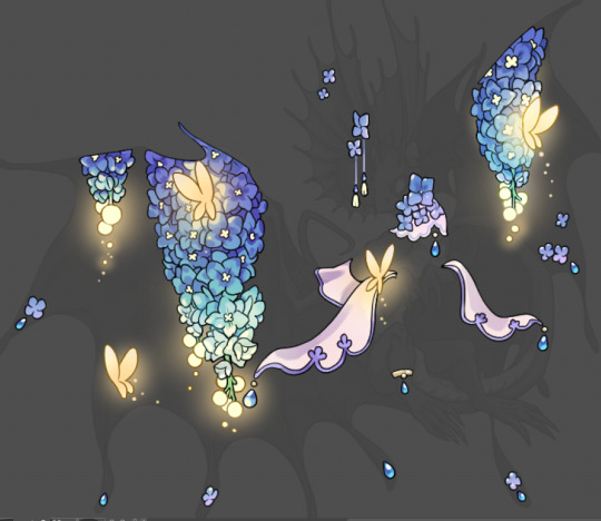
Tutorial: How I Render Accents
PART 2: COLORS
I usually do not recommend 'pixel hunting' aka going over your work with a fine tooth comb and picking out stray pixels to erase. However, for setting up a proper base layer for accents it is imperative to do so.
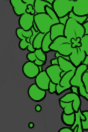
To explain my method of color blocking: I select everything outside of the lines, invert that selection, then fill in. This does a more accurate job than going into each and every section and filling them all in individually, and is also significantly faster. Only downside is small sections like above where you can see bits of the green (which I use bright green against a dark grey background to contrast the base color, lines, and background) poking out, as well as the inner section where it filled in a spot I did not want filled in. Getting all of this right in this stage will make your life easier as you go. (It's also the method I use to color block all my work, even beyond accents)
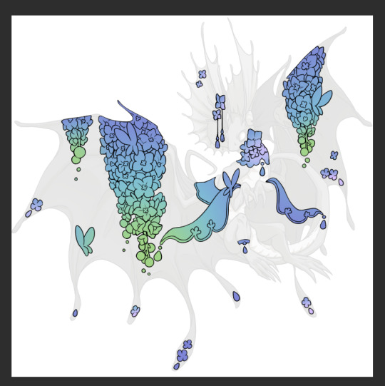
Now this where my style of rendering color may come off intimidating and, tbh it might be. I do gradients first and then I color over them with "normal" blend layers. I typically don't use multiply layers unless I'm shading something that has a lot of textures. If this scares you, it's okay I'll keep walking you through it. Here, my gradient goes from a pastel but deep periwinkle, to a soft more cyan blue, then to a lighter pastel green. Skipping steps and going from the periwinkle to green will give it a different look. There's also hints of a pinkish tone as an accent color.
So as I said, these additional layers are done with regular "normal" blend mode layers. I've placed one in between the butterfly line art and the line art for the rest of the flowers, and then an additional layer under everything else. This allows me to create a glow effect specifically around the butterflies, and then specifically under the flowers. Going back and forth with the proper amount of opacity (by using the airbrush transparently) helps to make it glow but not be Too Loud. Also checking it against a dark background can help to check for spots where it spills past the borders, as well as really gauge how Bright it is. I've also color matched the butterflies with the flower pits and the bulbs. This adds extra cohesion and makes them all look uniform but different enough with the gradients.


The stages of how I render gems/dew drops. Take the base color, make it a bit darker and less saturated (as well as changing the hue a bit depending on what the default color is. For yellows I go more orange/red, for blues I go more purple or even pink. It depends), add a small drop light at the bottom thats a fairly saturated version of the base color, and then a stark white/ near white highlight. That's it. Don't over complicate it, it will not matter when it gets shrunk down. Note that I do not use multiply/overlay/screen layers for these types of things as it adds too much bulk to the files and doing it manually helps to strengthen your color theory skills.
For shading and rendering, again, I create a "normal" layer and simply. Draw over what exists. Color picking and hand blending allow me to create the exact shades and effects that I want that multiply/screen/overlay layers may not be able to achieve. (which isn't to say I dont use them! i just don't use them for the main meat and potato part of my coloring) All of what is shown here is also achieved with the CSP asset SOIPEN (which can be found for free in the asset store)
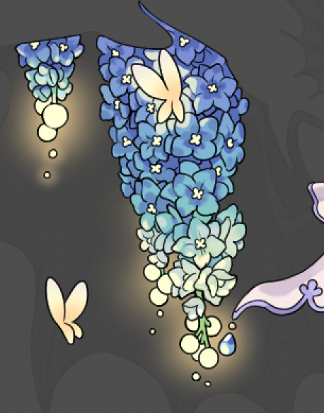

another example. The one on the right is showing how the layer looks without the gradient base layer under it. All of this is rendered by hand. I also specifically put a highlight color around where the butterfly is sitting to give a better illusion that it is properly sitting on the flowers rather than just in front of them.
Next is changing the color of the lines, if needed. A method i'll use is I color just the sections I want (on a separate clipping layer) then lock that layer's alpha setting to them add in a gradient. It's a small and subtle effect that adds more depth without doing a lot of effort. (work smarter not harder)
Now we get to the Polish Layers!
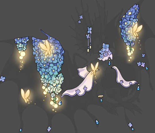
first image is how it looks as a base. second image is with an overlay layer applied. I've used some dark purples and mid tone desaturated greens to push the values a bit further (especially evident on the top left wing) Third image is with a screen layer applied, highlighting the inner most part of the flowers and adding some additional bounce light.
An important thing to note about making accents vs making full coverage skins: OPACITY AND LAYER TYPES MATTER OVER TRANSPARENT SPOTS. What I mean by this is that if you use a soft, light grey to shade with a multiply layer, don't clip it to anything, and have it go outside the lines - that will no longer appear as a 'shadow' when it comes to the final result. Instead you will have a section of soft light grey that is simply laid on top of whatever the image under it is. The same applies for overlay/screen/add layers and so on. If i use a very dark color on a screen layer (to give a soft highlight) and airbrush it over a bunch of stuff and don't clip it, it will end up with this horrible dark splotch over everything that isn't opaque. To this end, mastering normal layers is imperative to having well rendered and convincing accents.
Another thing of note: when it comes to sparkles/small details, note how 'large' the sparkles behind the butterflies are. They seem a bit chunky, yeah?
this is what they look like at proper size. If anything, I could have gone larger on the small metal beads connecting the dew drop jewels to the lace.
Another trick I also like to do is this:

a slight hint of transparency! It's just enough to let the dragon's lines underneath show through but not enough to be super noticable. I like to do this a lot when it comes to sparkly and magical effects.
Next is the worst part of all: destroying all that beautiful hard work with the shadow and line art layers! (sobbing)
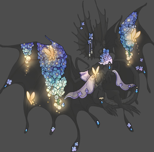
This stage always agonizes me. This is my first pass of the shadow/line layers and let's hope it's dark enough.
But yeah that's a start to finish look at how I create my accents. Unfortunately a lot it devolves into needing to know, yknow, line weight and silhouette importance, color theory and the ways that drawing applications actually apply color to a png vs how its rendered in app. All of these things impact the finesse of the accent, and are things you do have to learn gradually over time, but hopefully this has given yall some additional insight and perhaps some helpful tips.
And this should also explain why I get so mad when people go 'hey can I get this accent in another color' no! no you literally can't!
130 notes
·
View notes
Text
Tutorial: How I Render Accents
PART 1: LINES
a quick disclaimer: as stated on the title, this is how I render accents and obviously a lot of it will not apply to whatever style/method/etc that you may use. Another thing is there are some aspects of my style that will seem obvious to me that I may overlook explaining. please consider this a more generalized guide than a step-by-step.
So, first things first: the lines themselves.

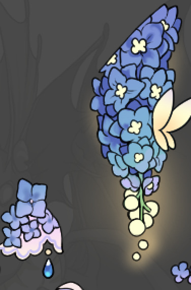
I'm going to be making an entry for Brightshine for this tutorial, so it'll be the example i use. I use Clip Studio Paint for all of my accents and I specifically use the asset found in the CSP asset store called SOIPEN for my lines, specifically on a size 3. I feel it does a good job of getting crisp yet soft lines and matches well to the line weight of the dragons line art. I typically do not zoom in very far and try to focus on making the outer silhouette ares bold and the inner lines soft. This gives a crisp edge to the work and a definitive line that makes it easier to color later on.
Something to note if I utilize the line method of going back and forth between opaque and transparent colors. It's a hotkey you can set that effectively turns the same brush you're using into an eraser. It allows me to carve away segments to create that negative space (as seen on the middle of the flower above) rather than trying to perfectly draw in that specific circle shape. Negative space is a huge tool to master that can give a lot of depth to your work. It also helps to sometimes fill in segments or widen out segments that are just Barely touching. The less complications in the lines the better.

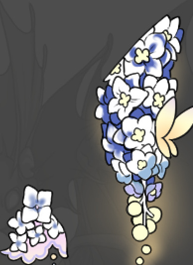
For the main feature, the flowers, I will typically find a reference showing a good clear outline of how the flowers look and simplify the shapes. The flowers in question here are Delphiniums and I've decided to render them upside down as if they're hanging. Simplifying the shapes and giving the illusion of the petal bunching is more effective than genuinely drawing each and every petal in a 100% accurate way. (also since it's for Brightshine I've replaced the flower bulbs at the ends with light bulbs)
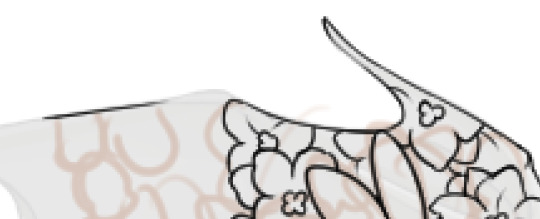
When doing line work that goes right up to the edge of the dragon, I'll typically start with the line for the edge, then build from that. Also when it comes to narrow areas (like the tip of the wing there) I'll leave it blank and typically fill it in with gradients or other small things to not make it too busy.
A very important rule for making accents is: Do Not Invest In Details That Will Get Lost In Resizing. I don't make super small details that don't matter, for example if you look at the innermost part of the flowers they are blocky and somewhat large compared to how they actually are on the flowers. When they get resized they will barely maintain that level of detail.
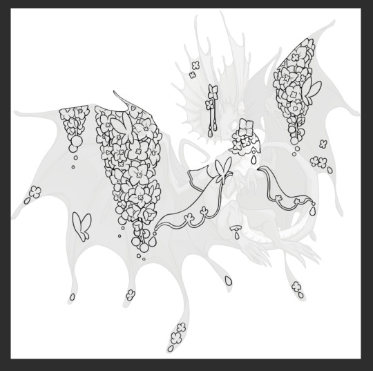
With all of the linework done I'd like to point out how I do composition for my accents. I tend to have 2-3 main focal points (in this case it's the two major draping areas on the wings, and the flowing lace on the arms) and everywhere else is filled in with evenly distributed small bits. Originally the butterfly on the bottom left wing wasn't there in the sketch but when I looked at the accent lines for what I had I noticed an empty spot and filled it in with a matching motif.
Some main points of how I craft my accents include: keeping the main focal points and number of thematic motifs limited and deliberate. I could add a bunch of like, jewelry trinkets or more lace and really clutter the accent but by not doing that it gives the flowers room to breathe and be the star of the show. Also using references for flowers creates a much better image than winging it.
In the next part I'll go over my coloring/rendering process!
27 notes
·
View notes
Text


what is happening with flight rising today. my dragon (proper image first one) has blossom...which is presenting as a fucked up version of branches?? like thats not even how branches looks???? whats happening.
first mobile's been glitching literally all day, now this
7 notes
·
View notes
Text


BRUH WHAT IS HAPPENING WHY IS IT BUGGIN SO HARD?????
0 notes
Text
Hey so what the hell is going on with mobile? Why is it freaking the hell out??
It might have smth to do with my adblock plugin but I refuse to turn it off for any reason since ads are universally malicious and invasive.
#flight rising#anyone else have this problem??#it started last night and i figured it was just smth screwy but its gotten worse
0 notes
Text
No promises but which would y'all theoretically prefer?
I don't want to like gatekeep my rendering process but I also don't rly like public speaking so I wonder if an art stream would be fun or just worrisome. I guess it depends on the type of response I get, typically the more ppl who come in and comment the more fun it is.
1 note
·
View note
Text
@ prev tags

I've been mulling over another floral accent would y'all me interested in me doing a stream of it or doing a step by step on how I do my rendering? I feel like nothing I do is super out of the ordinary but maybe I could share some insight or smth

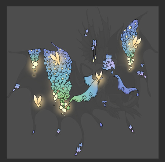
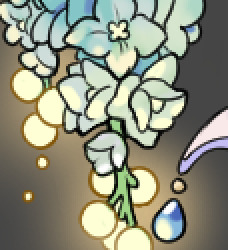
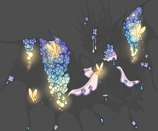
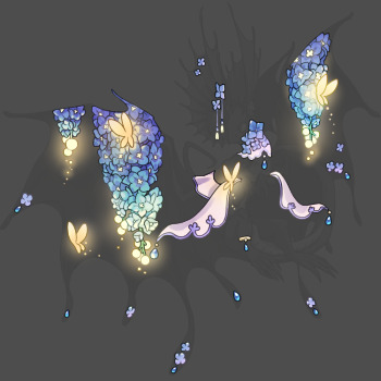
off my shit with these floral umas
#im a man of the ppl#and also i wanna interact with the fr community in a way other than being my own customer service cuz it's driving me insane#just thinking out loud
295 notes
·
View notes
Text


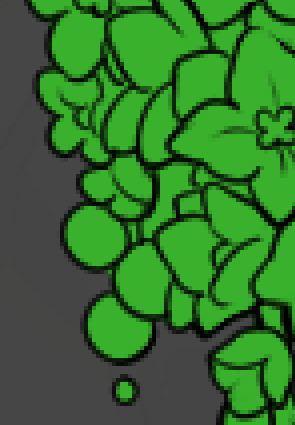
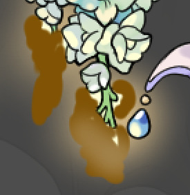
everybody give it up for this brand of green. round of applause for most under appreciated green
52K notes
·
View notes
Text
Running an accent shop means I am constantly answering the same questions over and over and over. I feel like I'm going insane. "Can I reserve a slot" (no) "can I get this in another color" (no) "can I buy this custom that's clearly stated to be a custom" (absolutely fucking not) I'm gonna start barking and blocking ppl who don't read the FAQ I swear to fucking god. Cuz it's never just the one question the one time, it's the same question over and over and ppl never read the thread even tho I deliberately try to minimize clogging so it remains an easy to parse resource for my accents.
1 note
·
View note
Text
off my shit with these floral umas
295 notes
·
View notes
Text

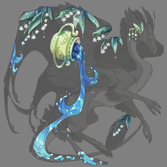
Lily Aquarius, my wavecrest festival entry
I'm so determined to get another festival win this year. If it doesnt win i'll definitely be printing it (I won't set up an individual pinglist until fest time but if you're interested in my general pinglist you can find a link to my accent thread in my bio)
114 notes
·
View notes