#also i had to get creative with the 'watermarks' so that's why there's a lot of yellow and blue
Text
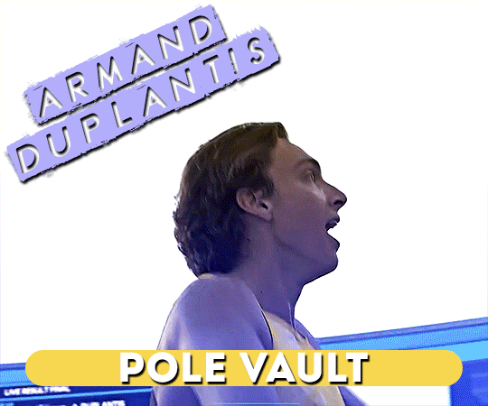
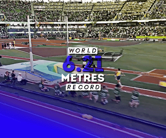

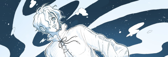
armand duplantis of sweden wins the gold medal in men's pole vault with a new world record of 6.21 metres at the 2022 world athletics championships in eugene, united states. (july 24, 2022)
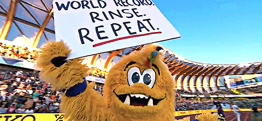
+ legend the bigfoot recognises another legend
#armand duplantis#athletics#team sweden#world athletics championships#gifs*#userfia#<- always have to tag sofia when a swede wins something lol#anyways goat lit goat#and u just know that he's gonna break his own record again#insane!!!#also i had to get creative with the 'watermarks' so that's why there's a lot of yellow and blue
50 notes
·
View notes
Note
hiiii mel <3 i’m.. thinking of starting to write for nct.. mostly jaemin.. and i more or less have an idea for formatting but it’s been a really long time since i’ve had to do graphics for fic’s (like the banner and stuff!) and i was wondering if you had any tips for that? like where to find good pictures (solid backgrounds seem like the best choice for not clashing with the lettering, a problem i ran into unfortunately…) and also is there any particular place you get your fonts from? if you aren’t comfortable answering that (or any of this!) then that’s totally ok and feel free to just give general advice or ignore this completely :]
now i leave you with renjun… https://www.instagram.com/reel/C117-m9JGuo/?igsh=aXI1YmZ6M2YycHg1
hiii! under the cut!
so you've already got a good idea with using solid backgrounds for fic headers to make it easier for the text to show up! i source pretty much all my images from the groups/idols' official social medias. i just caution you not to take screenshots of say, instagram uploads, because this will degrade the quality of the image. either download it from twitter or wherehaveyou, or from an updates account like neocatharsis or wayvment here on tumblr! another word of caution: DO NOT DOWNLOAD TEASER IMAGES/PHOTOSHOOT IMAGES FROM CONTENT CREATORS WHO MAKE EDITS TO THE IMAGES, SUCH AS CHANGING THE COLORS, UN-WHITEWASHING, ETC., WITHOUT THEIR PERMISSION. THAT IS THEFT FROM OTHER FANS. updates accounts like neocatharsis and wayvment simply reupload the original images posted by the entertainment company/idol in the exact same form without making changes to them. editors make alterations to the image and that new image is their own creative work, separate from the original one posted. you need the editor's explicit permission in order to use their edited version as a fic header.
i do all of my editing on my phone for my fics (except for the thin section dividers that i use, which i make in pirated photoshop cs6 so i can get specific dimensions, 540x2 pixels, and make the gradients super quick in a way that i know how to do. there may be a super easy way to do this w an app on ur phone too, that's just how i know how to)
anyway, if i have a photo that i really like, that i just knowwwww matches with the image of the guy in the fic in my head or smth, that i just rlly want to use but has a busier background, sometimes i'll use the portrait editing settings on my phone to blur the background a little bit and that makes the text a lot more legible (i have a samsung but im 99% sure iphones can do this too)
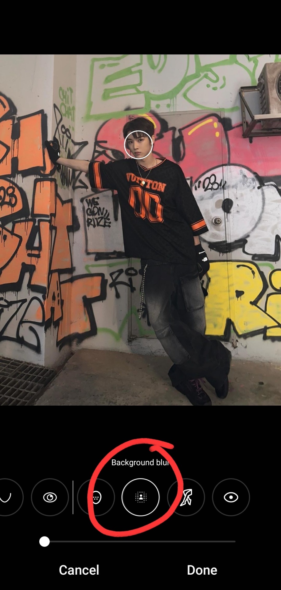

i typically don't bump it past 1 or 2, or the edges of the blur start looking a bit harsh, and i find that i don't really need more than this for the text to pop against the background anyway!
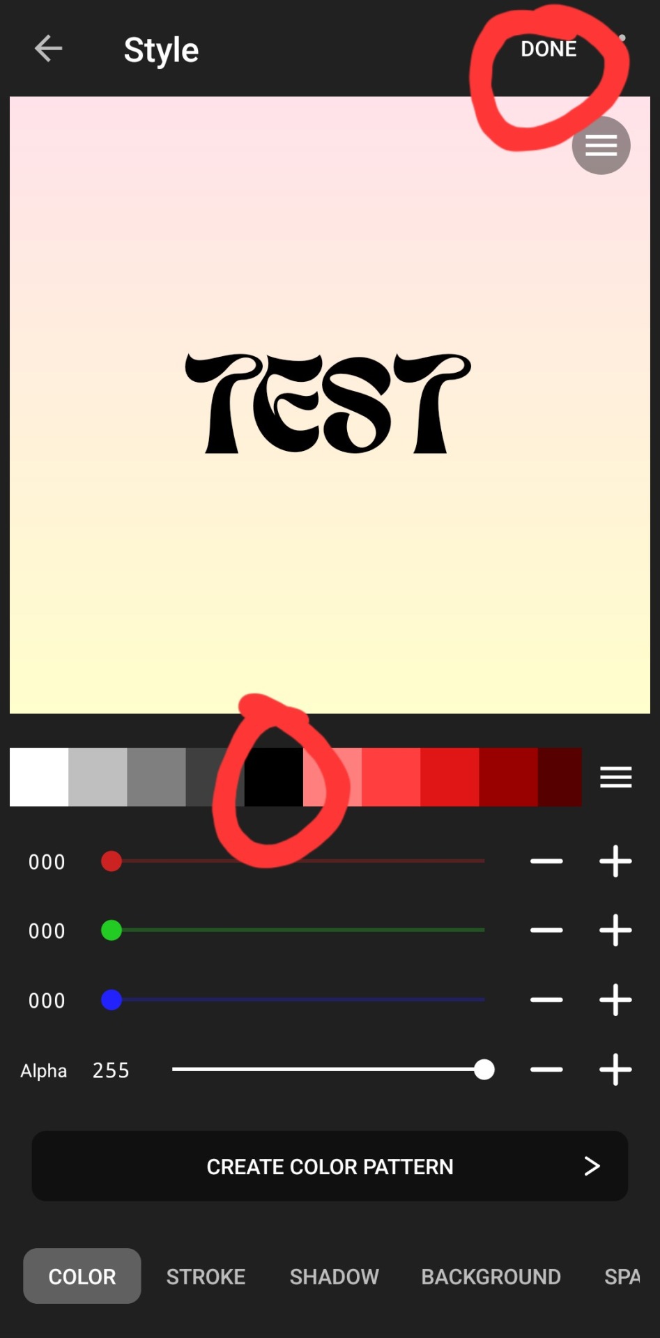
as for putting the text on the photos, i've the used the app phonto for years! it's completely free, doesn't put any watermark on your photos, comes with a bunch of fonts pre-installed, isn't super ad-heavy (it has a rlly small banner ad all the time at the top, and only shows u a skippable 10s ad when u save a finished photo), and you can download fonts from the internet to install straight into the app!
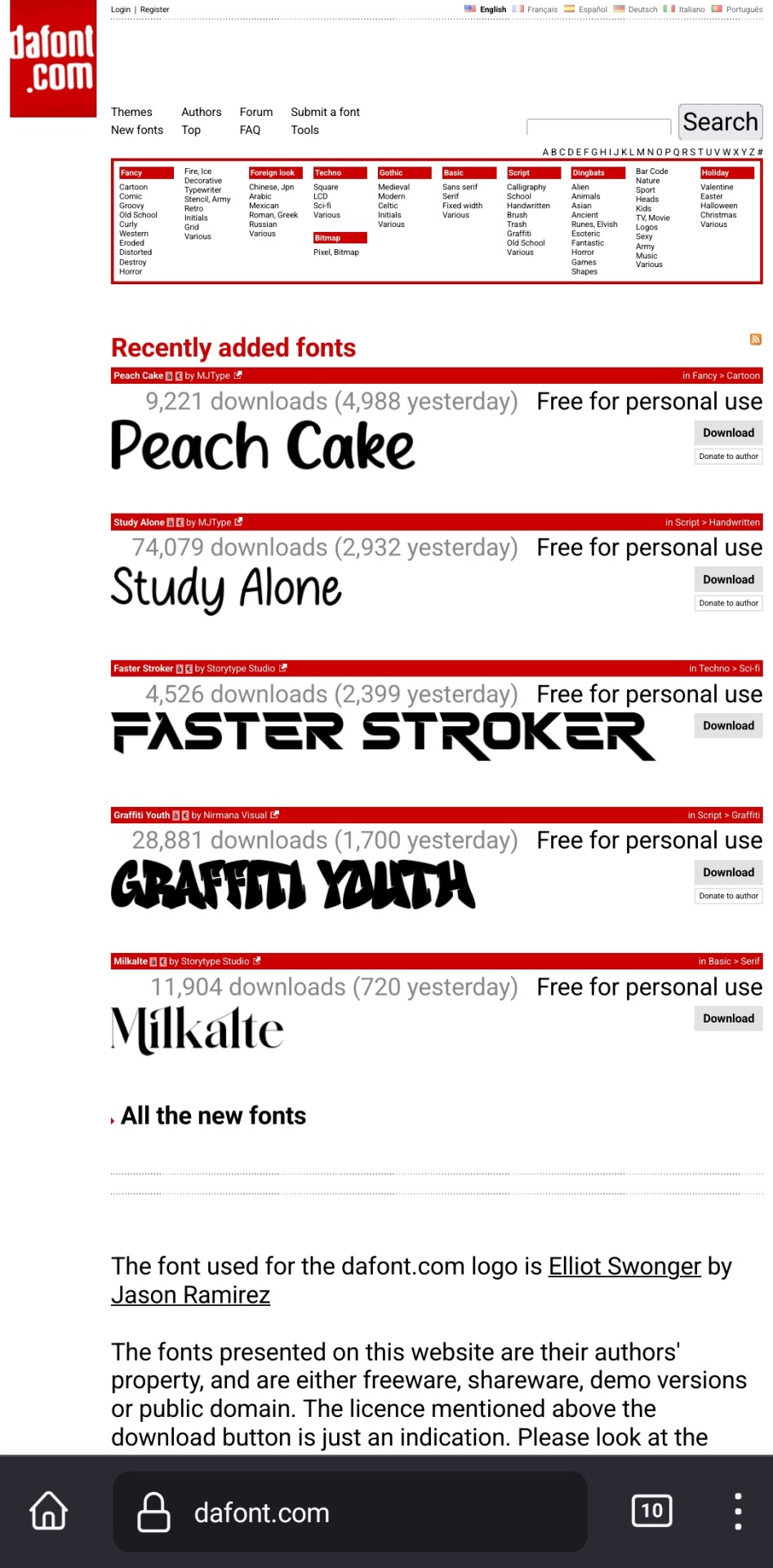
my favorite free font website is dafont.com, i literally will spend hours just browsing on there looking at fonts to download lmao. anyway here's how i find fonts for stuff and download, install, and use them with dafont and phonto:
once you have phonto downloaded, open dafont.com
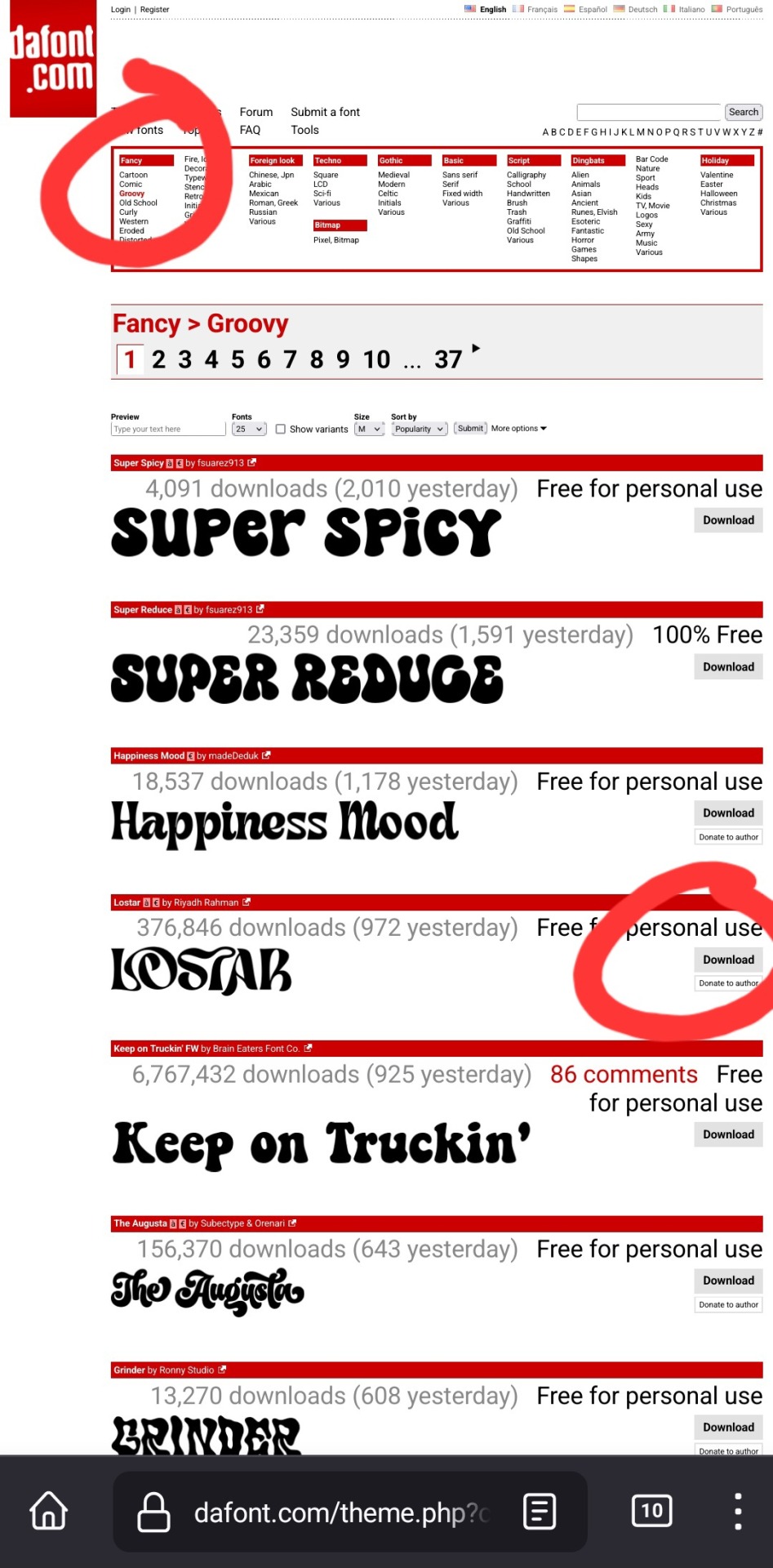
up at the top, it has a bunch of different categories of fonts. for this example, i chose fancy > groovy, and then on this first page, i liked this font called "lostar" (there's also a search bar up there, but it only searches font names, not kinds of fonts, so if you're looking for a groovy-feeling font and you searched "groovy," only fonts with the word "groovy" in the name would come up)
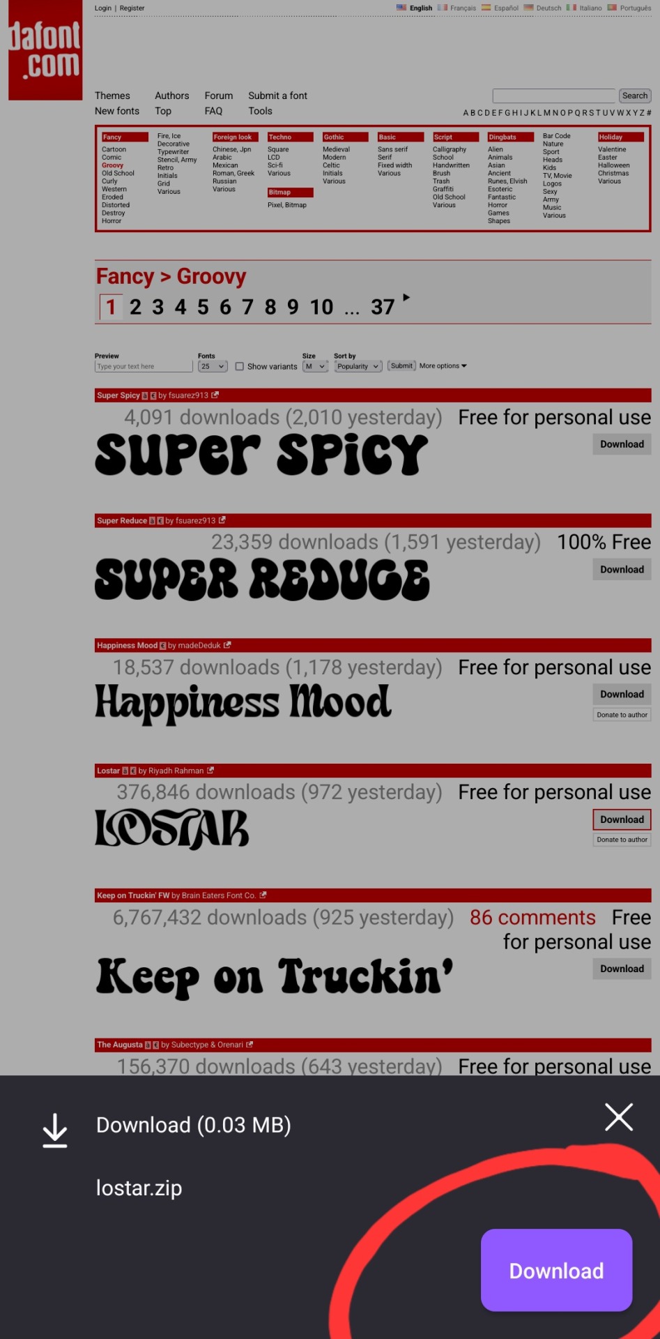
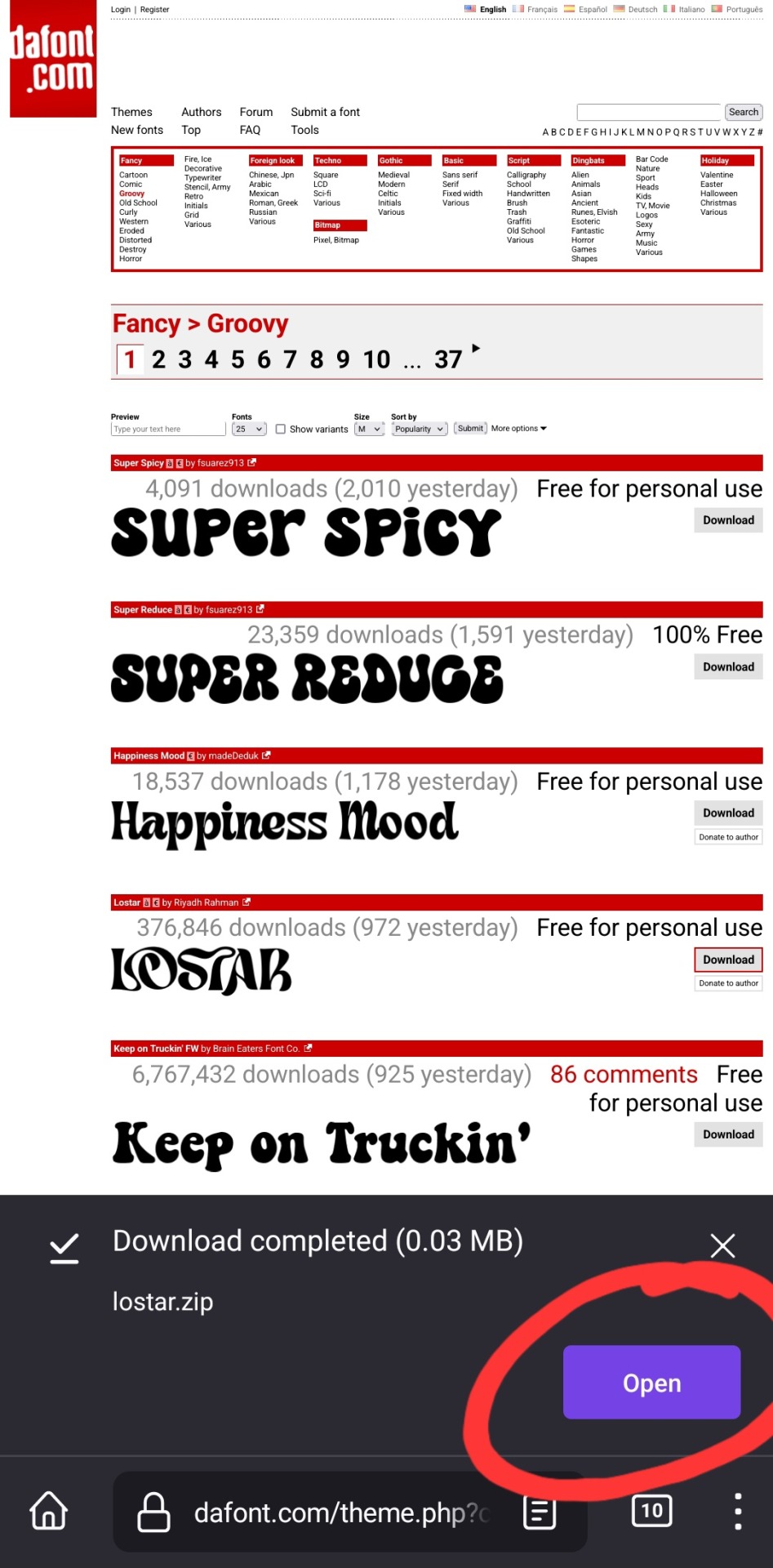
i then press download, and open in my browser (i use firefox btw, which is why it looks like this lol). make sure you're opening the .zip file with the phonto app (it opens directly into into phonto on my phone, you may have to choose to open the .zip file using the phonto app from several options, instead of your phone's file explorer or some other app on your phone)
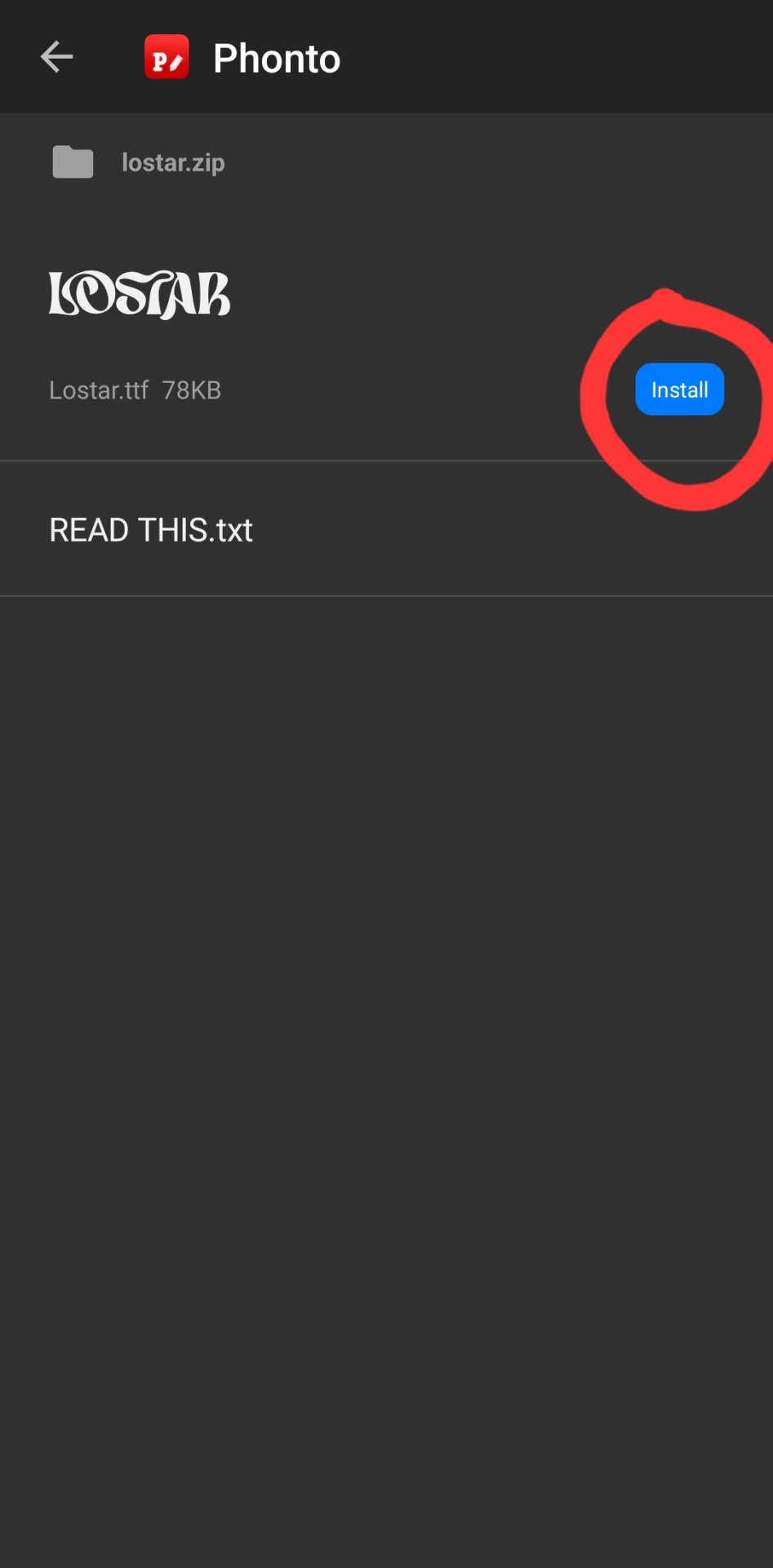
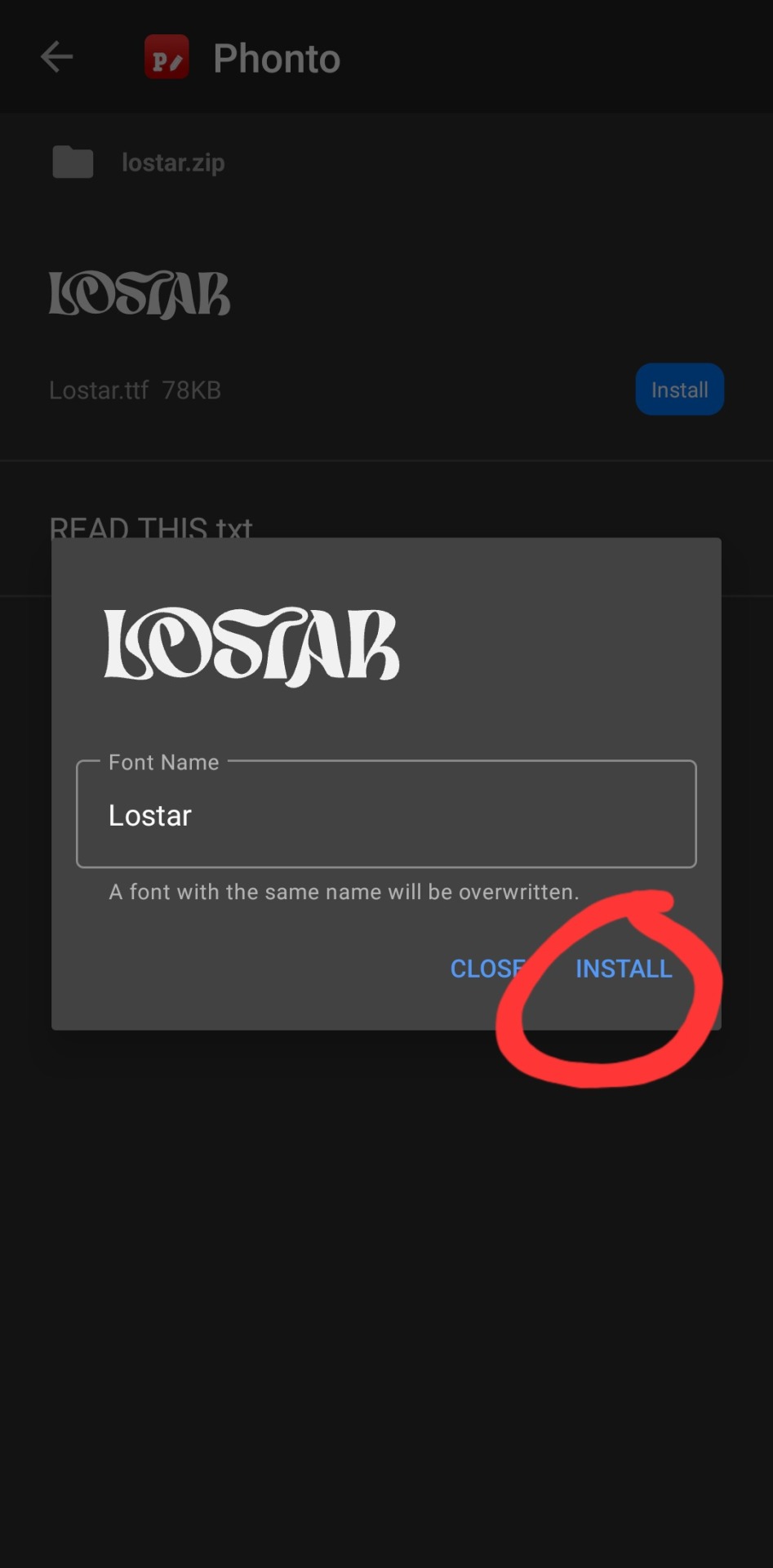
in the phonto app, you have to click install, then install again (it gives you the option to rename it, but i just keep the original font name bc why would you rename it?).
that READ THIS.txt file is a message from the font maker, it's the personal use license for the font (most of the fonts on dafont.com are free for personal use ONLY, and these .txt files that are contained in the .zip files are notes from the font makers telling u what u can and can't use the fonts for. generally, as long as ur not a business, u should be good this is not legal advice, please read them. also there's usually little thank you notes from the font makers in here as well!)
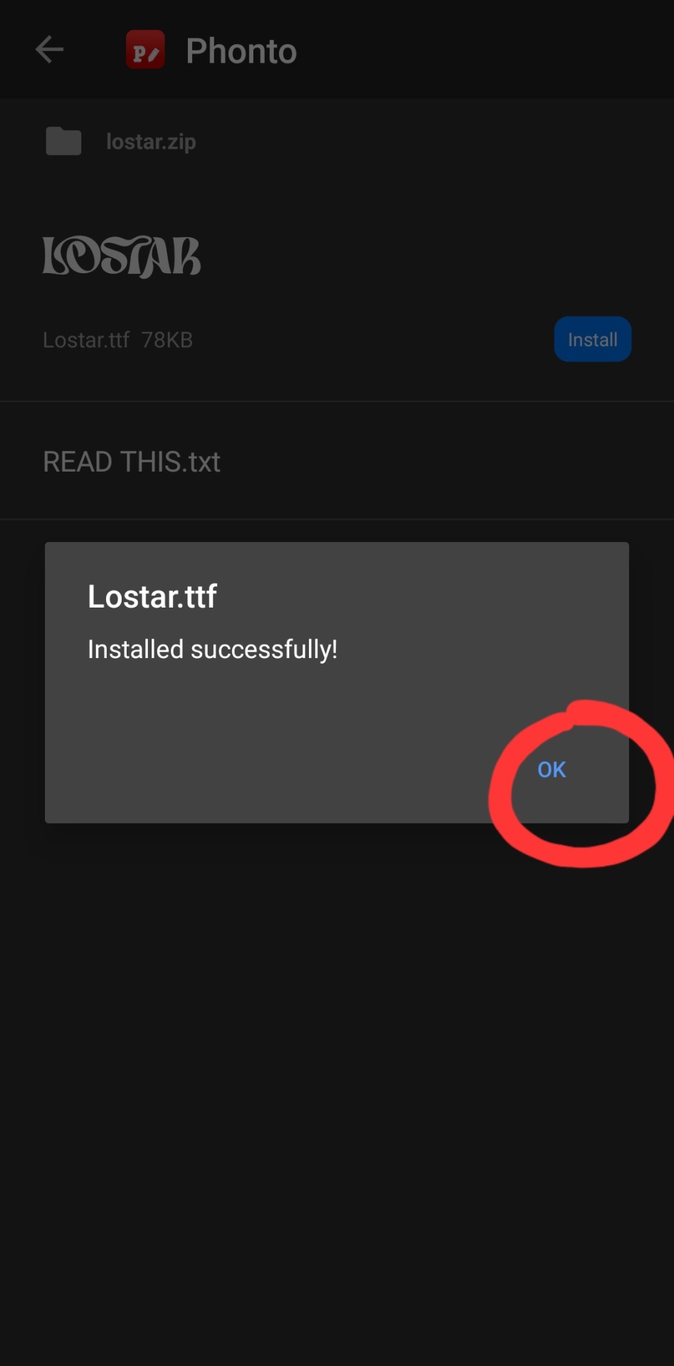
click ok.
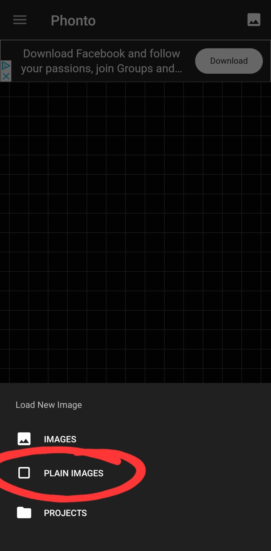
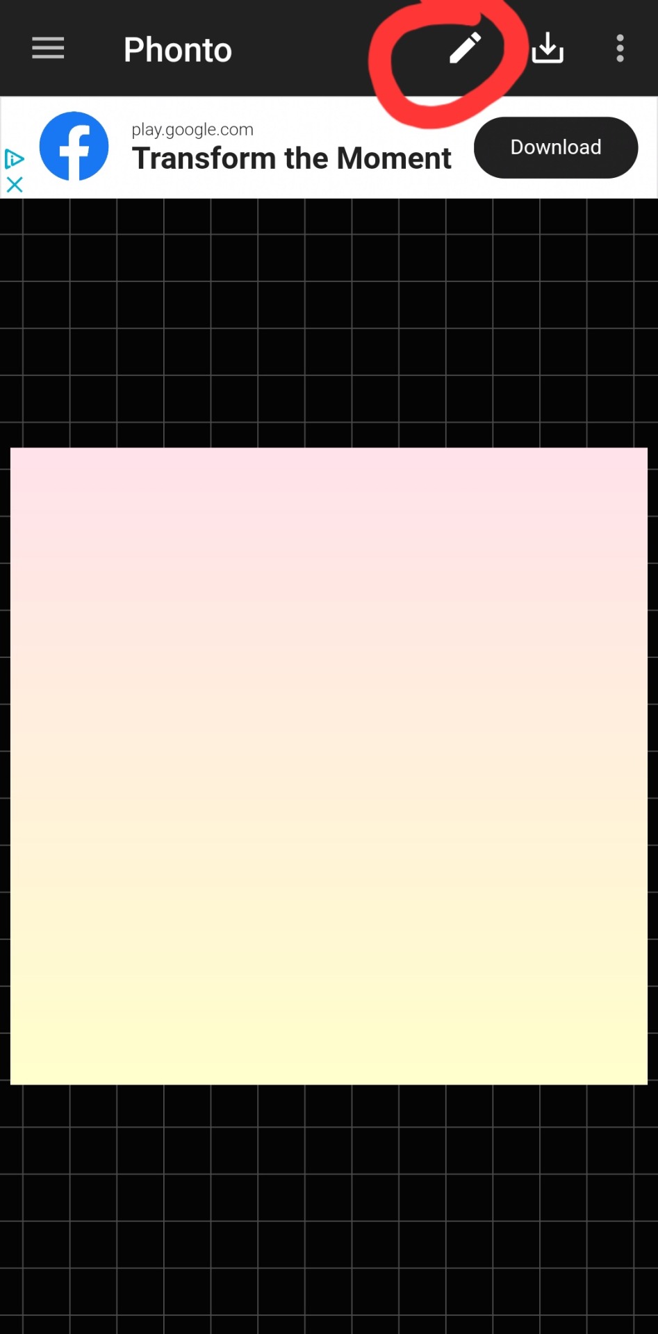
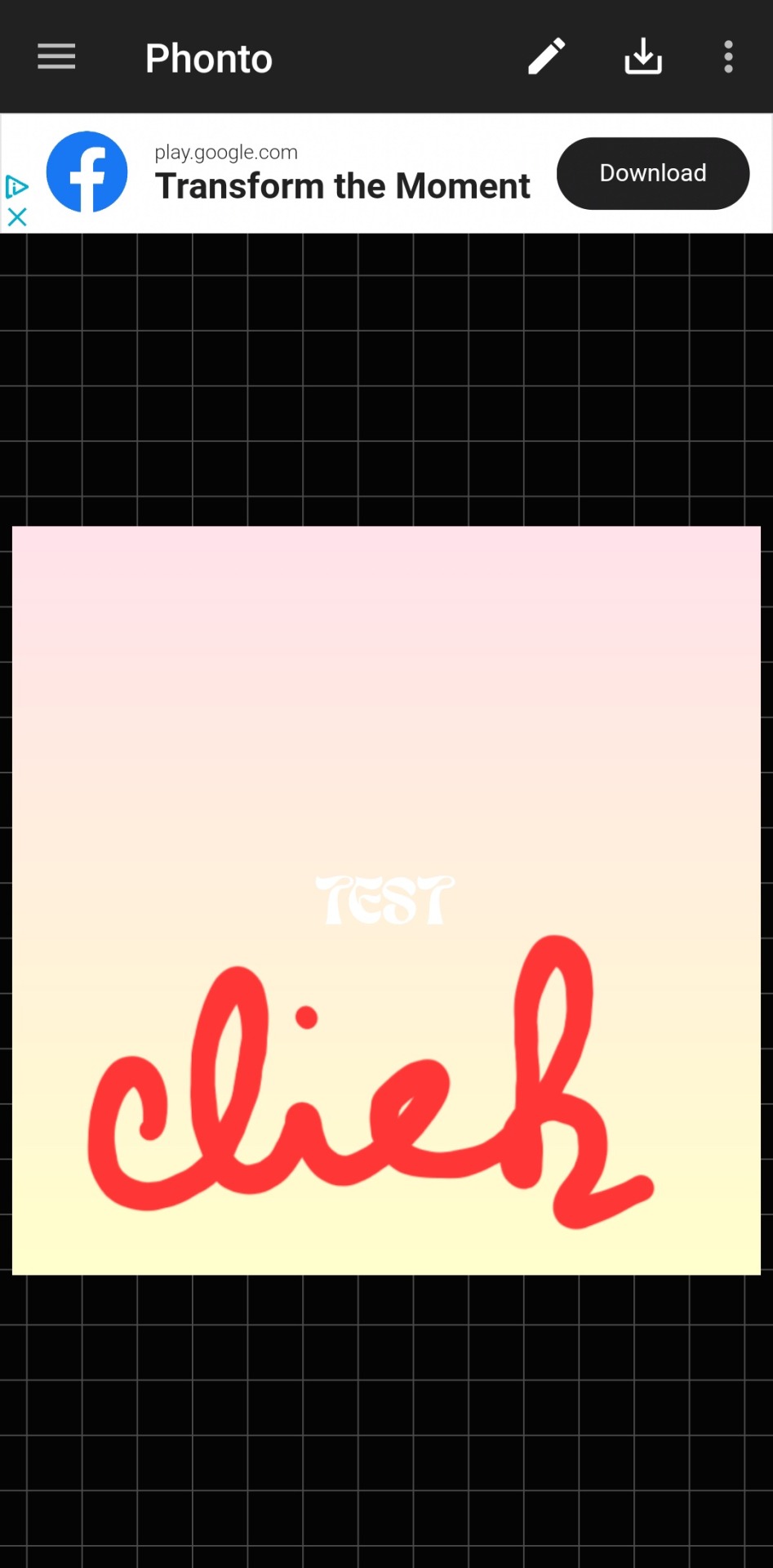
then you've got to slap some text on an image. you can choose an image from your camera roll, use one of their plain images, or open a pre-saved work-in-progress. for this example i used one of their premade gradients to make it easy
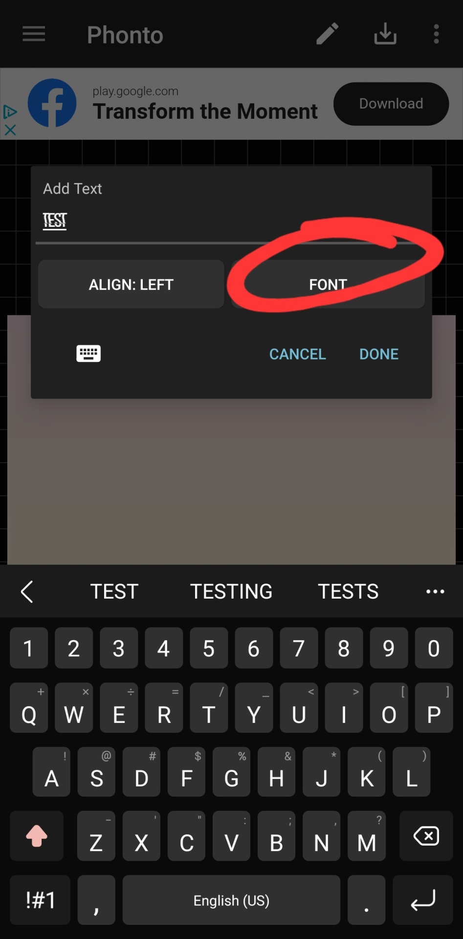
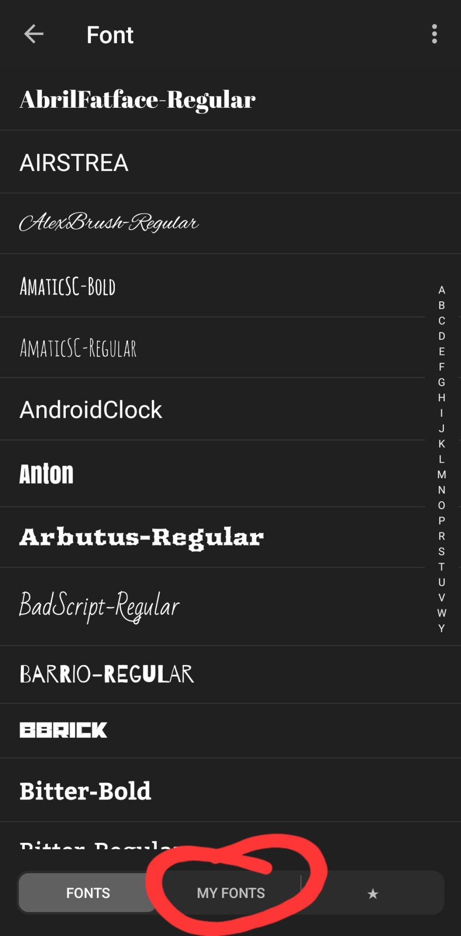
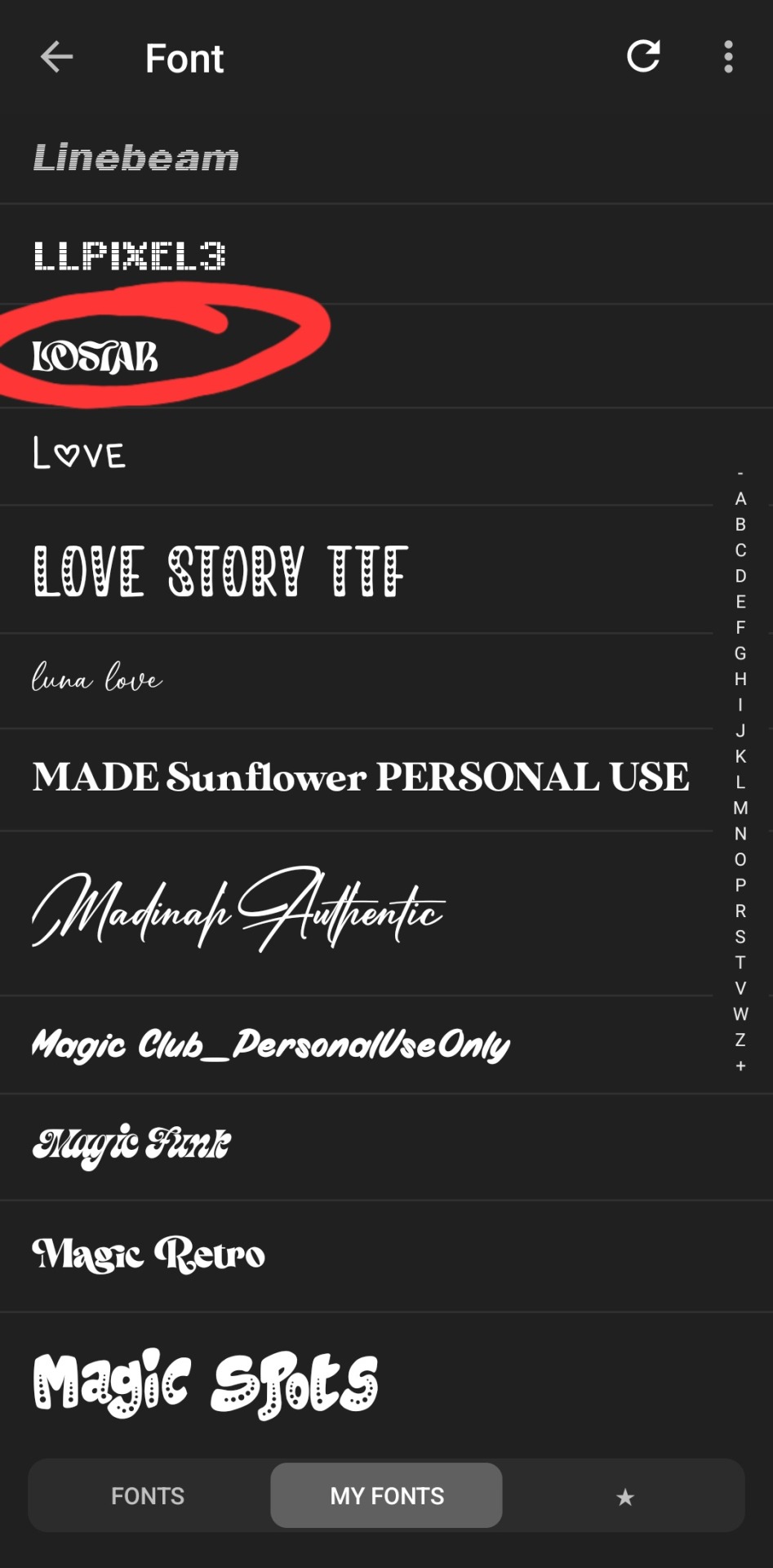
type whatever it is you want, click font. the left tab is the pre-installed fonts, the middle tab is the fonts that you've downloaded from elsewhere. here's the lostar we just got!
oh can't see it.
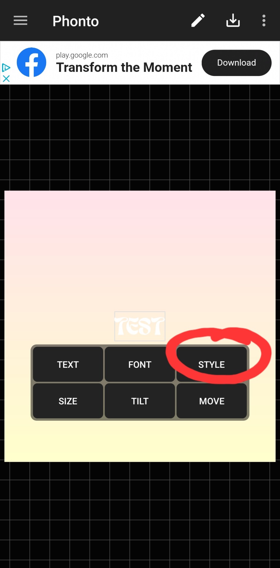
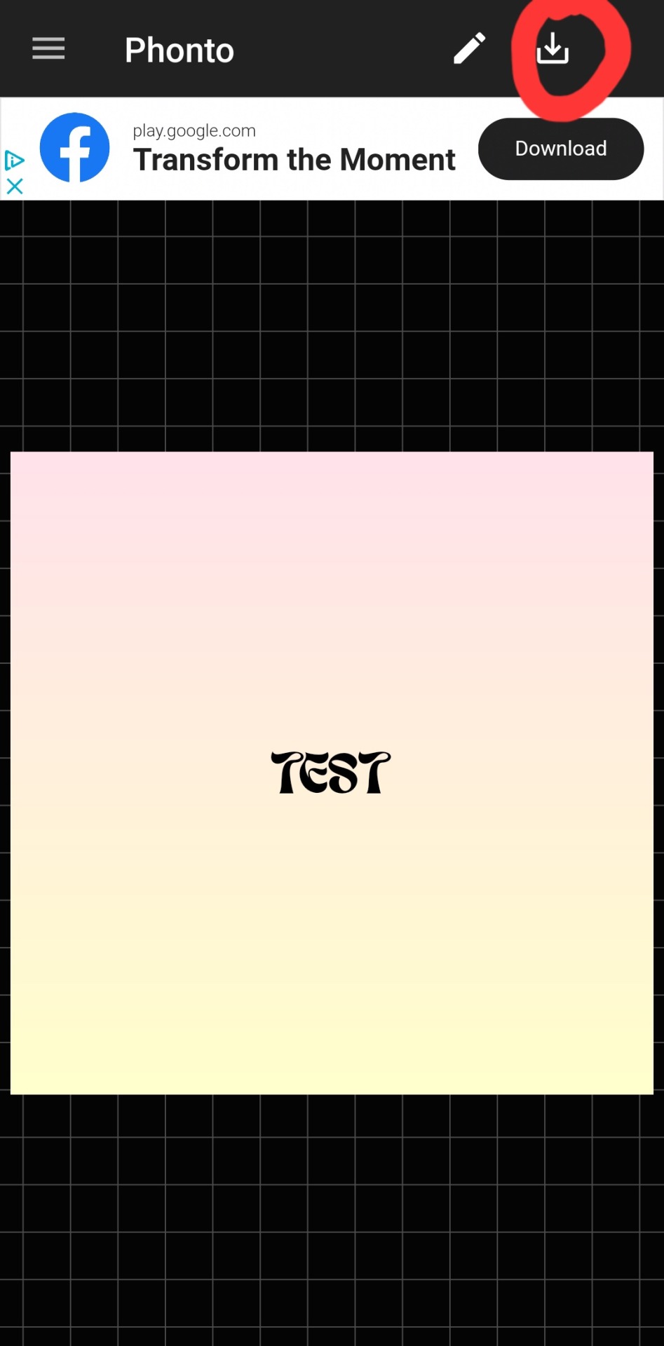
there we go! how fun! i'll probably use this in a fic header in the future. download button in the top right.
#hope this was helpful!#i don't mind sharing this stuff#i didn't invent fic headers or dividers or literally any of this lmao#answered#anonymous#talk#text#mine#writing tag#i suppose.....since its about my fics.........sorta...idk dude#also the renjun cheekies 😭😭 thank youuuu
3 notes
·
View notes
Text
long post about ai art/image generation. sorry
i Dont think AI generated art is an Inherently Bad Thing. my problem with it is that the training sets that these developers use for these AIs include copyrighted works from artists who have no idea their work is being used in that way / never gave permission for anyone to use their work in that way
midjourney (the proprietary art AI)’s training dataset is Completely Unknown to the public but from what ive seen it probably trawls artstation, deviantart, and stock sites, even trying to replicate watermarks/credits/signatures (i got these off their reddit lol)
since the AI is “taking inspiration” from its training sets its probably near impossible for an artist to take action against the devs here. can an AI be inspired? well, its not exactly copy pasting things together so its original art, right?
(as a side note, it seems that a lot of people just don't understand how ai image generation works so i'll link this computerphile video because it explains it very well. basically AI generates noise then denoises it based on what its learned from its training images)
given the amount of data needed to train and the seemingly large amount of visual artists who want nothing to do with AI, it seems unlikely that devs switch their training set to a community contributed or creative commons 0 dataset… if you post your art accompanied by text or alt text, it can be "caught" in a internet data crawl used to train a model.
technically, its not breaking copyright licenses (but some devs Do advise not to sell any generated art because the licensing is questionable). art and image generation ai is so technologically impressive and i dont blame artists for using ai as a tool. but if this becomes an industry standard, new media will start to look even more homogeneous / samey
[OPINION] no art is truly original but ai art is especially unoriginal. it creates a representation from other representations. i know some ppl fear ai will replace the need for artists and the skill level now expected of artists will rise, but i dont think it can ever replace human art.
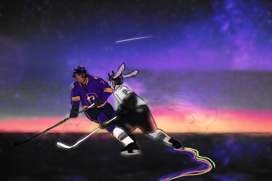
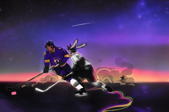
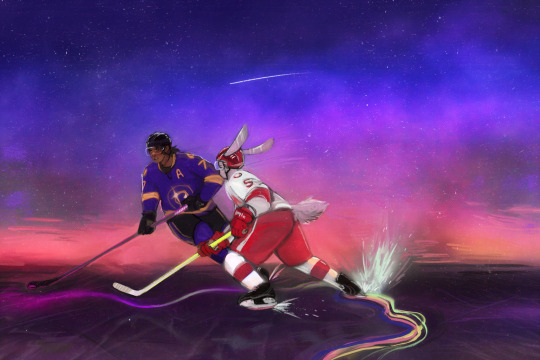
another side note, i have experimented with Stable Diffusion with my own art (turning sketches to rendered pieces) using my own graphics card. right now there's not much to it and it will spit out the most generic art assets and also make your brown characters white
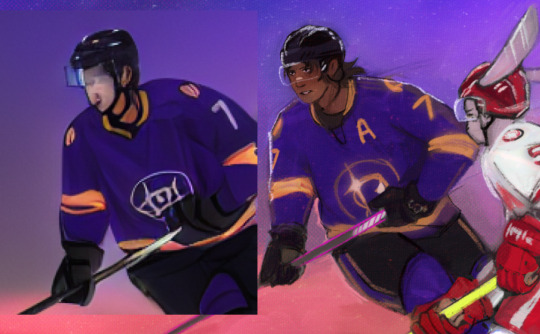
it kept on making them white and also an LA kings player too i had to fight it constantly by just erasing things that didnt quite work (this is why theres kinda a halo around the characters)
ive documented my process here in pictures. hopefully you can tell where i step in and make tweaks. between the last two i painted it over since i wasnt getting anymore mileage out of the AI. also i manually changed the bunny's uniform to red to hopefully give the ai an easier time (it barely worked)


i dont know what my conclusion is here except that maybe ai art could be cool if ai devs respected the artists their program is learning off of. but of course that wont happen. so therefore my real conclusion is that i would like to be a bird and eat crumbs in a park
#most of this is from my twitter but the art is exclusive to here i guess#i am so sorry for the long post. i hope it makes sense
25 notes
·
View notes
Text
Using Canva
Art as always been a stumbling block for me in game development. It has stopped all of my motivation for bringing Grimfel to life. I could befriend an artist but then I had to rely on their schedule and was let down a lot. Then there is compensation which I couldn’t afford. So as someone who lacks incredible illustration skills I have found Canva to be a great resource when creating art for my game.
I have several other methods that incorporate AI which I will go into detail in future posts. However, now I will show you how I create art in Canva, anything from UI to in-game art.
First thing is that I recommend you getting Canva Pro. They give you a free month trial. Otherwise you will end up having to pay to remove watermarks and for Creative Commons license use.
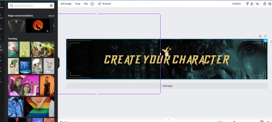
So here’s how I created the ‘Create Character’ button that you will see on the first few passages of Grimfel. Here is what the finished product looks like.

I’m quite proud of it to be honest. So to prepare the image I decided I wanted to have a forest with a woman holding a masquerade mask. So I created the image using filters from a royalty free image.
First I searched on the elements section of Canva for borders, I found those lovely lines that you see placed at the side of the finished gif above.

I also looked for a raven silhouette to go above my text. Manually placed all those in the right positions of the banner template. I uploaded a custom font from dafonts.

I needed a forest background. Something similar to the one that I use for my UI background. So I looked and found one that stood out!

Using a Nordic colour filter, I placed my ‘Forest’ on an empty banner template. Getting the hang of Canva. It seemed a piece of cake. Especially with importing images.

This photo was created from a stock photo and sketch filters. I used Pixlr to do this one. But you’ll see why this image is important.

Using the same Nordic colour filter I placed the image to the right side of my banner. You then turn down the opacity so that it ghosts the image and blends into the Forest. The only issue with that is there’s an ugly line in the middle from the opacity.

So to correct this I used a blank black background on the left side and turned down the opacity. This removed the ugly line.
And then for the finishing touches I went into text animation to bring it to life! There’s so many great options you can choose from, I quite liked the typewriter animation but I chose ‘Breathe’.
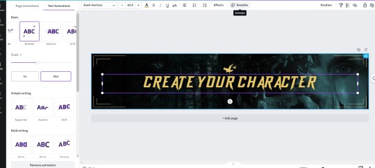
Canva hides the ‘save image’ section into its ‘Share’ box in the upper right corner. It also likes to make animated images into MP4 video files so instead I specify I want to save it as a ‘Gif’.

And that’s how I created my ‘Create Your Character’ Menu button that you will see at the beginning of the game! Simple ey? Canva is so cool and you can do a lot of things with it. I would recommend to use it in conjunction with other apps but you can get some great royalty free commercial use graphics and pictures from there without having to sweat if you are infringing on anyone’s rights.
6 notes
·
View notes
Text

I am vaguely desperate to get creative again, to get back into other hobbies beside video games. Which has gotten me to finish this, in my never ending quest to relearn my digital art skills. And gotten a couple of sketches out of me - all practice or concept. Obviously better than nothing, but its quite the mood tonight that's gotten me to go in and finally slap my watermark/sig on here and post it.
Just a bit of practice in trying to redesign Hiro lightly (who is also always in search of a slightly different name, but I'm not getting anywhere there either). This has been done for a while and honestly not sure why I'm posting it? Like, not really a lot of people looking for my art. But I've been working on another minor concept for this as well and that was the extra kick in the pants to do something with this.
I won't even pretend that I wasn't aware I have terrible same face syndrome, but I've been just trying to get back into things so it hasn't been something I've sought to tackle. Until I had this mostly finished and I couldn't stop seeing Kari instead of Hiro. I mean, they're related, but its not supposed to be that bad. I have some ideas, but I'm fearing that until I nail an early concept of Kari's mother, it'll be hard to separate father and daughter enough to get this. And I don't think it's actually going to save me from same face syndrome in the slightest.
#text is a ramble#I'm not feeling like well#more than survivable just really need a pick me up#oddity artwork#hiro faelchucroi#hey look at my oc
0 notes
Text
I pretty much died when I saw the Marvel titles on my facebook feed of the upcoming movies. Seriously? Agatha the coven of chaos? Holy hell.
Ironically chapter four is full of supernatural theme in Multiverse mode for Stand By Me.
I'm also changing a lot of backgrounds in the process and wow when comes to mentors, holy shit - so many in line. I almost pick Regina for mentor from Once Upon a Time to be frank 😂
But b/c the feature in Stand By Me weighs heavily on what I love writing most - fantasy and adventure along with script in mind already. It is already completed. I just don't feel like publishing yet. I kinda am a mean OC writer making her confuse who to choose for a lover even though Jazz is her Autobot guardian 😂💜
I promise he will be feature for the rest of the chapters I had in mind. I don't want to share out too much b/c I know what happen to creative writers that have their ideas out gets stolen. Be warn - I don't tolerate stealing. I also understand and empathise those that have their shit stolen. One reason why I walked out of Roleplay in the first place - never admitting my writing style was stolen. Trust me, I know and when it does happen again, I make sure people pay. I ain't going to be nice. I'm going to be full on bitchy mood.
I will instantly block with no mercy. Imagine if it happen to you, I'm fairly sure you would be pissed too. What we create deserves to be watermark.
0 notes
Text
So, I had actually planned to start posting the bts content of season 3 from peaky blinders this week but during the last couple of days a few people have reached out to me, telling me that there are certain people on other platforms who are stealing my content. Not only are they ‘stealing’ it but also acting as if it’s their own work by watermarking it etc. I have tried to have a talk to a few of those so called ‘creative blogs’ and asked them to credit me, which not everyone did. Instead as response I got told that “everyone takes those things” and that’s why its apparently okay (because everyone’s doing it lol). I don’t really agree with that, because after all its my time and effort that I put into this content, especially because it wasn’t available online at this point, so I decided to share it with you.. But honestly I don’t really feel like spending time getting the videos to my computer, cutting and coloring sequences and turning them into gifs when someone can just come around and steal it off from me, branding it as their own. So I am not sure if I will continue posting bts content which is unfortunate because I had a lot of plans.
52 notes
·
View notes
Text
#showyourprocess
From planning to posting, share your process for making creative content!
To continue supporting content makers, this tag game is meant to show the entire process of making creative content: this can be for any creation.
RULES — When your work is tagged, show the process of its creation from planning to posting, then tag up to 5 people with a specific link to one of their creative works you’d like to see the process of. Use the tag #showyourprocess so we can find yours!
sabrina @lanwangiji, my love, tagged me to share my process of making this typography edit! check out her explanation of her the untamed edit and her edit tag.
1. PLANNING
i once opened lyrics edit requests so i can learn and practice typography. this edit was a request as well. i asked them which lyrics they wanted to have and the colors they’d like. since i got several requests and it was hard to keep tabs on them, i made a trello board so i could organize everything. i’m still using the trello board for every edit idea i have, the board makes my life easier.
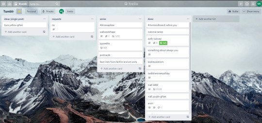

above is what i filled the card in the board with. basically just information of the requests.
1.1 INSPIRATION
once i got the request, my first thought was to find the vibe the song/lyrics exude. “it’s an old curse” screamed witchy vibes to me, so i went to pinterest to find some inspirations. at first i was looking for witchy poster designs and i came across this. i liked how it has smoke-ish graphic and i thought the smoke suited the “old curse” lyrics. and tbh pinterest is a rabbit hole, they gave me suggestions after suggestions, like this and this which became my inspiration for the color palette (i added the gold from those pics) and the sun moon design gave me the idea to incorporate space stuffs too. i somehow landed on this too, and because i wanted to include space theme, i made a simple phases of the moon. ultimately the hero of this edit was the lyrics, i didnt want the graphics took the center stage. i was inspired to make a crystal ball and do this kind of typography but after several trials i couldnt get the the typography right, so i scratched that idea and went with the space theme instead.
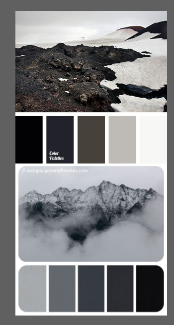
1.2 PICKING COLORS
after i was feeling inspired enough, i went looking for the right colors. i usually just type “color name” and “palette” on pinterest. example “dark grey color palette” and i chose the one i liked best. when the request only asked for 1 color, i always searched for either a complimentary or contrasting color to give it a jushz, to add sprinkles. that’s why i added gold on top of the dark grey.
1.3 FINDING FONTS
this is the hardest part. the fonts play important role to the design. they need to convey the vibes of the lyrics, in this case witchy/magic vibe. i needed to find fonts or font just as magical and a bit whimsical. tho i hoard fonts... i like to use new font for every typography edit lmao sue me.
i highly recommend going to creativemarket free goods site, pixelsurplus font freebies and behance to search for fonts. i always use 100% free fonts, that means i can use it personally as well as commercially. creativemarket gives me desktop license for the fonts, which means i can use it for commercial as well. the reason i do this because i want to open an etsy shop someday, and i want to have the right license when i sell my stuffs. i almost never buy fonts bc they are expensive lmao.
the fonts in used are “Vintage” for the main typograpy (i think i was a freebie from creativemarket) and “Morganite” for the title of the lyrics and the name of artist.
2. CREATING
once i have my materials and ideas, i open my illustrator and hope it doesnt crash every 5 min.
for this kind of typography edits, i use 600x700 px. tbh i dont like using 540px, the suggested tumblr size, as the width bc to me it doesn’t look as good in quality, so i up the px. but more on this sizing later. i utilize the artboards function in illustrator, and i use 2 artboards.
i use illustrator (ai) bc i’m working with vectors. when i work with vectors, the graphics/texts or whatever im making in ai wont become blurry or lose its quality when i enlarge or shrink it. in compare to photoshop, i need to make for example the moon graphic very big, so i wont lose the quality when i reduce and enlarge it again. with vector, i can start small and when i expand it, it’s still as good as when it’s tiny.
2.1 GRADIENTS
i started with the gradients first. i created a rectangle as big as 600x700px and with the “freeform gradient” tool in ai, i played with the colors. below is the color palettes i used
2.2 LYRICS AND GRAPHICS
once the gradients are done, i worked with the lyrics and graphics right away. when i first doing this edits, i made typos a lot lmaooooooo. so i copy and pasted the lyrics on top of my artboard, so i wouldnt have any typos.
i had 3 layers in my ai. one for the inspo pics and the OG lyrics. the rest for the edits themselves. i broke up “It's an old curse/dreamers diving headfirst” into to parts, hence the 2 more layers
i almost always started with the lyrics first then the graphics. but for this edit, i made the smoke first so i can layout where my text would be.
tbh the process of making the lyrics is a trial and error. i tried bunch of different stuffs and i chose whatever the best. but i worked like methodically, i made sure i finished the first part of the lyrics first then i could move on.
i was lucky with this font “vintage”. the font offers me several glyphs like these
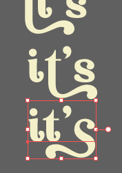
and i chose the one at the bottom. you’re very lucky if you find a font and they have glyphs.
excursion: glyphs vs fonts
glyph is an individual character. It might be a letter, an accented letter, a ligature, a punctuation mark, a dingbat, etc.
A font is a digital file which is used to display a typeface, which contains the entire upper- and lowercase alphabet as well as punctuation, numbers, and other special characters.
after i was finished with all the lyrics i added some graphics to make the edit pretty like small stars or dots. i added the song title and the artist too, sometimes at the bottom sometimes at the top. and i added my watermark put it as small as i could and made it a bit invisible but still can be seen.
2.3 EXPORTING
exporting! this is where i’m going to go deeper with the dimension of my work. in ai, i always choose to save with “export as screens” function. it automatically divides the artboards i have and save them separately. i always save as png, bc the size is smaller than jpg but can maintain the quality.
now the export tab looks like this
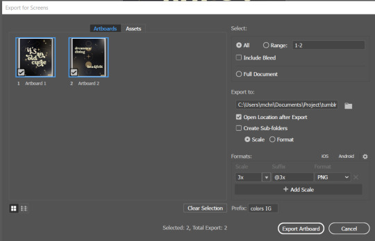
see the formats? i always scale up my edits, 2-3 times the original artboard size. reason is, to maintain the quality. i have tried to save it as original, 600x700 px, but it turned out a bit blurry. bc everything in ai is vector, when i scale up it doesnt lose the quality. BUT once i save it as png, it’s not a vector anymore, and when you zoom in until a certain degree it’ll be pixelated. that’s why i always scale up, to avoid it becoming pixelated when it’s just zoomed 1 or 2 times.
2.4 FINAL TOUCH
i opened my photoshop and also pray it won’t crash. import the png of my edits, add some grains/noise. the reason i use photoshop is, the noise filter is way better than in ai. it’s smoother somehow. and then i export my edits.
(i have a timelapse of how i made one of my edits, it’s not this one, but it’ll give you a better visualization. find it HERE
3. POSTING
now the hardest parts are done, we go to posting!
i uploaded the 2 posters on tumblr as photos then i wrote the captions. for this typography edit, i always chose another lyrics that i like from the same song for the caption. i bolded the lyrics, add link to all of my typography gradient edits.
i always use this link to color my caption. i usually choose 3-4 colors, and i took the colors from my edit. but this was not until recently lmao. before i just took a guess and looked for similar colors that match the edit, but then i thought “why didnt i just use the color in the posters lmao”
ok after i have my html code for the caption, i go to this site to replace the “;” with “ “ so tumblr can read the code.
i’m not one who puts their edits in draft, bc i just cant wait to post it. i have to option here, either i post it immediately when the time is right (i usually post between 4-8) or i schedule it, if im finished before 4.
i put all the necessary tags and click post! i am done finally!
i’m tagging:
@thetriangletattoo for this amazing series
@deludedandlostcause for this impressive gif
@half-lightl for this spectacular edit
@gayndrew for this stunning drawing
@thechampagnelovers for this cool collage
@cloudslou for this incredible edit
@heyangels for this incredible edit
35 notes
·
View notes
Note
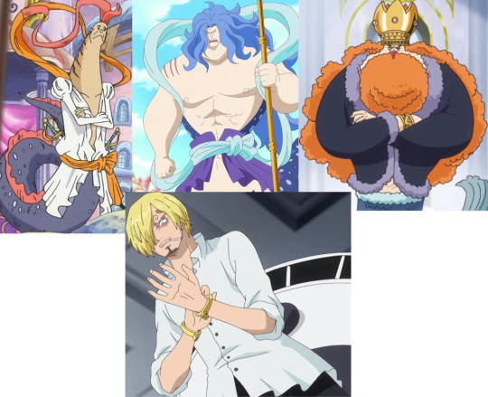
Hey you precious little cute artist chwan! Its me from heaven! You know the cause of this. That Sanji art... how could you make it so freaking amazing? Do you know how people will die seeing it? Have you ever wondered how creative you are? Do you even know how blessed we are to have you in this community? I blushed like an idiot looking at him.

Talking about the Sanji art, why was it so perfect? I need you to explain for making him exceptionally Gorgeous. The concept... how did you get the concept of All Green and now you are making it my obsession. How did you come up with it? Damn that was so creative. I became crazy over that Idea. Im in love... in love... with you and also Sanji. Thanks for making that art. From next time don't forget to keep your signature. I don't want people to steal your art.
Eeeeeeee you keep spoiling me afhjkas hehehe what am I gonna do I’m about to explode >///w///<
So, you wanna talk about thought process? I’d LOVE to! Please prepare to hear me gushing about it. It gonna be veeeryyyy looonggg ( ◕▿◕ )
Since Sanji was the first one to be designed, I was nervous at everything *wobbling novice sea witch at your service 👍*
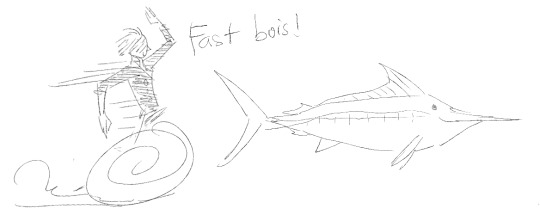
The first step is to choose what kind of fish. I like marine life but I didn’t like them that much to know more than a few common name. Initially I thought of dolphin, since they are very smart, and also a lil perv... And they blow clouds of water when they surface to breath, like someone’s smoking! So I started doing research to select a fitting species.

But while I was reading through various dolphin descriptions, two words caught my attention: FAST SWIMMER. I was like, wait who’s the fastest in the ocean??? So my research had come to a swift turning point, I abandoned the dolphin list to go through articles of “fastest fish in the world” instead.
That’s where I found out about the Black Marlin. Things clicked in place even faster than Sanji’s Diable Jambe 😆
The second step is to choose what he would wear, I just knew it had to be a white poet shirt, because Sanji. 👀
Took a few more look at the royal family attire and I was like, “yup! poet shirt and waist band, flowy flowy in the sea, seal the deal!” (you can see that in the initial sketch) This soon went through more changes, but at later stage.
The third step is to choose the vibe, setting, pose he’d be in. 3 words stuck with me whenever I think of Sanji: sadness (you could say he’s feeling blue, you know?, blue! 🤓), curiosity, and dream. So here we had pre-timeskip Sanji, maybe even a bit younger, the viewpoint going up, Sanji looking up too, like how one kept wondering about the strange world above but couldn’t go there, stuck in the depth of the ocean. Adding a book because he’s definitely a nerd! It’s supposed to be a cookbook or the encyclopedia of devil fruits.
The fourth step is lining. Troubles ensued! Lots of! The pose was haaarddd and I just couldn’t get the shirt hem to look right, it didn’t flow like I wanted, the tail design seemed bland, also his hair bang wanted to make me an enemy... I struggled, and the clock was ticking fast! So of course I did what an impatient one like me always do: Change the hard part.
I got rid of the flowy hem, decided to tuck it neatly in a leather-like band, eased up the pose, switched to post-timeskip design, enlarged the fins for dramatic effect, in the first place there were a line of diamond shape running along his tail (the part that helps a fish sense water pressure and stuffs, if I remember correctly), I turned that into Sanji’s swirls as well. The chosen book in the end was “Noland the Liar” because I wanted to slip in a mer!Noland and see if anyone would notice hehe..
Strings at collar and waist was added last as an attempt to balance the amount of black and white on character. Background was simply a bunch of water flows and bubbles, I tried to portray a fast current, hushing our boy to swim away, back to safe home.
The final silhouette and line of action wasn’t as nice as the sketch’s, but I’m not picky. *laziness will overwrite everything*

Finally, we crawled to the step I dreaded the most: coloring and shading... The tone was dark blue, giving of an even more ominous feeling I suppose? The next was this agonizing process of making the first thing to caught your eyes is his face, or better, his eyes, but definitely not his butt. TT_TT The black area was so strong, at one point I considered giving the (now blue) sea a plain black filling to neutralize the effect.
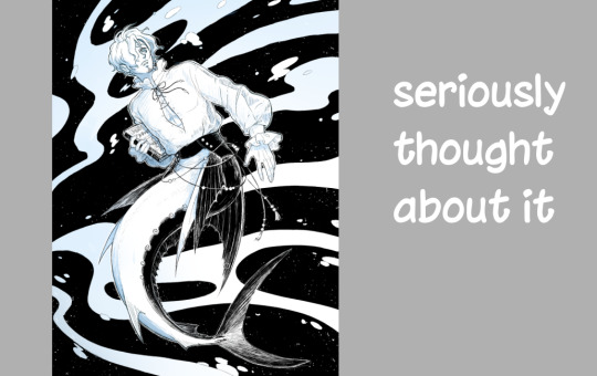
While taking care of the treacherous background, I pondered what Sanji’s All Blue would be, now that mermaid’s diet doesn’t include fish... 😂
Like, as a vegan cook, Sanji would want to get his hand on all kind of vegetable available in both world, sea and land? Then we must have the myth of a place, home to every plant possible? What’s the name?? All Green??? Yeah, All Green sounds legit.
When the piece was finally done, I uploaded it so fast I forgot the extra step of slapping on watermark! XD
Annnnd that’s that! That’s the whole process I went through drawing mer!Sanji. Thank you for hearing me out > 3 < 💖
15 notes
·
View notes
Note
Hello! Hope u are having a good day! :D
Umm just want to ask of your opinion... As someone who does art, if someone use your picture for things like making a collage or something related without giving you credit- either they know the picture is yours or they don’t know it’s yours -will you, let them? Like, will it be consider an insult and make you feel unappreciated? Just had something in mind...
What if instead of putting your name, they simply say “credits to the owners”, due to not knowing exactly are the owner of the drawing?
Will you feel offended, in any way?
Sorry for taking your precious time! > . <
hello, i hope you are having a nice day as well!
tldr: if youre doing it for your own personal use (meaning you are the only one who sees it, and wont post online) then please feel free to do so. if you are posting this collage online, you can do so but please give credit, cause i drew the original image in the first place. please dont confuse this with me allowing reposts. i only allow my work to be used in collages, amvs, etc. because its someone turning my work into something new. theres creativity behind it. and dont even say “credit to the original owners” to me, it lights a raging fire in me that can compare to no other
and here is the longwinded explanation :D
for me, it all depends on whether the collage is for personal use or if its going to be reshared online. personal use means only you or some select friends/family will see it. i know some people like to do collages for fun as a personal hobby and i think thats really cool and i would definitely allow my art to be used for something like that ^^! something like this will fall under personal use. using art as phone wallpapers also falls under this category (which is why you dont have to ask for my permission to use my stuff as wallpapers ^v^) because youre the only one seeing/using it!
of course, there are some people who use art for edits/amvs/collages that they post online like you said and i think thats great. i know i have no reposting in my bio, but for people who make these edits using others art, they are using their own creativity to make something new, with a work that i drew!!! i think thats super cool so of course i allow it. with. credit. im very thankful to the people who asked me for my permission first though, because it shows they care about the original artist ;v;. online, multiple eyes are seeing it and artists should be given credit when credit is due. reposting tho? no creativity at all. the laziest thing you can do to a piece of work. download image, upload to another site, post.
and i absolutely hate whenever i see “credits to the owner” because to me its the laziest and most disrespectful thing you can do to an artist. just the phrasing...irks me. like the person recognizes that they dont own the piece, the artist is the owner, and yet they are still reposting without permission. even a repost with no caption fills me with less rage than a “credits to the owner” so yes, i will be offended. please dont do that
please join me under the cut if you would like to see my explanation that has turned into a rant about reposting
and in some cases there is a watermark on the piece itself!!! clearly written!!! in plain view!!!! and yet people still write “credits to the owner”. like no, the owners name is clearly written on the watermark. plus it takes not even 5 minutes to put an image into a reverse image searcher and find the original artist. i have done this multiple times because yes, reposting without credit is really that common unfortunately and troublesome for people (me) who want to follow and support the original artists :/// my art has gotten reposted COUNTLESS of times with and without credit, and at this point ive given up on keeping track of and reporting them all cause theres just so many. im convinced i am aware of only 5% of all my art thats gotten reposted.
so to me, as a person who has gotten my art reposted countless of times, saying “credit to the owner”, even though i have written in both of my account descriptions NO REPOSTING in all capital letters, and have watermarked most of my work, is very disrespectful. i remember when my work started getting reposted A LOT for the first time, and i would get super angry every time it happened, and that rage has fizzled out now but it still remains. i still hate reposting with a burning passion.
i understand theres the innocent kind of reposting where the person is like “this art is so cool! i want to share this with everyone i know!!” (i know cause i did this in the past when i was a stupid kid) and then theres the kind of reposting that tries to gain likes and followers...off of someone elses work. off of something that they have not even made or own. how do you tell the difference between these kinds of reposting? the second one will probably have 100 something tags in the description :/...how lazy could that be? to use someone elses work for your own personal gain. my work is my work alone. if you want to get big on social media, do it with your own work. period.
i know im not alone on this because there is not a single artist i have seen who allows reposts with no credit. (and some reposters have the gall to say theyve done nothing wronggg oooooooo how inconsiderate can they possibly be ooooo im gonna kick them) theres some artists who dont allow reposts at all, no matter what condition, and i completely understand because someones art is their intellectual property, im done.
in conclusion please be considerate to artists, we already got it rough as it is ;-; (sorry for the super long answer ;;;;)
34 notes
·
View notes
Photo

“I don’t want to stir the pot…”
That’s what I told one of my friends the other day. I was talking about things I saw here and there especially regarding content creators, and I said I didn’t want to cause any trouble by bringing up some issues. But I feel like we had this conversation before and sadly it needs to happen again.
I think that if people knew the effort, time, and energy that goes behind creating content, then maybe they wouldn’t be so careless about posting uncredited stuff. And it’s not necessarily actively going to a creator’s blog and taking one of their posts and reposting it - no, sometimes the cycle goes like this: someone from instagram or twitter takes content from tumblr and they post it to their account, uncredited: if it’s an edit, the url is cropped out; if it’s a gif is simply uploaded as their own. Of course, the original creator was not asked about this. Then, another instagram account takes it and at best “credits” the first Instagram account that reposted in the first place. Meanwhile, the actual creator’s effort goes unnoticed.
(There’s not much we can do to stop that from happening, I’m afraid. And I won’t even get to mention Pinterest, which is another mess when it comes to crediting edits.)
But what happens next sometimes is that someone from tumblr sees this reposted content on instagram/twitter and just takes it and uploads it to their blog here, maybe only sourcing the instagram account or sometimes not even that. That’s one of my main issues with the “credit to: (ig account)”. Sometimes we don’t even know if they are the creators of said content - and if they are, writing “credit to” without checking with them to see if they are okay with their stuff being uploaded here is wrong too. I’ve seen a lot of amazing artwork posted here and credited to the artists on instagram or twitter, but I don’t really know if they are aware their art is circulating here. I know sometimes the position is thinking “well, instagram/twitter takes our content we might as well do the same”: I personally am not completely on board with that way of thinking. Same thing goes for accounts on other social media: writing “credit to meddows-taylor on tumblr” is not entirely okay either without checking. But what we can only control is what happens here, I guess.
The thing is tumblr is a sharing platform: we post stuff, people share it through reblogs, that gives creators the possibility of reaching more people that might not know us, and in return, our community grows. We can’t reach them if what other users solely do is liking posts, because “the sharing chain” gets cut. And what’s the consequence of that? That fewer and fewer creators are motivated to make content, to make edits, to gif stuff, to look for pictures, and make moldboards. And so we chip away the fandom base, day by day. Full disclosure: I personally also use likes as “bookmarks” and sometimes say to myself “oh I’ll reblog it later because I’m in a rush and I want to say something nice in the tags” or I forget later on. I vow to be better about it too. You have no idea what a nice comment in the tags, an ask giving us feedback, a new follower means for creators: it makes us happy, it motivates us, it fuels our creativity. And rebloging, in turns, makes us see what content is well-liked, helps us with feedback, and also allows us to get to know the people interacting with our content: that way the community grows, which is the main benefit of tumblr (that’s why events like @dtfrogertaylor‘s ones are so great, because it fuels us to create content but also makes us come together and meet new people we might haven’t interacted with yet)
I remember once someone saying it was “selfish” and “rude” to ask for credit or call out blogs that repost content systematically. I understand anyone can make an honest mistake without realizing, but if that happens, asking for credit where credit is due is not mean spirited. I don’t know something less selfish than creating content for others to enjoy, only asking that the effort behind it doesn’t go unnoticed. Just today I saw three “clearing out my camera roll” posts including gifs and edits by people I recognized instantly, and two new posts with gifs that even had a watermark on them. All of it without a single nod to the people who spent time and love making that happen.
I’m not one to start drama, anyone that knows me knows I try to reason with people and don’t mean to spread out hate: but I can’t really stay put solely to not “stir the pot” when I see friends get discouraged and unmotivated, when I see their work getting taken and dread to think we might not be able to enjoy their creations in the future because of it.
#I really hope this comes through as not meaning to cause drama for drama's sake#just felt I needed to say something#because this is still one of my favorite places to hang around make content for and I have so many friends here I care about#queen#bohemian rhapsody
53 notes
·
View notes
Text
fic graphics i made this year! ✨

orphan’s club | for my very first fic ever in my whole entire life! i think i wrote like 2? pieces of fiction before this point and one took place in a 7-11 and the other was about baked alaskas. okay i’m JUST connecting that to me doing diner fic for my first go. okay werk... i’m also really sad i lost the illustrator file to this bc i wanted to go back and color in my cookies. oi and i remember i originally wanted to doodle a different piece for each SECTION of the fic lmao the hubris!! but. looking at this, it really does have the most special place in my heart (’:
valyrian steel play | i’m obsessed with the catspaw dagger design so it makes up the two horns here! this one was quick work bc i already had the dagger done for a suuuper cursed illustration that i will never try showing anyone ever again (but i love it for ME). i really wanted these b&w headers to be a thing across my fics but for the life of me to this day, TO THIS DAY, i can NOT get my images on AO3 to center!! even if i use work skins!! america, explain???

blame it on the goose | oh what a sweet 2am it was putting this together realizing that geese are white like horses are white. listen. i fell so hard in love with this stoopit goose without ever playing its game. couldn’t even bear adding blood splatter to it. when the goose pic was missing a foot and part of its wing, i patched it out of love. it also has its own shadow on the rubble and i’m v proud of it even though it’s the easiest button to press on photoshop lmao
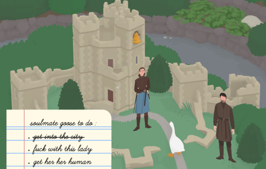
bonus in-game style! this is a collage! to-do list screencapped from here. arya and gendry are LUCKILY from a stock image!! otherwise i really was going to spend time vectorizing these little fucks even though i’ve only ever vectored objects. all i did was remove eyes, blacken gendry’s hair, and add head wound to arya. goose had me tooo committed to the visual. ps this sack of birb literally just goes around terrorizing towns and collecting golden bells from towers and you cannot tell me that that’s not king’s landing!! the one thrones crossover that's just meant to be.

storm uncles | oh gosh look away. this is the only place i’m going to share this one lol. truthfully making this gave me nothing but pure joy!! i used to stare at the image of the bg waves as i wrote and it would soothe me (’: this is still my first attempt at a multichap and i’m kinda back to believing i will finish it? i write dropped hard after the second chap and realized the orphan button is really good ux for inner saboteurs. but! i’m patient with the work it takes to unlearn self-doubt, embrace buckwilidism, and find solace in it’s not that serious. + i got two three?! really kind comments recently that multiplied the hope cells in my body. shoutsouts laura, anniephl, and risscat on ao3. ( : fun fact: after i finished writing renly for the first time, i read olenna’s first appearance in asos and a ton of her verbiage was down in my renly. the validation doth flowed even if they are not the same person but. the tyrellian adjacent extravagance and the baratheon petty is why i love my boy.

the muscle | this one came together pretty quickly and seamlessly and it’s now my favorite thing! the bg, band pic, wolf, and polaroid frame are all from stock. everything else is from like an online store’s product page lmao. watermark lines are still on the tickets but idgaf!! i also love owning a tablet just so i can use it for “lettering” that looks like this lol
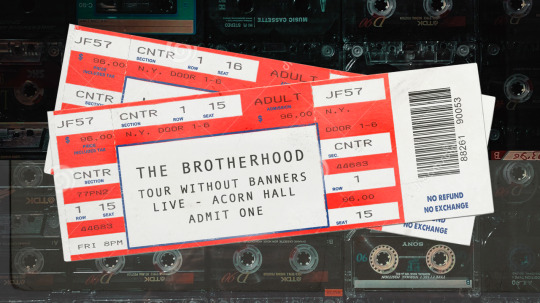
cute lil ticket closeup! cassette bg is stock and the yellowy layer is actually a postcard texture that i accidentally pasted and ended up liking bc it kinda looks like there’s a dirty glass case! i wish i took out the border on the left but it’s too late lmao
looking at this “progression” truly makes me so happy. i am an otter floating on its back hugging my five little shells like ah, yes, i will have the contentment and the buoyancy too. i love that fandom can be a space to just do what the fuck ever. it’s so freeing and jush-inducing to make things for fun again. next year i wanna experiment more with collages, maybe even doodle my first human body, and hopefully make things for others. just wanna get a little wonky, a little abstract, and a lot lot silly
to more creative nonsense in 2020! 🎉
17 notes
·
View notes
Text
I saw that ask meme with questions for gif makers going around, but I felt like answering them all on my own lmao
1. What are your top 3 favorite sets you’ve made
This one, this one (if the timing works lmao), and this one (I’m so proud of my AU gifsets... where did all that creativity go??)
2. What is your least favorite set you’ve made
I honestly don’t know... I don’t think I hate anything I’ve posted though. If I don’t like how it’s turning out, I just won’t post it lol
3. Which of your sets has the most notes
The most notes ever is this one I think
4. A set that flopped but deserved better
I don’t know... there’s a bunch, but I’m fine if a gifset flops
5. What is your favorite movie/TV show to gif
DOCTOR WHO
6. What is your least favorite movie/TV show to gif
I really don’t gif anything else lmao...
7. Who are your top 3 gif makers
I’ll just pick 3 people off the top of my head :) @shatner, @melodyspond, @stupidape
8. What gif trend do you hate
The pale/black and white gifs that are so hard to see.......
9. What/who inspired you to start making gifs
I wanted to gif my favourite parts of DW that I didn’t see anyone else doing, so I was like alrighty, time to learn how to do this!! I think the people that inspired me are long gone from tumblr, or I’m no longer following them because they’ve moved blogs (Natasha aka lumos-maxima... wherever you are, I MISS YOU... also Courtney aka needlebug I MISS YOU TOO)
10. What was the first gif you ever posted
THIS ONE! I remember being so happy about posting it, haha. Also, I still love that Confidential episode so much. I miss my space hipsters...
11. What is that one set you made that just won’t die
The Zoboomafoo one
12. What is the most embarrassing thing you’ve ever giffed
Everything I’ve ever posted
13. Where or from whom did you learn how to gif
Various tutorials on here and just by experimenting. I don’t even think I used Photoshop to begin with, since back in my Neopets days I used Paint Shop Pro to make graphics so I think that’s what I used first to try making gifs of videos.
14. How long does it usually take you to make a set
45 minutes to an hour or so?? It’s been taking longer and longer because the screencaps are so huge though and my poor laptop can’t handle it.
15. Have you ever had gifs stolen and reposted
Yes, and don’t think that I can’t tell when those are my gifs, even without a watermark!!
16. How long have you been making gifs
Since 2011...... my god
17. 10 sets, 8 sets, 6 sets? How many gifs to you prefer in a set
As many as it takes!!!!! But usually between 6-8
18. For the aesthetic, for the laughs, or for the feels what your preference
For FUN!
19. What is your gifting process like
Open video, find scene, screencap, load screencaps in Photoshop, resize to gif dimensions, add colouring, curse myself for picking a hard-to-colour scene, continue adjusting colouring and become increasingly frustrated because it’s not turning out the way I want it to, give up, add text, save gif, POST!
20. Mac or PC
PC
21. PSDs or original coloring for each gif
Original colouring. PSD who???
22. What fandom/movie/show/person etc do you gif the most
DOCTOR WHO and more specifically, David Tennant... I think his tag has the most :’)
23. What is the thing you gif when you don’t have anything else you want to gif
Any episode with Ten and Donna, or The Eleventh Hour, or the Day of the Doctor, or Blink
24. 480p 720p 1080p? What is the minimum quality you’ll gif from
I used to be all good with giffing 480p back in the day, but I guess now it’s 720p since the gif limits have gone way up.
25. Old dimensions or new dimensions and why
New dimensions because they look nicer on the dashboard.
26. How many un posted sets are in your drafts right now
ZERO.
27. Have you ever made a set, decided you hated it and deleted it? What was it
Probably at least one or twice, but I don’t remember.
28. Have you ever posted a set, regretted it and immediately deleted it
No, I don’t think so. I’m leaving my mistakes there for all to see!
29. Have you ever posted a set, realized you made a mistake later but it was already too late
Yes, I did this just the other day with that Missy, Bill and Nardole set. I got the dialogue slightly wrong lmao..... shh
30. How frequently do you like to post
I try to do at least one gifset a day if I can!
31. Do you schedule/queue posts or do you post right after you’re done
Right away. These gifsets are fresh off the grill.
32. What is your favorite tool/adjustment layer in Photoshop
Selective Color or Color Balance
33. Do you like to/can you make edits and graphics too or only gifs
Yes, I can do both but gifs are way more fun imo
34. A set that took you a long time/was really hard but you’re really proud of how it came out
I’m gonna say this one again because I was so proud of it when I made it, and I can’t believe I used to put that much effort into my gifs.
35. Do you change your giffing style a lot or do you have a set routine
I have a routine, as described above. My gifs are pretty much all made the same way as I describe in my colouring tutorial too.
36. Do you gif with something specific in mind or do you just wing it
Usually a mixture of both. I like to try to gif a different Doctor each day, so I’ll know who I have in mind but I’m not planning on a specific episode. I’ll just open up one of their series and go from there!
37. What sets if any do you have planned to make in the future
Idk, I was thinking of doing yet another gifset with Donna in it since I just finished her Big Finish series... but maybe I’ll do one with Eleven and the Ponds??? We’ll see.
38. What are you really excited to gif that isn’t out yet
The next Doctor Who holiday special?? :D
39. How often, if ever, do you delete old sets that you don’t like anymore
Never!! I love seeing how my gifs have slowly changed and improved over time.
40. Why do you make gifs
Because it’s fun, and it’s a way for me to relax after a long and busy day at work.
41. What is your least favorite part about your gif making process
When it takes forever for my screencaps to load, and when it takes forever for my gifs to save sometimes
42. How is your gif folder organized? Is it organized at all?
Lol nope.
43. Do you keep videos forever or delete them once you’re done giffing
I keep the episodes forever, but honestly I think I keep everything forever because I forget about getting rid of the other stuff like trailers and interviews... I should go through my downloads folder.
44. Ever had a gif become a meme? Would you like that if you haven't
I’ve had people use my gifs as reaction gifs and it is a weird feeling, especially seeing the gifs being used on websites other than tumblr. I remember seeing one of my gifs used in someone’s book review on Goodreads and I was like “WAIT THAT LOOKS FAMILIAR!!”
45. Ever gotten hate over a set
Not really hate, but I do get a lot people that are like “WHERE IS ______?” in their tags. And sometimes I just want to be like “Make your own gifs if you think they should be there!!!”
46. Ever gotten a really sweet compliment over a set
Yes :’)
47. Any advice for novice gif makers/people who want to start making gifs
Don’t give up!! Make gifs of whatever makes you happy, don’t worry about the notes too much, and use your tags! KEEP PRACTICING!
48. How would you describe your giffing style
I don’t know??? If someone else has a way to describe my style, then please let me know haha
49. How much would you say you’ve improved since you first started giffing
It’s been almost 9 years since I’ve started, so I hope I’ve improved quite a bit! :P
Well, that was fun. Congrats on making it to the end of this post!!! Now I will go make a gifset.
7 notes
·
View notes
Text
Learn Log #2 - Pixel Art Basics 2
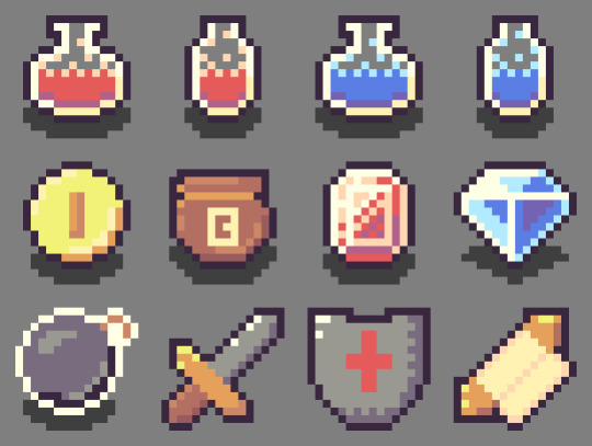
This week I continued learning the basics of pixel art and ended up making some pretty alright-looking RPG items. The topics covered this week were colour, shading and dithering and you can read about them below.
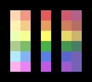
Colour
To understand colour in pixel art, you first need to understand colour. Colour theory explains the existence, and relationships, between the primary colours (red, blue and yellow) and the secondary colours (green, orange and purple). These colours and everything in between appear on the colour wheel, which we’ll get to in a second. What’s important to know is that these different colours can contrast against each other, complement each and give off different moods. I’m not going to go into depth but having some understanding of colour theory is essential in creating any artwork, including pixel art.
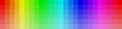
Anyway, that colour wheel I mentioned is vital to pixel art. Every digital art program you use for pixel art will include some form of the colour wheel which will allow you to select colours for your artwork. Below I’ve made a rough image of a colour bar with the very left pixel starting at hue 0 and the furthest right being hue 360 (each pixel increases hue by 15).

You’ll notice that hue 0 and 360 are both the same red. This is because a revolution around the colour wheel has been completed and we’re now back at square one. Remember that even in bar form this is a colour wheel – this information is key to utilising the colour wheel.
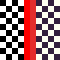
Now, looking at these colours, your eyes might start to tear up a bit. They’re very bright and harsh. If we put two contrasting colours, such as green and red, next to each other, this would only get worse. This limits our creativity and makes our games a bit irritating to play. So, if we lower the saturation and value of the colours a bit, it can make our pixels pleasant.
You’ll see here that I’ve reduced the value by 10 points making the colours a little darker and more comfortable on the eyes. You can also see the saturation decrease the further down the image the pixels are. Desaturation can also make your pixels less harsh. However, keep in mind that adjusting value and saturation will affect the mood of your game. Lighter, brighter games give off a friendly vibe while darker, desaturated games will give off a more serious vibe. You can also use these techniques on black and white pixels if you replace the white with a highly desaturated yellow and the black with a desaturated, dark purple as shown below.
Finally, if you’re looking for what colours to use in your pixel art piece or video game here’s some advice. 1) Make a colour palette – this will serve as a constant reference for what colours you’re using in the art. 2) To develop a palette, make a mock-up of your art – this will help you pick colours that work together and create a cohesive mood. 3) Remove unnecessary colours – keeping your colour palette simple or simplifying it as you go will make animation easier and make the art less noisy.
The final thing I’ll say is; use the HSV (Hue, Saturation and Value) measures and forget about RGB (Red, Green, Blue). I used RGB before this week and it pails in comparison to HSV. It might take some time to get used to, but it is crucial for nice shading, which I’ll explain later on.
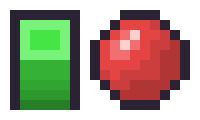
Shading
To discuss shading, we’ll be using this box and this sphere. Of course, they don’t really look like a box or sphere without shading, but we’ll get to that.

Someone starting out with pixel art, like myself, would usually just adjust the saturation and value measurements of the colour to achieve a brighter or darker tone. A lower saturation will give off the impression of brightness even if the value is at 100 by moving closer towards white. Meanwhile, decreasing the value moves the colour towards black making it darker. These new colours would be applied as shadows and highlights and often with gradients moving between the colours.
However, there is a much more interesting method of shading called hue shifting. In an environment, we will have a light source which may not be 100% white light. With hue shifting, we move towards the hue of the light source for brighter colours and for darker colours we move away from that light source (typically towards the opposite colour). This is why it is so important to ditch RGB and remember the properties of the colour wheel. Below are some examples of the different types of shading: the first image is of standard shading, the second is of hue shifting, and the third is a comparison.

You’ll immediately notice hue shifting is a lot more colourful and nicer to look at than standard shading. You’ll also see some colours seem a bit off (yellow, for example, shifts too far green and orange. This is because I simply followed the numerical values of the colour wheel. When using hue shifting, DO NOT do this. It can help a bit if you need guidance, but if you strictly follow the numbers, you’ll end up with weird colours. Go with your eye and what looks best.
Now let’s apply hue shifting to our box and sphere.
Looking much better! You’ll also notice I added another highlight to the sphere. This is because the sphere is also receiving indirect light bouncing up from the ground.
The formula for hue shifting goes:
Lighter = Hue Shift – Saturation + Value
Darker = Hue Shift – Saturation – Value (you can instead add saturation if you want brighter shadows)
The extent to which you manipulate these values will be part of your art’s style.
Dithering
Another method of shading used in retro machines that can still be used today is dithering. Dithering is used by alternating between colours in a pattern to trick the brain into thinking that the colour present is a combination of two different colours. There’s a couple of different ways to dither such as:
Uniform dithering – alternating each pixel between the colours
Pattern dithering – making a pattern transition between the colours
Random dithering – scattering the pixels randomly
Dithering is useful if working with limited palettes and works great with larger pieces. However, dithering between similar colours might not make a difference, and too much dithering can make an image noisy.
Week 2 Practice
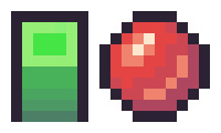
I wanted to make some fantasy RPG items for this week’s practice following HeartBeast’s and Davit Masia’s videos on item and gem icons. The first thing I did was create a colour range, as shown below. To make this, I picked out the six primary and secondary colours on the colour wheel and adjusted them to a tone that fit what I wanted. Next, I hue shifted them to create two brighter and two darker tones each.
This range allowed me to easily pick and choose colours for my colour palette. If I felt any of the colours from the range needed to be different, I just adjusted them in the palette. I decided on working with a small palette for the twelve items I was making and choose 16 colours as I was working in a 16x16 space. Within the palette, there are fifteen grids with the colour white and fourteen others. The sixteenth colour used was the black outline surrounding the palette.

I based these colours off a list of ideas I had which include health and mana potions, currency (coins, a bag of coins, gems), and weapons (bombs, sword, shield, spell scroll). To test out the colours I’d picked for my rough palette, I made line art of the items and roughly coloured in each item (Note: the grey background was not part of the colour palette).
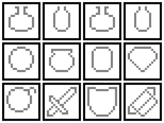
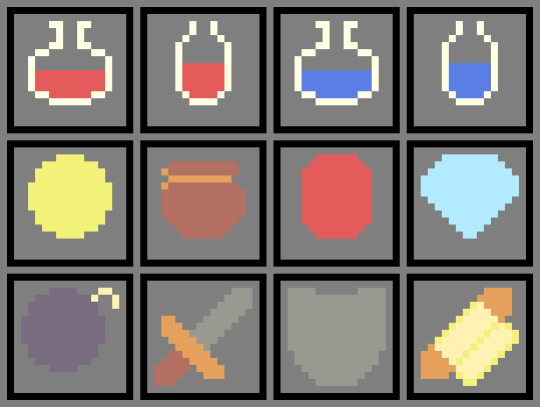
I assessed what I had and realised I wasn’t going to use green anywhere. I removed both shades of green from the palette giving me two spaces if I needed any new colours. I then proceeded to add more detail to the icons, including shading, and outlined each object so they stood out from the background. After a while, I realised that I needed some more brown tones as the coin bag and sword lacked some necessary shading. I used the new two spots in my palette for a lighter tone and a darker tone and finished my items.
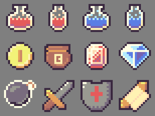
Now that I felt happy with my items, I quickly added a small shadow beneath each of the items I’d consider ‘pick-ups’ and animated them into a little GIF (apologies for the watermark). This was where I completed the piece.

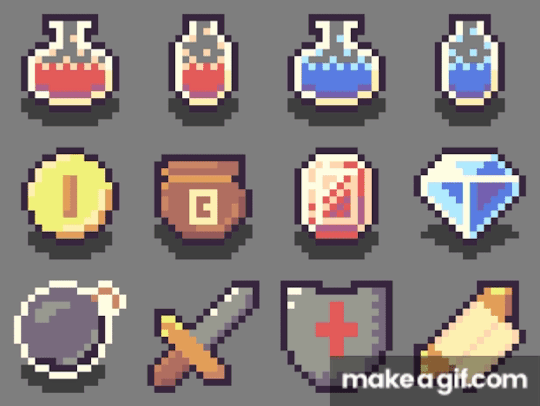
Reflecting on the piece, I think the items look pretty good. The form of the sword could use some work – the addition of the outline made it a bit big, turning it into a toy sword. Also, the shading of the coin, bomb and shield could all be a bit better, but I feel like I did an ok job with the limited palette.
The End
So, that concludes this week’s learn log. Next week I’m moving away from learning the basics and starting with GUI pixel art including logos, fonts, buttons and cursors so follow my blog if you’re interested.
My learning and this blog post wouldn’t have been made possible without these amazing resources. Go check them out if you wanna learn some stuff about pixel art!
Pixel Art 101: ‘Colour Palette’ by Pixel Pete
How to Colour Pixel Art by TutsByKai
How to Pick Nice Colours by MortMort
Pixel Art 101: ‘Shading’ by Pixel Pete
Hue Shifting in Pixel Art by Brandon James Greer
Dithering and Pixel Art by Armitage Games
[Let’s Pixel] 18x18 Item Icons by HeartBeast
How to Start in Pixel Art by Davit Masia
3 notes
·
View notes
Video
“How Soon Is Now?” (Sawyer/Kate/Jack, Lost)
Created in 2005
STOP THE VID FROM AUTO PLAYING UNTIL YOU READ THE WARNINGS.
WARNING LIEK WOAH FOR FLASHING EFFECTS AND QUICK CUTTING. SERIOUSLY, THERE ARE SOME HARDCORE STROBE EFFECTS IN THIS BECAUSE I APPARENTLY THOUGHT BLINDING PEOPLE COUNTED AS ART, LOL.
ALSO, THE MUSIC SEEMS ESPECIALLY LOUD SO GUARD YOUR EARS IF YOU’RE WEARING HEADPHONES. ;)
Heh, this is a genuine Blast From The Paaaast, lol! One of my very earliest of vids, made with the basic Windows Movie Maker that allowed me to do 2 things and 2 things alone: fade one clip into another (if I got creative, I could TRY to make it look like one clip was overlaid onto the other but none of them were, they all were just ridiculously long fades) and add one audio track. I couldn’t even add a watermark, lol. Dude, I couldn’t even do a fade in/out to black or white. All those you see in the vid were me fading a plain black or plain white still picture into the clip to try to mimic a fade in/out, lol! (That’s why they’re so harsh.) But, in my effort to put my own spin on things, I used my Paintshop Pro and Animation Shop to try to get my freak flag flying, lol!
It was just funny to see this again (I was trying to remember which version I’d used of this song and figured the fastest way to find out was to check the vid - it was by t.A.T.u. ;) ). I think I’ve come a long way in vidding in the 14 years since I made this but I think I’ve also lost some things, too. That “necessity is the mother of invention” spark that had me painstakingly and lovingly creating lightning out of Paintshop’s lightning stamp tool thing so I could animate it and try to get the motion in the vid that I felt it needed. And I should mention, I had to create that lightning as a GIF then import that onto the single video track. I couldn’t time it directly on the video track, so I had to make a MILLION GIFs with different frame properties to try and get the timing right, lol! EVERYTHING that isn’t just straight-up moving scene from the show was a still picture animated effect.
It’s much easier to vid things like this now and, yeah, this looks heckin’ low-tech and, dare I say, low-brow, even. The quality is trash because I only had tiny clips to work with and WMM hardly could render in HD, lol. (I don’t think HD was actually a thing at that point in time? I don’t know. I know WMM basic didn’t have it, that’s for sure!) But I remember how satisfying it was to FINALLY get that lightning timed in. I remember how many people asked me what effect I’d used in Vegas to do that silver metal flashing effect over their faces (that was all a bazillion still pictures lovingly prepped and animated) and how good it made me feel for them to be all, “Wow, that was a LOT of work, cool!”
It was a different time to be a vidder, then. There was a strong sense of community where people loved sharing tips and techniques and hey, would even give you a hand by creating a section of video for you to use in your own video if you wanted (I made people some goofy animated things, mainly causing people to disappear, that they didn’t have the means to do themselves). I was nowhere near professional at it but it made me so happy to be able to make something that people seemed to appreciate being able to use for their own vid.
The nostalgia is strong tonight, wow. ;) Anyway, don’t know that anybody cares to watch this or read my supa-long ramblings about it. I just felt like posting it and rambling, I guess! ;) If you watch, I hope you’re not temporarily blinded or anything because, dude, I loved the INTENSE FLASHING THINGS back then, lol!
Enjoy if you watch. I understand if you don’t. ;)
PS - If this still manages to autoplay and mess up your dash, let me know and I’ll take it down. I ABSOLUTELY don’t want to hurt anybody with this. Please let me know, okay?
#lost#sawyer/kate/jack#trigger warning: flashing lights#strobe lights#aislynn's vids#blast from the past
5 notes
·
View notes
Text
Not Working Much

I sat in the restaurant, opposite my friend, who I hadn’t seen in a little while and stared at him - surprised at what I had just heard.
"Sorry?” I replied.
“Are you not working as much as you used to?” He asked.
“What makes you ask that?” I was a little confused by his question.
“It’s just that I’m not seeing much go up on your social media recently.” He answered.
The penny dropped and I smiled back at him. “Oh, I get it...”
Unfortunate Impressions
I explained that since I restructured my business last year and started investing in new equipment, I had to make some key decisions.
Those decisions were based on what kept my accountant and the bank manager happy. It was all down to the realities of earning money, paying bills and balancing my work and home life.
I assured him that I was as busy as I have ever been (actually getting busier with video creeping more and more into the creative process), it was just that I was working differently and I had made the conscious decision to not post as much on social media.
A previous blog post details why I suspended my Instagram account and alongside that went the Pinterest account. That process also sparked a review of both my Facebook and Twitter accounts.
My Thought Process?
Social media platforms have evolved over the past two or three years, no longer the easy route to engaging with millions of people.
In fact, the increasing commercialisation of those platforms has meant that business pages are having their reach regularly reduced and every post is followed by the support team telling you that your post could reach more customers...if you pay them some money to promote it and detail the demographics of the type of person you want to reach.
The reality is that I don’t want to pay to promote a photo that is being distributed via an agency, news or stock site - in fact, there are increasing restrictions on how I make work available and where, and the cost implications that result from those decisions.
I’ve been engaging directly with clients, supplying a national agency and uploading on a regular basis to a stock/news site. This is taking most of my time and something has to give.
It’s social media that has made way, with me posting less content.
At the same time, I’ve wanted to continue to support local sport, but the changing face of local news coverage, the reduction of sales of photos to local clubs, teams, and players (a lot of people are seemingly happy to use watermarked images rather than commission or licence them) means that it has become tougher to justify spending two, three or more hours providing coverage essentially for free - when I could be working on commissioned projects.
I still try to cover local grassroots sport, but at the end of the day, I’ve got to put food on the table for my six and eleven-year-old (although I could do with eating less!).
I don’t want this to sound like I am complaining - I’m not - but there aren’t many people who would be happy (or more to the point, could afford) to ply their trade for nothing, devoting many hours for a few likes on social media.
Local Agency Thoughts
As an aside...one of the things I’d love to do is work with a local agency in and around Harrogate.
As part of my changing priorities, this has been identified as one of Caught Lights’ business and my personal aims to achieve in the next 12 months.
I would love to collaborate with local creative people to continue developing video, photography and design projects to a local, national and international audience.
If you would like to find out more - contact me and we can talk.
Taking a Sip of Beer
Getting back to the main reason for this ramble...
So I finished my explanation of why I hadn’t been posting as much on social media and took a sip of beer. My friend smiled back at me.
“Makes sense” He nodded in agreement.
We finished our lunch, chatting about his work, my work and putting the general ills of the world to right - but didn’t once mention Brexit.
A good lunch!
#photography#sports photography#business#Harrogate#Yorkshire#North Yorkshire#sport#sports#agency#PR#professional#creative#pr agency#thoughts
1 note
·
View note
Last Seen Blogs
piifpoftbum
DONT KILL MY VIBE

uriekukistan
(・・?)

1courtneymak-blog
Untitled

fangirlhours
Fangirling & Stuff
luxaria-nocturne
Thoughts for Sharing