#Visual Effects with Green Screen
Text
youtube
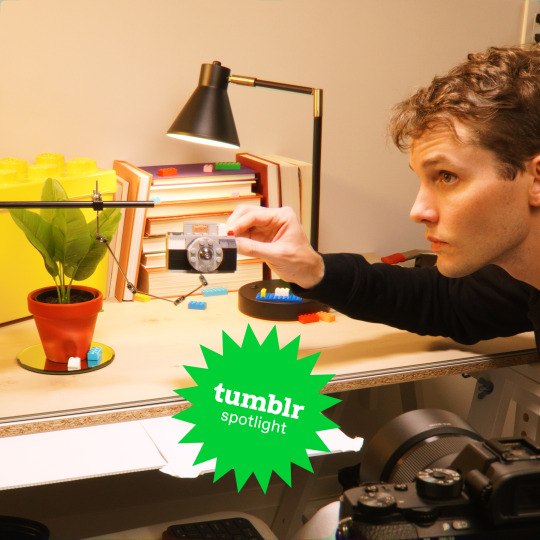
Quick Tip: Expanding and Contracting Text in Green Screen by DoInk
Welcome to our quick tip tutorial on expanding and contracting text in Green Screen by DoInk! This tip also applies to other segments used in the App, like photos or animations! In this blog post and accompanying video tutorial, we'll explore how to dynamically animate text to create engaging visual effects. Whether you're a teacher adding flair to educational videos or a content creator enhancing your projects, mastering this technique will elevate your productions and captivate your audience.
What you will learn:
Introduction to expanding and contracting text in Green Screen by DoInk
Quick tip guide on animating text for visual impact
Tips and techniques for creating smooth and eye-catching text animations
Real-world examples showcasing the versatility of animated text
Elevating your projects with captivating typography
With Green Screen by DoInk, creating dynamic text animations is both easy and impactful. Whether you're highlighting key points, emphasizing titles, or adding visual flair, mastering this technique is essential for crafting captivating visuals that leave a lasting impression.
#Green Screen by DoInk#Text Animation Tutorial#Quick Tip Tutorial#Visual Effects with Green Screen#DoInk Tutorial for Educators and Content Creators#Creating Dynamic Text Animations#Smooth Text Transitions#Captivating Typography Techniques#Do Ink#DoInk#How to use DoInk#DoInk App#Youtube
0 notes
Text
"No one really cared about the film industry, then Nude John Cena walked in"

This Lifehacker description is brilliant. Because it did go viral, and the VFX industry could do the same thing. Next awards ceremony, everyone shows up dressed like THIS.
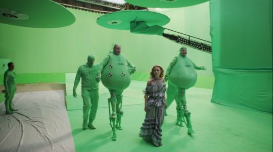


They discuss how shitty VFX artists get treated. How it takes forever for them to get paid, IF they ever get paid, and if every time they so much as think about forming a union, a producer goes, "Fine, we'll just outsource," so they back down. And in an interview on the red carpet, John Cena, sporting green pants and face dots, says, "I can disappear, of course," as he does he signature hand movement, "but that's it. The VFX people have to do everything else, like, if I want to look like a dragon or something."
I remember the year they tried. When there were articles, when people were talking about it. Changing our FB profile photos to green, representing green screen. I waited and hoped and looked for updates. Nothing changed. My best friend recently waited close a year TWICE to get paid for projects he worked on. This is a guy who's done this for decades, who had his videos playing at Cape Canaveral on a loop, who made me gape years ago at a 3D image of the inside of an intestine he'd created from nothing, who learns the newest VFX software because it's fun, and giggles with glee as he makes something explode.
In some imaginary world where I'm big in Hollywood and had phone numbers of agents and famous actors and actresses, once costume designers get the respect they deserve, doing this next year could be cool.
6 notes
·
View notes
Text
A behind the scenes look at the stunning visual effects work on Hollowman (1999).
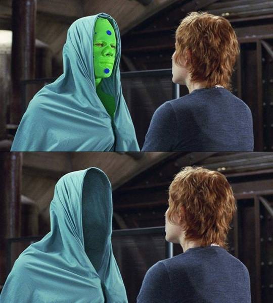
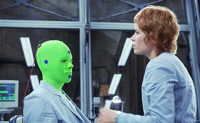
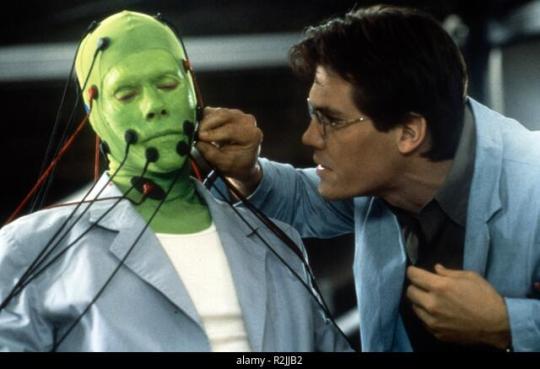
Hollowman, 2000
Dir. Paul Verhoeven
#hollow man#behind the camera#visual effects#vfx#horror aesthetic#horror#movie#horror movies#film#horror film#classic horror#horror icons#slashers#reblog#green screen#green suit#kevin bacon#2000s horror#2000s nostalgia#early 2000s#2000s#horror behind the scenes#likeformore#followforback#followforlike#likeforme#monday#daily flicks#daily flix#follow for fun
17 notes
·
View notes
Text


Greenscreen
#greenscreen#green screen#fails#photos#television#movies#visual effects#unreality#made-up aesthetic#nonsense aesthetic#aesthetic#aesthetics#aesthetic moodboard#moodboard aesthetic
1 note
·
View note
Text
#Gym Cycling Exercise#Green Screen Effect#Gym Cycle Animation#Workout Video#Virtual Cycling Experience#Fitness Adventure#Animated Landscapes#Indoor Cycling Workout#Calorie Burning Exercise#Endurance Building#Immersive Fitness Experience#Virtual Cycling Class#Green Screen Cycling#Animated Gym Cycle#Visual Workout Journey
0 notes
Text
NR6RYs
CLICK HEAR TO HAVE SOME FUN!

#visual effects#showcase#short movie#props#green screen#3dprinting#video editor#videography#video production#animal crossing villagers
0 notes
Text
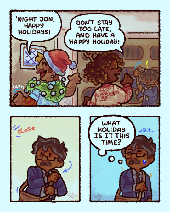
Based off of a personal experience I had earlier last week. Sometimes I forget Christian holidays exist despite them being treated as the most important thing ever by the majority here. And I think Jon would do the same thing (I'm projecting).
------
[ID: A Magnus Archives comic featuring Timothy Stoker, Sasha James, and Jonathan Sims.
Tim is a light brown skinned, Puerto Rican man with bleached bangs, short brown hair and a mustache. He's wearing a light blue Hawaiian shirt with sharks on it that are each wearing a red Santa hat that matches the one on his own head. He's also wearing a green boa with bells around his neck.
Sasha is an black British woman with dreadlocks that are all bleached at the ends and yellow glasses. She's wearing antlers on her head, and a white and red knit sweater.
Jon is a brown man with short black and grey hair and rectangular glasses and a mustache. He's wearing a two piece navy blue suit, over a white shirt and black tie. He's holding a brown satchel.
Panel one) Tim and Sasha are waving goodbye to Jon as they leave. Tim says "'night, Jon. Happy holidays!" Sasha says "Don't stay too late. And have a happy holiday!" Jon, off to the side is in the middle of equipping his satchel.
Panel two) A close up of Jon and he finishes putting the satchels strap over his shoulder. He watches his colleagues leave off screen. There is a visual sound effect of the door closing.
Panel three) Jon let's go of his satchel and thinks to himself with a slightly confused and awkward ecpression, "Wait... What holiday is it this time?"
\End ID]
#thinking that i might not make much tma art next year and this might be my last for a while#i wanna move on to more personal stuff yknow?#but i hope you all enjoy this piece at least!#tma#the magnus archives#tim stoker#sasha james#jonathan sims#my art#comic#came back to add some tags that i forgot->#muslim jonathan sims#Muslim jon
1K notes
·
View notes
Text
Does anyone else think that maybe special effects actors for action movies have had to key out the color green from their minds? How else can anyone take this seriously
Don’t get me wrong, I’m a BIG fan. But I think the idea of eventually phasing the color green out of your mind is pretty damn funny.
0 notes
Text
why Aurora's art is genius
It's break for me, and I've been meaning to sit down and read the Aurora webcomic (https://comicaurora.com/, @comicaurora on Tumblr) for quite a bit. So I did that over the last few days.
And… y'know. I can't actually say "I should've read this earlier," because otherwise I would've been up at 2:30-3am when I had responsibilities in the morning and I couldn't have properly enjoyed it, but. Holy shit guys THIS COMIC.
I intended to just do a generalized "hello this is all the things I love about this story," and I wrote a paragraph or two about art style. …and then another. And another. And I realized I needed to actually reference things so I would stop being too vague. I was reading the comic on my tablet or phone, because I wanted to stay curled up in my chair, but I type at a big monitor and so I saw more details… aaaaaand it turned into its own giant-ass post.
SO. Enjoy a few thousand words of me nerding out about this insanely cool art style and how fucking gorgeous this comic is? (There are screenshots, I promise it isn't just a wall of text.) In my defense, I just spent two semesters in graphic design classes focusing on the Adobe Suite, so… I get to be a nerd about pretty things…???
All positive feedback btw! No downers here. <3
---
I cannot emphasize enough how much I love the beautiful, simple stylistic method of drawing characters and figures. It is absolutely stunning and effortless and utterly graceful—it is so hard to capture the sheer beauty and fluidity of the human form in such a fashion. Even a simple outline of a character feels dynamic! It's gorgeous!
Though I do have a love-hate relationship with this, because my artistic side looks at that lovely simplicity, goes "I CAN DO THAT!" and then I sit down and go to the paper and realize that no, in fact, I cannot do that yet, because that simplicity is born of a hell of a lot of practice and understanding of bodies and actually is really hard to do. It's a very developed style that only looks simple because the artist knows what they're doing. The human body is hard to pull off, and this comic does so beautifully and makes it look effortless.
Also: line weight line weight line weight. It's especially important in simplified shapes and figures like this, and hoo boy is it used excellently. It's especially apparent the newer the pages get—I love watching that improvement over time—but with simpler figures and lines, you get nice light lines to emphasize both smaller details, like in the draping of clothing and the curls of hair—which, hello, yes—and thicker lines to emphasize bigger and more important details and silhouettes. It's the sort of thing that's essential to most illustrations, but I wanted to make a note of it because it's so vital to this art style.
THE USE OF LAYER BLENDING MODES OH MY GODS. (...uhhh, apologies to the people who don't know what that means, it's a digital art program thing? This article explains it for beginners.)
Bear with me, I just finished my second Photoshop course, I spent months and months working on projects with this shit so I see the genius use of Screen and/or its siblings (of which there are many—if I say "Screen" here, assume I mean the entire umbrella of Screen blending modes and possibly Overlay) and go nuts, but seriously it's so clever and also fucking gorgeous:
Firstly: the use of screened-on sound effect words over an action? A "CRACK" written over a branch and then put on Screen in glowy green so that it's subtle enough that it doesn't disrupt the visual flow, but still sticks out enough to make itself heard? Little "scritches" that are transparent where they're laid on without outlines to emphasize the sound without disrupting the underlying image? FUCK YES. I haven't seen this done literally anywhere else—granted, I haven't read a massive amount of comics, but I've read enough—and it is so clever and I adore it. Examples:


Secondly: The beautiful lighting effects. The curling leaves, all the magic, the various glowing eyes, the fog, the way it's all so vividly colored but doesn't burn your eyeballs out—a balance that's way harder to achieve than you'd think—and the soft glows around them, eeeee it's so pretty so pretty SO PRETTY. Not sure if some of these are Outer/Inner Glow/Shadow layer effects or if it's entirely hand-drawn, but major kudos either way; I can see the beautiful use of blending modes and I SALUTE YOUR GENIUS.
I keep looking at some of this stuff and go "is that a layer effect or is it done by hand?" Because you can make some similar things with the Satin layer effect in Photoshop (I don't know if other programs have this? I'm gonna have to find out since I won't have access to PS for much longer ;-;) that resembles some of the swirly inner bits on some of the lit effects, but I'm not sure if it is that or not. Or you could mask over textures? There's... many ways to do it.
If done by hand: oh my gods the patience, how. If done with layer effects: really clever work that knows how to stop said effects from looking wonky, because ugh those things get temperamental. If done with a layer of texture that's been masked over: very, very good masking work. No matter the method, pretty shimmers and swirly bits inside the bigger pretty swirls!
Next: The way color contrast is used! I will never be over the glowy green-on-black Primordial Life vibes when Alinua gets dropped into that… unconscious space?? with Life, for example, and the sharp contrast of vines and crack and branches and leaves against pitch black is just visually stunning. The way the roots sink into the ground and the three-dimensional sensation of it is particularly badass here:

Friggin. How does this imply depth like that. HOW. IT'S SO FREAKING COOL.
A huge point here is also color language and use! Everybody has their own particular shade, generally matching their eyes, magic, and personality, and I adore how this is used to make it clear who's talking or who's doing an action. That was especially apparent to me with Dainix and Falst in the caves—their colors are both fairly warm, but quite distinct, and I love how this clarifies who's doing what in panels with a lot of action from both of them. There is a particular bit that stuck out to me, so I dug up the panels (see this page and the following one https://comicaurora.com/aurora/1-20-30/):

(Gods it looks even prettier now that I put it against a plain background. Also, appreciation to Falst for managing a bridal-carry midair, damn.)
The way that their colors MERGE here! And the immense attention to detail in doing so—Dainix is higher up than Falst is in the first panel, so Dainix's orange fades into Falst's orange at the base. The next panel has gold up top and orange on bottom; we can't really tell in that panel where each of them are, but that's carried over to the next panel—

—where we now see that Falst's position is raised above Dainix's due to the way he's carrying him. (Points for continuity!) And, of course, we see the little "huffs" flowing from orange to yellow over their heads (where Dainix's head is higher than Falst's) to merge the sound of their breathing, which is absurdly clever because it emphasizes to the viewer how we hear two sets of huffing overlaying each other, not one. Absolutely brilliant.
(A few other notes of appreciation to that panel: beautiful glows around them, the sparks, the jagged silhouette of the spider legs, the lovely colors that have no right to make the area around a spider corpse that pretty, the excellent texturing on the cave walls plus perspective, the way Falst's movements imply Dainix's hefty weight, the natural posing of the characters, their on-point expressions that convey exactly how fuckin terrifying everything is right now, the slight glows to their eyes, and also they're just handsome boys <3)
Next up: Rain!!!! So well done! It's subtle enough that it never ever disrupts the impact of the focal point, but evident enough you can tell! And more importantly: THE MIST OFF THE CHARACTERS. Rain does this irl, it has that little vapor that comes off you and makes that little misty effect that plays with lighting, it's so cool-looking and here it's used to such pretty effect!
One of the panel captions says something about it blurring out all the injuries on the characters but like THAT AIN'T TOO BIG OF A PROBLEM when it gets across the environmental vibes, and also that'd be how it would look in real life too so like… outside viewer's angle is the same as the characters', mostly? my point is: that's the environment!!! that's the vibes, that's the feel! It gets it across and it does so in the most pretty way possible!
And another thing re: rain, the use of it to establish perspective, particularly in panels like this—

—where we can tell we're looking down at Tynan due to the perspective on the rain and where it's pointing. Excellent. (Also, kudos for looking down and emphasizing how Tynan's losing his advantage—lovely use of visual storytelling.)
Additionally, the misting here:

We see it most heavily in the leftmost panel, where it's quite foggy as you would expect in a rainstorm, especially in an environment with a lot of heat, but it's also lightly powdered on in the following two panels and tends to follow light sources, which makes complete sense given how light bounces off particles in the air.
A major point of strength in these too is a thorough understanding of lighting, like rim lighting, the various hues and shades, and an intricate understanding of how light bounces off surfaces even when they're in shadow (we'll see a faint glow in spots where characters are half in shadow, but that's how it would work in real life, because of how light bounces around).
Bringing some of these points together: the fluidity of the lines in magic, and the way simple glowing lines are used to emphasize motion and the magic itself, is deeply clever. I'm basically pulling at random from panels and there's definitely even better examples, but here's one (see this page https://comicaurora.com/aurora/1-16-33/):

First panel, listed in numbers because these build on each other:
The tension of the lines in Tess's magic here. This works on a couple levels: first, the way she's holding her fists, as if she's pulling a rope taut.
The way there's one primary line, emphasizing the rope feeling, accompanied by smaller ones.
The additional lines starbursting around her hands, to indicate the energy crackling in her hands and how she's doing a good bit more than just holding it. (That combined with the fists suggests some tension to the magic, too.) Also the variations in brightness, a feature you'll find in actual lightning. :D Additional kudos for how the lightning sparks and breaks off the metal of the sword.
A handful of miscellaneous notes on the second panel:
The reflection of the flames in Erin's typically dark blue eyes (which bears a remarkable resemblance to Dainix, incidentally—almost a thematic sort of parallel given Erin's using the same magic Dainix specializes in?)
The flowing of fabric in the wind and associated variation in the lineart
The way Erin's tattoos interact with the fire he's pulling to his hand
The way the rain overlays some of the fainter areas of fire (attention! to! detail! hell yeah!)
I could go on. I won't because this is a lot of writing already.
Third panel gets paragraphs, not bullets:
Erin's giant-ass "FWOOM" of fire there, and the way the outline of the word is puffy-edged and gradated to feel almost three-dimensional, plus once again using Screen or a variation on it so that the stars show up in the background. All this against that stunning plume of fire, which ripples and sparks so gorgeously, and the ending "om" of the onomatopoeia is emphasized incredibly brightly against that, adding to the punch of it and making the plume feel even brighter.
Also, once again, rain helping establish perspective, especially in how it's very angular in the left side of the panel and then slowly becomes more like a point to the right to indicate it's falling directly down on the viewer. Add in the bright, beautiful glow effects, fainter but no less important black lines beneath them to emphasize the sky and smoke and the like, and the stunningly beautiful lighting and gradated glows surrounding Erin plus the lightning jagging up at him from below, and you get one hell of an impactful panel right there. (And there is definitely more in there I could break down, this is just a lot already.)
And in general: The colors in this? Incredible. The blues and purples and oranges and golds compliment so well, and it's all so rich.
Like, seriously, just throughout the whole comic, the use of gradients, blending modes, color balance and hues, all the things, all the things, it makes for the most beautiful effects and glows and such a rich environment. There's a very distinct style to this comic in its simplified backgrounds (which I recognize are done partly because it's way easier and also backgrounds are so time-consuming dear gods but lemme say this) and vivid, smoothly drawn characters; the simplicity lets them come to the front and gives room for those beautiful, richly saturated focal points, letting the stylized designs of the magic and characters shine. The use of distinct silhouettes is insanely good. Honestly, complex backgrounds might run the risk of making everything too visually busy in this case. It's just, augh, so GORGEOUS.
Another bit, take a look at this page (https://comicaurora.com/aurora/1-15-28/):

It's not quite as evident here as it is in the next page, but this one does some other fun things so I'm grabbing it. Points:
Once again, using different colors to represent different character actions. The "WHAM" of Kendal hitting the ground is caused by Dainix's force, so it's orange (and kudos for doubling the word over to add a shake effect). But we see blue layered underneath, which could be an environmental choice, but might also be because it's Kendal, whose color is blue.
And speaking off, take a look at the right-most panel on top, where Kendal grabs the spear: his motion is, again, illustrated in bright blue, versus the atmospheric screened-on orange lines that point toward him around the whole panel (I'm sure these have a name, I think they might be more of a manga thing though and the only experience I have in manga is reading a bit of Fullmetal Alchemist). Those lines emphasize the weight of the spear being shoved at him, and their color tells us Dainix is responsible for it.
One of my all-time favorite effects in this comic is the way cracks manifest across Dainix's body to represent when he starts to lose control; it is utterly gorgeous and wonderfully thematic. These are more evident in the page before and after this one, but you get a decent idea here. I love the way they glow softly, the way the fire juuuust flickers through at the start and then becomes more evident over time, and the cracks feel so realistic, like his skin is made of pottery. Additional points for how fire begins to creep into his hair.
A small detail that's generally consistent across the comic, but which I want to make note of here because you can see it pretty well: Kendal's eyes glow about the same as the jewel in his sword, mirroring his connection to said sword and calling back to how the jewel became Vash's eye temporarily and thus was once Kendal's eye. You can always see this connection (though there might be some spots where this also changes in a symbolic manner; I went through it quickly on the first time around, so I'll pay more attention when I inevitably reread this), where Kendal's always got that little shine of blue in his eyes the same as the jewel. It's a beautiful visual parallel that encourages the reader to subconsciously link them together, especially since the lines used to illustrate character movements typically mirror their eye color. It's an extension of Kendal.
Did I mention how ABSOLUTELY BEAUTIFUL the colors in this are?
Also, the mythological/legend-type scenes are illustrated in familiar style often used for that type of story, a simple and heavily symbolic two-dimensional cave-painting-like look. They are absolutely beautiful on many levels, employing simple, lovely gradients, slightly rougher and thicker lineart that is nonetheless smoothly beautiful, and working with clear silhouettes (a major strength of this art style, but also a strength in the comic overall). But in particular, I wanted to call attention to a particular thing (see this page https://comicaurora.com/aurora/1-12-4/):

The flowing symbolic lineart surrounding each character. This is actually quite consistent across characters—see also Life's typical lines and how they curl:

What's particularly interesting here is how these symbols are often similar, but not the same. Vash's lines are always smooth, clean curls, often playing off each other and echoing one another like ripples in a pond. You'd think they'd look too similar to Life's—but they don't. Life's curl like vines, and they remain connected; where one curve might echo another but exist entirely detached from each other in Vash's, Life's lines still remain wound together, because vines are continuous and don't float around. :P
Tahraim's are less continuous, often breaking up with significantly smaller bits and pieces floating around like—of course—sparks, and come to sharper points. These are also constants: we see the vines repeated over and over in Alinua's dreams of Life, and the echoing ripples of Vash are consistent wherever we encounter him. Kendal's dream of the ghost citizens of the city of Vash in the last few chapters is filled with these rippling, echoing patterns, to beautiful effect (https://comicaurora.com/aurora/1-20-14/):

They ripple and spiral, often in long, sinuous curves, with smooth elegance. It reminds me a great deal of images of space and sine waves and the like. This establishes a definite feel to these different characters and their magic. And the thing is, that's not something that had to be done—the colors are good at emphasizing who's who. But it was done, and it adds a whole other dimension to the story. Whenever you're in a deity's domain, you know whose it is no matter the color.
Regarding that shape language, I wanted to make another note, too—Vash is sometimes described as chaotic and doing what he likes, which is interesting to me, because smooth, elegant curves and the color blue aren't generally associated with chaos. So while Vash might behave like that on the surface, I'm guessing he's got a lot more going on underneath; he's probably much more intentional in his actions than you'd think at a glance, and he is certainly quite caring with his city. The other thing is that this suits Kendal perfectly. He's a paragon character; he is kind, virtuous, and self-sacrificing, and often we see him aiming to calm others and keep them safe. Blue is such a good color for him. There is… probably more to this, but I'm not deep enough in yet to say.
And here's the thing: I'm only scratching the surface. There is so much more here I'm not covering (color palettes! outfits! character design! environment! the deities! so much more!) and a lot more I can't cover, because I don't have the experience; this is me as a hobbyist artist who happened to take a couple design classes because I wanted to. The art style to this comic is so clever and creative and beautiful, though, I just had to go off about it. <3
...brownie points for getting all the way down here? Have a cookie.
#aurora comic#aurora webcomic#comicaurora#art analysis#...I hope those are the right tags???#new fandom new tagging practices to learn ig#much thanks for something to read while I try to rest my wrists. carpal tunnel BAD. (ignore that I wrote this I've got braces ok it's fine)#anyway! I HAVE. MANY MORE THOUGHTS. ON THE STORY ITSELF. THIS LOVELY STORY#also a collection of reactions to a chunk of the comic before I hit the point where I was too busy reading to write anything down#idk how to format those tho#...yeet them into one post...???#eh I usually don't go off this much these days but this seems like a smaller tight-knit fandom so... might as well help build it?#and I have a little more time thanks to break so#oh yes also shoutout to my insanely awesome professor for teaching me all the technical stuff from this he is LOVELY#made an incredibly complex program into something comprehensible <3#synapse talks
746 notes
·
View notes
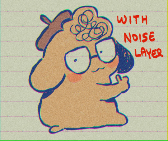
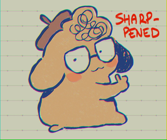
Note
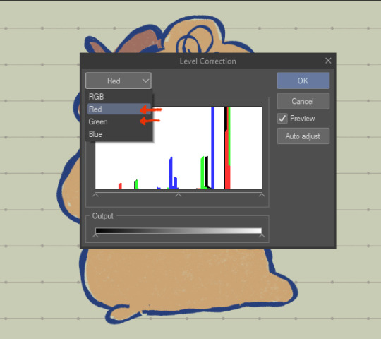
I noticed when looking super close at your line art that the there's slight red green and blue on the sides of the lines like an old 80s anime and i think that's super cool! How do you do it?
oh, that's chromatic aberration! i guess you could say its a kind of colour/visual distortion.
it's pretty simple to do, but i usually just use a csp auto action to do it for me to make things go quicker, but i can teach you how to do it manually in most programs.
i'm going to use this silly doodle of me as pompompurin as an example lol
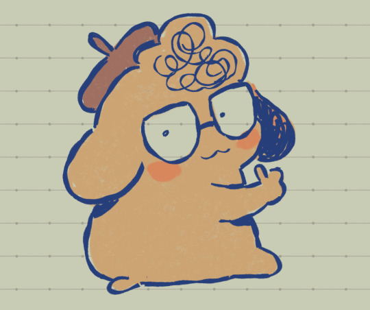
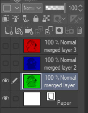
youre gonna wanna merge everything onto a single separate layer first and then we're gonna work with that merged layer. make two copies of that merged layer so you have three of them in total.
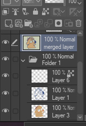
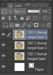
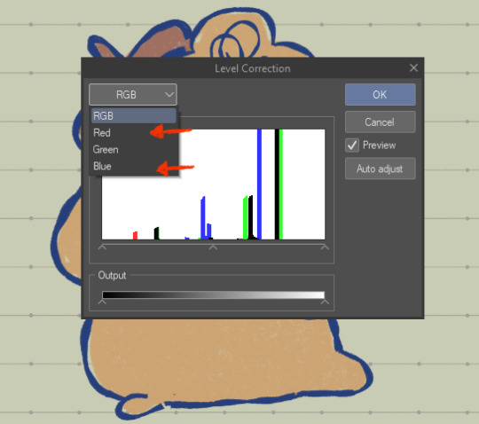
the top merged layer will be our red layer, so youre going to want to got to EDIT > Tonal Correction > Level Correction
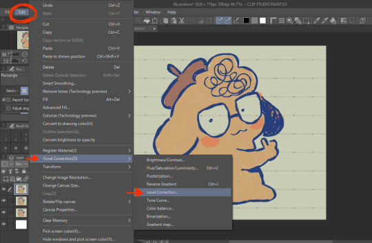
the level correction graph will pop up. since the top layer will be our red one, select the green level and drag the rightmost arrow on the Output scale all the way to the leftmost side. do the same for the blue level.
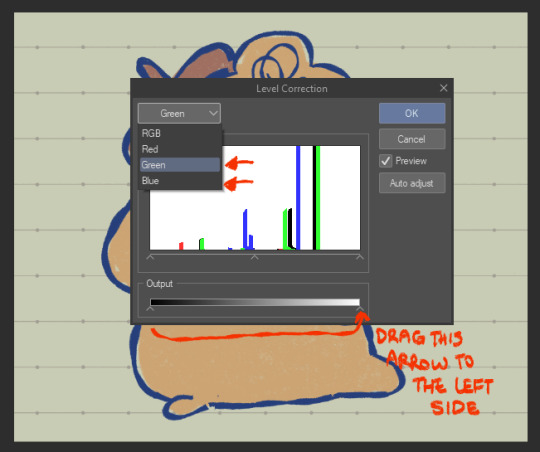
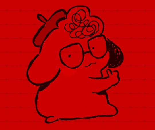
the image should be red like this afterwards.
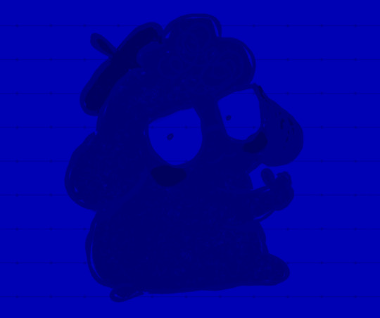
the middle layer is going to be our blue layer so do the same thing we did for the top layer except youre going to reduce the green and red levels instead, and the middle layer should be all blue like this.
for the bottom layer, it will be our green layer. same process as before, reduce the red and blue levels so its all green.
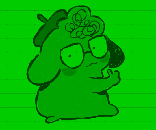
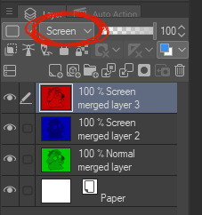
your layers should be looking like this now
from here, you want to set the layer modes of the red and blue layers to Screen, DON'T do the same for the bottom green layer though. you'll notice once you've done that, the image will look normal again!
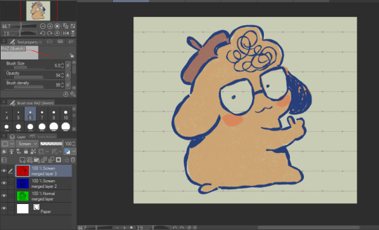
from here, all you need to do is shift the red layer in one direction, and the blue layer in another, to as much of an extent you want. the further they are from each other, the more drastic the effect will be
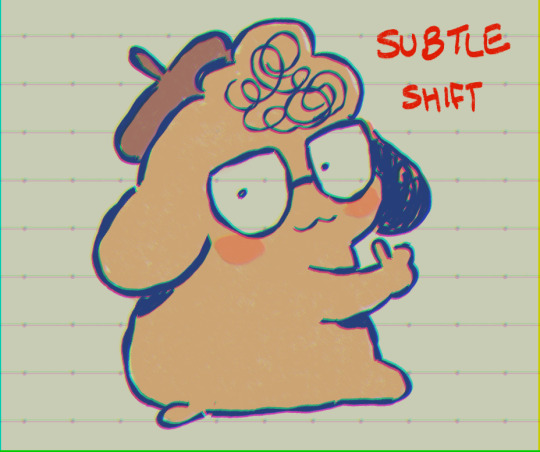
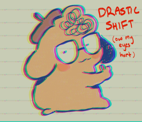
and that's how you do it! my other personal tip would be to add a layer of noise set to Overlay or Soft Light at a lowered opacity over the drawing bc it goes well with the aberration, or even sharpen the image.

if you dont want to do all that hard work though and you happen to have clip studio paint, just use an auto action, like this one!:
https://assets.clip-studio.com/en-us/detail?id=1713222
anyway i hope that helps? ^^;;;
647 notes
·
View notes
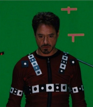
Text
One of my personal internal conspiracy theories is that big budget special effects movies and streaming series with like hundreds of millions or billions of dollars sunk into them are some kind of very open embezzlement schemes.
Even the best paid actors and directors and such can't explain the budget. The money certainly isn't on the screen when it comes to anything from costumes to cinematography to visual effects or editing. It's openly known all the jobs that contribute to "making the pictures look good" are getting their parts of the budget slashed. The Avengers Infinity Wars movies have got $300M price tags and they do NOT look like it. Rings of Power cost like $700M and literally used off the shelf craft store fabric for armor. They dump cheap CGI in because there's no union to keep the pricing fair and shoot everything on green screen so there's no travel and where is the money going?
But for example if you're a producer you also get paid, and all I can think about is how producers with business degrees are deciding on how the budget should be used on these huge shows with country sized price tags and if the budget isn't going into anything or anyone involved in the actual work of the movie, but the guy who thinks the movie needs to cost less and be a business product also thinks he has the most important job and he gets to decide where the money goes? Are these guys just like "okay, our salary will be $299M and the rest goes to the production itself."
I know I'm missing things, but I've seen hundreds of movies that look gorgeous and beautiful and have amazing effects and camerawork and they're all a tenth of the big budget shows and movies, or less, so where is the other 90+% of the money going? It's VISIBLY NOT PRESENT IN THE FINISHED PRODUCT. Who has it?
Someone already went into the technical details in the reblogs.
#idk this is conspiracy thinking#just obsesses me#they look cheap because they are cheap yet the budgets are huge#this one got locked bc some nice people went into detail and helped#and then the rings of powar fandom decided to start using it for harassment
836 notes
·
View notes
Text
youtube
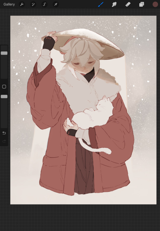
Capturing Winter Magic: Subject Masking in Green Screen by DoInk – Stuck in a Snow Globe Lesson
Step into a winter wonderland of creativity with our latest blog post and video tutorial! In this guide, we'll explore the enchanting world of subject masking using Green Screen by DoInk, focusing on the delightful and always popular "Stuck in a Snow Globe" project. Whether you're an educator bringing seasonal magic to your lessons or a content creator looking to add a touch of whimsy to your videos, this step-by-step tutorial is your key to unlocking the magic of subject masking in all time favorite Winter project of being stuck in a snow globe.
What you will learn:
Introduction to the Subject Masking Tool in Green Screen by DoInk
Crafting the "Stuck in a Snow Globe" project from start to finish
Tips for optimal subject masking in various scenarios
Enhancing your project with overlays, animations, and text
Real-world examples for inspiration and application
Empowering your creative storytelling with subject masking
Subject masking in Green Screen by DoInk opens up a world of creative possibilities, and the "Stuck in a Snow Globe" project is just the beginning. Whether you're telling a winter tale or creating festive content, subject masking adds a touch of magic to your storytelling.
Unlock the magic of subject masking and transport your subjects into a winter wonderland. Share your enchanted projects with us, and let the seasonal storytelling begin!
#Green Screen by DoInk#Subject Masking Tutorial#Stuck in a Snow Globe Project#Winter Wonderland Creativity#Visual Effects in Seasonal Videos#DoInk Tutorial for Content Creators#Creative Storytelling with Green Screen#Elevate Your Winter Content#Empower Your Creative Vision#Whimsical Video Projects#Do Ink#DoInk#Green Screen Magic#How to use DoInk#How to use Do Ink#How to make a snow globe project#Snowglobe projects#Quick Easy Winter Projects#Youtube
0 notes
Text
How Our Flag Means Death transformed Rhys Darby into a merman
Take a deep dive into Stede and Blackbeard’s big underwater reunion, featuring Kate Bush and buckets of glitter.
Warning: This story contains spoilers for Our Flag Means Death season 2, episode 3, "The Innkeeper."
How do you turn a pirate into a mermaid? All you need is a loyal crew, a killer soundtrack, and lots and lots of glitter.
Our Flag Means Death season 2 reunites swashbuckling lovers Stede Bonnet (Rhys Darby) and Blackbeard (Taika Waititi) after their tragic parting in season 1. An injured Blackbeard is hovering near death, stranded in a purgatory-like dream world after his crew attempted mutiny. He plunges off a cliff, sinking deep into the sea, and it seems as if his past regrets will drag him into the darkness. Then, a light appears, and Kate Bush starts to play: It's Stede, carrying a trident and sporting a golden fish tail. Merman Stede coaxes Blackbeard back to life, and together, they swim upwards into the light.
It's a moment that's simultaneously silly and heartfelt, a perfect encapsulation of the show's signature tone. Series creator David Jenkins says he and the writers have wanted a merman Stede scene for years, and it comes at the, ahem, tail end of episode 3, written by Alyssa Lane and Alex Sherman and directed by Andrew DeYoung. The sequence itself isn't long, but it proved to be a monumental undertaking, requiring careful collaboration from the visual effects team, stunts, hair, makeup, costumes, music, and more.
"When you're working on smaller shows like this that need big visual effects, you have to be very resourceful about how you do things," visual effects supervisor David Van Dyke tells EW. "I feel like the underwater sequence was a really great culmination of all the departments really working together and maximizing our resources."
With the episode streaming now on Max, EW caught up with a few key members of the OFMD crew, who break down exactly how they transformed Darby into a merman — fish tail and all.
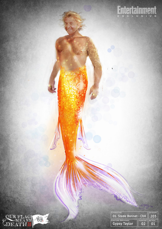
Gypsy Taylor's sketch of merman Stede for 'Our Flag Means Death' | CREDIT: GYPSY TAYLOR
A sailor's tail
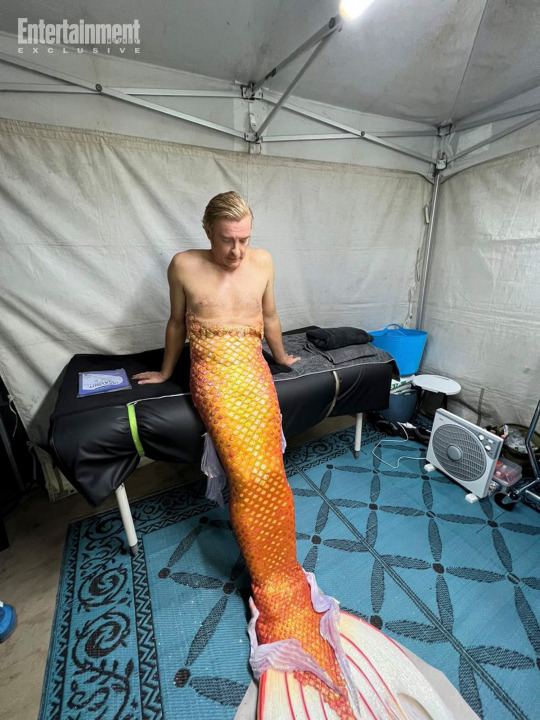
Originally, the plan was to use a green screen to give Darby a CGI tail. But it was costume designer Gypsy Taylor who pushed back, arguing that she and her team could build a practical tail that looked gorgeous and functioned underwater.
"I was like, 'Please make my dreams come true!'" she tells EW with a laugh. "'I want to make Rhys Darby a mermaid!'" It helped that Darby himself was game: The actor served in the New Zealand army, so he's a more than capable swimmer. He volunteered to film as much of the scene as he could, even if that meant learning to swim with a monofin.
As she started to sketch, Taylor immersed herself in mermaid imagery, finding inspiration in all sorts of aquatic creatures. Ultimately, she decided on a subtle golden look, one that fit Stede's personality but still brought plenty of drama.
"I delved deep into the mermaid world, and I could have gone all rainbow and big and luscious," she explains.
"But instead I thought, look, if Stede turns into a fish, and it's Blackbeard's dream sequence of what he knows of Stede, then he'd probably just turn into a really sweet goldfish. So, that's where I started. He's just this sweet, loving little goldfish."
Merman tail construction for 'Our Flag Means Death' | CREDIT: GYPSY TAYLOR
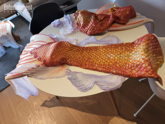
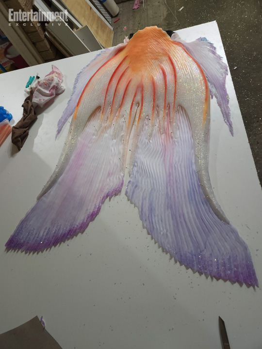
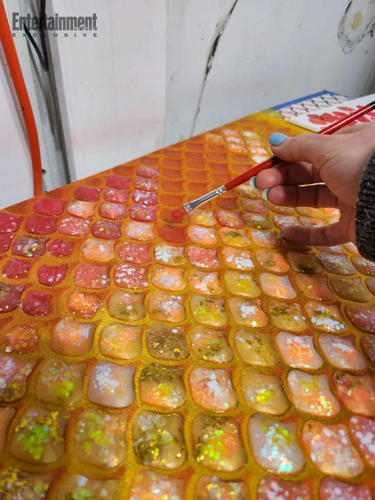
For the actual construction, Taylor recruited her longtime collaborator and props maker Hayley Egan. Many fake mermaid tails are sculpted out of a single piece of rubbery silicone, but Taylor wanted to keep Stede's tail as lightweight as possible, so Darby could actually move through the water.
So, she fitted the actor with a stretchy Lycra base, and Egan hand-sculpted and attached about 3,000 individual silicone scales. The final steps were to add the enormous, flipper-like monofin at the bottom, before sewing on thin, gauzy strips of chiffon to give the tail more movement in the water.
A close-up of Rhys Darby's tail in 'Our Flag Means Death' | CREDIT: GYPSY TAYLOR
Taylor worked closely with stunt coordinator Jacob Tomuri to make sure the tail not only looked beautiful but functioned underwater, too. (She also knew that they'd have to film quickly, since the chlorine in the tank could corrode the tail over time.) She carefully monitored the tail's weight — but it still wound up heavier than she anticipated.
"We added a whole lot of weight accidentally by putting five kilograms of glitter in," Taylor admits. "I had to warn the stunt team. I was like, 'I didn't think glitter would be that heavy! But we needed a lot of it. And it's so pretty!'"
The tail required 5 kilograms of glitter | CREDIT: GYPSY TAYLOR
Egan constructed four tails in all: a stunt tail, a tail for Rhys to practice with, and two hero tails for use on camera. Egan assembled them at her workshop in Australia, but she had to stuff them into a suitcase to bring them to the OFMD set in New Zealand. All was well, until she got to New Zealand customs, and the agent asked her: "Are you bringing fish into the country?"
"She was in fits," Taylor recalls, laughing. "She was like, 'Well, actually… I'm bringing four fish into the country.'"
Once the tail was fitted to Darby's body, the makeup and prosthetics team came in to seamlessly blend it to his bare skin, adding even more scales and glitter. But although Darby moved gracefully underwater, navigating dry land proved to be a bigger challenge. Once the actor was encased in his tail, he couldn't move around set, so the crew borrowed a wheelchair from a local New Zealand hospital to transport him to the tank. (See the video below.)
"We'd all go up this ramp together, with him in his little wheelchair, and we'd just sort of dump him in," Taylor explains. "Everyone was trying very hard not to laugh."
Diving deep
Season 1 shot in Los Angeles, but for season 2, Our Flag Means Death relocated to New Zealand. Many scenes were filmed in a studio or on the life-size recreation of the pirate ship Revenge, but Van Dyke, the visual effects supervisor, wanted to take advantage of New Zealand's natural beaches and ocean views — particularly for the scene where Blackbeard plunges off the cliff.
So, the crew scouted a gorgeous spot near Bethells Beach, capturing drone photography and 3-D photogrammetry. "LA's got a ton of great natural resources," Van Dyke explains, "but you might have a guy sitting there on the beach in your shot, drinking a beer out of a cooler that yours truly has to remove."
The actual ocean scenes were shot in an enormous indoor tank. Underwater filming isn't exactly easy, but fortunately, several members of the crew had experience on a certain blockbuster James Cameron production. "Thank God Avatar shot out there because we had a lot of seasoned underwater veterans," Van Dyke says with a laugh. "So, they knew what they were doing."
The tank itself wasn't deep enough to look like a real ocean, so Waititi had to float horizontally underwater, and the image was later flipped to make it seem like he was sinking downward. Then, Van Dyke and his team came in to clean up the shot, adding depth and adjusting the trajectory of bubbles. He also worked closely with Taylor and hair and makeup designer Nancy Hennah, who had to ensure that Waititi's enormous Blackbeard wig didn't float away.
"Look, CG hair is hard enough, and underwater is even harder," Van Dyke says, explaining that Hennah's meticulous wig work saved his team hours of effort. "There were some things that visual effects had to help out with, but we didn't have to stick a CG wig on him. So, thank you, Nancy, for doing that!"
The perfect soundtrack
Music has always been a major part of OFMD's DNA, and season 1 brought memorably anachronistic needle drops like Fleetwood Mac's "The Chain" and Leonard Cohen's "Avalanche." For the Stede/Blackbeard reunion, Jenkins picked an ethereal '80s classic: "This Woman's Work" by Kate Bush.
The song was always Jenkins' first choice for the scene, and it was written in the script, but music supervisor Maggie Phillips admits that she initially argued against it. Not only was the song originally written for John Hughes' She's Having a Baby, but it's been used in multiple TV shows and films, including Extras, Love and Basketball, and It's Always Sunny in Philadelphia. Even Phillips herself had already placed it in another TV show, using it for a terrifying execution scene in The Handmaid's Tale season 2.
Plus, Stranger Things had just propelled Bush's "Running Up That Hill" to become the song of the summer in 2022. "I mean, I was so excited that the kids discovered Kate Bush," Phillips says with a laugh. "Ultimately, my feeling is that whenever Kate Bush gets exposed to new audiences, that's great. But I was fully like, 'Don't use this song. There's too much baggage.'"
Rhys Darby on the set of 'Our Flag Means Death' | CREDIT: GYPSY TAYLOR
Jenkins pushed back, noting that the song suggestion came from Waititi himself, who's wanted to use it in a project for about a decade. Still, Phillips remained hesitant. "I was like, 'Okay, I still think this is a bad idea,'" she says. "And then I saw a cut of [the scene], and I ate my words."
Bush's dreamy vocals give the whole sequence an ethereal feel, and Phillips says she loves how the lyrics — "I know you have a little life in you yet/I know you have a lot of strength left" — take on new meaning as Stede coaxes Blackbeard back to life. "I saw it in a totally new context, and I love it," she says. "They actually recontextualize the song and make it work in a new way. I got chills watching it."
Plus, Phillips adds, the scene got one particularly important stamp of approval: "We heard through Kate Bush's management that she was very pleased with the use and very excited, which made me really happy as a huge fan."
Our Flag Means Death airs Thursdays on Max.
Source: EW
178 notes
·
View notes
Photo
Creator Spotlight: @kevinbparry
Kevin Parry is a stop-motion animator and visual effects artist in Toronto, Canada, who creates magical and mind-bending content for brands. Prior to working in social media full-time, he animated a number of stop-motion feature films at Portland-based LAIKA.
Check out our interview with Kevin below!
How did you get your start in stop motion and animation in general?
I was always very interested in moviemaking (monster makeup and visual effects), and that led to me studying animation in college, where I specialized in stop-motion.
How has technology changed the way you approach your work?
The shift to shorter content through social media feeds has made me approach storytelling in a more concise way. When I first started my career, ‘short form’ meant a story maybe 4 minutes in length. Now, I make videos that are as short as 4 seconds!
Over the years as an animator, who/what were your biggest inspirations behind your creativity?
I’m a big fan of directors and artists who have a bit more texture to their work - blending old-school, handcrafted techniques with modern technology. Filmmakers like Michel Gondry and Wes Anderson. And, of course, magicians! The surprise and delight of magic is something I try to capture in my work.
If there is one thing you want your audience to remember about your work, what would it be?
That I left them feeling stumped and curious about how I made it! It’s the best feeling when someone tells me they watched my video a dozen times and still can’t figure it out.
As we’re wrapping up with the year, what is one thing you learnt about yourself as a creator in 2022? Any goals for 2023?
This year, I’ve been focusing on making my work less polished. Meaning ditching green screens and doing a lot more of my stop-motion and visual effects in camera. It’s a bit of a battle with the perfectionist in me, but I think my work can have a lot more charm to it if I embrace mistakes and the rougher edges.
How did you transition from working for a company to working freelance?
I was working on stop-motion animated feature films at LAIKA and then eventually left to pursue social media full-time. There were a few years of overlap where I built up an audience and had already started to get offers from companies before finally making the leap. I’m thankful for all the years spent doing studio work because it prepared me for the business side of freelance—stuff like pitching concepts and understanding when work needs to serve the client and not myself.
Do you have any tips for creators out there looking to make the same move?
My two tips are:
Be as unique as possible. You want to give companies a reason to come to you, and not someone else.
Find a balance in your work between Hollywood and homemade. You want it to be professional enough that companies trust you with their brand but approachable enough that it blends in well on social media.
Who on Tumblr inspires you and why?
To be honest, I’m new to Tumblr! I signed up a few weeks ago and have just begun to explore the fantastic content. If people can leave a comment with who I should check out, that would be fantastic!
Thank you for stopping by, Kevin! Be sure to check out more of their work over at @kevinbparry, and drop a comment below with who Kevin should check out on Tumblr!
522 notes
·
View notes
Text
The reason I think why Days of Future Past's visual effects have aged so well is because they didn't just shoot in a green screen area, they shot in sets and on location as much as possible and had the actors do choreography fighting with the Sentinels.
Also the screen isn't full of visual noise to distract you. When Colossus's wrist is twisted and his head crushed, when Sunspot and Bobby's necks are snapped, when Blink is stabbed, when Warpath is killed, all you see is what you need to see.
Unlike Endgame where there's so much happening it's distracting, Days focuses on what needs to be focused on
But noooooo Endgame is the superior movie NOT
#x men days of future past#days of future past#x-men#xmen days of future past#xmen dofp#dofp#anti avengers endgame#anti endgame#x-men days of future past
86 notes
·
View notes
Note
Hi! Do you use a filter or gradient map to get such pretty and muted colors?
I tend to naturally use muted colors for a lot of my pieces! Case in point, here are a few examples of flat colors on some of my recent pieces:
But you’re right, I do also have a small trick with gradient maps! The key to the sort of muted effect is, I think, texture. If you have texture, there’s often a subconscious feeling of groundedness, like you’re observing something on paper instead of through a screen. It helps also to darken the colors a bit!
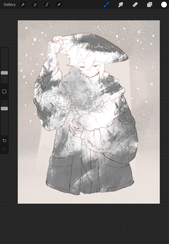
First, using a bunch of texture brushes, on a new layer on top of your flats, I add a few loose strokes in gray or black here and there where I plan on darkening the color, usually following along the shadows a bit! I have a folder of crunchy brushes specifically dedicated to this step, including procreate’s nikko rull brush, the medium nozzle airbrush, and the burnt tree brush:
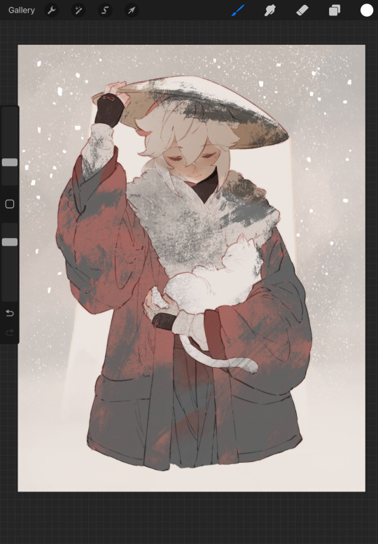
Then, fill any blank area with white and apply a gradient map! Usually this is a good stage to play around with hues over the value range, since these will subtly affect the color later! I usually prefer to use warm maps with a bit of blue or cool gray tossed in here and there, or gray maps with a bit of red! There’s a lot of options here if you play around with making your own gradient maps :)
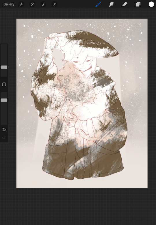
Then, change the layer mode to linear burn and turn down the opacity until it looks subtle!
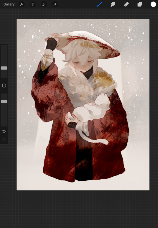
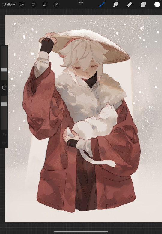
I learned this trick last year from a YouTube video studying another artist’s style, and it really is a nice quick way to give large blocks of color a bit of visual complexity and break up the monotony! Here’s the video for anyone interested: https://www.youtube.com/watch?v=FgqpVKzuiXM
Occasionally I’ll also use this slightly in reverse and use a contrasting bright color with a texture brush to give a velvety feeling! This is most notable in my Taranza piece, I think:

Without the green highlighting bits, the green is so dark it could almost be mistaken as black, but with the green highlights it becomes a lot more readable! Also note the texture between the green highlights and the base dark green!
This is definitely one of my favorite shortcuts for getting deeper colors and subtle hue variance on my pieces :D I hope this helped!
279 notes
·
View notes
Last Seen Blogs

doumaslut
Untitled
venom-and-leather
You're Exactly What the Doctor Ordered

d0llh0use-c0ining
♡︎ a dollhouse full of gender for you ♡︎

millenniumtattoo
Millennium Tattoo

glitterygoopbailiffoperator-blog
Untitled