#The art style fits the topic and setting so well too
Note
do you have any advice for opening commissions? i feel like you have them very professionally set up, and i have pretty bad social anxiety, so it might be helpful to hear tips for communicating with customers and such, or setting up a fair tos!
hi so, maybe i do have some advice!!! <33 thank you so so much for the kindness & seeing me as professional lol i’ve been doing comms for 2-3 years and i must say.. still getting the hang of a lot of things. you go through a lot of trial + error trying to figure out what works best for you, so remember theres no truly right way to go about comms! they should all fit the needs, pace, and benefit of you and your work ethic!
what i did personally is start off at some lower prices just to test the waters and get the ball rolling. i priced rendered characters at i think, $24 per character? possibly lower, i cant quite remember. and then i gradually went up as i started to progress in my art style more + had more people coming in.
with customers, i have a lot of anxiety as well! im autistic, so i never like making a customer feel like i dont truly care abt the commission by accidentally sounding too flat or anything. i tend to RLLY overthink it lol so we make sure we are extra talkative + kind about their comm! giving them compliments on the character, showing genuine excitement so they know theyre in good hands! (we love engaging esp when the customer seems VERY excited or enthusiastic abt the commission!)
a lot of irl turmoil tends to happen in our life which can make a comm delayed sometimes. could be severe mental health problems, just being busy w/ shit in general. its important to just keep your customers up to date, especially if its going to take a realllyyy long time or the customer likes frequent updates.
i used to be able to get shit done in like a night. but, with an actual line up/queue of comm work we progressively started taking longer and longer esp as we transitioned from a teenager starting out and into a busy adult with persistent mental health issues. (plus our art becomes more complex as time goes on, so that has to be taken into account) tbhs, depending on your availability and how much effort goes into your work, and as the demand grows, you need to charge accordingly and just be honest with your clientele.
as for TOS do what makes you comfortable! make your limits known and put your foot down when a request or any topic makes you uncomfortable. dont let your customers get inappropriate with you or try to make you feel bad if they dont wanna pay for what they ask for, etc. i also recommend requesting payment after sketch/half and half when starting out just so you can get some experience under your belt + assure future clients that youre professional n wont scam them! (if you plan on switching to payment upfront in the future)
just remember that u are not a machine, you are a human being making art for someone else. putting love n effort into your craft, time and effort. take your time getting the hang of comm stuff, things dont have to be perfect in your setup at first.
47 notes
·
View notes
Text
Best To Worst Zodiac Signs At Communication
Communication is a skill everyone has to have to fit into society.
But communication is a lot more than just talking. It’s being aware of one's wants and emotions. How to convey those emotions in a way others understand. Listening to others and comprehending what they are saying. Listening with compassion and respect.
It may be surprising where each of the zodiac signs falls on this list. That is because no matter how good a sign is at talking, they can miss out on all the other points of communication.
Read on to find out the zodiac signs best to worst at communication.
#1. Aquarius
Aquarius was unlikely to be most people's number one choice at best communicator in the zodiac.
Unfortunately, Aquarius is often forgotten compared to other zodiac signs. Aquarius is ruled by Uranus, is a fixed sign, and an air sign. It gives Aquarius the intelligence, compassion for others, and grounded, self-confidence to properly communicate.
Aquarius wants justice and equality. Without strong communication skills, that goal of world peace would be impossible.
Aquarius is often found in careers that have a focus on communication, networking, and connecting others through a common goal.
Aquarius’ ability to communicate and connect with people is their superpower.
#2. Capricorn
Capricorn is direct, knows what they want, and will listen respectfully. Then they will explain why they are right.
Capricorn is aware of their power to command attention. They are great public speakers when the opportunity arises.
Capricorn has a strong sense of purpose and a deep understanding of the topic they are speaking on. In fact, it is unlikely that Capricorn will talk about anything if they haven’t researched it.
They are determined to not set themselves up for sounding ignorant. Capricorn has a reputation for knowing what they are talking about. They won’t risk that by giving opinions on things they have no knowledge of.
#3. Aries
Aries is a little too blunt.
Aries can come off as insensitive with their communications. It can seem as if they are disregarding what others say. Which, maybe they are, it’s part of their process.
Aries does have trouble with the other people part of communication. But they are experts at knowing their wants and emotions.
The delivery can be rough. Aries is the zodiac sign most likely to defend themselves. They have an iron will and won’t bend to others if what they want is dishonest to Aries inner self.
Aries isn’t without compassion or respect for others. What others want from Aries needs to be in the same fashion of communication. Clear, direct, and confidant.
Aries will have a hard time if the person they speak to speaks in metaphors or poetic explanations.
#4. Leo
Leo knows what they want and will tell the people they are speaking to what that is.
Like Aries, Leo has the self-awareness part of communication down. As well as compassion and respect for others. But the delivery can be a bit harsh.
Leo doesn’t mean to be harsh or hurt anyone’s feelings, they just don’t find sugar coating to be their style.
Leo can be quite critical of others. Which can appear in their blunt way of speaking. It is an area they would do well to be careful of. Just because the good intention is there doesn’t mean that is how others will take it.
Ultimately, Leo wants to help others better themselves. Doing so takes a lot of communication skills. Luckily Leo has them.
#5. Taurus
Taurus is an amazing listener.
Compassionate, respectful, and knows what they want. Taurus has mastered the art of tactful criticism.
But what they haven’t mastered is how to properly communicate their own needs.
Taurus tends to get caught up in the eye of their friends' drama storms. Consoling and telling them what they want to hear. Taurus is the friend everyone turns to when they need help.
But when Taurus needs help, they isolate instead of reaching out.
It is in their nature to feel like they somehow deserve less support. They are the strong ones to others. How dare they show moments when they are not?
Taurus’ communication tends to be a one-way street. Toward them, but never from them to others.
#6. Virgo
Virgo is very clear in their communication.
As with everything else, Virgo wants to make sure their words are to the point. Virgo knows what they want and how to say it. They can listen respectfully.
But if someone disagrees with what Virgo has to say, it can cause them to short-circuit. Virgo prepares in the smallest of details and argues every response they could think of to the conversation.
When someone disagrees with Virgo in a way they didn’t see coming, Virgo can freeze. Not having an answer can throw Virgo off badly enough they have to pause and regroup.
It can make for an awkward exit.
#7. Cancer
Cancer can communicate well when the conversation is going their way.
Cancer can be good at letting others know what is wrong. If they are healthy and mature. A Cancer who hasn’t yet acquired those skills may not communicate as well.
They can start to lack listening ability and hear everything as criticism. This is exactly why relationship communication can be hard with a Cancer partner.
All is well and good when Cancer communicates their needs and wants to a partner. But if their partner responds in kind with irritating habits Cancer has, brace yourself.
Cancer does not like to be criticized.
#8. Pisces
Pisces is decent at communication.
They can listen very well and are accommodating to others. But they don’t always know what they want, and Pisces tense to speak in metaphor. Which can lead to a lot of confusion for the other half of the conversation.
Pisces has a hard time using direct words to get their point across. Those kinds of words can express the full scope of the emotions they are feeling.
Plus, this is how they think. In a whimsical, abstract way that finds directness rather boring.
#9. Sagittarius
Sagittarius can communicate, they just have no idea what they truly want.
Sagittarius comes off as a confidant zodiac sign who knows what they want. They think they do, but the results are never satisfying.
Finding the root of what they want is what will give Sagittarius meaningful connection and therefore better communication. This is in both relationships with others and with themselves.
#10. Libra
Libra has trouble communicating when it comes to what they want.
Libra is always torn between making others happy or themselves. More often than not, they choose others.
This can lead Libra to miscommunicate their own desires in all scenarios. Making them unhappy with the state of their relationships and success.
Libra wants to reach for more and be happy like everyone else. Their inability to communicate what they want over the most basic things holds them back.
#11. Gemini
Here is the unexpected one.
Gemini, ruler of communication, can surprisingly suck at it.
Gemini could talk people's ears off all day, but will rarely say anything of substance. Gemini doesn’t really listen to others, either. They want to do the talking.
Nothing is more obnoxious than being talked over. When in a conversation with Gemini, they tend to not only talk over others but complete their sentences and keep going as if no one spoke.
Gemini could do well to learn how to listen.
#12. Scorpio
Scorpio is by far the worst zodiac sign at communication.
Because they just don’tcommunicate.
Scorpio knows how they feel and what they want to say. But they are so fearful of others truly seeing them, that they never express themselves. Not beyond short, sharp comments anyway.
Scorpio is about internal transformation. They are so focused on what’s inside them that it can be hard to remember other people exist. Outside their mind. And are individuals, not the imaginary counterparts Scorpio made of them.
Scorpio needs to remember that the world isn’t just inside them. And they can’t control the real world how they like to imagine they can.
#Zodiac#Zodiac Signs#ZodiacFacts#astrology#astrology signs#Aquarius#Aries#Cancer#Capricorn#leo#libra#Sagittarius#Pisces#taurus#scorpio#Gemini#virgo
21 notes
·
View notes
Note
Hiii Andy! I've adore your art for years and your characters. Their designs are so lovely!! And expressive!! I was wondering if you had any tips for a cohesive character design? Or even advice on adding little asymmetrical details or features? And help is greatly appreciated! Thanks! Wishing you all the best!
HELLOO!!! AAAH Thank you so much for such a thoughtful question, this makes me so happy to hear! I'm so sorry it took me so long to get back to you, it turns out I have way too many things to say about this topic AKLSDHFKLSDG
(pls take this readmore<3)
For the starting point in a design, I try to stick to whatever rules apply for the setting the character is in, and their role in that setting.
Basic colour theory is always at the back of my mind, as well. I tend to use analogous and complementary colours when I design my characters and their closets. Analogous colours keep a palette contained and feeling similar to itself without being monotone. And then using colours that are complementary to that elsewhere in the design adds contrast while still maintaining that feeling of cohesion :D
The intended use of the character also heavily affects what can make a design cohesive or not - it's very dependent on art style and medium. (A design for use in animation would be extremely different from semi-realistic TTRPG concept art. The rest of what I've written skews more towards the second option!)
I consider the colours, shapes and materials that make sense for what I want to convey about the world, and how the character would want to be presented in it. The Dogwood characters are my current exercise; Mel's clothes fit him perfectly since he works a labor intensive job on the farm, and his identity is wrapped up in it so he never strays far from heavy cotton, straight cut. Ryan and Park both wear ill-fitting clothes in completely different ways (Ryan, butchly. Park, autistic and transly) - and they each have work uniforms. Ryan's work uniform suits her gnc appearance (welding coveralls/safety gear), while Park's uniform completely transforms him into "Just Some Guy" and that changes how others read him, too (cashier). And they all shop at Local Thrift Store / Farmer's Surplus / The Walmart 1hr Outside of Town. Their styles give them each a distinct silhouette, and their levels of social comfort as well as public expression contribute to body language, colour choices, and shapes that make them stand apart from each other despite living in the same small bubble. COHESION!
Asymmetrical details and features are my FAAAAV THEY ARE SO FUN, I find inspiration for these in people-watching, nature documentaries, architecture, my reflection, my friends.. <333 This part is also fun to tie in to the character's setting! Springboard questions like. Are they prone to injuries? Magical injuries? Do they have like, modern dental procedures available? Do they give a shit about crooked or crowded teeth? Are they missing a tooth, or did they chip one? Do they smile a lot and have crow's feet/other wrinkles? Do they get a lot of sun, and do they have/use sunscreen? (Even finer wrinkles.) Did they have acne as a teen? Do they still? Are they in a combat-heavy setting, with the scars to show it? Even more uniform features like freckles aren't symmetrical.
Clothing is really good to use to play with asymmetry - maybe the character rolls their cuffs but one is coming undone a little. Jewelry of all types is also great for asymmetry since it can go anywhere on the body!! Facial and other physical deformities or injuries are also incredible to see, and should be researched to find out if they impact other parts of a person's overall health and mobility outright. The different skin texture of a birthmark, for example! I noticed in certain photographs, the subject's red birthmark changed the texture of the skin, so I started drawing Orson with one drooping eyelid on the side affected by his birthmark. The more you look, the more you find!
Before I get too carried away. I try to use asymmetrical details and features as a way to boost that "world setting" cohesion, and to bring attention to parts of the character I am personally endeared by or want other people to notice. Mahon's snaggletooth is an eternal fav, which made me draw him smiling more, which made me more prone to drawing lines around his eyes. And since the anchor is in his left hand, and he tries to hide it subconsciously, I put thumb-holes in his left sleeves, which he plucks through as a nervous fidget, and as a result, his clothes pull a little across his entire body :D ITS VERY FUN to find the right jumping-off point that lets specific details click into place. For Mahon especially, since so many of those details are derived from the setting and his role in it!
Asymmetry and symmetry are just tools at ur disposal. Asymmetry tends to be more comfortable and natural. Symmetry gives a sense of stability and can be pushed for a sense of power, a sense of being uncanny, rigid, etc. Asymmetry can also be pushed into uncaniness depending on what it's applied to!! (But as a matter of personal taste, I find asymmetrical details to feel more natural and inviting than perfectly symmetrical ones. Which. Again. Depending on the character's purpose, could equally contribute to a cohesive design!!!)
OMG ok my final thought. Asymmetry can also be used as a balancing tool which yet again lends to a sense of cohesion. Adding a detail on the left while leaving it out on the right, repeated throughout with different details where applicable. Loam's colour spots, archery gear, scars and jewelry are all areas I've played with this idea.
#asks#i hope this helps even a little!#if u want to zero in on specifics pls dont be shy to ask#I HOPE YOU'RE DOING WELL!!!! wishing you the best TOO!
38 notes
·
View notes
Note
What armor sets does Sol wear throughout the game? I love his style!!
sorry for the late reply, I had to really dig through my screenshots to find examples, but this was something I myself wanted to do, so behold:
(beware of some very bad screenshots)
The ARR outfit was not very outlandish, but I think it was what started his constant theme of coats, or at least longer chest pieces.

I really wish I was taking more screenshots during my playthrough, but it is what it is haha
Once I hit HW and discovered the Asuran aiming set in hunt marks shop 5 minutes into Ishgard, I instantly switched to it and went through entirety of HW and its patches (and even into SB) with it
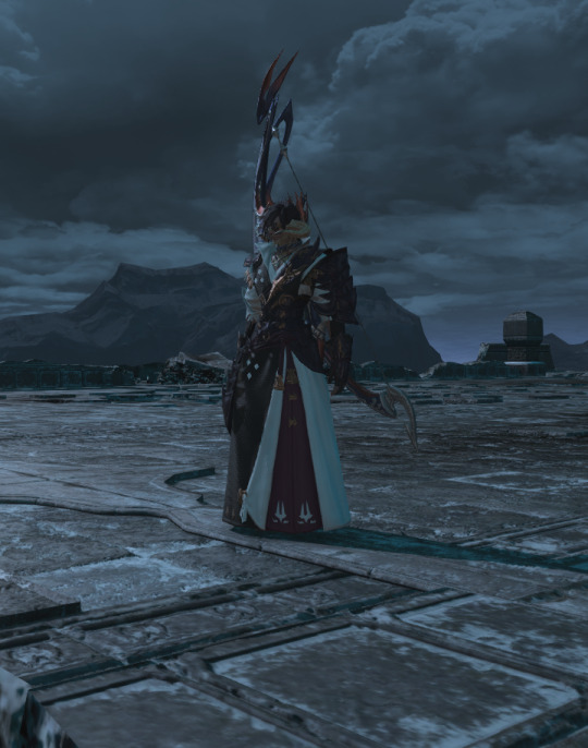
the SB itself gets very foggy, as I wasn't a fan of this expantion, so I can count the amount of screenshots I took on 10 fingers or so, but what stayed through them was this outfit, which I only dyed black later on it seems
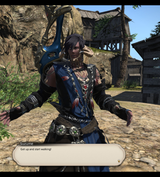

(I also have too many bows that I love, so I don't count them much as a part of outfit, because I keep constantly changing them)
ShB was the expansion that I started playing ffxiv, so once I finished it, I started diversifying the glams at long last, but for the msq I had this one, with mask being toggled on and off:

and in the later story I changed his style to this (for plot reasons, but then it kinda stuck):
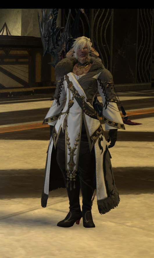
Once I discovered the existence of Edenmorn coat, I discovered my religion as for it is still in my top 5 favourite pieces, so I went through Shb patches with it, and it was also the time I changed Sol's hairstyle to something more familiar to people who have seen my art through years xD

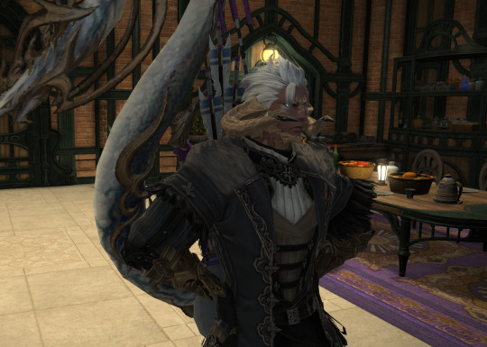
I had a different outfit for Bozja, as I spent 3 irl months in that place and it felt fitting the area and plot theme of living in the trenches lol

Going into EW, I started of with some experimental glam, but quickly switched back to edenmorn coat, especially once we hit snowy areas

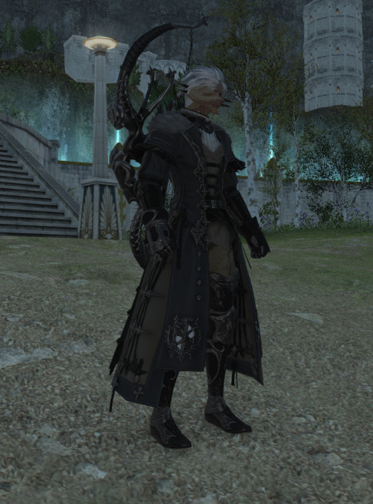
(EW is also where I have finally started taking many screenshots too)
but my true love was discovered in bard artifact gear, that we got at the 89 level or so. It is undoubtedly my number one glam and will stay so for a long time. It just fits Sol well in my head, I can hardly put it in words,,,

EW was also the expansion I started raiding for the first time ever, and gaining a static somehow led me to switching glams so often i don't even have screenshots of most of them (some were simply just to tease some static members). But I will share those that have stayed with me, or those that I seem to come back to most often!

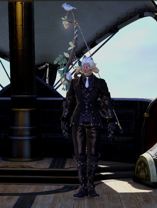


and that pretty much sums up his glam journey for Bard! I play all classes, so I have much and many more glams, but that is a separate topic xD
I am still unsure what to choose for him for DT, so for now he is relaxing in comfy clothes :D

#ffxiv#long post#I don't know how people lived with 10 glam plates before#I need 20 more I have too many glams#help me yoshi p
3 notes
·
View notes
Text
The Art of Job Hunting by Anastasia Helena Fernald

Overall an interesting collection.
The collection is a satire on primarily unemployment and the job market, but also some other related stuff - the military, family, nationality.
There are a lot of strong sections in here, and the Q&A job application format works really wonderfully. Fenald has a recognisable voice, and the rhythm and cadance of her work is varied but consistent enough to feel cohesive.
The poems on nationality and foreign-ness are particularly good and fitted well with the story-telling style used in many of the poems.
There is also very clearly a lot of experimentation going into these poems. There is a huge range in the style and the poems that really stood out were the ones which didn't quite blend in with the rest of the collection.
The couple of poems that leant into the absurdism/tried to approach the topic from an unexpected place really broke up the literalism that most of the collection stayed close to.
It's also worth mentioning that the author clearly had a message to put across, and although the focus wasn't exclusively on one topic, the central ideas were portrayed clearly and without spoon-feeding the reader.
It isn't a perfect collection, however.
The core frustration and bitterness of unemployment is not particularly a subtle theme, and at times the "show don't tell" rule may have been ignored a little. There are sections where the message of frustration becomes frustrating in itself - the collection feels cathartic in places but such a barrage of hopelessness does become a little hard to get through in places.
The poems also felt very tonally American, and while this isn't a problem in and of itself, paired with the current-affairs heavy content started to feel a little like it was designed for social media.
The more heavily structured poems also fed into this too, OK Google, Define Job and Résumé Poem are two that felt very much intended to be seen outside of the collection, although this could also just be my personal taste coming through.
The collection does pick up by the end, though, and I think a lot of my frustrations are with the earlier poems which seem to be trying to set a tone, but do so in such a blatant way it can feel as though you are just being told what to think and feel about the topic, rather than being allowed to feel what the authour does through her writing.
Room to improve, and I certainly wouldn't rule out reading more of Fernald's work!
I received an advance review copy for free, and I am leaving this review voluntarily.
#poetry#poetry review#book review#books#this one was an advanced copy btw#had a good time#but definitely hoping for some growth in her work
2 notes
·
View notes
Text
hello all! my name's cas, and i'm looking for some fellow 21+ writers who would potentially like to form a close-knit little writing group on a private jcink site.
i'm thinking mainly of having a little sandbox style site with mini sites built in, where we would have the potential to kind do whatever we want, but there's also the possibility to create our own little universes as well. if this sounds like something you'd be interested in, take a peek below the break for some more info!
also, as a quick note i'd like to say i've already got some skins set aside that i already have purchased or some other ones i'd like to buy in order to get things set up, so we'll be able to have something to start off with!
i've been out of the main rp scene for a bit, but i've been missing that small little sense of community that can come from creating amazing worlds and plots together. more than anything i'm seeking out like-minded people who feel the same, and would have a passion for doing the same. i want to really focus on character development, and cultivating all sorts of depth and storylines amongst each other! if that sounds like you're cup of tea, then i suggest you stick around.
a little bit about me as well before we start - i'm 26, nonbinary and use they/them pronouns. some of my favorite genres lie in supernatural, fantasy and crime elements. i also love love love queer plots, and most of my characters are queer each time. i'm a huge sucker for a good family plot and love a good bit of drama in just about everything i do. i prefer rl fcs and am comfortable with most topics, and i enjoy darker tones in a lot of my plots! some of my interests are video games, kpop, art, and obsessing over whatever show i have binged recently. i'm a huge chatterbox and love to get to know my partners, so if you like talking about headcanons or just silly stuff about our characters in general, then you're in the right place!
now that that's handled, just as a note, i'm looking for about 5-10 people who are interested in this little group! i think that number is good for a good little community to really get some plots going! i have a couple ideas already rolling around for some potential verses to start out with:
high fantasy — primarily inspired by the likes of got/hotd/lotr/eragon/etc and other similar fantasy stories, i'm imaging a world with multiple kingdoms, creatures, and all sorts of lore we could build out. primarily focused on court intrigue as well as a touch of classic fantasy drama, i would love to create a cast of characters to expand and fill out this world more.
supernatural — an open lore based world, i've had this idea rolling around in my head for some time. in this world anything goes for creatures, whether inspired by other cultures or simply a creation of your own imagination. but there would be an overarching plot revolved around a magical town and other subplots for us to take part in! (in that same vein though i'd love something simple too with just like a classic wolf pack dynamic!)
sci-fi — this is also quite a bit more open, but more in the sense of space exploration. inspired by the likes of dune and the robinsons, think space exploration but with a touch of plot as well re: some revolution elements. space pirates, androids, and all sorts of things are welcome! this one has a lot open in terms of world-building as well.
all this being said, these three are by no means the only things we could jump into, but rather a jumping off point! i want to encourage a place where all of us can develop these worlds as we see fit, and make something we all truly love! if you're interested, please feel free to like this post or shoot me a message and we can chat on discord!
#jcink rp#jcink roleplay#private rp#this is kind of a shot in the dark#but i figured i'd give it a try at least
2 notes
·
View notes
Note
Hey, i was wondering if you could give some tips on how to write image IDs?
I've been starting to add them to the alt text of my image selfposts but i feel like im not doing them properly and since you have the update accounts and write them often i thought that you could give some good advice about it
Also here's some other halloween candy for you lmao

[Image ID:
A photo of a long white ceramic serving plate topped with slices of cake with a light and dark swirled pattern in the cross section. The slices are laid out like tipped over dominos bricks.
End ID]
Yay! Marmorkuchen!
But about image IDs. I tend to go from big to small in the description. Describe the most banel basic ass shit first, like “Is this a photo, is it art, if so what kind? Digital? Photograph or scan of a manual drawing? Is this an infographic?” From then you can describe the general topics, themes and layout of whatever it is you’re describing. You also have to consider whether you’re writing this ID for people who are familiar with the contents (fanart) or if it’s gonna be for people who don’t. Deciding the level of detail is a personal choice but mostly influenced by what amount of detail is necessary for this to be a functional image ID. You wouldn’t describe the font that something is written in unless it matters for example!
You can also decide what writing style best fits the ID. i tend to write full, dense sentences to get as much info in without the ID running too long but I also write in full sentences and following grammar rules. Sometimes a note taking style works better if there’s lots of disjointed things you can’t fit well into nice sentences!
And if you’re describing multiple things or a series of things in one post you can describe key elements in more detail once and then refer to them more simply for the rest of the ID!
I normally avoid putting IDs in alt text because they can be harder to access for people and have a much shorter character limit. Also try to always surround your ID with some form of ID start and end indicators and keep the ID, if in the body of the text, as close to the image as possible!
As an example, say you’re got a 4 panel comic, I’d describe it like this (gonna make smth up as an example) if I was writing a description for an audience who isn’t necessarily super familiar with the material.
[Image ID:
A 4 panel comic of a made up scene in Just Roll With It Riptide. It is drawn digitally and fully coloured. The scene takes place on a ship, presumably the one the show is set on, called the Albatross.
Panel One: Jay, a woman with long ginger hair wearing a blue jacket over a white blouse, catches Gillion, a turquoise skinned Triton with green hair, fish fins and wearing a black sleeveless turtleneck shirt, sneaking around the ship. Gillion is carrying a brown sack over his shoulder and sneaking. A speech bubble from Jay reads: “Gillion, what are you doing?”
Panel 2: Gillion is turned towards Jay, looking sheepish. You can see that the bag he’s carrying is filled with gold, which is leaking a little trail of coins behind him. Now that you can see Gillion’s entire body you can see he also has a tail and a flask of water tied around his waist, containing a small cute pink frog-octopus hybrid, which is know as Pretzel. Gillion: “Nothing Jay! I am merely, uh, relieving the ship of an unnecessary load so we can sail faster!”
Panel 3: Jay and Gillion stare at each other, Jay is unimpressed. Pretzel, peaking out of the flask at Gillion’s hip, starts collecting coins from where they leak out of the bag. Jay: “Gillion if you throw any more gold overboard as taxes I’m throwing you overboard to lighten our load.” “You” is written in italics for emphasis.
Panel 4: Gillion starts sprinting towards the edge of the ship, indicated through a running pose and blur lines, with Jay giving chase. Her eyes are in glowing red and a targeting reticule is superimposed over one of her eyes, as though she was locking in on her target (Gillion). A stream of gold sprays everywhere from the speed of the chase and Pretzel goes flying with it.
End ID]
#friendly visitors#anyone else feel free to add on this was just everything I could think off from the top of my head#and also now I really wanna see this jrwi comic I made up as an example
10 notes
·
View notes
Note
Hi!! I hope you are having a good day,
I recently read your fic flower language and I think it is amazing!! I really like your writing style and was wondering if you have any writing tips or advice on planing out the plot for your stories.
Aw, thank you so much for saying hello, and I'm glad you like Flower Language! I hope you were having/will have a good day, upon you seeing this response.
I conveniently had the opportunity pop up for me to sort of hash out my thoughts on this kind of question in a conversation with someone just recently, so I'll try my best to reiterate it okay-ish.
On advice for plotting out stories:
I am character focused, in everything I do. In original works, this results in very soft world building, so I can't offer great advice for the next trendy "What House are you?" kind of universe, sorry. My first priority is: what kind of circumstances in this rough idea of a universe could realistically arise (few ass-pulls allowed) that would help this character develop and reach a satisfying ending? I find that, through this approach, the world simultaneously builds itself up alongside the hero's journey. And, I guess it kind of makes sense, given that humans have made society as we know it, so when you write each character as an individual rather than an obvious device, you're essentially going caveman mode, and reinventing society for your universe! Additionally, creating a reactive rather than proactive plot stops yourself from potentially making lore tidbits that don't go anywhere, or grandiose buildups that fall flat. For reference, with Flower Language, I have a doc called "Flower Language General Ideas," and it's full of disjointed sketches for scenes yet to come, and ideas that have or haven't yet come to fruition, purely spurned from: "hey, this character reacted in [x] way to [y] thing, so maybe something along the lines of [z] would make sense to happen next for them!" The catch is, I'm not holding myself to any of them. If an idea becomes outdated, or addressed in another way, I will scrap that sonovabitch so fast, you won't even see me sucker-punch that concept into backspace oblivion. The priority is shaping the world around the character, not a plot point. Minimalistic world building that suits your characters like a well-fitted shoe is so comfy for me. I like it. So, in sum for my style of planning:
What is this universe trying to tell?
What are the characters of this universe trying to tell?
Find an appropriate atmosphere in this universe to match both accordingly.
Have the universe build around the character and whatever they need to get done™.
And I apologize I advance for how vague that is, but it's the best way I can put my thoughts right now.
On Writing Tips:
The one on my mind right now is the topic of originality. To put it simply: originality is kind of dead, and that's okay. I think if many people who aspired to make art and put it into the world realized that instead of scaring themselves out of it by calling themselves frauds, we would have a lot more art to enjoy. We, as humans and artists, are a lot of the same sets of dreams and insecurities, and we've been penning the human condition in a bazillion different ways ever since we first learned to etch words into stone. So, I think that rather than looking at your own writing and worrying about how it's too much like [x], you should instead look at it from an individualist perspective. When you found that piece of media that inspired you, or that character that really spoke to your soul, and now you can't help but see it/them in everything that you put your heart into, that's not the work or character you were inspired by- that's you. That work or character made you realize a part of your personal soul/mind/self, whatever you want to call it, and put it into words and plot. And yes, I do mean "realize," not influenced. There's some things I don't relate to, but can understand. There's some things that make my heart catch in my throat with an innate attachment. One of those is being open minded, and the other is a connection. I don't like NFL or sports stuff in general (for the most part), but I can understand how people might enjoy the competition, unhinged nature of it all, the community, and annual bustle and excitement. Now on the other hand, when I first read Madeline L'engle's Murray Family books, I felt spoken to. Now I see some of the Charles Wallace in the things I write and say. But that's the thing- now I see it. It was still there before. I just didn't realize it in a solid form until then.
You aren't taking from the things you read/watch. You're realizing parts of yourself from them. And like they say, write what you know.
8 notes
·
View notes
Text
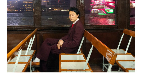
Bolis Pupul — Letter to Yu (DeeWee)
youtube
Bolis Pupul’s mother died suddenly in an auto accident in 2008, leaving the artist bereft in the ordinary way but also beset with questions about his own identity. She was a native Hong Konger, married to his father, a well-known Belgian cartoonist, and although Pupul grew up biracial, he had never fully connected with his mother’s country of origin. Not that he hadn’t thought about race and colonialism and prejudice. “Blenda,” from Bolis Pupul’s Topical Dancer album with Charlotte Adigéry included the repeated line “Go back to the country where you belong” (difficult to do when you’re half Belgian/half Chinese). Still with Letter to Yu, Pupul immerses himself in his heritage, weaving the sounds and culture of his mother’s world into thumping, memory-haunted elegies. It’s an extraordinarily moving tribute, propulsive and dreamlike at once.
The disc begins with distant whoosh of traffic sounds, and Pupul reading a letter he wrote to his mother when he finally reached her birthplace. (Pupul’s mother is the “Yu” in “Letter to Yu.”) He reads through a voice alterer against a backdrop of ghostly bells and restless percussion, an elegant setting for pure loss. Murmurs the artist, “My heart is in my throat/My eyes filled with tears/This is where you were born 59 years ago/and I’m finally here/why did it take me so long.”
This cut sets the tone for an album that uses the sounds of the dance floor and busy Hong Kong to explore deep human longing. “Completely Half” flutters silkily on disco percolations, while contemplating alienation from one’s own language and culture. “Mau Tau Wai Road (with Salah Pupul)” folds the sweet female-voiced romanticism of Chinese pop into a syncopated dance beat; it commemorates the address where Pupul’s mother was born. The instrumental “Spicy Crab” splays Eastern-sounding string plunks across eddies and cascades of synth arpeggios. Then Pupul turns the singsong, tonal sounds of spoken Chinese into something like a riff in “Doctor Says.” Against a pounding, pulsing club beat, a man speaks a phrase, maybe something ordinary, but by repetition it becomes part of the melody. “Frogs,” too, intersperses brief, Chinese language phrases into blotchy beats. Peering over the language barrier, we catch glimpses of the familiar wrapped in the unknown. It’s also catchy and dance friendly as hell.
There’s something very moving about Pupul’s attempt to understand his mother by vacuuming up the sights and sounds of Hong Kong and fitting them carefully into his Western-style DJ art. It works on a human level — we can all relate to losing people that we love — but also as music. Letter to Yu is poignant and powerful.
Jennifer Kelly
#bolis pupul#letter to yu#deewee#jennifer kelly#albumreview#dusted magazine#electronics#dance#hong kong#belgium
1 note
·
View note
Text
Embrace Life Uninterrupted: Discovering Nexwear’s Incontinence Elegance
Today, we’re diving into a topic that might not always be the easiest to discuss but is undeniably a part of life’s journey for many. Yes, we’re talking about incontinence – and no, it’s not the end of the world! In fact, it’s the beginning of a revolution in comfort and confidence, all thanks to Nexwear.
Introducing Nexwear: Where Elegance Meets Innovation
Picture this: a world where incontinence doesn’t mean sacrificing style or comfort. Enter Nexwear, the game-changer in the incontinence care scene. Far from the clinical and mundane, Nexwear brings a touch of elegance and innovation to a space that has long been overdue for a makeover.
The Nexwear Vibe: Not Just Another Incontinence Brand
Nexwear isn’t just about products; it’s about a vibe – a vibe that says you can still embrace life, uninterrupted. Living with incontinence doesn’t mean compromising on your style, your comfort, or your confidence. It’s about reclaiming your narrative, and Nexwear is here to help you do just that.
How Nexwear is Changing the Game:
Chic and Discreet Design: Say goodbye to bulky and uncomfortable! Nexwear’s products are sleek, chic, and discreet. It’s like wearing your favorite fashion accessory, but one that offers unparalleled comfort and protection.
Innovative Absorbency Magic: No more worrying about leaks or discomfort. Nexwear’s premium line boasts state-of-the-art absorbent materials that lock away moisture, ensuring you stay dry and confident throughout your day.
Odor-No-More Technology: Let’s be real – nobody likes unwanted odors. Nexwear has got your back with advanced odor control technology, so you can move through social and professional settings with ease.
Skin-Friendly Feels: Comfort isn’t just a word for Nexwear; it’s a feeling. The brand uses skin-friendly, breathable materials to keep you comfortable and irritation-free, promoting healthier skin and overall well-being.
Choices Galore: Because One Size Doesn’t Fit All – Nexwear understands that everyone’s journey is unique. That’s why they offer a range of options – from underwear to pads and liners. Your comfort, your choice.
The Nexwear Community: Your Support System
Navigating life with incontinence can be challenging, but you’re not alone. Nexwear is more than a brand; it’s a community. A community that listens, supports, and continually innovates to make your journey a little smoother.
In a world that sometimes overlooks the elegance and grace needed in incontinence care, Nexwear steps in with style. It’s not just about managing a condition; it’s about living life with unabashed confidence and comfort.

So, here’s to embracing life uninterrupted, with Nexwear by your side. Stay stylish, stay confident, and most importantly, stay you. Life’s too short for compromises – and with Nexwear, you won’t have to make any. Cheers to a new era of incontinence elegance!
1 note
·
View note
Text
ACADEMIC BLOG POST 1- Narrative: Can It Boogie?
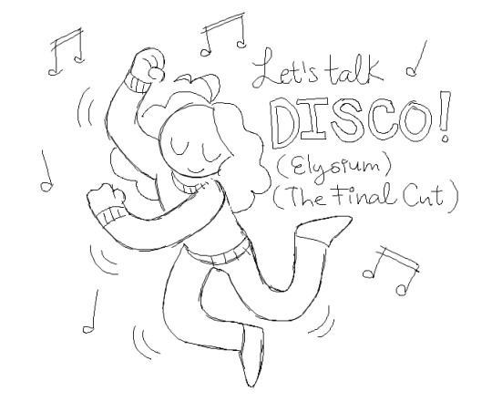
What makes a story compelling? Is there one answer that applies to all narratives, and, if there is, is it so horribly broad as to be utterly useless? From Aristotle to Campbell to Juul, we've been trying to figure out a way to pin down the key to a good story for centuries. Like many modern narratologists we covered in the lecture, I have trouble coming up with an all-encompassing, meaningful theory that's inclusive of the video games I enjoy and traditional narratives. Interactive media, especially video games, can follow a strategy all its own. That's not blasphemous to the media before it.
While researching some articles on ludology for this lecture topic, I came across an article that, while risqué, does have some points to make about the merits of viewing video game narratives through an entirely different lens. I believe Shira Chess's piece The queer case of video games: orgasms, Heteronormativity, and video game narrative to be an extremely welcome takedown of the Freytag and subsequently the Brooks model. It's true that many traditional narratives have a singular climax, and indeed many video games can fall under this mold as well, but at the urging of Chess to consider other viewpoints of ludological narrative, I'm quite pleased at the prospect of games not following that route in favor of "little victories"-- incremental pockets of pleasure in limbo.
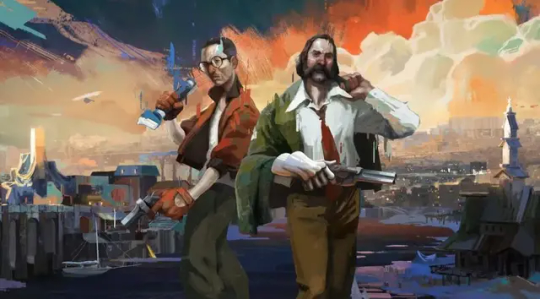
Figure 1: The main characters from hit 2019 video game Disco Elysium: The Final Cut
DISCO ELYSIUM
I sincerely doubt Propp had anything like Disco Elysium in mind when he penned his theories, and yet it's a game that rings true to everyone I've known that's played it-- especially myself. It's dense, jam-packed with 20+ hours of fully voice-acted dialogue, and tightly woven into a story both alien and familiar. Sure, it has a beginning, middle, end, and you could even fit some characters into Propp's archetypes in there if you pleased*. Not only is it an interactive narrative, however, it leans into its own absurdity to a degree that can derail the entire story itself. In an interview with some of the minds behind this grand-scale narrative, writer Argo Tuulik admitted that a great deal of Disco Elysium's success is owing to the creative team's naive willingness to explore even the most off-the-wall idea and not being too precious about the moral integrity of its characters. That's something I really, really value in a piece of media; the ability to not let any character be utterly invincible or badass without reason, for even the most level-headed to be open to humiliation and bizarreness.
*Here, I'll rattle some off now: Harry is the hero, Kim is the helper, Klaasje could be a false hero, the Thought Cabinet is a Dispatcher, etc.
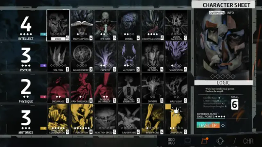
Figure 2: Disco Elysium Character Sheet Screen.
Gameplay is almost Dungeons-and-Dragons-esque in nature. As a player, you must level up your skills, each representing a different facet of your ability to do your job. While each route is plotted, this is a massive departure from the narrative styles we are so used to in traditional media.
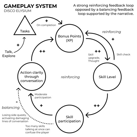
Figure 3: A brilliant graphic of the Disco Elysium cycle by Gabriel Chauri.
There are standalone events in Disco Elysium, set in stone or otherwise, and they are fantastic, but so much of the fun of the game lies in the mechanics themselves.
As a 2D animator, my skills would still be valuable in creating such a game-- while I'm picking up Blender on the side, Disco Elysium's still utilizes 2D animation and overlays on top of 3D models. It feels grungy and artistic and gross, something I would adore emulating on my own time. Perhaps After Effects can help me out.
Bibliography
Aarseth, E. (2004). Genre trouble: Narrativism and the art of simulation. In N. Wardrip-Fruin & P. Harrigan (Eds.), First person: New media as story, performance, and game (pp. 45–55). Cambridge, MA: MIT Press.]
Brooks, P. (1977). Freud's Masterplot: Questions of narrative. In S. Felman (Ed.), Literature and psychoanalysis: The question of reading: otherwise (pp. 280–300). Baltimore, Md: Johns Hopkins University Press.
Campbell, J. (1949). The Hero with a Thousand Faces. 3rd ed. Novato, Calif.: New World Library.
Chauri, G. (2021). Disco Elysium RPG System Analysis. [online] Game Design Thinking. Available at: https://gamedesignthinking.com/disco-elysium-rpg-system-analysis/ [Accessed 11 Oct. 2023].
Chess, S. (2016). The queer case of video games: orgasms, Heteronormativity, and video game narrative. Critical Studies in Media Communication, 33(1), pp.84–94. doi:https://doi.org/10.1080/15295036.2015.1129066.
Freytag, G. (2012). Freytag's technique of drama: An exposition of dramatic composition and art. London: Forgotten Books. (Original work published 1863)
Inderwildi, A. (2021). What the Epic of Gilgamesh can tell us about Disco Elysium’s most troubling character, the Deserter. mashxtomuse. Available at: https://www.mashxtomuse.com/single-post/what-the-epic-of-gilgamesh-can-tell-us-about-disco-elysium-s-most-troubling-character-the-deserter [Accessed 14 Oct. 2023].
Juul, J. (2005). Half-real : Video games between real rules and fictional worlds. Cambridge (Massachusetts, Usa): The Mit Press.
Roof, J. (1996). Come as you are: Sexuality and narrative. New York: Columbia University Press.
Williams, L. (2022). How a collaborative writing process birthed Disco Elysium. [online] Games Hub. Available at: https://www.gameshub.com/news/features/disco-elysium-narrative-writing-process-18597/ [Accessed 1 Nov. 2023].
ZA/UM (2019) Disco Elysium: The Final Cut [Video game]. ZA/UM
0 notes
Text
Property Is Where The Coronary heart Is But Check out Here Initial!
What's wonderful about interior decorating is the fact that there is not any right or wrong strategy to approach the topic. With so many designs accessible under the sun, you can get inspiration almost anyplace. The ideas in the post beneath may help you take a look at new home design tips or perhaps supplement what you could may have learned.
If you are intending an interior design venture you should make a decision on all of your textures and colours before you start. Unless you program all of it in progress you will discover that you wind up straying from the authentic strategy. This is simply not very good, as you wish a structured seeking result.
Look at the furniture you might have in your residence and find a variety of colors and household furniture that matches well together. You want to have furnishings colours that compliment the other person, along with the colours close to your home. Avoid picking shades that aren't associated, because this may look such as you don't know design.
In the living area, attempt to set up your furnishings into locations. Possess a middle committed to watching tv, a centre focused on reading through as well as a middle devoted to conversation with family and friends. This can be the best way to break-up your furnishings, provide the area look and feel and then make the place user friendly way too.
For spaces rich in ceilings, you need to differ the locations of your lighting fixtures. The reality that the ceilings are incredibly great can destroy the lighting in a place. To combat that, try using both roof lamps both and lighting that sit ground-levels. It can help to make a lot more satisfactory illumination inside the room.
Be sure to supply the space for storage you need. You'll by no means get a room that appears enjoy it became available of the newspaper if there's clutter almost everywhere. Search for appealing storage units taken care of in a cloth which fits the remainder of the area. If you make storage space a part of your style, it's simple to make a place seem amazing.
Fix up a child's area from his standpoint. Think about the things they like so they can appreciate how you will redecorate their space. Make certain they could effortlessly accessibility every little thing. Attempt to see your home via a child's view.
Make sure that every room has superb illumination. High quality illumination will allow you to showcase your home, and can even help a room feel bigger. If there's an area at your residence which includes darker corners in spite of the lamps excited, select a stylish new light. It'll make your whole room seem better.
Try hanging the picture frames in an eye-levels, rather than better through to a wall structure. Graphics put up excessive provides the impression of decrease ceilings. Trying to keep picture frames at the decrease stage also causes them to be more apparent, and will keep website visitors from being forced to look up to be able to view your gorgeous art.
Consider using wallpapers on only 1 / 2 of the wall surface. Redecorating your walls may be high-priced. To spend less, only wallpapers 1 / 2 of your wall structure. Give your wallpapers a nice edge and painting the remaining wall. This is an excellent method to get a fashionable searching property whilst saving cash.
Pedestal kitchen sinks are wonderful alternatives in small bath rooms. These sorts of kitchen sinks use up much less space, and they create a little washroom appear larger. They have a sophisticated interest them that is certainly vintage and works with any decor. You can find them on your community redecorating retailer at numerous value details.
The content over has with any luck , helped the thing is that you have a lot of factors to interior decorating, but no really incorrect or best way to approach it. Acquire remarks and don't permit yourself get confused with the details you have just read. Apply https://thietkechungcu.com to your models and you are certain to find out a much more created residence.
0 notes
Text
Just Add Glitter by Angela DiTerlizzi. Illustrated by Samantha Cotterill.
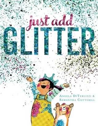
Age Recommendation: Early Learning
Topic/ Theme: Fun, Glitter.
Setting: Unidentified Westen
Rating: 3/5
This is such a wonderful book. Though for from the best picture storybook I've read. While I'm not a massive fan of the colouring, I really appreciate the texture. On every page, there are patches of what is intended to feel like glitter. Cotterill's art style reminds me a bit of Jeannie Baker's it's the collage style. But unlike Baker's full colour and texture style, this has a more of a 2D feel to it. It feels the right kind of childish (without that being any kind of insult). The characters are cute. A bored little girl and her cat. I can see it being relatable to people. Even if for some children that cat could be a plushie.
Okay so the writing itself. I have reservations. It is lyrical, designed to be read out loud, performed. That said the last line does not quite work for me. It's a bit jarring. The idea of "The glitter made it hard to see, what sparkles most... is you and me." is lovely but as it is presented across two pages messes with the flow. But a performance book, a book for storytime, for reading time with family it is almost perfect. Because it leads so well into craft activities, glittery crowns, dinosaurs and pictures of cuckoo clocks. These things are all included in the story and illustrations at one point or another. For that this is brilliant.
The most cynical quote I've ever read on glitter but also the reason I found this book is "Then it’d be all red and pink hearts and more glitter—AKA the herpes of craft supplies." (New Year's with the Single Dad, Whitley Cox). Look I couldn't resist okay. But it does kinda fit too. Glitter gets everywhere and that is an undeniable truth.
#just add glitter#book review#angela diterlizzi#samantha cotterill#picture story#ktreviews#read 2022#glitter#booklr
0 notes
Text
Project 2 - Manifestos
Takamura Kotaro’s manifesto ���A Green Sun (1910)’ caught my interest since it regards a certain concern in art that I wasn’t aware of myself. Takamura was a painter and sculptor who was described as ‘artistically well educated but emotionally mixed up.’ This I could see was evident when I read his writing, in which he expressed how he seeked freedom in the art world. He was also quite concerned about how ‘so-called Japanese-style painters’ couldn’t, in his opinion, ‘move forward’ and are marked by the term ‘Japanese style.’ To support this point, he relates it to how ‘so-called Western-style painters’ can’t either be ‘weighed down by oil paints on their backs.’ Takamura wished to see individuality in artists and did not seem fond of how painters of certain styles were restricted to be identified through only that style in general.
‘I want to recognise an infinite authority in the artist’s personality. In every sense, I’d like to think of the artist as a single human being.’
Takamura mentioned the term ‘local colour’ which piqued my interest. It’s a term I wasn’t familiar with. I learned that ‘local colour’ refers to the ‘natural colour of an object unmodified by adding unrealistic light or any other distortion.’ Specifically, Takamura focused on the Japanese adaptation of this technique. In Japanese-style paintings, the sun in particular is usually painted green, hence the title of the manifesto. Takamura must have found this very dull in Japanese-style art and opposed the notion that ‘nature in Japan has a certain inviolable set of colour peculiar to it.’
I find it really fascinating how this manifesto was concerning an art style and its characteristics. I also found the topic itself to be quite insightful as an artist. Reading Takamura’s wishes for artists to pursue their own unique and individual style was quite inspiring. I do agree that artists should allow themselves to be free with their artwork and shouldn’t always necessarily adhere to what everyone else does for a certain genre. It would only strip the art of its uniqueness. I can personally relate to this since I'm aware that I also restrict myself when trying to draw. I always have a fixed idea in my head that I want to create to fit into the art styles that I like without allowing myself to be more experimental with what could work for me. I too would like to create art that reflects me and my 'frame of mind.'
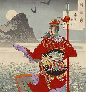
Takamura Kotaro, A Green Sun 1910, Kortext:
Local colour definition:
0 notes
Text
Your Very Own Individual Interior Design Guide
It is no magic formula that interior design is really a topic that intimidates a great number of folks. All too usually, the one thing standing upright in between you and also a lovely property is of information and gratitude of design tactics. Utilize the minds with this piece for your personal living quarters and you will in the near future possess a house that impresses family and friends as well using its glamor.
An excellent idea when you're hoping to get some internal developing completed is to speak with a expert internal developer. Everybody believes they could try everything themselves, which isn't a poor quality, but professional indoor creative designers provide an eye for things that the typical Joe doesn't think about.
A great interior decorating suggestion is usually to understand the art of subtlety. Some individuals like gaudy variations and that's perfectly fine. But lots of people just end up getting tacky designing simply because they're overzealous and simply don't know when you should cease on their own. All you have to recall is the saying "more is significantly less".
Make xưởng gỗ that there is ample illumination in just about every space of your home. xưởng chế tác đá thạch anh can need you to do some preparation as to the best places to situate your lighting or chandeliers. In case you have a huge space, you will need to tactically position the lamps to filter through the complete place.
Take care when picking hues for your internal-style task. You need a colour plan the functions harmoniously jointly to generate a well balanced appearance. It is just as crucial to protect yourself from integrating a lot of shades that clash with one another since it is to prevent building a mundane, monotone and boring place.
When redecorating a master bedroom, incorporating a little coloration can help. Painting a single accent wall structure or include some more strong bedroom pillows to the mattress. Spot a highlight office chair inside the corner or use lampshades using a bold put of coloration. This brings visible attention towards the place, and it is an inexpensive method to affect the room.
Generate some classiness in the space using sconces for lighting. The dim light which comes coming from a sconce is considered to be fancy and enchanting. You can even buy them in a number of styles, colours, and designs so that they will easily fit in perfectly using the theme of your place.
You can create very worthwhile indoor designs by deciding on a centerpiece. Your focal point can be quite a perspective, a thing of beauty, a genuine furniture or possibly a helpful appliance. Avoid cluttering about this important level and employ this centerpiece to set a style or even a motif for the area.
These seeking to design and style an area in their residence needs to be intelligent about it. Whatever products you want to decorate your living area with ought not take outside the functionality of your place. As chân bàn sắt , don't place a large part in an place that where by you will find a lot of visitors.
When you find yourself decorating your living room, you should create a centerpiece within the room and arrange furniture following that. Your centerpiece might be a large windowpane or possibly a fireplace. If you work to have your household furniture supplement this center of attention, you will have a room you will be proud of.
Simple shades are excellent to use in virtually any area of your house as they possibly can match up just about any design or shade. These colours consist of beige, taupe, black and white and therefore are a good form of shade in case you are redecorating using a modern day style. Incorporate these hues if you wish to be about the secure side with the coloration structure.
Interior decorating might appear to be one thing which it is actually extremely hard to acquire expertise. The fact is, nonetheless, that schooling is vital to dealing with any layout conundrum you encounter. Take advantage of the information within the post earlier mentioned and you will probably no more issue how to handle the numerous areas in your house.
0 notes
Text
Jung Min Seub
Jung Min Seub makes these really cool peices of work that reminds me of mushrooms! I imagine that's their main inspiration. The way the branch like structures are set looks like mutant mushrooms that somehow form these mythical witch houses.
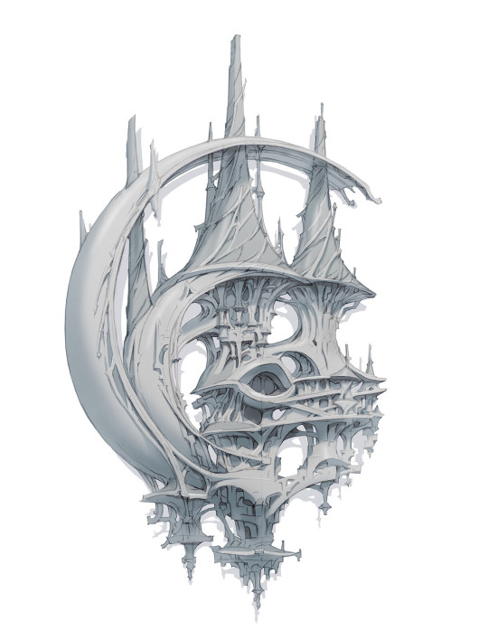
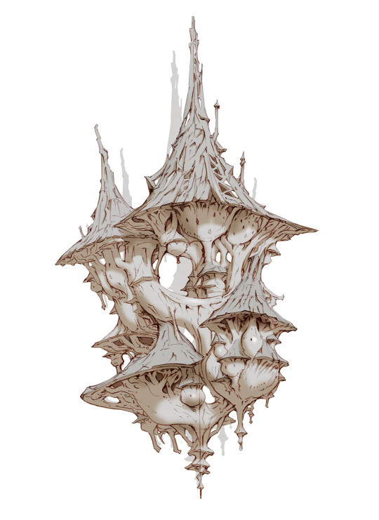
Now I really like this style. Its like a greener earth future of maybe a futuristic cheaper way of making affordable housing. I really like these, especially how the colour palettes are different. The cool grey is in the shape of a moon, and is a similar colour to what a moon would shape like. While the deeper yellowish white is more rigid and has a run down vibe. The concepts are similar but the execution is so different. I think what I like most about the warmer coloured mushroom home is the roof, the texture gives off this old roof look that blends really well with the mushroom homes.
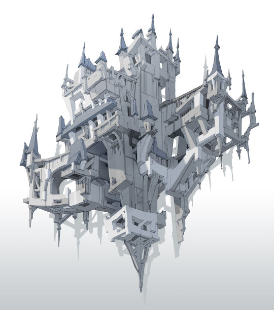
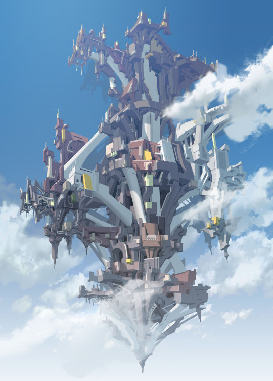
Now, don't get me wrong I do love the whole colour pallet that this artwork has and I do love that they kept with the angular shapes throughout making this but I still prefer the mushrooms. Jung Mi Seub has many ways of making artwork and different styles of different buildings and houses and this isn't my least favourite. I do love the shadowing and the tones, just prefer the natural look of the shrooms.

I don't like mechs, things like shown above. I feel like they are too cluttered and I'm not super into the mechanical style like this. My brother is, he makes Gundam Model Kits and adds little details and things using knives and paint and Micron pens. Anyway, Apart from that I do really like the bones look of the mechanical camel(?). Going mech like in a way that shows off bone structure and muscles in animals is a really cool idea and it was well executed here. I love that they drew people to show the scale of it. To really show off what it looks like and what the size of it is. For something I normally turn my nose up at this is really cool, the colours are similar to the colours of bones as well so that also conveys that vibe.
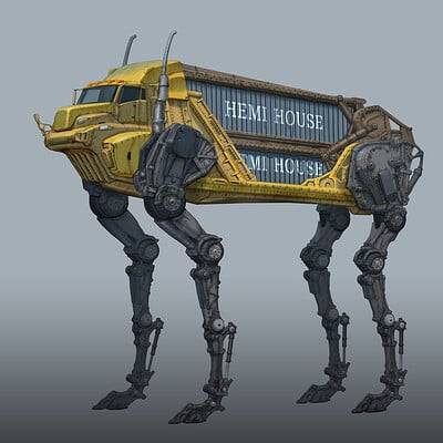
Ok this one is kind of funny to me, the long animal legs on a truck to make it look like an animal. I honestly love it, I think I'm going to be thinking about this for days, maybe even weeks after making this post. I find it really cool that they made the grill of the truck the teeth, It fits so well and it's just such a good use of what is available on a truck. I keep thinking about this thing running down the highway. It is more agile and a more smart way of travelling goods on the road, the amount of truck accidents that happen so often is kind of ridiculous. It is a heavy vehicle and its just so large. Its like if you gave an ant a tech deck.

^Jung Min Seub's current Profile Picture on art station
Bless Online El Lano city
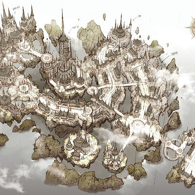
More on topic, this is one of the maps they made, The colours sued have old map vibes and the look is more top down to reveal the details and the more important parts of the maps like I mentioned in the post about the Edge Chronicals. I think a good map shows off the most important details of the lands they are supposed to represent instead of just a top down view of the shape. Yes, the shape of an island is an important attribute especially if it is in a shape of a frog or a skull or what ever specific shape has been chosen. The most important thing, in my own opinion, is what the island holds, depending on said scenarios. Less details can show more mysterious sides of what island/ area you are mapping. But if you are planning the island to have significant and large structures it is way better to do a more close up detailed map.
0 notes