#Stamperia Valdonega
Text
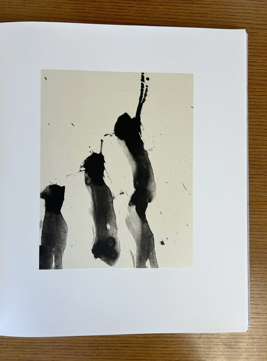
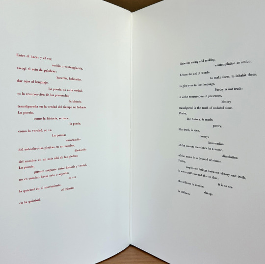
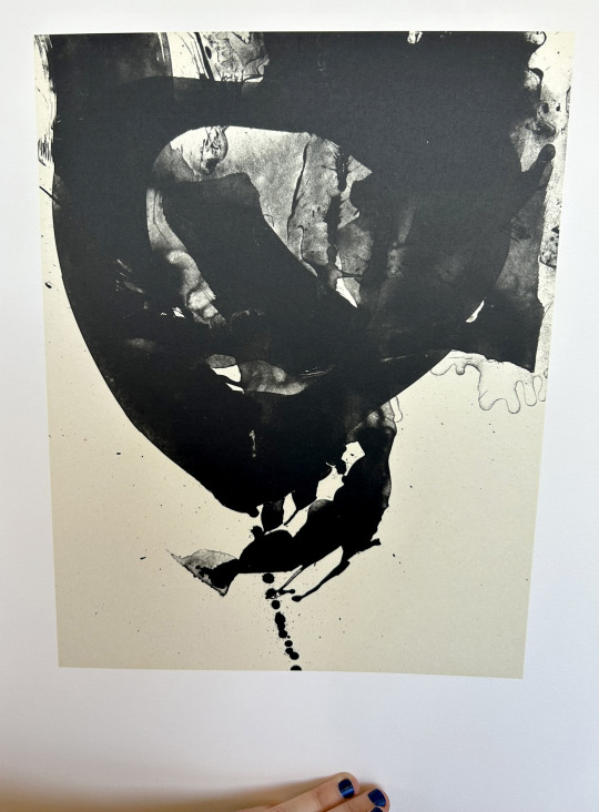
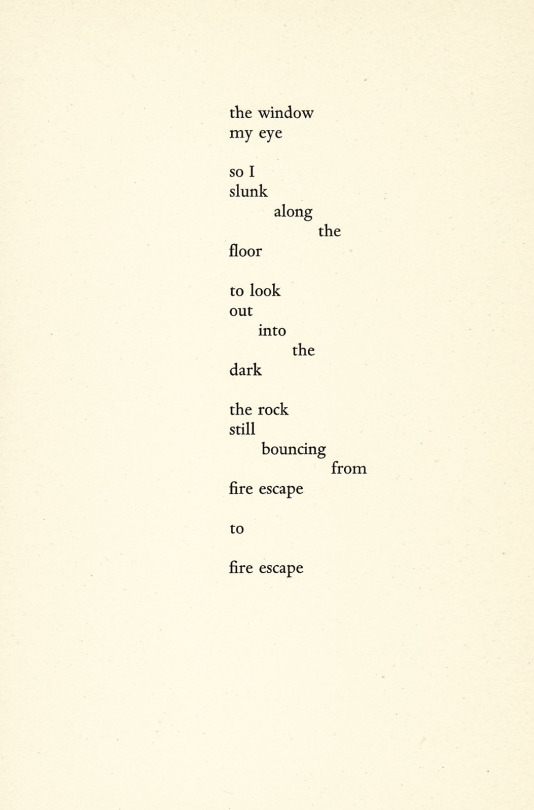
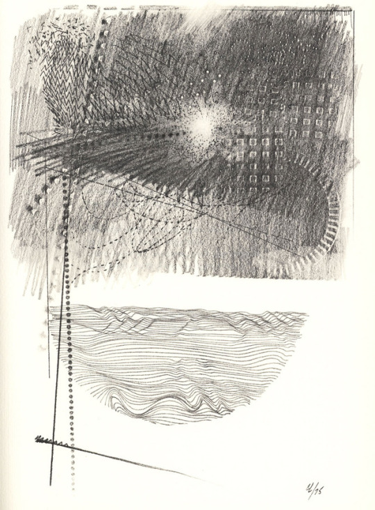
It’s Fine Press Friday!
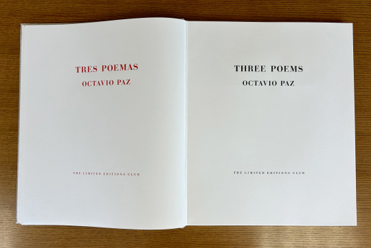
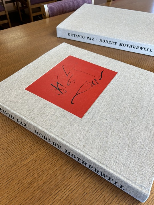
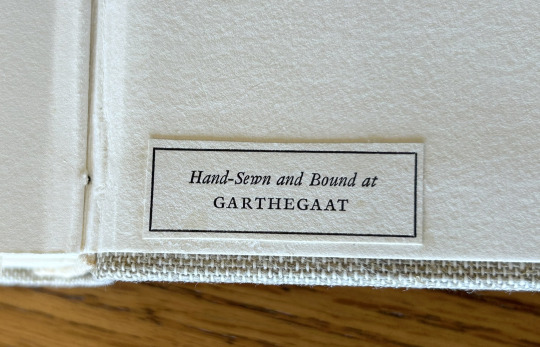
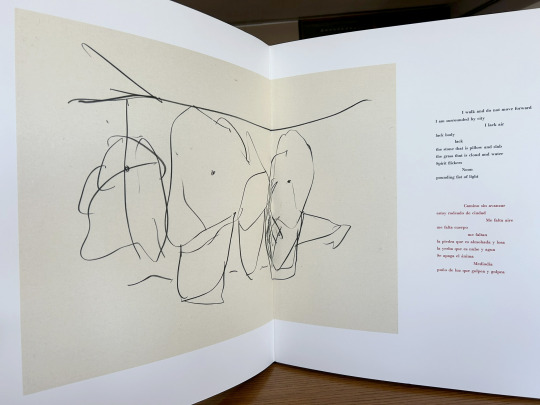
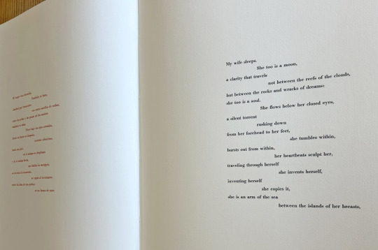
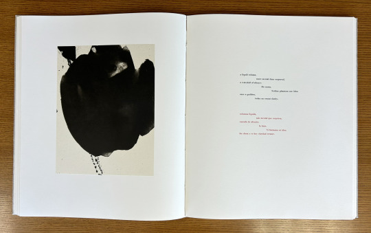
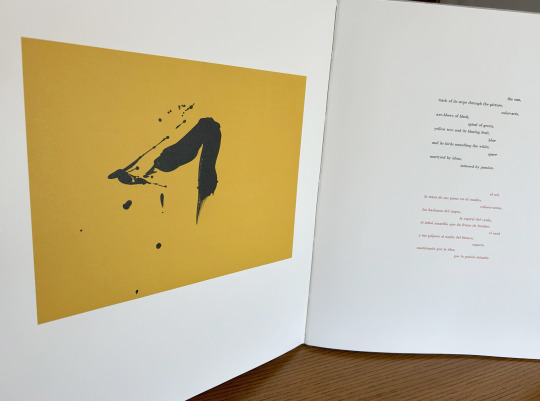
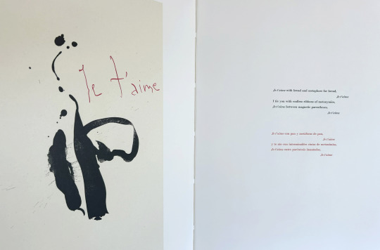
Today we’re taking a look at our 1987 Limited Editions Club release of poet, diplomat, and Nobel laureate Octavio Paz’s (1914–1998) Three Poems. Published as a bilingual Spanish-English edition of selections from The Collected Poems of Octavio Paz, 1957-1987 (translated by Eliot Weinberger, the primary translator of Paz’s work into English), this prodigious publication measures 56 cm and features lithographic illustrations by abstract expressionist painter and printmaker Robert Motherwell (1915-1991). The text was handset at Stamperia Valdonega (Verona, Italy) in Bauer Bodini Bold and Bauer Bodini Bold Italic typefaces, both of which were cast by Fundicíon Tipográfica Neufville (Barcelona, Spain). Lithographs were printed at Trestle Editions on hand-made Japanese papers and text was printed at Wild Carrot Letter Press (Hadley, MA), Stamperia Valdonega, and The Heritage Press on mould made paper from Cartiere Enrico Magnani (Pescia, Italy). It was hand-sewn and bound at the Garthegaat Bindery.
The book was designed by Benjamin Shiff, LEC book designer and son of Sidney Shiff, who had purchased the debt-ridden Limited Editions Club in 1979. Under the leadership of Shiff, a one-time Wall Street broker, the LEC gained a broadened subscription base, increased the quality of their publications, diversified their roster of artists, and returned to profitability.
Though minimal and modern in presentation, the production of this edition plumbed the depths of printing history. The Magnani paper mill was established on the banks of the Pescia river (known for its clear water- a necessity for paper production) in 1404, half a century before Gutenberg’s printing press was first put to commercial use. And the Fundicíon Tipográfica Neufville (operational 1885-1995), also known as Neufville Typefoundry, was the biggest 20th century supplier of the printing industry in Spain. After a number of ownership transfers, the company, alongside Bauersche Gießerei (a German typefoundry, operational 1837-1972), was succeeded by Bauer Types, which would leverage ownership of the rights to many of the original typefaces from both foundries to lead the way from lead type production to digital typography.
--Ana, Special Collections Graduate Intern
View more Limited Editions Club posts
View more lithography posts
View more Cartiere Enrico Magnani posts
View more Stamperia Valdonega posts
#Fine Press Fridays#Fine Press Friday#Limited Editions Club#lithography#Cartiere Enrico Magnani#Stamperia Valdonega#Bauer Types#Magnani paper mill#Bauersche Gießerei#Octavio Paz#Eliot Weinberger#Robert Motherwell#Fundicíon Tipográfica Neufville#Three Poems#Tres Poemas#Wild Carrot Letter Press#Trestle Editions#mould made paper#Garthegaat Bindery#Benjamin Shiff#Ana
23 notes
·
View notes
Photo
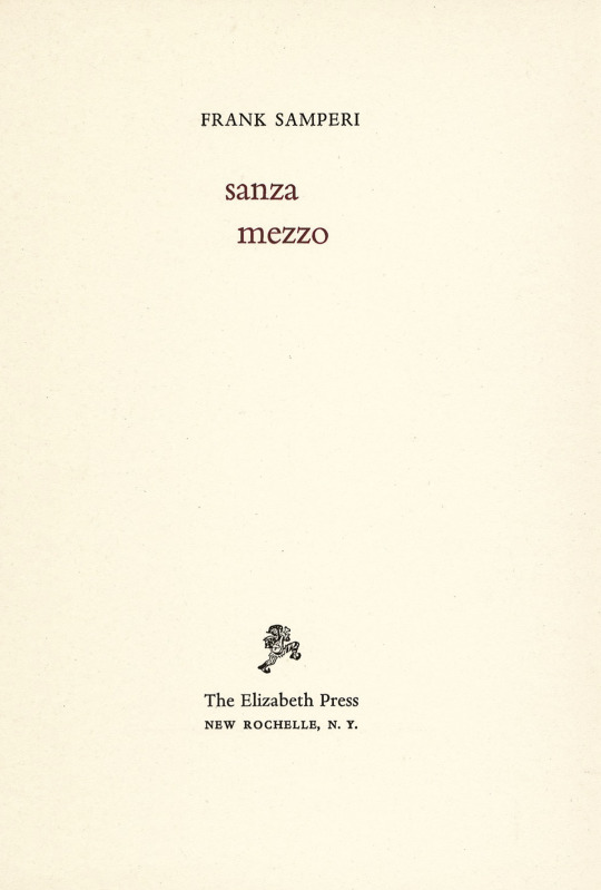
From: Frank Samperi, Sanza mezzo, The Elizabeth Press, New Rochelle, NY, 1977, Edition of 400 [Designed by Martino Mardersteig, Printed by the Stamperia Valdonega, Verona]
#graphic design#poetry#book#frank samperi#martino mardersteig#the elizabeth press#stamperia valdonega#1970s
42 notes
·
View notes
Link
First Edition Decorated gray boards with sepia head of Pound by Gaudier-Brzeska on the front cover. Copy #41 of 503 printed at the Stamperia Valdonega di Verona. INSCRIBED and SIGNED on the front endpaper by the poet: 'Teresa's copy/Ezra Pound.' Laid in are three pieces of ephemera: a postcard advertisement for this book with a portrait of Pound signed by V. Scheiwiller, a folded price list with the same portrait from Scheiwiller, and a color postcard of Rapallo, addressed in an unknown hand to Teresa Magee in Rome in 1967, and SIGNED 'Love and best wishes/Fifi/John/Olga/Ezra Pound.' The postcard is SIGNED by Pound, but the other names appear to be in their own hands. Bookplate on front pastedown of Maire Christina Magee Lawson. Some wear to the boards, Very Good
0 notes
Photo


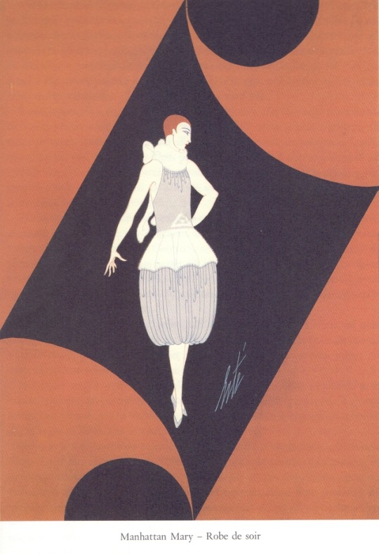


Erté Cose che ricordo
La Bautta , Matera/Ferrara 1987, 290 pagine con tavole in esacromia.
Edizione impressa nella Stamperia Valdonega, a cura di Martino Mardersteig, su carta delle Cartiere Magnani di Pescia. La bautta, marchio dell'editore, in serigrafia. Cartonato editoriale.
euro 140,00*
email if you want to buy :[email protected]
Elegantissima edizione delle memorie di Ertè, illustrate da disegni dello stesso maestro.
orders to: [email protected]
twitter: @fashionbooksmi
flickr: fashionbooksmilano
instagram: fashionbooksmilano
tumblr: fashionbooksmilano
4 notes
·
View notes
Photo
From: Frank Samperi, Sanza mezzo, The Elizabeth Press, New Rochelle, NY, 1977, Edition of 400 [Designed by Martino Mardersteig, Printed by the Stamperia Valdonega, Verona]
#graphic design#poetry#book#frank samperi#martino mardersteig#the elizabeth press#stamperia valdonega#1970s
31 notes
·
View notes
Photo

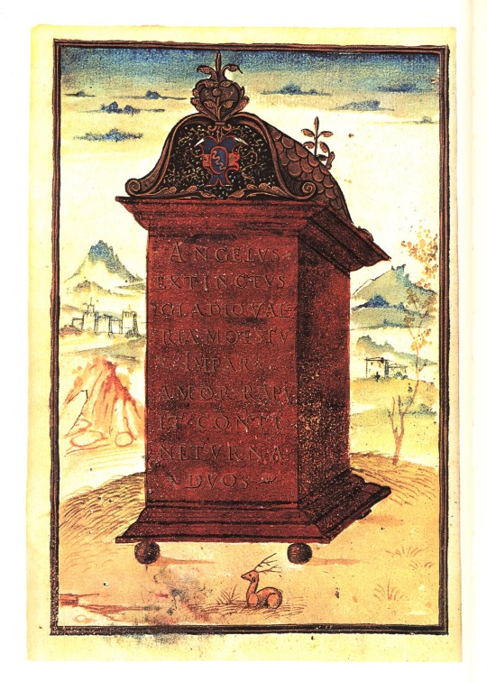


It’s Fine Press Friday!
Novelle Cinque: Tales from the Veneto, translated and edited from the original Italian by George H. Bumgardner, is illustrated with four watercolor facsimiles from the 16th century manuscript and constitutes a major part of the “Refugio de miseri” (the refuge from misery), containing five short stories that detail the misery surrounding young lovers in Venice. Our edition was translated into English for the first time from the manuscript residing in Beinecke Rare Book and Manuscript Library at Yale University and was designed by Martino Mardersteig, who also oversaw the letterpress printing in the Stamperia Valdonega in Verona, Italy. Mardersteig was notably connected to the Officina Bodoni, a private press in Verona specializing in hand press to create beautiful and incredibly high quality books, through his father Giovanni Mardersteig. The elder Giovanni designed the Dante, Griffo, and Zeno typefaces based on the popular Old Humanist types of European printing in the early 20th century. This edition was printed in Centaur typeface designed by Bruce Rogers, another Old-style typeface similar to typefaces designed by Mardersteig. It was printed on Pescia paper made specifically for this edition by Cartiere Magnani and bound by Legatoria Recalcati in Milan. There were 1950 copies published by Imprint Society Publishing in Barre, Massachusetts in 1974.
The colophon on the original piece indicates that the manuscript belonged to an Antonio Angelieri and Bumgardner notes in the introduction that the first story is an original belonging solely to this collection, while the following four stories were previously printed as part of other collections. The fifth story, “Justa Victoria,” was printed by Officina Bodoni in 1943. In a strange twist, he believes that the manuscript was given to Angelieri as a wedding gift, although the stories contained in this piece are anything but wedding-friendly. He describes the collection as “an antecedent to Romeo and Juliet”.
View more Fine Press Friday posts.
-Emily, Special Collections Writing Intern
#novelle cinque#refugio de miseri#beinecke#Monotype Centaur#Stamperia Valdonega#pescia#cartiere magnani#George H. Bumgardner#Martino Mardersteig#Centaur type#Novelle Cinque: Tales from the Veneto#Fine Press Friday#Fine Press Fridays#emily birz
31 notes
·
View notes
Photo

Frank Samperi, Sanza mezzo, The Elizabeth Press, New Rochelle, NY, 1977, Edition of 400. Designed by Martino Mardersteig, Printed by the Stamperia Valdonega, Verona
#graphic design#typography#poetry#book#cover#book cover#frank samperi#martino mardersteig#the elizabeth press#stamperia valdonega#1970s
14 notes
·
View notes
Photo

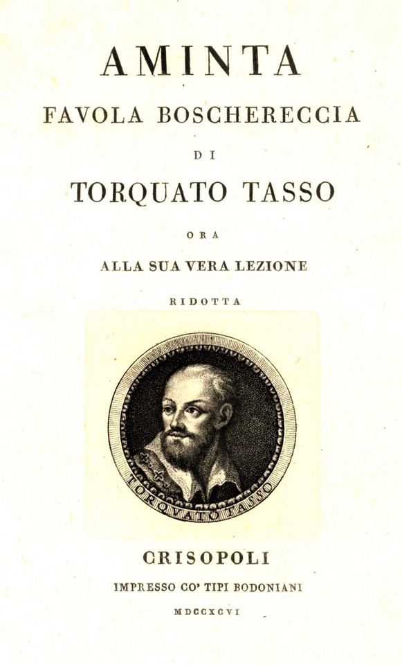


Typography Tuesday: Bodoni
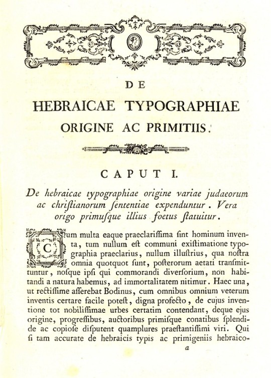
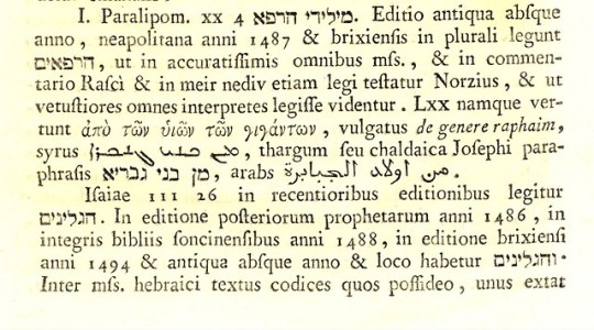
Among the most prominent of 18th-century type designers was the great typographer, compositor, printer, and publisher Giambattista Bodoni in Parma, Italy. Bodoni was especially influenced by the type designs of French type founder Pierre Simon Fournier and the English type designer and printer John Baskerville. Bodoni, along with the French type founder Firmin Didot, established a style of type design that became referred to as “modern,” and in the 20th century is called “Didone,” a term that combines the names of Didot and Bodoni. Bodoni’s typefaces are not revived classical forms, but new, rational designs characterized by a strong contrast between the thick and thin parts of the type body.
After a nearly 20-year period of training, Bodoni became the type designer and printer for the new ducal press at Parma in 1768, where he would spend the rest of his career until his death in 1813. Shown here are examples from Bodoni’s early and later work:
Giovanni Bernardo De Rossi. De hebraicae typographiae origine ac primitiis seu antiquis ac rarissimis hebraicorum librorum editionibus seculi xv. Parmae: ex Regio typographeo, 1776.
Torquato Tasso. Aminta, Favola boschereccia di Torquato Tasso; ora alla sua vera lezione ridotta. Crisopoli (i.e. Parma): Impresso co' tipi Bodoniani, 1796.
The first displays examples of his many fonts for different languages, including Latin, Hebrew, Greek, Syraic, and Arabic. The second displays his classic font (in Italian) in both Roman and Italic. When Bodoni began working for the Duke of Parma, his imprint would usually appear as ex Regio typographeo, without Bodoni’s name (as in the 1776 example above), but one knows this is by Bodoni because he was the only royal typographer from 1768-1813. In 1791, however, as a way to convince Bodoni to remain in Parma, the Duke allowed Bodoni to establish his own private press, and after this period we begin to find Bodoni’s name in the imprint, as we see in the 1796 printing above.
The 20th and 21st centuries have seen an extended revival of Bodoni typefaces in both cold type and digital versions. The 20th-century German-Italian typographer and fine-press publisher Giovanni Mardersteig, was so taken by Bodoni’s type designs, that when he founded his own private press in 1922, he obtained from Italian authorities the exclusive right to utilize a selection of Bodoni’s original matrices, naming his well-known press Officina Bodoni, which continued to produce quality hand-press work to the end of the 20th century under the direction of Mardersteig’s son Martino, the proprietor of Stamperia Valdonega, which was also founded by Martino’s father in 1948.
View our other Typography Tuesday posts.
#Typography Tuesday#typetuesday#Giambattista Bodoni#Bodoni type#Didone#Parma#Giovanni Mardersteig#Martino Mardersteig#Officina Bodoni#Stamperia Valdonega#18th century#18th century type#18th century printers
28 notes
·
View notes
Photo


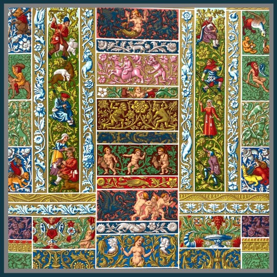

Fashion Friday: The Mannerism of Michelangelo
The Renaissance period is often synonymous with the greats of Michelangelo, Da Vinci, and young Raphael. These master painters poised "imitation" as preeminent beauty, art as poetry—ut pictura poesis—with Michelangelo arguably harnessing the peculiarities of the human spirit most adeptly in his abstract sprawl of figures, elongating their unseen beauty.
A Renaissance essay on Michelangelo by the nineteenth century art critic Walter Horatio Pater investigates the imagination of the master, calling attention to the artist's wayward loves-at-first-sight and their contradictions with the sculptor's mantra of la dove io t'amai prima, or, where I loved you before. Pater argues that it is precisely this paradox that comprises harmony: the delight between the sweet and the strange.
Pater repudiated his own time of the Victorian era, acclaiming the decadence of the Renaissance period as the seizing of life, or more aptly in his own words on living:
...to grasp at any exquisite passion... or any stirring of the senses, strange dyes, strange colours, and curious odours, or the work of the artist's hands, or the face one's friend.
It is in his words that we can embrace the unnatural grace of the late Renaissance, the period adorned with the Mannerist style of bold outlines, objects at-play with nature, and form with fantastical animal-humans. This unique style of the Renaissance is attributed to Michelangelo's successors who desperately tried to imitate his alien elegance.
Hidden in the figures of Michelangelo are these languid features, satyrs in repose, where solemnity and "faces charged with dreams" dictate, as described by Pater. Darting poetic thoughts give us a glimpse of the bittersweet temperament of Michelangelo's genius. He wrote of his torments in the pagan frivolities of endless quarrelling and his anger at the Gods for loving him so that he reached an age of eighty-eight years.
In all of his years, Michelangelo claimed his figures to be common, austere persons, yet his hand rendered an inherent surprise and energy that future imitators would exploit in quirky forest gods and lovely monsters.
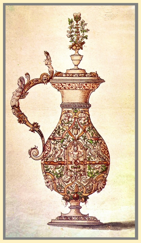
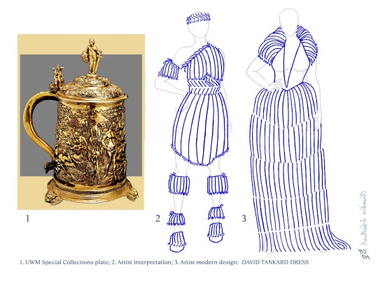
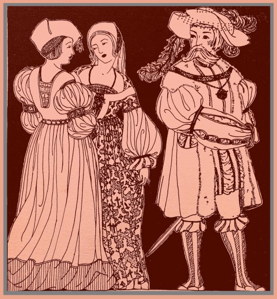
Ergo, my first fashion plate is titled "DRAGON EWER Dress," odd, but not as eccentric as the last two designs; perhaps you can trace the growth of the outlandish creature in each iteration.
Here is a listing of sources from the UWM Special Collections which I have augmented with digital color and outline to emphasize particular details of my inspiration:
1) A watercolor drawing by (or after) Wenzel Jamnitzer, circa 1575 in the Virtuoso Goldsmiths and the Triumph of Mannerism, published by Rizzoli International in 1976.
2-4) My interpretation and contemporary design of the DRAGON EWER Dress, SNAIL CUP Dress and DAVID TANKARD Dress based on Renaissance period vessels between 1540 to 1590 as published in the Virtuoso Goldsmiths and the Triumph of Mannerism, published by Rizzoli International, in 1976.
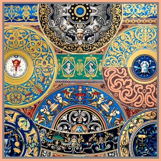
5, 6) French Renaissance plates of frieze borders in Rouen prayer books from 1508; and painted enamel work of Limoges under Italian faience between 1520 and 1540 as published in the Das polychrome Ornament: Hundert Tafeln, by P. Neff in 1880.
7) Walter Pater included an image of Michelangelo's The Holy Family, or, Doni Madonna, at the Uffizi in Florence, Italy in his aethesticism manifesto, The Renaissance: Studies in Art and Poetry, published by the Limited Editions Club, Stamperia Valdonega in 1976.
8) Costume of the early sixteenth century often in velvets (red is common) and embellished with fewels, gold, lace, fur and feathers as illustrated by Belle Northrup in A Short Description of Historic Fashion published by the Teachers College at in 1925.
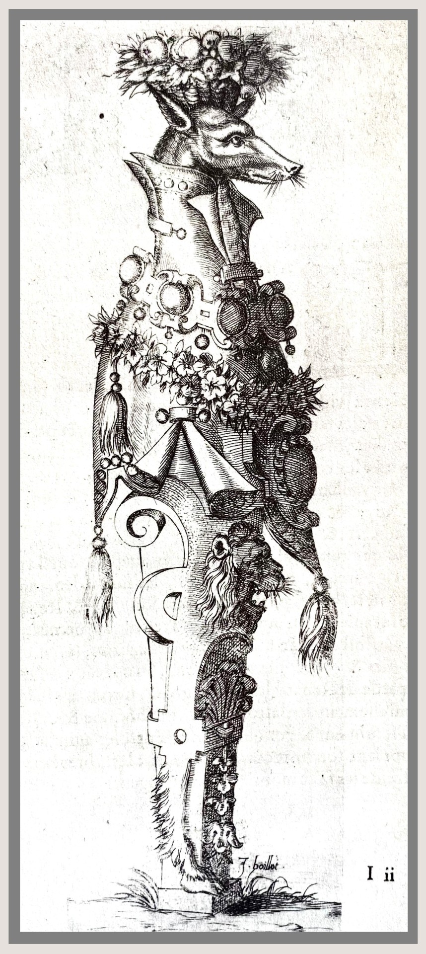
9) An 1592 engraving by Joseph Boillot titled Et Levrs Antipatie (possible translation Antipathy Lips) as published The Renaissance in France: Illustrated Books from the Department of Printing and Graphic Arts, by the Houghton Library, Harvard University in 1995.
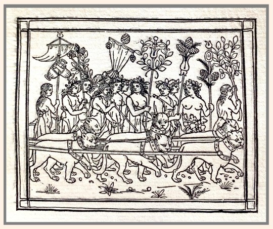
10) A drawing or possible woodcut of indentured lions as published in Thomas Wood Stevens' Book of Words: A Pageant of the Italian Renaissance, published by the Alderbrink Press at the Art Institute Chicago in 1909 for the Antiquarian Society.
View my other posts on historical fashion research in Special Collections.
View more Fashion posts.
—Christine Westrich, MFA Graduate Student in Intermedia Arts
#Fashion Friday#graduate research#Christine Westrich#Renaissance#Renaissance fashion#fashion#costumes#costume design#fashion design#fashion plates#Michelangelo#Walter Horatio Pater#Virtuoso Goldsmiths and the Triumph of Mannerism#Das polychrome Ornament#The Renaissance: Studies in Art and Poetry#A Short Description of Historic Fashion#The Renaissance in France#Book of words; a pageant of the Italian renaissance
92 notes
·
View notes
Photo
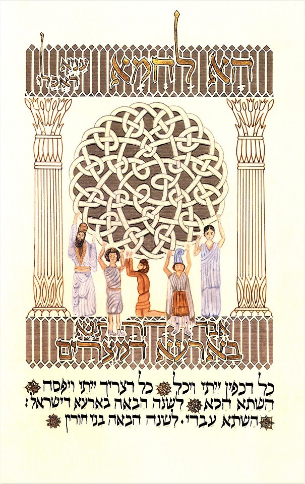


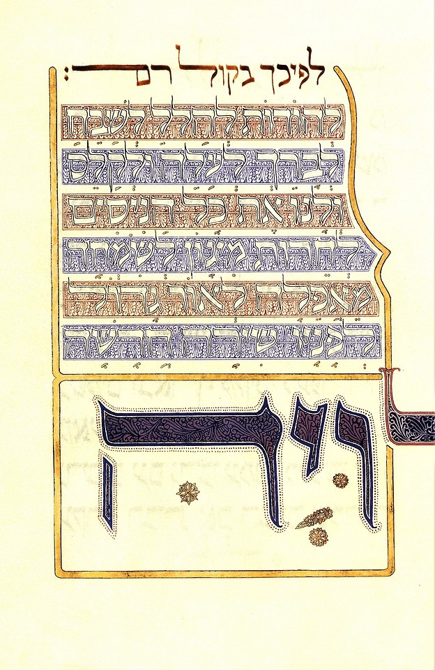
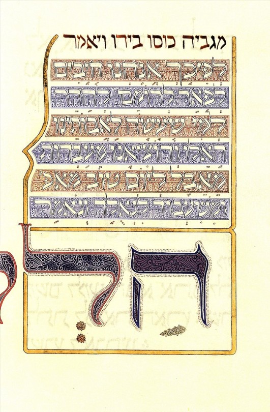
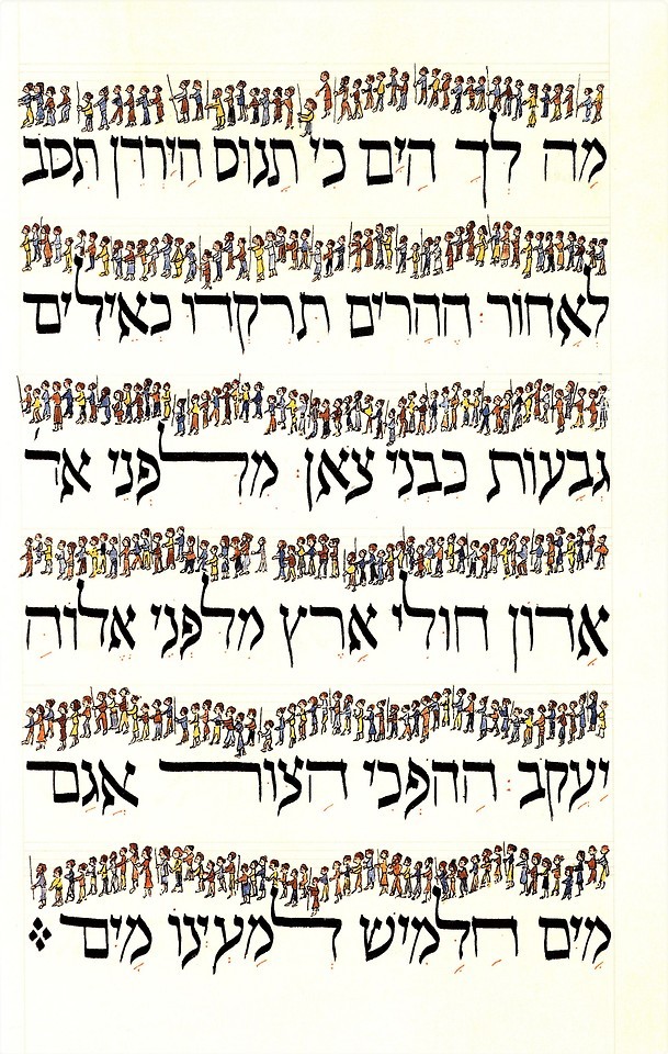
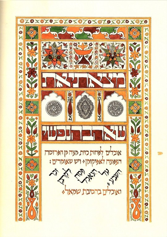
Pesach Greetings!
This holiday we present a 2000 facsimile of The Moss Haggadah published by Bet Alpha Editions. In 1983, American-Israeli artist David Moss was commissioned to produce an individual, hand-made Haggadah in the tradition of the medieval illuminated manuscript. Upon its completion, it was so well received by all who saw it that its owners, Richard and Beatrice Levy, graciously agreed to allow Moss to reproduce the work as a facsimile edition. Because the work, created on vellum, contained paper cuts, gold and silver, and many complicated features, research was begun on the project to see if a printer could be found who was capable of reproducing the look and feel of the work. In 1986, with the help of Martino Mardersteig of the prestigious press Stamperia Valdonega, 550 examples of this work were produced. Due to the overwhelming success of Moss’s facsimile haggadah, Bet Alpha Editions published this hardcover edition of the Moss Haggadah for the commercial trade.
View our previous Passover posts.
#Passover#Pesach#haggadah#David Moss#Moss Haggadah#Jewish holidays#illuminations#Hebrew manusscripts#facsimiles#bookhistory#Hebrew books#Hebrew illuminated manuscripts
561 notes
·
View notes
Photo


It’s Fine Press Friday!
This week we present the Poems of the Two Worlds by Frederick Morgan, with drawings by Clyde Lynds. It was designed, set, and printed by Stamperia Valdonega in Verona, Italy, in 1977 in an edition of 500 copies on Magnani mould made paper. The negatives for the plates were supplied by the Parabolik in Milan.
Giovanni Mardersteig (1892-1977) was a German born printer and typographer who founded the private press Officina Bodoni in Switzerland in 1922, and later moved the press to Verona in 1927. In addition to the Officina Bodoni, Mardersteig ran a mechanized press which he name Stamperia Valdonega, which he started in 1948. This allowed him to produce books in larger editions. Giovanni Mardersteig died in 1977 and the Stamperia Valdonega was taken over by his son Martino Mardersteig.
View more Fine Press Friday posts.
–Sarah, Special Collections Undergraduate Assistant
#Poems of the Two Worlds#Frederick Morgan#Clyde Lynds#Stamperia Valdonega#Giovanni Mardersteig#Officina Bodoni#Martino Mardersteig#Fine Press Fridays#fine press#Sarah
34 notes
·
View notes
Last Seen Blogs

limonludondurma6
Omer
gapbussy
🔞 Gapbussy 🔞

odai-alkhatib
odai alkhatib

sacchy
SACCHY (Sacchy Cosplay)

ggmanreviews
GGMan's Weekly Video Game Recommendations