#Cartiere Enrico Magnani
Text
It’s Fine Press Friday!
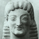
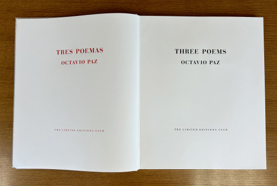
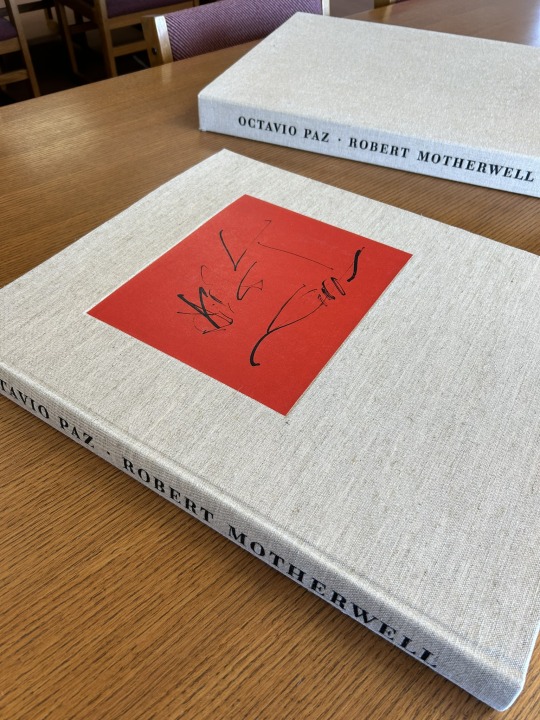
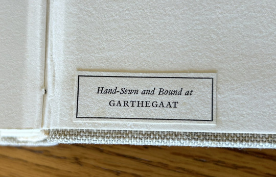
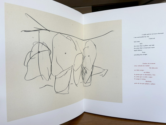
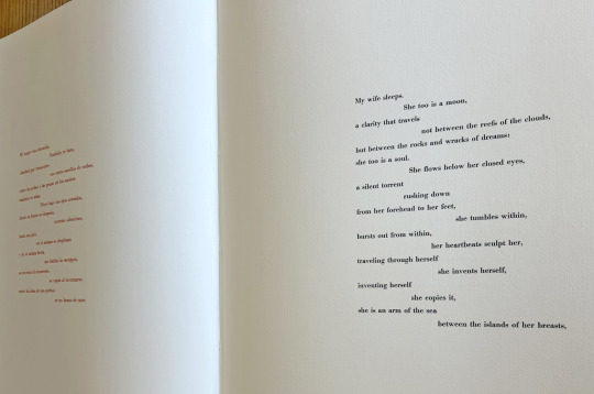
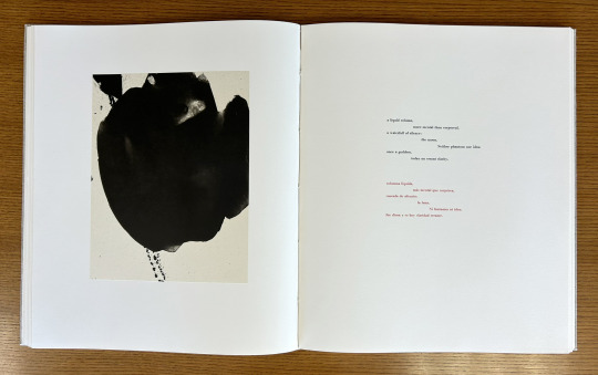
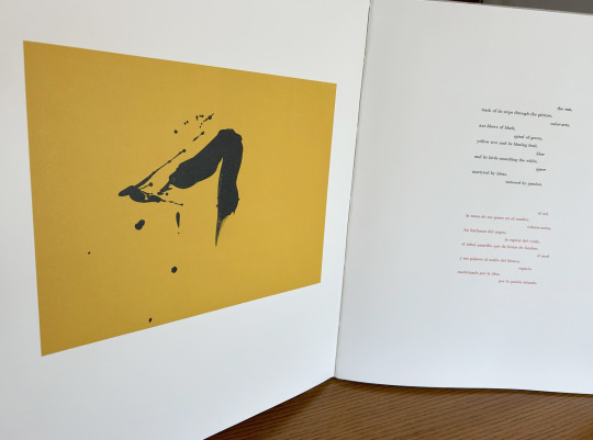
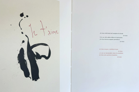
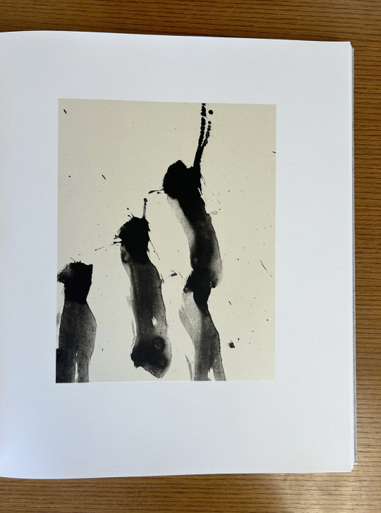
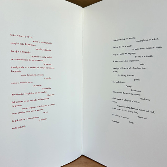
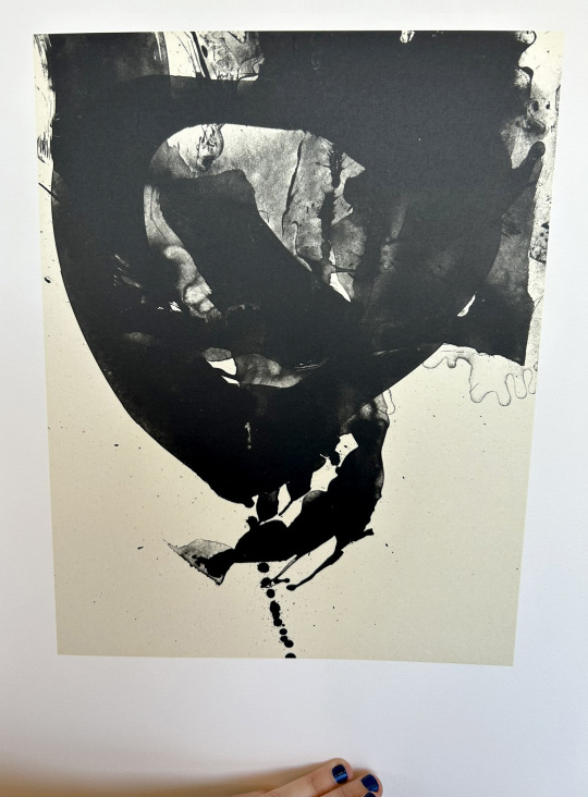
Today we’re taking a look at our 1987 Limited Editions Club release of poet, diplomat, and Nobel laureate Octavio Paz’s (1914–1998) Three Poems. Published as a bilingual Spanish-English edition of selections from The Collected Poems of Octavio Paz, 1957-1987 (translated by Eliot Weinberger, the primary translator of Paz’s work into English), this prodigious publication measures 56 cm and features lithographic illustrations by abstract expressionist painter and printmaker Robert Motherwell (1915-1991). The text was handset at Stamperia Valdonega (Verona, Italy) in Bauer Bodini Bold and Bauer Bodini Bold Italic typefaces, both of which were cast by Fundicíon Tipográfica Neufville (Barcelona, Spain). Lithographs were printed at Trestle Editions on hand-made Japanese papers and text was printed at Wild Carrot Letter Press (Hadley, MA), Stamperia Valdonega, and The Heritage Press on mould made paper from Cartiere Enrico Magnani (Pescia, Italy). It was hand-sewn and bound at the Garthegaat Bindery.
The book was designed by Benjamin Shiff, LEC book designer and son of Sidney Shiff, who had purchased the debt-ridden Limited Editions Club in 1979. Under the leadership of Shiff, a one-time Wall Street broker, the LEC gained a broadened subscription base, increased the quality of their publications, diversified their roster of artists, and returned to profitability.
Though minimal and modern in presentation, the production of this edition plumbed the depths of printing history. The Magnani paper mill was established on the banks of the Pescia river (known for its clear water- a necessity for paper production) in 1404, half a century before Gutenberg’s printing press was first put to commercial use. And the Fundicíon Tipográfica Neufville (operational 1885-1995), also known as Neufville Typefoundry, was the biggest 20th century supplier of the printing industry in Spain. After a number of ownership transfers, the company, alongside Bauersche Gießerei (a German typefoundry, operational 1837-1972), was succeeded by Bauer Types, which would leverage ownership of the rights to many of the original typefaces from both foundries to lead the way from lead type production to digital typography.
--Ana, Special Collections Graduate Intern
View more Limited Editions Club posts
View more lithography posts
View more Cartiere Enrico Magnani posts
View more Stamperia Valdonega posts
#Fine Press Fridays#Fine Press Friday#Limited Editions Club#lithography#Cartiere Enrico Magnani#Stamperia Valdonega#Bauer Types#Magnani paper mill#Bauersche Gießerei#Octavio Paz#Eliot Weinberger#Robert Motherwell#Fundicíon Tipográfica Neufville#Three Poems#Tres Poemas#Wild Carrot Letter Press#Trestle Editions#mould made paper#Garthegaat Bindery#Benjamin Shiff#Ana
23 notes
·
View notes
Link
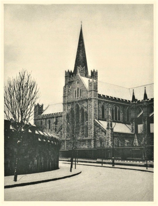
Large folio bound in full midnight blue Japanese cotton. Copy #249 of only 400 numbered copies, SIGNED on the colophon by Jacob Lawrence who has contributed 8 original silkscreens to this massive (16' x 22') and truly magnificent work, one of the high points of the press. These silkscreens are identical, except for not being individually signed, to the very few portfolios of eight prints currently selling for upwards of fifty thousand dollars. According to the publisher, anywhere from 17 to 21 screens were required to bring out the coloring of each illustration, making a total of 144 separate stencils, all of which were destroyed after the strictly limited number of some 400 original sets of prints had been achieved on the fine Whatman paper specified by the Osiris Printing Studio in New York. The text was printed on a heavy handmade paper from Cartiere Enrico Magnani of Pescia, Italy. Monthly Letter laid in. A gorgeous book. The clamshell box has a few small bumps and frayed spots; the book is as new. Fine in a Near Fine suede-lined linen clamshell box with leather label
0 notes
Photo
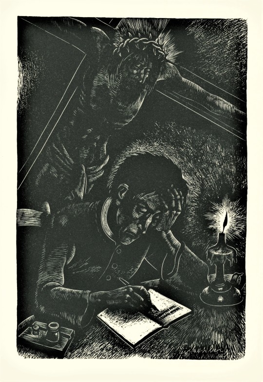
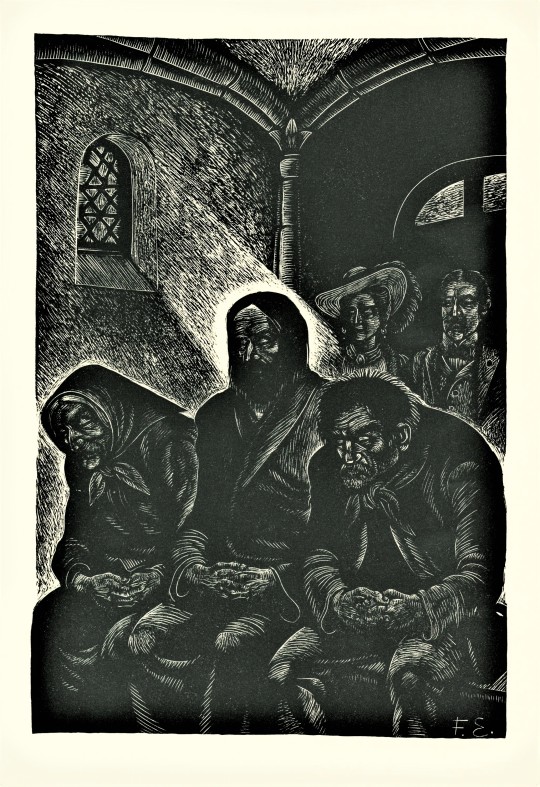

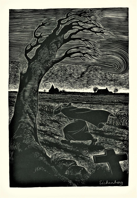


Wood Engraving Wednesday
FRITZ EICHENBERG
We hold quite a number of books illustrated by the German-American illustrator and wood engraver Fritz Eichenberg (1901-1990), fourteen of which include original wood engravings. Today we present his engravings from the 1986 Limited Editions Club production of French author Georges Bernanos‘s Diary of a Country Priest (Journal d'un curé de campagne), printed by the Heritage Press in an edition of 1000 copies signed by the artist. The blocks were printed separately at Wild Carrot Letterpress on Cartiere Enrico Magnani paper. This was one of the last major commissions of Eichenberg’s very long career before he died of complications from Parkinson's disease in 1990. Our copy is another gift from our friend Jerry Buff.
View other posts with illustrations by Fritz Eichenberg.
View more posts on works by the Limited Editions Club.
View more posts with wood engravings!
#Wood Engraving Wednesday#wood engravings#wood engravers#Fritz Eichenberg#Georges Bernanos#Diary of a Country Priest#Limited Editions Club#Heritage Press#Wild Carrot Letterpress#Cartiere Enrico Magnani#Cartiere Magnani#fine press books#Jerry Buff
41 notes
·
View notes
Photo

It’s Fine Press Friday!
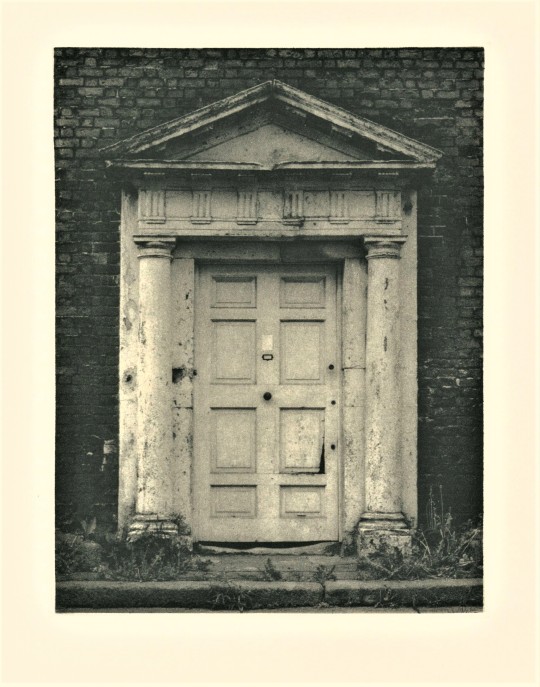
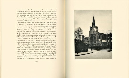
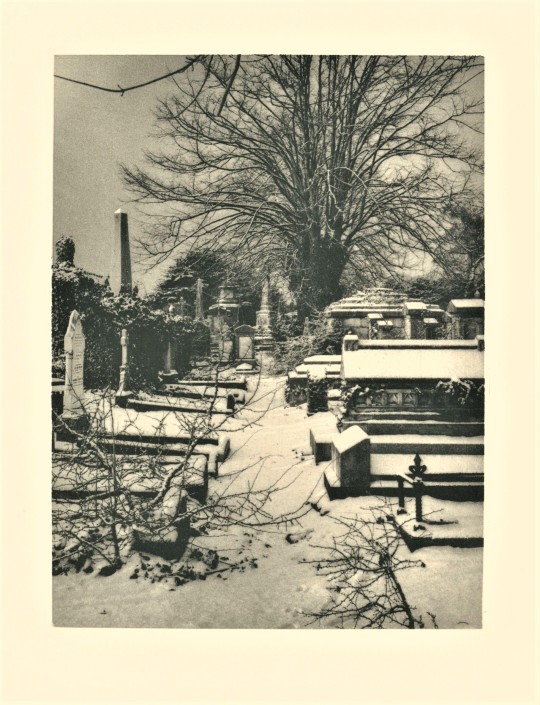
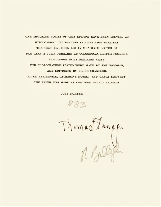
This copy of James Joyce’s, Dubliners, with introduction by American academic Thomas Flanagan and photogravures by Irish artist Robert Ballagh (b.1943), was published in 1986 by the Limited Editions Club (LEC), New York, in an edition of one thousand copies signed by Flanagan and Ballagh. It was in 1905 that Joyce first took his manuscript to a publisher, although he had a lot of difficulty finding someone to print his book. After many rejections a publisher accepted but demanded changes, resulting in the termination of their agreement. This drama continued for years until the book was finally published in 1914 by Grant Richards Ltd., London.
Dubliners is a collection of fifteen short stories that is a portrait of Dublin during a time when Irish nationalism was at its height. Joyce used his own family, friends, and acquaintances to depict the people of Dublin “in all their uniqueness, their generosity, and love of music, as well as their moral confusion and psychic paralysis” (LEC Letter number 547). This psychic and moral paralysis stems from the long history of Ireland’s subordination to British rule.
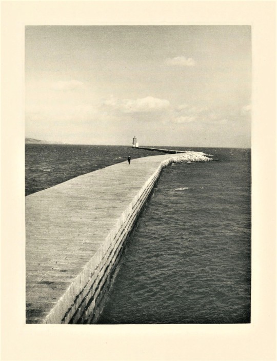
Robert Ballagh was born and raised in Dublin and shares Joyce’s fascination with his city. His six photogravures express the sense of isolation and paralysis that exists within the stories. They are velvety and still, and rest alone in the center of the page. They themselves are isolated by the many pages of text that exist between it and the next image.
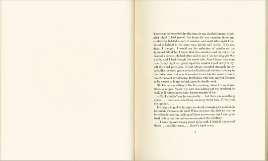
The type design also illustrates a sense of isolation, with each short story beginning with a title in a single line on the right resting in the expanse of an empty page spread, and after turning the page, another blank page, and opposite to it the beginning of the text with no header, but space for one.
The type was printed at Wild Carrot Letterpress and Heritage Printers. The text was set in Monotype Scotch by Dan Carr and Julia Ferrari at Golgonooza Letter Foundry. Benjamin Schiff, son of then LEC owner Sidney Schiff, designed the book. The photogravure plates were made by Jon Goodman and printed by Bruce Chandler, Peter Pettengill, Catherine Mosely and Greta Lintvedt. The paper was made at Cartiere Enrico Magnani. The book was hand sewn and bound at the Jovonis Bookbindery in West Springfield, Massachusetts. Our copy is a gift form our friend Jerry Buff.
View more Limited Edition Club posts.
View more Fine Press Friday posts.
– Teddy, Special Collections Graduate Intern.
#Fine Press Friday#Dubliners#James Joyce#Irish Literature#Ireland#Dublin#Fine Press Fridays#LEC#Limited Editions Club#fine press books#Photogravure#Printmaking#Intaglio#English Monotype Scotch#benjamin schiff#Thomas Flanagan#Robert Ballagh#Wild Carrot Letterpress#Golgonooza letter foundry#teddy#Heritage Press
56 notes
·
View notes
Photo

It’s Fine Press Friday!
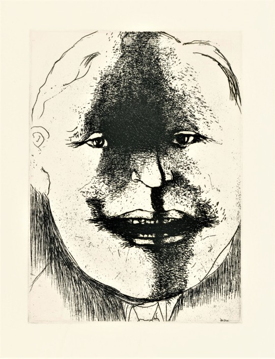
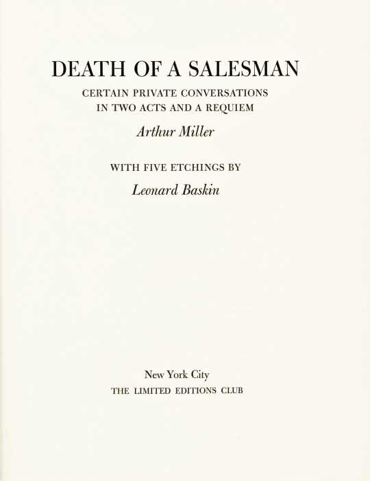
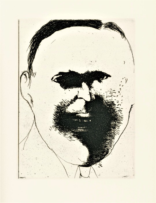
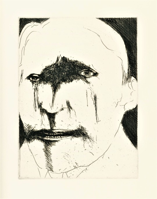
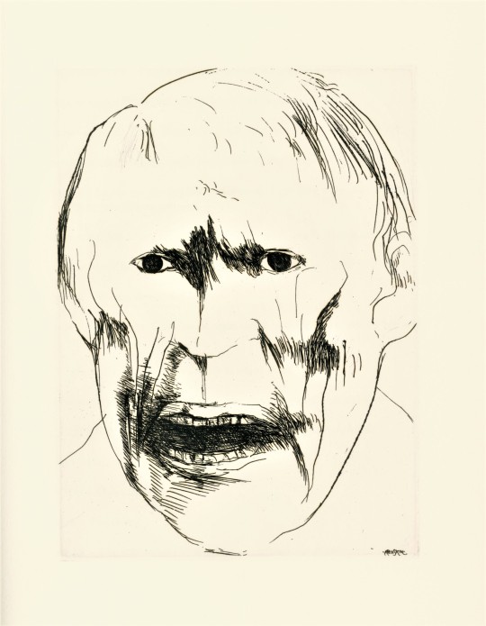
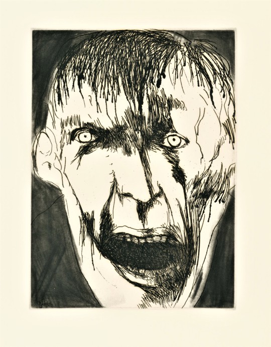
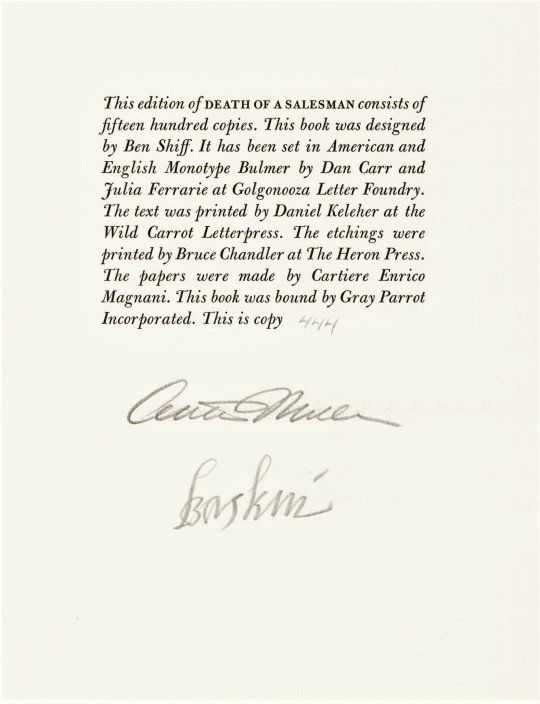
Death of a Salesman: Certain Private Conversations in two Acts and a Requiem, a tragedy by American playwright, screenwriter, and essayist Arthur Miller (1915-2005) is here published, with five etchings by American graphic artist, Leonard Baskin (1922-2000), by the Limited Editions Club (LEC) in a limited edition of 1500 copies signed by the playwright and the artist in 1984.
The play, Death of a Salesman, first opened on February 10, 1949. It was incredibly popular, and is considered by some critics to be one of the best American plays. It has since been revived on Broadway five times and adapted to film ten times, and has won numerous awards. Salesman is a fine example of one of Arthur Miller’s dominant themes,the importance of the father-son relationship. It is somewhat inspired by Miller's short time working for his father. His biographer wrote:
Arthur particularly loathed the vulgarity and aggressiveness of the buyers, who treated his father and the salesmen with arrogant contempt, and he became acutely aware of the meaning of self-respect when he saw how cruelly it was abused.
The play is about the unrealistic expectations we have for ourselves and others, expectations that cause us to lose sight of what really matters even to the point of falling out of touch with reality. In this case it is the expectations a father has for his children.
This edition marks Leonard Baskin’s third time illustrating for the Limited Editions Club. Other tiles he has worked on include, Eugene O'Neill’s The Iceman Cometh, 1982 and Aristotle’s Poetics & Politics, 1964, both of which we may feature at a later date.. The striking etched portraits are very characteristic of Baskin’s work. Baskin often works in themes of death. His etchings richly portray the mental degradation that the main character, Willy Loman, suffers from.
This book was designed by book designer Benjamin Shiff, son of LEC owner Sydney Shiff. He selected American and English Monotype Bulmer fonts, which were set in type by Dan Carr and Julia Ferrarie at Golgonooza Letter Foundry. The text was printed at the Wild Carrot Letterpress by Daniel Keleher and the etchings were printed at The Heron Press by Bruce Chandler. The paper was made by Cartiere Enrico Magnani and the book was bound by Gray Parrot Incorporated. Our copy was a gift from our friend Jerry Buff.
View more Limited Edition Club posts.
View more Fine Press Friday posts.
– Teddy, Special Collections Graduate Intern
#Fine Press Friday#Leonard Baskin#Limited Editions Club#LEC#Arthur Miller#Death of a Salesman#Ben Shiff#Benjamin Schiff#Wild Carrot Letterpress#The Heron Press#Catiere enrico Magnani#Gray Parrot Incorporated#Julia Ferrarie#Golgonooza Letter Foundry#Dan Carr#Monotype Bulmer#Teddy#Etching#Book Design#Fine Press Books#Printmaking#Fine Press Fridays#Pioneer Valley School
44 notes
·
View notes
Photo


It’s Fine Press Friday!
This week we bring you The Secret Sharer: An Episode from the Coast by Polish-British author, Joseph Conrad (1857-1924), with three etchings by Bruce Chandler (b. 1945), published by The Limited Editions Club, New York City,1985.
This short story was first published in two parts in the August and September 1910 issues of Harper’s Magazine. It was published in a collection of short stories called Twixt Land and Sea in 1912.
Bruce Chandler is a printer, publisher and the proprietor of Heron Press in Boston, Massachusetts. He printed his two color etching at his own Heron Press for this publication. The second etching was printed at Water Street Press, and the last print, a dry-point print, was printed by R.E. Townsend.
The book was designed by Ben Shiff and Bruce Chandler. The papers were made at Cartiere Enrico Magnani. The text was set in Monotype Van Dijck at Mackenzie and Harris, Inc. This edition of 1500 copies was printed by Darrell Hyder. The book was bound by Dennis Gouey.
View more Fine Press Friday posts.
-- Teddy, Special Collections Graduate Intern
#Fine Press Friday#Fine Press Fridays#fine press books#etchings#etching#Illustration#Limited Editions Club#the secret sharer#joseph conrad#Bruce Chandler#Harpers magazine#English literature#book publishing#dry point#printmaking#heron press#Van Dijck monotype#Mackenzie & Harris#Darrell Hyder#Dennis Gouey#benjamin shiff#R.E. Townsend.#Ben Shiff#Monotype Van Dijck#Cartiere Enrico Magnani
41 notes
·
View notes
Photo


It’s Fine Press Friday!
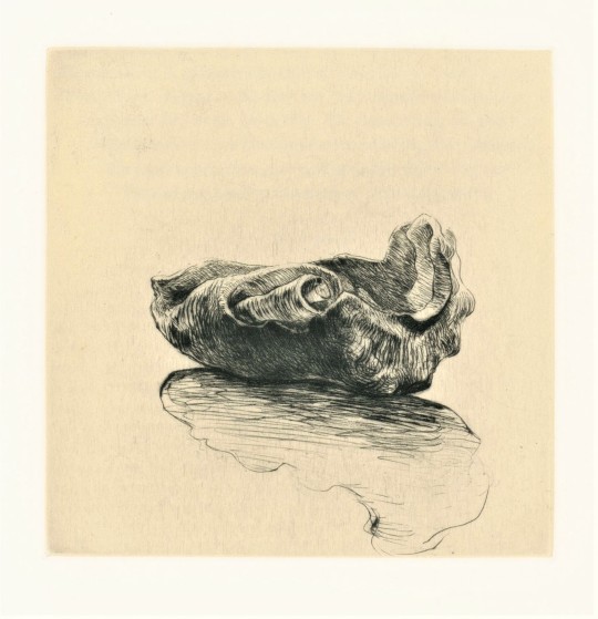
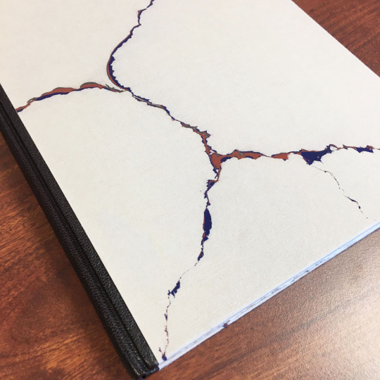
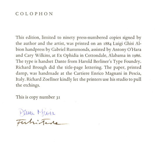
This week we present Journeys in Sunlight, with poems by Dana Gioia and etchings by Fulvio Testa. Printed in an edition of 90 copies by Richard-Gabriel Rummonds on an 1884 Luigi Ghisi Albion handpress for his Ex Ophidia imprint in Cottondale, Alabama in 1986. Rummonds was assisted by Antony O’Hara and Cary Wilkins. The book is signed by the poet and the artist. The type is handset Dante from Harold Berliner’s Type Foundry in Nevada City, California. Richard Brough did the title-page lettering. The paper, printed damp, was handmade at the Cartiere Enrico Magnani in Pescia, Italy. The book was bound by Craig Jensen in a dark brown morocco spine, with boards covered with gray Zerkall Amora mouldmade paper marbled by Paula M. Gourley in olive-brown, dark blue, and umber with gold fleck. It is housed in a drop-spine box covered and lined with medium brown Bamberger Iris cloth and a paper label printed in black with “EX OPHIDIA” and pressmark no. 3.
Richard-Gabriel Rummonds is considered to be one of the finest handpress printers of the late twentieth century. He was born in Long Beach, California in 1931. He founded his Plain Wrapper Press in Quito, Ecuador in 1966 printing Eight Parting Poems, a keepsake for his friends. He later moved the press to Verona, Italy in 1970. Rummonds became well-known for his private-press edition of Seven Saxon Poems by Jorge Luis Borges in 1974. Rummonds printed 38 titles under the Plain Wrapper Press imprint from 1966-1988 (UWM Special Collections holds five). He founded the Ex Ophidia press in the early 1980s when he was appointed the director of the book arts program at the University of Alabama. Rummonds printed four fine press books under the Ex Ophidia imprint, with Journeys in Sunlight being the last. Rummonds switched his focus to authoring books about working with handpresses, such as Printing on the Iron Handpress (1998), Nineteen-Printing Practices and the Iron Handpress (2004), and the memoir Fantasies & Hard Knocks: My Life as a Printer (2015). In 2014, Rummonds started using the imprint Ex Ophidia Press as a fine literary press.
Journeys in Sunlight is another wonderful gift from our friend and benefactor, Jerry Buff.
View more Fine Press Friday posts.
–Sarah, Special Collections Graduate Intern
#Fine Press Fridays#Richard-Gabriel Rummonds#Journeys in Sunlight#Dana Gioia#Fulvio Testa#Ex Ophidia#Paula M. Gourley#Antony O’Hara#Cary Wilkins#Harold Berliner’s Type Foundry#Richard Brough#Cartiere Enrico Magnani#Plain Wrapper Press#Jerry Buff#etchings#Sarah Finn#sarah
27 notes
·
View notes