#SELECTIVELY MUTE SUNNY FOREVER
Note
Because uh i'm curious I have few questions
What are your Omori OTPs?
What are your headcanons for each character?
who's your favorite character?
SUNFLOWER!!!! i love sunflower. and heromari. and kimbrey. i loaf them all
———————
sunny - he is autistic, he is selectively mute, he grew out a mullet, he’s 4’11.5 (but tells everyone he’s 5 feet because being under 5 feet is to embarrassing for him) and uhhhh he knows a lot of useless facts. he’s also a menace on twitter
basil - he is also autistic (me projecting my autism onto everyone), he’s tall, and muscular, he once cried to gee by girls generation, his hair is unnaturally soft, he’s a platonic kisser, and he is vegetarian except for bacon when someone else makes it. he’s german/french.
aubrey - she has piercings that she did herself, gets together with basil to dye her hair, really likes marshmallows, likes kpop (secretly), also likes a lot of punk/rock music, and she’s korean/slavic.
kel - he has adhd, he is actually really smart but a lot of people don’t think he is because of his reputation, weirdly insightful and notices a lot of small details that others don’t. really likes chocolate chip muffins. also his hair is curly. he is brazilian/mexican
hero - he is a TWINK. i don’t care what anyone says he is not muscular at all. he is a noodle guy. he has to have the dishes done before he cooks anything. he likes the dad clothes section of target. he likes water with only one ice cube, his hair is also curlier. exclusively wears low rise converse. same ethnicity as kel :D
mari - she is transgender. no it wouldn’t make sense because of when the game takes place but i believe in trans mari. she has ocd, and she is very soft spoken. dresses like a grandma for comfort. she has a HUGE sweet tooth!!!! she also has a round face and always smiles with her teeth
———————
my favorite character is basil!!!! he is so silly, and his character is really relatable to me. also apparently i have a thing for blondes. who would’ve guessed
#omori#omori basil#omori game#sunflower omori#basil omori#omori headcanons#i love basil a normal amount#also i would type more of my headcanons but we would be here forever#SELECTIVELY MUTE SUNNY FOREVER#hero is a malewife in every meaning of the word
23 notes
·
View notes
Text
Hi we're the Sweets system and I'm gonna just like... loosely describe the girls
1: Veronica! She/They/It. That's Me :3c I view myself as like... part digital gal inhabiting various sizes of mousebot chassis, part Nimona-Esque shapeshifter to match my chaotic and ever changing mood. I'm the like main one of us here forever probably. Veronica.exe, here to infect tons of devices but only to cause minor mischief and also be your biggest cheerleader
2: Lyssa! She/They. She's my non-religious Guardian Angel. She did Fall but she's restored now. She says like... when things need a Guardian Angel, they just appear and do their best to safeguard the thing that needed them. She's all formal and slightly grumpy, but she looks out for me and helps me handle life and my health and mental illness and stuff.
3: Drizzle! She/Her. She's a sweet and quiet little blue and yellow bunny girl. She reminds me to be kinder and nicer and softer. Also she's very autistic and loves bunnies more than I love mushrooms. She has troubles speaking out loud, and is selectively mute. Most of the time she just quietly watches everything. She's bunny4bunny with only one exception.
4: Clover! She/Her. She's a hyperactive, 0 impulse control, horny party girl of a Fallen Guardian Angel foxgirl. Also the only cis girl in our system. She failed to protect what she was supposed to cause responsibility isn't her thing, and I guess she's just here now? She's quiet and sleeps a lot cause she doesn't like how much responsibility is in our life. When she's up though she's pretty fun, if tiring. She pushes me to be a little more hedonistic and worry less about being so focused and working too hard all the time.
5: Ash! She/Her. She's a black and dark blue furred victorian goth bunnygirl. She does very little of her own accord, and will usually only speak if she's bribed with berries. She's Drizzle's sister. She likes sitting in the shade on a warm and sunny day, eating sour things, and listening to exactly two songs. She holds a lot of our trauma memories and emotions, but is slowly giving them back to me when she feels I'm ready for it.
#we did have one more named Dove but she's fully dormant and gone now#maybe she'll come back someday#no idea what happened to her#anyway that's us#The Sweets System
5 notes
·
View notes
Text
The Most Gorgeous Blonde Colors in 2022!

Does any blonde really have more fun? You can neither confirm nor deny, yet these beautiful blonde hair color ideas have us itching to try it out. In winter weather they give their beauty a routine a major case of cabin fever, you’ve got your ticket to somewhere sunny; or if the season color is fading and ready for an update, you have got all the options.
In case channeling a platinum shade à la Marilyn Monroe or your favorite color crush, best blonde color, you are finding motivation to support you upgrade your do at your next hair appointment on all ends of the blonde range. Such blonde shades complement complexions of all types and will leave you feeling fresh and fabulous. Let's move ahead and get inspired.
01 Bronde (Brown/Blonde) hair color
A combination of brown and blonde, "bronde" is, in accordance with the hairstylist and oVertone Ambassador Douglas Michael, achieving traction. Defined by a gold base, the end outcome is more muted. "Blonde doesn't always have to be platinum," he stated.
02 Dirty Blonde Hair Color
The affable color is as effortless as it is timeless. You would love how these loose waves play up the natural tones of her color with subtle underlines.
03 Sandy blonde hair colors
Sandy blonde color is the next color you should take into consideration if you want a more "beigey" or muted blonde, as per the Michael. The beige tone is an outcome of combining a gold base with a cooler reflecting color.
04 Rooty Ash Blonde
Gloomy roots and super blonde strands can completely get along, particularly when selecting a cool-toned ashy blonde that matches your natural hair shade.
05 Champagne blonde hair colors
The shade is a mash up of cool pearl and a tad of gold, as per Shvonne Perkins, Madison Reed Expert Colorist. Lauren Williams, one of the best Austin-based hairstylists, adds, "Such shade is really the best of the best for just about any skin tone. It softens blondes and adds a milky, luxurious tone to the hair. A unique addition to your root displayed "lived in look" or bright global blondes.”
Read Also: The 19 Best Blonde Colors: Determining Every Glamorous Shade in The Sun
06 Rose blonde hair color
If you like a little more warmth in your locks then test out a rose golden shade. You know, these are colors that are mixed with a little more copper and pearls, which give a red-not-quite-blonde look," Perkins has said, adding that "such colors are being adopted because they It's easier to hold than platinum blonde and tones are more compliant." It also noted that tones with more warmth and richness provide more radiance and reflectivity. "It can make skin more radiant and refreshed,"
Read Also : 5 Reasons You Need a Best Colorist for Your Hair
07 Spiced gold hair color
interested in getting the hang of this pure blonde locks? Williams calls Spice Gold Blonde a nice provisional color. Add a little spice to your life by sporting the perfect mix of gold and copper tones in this trendy color. "It would be a great change for blondes who are looking for depth and resonance in their complexions while getting a lot of sparkle."
08 Baby Platinum Blondes
Create platinum blonde more wearable and low maintenance with highlights and lowlights across to create a multi-dimensional baby blonde look. Combine into the roots to lessen trips to the salon.
09 Dirty Blonde Shadow Root
Brunettes can forever get in on the sunny times, too. Through a shadow root and consistent balayage highlights, this hair color is affordable enough to push back your touch-up appointment for a few weeks and even months.
10 Golden Blonde Balayage
An always classic blonde hair shade that is easy and breezy enough to last for weeks and months without any extra twists. Inquire for varying shades of gold, honey, and baby blonde.
Quick Link
No. 1 Hair Salon And The Best Colorist
How To Pick The Best Blonde Colors For Your Skin Tone?
What Are The Important Qualities Your Beauty Salon Needs?
11 Pearl Blonde
Similar to platinum, but with an extra pearly zing, this color looks exactly striking when combined to slightly darker roots to prepare a color melt with major style.
12 Sunset Blonde
A wholesome dose of late-afternoon light makes dirty blonde look amazing in any season. This hot and latest trending hair color feels just like a sunset.
13 Classic Balayage Blonde Hair Color
You can't get enough of the cult-favorite coloring technique balayage. Through highlights sweeping from face-framing layers to the back end of your tresses and just sufficient space at the crown for original color to peek with, your salon's balayage professionals will know what to do.
14 Sandy Platinum Blonde
A neutral best blonde color for all skin tones, stone blonde is the nice way to lighten up your darker blonde cords without having to go full-on platinum.
15 Cream Blonde Ombré
Although the darkest of brunettes can get a dose of blonde on their cords and a color melt going from deep chocolate brown to creamy ash blonde.
16 Strawberry Blonde Hair Color
This is a very sweet hair color takes us back to good days by passing the bridge between blonde and auburn in the loveliest of tricks.
17 Frosted Wheat Blonde
Generally associated with winter blondes, cool blonde is really oh-so flattering for warmer seasons like summer, too. Inquire for a root smudge to marry your roots to the new hair shade.
18 Butterscotch Blonde
Hoy and melty like butterscotch, such blonde hair color tiptoes along the line of strawberry blonde—and you will be fans of this delicious color.
19 Ice Blonde Hair Color
You are loving the cool-girl color of the moment for its grey highlights that are matched by a youthful bright blonde.
20 Golden Champagne Blonde Hair Color
Traditional Hollywood charm comes in its finest form with luscious, golden waves that look right off the beach. In this look you will warm up any time of year.
Why hire the best colorist in NJ
The hair is the final and main beauty crown you wear, and the hair department really depends on that. No matter you have synthetic hair or your natural hair, it’s crucial to have a good hairstylist in your corner to help you hold it? Best colorist in NJ are qualified enough to provide you with exactly what you ask for, even you want to change up your entire look or just maintain the style you already are with. Thinning hair is an art. There would be many thoughts and strategy that goes into it, even when it’s just a trim. There are many other elements that have to be taken into consideration.
An expert hairstylist will observe your face, cut closely, and style your hair according to what you ask for. The stylists will always ask you about the length you want to keep, and give you the best suggestions based on the health of your hair. You just need to put your faith in them because they know what your hair need are, while still respecting the style you want to get. Experts will always suggest the best hair products. All people have different hair, which means you all need different types of products. Hairstylists will help you select the best products for your hair type.For more details on Best blonde colors, explore https://www.abbyhaliti.com/
#best colorist nyc nj#best colorist nj#best blonde colors#best balayage nyc#best balayage new york#best balayage new jersey#best NY and NJ colorist#best salon NY NJ
1 note
·
View note
Text
“Step into Spring with These 5 Fashionable Sneaker Trends”
"Improve your sneaker style this spring with these valuable tips on the latest fashionable sneaker trends."
When it comes to fashionable footwear, designers are on a mission to elevate sneakers beyond street style to become the luxe staple we can't live without.
Showy with a plethora of textures – think shiny silhouettes, suede, and crystals, not to mention sneakers with chunky soles to classic retro styles, this season it's all about high-fashion comfort – with enough flair to be on our 'most wanted' list, whatever the dress code.
Here's how to get your trainer therapy with these five sneaker trends...
1. Snazzy silver
"Sneakers are everywhere this season, from mega metallics to pops of color or classic white; there is a style to suit every woman," says Lisa Kay, CEO of Sole Bliss.
"The silver trend continues… it's modern, eye-catching, and incredibly versatile, as metallics can work as a neutral," says Kay. "Silver trainers can be easily dressed up or down and work as party shoes or everyday wear."
Next -Signature Forever Comfort Leather Chunky Wedges Platform Trainers, $76
Sole Bliss Palazzo: Silver Leather, $299
2. Peach fuzz
A hot topic in fashion circles, Pantone's 2024 Colour of the Year, Peach Fuzz, is a playful, peachy tone that hits all the right notes…
"With a call to the Eighties, this is a colour trend that cries sunshine no matter what the weather barometer says," notes Donna Hill, Gola digital and marketing director.
"Used as a highlight across several styles this season, its warmth and radiance brighten any outfit.
"Worn with whites and denims, a touch of peach fuzz adds a sunny and feminine touch to simple styles."
JCrew Color Block Trainer, White Peach, $69
Gola Classics Women's Raven Trainers, Orange Spice/Raspberry/Coral Pink, $120
3. Embellishment
With a glimmer of glitz or crystals, if solid silver feels too heavy metal, a glimpse of embellishment gives newness to your everyday look.
Go nude with a bit of bling, or pair darker tones with white jeans to put a spring in your step.
Bobbies Willow, Milos Beige, $215
Sole Bliss Star: Navy Leather & Suede, $299
4. Vintage vibe
A key trend for SS24, vintage styles are where it's at…
"From colourful suede options to Eighties-inspired court trainers, retro styles are here to stay," says Hill.
With so many options, she says vintage classics can be styled to suit any occasion.
"Bold-coloured suede options elevate the simplest looks and work well with tailored trousers and ankle-grazing denim," Hill continues, "while chunkier options provide the perfect juxtaposition to floaty dresses and skirts."
Chrysoline de Gastines, co-founder of Balzac Paris, agrees: "With a thinner, more delicate profile imbued with a vintage essence, the sneaker of 2024 reimagines its contours while striving for a lighter construction."
With daring color selections to create a truly distinctive and original design, Gastines says the subtly elevated sole and vibrant upper complement both trousers and feminine ensembles, such as skirts or dresses.
Gola Classics Women's Elan Trainers, Marine Blue/White, $110
Balzac Paris Yellow and Black Colette Sneakers, $225
5. Athletic aesthetic
Whether it's fun brights, muted schemes, or pops of color, there's an attention to detail with the latest looks in sporty trainers.
"With running shoes styling out most of our wardrobes, styles such as the 'LKB step' are the perfect shoe to fuse utmost comfort with fashion, playing into the chunky trainer trend," says Thomasine Jordan, global product and design director of LK Bennett.
Furthermore, they look fabulous with faded denim, loose linen, or leggings and offer an instant style update to your wardrobe with that all-important street cred status.
Hoka Women's Arahi 7 Shoes, $145, Runners Need
LK Bennett LKB Step Cream Leather and Grey Suede Trainers, White, $350
Read the full article
0 notes
Text
Summer Vibes at Home: Essential Homeware to Brighten Your Space

We’re in the middle of Summer, but it won’t last forever. Bringing the summer sunshine into your home and keeping the vibe going is easy with the right selection of bright and vibrant homewares. Investing in a few key pieces of summer homeware will make your home even more enjoyable during those long summer days (or remind you of the warmth when it gets colder), but knowing what works and what doesn’t take a little time and effort. Here is all you need to know to turn a room or even your entire home into a summer paradise.
Freshen up with plants and greenery
If you’re asking yourself “How can I make my room like summer?”, one way to guarantee a summery twist is to bring the outdoors in. Fresh, seasonal greenery, beautiful flowers and homeware that complements and celebrates all things fresh and natural gives a vibrant summery edge to any space. From gorgeous floral prints to glittering emerald green tableware, you can easily celebrate the great outdoors within four walls. Indoor plants and freshly cut flowers also bring a less-than-vibrant room to life.
Bring in earthy textures and patterns
It can feel like a summery space has to scream vibrancy and bold colour, but gentler tones can also add that summer feeling if you prefer things a little more muted. HK Living’s elegant range of dining and tableware shows off just how effective earthy and muted tones can be. Textured and 70s-inspired styles create a fun and fresh feel for any living space. Playful prints teamed with muted tones allow the pattern to stand out and for a summery look, you can swap out heavy textiles and ornate wintry patterns for a simpler, fresher style.
Get breezy with your soft furnishings
Heavy blankets and thick drapery are just perfect for cold winter nights, but when summer’s around we want to let the light in! Lighter fabrics that let more light in are ideal for any space where you want to make the most of the brighter days. You can also change up your cushions and throws, opting for sunny shades and floral patterns that suit your summer space.
Add a zesty twist to your kitchen with fruity prints
Let’s face it, we spend a lot of time in our kitchens and whether we love every hour spent cooking and dining or would rather be elsewhere, making the space a celebration of summer should be a priority. Quickly brighten up your kitchen-diner with fruity prints or if you’re feeling really brave, a feature wallpaper.

Sunshine shades for a beachy feel
Decorating with yellow or investing in some bright sunshine-inspired homeware can instantly brighten up any space. When you think about what colours to decorate with in summer, yellow must be up there in the top three! From gentle yellow tableware to bright feature pieces for any room in the home, a touch of yellow instantly brings sunshine to your space.
You can achieve your dream summer aesthetic with a few small feature pieces or simply change up your homeware. Explore what’s new in homeware to celebrate the latest summer trends.
0 notes
Note
think you could do the lovable Jack's reaction to a mute female german shepherd (reader) giving him a Love letter.
I love Jack!
Disclaimer: I don’t have mutism, and I don’t know anyone who does, so I had to try and do a little research myself on it. I did my best, so I hope I did an okay job. If there’s things I need to fix, I am more than happy to. I did this more based on selective mutism, which can have a lot to do with anxiety (something I am familiar with). So I hope you enjoy, and as I said before, if I missed the mark or did something incorrectly, please let me know!
Jack turned the pages of his book, using his left hand to wave away a fly that kept trying to land on his ear. Next to him he had a number of texts books. It was far to nice for him to study in the stuffy library, so he was taking advantage of the sunny day. He reached for his note book, scribbling a few highlights from the last few pages he had been reading, and turned back to his book. A few other students passed by. He’d wave if he made eye contact with anyone, but for the most part, it was pretty quiet. He was getting really into the thick of the chapter, so Jack was sinking deep into his own little world. He assumed the crunching gravel was just someone passing by, but his ears pricked up when they stopped. He finished his page and carefully stuck his bookmark in the book before looking up.
“Oh! Hey,” Jack set his book aside, gaze now solely focused on you, well, around you. He knew not to make direct eye contact with you in situation you may already be comfortable with. So he looked at the buttons on the trap of your bag. One he’d gotten you. It was just a cute little character from a book you had let him know you liked. He’d gotten it a few weeks later. His memory was impressive.
You waved as a hello. Jack knew you were mute, but it never seemed to bother him. You always had a notebook with you that helped you talk to other students, at least the ones that took the time to do so. With your anxiety, and inability to speak, many students wrote you off. Even other canines, known to be so friendly and sociable, tended to avoid you. Jack was one of the few who whole heartedly let you communicate with him, and didn’t avoid asking your opinion on things, and would wait for you to respond if you were up to it. He was also extremely patient and could read your body language and knew when you were getting overwhelmed by the people around you. At least he was giving an effort, there weren’t a lot of students who tried. It made it pretty difficult to talk with just anyone.
At least you had texting. You enjoyed texting Jack. He also tended to use a lot of emojis, so you never had to guess the context of what he was saying. It was also helpful when you had questions about classes you were unable to voice or ask in person.
“Are you feeling good today?” You nodded, and froze for a moment. You had written him a love letter, and it felt heavy in your bag. It had taken you forever to do. You had long ago lost track on how many drafts you had gone through to be comfortable with this one. Now, in front of Jack, you didn’t feel so sure. Your ears drooped, and you crossed your arms in front of you, looking anywhere but directly at Jack.
“Did you need help with something?” He tilted his head, but was careful not to look directly in your eyes. He didn’t want to trigger your anxiety. You shook your head, and fought your nerves. It suddenly felt like you couldn’t breathe, and you began to fight panic.
“Woah, hey, it’s okay...Want me to go?” He didn’t seemed bothered by it, just concerned. He was even willing to give you the space you may need to collect yourself without making you feel bad. That was part of what made him so wonderful.
You shook your head, and quickly dug in your school bag and shoved the letter in his hands and turn to run. He didn’t chase you, even if initially his instincts told him to. Jack had pretty good control over himself.
You bolted to your dorm and hid under the covers until you could control yourself better. It took a good hour, an hour where you weren’t kind to yourself. You mentally scolded yourself for being so awkward and weird, and your stomach turned thinking of how he must have reacted to getting your letter. You wondered if he laughed while he read it, if he had shared it with his friends. You wondered if he felt sorry for you. You felt sick.
Your phone vibrated, and you reached for it. You knew it was probably Jack checking in on you. You almost bet he didn’t feel the same way and was going to tell you so over texts. It would be easier than hearing him say it in person. You looked at the screen. Jacks name with the little dog emoji next to his name appeared on your home screen. You read the initial first few words that were visible. You didn’t know if you wanted to open it, and have him know you had read it. You wish they’d take that feature away from text messaging.
From: Jack
𝙰𝚛𝚎 𝚢𝚘𝚞 𝚘𝚔𝚊𝚢? 𝙸 𝚛𝚎𝚊𝚍 𝚢𝚘𝚞𝚛 𝚕𝚎𝚝𝚝
It didn’t preview the rest of his message. You felt like there was a rock in your gut. You couldn’t even talk to him face to face, you bet he was going to turn you down.
𝙰𝚛𝚎 𝚢𝚘𝚞 𝚘𝚔𝚊𝚢? 𝙸 𝚛𝚎𝚊𝚍 𝚢𝚘𝚞𝚛 𝚕𝚎𝚝𝚝
It was mocking you. You covered your head with the covers, and hid away with you phone. You didn’t know how much time passed while you inwardly battled with yourself. You took a deep breath and opened it.
From: Jack
𝙰𝚛𝚎 𝚢𝚘𝚞 𝚘𝚔𝚊𝚢? 𝙸 𝚛𝚎𝚊𝚍 𝚢𝚘𝚞𝚛 𝚕𝚎𝚝𝚝𝚎𝚛. 𝙸𝚝'𝚜 𝚛𝚎𝚊𝚕𝚕𝚢 𝚜𝚠𝚎𝚎𝚝. 𝙸 𝚑𝚊𝚍 𝚗𝚘 𝚒𝚍𝚎𝚊 𝚢𝚘𝚞 𝚕𝚒𝚔𝚎𝚍 𝚖𝚎. 𝚃𝚑𝚊𝚝 𝚖𝚊𝚔𝚎𝚜 𝚖𝚎 𝚏𝚎𝚎𝚕 𝚛𝚎𝚊𝚕𝚕𝚢 𝚑𝚊𝚙𝚙𝚢, 𝚋𝚎𝚌𝚊𝚞𝚜𝚎 𝙸 𝚕𝚒𝚔𝚎 𝚢𝚘𝚞 𝚝𝚘𝚘. 𝙸𝚏 𝚢𝚘𝚞 𝚠𝚊𝚗𝚝, 𝚠𝚎 𝚌𝚘𝚞𝚕𝚍 𝚖𝚊𝚢𝚋𝚎 𝚍𝚘 𝚜𝚘𝚖𝚎𝚝𝚑𝚒𝚗𝚐 𝚜𝚘𝚖𝚎𝚝𝚒𝚖𝚎?
Do something? With you? He wanted to do something with you. You felt your tail wag nervously. He was happy. He wasn’t mad, he wasn’t telling you off, he was asking you out on a date! The world was still turning, it wasn’t ending. You were still friends with Jack, and Jack was asking you out.
From: You
𝙸'𝚍 𝚛𝚎𝚊𝚕𝚕𝚢 𝚕𝚒𝚔𝚎 𝚝𝚑𝚊𝚝
You were glad you had the courage to ask.
#the-purpleflower#jack x reader#beastars imagine#jackxreader#add to masterlist#I tried my best for this so I hope anyone who is actually mute thinks I did okay#it was really interesting and props to anyone with this condition you are wonderful and deserve the world#also this was really fun to do and really cute#I hope you enjoy
66 notes
·
View notes
Photo


THE MIRROR’S RIFTS || A WIP by me~ ( @quilloftheclouds )
The new kid in the neighbourhood, Maxine didn’t expect to make friends so quickly–nor did she expect to get caught up in a world-endangering puzzle of parallel dimensions and time-defying monsters.
GENRE || MG/YA fantasy; mild horror and great adventure~
POV || Third person limited omniscient, past tense
STATUS || Early stages of outlining
FEATURES || LGBTQ+, diverse, and neurodivergent main cast; imaginary (and maybe not so imaginary...) adventure games!!; sapient buildings with a variety of charming personalities; a group of rambunctious kids; creepily touchy mimic-like creatures from another dimension; (kinda) time travel; magic keys; magic challenges to get said keys; and a race to solve a universe-transcending puzzle before this dimension collapses!
SYNOPSIS
Moving to a new city, moving to a new school, most kids might be the most concerned about leaving their old friends behind to get tossed into a world of awkward loneliness. Maxine relates, being a socially anxious wreck half the time, and “that weird nerd” the other.
Except... she makes her new friends the very first day--a misfit bunch of inventive creative kids just as weird as her! And the adventure games exploring the forest around their neighbourhood are wonderfully fun and wonderfully imaginative: until they aren’t.
Until they discover the perfectly pristine but definitely abandoned greenhouse in the deep woods behind Maxine’s house. Until that greenhouse speaks to them. Until they realize they have accidentally broken the time-frozen bubble around a dimensional rift, allowing a terrible power to begin infecting the forest they call home... and they’re the only ones who can stop it.
THE QUARTET OF CHAOS
MAXINE || Queer Girl || She/They || The new kid in the neighbourhood. Socially anxious wreck. Makes oddly specific puns and can’t ever take anything seriously. Never knows what to say, but stars blink if she isn’t always talking. Means well but doesn’t always understand when it’s time to be quiet. Has a terrible sweet tooth and always has candy on her. Somehow. (Her parents have tried catching her taking it, each time unsuccessful.)
SAM || Nonbinary || They/Them || Just wants to fight literally everything. Has a sword (stick) and shield (cardboard) which they use to wail on any branch or tree stump that looks evil. Enjoys climbing things they definitely shouldn’t, running in circles, and tackling friends. Can list off seventy facts about traditional weapons and traps but can’t ever sit still enough to do well at school. Probably (definitely) has undiagnosed ADHD. Has an older sister named Quincy who is really nice but much too nosy.
ISAAC || Cis Boy || He/Him || Nature nerd and the flower prince. Loves natural crafts like flower crowns and basket weaving and the like, and nothing can escape the flowers he puts on everything. Very quiet, selectively mute, and dislikes loud sounds. Has a history of abusive foster families, but he’s now a part of a loving family with two fathers just as nature nerdy as him.
“SUNNY” (GABRIELLE) || Trans Girl || She/Her || The tech expert who loves sci-fi and reading possibly a little too much. Very bubbly and giggles at the slightest thing. Honestly the main creative brain of the group; comes up with the most strategic and detailed plans for games and adventures. EVERYTHING she wears is yellow or orange, no exception (hence the nickname). Has very strong opinions about the randomest of things. Probably autistic.
Leave a comment or send me an ask if you want added to the taglist!
Forever Taglist; @livvywrites @dove-actually
This is... intended to be a novella/novella series. But WHO KNOWS WHAT WILL HAPPEN THERE. Certainly not me.
ANYWAYS this is what became of my woodland wip idea!
#wip intro#violetvineyard#writeblr#writeblr community#Quill's writing#the mirror's rifts#tmr#aesthetic#maxine#sunny#isaac#sam#quincy#quincy is like candace from phineas and ferb and i love her#MOMMM sam is climbing the roof againnnn!!!#anyways i love these kids#also yes they are actually kids#i dunno middle school aged maybe?
151 notes
·
View notes
Text
Creating The Best Kids Bedroom Ever!
Creating The Best Kids Bedroom Ever!
Interiors
Lauren Li

Dulux ‘Pancake Mix‘ elevates this nursery to the perfect shade of neutral. Photo – courtesy of Dulux Australia. Stylist – Bree Leech. Photographer – Lisa Cohen.
So many designers admit that their first ‘project’ was their own bedroom. It seems that designing their own rooms sparked a lifelong passion for interior design, which made me think about how our childhood bedrooms are so influential in all of our lives. Childhood bedrooms are a place of independence, where little people can carve out their own space in the world. It’s where they go to sleep and dream, read and play – and sometimes for time-out! It’s a place to keep their books and the things that are precious to them. Kids bedrooms should be a space to spark imagination, feel safe and comforted.
I love kids’ rooms that let them be kids. There should be an opportunity for them to put their stamp on the space, even if their preferred ‘colour palette’ may not flow with the rest of the house. After all, it’s their way of expressing themselves through their surroundings, which is so important! However, at the end of the day, we need to balance their ideas with what will look good. In my experience with my daughters, their influences range from the plastic fantastic Barbie Dream House to Sylvanian Family country cottage. They need guidance!
The best kids rooms happen when their ideas are integrated into the concept for a room, but executed in a more refined way. Above all, the space should show their personality. So if that means a crazy stack of books here, a fleet of plastic trucks there, or a Barbie campervan, then so be it. They won’t be kids forever!
When I design kids’ rooms for my clients, I love to ask the kids a few questions so that I incorporate their ideas. Some kids have never given what their bedroom looks like a second thought, while others provide mood boards! It’s a lot of fun. Be careful what you wish for though, I have been asked to do a cactus/outer space theme… that one was challenging!

Dulux ‘Pancake Mix‘ elevates this nursery to the perfect shade of neutral. Photo – courtesy of Dulux Australia. Stylist – Bree Leech. Photographer – Lisa Cohen.

Dulux ‘Pancake Mix‘ adds warmth to this nursery. Photo – courtesy of Dulux Australia. Stylist – Bree Leech. Photographer – Lisa Cohen.
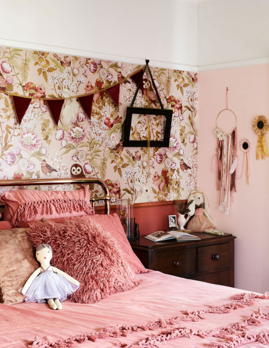
This is how to create a pretty pink room, while avoiding the princess clichés! The home of Melissa Harris and family. Photo – Caitlin Mills for The Design Files. Styling – Annie Portelli.
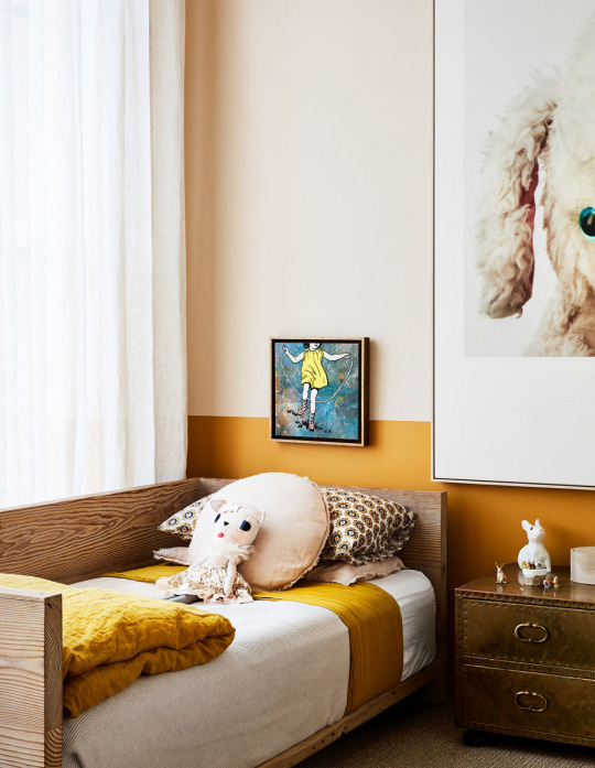
Kids rooms don’t have to be just blue or pink! This old gold colour painted to dado height is bright and fun yet sophisticated. In the South Yarra home of Mardi Ola. Photo – Caitlin Mills. Styling – Annie Portelli.

Room by Studio Giancarlo Valle. Photo – Stephen Kent Johnson.

Room by Studio Giancarlo Valle. Photo – Stephen Kent Johnson.

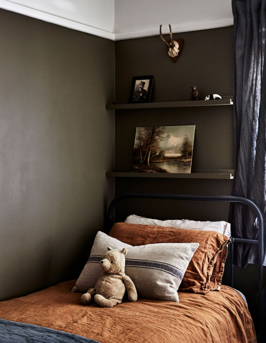
There is hardly a more classic combination than navy and tan, which is perfect for a nursery that will carry through to their teen years and beyond. Room by Nest Design Studio. Photo – Kate Monotti.
Colour
If there is one room in the house you can avoid white, it’s the kid’s bedroom! Even a subtle shift from white to a buttery cream wall (we love Dulux’ Pancake Mix, as seen above!) adds so much warmth and interest to the room, whilst still offering a calm, neutral base.
Painting all of the walls a beautiful colour creates a different feel to the rest of the house, and makes the room feel like it’s really ‘theirs’. Even painting the bottom half of the wall is a great way to introduce colour in an impactful way, without committing to the entire room.
When choosing a colour for the walls, firstly think about what kind of mood you want to create. Sometimes the first thoughts are to go fun and bright, however if you want the room to feel restful (ie. if you want young kids to actually go to sleep!) then maybe consider some more calming and muted colours.
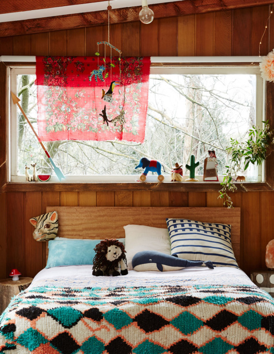
But paint is just one way to use colour in a room, consider how fabric can add gorgeous colour. An upholstered bedhead or curtains can be a great way to incorporate colour, while an incredible canopy over the bed is sure to delight and make bedtime a little more fun!

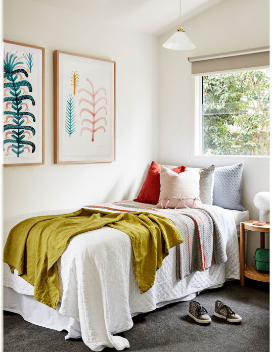
Using an over-scaled design keeps a floral look young and contemporary. Room by Aimee Tarulli of Archer Interiors. Photo – James Greer.

Room by Sisalla Interior Design. Photo – Tess Kelly.

Room by Sisalla Interior Design. Photo – Tess Kelly.

Room by Sisalla Interior Design. Photo – Tess Kelly.


Room by Nest Design Studio. Photo – Melissa Lau.
Wallpaper
Using wallpaper in a kid’s room is a lot of fun – but it can be totally overwhelming to decide on a design! The more colours in the design, the busier the room will feel. However, if the pattern is quite busy, but incorporates just a few colours, it will look more harmonious overall. I encourage my clients to consider wallpaper on all of the walls in a room, as it creates a continuous backdrop to the room, with less breaks in colour and pattern. My tops pics for wallpaper are:
1. These Walls is an Australian brand perfect for a youthful yet sophisticated look suited to tween – teenage rooms.
2. Anewall print murals to suit the wall size you need and they have some beautiful painterly and overscaled designs.
3. Sandberg is another go-to. The designs are floral but with a sophisticated Swedish twist.
4. If the wallpaper designs out there are not quite right, consider commissioning a mural from a local artist like Kelly Thompson or Leah Bartholomew.

Photo – Caitlin Mills. Styling – Annie Portelli.
Kids bedroom from the home of Melissa Harris in Box Hill. Photo – Caitlin Mills. Styling – Annie Portelli.

Kids’ bedroom from the home of interior architect Edwina Gelann and family. Photo – Caitlin Mills. Styling – Annie Portelli.
A kids’ bedroom from the Melbourne home of interior designer Karin Altman. Photo – Caitlin Mills. Styling – Annie Portelli.

Photo – Caitlin Mills. Styling – Annie Portelli.

The teenage bedroom from the home of Chloe Quigley and family. Photo – Eve Wilson.
Art
There is absolutely no reason that kids shouldn’t be allowed to enjoy art in their bedrooms. There are so many types of artwork – consider prints, vintage posters, fabulous tea-towels by Third Drawer Down, mobiles and even kids’ own masterpieces!
Art can also be found in more traditional gallery spaces, however, broaden your search to markets (like The Big Design Market), Etsy, antique stores and auction houses. Try using different coloured frames and arranging them in creative ways.
Artists such as Pete Cromer, Rachel Castle and Hello Miss May are great places to start. Check out the collections by Pinky’s Store, Contemporary Editions, Minted and Paper Collective.

The Sorrento weekender of Kate from Kip & Co features clever under bed storage in the kids bedroom. All bedlinen and blankets from Kip & co. Photo – Caitlin Mills. Styling – Annie Portelli.

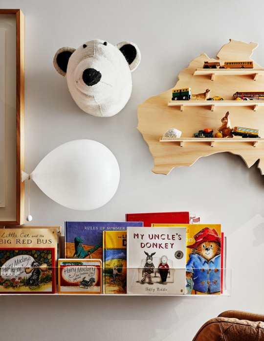
Front-facing perspex bookshelves from Ubabub, in the adorable kids’ bedroom in the Fitzroy apartment of Imogen Milford. Photo – Amelia Stanwix. Styling – Annie Portelli.

Plywood crates by Like Butter, in the kids bedroom in the home of Georgie Cleary and Pino Demaio. Photo – Caitlin Mills. Styling – Annie Portelli.
Storage, shelving + keeping things tidy!
Storage is key in keeping my sanity at home, but I’ve found that there is some storage that works better than others. To get the kids to pack up their own things (I can dream right?), storage needs to be accessible. High shelves don’t work, because they simply can’t reach them, so opt for low shelving and cupboards. There needs to be a combination of open and closed storage; they like to keep some of their favorite things on display, whilst games can go in a cupboard.
Too many baskets filled with toys can just take up floor space, so put your baskets into shelves. The key is to have a place for everything to go – lego, games, toys and barbies all have a ‘home’.
Kids love to have a special drawer or cupboard for their precious things (mostly consisting of rocks from the garden, erasers from Smiggle and stickers). Mustard have a great range of lockers that make perfect bedside tables for small people.
Plyroom do an open shelf that suits books and baskets, with a range of furniture that suits little kids and transitions into pieces to keep for life.
Ubabub design and manufacture a clear acrylic shelf, the Booksee that allows the books to front face so that kids can easily see and access their books.
Pinky’s Store has cute colourful crates that stack.
The String Pocket is a perfect way for them to display their favorite toys (let’s face it, maybe your idea of a nice wooden handmade toy is different to the Shopkins and matchbox cars given to them by the grandparents) but almost anything displayed on this nifty Swedish system looks good.

Gorgeous kids bunks in the home of Alex McCabe of Kip & Co. Photo – Amelia Stanwix. Styling – Annie Portelli.

A tent-style bed in Finn’s bedroom in the Fitzroy apartment of Imogen Milford. Photo – Amelia Stanwix. Styling – Annie Portelli.
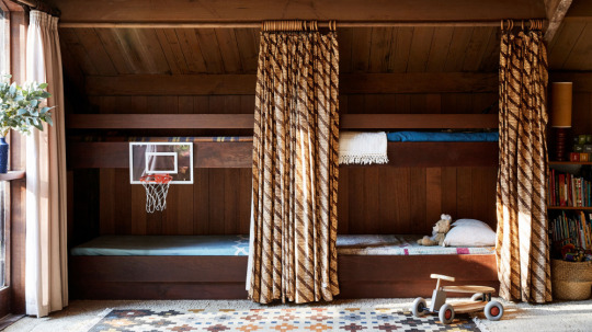
Kids quadruple bunks (!) in the gorgeous Eltham home of Sunni Hart and family. Photo – Caitlin Mills. Styling – Annie Portelli.
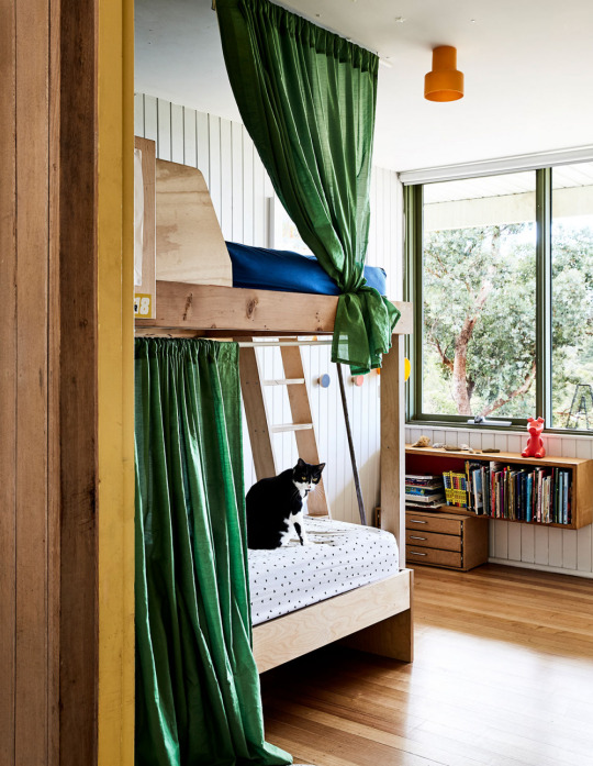
Photo – Caitlin Mills. Styling – Annie Portelli.
A sweet kids bedroom in the former home of Poppy Lane and Scott Gibson and family in Eltham. Photo – Annette O’Brien.
Sleep Zone
Bunk beds are having a moment. They certainly have the novelty factor, especially custom-made bunks, with curtains for added bonus points! Bunks give kids the kind of space where they can hide and feel cocooned and safe. A little shelf to keep their favorite books close, with a reading light inside makes bedtime a little more enticing. Well, we can hope!
In terms of bedlinen – this is the quickest and most affordable way to add impact easily to a kids room. Letting them choose their own bedlinen (from an edited selection!) is a way that they can take pride in their own choices too. A great way to create a room that looks cohesive is to select the bedlinen first and then choose a wall colour based in the bedlinen. Afterall, the bedlinen selection is limited compared to the paint colours available!
Pony Rider, Kip & Co, Sage & Clare, Rachel Castle, Society of Wanderers, Little Louli and even your local Adairs proves there is absolutely no shortage of gorgeous bedlinen for kids!
0 notes
Text
[RF] Pale in Comparison
Winter had sucked all the color out of the world.
The prairie in the glory of midsummer had been a surge of green, summer winds sending pulses through the tall grass, causing it to wave like an underwater kelp forest in a strong current. Now, however, it had relinquished its blooming majesty, its former radiance dulled to straw the color of a deerhide. The flowerheads were stripped of their colorful identities, appearing like sepia photographs of themselves; the ghosts of summer past. The sweetclover, which had extended from one horizon to the other back in June, covering the prairie in a blanket of gold, was now skeletonized, its broken-off stems rolling like tumbleweeds in the winter gales.
Trevor was over it. Another South Dakota winter, another four months until the snows would cease and the ice would melt in the creek. In March and April, the spring blizzards would bury the world and on the subsequent sunny days, the combination of blue sky and white land would be startling, like finding oneself living in the center of a bicolored flag.
But for now, a capricious midwinter thaw had left snowdrifts only in the prairie draws, on the north-facing ridges, in the shadows of the ponderosas that speckled the hills. And around the trailer, mud. In a few nights, a deep freeze would turn the sides of the tire ruts into knife edges, testing the suspension of any vehicle that took the approach too fast. Still, that was better than the loamy mud, which could imprison even a 4x4 until freezing cold or drying winds finally freed it.
The view from the front porch could be gorgeous. Back in July, when the church group from Virginia had constructed a wheelchair ramp for the trailer, the evening sun had set the prairie on fire, its light reflected by a thunderstorm hanging in the sky as if by a puppeteer’s strings. “God almighty,” the youth pastor had exclaimed. But now, grays and browns mingled in a decidedly drab palette. Over at the little bird feeder, the goldfinches were no longer yellow-and-black exclamation points, but had acquiesced to dullness, dressed for a time of year when vibrant color seemed to be outlawed by some unseen authority.
Trevor stared at the expanse of mud that spooled out from in front of the trailer and unwound into a ribbon that led over the hill toward the old sundance ground and, eventually, the paved road. He wondered if he would get out today. Always a calculation this time of year. Driving on the muddy channel that was his approach was out of the question; he would set a course across the grass, which would provide enough barrier to keep his tires from sinking in again. Two-tracks radiating out onto the prairie showed how many times he and his family had taken this course of action since the last snow.
It felt ironic that their approach took them by far the long way around – heading north to go south; harder than it needed to be, like so much of life around here. But the way south was blocked by Roanhorse Creek. This wasn’t all bad; the creek provided nice wading in the summer and water for the horses for most of the year. It also gave rise to the only trees on the property, although the cottonwoods whose leaves whispered in the summer breezes now stood dumb and impassive, and resembled skeletal wraiths at nighttime.
A horse would make it, of course. He could saddle up the buckskin, ride cross-country and be in town in twenty minutes. But that would be silly…he snorted at the ludicrousness of this thought. First of all, he had to go way beyond town today. And even if he were just going to his old job at the tribal building, was he supposed to just hitch it up outside for the day? Tie its reins to one of the smokers’ benches by the entrance? What was this, 1895? No, better not to risk TȟatéZi getting stolen or having some gang sign spraypainted on it or some shit. Besides, he needed to pull into his job interview looking halfway decent, not spattered with mud and smelling like horse sweat.
Trevor regarded his truck, sitting smack in the middle of the sloppy mess. Fuck, he thought.
Still, he didn’t really have a choice today. No job interview, no job. No job, no funds. Another calculation, but this one was straightforward. He went back into the trailer and made his way to his bedroom in the back, passing his brothers in the living room. One was sleeping on the couch and the other was crashed out in the recliner, oblivious to the flickering hearth of the muted TV. Let ‘em sleep today, Trevor thought.
In the bedroom, he stepped across piles of clothes – some clean, some dirty – and over the miscellany of his life; a pile of old DVDs, a defunct gaming console, a canister of Bugler and squares of broadcloth for the tobacco ties he was supposed to make for ceremony, a scattering of empty Mountain Dew cans, a 24-pack of ramen, a basketball.
He hunted around in his closet for the dressy clothes that he knew were there. He had worn them once, on the day of his high school graduation, three years before. And there they were; a purple button-down shirt, a solid black tie, and black chinos. Further rummaging found him a pair of brown loafers and a tan braided belt. He would look sharp for this interview – couldn’t hurt.
Trevor took a quick shower. The hot water always took forever to come and once it did, didn’t last long. He got dressed hurriedly, glad the tie that had come as a set with the shirt was a clip-on, and ran a comb through his hair. It wasn’t long enough to do much with other than backcomb it a little with some hair gel, but he figured that looked better than not. He considered putting in big stud earrings to look extra fly, but decided again it; might not be the right look for the occasion.
Now fully dressed and ready, Trevor took stock of his appearance. His summer tan was long gone and his skin was as pale as the white kids he had met during his one semester of college. The same change of season that had desaturated the prairie and garbed the birds in dull colors had undone all those days spent out in the badlands sun – working with the horses, swimming at the dam, helping keep fire at sundance. Too many French fur traders in his lineage. He recalled the book that his eighth grade teacher had assigned them – Part-time Indian or something – and thought, Yup, that’s me. Indian in the summer and wašiču in the winter, like changing plumage.
Trevor envied his brothers their melanin. He had learned that word in one of his college classes and now thought of it nearly every day. Travis was a rich brown complexion even in the dark days of midwinter. Trenton was in between the two but had jet-black Lakota hair and definitely looked “ethnic,” enough to be followed around stores in the border towns. Trevor knew it was his privilege to be exempt from such treatment, but it bugged him nonetheless. He hadn’t asked to be light-skinned. His brothers called him žiží – a reference to his tawny hair. They had gotten into scraps over this, and Trevor even bloodied Travis’ nose in one such altercation. Once one of them had even called Trevor a “half-breed” but Trevor retorted with “Fuck you, boy, you got the same blood as me. Fuckin’ dumbass.” This seemed to put the issue to rest.
Trevor’s brief stint at college had been at an out-of-state school, which now struck him as an ill-advised decision. At least South Dakotans had some experience with Natives. Even the East River kids had at least crossed paths with one at some point, and didn’t think of Indians as something from the pages of a dime novel. Trevor was the first Native in many years – maybe ever – to attend the small-town liberal arts college in a neighboring state. He thought the fact that the college was reasonably selective would mean that the students were smart enough not to ask dumb questions. He was wrong.
The queries were predictable enough, clichéd even; Are you really Indian? (Yes) Do you speak your language? (No) Did you get in because you’re Indian? (Who knows? I’m pretty smart and got good grades.) Does the college have admissions quotas for Indians? (If it did, you’d think more would go here.) What’s it like on the reservation? (I don’t know; different.) Do you prefer “Native American”? (I find the question annoying, to be honest.) Do you like Leslie Marmon Silko? (Who?) Have you seen Dances with Wolves? (Some of it.) Do you know a guy from Pine Ridge named Verdell? He used to work with my dad. (Maybe) His last name was something Horse. Running Horse? (No)
Fielding these questions was exhausting and added another layer of weariness and alienation to his college experience.
He found himself having to answer such inquiries from his roommate, classmates, professors, his R.A…Sometimes they were cloaked in well-meaning concern (I bet you get tired of all these questions, huh?) but they were always there. Most evenings, Trevor would retreat to his room and call his mom. His roommate, Skyler, a cross-country runner who was handsome in an unspectacular way and who monitored his water intake religiously, was hardly ever around. He seemed to have no trouble making friends in college and reveled in the social opportunities around him.
In his phone calls back home, Trevor found himself experiencing a homesickness that inhabited the pit of his stomach like a hunger pang. He had never been gone from home for that long. Really, his only trip away had been the summer before his senior year, to a weeklong STEM camp for Native kids that one of the state colleges had put on. But that had been with a half dozen other students from his high school. Here he was alone.
The subjects of their conversations would leave Trevor feeling a gravitational pull toward home: Trenton got into a fight at school and got suspended. Travis is drinking again. We had sweat for your auntie because they have to amputate her leg after all. Those dogs were back again. Everett hit $200 at the casino on Tuesday night but of course he put it all back in. They’re having a basketball tournament for that boy who got paralyzed in that wreck. Our hot water heater went out but uncle came and fixed it. They still haven’t found that Two Arrows girl that went missing. Travis wants to go up on the hill this spring – maybe that will get him to quit drinking.
Good news, bad news, mundane news…The latter tugged at him the most. Like many who grew up on Pine Ridge, he had a love-hate relationship with the reservation. It was the home of his people after all, and could be so beautiful (“God’s country,” as it was called by even those who had no time for the white man’s God). But the hardships, the tragedies, the death…it all wore away at your spirit, hardened you. Still, the news of day-to-day life going on in his absence; a school powwow, a bingo tournament, tribal council drama, rumors of a Dairy Queen opening. It made him miss home in an ineffable way.
The last vestige of his indecision evaporated after a particular conversation in the lounge of his dorm. He had been sitting on a beanbag chair, discussing random topics with two friends (at least, he considered them friends, in some ill-defined adolescent way). They had all left a dull party that hadn’t livened up even after a couple of drinks, but still felt heady and obligated to prolong the night a little longer. So, they were shooting the shit, in a garishly-lit common space that smelled of burnt popcorn, and Trevor was feeling rather collegiate. An off-campus party, late-night conversation; weren’t these the trappings of university life that he had seen in teen movies, if a much more prosaic version?
Kayleigh, tipsy off Jäger bombs, started the chain of events that would unravel his college experience with a simple, but pointed question: “How Indian are you, anyway?”
Colton snorted at this comment. “Kay, you can’t just ask that!” But he was clearly more amused than disapproving.
“You mean like my blood quantum or what?” Trevor asked.
“Is that what you guys call it?” said Kay, now playing the innocent party. “I just mean, like, you say you’re Indian, I mean like I know you are, like, I know you are on paper…” The alcohol was causing her to trip over her words but she plowed on. “I mean like, okay, if I were to like, run into you on the street…” Kay was now gesturing expansively, as if the meaning of what she was saying wasn’t explicit from words alone. “Like, I wouldn’t be like, ‘Damn, look at that Indian,’ right? I’d just assume you were a white guy. I mean you know what I mean? Ugh, I’m not making sense.”
She was making perfect sense. Colton looked embarrassed, and for a second, Trevor thought he might shut Kay down. But instead, his inhibition similarly worn down by a few shots of German 70-proof, he followed suit. “I think what Kay’s drunk ass is trying to say is, like, your ancestors are Indians, right, like in the history books. Like Geronimo or whatever. But do you consider yourself one of them? Or are you, like, their descendant?”
Trevor could feel the ball of rage growing within him, a sea urchin radiating spikes in his gut. Stop talking, he thought. Just stop talking.
Colton continued, heedlessly. “Okay, so like I’m Irish but I’m not like Irish Irish, like a leprechaun or some shit. Like my ancestors…”
Trevor stood up, his fists balled. He was now stone-cold sober but his anger was its own intoxicant. “It’s none of your fucking business. It’s none of your business what the fuck I am!” He was shouting; he couldn’t help it. He picked up a half-empty can of PBR and threw it at the wall, slamming the door to the lounge on his way out. The sudsy contents of the can leaked onto the ugly orange dorm carpet, as Kayleigh and Colton sat in stunned silence.
“Jesus,” said Colton finally. “Just trying to ask an honest question.”
After that, Trevor had holed up in his room for a few days, skipping classes and avoiding other students. When he told his mom he was dropping out, she hardly sounded surprised. He knew she would be glad to have him back home; the prodigal son returning. Trevor, the one who had his shit together, who had gone to a STEM camp and was almost salutatorian. He knew she thought that once he got back, he could do what she couldn’t; get Travis on a better path, bring another income to the household, fix what needed to be fixed around the trailer, shoot at the stray dogs when they came around. It would all fall to him. His failure was their blessing; they would lean on him as long as he could stand.
So here we fucking go, he now thought, patting his gel-stiffened hair and giving himself one last hazel-eyed glance in the mirror. Gotta get that bread. His brief stint at the tribal building hadn’t panned out. He was a good worker but wet weather made his road too sloppy to get out easily. Too many latenesses had translated into a pink slip. “Shit man we all got bad roads. Gotta leave earlier,” his boss had said.
So, lesson learned, he was giving himself extra time getting ready for this interview. Really, the lady had just told him to come by “around mid-morning,” so he’d probably be okay. The job was off-rez, down at the county livestock auction and sale barn in one of the closest border towns, “white towns,” as Ridgers called it. It was mostly going to be paperwork – inventory and itemizing and that kind of shit – but it was decent pay and Trevor hoped that he could transition over to working with the animals before long. On most days, he preferred their company to dumbass people.
Grabbing his bag, Trevor stuck the loafers inside with his other miscellany. He would need to wear his cowboy boots across the muddy expanse between the bottom step of the porch and the door to his Blazer so he jammed his feet into them. Outside, he walked gingerly so as not to stain his black slacks with muck. Once in the driver’s seat, he figured he would leave the boots on for the drive, since they were already smearing mud on the floor liner, and in case he got stuck and needed to get out. Trevor knew that the people who worked at the sale barn were as countrified as he was and wouldn’t judge muddy boots under most circumstances, but he also knew that being from Pine Ridge meant he had to put his best foot forward, literally in this case.
Trevor fired up the Blazer, put it in four low, and gunned it. His tires found grip and he jerked along, slimy divots of earth spattering his windows and roof like hail. His windshield wipers left a pasty smear that obscured much of his view, but he practically knew the way by feel. As soon as he could, he bumped up onto the grass, gopher holes and clumps of prairie bluestem jolting his ride, testing what was left of his suspension. When he finally hit the pavement, the smoothness was startling as it always was, like a TV being suddenly muted, like silence after a door slamming.
He cruised through town, passing the gas station, the other gas station, the commod building, the quonset hut, the old BIA headquarters…and turned south into Nebraska. He tried to ignore the persistent squeal under the hood that had gotten worse lately. The overcast sky reflected the dullness of the land – as below, so above – and Trevor alternated between zoning out and counting hawks on telephone poles. A handful of miles south of the border, the vehicle gave a jolt and Trevor felt a temporary loss of control. He hit the brakes and steered toward the shoulder, but the Blazer was suddenly steering like an army tank. Fuck, he whispered.
Once he wrestled Blazer off the road, Trevor got out and popped the hood. He already knew what he would find under the rising steam. “Fucking serpentine belt,” he hissed to the universe. Trevor was good with cars but he didn’t have the tools for this fix. Luckily, he thought, out here in the country, somebody who did would be by soon. Lots of Natives on this road, maybe even a cousin would happen by who could at least give him a ride to town. Trevor thought of calling his dad’s brother Everett on his cell, but figured he’d give it a bit. He hated the thought of owing Uncle Ev anything.
Sure enough, in a few minutes, a gunmetal gray truck passed by slowly, hit a u-turn, and pulled up behind him. Trevor felt a twinge of envy over this late-model Dodge Ram MegaCab with duallies. It had county plates on it, so the cowboy-hatted driver was a local guy, and as he got out, his Carhartt overalls and mud-caked boots identified him as a rancher.
“Trouble?” MegaCab asked, giving Trevor an easy smile.
“Serpentine belt busted,” said Trevor, unconsciously smoothing out his rez accent in favor of a more neutral affectation. Code-switching – another term he had learned at college (by the professor who asked him if he prefers “Native American”).
“No shit, huh?” MegaCab considered this information. “I got nothing for that but I could give you a ride somewhere. You call anyone? Someone coming after you?”
“No,” said Trevor. “I’m trying to get down to the sale barn for a job interview.”
MegaCab looked at Trevor as if for the first time. “Oh ok so that’s why you’re all fancied up. Well, hop in if you don’t mind leaving it here.”
Trevor considered this. He was off the rez so there was less of a chance that the Blazer would end up with busted windows or slashed tires. And he was eager to get his interview over and done with.
Before he could answer, MegaCab added “I have to stop in Whiteclay first but then I’ll take you down.”
This was only a few miles out of the way so Trevor assented and climbed into the rancher’s idling behemoth. It still retained some new-truck smell, mixed with a tinge of manure and rich earth. Really, it was almost luxurious.
MegaCab flipped a u-ey again and headed back north toward Whiteclay. Formerly notorious for copious alcohol sales to people from the dry reservation whose border it sat on, Whiteclay’s package stores had been shuttered after the state had revoked their liquor licenses following years of protests over their depredatory business model. Now, it was just a town of a couple small stores and fewer than a dozen permanent residents, its streets empty of vagrants, its ghosts banished.
“So, you from Hot Springs?”
Trevor momentarily wondered where this question had come from, and then remembered that he had 27-plates on the Blazer – Fall River County, a relic of when he bought the car from a white lady over there. He had kept the off-county registration because the plates were far less likely to get you pulled over off-rez than the infamous 65s of Oglala Lakota County.
MegaCab continued without waiting for an answer. “I used to go up to Hot Springs a lot when my dad was in the V.A. hospital up there. Nice town.”
“Yup, it’s pretty nice,” said Trevor, wondering if he would have to sustain this small talk the whole way.
Luckily, MegaCab took it from there, reminiscing about his high school football team dealing Hot Springs a particularly lopsided loss, and then they were at Whiteclay. Trevor played around on his phone while his driver of the moment went into the little grocery store. He looked up his old roommate Skyler on Facebook (why, he didn’t know; certainly not to friend him) and then Googled “Pine Ridge South Dakota Dairy Queen” just to see if there was any truth to that rumor.
MegaCab returned with some mail – Trevor had forgotten that there was a little post office in there – and they turned south toward Rushville.
Two miles and five hawks-on-telephone-poles into their trip, MegaCab got chatty again:
“I still can’t believe that the state revoked the liquor licenses. They had no legal right to do that of course, but just like everyone else these days, they bowed to the pressure from liberal special interest groups. Those store owners – my brother was one of them – followed the damn law to a T but still got their rights taken away. They’re the real victims in all of this.”
Trevor, whose father was found dead in Whiteclay when Trevor was ten years old, didn’t answer.
“You know it’s just going to push the problem down the road. These Indians are gonna get their liquor one way or another. You guys must see that all the time up in Hot Springs.”
These Indians. You guys. Trevor suddenly recognized MegaCab’s presumption, and wondered when if he should correct it.
“If they wanted to buy millions of cans of beer in Whiteclay every year and drink themselves to death, shit, I say let ‘em. It’s a free country, right? Those AIM types are always going on about Native rights and shit, y’know? Well shit, you have the right to drink and die if you want. Not saying that I want that for those people or anything, but the nanny state can’t be protecting everyone from problems of their own making.”
Trevor, whose brother had first gotten jailed for drunk and disorderly at age 14, two years after their father died, said nothing.
MegaCab continued to rhapsodize about “the Indians” and their problems, adopting the tone of an expert, one who knew all about them. Trevor felt the blood rise to his face. Some coloration at least, he thought darkly. In the pit of his stomach, the sea urchin had returned to stab at his insides. What must it be like, he wondered, to live a life in which people aren’t constantly telling you who you are, naming your characteristics like symptoms, trying to trap you like a spirit in a photograph?
The Blazer came in sight on the shoulder ahead. “Can you let me out at my ride?” Trevor asked, his voice hardly recognizable to his own ear, like hearing himself talk underwater.
“Sure, you need to grab something out of it?” said MegaCab, reluctantly pausing his diatribe.
“No it’s okay,” replied Trevor, “I’m gonna call someone to come help me fix this after all.” He fiddled with his phone as if to underscore this intention.
“Well, if you’re sure,” said MegaCab. “And hey,” he added as Trevor stepped down onto the running board. “You be careful around here. One of these rezzers might see you here all by yourself and try to mess you or your car up. And watch out for drunk drivers. You just never know with these Indians.” MegaCab gave a serious nod to accentuate this show of concern. Then he wished Trevor luck and drove off.
Trevor watched the truck recede into the distance until it was merely a gray speck between the monochrome earth and the steely sky. He sat down in the cold front seat of the Blazer and looked into the rearview mirror. Hazel eyes stared back at him under a pale forehead. Fuck it, he thought; people are dumbasses. Let ‘em believe what they want; that he was from Hot Springs, that could be was related to that Apache, Geronimo, that he was only Indian on paper. Trevor saw what they didn’t; the hidden depths beneath the surface, and in their faces, in the spaces between their words, their ignorance displayed like a tattoo.
In another minute or two, he would call Uncle Ev for a ride. In another hour or two, he would be offered a job at the sale barn that would bring another income into his household (and buy him a new serpentine belt). In another day or two, he would finally finish the tobacco ties for ceremony, at which he would pray for Travis’ sobriety and his auntie’s diabetes. In another month or two, the lengthening of the days would be unmistakable.
Spring would come as it always had, first heralded by a single meadowlark piercing the predawn silence with his song. This would be followed by a green sprig on the prairie, pushing up, perhaps, through snow. Then a cluster of pasqueflowers appearing suddenly on a hillside, a skein of geese overhead, sheet lightning on the horizon. Small miracles, one after another. Finally, color would surge back into the world like paint scintillating on a canvas, causing goldfinches to glow like stars and evening thunderheads to stand like towering fires.
The brilliant Dakota sunlight would stoke the melanin in Trevor’s skin, and nobody would mistake who he was. He would go up on the hill for two days and nights with Travis that spring, and Trenton would keep fire for them. He would pray for the coming year, for the survival of his people, for enough blessings to outweigh the hardships. And there, among a sea of undulating green, facing the crimson blaze of sunrise, he would again know himself and find the strength to carry on, in the face of all the peculiar indignities of this world.
submitted by /u/PrairieChild
[link] [comments]
via Blogger https://ift.tt/33fx51H
0 notes
Text
The intricate world of pattern design (and how to create one for your brand)
What’s the first thing that comes to mind when you’re thinking about patterns? Ugly wallpaper or your grand-aunt’s curtains might pop into your head. But patterns are so much more than that—and they’re so on-trend right now that you just can’t escape them.
These colorful pattern designs for a chocolate brand resemble classic tile patterns. Packaging design by .g.
Patterns can be found all over corporate design, web design and packaging. And for good reason: they’re an amazing way to build and strengthen brand identity and style. Trust me, there’s a pattern out there for everyone.
In this article we’ll introduce you to the world of patterns: what they are and how they’re created, what types of patterns are out there and—last but not least—how you can find the perfect pattern for your brand. Let’s dive right in!
Things you need to know before you start designing your pattern
—
The geometric patterns that cover the walls of the famous Alhambra in Spain are just one example of patterns used in architecture. Via Hoboish.
Basically, a pattern occurs when one or more symbols repeat themselves and fill a surface in a (more or less) structured way. This repetition can be regular or irregular. The effect of the pattern changes depending on which symbols are used and how they are repeated.
Trees are perfect examples of patterns occurring in nature. Via Pexels.
While patterns are really on trend right now, technically, they have been around for, well, forever. Often they occur naturally—think trees in a forest or sea shells on a beach. So it’s no surprise that throughout human existence people have been drawing and decorating their surroundings using patterns. We can find the first pattern designs in cave painting and trace them through history and cultures like a common thread. There’s no lack of examples in architecture, art and fashion.
And there’s a simple explanation why we feel so drawn towards patterns: by filling a canvas with symbols using a repetitive structure and spacing our brains recognize the repetition, which gives us a feeling of order. This harmonious order makes looking at patterns a pleasurable experience.
Using pattern design for your brand
—
Think about mood and style
If you want to find the right pattern design for your brand, it’s crucial to first understand who your audience is and what mood and style you want to convey. Patterns are a great tool for establishing a connection to a specific feeling by creating a coherent image without having to put it into words. But first, you’ll want to think about what mood it is you want your brand to represent—and how your pattern can help you with that.
Let’s look at floral patterns. While this is a popular pattern choice, it doesn’t work for every brand. Imagine seeing a floral pattern on a lawyer’s business card—feels wrong somehow, doesn’t it? However, if it’s a business card for a florist or a cosmetics packaging, it would fit perfectly. The reason is obvious: the flowers in the pattern represent a direct connection to the brand’s service or product.
Additionally, we instantly associate floral patterns with certain things—such as femininity, beauty or a sunny meadow—which is exactly the mood a brand would want to create when using thy type of pattern in connection with their product. If your client is craving beauty and harmony, there’s a good chance they will be drawn towards your product if the mood of the packaging conveys just that.
Incorporating your logo into your pattern
Your logo is the foundation of your brand identity. So if you want your logo to have even more impact, you should consider turning it into a pattern. Your logo itself (or a simplified variation of it) can act as the symbol that’s repeated in your pattern. By repeating the shape you can create a coherent connection to your brand across all kinds of brand materials, which will amp up your logo’s familiarity in the eyes of your audience.
Using patterns to differentiate products
You can use the same pattern in different colors to differentiate flavours. Packaging design by Martis Lupus for LOL Lots of Love.
Using patterns in packaging design can be particularly helpful when you’re trying to visually differentiate different products, while at the same time maintaining a consistent connection to your brand. For instance, you can use the same pattern in different color schemes and variations to signify different flavours.
A creative packaging for fish feed, designed by Tomdesign.org.
Another option would be to create patterns with a specific connection to each product. See how the fish feed packaging above uses a tropical fish pattern to reflect what’s inside? Other variations of this brand’s fish feed might feature illustrations of goldfish or carp, while using the same style to maintain brand coherence.
Additionally, patterns can help you stand out and highlight unique features. If your product comes from a certain region of the world, such as coffee or cacao beans, try incorporating a pattern that is unique to that region for an instantly recognizable feature.
Pattern colors
—
A great example for incorporating brand colors in the pattern used for a packaging design by Martis Lupus.
In most cases it’s a good idea to start with your brand colors when creating your pattern. But patterns offer you the chance to supplement your existing colors with additional shades.
When choosing the colors for your pattern it’s crucial to think about your target group or audience. Is it a youthful, fun-loving audience you’re trying to appeal to, go for fun and bright colors. Muted colors and pastels on the other hand create a harmonious, calming effect and would be a good choice for a more mature audience. If you’re going for modern and high-end, keep it simple color-wise and stick with a minimal, monochrome color selection.
A modern geometric pattern design using a monochrome color selection really emphasizes the contrast of each line of the pattern for maximum effect. Via Kilo Studio.
Patterns are a fantastic way to play with colors and give your design a specific look and feel. Patterns work in synergy with the chosen colors, which can enhance their effect. A clean and simple pattern in pastel colors for example will feel much more calming than the same pattern in bright neon colors. Similarly, a black and white pattern can make a powerful statement. The contrast between two opposing colors allows your eyes to focus on nothing but the pattern, which gives it more impact.
The different types of patterns and how to use them
—
The different types of patterns depend on the structure in which elements are placed. Here’s how they are created and what effects they can have:
Geometric patterns
The easiest way to create a pattern is by placing graphic elements in a repetitive, evenly spaced pattern. That’s what we call a geometric pattern—referring to the geometric shape of the grid, not the symbols used in the pattern.
Imagine the composition of a geometric pattern like a grid. A symbol is placed on each intersection where the lines of the grid meet. The resulting effect depends on how and in what distance the next symbol is placed. Are the elements spaced evenly, the resulting pattern will look more organized. If the distances between grid intersections are irregular, the effect will be a little more messy. To add a bit more movement and interest, you can also rotate elements with each repetition.
A similar type of classic geometric patterns are stripes, which are created by placing elements in lines or using elongated elements. If lines intersect, you’ll get a check pattern. If linear elements are placed diagonally or if they change directions, you can create a zig-zag pattern. There are endless variations of these types of geometric patterns and you can combine them in a multitude of ways.
Allover patterns
Electric Ink uses a cool black and white allover pattern on their packaging created by Robot Food.
Some patterns incorporate various different symbols and the structure of their placement is not clearly visible. That’s what we call allover pattern compositions, the second main type of pattern.
Because allover patterns often have a more complex composition they add a lot of interest and can be really eye-catching. Although technically they should include a repetition to qualify as a complete pattern, in many cases they are only hinted at for lack of space—such as on packaging or in corporate designs. Usually, all you need is to create the impression of a pattern by filling a space with different symbols, so no need to adhere to any strict rules.
This allover pattern has a playful watercolor effect. By ananana14.
Allover patterns can be monochrome to draw attention to the graphics or colorful for a full-on look. The symbols used in allover patterns can be simple geometric shapes or complex drawings—in allover patterns anything is possible. That said, make sure that the pattern you choose works well with your brand style and creates a coherent look.
Floral patterns
An exotic 80s inspired floral pattern on a business card. Via The Welcome Branding Group.
A special variation of an allover composition are floral patterns. Floral symbols are clearly the most popular elements in pattern design.
Depending on color palette and style of the symbols the look and feel of the pattern can vary dramatically. A monochrome black and white floral pattern can look exotic yet cool and calm, while a colorful floral pattern is fun and loud. Pastel florals on the other hand are classic, chic and feminine.
There are endless ways to draw floral symbols—whether they’re realistic, abstract, classic or modern—the sky’s the limit. Since floral patterns are deeply anchored in many cultures and have been around for thousands of years, they are a fantastic way to create a reference to a certain culture or time period and connect with people’s associations.
A particularly attractive trend, that has been prevalent recently, are vintage floral patterns. These patterns feel classic yet fresh and evoke fascinating associations to the styles of the 20s, 50s or 80s—or even striking new variations.
Communicative patterns
Whether you’re using a pattern for product packaging, business cards or web design—patterns are a wonderful way to create a connection to what your brand does. It can easily connect packaging with what’s inside and let your customers know what to expect.
If that’s what you want your pattern to achieve, communicative patterns are your best bet. These patterns can say a lot about your brand—and will make people talk about you for sure. They’re fun to look at and fun to create. Use them to give your brand a humorous twist, turn some heads or to connect the dots if what you do is abstract and hard to explain.
But communicative patterns don’t have to be loud and garish. They can work just as well in more laid-back, classic styles. Again, the rule is: anything goes, as long as it works for your brand. Think of symbols that represent your brand. All those things that communicate what you do can be shaped into a unique pattern that will catch your customers’ eyes.
Textural patterns
A textural pattern as background in a web design for Kurth Glas by fortunefaded.
Sometimes a space is filled with a pattern-like composition of shapes that can’t be distinguished as separate symbols—a textural pattern. These textures are technically not ‘real’ patterns, but they have the same effect. They are perfect for creating interesting backgrounds.
A great example for watercolor texture on a packaging design by MMX.
Currently, a very popular textural effect for patterns is the watercolor effect. It creates a light-hearted, cheerful and youthful mood. Usually, pastels and bright colors are used for this. Depending on the shapes you create with watercolors, you can either use this effect as a consistent background texture or as an allover pattern.
A colorful example for a marbled texture on chocolate packaging. Via Mary and Matt Chocolate Editions.
Especially the marble effect seems to be everywhere lately. These patterns can go from simple and calming to action-packed, depending on the strength and frequency of the swirls. This textural pattern can be created using monochrome colors for a classic yet striking effect, but combining more shades will give your design a really lively feel.
Combining different patterns
This is a good example for presenting different patterns on different products next to each other. Via The Paper Town by Jessika.
Once you’re hooked on patterns, you’ll probably want to use more of them for your brand, and the good news is: you don’t have to stick to one! You can mix and match them across your product range and brand materials and create a collection of patterns for your brand. There are no hard and fast rules, but make sure that your pattern combination looks harmonious across the board and matches your brand.
As a rule of thumb, know that there should be at least one element that links the patterns of your collection to each other—say monochrome line art or watercolor florals. It usually works very well to combine different patterns of the same type. Particularly suitable for this are geometric patterns. Another linking element can be your color selection. It doesn’t even have to be the exact same shade selection, even colors from a similar color spectrum, such as pastel shades, can go well together.
If you’re already using a flashy allover pattern for your brand and you want that pattern to get the full attention, then it’s a good idea to combine it with various simpler patterns. It is helpful to use the shades of the allover pattern as a starting point and pick a limited selection of these shades for the additional patterns.
Note: The size of the patterns you use plays an important role in the creation of your collection. Especially geometric patterns work well for combining different sizes of symbols, which create a different moods and effects.
The beauty of combining patterns is that you can extend your pattern “wardrobe” as needed with each additional product or landing page to give them a unique feel.
Everything’s better with a pattern
—
A cute cacti pattern by Cross the Lime.
As you can see, the possibilities to use patterns are endless and no matter what you do, there’s a pattern out there for you. Just keep in mind who your customers are and what style you’re going for, so you can make sure that your pattern creates a coherent style for your brand.
Now comes the fun part: venture out into the intricate world of pattern design and start creating your own!
Need a custom pattern designed?
Our designer community can make your wildest ideas come to life.
Let's do it!
The post The intricate world of pattern design (and how to create one for your brand) appeared first on 99designs.
via 99designs https://99designs.co.uk/blog/trends-en-gb/pattern-design/
0 notes
Text
The intricate world of pattern design (and how to create one for your brand)
What’s the first thing that comes to mind when you’re thinking about patterns? Ugly wallpaper or your grand-aunt’s curtains might pop into your head. But patterns are so much more than that—and they’re so on-trend right now that you just can’t escape them.
These colorful pattern designs for a chocolate brand resemble classic tile patterns. Packaging design by .g.
Patterns can be found all over corporate design, web design and packaging. And for good reason: they’re an amazing way to build and strengthen brand identity and style. Trust me, there’s a pattern out there for everyone.
In this article we’ll introduce you to the world of patterns: what they are and how they’re created, what types of patterns are out there and—last but not least—how you can find the perfect pattern for your brand. Let’s dive right in!
Things you need to know before you start designing your pattern
—
The geometric patterns that cover the walls of the famous Alhambra in Spain are just one example of patterns used in architecture. Via Hoboish.
Basically, a pattern occurs when one or more symbols repeat themselves and fill a surface in a (more or less) structured way. This repetition can be regular or irregular. The effect of the pattern changes depending on which symbols are used and how they are repeated.
Trees are perfect examples of patterns occurring in nature. Via Pexels.
While patterns are really on trend right now, technically, they have been around for, well, forever. Often they occur naturally—think trees in a forest or sea shells on a beach. So it’s no surprise that throughout human existence people have been drawing and decorating their surroundings using patterns. We can find the first pattern designs in cave painting and trace them through history and cultures like a common thread. There’s no lack of examples in architecture, art and fashion.
And there’s a simple explanation why we feel so drawn towards patterns: by filling a canvas with symbols using a repetitive structure and spacing our brains recognize the repetition, which gives us a feeling of order. This harmonious order makes looking at patterns a pleasurable experience.
Using pattern design for your brand
—
Think about mood and style
If you want to find the right pattern design for your brand, it’s crucial to first understand who your audience is and what mood and style you want to convey. Patterns are a great tool for establishing a connection to a specific feeling by creating a coherent image without having to put it into words. But first, you’ll want to think about what mood it is you want your brand to represent—and how your pattern can help you with that.
Let’s look at floral patterns. While this is a popular pattern choice, it doesn’t work for every brand. Imagine seeing a floral pattern on a lawyer’s business card—feels wrong somehow, doesn’t it? However, if it’s a business card for a florist or a cosmetics packaging, it would fit perfectly. The reason is obvious: the flowers in the pattern represent a direct connection to the brand’s service or product.
Additionally, we instantly associate floral patterns with certain things—such as femininity, beauty or a sunny meadow—which is exactly the mood a brand would want to create when using thy type of pattern in connection with their product. If your client is craving beauty and harmony, there’s a good chance they will be drawn towards your product if the mood of the packaging conveys just that.
Incorporating your logo into your pattern
Your logo is the foundation of your brand identity. So if you want your logo to have even more impact, you should consider turning it into a pattern. Your logo itself (or a simplified variation of it) can act as the symbol that’s repeated in your pattern. By repeating the shape you can create a coherent connection to your brand across all kinds of brand materials, which will amp up your logo’s familiarity in the eyes of your audience.
Using patterns to differentiate products
You can use the same pattern in different colors to differentiate flavours. Packaging design by Martis Lupus for LOL Lots of Love.
Using patterns in packaging design can be particularly helpful when you’re trying to visually differentiate different products, while at the same time maintaining a consistent connection to your brand. For instance, you can use the same pattern in different color schemes and variations to signify different flavours.
A creative packaging for fish feed, designed by Tomdesign.org.
Another option would be to create patterns with a specific connection to each product. See how the fish feed packaging above uses a tropical fish pattern to reflect what’s inside? Other variations of this brand’s fish feed might feature illustrations of goldfish or carp, while using the same style to maintain brand coherence.
Additionally, patterns can help you stand out and highlight unique features. If your product comes from a certain region of the world, such as coffee or cacao beans, try incorporating a pattern that is unique to that region for an instantly recognizable feature.
Pattern colors
—
A great example for incorporating brand colors in the pattern used for a packaging design by Martis Lupus.
In most cases it’s a good idea to start with your brand colors when creating your pattern. But patterns offer you the chance to supplement your existing colors with additional shades.
When choosing the colors for your pattern it’s crucial to think about your target group or audience. Is it a youthful, fun-loving audience you’re trying to appeal to, go for fun and bright colors. Muted colors and pastels on the other hand create a harmonious, calming effect and would be a good choice for a more mature audience. If you’re going for modern and high-end, keep it simple color-wise and stick with a minimal, monochrome color selection.
A modern geometric pattern design using a monochrome color selection really emphasizes the contrast of each line of the pattern for maximum effect. Via Kilo Studio.
Patterns are a fantastic way to play with colors and give your design a specific look and feel. Patterns work in synergy with the chosen colors, which can enhance their effect. A clean and simple pattern in pastel colors for example will feel much more calming than the same pattern in bright neon colors. Similarly, a black and white pattern can make a powerful statement. The contrast between two opposing colors allows your eyes to focus on nothing but the pattern, which gives it more impact.
The different types of patterns and how to use them
—
The different types of patterns depend on the structure in which elements are placed. Here’s how they are created and what effects they can have:
Geometric patterns
The easiest way to create a pattern is by placing graphic elements in a repetitive, evenly spaced pattern. That’s what we call a geometric pattern—referring to the geometric shape of the grid, not the symbols used in the pattern.
Imagine the composition of a geometric pattern like a grid. A symbol is placed on each intersection where the lines of the grid meet. The resulting effect depends on how and in what distance the next symbol is placed. Are the elements spaced evenly, the resulting pattern will look more organized. If the distances between grid intersections are irregular, the effect will be a little more messy. To add a bit more movement and interest, you can also rotate elements with each repetition.
A similar type of classic geometric patterns are stripes, which are created by placing elements in lines or using elongated elements. If lines intersect, you’ll get a check pattern. If linear elements are placed diagonally or if they change directions, you can create a zig-zag pattern. There are endless variations of these types of geometric patterns and you can combine them in a multitude of ways.
Allover patterns
Electric Ink uses a cool black and white allover pattern on their packaging created by Robot Food.
Some patterns incorporate various different symbols and the structure of their placement is not clearly visible. That’s what we call allover pattern compositions, the second main type of pattern.
Because allover patterns often have a more complex composition they add a lot of interest and can be really eye-catching. Although technically they should include a repetition to qualify as a complete pattern, in many cases they are only hinted at for lack of space—such as on packaging or in corporate designs. Usually, all you need is to create the impression of a pattern by filling a space with different symbols, so no need to adhere to any strict rules.
This allover pattern has a playful watercolor effect. By ananana14.
Allover patterns can be monochrome to draw attention to the graphics or colorful for a full-on look. The symbols used in allover patterns can be simple geometric shapes or complex drawings—in allover patterns anything is possible. That said, make sure that the pattern you choose works well with your brand style and creates a coherent look.
Floral patterns
An exotic 80s inspired floral pattern on a business card. Via The Welcome Branding Group.
A special variation of an allover composition are floral patterns. Floral symbols are clearly the most popular elements in pattern design.
Depending on color palette and style of the symbols the look and feel of the pattern can vary dramatically. A monochrome black and white floral pattern can look exotic yet cool and calm, while a colorful floral pattern is fun and loud. Pastel florals on the other hand are classic, chic and feminine.
There are endless ways to draw floral symbols—whether they’re realistic, abstract, classic or modern—the sky’s the limit. Since floral patterns are deeply anchored in many cultures and have been around for thousands of years, they are a fantastic way to create a reference to a certain culture or time period and connect with people’s associations.
A particularly attractive trend, that has been prevalent recently, are vintage floral patterns. These patterns feel classic yet fresh and evoke fascinating associations to the styles of the 20s, 50s or 80s—or even striking new variations.
Communicative patterns
Whether you’re using a pattern for product packaging, business cards or web design—patterns are a wonderful way to create a connection to what your brand does. It can easily connect packaging with what’s inside and let your customers know what to expect.
If that’s what you want your pattern to achieve, communicative patterns are your best bet. These patterns can say a lot about your brand—and will make people talk about you for sure. They’re fun to look at and fun to create. Use them to give your brand a humorous twist, turn some heads or to connect the dots if what you do is abstract and hard to explain.
But communicative patterns don’t have to be loud and garish. They can work just as well in more laid-back, classic styles. Again, the rule is: anything goes, as long as it works for your brand. Think of symbols that represent your brand. All those things that communicate what you do can be shaped into a unique pattern that will catch your customers’ eyes.
Textural patterns
A textural pattern as background in a web design for Kurth Glas by fortunefaded.
Sometimes a space is filled with a pattern-like composition of shapes that can’t be distinguished as separate symbols—a textural pattern. These textures are technically not ‘real’ patterns, but they have the same effect. They are perfect for creating interesting backgrounds.
A great example for watercolor texture on a packaging design by MMX.
Currently, a very popular textural effect for patterns is the watercolor effect. It creates a light-hearted, cheerful and youthful mood. Usually, pastels and bright colors are used for this. Depending on the shapes you create with watercolors, you can either use this effect as a consistent background texture or as an allover pattern.
A colorful example for a marbled texture on chocolate packaging. Via Mary and Matt Chocolate Editions.
Especially the marble effect seems to be everywhere lately. These patterns can go from simple and calming to action-packed, depending on the strength and frequency of the swirls. This textural pattern can be created using monochrome colors for a classic yet striking effect, but combining more shades will give your design a really lively feel.
Combining different patterns
This is a good example for presenting different patterns on different products next to each other. Via The Paper Town by Jessika.
Once you’re hooked on patterns, you’ll probably want to use more of them for your brand, and the good news is: you don’t have to stick to one! You can mix and match them across your product range and brand materials and create a collection of patterns for your brand. There are no hard and fast rules, but make sure that your pattern combination looks harmonious across the board and matches your brand.
As a rule of thumb, know that there should be at least one element that links the patterns of your collection to each other—say monochrome line art or watercolor florals. It usually works very well to combine different patterns of the same type. Particularly suitable for this are geometric patterns. Another linking element can be your color selection. It doesn’t even have to be the exact same shade selection, even colors from a similar color spectrum, such as pastel shades, can go well together.
If you’re already using a flashy allover pattern for your brand and you want that pattern to get the full attention, then it’s a good idea to combine it with various simpler patterns. It is helpful to use the shades of the allover pattern as a starting point and pick a limited selection of these shades for the additional patterns.
Note: The size of the patterns you use plays an important role in the creation of your collection. Especially geometric patterns work well for combining different sizes of symbols, which create a different moods and effects.
The beauty of combining patterns is that you can extend your pattern “wardrobe” as needed with each additional product or landing page to give them a unique feel.
Everything’s better with a pattern
—
A cute cacti pattern by Cross the Lime.
As you can see, the possibilities to use patterns are endless and no matter what you do, there’s a pattern out there for you. Just keep in mind who your customers are and what style you’re going for, so you can make sure that your pattern creates a coherent style for your brand.
Now comes the fun part: venture out into the intricate world of pattern design and start creating your own!
Need a custom pattern designed?
Our designer community can make your wildest ideas come to life.
Let's do it!
The post The intricate world of pattern design (and how to create one for your brand) appeared first on 99designs.
0 notes
Text
Melancholy Mix Vol. INFINITY
The music of melancholy - 13 choice cuts that turn pain into beauty.

I’m going to level with you, kiddo: heartbreak sucks. There’s no avoiding it, and the thing is, it’ll keep on coming. HEARTBREAK, FOREVER AND FOREVER, A HUNDRED YEARS HEARTBREAK.
I know, I know, it’s an incredibly bleak viewpoint, but fortunately it’s not all whiskey benders and facepalms (poor, poor Bogie). Luckily, us humans have an uncanny talent for turning pain into something practical, even managing to transform suffering into statements of beauty, whether in the form of paintings, films, novels, or whathaveyou - the list is as vast and infinite as there are causes of heartache (RIP TANGY FRUITS).
If you are anything like me (and for your sake, I hope you’ve made peace with that), you’re inexorably drawn to the melancholic in life, especially when it comes to music that poignantly expresses it. So, in the name of melody and melancholy, here are (in no particular order) 13 slightly left of field songs that you should probably avoid if you’re in the midst of heartbreak (hang in there, you can do this!):
Steve Conte - ‘No Reply’
This particular song weaselled its way into my life at a time that couldn’t be more unfortunate (WHEN IT RAINS IT POURS, FOLKS). How does that happen? Autoplay - the cause of, and solution to all of life’s misery. Anywho, this track comes off Future Blues, the soundtrack to Cowboy Bebop: The Movie, and is that rare mix of song that if were personified, would be crying while smiling triumphantly. BITTERSWEET. Come for the angst, stay for the sweeping strings and accompanying tears. Listen here
The Fairfield Four - ‘Lonesome Valley’
The Coen Brothers are good at many things. Who am I kidding, they make the masterful seem effortless. Therefore it comes as no surprise, that they knock it out of the park with their music selections in O Brother, Where Art Thou. ‘Lonesome Valley,’ a traditional American gospel folk tune, is performed mournfully by The Fairfield Four. Their acapella rendition is enough to petrify the hairs on the back of one’s neck - if you do not, I repeat, DO NOT want to be moved to the core, avoid this song at all costs. Listen here
Slint - ‘Washer’
It almost feels like an intrusion to listen to ‘Washer,’ the most somber track from Slint’s 1991 album Spiderland. The stark production of the record is so naked and intimate, that one would be forgiven to feel uncomfortable when listening to Brian McMahan reveal lyrics that are tantamount to reading a secret journal entry. If you can accept this (and oh my gosh, you should), the reward is one of the more interesting displays of the quiet loud dynamic that was so emblematic of early nineties alternative music. Listen here
Calexico - ‘Missing’
“She notices a chunk bleeding from your chest.” Wrap me in a warm blanket, and bury me in this song. Perhaps the most lyrically poetic entry on this list, Calexico hauntingly evokes the forlorn landscape of inner loss and longing - a barren desert if ever there was one. Essential listening, ESPECIALLY when things are getting you down. Listen here
Shawn Colvin - ‘The Facts About Jimmy’
You may be familiar with Shawn Colvin from her hit ‘Sunny Came Home,’ the main single off her 1996 divorce concept album A Few Small Repairs, but whereas that song details the painful end of a marriage, ‘The Facts About Jimmy’ paints the destructive world of a man oblivious to his own emotional carnage. For those who have had divorce creep into their life (that goes for children too), many of the songs on the album will resonate, but the muted and delicate instrumentation of ‘The Facts About Jimmy’ particularly underscores the quiet, devastating environment of a failing marriage at its lowest point. Listen here
Little Dragon - ‘No Love’
“No love in my soul left for you.” One of the more bitter entries featured on this list, Little Dragon’s ‘No Love’ wastes no time in burning bridges. If you’ve ever been jilted by love (*hugs*), this track would otherwise strike too strong a chord were it not for the soothing, self-assured vocals of Yukimi Nagano. Make this your new anthem for moving on. Listen here
Chris Whitley - ‘Assassin Song’
Criminally unappreciated, Chris Whitley is one of the greatest singer-songwriters you’ve never heard (if you have, LET’S BE FRIENDS). ‘Assassin Song,’ from his 2003 album Hotel Vast Horizon, is a perfect encapsulation of what makes Whitley so special in the canon of melancholy. From the dusty honk of his resonator guitar, to the plaintive lyricism channeled through his ghostly voice, Whitley creates an allegory for the solitary and transient life of a musician through the tale of an assassin who “slide[s] through town.” Let this song crawl under your skin, and make a permanent residence. Listen here
Chuck Ragan - ‘Don’t Say a Word’
Who would have thought that singing punk music would be a perfect training environment for the weathered yarns of Americana? ‘Don’t Say a Word’ relates a stoic acceptance of worldly pain, resolute in finding the strength to endure regardless. Chuck Ragan’s raggedly worn vocals (honed through his years in the punk band Hot Water Music), convey the experience of someone who has been through the ringer, and are a perfect fit for a song that just wants to hold and reassure you that everything will be alright. Recommended listening beverage: sweet tea. Listen here
Citizen Cope - ‘Sideways’
This song is deceptively simple, but therein lies its power. If a random solo musician covering the song in Vietnam can bring you to tears, you know you’ve found something special (and yes, that happened and I cried BUT HE WAS JUST SO GOOD). Much like the lyrics proclaiming that “These feelings won’t go away,” ‘Sideways’ has a singular musical focus that cuts to the core. Although the version featuring Santana may be more well known, the unadorned sparseness (are you noticing a trend here?) of Citizen Cope’s original iteration is far more effective as a personal statement of grief when unshackled from Santana’s guitar trickery. Plus, the song prominently features the flatted fifth musical tritone, more affectionately known as ‘The Devil’s Interval,’ so bonus darkness points! Listen here
Pelican - ‘Final Breath’
“And I will love thee still, my dear. Till all the seas run dry.” It’s not often that a metal band will create a breathtakingly beautiful song about unconditional love, but when it happens, you better hold onto it for dear life (I mean come on, IT’S A METAL UNICORN FOLKS). Such is the result of ‘Final Breath,’ instrumental band Pelican’s first foray into music featuring lyrics. With Allen Epley (of Shiner fame) providing the dreamy vocals required to make one’s heart flutter, ‘Final Breath’ musically beds lyrical sweetness with a wistful sense of finality. All that is good in life, must eventually end. Listen here
Neurosis - ‘The Road To Sovereignty’
Neurosis (for my money) are the undisputed kings of doom and gloom, but ‘The Road To Sovereignty,’ the final track from their classic album Times Of Grace sees them easing back on the grinding intensity just enough for their folk side to shine. Thankfully, none of their trademark off-kilter dissonance is lost in the process, but the effect is markedly different. Instead of creating a musical storm as is their usual calling card, ‘The Road To Sovereignty’ is rather a meditative reflection in the wake of destruction. Listen here
Phillip Glass - ‘Metamorphosis 1′
When it comes to ‘Metamorphosis 1′ by Phillip Glass, the less said, the better. Find yourself a quiet place, dim the lights, put on some headphones and let the composition wash over you (fetal position optional, but advised). Listen here
Bernard Herrmann - ‘Scene D’Amour’
How does one make an impossibly great film a masterpiece? You hire Bernard Herrmann as your composer, that’s how. Personally, I find it difficult at times to even handle ‘Scene D’Amour,’ a showstopping composition featured in Alfred Hitchcock’s seminal work, Vertigo. Without a doubt, one of the most heartachingly melancholic things I have ever heard in my life. Oh my word, when the string section gets quiet?!? I’M NOT CRYING, YOU ARE. Listen here
You made it! *high five* Hopefully, you feel a smidgen braver for having stared into the abyss. It can be a dark and lonely place sometimes, but the most beautiful things often are.
0 notes
Text
“Step into Spring with These 5 Fashionable Sneaker Trends”
"Improve your sneaker style this spring with these valuable tips on the latest fashionable sneaker trends."
When it comes to fashionable footwear, designers are on a mission to elevate sneakers beyond street style to become the luxe staple we can't live without.
Showy with a plethora of textures – think shiny silhouettes, suede, and crystals, not to mention sneakers with chunky soles to classic retro styles, this season it's all about high-fashion comfort – with enough flair to be on our 'most wanted' list, whatever the dress code.
Here's how to get your trainer therapy with these five sneaker trends...
1. Snazzy silver
"Sneakers are everywhere this season, from mega metallics to pops of color or classic white; there is a style to suit every woman," says Lisa Kay, CEO of Sole Bliss.
"The silver trend continues… it's modern, eye-catching, and incredibly versatile, as metallics can work as a neutral," says Kay. "Silver trainers can be easily dressed up or down and work as party shoes or everyday wear."
Next -Signature Forever Comfort Leather Chunky Wedges Platform Trainers, $76
Sole Bliss Palazzo: Silver Leather, $299
2. Peach fuzz
A hot topic in fashion circles, Pantone's 2024 Colour of the Year, Peach Fuzz, is a playful, peachy tone that hits all the right notes…
"With a call to the Eighties, this is a colour trend that cries sunshine no matter what the weather barometer says," notes Donna Hill, Gola digital and marketing director.
"Used as a highlight across several styles this season, its warmth and radiance brighten any outfit.
"Worn with whites and denims, a touch of peach fuzz adds a sunny and feminine touch to simple styles."
JCrew Color Block Trainer, White Peach, $69
Gola Classics Women's Raven Trainers, Orange Spice/Raspberry/Coral Pink, $120
3. Embellishment
With a glimmer of glitz or crystals, if solid silver feels too heavy metal, a glimpse of embellishment gives newness to your everyday look.
Go nude with a bit of bling, or pair darker tones with white jeans to put a spring in your step.
Bobbies Willow, Milos Beige, $215
Sole Bliss Star: Navy Leather & Suede, $299
4. Vintage vibe
A key trend for SS24, vintage styles are where it's at…
"From colourful suede options to Eighties-inspired court trainers, retro styles are here to stay," says Hill.
With so many options, she says vintage classics can be styled to suit any occasion.
"Bold-coloured suede options elevate the simplest looks and work well with tailored trousers and ankle-grazing denim," Hill continues, "while chunkier options provide the perfect juxtaposition to floaty dresses and skirts."
Chrysoline de Gastines, co-founder of Balzac Paris, agrees: "With a thinner, more delicate profile imbued with a vintage essence, the sneaker of 2024 reimagines its contours while striving for a lighter construction."
With daring color selections to create a truly distinctive and original design, Gastines says the subtly elevated sole and vibrant upper complement both trousers and feminine ensembles, such as skirts or dresses.
Gola Classics Women's Elan Trainers, Marine Blue/White, $110
Balzac Paris Yellow and Black Colette Sneakers, $225
5. Athletic aesthetic
Whether it's fun brights, muted schemes, or pops of color, there's an attention to detail with the latest looks in sporty trainers.
"With running shoes styling out most of our wardrobes, styles such as the 'LKB step' are the perfect shoe to fuse utmost comfort with fashion, playing into the chunky trainer trend," says Thomasine Jordan, global product and design director of LK Bennett.
Furthermore, they look fabulous with faded denim, loose linen, or leggings and offer an instant style update to your wardrobe with that all-important street cred status.
Hoka Women's Arahi 7 Shoes, $145, Runners Need
LK Bennett LKB Step Cream Leather and Grey Suede Trainers, White, $350
Read the full article
0 notes
Last Seen Blogs

seongweon
성원

smoking-elegance
smoking elegance

fezadxd
fez.xd

kookyburrowing
darth vader? more like darth HATER

fcklshtr
welcome.