#I should use the same brush for lineart that I used for the words
Text
HOW THE FUCK DID I MAKE THIS IN SO LITTLE TIME AND ACTUALLY BE HAPPY W/ IT-
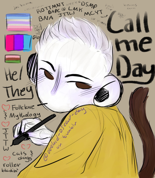
#day doodles#my art#meet the artist#done within like 3 hours#mostly made for my confidence#could readjust the tail and make the skin less AH#but otherwise I love my shit#fandoms; Rise of the Teenage Mutant Ninja Turtles. Dream SMP. Bee and Puppycat. Lego Monkie Kid. Minecraft Youtubers Blogs. Brand New Anima#and then ofc journey to the west#the cat doodle near the flags is my oc Richard#he is a good boy unlike a certain pos (my real cat Tazz)#monkey tail cuz why not#I should use the same brush for lineart that I used for the words#and from now on my finished products are gonna supposed to be sketchy#too much stress making the lines elegant or even smooth#so fuck it#fuck ton of tags
10 notes
·
View notes
Note
Messy linework tips ?
Keep the sketch in and just erase the parts you don't like; you don't need to give up the sketch layer for the lineart layer or vice versa, you can keep both. it took me a stupidly long time to realise that
try to avoid "lineart" brushes (aka hard edge tapered brushes with full opacity) i think they're also called "inking" brushes yeah those are for clean, strong lineart and that's not what we're going for
look for more textured brushes instead, brushes that change their opacity with pressure ( aka the harder you press on your tablet, the more opaque the stroke becomes), you can even do the lineart with that very same sketch brush you used. When it comes to messy linework, it's about the quality of lines, not the tidiness
some parts will be messier than others and that's okay! we should give up on that perfectionism and need for control and let some parts be messy
try to think about the angles and shapes your linework creates. This is where style and personal preference come into play: I personally like more sharp, boxy, geometric shapes and figures, but you can also go down the soft, round, organic shape route (like Loish's artstyle for example if you're familiar with her works or,.,, disney idk) OR you can have a nice balance between both organic and geometric lines as it creates a nice effect ( a very good but random example i can offer off the top of my head is ehm Chuuya's hair in the dead apple manga— it has both very sharp buy also curvy "S" lines and it's just so very pleasant to look at you should look it up bshjds ) many or most artists usually use both organic (Circle- round, curvy) and geometric (Square - sharp, angle, precise) shapes in their work with a preference for one or the other. It's a spectrum, if you will
that's all i could think of........ disclaimer take everything with a grain of salt it's just word from the street aka what i do and what works for me if it doesn't work for you and i ruined your life and marriage it's not my fault
also if you meant like,, tips for /fixing/ a messy linework then i severely misinterpreted this ask 😭 nor can i help you my linework is messy too I'm not your guy anon
#it just hit me last mintute that maybe you wanted tips for improving lineart and i had a glass shatter sound effect.mp4 moment#hopefully you didn't mean that aha <3#really if there's anything to take from this just. keep the sketch layer in on a lower opacity don't hide it it saves lives#ask iztea
59 notes
·
View notes
Note
Ok since you drew Gai incredibly soft i couldn't take my eyes from your drawings. But today was the last bit of me holding myself back from showering you with praise. The way you draw the hands is beautiful, and oh you've created a amazing face drawing style for yourself. The facial expressions you drew really reflect the emotions of the characters very well. Not to mention the bodies. Ok... Yeah well, no need to give you headache with my talking-
But please let me ask. Did you practice drawing each body part individually, or did you just go over your favorite characters and let your drawing style settle on its own? I ask this because every time I take a break from drawing, the way I draw the characters' faces changes and I can't get the consistency I want. The same goes for the body and hands, how many hands did you have to draw to be able to draw hands that soft and good :')
And lastly, can I ask which brush you used in PS? Yes, I'm sorry to bother you with my questions, but as I said, I couldn't stop myself after seeing your sketch and lineart comparison today.
Disclaimer: I use a translator, so if there are errors in the text, please excuse me in advance!
I'm glad to hear praise in any form, and if you really want to please me with it - don't hold back, haha! I am very pleased that you like my style and you ask questions - I will be happy to answer them!
In fact, I always drew a character, not a separate body part. Once my great-grandfather told me that hands and even eyes, apart from the whole body, are able to convey the emotions of a character better than words, and this left its imprint in my subconscious. I always drew the way I wanted myself, how I felt the character and felt the slightest changes in the perception of the drawing when I changed the positions of my hands or slightly covered the eyes of the character in the drawing. This is a kind of magic that arises through experience and work. But I must be really crazy if I haven't practiced drawing my hands separately from my body, haha! Only if the composition and the idea required it. Even in manga, my favorite things to draw are hands, hair, and eyes. And to be honest, I had to draw A LOT OF hands.
And it also seems to me that you should not worry that your hands or face did not turn out as you expected from yourself. Drawing is still hard work and you know it perfectly well, but you probably see progress in your abilities even after so much time without a conditional pencil in your hands. I'm going to sound corny, but you can definitely do it if you just enjoy drawing and practice a lot. Lee taught us not to give up haha! You will definitely succeed!
And yes, this is the most common brush in PS, I originally had it among the main brushes after downloading the program itself. It's hard for me to say the exact name, because I have a program with Russian, but the closest brush in appearance is KYLE Ultimate - Mr. natural or Rough Inker 3
I will be glad if I have the courage to answer your questions and you will ask more! Thanks!
4 notes
·
View notes
Note
hey kels i was scrolling through my dash and then i caught a glimpse of your new fallon drawing and i want you to know that i went absolutely buckwild and then i scrolled further to see the whole drawing and i'm pretty sure i squealed. kels ever since ive started following you and your art and fallon have slowly nestled yourself inside my brain its amazing how excited i get whenever u upload a new drawing. also ive noticed that i'm slowly but surely starting to sound more and more unhinged and wild like you. how the fuck do you have so much influence on me.
ALSO i love the new fallon drawing!! you are so right blue gold and white are just her colours they fit her v well!! and i love how much texture you used throughout the whole drawing and her shoes are AWESOME!! also love the whole winter fairy-ish vibe <3
ALSO i was wondering if you could like sort of,, idk explain your drawing process on this drawing? like if you did the colouring first or the lineart and stuff bc i just love how it turned out and id love to try something similar!!
AW!!! i am so hype for my awful girl to be Enjoyed so much!! she is my favorite dressup doll i love to play barbies with her most of all heheh. also i am THRILLED that my Unhinged and Unwell nature have rubbed off on u. i know i am a Strong personality and it makes me V POLARIZING (i am either LOVED or LOATHED i havent met many ppl who are just like meh abt me. i am an Experience) and its always a DELIGHT when someone finds my feral animal traits endearing or positive and kind of picks up on them. i think because life is short that we should all be as bananas as we please at any point in time. PURE ID HERE BABY
AND TY TY!! my girl has a strong aesthetic and this piece kind of went a liiiiittle against some of that (its a lot of hard angles vs i normally give her a lot of ovals and rounded edges) but for the setting its appropriate bc im trying to give her a bit more of a """"harsh"""" or """"severe"""" vibe (like as harsh and severe as she can possibly look which isnt very). i LOVE to use texture brushes they are such an easy way to get out of drawing details myself because i am SO lazy!!
okay i “”answered”” this i GUESS technically because i typed words in response but its a whole lot of jack shit so like. here ya go. SORRY PAL.
here are some more shoes as u can see i basically draw her in the same ones always except when i draw her in a plugsuit

OKAY THE DRAW IN QUESTION i kind of cheated on bc i literally just traced over one of my older draws i did for a very obscure au i made of who made me a princess (i am always doing such ridiculously niche shit i love to sit in my little sandbox and have no one else understand my barbie rps) BUT the process is the same as basically every draw i do like this. it is very simple so dont worry (or do, maybe)
i use 1-3 layers at a time and then immediately merge when i feel like im done and LIVE W MY MISTAKES if not!! anyway prepare to be massively underwhelmed heh
this is so funny i cant believe i literally traced my own drawing im a fuckin FRAUD im the laziest bitch i know. anyway. my sketches are way messier than this but it always starts out either scratch ass lines or color blocking w this bright ass magenta bc thats what feels right!!!!!!
HERES THE LAYERS I USED LOL i do all textures n shit as a clipping mask so actually i used 4 layers for this bc id set down one texture or pattern that was gonna overlap on a diff layer so i wouldnt have to work harder to erase and then BLINDLY MERGED to make things more difficult if actually i fucked up before that!!! work smarter not harder except when it is absolutely braindead to do otherwise is my motto
IF IM DOIN SMTH NICER like this then i usually make sure all my lines connect (this is also why i do a lot of angles and simple clear shapes when i draw) so i can set that layer as reference and USE THE FUCKING FILL TOOL BAYBEEEEE!!!!! this also makes it easier to fuck around with COLOR imho bc you can just rapidly swatch with zero efforts. i Love to take shortcuts. i Love to be lazy. i HIGHLY rec this, if i have colored smth that stays in the lines then its bc i connected the lineart and used the bucket fill underneath. if my lines dont connect sometimes ill make a temp line and erase after i filled. im dedicated. ALSO u can see here that my patterns layer is all overlapping and fucked up bc i didnt check and erase fully but i use p limited palettes in general so... IT DIDNT MATTER THIS TIME!!!!!!!!.
anyway after all that i lock the lineart layer if i havent already and color some of the lines for some PIZAZZ. easy way to immediately fake effort i do love to do that
HERES AN ACTUALLY MESSY SKETCH:
i do all of my fucking draws on the same canvas bc im a horrible little beast, so the only reason i didnt erase the sketch and use it for the colors layer was bc there were others on that layer already and i didnt wanna scoot them so i could cap the finished draw. i did NOT connect my lines for this one i colored like a toddler. who gives a shit we all die in the end anyway!!!
YOU DIDNT ASK FOR THIS BUT LINELESS MY LOVE... i just color blocked for this one alas i do not have process caps, i will do that next time i draw i guess if anyone wants that!!? i typically only use a single layer for lineless- block out the shape, alpha lock, then color and carve from there. EASY PEASY!! ive shown it before but i spent all my formative draw years on v limited feature programs (mspaint, oekaki, TEGAKI MOST OF ALL) so i dont explore tools much and do what seems easiest and most intuitive to me... im sorry i dont have any sick tricks or real process i am but a feral little clown drawing in the DIRT. also here is the tegaki overlay i use whenever i am Blocked or fatigued w procreate layout. it makes me feel NOSTALGIC and INSPIRED so i do this instead of like, actually getting on tegs2
this ended up long as fuck and FOR WHAT?? its just 10 images and several paragraphs of “sorry im the laziest fucker ALIVE”
#idk what to say here every time i type anything i thnk it makes me seem just completely detached from reality#its not untrue i GUESS. im Unwell but in a stable SUCCESSFULLY COMPLETED THERAPY AND HAVING FUN WITH IT kind of way#kels talks#damn sorry anon this was a whole lot of not answering you at all
23 notes
·
View notes
Text
I was going to post
“why did the drawing on my mirror turn out better(imo) than what I put in my sketchbooks(both physical and digital)?”
And call it a day while probably hoping someone out there has the answer but I figured it out, or at least I think i did
It’s because working on the mirror I wasn’t afraid of imperfections, I was just drawing to draw. Vibing to music and giggling about the silliness of trying to draw on my dirty mirror with a dying dry erase marker. Knowing that eventually what I drew today would be erased. Anything I wasn’t happy with I was able to simply sketch over, erase or ignore because it wasn’t meant to be perfect. It was simply meant to be. Imperfections and all. It’s something I’ve wished I could do more. It’s something I wish I could view other things with, including myself.
But when I work on procreate or my sketchbook I hold myself to standards that I should put myself in. Everything has to be perfect even though I have all the tools in front of me than would allow me to go back and do it again. If I make a mistake I start to dislike what I’m working on and eventually if I mess up enough. even if it’s just a sketch, I’ll just abandon it all together and start something else after a small break. The lines have to be perfect. Lineart, if I do any, has to immediately have personality and can’t be done with the “wrong” brush. I can’t get the colors wrong, even if I don’t know what colors I want to work with. I struggle to get myself to use references because the artists in my life that I grew up around always said it was bad. Newsflash: it’s not. But it’s hard to stop thinking like that. And when I do work with refs I always feel like it’s too similar to the ref. I can’t reliably compare what I’m drawing to what I picture in my head because normally it’s fuzzy images and tons of words. Which ends up making me overthink what I’m drawing, because I’m trying to compare myself not only to others that I look up to but also a different art form that I use to help shape what I want to draw. What I draw has to be everything it’s not.
But I know that I don’t have to be the best, and I know I’m not the best but that doesn’t stop me from tearing myself down.
I think from now on I’ll try to look at my sketchbook and procreate like I did my mirror.
It’s the same way my younger self looked at art until I had one too many people tell me it was cringe or tell me how I could do it better if I did it a different way.
I’m going to try embrace the imperfections
1 note
·
View note
Text

my acetate cel materials test sheet. took 3 hours to paint the colors on, so hopefully that gets faster (granted, it does have 4 faces on it) but i definitely wish i'd put more time into making the test drawings be a little more... on model.
i used grafix 8.5 x 11 acetate sheets (about 25 cents a sheet where i bought it) (i went for printer sheet sized cause it's the size of my scanner's scanning bed.) All the actual lineart is done with a technical pen with koh-i-noor acetate ink in it. i tested all my regular liners and stuff (pentel pocket brush pen, sakura pigma microns and brush version, white gel pens, sharpies) just to see if i was going overkill by buying a 22$ pen and 7$ ink i'll use Only For This and nope, everything else wipes off readily except regular sharpie, which is unfortunately just not opaque enough for lineart. (weirdly, the sharpie liner wiped off so completely it's just a smudge) Although i did the white highlights in gel pen anyway, cause it's easy and a little bit more stable than some of the regular liner's inks
Even the special acetate ink is a little fragile and takes a while to dry. Note the smudges on the upper-left drawing, which i inked first. the acrylic is just cheap-ish DecoArt brand i got in a set because it had close-enough colors for most of ragged's design, but if i continue Seriously i might invest in 10$ a pot to get vinyl paints, cause although only one brand out there now still labels it as specifically animation paint (toon tones) afaict most vinyl paint should be the same thing. at least for painting cels in western animation
here are some things i've learned about the medium from this:
it's freaky how much it looks like digital art in person. the colors are so impossibly flat and smooth, which you don't think about much when looking at old animation because it has the texture of the film grain on it
harder to color in the lines than you think. especially when your colors cover up the lines. probably gonna have to try to draw a little bigger. a good reason for that stylistic choice of having thicker outlines just for the outer edges though, i couldn't afford a second technical pen right now sooooo i'll just have to git gud
you Really gotta blob on the paint. this could be from getting cheap acrylics but footage i've seen of old production suggests that's just how it is. a softer brush was better for it (i think it was a cheapo watercolor brush?) but i could only use that for fairly big areas cause it splayed out wider
it seems like the acrylic faintly warped the acetate, i think from the acrylic shrinking as it dries. in general, the cel got pretty wibbly from just handling it. Later productions did use polyester instead of acetate and perhaps that is less affected, but i don't think i feel a need to have archival quality materials, at least not when i'm just experimenting and am going to digitally composite my animation anyway. (and acetate was cheaper than Dura-Lar)
gonna have to solve the shadows it casts in the scanner, even when the lid is pressing it down. it's a pretty cool-looking effect for just an image, but it's gonna be annoying in the video editing stage (and the smooth flat colors make it super obvious to me that my scanner's colors are really off, i still had to edit this but didn't bother making it totally irl accurate)
taking out the light table for this was a pretty good idea even though i wasn't animating, cause it made it real easy to check for missed or thin spots on the paint
cotton gloves to avoid fingerprints made me feel like a Cool Serious Artist, and then i didn't have to scrub paint off my fingers afterwards
i feel like i really Get something about why old animation looked A Certain Way that i didn't understand just from reading about it, but can't put it succinctly into words. aside from that and the fun of Nerdiness, research and bragging rights i'm not sure i'd suggest animating like this when digital tools are available, cause once you put it on a screen it just looks like digital art anyway
1 note
·
View note
Text
Day 24
Prompt: When you meet your soulmate for the first time, you get a brief flash-forward of your future.
Word Count: 1,154
Main Taglist: (Send an ask to be added or removed!) @starlocked01, @spoopy-turtle, @lizluvscupcakes, @more-fandon-than-friends, @i-cant-find-a-good-username, @vindicatedvirgil, @star-crossed-shipper, @justaqueercactus, @gayboopnoodle, @sanderssidesweirdo, @the-sympathetic-villain, @8-writes, @lizzy-lineart, @battlebunnyteardropsinthesun, sirprplsnail
Soulmate taglist:(Send an ask to be added or removed!) @elizabutgayer, @melodiread, @tsshipmonth2020, @mikalya12, @8-writes, @lizzy-lineart
CW: weapons.
Virgil entered the room, following behind Prince Roman. He stepped to the side, blending into the background with the ease of someone who’s done this for years. Roman approached the table and took a seat directly in front of where Virgil was standing. He watched as the room slowly filled with the officials necessary for this alliance to take place.
Someone else came and stood beside him as another prince swept into the room, sitting beside Roman at the table. He glanced over at the person, head not moving from its position. “Are you an attendant or a bodyguard?” He asked quietly.
The man smiled, not taking his eyes off the man he came in with. “A bodyguard. You?”
“The same. My name’s Virgil, I’m with Prince Roman.”
“Logan with Prince Patton.” This time, he flicked his eyes over to look at Virgil, accidentally meeting his eyes. In that split second of contact, their future flashed before their eyes.
Virgil rolled over in bed, snuggling closer to the warmth next to him. He hummed as an arm was slung over his back, a warm chest pressing against his side as another arm snuck under his torso. Logan hummed, his head resting on Virgil’s back. Virgil chuckled, moving as close as possible. “You’re warm.”
Logan’s answering chuckle was a rumble against his side. “We should get up soon, my love.”
“Noooooo.” Virgil whined, somehow managing to worm his way even closer to his now husband. Logan’s arms started moving away from Virgil, who curled closer. “Nooooo, don’t leave me!”
This pulling away and pressing closer continued until they both tumbled off the bed, thudding to the floor with giggles. Logan sighed but tried to untangle them from the blanket. “Are we getting up now?”
Virgil briefly considered trying to curl back up in the blankets on the floor but Logan had already stood and was waiting to give him a hand up. So, he took the offered hand and let Logan pull him into a hug. He leaned down for a kiss and a murmured, “Good morning, Husband.”
~~~~~~
Logan picked up a sword and tossed it between his hands. “Come on, dear. Won’t you duel me?”
Virgil just laughed as he stepped around the other bodyguard, coming to a stop near the daggers. “You are an insatiable flirt when you want to be but you know I prefer to dual wield.” That being said, he grabbed two short swords.
“Ha ha!” Logan crowed as Virgil went into a ready position. “Let the best bodyguard win.” With that, he launched himself at the man he’d been flirting with just a few seconds ago.
Virgil parried and the fight was on, the pair going back and forth across the training grounds. To the outsider, this would look like a fight to the death, but to them it was courting. The sun set behind them as they continued to strike, block, parry, swipe, slash, and try in every other means to kill each other lovingly.
The time came when Virgil’s foot slipped and he went down. Logan swiftly hit the ground on top of him, his knees straddling the bodyguard and his sword at the other’s throat. A gasp rose from an ignored onlooker, the pair's attention solely on each other.
“I believe that’s a win for me.” Logan said. Virgil didn’t respond, instead surging up to kiss Logan on his cheek before he dumped the man on his side, standing and brushing his clothes off, offering a hand up.
They broke eye contact, both turning to watch their respective prince instead. They were quiet the rest of the meeting, standing side by side but never once glancing in the other’s direction. When the meeting was over, the two princes seemed to continue talking to each other. This made sense as they were to be married for an alliance. Virgil was glad, having had to listen to Roman’s pining for Prince Patton ever since he got the position.
“So,” Logan’s voice brought him from his thoughts, “I’m assuming this means we’ll be seeing more of one another?”
Virgil smiled, shifting so his shoulder was barely pressed against Logan’s. “One way or another.”
Logan pressed his own shoulder back on Virgil’s. “If what I saw is true, I don’t think I’d mind that all that much. Although, I must ask, how good are you at dueling?”
Virgil smirked. “Better than you’d think looking at me.”
Before their conversation could continue into a duel, Prince Remus approached Virgil. “I’m bored.”
Virgil rolled his eyes. “Go bother someone else, my prince. I’m trying to have a conversation with Prince Patton’s bodyguard.”
Remus looked between them, his sharp eyes noticing their shoulders pressed together. “What are you talking about?”
Logan smiled but shifted away from Virgil. “We were discussing if we were to take turns guarding both of them or if we were to do so at the same time.”
Virgil nodded. “You know,” he turned to Logan, “I still think it would be more efficient to have one person guard both of them. Then, we could swap between the two of us in shifts.”
Logan shook his head. “No, because we each already take shifts with another guard. If we both guard together, that keeps the shifts intact.”
Remus pouted at the lack of attention and wandered off, likely to cause mischief but Virgil couldn’t care less in that moment. Instead, his full attention was on the man standing beside him who he knew was gonna be his husband one day. “You might be onto something. However, I think we should both take a slightly longer shift than normal. Just so they match, of course.”
Logan nodded, a mischievous smile forming on his face as he understood Virgil’s intentions. “I think that’s a wise decision.”
So, they stayed five paces behind their charges while being glued to each other’s hip, asking as many questions as possible. Virgil’s questions were more along the lines of which weapons Logan favored and if he would be willing to teach them to him while Logan’s were about evasion and protection strategies, but they both still learned a lot from each other as they kept up the façade of being interested in comparing notes. It wasn’t until they were relieved of duty that their questions turned more introspective, more tender. The weapons were replaced with food, the tactics with morals.
Soon, the princes both went back to their respective kingdoms to prepare for the wedding. Meanwhile, their bodyguards maintained a steady stream of letters back and forth. Part of them were about security measures and the integration of the royal guards when the marriage took place but most of them were about personal things. That duel that Logan saw was the crux of their relationship, sending them from casual flirting to both proposing at once. A month later, Virgil’s glimpse of a cozy morning was realized.
#tsshipmonth2020#soulmate au#analogical#background royality#remus sanders#logan sanders#virgil sanders#patton sanders#roman sanders#kingdom au#medieval au#fluff#ace writes
132 notes
·
View notes
Text
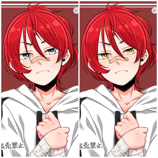
How to have mismatched eye color in any picrew: a tutorial
*****
At the bottom I give a quick overview (but not a specific tutorial) of how you can also make various other things that are almost never available in picrews, some of these are harder than others: Other forms of Heterocromia, Inner eye ring colors, Custom scars, Custom skin tone variations (can make vitiligo, granted the picrew creator added enough skin variations), Custom hair color streaks
*****
Hate when you choose the perfect picrew, but your oc has some form of heterocromia and the picrew won’t let you show that?
Here’s a quick trick to fix it, with zero artistic talent required.
Everything we need is already in the picrew! We’re just going to use a simple layer trick to merge 2 of the same picrew
This will be user friendly for people who have no experience with digital art and will be done using a free mobile app. (Since most people don’t have computer drawing apps if they aren’t into digital art)
Needed: a picrew you like, a free digital art app (I’m going to use ibis paint X for this tutorial)
The link to the picrew I’ll be using for this. No orange eye color though, the one thing I needed lmao
Step 1:
Save two versions of the same picrew with differing eye colors in each as the only difference.
In my experience, the picrew stays built when you re-enter the link. So, just build it and save it as normal, then it will still be there and you can change the eye color before saving the second copy.
Your copies should look about like this: it’s important to keep the rest of picrew as a copy except for the eye color. The fewer differences, the easier it will be.
Step 2:
Ok, now the hardest part is over! Drawing apps can look scary if you’re not used to them, but it will be ok.
When we open IbisPaint X it will look like this:
You want to select ‘My gallery” and then hit the plus sign at the bottom left hand corner. You’ll then be given this menu:
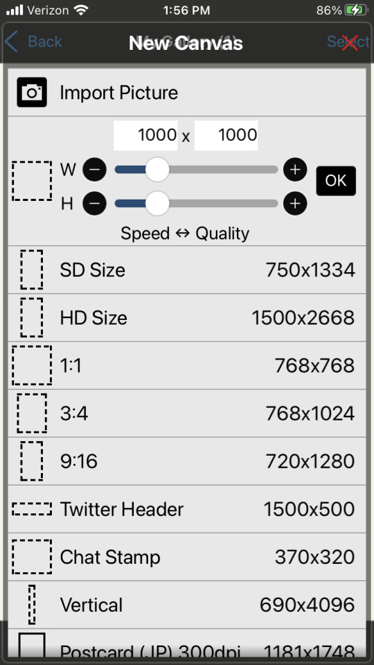
Now this looks like a mess, butttt you’re just going to ignore it all and click import picture. You can then choose 1 of the picrew’s from your gallery. Don’t worry it doesn’t matter which you choose.
You will be prompted with this notification:
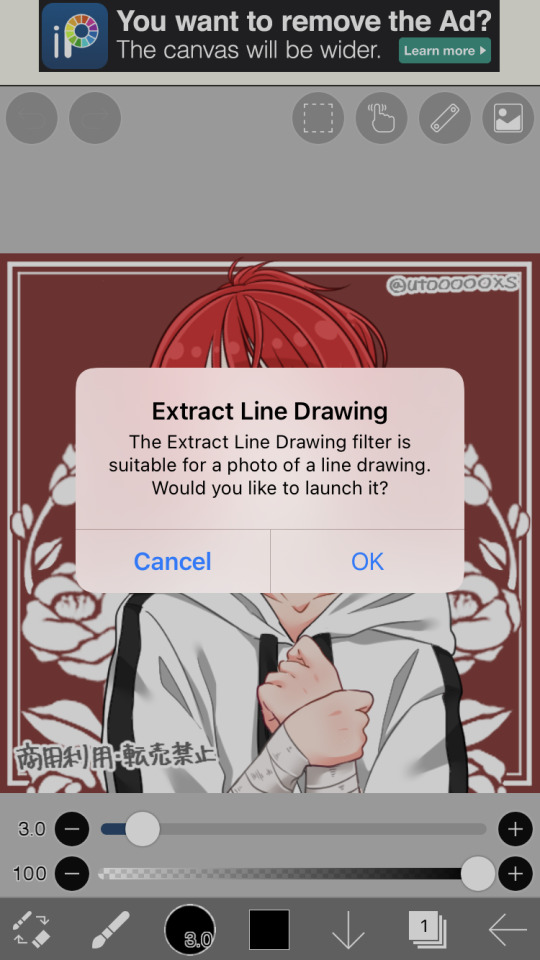
Cancel this. This will turn the work into lineart or something I’m not sure tbh. Not familiar with this app. But it will mess up our picrew. Accidentally did it? No problem! Just close the app and go back through the menu
Step 3:
So, now you have this:
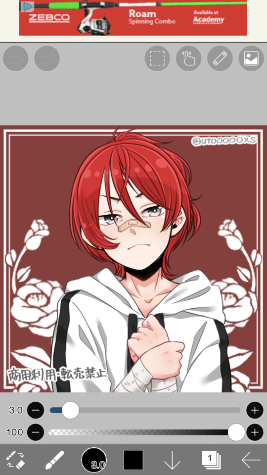
We’re ready to overlap it with the other picrew we made!
I’m running out of the 10 photos per post, I’ll try to still give a visual for each step though. Hope it’s not confusing
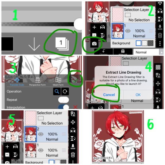
1- First we’re going to hit the ‘layers’ symbol at the bottom right
2- here we can see the layers, this app seems to automatically make a new layer for a new picture, so don’t worry about any of this! Select the add photo button and choose your picrew with the opposite eye color of the 1st
3- Dont mess with these settings, just push the green check! We don’t want to move the picture since we’re relying on them being directly on top of each other
4- cancel the lineart thing again
5- Now we have 2 layers, each with 1 version of your picrew
6- you can just tap above this menu to close it. It should appear as though our picrew has changed eye color.
Step 4:
Now for the fun part! We’re going to erase one of the eyes on this top layer to reveal the other color underneath!
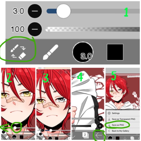
1- We’re going to switch from pen to eraser using this button in the bottom left hand corner.
2- For the best precision, we’re going to want to zoom in towards the eye that isn’t supposed to be the current color (we can zoom in by placing two fingers on the canvas and pulling them apart. Idk what this is called. Reverse piniching?) The other thing we’re going to do is make the eraser smaller by sliding the top slider to the left.
3- Now we’re ready to erase! Carefully erase over the eye and it will change color. Be careful not the erase the other eye, or it will change color as well. If you make a mistake, the undo button is towards the top of the canvas
4- all done! Just gotta save it now. Push the button in the bottom right corner
5- When the menu comes up, you want to save as a normal PNG. Now it’s in your gallery!
Step 5:
Done!
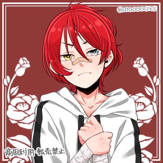
It doesn’t look edited at all! Because it’s really not, we just combined two of the same art in different colors. No one would ever guess. It still has the same dimensions and everything!
*****
Other stuff you can do with this trick:
Although some of these take a lot more careful erasing, these shouldn’t require any actual drawing. You can use these basics to experiment with this stuff as well:
- A different colored ring around the middle of the eyes: put the middle color on the bottom layer and erase around the pupil carefully in a circle with a very small eraser brush size.
- eyes that are half colored, in a line down the middle (a form of heterocromia): layer order doesn’t matter, erase half of each eye carefully, depending on which color should be where.
- a color streak through the hair: this one will require careful erasing to look good. You’ll need a picrew where the hair is entirely the color of the streak, and a picrew with the surrounding hair color. Put the color streak layer on the bottom layer. Erase the top layer in the shape of the streak you want colored. You can place it anywhere. You can do this with faded hair tips as well, but how well that turns out will depend on the color difference the creator had between similar hair colors... in other words, if dark and light brown are closer together in color value, it will look more natural when you merge them. I would recommend putting the lighter hair color layer on the bottom. When you erase, you’ll be drawing where the highlights are, functionally the same as the color streak.
- you can make uneven skin tones or vitiligo if the creator has added enough skin tone variations to the picrew: to make vitiligo you’ll make a picrew with your lightest skin tone and a picrew with your darkest skin tone. You’ll put the lightest skin tone on the bottom layer. Then you’ll erase the top layer in the pattern where skin pigment has been lost. You’ll be able to control the pattern of color loss like this, and make any pattern you want! This layer order works best for putting light patches on darker skin. If you want to darken an area you’ll put the darker layer down first and erase the top layer with lighter skin into the pattern you want. Essentially: put light down first if you want to put a light pattern on dark skin. Put dark down first if you want to put a dark pattern on light skin
-custom scars if the creator has added enough skin tone variations to the picrew: this is the same idea as skin tone variations. This time though, we need a picrew with a pink tone skin color choice, a lighter one than the character’s skin tone can also work if you want silver scars. Make a picrew with normal skin tone for the character, and a picrew with the scar color. Put the scar color picrew down first, then add the normal tone one. Now when you erase it should make scars in any pattern you want!
If you’re having trouble erasing neatly, the answer is always to zoom in on the canvas and decrease the eraser brush size! Also you can undo and redo until it looks how you want!
That’s all I can think of right now! Hope everyone has fun making those OC’s that the picrews always seem to forget. And especially anyone who’s been left out themselves!
I have on anon asks if anyone has questions/problems using this tutorial! Or any questions about how to do something similar
Feel free to add other tips to this post as well!
*****
6 notes
·
View notes
Text
You Are Strong
A/N: Phew, I worked on this most the afternoon. I am not sure if m’gonna write some more for the rest of the night. I need to take a little break to refresh myself! But, this fanfic is part 2 to the one I released yesterday, which was called, “You’re Not Weak” So if you wanna understand this one, read that one first <3 I hope you guys like it!!!
Summary: King decides to bring Ram back to his own dorm instead of his condo. It is there that King gets to observe what Ram does to calm himself down and also gets to join in on those said activities.
Word Count: 2176

While he thought about taking Ram to his own condo, King hummed as he thought against that and changed his destination, heading towards the Engineering Dormitory. Sure his condo was quiet and could probably help Ram’s over-sensitivity to everything around him, but Ram had only been there one time and it wasn’t for long. He knew that the boy would be more comfortable if he was in some place that was familiar to him and his dorm room would have to suffice. Noticing the change of direction as King grew silent, Ram eased the earphone back in his ear and kept his eyes towards the ground, vaguely aware that King was leading him back to his own dorm instead of heading to the senior’s condo. Keeping his grip on Ram’s arm soft, King glanced back every once in a while to make sure Ram was doing okay before they finally made it to the brick building that was the dorms. Still keeping quiet, King slowly pulled Ram a bit closer as he walked them in, deciding to stay out of the elevator since it was an enclosed space and he wasn’t sure if Ram was ready for that sort of thing just yet.
“Mind if we take the stairs, Cool Boy?” King asked, just making sure his conscience was right, grinning softly when he saw the soft nod Ram gave him. Squeezing his wrist to make sure Ram knew that he understood, King continued to lead them up the stairs, feeling the soft taps of Ram’s thumb on his hand, letting him know which floor to stop at. Hitting the second floor, King felt Ram moved and before long, he was the one being led towards the junior’s dorm room. Hitting the end of the hallway, Ram could not be happier as King’s headphones muffled the noise around him as he finally got to his room, shakily grabbing the keys out of his pocket and unlocking the door. Pulling King in and shutting the door behind him, Ram took in a deep, shaky breath and removed the earphones, handing them back to King as he dropped his bag ungracefully on the floor, moving towards his bed as King pocketed his headphones. “Okay...are you okay now? If so, I should go so you can have your alone time. Remember though, Cool Boy, if you need anything, don’t be afraid to text me, yeah?”
Swallowing the lump that was still in his throat, Ram watched silently as King waved and turned to exit. Clenching his bed-sheets, Ram bit his lip and quickly shot up, reaching out and grabbing the back of King’s Engineering vest tightly, making the senior yelp and halt all his attempts of leaving. Blinking at the floor as he felt the tremble of Ram’s hands, King slowly turned and eyed Ram who was keeping his gaze on the floor, a slight flush filling his cheeks as he realized what he did to make King stay. Frowning softly, King reached out and gently took Ram’s wrists in his, rubbing his thumbs against the undersides, trying to show through his actions that it was okay. Letting his eyes finally meet King’s Ram hoped that his silent wanting for the senior to stay could get through just by the pleading gleam he had in his eyes.
“Do...do you want me to stay?” King asked, keeping his voice soft as Ram nodded, the gesture barely there but still enough for King to see his answer. Taking in a deep breath, King let out a hum to show that he agreed before he let go of Ram, moving to take off his shoes and placing them down next to Ram’s when he did the same. Gesturing King further in the room, Ram slowly stepped towards the couch and sat down, waiting for King to do the same as he pulled the coffee table closer. Leaning over the couch, Ram picked up his backpack and opened it, trying not to pay attention to how much his hand was still trembling. Watching him silently at first, King leaned back when the junior pulled out a work packet for the class he was currently missing and set it down on the table, digging through his bag for the pencil King had gifted to him. “Cool Boy...you don’t need to do that right now...why don’t you relax a little before focusing on doing classwork?”
“...” Pausing as he took in what King had told him, Ram closed his fist around the pencil and stared at the packet on the table, not really sure what he wanted to do if he was being honest. Noticing the way he was struggling to decide, King licked his lips and reached out, gently wrapping his hand around Ram’s wrist, pulling it out of the bag as he took the pencil out of his grip. Not saying anything when he saw that Ram was using the pencil he had given him, King bit back a satisfied grin before he placed it on the packet, leaving it there as Ram moved to let his bag drop to the carpeted floor. Pulling out his phone, Ram pulled up King’s name and texted him, turning his eyes to the side when King’s phone pinged and the senior checked his message. “What should we do then?”
“Well...what do you normally do to relax? Just do that and I’ll follow your lead,” King hummed, leaning back against the couch with a soft smile. The last thing he wanted to do was make Ram do things that he wasn’t comfortable with, so he stayed quiet as Ram slowly pushed himself off the couch and moved towards the kitchen area of his dorm, setting up the tea kettle before he leaned back against the counter. Brushing his fingers through his hair, King stood up and followed Ram into the kitchen, humming the song that he had the younger boy listen to as they were making their way towards the dormitory. Listening to the humming as King still next to him, close but not close enough to touch, Ram closed his eyes and shyly lessened the distance, pressing their shoulders together as the warmth of the senior spread through his chilled body. “What kind of tea are you making?”
Turning around so he could open the cabinets above them, Ram pulled out a plain yellow box with a picture of a white flower decorated on the cardboard. Showing King the box, Ram watched as he grinned and held his hand open. Handing to him, Ram leaned back against the counter again, keeping their shoulders pressed together again as he listened to King ramble on about how this tea was right for calming anxieties, stress and how it can help with insomnia. Seeming to realize that he was rambling, King bit his lip as an adorable blush began to stain his face. About to text him that he was truly listening, Ram paused as the tea kettle began to whistle, telling both of them that it was ready. Jerking his chin towards the cabinet next to the fridge, Ram moved to turn off the burner as King picked out two mugs for them. Noticing a black mug with a silver lineart of a wolf, King picked that one for Ram while he got himself a mint green mug that reminded him of one of the plants he had in his condo.
“Let me pour the water! Please?” King asked as he placed the mugs on the counter, waving his hands around as he noticed Ram try to lift the hot kettle by its handle. Freezing up at the urgency King had in his voice, Ram allowed the senior to take the kettle, standing back as he watched King pour the water in the mugs. Deciding to let himself put the teabags in, Ram tried to steady his hand as he dunked them in, letting them sink to the bottom of the mugs before he pulled out a spoon and gently stirred, letting his eyes settle on how the water changed to a dark color and the smell of Chamomile filled his nose. Letting out his own sigh at the smell, King shuffled closer to Ram as the boy took the spoon out and placed it in the sink so he could wash it later. “How about you go change into something more comfortable? I’ll set this stuff down on the table and let it cool while you do that!”
Biting his lip as he thought, Ram knew that King was probably right so with a sigh, Ram spun around the older boy and moved towards his room. Watching him disappear, King let out a snort and picked up the mugs carefully, walking them back into the main area of Ram’s dorm, setting them back on the table as he sat down on the couch. Leaning back, King stared at the turned off television until a sound of shuffling feet caught his attention. Peering up, King bit back the embarrassing squeak he wanted to let out as he took in Ram. The gel must’ve been quickly washed out of his hair since his bangs were down and partly over his eyes. Letting his eyes lower down Ram’s form, King took in the way he was wearing a shirt that seemed to be too big on him and just a pair of boxer shorts that barely peeked out from underneath the shirt. Not to mention the boy was carrying a black and grey checkered blanket around his shoulders that was still being dragged against the floor. Noticing the look King was giving him, Ram swallowed the nerves he could feel growing in his throat and began to fidget, shifting on his feet, left to right. Shaking his head to dismiss what wanted to slip from his lips, King smiled softly and patted the spot next to him.
Rubbing his eyes as the sunlight peeked through the open windows, Ram walked towards King and threw the blanket on top of his senior, who sputtered and shrieked in shock. Covering his lips to hide a growing smile, Ram walked around the room, shutting the curtains so that the blinding sunlight wasn’t making his eyes hurt before he flicked the light switch off, making the fluorescent lighting turn off and bathing the room in a muted darkness that helped ease the unnerved feeling that was making his whole body itch. Pulling the blanket off his head, King blew some of the bangs out of his eyes as he observed the way Ram was making everything perfect for his current state of mind. Moving to sit next to King, Ram shakily grabbed the remote and turned on the television, turning on Netflix before he handed King the remote, letting him choose whatever he wanted to watch. Taking the offered remote, King searched through all the sections of Netflix while Ram fixed the blanket around them, scooting a bit of closer to King until their thighs were touching and the blanket could sit comfortably around the both of them.
“How does a Disney movie sound? Hmm...but which one?” King asked, tapping the remote against his knee as Ram reached forward and brought his tea close, taking a careful sip of the still hot beverage. Knowing that Ram would like something with dogs in it, King squinted his eyes as he was stuck between Fox And The Hound or Oliver And Company. Choosing the latter, King placed the remote between them and grabbed his tea, leaning back against the couch as Ram felt his tense body finally relaxing as the beginning credits for Oliver And Company and the tea filled his senses. Noticing this, King hid his pleased smile behind the mug as he took a sip, letting out a contented sigh as the tea warmed him from the inside. Peering to his side, Ram tightened his hold on the mug and slowly slid, falling against King’s side. “You okay?”
Nodding softly, Ram took another sip of his tea and kept his eyes on the movie, trying not to pay attention to the way his cheeks were filling with color and how King was observing him. Squirming a little, King freed one of his hands from his mug and slowly laid his arm over Ram’s shoulder, pulling him a little closer as he fixed the blanket around them. Rubbing Ram’s back, King settled back again and moved his gaze to the movie, not seeing the way Ram was smiling into his mug as he finally could feel the deep rooted paranoia that he woke up with fade to something just a bit more bearable. Snuggling closer to King’s warmth, Ram slowly linked their ankles together and settled, relaxing himself in his senior’s warmth as the first song to the movie played, bringing a soft smile to both their faces as they pressed against each other, the warmth of the tea and King’s body lulling Ram into a silent sense of comfort.
89 notes
·
View notes
Note
Please share tips on how to make fr skins, yours are so good and you make them so fast !!
Thank you for your kind words!! ;0;
Each skin takes about 3 hours to complete though it’s usually longer since my art process is accompanied by me constantly waffling around for snacks and watching tv. I usually start off with a vague doodle over the dragon image and I set it to a lower opacity when I do the lineart.
Next I put down the flat colors, usually on separate layers so I can adjust the color if necessary. The flat colors I use here are almost never the same colors I end up using in the final product, they’re just bases for me to put the clipping mask layers over.
When I shade I tend to use around 3000 clipping mask layers; you can see here that on the tail alone I have 5 layers and that’s not counting the ones I merged down to save space. Typically there’s one layer for the shadows and two for the highlights, plus a few more.
It’s usually at this stage I like to experiment with brushes to see what effects I can achieve! I was testing out this new brush on layer 27 and discovered it made this beautiful gradient effect on the tail and I decided to keep it!
You can also see here that the charcoals are really good for doing metallic effects. ALSO while we’re on the topics of metals, it took me a really long time to figure this out but when you’re shading gold, it looks really good when you add red undertones! You can see it more clearly in the vase on the right.
This is a bit of a beginner tip but also, NEVER shade with black and white! It makes the colors look super muddy! It took me a really long time to actually figure this out and if you go back and look at some of my old art you can see that the colors are all flat-looking even though they’re fully shaded, because I used black. The general rule of thumb is that if your shadows are super saturated then the highlights should be pale, and vice versa.
Don’t be afraid to go absolutely ham with the color palette! As long a they’re not violently different then chances are you’ll end up with at least a semi-coherent final product. You can always go back and fine-tune individual layers. Just remember to keep a contrast between your focus and the background (in this case, the pale bits of the pagoda and the seaweed pattern contrast with the background because even though the background is a million different colors, they’re all relatively dark).
Also, don’t nitpick too hard about tiny details or mistakes! I work on a super large canvas so when I shrink it down to 350x350 for submitting, a lot of the little errors get lost.
Anyway these are just some basic tips that work for me! I’m self-taught so a lot of these are things I learned over several weeks of work, and as you work you’ll discover a lot of your own personal shortcuts and tips. Good luck! \o/
19 notes
·
View notes
Note
hey alice! 7, 15, 24, 45 :D
Hi Cristen! Thanks for asking! ^///^
7: What is something you want to develop in your future creations?
I want to work more on my personal style. As of now, I feel like all my edits are a mash of different ideas that don’t blend into something complete. =/
15: Talk about some of your favourite creators: what do you love most about their creations?
There are so many talented people I admire!
First of all, @hoshinoemiko. She’s not active now, but I hope she comes back at some point. Emi’s works are super creative, like, Emi even made some “fake” anime gifs that look 1000% canon and people keep on asking which episode they are from! Imo, that’s the highest level of badassery. *_* And even the simpliest works of Emi look exquisite and meaningful. On a side note, Emi’s creations are very inspiring; I started making edits because of my admiration of her works, and with the help of her advices. ^_^
Secondly, @aizawashoutta. Ana’s style is very unique and recognisible. All her colorings look so perfect, so complete, and you can always see how much effort Ana puts in each of her creations. Ana is amazing! Her preferred colors are vibrant and very satisfying for the eyes. Her lines are solid but full of grace, perfectly complementing each other - Ana is so good at choosing which line to make thicker and which one to make thinner (something I myself need to learn to do to make better lines for my colorings...). Also, Ana's choice of fonts is superb. *_*
On the other hand, @tsukiko-ciah is also a splendid manga colorist. I love all the colors, the shades, the lights in Tsukiko’s works. They blend so perfectly! Absolutely wonderful! And Tsukiko’s AMVs are masterpices, because each of them tells a story, created by the great choice of a song, animation and special effects... Tsukiko’s Soukoku AMVs are the best. *_* Not to mention gif sets and rare edits. *_*
And before this gets too long, I’d like to say a few words about @dicennio. Nana’s graphics is just... edit goals. That’s all. Nana can turn a simple screenshot into a piece of art, filled with symbolism and giving food for thoughts. And a set of images form a perfect, complete creation - a story, a manifest, a confession... I admire each and every Nana’s work, they are wonderful and eye catchy even if I do not know the fandom they belong to. *_*
Guess I’ll stop here, because I can tell much more about others. ^///^
24: What’s your step by step? How do you organise your editing process?
I think I do not have an actual step by step - but I do have some patterns I follow. :) Sometimes I visualize my future edit, in my mind or on a piece of paper. Sometimes I prefer to start with gathering resources that I drag into Photoshop and then think what I should make outta them... Anyway, the next step is cleaning, redrawing, removing the unneeded parts (such as backgrounds or other characters that I do not want in this very edit), sometimes recreating an image by “glueing” it from several bits, etc. Then I start to add backgrounds, textures, brushes, speech bubbles, text, special effects - whatever I think might fit my idea. Then I add my preferred psds and adjust them to my liking. Then I take another look at my work... and start to remove something that I don’t believe to look good, add more “ingredients”, adjust more layers, etc etc. If I make a gif set, I move to making gifs at some point. And the finishing line is the same as for most of us all I guess - saving my images in different versions and trying to get a satisfying result. :) Oh, and if I make a manga coloring, the process is a bit more complicated bcos it starts in SAI and includes outlining the manga cap, panicking, editing my lineart, coloring the image, more panicking, adding lights and shadows (don’t forget about more panicking, it’s essential), and at some point I move to PS and start to edit what I just colored. X)
45: Do you show your creations to anybody before posting them?
No, not anymore. My mom got bored of this and I’ve left her alone. XD
#replies#long post#I feel like I just wrote an essay XD#I am sorry there probs lots of typos and mistakes here#my spellcheck is turned off =_=
6 notes
·
View notes
Photo
answering a handful of asks under the cut !!
answers & replies here are generally:
brush settings
misc. responses
(MANY OF THESE I’M ANSWERING...VERY LATE.... IM SO SORRY FOR THE DELAY I JUST WANTED TO WAIT A BIT SO I COULD COMPILE EVERYTHING ALL TOGETHER.....)
Anonymous said: Hello friend may I ask about your brush settings? Because I am in love with your colouring and line work!
Anonymous said: Your art is so cute! What brushes do you use?
Answer: i main SAI2 now, but here are the same settings when i was using them in the original SAI!!

(i just copied my own settings in SAI2 now so they should work the same... also sometimes i use the marker tool for doodling nowadays)
Anonymous said: do you post speedpaints anywhere? i'd love to see your painting process! your art style is phenomenal hngh
Anonymous said: Do you have a youtube channel? Just wondering, since I can't seem to find it. I'd like to watch some speedpaints or something .u.
Anonymous said: could do you a tutorial on how you color hair??? its so pretty and baffles me all the time
Anonymous said: Would you ever do a tutorial showing how you draw? I've see you post on how you color but not lineart (ps your style is super duper cute!!)
Anonymous said: Ayy ;3c hello stocky, your art is amazing ;; how is your process for color your drawings? Plz need to know! God bless you♥
Anonymous said: How do you color soooo well? Can I get some tips? ( ;n; )
Answer: i’ve sometimes done lil art streams for friends before! i could use the same capture software to make speedpaints sometime.... i’ve been considering it for a while actually!
my process can be a lil sloppy when i try to break it down into steps for tutorials so i think the best way to show + explain is through art streams (& video process)...
i was thinking of starting art streams on twitch in the near future too... it’s just when i’ll finally be able to get setup finally that i’d be able to set a streaming schedule
Anonymous said: I never played Megaman but I used to watch my older brother play it, and I finally started playing it because of your art too lmao (i love it)
Answer: MEGAMAN GOOD!!! im so glad you’re enjoying the series now too!!
Anonymous said: Socky, will you restock the sanic charms (the knuckles and tails link one) or make other characters?? i love them !
Answer: THANK YOU i’m glad u like em!! each time they sell out i do plan to restock them so no worries!! 👍 I AM AIMING TO MAKE MORE CHARMS OF OTHER SONIC CHARACTERS TOO they’ll come eventually when i’m able to make the designs & get them ordered!!
Anonymous said: ((whispers, this may have been asked before and I wasn't sure where to ask it, but what does "i tried my best x5" mean? is it a reference to something? ;;))
Answer: OH NO WORRIES I’LL CLEAR IT UP!! it’s in reference to a youtube user’s rp comments as “kagamine len”. i’ve seen it MANY years ago & at that time it became sorta an inside joke between me & my friends.
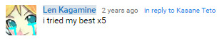
later i referenced/used it as a response a few times on my len askblog to keep it going.

it’s a small lil thing i guess but i’ve sorta adopted the saying now haha
Anonymous said: socks r gr8 doncha think
Anonymous said: ookay im going to sleep now sorry
Answer: no come back you are valid !!
Anonymous said: your aRT gives me heARTATTACKKKS
Answer: BREATHE, ANON
Anonymous said: I JUST FOUND YOUR BLOG AND I LOVE YOUR ART STYLE! <3
Anonymous said: Wanted to say I absolutely love your art and how you draw the Kagamines. Please keep it up!
Anonymous said: HELLO I JUST. WANNA SAY I ADORE YOUR ART AND BLOGS !! KEEP UP THE GOOD WORK AND I ALSO WISH YOU ALL THE BEST !!
Anonymous said: your art makes me cry out of joy. I am actually crying because your style makes me so happy!!!! keep up the good work!! <3
Anonymous said: your artstyle. CUTE
@transjackatlas said: you art style is absolutely adorable 💙💚💕
@emmi-san said: I only wanted to say that I love your art style and the cute representations of the vocaloid songs ✨💕
@tyranart said: Your arts wonderful and I hope your day is full of nothing but enjoyment
@thekillermarti said: how do you draw so cute?!
@neykoart said: YOUR ARTSTYLE IS SO CUTE OH MY GOD YOUR TETO DRAWING WARMS MY HEART SO MUCH
@dumiz-hyper-saiyan said: Hiya! I wanted to ask, how is your art so great!? You are so so talented (I know it’s not really a question but I love your drawings so much! I hope we can be friends cause you seem to be a amazing person!) hehe!♥️
@seraphofivorylight said: ( ̄▽ ̄) i just found ur blog today and i want to say i really love how soft ur art is !! its super pleasing to look and i definitely wish i could have some of these as prints to slap onto my wall of posters ✨ keep doing ur good work !! i hope ur doing well !!
Answer: THANK YOU SO MUCHHCH!!!!! i’m glad y’all are enjoying my art u folks are the MVPs & it’s super motivating to get your nice feedback _(┐「ε:)_ 💕 💕 //sends you all my lov e
@moderndayoutsider said: Just thought I'd shoot a message and say that I absolutely ADORE your art and you're one of my inspirations <3 God bless! Keep on doing what you're doing! :D
Anonymous said: ahh i wana say that ive been a fan of you for years and youve inspired my own art sm T_T... bout time i told you how much i love ur stuff 💖💖💖
Anonymous said: Woah, I'm a bit new to your blog and I just want to say how cute your art is. I'm literally so glad this was on my recommended. If I hadn't clicked on your blog then I don't know where I would be. To be honest, I would send you this on my real account but I'm actually really afraid to talk to you, and plus I'm really shy heheh. But keep up the good work! You're an inspiration to us all.
Anonymous said: Hi socky!!! I just wanna drop by and say that I love ur art so so so much !! The coloring and shape of it is so appealing and sometimes I spend hours at a time on your social media just marveling your art. It's really pretty!! Keep up the good work ✨✨✨
Answer: sdfgFDGDdsf knowing that u folks are inspired by my works makes it all worth it, i hope u know (;__;💕 💕 thank you so much for sticking around & enjoying!!! it really means A LOT pleas y’all have a lovely week!!
Anonymous said: Do you take commissions?
Anonymous said: Commission?
Answer: I SORTA HAVE COMMISSIONS OPEN tho i take them by a commission form which puts you on a waitlist. i’m more active on my twitter and tweet updates, & handle most contact about them there...
here’s a link to the tweet about my current commission info + the link to the form is inside --> [comm info]
Anonymous said: Where are you from? Your art is so clean and stylish!! 💖✨
@mysticmangaanimepainter said: What year u start drawing???😮
Answer: started drawing wayyy back when i was able to first hold a crayon haha. tho i sorta started paying attention to what i was doing around middle school? started drawing digitally between middle & high school iirc... im from the US also !!
AAAND AGAIN A LOT OF THESE WERE ASKED/SENT VERY LONG AGO..... & IM SORRY FOR JUST NOW ANSWERING THEM... o+<
but to all who’s sent me nice messages & words of encouragement, thank you so much 😭💕💕💕 i rly appreciate em all & even tho i’m not very responsive here on tumblr i rly like to look at and read the messages from time to time;;;💖
#THIS IS SO LATE THERE ARE ASKS SENT FROM YEARS AGO IM SO SORRY HGFDJLHDJ#i'm not very responsive here on tumblr but i do see & love all the good feedback yall have sent!!#ask compilation#answered
67 notes
·
View notes
Text
Colouring/ Shading/ Lighting for Digital art
HI! Hello~ I’m here and I have a teeny tiny tutorial for you today (courtesy of dear Melito who actually wants my help??? I’m??? Blessed??? I realise that there’s a lot of you who have no clue who the fuck this person I’m referring to is, oh well, not my problem — ur missing out on hella great cake.)
So I have a timelapse of everything (below, duh, in case you can’t scroll) and I’m also gonna make comments on it cus ya know, these vids are only a minute long and thirty fucking megabytes like Jesus Christ.
So without further ado-do!
Should I have added music? Probably??? Ehhh the deathly silence can comfort you. (Wow what a mood.)
The Run Down:
Is rundown one word or two??
When colouring, I break it up into three main steps: base, line and “Hiding All My Fuck Ups”
(First) Base
I’ve never made it to first base... or any base
When colouring, use a non translucent brush to colour in everything. As in, so it’s completely solid??? Where’s my English today?
For every different colour, put it on another layer! I tend to do the skin colour first. You can go over lines that will be covered with another colour... did that make sense?
That’s it, I just felt the need to have three steps at least.
Line
As in... line art.
What I do is I lock my layer — that means when I try to add colour, colour will only be applied to the area that’s been drawn on.
I usually colour pick the colour I used for the base, and the line looks very pale when done (I do this with a non translucent brush too)
I then adjust the layer with lineart so the colour looks darker and more saturated. For my program (Medibang) I go Filter > Hue > Max out the saturation and lower the brightness > save. Sometimes I may do it again if it’s not dark enough.
If you can’t edit the colour then there’s another way! Duplicate your lineart > select the layer on top > change blending/ layer type to “Multiply” (it multiples the colour... duh)
If THAT doesn’t work I have one last suggestion before I sadly admit idk — duplicate line art > select top layer > colour the entire think a dark colour or black > lower the opacity
Line art done! (This time I wanted six steps — 6 is my fav number)
“Hiding All My Fuck Ups”
I rely on this too much okay?
I can actually further split this into two; shading and “I’m Kidding Myself” — let’s begin!
Shading
To shade, I work from bottom layer up!
What you’re gonna do, is select your bottom colour, (or any really but ORDER HELPS) and lock the layer.
Why? That way it’s easier to colour without going over the lines! (Your building on the foundation you set essentially)
With a semi translucent brush (FYI, translucent brushes are thinks like “blur” or “smudge” that purely affect what’s there and do not add anything) I use the watercolour brush set at 15-20% opacity.
I’ll eyedrop the base colour that I’m shading, and with the colour wheel, tru and find a darker version of that. NOTE: when looking for a darker colour, I don’t go to the black, I try and find a more saturated colour OR a darker HUE — black is a curse, I don’t ever use pure black or pure white — give your work the colour it deserves UwU
With the watercolour brush, I literally run the darker colour over all lines that indicate a shade (imagine a light somewhere and what that light touches is what you mainly focus on)
For clothes, I follow the creases I’ve drawn
For hair, I tru to imagine the hair in three main shapes and run the colour over the perimeters of those
Then it’s time to blend! I usually just eye drop the base colour again for this, and trace (lightly, our tablets have pressure sensitivity — same going for steps 1-8) the line that divides the light from the dark, adding a middle ground since the watercolour brush is only semi transparent.
For adding blush to skin: create new layer above skin layer > set to multiply, again, if you can’t do this then you follow same steps as before with line art) > using an Airbrush like brush (soft, no sharp edges, kind blurred), colour the skin areas that need blush.
Skin areas that need blush; areas with LOTS of blood vessels (head... the OTHER head...) areas with thinner skin (elbows, knuckles, knees)
If your skin layer was on the bottom, your blush will only appear on top of the skin and not the other layers!
Just be careful about the areas outside the drawing — you may need to do some tiny erasing
Finally, merge all the colours together. Sometimes different layer types don’t like to merge together without screwing up your other layers, to avoid simply merge them one at a time from bottom up.
As in, second last one and last one merged together, then the one above that merged with the last one — merge everything with the last one... AM I MAKING SENSE?!
I’ll usually merge the lineart with the colour too — I just didn’t here for some reason
“I’m Kidding Myself”
Here we add stuff that hides flaws and merges the character with a background if you have one!
I use three types of layers for this, if your program doesn’t use these then see if they have similar functioning ones (I’m always experimenting so this isn’t set in stone) if your program has nothing then... this will be a little harder, you’re gonna have to do this by hand somehow.
I use these kinds of blending layers; Multiply, Overlay and Add
First I prevent getting the colour on anything BUT the character; magic wand tool > select the empty space > hold ctrl/shift and keep tapping to add or remove areas > invert if you need in order for the art piece to be selected
You can see this when my background when blue, I’m basically highlighting my art of Yuri
Colour this entire space on a new layer. The colour I use doesn’t change here on out (except in the video I do cus I lose the colour but that’s aside the point). When choosing a colour, consider the colour of light — I use human colours??? Colours you find on a person essentially.
As a general rule of thumb; for every new thing, new layer, it gets a little harder here. I also use a semi translucent (watercolour) brush again for everything!
Now we have a silhouette of Yuri — I set this to multiply, it’s essentially like a highlighter marker pen but darker?? This is so that I may adjust the entire colour to fit the lighting colour
New layer (NL), I set to Overlay. Overlay is like multiply except bright! Remember what I did when shading? Yep, rinse and repeat! Afterwards, adjust the layer’s opacity setting so that it fits better with the image.
I’ll also make the brush really tiny and go over hey areas to highlight such as the edge of the nose, chin and jaw — I’ll also add shine to the eyes.
NL, set to Add. I only ever use this layer if I want to achieve “blinding lights” sort of looks. So when the lighting is immense, I have a white background, or the background is incredibly bright.
I use add layer scarcely, to blemish any lines and make it look more refined. I’ll also adjust opacity if need be.
NL, I’ll use the airbrush set too REALLY BIG (1000 usually) and if I have a background, will try and add light to it by making this layer multiply too. I’ll add darkness in the side or corner of the background etc.
NL do the same thing with Add except also make a point for where the light is coming from.
NL, I’ll use a mix of Add and Overlay to add sparkles, fragments, light spots etc depending on image type of need be
Using a Fluffy pastel brush (it’s textured) I also use pure white. This is the only time I ever do.
I’ll add reflection to eyes, jaw and nose. For hair, I’ll pick out a few strands of hair where it’s darker and throw in some loose lines. Clothes are rarely outlined and only where light touch. I use this limitedly.
Ctrl + D ;) to deselect the lasso tool — I don’t usually merge the layers after this because it’s usually too messy and I’m done anyway so I save it, however you CAN put them all in a FOLDER if need be. (I have a few in my vid, the entire thing is in a folder tbh)
Voila! That’s it!
I hope this has been of some help or use! And that this makes SOME sense... I’m absolute shit at explaining everything...
This was incredibly fun to do tho and I spent two hours typing this all! Wow!
Okay thanks for reading! (Hope this helped Melitooooooo, don’t forget the wedding cake ~ v/ important part of marriage you know)
#art#digital art#yoi#yuri plisetsky#art tutorial#tutorial#colouring tutorial#how to colour#colour and shading#how to draw
47 notes
·
View notes
Text
A BASIC GUIDE TO DIGITAL ART ON PROCREATE
okay so i joined the digital art scene about a year or so ago and it has been a total whirl! there’s so much stuff that’s so confusing and hard to understand at first. And that’s okay! A stupid amount of what constitutes as “good” or “complex” art is to do with layers, patience and experience.
and because literally every tutorial on here is for Paint Tool Sai i thought it might be useful for those of us using Procreate! because i don’t have sai and i have a relatively shit laptop by comparison to my Ipad.
so without further ado - here is how to make a KICKASS piece of art on procreate
1. REFERENCE + SKETCH
the first thing you're gonna wanna do is collect any references you need for thing youre tryna make. you can collect references by finding stock images, using other artists work (i use these mostly for colour refs cause i SUCK at finding good colours). however when i make art nowdays i usually just snap a selfie and use that. for this work i did the last option (see below)
after grabbing my reference i decide on the style i wanna use. for beginer artists what i suggest doing is just pasting the image onto your canvas, opening layers and adjust the opacity to around 20% by clicking on the little N on your layer with the photo. then once thats done add a new layer by clicking the + and work over that
for more experienced artists experimenting with style just stick that bad bitch reference in the corner, then open a new layer and sketch in your own style.
when it comes to sketching i usually do little flicky lines. i do this with a mid grey (like 50% white 50% black) i recommend the “Narinder pencil” which you can find by clicking the little brush at the top, selecting sketching and then selecting that bad boy. you can adjust size and opacity using the sliders to the side of the screen.
when sketching you just wanna get a rough idea of where you’re gonna do your eventual lines - don’t worry about it being smooth or anything just get down where everything goes
once you’re done you might have something like this:
this brings us too...
2. LINE ART
for beginners - lineart is just a sexy word that means a clean drawing with hard lines so you can colour it easier and it looks prettier. you want to do this on a new layer so you can delete the sketch one later.
your goal with lineart is to make it three things:
1) its gotta be seamless so you can select the insides, don’t leave little gaps between lines
2) its gotta be smooth! jagged lineart isn’t NEARLY as sexy as smooth curvy lines
3) this one is more of a tip - but lineart generally looks better if you do thinner lines inside your shape with a slightly thicker border line. again this isn’t essential but i find it looks cuter
the way i get my lineart all cute is by using the monoline brush (found in calligraphy). sometimes i use my own modified version of the Technical Pen (found in Inking) but mostly monoline is pretty neat. You can use whatever brush you want but mostly you just wanna ensure that its nice and smoooooth. you can do this by selecting the brush and then clicking it again. this will bring up a popup menu like this:
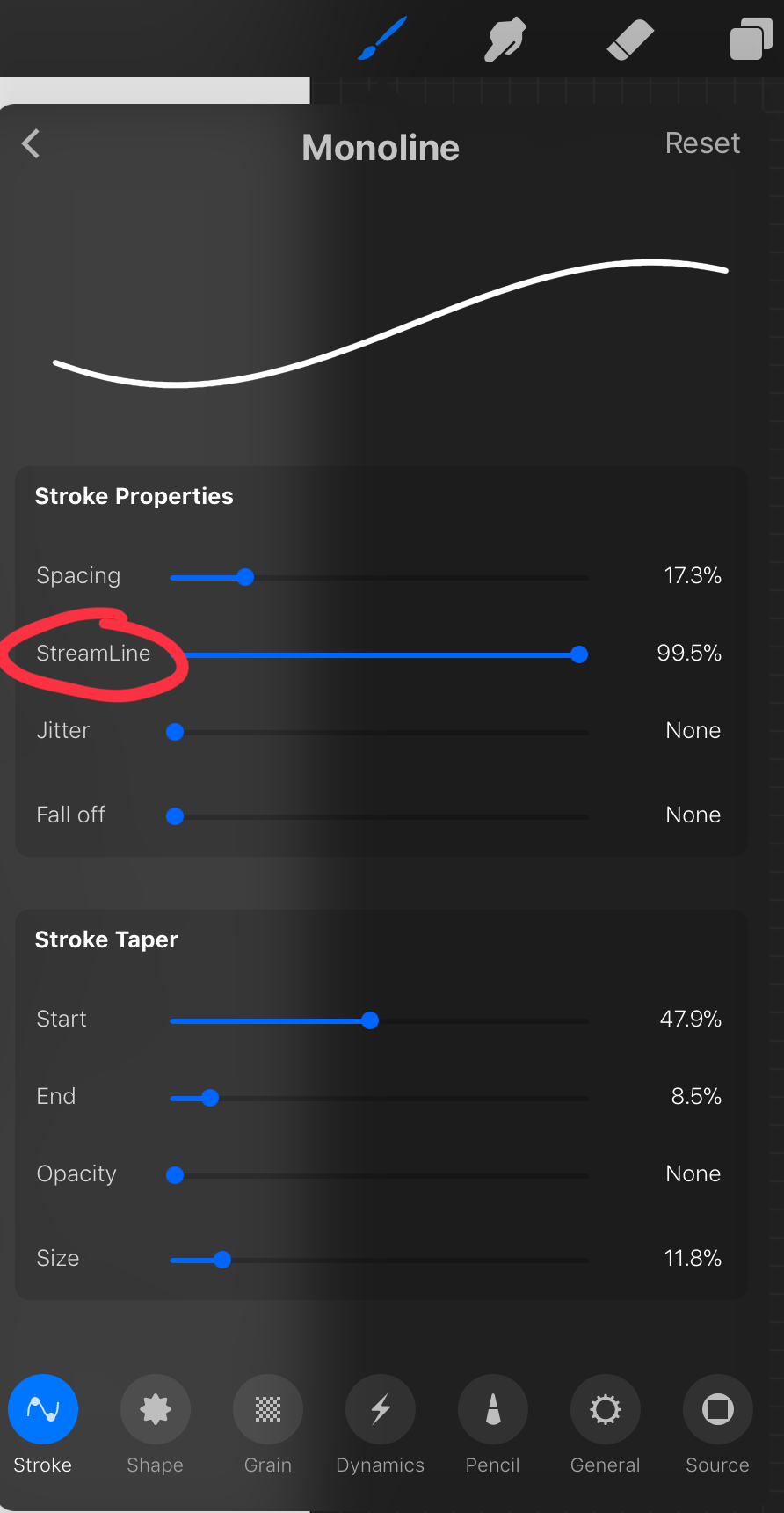
most of these brush settings are complicated and stupid and i’ll do a big post about it later. the only one that really matters here is streamline. if you wanna use a different brush for lineart just wack that slider up between 80-100% and you’re set.
once your lineart is finished on a seperate layer go to your layer menu and unselect the little tick on your sketch layer. you should be left with something like this.

3. ADDITIONAL DETAIL LINEART + MONOCHROME BASES.
once your focus lineart is done you can add detailed lineart by repeating the same process with sketching and lineart i described above. i like to do details separate because if i dont like it i can just delete the whole layer without destroying my focus.
what i find important in these now is using my favourite fuckin tool in this whole program. you can find it here:
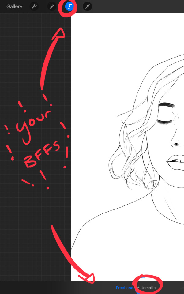
Only start using this once youre 100% done with your lineart. once thats done - make sure youre on the lineart layer and click that weird little s at the top of the screen. go to the bottom and click automatic. then select somewhere INSIDE your lineart. it should do something like this:
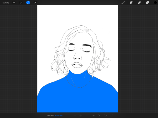
don’t freak out! what that blue stuff means is that you've just selected the inside bit of your lineart. continue selecting until your subject is 100% coloured in.
MAKE SURE THE BACKGROUND/STUFF OUTSIDE YOUR LINEART ISN’T SELECTED.
ALSO MAKE SURE YOU’VE SELECTED THE LINES THEMSELVES. THEY WILL TURN WHITE ONCE THEYRE SELECTED.
if u fuck up and select something by accident that’s all g, theres a little undo button on the bottom. if you click on the paint brush or another tool and you cant add stuff to your selection you can reload the mask by holding down on the weird s and the selection will reload. If there are certain bits of your work that you’re struggling to select with automatic selection that’s also not an issue. just click the “freehand” setting next to the automatic setting on the bottom and you can now use your stylus to draw around what you want to select.
once you’ve selected your foreground in its entirety - THEN click the layer button. insert a new layer underneath your lineart layer. Using literally any brush (works best if you get one from the painting section) colour EVERYTHING white. just get round brush and colour all of it. you wanna keep your line art layer separate over the top.
once all of it is coloured hold down on the weird s tool until it reloads the selection. then look along the bottom of the screen and click the little button that looks like 2 arrows pointing at each other.
THIS INVERTS YOUR SELECTION.
Open a new layer and make this entire thing a grey. THIS IS WHOLE STEP IS OPTIONAL BUT ITS SUPER USEFUL AND THE SELECTION TOOL IS SUPER HELPFUL FOR GOOD ART. DOING THIS WILL BE SUPER USEFUL WHEN YOU COLOUR STUFF LATER.
once you’re done it should look something like this:
4. BASE COLOURS
okay so this is where shit starts to get real. The goal of putting down base colours is to make is easier to add eventual shading to your piece and decide your colour scheme. This is where the white layer you just used is gonna become your BITCH.
you wanna start by duplicating your white layer you just made. You do that by opening your layer menu and swiping that thot to the left. this is what should happen:
click duplicate. Select the top duplicate you just made and select our favourite weird s tool. click inside your shape and the whole white shape should go blue (become selected). next, open a new layer on top of the white layer. colour in your base colours and now none of it can go outside the lines. you didn’t even have to do a billion selections. you just select inside the white blob on the layer we made the step before, opened a new layer and started colouring. fucking superb. so much time saved. DO YOU KNOW HOW MUCH I USED TO SUFFER BEFORE I THOUGHT OF THIS. HOW LONG I SPENT SELECTING AND RESELECTING I CANNOT
A TIP FOR PEEPS NEW TO THIS PROGRAM - if you use your finger and hold down on a colour you’ve just used it acts like an eyedropper tool so you can pick up any colour you want. like this:

once you got your base colours done you can either:
1) go to your grey layer you made in the last step and select the tick next to it. once you’ve done that scroll to the bottom of your layers and select background. it will open a colour wheel. pick your background colour.
2) you can use my second favourite tool from this program! go to your grey layer you made in the previous step. click on it, then click on it again. (not the little n just click the whole layer) this menu should pop up:

oh MAN okay so.
“alpha lock” pretty much means that it locks whatever is on the layer. when you get another brush and go over a layer with alpha lock turned on you can only paint over what you have previously put on the layer before turning on alpha lock. Its like automatically selecting everything on the layer. its fucking brilliant.
anyway.
scribble over your grey layer (once alpha lock is on) and boom you have a base for your background.
NOW YOU KNOW ABOUT ALPHA LOCK YOU GO BACK TO YOUR LINEART LAYER. SELECT ALPHA LOCK. COLOUR IN YOUR LINES ROUGHLY 2 OR SO ISH SHADES DEEPER THEN YOUR BASE COLOURS
(minus eyes i like to keep the lines around them black.) this will make your art like 100000000 times nicer (majority of the time)
once you’re done you should get something like this:
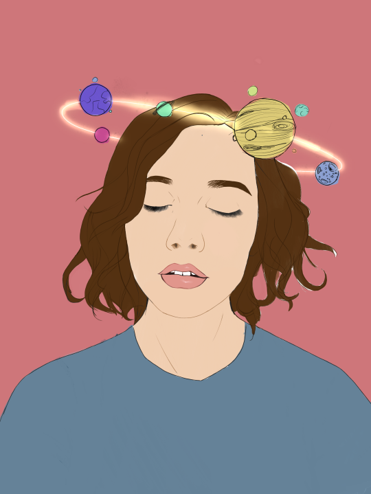
this brings up to...
5. SHADING!!!!!!!
this is my favourite step tbh.
what you wanna do is chuck on a new layer over the top of your base colours. and go into your brushes. pick up your basic bitch “round brush.” this is (in my opinion) the best painting brush in the program. Its the thing you can do the most with. so what you wanna do it get a slightly deeper colour from your colour wheel by yeeting your colour selection slightly more saturated and slightly more dark. dont just make it blacker move your colour selector on a diagonal to get a nicer colour. (i’ll eventually do a colour theory ref but today is NOT that day.)
i like to do colouring in short, light strokes. DON’T PRESS TOO HARD. you wanna get that cute little gradient.
A THING FOR BABY ARTISTS: on every art program i have ever used, the blending tool SUCKS. it makes paintings UGLY AF. (wow another tutorial i have to do at some point.
i HATE the blending tool.
SO HERE IS HOW I COLOUR MY ART TO MAKE IT LOOK, YKNOW, GOOD:
Unless you’re drawing something SUPER freaking smooth like a bubble or some shit. when you wanna blend colours what you gotta do is:
1) put in your darker colour.
2) use your finger to bring up the eyedropper tool to select a mid colour of the colours your blending together - a mix between your lighter and darker colour. (remember that tool? it looks like this)

3) Paint the colour you just made in the middle of your lighter and darker shades. REPEAT THIS PROCESS ON EITHER SIDE OF THE COLOUR YOU JUST PUT DOWN TILL IT LOOKS GOOD. The result is an WAY sexier piece of art.
once you’ve put in all your shadows repeat the same process with highlights.
FUN TIP:
if you decide you dislike a colour or want to change the colour you already did all the shading for you can change the colour without any major drama. You can do this by select ing the colour on your colour wheel you would like to change your already shaded work too. (make sure you’re on the right layer.) then hold down on the colour dot on the top bar (next to your layer settings) and drag it to whatever you want recoloured. let go of the dot and it should recolour your work (including all the shading you’ve done granted that its on the same layer) like this:
once you’ve got all your shading done it should look something like this:

6. background and pretty bits
so! youve got this kickass work but nothing surrounding it. lets fix that.
In procreate there is SO MUCH you can use to spice up a work. a SCARY amount even. this is when layer settings are gonna start to come in handy.
ill do a masterpost on procreate brushes for backgrounds later, but for this piece what im gonna do it head over to the Luminescence section and pick up a “nebula brush”. this makes a complex galaxy kinda design in a randomised stamping pattern that is frankly SEXY AS ALL HELL. Select a layer below your base colours but above your background colour.
IMPORTANT NOTE: this brush’s blend mode is autimatically set to “add” (ILL DO ANOTHER POST ON THAT LATER)which means if you go over the same spot heaps of times it will eventually go a bright white. This can be nice, but its not really what i want cause its kinda intense. to make this thing go glowy but not ~too~ glowy im gonna lower the brush opacity (the bottom slider) to around half way. i set my colour to a light yellow and a darkish pink and put in some nebulas!!!!
once that was done I wantd to add some more colour variation so i popped open a new layer - selected the lightleak tool and lowered the brush opacity using the slider to around 20% just to spice some shit up
you can kinda do whatever you want for your background. sometimes its nicer just to go into artistic, select a random brush and draw a square underneath what you were doing. backgrounds can be super detailed or super easy it doesn’t really matter to be 100% honest.
THE PART 2 OF THIS STEP WILL ADD HEAPS OF DIMENSION TO YOUR WORK AND MAKE IT SUPER PRETTY:
adding light effects over the TOP of your main subject often creates a more realistic sense of depth. In simple terms it just makes the thing look more 3D and nice. to do this, get a random brush with a nice (preferably light) colour. i picked up a “bokeh brush” from the Luminescence section. make this pretty big. sprinkle your brush across the page on a NEW LAYER above all of your work so far, including line art! Then open your layer menu and click that little n in the corner again. Remember this one:
click the little n. then go down to the bottom and select a layer setting from either of the 2 groups circled (i normally like overlay for this type of thing) you can mess around with layer settings and opacity till you find something that looks super nice. My piece now looks like this:

pretty cool right. now we’re gonna make it EVEN COOLER.
7. LIGHT FILTERS
this is something i picked up from artists like softmushie and cryptidw00rm. (not gonna @ them here cause they probs dont wanna get tagged in my shitty tutorial thing but yeah i owe so much to those two especially)
for those unsure of what im talking about: light filters are layers you add over work to make the lighting on it seem more natural and pretty. you do this by colouring over your natural highlights and shadows with different colours and then messing with the layer settings to make it seem like its being hit by sunlight. these layers go BELOW your foreground stuff (the bokeh lights from step 6) but ABOVE your lineart.
start by opening a new layer. select a colour similar to where the green outlines are here:
now on this layer paint over anywhere where the sun or other light source would be normally hitting (like cheekbones hair etc.) this can be kind of like shading. dont worry if it looks shit at first we’re gonna change it.
open a new layer beneath the one you just made. Using a colour similar to one circled in purple above colour over all the shadows in a piece. it should now look like this:
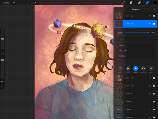
now open your layer settings on the purple/darker layer by selecting the N like we did with the foreground layer before. you can play around from here by setting the layer mode to anything from the “darken” or “contrast” menu. For this work i chose overlay. I then lowered the opacity until it looked nice.
Repeat the step above with the lighter highlight layer. when adjusting this one make sure you set the layer mode to anything from the “lighten” or “contrast” menu. For this work i did hard light.
your peice should now look kind of like this:

AND YOU’RE DONE!!!!!!!!
look at that sexy thing you just did. Congrats on creating an awesome peice of art!!!!!!
if you guys are interested in more tutorials like these or have any reqs for similar stuff send me a question or a dm to my blog @plasticbattleaxe
if you create anything by following tutorial that you want me to see don’t hesitate to tag me or submit it to my blog!!! i love seeing y’all make art
also - i know it’s annoying - but reblogs > likes. thanks for your support
i hope someone finds this useful!!!!!
#reference sheet#art reference#reference#art ref#procreate#procreate ref#zoeyeets#plasticbattleaxe#plasticbattleart#layer ref#art tutorial#art studyblr#art tips#ref artist#tutorial
1K notes
·
View notes
Photo

Hey! There was some confusion in my Pokemon’s Official Artists -post so here’s some continuation to that.
I probably shouldn’t have used the word “style” in the post since all the artists follow the same stylistic ruleset so that the art of the series is unified. That’s why at first glance you won’t be able to tell the artwork is not made by the same person. So sorry for causing confusion with that.
What I meant to say is the tools these artists use to reach the same style are quite different, and even after their efforts to look the same you can tell the small differences in each.
It was my bad to assume such details are as obvious to everyone as they are to me who stared at these artworks for ages looking for even the most minor features.
My examples above are exaggerated to bring out the differences for even non-artists with less knowledge on digital art and its tools.
More details below the cut:
Sugimori’s lines are precise, but his lineart brush is choppy so the edges can look sketchy at times, especially on some of his pokemon art such as Yveltal. His shading on human characters is laid-back - he places shadows only where they are most needed and takes shortcuts, crossing differently colored areas separated by lineart with a single brush stroke.
For example Lillie’s hat casts a shadow on her head and Sugimori shaded her hair and forehead at the same time. You can also see the distinct low opacity eraser used on the shading on Lillie’s hat and legs. I showcased all these features on my example.
Ohmura’s tools are cleaner and he pays more attention to detail. This is most clear with Archie and Rosa. Every piece of Archie’s metal decorations are shaded individually to bring out their shape. Small light spots on his legs and shoes are also details Sugimori would have never bothered to draw in. Rosa is a bit older example from BW2, but when compared to Sugimori’s Hilda from BW1 you should pay attention to how much cleaner Ohmura’s shading is. Look closely at the arms, hair and shoes.
And if you compare Ohmura’s pokemon to Sugimori’s the differences become even more clear. You can look at Yveltal from earlier, Zekrom or Samurott (by Sugimori) and compare them to Decidueye or Solgaleo (by Ohmura).
Mizutani illustrated all of the gym leader redesigns for ORAS, some of the NPC trainers there too and the Pokebank lady Brigette. She used a more textured brush for lineart and you can see it best on Wally with his fingers, hair and buttons on his shirt. Compare his fingers to Rosa’s and Lillie’s and you see how different the lines are.
Mizutani tried her best to copy Sugimori’s style of shading by using a low opacity eraser to fade the edges of the shadows a bit, but her “mistake” was using a brush that has too sharp edges. On Flannery‘s pants and literally every shadow on Steven you can see how sharp the edges are compared to Sugimori and Ohmura. Mizutani most likely didn’t use a round brush, but a square or rectangle which ended up in this result.
take (with no capital letters supposedly) is a rather new and mysterious artist and so far we only know of them having illustrated the Aether Foundation members - employees, Faba, Wicke and Lusamine.
take is the easiest to tell apart from the rest. Unlike all the other artists, they use 100% opacity round brush for both lineart and shading, and take doesn’t erase tips of lineart or edges of the shading with a lower opacity brush. Their lines have no texture at all whatsoever. Shading is strictly defined, except in areas like Wicke’s hair where take has used a very soft brush, “airbrush” as some like to call it. None of the other artists has soft parts like that.
Some minor things about take’s illustrations is also the eyes that aren’t shaded at all, unlike everyone else’s. take also draws nails on the female characters - yet again something none of the others do unless the character has nail polish like Elesa (by Ohmura) or Olivia (by Sugimori, I think? resolution on this one is a bit too low)
I hope this clarified things, or at least didn’t make it any more confusing. :’) I admit the details are minor since the style looks the same from afar, but because they CAN still be pointed out I believe they should.
740 notes
·
View notes
Text
Day 14
Prompt: The first words you hear your soulmate speak are written on your arm.
Word Count: 991
Main Taglist: (Send an ask to be added or removed!) @starlocked01, @spoopy-turtle, @lizluvscupcakes, @more-fandon-than-friends, @i-cant-find-a-good-username, @vindicatedvirgil, @star-crossed-shipper, @justaqueercactus, @gayboopnoodle, @sanderssidesweirdo, @the-sympathetic-villain, @8-writes, @lizzy-lineart, @battlebunnyteardropsinthesun
Soulmate taglist:(Send an ask to be added or removed!) @elizabutgayer, @melodiread, @tsshipmonth2020, @mikalya12, @8-writes, @lizzy-lineart
Logan had always wondered what he’d do to get the words “If you take one step closer I’ll bite you,” written on his arm. His parents had been horrified at them and put a cuff over it but Logan had removed it when he’d turned eighteen. So far, he’d never entered a situation in which someone’s first words to him would be nearly as violent as that.
This is probably why it was such a shock when he’d heard them in the least likely place. Thanks to waiting for the last second to sign up, his class schedule for his second semester at college had resulted in a three hour wait that he was too stubborn to go home for. So, he waited in the building, using the time to get ahead of his homework and eat lunch.
He’d just gotten to the bathroom when he heard what sounded like heavy breathing. Looking under the stalls, he found someone curled up in the far corner of the largest one. “Is anyone in here?” He asked as he knocked on the door, letting the person know he was there.
He got a grunt in reply so decided to slide under the door, vowing to thank the janitorial staff the next time he saw them. He stood, brushing the dirt off and straightening his tie, eyes glancing to the person still huddled in the corner. He found the alternative emo boy from a few seats down in half his classes sitting there, clutching his stomach.
“Are you okay?” He tried to remember if he ever heard him respond during attendance checks.
The emo glared at him, head still close to the toilet bow. “If you take one step closer, I’ll bite you.” He growled, voice hoarse.
Logan looked down at his wrist. “Well then.” He took a step closer but stopped when the smell from the toilet hit him. “Oh my goodness gracious.” He muttered.
He remembered the emo’s name just as said classmate hissed at him. Logan just sighed. “Stay here, I’ll be back in a second.”
Virgil glared, managing to spit out a snarky, “Where do you think I’m gonna go,” before he was ducking his head back over the toilet.
Logan unlocked the stall and walked to the backpack he’d left at the hooks for coats. He opened his food pocket and pulled out the pack of gluten-free crackers and small water bottle he kept there for just this exact situation. After a moment of thought, he grabbed the baggie of generic antacids he kept in a nearby pocket. He reentered the stall to find Virgil with his head against the wall and eyes firmly closed.
“May I ask if you know what brought this on?” Logan asked, crouching next to him.
Virgil’s eyes opened, bleary and unfocused. “Yeah, anxiety over having to do a presentation in an hour or so.”
Logan nodded. “Alright, here’s some crackers. I don’t know about you but I’m allergic to gluten so you’ll have to deal with the bland gluten-free ones. Here’s some water to wash it down. These should help settle your stomach. Have you eaten anything today?”
Virgil gratefully took the offered items, slowly making his way through a cracker while shaking his head. “Nope, I didn’t have time.” He took a swig of the water bottle Logan had opened.
Logan sighed, sitting next to him, one foot planted on the ground while the other leg curled up. “Okay, then these crackers will really help. Did you pack a lunch? You have time to eat that if your next class is the one I’m thinking it is.”
Virgil glared at him. “You memorized my classes?”
“No, I just know we share quite a few classes and know our next one has presentations instead of a lecture.”
Virgil nodded, his head leaning back against the cool wall. “You must think I’m pitiful.”
Logan smiled, his hand reaching out to rest gently on Virgil’s knee. “Far from it. It’s not your fault that you are the way you are. In fact, with how much you speak up in class, I’d consider you to be rather feisty and intelligent, never afraid to speak your mind. It’s something quite admirable in my opinion.”
Virgil squinted at him. “Are you sure you have the right classmate?”
“I know I have the right soulmate and I think that’s all that matters.”
Virgil brought his wrist up to look at, staring at it for a few seconds before glancing at Logan’s wrist. “So we are. Huh, I’m almost tempted to apologize for giving you that.”
“And what? Let me not know that my soulmate is amazing? I’d rather keep it if it’s all the same to you.”
Virgil chuckled. “Alright then.”
Logan gave it a few more minutes but when the crackers seemed to stay in Virgil’s stomach, he stood and offered a hand to his soulmate. “I think we’re in the clear.”
Virgil took the helping hand and stood, flushing the toilet before they both exited the stall. The emo took the time to gargle with the rest of the water bottle, spitting into the sink. “Ah, that feels better.”
Logan smiled, walking to pick his backpack up. “Is this one yours?” He called, holding up the other one. Upon getting confirmation, Logan brought it over for him. “I think we still have about a half hour until class if you want to sit and talk, get to know one another while we eat lunch?”
Virgil smiled, situating the backpack. “Yeah, that sounds nice.”
When they had to go to class, they sat next to each other instead of down the aisle from each other. Logan gave Virgil’s hand an encouraging squeeze when the emo went to do his presentation. Virgil reciprocated the squeeze when it was the prep’s turn. They ended up talking after class too, promising to go get ice cream for their first official date.
#tsshipmonth2020#allusions to vomit#it happens but is never expressly mentioned or described#mentions of food#threat of harm that is never followed through#virgil sanders#logan sanders#analogical#soulmate au#ace writes
129 notes
·
View notes
Last Seen Blogs

raimundoalvesdemedeiros-blog
Untitled

spiritkawaii
Spirit Kawaii

yourcentre
Untitled

the-stars-laureate
lovergirl
oksandio-charoix
Charoix Sqd