#Grade: A
Text
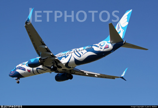
No. 52 - Alaska Airlines Xáat Kwáani and Salmon-Thirty-Salmon Liveries
Did you think I was done with Alaska Airlines?
No, this is actually my last post about them for now (though, mark my words, you will be seeing a post about the Gold Nugget Jet in the not-too-distant future - I just feel like we need a break from nothing but consecutive posts about the same airline, and I have other things I want to cover). But it's something that's both requested and which I've wanted to talk about for some time.
In my last post I discussed the identity of the man on the Alaska Airlines tailfin. It wasn't a major part of the story, only taking up a small piece, but I did touch on how ChatGPT apparently will lie when asked about the background of the livery. Not only does it falsely attribute the livery to Fred Kabotie, who I'm sure had more important things to do, but it also falsely claims Fred Kabotie, who was Hopi, to be Tlingit. As it turns out, though, Alaska Airlines does have a livery designed by a Tlingit artist.
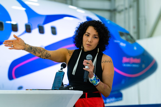
image: Brandon Farris
Crystal Kaakeeyáa Rose Demientieff Worl is a Tlingit artist known for large public artwork which heavily incorporates indigenous artistic traditions and visual motifs across many mediums. Some of her previous work includes large-scale murals in Alaska and throughout the world and guardrail panels at Juneau International Airport. She feels like the most natural choice possible to design an airliner livery, given the scale and diverse canvases she works with, and in May of this year the airplane you can see looming behind her was unveiled in a brand new livery that I, and a lot of other people, immediately fell in love with.

It's safe to say that this is one of the most ambitious and unique special liveries out there. Xáat Kwáani (which means 'salmon people' in Tlingit) is a beautiful and one-of-a-kind take on the often-noticed resemblance airplanes have to fish.
Salmon fishing is huge in Alaska, both now and historically. Today fishing is a major part of the Alaskan economy and something many people making a living off, but historically they were even more directly responsible for making the difference between life and death for those who lived beside them. A major source of food, they were literally life-bringing to indigenous societies, necessary to survival. Humans and salmon were part of the same ecosystem.
Independent of this fact, airplanes seem to lend themselves to comparisons to sea creatures. They may be called 'birds', but time and time again other people confirm that I'm not just imagining it, they do distinctly look like cetaceans and fish. Very early on in this blog the fact that 747s look like Humphead Wrasse was discussed. Amakusa Airlines, Japan Transocean Air, and Southwest Airlines have all leaned into this fish resemblance, and I'm sure over time my sea creature plane tag will continue to grow. This genre of livery will never cease to delight me.

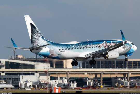
I think it's fairly predictable that I always loved N559AS, the brilliantly named salmon-thirty-salmon plane. I was devastated when I learned that the livery was going to be removed. I mean...just look at her.
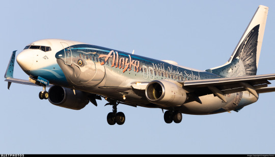
The salmon-thirty-salmon was a very unconventional take on the fish-plane, using a much more realistic drawing than any other attempt. It doesn't even try to transform the plane itself into the fish, which I think is potentially a smart way of accepting the limits of doing so. Instead, it fully displays the honestly hilarious and adorable face that salmon have while providing a nice canvas, a bit of water for the salmon to be carried on. At the same time it incorporates thoughtful details like the scales on the interior winglets, and the way the salmon's body is aligned with the empennage and nose feels very precisely done. It can create a somewhat uncanny doubling effect from a few angles, but by no means is it enough to rob the livery of its charm or elegance.
The salmon-thirty-salmon gets an A.
I've lived near the ocean my whole life. I love fish. I loved this plane. I was heartbroken when I learned the livery was going to serve its final milk run before rolling into the hangar for the very last time, coming out repainted and lost forever. It's always a bitter pill to swallow when airlines retire special liveries, particularly when it involves the plane being repainted into the standard colors. A lot of other people were sad to see this design go too.
What we didn't know was that this was not the end of the salmon-thirty-salmon. She was not lost, but transformed. When she emerged from the hangar again she was not wearing Alaska Airlines' default colors but something even more eye-catching, a livery honoring the same fish but with extra layers of meaning added by means of an intricate and beautiful new design.
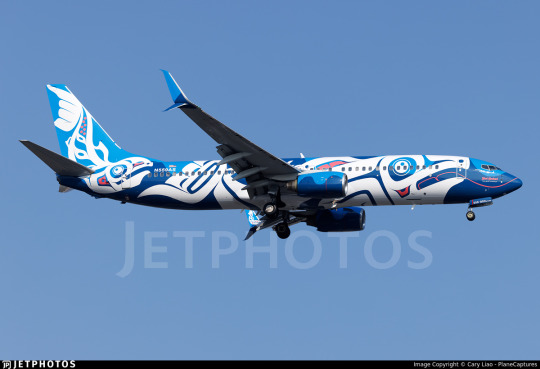
Costs, materials, and man-hours used to paint an airplane vary dramatically from case to case, livery to livery, model to model, airline to airline. The numbers in my description are somewhat conservative estimates used for comedic value. Alaska Airlines actually gave some numbers for Xáat Kwáani - twelve days, 117 gallons of paint. The colors used are Midnight Blue and Atlas Blue for the background, White for the fish themselves, and Pink for highlights, and a clear coat has been applied over the top in order to preserve the livery. Alaska Airlines has every intention of keeping it intact for as long as possible.
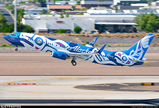
The use of colors is beautiful. The waves of darker and lighter blue keep it from ever looking too light or too dark, adjusting to the lighting in order to always remain saturated and vivid, and the irregular wave pattern keeps any part of the livery from looking static. The use of the pink as a highlight is sparing but effective. The white, though, is what makes this livery so fantastic. A central tenet of this blog is a disdain for the dominant trend of livery design in recent history, Eurowhite - that of an almost entirely white fuselage. And there is a legitimate sense of general derision for white, but it can be so powerful as a design feature. There is no contrast more powerful than a stark and complete absence, a space carved out fully from the world and color around it. It is the color of bone and snow.

The balance of each color is just perfect, the blue never overpowering the white, the white never fully blocking out the blue, the pink subtly adding depth throughout, and the shapes of the salmon are placed perfectly, not feeling cramped or confined. They are free to wander the fuselage and they have an amazing sense of movement to them, as if caught mid-leap. I've seen salmon swimming upstream to spawn, and they are so startlingly large and vivacious. The fish on this plane, though stylized, perfectly capture the way that these fish look in motion.
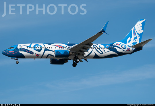
Formline is a style of art historically created by indigenous peoples of the Pacific Northwest coast of North America. It was a common and versatile visual element, present in everything from painting to carving to weaving. It is defined by its use of continuous, curving lines which may change in angle, width, and direction but do not terminate. Though it was diminished in quantity by suppression of indigenous culture by US and Canadian settlers it never went away, and from the second half of the 20th century onwards it has been surging back as more and more indigenous artists are able to produce and display their work. Worl has worked with formline many times before. She is quoted as saying:
Every time I looked at an Alaska plane, I couldn’t help but visualize the salmon being in formline [...] I can’t help but look at things and see how to Indigenize them.
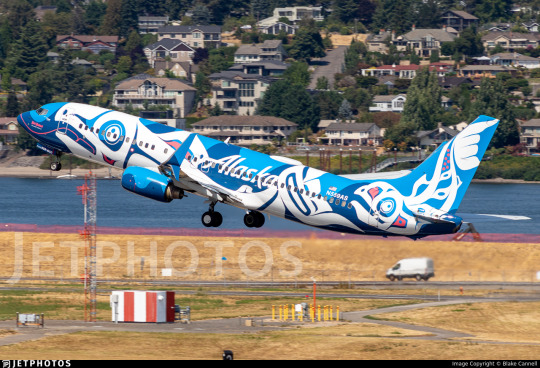
And the idea has now come to life in this absolutely unforgettable livery. I wish I was within the range of the 737-800 from Alaska Airlines' hubs so that Xáat Kwáani could pay a visit to my home airport, because this is among the most beautiful planes in the world right now. And beyond just nice colors and pleasing shapes it represents something important - indigenous artists being given a 40-meter-long flying platform on which to honor fish which have provided countless centuries of life to the people who live beside them.

Worl's work is above and beyond what I would have ever expected for a custom airplane livery. Even the 'Alaska' wordmark is neatly incorporated into the formline, blending into the background to the point it's hard to notice in a good way.
Most liveries are designed by graphic designers and branding firms. Landor Associates design liveries and logo, but they aren't building monuments or putting their work in galleries. I don't mean to diminish their work - obviously I'm passionate about it, I have a blog about it - but it's just fundamentally different from what Worl does. It has different priorities, a different philosophy, and a different level of personal investment.
From my perspective Xáat Kwáani feels less like branding material and more like a piece of artwork. This isn't something designed to go on letterhead, to be put in a press kit, to be widely reproduced. It's something to be looked at, thought about, and remembered. This is a mural that flies.
I mean...A+, obviously.
There is just about nothing else in the sky which has the same visual power as Xáat Kwáani. As far as I'm concerned, every gallon of paint was worth it to give us this flying tribute to the people and wildlife of the state Alaska Airlines takes its name from.
127 notes
·
View notes
Text

41K notes
·
View notes
Text

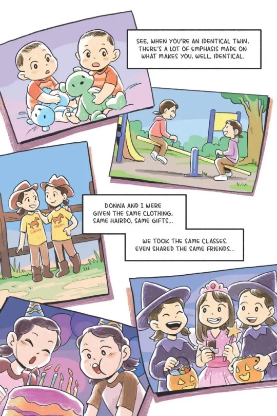

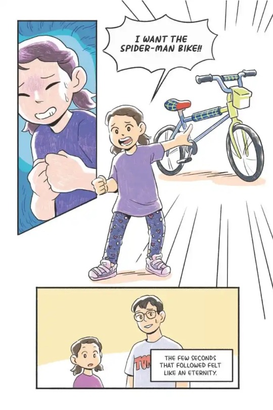


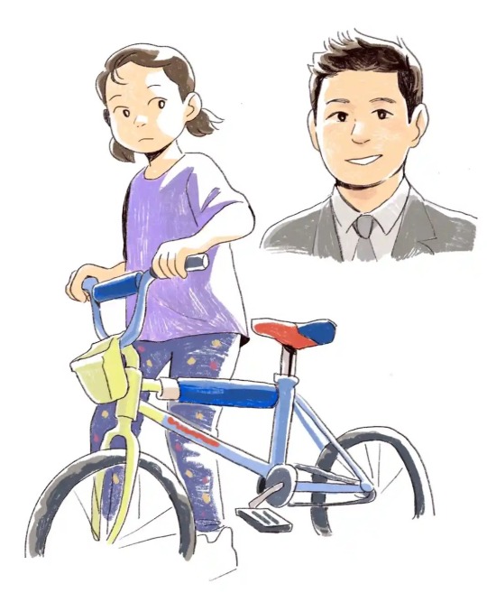
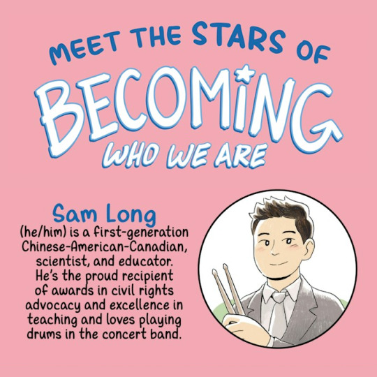

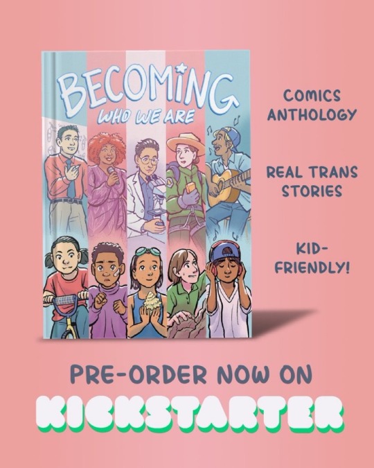
Preview of Sam Long’s story, drawn by the amazing Cynthia Yuan Cheng! (@cynthiaycheng, cynthiaycheng.com)
Becoming Who We Are Kickstarter ends Dec 14! Preorder now to help us fund the book!
bit.ly/becomingkickstarter
#becoming who we are#trans stories#trans kids#trans childhood#queer comics#trans comics#comics anthology#comics Kickstarter#Sam long#Cynthia yuan cheng#middle grade graphic novel#middle grade comics
65K notes
·
View notes
Text
43K notes
·
View notes
Text
I'd fucking retire dude are you kidding me
#guilty gear strive#fight stick#fighting games#guilty gear#ggs#bro's beating ass with the leapfrog grade 3 ass fight stick
73K notes
·
View notes
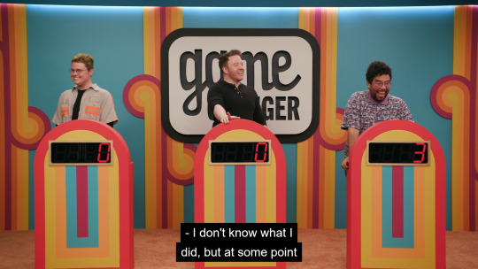
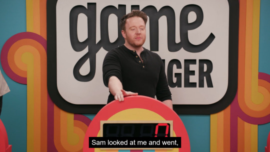
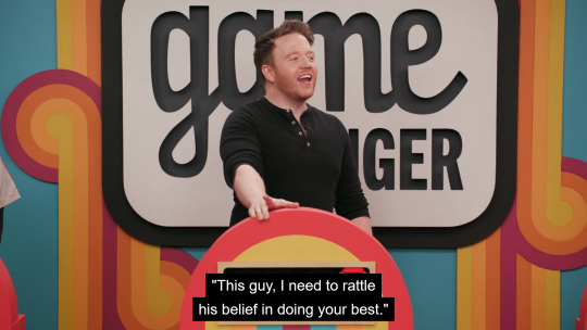
Text
like where did it come from i was literally doing a silly little art and craft
#dropout tv#game changer#sam reich#erika ishii#me mid-apple butter stirring: i am inherently worthless and also remember that embarrassing thing i said in ninth grade history class yikes
39K notes
·
View notes
Text
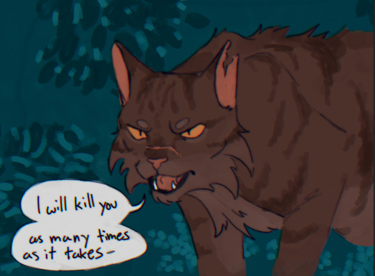

this is how i feel about any Warriors character
#like sir you are a cat calm down#warriors#warrior cats#tigerclaw#tigerstar#art#fan art#fanart#warriors art#warrior cat fanart#warriors fanart#also please be nice i haven’t drawn cats since 6th grade
50K notes
·
View notes
Text
#interested bc i could only get money for personal spending by getting good grades#and only when the quarterly report cards came out#each letter grade had a different dollar value assigned to it lol#including negative dollar amounts#like if i ever got a D they would subtract money from the total#and if i got an F i would get no money at all#(thankfully neither ever happened to me but its happened to my siblings)
9K notes
·
View notes
Text
changes and trends in horror-genre films are linked to the anxieties of the culture in its time and place. Vampires are the manifestation of grappling with sexuality; aliens, of foreign influence. Horror from the Cold War is about apathy and annihilation; classic Japanese horror is characterised by “nature’s revenge”; psychological horror plays with anxieties that absorbed its audience, like pregnancy/abortion, mental illness, femininity. Some horror presses on the bruise of being trapped in a situation with upsetting tasks to complete, especially ones that compromise you as a person - reflecting the horrors and anxieties of capitalism etc etc etc. Cosmic horror is slightly out of fashion because our culture is more comfortable with, even wistful for, “the unknown.” Monster horror now has to be aware of itself, as a contingent of people now live in the freedom and comfort of saying “I would willingly, gladly, even preferentially fuck that monster.” But I don’t know much about films or genres: that ground has been covered by cleverer people.
I don’t actually like horror or movies. What interests me at the moment is how horror of the 2020s has an element of perception and paying attention.
Multiple movies in one year discussed monsters that killed you if you perceived them. There are monsters you can’t look at; monsters that kill you instantly if you get their attention. Monsters where you have to be silent, look down, hold still: pray that they pass over you. M Zombies have changed from a hand-waved virus that covers extras in splashy gore, to insidious spores. A disaster film is called Don’t Look Up, a horror film is called Nope. Even trashy nun horror sets up strange premises of keeping your eyes fixed on something as the devil GETS you.
No idea if this is anything. (I haven’t seen any of these things because, unfortunately, I hate them.) Someone who understands better than me could say something clever here, and I hope they do.
But the thing I’m thinking about is what this will look like to the future, as the Victorian sex vampires and Cold War anxieties look to us. I think they’ll have a little sympathy, but they probably won’t. You poor little prey animals, the kids will say, you were awfully afraid of facing up to things, weren’t you?
#this is the sort of observation I make here that people#go off and write their thesis about#so while I’m not expecting to be the first or cleverest person to say this#if you do use it as a springboard#tell me if you get a good grade ok?#I’ll be tremendously proud of you#like if you take a shitpost and use it to craft deep attentive thought on something important#I just think that’s probably the most noble use of a human brain#it makes me want to take off my hat and slam it to the ground in inexpressible emotion#it’s a cowboy hat btw#and I say something like GOLDURN IT THAT KID SURE HAS DELIVERED.#ok so don’t deny me this#especially if you correct me after a long research journey#GOLDURN IT THE KID IS RIGHT!
24K notes
·
View notes
Text
not just ‘he would not fucking say that’ but ‘he would not, under torture, admit that’
#he is not in touch enough with his feelings to say that! he will say anything BUT that!#that thing about characters getting a good grade in therapy etc etc#writing
85K notes
·
View notes
Text
No. 32 - Japan Transocean Air Jinbei Jets
Over the past two days, @lillybean730, @whatmorecouldapoorboydo, and @fungaloids have all tagged me in this post, which contains this image.
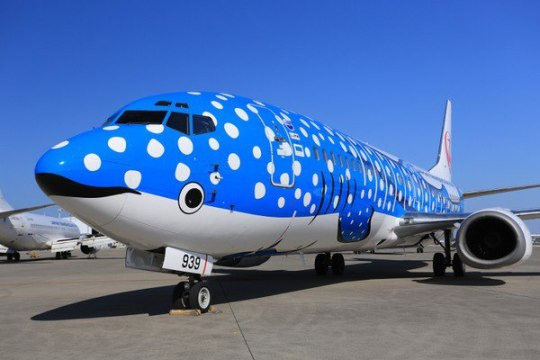
The link beneath is broken, but based on the text below, I would presume it was posted in response to the introduction into service of Japan Transocean Air's two "Jinbei Jets". ('Jinbei-zame' is the Japanese name for whale sharks!)


That's right, there are two of them! The Jinbei Jet actually comes with a matching Sakura Jinbei! They're both Boeing 737-800s delivered new to JTA (a JAL subsidiary based in Naha which usually just uses the JAL livery, hence the vestigial Tsurumaru logo on the tail) in late 2017; the blue Jinbei entered service in September while the Sakura entered service in December.
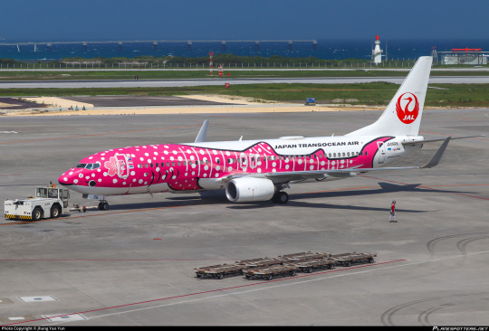
These are adorable, there's just no way around it. The low-sitting eyes, combined with the existence of the cockpits, does make it look a little like the plane has two sets of eyes, or one real set of eyes and one set of false eyes to throw off predators, but just - just look at her!
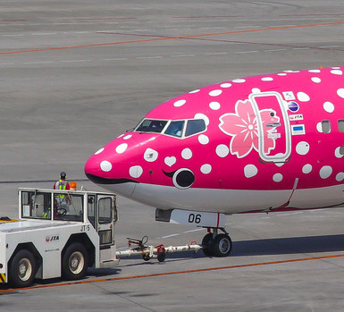
Her little eyelash! The little sakura blossom behind her ear! AAAH!

The methods used here resemble those Amakusa Airlines uses for their absolutely darling dolphin plane. The whale shark design is centered at the nose of the airplane and then allowed to diverge from there, which allows for the general shape of the shark to be expressed well. Together with a very clever use of negative space on the bottom half of the plane, this also very easily renders a white underbelly. Blank space is then left above the dorsal fins to write the name of the airline, and the tail frames the tailplane really nicely.
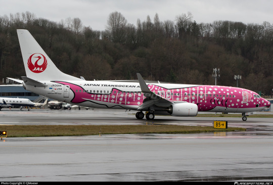
They're both very well-drawn and pretty designs. While I do wish there was something other than plain white in the background, like maybe a wave design or even just a light blue, I understand the choice, and it's not really what the point is here. The point is the whale sharks. Still, the white feels very sharp as a contrast, and I prefer the way Amakusa Airlines used a lighter blue and limited the white space. The Tsurumaru is also a bit busy. It's a gorgeous logo but I think on a plane like this the whale shark should be the only thing that really pulls any attention. The viewer's eye should be drawn right to the airplane's eye (the drawn on one) immediately, without anything directing it to the tail, like a big bright red logo. While the sharks themselves are incredible, the rest of the plane isn't a particularly good vehicle to present them with.
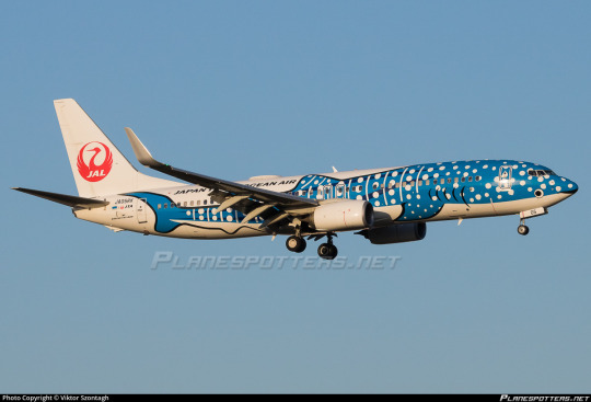
Again in contrast to Amakusa Airlines, this design is much more realistic and much less stylized. I don't think that's a good or a bad thing. In fact, I think they're both wonderful. Despite both being sea creatures they are very distinct-looking, which I like. One is a very cartoonish and delighted dolphin with two smiling dolphin engines, and the other is a set of two very charming elegant whale sharks with delightful big round eyes. Both of them make me very happy when I look at them. I feel like my job here is slightly redundant because I think my reaction is completely universal.

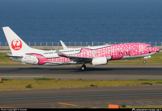
These are just a pair of really pretty and endearing planes, and I could not adore them more. I think I prefer the vivid pink of Sakura Jinbei, but I also do love the classic blue color. And I think the knowledge that these two are a pair improves each of them even more. They're simply lovely.


An A for Jinbei and Sakura Jinbei!
#tarmac fashion week#grade: a#era: 2010s#era: 2020s#region: east asia#region: japan#japan transocean air#japan airlines#aquairium#requests#special liveries
129 notes
·
View notes
Text
that damn chicken
#myart#dungeon meshi#dunmeshi spoilers#falin touden#everytime i draw chimera fal i think about the kid i knew in like 3rd grade who was obsessed with drawing dragons and how if maybe if i too#some notes i wouldnt struggle so bad with drawing the body so connor colin whatever ur name was shoutout to u dude#dungeon meshi spoilers
11K notes
·
View notes
Text
my mother taught me to crochet when i was young. she was left handed, so she taught me how in the bathroom mirror so her hands would be in the right position.
she learned to crochet from her grandmother, who was right handed. her grandma was the one that originally used the bathroom mirror to teach her granddaughter properly.
i find something poetic about that. here in this bathroom mirror, through generations, we adapt to our young who have a different way of learning and interacting with the world
#my mom grew up in the 70s rural missouri#very much in the ‘left handedness is the devil’ era#her first grade teacher handcuffed her left hand to her desk#so i find it very sweet that my great grandmother#took the time and effort to show her grandkid how to create and crochet with her left hand#using the only methods she knew how- the bathroom mirror#the narwhal speaks#crochet
55K notes
·
View notes
Text
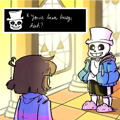
*hours of my life wasted on putting sans in a hat
(this really didnt have to take this long, but i think my dedication is comedic)
#i havent written in cursive since the 3rd grade#i also have never tried a background before#art#kirbee's garbage truck#undertale#sans undertale#sans#digital art#frisk#frisk undertale#my art
8K notes
·
View notes
Text
I am aware I have died on this hill before but people who really strenuously argue that fanfic isn't "real writing" drive me insane. what do you meeeaaaaannn. besides the fact that any attempt to define "real art" vs "fake art" is inherently reactionary, it just doesn't make any sense. it's Writing. people Write it. what the fuck are you talking about.
#like. my fifth grade vampire novella was 100% original fiction. objectively it was awful on every axis. it was still writing. what.#marina marvels at life
10K notes
·
View notes
Text
"a joy to have in class" aka This Child Will Not Be Diagnosed for at least Eight Years
133K notes
·
View notes
Last Seen Blogs
flowerbarrel-art
FlowerBarrel Art

lizzysnappingphoto-blog
Lizzy Spear

thenocturnalcrypt
The Passion of a Sorceress

cookiesandcinnamon
Untitled

missd476
There's a title here somewhere