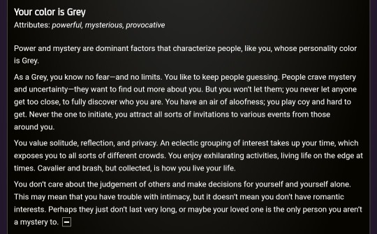
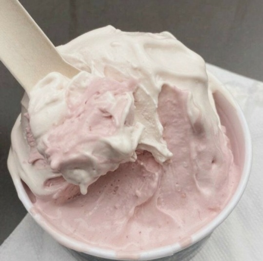
#Color Grey
Text
I hate drawing in grayscale, but I'm scared of colors :v
12 notes
·
View notes
Text
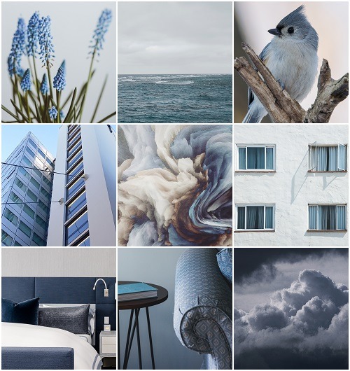
Colors: Blue and Grey
There are infinite shadings of light and shadows and colors...it's an extraordinarily subtle language. Figuring out how to speak that language is a lifetime job.
#blue and gray#blue and grey#Blue#grey#Gray#color blue#color gray#Color Grey#Colors#color palette#color combinations#color combo#winter palette#winter colors#color aesthetic#color moodboard#moodboard#aesthetic#conrad hall
23 notes
·
View notes
Text
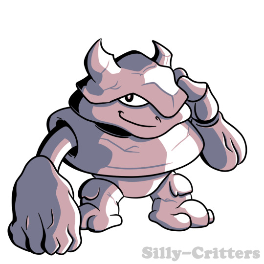
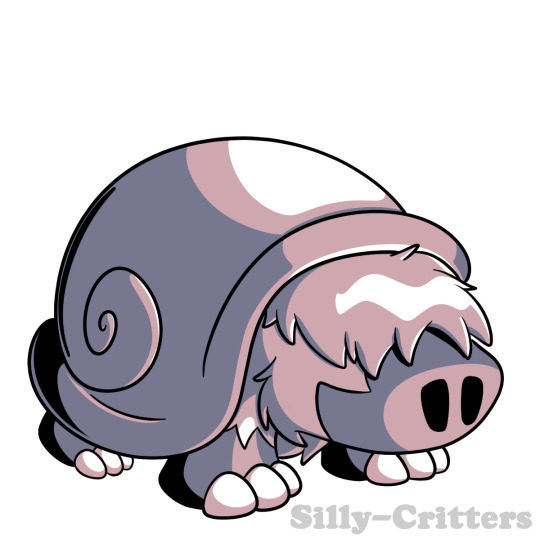
Pebble
A tiny rock elemental that lives in small caves, it tends to just wander and take care of the fauna and flora of the places it lives in, if it sees anyone attacking other monsters it will go there to help.
Drops:
Rock (Common)
Broken Pickaxe (Common)
Iron Ore (Uncommon)
Living Rock (Rare)
Small Rock Club (Rare)
Pebble Card (Very Rare)
3 notes
·
View notes
Text

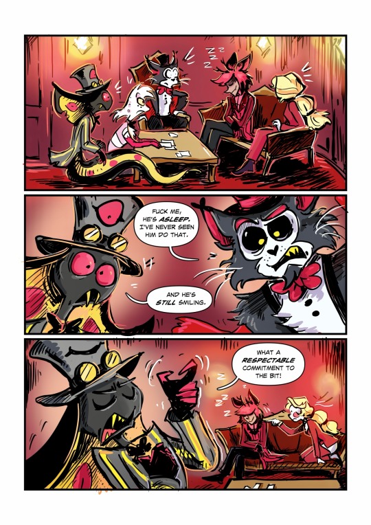
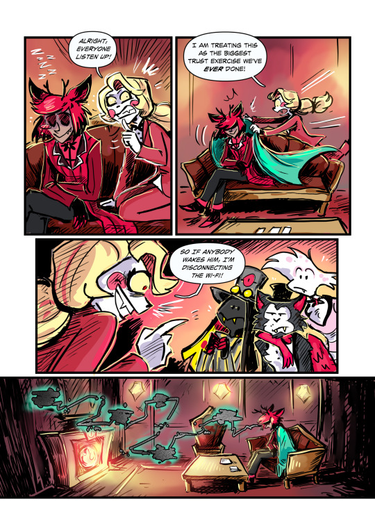
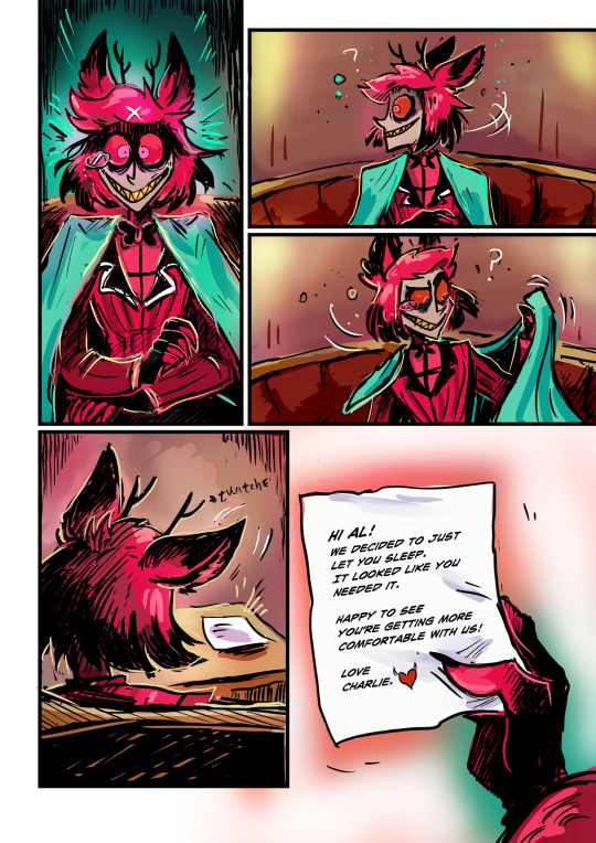
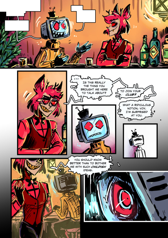
Imagine spending all your energy being cool and mysterious 24/7.
What an idiot have I mentioned I love him?
Idea came from a cool post @nouverx made about Alastor’s possible sleeping habits. 💕
#grey art#hazbin hotel#hazbin hotel fanart#hazbin hotel comic#Oh I am DONE coloring stuff for a while! it’s so boring!#I mean it looks great but I haaaaaate spending time on it!#get used to grayscale stuff for a while#also coloring multiple characters is stupid! no no no.#angel dust#husker#sir pentious#alastor#charlie morningstar#hazbin husker#hazbin alastor#god I’m glad to be done with this one
42K notes
·
View notes
Text
Anon said: This one may be stupid but mine color change so I never know
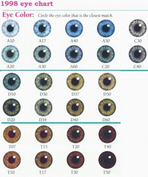
Feel free to tag your eye colour!

#eye color#grey eyes#blue eyes#green eyes#brown eyes#appearance#tumblr polls#tumblr users#tumbler polls
20K notes
·
View notes
Text
Lamborghini Autentica super car grey 4k desktop wallpaper

This wallpaper is about Lamborghini Autentica super car, 4k desktop wallpaper, grey color, Lamborghini cool. This image size is 600629 kb and resolution is 3840×2160.
0 notes
Text
| What's your color?
0 notes
Text
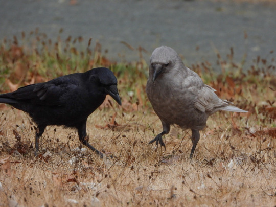
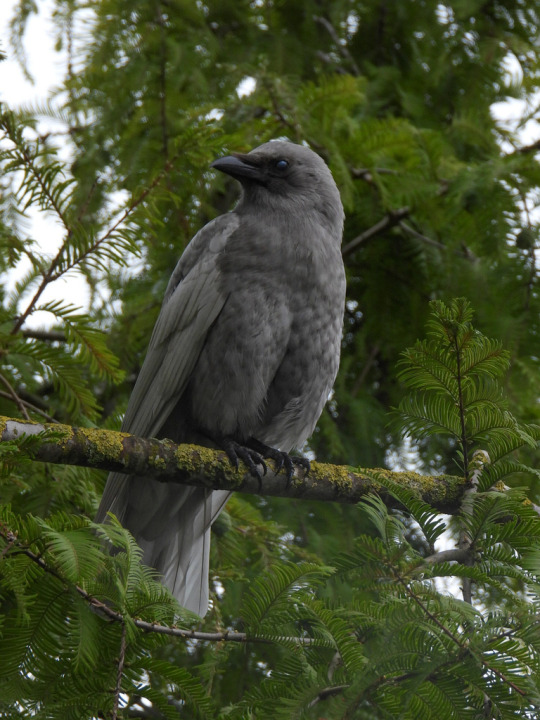
A beautiful grey American crow (Corvus brachyrhynchos) [x]
#source says leucistic so we’ll go with that#leucistic#leucism#american crow#crow#bird#Corvus brachyrhynchos#looks diluted such a nice color#I can’t remember seeing one such a nice solid grey#have seen brownish and white and maaaaybe a very light grey?#good job nature#keep up the good work
42K notes
·
View notes
Text


✿ ۪⋆ pink friday


#divider by v6que#pics edited by me#kpop#newjeans hanni#hanni moodboard#kpop moodboard#colorful moodboard#vintage moodboard#y2k moodboard#pink moodboard#grey moodboard#random moodboard#messy moodboard#alternative moodboard#edgy moodboard#grunge moodboard#indie moodboard#carrd moodboard#lq moodboard#aesthetic moodboard#soft moodboard#film moodboard#fresh moodboard#retro moodboard#coquette moodboard#gg moodboard#newjeans moodboard#kpop layouts#newjeans icons#hanni icons
4K notes
·
View notes
Text

Your Words Are Engraved In Me - Submitted by @incantu
#211E29 #2C2C45 #423D51 #A18993 #644F5E #D2D1CB
5K notes
·
View notes
Text
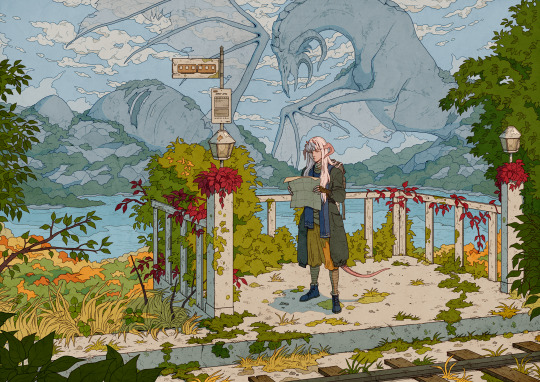
Traveller
#artists on tumblr#at it again with the detailed backgrounds#there's something so relaxing about drawing 49285947 leaves#it seems we've kind of skipped the colorful part of autumn here#went straight from summer hot days to winter depression grey#all of my DMs are on hiatus or travelling so no D&D for a couple of weeks#bless them all on their journeys and forays#i hope every DM is having a good day actually#thank u for your service
5K notes
·
View notes
Text
✿ ♫ ❁ ♫ ❀ ♫ ✾
#ᯓ★ chaey2k!#⠀ yeritos#locs cr bambicito#kpop moodboard#alternative moodboard#soft moodboard#coquette moodboard#colorful moodboard#messy moodboard#clean moodboard#random moodboard#kpop layouts#kpop icons#kpop messy moodboard#pastel moodboard#pink moodboard#gg moodboard#vintage moodboard#red moodboard#rainbow moodboard#illit moodboard#minju moodboard#park minju#minju#illit#icons#green moodboard#grey moodboard#gloomy moodboard#retro moodboard
2K notes
·
View notes
Text


✿͙ ཆི̼̻❤︎ ───ᔉ࿔ొo࿀࿁ ᵕ̣̣̣̣̣̣ 📂
#⃝ 还没跟你牵着手


#﹒ ﹒ ﹒#♪ ( 可能从此以后 学会珍惜 天长和地久 ) ♬#﹒ ﹒ ﹒ ﹒ ﹒#messy moodboard#archive moodboard#random moodboard#minimal moodboard#layouts#symbols#locs#bios#aesthetic#slay#mb#aes#moodboard#grey moodboard#blue moodboard#colorful moodboard#pink moodboard#aesthetic moodboard#visual art#carrd layouts#soft moodboard#angelcore#angelcore moodboard#alternative moodboard#cute#faye wong#visual archive
2K notes
·
View notes
Text
Iron Cow Shell
They used to walk around the surface before they were bought into the mines to move the carts around until workers noticed they were starting to eat the iron ores and even the carts themselves, now their shell is made of iron and they started hiding in the Grub Moles holes, now they are still docile but will fight back.
Drops:
Rock (Common)
Monster Meat (Common)
Broken Pickaxe (Uncommon)
Iron Ore (Uncommon)
Iron Shell (Rare)
Monster Fur (Rare)
Iron Cow Shell Card (Very Rare)
1 note
·
View note
Text

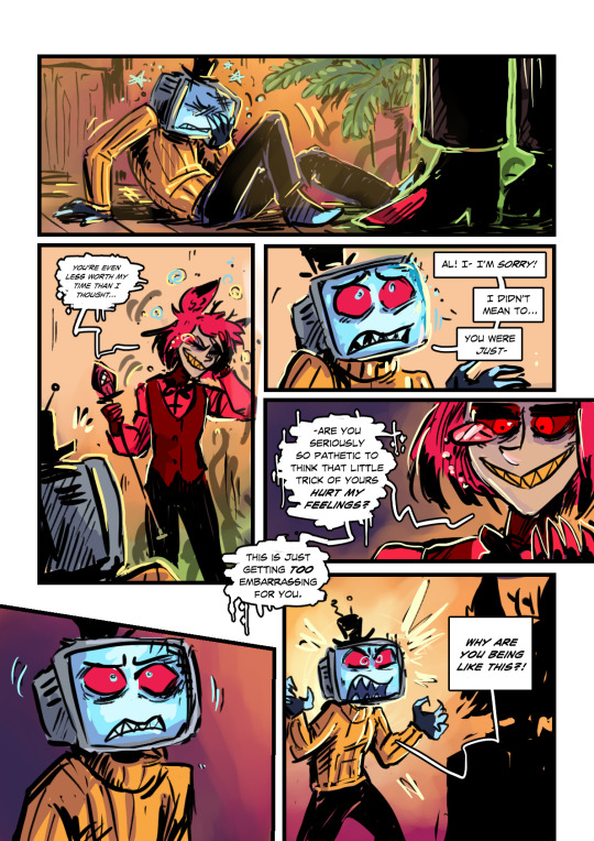


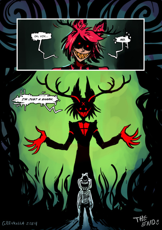
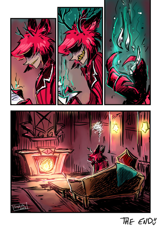
“I’m a SHARK-” said Alastor the deer demon, “because it’s a good metaphor!’
(NO I will not do a part 2!💕)
#grey art#hazbin hotel#hazbin hotel comic#radiostatic#one sided radiostatic#vox#hazbin vox#alastor#the radio demon#comic#I feel like the coloring got weird here but whatever 👌💜#I think Vox severely overestimated his importance to Al#and to prevent himself from dying from cringe he became a supervillain#I’d absolutely hate Alastor with a passion too if he made me feel that small.😂#radiosilence#onewaybroadcast
5K notes
·
View notes
Text
I think 90% of my gripes with how modern anime looks comes down to flat color design/palettes.
Non-cohesive, washed-out color palettes can destroy lineart quality. I see this all the time when comparing an anime's lineart/layout to its colored/post-processed final product and it's heartbreaking. Compare this pre-color vs. final frame from Dungeon Meshi's OP.


So much sharpness and detail and weight gets washed out and flattened by 'meh' color design. I LOVE the flow and thickness and shadows in the fabrics on the left. The white against pastel really brings it out. Check out all the detail in their hair, the highlights in Rin's, the different hues to denote hair color, the blue tint in the clothes' shadows, and how all of that just gets... lost. It works, but it's not particularly good and does a disservice to the line-artist.
I'm using Dungeon Meshi as an example not because it's bad, I'm just especially disappointed because this is Studio Trigger we're talking about. The character animation is fantastic, but the color design is usually much more exciting. We're not seeing Trigger at their full potential, so I'm focusing on them.
Here's a very quick and messy color correct. Not meant to be taken seriously, just to provide comparison to see why colors can feel "washed out." Top is edit, bottom is original.
You can really see how desaturated and "white fluorescent lighting" the original color palettes are.
[Remember: the easiest way to make your colors more lively is to choose a warm or cool tint. From there, you can play around with bringing out complementary colors for a cohesive palette (I warmed Marcille's skintone and hair but made sure to bring out her deep blue clothes). Avoid using too many blend mode layers; hand-picking colors will really help you build your innate color sense and find a color style. Try using saturated colors in unexpected places! If you're coloring a night scene, try using deep blues or greens or magentas. You see these deep colors used all the time in older anime because they couldn't rely on a lightness scale to make colors darker, they had to use darker paints with specific hues. Don't overthink it, simpler is better!]
#not art#dungeon meshi#rant#i'm someone who can get obsessive over colors in my own art#will stare at the screen adjusting hues/saturation for hours#luckily i've gotten faster at color picking#but yeah modern anime's color design is saddening to me. the general trend leans towards white/grey desaturated palettes#simply because they're easier to pick digitally#this is not the colorists fault mind you. the anime industry's problems are also labor problems. artists are severely underpaid#and overworked. colorists literally aren't paid enough to do their best#there isn't a “creative drought” in the anime industry. this trend is widespread across studios purely BECAUSE it's not up to individuals#until work conditions improve anime will unfortunately continue to miss its fullest potential visually#don't even GET ME STARTED ON THE USE OF POST-PROCESSING FILTERS AND LIGHTING IN ANIME THOUGH#SOMEONE HOLD ME BACK. I HATE LENS FLARES I HATE GRADIENT SHADING I HATE CHROMATIC ABBERATION AND BLUR
2K notes
·
View notes
Last Seen Blogs
kaizensluvr
kaizen
la-voz-de-una-estrella
𝐿𝑜𝑠𝑡 𝑆𝑡𝑎𝑟

lgo
@LGo

thejoggingdead
Like The Walking Dead, But With Better Cardio
that-soccer-guru
I'm just out here loving Soccer ✌🏻