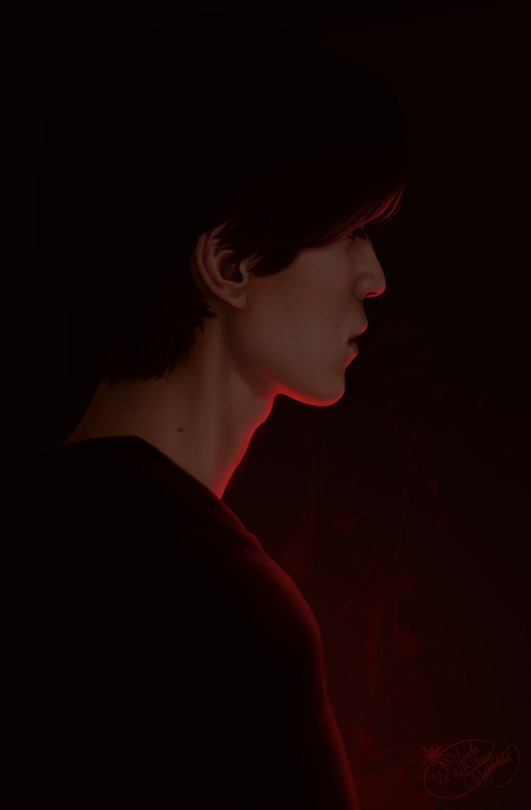
#And see if I could add a different light effect and colour scheme than the original reference
Photo
Guess who has almost finished watching Strangers from Hell?
Lee Dong Wook is such a pretty man — even when he’s playing a murderous dentist, apparently. I just couldn’t help myself.
I feel like I’m having five simultaneous epiphanies when it comes to my art and it’s a little overwhelming. But hey, I’m making a lot of progress so I'm not complaining.
#Strangers From Hell#Seo Moon Jo#Lee Dong Wook#Art#Fan Art#KDrama#If evil why pretty?#I just wanted to do a quick study#And see if I could add a different light effect and colour scheme than the original reference#And still make it look good#Turns out that I can#That's both delightful and slightly worrying#I don't know where my limits are anymore#Though I have to say#Not the easiest angle to get the likeness right x'D
337 notes
·
View notes
Text
Maya Motion Tracking 2
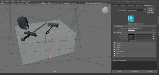
Before I could export things into Nuke, I had to set the table texture to AiShadowMatte so that the shadows on the flat surface would be captured without capturing the model itself (next time I try this I will make the table model more accurate so the shadows perfectly match.

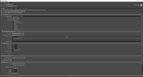

After having a discussion with Paul about exporting from Maya using AOVs I had a chat with Gary to figure out the process which was actually very simple. The most important AOV's that I would use for this project are RGBa (everything captured), Specular Direct (Light), Specular Indirect (Reflections) and Shadow Diffuse (Shadows). AOV stands for Arbitrary Output Variables, rendering a project using AOVs allows you to fine tune each part of the render individually whether you want just the shadows to be a little more saturated or if the reflections need to stand out more with a little extra contrast. AOVs can be selected from in the AOV tab of the render settings and creates a folder for each variable.

Gary showed me how to import the EXR image sequences into Nuke and the correct nodes needed to plug them in together.


As an example of what can be achieved using AOVs we used a glow node on each Specular node to compare the results.

This is the full node tree that I used for the second image above on the Specular direct which gave the swords a lightsaber-like glow.
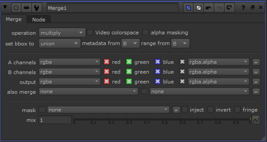

Changing the operation of the merge node is equivalent to changing blend modes in Photoshop and has a big effect on the resultant image. We found that using multiply for the shadows and screen for the specular looked pretty good, some of the other operations became masks for the whole image or burned the colour of the merged node.
TURN ON SOUND
I went back to campus to try it out again on my own on two occasions to see if I could figure out how to export the full video and play around with the node settings to finish the motion tracking exercise. The first video is made using a similar tree to the one I made with Gary but the lighting looks a little bit stale and boring so I wanted to go back into Nuke and play around with the 'Grade' and 'ColorCorrect' nodes because colour grading is a huge part of compositing. The original footage itself is quite plain and sterile and I wanted to see if I could bring out some of the colour and some more saturation to the video. I wanted to give it more of a cinematic feel than the first video however I think I dialled up the blues too strongly on the table leg which is very distracting. I had initially wanted to bring out this blue hue to add a splash of colour to the bland shot but looking back on it it's a bit too much, I should have looked at some colour schemes for a warm sinister tone because I think the blue takes away from this. I may be being overly critical because this is something which is very easy to overwork and get lost into so I need to take a step back next time so I don't get lost into subtle changes and instead ask someone with fresh eyes to see what they think. Overall the second video looks somewhat cinematic and considering it was just me fiddling around with some new nodes it looks alright.
I also wanted to see if I could animate the glow so I did a tiny bit of keying to adjust the glow over time.
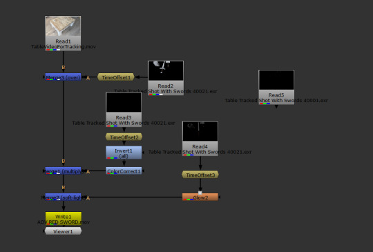
This is the original node tree, the main issue I had to figure out myself was the time offset nodes because all of the EXRs were numbered starting at 40001 so I had to set the offset to -40000 to make the AOV footage sync with the original video.
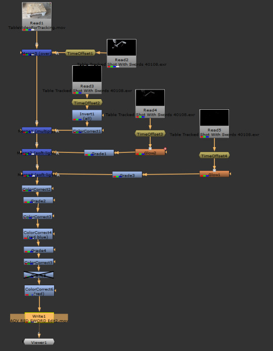
This is the final node tree with a lot of different correctional modes attached.


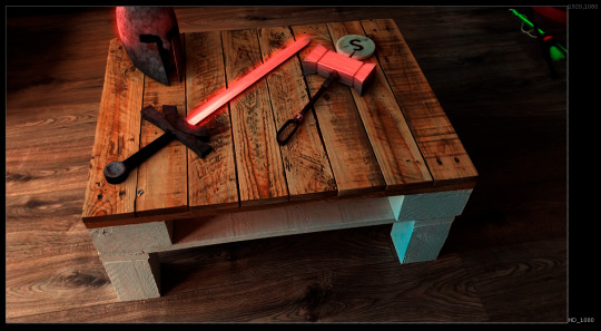
These were some of the tests made whilst tweaking colours, I wanted to use this as am opportunity to play around with colour grading so that I understood the limitations and here I have learnt that it is better to work within the confines of the original footage and work in a process of reducing a combination of green, reds or blues rather than trying to create more of one colour which I'd already lacking. I need to do some more work on this and have a think about the lighting I want for my video because it may be a good idea to set up some lighting when filming to make it more cinematic. I think I should have leaned into the colour palette of the first image as the original video is quite desaturated so trying to force a warmer palette from quite a cool washed out room didn't work as well as a colder palette could have.
0 notes
Text
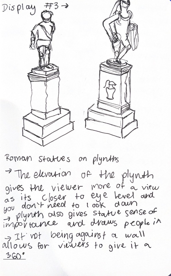
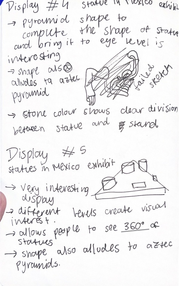
British Museum Visit:
For this visit we had to observe the way the artefacts and statues were curated, which involves the thought put into the way an object is exhibited. This can enhance the piece, or even change its meaning. We had to find 5 exhibits of interest. I did sketches for a few of them, some of them more rough than others, and sketch for display number 2 in particular inspired me.

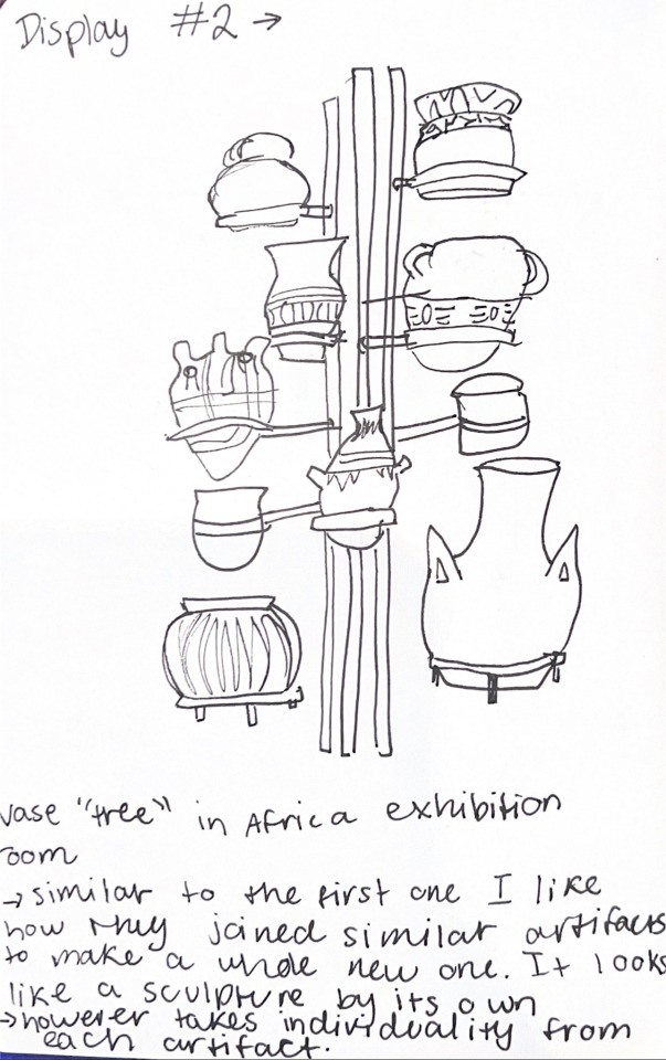

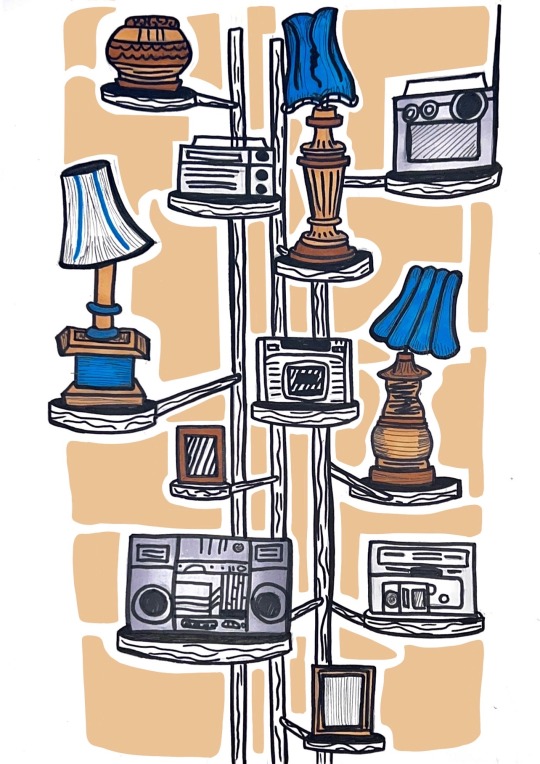
The tutor mentioned about thinking about which things could be exhibited as artefacts of elephant and castle, and to do an A4 sketch based on that. I did not have to think much as I realised that really the subjects I have been drawing up into these points really can be seen as “artefacts” of the pub we investigated. So I picked the exhibit of the African vases, as I found it incredibly interesting how, put together with that structure, they look like one sculptural body and a lot more interesting to look at compared to it by itself. So I thought to draw it (more carefully and polished compared to the initial sketch) and substitute the vases for the lamps and other objects that can be found in the pub.

I made it with pencil first, where I had a lot of repositioning to do while I went along. This is one of the times of this project where I struggle due to its handmade nature and how we cannot use digital for our final pieces. One of the reasons I prefer digital is due to being able to play around with composition before anything is final and explore possibilities in a short time. However doing this was also good so I do not only rely on digital. I then decided to add colours with markers, and used posca to make the linework similar to the other pieces so that they all feel cohesive. This also allowed me to add bits of texture that I found in the pub onto the structure that is originally made of metal and does not have a lot of texture.

I really liked the result but felt like it missed something more that would make it pop. I reflected that maybe it was the background, and how I feel the colour scheme needs one more colour to make it pop, but I felt very hesitant of doing something too permanent and ruining this piece. So I went onto Procreate and made a projection of how it would look like with colour in the backdrop and use very geometrical shapes.
I was very happy with this projection and took it to a tutor during tutorial to discuss whether it was the right course of action and what medium I should use to bring this to life. I thought that maybe using coloured paper would make it more interesting and create more depth, and it would also allow me to experiment with different types of textured paper. So I bought quite a few options with different shades and finishes.
I first tried to print the projection and trace the shapes of the projection so I knew exactly what to cut, however I soon realised that no matter what I did the proportions of the shapes did not match the original hand drawn piece, so I had to redraw the shapes from scratch. I used the projection as a guide of what shapes I wanted and where, but had to freehand them on top of a tracing paper while seeing the original piece underneath.
With that I cut used the tracing paper to transfer the shape outlines into one of the papers, and cut out a few but not all of them to have an idea of how it would look like, and if the paper choice was the best.
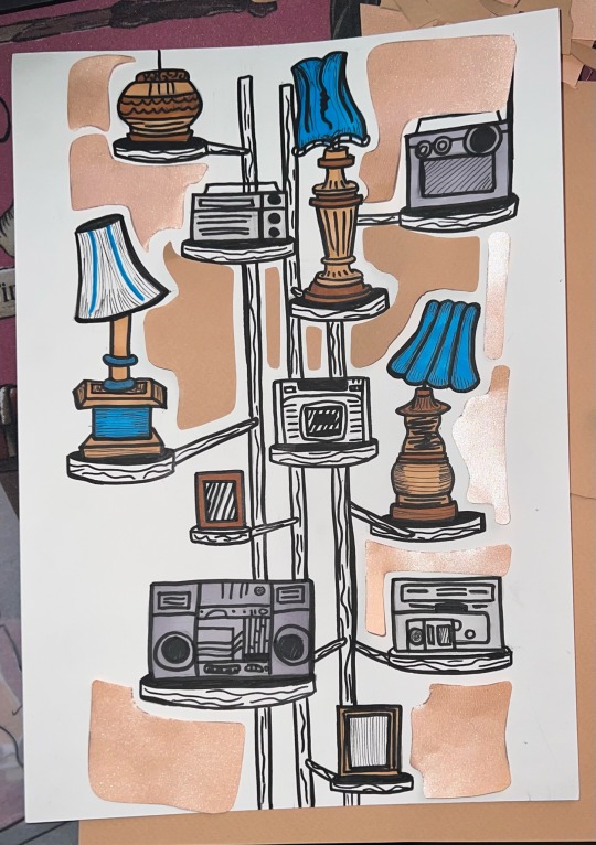
It turned out I did not like the effect of the paper as it was too shiny, and against the light a big portion of the shapes would have a reflected glare on it. This removes the pop of the colour and the stark outline of the shapes, which made it unsuccessful. I then chose a non-shiny paper of a bit of a deeper colour that would work better, and did the same process.
I was very happy with the outcome, but went and did a few microscopic cuts to refine the shapes, leaving me with the final piece.
0 notes
Text
PREVIOUS RSA WINNERS - “ANALYSING PAST SUCCESS”
with some research, added to our collective, imaginary-yet-practical utility belt, and dictating the sort of direction we would like to head in our project - it comes a time to look at some student’s attempts at bringing their ideas to life, so we can engage further with the visual side of this module, and begin thinking about producing visuals..
to start this process - I chose 3 of my favourite of the previous RSA winners, and wrote some notes, analysing the sort of aspects that worked, and didn’t for each film - to see if I can replicate their success, and hopefully avoid anything negative through the production of my film.
youtube
Leanne Dooley: Limerick School of Art & Design
“ Illustrator and animator Leanne picked up the Natracare award, which comes with a prize of £1,000 as well as being picked by RSA staff for an additional award of £500.
It’s a film all of us judges could agree was an outright winner.
Leanne's use of colour, texture and form is accomplished – and the film makes great use of visual metaphor without just representing the words directly. ”
Dooley’s work opens with dynamic typography, ornamented with simple, easy to understand iconography; through the use of speech bubbles and characters that are fundamentally basic, with no faces or intricacies in their designs beyond the few elements of colour that showcase the individual
making the subject matter digestible is what is key for this project - so I think one of my primary ideas will be looking into the idea of using simple visual language to showcase some of the key concepts from such a complex and severe subject matter.
writing this - the idea of using the juxtaposition between simple visuals, and serious subject matter might be another concept I’d like to display in my work..
the use of boiling lines; with the writing for the list being drawn twice, and looped in a simple two frame repeating sequence adds a subtle element of movement to the animation, which I feel, combined with hand-drawn element is something that works extremely well for this animation.
when I figure out what medium I’ll be working in for this project - I will have to do something akin to this, by thinking about what kind of things I can do to make each shot feel more than just itself, with simple techniques like these..
the transitions between each shot are creative, and engaging through their imaginative use of the visuals - and this is definitely an aspect of this project that is extremely important to me, and I will have to do work to make sure the transitions between each of my shots flow nicely, and aren’t too jarring..
maybe having it all feel like it’s a part of one set piece is the solution to this?
the use of different coloured backgrounds is an element of design that I find to be extremely effective; which in combination with the limited colour scheme creates for a sleek and proffessional feeling outcome in the final film.
vimeo
Mark Churcher: Edinburgh Napier University, Scotland
“A Sinking Feeling”
“ A stop motion animation using 3D models. The animation centres on a cube which rotates revealing different scenarios to show the various futures that are possible if we act - or not - on climate change. ”
this animation uses the natural flow created through the soundtrack (speech) to create transitions, though the visuals don’t necessarily match what is being said - but instead visual representations of the subject matter are warped to match the descriptions; such as the cube that showcased the subject matter on each of its faces rapidly spinning, after the listing ends with “etc. etc.”
very bright, the light blue background remains consistent the whole way through - not using white is a deferral from a formula that I like very much, and will heavily consider using in my own project
the colour scheme is very natural - to match the subject matter of reducing emissions to save the earth; with a primary usage of greens and blues, the only exceptions to this being the red books, the brown of the tree, and the numerous greys for rocks, buildings, etc.
the establishing shot is powerful, having it open with a title makes it feel like an animated poster; and ignoring the speech of the first lines, and
an element of the amateur that comes from the subtle finger marks in the clay, the accidental repeated part of the loop in the establishing shot, and the jagged lines from where the objects have been cut is one of the things that stops this animation from feeling corporate - whilst still retaining a sense of professionalism.
youtube
Arthur Kearns: Birmingham City University
“ full of energy and character.
Although fully engaging with the darker parts of the audio, its roughly rendered world where colours bleed outside the lines feels alive and really human. ”
though without much actual animation in the characters movements; Kearns’ work uses lots of boiling lines to reconcile for this - whilst also giving a very hand-drawn feeling; complete with inconsistent framework and marker-esque colour that through their constantly changing energy engages the audience’s eyes more effectively.
with an emphasis on character-lead animation, a few of the shots are framed in very similar ways - which, rather than appearing as a negative instead I argue helps the animation flow between each shot, better.
I think for my own work I will have to look into something akin to this - focusing on designing effectively so that the frames naturally transition with a flow created through the use of space, shape, and object type.
SO WHAT DO THEY HAVE IN COMMON? - “USING OUR ANALYSIS TO DETERMINE A RECIPE FOR SUCCESS”
from everything we’ve brought up and thought about from each specific film; I wanted to take some time to highlight some specific aspects that were prominent throughout all of the projects, and try to relate them to my own approach
Consistent style throughout
picking the sort of style to make the project is a fundamental first step in dictating how you will approach the visualisation process, and therefore the direction you’re heading in
setting the strong frame work comes from thorough research, and an understanding of your project so that things will fall into place, without the necessity of compromise, or alteration..
a problem with working with styles in a project like this, is that everything needs to match, in terms of consistency - certain shots you may have a really strong idea about, in one specific style; but others may not be..
using the breaks in the dialogue as guides for the structure for the piece implies the number of shots that are recommended for this minute and a half animation - so maintaining a style that contains strong concepts for each of the shots is where I think the challenge lays, here.
Straight-forward visual representation
a theme that I think is the key thinking behind this project is condensing the research we have done into a digestible format, for a general audience’s viewing;
imagining nobody knows about the concepts the speaker is discussing, it is our job to visually communicate these concepts in a way that is easily understandable, with a blend of simple, understandable graphics and of course showcasing relevant iconography that relates to the subject matter.
Smooth transitions
a specific fundamental that I had previously highlighted discusses the importance of having interesting transitions, that stitch the specific shots together.
keeping things interesting by showcasing movements that persist beyond just the primary action in the foreground - thinking of how things will flow into one another, creating relations between two completely different shots and or sequences.
it covers the ground highlighting almost every single one of the positives addressed in the analysis of the three case studies; and therefore I must emphasise its importance, in relation to my project going forward
and above all
S I M P L E.
keeping the project to a manageable degree, while also producing a visually stimulating outcome is arguably the single most important thing!
you can’t set yourself more than you’re capable of; but by the same argument you shouldn’t undersell your abilities -like all good things there needs to be a balance;
and through some further research - we’ll further our understanding of the kind of project we want to make, and therefore where this balance lays for us..
0 notes
Text
Movie Review | Olivia (Lommel, 1983)

This review contains mild spoilers.
Ulli Lommel's The Boogeyman is not a great horror movie but it is one I think of often. It's marred by a clumsy, effects-laden climax, but the bulk of the movie has a strangely artificial tone. The gruesome slasher-esque kills (which earned it a spot on the Video Nasty list) and supernatural elements seem at odds with the picturesque, almost postcard-like veneer of the overall film. It's as if the reality of the film is at war with itself, echoing the tension in the horror plot. A primary driver of its tonal discord is the extremely uncomfortable opening scene, where the partner of the protagonists' (possible sex worker) mother physically abuses them and is then killed by one of the children, who subsequently goes mute from the trauma. The scene is shot in hot, saturated colours (a quality perhaps inspired by the films of Rainer Werner Fassbinder, with whom Lommel collaborated earlier in his career), giving it an especially rancid quality, as if it's corroding through the screen.
Olivia has a version of this scene. Here, the heroine witnesses her prostitute mother being killed by a violent john as a child, the scene this time being shot in moody dark blue lighting. We cut to fifteen years later, and now the protagonist, played by Suzanna Love (star of The Boogeyman and Lommel's wife at the time), is trapped in an unhappy marriage with a controlling, abusive husband. (I watched this the same weekend as Sudden Fury, a Canadian thriller about a man who schemes to kill his wife in the backwoods of Ontario, and it was startling to see two strong candidates for the Cinematic Bad Husband Awards almost back to back.) As she spends her days looking out the window towards London Bridge (where they live), she begins to envy the freedom enjoyed by the nearby prostitutes and tries going out to do likewise during one of her husband's night shifts. However, when she picks up a john, it turns out she'd internalized her childhood trauma more than we'd realized, and murders him at the behest of the voice of her mother who speaks to her. (It's worth noting that the man has mannequins in lingerie in his flat, which adds to the scene's weirdness.) She also falls in love with an American engineer hired to provide estimates for restoring the bridge, but when her husband finds out, things meet an abrupt, violent end. Years later, the engineer is visiting Lake Havasu, where the old London Bridge was relocated, and spies a woman who bears an uncanny resemblance to Love. Could this be the same person?
The plot has elements that were obviously inspired by Psycho and Vertigo. Compared to Brian De Palma and Dario Argento, two other directors who were channeling Alfred Hitchcock's influence to exhilarating results at around the same time, Lommel's film lacks the same technical sophistication, but that adds to its distinct atmosphere. A lot of films can be described as dreamlike and it can mean an awful lot of different things. Compare the films of David Lynch and Lucio Fulci (the latter of whom I will always bring up given the opportunity), which are very different yet the word applies to both. In Olivia, the film's tone and rhythms make its sense of reality feel strangely tenuous, even if there's nothing in the narrative to suggest what we're seeing isn't actually happening. In describing Jonathan Demme's Married to the Mob, Roger Ebert cites its "sleepy/wide-awake style", which are words that came to mind. The visual style, which features a lot of strong blue lighting, is not as precise as the work of those other directors, putting the film in a state of slight stylistic flux. Production details add to this quality, with the bridge in Lake Havasu and the faking of London locations through well chosen props, as well as crew members cosplaying as Londoners during a crowd scene (which features some not terribly convincing British accents). That the murders (one of which makes similar use of an electric toothbrush as a scene in Boogeyman II) in the version I watched had their audio sourced from a video version instead of the original elements helps them ripple the film's fabric even further.
Speaking of Demme, the film also brings to mind Something Wild, in the sense that the night isn't just a time of day but a different state of mind and perhaps a different place altogether, which emphasizes the somnambulist qualities of the daytime scenes. Are these even in the same reality? Is night real and day just a dream through which the heroine sleepwalks? There's also the relationship between wardrobe, self and storytelling. (As I've spent too much of the last year and a half perusing menswear blogs and then trying to talk myself out of ill-advised purchases, this is an idea that's been on my mind a lot lately.) When Love dresses up as a hooker, she puts on a nice purple floral dress, which on one hand doesn't strike me as a particularly slutty outfit, but is also likely the most sexy item this character, who we understand doesn't get out much and is married to an unkind husband, would reasonably have. Yet with her sunglasses and golden hair, she suggests a Hitchcock blonde and balances the same aura with her kitchen sink daytime existence. (Lommel grew up in postwar Germany and would likely have been sensitive to the economic realities that drive people to that line of work, something he explored in Tenderness of the Wolves. Interviews with Love and assistant director John P. Marsh also suggest that the prostitution elements and opening scene were Lommel's way of processing traumatic events from his childhood. Lommel himself shows up to play a detective, while Love's brother Nicholas, who also appeared in The Boogeyman, plays the client who murders the mother, making this a family affair.)
If like me you own the Vinegar Syndrome blu-ray, you have up to three covers. The slipcover, which features a shrieking woman plunging a knife into her mate (and a grimacing face on the moon over London Bridge) suggest something more blood curdling than the finished product, while the reversible cover brings to mind a Playboy centerfold, accurate to brief sections of the movie (like really brief, before the movie snaps back to horror) in terms of the proceedings but certainly not the tone. The "actual" cover, with the heroine's face hidden by her large sunglasses and the deep blues of surrounding her, better capture the movie's distinct look and feel. And of course, much of the film's power comes from Love's performance, who brings an innate sympathy and low key nerviness to the role. (Love admits to having been uncomfortable with the sexual content in the movie.) Like the movie around her, the different sides of her character seem to be wrestling with each other, the resulting offness and inner tension making her performance, and the film as a whole, extremely compelling.
2 notes
·
View notes
Text
Stewarts Building Services.
Construct It Live.
Content
Action 9: Lighting Your Transformed Loft Space.
Can I Convert My Loft Space?
Selco, Its Where The Profession Go! We Equip All The Building Products, Hardwood As Well As Products You Need Under One Roofing System.

Step into one of our exceptional seminars and gain from the specialists. Discover exactly how to prolong your home on a budget, locate your method through the preparation maze or even construct a power effective residence from square one. Invite to Building Futures - our ₤ 1 million scheme to sustain children's health and wellness, sporting activity and education and learning and also the arts.
Builders' sellers throughout London and also the South East are functioning to set protocols to make sure safety initially under the brand-new Tier 4 Covid-19 constraints.
The market will remain to run, after the federal government classified it as a necessary solution.
The BMF, in partnership with businesses across the industry, has actually obtained authorization under the government's ₤ 2bn Kickstart scheme for 143 work positionings.
National profession body the Builders Merchants Federation produced detailed Covid-19 procedures at the start of the pandemic, and also the guidance will remain in place as new constraints are generated.
The Trade Credit Scores Insurance System, which is authorized under State Help Policy, is offered up until 30 June 2021, backdated to 1 April 2020.
Your one-stop-shop for self as well as custom-made develop details as well as motivation. Action needs to be toregister your interestwith councils, in the locations where you 'd like to build. Kier Living was responsible for developing the revolutionary and also prize-winning blended period, sustainable as well as budget-friendly new community in Birmingham. The job provided a series of home kinds to appeal to the broadest demographic feasible with the purpose of giving citizens an extra 10% home. At Kier we pride ourselves on combining the very neighborhood understanding as well as proficiency of our teams, with the nationwide abilities and confidence of a FTSE 250 company. Come as well as go to the Kier Living website to see our latest advancements and also learn why Kier residences are developed for the future. The extensive building jobs which they did on our behalf were finished on budget plan, on schedule and also to the highest feasible criteria.
Action 9: Lighting Your Transformed Loft.
The financial decline in the direction of the end of the noughties brought with it the fact of minimized demand for new homes. Throughout, HBF continued to place the situation onward for Government intervention to help fortify the marketplace and restore consumer self-confidence. HBF contributed in the development and execution of various need side policies, consisting of the extremely successful Help to Get Equity Lending scheme.
Snowden Builders can help you get your dream home - WOODTV.com
Snowden Builders can help you get your dream home.
Posted: Fri, 15 Jan 2021 17:00:00 GMT [source]
Brings you 1000s of stories, conversions and also improvements from estate agents as well as private sellers across the UK. We additionally understand that moving right into a brand-new residence can be a stressful time. building services witney for small businesses 's why we assure to do whatever we can to make the entire experience as smooth and also easy as possible for you from beginning to end. Depending on the phase of construction when you buy your new home we can supply you an option of coatings, consisting of kitchens, repaint colours, electrical installations, floor coverings and chinaware. The very best training or recruitment honor went to Lindum Group as well as rg+ p and Keystone scooped the very best retirement system trophy.
Can I Convert My Loft Space?
HBF efficiently promoted an extension of the plan to 2021 and recently, an additional ₤ 10bn of financing for the system. Collaborating with Government authorities to make sure housing plans are presented that facilitate housing supply, in a manner that is practical for the market. Ensuring elderly political leaders and federal government officials know housing concerns as well as the obstacles encountered by our participants. Structure your house is exceptionally gratifying, and it's easier than you think! The majority of self-builders do not lay blocks themselves, but handle specialists to develop their residence. If you do not want to be hands-on, then commissioning a personalized develop house can be the best path.
Is a small loft conversion worth it?
A loft conversion is often cited in surveys as the best way to add value to your home. Recent research carried out by the Nationwide Building Society has stated that a loft conversion could add up to 20% to the value of your home. If you're looking at a house valued at £200,000, that's an increase of up to £40,000.
All workers as well as sub-contractors utilized were a pleasure to manage and we're definitely happy with the job that was executed. Considerate, brilliant, well thought out design as well as build should raise both living area as well as residential or commercial property assessment.
Selco, Its Where The Trade Go! We Stock All The Structure Materials, Timber And Also Supplies You Need Under One Roof Covering.
Whether you're suitable a neat galley cooking area or a large kitchen-diner, the expense of cooking areas can differ commonly, with an ordinary expense of around ₤ 5,000 to ₤ 6,000. Have a look at our cooking area fitting cost guide for more details. The finance is requested through an application procedure which starts by reviewing the project with the Homes and Communities Firm before the formal application procedure for the car loan starts.
youtube
HBF likewise operates your home Building Careers website, offering an outstanding source of details to any person thinking about learning a lot more about careers in the sector as well as the best methods to use. The web site is sustained throughout social media sites and is upgraded routinely with market staff member profiles, news stories and information on upcoming occasions. In addition to this site, HBF also runs the New-Homes. co.uk site, an on the internet building portal that promotes new homes available for sale across the nation. This is HBF's consumer-facing website as well as is supported throughout social media, specifically on Facebook and twitter. Flaunting a substantial online existence, the internet site offers an unique benefit enabling participants to advertise their residential or commercial property listings absolutely free.
Ordinary Price Of Building A 3 Bedroom Home.
By making use of members' experience with similar plans in England, HBF played a crucial function in making certain the system's introduction as well as ongoing execution were smooth and successful. In 2016 we launched an arrangement with Openreach with regards to super-fast broadband arrangement that now sees all websites of more than 30 systems get approved for free super-fast broadband connection over and above the conventional solution.
How much space do you lose with a loft conversion?
Depending on where they are located, they might restrict how you can use the space as well. But in https://www.pristinebuild.co.uk/conversions-refurbishments/ lose more than five foot - there's no way we could build on storage all the way to the front. So https://www.pristinebuild.co.uk/towcester/builders/uk/ lose about five foot and then have storage in front of that starting from 50cm high.
Clarkson Evans is the very best subcontractor/services company as well as Product of the Year comes from ARC Structure Solutions. The company likewise had 2 finalists in the Regrowth classification as well as one in the Design-- four floors or more category. Additionally on the night Bovis House performance supervisor Roger Morton was named the first ever Housebuilder Star-- a brand-new honor for those who go beyond the norm in accomplishing success or supporting colleagues throughout the year. Barratt was crowned Big housebuilder of the year at this year's Housebuilder Awards, in which Cavanna Homes won the Medium housebuilder category and also Hayfield took the Tiny housebuilder of the year gong. There are additionally countless legal charges as well as taxes which will vary relying on the worth of the land. Every one of the expenses above are computed to include the expense of labour. However, the cost of individual tradespeople can be broken down by trade and the length of time they spend on the work.
We have actually additionally reached link agreements with Virgin Media and UTC as alternative choices for builders to access super-fast services. HBF works with the industry's behalf to make certain the technological standards as well as Structure regulations that the sector is needed to develop to are sensible and also attainable.

#builders near me#builders in london#find a builder#trusted builders#builders merchants near me#reputable builders near me#general builders near me#trusted builders near me#local builders near me#building contractors near me#small builders near me#builders near me checkatrade#recommended local builders#checkatrade builders#local builders merchants
2 notes
·
View notes
Text
a virgo asks for editing help
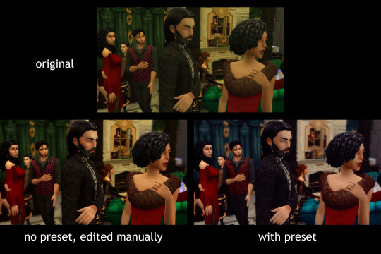
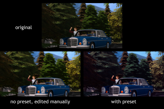
I’m struggling to decide whether or not to apply uniform colour grading across all my TMA screenshots, like other storytelling blogs do (or think an instagram with a colour scheme). I currently just adjust the colours for each screenshot without using any sort of “rule” or presets. This takes. Fucking forever. I tend to gravitate towards “true to life” colours (desaturated shadows, undertones don’t skew towards any particular colour), so I have to edit every screenshot differently. Adopting uniform colour grading would make editing faster for me, but it would potentially sacrifice variety and mood for a consistent colour story. Any editing advice is appreciated, regardless of your opinion about which method I should go with!!
Here’s some comparisons, with a teal and red PS action from a pack that @intramoon recently released. I picked this one just to better highlight the differences, I would probably use something else if I were to actually implement this. Beware, seeing images with vastly different colours side by side affects how our eyes perceive those colours, but it should get my point across.
PLEASE VIEW THIS POST ON YOUR DASH OR ON MOBILE TO ACTUALLY CLICK & SEE THE PICTURES
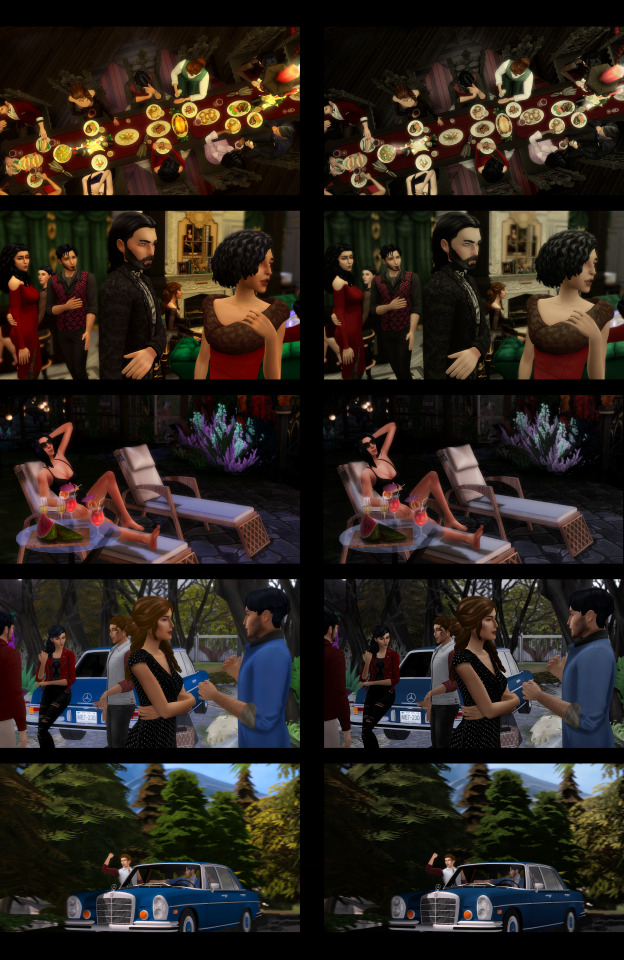
ex 1: In this dinner scene, I originally wanted to create that warm, comfortable atmosphere, but the original was steeped in the green tones for no good reason. It is incredibly difficult to add warmth by bumping up the yellow without intensifying that vomit green. The preset version, however, takes care of all that for me, but, to me, the mood is sacrificed a bit. My problem with presets is that, yes, a very tombstone-like colour story is fitting for a story about vampires, but I like to create a world with more depth than just that. I have lots of scenes like this one where the mood of a family dinner is more important than a vampire aesthetic. I guess my question is, is it worth sacrificing the various different moods I can create, for speed and a consistent colour story?
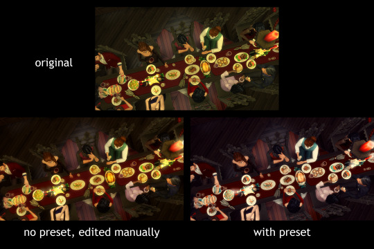
damn how professional does that preset version look though like,,,,,, anyways.
ex 2: Another example where I’m batting that incessant green, but I tried my best. In this particular shot, the tone has shifted from a warm party atmosphere to the arrival of someone unexpected, but to me, neither of the editing tactics convey this properly (one is way too green, the other, too stylized). And unlike in film, where you can gradually change the colour grading to shift the mood, jumping from one colour story in one screenshot to another in the next is very jarring. You can also see here how the preset changes its tone when other colours are present in the original, but can you see the sense of unity/continuity there? The consistency ties into the previous image.
ex 3: The set of images this came from was one of my favourite sets in terms of how I edited them, the freedom of which would be sacrificed if I switched to using presets.
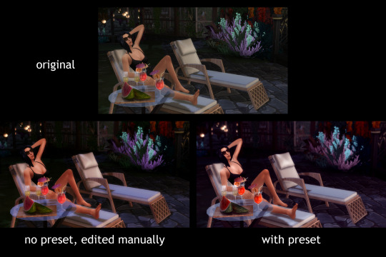
ex 4: now this is to illustrate how the preset may vastly change outdoor, daylight scenes. There are definitely presets that won’t do... that to an image but this was the example with the one I’m using. (I tried a different outdoor daylight scene with this and to save y’all’s eyes I’m not going to use it as an example. All I’m gonna say is it was an eyesore. Already when editing the original I spent ages brightening and fixing the image, and I got a whole slew of new issues with the preset applied to the same shot. Safe to say it can get hairy if you don’t pick the right one.)
These are all the ones I had time to pump out (before I lost my mind) but I have to experiment more before I commit. Honestly the most time consuming part of editing for me is editing in the DOF. Blurring backgrounds is such a nightmare but until I can get a computer that can run reshade to do it for me, I’m on my own. Thus, if using presets can cut down my editing time and make making posts less tedious, I’m seriously considering it. I still have to compensate for light and shadow, as well as the colours in the original images affecting how the preset looks, but I was expecting that.
Anyways, this was mostly to ask if y’all like the look of the reshad-y editing (it wont necessarily be the one I used in these examples) over my current process, and if y’all passionately prefer one over the other. Now I will say, doing this whole post took me damn long as well, but I did have fun seeing what effects I could produce........ even if sometimes it made my eyes bleed.
Complied side by side comparisons under the cut because I don’t want this post to get any longer
Red & Teal from above

Something closer to what I’d actually use for this story:
#in which i accidentally teach part of a colour theory lesson#honestly despite all this work i put in im feeling like my current editing style is just more versatile#its just the damned DOF#highkey wanna cry
6 notes
·
View notes
Text
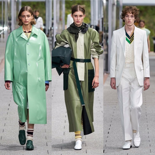
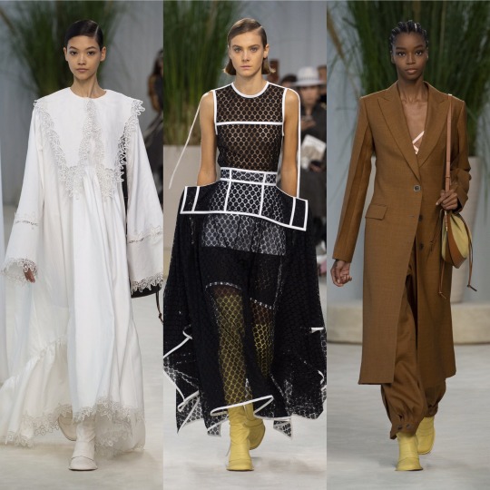
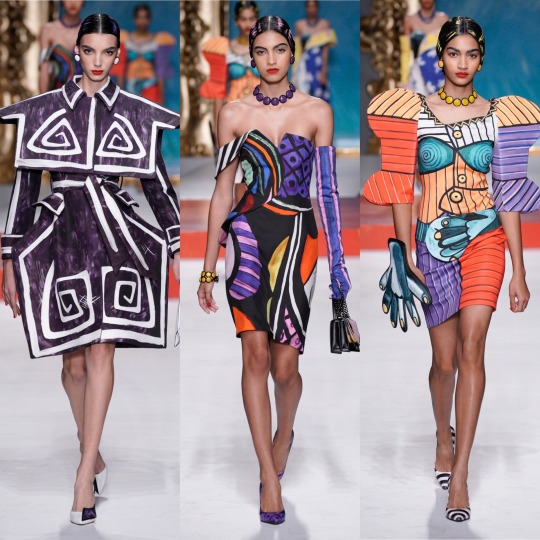
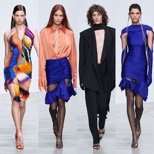
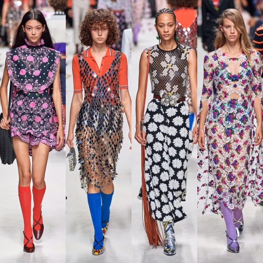
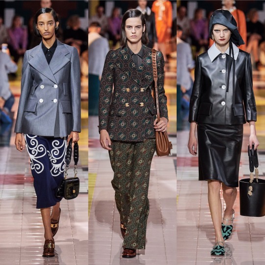
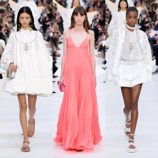
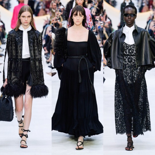
S/S 2020 Fashion Month: A Basic, Uneducated Fashion Heaux’s A-Z of Everything Noteworthy (Part 2/3)
Hi to anyone reading,
Back at it again with the giving my unsolicited opinion on 2020′s spring/summer offering, I’m gonna hop straight into part 2 of my fashion month review!
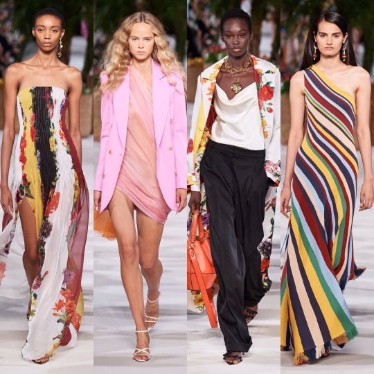
Sorry to start with an underwhelming few but my compulsive tendencies are making it really hard to break out of this alphabetical structure (cry laughs whilst thinking about how long it took me to face up at my retail job last night because it would give me vaguely homicidal urges and make my fingers tingle every time a customer moved something slightly out of line), so I’m gonna whizz through a handful of collections. First up, Halpern:
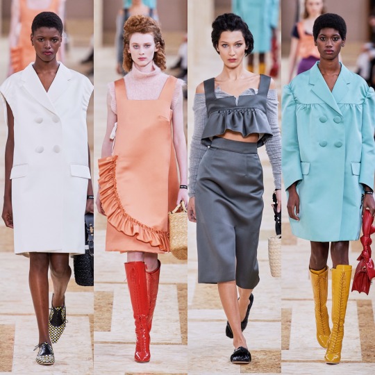
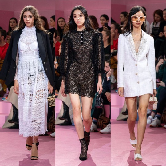
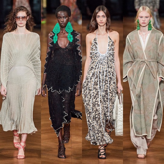
Not much to say but I’m envious of the heavy liner (my hooded eyes could never) and I like the colour scheme. As for the 80s style metallic pink dress?

Helmut Lang:

And Hermes:


Of these 3 collections, Hermes is definitely the most interesting. I like the colour scheme and the utilitarian shapes and the tan coloured jackets are an absolute shoot. This is how you make safari look fresh, D&G take note.


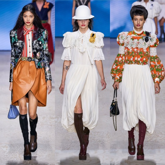
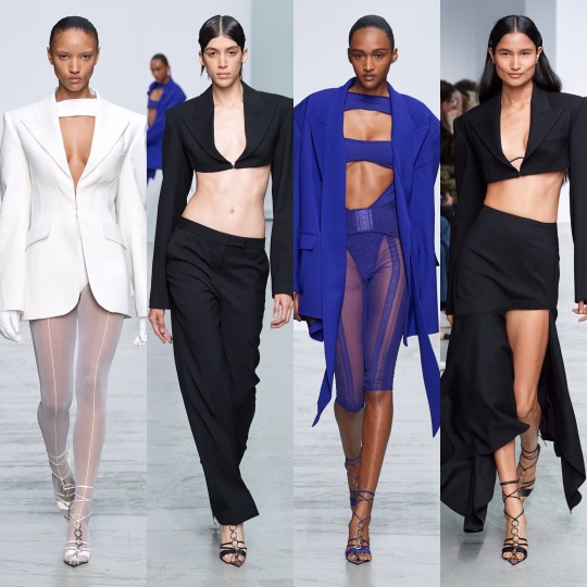
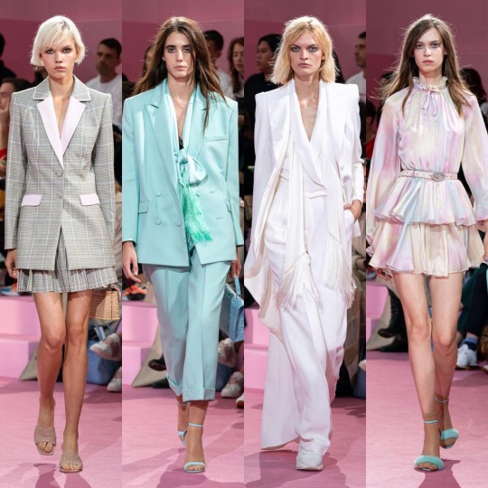
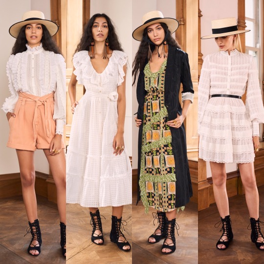
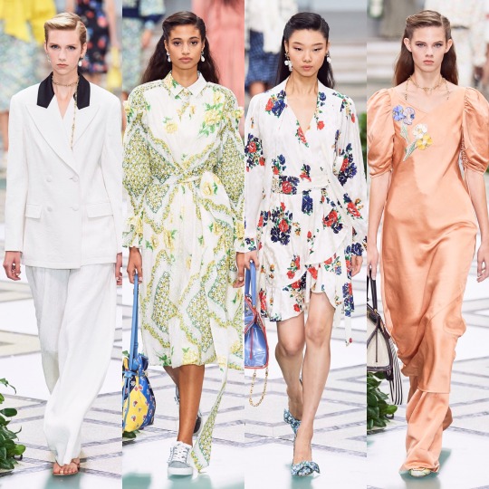
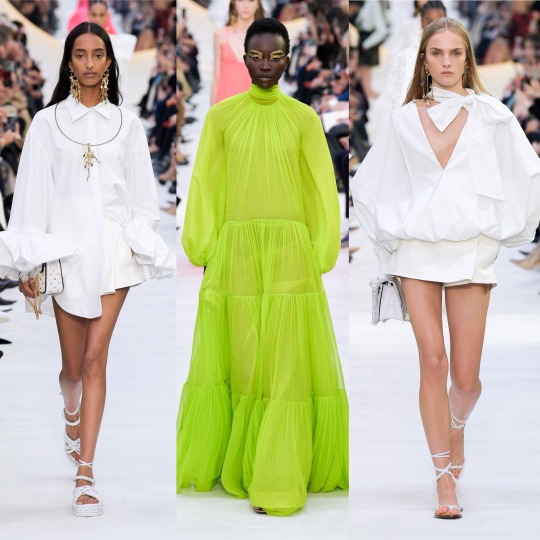
Isabel Marant was okay. It’s cute, sure, reminds me of something Mary-Kate and Ashley would’ve come out with/worn in the 2000s, and there’s definitely some things I would wear, but I wouldn’t say it looks all that luxury. Pricey, sure, but like, Free People pricey, not designer pricey. As a collection, it’s not all that conceptual, unless the concept is L.A girl does a Starbucks run after her bikram yoga class. What I will say though is that some of the S/S 2020 commercial trends are becoming clear: white cheesecloth pieces, peasant blouses, cowboy boots, scrappy sandals, neutral tones, and bandana print.
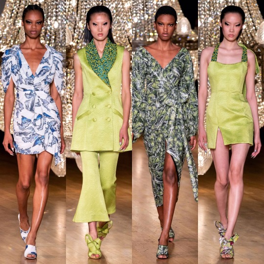
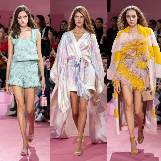
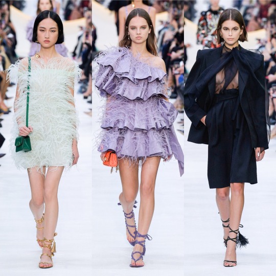
Now onto the darling of high fashion Twitter: Jacquemus.
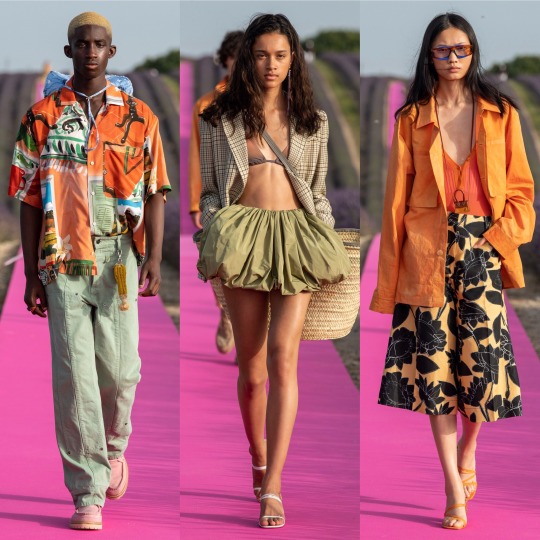

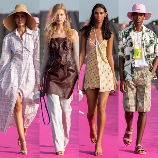
As far as presentation goes, this has to be one of my favourite set-ups of the season; a hot pink runway running through a lavender meadow is as canny and serene as those who sing the praises of Simon Porte Jacquemus would have you expect, and the clothes were easy, breezy and beautiful, even if there is an element of getting dressed in the dark going on with the styling which put me off including a few otherwise gorgeous pieces. It might not be 100% my style but you can tell this is a brand of the future which is only going to go from strength to strength.


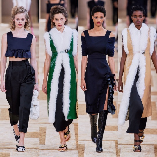
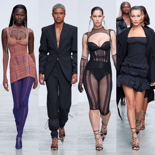
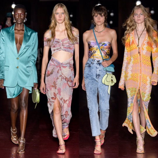
And everything was beautifully and purposefully crafted on the runway with J.W Anderson this year. The pieces are graceful and timeless whilst still easy to envision as something a modern woman would throw on to (very fashionably) run some errands in the city. This was also one of the handful of shows (IIRC! This might be a case of extreme deja-vu!) where we saw the sandal straps tied over the trousers, I’m guessing to accentuate the ankles, and...I’m surprisingly here for it? Though in a sense it kinda resembles when I accidentally get my work trousers tucked into my slipper socks, it’s an interesting touch and adds a bit of a shape to otherwise billowing bottom halves.

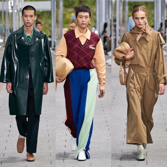
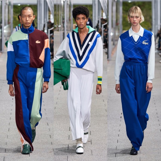

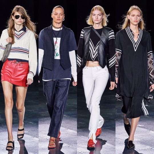
Following Jacquemus’ lead (or vice versa, I’m way too deep into this fashion month haze to work out who went first at this point), Lacoste also put on a co-ed show. Otherwise crisp and preppy as per, the neckerchiefs (even if seeing them all next to one another does give off a bit of a Disneyland Main Street barbershop quartet vibe) and vinyl/wet-look/PVC/I’m still not sure what differentiates the 3 coats were an out of the box touch for them and I really liked it. It’s athleisure, but more like something Hayley Bieber would’ve worn as part of her Princess Diana inspired shoot than anything I’d wear to the gym.
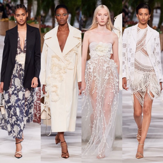
LMAO, as if I go the gym. But you get my point. Next, Loewe:
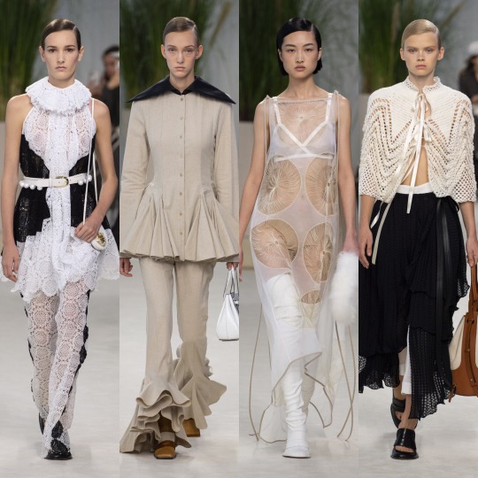
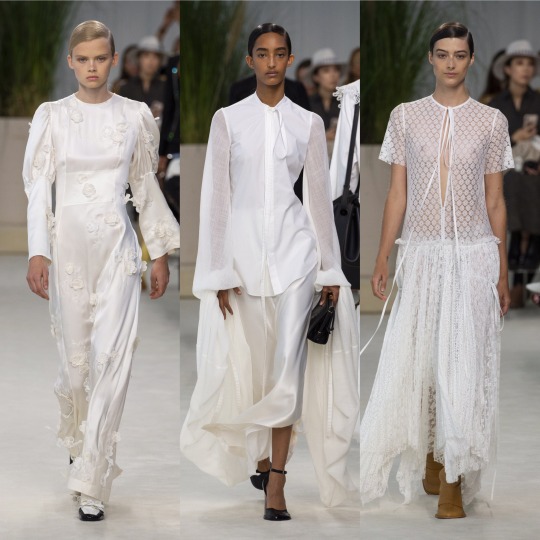

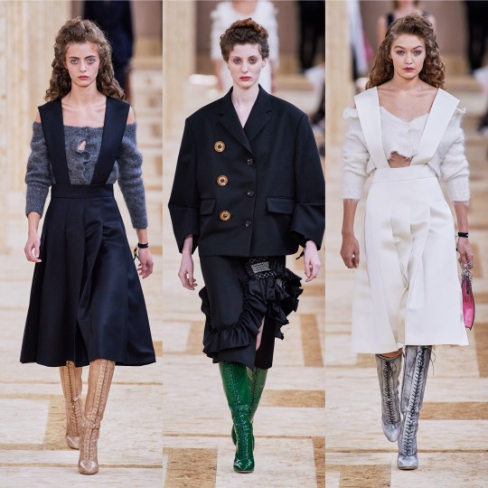
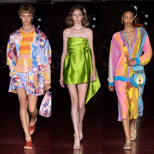
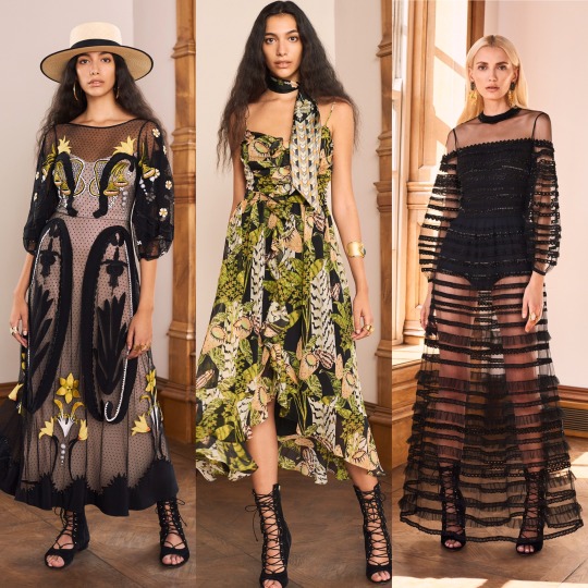
Delicate, feminine and all around delightful, the S/S 2020 Loewe collection is up there with Chloe and Brock when it comes to most spring appropriate. More chiffon, lace and doily-like detailing, please, the old woman in me lives for this kinda thing made fashionable. Like with J.W Anderson, you can tell the design team wanted to do something different without just throwing shit onto their pieces for the sake of being wacky, and so we end up with these dramatic, slightly geometric waistlines and almost angelic Victorian nightgown inspired dresses that kinda make me wished that 1). ghosts existed and that 2). I lived back in that era so I could die some tragic death wearing any one of the dresses on the left in the top 3 rows and then haunt the shit out of everyone. That would really be an iconic fashion moment. Also wonderful, imo, was Louis Vuitton:
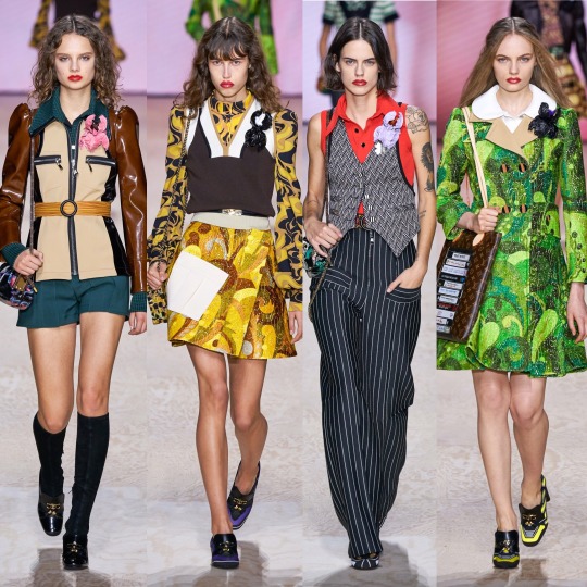
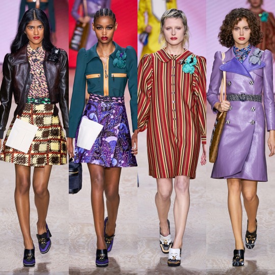


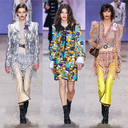
The mix between 60s and Edwardian I never knew I needed, as opposed to Gucci’s forward thinking take on the former decade, Louis Vuitton takes it back even further and throws in late 19th/early 20th century structures and references. I adore the what seems to be a mix between brocade and paisley print and the exaggerated collars are a very cute touch. The jacket on the top left is a highlight, a more neutral version of the similar catsuit seen at the Longchamp show (I couldn’t personally pick enough highlights from that to include it), and I now more than ever really want to try and pull off a sweater vest. The shoes might not be the most exciting thing ever but they’re also a personal favourite, from the knee high boots to the loafers with the LV moniker.


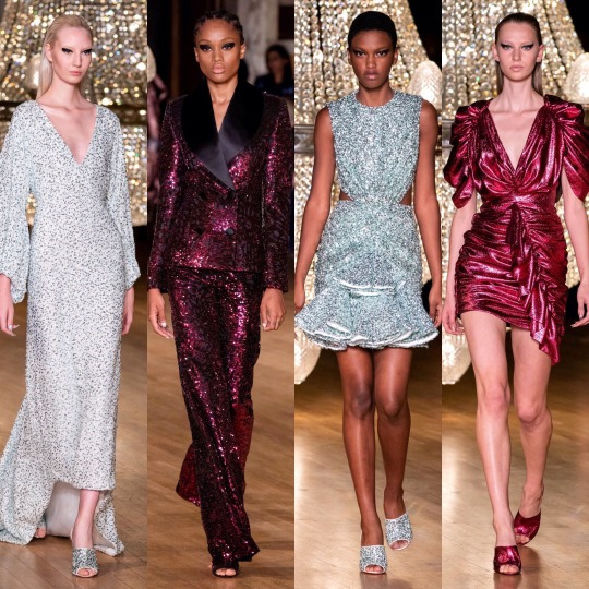
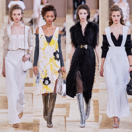
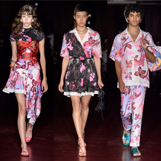
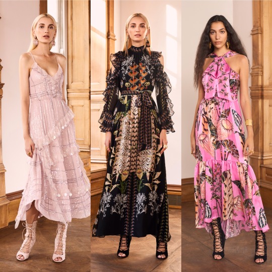
Maison Margiela was very cool and again, I’m in love with the shoes and just the accessories in general, ESPECIALLY those hats. I don’t know if I’m way off base here but this show is almost a modernised, fashionable version of a 1940s period drama about WW2 pilots and evacuees. Yes, maybe I am just getting that solely from the trench coats and the naval influences and the exaggerated collars but I think with that list I made quite a case for that perspective, right? Right.


And completing this holy trinity (appropriating the term I usually reserve for Emma Watson, Emma Stone and Emma Roberts is not without careful consideration) is Marc Jacobs. One of my ultimate favourites of this season, this collection is absolutely EVERYTHING: kitschy, dream-like, whimsical, over-the-top, and totally appropriate for your slightly eccentric aunt who always drinks too much wine and talks a lot of shit every time she comes over for dinner. I really feel like I walked into wonderland looking at this collection, and in the best way possible, it gives me a female Russell Brand in the 2000s’ wardrobe on crack. On the one hand we have these insanely beautiful and ethereal chiffon floral dresses but then we also have fricken top hats. Basically, it’s everything I love about fashion and I don’t know if anything can top it. Periodt (and I type that with a totally straight face).
Next, onto another personal fave, Marchesa:
Which is as always, beautiful. I was going to write that if Disney princesses came to life and lived in the modern world (so, in other words, Elle Fanning), they would be wearing Marchesa and then I remembered that the film Enchanted exists and had a lightbulb moment and thought OH MY GOD IF THEY REMADE THAT IN 2019, THE DRESS ON THE RIGHT IN THE MIDDLE ROW WOULD BE A PERFECT LEVELLING UP OF THE CURTAIN DRESS.
Anyways, favourites of the favourites are the bottom row; I would die for that feather trim.
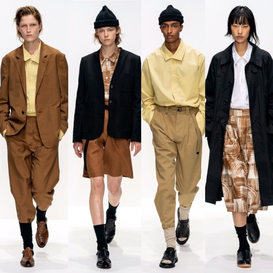

BUT where Marchesa is everything opulent, overly ornate and err-ing on “fussy”, Margaret Howell’s S/S 2020 collection is completely stripped back and just as effective, if not as to my taste. Very cool, very current, and altogether effortless (in a good way!), with this show Margaret Howell made mid-20th century utilitarianism relevant. I never thought I’d be praising the combination of bermuda shorts, crew socks and a beanie and yet here I am. Character development.
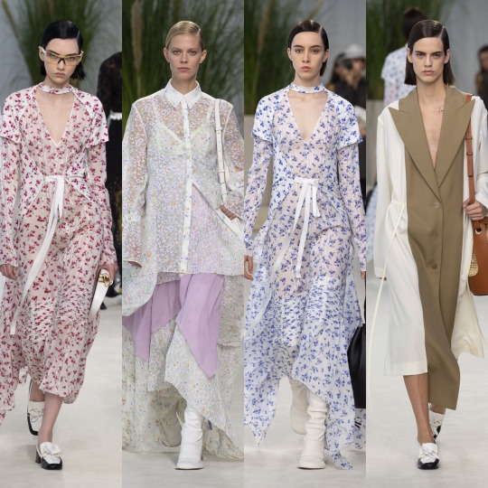
Next is Marine Serre:


Which I really like! The bottom row isn’t really to my personal taste but I can acknowledge that if I saw somebody wearing any one of those outfits I’d think they looked sick, and as for the first two rows, those mesh tops and the slightly chintzy florals are right up my alley.

Marques Almeida put out a really strong collection, imo. The blending of luxurious silhouettes and fabrics with street wear inspired prints and styling is a really interesting and unique contrast and if Billie Eilish ever decided to stop wearing those tweenie clothes and wanted to actually seduce somebody’s dad (I LOVE BILLIE EILISH AND I KNOW WHY SHE DRESSES THE WAY SHE DOES, IT’S A JOKE, PLS DON’T HATE ME), I’d love to see her wearing something like this. It’s a blend of punk, urban, and 2019 e-girl and has the kind of edge that Topshop has lost over the past couple of years that used to make it so aspirational to my 13 year old self. Of all the shows, it also probably has the most personally wearable accessories, and a shit tonne of cool make up looks I’d love to try if it weren’t for my lack of visible eyelid, lol.
Make up looks were a highlight of the Max Mara show too, for me anyway.

I otherwise wasn’t hugely keen on the collection, it being a little too matronly/Miss.Trunchbull-esque for my liking (wild card fashion inspiration of 2019, apparently?). The light paisley print dresses are very dreamy, though, and I can never resist a good suit.


As for Michael Kors, dare I say it, but the basic bitch in me loved it. I know as a designer he’s not held in very high regard by the fashion community and I'm not saying it’s at all original but it did what it set out to do well; I mean, it’s quite fitting that he cameo-d in an episode of Gossip Girl because every outfit would be perfect for the Constance attending incarnation of Blair Waldorf, which is probably why I like the collection. Like yeah, it’s a bit of a Polo Ralph Lauren/Lacoste rip off but it’s daintier and more feminine and so I’m not gonna lie, I’m on board with it.
Next, Miu Miu.


One of the collections I was most excited for, I was a little disappointed. Don’t get me wrong, I really like the collection, but I have never once disliked anything Miu Miu and I usually love it. There are things I love about this line too: the cream, floral lace-up boots, the off-the-shoulder cardigans, the houndstooth oversized coats and of course the fur-lined gilets. My mum used to buy me similar ones when I was a little girl and so they give me childhood nostalgia in the best way possible. I mean, the collection is as girly and eccentric as ever. I think it’s just a little too on the primary school librarian side for me, this time round. Sorry Miu Miu xoxo
Now I’m just gonna speed through a couple, starting with MM6 Maison Margiela, the younger sister to the more expensive regular Maison Margiela line:


And Monique Lhuillier:

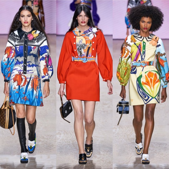
So that I can get to one of my other ultimate favourite collections for S/S 2020: Moschino.

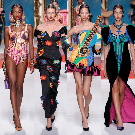
Oh my god, where to even start. Firstly, I might be reaching, but if this show is even remotely to thank for art nouveau mesh tops showing up in the Urban Outfitters new in section, then a very sarcastic thank you to Jeremy Scott. You just made ethical shopping a lot harder. HOW am I supposed to not buy an Alphonse Mucha top? HOW!? I mean, I’m sure I’ll manage (I’m on month 3 without a shopping spree I can’t actually afford now and yes, I am very much patting myself on the back), but HOW!?
But on a serious level, if renaissance was the print of 2019, which I’m still very much into BTW, bring on modern art as its 2020 replacement. The Pablo Picasso inspired show not only livened up a generally pretty predictable fashion month but it’s also got me searching up other times art has met fashion on the runway and thrown me down a particularly aesthetically pleasing wormhole I’m not sure I ever want to escape from (https://frontrowmagazine.ca/art-inspired-looks-were-all-over-the-runways-of-fashion-week-a74e8bc7ff0d and https://www.vogue.com/article/spring-2017-ready-to-wear-fine-arts-trends are good starting points!).
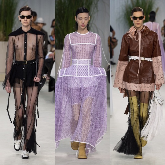
Mugler was also up there with the best of them, imo:

See, if the Moschino collection was all about dabbling in art class, Mugler’s S/S 2020 collection is its more mathematically inclined sister, all about sharp lines and deconstructed silhouettes and symmetry all whilst looking hot as fuck. So very Mugler, basically.
Now, this reference might be slightly off because I haven’t actually SEEN Ex-Machina yet but I imagine if Kim Kardashian were to channel that movie for a costume party she’d end up wearing something from this collection. That sounds like a roast because Kim has worn some questionable outfits but I blame Kanye for most of that and I’m referring to her on a good fashion day, alright!?
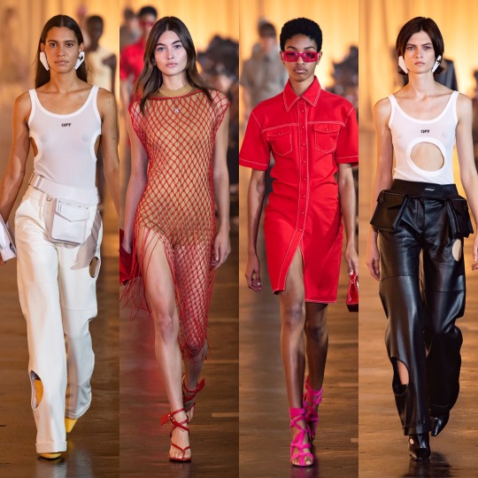

As for Off-White, it’s obviously a lot more commercial than most of the lines I’ve reviewed so far. Like, I can see a lot of these outfits on a mannequin in Urban Outfitters (no, I am not being paid to namedrop them, about 3 people in total read this Tumblr so any kind of sponsorship money would be severely wasted on me). That’s not necessarily a bad thing, and I love all of these looks; it just seems unfair to compare them to the the Mugler or Moschino collections, for example.
The stand outs for me are all on the bottom row: I would buy the utility vest, leather blazer and the all mesh turtleneck under washed-out tie-dye on the spot if I saw them in a high street store. Unfortunately, I feel like that’s kinda where they belong. You just expect collections to be a bit more conceptual, and this one is a little watered down, as much as it’s my style.


Oscar de la Renta was beautiful, of course. Not like I’m shook by how beautiful it is but kinda just what you’d expect from a brand with a name as poetic and fun to say as Oscar de la Renta. The silhouettes are dreamy and the details are as fit for a fairy princess (lmao) as ever. Plus can I just say how happy I am to see butterflies on dresses for adult women again!? And dresses worn by Blanca Padilla nonetheless!? Very here for it.
Next up is another on one of my fashion month highlights: Paco Rabanne.


LOOK AT THIS SHIT!
I mean, don’t get me wrong, something about this collection (I’m pretty sure it’s the knee high coloured socks) is giving me primary school teacher vibes, but I'm not mad about it. It’d be the kind of teacher who’s actually really good at their job and has loads of cool hobbies and a really hot boyfriend or girlfriend or wife or husband who you secretly want to be then you grow up/and or have a huge crush on.
Like with Marc Jacobs, there’s obvious flower child elements here, and whilst on the whole the former took my breath away slightly more, this is a lot more wearable. My favourites are the paisley print dress and cape on the left in the very bottom row and all the chainmail pieces (which remind me of the dress Naomi Smalls wore in that whole club ninety-sixxxxx skit on drag race), plus that floral cut out dress with the trailing flute sleeves, which is absolute PERFECTION.

The 70s influence was clear in Peter Pilotto’s S/S 2020 collection too from the abundance of tie-dye to the knit v-neck dress, zany colour and print being the very on-brand focus. That being said, this is definitely more of a street-style inspired collection than usual and whilst the floral suits and dresses on the 3rd row down are very typical Peter Pilotto, the tie-dye corset and combat trousers on the far right, second row from the bottom, are very Jaded London. As for the reoccurrence of the bucket hat, I’ve remained steadfastly against them for several years now (even when our Lord and Saviour Miss Robyn Rihanna Fenty started wearing them) but the way they’re done in this collection even I could definitely get behind; all in all, the show surpassed my expectations.
The same goes for Ports 1961, which was a lot more eccentric than I gathered is the norm from a few google searches. Honestly, I hadn’t really heard of the brand which, upon reading up on it, I feel very dumb for considering it has been around since (in the shock twist of the century) 1961.

Yes, I know how that sounds! But forgive me, I’m still learning:)
Anyway, the fishnet detailing alone pretty much sold the looks I picked out. Seriously, I got a pair of those bloody tights, like, 2 years ago when they became a thing again and now any outfit where I have my legs out feels incomplete without them.
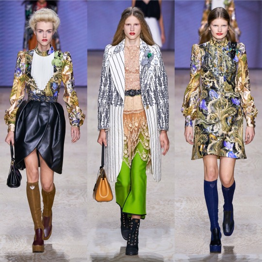
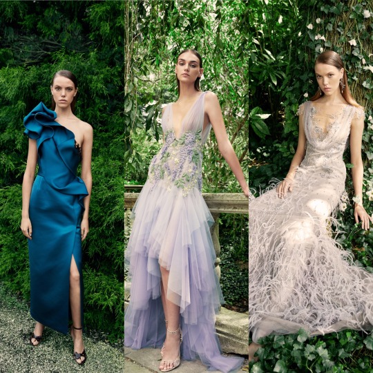
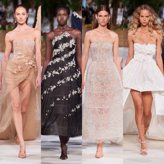
Next is Prabal Gurung, which, as far as presentation goes, was fucking STUNNING:


I mean, you could say that I’m easily impressed and that the presence of the bouquets won me over (and you’d definitely have a point there), but it’s also this year’s Givenchy haute couture-esque feathers, the trailing pearl necklaces, the exaggerated shoulders, the dreamy colouring, the everything looking like it could’ve grown off a very fashionably-inclined tree. Like, there’s a lot to love here, from the naturalistic elements, to the context behind the show, an ode to American fashion history and those cast out of it (and the notion of “being American” in general) for so long.
Going from a high to a (personal) low, however, next we have Prada:

I don’t know, I get that it’s supposed to be simple and stripped back and dignified and whatever and I like the looks I picked but it’s just a bit blah for me. The bonnets that kept cropping up just didn’t do it for me and almost ruined what is an otherwise nice skirt suit (top right). Nonetheless, I like the silhouette of the sheer black dress and the the brocade print suit is really luxurious looking, even if the pattern is a *little* Wetherspoons carpet.
Anyways, here’s a quick overview of Rag and Bone:
So that I can stop moaning and get onto a collection I REALLY liked:


I am of course talking about Ralph and Russo. See, this is kinda what I expected from, like, Chanel and yet it’s Ralph and Russo that delivered. Also, it gives me Alessandra Rich vibes which is very much a compliment considering how much I love her designs. I mean, if Valley of the Dolls were to get another film remake in 2019, this is exactly what I’d like to see the female leads wearing, from the pastel suits to the satin kaftan style dresses. The yellow feather trimmed dress is practically a copy of something Marchesa has already done but it’s cute all the same. In my top 10 collections of the season, for sure.

Rick Owens was another strong collection; it goes without saying that it’s not the most wearable but that’s not really what Rick Owens is known for, so I wouldn’t expect anything else. If you want fashion on an alien planet, or something Lady Gaga would’ve worn in 2010, he's your man.
Next, Rodarte:
Obviously the dresses are beautiful and the set is magnificent, BUT...I’m really not a fan of the whole celebrities filling in for high fashion models thing. I like Lili Reinhart and I adore Kirsten Dunst, she’s been in a load of my favourite films, but in a similar vein to Dolce and Gabbana’s influencer show, it’s just distracting from the actual garments, if even worse because I don’t WANT to be distracted here (the same can’t be said for the D&G show, lol). If anybody has read this far, let me know your thoughts!


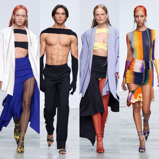
Roland Mouret was nice, and I always like a coed show, especially when a designer isn’t afraid to blur the lines of masculine and feminine. It’s fresh, lightweight and luxurious looking, Cannes film festival street style eat your heart out, and I love the colour palette.
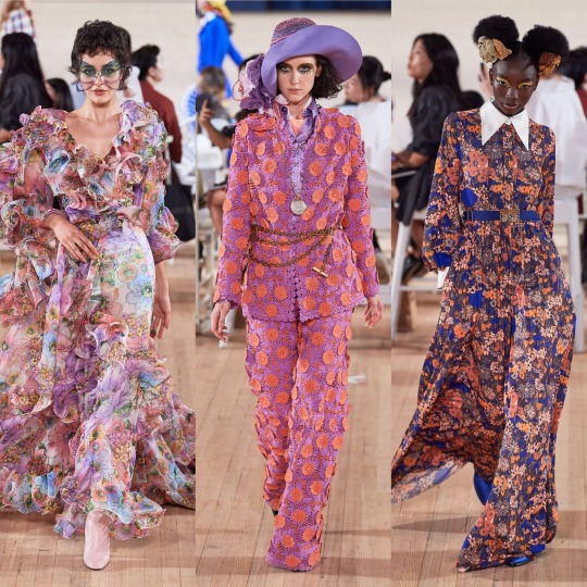
Similarly, colour was my favourite thing about Sally LaPointe’s S/S 2020 collection.

I would never think that teal and burnt orange would work together, let alone in some kind of faux leather, and yet here we are. Orange is in itself always an interesting colour choice, perfect for the summer with a tan, and I really love monochrome outfits, even though they’re something that ends up being quite pricey to put together; slight differences in tone are okay but if you just randomly throw together a few things and they’re too off, it really doesn’t work and you’d have been better off wearing contrasting colours. For that reason, I’m just gonna admire that all-pink outfit from a distance.


As for Schiaparelli, it’s one I always look forwards to for the sheer weirdness. RTW isn’t quite as kooky as haute couture but still, the interesting choices are still there; what at first glance appears to be flame print is actually coils of hair, and paired with a water print suit is a sequinned jacket emblazoned with a paradisiacal mirage. Ornament-like facial decorations as seen in the over-exaggerated glasses worn with the pony hair suit are also one of my favourite new things to happen in the high fashion scene in the past couple of months and I can’t wait to see how they get watered down to become more approachable for us...regular, non-structurally blessed folks who can’t pull off anything and everything.
Simone Rocha was STUNNING. Romantic and ethereal, it’s druid goddess crossed with upper class Victorian woman of leisure, equal parts delicate and grungy, like a modern, fashion version of Lady Gaga’s Scathach in the Roanoke season of American Horror Story. You know, in the flashbacks, not in present day when she was all gross and like...scalping people and shit. Each dress is so ornate and has such an interesting structure, and the fabric choices give off an organic kinda vibe that create a handmade feel; the collection is, imo, really worthy of being shown under a haute couture heading. When it comes to my favourite element of the show, I’m torn between the petticoats and the hair accessories. I’m just gonna give a cop-out answer and say both.
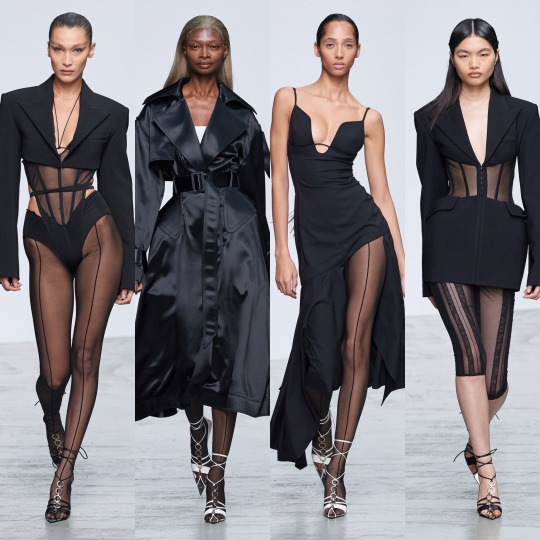
Stella McCartney on the other hand, is very much a clear ready-to-wear collection.


It’s pretty, for sure. The pastel blazers paired with delicate white mesh tops underneath are a gorgeous combination for spring and I like the reoccurrence of the chain glasses (Gucci, right?). But I mean, when you go from Simone Rocha to this, it’s a bit anticlimactic. Plus, if I’m honest, kaftans are always going to remind me of Honey Mahogany from season 5 of Drag Race. Don’t get me wrong, I’m sure she’s a lovely person but her runway looks aren’t really ones I look back fondly on, and you’re lying if you say you enjoyed them for anything other than meme purposes.
Temperley is equally meh, though the return of the Erdem-style boating hats is getting me excited that high street retailers might actually pick up on the trend and bring out some cheap ones for me to embarrass myself by wearing.

I also love a good 70s suit, the neckerchiefs are cute and there are some really delightful prints here that are a more unique approach to florals for spring.

Coming towards the end now, next is Thom Browne:


I LOVE this. Like, don’t get me wrong Rick Owens was cool but I adore how on the nose the concept is here; time to bring back all the Marie Antoinette puns I didn’t get to use in my Versailles Instagram post. I don’t know if it’s the history buff in me or the Sofia Coppola Stan but I will always be willing to sign any kind of treaty for anything related to the excesses of the 18th century French monarchy, and this is that turned up to 1000 infused with a dash of the Teletubbies, which sounds like a nightmarish concept, I know, but as high fashion it WORKS.

Tory Burch was very commercial, seemingly half inspired by Monterey yoga moms and the other half by Hamptons socialites.


And then there was Valentino, which was fucking exquisite, imo. LIKE, CALLING DOCLE & GABBANA: THIS IS HOW YOU MAKE TROPICAL PRINT INTERESTING. YOU MAKE THE VELVET MONKEY’S ARM THE FRICKEN WAISTBAND.
Seriously, though, I am enamoured with this colour palette; all the whites and golds are angelic and fr, I didn’t know until now that you could make neons this elegant. I’m also getting an almost clerical feel from a lot of these looks, with the plaited waistband on the black dress that’s 7th row down in the middle, the stunning red cape and the multitude of exaggerated neck ruffs. I think I’ve mentioned before but I always love religious references in clothing-I don’t think I’ll ever get over the 2018 Met Gala-and so whether I’m reading too much into it or not, this collection really did it for me.


Whilst it’s probably as far removed a collection from Valentino’s S/S 2020 contribution you can get, I also loved Vera Wang this season. It might purely (I PROMISE THIS IS MY LAST GOSSIP GIRL REFERENCE) be because it gives me Jenny Humphrey vibes and *controversial* she did have my favourite style of any of the main characters, but sue me, this is just the right amount of late 90s/early 2000s grunge. Deconstructed trashy goth it girl is an interesting concept to see on the runway and I completely support it.

Versace on the other hand was very hit or miss. The looks I picked out I really loved but ultimately, for one of the household name brands, a lot of the actual garments were a bit pedestrian. I will say though that for me, it’s a case of the whole being greater than the sum of its parts. The slicked back mermaid hair and the pops of colour in the makeup and the interesting necklines meant that when it was good, it was GOOD. However, overall, still a bit too 80s Miami businesswoman, and please GOD, can we leave that hideous J-Lo dress in the past, it should really not be the climax of the show in 20-fucking-19!


As for Victoria Beckham, I liked it, but it’s a bit of a Gucci copy, no? And no way near as interesting?
And on that note, I’m gonna have to cut this off. Super annoying but with only 5 collections left that I want to talk about, Tumblr is being a little bitch and will not let me add anything more to this post. So, see you in 5 for the final post!
Lauren x
#valentino#ss20#fashionmonth#nyfw#pfw#lfw#mfw#versace#rickowens#rick owens#simone rocha#schiaparelli#moschino#mugler#style#fashion#runway#details#trend#ralph&russo#off-white#oscar de la renta
12 notes
·
View notes
Note
I MAY BE TO SCARED TO INTERACT BEYOND ANONYMOUSLY BUT I WOULD VERY MUCH LIKE YOUR ASOUE EPISODE RANKINGS
Mmk It’s gonna be long tho so it’s going under a cut
Penultimate Peril Part 1
very accurate to the books! any changes made sense within the context of the show and worked
gorgeous aesthetics, strongest opening of any episode aside from Bad Beginning
only minus points because of Sporty Kit but she’s in it so little and the rest of it is so good that it doesn’t even matter
Max Greenfield as the Denouements was phenomenal
I actually liked the part where they try to make us think Kit was shacking up with Ernest, it was clever
Also I actually like the green uniform, I think it’s a more flattering colour on the actors than red would have been
Dewey’s death scene was amazingly shot and acted
I would die for Sunny in her toddler uniform. That being said in this episode if you look closely you can in fact see the light from the ipad they used to get her to look in the right direction
Reptile Room Part 1
Once again, gorgeous aesthetics and incredible book accuracy
Minus points for the spyglass subplot
Higher than part 2 because of Aasif Mandvi’s wonderful portrayal of Monty
I love the conservatory reptile room
Reptile Room Part 2
Very book accurate and entertaining
This is the episode where Violet’s outfits begin to slap
Minus points because with Monty’s death they made the colour grading less bright which makes sense but is less fun to look at
Also not a fan of how comedic and bafoonish the troupe is, it’s really more of an overall problem but it really just undermines how impactful Monty’s death is
Bad Beginning Part 2
Let’s be real, the Bad Beginning episodes were the most book accurate of the whole show
Loved the entire Marvelous Marriage bit, the play and marriage were done spectacularly
Lots of Jewish references, we stan
I actually like Jacquelyn’s presence in the first season, it works and adds a new element to the story
I also like Gustav being a major part of this episode because we never saw him in the original books and it’s nice to see his character before he dies (also symbolism with his death and Dewey’s)
Hostile Hospital Part 2
Do I even need to explain why this is so high on the list?
Higher than the first part because of the absolute horror of the whole operating theatre, it’s done so well
The aesthetics and filming work perfectly to underline the horror of everything
Only so low because I personally am not a fan of horror aesthetics
Bad Beginning Part 1
Once again, Bad Beginning episodes were the most book accurate and I love Jacquelyn
Strongest opening of any episode aside from Pentultimate 1
Only so low because of the cheesy CGI and NPH’s comedic Olaf
Hostile Hospital Part 1
ESME IN THE LIBRARY OF RECORDS HOLY FUCK
Low because aside from Esme being fucking fabulous in that scene I found the rest of the episode to be a bit boring at times
However, very accurate to the books and the chase scene in Last Chance was sufficiently freaky, as was the scaring Babs scene
For that matter, absolutely loved that we got to see Babs
Penultimate Peril Part 2
The Baudelaires in the trial scene made me🥺
The scene with Justice Strauss and Olaf with the kids was amazing
The ending made me cry
So low because of the opera scene, like how many issues did that have? It was pretty though
Also low for confirming Justice Strauss to have survived the fire, we don’t like getting answers to our questions
AND ANOTHER THING Esme’s ending was really lackluster? To the point of just being shitty? Especially given that while she is comedic, Lucy Punch hasn’t played up the comedy aspect of her character as much as NPH has, so Esme feels scarier and like more of a villain at this point so giving her that ending really fell flat
A very strong ending that really should have been the ending to the whole story
Grim Grotto Part 2
Grim Grotto was brought so low because of the absence of Widdershins but at least with part two you can pretend the first part had him and he left like in the books
Ansolutely in love with the submarines and Esme’s dress
Grim Grotto was one of my favorite books of the series as a kid so naturally it’s gonna be pretty high on the list
Also I think K Todd Freeman brings a needed likeability to Mr Poe, so when th Baudelaires are on Briny Beach again you do get the feeling they’re torn between going with him or Kit. Like they distrust and dislike him at this point but they don’t want to distrust him
Slippery Slope Part 2
The sinister duo are fab
Sunny is at her cutest in this episode, we’re talking peak cute
It’s pretty low because there’s a lot of stuff in the headquarters with Quigley that got cut, didn’t really make much of a difference but I missed it
I feel like Esme in the headquarters had so much potential to be as freaky as her Library of Records scene and it just fell short
Ersatz Elevator Part 2
Minus points for the VFD subplot but part 2 had less of that which is why it’s higher
Also in the ranking of Sunny being the cutest, this episode comes in at a close second to Slippery Slope
That being said overall I really adored the aesthetics of both episodes, absolutely love the mix of film noir and art deco
Jerome at the In Auction was amazing but Larry, Jacquelyn, Olivia, and Jacques was less so
Also still not a fan of the writing of the Quagmires
Ersatz Elevator Part 1
Once again, adore the aesthetics
Love the casting for the Squalors
Gunther’s disguise was *chef’s kiss*
so low because of the VFD subplot and the gratuitous musical number
That being said I did like the cuts between Keep Chasing Your Schemes and the Baudelaires finding the Quagmires, it worked well
Grim Grotto Part 1
Very low because of the absence of Widdershins and what this did to Fiona’s character
In general the way they wrote Fiona’s character was even less sympathetic than the books
Why, dear god, oh why was Quigley at Anwhistle Aquatics
Why, dear god, oh why does the Medusoid Mycelium look like that
Carnivorous Carnival Part 1
This was in fact my all time favorite book in the series as a kid and I just remember being a little disappointed I guess? By the episodes and I could never put my finger on why
Olivia’s character 😒
Higher than the second episode because I do love the creepy carnival feel and the feeling of unease before the Baudelaires know who Madame Lulu is
Also Esme’s gold outfit
As far as gratuitous musical numbers go, I do enjoy House of Freaks
Carnivorous Carnival Part 2
Cool carnival aesthetics
Chabo the wolf baby is adorable
Olivia’s death was more impactful and upsetting than Jacques’s, I’m just gonna say it
We miss a morally gray neutral character who is more interesting than a copy pasted Jacquelyn/Mrs Quagmire
Wide Window Part 2
This is really only so low because the colour grading is still kinda dull and it works within the episode but also makes it boring to look at
That being said the whole Hurricane Herman scene was phenomenal
rEaL eStAtE aGeNtS
The Colours in this episode were pretty, with the Lavender Lighthouse and the raincoats
Violet’s outfits remain slapping
The change to Josephine’s character is a good change (until season two when they do that to every single other character and take away any and all moral ambiguity but still)
Slippery Slope Part 1
we weRNT EXPELLED
I did love the Mortmain Mountains set
so low for the killing of the freaks, Sporty Kit, and for the heavy handed way they got rid of Jacquelyn
Wide Window Part 1
Boring and dull
Only this high because of Violet’s poppin outfits, the beautiful set, and Alfre Woodard as Josephine
Also the Captain Sham disguise is my favorite after Gunther
Austere Academy Part 2
The only reason part two is so high is because it has more Carmelita
who is the only good bit of these episodes
Like they’re both relatively book accurate, especially with the casting but like
I did not think it possible to make the Quagmires in this book more boring and yet
I get that it’s supposed to be dark and gloomy and depressing but it shouldn’t be so much that people just don’t want to watch it
Sunny running after the Quagmires in her little uniform does put this episode at like number 5 in her cuteness ranking though so points for that
Miserable Mill Part 2
While I miss the sword fight, I do understand why it was changed so I can accept it
Part 2 is higher because of Georgina’s slappin purple pantsuit
As far as MM goes I did actually like it but it still is kinda boring in comparison to the rest of the episodes
But I did like the mill scenes and Sir
Also a really strong ending that sets up season two nicely
Miserable Mill Part 1
See above
A little lower that Part 2 because of more Quagmire scenes
I actually liked the Quagmire scenes in season one and how it was handled but less so in this episode? Maybe it was the cheesy effects with the fighting
Also CGI Sunny. Her least cute episode
Vile Village Part 2
Vile Village was definitely one of my favorite books and I was so disappointed by the episodes
While I liked the western aesthetic, I don’t think it felt right with the feel of the book
Also crow nazis
Now that Jacques is dead there’s no bad VFD subplot so that’s why it’s higher than part 1
I really like how they handled Sunny not being able to take her first steps because she’s too old now. This is also definitely a good episode for the Sunny Being Cute scale
Vile Village Part 1
I really think the only thing this episode has going for it is the costumes, specifically Violet and Sunny’s
the watercolor dress, flannel, overalls, jesse hat, tricolor dress? fashion legends
disappointing, kinda boring, bland to look at, horrible VFD subplot, D+V???, bad CGI
however cute donkey
also a fan of Esme’s accent, idk what it’s supposed to be but it made my russian friend laugh
Austere Academy Part 1
Same as the first part however less Carmelita and Larry and Jacquelyn are at their most useless
Just the least entertaining episode overall
The End
honestly do I even need to explain this
I get what they were going for with the pink sheep and I quite like the tents but the pink robes were not flattering on anyone
Kit. Sugar. why is she in a white dress? when did she have time to change? overt christian symbolism after 14 episodes of Jewishness. Ishmael founded VFD. Ishmael can walk
The bad CGI. I haven’t seen CGI this bad since season one
The arboretum was disappointing and didn’t give the feel of years worth of buildup and it didn’t feel like the Baudelaires could live off of this stuff
That being said I loved chapter fourteen and BL
#asoue#a series of unfortunate events#asoue netflix#asoue thoughts#i would love to hear other peoples opinions on this
2 notes
·
View notes
Text
YOZORA RP PLOTTING CHEAT-SHEET!

Want new-and-exciting plots for your character? Long to reach out to more of your followers, but don’t know where to start? Fear not! Fill out this form and give your RP partners both present and future all the of juicy jumping off points they need to help you get your characters acquainted.
Be sure to tag the players whose characters YOU want more cues to interact with, and repost, don’t reblog! Feel free to add or remove sections as you see fit. Template here.
tagged by: stolen from rosaguard because this is a hecking good meme
tagging: anyone who wants to !
OOC info!
Mun name: Fallacy !
OOC contact: Feel free to DM me via Tumblr, or Discord if you have it !
who the heck is my muse anyway?
Yozora is the main protagonist of the fictional video game ‘Verum Rex’, as seen in the Toy Box world of Kingdom Hearts 3. He then made his debut in the Kingdom Hearts 3 secret ending, named after Yozora himself, as a canon character in the KH universe. We have seen all but two minutes of Yozora, and he currently does not have any speaking lines: thus this blog is solely built on my own headcanons and meta, including the universe in which he resides, Replica Earth. You can read more about Yozora’s world here.
Born into poverty, Yozora had a bleak upbringing. In a bid to earn more coin, Yozora was sold off by his mother to a medical research group: who strived to ‘improve humanity’. This medical research group, was in fact, the robotics consortium known as Gigas Corporation: the company known for producing the Gigas robots that helped to construct Replica Earth. Under the covert trial ‘Project Night Sky’, the young Yozora was subject to gruesome experimentation... An operation that replaced his human heart, with the heart of a Gigas unit: an astral core, that harnessed the power of the stars. He was one of many children to undergo the procedure... and the only one to survive.
A success to the scheme, Yozora was hailed the ‘Verum Rex’ (True King) of humanity: and was prophesied by Gigas Corporation to lead humanity to a new age. After discovering that Gigas Corp were murdering ‘lesser humans’-- those who could not sustain the power of the stars-- Yozora severed his ties. He fled the corporation, along with his two best friends, and the ‘Verum Regina’ whom was intended to rule beside him. His victory, however, was short lived: his queen was recaptured, and Gigas Corp were swiftly moving towards their next goal. Project Night Sky Phase 2. Declaring war against Gigas Corporation, Yozora vows to put an end to their tyranny, and to free the victims of their reign.
Whether it be a side effect of the experimentation all those years ago, Yozora had recently begun to see the ‘Watchmen of Fate’-- ghostly spectres haunt his form-- along with the true identity of his home realm. Replica Earth was in fact a netherrealm: the graveyard of worlds, where lost souls would find solace... until their reincarnation. It would appear that Gigas Corp had discovered the truth of their world, and had ‘created’ Yozora in an effort to achieve immortality and divine rule over the multiverse. Yozora was more than just a king... he was the god of death. Whilst he had abandoned his regal title, it was only after discovering the volatility of the multiverse, that Yozora decides to save it. To maintain the order of the universe, Yozora must uphold the cycle of reincarnation. Reaping souls... and leading them towards the light.
things you should know:
Yozora is NOT the Master of Masters, Sora, Riku, Noctis or a fusion of any of these characters. A popular fan theory claims that Yozora is a future version of Sora/Riku/MoM, or is the Nobody of Noctis, but that is not the case here. He is his own entity.
My portrayal of Yozora is not exclusive to the Kingdom Hearts universe. Many make the assumption that Yozora is heavily tied to the Kingdom Hearts universe, but that’s not the case! Yozora’s kingdom is the ‘underworld’ of all worlds and universes: where all souls find purgatory before moving onto their next life. Yozora is extremely crossover friendly.
what he’s been up to:
Main verse: From human, to cyborg, to king... Yozora had only recently acknowledged his wider role in the universe as the god of death. He is still learning about his divine purpose, and how Gigas Corporation are contributing to the destruction of the multiverse. Amid the ongoing war with Gigas Corporation, Yozora works in the shadows to uncover the truth of the universe before Gigas Corp.
where to find him:
Tokyo, Replica Earth: One of the thirteen Arks of the Replica Earth space colony, this is Yozora’s home. Replica Tokyo also functions as the ‘Realm of Lost Souls’: where the deceased from other universes are brought to rest. A fugitive of Gigas Corporation, Yozora has multiple bases: one being the city’s ‘Underground’: a network of black markets nestled within Replica Earth’s subway system.
Literally any realm: With the ability to cross dimensions, thanks to his astral crossbow, Yozora occasionally traverses up the celestial ladder in search of answers. However, the distance he can travel away from his home realm is limited, for he is tethered to the starlight harnessed directly from Replica Earth (and more specifically, the Verum Regina that remains in Gigas Corporation’s captivity). Should Yozora find a sustainable substitute-- a mortal with a strong hold of their fate (and thus, an affinity to the stars)-- Yozora will be able to forego returning to his home realm.
current plans:
Take down Gigas Corporation: Yozora aims to put an end to Gigas Corporation’s tyranny. Through taking down Gigas Corp, Yozora will save all the new victims of Project Night Sky Phase 2, as well as rescue his significant other.
Find the truth of the universe / his existence: Serving as the King of Death, Yozora traverses the multiverse reaping souls and sustaining the natural order of the cosmos. All in all, he is still trying to understand his purpose, and the intentions of the ‘Watchmen of Fate’ that haunt him.
desired interactions:
Verum Rex muses / muses with Verum Rex verses! As much as I loved building Yozora’s world, it’s twice as fun to build it with other roleplayers! Whether it be ‘canon’ Verum Rex muses, or existing muses with Verum Rex verses, I would love to involve you all in the little universe I’ve created for Yozora~ ;v;
Partners in crime: the Reapers of the galaxy! Yozora has largely been working alone in guiding lost souls to his home realm... it would be amazing if he could recruit a whole team of reapers to help him sustain universal order. This is by no means a sinister role (though if your muses prefer violent death, Yozora won’t judge!) It would be similar in function to a roadtrip au, where the Reapers travel with Yozora and engage in all sorts of shenanigans. With Yozora being the king, the Reapers would also become his ‘knights’... and I hoping to build a ‘Knights of the Round Table’ with those that agree to help him ;v;
+ many more interactions! this section will be updated over time, the more interactions I think of !
things that bother me:
Yozora being perceived as looking like Sora. I can accept Yozora being mistaken for Riku and Noctis... but not Sora. They are different heights, ages, and have completely different hairstyles/hair colours. That’s one piece of canon that I strongly reject. If it happens in a thread, Yozora will ignore it.
Yozora being assumed to be Sora/Riku or their son. Thankfully it hasn’t happened yet, but please do not approach Yozora as if he’s Sora, Riku, their fusion, or their son. I can accept that he looks like Riku, but Yozora is his own entity.
#⚔️ *:・゚✧┆a heart’s relapse. ❪ queue ❫#⚔️ *:・゚✧┆realities wrought from an iron cast mind. ❪ plots ❫#⚔️ *:・゚✧┆anime edgelords… my ultimate weakness… ❪ ooc ❫
7 notes
·
View notes
Text
It had been a few weeks since Gwilym had let slip about your marriage to everyone and the guys would not stop going on about it, especially Joe. The press tour was continuing in America this time and after a long flight with Joe going on about seeing all of the wedding photographs as soon as possible, you were more than ready for a soft bed to collapse on. You fall face first onto the plump duvet as soon as you enter the room and you hear Gwilym chuckle to himself behind you as he shuts the door, watching the bed bounce a little as the mattress adjusts to you.
“You alright there?” he asks as he throws the hotel key onto the side with a loud clatter.
“Fine,” you mumble into the sheet, “just tired.”
“Too tired for a little fun?” Gwil asks as he lays down next to you and walks two fingers up your spine temptingly. You turn your head to face him as a smile creeps across your lips and when you meet his eyes he takes his bottom lip between his teeth as if to coax you into making the next move.
“Hmm,” you hum, “what are you thinking about?”
He releases his lip and you watch the blood rush back to the small indent of where his top teeth sat on the pink cushion, then he licks his lips slowly as he studies your gaze that follow the path of his tongue.
“I’m thinking about the last time we were in a hotel room like this...” he trails off as he waits for a hint of recognition in your face as to what he was referring to, and when he sees your eyes light up he can’t help but grin smugly, “you know how much I loved watching you ride my thigh like that. Spreading your slickness up and down my leg made me so hard.”
“Is your cock getting stiff just thinking about it?” you whisper as your eyes travel down to his trousers to see the fabric straining already.
“What do you think?” he smirks.
“Let me take care of you then, my love,” you say as you lift yourself up and start to undo his trousers. Four loud knocks sound out on your door just as you’re about to set him free and he shakes his head vigorously as he places his index finger up to his lips for you stay quiet. He’d been thinking about this since you were on the plane and had stepped over his legs to get to the toilet; hovering teasingly as you held onto his thigh to steady yourself, and there was no way he was going to let anyone interrupt.
“(Y/N)! Gwil! Open up,” the familiar sound Joe’s excited voice calls through the door. You look at Gwilym as your hand stays completely still on the rigid outline of his hard length and all you want to do is feel his skin against yours.
“Guys, I know you’re in there, my room is opposite, remember? I need to show you something! I- Oh wait, shit. You’re doing it aren’t you? I’m so sorry! Oh my god I didn’t even think, I-”
“What is it?” you ask as you open the door a fraction after Gwil finally gave up and nodded for you to answer before scurrying away to the bathroom.
“Well you took your time,” Joe winks.
“Jet lag, darling,” you smirk.
“If that’s what you want to call it… Anyway, look at this,” he taps on his phone screen a few times then turns it to face you as a video starts to play.
“What the hell is this?” you ask as a cheesy romantic song starts to play and press photos of you and Gwil begin to appear as a slide show in time to the music. Your eyes widen with shock as emoji hearts are scattered around both your faces and Joe laughs at your reaction.
“This, my dear, is a tribute to the love between you and the gooey eyed Gwilym.”
“Did you…?”
“No! The fans did,” he chuckles, “and this was posted even before he let slip about you two.”
“Oh that’s cute!” you grin as the video ends and another one starts, “how many of these are there?!”
“Hundreds, especially now. Anyway, this is only half of what I wanted to say. Can I come in? This is a little weird standing out in the hall...”
“Oh, right, of course. Sorry,” you laugh as you open the door further and let him in. He heads straight for the bed and takes a seat on the edge just as Gwilym appears from the bathroom looking slightly flushed.
“There you are! Thought (Y/N) had gotten rid of you finally,” Joe smirks.
“Nope, just had a quick shower. What’s all this, then?”
“Take a look,” Joe grins as you hand him the phone just as another video dedicated to the both of you begins. Gwilym’s expression turns from confused to amused in a very short space of time and you both watch him laugh as the budget effects appear on the screen. When the video ends he immediately checks the comments and gives Joe a look when he sees something from him.
“You comment on these?” he asks as he cocks an eyebrow at him.
“Well, sometimes,” he shrugs.
“Unbelievable,” Gwil sighs with a smile.
“Anyway, as I said to (Y/N), this is only part of the reason I wanted to see you both...”
“The other part being…?” you ask.
Joe opens his mouth to speak then stops himself and smiles a wicked grin instead which makes both you and Gwilym start to worry.
“What? What are you thinking, Mazzello?” you panic.
“Nothing. Nothing at all,” he sighs happily as he takes his phone from Gwilym and heads to the door, “I’ll see you both soon.”
He exits the room and your anxious faces turn to one another as you wonder what suddenly popped into his head to make him act like that. Joe was unpredictable at the best of times and you’d all seen that look before when he thought of a ridiculous idea that he wanted to bring to life.
“That was...odd,” Gwilym finally says.
“How did you get on in there?” you ask, changing the subject quickly as you look over to the bathroom.
“Would have much preferred you in there with me,” he pouts.
You open your mouth to speak but the noise of both your phones going off at the same time stop you from acting on your intention to talk, and the two of you check your devices to see Joe’s instagram handle on the screens. Gwilym unlocks his first to see a photo of you and him posted to Joe’s social media with the caption ‘hands up who wants Gwilym and (Y/N) to recreate their wedding for us?’ and thousands of replies already.
“You’re joking,” he sighs as he shows you what the fuss was about. You laugh out loud at the thought of it, then start to scroll through the growing amount of comments and eventually look up at Gwil with a concerned look.
“You do realise we’re going to have to do this, right?” you say.
“What?” he laughs.
“Have you met Joe?” you chuckle, “oh, and now Ben, Lucy and Allen are in on it.”
You hand Gwil his phone back to show them the comments from your fellow cast mates in favour of a recreation just for them and he rolls his eyes.
“We’re going to have to do this,” he concedes.
lucyboynton1: we NEED this! Also, still waiting on those photos @y/n…
benhardy: they aren’t getting out of this one. When are you sending out the invites then Joe?
therealleech: it’s only fair, they’ve got an invite to mine ;)
You’re not entirely sure how it came to this but you did know that it was all down to Joe and his campaign on instagram that had caused you to now be sat around a large table with your cast mates after having just ‘married’ Gwilym once again. Fans had sent in numerous videos of the two of you, dedicated to both your friendship and romantic relationship, and you’d looked through all of them to choose a theme for this recreation. That had been a concoction of Joe and Lucy’s ideas because no one could decide on just one colour scheme or set of decorations, so they left it up to the general public and had you two decide on which one you preferred. It was something different to take your minds off of the constant travelling you’d been doing and sometimes, after a particularly long day, just laying in bed with Gwil and looking through the adorable videos were just what you needed.
“Speech!” Ben suddenly cheers as he clinks a glass carefully with his knife.
“Uh, I don’t know about that,” Gwilym laughs, “can’t top the one I did at the actual wedding.”
“Then what about a speech from (Y/N)?” Lucy smiles as she gives you a wink.
“Oh. I couldn’t...” you mumble nervously.
“Go on!” Joe chimes in, “speech!”
You look anxiously at Gwilym and he squeezes your hand reassuringly as he gives you the soft smile you fell in love with all those years ago.
“Okay. Speech it is then,” you grin as you stand up in your white lace maxi dress, “well… public speaking has never been my strong point but here we go!”
You look around at the friendly faces surrounding you and sigh happily before beginning.
“We’re beyond blessed to now have all of you beautiful people in our lives and we’re so glad we could share some part of our big day with you all finally. Now, to this guy...” you chuckle as you turn and gesture at Gwilym, “where do I start?! I’m not a huge believer in love at first sight, but I imagine what I felt when I saw him walk into that party the first time we met was very similar. I knew he was the one for me when later on that same night he asked if I wanted to go and get chips on the way home.”
“And I knew she was the one for me when she said ‘yeah, as long as you chuck a battered sausage in with them as well’,” he adds as he giggles through his words. The table erupts with laughter at the story they’d never heard before and he places his hand on your lower back as he looks up at you with baited breath while he waits for you to continue.
“Gwilym has-” you pause as your emotions come bubbling up into your throat and your eyes start to sting with tears, “oh, wow, okay,” you say as you clear your throat and everyone looks at you with glistening gazes, “Gwilym has this magic power that makes all my problems disappear as soon as he looks at me and I wouldn’t be the person I am today without him.”
You rush the last bit then sit straight back down to hide your face in Gwil’s shoulder as your tears start rolling down your cheeks and everyone applauds you. He kisses your head over and over as he holds you tightly and tries to contain his own emotions.
“I love you, I love you, I love you,” he whispers.
can I ask for a Gwilym Lee imagine where the cast wants to recreate his and yn marriage?sort of based on your Gwil and Yn being secretly married imagine the cast all being super happy for the two,and starting this idea on Instagram,and scalating to make it real
&
I was watching all the YouTube videos dedicated to the bromance of the boys and I was wondering (based on your Gwil and Yn being secretly married imagine) that (before) and after the fans find out about them,there are lots of videos dedicated to them, and its just super cute and fluffy,and the cast even come along in some of the comments
@painthatiusedto @winnielinleigh @queenslandlover-93 @excellentbecca @ametaphorbrian @peachllobotomy @lovemarvelousfics @lovemelikeyou1997 @readinghorn @godohammers @timeandpixiedust
#gwilym lee#gwilym lee x reader#gwilym lee fanfic#gwilym lee imagine#gwilym lee fluff#gwilym x reader
72 notes
·
View notes
Text
Devlog #34 - Status Update, Character Design, and UI
Hello! It's time for another update on the development status of Brassica. It’s also our first actual devlog purely about Brassica!
After working on separate projects for a while, we are now in the process of getting back on track working on the same game again.
Because of that we're happy to announce that the rest of Brassica's Act 2 will be released in March!
It grew a bit in size from what we originally planned but that just means more game for you~
The exact date will be announced when we can more clearly estimate how long the remaining tasks will take but we're in the process of finishing everything up so it shouldn't be too long.
As for Act 3, our current plan is to release it in April. From now on development should be a lot faster but because we mainly worked on it on the side until now, that is still only a rough estimate. We'll definitely keep you updated on any developments regarding the release dates though!
Well, and that's about it for the status update. Because it's been a while since our devlogs actually described much of our development process (and we haven't shared much about our thought processes behind Brassica), we decided to bring that back with today's devlog.
PECTIN will tell you a bit about Saffron and his design while eZombo describes the development of the UI.
So without further ado, here we go:
Art - PECTIN
Saffron is the curious prince the player takes control of in Brassica. Before I began concepting him Felix and I defined his character. At this point we already knew he would be one of the princes Sappho tricks into going on the journey. (And would then fall in love with another prince because YaoiJam'18). We soon agreed on naming him Saffron. So I already associated the colours of the spice "saffron" with him here.
We also wanted to make him a protagonist with his own personality. Thinking of the player who role-plays him we thought it would be cool to have his character split into three separate personalities he could have:
- the cunning and a bit wild prince
- the typical goody two-shoes type of hero
- and the soft boi who's overwhelmed by the whole predicament and really needs a hug
Another external influence was, my intention to try and fuse traditional things with modern sportswear. Brassica is a fairytale but it's told in a contemporary voice. That's where the idea came from.
...Okay. So I had his name, colours I could associate with him, the three archetypes and my goal to fuse sportswear with traditional clothing. Having all of these "pointers" I began looking for reference pictures. I browsed through online stores of popular sports brands to find things that would fit the character. Due to Saffron's character ranging from cute to rather untamed (in the sense that he would climb a tree without hesitation) I thought that wearing shorts would be most suitable and comfy. But for the top and the overall outfit I wanted to let myself get inspired by traditional elements. The name "Saffron" reminded me of the spice and then its use in Indian culture. I never designed a character with Indian influences before and thought researching into that would be interesting. I found a lot of stuff I could translate into the design. Even the leggings Saffron wears were intially inspired by my findings about Indian culture.
Here's a visual breakdown of what inspired what (excuse my srawly handwriting >-<):

During the process of drawing out his design, as I always do, I thought about how each component of the outfit would "flow". There're lot's of lines and intersections in his outfit that guide the eyes along the his body:

And here is our boy again as a sprite. Not much different right? Here I put one of his hands in his shorts' pocket, because I think it would suit someone who is either unsure and does that or feels liking hiding something.
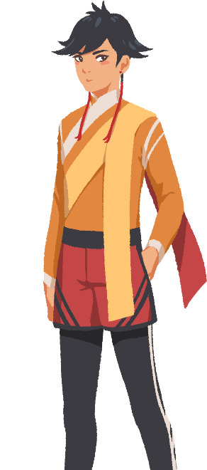
That's it about Saffron! I could go on about his colours but I'll save that for when I explain the general artstyle of Brassica! :3
UI - eZombo
Because Brassica was planned as an entry for Yaoi Jam 2018, we thought about ways to keep the scope small. One idea we came up with was to reduce the size of the screen that shows backgrounds and characters so producing the art is a bit faster than filling a full HD 16:9 canvas. One inspiration for that was Sticky Zeitgeist by Porpentine & Rook but something like the Undertale console version where the graphics at the border of the screen change based on the in-game location was also something we considered.
When it came to actually planning the screen, Undertale's influence came through again, because the main area of the screen actually has an aspect ratio of 4:3. This obviously leaves a lot of unused screen space but one thing we knew we could definitely use to fill this was the text box. Having it separate from the main screen also made sure that it didn't overlap with the characters or backgrounds so the space that was reserved for that could be used to its full potential.
With two elements already on the screen, we still had the sides to fill with content. Just using graphics as borders definitely was an option but because Brassica's story plays out a bit like a road movie, we thought having a map of the game world would definitely add to the feeling of that. And to make the UI visually more balanced again, the last bit of free space was then filled with some information on the time of day and how many days were left for the quest of the princes which basically added all the important context for what is going on in the center of the screen.
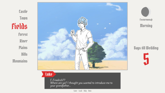
A first mock-up of the UI featuring a familiar face and St. Bernard...
Around that time, we also developed the idea of presenting the whole game screen like a paper or puppet theater. This seemed like a good way to bring all these different elements together while still supporting the colorful fantasy-ish look of the game art.
I did a quick sketch of how this could look, which turned the mock-up into this:
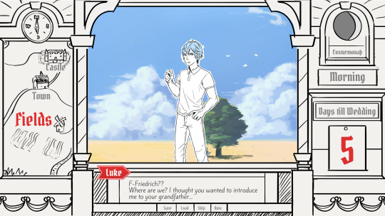
Aside from adding some more purely graphical elements, I adjusted the text box and the flag that showed the name of the character that is currently speaking.
The map was graphical now instead of just a list (which would have given away future locations) and I was overall fairly happy with the direction the UI was going in.
A few of the border elements overlapped with the main screen now but I tried to make sure it only happens in areas where we wouldn't put any focus.
After getting some feedback from PECTIN I then went on to work on the final lineart while also trying to simplify all the shapes. By then, the characters were also being concepted so instead of Luke I could put Ode into the mock-up (along with a reference for a possible background style).

As you can see, some unnecessary lines, elements, and text were removed to simplify the look of the UI and make sure that the important elements aren't overshadowed by anything else. Overall I tried to keep the lines clean without making them look overly sterile, so any round shapes are generally drawn freehand instead of using any vector shapes. Except for the compass, moon, and their enclosing arcs. Those just looked sloppy when they weren't exact. Not using fixed line widths was another way to make the lines more organic even when they were perfectly straight.
The idea to use different colored flags for each character also came into play now, although Ode's color here is actually used by Hans now…
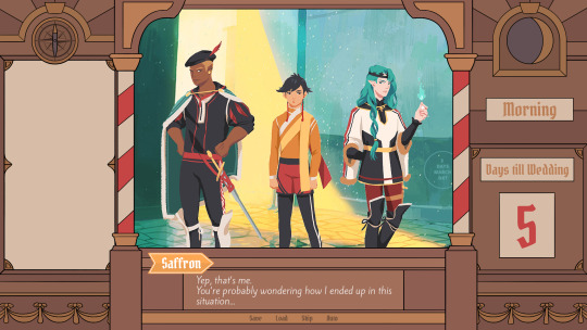
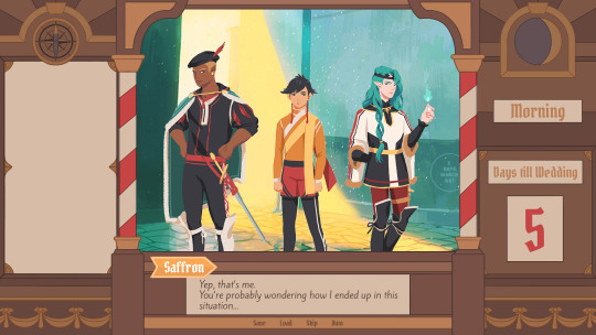
Colors were next on the agenda. First a basic pass, followed by some adjustments and line colors to make the lines fade more into the background. Having the concepts for the three princes was very helpful for this step because it was important that the UI colors fit into the overall color scheme while keeping the focus on the actual game art.
That's why red is only used close to the center and for important UI elements (the current location on the map is also marked in red). The rest of the colors are rather muted and monochrome on purpose with only a little bit of gold to break it up.
Throughout the whole process my main references were old paper theaters but especially during the coloring process I deviated from these references in favor of using colors that would match with most backgrounds.
Once we were happy with the colors, I did a relatively quick shading pass, just adding shadows with a fairly abstract light source to keep most shadows parallel to the lines. I also added some subtle noise to make everything look a bit more organic.
For the most part it still looked too clean though, so PECTIN suggested overlaying the UI with some watercolor textures.

Which lead to this final mock-up and not only solved the problem but also gave the UI a more painterly look that didn't interfere as much with the general artstyle.
Well, but as always, there are still a few things that changed on the way into the engine.
The map was obviously added (which could probably fill a devlog by itself), the text on the side was changed to better reflect the current quest of the princes (although the other sign may or may not return in future acts...), I added a CTC icon and updated the quick menu (although I can't remember why "Load" was removed so maybe that will return again), but most importantly:
The text box was reduced from three to two lines of text. This wasn't as much an active decision as it was caused by the fact that small line spacing in Ren'Py cuts of parts of some letters until all lines of text are displayed. There are some games that still do this but personally I don't really like how it looks while the text appears. Increasing the textbox would have caused a lot of work because I would have had to shift around more elements of the UI to keep a balanced layout so it was simply easier to remove a line of text and increase the line spacing.
This had a pretty strong effect on the writing because sentences have to be fairly short now or if that doesn't work, broken up into multiple lines.
Even if it wasn't exactly planned, it still influenced the writing style of Brassica and further distinguished it from our other games (although there's more to say on that one) and in hindsight, only two lines of text also look a lot cleaner in this layout.
I could go on about the actual implementation of the UI but this has already been a pretty lengthy post so maybe I'll save it for another devlog.
But that's it for now! We'll be back in two weeks with some more development insights and our current status. We also plan to start posting these devlogs regularly again, so stay tuned for that!
As always, thank you so much for reading and we hope you could find a few things of interest in this devlog.
#brassica#fairytale#devlog#gamedev#game#development#otome game#romance#tutorial#visual novel#indiedev#indie#okay
8 notes
·
View notes
Photo
BTS RAPLINE TRIPTYCH PAINTING~
<- So Far Away -> Awakening <- Daydream ->
- - 23ish Hours later and it is complete! - -
Now starts a very long explanation (which I will try to keep as concise & understandable as possible but... well, you know me lol that probably won’t happen lol) as to what the rapline’s solo mixtapes and this triptych means to me...
I’ll start at the beginning, which isn’t the first piece I created (which was J-Hope’s painting), but actually the final piece I made; Suga’s.
Suga’s mixtape maybe spoke to me, personally, the most out of all of them; the roughness of the tracks, along with the raw and meaningful lyrics are some of the most emotionally charged tracks Bangtan have produced.
I named Suga’s piece ‘So Far Away’, which is the final track on the album, and one of my personal favourites. Not only is it Suran’s haunting vocals that add a really dream-like feel to the track, but the lyrics really give the concept of a ‘journey’ of self-love (which is a big overall theme of this triptych).
A sense of something in our pasts being so far away from who and where we are now, but also the idea that the place we want to go also seems so far away in the distance... It’s the beginning of a journey, and the beginnings of anything are always difficult.
The imagery to accompany this is more subtle than the others, since the imagery in the two music videos released during this album (Agust D (title) and Give It To Me) are less about this more ‘melancholic’ theme. So I went with the colour scheme of the music videos (darker greens, turquoises and blues, with bursts of yellow, orange and red as part of the flames and dramatic lighting). I also used the glimpse of a ladder we see in Agust D (ladders are steeped in lots of traditional symbology, and I also wanted something angular and red to contrast nicely with the green background, so I won’t go into too much about that).
And although the music videos are quite dark, I wanted to keep the light and clouds around the moon (which I’ll get to in a minute) bright. And although I feel like I could have made it a touch darker, I like the overall vibe of the piece, as it doesn’t feel too gloomy.
(Important thing to mention, I didn’t create this triptych to psychoanalyse everything in the Rapline’s mixtapes which may or may not relate to their mental health. This piece is a wholly personal piece, with using my own emotional responses to the mixtapes as a way to look at recovering and learning to love yourself...)
The oversized clothes (with a big focus on the folds of the clothing) was inspired by the Spanish Surrealist artist Remedios Varo, who I only discovered recently but immediately fell in love with her dream-like paintings. In particular, this piece was inspired by the first panel in her own triptych she painted between 1961-62.

This piece (called Toward the Tower) was another starting basis for background styles and colour-schemes, as well as the more stylised (but detailed) figures, clothing and buildings. The piece is Varo’s own commentary on life in a convent, and the ideas of entrapment and freedom (which are continued throughout the triptych). And although this differs greatly from my own triptych, I think the way in which Varo approached the artworks and theme are something I wanted to emulate in my own piece.
Now onto the moon iconography I included. Now, because I initially started with J-Hope, who I made into the Sun was more of an after thought, this idea only really came about because of that. But as soon as I made that choice, I realised how perfect it would be to have Suga be his seemingly ‘opposite’: the moon.
The moon gets its ‘power’ (so to speak) from the light of the sun, and the gravity that binds it to our planet and allows it to control tides and effect seasons (I think... Look, I don’t pretend to know everything about the moon, ok, I just think she’s beautiful and doing a great job...). So the idea behind this is that in fact to start a journey of self-love or recovery, we often have to look to others for advice and support. (This may be actually seeking out help from a professional, chatting to a friend or family member, or simply discussing your thoughts openly to a diary or something similar...). We need to make an effort to share our burden with ‘others’, even if it is difficult.
(I don’t pretend to know everything, or anything, about dealing with mental health, by the way. But I do know a bit about learning to love yourself, and dealing with moving on from a rough patch... Basically, I’m only speaking from my personal experiences so please don’t come for me....)
I think Yoongi, along with the Agust D mixtape, fit perfectly with the concept of the moon. A big part of this is the cycles of the moon, and the very nature of change and movement which that encompasses. I went with a full moon in the sky, as it usually indicates the end of the cycle (i.e. the end of your difficult past) and suggests the start of a new one (i.e. the start of a brighter future).
The flames are mainly a crossover from Rm’s piece, although fire is a big theme in Suga’s music videos (and personality in general). Though I will go more into the fire in Rm’s piece...
The final thing I want to talk about for Suga’s part is the lyrics I included on the ribbon. I decided instead of trying to wade through all the songs on each mixtape to find the perfect lyric, I’d instead take the lyrics from their more reason Trivia tracks on the Love Yourself: Answer album.
Suga’s, which is called Seesaw (and is my personal favourite, I might add), speaks of a kind of ‘seesaw’ battle that exists between himself and someone (or something?) else. I’ll admit, I haven’t looked into the reasoning or real meaning behind the song, but I was drawn to the lyrics: 니가 없는 이 시소 위를 걸어
니가 없던 처음의 그때처럼 (I’m walking on this seesaw without you
just like the beginning when you weren’t here). I interpreted this as the ‘you’ representing the version of yourself that you want to be, versus the version of yourself that you are at that point in time... The precariousness of walking on a seesaw and trying to balance public personas and internal monologues is a very poignant theme, even to people like you or me. There’s also a sadness to the lyrics, the idea that the situation feels hopeless, like it was before. It’s a cycle, perhaps, of self-hatred (something we all get into now and again). And, just like on a seesaw, one step in the wrong direction and we can easily fall back into old ways and viewpoints of ourselves...
Primarily, Suga’s piece is a beginning. The beginning to one of the most difficult journeys we take in life; the journey to loving ourselves.
The next piece is actually not Rm, despite his being the central panel. Obviously, the colours and imagery are supposed to flow into each other in the order they are presented, but I decided half way through that it made more sense in terms of my message to have J-Hope’s be the actual ‘second panel’.
So, here is where I’ll talk about the very first piece of this triptych I created; J-Hope and ‘Daydream’.
The whole idea of creating a triptych for the rapline’s mixtapes came to me as soon as J-Hope had released Hope World. I love the stark contrast between each of the member’s styles, both musically and aesthetically, as well as the way that they all reflect an overall ‘bangtan’ feel.
And actually out of all the music videos, ‘Daydream’ is probably one of my favourites. The whole vibe, use of colour, editing style, and the way it works seamlessly with the song is basically perfection, and it fits with J-Hope’s personality and music style brilliantly as well. And although the album itself didn’t speak to me as much as the other two member’s had; it still really showcases the talent and diversity of J-Hope’s music ability.
Right, now to my artwork... So I was obviously inspired heavily by the Daydream music video, both in the aesthetics and symbolism (aka the fish). It also fits perfectly with the surrealist style I was going for. The overall brightness of the mv was perfect for the sense of ‘hope’ I was trying to portray in this piece.
So this was based on the very last panel of Varo’s triptych, which is called ‘The Escape’.
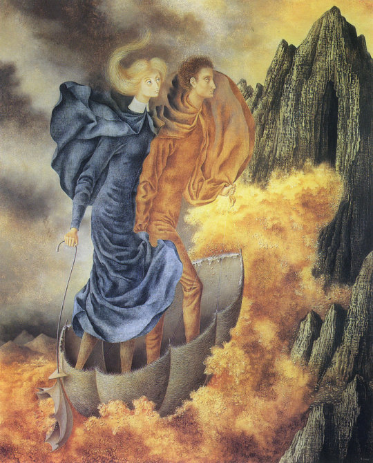
Much as the title suggests, the final panel is an escape up into the mountains. It suggests a climb away from dark storm clouds into the light. And my own interpretation in my piece was definitely based on this sense of freedom. But to fit with both J-Hope’s mixtape (aka the Blue Side outro track which deserved a full song!!!!!!), my own personal connections and also to fit with the aesthetics of Varo’s piece, I wanted to include the element of blue and the storm clouds.
The main reason behind this is to reflect the fact that even if someone appears happy on the outside, there’s always a chance something darker and melancholic... This doesn’t undermine or make the happiness you may see or feel any less real, it’s just important to acknowledge that hardships exist and are all a part of life... Going through tough times, having ‘scars’, shows that you have survived!
The lyrics I used from his Trivia: Just Dance reflect this idea too. They translate roughly as ‘my dreams that once had no answer, now become something we can relate to’... Also, the position of Hoseok’s head (which was partly just because I really like the reference image because he look beautiful to be quite honest), looking away as if towards the future, fits with this concept too.
I think I wanted this piece to mainly be the dream of recovery, the dream version of yourself... The bright sunshine in your life that you hope one day will be reality... Putting it and Suga’s either side of the Rm central piece helps it to reflect the idea of Past - Present - Future. Not necessarily in a chronological sense, but more the way in which they react and connect to eachother.
The final piece of the series is the central Rm panel, which is also the one with the most symbology.
I actually did this one as a part of a collab with other artists to celebrate Namjoon’s birthday (it had to the hashtag ‘infinitereasonstolovejoonie’ and it was the cutest thing ever!!!).
Ok so there’s a lot to breakdown with this piece, so I’m going to start first with the reference I used for Rm’s head. I knew I wanted to use something from the Joke music video, because I really loved the straitjacket look coupled with the extreme chiaroscuro used in the mv. Unfortunately, most of the reference images were really bad quality (since they were mostly just screencaps), as well as them being difficult to draw angels, making it all the more of a battle for me to draw... I like that I made him look down, purely because it both contrasts with Suga and J-Hope, and also in the way it suggests both defeat and hope. Defeat, in the way looking down is linked with shame, and hope in the idea that it could almost suggest that Rm is about to look up...
The background also links to these contrasting ideas. The dark blue and stormy clouds, mixed with the flashes of lightening help to create a sense of the phrase of ‘every cloud has a silver lining’. This idea was mainly my own invention, since most of the references (including the music videos and Varo’s paintings) didn’t include lightning. The colourscheme was vaguely inspired by both the Joke music video as well as Varo’s central panel.

Titled as ‘Embroidering Earths Mantel’, it is probably the piece I took the least inspiration from out of the three. Varo’s piece shows the girls in the convent she had known to be trapped and forced to work, a hooded figure in darker clothes overseeing them... This sense of danger and being unable to escape was the main concept I took away from this... Another thing that I took from this was the use of the yellow in contrast to the dark and stormy sky (which I chose to do flames, which were taken from the Awakening music video).
Speaking of the Awakening mv, I decided to only really use the flames from the aesthetics, but still use the name as the title of the piece. ‘Awakening’, much like Rm’s looking down head, is evocative of moving from one state (being asleep/looking down) to another (being awake/looking up). It’s not awake, it’s not final or definitive. It’s a transitional period.
Put in the centre of Suga and J-Hope’s pieces, Rm’s represents the ‘present’. A time when you’re working through recovery, or where you’re beginning to learn to love yourself. It’s not an easy or particularly ‘happy’ time, and it often contains a lot of hardships and difficult to decisions.
I thought this fitted the best with Rm, who is the leader of BTS. He has to carry a lot of responsibility on his shoulders, which I represented literally in my piece with the 6 lightbulbs/microphones that drip onto his shoulders (this imagery was inspired by both the Do You music video, as well as the album cover). Another interpretation, and probably the one I was aiming to be more prominent, was the idea that although being a leader means he is responsible for a lot of the groups public image/etc, the other members aren’t a burden, but instead act as an anchor for his strength... You can almost see the ‘drips’ acting as puppet strings; the other members lifting him up when times get tough.
This links back to the idea of the moon I talked about in Suga’s piece. Although recovery and learning to love yourself, or whatever it is you’re dealing with, can’t be solved immediately just because you have a loving family or friends, having a person you trust to talk to can help you deal with things a lot easily then trying to go it alone... This is probably one of the most difficult things in dealing with mental health struggles, since most of us are really reluctant to ask for help in fear of being an annoyance to others... We always make excuses that our problems, whatever they may be, aren’t worthwhile discussing or talking about since everyone has their own problems and you don’t want to burden them even more...
(And although this is advice that I rarely take myself, I just want to say Your problems are not worthless, you are not a burden to others, and you deserve to be happy!)
The final part of Rm’s piece is the lyrics I chose from his Trivia: Love. 너 땜에 알았어 왜 사람과 사랑이 비슷한 소리가 나는지 ‘I found out because of you
Why “person” (saram) and “love” (sarang) sound similar’. I chose this both because I wanted it to fit with a ‘reason to love joonie’ (i.e. his brilliant lyric writing skills), and also for the way it relates to my own experiences.
The ‘person’ in my case is less an actual singular being, and more the art community online and the k-pop fandom... So without going into details, the last few years haven’t been the easiest for me, so having the k-pop community to enjoy memes with, listen to and get excited about music with and to be artistically inspired by really helped me get through feeling lonely and down... And although I’ve (luckily) never had any horrific experiences, I know that a lot of people who like k-pop and are a part of community have (or are having them), and having k-pop around has helped them survive the most difficult situations...
I wanted this triptych to both a personal and universal piece, something people can relate to and understand (as well as be able to appreciate on a purely aesthetic level)....
I hope that everyone who has taken time to read this ridiculously long essay about this piece get’s this sense of inclusion, which is something I truly admire about BTS in particular...
Just remember, if you’re going through a difficult time, things really will get better! Recovery, Life, Self Love; it’s all a journey that there’s no guidebook to...
And to quote BTS’s ‘Young Forever’:
~~Dream : Hope : Keep Going : Keep Going~~
Thank you for reading!
[this piece is available on my redbubble btw]
#art tag#bts fanart#bts#digital art#painting#triptych#bts rapline#suga fanart#rm fanart#j-hope fanart#min yoongi#kim namjoon#jung hoseok#kpop fan edit#remedios varo#surrealism#bangtan sonyeondan#agust d#rm#hope world#love yourself: answer#i haven't proofread this#so if it makes no sense then uhhhhhhhhhhhhh sorry
63 notes
·
View notes
Text
Better late than never: my top 10 Transformers of 2017
Yes, yes. I know I’m about 7 months too late but it’s been a tough slog. I was 90% complete in January but have only snailed along since then. I love doing these to really collect my thoughts on a year of collecting but I ended up letting it slip way more than I intended to. Anyway, with that aside out of the way, let’s get cracking.
Here we are again, that time of the year when everyone reflects on the best of the year that was.Twelve months on and the job of selecting my top 10 figures for 2017 was no less daunting than it was the last time. I found myself drawn to my closing remarks from last year as a starting point.
“Hasbro and Takara look to be continuing their winning formula with a strong opening salvo in the form of Topspin, Quake and Krok. It’s also a movie year and I’m very curious how they’ll apply this design ethos to the movie line. The Masterpiece line will welcome more Beast Wars figures and will deliver arguably the most important release of the year: the despot we all want, but will it be the one we deserve?
Third party continue their onslaught of amazing product. MMC’s stable is ready to burst with Kultur on the cusp of release and IDW Megatron due later this year. Maketoys have MP Jazz and Targetmasters on the way whilst pushing the aesthetic and action figure boundaries of the franchise with their Cross Dimensions line. Master Made will turn their eye to their next project after they finish Scorponok and Fort Max. SparkToys will deliver the follow up to their War Within Optimus Prime with Megatron and maybe even the King. Having wow’d us with what they can do at Legends scale, Iron Factory will deliver combiners and a six changer.”
As it turned out, all these things happened. And more. The mantra of “there’s never been a better time to be a Transformers collector” has never been more true. It’s with this backdrop that I embark on disambiguating my own ever-changing proclivities.
Some honourable mentions first because it feels like a transgression of the highest order to not acknowledge at least a slither the other amazing figures that did not make this list.
First off, dear Iron Factory I love everything you guys do. It’s a travesty that nothing you guys made ended up on my list. But the bite-sized delight that you guys deliver time and time again cannot go unacknowledged. From Ultimate Commander to Sixshot, you guys pack an impossible amount of articulation, fun and detail that should not be possible at such a scale.
Planet X Mors: Planet X has been a regular occupier in my lists over the years and as amazing as their Trypticon was, there’s nothing more ambitious than dethroning an official version of a toy. They did that with Grimlock and then repeated it with Starscream, Skywarp and Thundercracker. It’s a stunning toy that has not left the coffee table since it’s arrival and it was hard leaving it off this list.
MAS-01 Optimus Prime: I have an Ultimetal Optimus Prime. I should not need this. There’s only so many humungous, non-transforming toys one should have in an era that is delivering knockout citybot after citybot. But I succumbed and gratefully so. Whilst Ultimetal delivers an impeccable amount of diecast, detail and finish, MAS-01 delivers insane poseability that will never be possible in a transforming version of our favourite Autobot commander.
Titan Returns Black Shadow: It’s been awhile since an official leader class figure has been of interest to me. Black Shadow outshone the main course that he was an appetiser to. Beautiful headsculpt, wonderful colours, topped with an incredibly clever and satisfying transformation.
Titan Returns Gnaw: It’s a rarity that Hasbro could outdo Takara but they did. Fun and so full of character, Gnaw was a wonderful addition to our fandom. You can see it in the amount of fun photos this little fella has graced. I’ve had a Legends figure in my top TFs in the last 3 years and it was really hard to not have one on the list this year.
TAV-60 Bisk: A fading line that accompanied an uninspiring TV show, TAV managed to deliver some amazing Decepticons with unusual shapes and transformations. Bisk was the epitome of this. A muscle car that turns into a hyper articulated lobster, Bisk was a bundle of joy I found hard to put down for many months in front of the TV or on holiday.
I’ll have to stop there as I’ll be here all year otherwise. Let’s rollout for the top 10.
10: Beast Wars Optimal Optimus (Perfect Effect Beast Gorira)

Never having owned a toy of this quintessential character, I drooled enviously while everyone picked this up at TFNation because it was too large to lug home. The FOMO factor egged me on to buy it on eBay at TFNation in the early hours of the morning. I ship it so it’d be there when I got home. However, upon arriving home after having been away for almost two months I allowed it to gather dust alongside my backlog of unopened toys. It led me to more than once question if I’d just been a sucker for convention hype.
Finally opening it in December, I discovered the perfection that is Perfect Effect’s Beast Gorira. The sculpt is immaculate but what elevates this is the premium finish. Perfect Effect brought their trademark paint and attention to detail to the table and made this the ultimate representation of Beast Wars Optimal Optimus. As much as I love posing Gorira, what holds him back from climbing higher is the finicky transformation.
9: Maketoys G1 Pointblank (Maketoys MTRM-06 Contact Shot)
A surefire way to my heart is a futuristic alt mode. The Autobot cars and Decepticon jet Targetmasters have always occupied a mystical spot in my head for that reason. When Maketoys dropped Pointblank, a Masterpiece of a toy I’d only known from the well-read pages of my G1 toy catalogue, I had high expectations. Those expectations were well and truly blown out of the water when I handled it for the first time. The way those legs compress, the way that chest works, the playability and detail of that cockpit, that insane articulation… it’s a stunning feat of engineering. So much so that it made not one but two trips as a holidaybot in 2017. Subjecting a masterpiece toy to the rigours of a holiday is something that makes most collector’s cringe. But it was that good. That’s a hell of an achievement for a Masterpiece toy.
8. G1 Starscream (MTRM-11 Howling Meteor)

In a heated 3rd party masterpiece scene, if you were going to dislodge an official figure from being the preferred representation of a character, you’d go after the decrepit Seeker mould. But it’s a risk. There was no shortage of collector relief at having finished the Seekers this year so it makes Maketoys ambition all that more audacious. But if anyone was going to pull it off, it was Maketoys. They did. The presence, paint and peerless articulation of everyone’s favourite scheming whiner is a joy to behold, pose, and play. All that stopped it from usurping higher spots on this list was the lack of upwards head articulation and its unphotogenic dark face.
7. MP-32 Optimus Primal

I’ll confess to being one of those “Trukk not Monkey” people once upon a time. But Beast Wars was a show that I grew to love. It lacked the cast of thousands of G1 but it more than made up for that with a story and characterisation that still withstands the test of time. When I liberated this figure from its packaging, the love I felt was instantaneous. The CGI perfect blue, the multiple faces, the loving attention to the sculpt, I was sure I’d have to file for divorce. It went everywhere with me even to the distant fjords of Norway as seen in the picture I’m using here. But there was drama. Gutwrenching heartbreak ensued when I discovered I’d broken it in a fall on a climb in Husedalen. It was an expensive replacement but one I did at TFNation before returning downunder. My personal story with this figure would have catapulted it into the number one spot in any other year but such a time it is to be a collector that this was as high as it could climb.
6. MTMTE Rodimus (SXS R-04 Hot Flame)
If you know me well, you know the place MTMTE and Lost Light holds in my heart. There was a crack at this by a more accomplished third party company that satisfied most. Not me though. SXS stepped up to the plate to deliver the perfect rendition of the cavalier Co-Captain of the Lost Light. It rendered MMC’s Calidus to a mediocre representation of a Hot Rod / Rodimus. The sci-fi vibe of the rugged alt mode, the perfection of the chest sculpt relative to the shoulders, and the exceptional articulation were exhilarating to experience. It’s a toy that will not leave the coffee table anytime soon.
5 . War Within Megatron (SparkToys Spartacus)
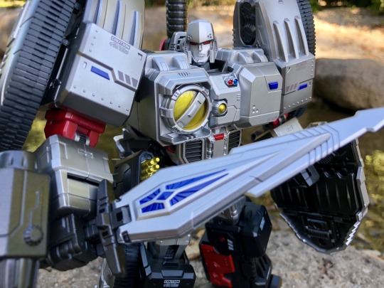
It was the year of Megatron. Whichever line you look at, there was not just a good one but a great one. That’s why there are three on this list. War Within got me back into buying Transformers. It lit the spark that re-ignited that childhood love that I’d had for Transformers. Last year, SparkToys Optimus Prime almost took the top spot and they were always going to be in contention in 2017 again given how much nostalgia this plays up in me. Collectors talk about paint and finish but this is a whole different level. Not only is the detail of the sculpt exceptional, every nook and cranny of this pre-war despot is coated in loving layers of vibrant paint. Add the commanding presence of a gladiatorial Megatron and a generous armoury, this figure is packed with endless fun as well as beauty.
4. Titan Returns Decepticon Targetmasters: Triggerhappy, Slugslinger, Misfire
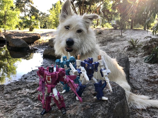
This is a cheat as Triggerhappy had already made my list last year but there was an overwhelming sense of achievement unlocked when I completed this triplet of Targetmasters. All cut from the same cloth but each so uniquely distinct with tonnes of articulation, personality and clever little design decisions, I spent whole evenings playing and photographing these handsome lads. Another important factor was that I acquired all three of these locally and with my boy. As someone who largely imports these days, the fact I could experience the thrill of the hunt again chasing such great figures cemented their place in my memory banks.
3. Chaos Theory Optimus Prime GT-03 Optimus
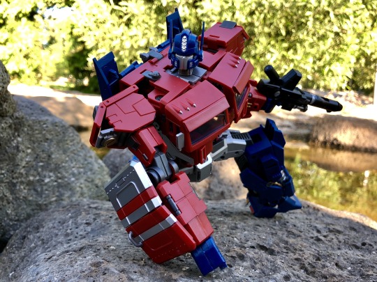
I mentioned the importance of James Roberts’ MTMTE to my love of Transformers. It’s fiction that elevates the characters and their journeys to a level that we haven’t experienced before. But before there was MTMTE, there was the two part story Chaos Theory. I remember reading it amid the Costa era of TF comics and knowing straightaway this was special. The gravitas with which it regarded the four million year old war and the relationship between the two diametrically opposed leaders gripped me like nothing else. It was not till much later that I realised it was the start of James Roberts’ meteoric rise in TF fiction.
It was only in October 2017 that I secured all the variant covers of those two issues of Chaos Theory (Transformers #22 and #23) after having stopped buying physical comics for many years. But to then obtain a Masterpiece version of that Optimus? With perfectly stunning articulation, paint and detail? A sculpt that oozes a sense of heroic gravity? That I did not expect.
2. Chaos Theory Megatron (GT-02 Tyrant)

Chaos Theory was a tale in two parts. The covers represented the two halves of the story: Optimus Prime and Megatron in both their current day and youthful forms. Generations Toys completed the other half of that equation with their wonderful designed Chaos Theory Megatron. With transformation steps that evoke Masterpiece level ingenuity and a transformation that is a pleasure to switch back and forth between, it’s amazing how Generation Toys designed such a Megatron full of fearsome presence yet is also a stealth bomber at the same time. .
1. MTMTE Megatron (MMC R-28 Tyrantron)

This was a hard choice. On the one hand, of all the figures on this list, MMC’s MTMTE Megatron has the laziest of transformations on top of being a heavy partsformer. On the other hand, never has a character stepped off a page more than this. This wonderfully epic rendition of the tormented Megatron knocks it out of the park. Not only is the every part of the body sculpted to perfection but the head sculpt captures the grim introspection that dominated the former Decepticon leader’s tenure on the Lost Light. If that wasn’t enough, the figure does double duty and with a few bits of parts forming becomes pre-war Megatron from Chaos Theory. It’s a monumental effort from MMC and allowed me to round out 2017 with the 3 most important representations of Megatron to me.
So there’s my list for another great year. 2017 was a special year for me. One dominated by the realisation of some of my favourite characters from my favourite Transformers fiction. It’s a reflection of how vibrant the transforming scene is at the moment that it supports not only a heavy masterpiece market but multiple TF canons as well. There’s truly never been a greater time to be a fan.
#transformers#transformers idw#more than meets the eye#tf mtmte#MTMTE#mtmte megatron#mtmte rodimus#lost light#optimus prime#beast wars#beastmode
21 notes
·
View notes
Photo


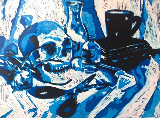
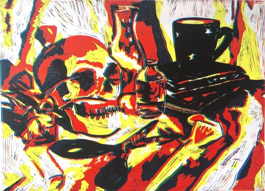
Assignment 3: Chiaroscuro
Composition
As the course materials instructed I created a still life with various objects and folds of fabric. I took multiple photos of the arrangement.


Going through the photos I selected six that I felt would make good compositions.
I selected these as:
They have a good balance of light and dark suited to a chiaroscuro composition.
The objects fill the frame but leave space where the folds of fabric can be seen.
I preferred compositions where the skull was in a 3/4 profile as it is more recognisable as a skull and softer than a full profile.

From this selection I chose a composition I would further develop into the final print. In order to help me to visualise the potential tonal layers I converted the colour photo to a high contrast black and white and a black image and monochromatic version.

Drawing
I began the drawing process using a grid to help me to block where the objects are in relation to each other. My first drawing focused on the outline of the objects however after trying to add tone to the drawing I realised that the outlines were hindering the shading.


I started my drawing again, however this time only looking at the tones in front of me, ignoring the objects themselves. Using three shades of blue, the white of the paper and black I worked through the grid systamatically just marking the spaces I could see. This image was much more successful than my initial drawing.

Developing for Print

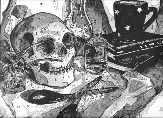
Printing
I decided that I would use a reduction method to create the print as I was concerned that the level of detail would be difficult to match over four plates and that the registration in particular would be very challenging. I wanted to experiment with different colour variations and settled on using the primary process colours, traditional sepia tones (often seen in chiaroscuro prints), black and grey and a blue toned print.
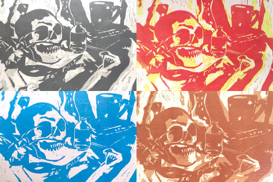
The process was slow and frustrating as I struggled to visualise what areas to cut and which to keep as I progressed through the layers. I find reduction prints quite stressful as knowing that I can’t repair any mistakes without starting again from scratch increases the pressure!
Final Prints
(Please note, these are photos of the prints and I will be updating the images when I have access to a large scanner next month)
Although I do like the shades of blue overall, the lightest shade unfortunately came out too light causing the composition to have a starker appearance.
Like the blue tones, there is not enough contrast in the lighter transitional tones within the grey composition. The colours work well together however and I feel the overall composition is striking.
Despite the sepia tones not being a colour scheme I personally enjoy, this is my favourite of all the colour variations as it is the most effective. I am glad that I experimented with colours I wouldn’t usually choose.
The final process print I intentionally offset the colours in the printing process to allow all the colours to be seen in the final print. The end result appears oddly sinister. The red and yellow resemble neon signage which paired with the subject matter creates a sense of unease.
The final prints are more effective than I expected and most importantly to me the image is readable visually as I had some concerns that the folds of fabric may be confusing to the eye. The process has caused me to consider my drawing approach. I usually focus on overall shapes however looking closer at tone has improved the realism of my images.
1 note
·
View note
Text
Design neon sign for bedroom
Neon signs are a fun way to express yourself and bring a sense of humor to any place. These signs are used in bars and restaurants to draw customers and increase their exposure. Because of the increase in popularity of Instagram and Pinterest, unconventional decoration has seen a significant rise in popularity. These lights are now more popular than ever. The bedroom is a very popular space for neon signs. You can add a fun and artsy touch to your bedroom with neon signs. Neon signs can not only be visually pleasing, but they also offer a fun way to personalize the bedroom.
Here's more on the following topics:
You can personalize your bedroom with neon signs
In the bedroom, where can you install neon signs
Faux neon signs to the bedroom
The size of neon signs
The energy consumption of neon signs
Consider these points before purchasing a neon sign
HOW CAN YOU PERSONALIZE A BEDROOM WITH NEON IGNS?
ADD IDENTITY to your BEDROOM
Personalised neon can make a space feel more personal. Your bedroom can feel personal with neon lights that spell or signify your name. Neon lights are a fun way to express your individuality. A personal neon sign can make a child's bedroom feel more special and give them a sense of belonging. You can also use neon lights in your bedroom to create a special space for your child.
A custom neon sign for the bedroom can also be made to suit your individual needs. It will give you a feeling of individuality as well as excitement. You can have custom signs made, rather than pre-made signs that are available in stores.
When designing a custom neon sign, you'll be able generally to specify the following:
Type of backboard or mounting
Depending on your provider, you might also be able give the sign sophisticated lighting features, such as the ability to flash or dim.
CREATE A SPECIFIC MOD IN YOUR BEDROOM
The best way to set the mood for your bedroom is with neon signs. To create a peaceful atmosphere in your bedroom, you should use colours like light purple, blue, and green. If you enjoy the natural world, green signs can be a good choice. It is possible to create a relaxing atmosphere with soothing images such as stars and moons.moon feather
It's easy to lighten your mood by using neon signs in orange and yellow.
A neon sign that is pink or red could suggest romance, especially signs like hearts and lips
A bedroom mood can be created by spelled out words. You can create a warm, cozy feeling by writing words like "home", "dream" or similar. Positive phrases such as "be positive" and "good vibrations" can also help create a happy, inspiring feeling.
CONTRASTING BEDROOM COLOURS MAY BE USEN
You can make your bedroom more creative and mysterious by using neon signs. You can make your bedroom appear cool and artistic by using a glowing sign in dark. Bright, striking signs can also make your bedroom appear unusual. A great way to create a different bedroom is to use contrasting colours in the bedroom's scheme. Contrasting colors like yellow and red can give your bedroom a unique look. This will give your bedroom a dramatic look.
WHERE CAN THE NEON SIGNS GO IN THE BEDROOM
Since the 1960s, neon signage has been an integral part of cafes and bars. They are a popular way to get customers in a wide variety of businesses premises, including hair salons and shops to tattoo studios and garages.
NEON LIGHTS - BEDROOM CEILING
Popular options for lighting the bedroom ceiling include neon lights. It is possible to make the ceiling look like the night sky by placing stars and moons. Neon lights can also be installed on the ceiling to save space. It is a smart way to make the most of space if your walls are overcrowded with decorations.
NEON-WALL LIGHTS FOR YOUR BEDROOM
The wall offers plenty of space and is an ideal place to experiment with different styles.
NEON LIGHTS UNDER THE BED
It is a great way to express your love by placing neon lights above your bed. Placing a romantic message above the bed is an effective and popular way of expressing your feelings. A romantic way to set the mood is to place shapes like hearts, roses, or lips over your bed. You can easily set the tone with simple phrases, such as "love", "xxx", and other similar words.
NEON IGNS IN PICTURE FILES
You can use neon lights to put a quote on a picture frame or add some humor to your room. You can create a new bedroom by using neon signs instead of traditional photos.
WHAT ARE FAUX SIGNS NEON FOR THE BEDROOM?
Traditional neon signs are typically made from soft-lead glass and filled inert gas. Faux neon signs, on the other hand, are made from thermoplastic Acrylic known as Altaglus (or Perspex). Faux neon signs are an alternative to traditional neon signs. Faux neon signs utilize environmentally friendly LEDs to illuminate in various shapes and colors.
FAUX NEO SIGNS TO THE BEDROOM: ARE YOU SAFE?
Also known as LED neon sign, faux neon signs can be safer and more economical to operate than traditional signs. LED neon signs do not produce heat and are safe to touch unlike traditional neon signs that can get extremely hot. LED neon requires less power which results in lower electricity costs and better safety. They also don't release any harmful gases. They can withstand shattering and are more sturdy than glass due to their unique design. With LED neon signs, you can get that special glow in your bedroom without worrying about breaking.
HOW BIG CAN THE NEON SIGNS IN A BEDROOM BE?
The sign size depends on how big the bedroom is. A sign with text only will look larger than one that contains both text and logo/image. A sign with more lines of text than one will take up more space. Learn more about your options for custom neon signs.
HOW MUCH ELECTRICITY DO NEON-SIGNS USE
It is less energy-intensive than you think to use neon signs. Modern neon signs have a 240v transformer that uses about the amount of electricity used by a single light bulb. LED neon signs consume only 15% to 20% of traditional neon power for a similar job.
WHAT SHOULD YOU CHECK BEFORE I BUY A NEO SIGN FOR MY BEDROOM
Check that your sign meets the required standards before you buy it. Neon signs must adhere to BS EN50107. This British Standard describes how luminous discharge tube installation must be made. They must also be compliant with the IET wiring regulations, another British Standard known BS 7671. These specifications describe how these types and installations should wire. British Standards Institute approves NeonPlus signs as CE Compliant.
Check out our gallery to see some examples of our LED signs. View our selection to find out more about the many design options.
0 notes
Last Seen Blogs

qqehhaiai
제목 없음

divinggym8-blog
Untitled

shovedoffacliffbyhisbff
Why Did This Have to Happen..?

eyemob202
EVERYTHING YOURS EMPIRE

chambynho
Sem título