#And in my art style the nose it's like the main thing
Text

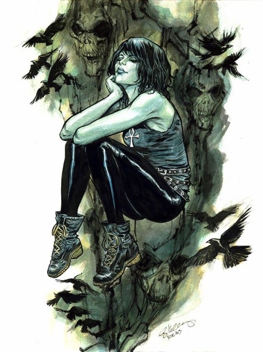
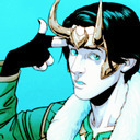
Here's my interpretations of all the OOT sages!! I have closeups of each sage and my thoughts behind their headcanon design changes below ^_^ (im alsooooo thinking of selling these as stickers if i ever figure out my silhouette)


Zelda
I headcanon Zelda is half Hylian half Sheikah with Impa being their aunt (mother’s sister, mother being full Sheikah and died when Zelda was young)
I also hc Zelda/Sheik as either transmasc or gender fluid depending on the interpretation of OOT I’m using, in this art Zelda is gender fluid and since I’m talking about sheik and Zelda a lot here I’ll just use they/them
Combined Zelda’s design with Sheik’s to make it more believable that they’re the same person this includes:
A skin color closer to Sheik’s concept art
Heterochromia, which is why sheik was hiding one of their eyes (and Zelda was forced to wear contacts or use magic to hide being half Sheikah post civil war)
Hylian pointed ears, another characteristic sheik had to hide (more info under Impa’s notes)
Lighter blond hair to be closer to Sheikah white hair
Sheik’s eye shape and eyebrows
Textured long hair, sheik would have a braid like in smash bros
Not pictured but if sheik is broad shouldered and muscular, then so is Zelda!!!!
Big forehead Zelda truther
Impa
Shares some traits with Zelda since I hc them as being related such as similar nose shape, eye shape, and skin tone
Textured hair styled into locs, tied into a short ponytail
Sheikah pointed ears, since Sheik hides their ears I thought it would be fun to have another different characteristic between the human races such as differing ear shapes. If Sheik showed their ears it would be a giveaway that they are not fully Sheikah
The rest is basically the same
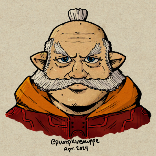
Rauru
Rauru is perfect as he is all I did was give him spots on his skin to give him more accurate skin of an older person
Saria
So one thing I hc about Saria is that she was Link’s caretaker/mother figure in OOT so my main goal was to make her look childlike but have a more mature face
So I gave her rounder cheeks and made her smaller compared to everyone else and gave her larger eyes and a button nose but I also gave her some lines around her eyes to suggest age, I also gave her thinner eyebrows similar to a kid
I changed her eyes to brown bc I’m tired of all these blue eyed characters, there’s a severe drought of brown eyed characters in tloz
I gave her freckles
Her ears are also pointed upwards. I think the great deku tree did his best to make the kokiri look Hylian especially for link’s sake but he couldn’t get the ears right and they turned a little more animal-like since they live in the middle of the forest and are used to animals than humans. So kokiri look identical to Hylian children except the one difference is their ears being a different shape
Everything else is basically the same


Ruto
RUTOOOOOO ‼️‼️‼️‼️💕💕💕💕💕💕💕‼️‼️‼️‼️‼️💕💕💕💕
Her size is much larger bc why are all the royal male zora 20 stories high but not the female zora, she would be almost as tall as Darunia at this age
I changed her eyes to be like all the other zora, it’s weird all the other zora have full color eyes yet she has human eyes 😭😭 you can tell the Zelda team was terrified about being called monster fuckers by committing fully to making Ruto have all the same traits as other zora
I also gave her freckles and added more spots on her to give her more texture and bc I love the way the Majora’s mask zora look
I haven’t drawn her body so I don’t have itemized changes but I’d make a couple more changes, other than that she’s perfect. Only smaller changes were made to just make her more zora-like than the design the devs used bc they were scared of idek what. Women can be beasts and monsters!!!! Cowards
Nabooru
Nabooru had the most changes besides Zelda but technically Zelda was a mash of two designs rather than fixing all of the issues with Nabooru’s design
My goal was to make her look like an actual person rather than a caricature such as changing her over exaggerated nose to be a hooked nose, removing the white on her lips, etc. If there is anything I need to change about my new design for her please let me know, I want to keep her recognizable without using the harmful designs the devs gave her
I gave her a darker skin color and gave her moles
I toned her red hair so that it looks more natural
I haven't fully decided on her clothes but considering she's in the desert i gave her long sleeves esp bc the area you find her in has crazy sandstorms
I'm still deciding if i keep her yellow eyes or not, i like their contrast and how it matches her eyeshadow but also I want more brown eyed characters
Darunia
The one big change about Darunia is making him more animal like by giving him more of a snout and a dog-like nose. I don't like how Gorons are designed in games like twilight princess and the white lips they have in majora's mask so my main goal was for him to just seem more animalistic and non-human
i also added lighter color around his nose area to suggest age similar to a dog
nothing else changes other than that
#tloz#pumpkinsouppe#oot#the legend of zelda#ocarina of time#legend of zelda#zelda#princess zelda#zelda ocarina of time#zelda oot#ruto#ruto oot#nabooru#nabooru oot#rauru#rauru oot#saria#saria oot#darunia#darunia oot#impa#impa oot
41 notes
·
View notes
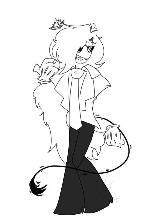
Text

So
The HAS BEEN HOTEL
HA HA HA
I don't know I just like Lucifer
#hazbin hotel#hazbin hotel lucifer#lucifer morningstar#hazbin hotel fanart#my art#hazbin art#I don't know if Lucifer is supposed to have a nose or not#The art style is extremely cartoony so I truly don't know 🙃#And in my art style the nose it's like the main thing#I draw the nose first and then I use it as a guide for the rest of the face#So I decided to draw him with a small nose lmao#also no hat. because it's a portrait and I wanted the hat to not obstruct his face#I was going to draw him with an Adam's apple and then I thought “wait. that doesn't make sense”
27 notes
·
View notes
Note
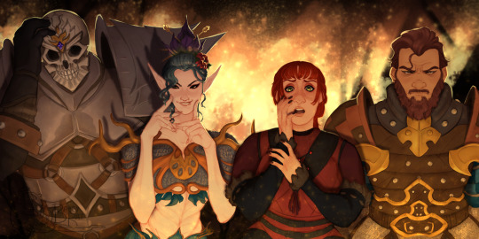
i just need to take a second to gush about how much i love durge drow and astarion, they feel so fleshed out and perfectly written together in their fucked up wretched ways. They really inspire me to write more for my own tavs, hopefully one day ill be able to say im as happy with my own work as i get when seeing yours. I have to ask though, do you have any tips on drawing head shapes and faces? or maybe about wrinkles? i find i really struggle with that stuff when drawing and i adore how expressive and grungey all your art looks!
First of all thank you so much, I love hearing what people think of the two of them together 😭
Honestly you've hit on something that's quite near and dear to my heart, I love developing and figuring how to draw and stylize different faces to get the most unique, interesting looking results - everything about the details is highly rewarding to me. What does x type of nose look like from this angle? In this style? How can this eyeshape best translate to my art? How different does a face look when its making this expression? What does that MOUTH DO? etc etc.
In fact you kind of inspired me to put a little tutorial/guide together the last hour lmao and what a blessing it is that the two current subjects of this blog serve as great models here, being that their faces are basically polar opposites!
When it comes to heads, you've probably heard it a dozen times before that you want to think of them in terms of geometry and facets; my process to drawing them is pretty conventional so I won't spend too much time on it, but it goes something like this:
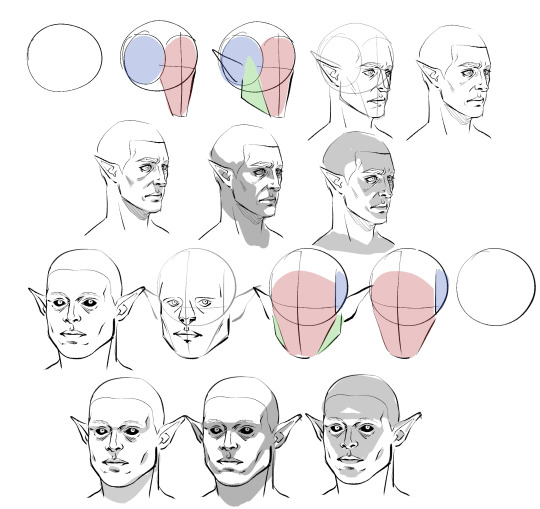
Obviously I don't do every single one of these steps most of the time, which is just something that comes from practice/developing muscle memory, but it is helpful to start off this way for two main reasons:
By making these guide lines and splitting a head into pieces like this, you'll have an easier time seeing and understanding it as a multidimensional object, and in turn, facilitate It for you when you venture out into doing wacky angles and lighting.
Making different headshapes starts HERE. notice how Astarion's "face" slate is narrower and longer, how my durge's jaw pieces sit lower on the head, how all of the same pieces came together in the same way but we ended up with one real pointy elf and a real brick of a drow - making characters look different successfully begins very early in the sketching process.
The next thing you want to do branches out into every day life: start noticing yours and other people's facial features. How does an upturned nose look from a high angle? How does the size of someone's cheekbones affect what they look like when they smile? How about when the light hits them a certain way? Does someone's lip shape changes when they pout? When they laugh? How does a person's hairline change the shape of their face? You do NOT need to creepily sketch every stranger you see on the bus, but get into the habit of actually noticing what people look like when you talk to them - when you look at pictures, when you watch movies - make a mental list of interesting ways mouths, noses, and eyes can come together in a variety of different proportions to make completely distinct looking mugs, and how they change depending on how you are looking at them.
Light and shadow play a HUGE role in how faces look, too, basically as crucial as actual bone structure does. As you see up there I tried to rough out how natural, head on, and underhead light would look on these two very different looking guys, and while we can see definite patterns, there are small differences that come to be because of the sizes and shapes of their features.
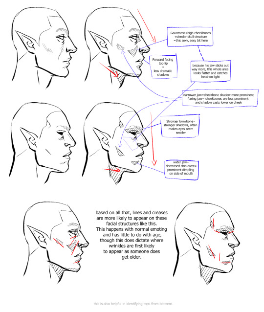
Here is a very, very basic look at how some of these features come to look the way they do, how they interact with one another, and how they compare between a blocky, rather conventionally "masculine" head and one that's much softer and slimmer.
Note please that it is not one or two characteristics that give a chaarcter their "look"; you can reduce a face to eyes, mouth, and nose through stylization and still have them be recognizable, but if you want to do more than that, you have to consider the whole package! Chin, cheeks, brows, direction of the jaw, slope and size of the forehead, depth of eyes, ridge of the nose, etc - I know this is probably far more than you bargained for, but if you start making note of a FEW of these things now and slowly add on, this will eventually become second nature to you.
Similarly, understanding how these characteristics come together will help you with rendering light and shadow in a realistic way, and predicting what their facial expressions may look like - if no two people are alike, neither are their smiles. :)
Lastly, remember that I'm no expert - I have developed my own methods and semiotics and yours may look slightly (or vastly) different, and that's fine! I hope only that by sharing this it has given you a base to work off of.
Anyways, I HOPE this has been helpful and not just the unsolicited ramblings of a face pervert.
391 notes
·
View notes
Note
hey, long time admirer of your stuff! ive just been wondering, though, how exactly do you do your eyes? like.. obviously they're different from character to character, but how do you usually form them and whatnot?
thank you ! - 💥
heya thank you :) it's been a while since i answered one of these in depth but for you good anon i will try my best.....
Here's the simple answer:
Here is some more thought-process/behind the scenes stuff:

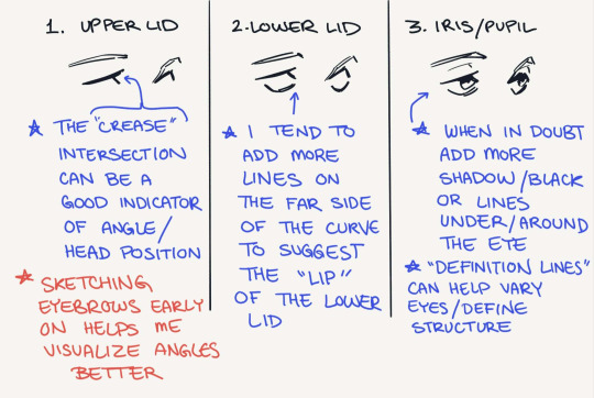
Obviously head angle determines many things about drawing eyes; I've been trying harder to keep it in mind when I'm putting lines down, and it'll generally make them look more grounded/offer better depth.
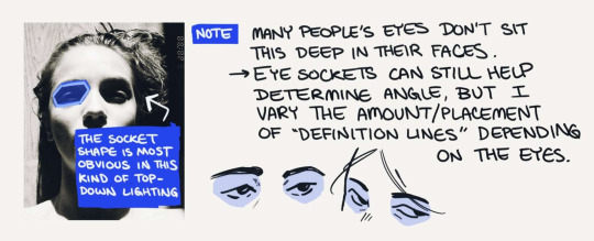
The main takeaway from head angle is how are the eye sockets oriented. Doing drawovers of photographs is a cheap+easy way to get a feel for this, but I wouldn't worry about 100% anatomical accuracy; what I'm trying to get a feel for is the placement of eyes versus the brow/nose bridges.
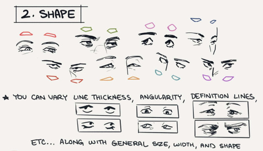
The amount of detail I put into eyes is wildly inconsistent haha it rly depends on the piece and art style, but the (for lack of a better word) "definition lines" and spots of black in deep shadow make up most of the detailed stuff.
I'm still not great at drawing massively distinctive eye shapes but I try to maintain a general sense of one for different faces (ex. Rectangular, narrow, round, angled up or down). I'll also be the first to admit it takes a lot of conscious thought to reproduce the same line variation/angles in someone's eyes each time you draw them, but if you're looking for advice on consistency those are examples of traits I'd keep in mind.
That's it for the most part.... I don't think the way I draw eyes is particularly unique lol so here are a few things that have gotten me where I am:
other people's art, a lot of which is manga. when I say naruto taught me to draw im only half joking hwheeze. my art tastes lean towards manga/comic stylization so none of this is hugely realistic overall....
that being said, I do like the more realistic side of manga/comic art so photo studies/anatomy tips have still been useful to me
this tutorial by sinix is one of my favorite things ever, because it explicitly discusses both anatomical knowledge AND how to translate that into shorthand
thanks for the ask!
#asks#anonymous#art asks#i've had zero time to draw hence the no posting ...... i miss her...#making this was a very nice break from the everything else :')
437 notes
·
View notes
Text
Walkway Aesthetics
The door opened from the spaceport to the city proper, and I couldn’t help saying, “Oh wow.” I’d expected a regular walkway, maybe with a moving sidewalk or hovercarts, probably with ads and decorations. The last few big cities we’d visited had all been pretty bland in terms of entrance-way style.
This one was an aquarium. The long tunnel curved away under a domed ceiling with vast sea creatures undulating by overhead, and others darting about in flashes of scales. Subtle blue-and-purple lighting lit up both the benches alongside and the water above. Specks of phosphorescence danced everywhere like fairies under a starry sky. The effect was breathtaking.
I ventured out into the purple-blue wonderland. “Wow, this is amazing.”
Three of my coworkers followed, and were less impressed.
“Eh, it’s not very original,” Kavlae said with a flip of her frills. Under the lighting, her sky-blue skin was a shifting purple. “Water scenes are pretty tiresome, honestly.”
“You said it,” agreed Mur down from floor level. He tentacle-walked along like the opinionated squid alien he was, blending with the bluish shadows. “Once you’ve seen things swimming past, you’ve seen them all.”
I asked, “Are you serious? This is beautiful.”
Paint huddled close beside me, her orange scales turned an indistinct brown. “I think it’s scary.”
“What? Why?” I asked.
She clasped her hands, shaking her head. “That’s a lot of water, and a lot of creatures. What if the barrier broke?”
“Well yeah, that would be bad,” I admitted. “But it’s not going to.”
Paint walked faster. “Still scary. Look at that one! It’s so big!”
The alien whale or whatever that coasted past had bioluminescent swirls along its underside, and a cloud of the glowing water-pixies flitting along after it. Beautiful, and awe-inspiringly close.
“Ah, that’s so cool!” I said, turning in place as I walked to keep it in sight.
Paint just squeaked and scampered ahead, followed by Kavlae and Mur.
“C’mon, we’re leaving you behind,” Mur told me.
“I’m coming,” I said. There were glowing eels or something up ahead, and I jogged to get a look. The other three continued turning up their various noses the whole way down.
When we finally reached the other end, a family of humans were just entering the tunnel. Their awestruck expressions were vindicating.
“Ohhh, wow!”
“This is lovely!”
“Look at the size of that one! I can almost touch it!”
“Don’t smudge the glass, honey.”
“But it’s so cool!”
I joined my coworkers at the exit with no small amount of smugness. “See? They get it.”
Mur waved a tentacle. “That just shows that your entire species has poor taste in decor.”
Paint shuddered, stepping into the brighter light of the station. “I would feel much safer with solid ground on all sides instead of all that water.”
I laughed. “See, that would make me worry that it was about to fall down on me.”
“A proper burrow would never!”
Kavlae walked past us both. “You planet-born folk have the silliest ideas about these things. I’ll stick with my windows into space.”
The rest of us immediately jumped in to agree that the risk of a hatch blowout was scarier than any cave-in. But the view of stars and galaxies could be pretty dang beautiful, so it was worth it.
~~~
Inspired by this art by @ellohcee.
These are the ongoing backstory adventures of the main character from this book. More to come! And I am currently drafting a sequel!
#short one today so I skipped the readmore#just a bit of interaction about something beautiful#to human eyes at least#humans are weird#haso#hfy#eiad#humans are space orcs#my writing#The Token Human
148 notes
·
View notes
Photo

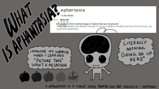
A “Guide” to working with Artists with Aphantasia
DISCLAIMER:
I KNOW ARTISTS WITHOUT APHANTASIA ALSO USE REFERENCES
This is not going to be applicable to ALL artists (with OR WITHOUT aphantasia)
I don’t speak for everyone!!!
PLEASE Read the information artists provide you THUROUGHLY
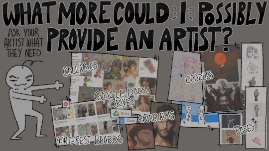
ASK ARTISTS WHAT KIND OF INFORMATION THEY NEED
I’m sorry about the typos I am dyslexic and no one is beta reading this :3c
HERE IS THE OG TWITTER POST
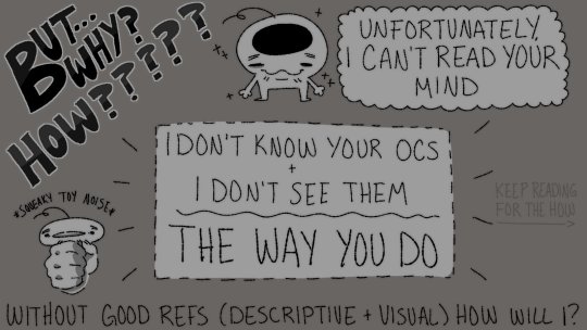
I made this guide out of frustration.
I was having a hard time communicating with commissioners how much visual information I needed, and that giving me creative freedom doesn’t, personally, work for me. It all comes down to the why; Aphantasia.
... I realized a lot of people don’t understand what that is, and how it might affect an artist.
Note: I am a character artist!!! I do personal commissions!!!! I don’t do commercial work!! This guide is about things that I have found extremely helpful!! This may not work for everyone!!!!!!!!!!!
So, here is the official written guide to what I, personally, have found helpful when getting commissions:
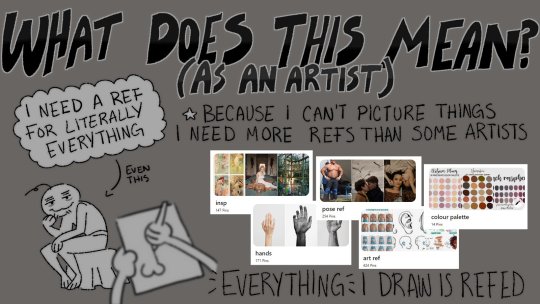
A healthy dose of both written and visual information is needed, but the percentage of which heavily depends on the type of commission and how familiar I am with the characters.
- Is it an illustration of a scene between two character? Descriptive information on the scene, the emotions, general vibe, dialogue are more important to the composition - but visual references on each character (and their characteristics), the space, the palette, and any objects would be needed.
- Is it a reference sheet commission? Descriptive information is no longer as important, and the main focus is on the visuals. Descriptive information would be limited to a brief description of personality, placement of certain markings, and/or the written information on the reference. Visuals would be EVERYTHING - every single aspect of that character would need a reference.
Google Docs, Google Drives, PDFs, Character pages (Toyhou.se or Refsheet.net) is an easy way to compile both written and visual information in one place!
What is some good visual information to compile for your characters?
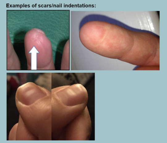
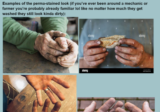
Physical
Age/Race/height/body type
Skin colour/ scars/ freckles/ skin conditions etc
Eye colour/shape
Nose shape
Hair colour/texture/style/decorations
Any additional details (prosthetics limbs/no limbs!/tattoos/piercings/wings)
Face Claims are extremely helpful - and it’s okay to have more than one!
It’s good to specify which parts of what reference are important to your character
Items
Clothing/Jewelry/Accessories
Weapons
Personal Items
Companions
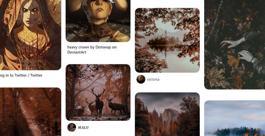
Here is an example of how I organize my Pinterest boards for my own Ocs:
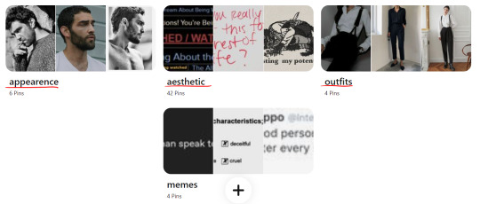
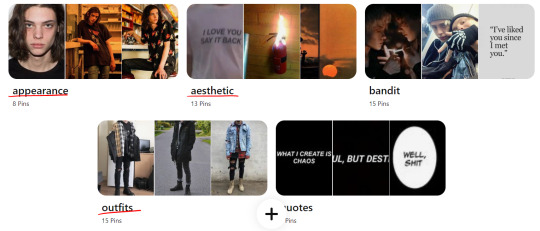
Appearance: Every single visual reference I would need for their physical appearance. Faceclaims, hair styles/texture/colours, facial hair, body types, hand shapes, nose shapes, lip shapes, eye shapes
Aesthetic: Helpful for illustrations. Palettes and aesthetics that I attribute to these characters. Art styles, symbols, colours, settings, etc...
Outfits: Outfits and accessories. Full outfits or single items, textures, colours, patterns.
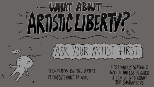
NOTE: It’s important to remember that some artists can only work with certain references (ie. drawn references vs photo references). If you’re unsure/your artists hasn’t stated which works best for them - ask!
I cannot work with drawn references in simplistic styles (anime specifically), and I struggle with using nothing but Final Fantasy screenshots. They’re important when it comes to providing colour or even outfit references - but facial features are much harder for me to translate.
Some artists are okay with things like piccrews and can translate them very well! I can’t.
What is some good visual information to compile for your characters?
Written information can vary from commission to commission; unless the illustration is based off a story, I don’t need a novel to be written about the piece.
Being dyslexic also makes it a struggle for me to parse through written information - I tend to have to break it down outside of the initial commission submission to fully understand what. I also tend to ask a ton more questions when I’m provided more written information than visual - revisions take time and energy.
It’s important to have visual to accompany your written info;

( shout out to @moki-dokie for letting me use their info as an example!! )
Commission information examples
DESIGN COMMISSIONS:
Info given:

Outcome:
Easiest character design commission I have ever done. The information given was so concise that the only revisions were my own suggestions on the design itself.
---
Info Given:
Outcome:
a TON of written information was given to explain the characters backstory, to further drive my understand of the aesthetic and setting of the world the character lives in. The pinterest board provided had a lot physical references, outfits, aesthetics, and colours.
---
ILLUSTRATION COMMISSIONS:
Info Given:
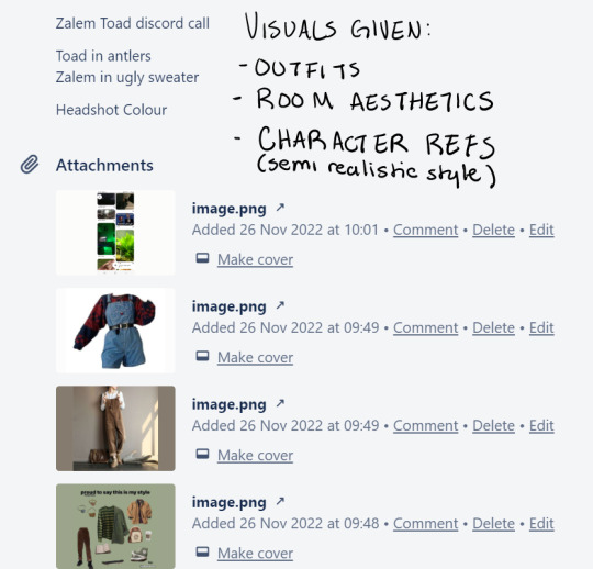
Outcome:
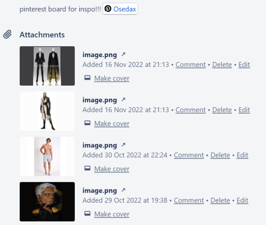
I had a lot of previous information on both of these characters (I designed the top one myself), but I was provided limited written information for this; Holiday Discord call where Toad (character one) is getting a present from Zalem (character two). Zalem is barely hiding how they feel about Toad who is excited.
All other information provided was visual; Outfits and room aesthetics.
We discussed poses in Dms and collaboratively found references.
---
Info Given:
Outcome:
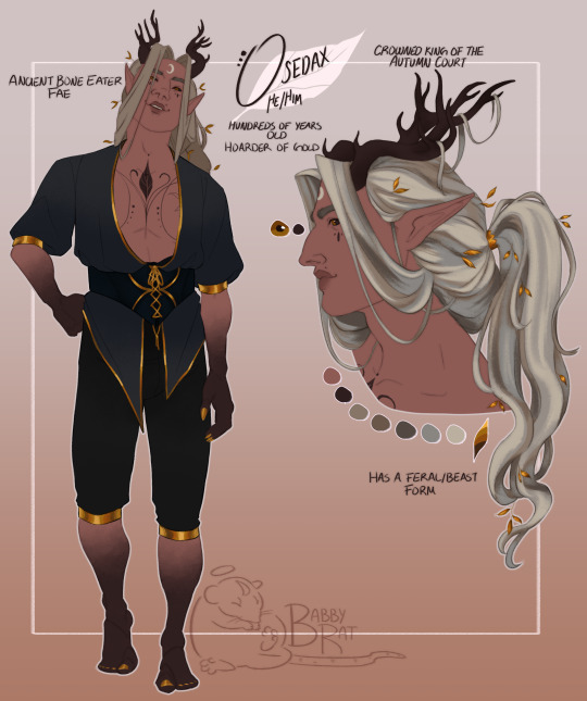
Absolute favorite example of the PERFECT amount of information given and the PERFECT amount of creative freedom given.
I was handed character references with all angles as well as their armor + how to simply the armor. Pose + expression references. A general aesthetic + palette to work with. The setting. A doodle to lay out exactly what they were visualizing.
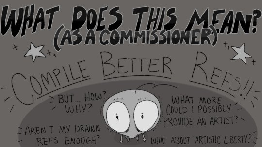
I have all the information you could need! Now what?
I am very privileged to no longer need to take first come first serve commissions, and it’s given me the ability to really sit back and filter through the commissions that I want to do, and those that I immediately do not consider.
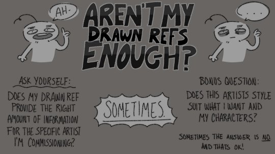
I think it’s important that, before commissioning anyone, you should ask yourself a couple important questions:
Does this artist’s style suit what I want?
Does my character suit what this artist usually draws?
Do the references I have provide the right amount of information for the specific artist I want to commission?
Sometimes the answer to these questions are; No.
... and that’s okay?
Unfortunately, not every artist is going to be able to bring your vision to life, or feel happy with the completed piece!
If you’re someone who has Big Buff Demon Men characters that are drawn in a heavily realistic style - you might not ask an artist who draws smaller, softer characters with squishier shapes and a general aesthetic that doesn’t match your Ocs!
If you’re someone who has characters and all of their references are in an anime style (including other commissioned work), and you have no realistic face claims... maybe commissioning that semi-realistic artist and not providing them with the references the need to translate your character into a semi-realistic style isn’t a good idea?
I don’t understand when some people get upset when they commission an artist who clearly doesn’t draw characters that look like theirs and they clearly... don’t translate them as well.
I am making this extremely clear RIGHT NOW before anyone says anything:
Everyone can and SHOULD learn to draw the entire spectrum of humanity. From facial features, hair textures, body types, etc...
But some artists struggle to draw characters with certain aesthetics? Outfits? Accessories? You wouldn’t expect an artist who draws soft pastel art to suddenly translate your extremely rough, hard, and hot character properly?
Now, if all the answers are Yes?
Read all information provided thoroughly
Ask questions for clarity
Provide what you can, collaborate on what you can’t
Resources
@anonbeadraws post: Reference sheet for your commission references!
JAMIErightmeow’s video: I have APHANTASIA
Aphantasia Dot Com
#my art#artists on tumblr#guide#aphantasia#artist with aphantasia#UH#damn i wasnt gonna write this much lmao#I hope this helps people#its helped a ton of people on twitter already#UH ANYWAY#if youre about to comment some shit like oOoOigiOIgioOIoI#IT HELPS PPL WHO DONT HAVE APHANTASIA TOO#shut up#please#i know#i am AWARE#THIS is for MY HOMIES#but also use this as a resource if you need it???#kiss kiss kiss kiss
798 notes
·
View notes
Text
Hazbin Hotel, and a list of criticisms
Hi! You can call me M, and I recently watched Hazbin Hotel. I used to be a fan of vivziepop, but I'm not anymore, after learning that she's transphobic and having Helluva Boss leave a bad taste in my mouth. Here is all of the strange areas I noticed, free of anything I've seen already. This is only hidden under a keep reading because I think this'll be a long post and I don't wanna waste space.
The show is way too fast-paced for its own good. The show was on episode 6 of 8 and STILL introducing new characters. I swear the show doesn't know how to pace itself.
Why have Adam be the main representative of heaven? I know that Eve was technically the first person to sin, but Adam sinned as well, and I highly doubt he'd be put into such a position of power after dying.
Why have Lucifer's character design be the way it is? If he's so old and a fallen angel, why not have that represented anywhere? God he looks like a middle schooler but with a horrendous colour palette.
Despite being named after the hotel, it barely serves more than a backdrop. There are no new guests other than Pentious, and there's no reason to have it around at the point of episode 8
Episode 8, after the fight with the angels. They fix the hotel, and say they'll get new guests. The main cast still has no idea how to redeem sinners other than what Adam said in court in episode 6. Why continue on this idea without even knowing if redemption is a possibility? Charlie hates the idea of instilling false hope into people, yet she still advertises the hotel as a way out, without any knowledge of how to leave.
There's barely any interesting representation in a supposedly queer show. When Angel Dust is on-screen, he's essentially the promiscuous gay guy stereotype. When Vaggie and Charlie act like a couple, it feels wrong. Alastor is supposedly aroace, but the only mention is a barely-characterized cannibal he supposedly goes way back with calling him an "ace in the hole", which means next to nothing.
Alastor isn't scary. Not one bit. He's said to be scary, but nobody in the main cast is afraid of him. Sure, Charlie is higher in power than him, and she doesn't seem afraid, but there is NOTHING showing that anyone is even slightly bothered by his threats, other than Husk, and he's revealed to be OWNED by him. Angel Dust even flirts with him in episode one. EPISODE ONE. The only slightly scary line from him is "This face was meant for radio", and even then it's undermined by how it's treated.
Pentious means nothing to the show, and I'm fairly certain means nothing to the cast. His only characterization is that he's a coward, and he's an inventor. Then he's fridged. Not even kidding. He dies to get a big reaction out of another character.
Charlie is strange. Despite being a princess of hell, she acts like she's never seen bloodshed before. She acts like a naive child until she starts swearing, and even then it sounds wrong with her characterization.
We never learn, in-show, how anyone died. We're assumed to know almost everyone.
New characters are introduced constantly, and most of them are treated like we already know them. It's like Spiderman: No Way Home, where they show off new characters, but the story acts like we're supposed to point at them like "OH, IT'S THE GUY FROM THE THING!".
Genuinely had this thought out loud, "If your character is named Cherri Bomb, why have her as a normal sinner?" Like, I know it could be a nickname. I don't care. It makes no sense to have her just be someone normal. She's like, the only character shown to use explosives. Why not have her use it as a main power.
Why is the art style inconsistent with noses? Charlie, Vaggie, Alastor, and Mimzy have noses, as well as others, I'm not sure, but others don't.
On the topic of designs, there's so much clutter, and they all use basically the same colour of red, except for Angel Dust, who I suppose is Vivzie's special little boy. They're all so sharp and uninteresting, there's barely any variation.
Mimzy's introduction is a nothing burger, and is barely anything more than an opportunity to make Alastor look more powerful. She adds nothing to the story, and does nothing other than attract supposedly dangerous people to the Hotel.
I've said it before, but so many storylines are rushed. The episode about heaven could easily have been, like, an entire season's worth of content. It could have been slower, introducing us to the general feel of heaven before slowly showing the cracks, like how nobody really knows how they got here, or how angels don't know much about Hell or the exterminations.
How do the exterminators not know that they can get hurt or that they can die? And if they don't, how come Lute knew that she could remove Vaggie's wings and harm her?
Vaggie says that she didn't know angels could be hurt before finding out about the dead angel. The writing must've been so out of wack, because SHE'S SUPPOSED TO BE AN EXTERMINATOR. An exterminator that was WOUNDED in order to not come back. What in the nine circles of hell.
So much is assumed that the viewer already knows. I used to be a fan of Helluva Boss, so I know probably a lot more than the casual viewer, but if I were to go in blind to this show, I would know absolutely nothing.
This show feels more like Vivienne's character showcase than a story set in Hell. Barely anyone associated with common Christian theology knowledge is part of the story, and even then it's written so incorrectly.
I'll admit, I am slightly biased, as I've read through the vivziepop critical tags, but there's so many small holes in the story.
57 notes
·
View notes
Text
Alright, let’s talk about Ken Wakui’s newest work
Negai no Astro
Or Astro Royal, whatever you prefer.
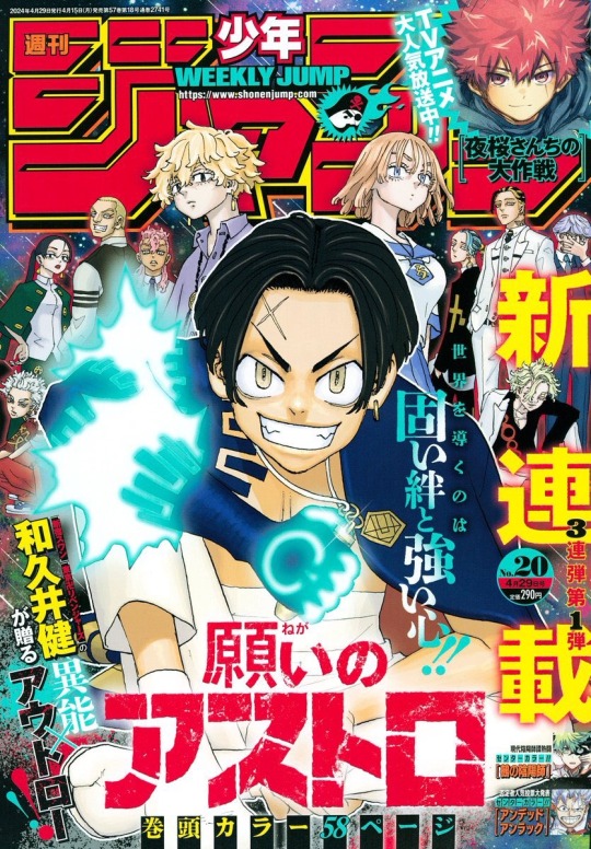
I will be giving no blatant spoilers in this post, only speculations:)
Manga PV here; ITS SO GOOD!!!!
⎯⎯⎯⎯⎯⎯⎯⎯⎯⎯⎯⎯✦
Let’s get the obvious out of the way, Ken Wakui has a very distinct art style. And I love it! A lot of people are making fun of it (mostly on Twitter/X), and it’s really sad. I love his style, and character development.
I have high hopes for this manga, and want to paint a picture of what to expect for those who also want to get into it♡
Let’s start Character Designs
—our main-trio—
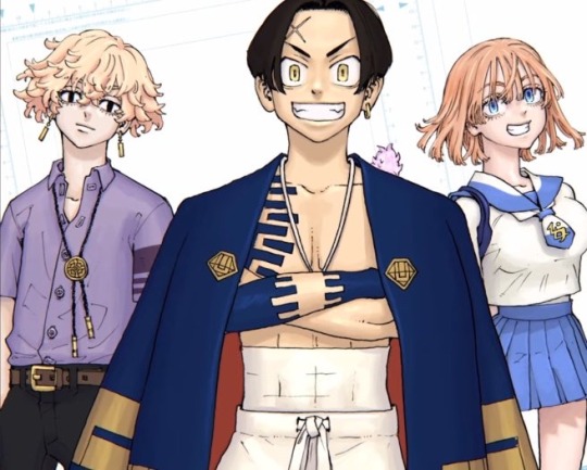
We’re only one chapter in so far, so we’ve only met the main two boys, Terasu and Hibaru (left to right).
Terasu Yotsurugi - 12th Son
Loving Terasu’s take-no-shit personality so far. Simultaneously, he seems very kind and loyal to Hibaru’s ideals.
Terasu is giving Ryusei/Chifuyu lovechild.
Hibaru Yotsurugi - only Biological Son
I love Hibaru’s chivalrous/“old-fashion” ideology. He may seem ‘generic shonen protagonist’ right now, but i don’t care. I will appreciate him.
Hibaru is giving Mikey/Takemitchi lovechild.
As for our blue eyes beauty over here, we have yet to see her yet. She seems very cute though.
She’s also giving lovechild vibes; Senju/Hina specifically…
—The Yotsurugi family—
There are 13 Siblings of the Yotsurugi family, whom has a history of being Yakuza.
12/13 Siblings are adopted.
So far, we only have designs for 11 siblings.
We do not know a lot of names thus far, WHICH I NEED BTW, so let’s go over what we do have, and my first impressions of them.
—Names going Left to Right per image
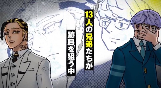
Shio Yotsurugi - Eldest Son
He’s giving Timeskip!Taiju vibes. Anyone who says he looks like Ran…. I can’t see it. He’s too beefy- sorry.
I just know I’m not going to like this guy.
Has a lot of the people’s support, but not mine.
Probably thinks he’s going to make the family better when he’s really ruining it:(
Unnamed Glasses Guy - maybe 2nd Son?
Mmmmm no thoughts.
Token megane character—
Probably corrupt.
I hope he proves me wrong.
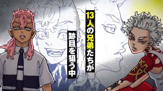
Kou Yotsurugi - 11th Son
Middle child vibes
He will be deranged and misguided.
Probably “hates” Hibaru because he’s so much like their father, who I assume he respects, but doesn’t agree with.
He probably secretly admires them both though.
Unnamed Hottie - maybe 9th Son?
MINE. 👹👹👹 RAPID. FERAL. BARKBARKBARK—
I NEED NAMES, NOW WAKUI. NOW.
Who is he. Where was he. I must know.
also lowkey giving Angry’s blue-ogre vibes…
Based on vibes alone, I lay claim. Awoogaawooga♡
Didn’t appear in chapter 1 though so:( </3
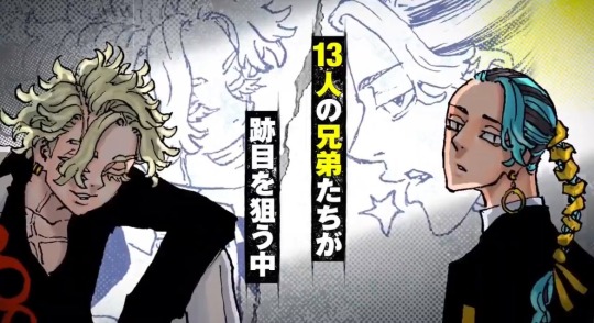
Unnamed ScarGuy - maybe 10th Son?
Eyes always closed, speaks with ♡ at the end of his sentences…
Seems charming. I mean, look at those eyelashes…♡
Wanna give him a kith.
I have a feeling he and Unnamed Hottie are biological brothers… not sure.
Wakui please, sir, just one chance—-
Unnamed BraidGuy - maybe 8th Son?
Mr. I’ll just stay in my lane. Respect.
Realistically, I think he’ll be my first/second favorite eye candy, depending on how these characters personalities/canons end up being explored.
I’m sorry I have a thing for men with long hair!
Cool earrings too lol
Seems neutral to who’s in charge.
Wakui, seriously, I CAN TAKE HIM—!!!
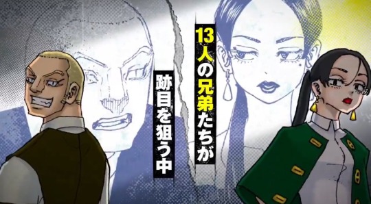
BENKEI???? - maybe 5th Son?
Has lion-like eyes and sharp canines….big nose
My size kink is acting up—no, please nO—!
Okay but seriously. I’m not sure what to expect from him yet.
He seems honest, but I can see him getting power hungry:(
Handsome Lady - Maybe 3rd Daughter?
Cooler older sister vibes.
Awoogawooga
Please be a lesbian or at least bisexual—
Seems logical and cool. Probably doesn’t coddle innocence.
Mr.BigNose - Maybe 4th son?
Uh-uh. No thanks. Not bc of his appearance, but bc his character is depicted as insufferable so far.
Probably sexist.
Probably too coward to admit it, but if things with the family bond start turning south, he’s the first one OUT.
Hehe I may have left this screenshot wide to show off the One Panel that shows Mr. Unnamed Hottie *twirls hair*
I mean seriously look at him I’m going to scream without the s
Story Direction and Expectations
I trust Wakui. The way he explores his stories is through character bonds and personal ideals.
This is one of the reasons why I grew so fond of Tokyo Revengers.
Plus… it’s Found-Family Gang activity. It’s my soft spot ¯\_(ツ)_/¯ I would say Yakuza but I want to be respectful in how I throw that word around, so I’ll avoid it for now if I can.
The supernatural powers that get involved will surely lead to a type of succession war between the siblings.
“What it means to be strong” will probably be the fundamental lesson of the story.
I am so excited to see how Negai no Astro will progress!
Please support Ken Wakui however you can by reading Chapter 1 onwards!♡
#negai no astro#astro royale#ken wakui#Hibaru#Hibaru Yotsurugi#Terasu#Terasu yotsurugi#shio#Shio Yotsurugi#Kou#Kou Yotsurugi#yotsurugi family
55 notes
·
View notes
Note
Hello!! I really like the way your art looks- style, coloring, and everything!! I’m kind of curious how you draw faces, that’s one of the main things I’ve always struggled with (maybe because I used to just draw a ton of Sans and Wheatley who…don’t have much going for faces)
Anyways that’s all!! You don’t have to tell if you don’t want to!
-Starlo fan
hii! thanks for the ask :D made this Real quick 4 u:

sooo im admittedly not that good at drawing different facial features/ expressions. the main things i do though are big eyes, lines on the nose and cheeks, big ears. i want it to look sorta like a mix btween cartoony and anime??
might be a little long so more under cut :]
whenever i draw a character, first thing i do is choose a shape that suits them! ill base it on personality most of the time. (explained further next paragraph). for the eyes, theres 2 main ways i draw them! ill either make the pupil half black with a highlight in the middle, or make the eye 2 colours with a highlight on the side!
A big thing i like to focus on is shape language! an example of this is how i draw Pearl and Marina from splatoon! i use sharp, triangular shapes for Pearl, on her eyes, tentacles, clothes, basically everywhere. For Marina, I use round, circular shapes! ig to portray the contrast in their personalities? something like that. My main inspiration for this and my artstyle in general is starrysharks (twt & tumblr)!!!! please check out his art its so shapey and colourful probably my favourite artist ever.
if u struggle w making faces even, what i do is duplicate for example most of the time ill draw one eye, duplicate then flip it lol. u could also use the symmetry tool!! i usually never use guide lines and the sketch is my lineart most of the time.
big piece of advice that helped me a lot is to copy!! if you really like the artstyle of ur favourite show, try redrawing a screenshot from it! just remember to give credit if u reference from an artist👍👍
aaaand thats all i can think of to say!!! hope this helps! thanks sm for reading, have a nice day :D i drew a starlo for u!!!!!
-another starlo fan
64 notes
·
View notes
Text
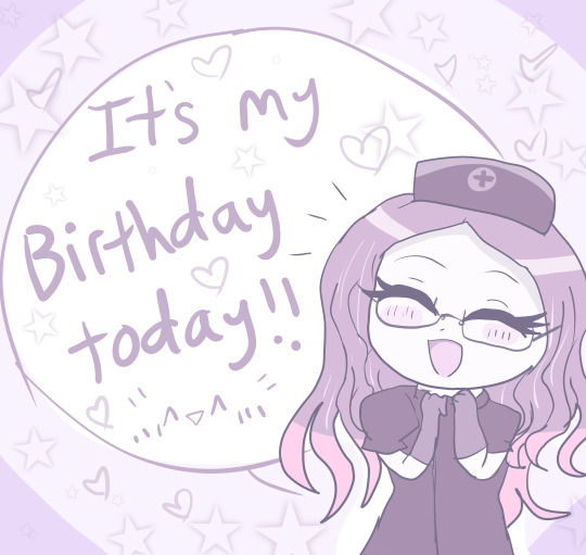
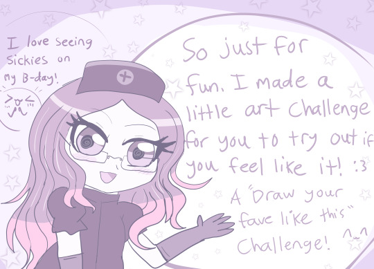
Hello everyone!! Today I grow a year older :3 (and I hate it lmao) FEEL FREE TO REPLY BIRTHDAY WISHES IF YOU WANT :3
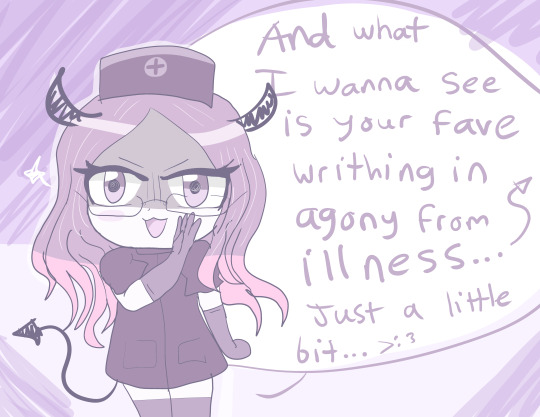
So, over the time I've come back here, I've become pretty confident and proud of my once hidden passion about sick characters, sickfics and sick comfort/whump... 🌡️
And you all have been so supportive and sweet despite my weirdness so I thank you for that. You helped me feel more confident in my otherwise weird fixation <3 So, for my birthday I thought I'd try and make up a little drawing challenge for anyone who wants to give it a try... There are soo many talented artists on this site (and in this fandom)
So... It's your turn to target your faves now. You will see how fun it is and hopefully understand why I love doing it so much. 😈🌡️
(plus it's my birthday and I require some sustenance LMAO JKJK)
But yeah anyone can join in. This is just for fun though! You don't have to if you don't want to! I think its okay to ask for some food on my birthday though...right?? X'D So if you wanna do sth for my birthday...then... 👉👈 💦
CHALLENGE BELOW~
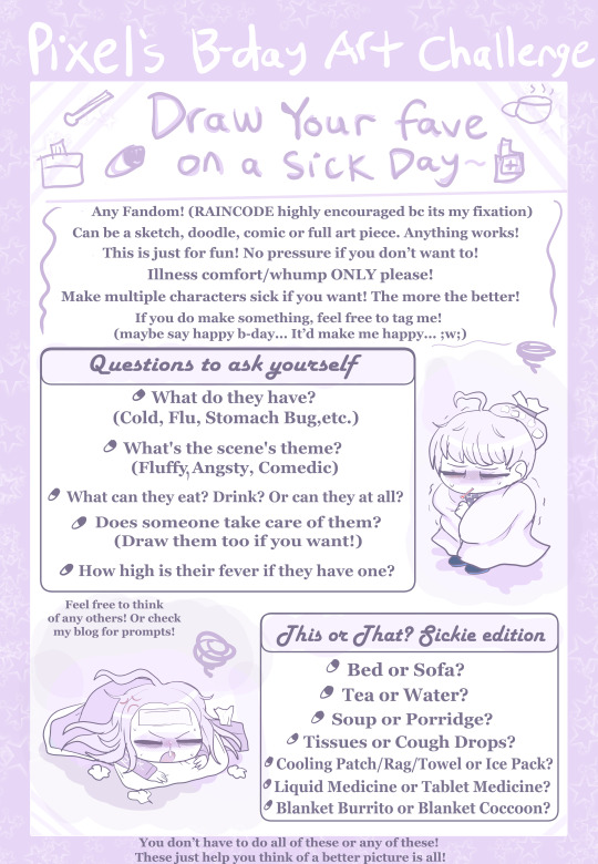
DRAW YOUR FAVE ON A SICK DAY CHALLENGE🌡️😷🥵🤧
~~~~
(Mmmmkay, I am lying to myself when I say this isn't mostly aimed at the RainCode community... X'D Can't help myself. But anyone can join regardless of the fandom!!)
So here's the challenge and the rules!! (featuring my two main lil targets ofc :3)
Regardless of who it is, put your fave through some sickness hell >:3c I'd love to see it! Make em' as miserable as you want!
destroy them 😈 jkjk XD
If you're in the RainCode community you can target anyone, but as you know, my main targets are Yuma and Makoto. If they're also your faves and who you decide to use, that will make me extra happy!
Some tips for anyone new to drawing a sick day scenario art. A few things that make it look convincing are the following:
Pajamas or Loungewear
Messy Bed Hair
Fever flushed face w sweat or at least a red nose
Tired Eye bags
Shivery body
Ice Pack or a Compress on the head
Thermometer sticking from their mouth
LOTS OF BLANKETS
Tissues or medicine surrounding them
Tea or Soup (or both)
Those are just to name some from the top of my head. If you'd like some pointers on how to make a character look ill, check out my Fever Coloring Guide. This is for digital artists but traditional artists can try it too!
You can add injury or angst to the scene but I'd like illness to be the main focus of it.
The scene can be anything you want to, it can be fluffy and wholesome (with a caretaker) it can be angsty, or it can be silly. Its all up to you! Do it for the sake of fluff! Caretaking scenes are the best for any kind of relationship >w<
Either way, have fun with it!! I look forward to see what people make if they decide to give it a try! It doesn't even have to be a full on picture! Doodles and sketches are fine too! Just show me something >w<
(feel free to tag me and say happy b-day and mention my challenge, I am proud to be known for this and would love for many to participate :3) I wanna see you take a go at it :3 Show me your style! :D
~

~~~
(wow look at me misspelling the word writing on text when I did it fine with my own hands lol)
Now, I know not everyone can draw...
Well never fear! I accept writing as well! ✍️✍️✍️
(hi vivia lol sorry for giving you a cold, at least you have an excuse to read and do nothing now haha x3)
Sickfics are one of the biggest things I live for! Any little drabbles or full fics with more than one chapter are welcome! Again target who you want any fandom you want, but I'll def be super happy if you make a RainCode fic. And even happier if you target my faves as well, but again, anything will do! Just make a cute story about your fave being miserable and being tended to! Trust me, it's super fun!
You can add injury or angst to the scene but I'd like illness to be the main focus of it.
Feel free to post your writing here and tag me or mention my AO3!
If you need a start to your fic, look on my blog for illness prompts! Maybe it can help give you a good start or give some inspiration! (thats why I share 'em :3)
I look forward to anything you try to write!
~

That's about all!! I hope you decide to participate! ✨
Good luck, have fun, and godspeed you future whumpers! 😈
(nah jk XD)
AGAIN THIS IS FOR FUN! NO PRRSSURE IF YOU DON'T WANT TO!
#pixeldoodles#my art#art challenge#illness whump#sick whump#whump community#rain code#whumpcode#artists on tumblr#digital artist#fever whump#cold whump#whumpblr#whump ideas#whump scenario#sick art#sickfic#sick day challenge#yuma kokohead#makoto kagutsuchi#vivia twilight#shinigami rain code#IM A LITTLE NERVOUS ABOUT TRYING THIS#but idk it sounded like a fun idea... >w<;#plus it was fun to design the challenge pages#pretty much used the color replacement tool on photoshop to make it all purple LMOA#but yeah if you wanna give it a try I would love to see what you come up with!!#especially from the raincode community... XD#be sure to show me!! >w<#thanks for reading if you did!
46 notes
·
View notes
Text
*takes a deep breath* AHHHHHDKAJFKSJA
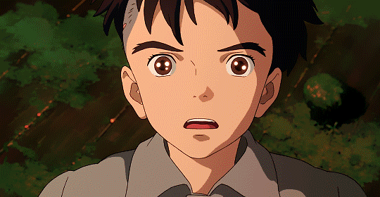
I JUST WATCHED BOY AND THE HERON AND I LOVE IT SM AND IT'S SO GOOD.
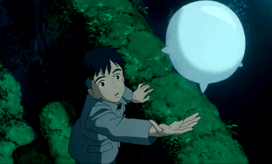
So obvs, it's studio ghibli, it's gna be some of the prettiest stuff you've ever seen. So many scenery frames made me think "I'm gna scour the internet for them and repaint them as art practice. It resembles smudgy oil paintings rather than studio ghibli's gouache style (see spirited away, Totoro) but it's honestly beautiful nonetheless, and seeing it on the big screen made me feel like I was in the movie. There's even a stone passage that looks like the one from Coraline. The animation works so smoothly to make the film an overall wonderful immersive experience.
The character design was so good. You have your classic ghibli, countryside, apron wearing girl. Your boy with spiky hair. And probably the best addition of a butch seafarer, Kiriko, dubbed by Florence Pugh (oh my goodness I am too gay for this). The grannies were so inexplicably lovely and visually distinct I just want a hug from them. The wizard (Mark Hamill having this otherworldly yet grounded design and amazing hair. The heron was oddly grotesque without being scary (this is such a gift only japanese have.) and his various designs fluctuate along with the story. I was surprisingly intrigued by the fact that even in crane form, he had human teeth. And ofc THE WARAWARA.

GOSH THEY ARE ADORABLE I LOVE THESE DAMN TAPIOCA PEARL LOOKING THINGS THEY HAD ME SQUEALING IN THE THEATRE EITH HOW CUTE THEY ARE.
The score is beautiful and I dare say that it's on par, maybe even better than the Spiderverse score (and that's REALLY HIGH praise coming from me, I love the Spiderverse score to the point where it's on my Spotify wrapped.) I loved how the use of motifs, especially in relation to magic in the film. And definitely need to go give it more listens. 11/10 would recommend listening to it even outside of the film, it's just that great, give it a Grammy or smth.
Humor in this film is hilarious without being corny. It's very on the nose, what's currently happening in the scene humor. Characters (won't say who) also have amazing dynamics that supply a lot of humor for the film. Obviously we have that last snippet from the trailer and I'll give you this out of context "Mahito's turned into a parakeet"
The story is very easy to follow. The first half of the story is very grounded. And even in the second fantastical half, the visuals and little sprinkles of just the right amount of information help to guide us through the amazing fantastical world. Nothing ever feels too spoonfed to the audience or too overwhelming.
Spoilers below the cut
Character was great too. The main cast each have a very touching emotional aspect and nothing is what it seems, not from the trailers and not even within the show. Characters go on journeys you never could've expected from the beginning of the show. Such as the heron, who I genuinely thought from trailers was gna be the bad guy but turned into a genuine, squat goblin companion. And the parakeet king goddamn I thought he was gna be a good guy with his "we must protect this world" gig, not some giant cannibalistic parakeet with a surprising penchant for sneaking. Anyway, I especially loved how we meet characters almost multiple times with how we're introduced to different versions of them. Kiriko>>>
The moral of this story had me confused ngl, but I'm fcking dumb and need to go read some analysis so ignore this. The main message I got was that "Life is shit. But it's worth living and I can make it better for myself. Through friends, I don't have to be alone through it all" which made me tear up ngl since I've been struggling with life this year and seeing how our boy Mahito went from being a closed off lil squat to that *cries*. Personally I interpreted the great granduncle and his blocks as seeing what's wrong with the system the older generation has built, and demanding more from it/straight up turning away from it. Also Mahito learning to let go of his mom. The pelicans wanting the best for their children and not always liking what they have to do for survival as a link to war soldiers @hamable . I also read from @simplysparrow14 and @rockpaperimpala the film is also Miyazaki coming to the realisation that 'studio ghibli will be his legacy and it will be put to rest, it won't be the same if continued without him and that's okay' and ow I just got hit in the feels.
To summarize the boy and the heron excelled, slaps, is show stopping, brilliant, awesome, a true work of art and soul and 11000/10 go watch it ON THE BIG SCREEN I am not joking.
#ahh i just saw it#it's so good#*cries*#110000/10I love this film#go watch it#amazing showstopping brilliant talented#soulful#the boy and the heron#studio ghibli#hayao miyazaki#art#also it's like 2am here I stayed up writing this
67 notes
·
View notes
Text


THE COLOURED DIGITAL PEICES ARENT MINE, THEY ARE OFFICIAL ART FROM THE GAME
(so you can tell whos who, and for those unfamiliar with rainworld)
I drew the main three rainworld characters from the base game and gave them environmental adaptations according to their play style for sillies :3
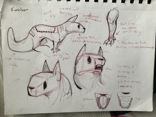
SURVIVOR:
I gave survivor a more average slugcat body type as it serves as the “normal mode” of sorts in the base game. The back legs are spring like and adapted for jumping and quick manoeuvres. They have a streamlined head shape to allow for this movement, but their dew claws are also adapted into a hook like shape to improve grip on poles and ledges. They have a balljoint in the front legs to improve with this as it gives a fuller range of motion. They also have more omnivorous teeth, with molars, carnassials and incisors! They are fitted with big ears for good hearing, whiskers to measure spaces, and reflective eyes to improve with vision in the dark due to many areas being underground. Ontop of this they have a strong prehensile tail to allow for easier escape from predators.
some little things I added for sillies are the claw marks on the back and neck along with a bite mark where they would have gotten away from a lizard :3
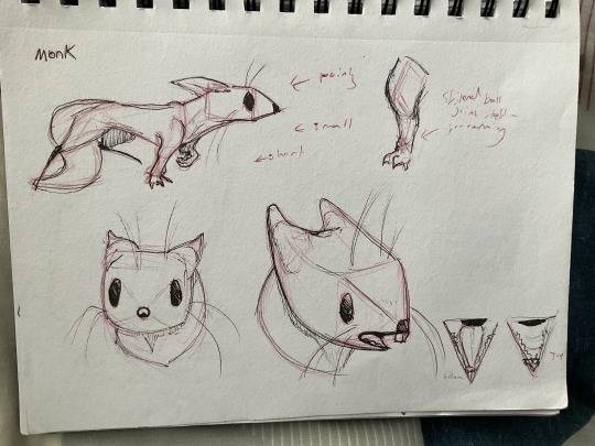
MONK:
Monk has similar base adaptations like the other slugcats such as the spring legs and good vision :3 But their nose is incredibly pointy, forcing the teeth into a more rodent like shape which aided in consumption of fruit but not excluding meats. They are also more streamlined than survivor, smaller and with shorter legs; their ball joints in the lower arms are stiffened for strength and their dew claw is similar to that of a cat’s. These factors are all to help improve running speed, and allows for monk to escape into smaller areas more effectively, they are less able to pick and choose fights like survivor but they aren’t incapable of killing.
My version of monk doesn’t have any visible scars to push the fact that they are adapted to opt for escaping rather than fighting :D
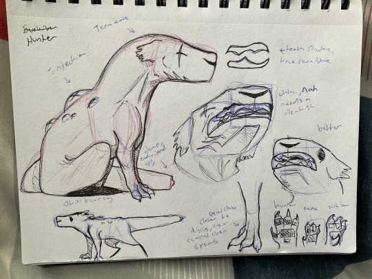
HUNTER:
I ran out of red ink on the red slugcat, typical, hehe :3 Hunter has adapted for physical strength to improve success when, well, hunting! I had to take note that hunter does fight with spears rather than claws and teeth, so I noted that they wouldn’t be too drastic from the other slug cats, but still a lot stronger. So i gave them a more robust jaw for improved biteforce because fuck that apparently, as well as very ancient canines like that of thyacoleo to emphasise a meat based diet. Furthermore the dew claw is adapted into more of a proto-thumb than the others to aid in object handling, such as spears and debris. I say proto-thumb as it isn’t a fully formed opposable thumb, but more acts as something for the object being throw to lie on, improving accuracy and damage! The tail isn’t as prehensile as hunter’s body doesn’t need to rely on climbing to escape due to improved offensive adaptations. They don’t have whiskers due to their larger size, but have an improved sense of smell to track prey more effectively as they are a solitary predator.
My hunter has the infection around their back area like usual, but also has scars under their chin and the tip of the tail has been bit off from a vulture attack, where as the eye scar i believe came from a scavenger attack in cannon? But i could be wrong. I chose a vulture as they are the apex predator in most regions, and would make more sense them giving hunter the extra scars rather that a more secondary based predator such as lizards (like with survivor). The ears have also been affected, but thats up to you whether you think it’s infection or scaring, I can’t decide :3
Hope you guys like my headcannons, i love making adaptations for things its fun :3 reminds me a little of all tomorrows (but obviously nowhere near that scale lmao)
#rain world#rainworld#slugcats#rain world art#Rainworld fan#rainworld fanart#rainworld designs#Rainworld hunter#rainworld suvivor#Rainworld monk
28 notes
·
View notes
Note
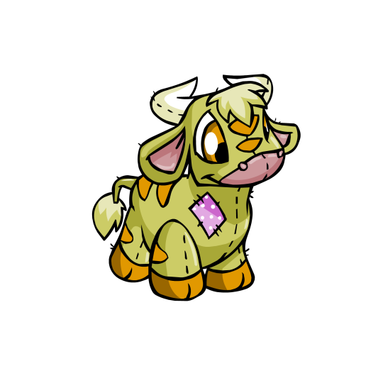
can you review my favorite neopet, the kau? (sorry if you already did, you know how it is with the tumblr search function)
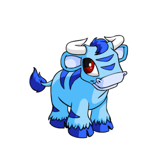

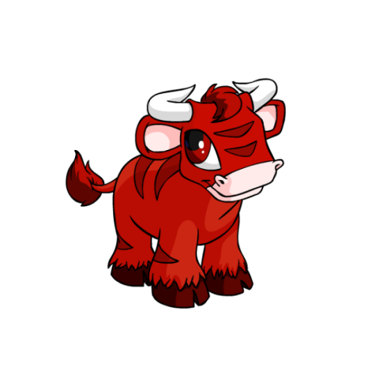
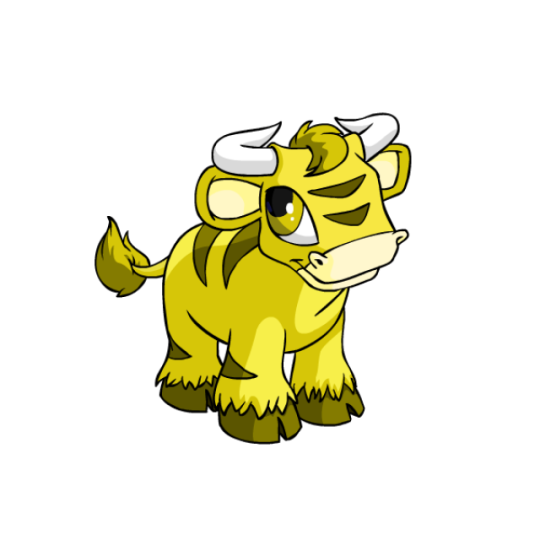
As you may be able to tell by their ever-so-creative name, the Kau is based on a cow, though the horns are more bull-like. (Neopets does not practice sexual dimorphism, and even gender-specific colors like Royalgirl still have horns. This is fine, as it makes them more of a fantasy creature.)
The Kau almost strays too close into "just a cow" territory, but the decision to give them stripes instead of spots adds a bit of flavor. The horns also face backwards, which isn't unheard of in certain types of bulls (see: gaur bulls) but is unusual for standard domesticated breeds
Beyond that, the body is nicely blocked out in terms of color, with darker stripes, hair, tail tip, and hooves complimenting the base color. The muzzle and ears are usually a tint of the base color, but that said I do like it when they make them a light shade of pink like on the red Kau above.

The Kau benefited quite a bit from customization, losing the overly detailed eyelashes and generally just getting much better drawn and better shaded art. I also like the pose change, which enables you to see the body much better.

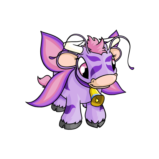
It is also worth noting that Kau have a weird little quick wherein a small number of colours sport a bell around their necks. There's no rhyme or reason to what colours get the bell—all of them are post-customization except for faerie (shown above), yet not all post-customization colours get the bell. For the record, I rather like it—it adds a little something to the design, and customization always enables it to be removed if desired.
Favorite Colours:
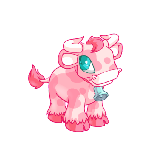
Pastel: The pastel has been a fan-favorite ever since it came out, and for good reason. The pink base color is lovely and is accented with a bit of blue in the eye and on the bell (this being one of the few lucky colours to sport one). The big thing that elevates this design for me though is the choice to change the stripes to cow-like spots, which isn't normal for pastel but makes the design extra cute. The spotted cow does the same thing in classic black-and-white, but I find the position of the spots on the face with that colour to be much more awkward.)
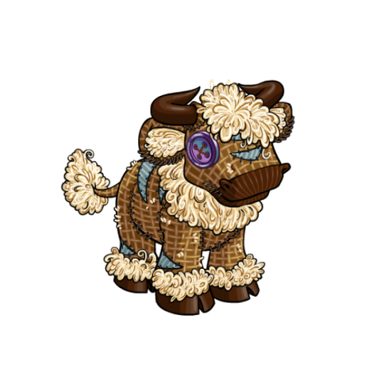
Burlap: I'm of the strong opinion that burlap pets should always be at least slightly uncanny and unnerving and should stick to dull monotones, which are the main selling points for the colour to me and are what keeps it from overlapping with plushie too much. In that respect, the burlap Kau is a bad burlap pet, but a great colour for the Kau overall, if that makes sense. The extra fluff around the neck, head and legs reminds me of a highland cow, and the textures on this one are really spot-on, down the corduroy nose and blue stripes.

Plushie: Speaking of plushie, while I think the burlap is surperior overall, I do like the plushie quite a bit as well—mostly the UC/styled version, which is absolutely adorable and has a great shape to it. I also like the subtle tan shades (though I wish there was less of a green tint to it) and the way the pink patch kind of matches the nose and ears. The converted version tries, but the big issue with it (aside from, well, Being Converted) is that it's missing the pink patch. If there wasn't room on the chest, just move it to the side or something!
32 notes
·
View notes
Note
You draw bodies so meaty and juicy! It must've taken years to polish your style that well! What was your process on studying anatomy and what/where did you pick up your art references/influences from? I'd love to study how to draw that plump for myself, your art hits so many of my buttons, afsgfsfdfafsgsfa
Hm well I've been drawing for an average of 3 hours a day for a decade now. But we're all constantly evolving too.
I started with drawing comic book characters. Also, I have a money waste hobby, which was collecting mecha's and the avp action figures that i could use for refs. And the yautja while having muschles also had the cupcake belly, so i just copied what i saw. Later in school, when you get art classes, they are forcing you to learn how to draw realistically. which I was never having a good time with. It was so boring and hard for me. But there where i was just looking at the doctors' posteres with skelatons and muchles, which just stuck with me automatically? I was already doodling characters whose characteristics showed in they way they were shaped. Not who looks the most real.
There's this artist called Bill Mauldin, who I was in love with the way he drew characters. Scruffy tired men why weren't really the bright 6-pack super young dudes, and I was gravitating towards them verry much so.
And that's where my mix of bold lines and lazy curved men comes from? Becouse, this is going to sound so stupid. My teachers knew I made a drawing, when they saw the nose of my characters. Becouse I have a specific way I do that, and later it was also me drawing fur. But the note I always got was that it was not cartoonist enough to be a cartoon/comic thing, and not realistic enough to be an official portrait thing or whatever. So I never really felt like I had a style, I was just doing it wrong on all fronts...
Moving in more modern time, I wanted to be mainstream (and make money, sorry can't ignore that that is one of the main reasons ive mobed to where i amXD), so I looked up what sold well. The bottom line is NSFW and furries. So i focused on that, and the more ridiculous, not realistic human, I made it the better it got relieved. Also, coming back on Mauldin, I was attracted to the 'pudgy', so instead of perfect muscle, I'd just give them a little more food and water, so to say.
And just see what you like, In my case, I have a weird obsession with tits and thighs, so I highlighted what I like (‿!‿) ԅ(≖‿≖ԅ)
This is a whole rant, and I don't know if you got your awnser, but, yeah ฅ^•ﻌ•^ฅ
25 notes
·
View notes
Note
MY FUCKING GOD HOW I LOVE FIRST PART OF EXECUTION
I LOVE YOUR STYLE AND I SEE HOW MUCH WORK YOU PUT INTO THIS ITS SO BEAUTIFUL AND DETAILED
I ALWSO LOVE HOW YOU MADE FOR MAIN ELITE DIFRENT THRONES ITS SO NICE DETAIL
SEEING ME UP THERE LITERARY MADE MY DAY THANK YOU SO MUCH FOR PUTUNG ME THERE
Alwsi sorry for screaming im yast so in nice mood after reading this ^^
Thank you!!
I put a decent amount of thought into the throne's designs!
In this essay I will-

Hootbons was the most difficult to design. Good thing I started with her's first!
Since her OC maple is a rubberhose cartoon, I went with a 20s technology theme. The 20s were a time of great technological advancement. Radio, Television, even Vaccum cleaners!
Just cluttering a bunch of 20s technology together didn't look very good, though, so I added maple tree branches along with animation themed items like pencils and animation cels.
Mushy's is just a slightly redesigned version of her throne from her execution. I added a few more mushroom types for variety.

Dia's was easy. It's just his crown as a throne.
Since I found 0104-vkta from her human Gangle art, That's what I based her throne on! You'll see a combination of the happy and sad masks in the middle.

Loxely's was also simple, she's a flower. I made her throne a flower.
Goose's is supposed to be a goose feather, but I looked up references for duck feathers instead for some reason. (also, I just drew generic bird feet instead of goose feet??)
since Rabid is a jester with a clown nose (a mix of a medieval form of entertainment and the more modern concept of a circus clown), I decided to mix a medieval throne with props you'd find in a circus!

Burrotello's throne was made reaalllly late in the game, when I had already finished most of the sketches for part one, but I felt bad not including her since she was the only new member of our discord at the time.
I went with a gothic theme for her's. I don't think her clothes can really be considered goth, but that's what I went for. Maybe it's the earrings.
You'll also notice that, unlike the others, she doesn't have anything on the backrest! I forgot it 😭 (this design element is an important theme.)
Edit:
Just realised I forgot to include Ark-fork!
Her's was pretty simple, it's just a throne made of bones. There wasn't really any planning for this one!

Okay, so the backrests! Each of the thrones have a circular element in that area (except for Burrotello because I forgot, and Dia's and Mushy's aren't really circular, but you get it). They are meant to represent halos. If you look at the backgrounds, you'll see eyes on the balcony of the elite's seating section:

And, it's not very visible since the large thrones are covering it up, but there are wings on the back wall behind the elites.

Multiple eyes and wings are commonly attributed to biblically accurate angels

The elites sit high above everyone else, surrounded by angelic imagery with "halos" behind their heads. It is a very clear show of their hubris, of their willigness to play god not only with their AUS, but with their own audience, deciding who lives or dies by the wave of a hand (i.e. executions).
When I describe "the elites" here, I am specifically referring to how they are portrayed as characters in my comic. This is not a comment on the real people behind these sonas.
If you read all of that, thanks! I put a lot of work into this comic, so i appreciate people taking interest in my process!
44 notes
·
View notes
Text
Complaining About Fanart
Mwahaha I’ve tricked you this is actually an art appreciation post. But bc I’m in love and look at fanart all the time every day, I’ve noticed 2 main categories of comic! death of the endless fanart which are as follows:
Generic Comic Book Woman With Eyeliner
The other ones
Show!Death does not suffer from no. 1 as much, I imagine bc of the time the show came out? I’m not going to share examples of type one bc I don’t want to shame any artists for my own personal taste but like. You know which ones I’m talking about right? Like you’ve seen It. You Know.
But here are ones I LOVE bc they’re unique/beautiful/she looks a little icky
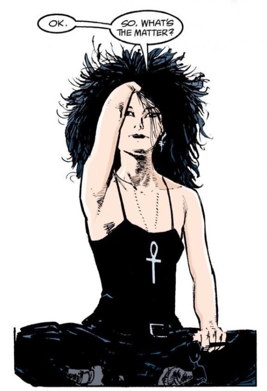
The official comic art obvs, I feel like her hair would crunch if I touched it
2. Any drawing of her by Chris Bachalo, he always makes her shape language so round and I love that. Huggable. Squishable. 10/10z

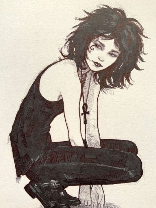
3. Taurin Clarke’s style (@ taskforcetuesday) . Look at her expression!!! Her little nose scrunch! She’s feelin mischievous!!!!!
4. Rebecca Puebla , the way the lines r so squiggly. Very good very good.
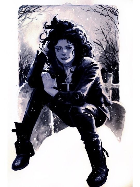
5. Quite literally anything by Alex Maleev. They just Get It, you know. She looks exhausted and lightly pissed off in all of their art. Perfect.
6. This specific drawing by Ryan Kelly. Idk why but this one just scratches an itch in my brain.
7. Lisa Treiman, she’s feeling mischievous!!!! That’s the number 1 thing I look for!!!! And a little icky! The wings! The expression! Amazing.

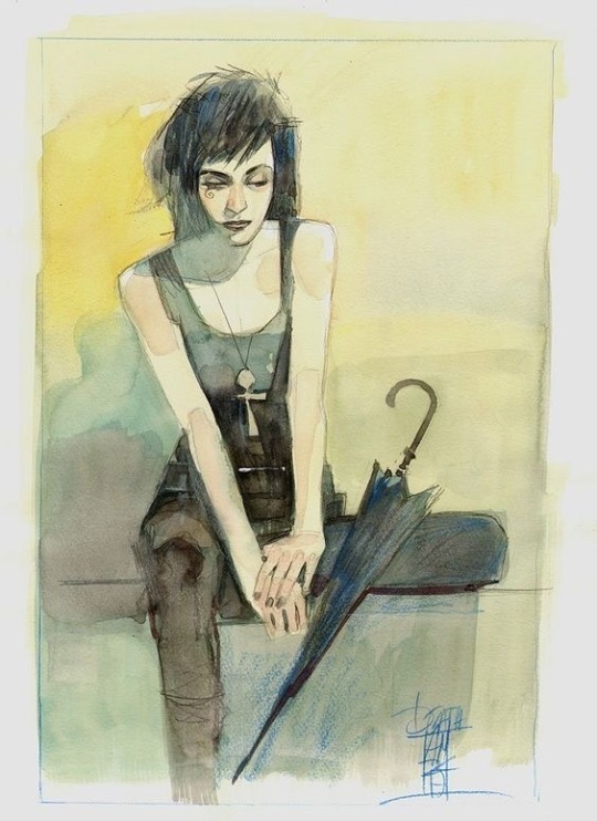
8. Kevin Wada, the colors are lovely I just adore how her cheeks r a little pink. N her shirt is so cool!!!!!

9. This one, just such a unique style. I go insane for the pencil sketch vibes.
So in conclusion I think I just like any drawing where she has a facial expression actually. And I’m definitely going to do a part 2 with Show!Death fanart bc there are so many artists who deserve so much love 🙏💕
One of my favorites by Miss Bliss on Twitter :)
EDIT: part 2 :)
#but please tell me you guys have seen type one#u know the vibes#with the kinda dead eyed stare into the middle distance#idk it just rubs me the wrong way bc that’s so not the vibes I get from her character#but to each their own#awwsd thoughts#sandman#death of the endless#dc comics#dream of the endless#the sandman#awwsd writing#death of the endless fanart#sandman fanart
113 notes
·
View notes
Last Seen Blogs

masterofwolfe
What's your desire?
klaudia2646
This Life Of Mine
las-lus
All we can do is run!
itsaboxoficons
Box Of Icons
jinghay
Stardust Corner