#2d mario style
Text

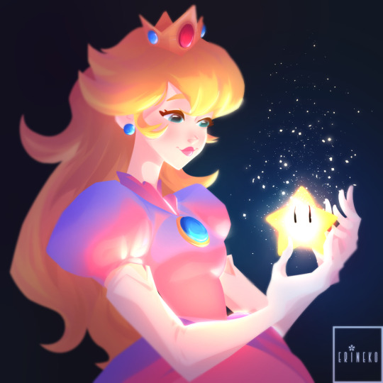
2d mario style commission for someone on twitter c:
#commission#toad#mario oc#mario fan character#nintendo#mario bros#super mario#mario#my art#no l/inktober today sorryyy#I'm having my period and I'm dying#2d mario style
125 notes
·
View notes
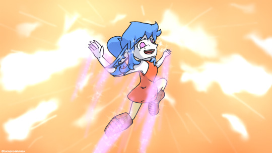
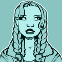
Photo

They made a personal attack on me with this glow up
#mario#super mario movie#foreman spike#also this is my attempt at the official 2d style#not perfect#but i'll keep trying#i just think he's neat#he's like a Fuzzy but a human..
252 notes
·
View notes
Text
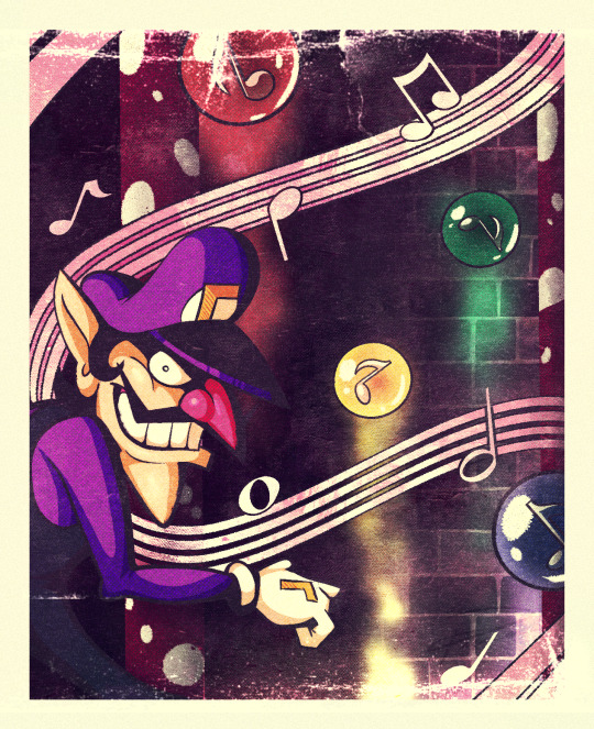
The Music Key Thief
Since we're nearing the 18th anniversary of the beloved classic Dance Dance Revolution: Mario Mix, here is a commemorative piece featuring the only time Waluigi was truly the antagonist in a Mario game.
#clip studio paint#character art#prismcreative#digital art#2d artwork#fan art#art#artists on tumblr#vintage style#poster art#poster#nintendo fanart#nintendo#super mario#waluigi#ddr mario mix
58 notes
·
View notes
Text

*inhales slowly and deeply*
SOOO MARIO FAM HOW WE FEELIN’
#DANG WE GOT FED A FREAKIN’ BUFFET THIS NINTENDO DIRECT#all that hype had my heart pounding#I’ve never played SMRPG before since I haven’t been able to#but I’ve heard that it’s one of if not the best Mario RPG game#so the fact that I’ll be able to play it has me very excited#AND THE AMOUNT OF TIMES I’VE SAID ‘STOP HE’S SO CUTE’ TOWARDS MARIO#HE’S SO TINY#and I was NOT expecting to have a SMB game#AND THE STYLE IS SO DELIGHTFUL AND CUTE#a power-up that changes the stage in some way is pretty cool and interesting#though it does feel like a drug trip 😂#AND THEY USE OVER-SIZED HATS TO GLIDE#AND THEY CAN TURN INTO YOSHIS TOO#AND A FREAKIN’ ELEPHANT POWER-UP#this is going to be the most fun I’ve had playing a 2D Mario game in a long time#so those two are the games I’m looking forward to the most#I might end up getting the Princess Peach game and the LMDM remaster#mario#super mario#super mario bros#super mario rpg#super mario bros wonder
83 notes
·
View notes
Text
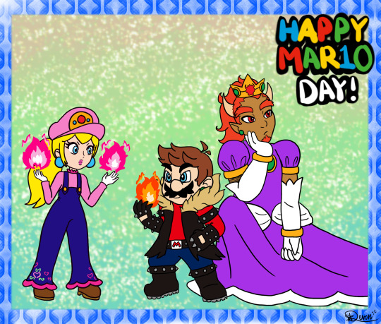

Happy MAR10 Day!! Take some silly role swap art ^^
#art tag#super mario bros#mario#princess peach#bowser#mar10 day#i like to think this isnt even like an au or anything theyre just playing dress up for fun#just silly pals doin silly things#also i tried drawing in the 2d mario style again… i think it came out pretty good!!#big red#peachy#cuddle monster#kin tag#self ship tag
17 notes
·
View notes
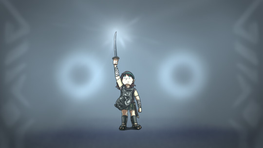
Note
Trick or treat
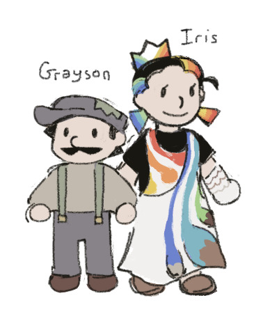
Here you get more Mario Knockoffs because i'm making it my mission to see how many different plots for homemade Mario knockoffs i can do
#Grayson and his sister Princess Iris of the Paint Palace#ask#i wanna do this thing where grayson and another mario knockoff from a different game accidentally get booted from their respective universe#and shoved into some weird dimension where shenanigans ensue as they figure out how to get back to their original games#[grayson will be a 3d model who moves like a videogame with preset animation cycles and the other one will be pixel art sprites that move#like a 2d game still. what im saying is that their retain their animation styles from their games i think it would be really fun to animate#doodle
17 notes
·
View notes
Text
My shot #413 for Spiderman Reanimated 2023 ⭐️
Hosted by the lovely ppl at @reanimstation !!
Isolated Backgrounds:


#spiderman reanimated#Reanimation#reanimated#spiderman Animation#animation#digital animation#2D Animation#toon boom harmony#digital art#artists on tumblr#digital artist#artist on tumblr#art style#mario kart#digital animator#digital painting
47 notes
·
View notes
Text
Princess peach fanart <3 <3 <3
#supermariobros#princess peach#super mario bros movie#2dartist#2d artwork#illustration#digital illustration#clip studio paint#stylized#cartoon style#cute#original art
14 notes
·
View notes
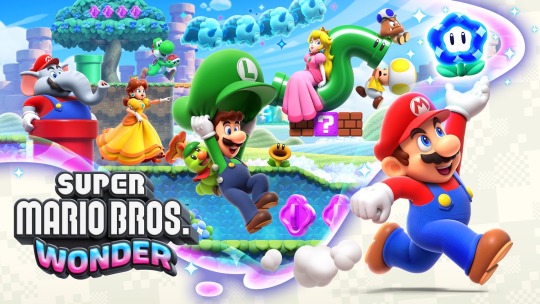
Text
So Super Mario Bros. Wonder is out and it’s great. But I specifically want to call out something about it’s approach to animation, because yes Wonder looks better than the New series but it’s important to acknowledge WHY.
youtube
This video, without words, does SO MUCH to demonstrate the difference between Wonder’s philosophy and the New series philosophy. And it's something I'll be discussing more... AFTER THE BREAK!
I think something that gets lost in the discussion about the NSMB series is how the series evolved graphically, because it’s easy to look at the difference between U over a decade ago (or U Deluxe just shy of 5 years ago) and Wonder and wonder (heh) just what was going on with U.
The answer is that for 5 years U represented the culmination of a different kind of graphical journey, one that I was there for and remember noticing even at the time. And look, YES the NSMB games are generic but let’s table that for a second and go on a bit of a journey here.
NSMB DS came at a time where having a 3D game on a handheld was a BIG DEAL, and NSMB reflects that in more ways than one. Because while the promo art looks like THIS:
The actual game looks more like THIS:
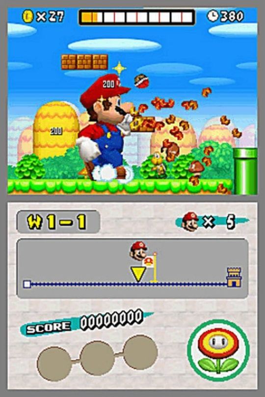
If you go back and play NSMB today the thing that’s going to surprise you is just HOW LITTLE 3D is in it. Yes Mario is 3D and most of the enemies are too but the blocks you bash, the Koopa shells you kick, the power ups you collect and the backgrounds you run through are NOT. They’re all rendered as 2D sprites to help the game run smoothly on the DS.
Why do I point this out? Because it’s indicative of the New series’s approach to 3D. The sheer act of being in 3D is a spectacle, having a 3D rendered Mario is a graphical trick so cool that the first game has to invent its own hybrid art style to show it off.
Now let’s flash forward to Wii:
Immediately we’re looking at a big shift, we’ve still got a hybrid art style but one that looks much more cohesive.. This game is a much more significant graphical leap, it LOOKS in gameplay like the first game’s promo material! And this trend would be continued by 2 which upped the saturation in its art style (2 is both my favorite game in the New series and my favorite pre-Wonder 2D Mario (no really) and I usually hate that it gets the shaft but that's a discussion for another time unfortunately).
Now jump ahead to U:
Nintendo's first game on an HD console, U was considered U-niversally (heh) underwhelming by graphical standards but for my money I think U still had a distinct graphical goal: to create environments that were U-nique (heh) to the previous games. NSMB is famous for using the same world themes in every game, but U takes them, polishes them up, and gives them a bit of personality to help stand on their own. From the moai and dessert motifs of layer cake desert to the mushroom trees of acorn plains to the night skies and auroras of frosted glacier. YES its the same themes but they have a bit more pop this time and that's intentional.
What HASN'T changed is the approach to animation, and this is where we circle back to Wonder. The "Wow" factor of these games is still that it uses 3D models, so it doesn't focus on HOW it uses models as much or how those models look in 3D space.
Go watch the video again and what stands out is how... for lack of a better term... utilitarian the U animations are. The Wonder animations are all peppered with bits of personality but the U animations are all focused on just manipulating the models, because the 3D models are the (theoretical) draw.
Moreover, look how the models are constructed. U Mario faces forward as if he is in a 3D space, while the Mario Wonder model is built to more closely resemble the Super Mario World sprites. If you look at the Mario Wonder model closely it doesn't totally make sense, Mario is tilted at a diagonal angle at almost all times, why? BECAUSE THAT'S WHAT LOOKS BETTER IN 2D. The U model is technically what looking at Mario from a side on perspective would be, but the Wonder model brings in elements of 2D animation to create something more visibly appealing. Honestly that's basically the MO of Wonder's graphical style, ignore realism and create visuals that LOOK GOOD with the perspective of the game. It's one of the reason that I find it so strange for the game to use the standard character models in the promo material:

Compared to how they look in game:
But that's just my thoughts. I'd be interested to hear what more seasoned artists think as well! And thanks for tuning in to this tangent haha.
3 notes
·
View notes
Text
I HAD NO IDEA THERE WAS A DIRECT TODAY AND I GOT BOMBARDED WITH THIS NEWS!?!
youtube
youtube
youtube
#IT IS A GOOD DAY TO BE A MARIO FAN!#SUPER MARIO RPG IS BACK BABY!!#FINALLY! A 2D MARIO GAME WITH STYLE!!#AND I LOVE THE WARIO WARE SERIES#Youtube
6 notes
·
View notes
Text
Hello!
Hi, im new Here! Im GameDev, sometimes i do fanarts and originals arts too. Some of my works:

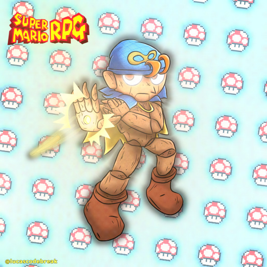
#low poly#gamedev#fanart#new on tumblr#mario rpg#geno smrpg#original character#ocs#super mario#shadow of the colossus#wondershadowofthecolossus#monoeta#projecthatcosmos#original story#original style#2d art#digital 2d#cute#adorable#smrpg remake
4 notes
·
View notes
Text
2d mario style commission I did! if anyone is interested, I will accept commissions in this style from now on c:
22 notes
·
View notes
Text
this nintendo direct is SO MUCH MARIO
#exoticbutterstxt#not complaining because mario games are good but damn theres a lot of mario#the new 2d mario looks really good though. visually speaking#i love the style
3 notes
·
View notes
Text
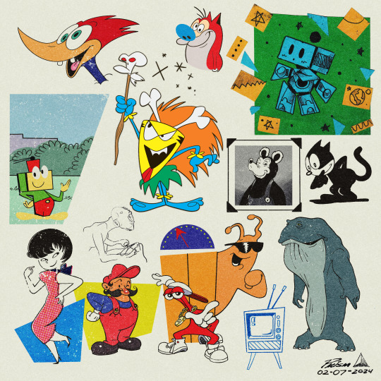
Sketchpad page from yesterday - today #2.
#clip studio paint#prismcreative#character art#digital art#2d artwork#art#fan art#artists on tumblr#vintage style#vintage#mario fanart#toejam and earl#jucika#woody woodpecker
30 notes
·
View notes
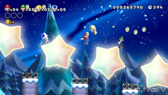
Text
JOY AND WHIMSEY IN THE WORLD (good day for mario fans)
#mario#super mario#goosey rambles#GOOD FUCKING DAY TO BE A MARIO FAN HOLY SHIT#NEW 2D MARIO THAT ACTUALLY CHANGES THE FORMULA AND HAS A DIFFERENT STYLE????#ELEPHANT MARIO?????#WEHEHE#WHIMSEY
3 notes
·
View notes
Text
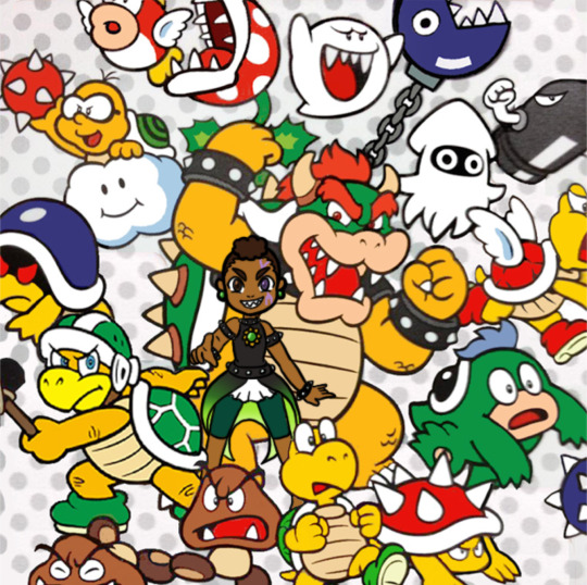
Omg look it’s King Devin, totally an official character cause look he’s in official art and everything woahhhhhh
#art tag#super mario bros#bowser#super mario oc#sonas tag#ignore my silly caption hdhfjdhs i am attempting 2d mario style again#it is hard…………..#once i learn it tho its all ill ever draw again fhjhvjhdvg#anyway look… it me………..#i will do more of these for practice#chocolate eclair#cuddle monster#my lovely minions#self ship tag
5 notes
·
View notes
Last Seen Blogs
otomes-world
Tien Shi
0th3rw0rldl1n3ss
a Bunch Of Strange And Odd Guys

astroisonline
astrovaciderrr
vanillssugar
Fanartist 🍉✨
mewhenidraw
Mreena