#like a 2d game still. what im saying is that their retain their animation styles from their games i think it would be really fun to animate
Note
Trick or treat
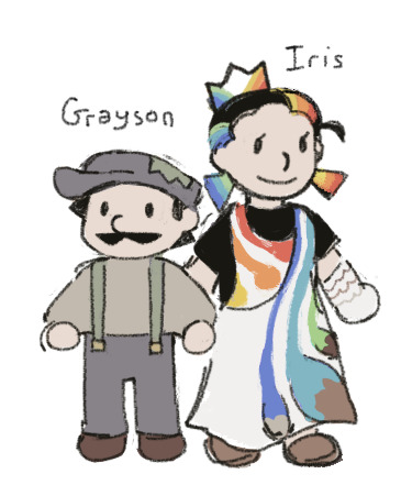
Here you get more Mario Knockoffs because i'm making it my mission to see how many different plots for homemade Mario knockoffs i can do
#Grayson and his sister Princess Iris of the Paint Palace#ask#i wanna do this thing where grayson and another mario knockoff from a different game accidentally get booted from their respective universe#and shoved into some weird dimension where shenanigans ensue as they figure out how to get back to their original games#[grayson will be a 3d model who moves like a videogame with preset animation cycles and the other one will be pixel art sprites that move#like a 2d game still. what im saying is that their retain their animation styles from their games i think it would be really fun to animate#doodle
17 notes
·
View notes
Text
What’d they do to Sora?—A visual analysis of KH 1, 2, & 3
One of the biggest staples of the original Kingdom Hearts games is their visual charm. The team managed to do what Disney rarely could: transform the animation giant’s 2D into amazing 3D and then some.
But something kinda funky is happening in KH 3. Somehow Sora and the gang are looking less, well, Sora-and-the-gang-y, and it’s not just the new wardrobe.
Before I get into what’s off about KH 3, I need to map out what makes KH 1 and 2 so visually appealing. There are three big reasons for why KH’s visuals have stood the test of time:
Color
Style
Animation
Color is usually what our eyes notice first in a given scene and is a vital tool for setting the mood. We universally associate color with so many things that we can immediately assume the tone of an image with a quick glance before even looking at the details. This psychology of color is utilized in everything from retail, to movie posters, to social media, and so on. Unsurprisingly, KH has also tapped into this with lush, playful color palettes that hearken back to each respective property. Disney takes us to places with magic, fairytales, talking animals, and monsters—nothing of the “real” variety, and KH reflects this first and foremost with color palettes that immediately tap into that fantastical setting. The color schemes that exist throughout KH are not likely to exist in real life settings, and they work hand-in-hand to assist cartoony shapes.
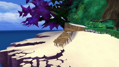
(At least, I would hope you don’t find something like this in real life.)
This lack of realism ties directly into style, another key factor in letting your audience know what kind of vibe you’re going for. KH sets this fantastical tone by taking elements from Disney and breaking them down into their most basic parts, playing with stylistic choices popular in both Western and Japanese character design to create something new. It’s a “less-is-more” approach to art direction. Simplify, simplify, simplify. This, combined with its vibrant colors, allow for unreal environments, ones reminiscent of the same childhood wonder classic 2D films instilled in audiences. Likewise, Final Fantasy characters, who normally exist in realistic settings, become softer in order to accommodate their new space. The end result is a world that seamlessly blends the simplified visuals of hand-drawn animation together with the complexities of 3D modeling.
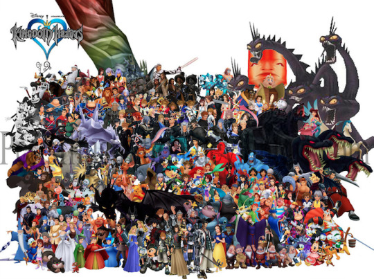
(The gang’s all here.)
These would not be complete, however, without equally fantastical animations. No matter the medium, the best way to tell the audience more about your character is through body movement. How characters move is also dictated by the overall tone of your content. Sora and the gang are animated with exaggerated motions and grandiose body language to remind us of the fanciful world they inhabit, and the larger-than-life personalities they have.
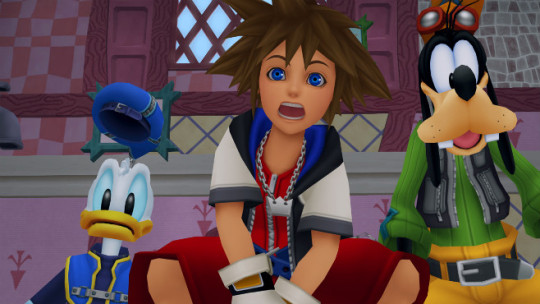
(Donald’s hat jumps with a mind of its own while Sora’s facial features spread across his face. Goofy unfortunately missed the pantomime memo.)
Contrastingly, characters from live-action movies rather than animated films move with much less grandiosity because they exist in realistic worlds. They are dictated by their setting just as much as stylized characters.
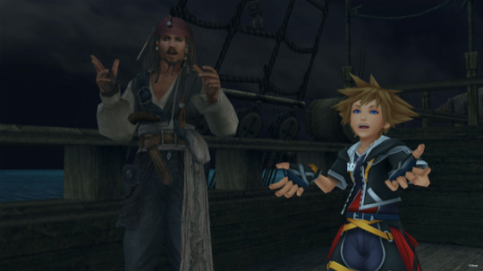
(Jack Sparrow may move in dramatic ways for a human, but Sora’s got all that and more thanks to being a spiky-haired shounen with giant feet and hands.)
Levels like Port Royal are where we can begin to see the problem with KH 3: once you strive for realism, you’ve already aged.
Achieving realism is still incredibly limited by technology. We’re getting closer, but as it stands we don’t have the necessary technology to make 3D indistinguishable from reality. Games especially fall victim to what’s known as Moore’s Law, which (as far as games are concerned) states that a graphics chip will upgrade every two years. So, once something is put out, it already has to worry about looking dated within as little as two years. Because of these limitations, a lot of media dip into uncanny valley real fast. Simply put, when something is meant to look realistic but fails, our brains take issue with it. We think, “Hey, I know that’s supposed to be a real bear, but it doesn’t quite look or move like a real bear, so I’m uncomfortable.” But take that same bear and turn it into a stylized cartoon and we no longer have a problem with it not looking like a real bear. The former is what’s happening to the KH 3 crew, while the latter is what they should be aiming for.
To begin, let’s look at these two screenshots of KH 2 and KH 3 respectively.

(Feel old yet?)
The bottom shot may be an early reveal, but it’s not far from the material they’ve released recently. As you can see, it’s much more detailed than the top image, but this is actually hurting the scene rather than helping it. The colors are muted and muddy in comparison, which would more accurately represent a real environment, but it’s so starkly contrasted by the unrealistic characters that it doesn’t connect. Sora is harder to see against the background because his colors and effects are also mimicking a more realistic application. Even the UI is harder to see, compared to the brilliant colors and shapes of the top image. What the top image lacks in explicit detail it makes up for in readability, creating a cartoony scene of implied information that more closely resembles a classic Disney film (which is the point of KH’s art direction to begin with).
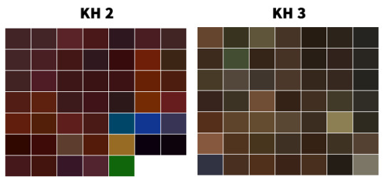
(While both swatches contain brown hues, KH 2 is more vibrant and thus allows for better readability and contrast. KH 3 literally looks like mud here.)
KH 1 and 2 largely avoid this readability and incohesive problem because hardware limitations were used to their advantage. When you’re tasked with creating a game full of Disney- and Final Fantasy-inspired assets but lack the technology to make anything look as “real” as pre-rendered cutscenes, you opt for airbrushed gradients, vibrant colors, cartoon features, and exaggerated shapes. Everything needed to look distinguishable from one another because PS2s were still developing and TV screens were fuzzier. Looking at the games now, it’s easy to see that they were made in the early 2000s, so of course they show age, but it’s also easy to see how beautiful they still are when compared to other games of the era which took on a realistic approach. (Also, imagine if Okami had gone with realism like it originally planned instead of sumi-e, and you can get a further idea of why style can easily trump realism in 3D aging.)

(Only one year apart. Neither are ugly, but when you aim for realism like in the first game, your age shows more and you dip a bit into uncanny valley.)
Now, I don’t think all of KH 3 looks terrible. The technology and efforts should be applauded, and in truth the Disney characters and Heartless shown thus far retain much of their original charm, and definitely benefit from the graphical upgrade most of the time. The animation is spot-on, as well.

(You just can’t look too closely, or else you get a face full of suddenly detailed textures that do not belong on a cartoon character.)
The counter is, unfortunately, that based on other released material, the art direction is not cohesive yet. You have some great-looking enemies and allies, those of which you know right away belong in a KH game, but stacked against a realistic background with lighting, effects, and muted colors that make it difficult to see. Details that are there solely because the technology allows it. More-is-less rather than less-is-more. They can’t seem to find a balance between simplified and detailed, 2D and 3D, Disney and Final Fantasy, that the original games built.
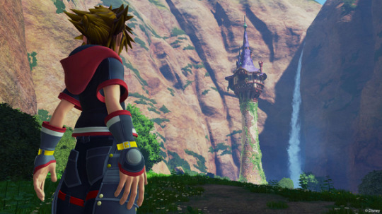
(I don’t even know what to say about this. It’s just straight up ugly. Why do his hands look like that? I feel like I’m looking at one of those nightmare-fuel fan renditions of “X character in real life.”)
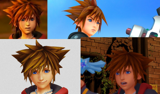
(fix this.png)
Until they make up their minds about modeling Sora and other original characters, and about how to handle the lighting, effects, and other issues which are holding simplification hostage, there’s always going to be something off, something that isn’t translating well from the jump to next-gen consoles and preventing the games from feeling as KH as possible—and it has everything to do with the industry’s fixation on realism. Cartoony/anime-esque characters comprised of simple shapes and designs, like 90% of the ones in KH, do not mesh well with realism, whether it’s in the details on their clothes or their environments. Hopefully the team can see that before release date, otherwise, KH 3 is going to be full of uncanny valley and readability issues.
im still gonna play the shit out of it tho
#kingdom hearts#kh#kh3#kh tag#for the record I like the Toy Story models but overall the scene was difficult to see#also if I see anyone regarding this as hate...............do u know me#Do U#kingdom hearts is my momther#this should also be titled WHATD THEY DO TO RIKU???#bc wow. that shot of him with kairi i just. water u doin
14 notes
·
View notes