0xart
0xArt
Discover random art things on random dates from an unknown artist!
26 posts
Don't wanna be here? Send us removal request.
Last Seen Blogs
nona1113
All Worlds Beauties

largando
Untitled
largando
Untitled
annetsoz
forget-that-not
try-so-hard-to-be-happy
Bienvenido sea el amor
Text
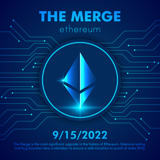
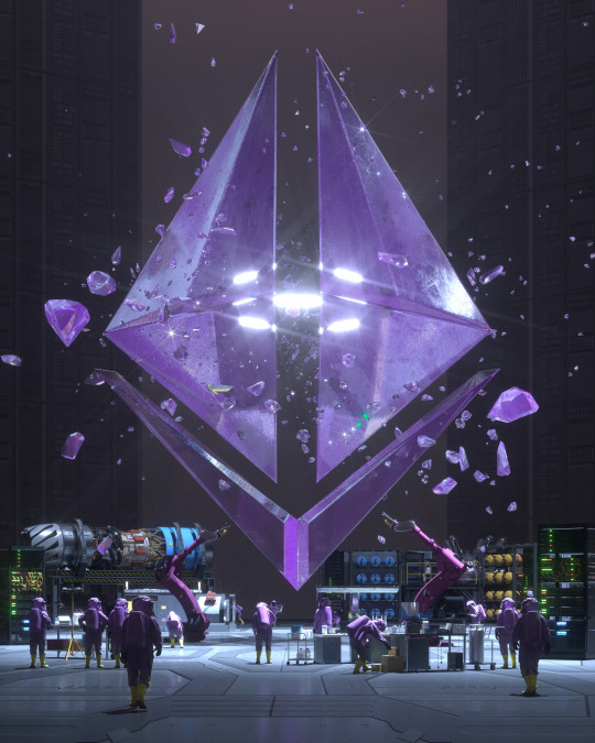
The Ethereum Merge
The Merge is the most significant upgrade in the history of Ethereum. Extensive testing and bug bounties were undertaken to ensure a safe transition to proof-of-stake (PoS).
#ethereum#merge#eth#crypto#cryptocurrency#cryptonews#cryptoart#bitcoin#blockchain#web3#defi#nft#nfts#nftart#nftartist#trading#investing#finance#graphicdesign#design#designinspiration#illustration#digitalart#artwork#art#artist#illustrator#photoshop#graphics#webdesign
0 notes
Text
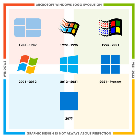
Microsoft Windows Logo Evolution
This logo evolution is proof that graphic design is not always about perfection. Microsoft released the first version of Windows in 1985 with a simple logo, then tried a lot of strategies to improve the logo after 1990, but eventually returned to the simplicity principle in design as it released Windows 11 in 2021 with a more simple and clean logo.
Which Windows logo is your favorite?
#graphicdesign#microsoft#windows#logo#design#logodesign#art#illustration#branding#logomark#brand#artwork#graphic#designer#illustrator#photoshop#creative#graphics#typography#vector
1 note
·
View note
Text
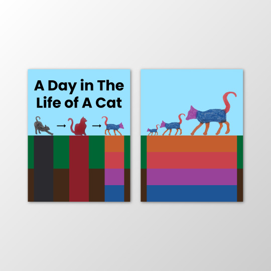
Composing a Complex Narrative (in a book): A Day in The Life of A Cat Book
The idea for the front and back covers of the book came to me very quickly as I split the front cover into two parts, the top representing the sky and the bottom representing the earth. Then I also split the bottom part into two parts by land and vegetation. After that, I created three columns of different colors. The first above is the cat waking up from sleep, the second above is the cat in a normal position, and the third above is a cat walking to spend the day like other animals. The first column is black, which indicates darkness, sleep, and laziness. The second column is red, meaning that the blood has started to move, and the third column is four colors and indicates energy. As for the back cover, I designed it the same way, but the cats had their day and went home. In the three spreads of three compositions, the first is a space iteration, the second is a figure/ground iteration, and the third is a scale iteration, where there is a logical relationship between them and the pages. A lot of surprises happened while making this book. That was a day in the life of a cat, as written in the book's title.
View 8-page book on Issuu
Thanks for reading!
#graphic design#calarts#imagemaking#cat#composition#book#books#cover#design#art#illustration#designer#graphics#digital art#illustrator#photoshop#indesign#typography#photography#drawing
0 notes
Text
BEEPLE - EVERYDAYS: THE FIRST 5000 DAYS (2007–2021)
@beeple
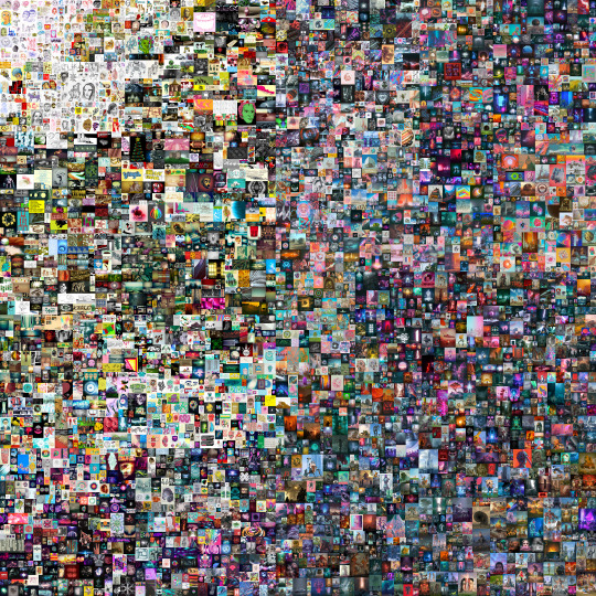
About The Artwork
EVERYDAYS: THE FIRST 5000 DAYS is a digital work of art created by Mike Winkelmann (b. 1981), better known as Beeple, an American digital artist, graphic designer, and animator known for selling NFTs. The work is a collage of 5000 digital images created by Beeple for his EVERYDAYS series from start to finish, every single day from May 1st, 2007 to January 7th, 2021. Its associated non-fungible token (NFT) was sold for $69.3 million at Christie’s in 2021 to Singapore-based programmer Vignesh Sundaresan, known online by his pseudonym MetaKovan, making it the first of the most expensive non-fungible tokens (NFT). Beeple used Cinema 4D and Octane in most of the images for this project.
Visual & Formal Qualities
Through careful observation of the artwork, I realized that the top left artwork represents the beginning of the project in 2007, so the EVERYDAYS series consisted of basic drawings, but once Beeple started working in 3D and focused on one skill or medium per year, as he did with Cinema 4D in 2015, they took on abstract themes, color, shape, composition, value, and repetition. In the last five years, however, his digital images have become increasingly timely, often reacting to current events. Beeple has stitched together recurring themes and color schemes to create an aesthetic whole. Organized in loose chronological order, zooming in on individual pieces reveals abstract, fantastical, grotesque, and absurd pictures, alongside current events and deeply personal moments. Society’s obsession with and fear of technology; the desire for and resentment of wealth; and America’s recent political turbulence appear frequently throughout the work.
Associations & Connotations
This project reminds me of British artist Tom Judd, who did a drawing every day for a year. Some of the 5,000 images involve figures from pop culture, including Jeff Bezos and Donald Trump, and are arranged chronologically. And some of the earlier images are hand drawn and not computer produced using design programs like Adobe Illustrator and Cinema 4D. Once you thought Beeple had been creating new artwork and posting it online for the world to enjoy without missing a single day for the past 5,000 straight days, you realized the value of this artwork. That is why it sold for an incredible price of $69.3 million. Beeple has taken us on an evolutionary journey, not only of his immense evolution and development as an artist, but of our community as a whole.
Thanks For Reading
Thank you so much for taking the time to read my article.
#beeple#everydays#nft#artwork#calarts#graphic design#art#illustration#graphic#design#digital art#creative#digital illustration#artists on tumblr#photography#drawing#fan art#nfts#nftart#3d
1 note
·
View note
Text

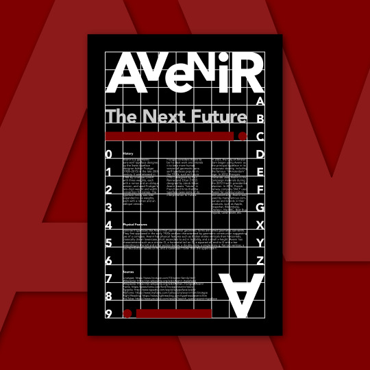
Avenir Typographic Poster Design - Typography Poster
Avenir Typeface Connotations:
When the word "avenir" comes to my mind, I immediately think of the future. The Avenir typeface reminds me of the geometric sans-serif typefaces popular between the 1920s and 1930s. When I see Avenir in books, screens, etc., I feel comfortable reading it, and it motivates me to read more due to its clean and modern design. If my typeface were a person, it would have a modern personality.
History:
Avenir is a geometric sans-serif typeface designed by the Swiss typeface designer Adrian Frutiger (1928–2015) in the late 20th century. It was released in 1988 by Linotype GmbH with three weights, each with a roman and an oblique version, and used Frutiger's two-digit weight and width convention for names. The typeface family was later expanded to six weights, each with a roman and an oblique version.
Frutiger considers Avenir to be his best work and intends it to be a more human version of geometric sans-serif typefaces popular in the 1930s, such as Futura (1927) designed by Paul Renner and Erbar (1922) designed by Jakob Erbar. Avenir means "future" in French and hints that the typeface owes some of its interpretation to Futura.
In 2003, the City of Amsterdam began using Avenir as the principal typeface in its corporate identity, including the famous "I Amsterdam" sign. In 2012, François Hollande used Avenir in his campaign materials during the 2012 French presidential election. In 2014, French railway company SNCF used Avenir for communication and advertising. Avenir was used by many famous companies and brands in their products, such as Apple, Snapchat, Bloomberg, Disney+, the BBC, Best Buy, Toyota, Land Rover, etc.
Physical Features:
Sans-serif typefaces like Avenir that use minimal geometric forms are called geometric san-serifs. They first appeared in the early 1920s and are characterized by geometric construction suggesting use of a compass. Avenir has physical features such as thicker stroke verticals than horizontals, classically drawn lowercase, short ascenders to aid in legibility, and a small x-height. Avenir has characteristics such as a circular O, a horizontal tail on Q, a squared-off end to G with a bar extending to the left and a flat section below, a double-story, a single-story g, flat top vertices, a pointed bottom vertex on M, and a lowercase f taller than the uppercase F.
Sources:
Linotype: https://www.linotype.com/72/avenir-family.html
Wikipedia: https://en.wikipedia.org/wiki/Avenir_(typeface)
Wikipedia: https://en.wikipedia.org/wiki/Adrian_Frutiger#Avenir
Fonts: https://www.fonts.com/font/linotype/avenir/story
Typedia: http://www.typedia.com/explore/typeface/avenir
MyFonts: https://www.myfonts.com/collections/avenir-font-linotype
Right Reading: https://www.rightreading.com/typehead/avenir.htm
YouTube: https://www.youtube.com/results?search_query=avenir+typeface
Thanks for reading!
#poster design#typographic#poster#design#calarts#graphic design#typography#typeface#type#artwork#art#digital art#graphic art#illustration#illustrator#print#lettering#artists on tumblr#creative#modern
4 notes
·
View notes
Text
In this optional assignment: Applied Fundamentals, from last month (June), I used all the skills that I learned in Course 1 to create a poster for a new album by a new band. The goal is to get me to apply all that "abstract" graphic design knowledge into a "real" piece of graphic design, a piece that I can shape and control. Then, just like real graphic design, I get to put it out into the world and see people's reactions to it!
I used my imagery from Week 1 as visual content.
I used my type knowledge from Week 2 to help me set the band’s name and title.
I used my color and graphic shape knowledge from Week 3 to build out the design.
I used my compositional knowledge from Week 4 to compose all my elements.
• Does the poster demonstrate a clear and intended use of typography? What is working or not working in terms of type?
• Do you have any suggestions or ideas on what techniques or strategies the student could use to develop their poster further (ie. in terms of image, type, color, or composition)?
Thanks for reading!
#poster#design#band#album#posterdesign#assignment#calarts#coursera#graphicdesign#visualdesign#printdesign#flyerdesign#art#artwork#illustration#illustrator#designinspiration#digitalart#typography#type
1 note
·
View note
Text
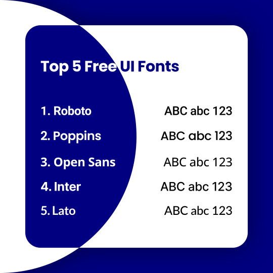
Top 5 Best Free UI Design Fonts for Website & Mobile App
1. Roboto
2. Poppins
3. Open Sans
4. Inter
5. Lato
What is your favorite font?
#ux#ui#user experience#user interface#graphic design#design#designer#illustration#art#illustrator#graphic#web design#web#app#mobile ui#uxdesign#mobile#website#typography#type
1 note
·
View note
Text
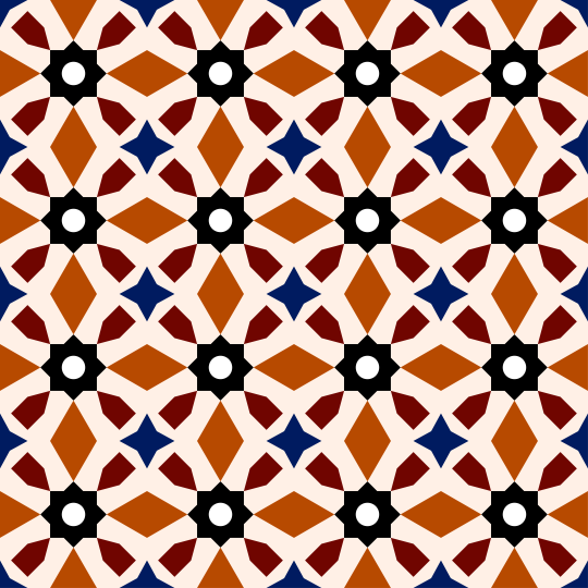
Moroccan Zellige Pattern Tile Design
I wanted to represent my country, so I made this pattern design of Moroccan zellige using multiple shapes and the most common colors of zellige in Morocco.
Behance | Instagram | LinkedIn
Thanks!
#morocco#zellige#pattern#design#illustration#art#graphic design#designer#illustrator#curators#digital art#geometric#geometry#aesthetic#abstract#graphic#artwork#vintage#handmade#nft
1 note
·
View note
Text
The global food crisis (starvation) is next. Be ready!
The global food crisis (starvation) is next. Be ready!
#global#crisis#starvation#fears#hunger#inflaion#economic#economy#concerns#food crisis#famine#food#drought#misery#poverty#scarcity#death#paucity#demand#due
1 note
·
View note
Text
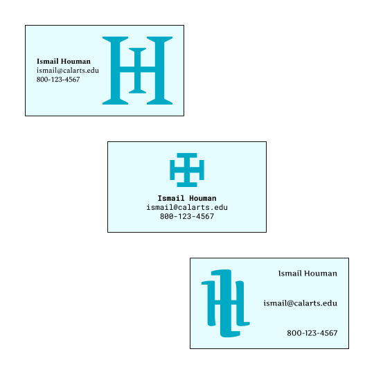
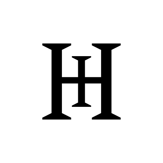
Assignment - June 2022: Make a Monogram, Make a Business Card
In this optional assignment: Make a Monogram, Make a Business Card, from last month (June), there are two parts. In Part 1, I made three different versions of monograms using the initials of my first and last names, so I combined the letters I (Ismail) and H (Houman) to make these monograms without distorting the individual letterforms. In Part 2, I use these monograms as the basis to create three business card designs for myself. For my personal information, I added my (real) name, (fake) email address, and (fake) phone number.
This assignment is optional, but recommended. It’s a chance to start to work with typography in a practical context. The best way to learn graphic design is by making graphic design! Take advantage of this opportunity to get feedback from your peers, and give your peers some feedback in return.
• Take a look at the student’s monograms. Do the monograms show a variation in typefaces? Do the letters of the monogram fit together in an inventive or interesting way? What is working or not working in the student’s monograms?
• Help your peer: Choose one monogram you feel strongly about. Do you have any suggestions or ideas on what typographic moves the student could make to make the monogram work better aesthetically?
• Help your peer: Choose one card design you feel strongly about. Do you have any suggestions or ideas on what typographic moves the student could make to make the card work better, typographically or compositionally?
Thanks for reading!
#monogram#businesscard#design#assignment#calarts#coursera#graphicdesign#typography#typeface#letters#logo#logotype#logomark#art#branding#designer#illustrator#logodesign#designinspiration#creative
1 note
·
View note
Text
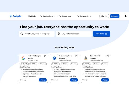
Jobple - Job Search Website UI UX Design
#ux#ui#ux design#ui design#ui ux#uxui#user experience#user interface#mobile ui#mobile app design#app#art#design#digitalart#graphic design#illustration#designer#web design#webdesign#website
1 note
·
View note
Text
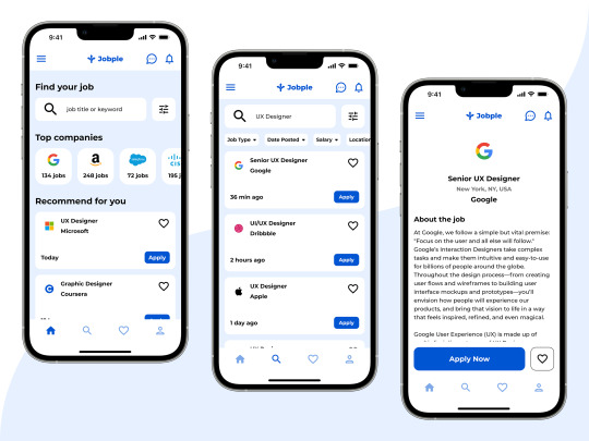
Jobple - Job Search Mobile App Design
#ux#ui#interface#design#web design#ui ux#ux design#ui design#product design#user experience#user interface#app#job#website#ui ux design#career#graphic design#ios#iphone#ux ui
0 notes
Text
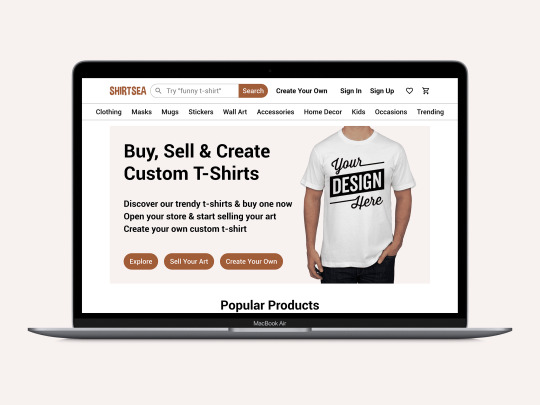
ShirtSea Website Design
Prompt: Design a flow to order custom printed t-shirts.
View the full project and case study here: https://www.behance.net/gallery/142778019/Custom-T-Shirt-Printing-Website-Design-And-Case-Study
Feel free to leave your feedback!
#ux#ui#webdesign#user experience#user interface#uidesign#graphic design#design#uxdesign#uiux#uxui#landing page#website#web#art#uiuxdesign#product#illustration#mobile ui#uxuidesign
1 note
·
View note
Text
Happy Earth Day! 🌎
Happy #EarthDay! 🌎
2 notes
·
View notes
Photo
It's rubber
https://www.protobacillus.com
724 notes
·
View notes