
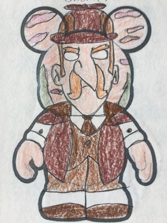
vinylnathan
VinylNathan's VinylNation
My name, as my URL may imply, is Nathan! I've been collecting Disney's Vinylmation figures for years and I love the creativity of the medium, so I've taken to doing my own designs on the Vinylmation canvas. Here's where I'll post all of my series to be viewed, so if you're a fan of Vinylmation or of any of the fandoms I draw for, then I hope you'll enjoy my work! Thank you!
28 posts
Don't wanna be here? Send us removal request.
Last Seen Blogs

camuvibes
my vibe zone
zoecelinagarcia-blog
Zoë Celina
batunuzz18yas-blog
Batu Cangöz
bigsmellygreen
The Weirdest, Worst Art
pixels-doodles
it's my blog, i choose the comfort characters
Photo
The complete Animal Crossing series! I have one more series that is nearly complete that I might post soon, but after that, I'll probably be on a bit of a hiatus. I've been super busy lately and haven't had a lot of time to draw. I should have more time in the coming weeks, though, so I'll get more done as soon as I can!
#vinylmation#animal crossing#tom nook#mabel#blathers#tortimer#kapp'n#phyllis#shrunk#dr shrunk#redd#crazy redd#reese#lyle#katie#pascal#resetti#mr resetti#sonny resetti#brewster#isabelle#kk#kk slider#dj kk#animal crossing population growing#animal crossing wild world#animal crossing city folk#animal crosing new leaf
2 notes
·
View notes
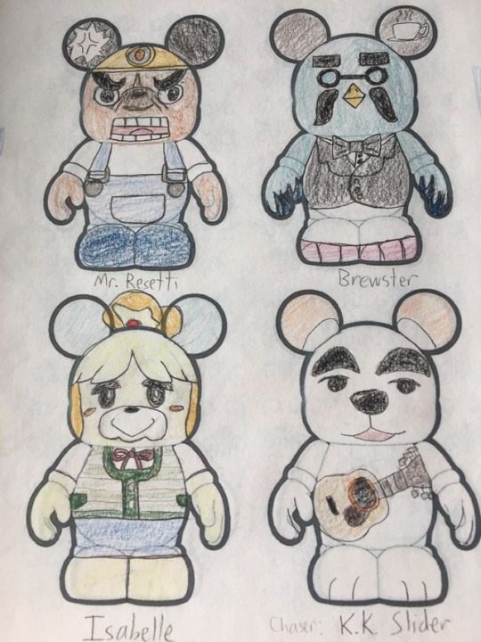
Photo
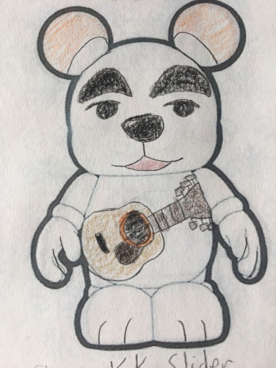
The final design for my Animal Crossing is none other than everyone's favorite singing dog! KK was admittedly a very simple design without much detail, but I still like how it came out. The guitar is a little weird looking as it is, I should've left it off and drawn it as a prop to hold or something like that.
#vinylmation#animal crossing#kk#kk slider#dj kk#animal crossing population growing#animal crossing wild world#animal crossing city folk#animal crosing new leaf
1 note
·
View note
Photo
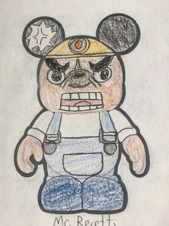
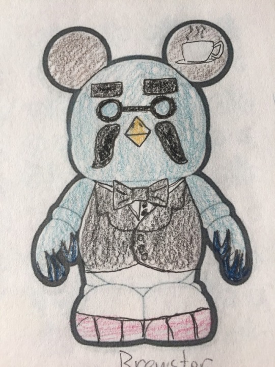
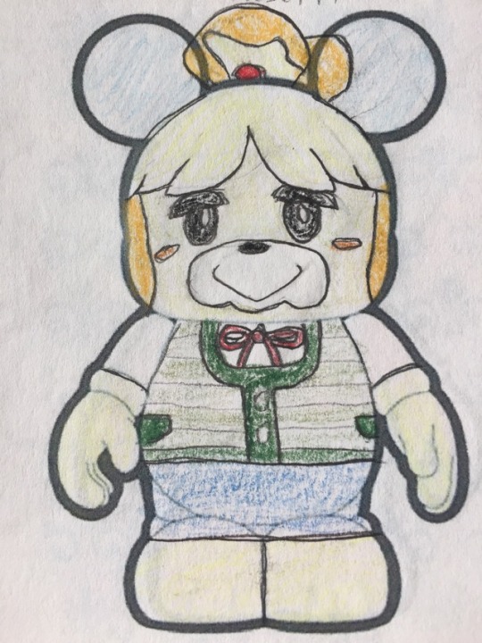
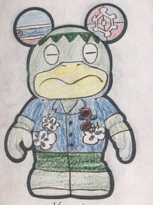
Moving on with Animal Crossing, we have three of my favorite characters. I'm pretty dang happy with all three of these, especially their faces. I think they're about the best of the Animal Crossing designs I've done. Resetti especially worked out better than I expected. I kind of wish I had done something a bit less bland with Brewster's ears, but oh well. Maybe he could have a coffee prop to hold instead. And lastly, the adorable Isabelle, eager to please as always. I thought the ears on the side would look weird but honestly I'm pleased with the result. Only one more to go in the Animal Crossing series! I'll probably be taking a bit of a hiatus after that, we'll see how much time I have to work on new designs soon. Next time: ???
#animal crossing#vinylmation#resetti#mr resetti#sonny resetti#brewster#isabelle#animal crossing population growing#animal crossing wild world#animal crossing city folk#animal crosing new leaf
1 note
·
View note
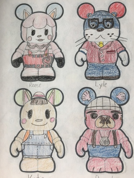
Photo
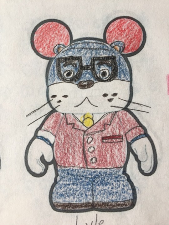
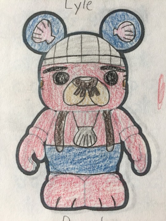
Moving on, we have a few of my favorite designs from this series. I didn't like how Katie turned out at first, I thought she looked bland, but she's grown on me a little. I love Lyle's beady little eyes, they're so shifty-looking. I do wonder if I could have done something a bit more creative with Pascal's ears, though. Oh well, it still works. Next time: Resetti, Brewster, and Isabelle
#vinylmation#animal crossing#lyle#katie#pascal#animal crossing wild world#animal crossing city folk#animal crosing new leaf
0 notes
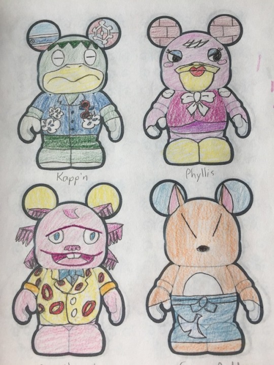
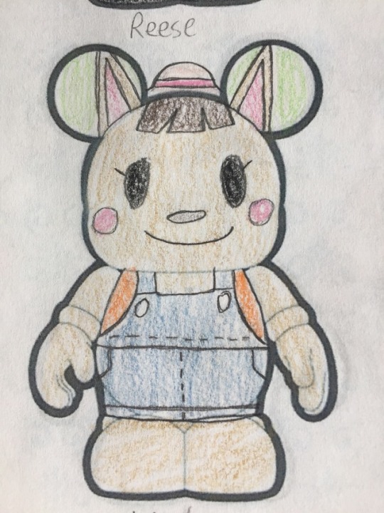
Photo
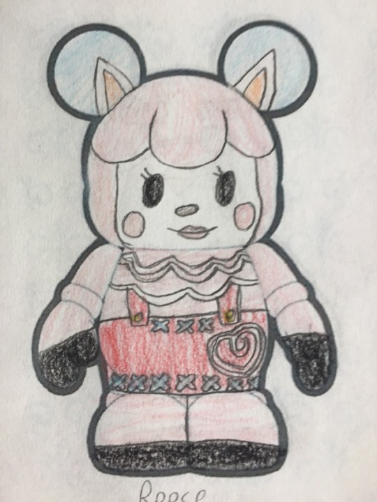
Continuing on with the Animal Crossing series, I am noticing that I've drawn multiple pink characters. Cool. Anyways, I'm not super happy with Shrunk, I think I could do a better job with him if I were to redo it. Redd isn't bad, but I don't think he looks great either. Reese is definitely one of my favorites though, I'm happy with how she came out. Next time: Lyle, Katie, and Pascal
#vinylmation#animal crossing#reese#shrunk#dr shrunk#redd#crazy redd#animal crossing population growing#animal crossing wild world#animal crossing city folk#animal crosing new leaf
4 notes
·
View notes
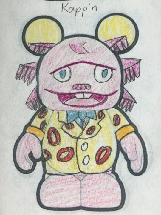
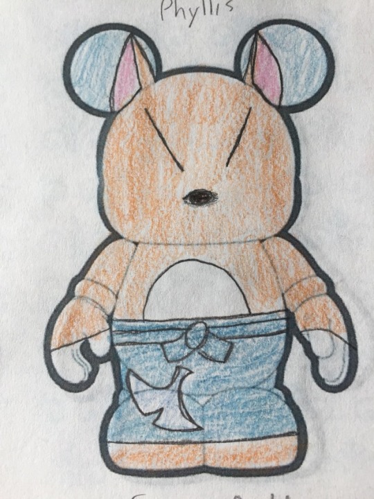
Photo
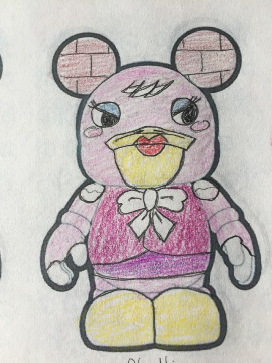
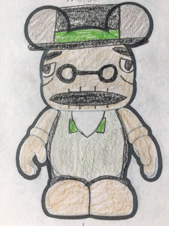
Continuing on with Animal Crossing, we have Kapp'n, Phyllis, and everyone's favorite retired mayor, Tortimer. I'm especially proud of how Tortimer came out, I wasn't sure how his face would fit to the mold but I think it looks pretty good. Phyllis could be better, but eh, she's not bad. And Kapp'n looks nice and relaxed, as he should. He deserves it. Next time: Reese, Shrunk, and Redd
#vinylmation#animal crossing#kapp'n#phyllis#tortimer#animal crossing population growing#animal crossing wild world#animal crossing city folk#animal crosing new leaf
0 notes
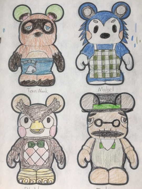
Photo
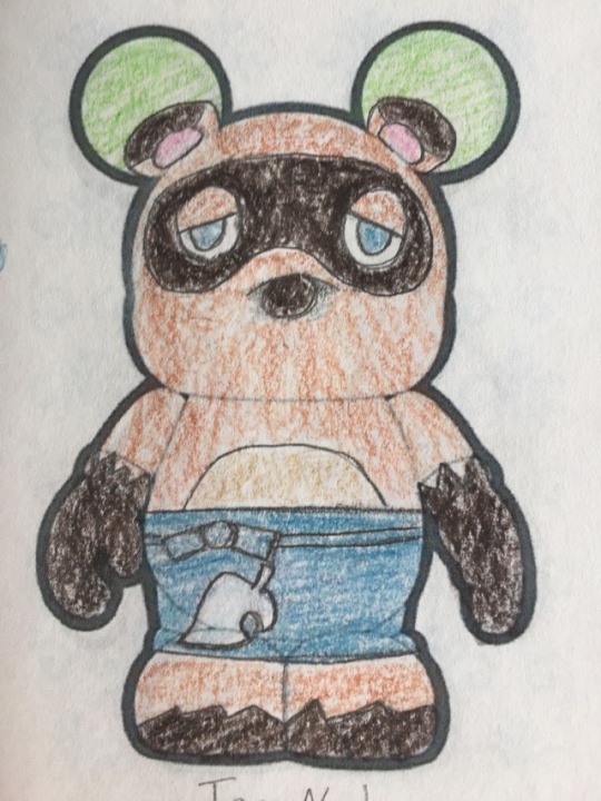
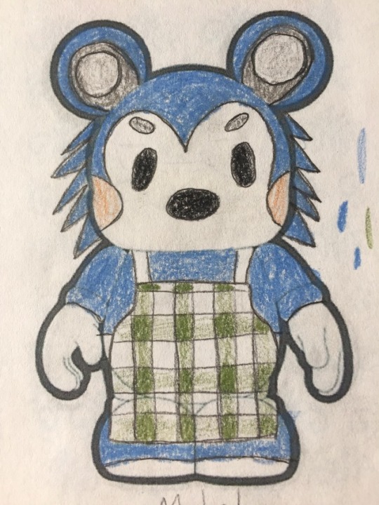
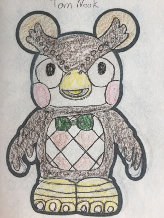
Sorry for the wait, but here’s my next series: Animal Crossing! This sixteen part series features a collection of my favorite characters from the games. Starting off, we have the one and only Tom Nook, a nice dude with a bad rep. I feel for him. Mabel and Blathers are also omnipresent in the series, so of course I had to include them. I’m glad with how they all turned out, I think they fit the Vinylmation canvas perfectly. Even if Mabel does look a bit like Sonic the Hedgehog.
Next time: Kapp'n, Phyllis, and Tortimer
#vinylmation#animal crossing#tom nook#mabel#blathers#animal crossing population growing#animal crossing wild world#animal crossing city folk#animal crosing new leaf
0 notes
Photo


Here is the Mysteries of Gravity Falls #1 series in its entirety! It was definitely a fun one to draw.
#vinylmation#gravity falls#mysteries of gravity falls series one#gnomes#jeff the gnome#shmebulock#gobblewonker#wax sherlock holmes#mabel pines#possessed mabel#chutzpar#manotaur#paper jam dipper#quentin trembley#rumble mcskirmish#blendin blandin#summerween trickster#gremloblin#mermando#creggy g#sev'ral timez#pterodactyl#bill cipher#the portal#stanley pines#grunkle stan#stan pines#tourist trapped#the legend of the gobblewonker#headhunters
17 notes
·
View notes
Photo
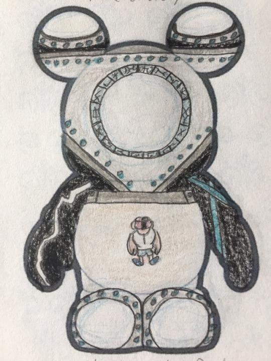
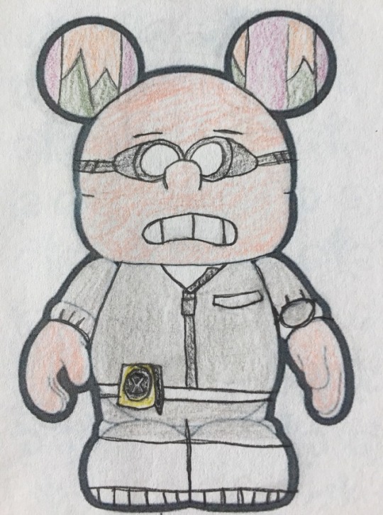
The final design for the Mysteries of Gravity Falls #1 series: the Portal. I wasn't entirely sure about going for something more setting based instead of a character, but I wanted the last design to capture the big twist ending of the first season. I think it turned out pretty well too. Little Stan does have kind of meaty hands, but eh, it's okay. Overall, I'm happy with this design and this series as a whole.
#vinylmation#gravity falls#mysteries of gravity falls series one#stanley pines#stan pines#grunkle stan#the portal#gideon rises
0 notes
Photo
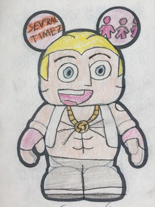
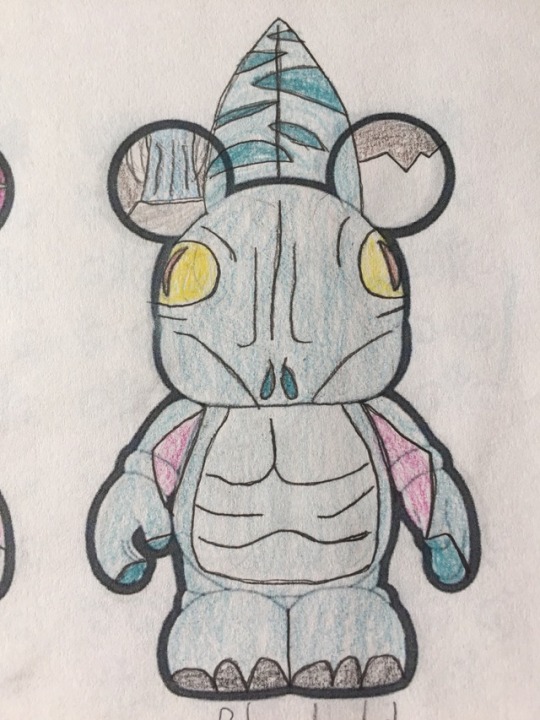
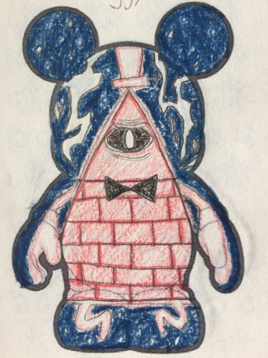
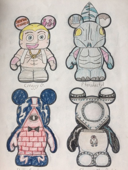
The penultimate entry for the Mysteries of Gravity Falls #1 series, bringing us close to the end of Season 1. Creggy G seemed the most iconic of Sev'ral Timez to me, hence why I chose him over the others. I actually like how the Pterodactyl looks, I like the design choices I made with it. And Bill Cipher in a royally ticked off state was fun to draw, I'm really happy with how the colors turned out. His hands look a bit enlarged, but I'm otherwise really happy with it. Only one design left to go for this series! Next time: ?
#vinylmation#gravity falls#mysteries of gravity falls series one#creggy g#sev'ral timez#pterodactyl#bill cipher#boyz crazy#land before swine#dreamscaperers
1 note
·
View note
Photo
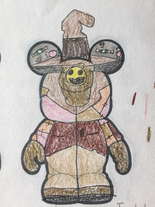

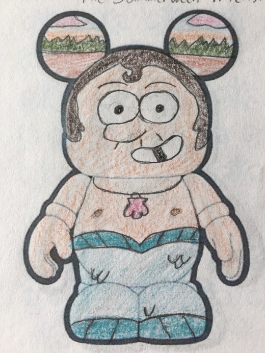
Moving on with the Mysteries of Gravity Falls #1 series, we have three of my favorite designs. It was admittedly odd trying to fit the Summerween Trickster's body type onto the Vinylmation canvas, but I think it looks alright. I was surprised with how well the Gremloblin turned out, I didn't expect to like it. And Mermando is as precious as I hoped, I'm happy with him. Next time: Creggy G, Pterodactyl, and Bill Cipher
#vinylmation#gravity falls#mysteries of gravity falls series one#summerween trickster#gremloblin#mermando#summerween#boss mabel#the deep end
0 notes
Photo
And now for Mysteries of Gravity Falls #1, we have three of the more bombastic characters of the show. I think Quentin Trembley and Blendin both turned out pretty well, though I do think I drew Blendin's goggles kinda weird. And I wish I could have done a more pixelated style for Rumble, but that's out of my league. Ah well, still doesn't look bad. Next time: The Summerween Trickster, the Gremloblin, and Mermando
#vinylmation#gravity falls#mysteries of gravity falls series one#quentin trembley#blendin blandin#rumble mcskirmish#irrational treasure#the time traveler's pig#fight fighters
0 notes
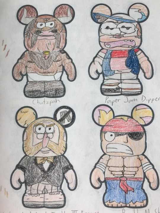
Photo
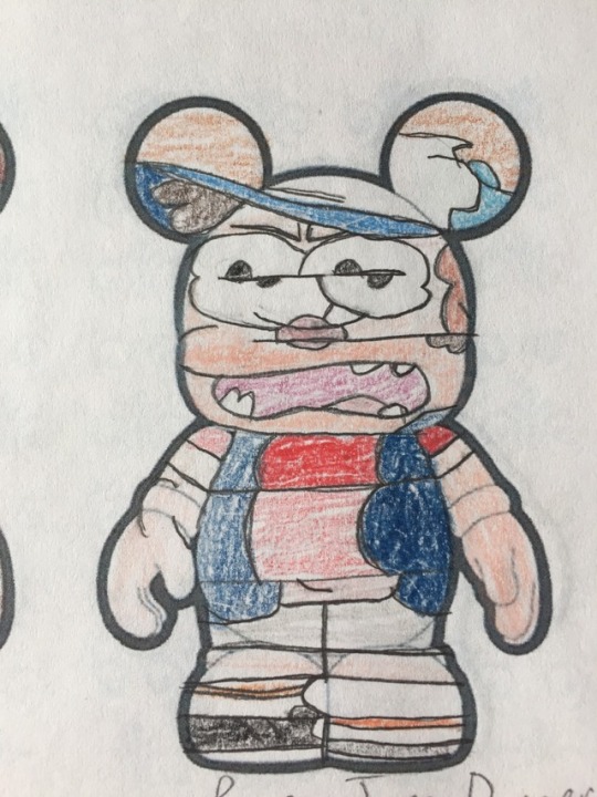
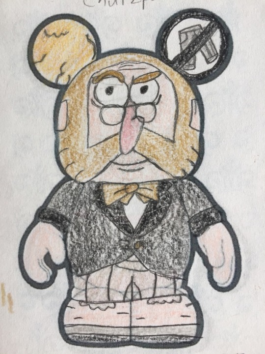
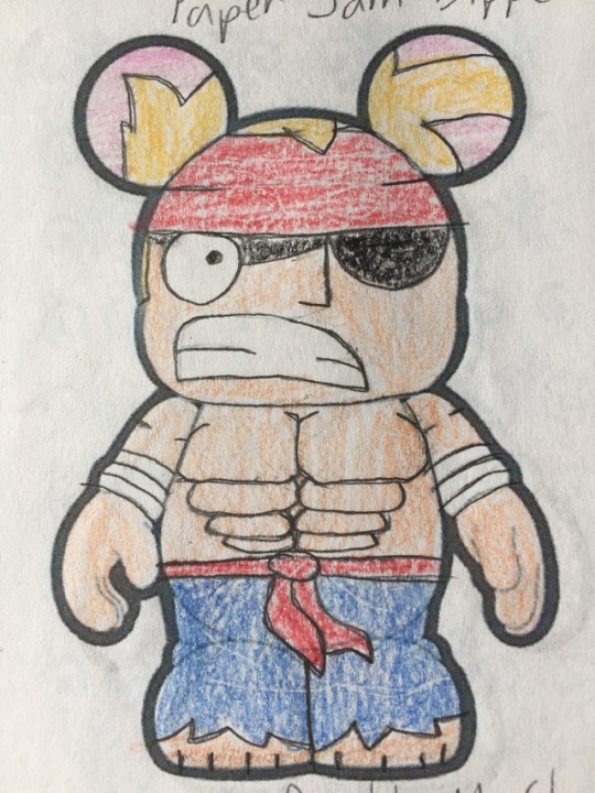
Moving along with Mysteries of Gravity Falls #1, we have some warped versions of the Pines twins. Paper Jam Dipper was fun to draw and came out looking delightfully twisted. Mabel, possessed by the ghosts of Ma and Pa Duskerton, looks nice and evil too. I do wish the colors had come out better on Chutzpar, though. Next time: Quentin Trembley, Blendin Blandin, and Rumble McSkirmish
#vinylmation#gravity falls#mysteries of gravity falls series one#mabel pines#possessed mabel#chutzpar#manotaur#paper jam dipper#dipper clones#ma and pa duskerton#the inconveniencing#dipper vs manliness#double dipper
0 notes
Photo
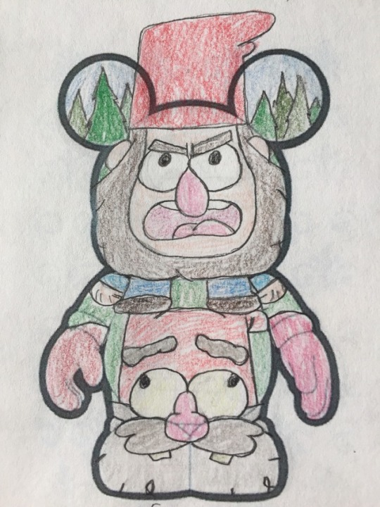
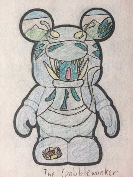
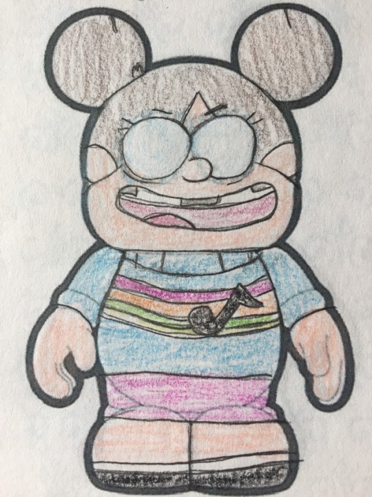
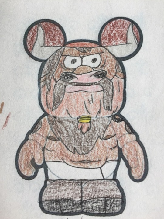
Yesterday was the anniversary of the Gravity Falls finale, so today I'll celebrate with the start of a new series: Mysteries of Gravity Falls #1. This series will consist of some of the oddities of Gravity Falls. Like, for example, everyone's favorite evil gnomes! I like to think I had some creative ideas with executing this series. I'm definitely happy with how Jeff and Shmebulock's faces came out, and the Gobbelwonker and Wax Sherlock Holmes aren't bad. Next time: Possessed Mabel, Chutzpar, and Paper Jam Dipper
#vinylmation#gravity falls#mysteries of gravity falls series one#gnomes#jeff the gnome#shmebulock#gobblewonker#wax sherlock holmes#tourist trapped#the legend of the gobblewonker#headhunters
0 notes
Photo
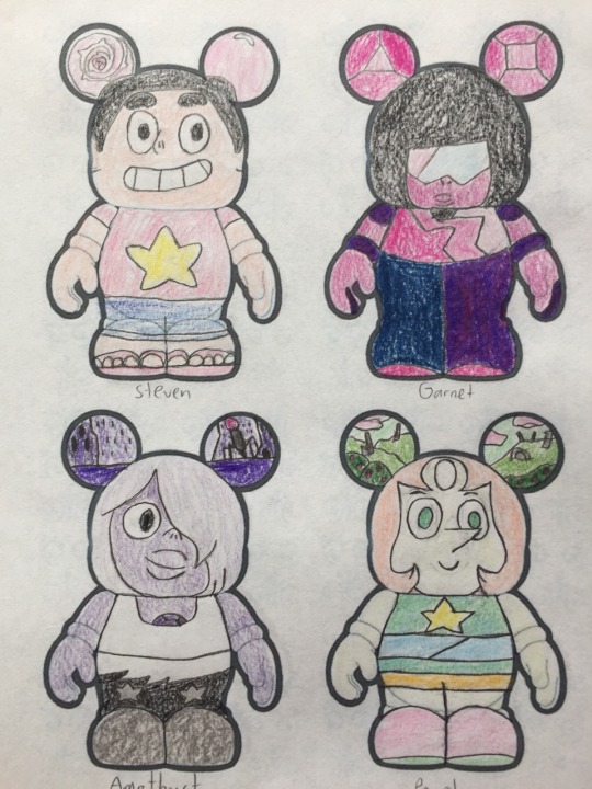
Here is the Steven Universe #1 series in its entirety! Comparing this recent work to the original Gravity Falls one makes me so happy, I’m genuinely proud of how far I’ve come in the last few years. By no means do I think I’m an amazing artist, but I’ve noticeably improved a lot, and I think that counts for something.
But sorry for rambling. As for my thoughts on the series itself, I think Malachite is my favorite design, I’m incredibly satisfied with how she turned out. I also love Jasper, Pearl, and Lion. And Connie and Amethyst. Honestly, I’m happy with all of them, I think this is my best series overall. Hope everyone who sees this likes them too!
#vinylmation#steven universe#steven universe series one#steven quartz universe#garnet#amethyst#pearl#connie maheswaran#lion#greg universe#rose quartz#peridot#lapis#lapis lazuli#jasper#malachite
3 notes
·
View notes
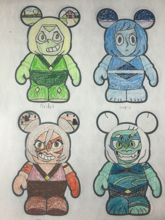
Photo
The final design for Steven Universe #1, it's everyone's favorite fusion abomination, Malachite! This series was based mostly on Season 1, so I definitely wanted her as the conclusion. And I'm extremely happy with the design too, it's definitely one of my favorites I've ever drawn. The face and colors all turned out better than I could have dreamed. I'm just really proud of that face, sorry if it sounds like I'm patting myself on the back. I just feel good about how I've improved.
2 notes
·
View notes
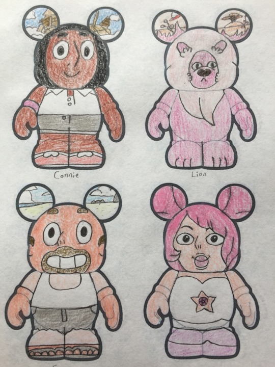
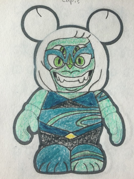
Photo
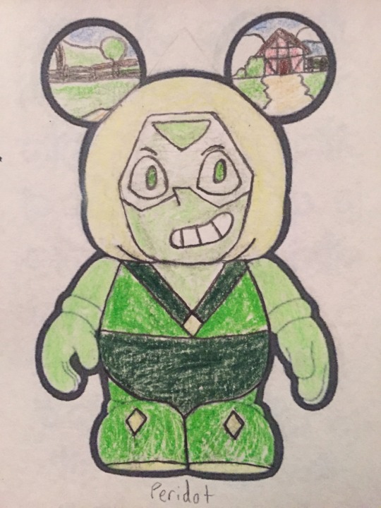
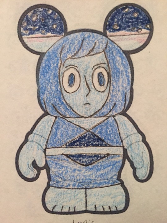
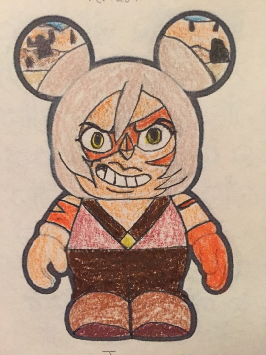
I proudly present everyone's favorite Homeworld Gems! I'm happy with how all three of them turned out, especially Jasper. Though I do wish, like Rose, that I could have figured out a way to make her hair look better. Just like I wish I could have made Peridot's hair more obviously triangular. But such are the limits of this canvas. I like how Lapis's hair looks, though. I'm satisfied with the ear designs for all of them too. I was initially going to draw the barn after it was remodeled by Lapis and Peridot, but that was too complex for me to do in a small area. Still happy with how it looks, though. Almost done with this series, just one design left. Next time: ???
2 notes
·
View notes