#whit brachna
Photo

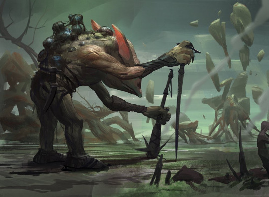
Geth, Lord of the Vault
Artist: Whit Brachna
TCG Player Link
Scryfall Link
EDHREC Link
#mtg#magic the gathering#tcg#$0.55#whit brachna#geth lord of the vault#double masters#legendary#creature#phyrexian#zombie
18 notes
·
View notes
Photo
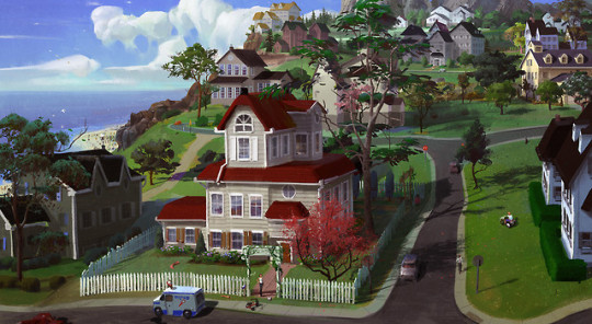
The Sims 4 Concept Art: Titled “Snoot Heights”
Concept and Illustration Artist by the name Whit Brachna, has released some lost concept art, showing off a world from The Sims 4 titled “Snoot Heights”. The illustration features some never before seen items in The Sims 4, including a beach, an ice cream truck, a Sim driven lawn mower, some cars parked on the road, a tricycle, and other small details like a soccer ball.
129 notes
·
View notes
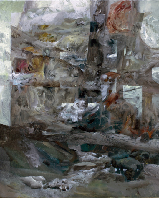
Photo


Various Projects
Whit Brachna
63 notes
·
View notes
Text
Gargoyle Process
This painting started from a sketch in 2015 that I didn't touch for a bout a year, then came back to after ruminating on it on and off over that lapse. It's loosely centered around this legend of the walled city of Agartha, and the guarding demons and djinn that would keep the unworthy from entering.
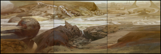
Here I sketched out the environment surrounding the figure and arranged the composition a bit. I wanted the environment to have a sort of Mediterranean feel to it, almost classical ancient Greek/Roman with a little hint of tropical. I ended up changing the perspective quite a bit because I wanted to paint in a lot of texture in the landscape of the background, and also wanted to drive home a feeling of the figure standing on a really high wall far above the ground below. So I raised the horizon line almost to the top of the canvas and redid a lot of the figure to fit in with a more top down perspective.
Here you can see the new perspective and wings, and my attempt at dumping colors all over the place that I felt gave off the feeling I wanted for the piece, which was a sort of bright and sunny warm day in the afternoon, soon approaching the golden hour.
Here's some images that I felt captured the mood and lighting I wanted to portray
Let the render fest begin! As I was painting the torso my power supply for my computer started crapping out and it was pretty terrifying to paint for fear of losing work. I had finished just about the entire torso and arms when it crashed when I tried to save it, and had to do it over, about 5 hours of work. The second version definitely came out better though. I threw in a crazy weird mandala-lever-table-mechanism I thought would be interesting but ended up chucking it for the sake of time and it threw off the composition a bit. It's inspired by this talk I listened to about the physicist Wolfgang Pauli and his therapy sessions with C. G. Jung. From what I remember, through deep trance or in a dream, Pauli saw this mandala that represented perfect rationality and other dimensions or concepts like increments of time integrated into each other. The idea was to sort of have the Gargoyle in control of one of the levers, hinting that your perception of reality may be manipulated or something along those lines. I mostly wanted an excuse to make a shiny 3D object and render it so that I could have perfect shiny reflection in the painting. I got my jollies in that regard with the mace that I replaced this mandala with.
Here's the talk and a picture of the mandala:
Here's some of the references for the skin and torso. In the old master painting with the man pointing toward the sky I really liked the way their skin looked really pale in some parts and very tan or oily/dirty in others and tried to replicate that effect on the figure with a sort of red-grayish green and a more yellow green. I imagine there being less callous spots that would be lighter and more "juicy" like when the skin is stretched it'll lighten up in those areas, kind of like when some plastic bends it gets lighter in those spots that are really stretched out. It's sort of an effect or look that produces a sensation that I wanted to portray and think looks cool and not much more.
Here's about where I had gotten before I lost my file to the dark lords of psd corruption. Lots of rendering and minute fiddling, pulling and pushing forms and moving around muscles underneath the skin. Reference is a lifesaver when it comes to anatomy, or anything really, but especially anatomy because of how complex it is and how easy it is for people (who all have bodies) to recognize when something is off. I remember this is where I really felt like I was going somewhere with the painting and it had some potential.
Got the rest of the human parts nailed down. I almost went fully Egyptian with his undergarments but decided against it. I found out the name for this type of clothing though, "shendyt" if you ever need to know that. Lots of challenging but enjoyable intricacies worked out here. If I could give a tip on picking color it would be to learn how to really feel it out. If you try to do this with only your intellect and calculate every aspect of surface color and lighting and reflection you mostly end up getting in your own way (not that this isn't important). If you can grab a color that feels ok and run with it you're better off than being indecisive and worrying that the color isn't perfectly accurate. Make a choice and observe the result. What happens when you lay that color next to the others, how does it feel deep down in your gut and heart. What does it need more of? It's like tasting pudding, when you put it on your tongue and smack it around in your mouth how does it taste? What would make it taste more like the most perfect pudding you can imagine? You also have to have good taste to make things that taste good.
Focused heavily on the wings and tree here. I took a big leap with the dappled lighting and just went for it. I knew it would be really hard to make it look realistic and it kind of became abstracted, but I learned a lot. After having finished it I've seen multiple images that would have been much better reference for the dappled lighting than what I used, but such is life. In place of accurate lighting effects I had fun making cool shapes and swirlies. I tried to create an effect similar to some sort of vectoring of light blobs where their outer edge sort of merges with the nearby blobs, similar to when you squint your eyes and look at lights out of focus. On the upper/outer edges of the wings I tried to pull of the effect of something being in shadow on a sunny day and heavily reflecting the blue of the sky. Since that surface isn't being blown out by sunlight you can really see other ambient light sources reflecting on it.
I darkened the shindyt loin cloth by plopping a multiply layer over it and touching it up a bit. I though the lightness of the previous color was attracting a little too much attention and contrast. But when I look at it now I almost like it better.
I also tried to get down some of the awesome patterning on eucalyptus trees that I see here around town. They're some of the coolest looking trees in my opinion and really wanted to capture that dramatic contrast of values and colors they have on them along with the smooth swirly lumps. This tree was extremely difficult and I redid it at least once. I still don't think I pulled off the look I was going for with it but I like it in it's own right.
Here's the bottom before and after the redo. I really wanted to pull off a section of surface that's lit evenly but has two different values/surface materials and have it look cohesive. This was a pain but I'm starting to come around to the idea of doing stuff over even if it's really close to what you want or it feels like too much work. It almost always comes out better.
I also had a friend help out and do a paintover to try and tie up the values which explains the darkened corner on the ground. Much more moody and dramatic. He also taught me this technique to strategically adjust the levels with brush strokes using a mask.
Create a levels adjustment layer. Depending on how you want to adjust the levels (lights, darks or midtones) move the sliders around to a spot you like, and this is the awesome part is it doesn't have to affect the whole image, so you can pick an area you want to change the levels of, adjust accordingly, and target that spot. To do this click on the blank white square (red X) and paint bucket it fully black, then go back to the levels adjustments (click on the layer name or graph square) and start painting or lassoing in white in the spot that you wanted changed. This helps a TON.
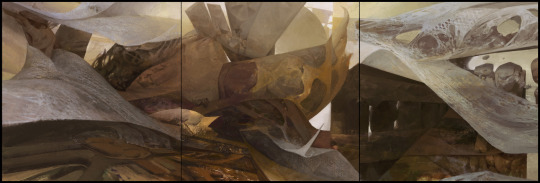
More progress! I started experiment with texture in the background by making some brushes and messing with them. I was really inspired by the way Craig Mullins can pull off seemingly intricate detail with abstract shapes and textures and wanted to try something similar. Maybe next time lol. I was also inspired by Dean Cornwell and looking at his work for the texture on the ground, trying to make nice big juicy blobs of paint that almost look like clumps of mud or stones. I also really had fun with trying to make a compelling pattern that was still in perspective. For the background I was looking at the Walter Everett painting above a lot, trying to get a beautiful harmony of really light values and colors, having forms be defined with only hue and not much value change at all. It's really hard to pull off.
I went nuts on the background. I replaced the original idea of a golden glittering canyon with a more earthy and gradient filled landscape. I also tweaked the values much brighter, which I think I darkened back down later. I was heavily inspired by Whit Brachna and had at least one of his paintings open the entire time I was working on the background.
These are some of my all time favorite paintings. Just look at them, gotdang.
3D mace! Mostly inspired by spiky black metal aesthetic. I made a very rough (but that's really all I needed) model of the mace in Cinema 4D. The most tedious part was obviously all the spikes. There's probably a way you could pull them out of the sphere in 2 seconds but I'm not versed enough to avoid tediously scooting each individual spike one at a time. I then took it into ZBrush and just scrubbed it over with a cool texture brush that gave it a bunch of amazing details that you can't even see in the painting. I tried to set up a scenario in C4D that was as close to the painting as I could muster to get the lighting right. I copied a bunch of disc tubes to try and replicate leaves and branches. Since the figures hand, and most of his upper body was cast in shadow I tried to strategically place some "leaves" over the top half of the mace.
I messed with a bunch of different surface materials and render settings and ended up going with the shiniest one, heh.
Here it is before and after being painted on, very minute adjustments.
I'd say the rest is pretty straightforward and can't really think of any extraordinary advice except maybe doing more quick studies of your weak spots. I'm realizing I could get a lot of benefit from doing a higher quantity of less elaborate stuff to really improve more.
I really hoped this helped and if there's anything you'd like me to elaborate on or that you felt was left out please don't hesitate to ask!
Here's some meaty juice for you. I made a 2000px tall resolution gif of all the process images which is included in the .zip, containing over 30 of the aforementioned 2000px res process pics, some full resolution (8000px) crops of the final image, and a few other random in progress shots. And finally here's the full resolution (8000px) final .jpg, the final .psd file (2000px), and my brush presets. Enjoy!
I'm not sure how to export your presets as new brushes and you may already need the .abr file for the presets to work, so if you have any tips on that let me know. Most of the brushes I use are straight from other sets or slightly tweaked and saved as a preset.
Anyway, I think this will conclude this massive post. I truly hope it's helpful, or at the very least mildly interesting. Thanks for reading!
24 notes
·
View notes
Photo

“By the river” by Whit Brachna https://ift.tt/2G4ij5o
0 notes
Text
Painful Quandary (Scars of Mirrodin) - Whit Brachna
5 notes
·
View notes
Photo
Virulent Wound by Whit Brachna
6 notes
·
View notes
Photo
Geth, Lord of the Vault
Artist: Whit Brachna
TCG Player Link
Scryfall Link
EDHREC Link
#mtg#magic the gathering#tcg#$1.13#whit brachna#geth lord of the vault#scars of mirrodin#legendary#creature#phyrexian#zombie
29 notes
·
View notes
Photo


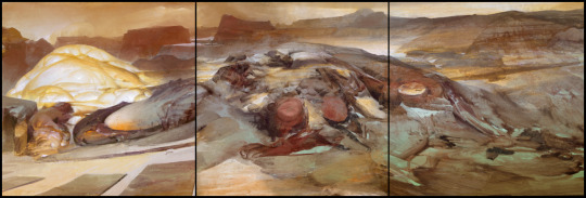
Favorite artists day six: Whit Brachna
My favorite abstract artist by far and i'm a huge fan of his non-abstract work as well.
#sharing one artist a day for a week and i love them so much#art#illustration#abstract#whit brachna#best artists#love em
21 notes
·
View notes
Last Seen Blogs

miss-wednesday-art
miss wednesday's portfolio

genderbent-disney
Genderbent Disney

roryfolklore
my Journey to international money transfer

howlingwolfqueen
Salty with life 24/7
justsarasboy
Nappy boy