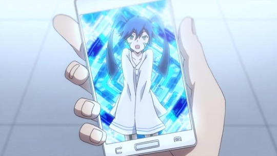
#we had this little oekaki board
Photo

this wasn’t actually what I meant by ‘trying to interact more with fandom’ but...
... gentle bullying is my MO after all.
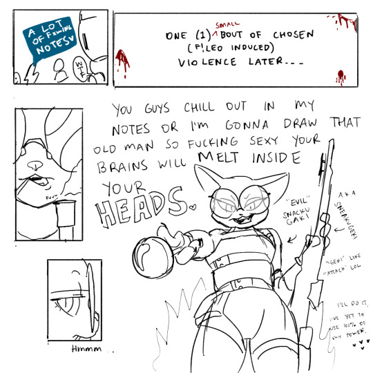
#okay okay#so#deep cut#i rebranded myself right?#cuz my old name was fucking sad and rushed#now snackugaki is wordplay#because a bitch LOVES wordplay#especially multilingual wordplay#so i snack#a LOT#my illustration class never saw me without a wrapper nearby#and back in my day before aggies and whiteboard#we had this little oekaki board#i couldn't fit oekaki into anything#but rakugaki (doodle/sketch) I could mash with snack#two things I love#hence snackugaki#also I'm 2nd gen 'oldschool' weeb trash#i'd have done like#sketchybog#or sketchibog#sketch + chibog#but.... I thought of it like 3 weeks after I changed names#rip#anyway#this is me threatening you#<3#get rekt
296 notes
·
View notes
Note
Hello! If you don’t mind, can you answer 3, 16, and 21 for the ask game? I hope you have a wonderful day/night 💛
Of course, Sluggy! Thanks for the ask 💛
Under the cut because this ended up kind of long XD
Here is the ask game if you're interested!
3. Least favourite things to draw?
Hmmmm well. I always struggle with backgrounds and just like… inanimate objects. I think I find them boring to practice! Would much rather draw a cute face or a body in motion, so shockingly, that is 95% of my drawing output XD
6. Which artists inspire you right now?
Ooh, well, all of my digi-mutuals for sure! There is so much amazing fic and art on my dash. Y’all are constantly producing so much high-quality stuff that it’s a little overwhelming sometimes!! But don’t stop, this is a great problem to have (though it makes me slow to respond, particularly to long-form fic orz).
Here are some other (non-digimon) artists I follow who have been hugely inspiring to me recently:
Trungles (Gorgeous art-noveau style! I have their tarot card deck)
Umishima Senbon (Bought their artbook at a con recently. I WISH I could draw that many beautiful lived-in spaces and inanimate objects!!)
Popsicle-stick (Dracula art)
Marghen (Dracula art)
Professorcalculusstanaccount (Tintin art and animations)
21. Weirdest thing you’ve ever drawn?
HMMM. That is a REALLY difficult q. to answer, because I used to draw a LOT of stuff that is utterly incomprehensible out of context (and it's something I still kind of enjoy doing, hehe). So here are some sample "no context is the best context" drawings I have on my hard drive (they're all REALLY old; most involve Tai, and some could be considered a little racy/in poor taste, take that as you will):

(Daisuke gets the better of Goth TK; a pogo stick and a hippity-hop is involved. One poem and one mini-fanfic now lost to time may explain how we got here.)

(The oekaki board I used to be on had a Whole Thing about Dai being infatuated with Tai. This drawing was a response to someone else's drawing that happened at Halloween. The person in the Sailor Moon costume is Matt; Tai's hand is visible and he's dressed as Tuxedo Mask.)
(gOD I miss oekaki! I would kill for the ability to do that kind of screentone shading so easily again DX)
(Recreation of a dream I had, before the words "Fox" and "News" were quite as bad as they are today 🤮 Digimon used to air on the Fox channel in the US, and they did a LOT of weird promos. My subconscious made her own)

(Panel of a comic that is meant to look 0_0 but isn't really, I swear!!)
(Satirical commentary on certain digimon fanfiction trends circa 2010 and earlier, via Kate Beaton meme)
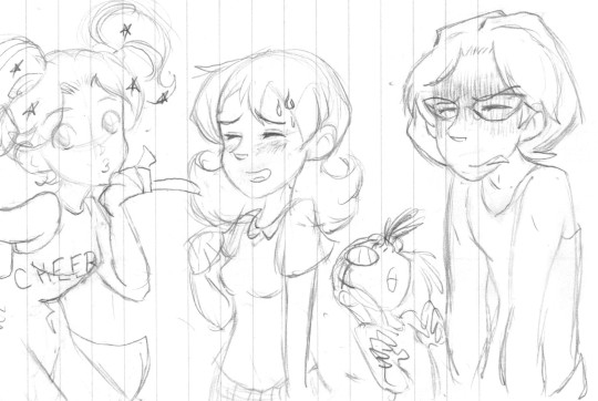
(Teen Girl Squad/Digimon crossover ft. the digigirls pre-Tri and Joe. Cheerleader! So-And-So! What's-Her-Face! The Ugly One!)
I'll be honest, there's probably a LOT more weird stuff in my sketchbooks. I don't really want to comb through years of old drawings for the most WTF-inducing ones, but suffice it to say, they're there, and the fact that the sample size is THIS big almost certainly says something about me :3
Phew. If you made it this far, thanks for letting me ramble and show you some weird stuff from the vault! I hope you have a great day/night as well!! 💛
2 notes
·
View notes
Photo
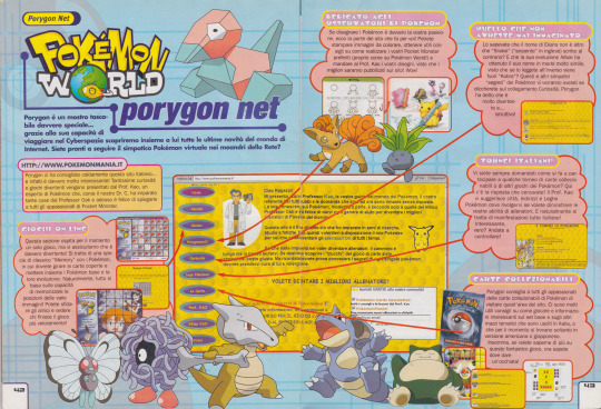
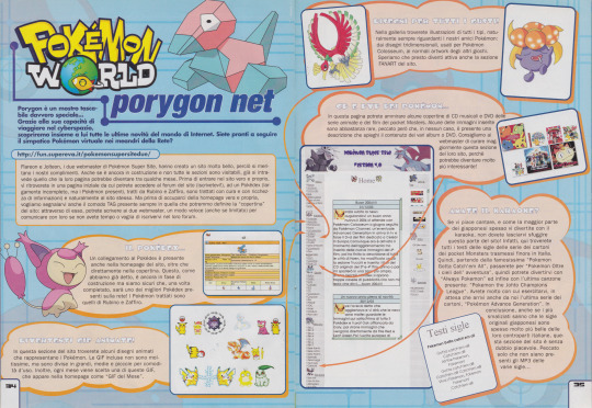
Pokèmon World Magazine: Porygon Net (Various Issues)
We’ve had a very long streak of Photoset posts lately, didn’t we? Let’s have a little break from anime and tie-in games and let’s go back to oldschool Pokèmon and my favourite childhood magazine, Pokèmon World!
This summer I'm working on my own portfolio site: it's getting built from scratch and, due to the kind of art it's going to showcase, I'm designing its layout to look like one of those old personal pages a lot of Internet users used to have back in the first 2000s.
This choice was also influenced by one of my childhood dreams, which was, infact, owning a corner of the Net all for myself; without the right equipment or spare money to purchase a domain, though, the idea of having my page online was only hypotetical, so all I could do was designing some cute layouts on Microsoft Frontpage and admiring what others were doing. Of course, as Pokèmon was my main interest at the time, I found the Porygon Net section of Pokèmon World mag to be extra inspirational.
Porygon Net was a very small section with just a double page: every month, the magazine's staff would choose and review an italian site dedicated to everyone's favourite monsters. These online corners were, most of the times, built by fellow readers and fans who sometimes even wrote back either by mailing the staff or boasting about it on their site's news section, thanking for the feature and the subsequent wave of new visitors.
As these places were built by teens or even kids (I may have seen some online pages managed by 10 year olds at the time o.o), their quality varied greatly depending on their web-making skills: some were very simplistic, other more orderly and neat, and some... showed potential, but needed more work. Pokèmon World's staff, though, never mocked these attempts, and instead also published suggestions to make certain parts of the site more functional and pleasing to the eye. I found this very encouraging, and I wonder if many of these people have continued with a career in the online world.
I went and browsed among my mag issues to find some sites to showcase: I mostly picked the ones that stuck in my mind since reading about them, or that I actually used to visit back in the day. Wayback Machine may have not been kind to the italian community, and I fear the majority of these sites are now lost; however, I'll post links if, surprisingly, I find them still alive!
Issue 4: Pokemon Mania
The pictures have been displayed in chronological order, but I still would've chosen to display this site first as I used to actually visit it before it was featured on Pokèmon World.
Due to its easy and straightforward name, Pokèmon Mania was one of the first fansites to show up on the search engine if you ever looked for more Pokèmon content. It was managed by a guy with the alias of Professor Kao, and the whole feeling of the site was that of a Pokemon lab at the start of your monster journey. Though it wasn't exactly a marvel in terms of layout esthetic, the site aimed to amaze with content: it had simple browser fangames, a section dedicated to drawing tutorials (with pictures taken from japanese sources- which at the time were very scarce and hard to get!), many sections dedicated to the Cardgame (apparently, the main focus of Kao's Pokèmon interests) and its live tournaments, and one centered on the monsters' trivia. One very interactive section even proposed quizzes given by the webmaster himself that visitors could answer via mail: Kao would then contact winners and even send out special official merch like Pokèmon Center plushies or other branded toys. Generous!
This site has been preserved in the Wayback Machine with a lot of snapshots, though unfortunately without many graphics. We can still navigate and read most of the sections!
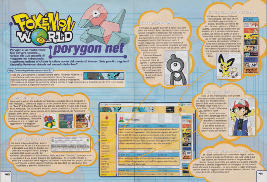
Issue 20: Pokemon Museum
My second site of choice striked me with its very homely layout: even looking at the snapshot in its article feels like I'm viewing a cozy corner of the Net, in which the webmaster poured its personal thoughts and passions more than providing a service like PokèmonMania did.
The issue is number 20 and quite some months have passed: online trends regarding these kind of pages had changed a bit and now people preferred to offer their own content instead of copy-pasting what Nintendo produced.
Pokèmon Museum's graphics have all been drawn by the owner, Kabutops: the background texture, banner, and a lot of the graphics all around the sections! Kudos for being to prolific and precise during a period in which digital art still hadn't reached its peak popularity, and drawing tablets were only restricted to professionals.
Going past the many sections dedicated to the anime, games and lore, one interesting aspect was the beginning of affiliates: fellow webmasters were starting communicating with eachother and sharing their visits by dedicating a little button to other sites. I loved the affiliates section because, once finished looking through a site, I could click on the cute little rectangle banners and find myself in another home without passing from Google searches!
But webmasters wouldn't affiliate with everyone, and for the purpose of only interacting with other best Pokèsites, awards had become popular as well: graphics that people would exchange after rating a site and feeling impressed with their content, presentation, or popularity.
Pokèmon Museum's magazine review focused on its affiliates and the awards, inviting fellow readers to have their site reviewed by Kabutops.
Unfortunately, the site is not present on Wayback Machine. I'll never know if Kabutops came back updating its museum after summer vacations :(
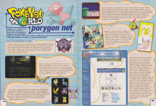
Issue 35: TBPS
Let's have another jump of several months; issue 35 featured a page under the bigger domain Pokevalley and named itself The Best Pokèmon Page, rather narcissistic!
This was one of those rare times Pokèmon World featured an english-speaking site. The layout doesn't impress me too much, yet the fact that the header reads "Crystal Water Version" conveys that the webmaster(s) used to periodically change aspect and palette of their site, an activity that proved to be very prolific for many page owners at the time: sites were often in construction, and people were experimenting with different colours or HTML code tricks to impress viewers and reviewers, have as many affiliates as possible and collect positive awards from other sites. Such was popularity, back in the day!
The site has a long menu with many sections dedicated to the main games and movies; although, none of those pages were catching anyone’s attention anymore as everyone had the same copypasted guides and info; instead, what’s interesting is the hefty section dedicated to browser games, the big menu with pages concerning the site and staff themselves, and the oekaki board! Oekakis were very popular in that period, as it allowed fellow aspiring artists to meet eachother and show off their own skills by drawing live! If a site hosted one, they could quickly become a melting pot of creativity.
Wayback Machine, sadly, doesn’t have anything concerning this site as well.
Issue 36: Arcywof
We’re back on italian sites with a page that definitely impressed even Pokèmon World’s staff for its pleasing graphics. When I first saw this among the magazine’s pages... my eyes lit up! I can’t hide that after seeing its beautiful palette, checkered background and condensed menu, teen me adopted Arcy & The Fire Pkmn as design guru: many of my subsequent mockup pages had exactly this layout, or variations of it.
It’s too bad, though, that aside from the beautiful presentation, the site’s contents aren’t exactly interesting: the Pokèmon images are ripped straight from Nintendo’s official archives, and most sections are concerning the anime’s characters, episode plots, and broadcasting dates. However, Arcywof also offers a forum and a live chat, which definitely helped the staff build an interactive and affectionate community around it.
Among all reviewed here, I’m most bitter that Wayback Machine hasn’t archived this site, because seriously, it’s a little jewel ;w; its pastel colours and checkered texture remind me of candy shops!
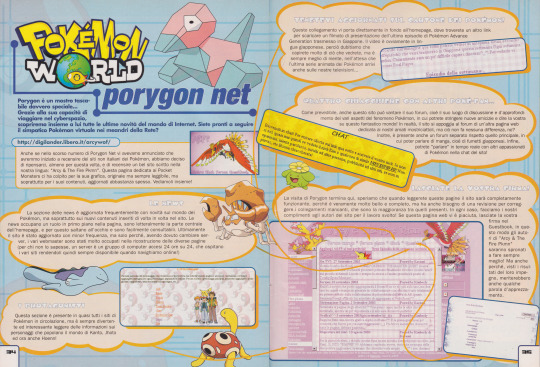
Issue 38: Pokemon Super Site
I wanted to finish this little jump in the past with a positive note and show at least one more saved address from Wayback Machine. Although not in its updated version originally featured in Pokèmon World Issue 38, Pokèmon Super Site has been archived and it’s more or less complete to explore. It’s too bad a lot of the graphics haven’t survived but hey it’s something!
It’s 2003, and the trend has changed once again: forums are as popular as ever and considered one of the most successful ways to build a solid audience for one’s own page, which are now treated more like portals or an extension to the forum itself.
Super Site’s sections are centered on game guides, nothing too special, but I do love the grey and white grid background on menus and header, as if we’re viewing a notebook page; reminds me of school days. I also really like the gifs section as featured in the review, all those old graphics bring back so much memories of scouting the net to save them all on hard drive!
If you stumble upon one of these sites in Wayback Machine, chances are the ever present affiliates buttons will still be working, allowing you to visit even more fansites. It’s a true trip to the past, and a never ending source of inspiration for me!
15 notes
·
View notes
Text
The Sega Arcade Revolution: A History in 62 Games
Flicky (September 1984)
Maze games were very popular during the first half of the 1980s. Hits like Pac-Man had made large sums of money for Sega’s rivals, and though the video arcade industry was no longer moving at the same speed it had during its early years, the genre was still popular enough that publishers kept up a steady rhythm of releases. Sega looked to its R&D division to come up with something that could keep pace with Namco and Bally/Midway. What it got was a little blue bird named Flicky.
Flicky’s development team was led by Youji Ishii, a Sega designer who would one day be responsible for the classic game Fantasy Zone. Having joined Sega in April 1978 after graduating with a degree in electrical engineering, Ishii was interested in creating games that were bright and colorful, and he believed that his works should be happy experiences for players. He started working on sound effects for games like Deep Scan and Zaxxon and got his first chance at design with 1983’s Up’n Down, a pseudo–3D arcade driving game. It sold enough for Sega to assign him to another title, one that was likely more important to Ishii’s career as it was to his employer’s bottom line. Sega meant for Flicky to be its response to Namco’s Mappy, emulating the time-based maze dynamic that was popular at the time. The visual style and gameplay Ishii had in mind would give Sega the competitor it wanted (Derboo, “Flicky”; “Fantasy Zone—2014”).
Flicky put players in the role of a blue sparrow who must rescue her chick friends, called Chirps (In Japan, they were called “Piopio,” a misspelling of the Japanese word “pyopyo” which means “baby bird”). The chicks had run amok inside an apartment building, and Flicky had to gather them all and guide them to the exit. Hungry cats called “Tiger” in the Western version and “Nyannyan” in Japanese actively chased the chicks, as did an iguana named Iggy (Choro in Japan). Touching the chicks put them in line behind Flicky, who had to avoid enemies while bringing all the chicks to the door. Items such as cups and trumpets were scattered throughout the stages, and Flicky could shoot these items at the cats and iguana to temporarily incapacitate them. The Nyannyan couldn’t hurt the baby birds, but they could kill Flicky with a single touch. The game lasted 48 stages before looping with a harder difficulty (Derboo, “Flicky”).
Ishii’s adorable character designs were brought to life by the talented hand of Yoshiki Kawasaki, a young artist who had joined the company because it was the closest job offer to his home. He had been a big fan of pinball and driving games, playing in the dark arcades of Hibiya, Japan, so the chance to join Sega was an exciting opportunity for him. Kawasaki was hired at Sega in 1976 as a designer. Though he was an artist, he started out in the purchasing department, and he spent many an hour playing Head-On. His work soon came to the attention of Hideki Sato, who recognized his talent and moved him over to the visual design division of Sega’s research and development department. His first assignment was the SG-1000 version of Golgo 13. After working on the laserdisc game Albegas and another release called Sinbad Mystery, Kawasaki began to long for something more interesting. He got his chance when he was handed the proposal for Flicky from the game’s lead designer. Kawasaki would finally have his big chance to put his programming abilities to greater use (“Interview: Yoshiki Kawasaki”).
When Kawasaki was assigned to Flicky, all that existed was a simple four-page proposal. There was to be a labyrinth and a simple game character. The concept was just a derivation of Namco’s Pac-Man, where players would collect dots in the maze. Ishii liked maze games, and he knew he wanted the game to follow that motif. He was certain of one thing: Flicky would not penalize players for falling through the floors as Mappy did. This was the starting design premise for the game and the reason why a bird was chosen as the main character (“Fantasy Zone—2014”). The problem was that nothing was detailed; there wasn’t even a description of the game’s background. The character profiles were also incredibly vague, reading “since the maze can be simple lines, the characters can look simple too. You can leave the background black.” Kawasaki based the main character, Flicky, on a lyric from a popular 1977 song called “Densen Ondo,” which referred to three sparrows on an electric line. Kawasaki wondered why birds would move on electric lines when they could simply fly. He figured that perhaps they jumped, so he decided to have Flicky jump (or “heroically jump,” as he put it) instead of fly. The Chirps were an evolution of the dots in the maze. Kawasaki revealed how he developed the little birds in an interview for Sega of Japan’s website:
The dots were originally really just dots. When you collected one it would disappear. But then, I thought it would be interesting if the dots didn’t disappear but instead line up. So, I made the dots line up behind Flicky. That’s when I really started fleshing things out. I asked if I could make the dots 8 × 8 pixels big, but in the end, I couldn’t do anything with 8 × 8 pixels. Then I thought: If they were little birds, I could do it [“Interview: Yoshiki Kawasaki”].
At first, he simply had the Chirps follow their bird friend back to the exit door. That was too simple, so he had them scatter when touched by a cat. When it proved too easy to gather up all the Chirps, Kawasaki spiced things up by having some of them race off in different directions. He gave these “Bad Chirps” sunglasses so that players would be able to recognize them (“Interview: Yoshiki Kawasaki”).
Creating those cute little chicks with attitude wasn’t very easy; none of the character models were. Kawasaki had to use a rudimentary tool that was similar to Sega’s TV Oekaki, a tablet-like device that came with a light pen. It plugged directly into televisions and was made available commercially for Sega’s SG-1000 in 1985. Using such a simple tool was problematic, particularly getting it to draw single pixels. It would often draw three or four at once (“Interview: Yoshiki Kawasaki”).
Kawasaki’s original level design had horizontal lines on the screen that resembled power lines. These lines were to act as the maze walls; however, once Flicky’s characters were completed, Kawasaki found the lines to be dull and unengaging. It was only after gazing out the window at an apartment building across the street from his third-floor window in Sega’s R&D annex building that Kawasaki found the perfect setting. Why not have the action take place in an apartment building? The residential setting let Kawasaki insert household items, like cups and baby bottles—things that would be found in a home with children. They would also help Flicky fight off Tiger and Iggy (“Interview: Yoshiki Kawasaki”).
Flicky played differently than most games of its type, most notably in the way the main character jumped. The control was very floaty and heavy with inertia. Players had to time their jumps correctly, particularly when coming down from the top of the screen. Ishii believed this was the product of the hardware limitations of the System 1 arcade board. These restrictions also influenced the design of the labyrinth stages, which did a decent job of creating the illusion of size. Ishii commented about this challenge in a 2014 interview with STG Gameside. “With Flicky, we challenged ourselves to make the stages feel like wide, expansive spaces despite the tiny memory available” (“Fantasy Zone–2014”).
Ishii was also able to make Flicky seem larger than it really was using free-scrolling stages. Players could move either left or right almost indefinitely, giving the stages a larger sense of scale. The inspiration for this design came from two sources: Williams Electronics’ 1981 smash Defender and a far-lesser known Commodore 64 title named Drol, which involved a flying and shooting robot. “Basically,” Ishii explained to Shooting Gameside in 2014, “I just like that style. I like how you can rush forward, then turn around really quick and retreat if you need to.” Ishii would revisit this design for his 1986 hit, Fantasy Zone (“Fantasy Zone—2014; Ishii).
The stages themselves weren’t random scenery. There was an overall theme to them that was very close to the team, particularly Kawasaki. As the gameplay centered on the concept of saving children, Kawasaki’s group wanted this objective to be Flicky’s driving theme. It wasn’t just about bringing some birds to a door for points; there was more to it than that. Kawasaki wanted players to feel the maternal instinct of protecting defenseless children from predators. He felt they could sympathize, even though the chicks were merely game characters on a screen. After all, Flicky was a sparrow, not a chicken, and while she was only the chicks’ friend and not their mother (despite being labeled as such in the SG-1000 port of the game) she could still want to protect them. “Children face a variety of dangers when they go outside,” he commented in a 2016 interview, “and the feeling of ‘wanting to return them safely to the nest’ is something that I think is experienced 80 The Sega Arcade Revolution by not just parents, but anyone who is around children. And it’s that emotion that drives Flicky, a sparrow, to protect the chicks, even though their parents are actually chickens.” Examples of this design are present throughout the game. The bicycle and balloons (which symbolize dreams) on the title screen, the apartment resident in the bonus stage windows—all were meant to drive the point home that the chicks were children who were in mortal danger. The later stages developed this narrative. For example, the outer space background represented the future, one that would be cut short if Tiger and Iggy got their way. Such themes were not uncommon to games made by Kawasaki. None of his games featured characters dying, and he preferred to make friendlier and cuter games to counteract the bad reputation arcades had in Japan at the time (“Interview: Yoshiki Kawasaki”; Szczepaniak).
In development for a year, Flicky could have been much larger than it finally was. The design team had around 100 stages done but few backgrounds, and there was very little memory space left. Kawasaki opted to keep only four backgrounds, differentiating them by color, and the stages were reduced to a total of 40. After playtesting the game, the team added a monster that would appear in windows and breathe fire. Iggy was also conceived at this point, primarily to keep players from standing still in a stage. He ran throughout the level, making it unsafe to remain too long in a single spot. Kawasaki wasn’t too fond of the lizard because he was added at the end of development. He had wanted Iggy to be an insect, but his lack of motivation for the character made the design look more reptilian. During Flicky’s development, Kawasaki developed something of a reputation for taking such shortcuts, a behavior that earned him the humorous nickname “Sabori Kawasaki,” or “Slacker Kawasaki” (“Interview: Yoshiki Kawasaki”)
Flicky changed names twice during development. The original title of Busty was switched to Flippy due to a trademark issue in the U.S. (Bally/Midway also noted that “busty” was American slang for women with large breasts). The next choice, Flippy, was eventually deemed to sound too much like Mappy, so the title was changed again (“Interview: Yoshiki Kawasaki”; Szczepaniak). The game—with its final title of Flicky—was released in Japan in May 1984 and worldwide that September. A decent seller, it would sadly never receive a sequel. Ports of Flicky were released on multiple home consoles and later in compilations, and Flicky herself has made several cameos in other Sega games but has otherwise been forgotten as a character. The closest she’s come to fame has been in Sega’s Sonic the Hedgehog series as one of the animals released when Sonic defeated Eggman and cleared a zone. All the bird friends that Sonic rescues are called “flickies” and resemble her (“Flicky”).
While it’s unfortunate that Flicky has not been given a second chance, the original game remains an important step for both Ishii and Sega. Much of what Ishii learned from making Flicky would manifest itself in a major way in his masterpiece Fantasy Zone only two years later. His experience with Flicky would also be influential in his later work on other platformers like Teddy Boy Blues (both arcade and Master System versions) and Ristar (Genesis). Sega, on the other hand, got a solid maze-chase game that provided valuable experience to someone who would become one of its most talented and prolific producers. Ishii was part of a major pool of talent that would explode over the next few years, soaring to incredible heights on the wings of a little blue bird.
6 notes
·
View notes
Text
I’m feeling a bit poop these days so let me talk about something that makes me happy.
I’ve probably mentioned this several times before, and also done a few pieces of art related to it, but I have a personal project that I dubbed “The Order of Magic”. It sort of started way back in 2001, when I was first getting into anime and manga properly, spending a lot of time roaming the early 2000′s of oekaki boards and spamming them with my shitty english and art.
TOoM sort of was my version of Sailor Moon and plenty of other things I dabbled into back then. One of my characters, Kasumi, is obviously a ripoff of Kazumi from Dead or Alive, since that was one of the games I had on my PS2. I had all the shitty villains and how they were all supposed to be Japanese, but I was too stupid to actually find proper Japanese names, so they all had shitty English names instead.
In all those damned years the story, world and the characters have changed so much, to the point that I don’t even remember how the story was back then. I might remember if I can find my old sketchbooks, but either way, it’ve been a project I’ve worked on for so many years, yet it is only in the recet 2-3 years that I’ve fully felt that the story was actually getting proper and good.
As we all know, when you grow older you tend to grow wiser and that is what I felt with my story and the characters; many of them were based on terrible stereotypes and labels that I eventually changed. I feel like I made my characters and the story much more fleshed out and much better than it was before. The point of the story was always to put little pieces of myself into every character, without them becoming too identical or too stereotypical.
Between year 2002~2006, @peyotepetite and I spent way too many hours in classes (oops) drawing ugly comics about the characters in “season 2″. She had made a couple of OCs that ended up being permanently part of the story, and while they had a serious background story and character, we always made stupid comics with comedic twists that made us grow more and more attached to all of the characters.
However, in the last few years, I took some hard decisions; I really wanted to finish The Order of Magic, because it was a project that I’ve had for so long and I felt like I would lose it all if I didn’t at least do SOMETHING to finish it. I’ve worked on a timeline for the story taht is 60+ pages long explaining much of the world building, the things that laid the groundwork for all the shite that is going to happen in the books and the explanation of what happened to some of the characters prior to their appearance.
So far the “season 2″ ended up becoming the main story, while “season 1″, the OG story, was entirely revamped, but is now just a prequel. Thanks to Peyote there is also going to be a “season 3″, which is going to introduce even more new OCs, but also conclude everyones story with some sad and sappy ending that’ll probably make me cry more than anyone who ever gets to read it.
Yes I know, it is rather ambitious to expect someone to write three books when I barely can write one... I don’t have the patience, the vocabulary or the drive to do it as fast as any “pro” writer can do, but I firmly believe that I’ll finally do it this time. I actually wrote about 2/3 into the main story until I stopped and now will use whatever I wrote as a basis for the “actual” book. Take out the stuff that is good and remove/change that which doesn’t work etc.
ANyway, this came out long, but I am honestly just so happy about this project and cant wait to share more of it whenever I kick myself in the ass and stop being a pooface and do things I am supposed to do.
3 notes
·
View notes
Note
Hi! First I just wanna say that I love your art work and style. I was just wondering how you got started in digital art? I've never ventured past traditional but I would like to try
Hi anon! Thank you for the lovely compliments!
(MY DIGITAL ART TIMELINE/STORY STARTS HERE, for those who want to skip ahead:)
To answer your question, when I was about 12 me and my best friend were really into Final Fantasy so we made a website to post our fan art. (on Geocities I think?? Boy, that says something about my age) XD She owned a tablet, so we would scan our artwork and color it, then post it online.
When I was 14 I finally got my own tablet and software that doesn’t exist anymore called CG Illust (it was like Photoshop but much simpler, more geared towards beginners).
Since obviously this was before the age of Tumblr or Instagram, I also frequented Oekaki boards quite a bit (that REALLY gives away my age, LOL), which were great for getting feedback. (Google it if you don’t know what those are) Eventually I joined Deviantart. (I still have my old DA account but I really should update it…)
Eventually in my early 20′s I decided to open commissions so I learned how to use Photoshop. It took a little while to get used to but I love it now. A few months ago I also started using Clip Studio, which is also amazing. I switch between the two depending on what kind of pic I’d like to draw.
(BEGINNER DIGITAL ART ADVICE STARTS HERE:)
If you want to start I would recommend buying a small, affordable tablet. I wouldn’t splurge on a huge, expensive one, those aren’t really as good for beginners.
When you start out, I would suggest drawing in your regular sketchbook, scanning it/take a picture of it, then line and color it on your software of choice. That will give you the chance to get used to the feel of the tablet and eventually you’ll also be able to figure out which pen/table settings you prefer. Eventually you’ll feel comfortable enough to start sketching directly onto the software with your tablet.
Also, I highly recommend watching beginner tutorial videos online, about a large variety of topics concerning digital art. I wish YouTube had been around when I first started digital art; I had to figure out most things by myself. Some of the best tutorials are the ones where they have you follow along with the video. So yeah, definitely take advantage of all the resources that are available to you!
47 notes
·
View notes
Text
@k-9-dog-cs made an ask list so here we gooooo
1.) How did you find ChickenSmoothie?
A moderator on the German version of Howrse had a little green caterpillar pet on their profile page. I thought it looked cute and went to the website to find out what it would look like grown up.
2.) What was your first pet you’ve adopted?
Since it was the butterfly wolves that brought me there, my first pet was also a bwolf. Here she is!
3.) What was your first pound catch?
A queen of hearts card dog. I no longer own it, but it randomly ended up on a friend’s account so that’s cute, too.
4.) What is your current best pound catch?
I grabbed a Spotted Tribal this year!
5.) What’s your favorite species?
Chickens! The hens with the fluffy tail are the best.
6.) What’s your current favorite pet you own?
This deer is my favourite pet on the site.
7.) If you could get a new animal species to adopt on ChickenSmoothie, what would it be?
Consider: Tortoises
8.) What is your current dreamie(s)?
Maybe a Dark Pink Shima bwolf? I also want to try getting a Cinnabun at some point, but I’ve been too lazy so far.
9.) Do you have any achieved dreamies? If so, which one?
My dreamies were the black UR Cat, Noncoon, and GWJ.
I own all of them~
10.) What was your first list pet?
I joined before the List even existed, but the second pet I ever adopted was a Nonballoon, so I guess that counts.
11.) What was your first UR?
Oh man I can’t remember for sure if I got the UR Bwolf or the UR Cat first. I think it was the bwolf, because I remember trading the Moonswirl I got from the 2009 re-release for it.
12.) What was your first store pet?
I think the red and yellow Androids. Not sure about it, though.
13.) Out of all the seasonal events, which one is your current favorite and look forward to every year?
Advent Calendar! My birthday is in December, I always get excited to see what we get on that day. Or about picking up a new gift every day in general.
14.) Which past summer event is your favorite?
The 2013 Slumber Party. I adored the story and the aesthetics. The whole Dreams vs. Nightmares thing was very cool. I also have fond memories of the discussion on the forums. We had a lot of fun with our speculations and stories.
15.) What is your favorite item(s)?
Either the Oarfish from the Lost City event, or the yellow Plasma Scythe from the store, probably.
16.) What’s your current favorite dress-up?
Hm. I’m not very invested in dressing up my pets for the most part, so I don’t have many. Maybe this one? It’s just a pet dressed as one of my OCs.
17.) What’s the most funniest dress-up you’ve done?
I’m such a boring person, I can’t even remember ever attempting to make a funny dress-up.
18.) What’s your best memory of ChickenSmoothie so far?
This one is always difficult for me to answer. There’s a lot of moments to choose from! I already used the 2013 summer event as my answer for the summer event question, so here’s two others:
I remember that back in 2010-12 I was very invested in my hoards, often spending all day trying to get more pets. It was a lot of fun to compete for the (then more active) hoard records thread, especially!
I met a lot of really cool people among other hoarders; it was perhaps the most social I’ve ever been on CS and it felt great to make friends.
Becoming a GH in 2015 was awesome, too. Doubly so because I applied together with my friend Irisidium/aaron, and we both got picked.
I think my heart stopped for a moment when I saw the message from Tess, ahah.
19.) What’s your most funniest ChickenSmoothie memory so far?
April Fool’s is a blast every year, but the first ‘event’ for it in 2010 was beautiful. Nick pretended to have taken over the site; it looked like our adopts were Nick pets only, and some people got legitimately worried that Tess wouldn’t be coming back.
“ Hi there everybody!!! It's Nick here
I have so many fans in the "I <3 Nick" club that I decided that I don't need Tess any more. I can just draw all of the art myself! I hope you like April's pets!!”
20.) What’s one positive thing ChickenSmoothie taught you?
It’s going to be a testament to how bad I was at this IRL, but I’m pretty sure CS improved my social skills. I feel like the site encouraged me to be more outgoing, generous and considerate. I was a rather abrasive and blunt person as a teenager. Not saying CS did the job alone, but it definitely contributed.
21.) If you could be a mod, which job would you want? (General helpers, admin assistants, etc.)
I was made a General Helper in 2015, and since then haven’t felt like I’d want any other position. I think it’s the best match for me!
If I had to choose something else, I guess I’d like it as an Archivist. But Solloby does a fine job at that, no need for a replacement :D
22.) If you could add a whole new feature or even improve a feature on ChickenSmoothie, what would it be?
I wish we had a spoiler function on the forums, mainly to make image-heavy threads easier to browse. It would be lovely if all those lists of pet images could be hidden until opened.
I can see how it would tempt people to post more rule-breaking content, though...
23.) What is your favorite 2nd Gen pairing?
These two were a match made in heaven.
24.) What 2nd gen pairings would you like to see in the future?
This dog and either this or this one. Cyborgs, please.
25.) If you could make any new UR, what would it be?
I remember talking to friends about this a while ago, and coming to the conclusion that we need more foods like the cinnabun. Coffee, maybe. I’ll take one UR coffee, please.
26.) Who are your friends and buddies on CS?
I would have to name so many people, because there’s just so many lovely users I’ve met over the years. Based on which ones I talk to the most, it’d be Thalassic, Raire, aaron and torpor, as well as the GH team (including former GHs like Swiftalu, Aquila, Nadine, Simon and Seasonal).
I’m active on a CS discord chat, too, so I talk a lot to the regulars there.
There are more people who I consider friends, but trying to make a full list would make me scared to leave someone out :(
27.) If you roleplay, what’s your favorite roleplay you’re currently in on CS?
28.) If you roleplay, who’s your roleplay buddies?
29.) How many forum posts have you made so far?
23,568
30.) Which forum section on CS you like/lurk the most?
CS Discussion, by far! I also like reading the introductions board.
31.) If you draw, what’s your favorite Oekaki board(s) you post your art on?
32.) If you draw, have you ever gotten featured? If yes, what got featured? If not, what one would you prefer to get featured?
33.) If you could add a new tool/feature or improve a feature/tool in Chicken paint, what would it be?
34.) If you draw, do you use a tablet or mouse or both?
35.) If applicable, what’s your favorite usermade adaptables?
36.) What usermade adaptables you own/made/mod/an artist of? If none, which one would you like to be an artist/mod of?
37.) What forums do you run/mod?
Unsure if that means boards or threads; I’d assume threads? I technically ‘own’ the religion thread on the 18+ board, but I wasn’t the one to create the original, and there’s nothing for me to ‘mod’ because generally, if something happens on there, the actual mods need to get involved.
I used to briefly be a mod for Adopt a Newbie some years ago, but school got in the way as I was about to graduate.
As a GH, I don’t mod anything, but we are expected to keep an eye on the Help and Intro boards.
38.) What’s your favorite stamps?
I’m happy that we have the pronoun stamps!
Other than that, I like the bird lover stamp :)
39.) What’s your CS username?
ZΕL
I used to go by Amazilion before that. To this day I sometimes come across people who didn’t realize that’s me and thought I left the site, whoops.
40.) If applicable, what’s your favorite gift you’ve given/received?
I have a friend who currently has the username lkjhgfdsamnbvcxz, but used to be known as Discord for the longest time. They haven’t been active for years, and last contacted me in 2014, but when they were still active they loved to help me with my hoards.
Once they entered an art contest and won a Vixen Advent for me. Another time they became the first person to hit the limit on buying a token pet (that wasn’t meant to be hit) because they got me so many vixen bunnies.
I am forever thankful to them for how much effort they put into getting me gifts. They’re an absolute angel who I didn’t deserve.
41.) If applicable, what’s your favorite hoard you’ve completed?
This one of the entire March 2015 moth bwolf litter.
42.) If applicable, what’s your current on going hoards?
I have 16 incomplete and 11 endless hoards at the moment.
That’s too many, so let’s stick to the endless ones.
Lightning/Arrow owls, Blue Nebula dogs, Microbiology dogs, SoulWings Sundogs, Gummy ponies, Ozone deer, Hummingbird bwolves, Vixen Advents, Vixen bunnies, Vixen rats, and a Bakery themed hoard. Phew!
Out of the still incomplete hoards, though, I am particularly proud of the Sushi PPS cats and Conure owls.
43.) What’s the most interesting pet ID you have?
I own pets with my birthday and my boyfriend’s birthday as an ID, but I’m not going to point those out.
I also have a dog with the ID 6666666.
44.) What’s your favorite April fool’s prank chicken smoothie did so far?
Tied between the chicken uprising and Totoro’s takeover. Because birds.
It was a lot of fun to bicker with Kyar on the ‘17 April Fool’s thread. He’s a traitor.
45.) Who would win: Avian or Totoro?
I think Totoro answered that for us this year :’)
Bird all the way!
46.) If you were able to get a custom pet, which oc of yours would it be based off of? If you don’t have an oc, what pet lines would you use?
Hm, I don’t think I’d want to use one of my OCs. But I’d probably go for a black/gray/yellow colour scheme. Matches both my favourite character, and that fursona I had when I was a teen.
And it’d have to be a chicken!
47.) What’s your oddest CS habit?
No idea. I can’t think of anything particularly odd.
Some people I talk to find it amusing that I will spend ages in the Pound waiting for a pet with a specific name to show up, though. The longest I’ve had to wait was an hour and a half, I think?
48.) What’s the oddest Ad that popped up on the site?
I don’t pay attention to them tbh. They’re usually just for other pet sites or pet care products, anyway.
49.) What’s your ChickenSmoothie username?
Last time I looked it was still ZΕL :P
50.) What species (that ChickenSmoothie has available) would you want to see more? It can even be PPS/EPPS lines too!
I believe we all need more chickens in our lives. And those sheep bunnies, especially PPS ones.
1 note
·
View note
Text
Kai-You Interview: Sidu
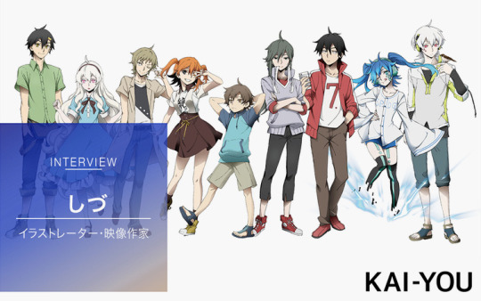
As promised, here is the english translation of Sidu’s side of the interview from kai-you.net, which was posted a few days after Jin’s. Warning: since this interview is from two months ago, some date-related infos are off, so I had to adapt them in order for them to make sense in the present time. As always, please message me if you have questions or spot any mistakes. Raw here. Jin’s side here.
Here is Sidu-san, an illustrator and video maker that, together with Jin-san – who handles the music, light novels and comic’s script –, is yet another person to have had a major role in the making of “Kagerou Project” (KagePro), which is celebrating its sixth anniversary this year.
Back in 2011, upon meeting Jin through Twitter after watching the video he had posted on NicoNico Douga, Sidu-san was put in charge of making the character designs and MV for “Kagerou Days”, which triggered a lot of attention from the viewers. Later, she was in charge of handling all of the MVs, illustrating the light novel “Kagerou Daze -in a daze-” and making the character designs for the serialization of the manga “Kagerou Daze”.
(T/N: Some of you are probably finding this part weird, but let me clarify. We all know that not all the PVs and character designs were made by Sidu, but when the interviewer says that she “handled” them, he probably means that Sidu had a role in their making, one way or another, even if they weren’t 100% her work.)
With her video composition that relies heavily on unique patterns and high-speed cut-ins, she has become the main person behind the visual image of “Kagerou Project”. Sidu-san also served as animation director for the first time in the production of the exclusive MX4D™ movie “Kagerou Daze -in a day’s-” that was released in November of last year.

Kagerou Daze -in a day’s- Key Visual
This interview discusses in detail about the backstage of this work and the repercussion that followed its release, as well as the different character images of Mekakushi-dan, the interweaving young main group of “Kagerou Project”. Moreover, it discusses how her moves as a creator that has also been supporting “KagePro” have been proceeding, together with how Jin-san has been receiving so much attention from the media.

Kagerou Daze -in a day’s- Scene Shot 1
──It seems that MX4D “Kagerou Daze -in a day’s-” was a work in which there were arrangements being laid out until the very end.
Sidu: Yes. (Laugh) I was editing the alpha in the studio until the afternoon of the final deadline. Until then, I’d spent the days not being able to tell when it was daytime or nighttime.
(T/N: “Alpha” is a term used by animators as short for “alpha channel”. For anyone interested, there’s a small article on its definition here.)
──What part was the most difficult?
Sidu: I’m in the position of a director that has to look after everything, so though the animation director was always present, there were points I had wanted to modify no matter what, and ultimately, I used the software named “After Effects” to work on the so-called “cinematography” by adding effects all on my own.
──The production was in an apparent harsh situation, huh... For starters, what kind of thoughts pushed you to accept being the director of a MX4D movie?
Sidu: It started with the talk about extending the PV. As in connecting all of the BGM, making it into a single track and creating a video for it. I thought, “If it’s something like that, I can do it. If no one else is willing, I can take it on.” and, as the discussion about it went on, the number of things I was put in charge of increased...
In the beginning, there wasn’t even a script, and I was supposed to just deliver to the studio a storyboard consisting only of drawings, but in the end, I also ended up writing down the script myself. However, writing a script all alone was hard, so I planned out the plot together with the novelist Jinzai Aki-san, whose novel, “Bandou Keiko, Nichijou ni Aki Aki” (Shinchou Bunko nex), was illustrated by me.

Kagerou Daze -in a day’s- Scene Shot 2
──How did you make the story?
Sidu: From what I had heard at first, it was supposed to have a 25/30-minute duration. It’s as much as one episode of an anime series, so I wondered if I could create a linear, coherent story from that, but during the actual process of making it, I figured it’s no good if it can’t even fit into 18 minutes. The original story had a slapstick comedy scene with explanations for first-time viewers to understand everything, but I cut it all off. Action scenes, too, were only left in the bits where they were truly necessary.
──This time’s tale feels like it’s set in a parallel world version of a certain incident that happens in the opening of the main story of “KagePro”.
Sidu: That’s right. “If all of the Mekakushi-dan had been in that scene, what would have happened?” is what I imagined when I wrote the plot. Also, this is a MX4D exclusive movie, so I thought I wanted to use the MX4D effects after all, and for such, it had to be that action-packed setting.
Sidu talks about the characters of “KagePro”.

Kagerou Daze -in a day’s- Scene Shot 3
──When making this work, what where the points you were careful with?
Sidu: The personalities of the characters. If it’s Kano, he protects his comrades from the shadows, while Kido sneaks about just like him; things like that. Just like this, I started writing about them by reflecting on what kind of posture each character would take, based off their personalities.
──When you say you were careful with the characters’ personalities, does it mean the images of the characters grew within you while making “KagePro” together with Jin-san?
Sidu: That’s right. This time, Jin-san had to give undivided attention to the music composition while I had to do the same with the movie, so I wrote the story and characters from my own interpretations. That’s why I think it’s become something different from the character images that Jin-san has.
──What part of Sidu-san’s interpretation of the character’s images is different from Jin-san’s, exactly?
Sidu: For example, Kido. When I read the light novel, I get a feeling that Jin-san views her as a pushy character. But, to me, she has the image of a cool young woman that can pull off the role of a confident man.
──I see. I think this is a valuable opportunity for Sidu-san to talk about the characters, so if you would, I’d like to hear about your impressions of all of them.
Sidu: It doesn’t change much regarding Shintarou. I do think he’s got a creepy side, but he also has the aspect of an older brother.

Momo, too, isn’t that different. Just like the image of the songs, I think she’s a bit of an oddball kind of character. Like she’s an idiot but quick-witted.

But... regarding Marry, I feel that there’s quite a gap.
──How big of a gap?
Sidu: Jin-san’s Marry, putting it simply, gives the impression of a psychopath; of someone that isn’t human. Even so, she’s faint-hearted and has a cute side for being an airhead. But within me, she isn’t so much of a scaredy-cat. Since she’d been living by herself for a long time and managed it somehow, she gives me the image of someone who’s got nerve.

Seto hasn’t had enough appearances at all, so I've got no idea about him. Having him there is fun, yet everything is fine even if he’s not around, so he might feel like a character that could run off somewhere anytime. But to me, Seto isn’t the type that moves foward thinking of himself. Similar to Ayano, he gives off the feeling that he’s holding in something dark.
When listening to “Kagerou Days”, the image that I felt of how Hibiya is aloof but doesn’t hesitate to protect the girl he likes was strong in me. But I think the Hibiya that Jin-san writes about is probably Jin-san himself. He’s an elementary schooler that lives in the countryside and is a little gross. (Laugh) Currently, the Hibiya as I see him is the result of this incompatible combination.
──What about Hiyori?
Sidu: Jin-san’s Hiyori is truly a rigid character, huh. Ah, but I don’t know if that’s his taste. (Laugh) The Hiyori as I see her is also the same as her impression from “Kagerou Days”. Though it feels like she’s always pushing others away, it’s not like she’s a character that thinks too ill of anyone.
Ene... is a base character, but she, as Ene, is clearly the number one mascot character as well. Same for the anime. But in the novel, her real character has a strong influence, so it was hard to find a balance.

Though he’s always grinning, Kano is serious when he has to be. Except, Jin-san’s Kano is feminine and feeble. But within me, he has the image of a cool character that hides his dark past and absolutely can’t be understood by others.
──Lastly, what about Konoha?
Sidu: Regarding Konoha, Jin-san and I might be in different vectors. Jin-san’s Konoha is a coward. If I had to compare, Haruka is the active one. The Konoha as I see him is completely detatched from Haruka and doesn’t have any of Haruka’s courage or fears. Konoha’s actions aren’t a result of him thinking; rather, he seems like a character that reciprocates what is given to him.
──I see. Indeed, after listening to this, it does feel like the movie is filled to the brim with Sidu-san’s interpretations.
Sidu: That’s why it might feel different from the light novel to the viewers.
Kagerou Daze -in a day’s- Scene Shot 4
──Jin-san said in his interview that it was something like an “official anthology”.
Sidu: I think that definition hits close to home.
It started out with the Oekaki Keijiban for “Puyo Puyo”.
(T/N: For those unfamiliar with the term, “Oekaki Keijiban” or “Painter Bulletin Board”, also known as PBB and PBBS, are bulletin boards or forums dedicated to drawing pictures by using a paint program that runs in a web browser. For more info, there’s a detailed article on the subject here. And for anyone wondering, Puyo Puyo is a 90′s video game. It seems to be called “Puyo Pop” in Europe and America.)
──I think I should request a retrospective from the viewpoint of Sidu-san, who has been supporting “KagePro” that celebrates six years now with illustrations and videos, if it’s possible. But before that, when was it that Sidu-san started making art and posting it online?
Sidu: I started from the Oekaki Keijiban for “Puyo Puyo”. During those days, I was just a spectator, and believed people drew digital art using the mouse. Then I found out about the existence of tablet pens. (Laugh) Using them to draw became fun, and the first thing I published after that was the Oekaki Keijiban.
──When was that?
Sidu: The time I was in that Keijiban was at around my second or third year of middle school. Either 2007 or 2008. I’d watch MADs and FLASHs a lot on NicoDou.
(T/N: I’m pretty sure that people who watch AMVs are knowledgeable of these terms, but since they are almost exclusively used by the Japanese and were created by them, here we go again. To put it simply, MAD is the Japanese initials for AMV. The letters stand for “music anime douga”, meaning “music anime video”. But, unlike the western fanvideos, they’re mostly mash-ups with lots of effects and heavy editing, so generally leave a more intense impression. The term can also be used to describe the Japanese underground media community. Meanwhile, FLASHs are videos made using Flash Animation, the most popular animation software amongst hobbyists and YouTubers. They could be fanvideos or original creations; mostly the latter. Also, just for the heck of it, “NicoDou” is an abbreviation for NicoNico Douga.)
──Was it also around this time that you made a Pixiv account?
Sidu: Pixiv came a little later. In another Oekaki Keijiban, the word “Pixiv” popped up, so I looked it up and found the site. I had originally made an account just for the sake of viewing and didn’t post anything at all, and that’s the account I’m using until now.
──Looking back, you started using both NicoNico Douga and Pixiv in 2007. Now-a-days, the term “UGC” (User Generated Contents) has become common, but I believe that Sidu-san had been playing around in places like Keijiban as an anonymous creator and threading numerous individual accounts in websites since your teenage years.
Sidu: Thinking about it now, it was amazing. There was actually a popular person in that “Puyo Puyo” Keijiban. I remember finding this person’s art on Pixiv and got emotional while thinking, “That person is still alive!”. It was easy to find them since their art style didn’t change.
Year 2011, where the phenomenon known as “KagePro” overtook a creator.
──And then, four years from there, you discovered “KagePro” in 2011, and three months later, you became its illustrator.
Sidu: Only, I was light-hearted about it back then. After all, every tip I was receiving about how to make the art was via Twitter.
──I think 2011 was an important year, where “Senbonzakura”, “Tell Your World” and “KagePro” debuted together in a contest to become representatives of the 2010 internet’s VOCALOID and NicoNico Douga.
Sidu: It was a lively year. Before “KagePro” started, I’d made acquaintance(s) with VOCALOID song creator(s) through Twitter, but I think that was the time when it truly became lively. I also drew art for their songs.
──Does Sidu-san remember the impression from listening to Jin-san’s musical composition for the first time?
Sidu: Back then, I’d skim over the rankings of VOCALOID songs that came out everyday on NicoNico Douga. KagePro’s first song, “Jinzou Enemy”, was there, and had me going, “This song... is cool,” so I tweeted that. Then came the sudden reply from Jin-san, “Thank you very much”. That was when we had our first interaction.
──What kind of interaction was it?
Sidu: At first, we didn’t talk about songs or art at all, only about games. Then Jin-san saw my Pixiv account’s URL in my profile page and went, “So you were an artist,” then asked, “Could you draw something for my next song?”. From that, we made “Mekakushi Chord” together.
──From this point on, I think the repercussion regarding “KagePro” began to broaden all at once due to the release of “Kagerou Days” four months later, so how did you take it back then?
Sidu: There was a time when all of Pixiv’s rankings were often about “Kagerou Days”. Moreover, everyone was good at drawing. It was a phenomenon full of people that drew the art motifs that I had created better than myself. While I thought, “Amazing~!” I also pondered over things like, “Wouldn’t it be better if I weren’t here? Aren’t I just dragging it down?”.
──It felt like the phenomenon was overtaking you.
Sidu: Right. Everyone had all sorts of interpretations, and there were people who drew accessories and cool Hibiyas. I thought people who thought that far and made that much stuff were amazing.
──By the way, what’s Sidu-san’s image of Jin-san?
Sidu: During that time, I thought he was someone that made cool songs. But as it turns out, all he talked about were damned Otaku subjects, so I started thinking of him like, “This person... is a weird-ass old man, huh...” (Laugh) We also talked about “KagePro”, but half of it was like, “If this person was in a live-action adaptation of it, what role would you want them to play?”
Many adults she didn’t know ended up getting involved.
──“Mekakushi Chord” only contained an illustration, but “Kagerou Days” was fast to be turned into video. Had you wanted to make videos from the start?
Sidu: I had. But at first, the only software to make videos I knew of charged a fee, so I thought I couldn’t handle it and gave up. But upon doing a search, I found countless free softwares. Especially a software named “AviUtl”; I tried it out on intuition and ended up using it a lot.
──The MV of “Kagerou Days” shows stills that move through camerawork like visuals and lyrics that cut in, so an unique style was born from it. Was it inspired by anything?
Sidu: I simply thought, “I want to make a VOCALOID-ish MV” and it turned out like that. There were videos like that since back then. The rest was just the feeling that I “had to create an opening”.
I liked videos with lots of illustrated frames and watched them often, thinking that “it would be great if I could make videos like these, but drawing so many frames is exhausting so it’s impossible”. I believed that “it will be more VOCALOID-ish this way” and made it without enough frames. Although, I don’t know how, I ended up with many frames. (Laugh)
──After that, “KagePro” moved forward as a collaborative work with a particular worldview. How did you feel when the project grew bigger and bigger?
Sidu: During the time of “Headphone Actor”, I had heard about the demo movie of the VOCALOID named “IA”, but back then, I wasn’t co-working with anyone and made everything by myself. Yet, at the time that the CDs, light novels and manga were released, a bunch of adults I didn’t know became involved. “Isn’t this... kind of bad...?” is what I felt.
──Meaning, from 2011 to 2012, the situation was steadily rising to a climax, and the people from companies and labels that keep everything in order became involved.
Sidu: That’s right. At that point, all of the characters had been made. I had suddenly been told by Jin-san, “These characters will come out next, so please make as many prototypes as possible for them” and from then, we made “Konoha no Sekai Jijou”.
The feeling of “Do I feel good about this or not?” doesn’t change from the videos to the anime.
──The phenomenon’s ignition was “Kagerou Days”, and adults started getting involved during the time of “Konoha no Sekai Jijou”. Were there any other songs that Sidu-san feels to have been a turning point?
Sidu: The first time I counted with another animation company and entrusted them with raw materials for the characters and animation was during the time of “Children Record”. It was the first time I’d made a video with someone else, but since it was related to “KagePro”, it was a pain in the beginning.
──What exactly was a pain?
Sidu: I really couldn’t manage to put what I wanted to do into words in a way others would understand. There is also the fact that I’m a taciturn, the type that doesn’t talk much, and the contents of my works are usually messy. Back then, I couldn’t deal well with taking lots of jobs and having to interact with people numberous times, so I thought the proposal of making an anime was terrible.
──Are there any remarkable memories from after that?
Sidu: That would be the opening theme of the TV anime, “daze”. Back then was when I made a video with scarce animation for the first in a long time. I believed I had made a video with an evolution of my old style. Basically, I prefer making videos with motion typography like “daze” rather than animation.
──What does Sidu-san, as a creator, consider a strength in your style?
Sidu: I’m often told I’m not the articulate type, and to tell the truth, I don’t even understand my own style that well. (Laugh) I’m not that conscious of my style; I just think, “I wanna make something like this” when I occasionally see something I consider cool and do it. But my sense of time ─ my way of timing things ─ might have not changed since the past.
──I think it’s a big point for the sound and images to be synchronized. The way of capturing motion in Sidu-san’s videos feels like the motion and the music are in the same session, like it connects with a percussion instrument through a wire.
Sidu: Hoa~, thank you very much. I’ll try to keep that up from now on. (Laugh)
──Is this more of an emotional than a technical thing?
Sidu: That’s right. It’s completely emotional. Whether I’ll “feel good about it or not”.
“Kagerou Daze -in a day’s”, the movie that resonated Jin and Sidu’s music and videos.

Kagerou Daze -in a day’s- Scene Shot 5
──About that feeling, I wonder if it didn’t come to life in the production of this MX4D. I felt something like a connection between the bridging and coordination of this production and the sense of timing of Sidu-san’s videos.
Sidu: I think that success was achieved entirely thanks to the technique of the contributing editors. In the process of making it, I did imagine things like, “I want to put special effects in this bit,” but when the part of adding MD4X effects actually came, it turned out to be fun. So I thought, “Let’s put in a lot of effects,” and it wound up really flashy.
──It flickered a lot; my glasses even got wet. (Laugh)
Sidu: Yes, yes. Makes one feel like, “just shake things up,” huh? (Laugh)
──Was there anything you obsessed over in the coordination of the animation or the MX4D?
Sidu: There are scenes in Shintarou’s point of view, and I thought that, since it was a subjective viewpoint, we couldn’t just halt them, so I made them oscilate all the time. While imagining them, I felt we should just make them flashy.
──This movie’s main point is the subjective viewpoint, huh? Within 20 minutes, the point of view is often switched. The opening scene with the terrorists also starts with a subjective viewpoint in first person. It became a form of narration similar to a virtual reality type of self-insertion.
Sidu: That’s right. We referenced that genre of video games named FPS rather than making it like a regular anime. I thought the MX4D effects were very compatible with that.
──Seeing the feedbacks, there were several positive ones like “they move so much when the frames are put together” or “the water and scents were amazing”, and it gave me the impression that many people enjoyed the aspect of self-insertion provided by the MX4D. I believe you have come across various different feedbacks as well, so how did you take them?
Sidu: I’m extremely grateful to the people who said it was fun. But there are also negative opinions. To be honest, even I think there were things I couldn’t manage to do, so I symphathize with them like, “So you think the same as me, huh?”.
It ended up being a short story, but it started out from a PV-like form of storytelling, so it felt like an omake. That’s why the people who said it was enjoyable (personally) make me the happiest.
──Is that to say that the story and the personal experience were memorable?
Sidu: Yes. However, for the story, “Kagerou Daze -in a day’s-” actually has a sequel, “Route-2”. I won’t go into details yet, but I can say there will be a connection with it through the use of this first-person subjective viewpoint.
──In Jin-san’s interview, he also talked about the pleasure of personal experience, and the keywords were “feeling of immersion”. The opening “RED” expressed a feeling of dizziness from being inside a whirlpool with its fast tempo. He said that, this time, he worked on the song for the movie completely separated from you, but in the end, I believe your feelings wound up linked to one another. Lastly, in retrospect of these six years, what was “KagePro” for Sidu-san?
Sidu: It was a school. I learned a lot of things through “Kagerou Days”. I learned a lot of bad things too. My art simply became better and I became better at making videos as well. I learned how to worldbuild and make videos and anime. I always had to greet lot of people at work, so I also became more sociable. It really felt like a school.
──Meaning you grew together with “KagePro”.
Sidu: That’s right. I also got to eat some delicious stuff. (Laugh)
──Hahaha. By the way, Jin-san said that “KagePro” was “meant to seriously deceive children”. And that “it wasn’t made to please adults”.
Sidu: That’s right. Lately, I have often heard people commenting with disdain, “that thing is aimed at children”. But I believe that everyone makes stories influenced by things they liked as children or animes they watched and mangas they read. That’s why I think childhood is important. It’s okay for it to be a work that adults can also enjoy, but what meaning would it bear if children couldn’t stand it? Is what I feel.
#kagerou project#kagepro#mekakucity actors#kagerou daze#kagerou daze in a day's#sidu#jin#anime#my translation
111 notes
·
View notes
Last Seen Blogs

straitjacketshopcom
StraitJacketShop

profane-angel
Profane Angel

perpustakawan
Perpustakaan + Kawan = Perpustakawan

juanibauer
JuaniBauer

mcu-fanatic
I Still Belive In Heroes