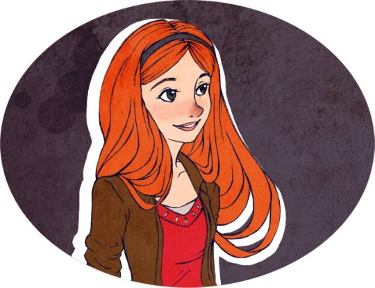
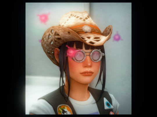
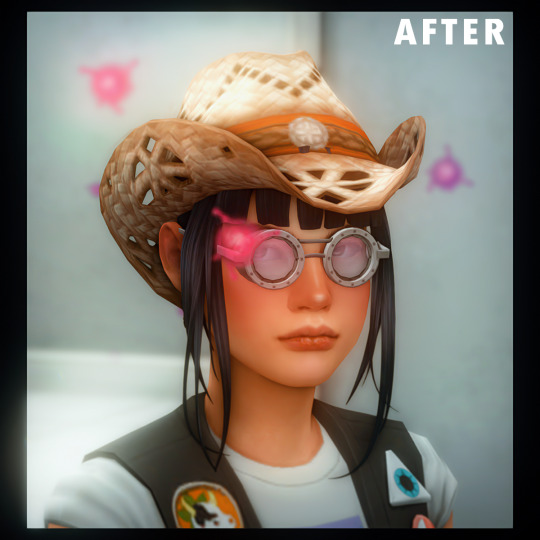
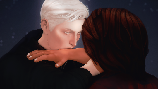
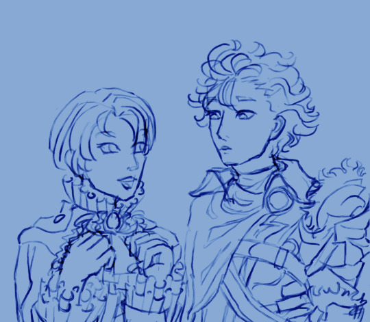
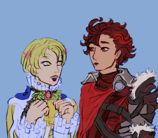
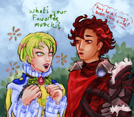
#used procreate’s liquify tool for most of it
Text

i’m in my liquify tool era now i’ve decided, why tf not ✌️
#hunter's art#used procreate’s liquify tool for most of it#then did adjustments and finishing touches in csp
3 notes
·
View notes
Note
Just wanted to ask, please forgive me if you've already answred this, what program do you use? Your art fucks HARD and like. I was looking at your art of the two moths over the city they die in and I was hit with the wave of "oh that looks really fucking fun actually." Like i know my art program can't do some of those effects and like, I'd love to try fucking about with them.
hi there, thank you! all my art is done in procreate and paint tool sai
because you mentioned that drawing in particular i thought it would be fun to break it down and show ppl what exactly went into each part of it so check this out
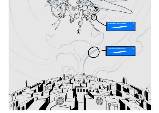
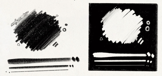
sketch & lineart - the brushes come from georgbrush.club and the urban sketcher is my most commonly used lineart brush, it has a nice irregular shape. the square brush is nice for big blocky sketches.
the cityscape was REALLY hard but basically I got a photo of the skyline of florence, traced some basic building shapes, then bullshitted the rest using the vertical symmetry/mirror tool to cut down on the amount of work (so i only had to sketch one half of the city). then for lineart I turned off vertical symmetry, turned on the two-point perspective tool, and got this:
the rose windows were made using the radial symmetry tool.
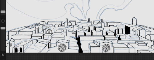
I didn't like it being so flat, so I used the liquify tool to make a kind of fish-eye effect (limited success tbh). I liked how it looked but the buildings in front needed something to cover them up to make the liquification less obvious...
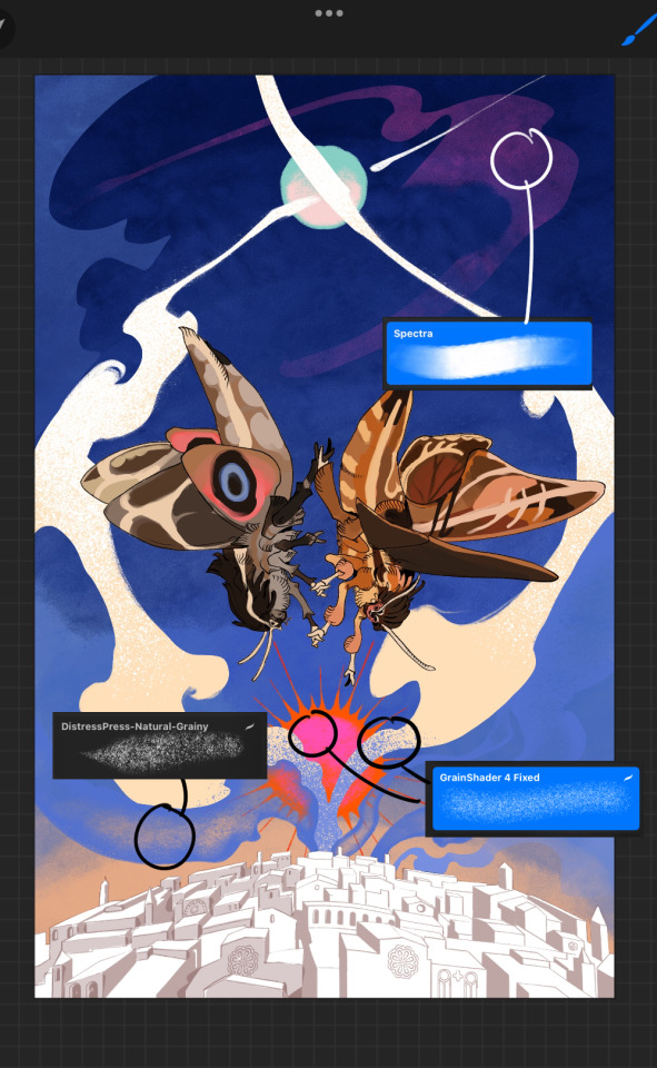
first pass colours. I felt they were very washed out, aside from the sun which i loved. I use the spectra brush (default procreate) for skyscapes a lot, I love the texture. Although the clouds were filled in using the lasso selection tool, I softened the edges using the square pencil again and added texture using true grit sampler grainy brushes. The translucency effect comes from my setting the brush as an eraser. The sun rays come from the radial symmetry tool.
Blocking in the moths' colours was done with the urban sketcher again.
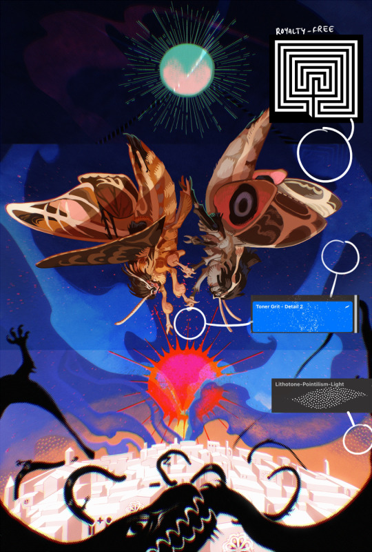
Something people may not have noticed is the labyrinth hidden in the sky! yeah I had a bunch of versions where it was more obvious but I found that it clashed a bit and was too busy, so I made it subtle. But yes. I searched for "royalty free labyrinth" and picked one.
The toner grit brush is one you've seen before if you've looked at any art on tumblr lately (this is such a popular brush) and it's from the true grit fast grit set. The pointillism brush is from the true grit free sampler pack, like my grain brushes.
I added shadows to the moths, increased saturation overall, and changed the clouds to a translucent blue (you can even see in the sun where I forgot to block in the sun itself because the clouds over it used to be opaque lol). Moon rays were drawn using the radial symmetry tool but this time with rotational symmetry off. I also moved the moon down closer to the moths because I felt that it was a bit far away, and this served to visually divide the drawing into three equal parts, so I chose to lean into that and divide the sky colours too, to show passing time, or an endless moment - morning, evening, night, etc.
And then the oroborous, I tried a few different effects on it because I wanted it to be very clearly separate from the main scene - I settled on a dot matrix newsprint texture, using procreate's onboard tool, and some heavy chromatic aberration. This is because the oroborous isn't real, it's purely symbolic and the moths' demise started when they became photographers so I liked the print media aspect there as well. The story itself is about grief without closure, cyclical violence, and sunk cost fallacy, while everyone explores an endless labyrinth, so an oroborous fits I think
what makes art fun to me is thinking up ways I can tell a story using just a single image. and sure a lot of it will be lost to an audience who isn't familiar with the characters or backstory but i want to leave enough in there that even complete strangers to my work will be able to construct a narrative about what's happening here, rather than it just being a cool image. that's my goal.
Finally I exported it to sai on my pc to give it a once-over. this is really important because the retina display on an ipad is oversaturated on purpose, to make everything look amazing and vibrant. but what this means is that on other screens, your work might look washed out. it's especially bad at displaying yellows! so i look at it in sai on my pc and i make minor adjustments, in this case I actually added another multiply layer on the moths and an overlay on their non-shadowed parts to increase the contrast there.
finally if you've read this far, I played a little trick with the caption of the drawing. yeah, THEY die... but only one of those moths is a theythem pronoun haver... the other has to survive. he isn't given a choice in the matter.
#fr you will never catch me trying to mystify my process i will explain literally everything#brushes
455 notes
·
View notes
Text
I got quite a few DMs over the weekend on twitter asking about my brushes, and as with anything, your mileage may vary, and digital art isn’t made or broken by brushes, but having them never hurt! Talking about how you use your tools is just as important as talking about what tools you use, so consider this a small breakdown of my process for digital sketching.
First thing’s first, I avoid sketching on an untextured canvas. If you like to have a flat, solid canvas, I recommend working at 50% grey, or adjusting your canvas to be slightly off-white. The harshness of black on pure-white can be a hang-up for many people, including myself.
I sketch on paper textures sourced from my own old sketchbooks and papers. The one I use most frequently is available in my Sketchbook Paper Pack, and named Off White.

While a true-to-life pencil look is not what I’m actively going for with my sketches, these papers certainly help achieve it.
I do almost all of my work in Procreate, but learned digital art first in Photoshop. Anything I share here in regards to how I use brushes can be applied to any brush, I’m certain!
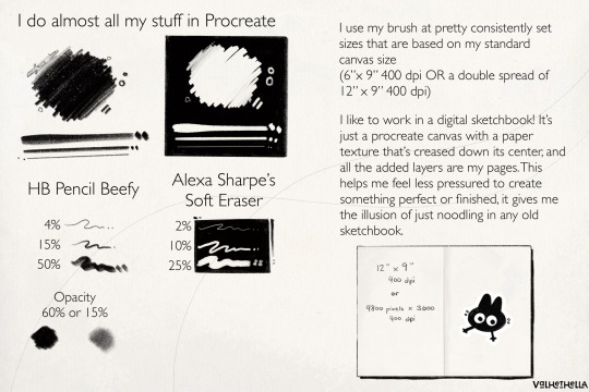
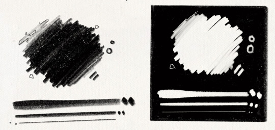
For my sketches, you’re seeing the work of one brush and one eraser.
For my brush, I use an altered version of Procreate’s native HB Pencil brush that I’ve named HB Pencil Beefy. It’s available in my 2021 Brush Pack.
For my eraser, I use Alexa Sharpe’s Soft Eraser. It’s available in their Eraser Brush Pack.
I use my brush at pretty consistently set sizes that are based on my standard canvas size, which is 6″ x 9″ 400 dpi or I use a double spread of 12″ x 9″ 400 dpi.
(If you work in pixels that’s 2400x3600 at 400 dpi and 4800x3600 at 400 dpi)
HB Pencil Beefy I use at 4%, 15%, and 50% size, with the brush’s opacity set to either 60% or 15%.
I set the brush to 15% opacity when I want to go in very softly with lots of that pencil texture. I use this when I need to scale back and really rough something out, or if I’m trying to get a sense of volume with some shadows or contours.
With Alexa Sharpe’s Soft Eraser, I use the eraser set at 2%, 10%, and 25% size. I only scale back the opacity on the eraser if I want to take something back to nearly gone, but still want those lines, faint, there as a guideline.
Jumping back to my file setup really quick, I like to work in a digital sketchbook! It’s just a procreate canvas with a paper texture that’s creased down its center, and all the added layers are my pages. This helps me feel less pressured to create something perfect or finished; It gives me the illusion of just noodling in any old sketchbook.
Okay. Back to the pencil. Below, I have a small idea of my process in sketching and drawing. This is not a how-to-draw demo, and it’s definitely not an anatomy demo – it’s just how I approach drawing using this brush. The page below, and the one above, were both done on a 9″x 6″ canvas at 400 dpi.
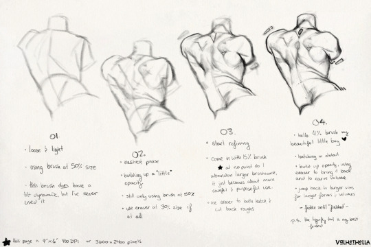
01.
Loose and light
using brush at 50% size
this brush does have a tilt dynamic, but I’ve never used it
02.
Nastiest phase
building up a little opacity
still only using brush at 50% size
use eraser at 25% size, if at all
03.
start refining
come in with 15% sized brush
at no point do I abandon larger brushwork, it just becomes about more careful and purposeful use
use eraser to hatch and cut back roughs
04.
hello 4% brush my beautiful little boy ♡
hatching in detail
build up opacity, using eraser to bring it back and to carve volume
jump back to larger sizes for larger forms and volumes
fiddle until “finished”
P.S. the liquify tool is my best friend
152 notes
·
View notes
Note
What program do you use to make your fanart? Is it on just an average ipad or is there special ones just for art? Your work looks so good! I’m wanting to try digital art but unsure where to start :)
I use the Procreate app for all of my digital art! ✨
It should be available on any iPad 💗 I personally invested for my birthday this past year and I have the 12.9" M2 iPad Pro, but I'll even occasionally use my fiancé's iPad Mini and the Procreate app on there in a pinch since it's so small and portable~
The only real difference is that performance might suffer a bit, the larger an art piece is or how many layers your work has, depending on the iPad. But if you're just starting out, I probably wouldn't find that to be much of an issue!
(More rambling about digital art origins under cut ✨)
There's definitely a learning curve, especially if you're more used to drawing traditionally! It can help to still sketch traditionally (if that's what you're used to) and then upload a photo of your drawing to your tablet to work over digitally (this is personally how I started out and I used to just make little digital doodles by tracing and coloring over my traditional sketches.)
A small doodle from my sketchbook that I traced and colored digitally, from around 2011-2012, I think? Uh, happy Doctor Who day today!
My very first digital art set up was actually a tiny Wacom Bamboo tablet where the drawing space probably wasn't even bigger than my hand, and a super old bootleg version of Photoshop CS2 which was already a version that was 7 years too old for the time (CS5/CS6 was the most updated version by the time I had started on digital art).
Everyone else in my class had the bigger/fancier/professional-grade Wacom Intuos and I remember my professor taking one look at my baby tablet and just going like "how tf are you drawing on that" lmao.
But still! Experimenting and doing little exercises can get you a long way – I would say to approach it with similar exercises you would do as if you were learning to draw traditionally for the first time.
Shade in circles/nail down basic lighting. Gesture drawings. Random scribbles. Just things that help you get used to the feel of digital art!
Test out different textures you can achieve with one brush, then expand it to see how other different types of brushes can behave and add to the experience.
For proof that even just one brush and not the best/most updated tools can work: these are two of my first more "serious" digital art projects I did in college (with my tiny tablet and mega outdated version of Photoshop) and 99% of the rendering was just done with the "soft airbrush" brush.
But even then, we were taught to create our base sketches traditionally and upload them to the program to work over.
Then one day I decided I wanted to just be able to also do all my sketches digitally and just worked on getting used to sketching straight on my digital program. It was then that besides the all-powerful undo-redo buttons, I started to really make use of the transform/canvas flip/liquify features which I don't think I can live without now lol.
(Caveat: I'm now a little too dependent on those features so I keep a traditional sketchbook to do silly doodles in occasionally to exercise my hand because sketching traditionally without the buffer of those digital tools is pretty difficult for me now lol.)
That was a little long-winded, I'm so sorry hahaha. I hope something in this rambling could be taken as somewhat helpful for starting out on digital art!! 💗
34 notes
·
View notes
Note
hi I hope you have great holidays (if you celebrate!) I love how your screenshots look, could you describe your editing progress in any chance? <3
definitely! my editing progress usually depends on the general feel of each photoset/screenshot so this is just a composed list of steps i generally take whenever i edit them.
the screenshot is taken with gshade (personal preset) and edited with ☠ photoshop CC 2019!
today we're working with this screenshot:
yes i took it with the border shader in gshade. less things for me to do in photoshop and i can angle the frame how i see fit!
since i've planned to crop this into a square (based on how the border is set) so we'd do that. after cropping i'd run an action (that i called "base") composed of:

in which the ☠ topaz clean and smart sharpen settings are taken from avonlea's actions. the camera raw filter is just there to add +5 clarity points. ☠ topaz denoise setting varies because unlike topaz clean, denoise pop up window will show up and let you edit it right at the moment. here's a before and after:

here i'd use the liquify tool to smooth out the rough edges, or export it as .psd to procreate if i wanted some extensive edit and draw on, etc.. then import it back again in pts for the next step.
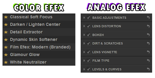
next i basically throw the screenshot into ☠ color efex & analog efex pro where i play around with the filters and spam the compare button until i'm satisfied.
the settings get changed every time so it'd be kind of useless for me to share them but these are the ones i mess with the most:
then i'll use the camera raw filter again to hot-fix the screenshot (mostly saturation, hue, highlight, white points, clarity and texture), resizing the image to 1280px wide*, run an action (that i called "noise") and we'll end up with something like this:

fyi: sharpen the screenshot after adding noise is a personal choice btw. sometimes i'd double sharpen the screenshot if i want it to be more sharp - run the unsharp mask option before the noise action itself.
*if the current width is lesser than 1280px i'd downsize it to 540px since upsizing a lower resolution image will make the details blurrier (there's rarely a case where my original screenshot after cropped is lesser 540px wide).
*if i use swre to hotsample my screenshots i'd resize the photo to 2160px wide instead. most of the 2160px width cases are fullbody shots in cas.
last step is to save/export the edited screenshot as PNG. the grand reveal:

unfortunately the site for these ☠ programs was not in english, i downloaded them a long time ago i forgot which site i got them from so i couldn't send/link them here :(
— anyway i hope this editing process helps with what you're looking for!! (someway somehow)
#hope your holiday was great if you celebrated!!#i cannot proofread#answering this while watching twd#ask#nː
24 notes
·
View notes
Note
love your art!!! it’s so pretty :00
do you have any tips for procreate? i’m new to it and still trying to find out what brushes to use.
thank you for the complements <3
as for tips, i’d say that the most useful tools procreate has are in the magic wand section, in particular the liquify tool and the gradient map: the first lets you adjust the proportions of your drawing, and the second…i don’t know how to explain it well, but if you play around with it you’ll see what i’m talking about! it changes the colours of the drawing (more or less intensely) based on a palette of your choice, and some people use it to colour black and white drawings
i only use the brush in the airbrushing section, but i had a technical pen phase (i used it for lineart but then i grew tired of it) and monoline can be useful for lettering and stuff like that. there are many free brushes online but i don’t know how to download them sorry :(
18 notes
·
View notes
Note
Hi River! It's time for Random Asks: Editing Edition!
What part of your editing are you most proud of?
What part of the editing process do you enjoy the most?
tbh this was hard for me to answer bc i honestly don't really like where i'm at wrt my editing skills. but i think i have the most fun with the liquify tool! and... well, i guess i'm proud of myself for actually starting to edit this year since i've never actually done it before. plus, while i don't think my edits are really anything special, i do know that they're better now than they were at the start of the year.
like starting from the old stuff to newer things i've done...
i started with just playing with the colors and overlays, maybe using the spot healing brush and blurring things a bit. then i started learning how to make poses for echthroi posts:


then i was like okay... let me close photoshop and see what happens in procreate when idk what anything does—while also still making poses (like these are all my poses weeeee):

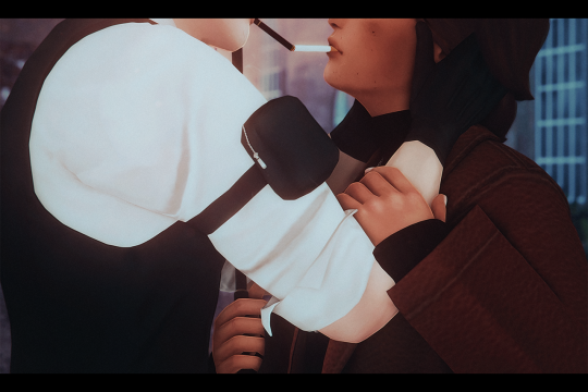
(that cigarette one is so sad </3 because i love those poses and they took me forever to make! the post is really colorful and pretty tbh! the problem tho is that theo looks ALL WRONG!! and i didn't know wtf i was doing with that luminosity brush lmao. i'd love to redo it someday with mattodore's updated sims and everything).
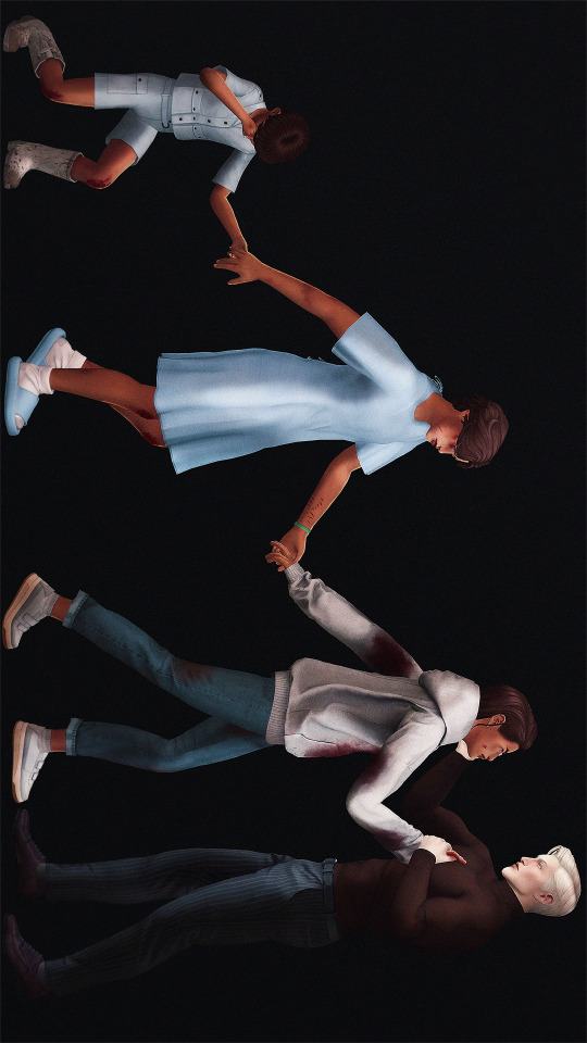
and then i went back to just using photoshop. and in sept. i wanted to experiment with blood and lighting/shadows for theo's birthday post so i did that. i think the coloring is... whatever. and it's pretty simple (or it looks that way… really this took me hours and hours of work. the original image was huge) bc ik i wasn't doing so hot at the time... but i'm really proud of the lighting and i like the poses i made for it. also the little bit of writing i did in the caption was nice. i'm a lot better at writing than editing, clearly:
and then in the last three months i think the cas edits i've been doing have been superrr gorgeous. i learned a lot from theo's birthday post and have actually been utilizing light and shadows since then:
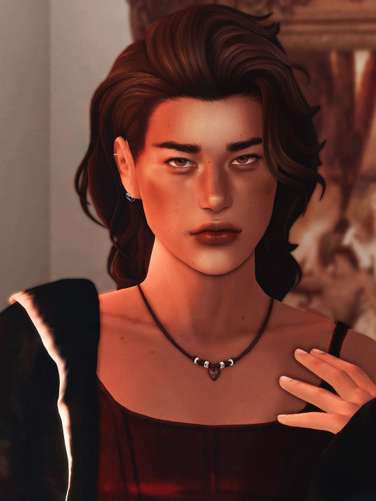


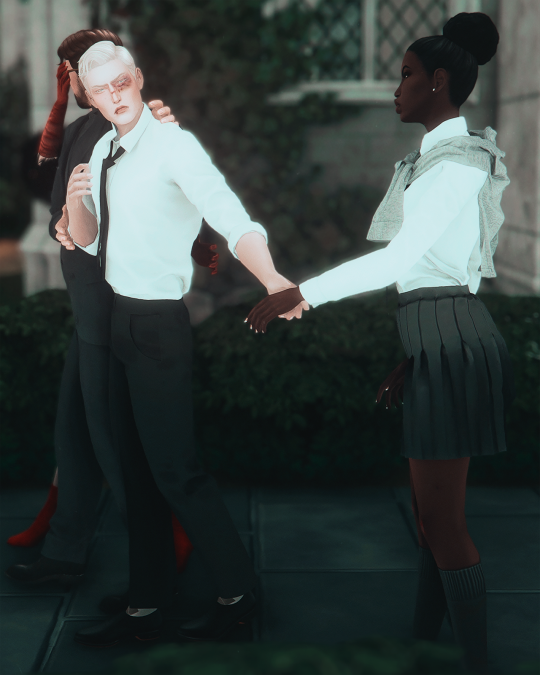
and then the last edit i did just a few days ago... it's easily my favorite theo pic i have now :) i didn't think i'd even share this on here... like i was just going to post it to pillowfort so i only intended to fix some clipping and smooth out the edges of theo's knees, but i ended up doing waaaay more than that. i like the way i colored it a lot. the face highlights, the blur, the slight vignette, and the chromatic aberration are pretty too. i just really like it... plus theo is beyond gorgeous as always:

like... honestly my editing really isn't anything special. um... but i do think it's better now than it was before. and i like what i've done recently (like these last two months specifically lmao)! i'm nowhere near where i'd like to be, but at least mattodore are so pretty it kind of carries any edit i make for them now lmaooo
#river dipping#asks#morrigan-sims#thank you for asking even tho i took foreverrr to reply#i really want to keep getting better at editing... coloring is the thing i wanna really focus on eventually#rn i just rely on my gshade preset / this psd i made forever ago / and this other psd and overlay i've started using#i need to just start making little edits here and there again tbh#but i've been focusing more on writing than anything else lately
2 notes
·
View notes
Note
Heya, I was wondering if maybe you can share some tips on how to "learn" a new face? I feel like I have an extremely tough time getting my sketches to look like a certain person no matter how often I draw the face using reference images.
Also wanted to say I adore your art style and hope you have a nice day :)
I wish I could reply with some smart lesson like I'm really that cool artist that draws faces from memory, but I'm not - I still use references every time, Ted Raimi, John Seed (years later!), whatever. I don't trust myself and I barely can learn anything these days🌚.
But here's what I can suggest:
Exaggerate a little. Like, not going full caricature (of course it depends on what style do you prefer), but stepping out of rule of thirds for example. Real people's faces are naturally asymmetrical, we all have our own different expressions > emphasize different mimic wrinkles. Look at Ted - he literally has different eyes.
Your blorbo has receding hairline? Make sure everyone sees it's receding! Aquiline nose? Make sure it doesn't look straight, etc. Nose length, jawline, eye shape, brows curve, cheekbones - these are usually the most prominent parts.
Pick 2-3 face features that you find important or like the most - even if you're drawing in some unrealistic style, make these features consistent. Your adaptation might not 100% duplicate the original but make your version recognizable as a character (remember those 00s animation versions of Men in Black, Godzilla orJackie Chan Adventures? this is what i mean)
If you feel like your sketch looks wrong but you can't tell what's the exact problem with it (i'm sure we all have such moments) - every graphic program (Ps, Procreate etc) has some sort of Warp or Liquify tool (Edit > Transform > somewhere there) - push it around, tweak it. It often helps.
And I'm glad seeing an artist that doesn't stop at going with same face in same comfortable style! Yes to variety and uniqueness, yes to recognizing the character right away without reading the tags, yes to appreciating unconventional mugs!
I wish you good luck and never-ceasing inspiration and motivation!
29 notes
·
View notes
Note
Just curious, what program do you use for drawing? And do you have a system for layers/coloring/etc?
I use procreate on the ipad! I prefer to stick to default brushes, and lately I've been using the wet acrylic brush for pretty much everything cause it gives stuff the oil painting vibe I'm going for. I'll put more about my process under the readmore!
I'll use my most recent drawing cause it's easier to explain with pictures. First I make a sketch, it tends to be pretty messy but I just erase the parts I don't need. That will look something like this:
Next, I put the flat colors on a layer underneath. Sometimes I use an opaque brush, but I prefer to use one brush for as much as possible so I scribble madly with my wet acrylic brush lol. I choose the skin color last, because skin is particularly informed by the colors around it(if you color pick skin from some photos or even cartoons you'll see). That looks like this:
Then, I set the sketch layer to either multiply or overlay mode, and merge the color and sketch layer together. Then I just paint over top. This is a good time to scribble out the mistakes that are still there from the sketch layer, or get rid of lines that are too harsh. I mostly just pick colors on the fly for shading, I guess I have a process but that is way more philosophical and long winded lmao. Here is the rendering:

Then I just sorta slap a background on. For more serious pieces I'll start with some elements of the background and perspective, but if I'm just excited about drawing my lil guys I do that first instead. I have some foliage brushes and the default cloud brush here:
Sometimes I'll add some more lighting on top with an add layer, but I didn't this time. I color correct at the end, which usually means saturating the figures and desaturating the background. I also use the liquify tool to fix any glaring proportion mistakes. And finally! My favorite part. Here is a timelapse:
Hope that is helpful!! let me know if you have any questions <3
5 notes
·
View notes
Note
I want to preface this by saying that I really enjoy and look up to the work that you do. Do you have any advice for improving digital drawing skills? How you do anatomy, how you found and chose your tools and workflow, that sort of thing.
Hey thanks that means a lot, and I appreciate the questions!! I have a feeling this’ll end up being a long-winded explanation, so strap in.
To begin with I tried a lot of different programs, but I ended up on procreate because it just feels the most natural to me! I draw on an ipad with an apple pencil, pretty standard stuff there.
As for the specific tools I use in procreate I actually just use the default round brush under paintbrushes for pretty much everything. Aside from a few more technical brushes for effects and patterns and whatnot, but all those are default brushes too!
When I first started digital art a couple years ago I really had no experience with it whatsoever. I had done traditional art throughout my whole life up until that point, but digital was a whole new beast. A lot of my skills with traditional work definitely carried over, especially once I started to get more comfortable working in digital.
The main thing I can tell you, and which I’m sure you’ve heard countless times already is practice practice practice! You don’t have to slave away practicing eight hours a day and devoting your life to it, but make sure you’re drawing smart! Any drawing is good drawing, but if you really want to improve try and make your practice a bit more focused. Pick one specific thing you struggle with at a time and work on them individually. Drawing from reference is always a good place to start.
As for my workflow, it’s honestly pretty horrible, but it works for me, so that’s all that matters tbh. You just gotta mess around with different things until you figure out what feels most comfortable and natural to your process.
Typically I’ll start from a reference, then once I’ve got enought of the figure down I’ll start to make adjustments with the liquify tool and clean up lines. I personally don’t use any sort of gesture or skeleton when I sketch, I just go straight into the lines and adjust as I go, then clean them up to a point I’m happy with. I also use a ton of layers so I can move around parts easier.
After this I start painting in my flat colors on a layer below the lineart, pretty standard stuff there! Typically when I choose colors I try and keep them all in the same family or tones, so you’ll see all my vampires have very cool tones and a lot of purple. Even the black and white colors have some cool tints in them.
Once my flats are finished I move on to the shadows. I start with the biggest section of color first, usually the skin, and make a clipping layer above it. I set the clip layer to overlay, then depending on the skin tone I use a very dark blue or dark red color for the shadows. This also often takes a bit of adjusting transparency and other values, but I’ve eventually gotten a feel for it.
When actually painting in the shadows I start pretty basic just to block out shapes and get an idea of where I want the light source to be. Then I go back in finer detail. Once I finish with a pass of shadow, depending on how it looks I’ll duplicate the layer, adjust transparency, then use gaussian blur to soften the edges while keeping the original shapes in tact. I also use the smudge tool occasionally for finer adjustments as well.
I do a similar process for each block of color until it’s to my liking. Sometimes, especially on the skin tone, I’ll go back and add another overlay layer above the shadows to do some countershading, which just makes things look a bit more three dimensional.
Once all the shading is finished I go back on the skin very gently with a soft, red airbrush to give it a bit of warmth and life, especially around the face. After this I use a white noise brush on another overlay layer to add some subtle highlights and skin texture. For shiny things like hair I make yet another overlay layer, and use a random brush pack I found online that has some nice water effects.
Once all the rendering and other effects are complete I then go back to my lineart layer, make a duplicate, then color it in red with a clipping mask. I take this new red lineart and bring it all the way down to above where the skin tone layer is. This has a very subtle effect, but it makes all the difference imo. After that I go back to the lineart layer once again and make a clipping layer above it, then gently use a red airbrush around where the light hits brightest. I do the same with a dark blue airbrush on the parts with the most shadow. This gives the lineart a bit of variation in color!
Lastly I just sorta wing the background most of the time so I can’t give you much assistance there haha.
Again, apologies for the super long explanation that probably makes zero sense, but I hope you’re able to at least glean some amount of knowledge from my process!!
2 notes
·
View notes
Note
Ooo I totally get the lineart thing!!
The most important part I've noticed is line weight.
The easy version of this is when you line your work be mindful of where you want to place shadows later and thicken those lines either with pressure sensitivity but that's quite hard at first (I still struggle after so many years) so I typically just go over them again to thicken them up just a bit. Then parts you want to stand out should also be slightly thicker, along with possibly the outside of the person/ object you're drawing. Where lines meet, so for example where the neck meets the jawline I thicken the corner up slightly too towards the inside of the person.
It's hard to explain in words ah
Also be mindful of how many details you add, meaning, if you have to zoom in suuuuuper far an add a bunch of little things with a tiny brush things can end up a bit cluttered and in return make parts where there isn't that level of detail look flat and unfinished, so be sure to zoom out a lot or keep a little reference window (under canvas in settings for procreate i think)
Something that I do for personal art a lot too is just skip the lineart and simply clean up my sketch and essentially turn it into lineart!
Another tip is to make use of the liquify tool! It's my savior and one of my fav features tbh, especially with lineart.
The blurriness could just come down to how big your canvas is. I have a past in graphic design so I'm quite familiar with it but I totally understand how the technicalities could get confusing. I usually just stick to either a 3000 x 3000 px canvas or 3000×4000 px for personal sketches and somewhere around A4 or A3 for work related things and then export in either jpg or png. It's good that you're using 300 dpi though!
Sometimes different apps mess with it too, so depending on where you post/ transfer stuff that could be the reason for the blurriness.
With layers just stick to the basics at first, my layer sandwich normally looks like this:
Lineart
Shading on a clipping mask layer (with multiply on)
Flat colors
Sketch (normally hidden)
But the biggest tip I can give is to just have fun. In the end the art is for you and it should be a fun progress, everything else comes along eventually :>
- art anon
hey art anon,
sorry for the late reply I was studying 😭
Thank you for all the tips I will definitely try them out and see how they work. I haven’t drawn much recently (bc of the studying) but I think for now I will stick to just cleaning up my sketches and go from there. It’s all a lot to process honestly and I’m just giving myself some time to try things out and see how they work.
Eventually I will get better but I’m not pressure myself rn (and I can always go back to traditional drawing which I haven’t perfect either but at least I know how that works for me personally)
0 notes
Text
Ipad artstudio pro

Ipad artstudio pro full#
Ipad artstudio pro pro#
Ipad artstudio pro Pc#
Heard about this through an artist in my circle- young, internet freelance artists working in character and design.
Ipad artstudio pro pro#
Max Banshees's Review of Artstudio Pro Reviewed on 8/29/18 11:31 AM Goes above and beyond star star star star star I’ve also been telling/yelling everyone to try out this app on instagram, (If you want to see some of my work done on ASP, i’m soyeyoh on insta) because although it’s not advertised as well as procreate, its functions, I think are superior than procreate.again, IMO.Īnyways, thank you art studio pro. All I use is Art Studio Pro, and it’s really all you need.and it’s only a couple more $$?! Like dang. Procreate? Well, let’s just say procreate is “dead” to me now. It is a smaller version of photoshop, and it is freaking AMAZING. These are only some of the features I mentioned, but Art Studio Pro is far, far ahead of procreate in terms of customizing and editing. Art Studio Pro supports kyle webster + your custom photoshop brushes, elastify/liquify, CROPS, has screen recording (duh), unlimited layers, the ability to change the image + canvas size AFTER you created the file, and it has CLIPPING MASKS. HOWEVER- I found out this app through a twitter post a weekish ago. So, before i bought this, i was on the fence to buy this app or not because i already bought procreate, and tried other drawing apps (such as medibang, csp and a couple more) and I liked procreate best. The meh's Review of Artstudio Pro Reviewed on 8/5/18 4:13 AM Overall even as is I really enjoy using the app and have been recommending it. It would be more convenient if it were picking up colors right where my finger is or very close to it. The last thing that kind of gets annoying is the offset of the color picker. It would also be extremely cool to have 3-4 small fave icons near undo for brushes you want to switch between often. It would be so much more useful if I could import a palette there or add on the fly. The colors on the side are a fantastic idea but kind of useless as I haven’t found a way to save colors I want there. I wish it happened it the background without bringing attention to itself. I’m glad it’s there but it’s annoying for it to pop up and halt everything until it finishes. With that said my biggest annoyance has to be the auto save. I love having a familiar interface to work with. This is probably one of my fave art apps on the iPad Pro. I’ve been recommending this to all my artist friends.
Ipad artstudio pro Pc#
Any chance we pc users might get some love too? Would love to move from iPad to pc in the same environment and keep my video recording. You all have been nailing it with these updates lately. ::Jei.'s Review of Artstudio Pro Reviewed on 9/14/18 5:53 PM Nailed it! PC version? star star star star star It would be nice to use a finger to erase for example. I could not find anywhere the options to customize touch controls. Also, this doesn’t affect functionality but it would be nice to have a black interface option.
Ipad artstudio pro full#
It would be nice to be able to position little buttons for our most used actions and tools in the toolbar, at least in full screen mode where you have no access to the menu bar. Having to menu dig to deselect or transform for instance is cumbersome. This app would be amazing if it gave users a bit more control over the interface. This doesn’t occur in Procreate or CSP for example. This occurs even with no cursor offset turned on and is particularly apparent when using a brush with a tilt dynamic, such as a pencil brush. The first thing is likely a bug, but I noticed that the offset between where the Apple Pencil is placed and where the mark is made seems much more noticeable in this app compared to others. It’s just missing a few important things in my opinion. I really like this app and I could see it becoming a go-to on the iPad. KH1986's Review of Artstudio Pro Reviewed on 9/16/18 11:34 PM Really Promising star star star star star_border
1 note
·
View note
Photo
I got quite a few DMs over the weekend on twitter asking about my brushes, and as with anything, your mileage may vary, and digital art isn’t made or broken by brushes, but having them never hurt! Talking about how you use your tools is just as important as talking about what tools you use, so consider this a small breakdown of my process for digital sketching.
First thing’s first, I avoid sketching on an untextured canvas. If you like to have a flat, solid canvas, I recommend working at 50% grey, or adjusting your canvas to be slightly off-white. The harshness of black on pure-white can be a hang-up for many people, including myself.
I sketch on paper textures sourced from my own old sketchbooks and papers. The one I use most frequently is available in my Sketchbook Paper Pack, and named Off White.
While a true-to-life pencil look is not what I’m actively going for with my sketches, these papers certainly help achieve it.
I do almost all of my work in Procreate, but learned digital art first in Photoshop. Anything I share here in regards to how I use brushes can be applied to any brush, I’m certain!

For my sketches, you’re seeing the work of one brush and one eraser.
For my brush, I use an altered version of Procreate’s native HB Pencil brush that I’ve named HB Pencil Beefy. It’s available in my 2021 Brush Pack.
For my eraser, I use Alexa Sharpe’s Soft Eraser. It’s available in their Eraser Brush Pack.
I use my brush at pretty consistently set sizes that are based on my standard canvas size, which is 6″ x 9″ 400 dpi or I use a double spread of 12″ x 9″ 400 dpi.
(If you work in pixels that’s 2400x3600 at 400 dpi and 4800x3600 at 400 dpi)
HB Pencil Beefy I use at 4%, 15%, and 50% size, with the brush’s opacity set to either 60% or 15%.
I set the brush to 15% opacity when I want to go in very softly with lots of that pencil texture. I use this when I need to scale back and really rough something out, or if I’m trying to get a sense of volume with some shadows or contours.
With Alexa Sharpe’s Soft Eraser, I use the eraser set at 2%, 10%, and 25% size. I only scale back the opacity on the eraser if I want to take something back to nearly gone, but still want those lines, faint, there as a guideline.
Jumping back to my file setup really quick, I like to work in a digital sketchbook! It’s just a procreate canvas with a paper texture that’s creased down its center, and all the added layers are my pages. This helps me feel less pressured to create something perfect or finished; It gives me the illusion of just noodling in any old sketchbook.
Okay. Back to the pencil. Below, I have a small idea of my process in sketching and drawing. This is not a how-to-draw demo, and it’s definitely not an anatomy demo – it’s just how I approach drawing using this brush. The page below, and the one above, were both done on a 9″x 6″ canvas at 400 dpi.

01.
Loose and light
using brush at 50% size
this brush does have a tilt dynamic, but I’ve never used it
02.
Nastiest phase
building up a little opacity
still only using brush at 50% size
use eraser at 25% size, if at all
03.
start refining
come in with 15% sized brush
at no point do I abandon larger brushwork, it just becomes about more careful and purposeful use
use eraser to hatch and cut back roughs
04.
hello 4% brush my beautiful little boy ♡
hatching in detail
build up opacity, using eraser to bring it back and to carve volume
jump back to larger sizes for larger forms and volumes
fiddle until “finished”
P.S. the liquify tool is my best friend
727 notes
·
View notes
Note
Prima you're so talented! The way you do lighting, coloring, shading and even how you draw that helps guide the viewer's eye onto a focus point is just beautiful.
Is there any tips/tricks/advices you could so graciously bestow onto others who are struggling?
If there was advice you could give your past self about drawing, what would it be and why?
Thank you in advance Prima, and as always, keep up the amazing work! :)
~With love <3
Thank you for the ask, and thank you for the compliment, you’re very sweet!
Im not the holder of the universal truth, so what I’m about to say is to take with a grain of salt, but here’s what’s working well with me and what I learnt:
I know this has become a joke among the art community, but I flip my canvas a lot lol. The eye tends to get used to the image it sees, so it’s getting harder to spot mistakes as you keep working on your piece.
Learning values!! From the moment I started working in grayscale, it made me realize how important it is to understand how values works, and how they will define your entire piece. Values are directly linked to the light, which is the most important part of a painting, it’s what will give your artwork « life » and its dynamic. Lighting is my first priority when I start something, I always choose a light source first and then I start the process. Learning how light works allows you to understand how it will affect and interact with its environment, how it reflects on some objects, and it helps a lot to construct an homogeneous piece. There are different types of lighting, with variable degree of intensity, and they will set the mood you chose for your piece.
When I start a sketch, I work with shapes first, I make a very messy line work and exaggerate curves instead of trying to make a perfect lineart first. The goal is to « catch » the dynamic of the pose, and to emphasis where the eye is supposed to focus on. It helps to get the proportions right as well.
Now tools speaking, I use Procreate, and I rely a lot on the liquify tool, to make minor changes on my shapes, the lasso tool is very useful to create sharp/smooth edges and for a lot of things actually, to work on some areas without touching their surroundings, the smudge tool, Gradient maps/color balance/curve/Hue settings are pretty uselful throughout all the process, I have no real advice for that, just tinker with it and see what fits you the most. And for the layer modes I use Multiply/Overlay mainly for the shades or to add colors to my grayscale thumbnail, and color dodge/screen/add for the ambiant light, vfx and rim light.
To my past self, I would tell to learn the theory alongside the practice. It’s a lot easier to understand how things work. To try everything, even if it might fail, even if it might take time to learn it. I think that’s the only real advice I can give, try again and again, do not feel discouraged by failure and if things become too overwhelming and if you start feeling you might never succeed in the task, just take a break, do something you know you’re good at, it will boost your self confidence and you will go back to the previous task with renewed confidence, and more willing to keep trying. Learning is a long process, we learn things throughout our entire life, so be patient, you have your whole existence to succeed. Do things at your own pace and even though it’s a completely human thing to do, try to not compare yourself with the others. They also had their hardships, and they also worked hard. Do not be afraid to get inspiration from them tho, we are all influenced by something or someone, so if you want to recreate something you saw, for your own learning process, there’s nothing wrong with it.
I hope this helped, I’m sorry if some things didn’t really make sense, I suck at explaining and at synthesizing. Have a wonderful day! ❤️
36 notes
·
View notes
Note
hi, i love your fanarts!! how long did it take for you to get good at digital drawing? are there any tips you could share?
hi, thank you!!!💞 i’ve been drawing digitally on and off for about 5-ish years, (using procreate on an ipad 10.2in 8th gen for 2 years) but most of my life i’ve been drawing traditionally. digital art can be challenging at first but once you get the hang of it i find it has lots of advantages. i’ll offer the advice i’ve picked up over the years:
• try not to use the blend tool if you can help it. i still use it sometimes, but only for colors that are already quite close to each other in hue and value, or for softening harsh edges. but often times, new digital artists use the blend tool to blend their whole piece and it ends up looking muddy and desaturated. use lots of different hues and values that are close to each other on the color wheel, and layer them side by side to get a nicer, cleaner blend.
• work general to specific: i start out just focusing on the proportions of whatever/whoever i’m drawing. normally i use references so i try to see how far the hand is from the elbow, the angle the head is tilted at, etc. i sketch in vague lines in a dark, reddish brown shade, just to get an idea of where everything is. the great thing about digital art is that you have the liquify and select tools at your disposal so you can adjust proportions without having to erase and start over.
• make use of the digital art tools you have:
you can add a multiply layer on top of your main layer and shade in the shadows, then adjust the opacity to your liking, merge them, and blend — it’s an easy way to get deeper shadows. add more saturation to the layer if it looks too dull.
adjust the colors of your layer whenever you need to — add more contrast, play with the curves, the levels etc. until you get a piece that has the colors you want.
flip the canvas and work on it that way, you can get a more objective sense of where everything should be, and you’ll end up with an overall more proportionate piece.
• practice often! you need to make stuff you don’t like in order to make stuff you do. don’t get discouraged, making art isn’t easy, but i think it’s worth the effort. hope this helps!🧸
9 notes
·
View notes
Video
This is a little review on Clip Studio Paint for the iPad. I switched over to using it a few weeks ago from Procreate (I’ve never used CSP before that) and just wanted to share some thoughts about it for anyone else who might be trying out different iPad drawing apps (the above clip is a small WIP for a character from a comic I’m working on).
Anyways, I’ve been using Procreate for the last few years and it really is a fantastic program, but there are a few things that have always bugged me about it: no clipping for groups, file info is lost if moved off canvas, brushes are great but have some ‘waxiness’ to them that never felt right for me, Procreate files don’t transfer to Photoshop well in some aspects, the native file type can be a bit weird, etc. The one thing that really bothered me, though, was that I was reliant on the iOS file/cloud system and its eccentrics rather than being able to just natively work from my own Dropbox.
CSP more or less solved all of that, though. It isn’t nearly as intuitive as Procreate in terms of mobile design, but it has all that good stuff you get used to on a full desktop painting application (and I can save my stuff in PSDs natively on Dropbox!). And really, it only took a few days to get used to its interface, so it wasn’t that big of a deal. What I really love about it, however, was that the brush ecosystem is so much better than Procreate’s. I had spent a decent chunk of change trying all kinds of brushes in Procreate, but within a few minutes of using CSP I imported a great pencil brush (for free) and it’s been better than anything I’ve used in Procreate so far (above video is using it). The brush engine just feels better as a whole to me as well; much more natural and enjoyable (this is the pencil brush I’m using if you’re interested).
There are a couple of small issues, mostly having to do with the stability of the app itself: sometimes it doesn’t access Dropbox properly, and I’ve had it close down a few times by itself (it does restore the file you were working on, but it can be annoying). It’s mainly little weird things like that, but they are few and far between and don’t generally hamper the overall experience. The lack of a sophisticated gesture system like in Procreate is probably the biggest drawback, but like before, I got used to it after a few days. Procreate’s recording system is also far superior (even if exporting the videos can be a pain sometimes). The one thing I really wish CSP had, though, was a good Liquify tool, but they do at least have a Mesh Transform tool that can get you by for most things (I mainly use it to quickly adjust sketches).
Procreate does have one thing really going for it though: the cost. You pay a one time fee for Procreate (I think it was $10 a few years ago) but using CSP for the iPad is a monthly fee (I think it was $3 or $5 depending on how many devices you use it on, I just did an annual fee). It’s still pretty cheap, especially against Adobe’s pricing schemes, but for some people it might not be feasible. They do offer a few months of a free trial though, and the desktop versions are a one-time fee if you go that route. I suppose that’s one more advantage for mobile CSP as well, as you can use it on mobile Android/Windows devices too (versus just iOS for Procreate).
Regardless of all that though, I’m having a great time with it! Procreate in the future might address some of the issues I listed, mainly with respects to the fact that they purposely disallow some features in order to keep the limited RAM of an iPad into consideration. But, being able to work directly out of my own cloud storage, plus the incredible brush library (and engine) for CSP has me hooked on it for the time being.
I also, for the hell of it, tried out the new Photoshop app for the iPad. It was uninstalled pretty quickly!
21 notes
·
View notes
Last Seen Blogs
dreamyellowbluepink
Imani Jankeh

lamronrazaso5733gj
Untitled


designdeposit167
designdeposit

proudestduck
Trouble in paradise