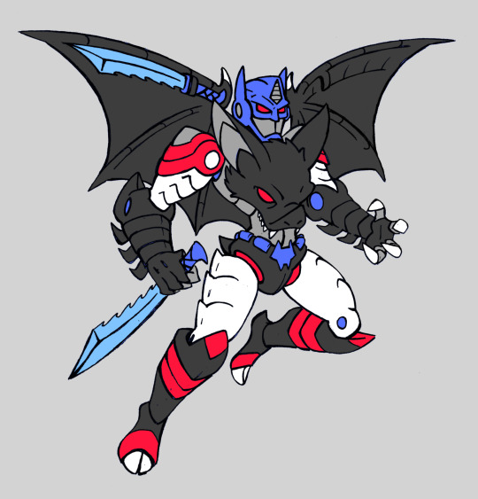
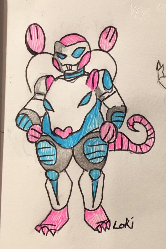
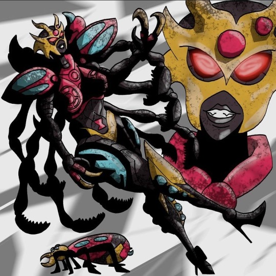
#transmetal arts
Photo
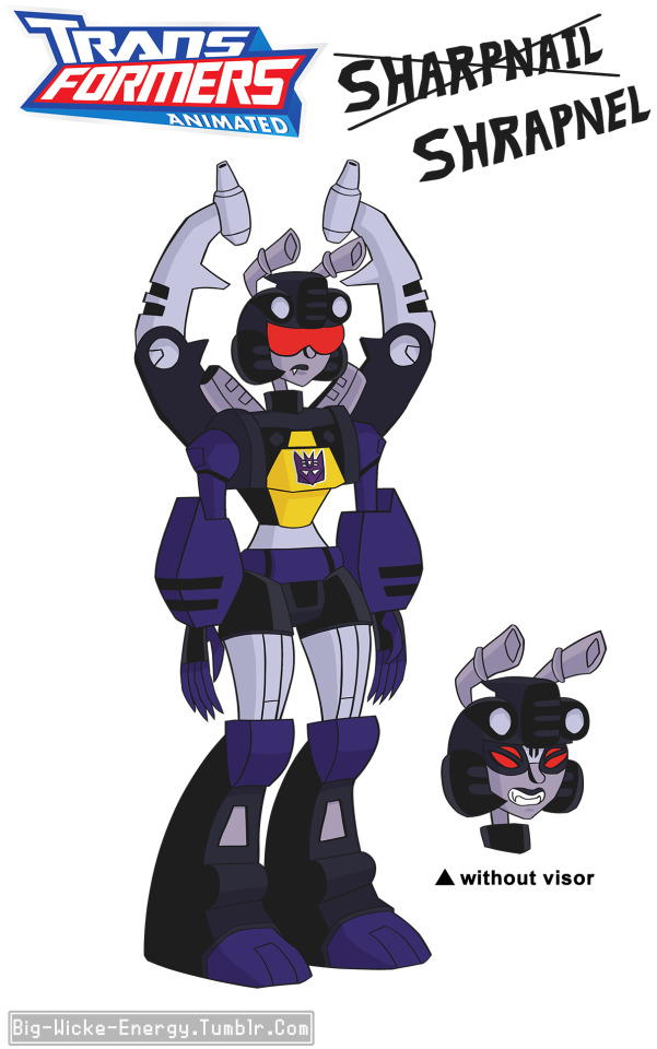
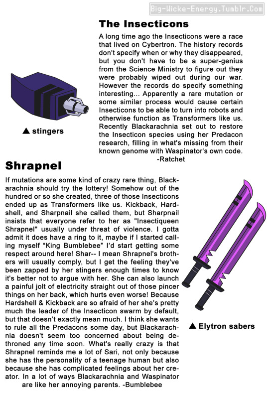
This design has been banging around in my brain for at least seven years and I really wanted to do it up like one of those Allspark Almanac profiles, even though that means writing everything from an in-universe in-character perspective
I’m not super confident that I was able to approximate the character voices for this, but if I put off posting this any longer I think I might explode
#maccadam#transformers#transformers animated#shrapnel#insecticon#insecticons#allspark almanac#tf animated#ratchet#kickback#artists on tumblr#character design#concept art#transmetal arts#i really thought id be posting art straight to this account years ago#but i guess that happened for the same reason this took so long
35 notes
·
View notes
Text
After the new Earthspark trailer I had to give tarantulas a quick try in my style
#I got motivated to draw him and this is my first time drawing him#it’s also my attempt at his Earthspark design so sorry if it’s ass lmao#tarantulas always had one of my favorite transmetal designs so I’m excited to see this new design#transformers#beast wars transformers#BW tf#beast wars tarantulas#transformers tarantulas#tf#tarantulas#my art#digital art
241 notes
·
View notes
Text
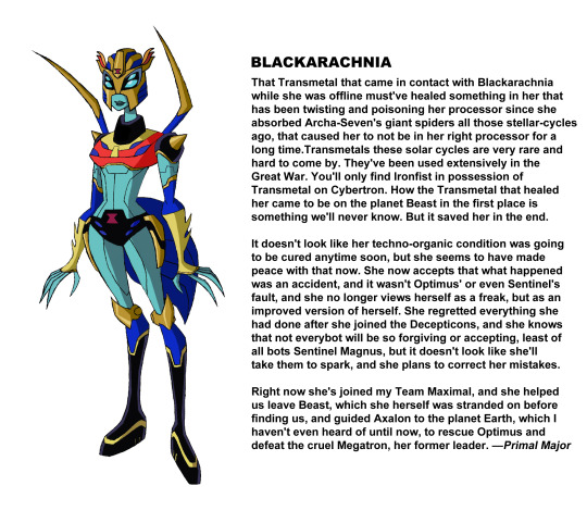
Blackarachnia
Yet another TFcon piece
121 notes
·
View notes
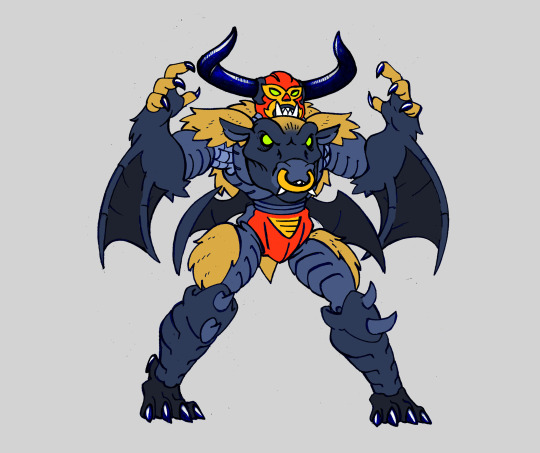
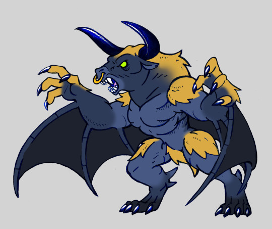
Text


A couple of years ago I went through a "transformers phase", and by that I mean I made a couple of transformers fanarts which is not something I usually do.
I have always been a big fan of Beast Wars and when I was looking at some beast wars era toys I found curious there were so many bat maximals, so I wanted to try and make my version of them.
First is the original Optimus Primal toy that turned into a bat, the original color scheme was gray instead of black, but I wanted him to have the same palette as the gorilla primal, also I gave him some batman features because I like batman
Then its Nightscream from Beast Machines, when I was reading about the character I found that while in the original series he was portrayed as a bit of an emo character, in the japanese dub he was turned into a very flamboyant gay character, and when the character was adapted into the legends comic he was portraid as a crossdresser that many characters mistook as female despite being male, so I went ahead and made it a "femboi" because I felt it suited his design
Next is Sonar, a transmetal 2 bat that never showed in the cartoon but did in the comics, in her toy bio she was never given any pronouns, so when she was added to the comics they made her female to have more fembots, so I made her a cute fembot, because why not
The last one is Noctorro, a Bat/Bull fuzor that also never showed in the cartoon, but did in the comics, when I read the characters bio it said noctorro is a fighter that uses no guns, thats why his toy didnt include any, and while his whole body had the same dark blue and golden color scheme, his face was particulary red, so I decided to make it look like a it is wearing a luchador mask, this paired well with its "no guns" fighting style. I also made his beast mode because the original toy was a bit of underwhelming and I knew it could look better
Also I know there is a new Maximal bat that in the comics called Nyx, maybe I will draw her later
#Transformers#beast wars#maximals#maccadams#transformers art#beast machines#fuzors#transmetal#transmetal2#bat#bull#batman#optimus primal
356 notes
·
View notes
Text
There’s a mainstream meme about dragons going around, I HAD to do something with it!
#my art#transformers#Beast wars#transmetal ii megatron#megatron#predacon megatron#predacon#dancing toothless#wings of fire#skywing#skywing megatron#Transformers spark#dancing#maccadam#traditional art#colored pencil#transformers crossover#my meme#transmetal#transformers beast wars#toothless meme#dancing toothless meme#toothless dance#WOF Predacons
25 notes
·
View notes
Text
Who gives a rats a—
2 notes
·
View notes
Text

A reaction to a recent ROTB press thing revealing that Takehito Koyasu is reprising his role of Convoy AKA Optimus Primal in it. He almost calls Primal Convoy out of habit (Japanese media used to have its own terminology before adopting the American terminology), hence this Japanese BW dub style bit. Used the Beast Wars Metals designs for added Japanese style.
#beast wars#beast wars transformers#beast wars metals#transformers#maccadam#macadam#megatron#optimus primal#maximals#predacons#transmetals#blueike productions#blue's arts#march of robots
18 notes
·
View notes
Text
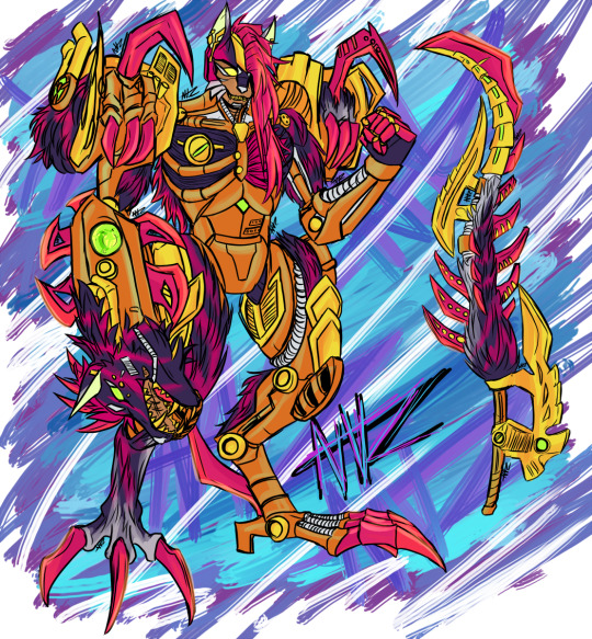
Despite the fearsome look of his Transmetal 2 Beast Mode, Joltfang is still a young bot who is intent on being liked by the other Maximals, though some are put off by his enthusiasm along with his 'class clown' act.
Don't let his personality fool you though - he's a highly skilled combatant whose expert knowledge of 'practical physics' makes him a very dangerous foe to face on the battlefield, at range and up-close.
Alt-form - Hyena.
Had a lot of wrestling with the color palette on this - the hot pink/red came in relatively early while the copper was one of the last things that came together for Joltfang (who's a Transformers alt-form of another Jumpchain OC, Shumari, I have who hasn't seen a lot of public light beyond a few offhand lines in some of the writing and two rough arts from almost 5 years ago posted on this very blog). He should get to show up more since I've been working on his design lately but it's been a pretty long absence for him.
Also, like Manticon-4, Joltfang also gets a kludged tech spec card (primarily Lockjaw's, given that Joltfang is based on his toy) but with a few unique traits mixed in, like a stronger intelligence + Metallikato proficiency, both suggested by @poisonbat.

And the reason why Joltfang's tech spec card isn't damaged or anything is because...
1) all of the text fit on there comfortably and didn't need obscuring, thus saving me that work.
2) Joltfang is a good contentious conscientious son-boy who doesn't try to eat random objects.
#transformer oc#beast wars#transformers#oc#fic supplement#2023#nvz my art#chains adventurous#shumari#i am so glad that this guy is the only transmetal 2 of the transformers oc pack#there's So Much Detail On Them cries
25 notes
·
View notes
Text
Am I completely happy with this? No. Am I willing to futz with it anymore? Also no.
22 notes
·
View notes
Text
Mommyrachnia anyone?
#blackarachnia#transformers#Transformers#beast wars#transformers beast wars#rise of the beasts#transformers rise of the beasts#transmetal#art#character art#artists on tumblr#fan art#comic art#anime art#kritadigitalart#kritaart#character design#character sheet#character showcase#transformers fanart#transformers art#transformers animated#fanart#anime fanart#mommy milkers#mommy k!nk
31 notes
·
View notes
Photo

Transmetal - México Bárbaro
artwork by Edmundo López
#transmetal#transmetal band#thrash metal#death metal#metal#album art#osdm#old school death metal#mexican metal#art insp
15 notes
·
View notes
Text
comics and animation have a lot in common, but one interesting difference is that arranging pictures in space rather than time means there's a tradeoff between the amount of drawings you use to show an action, the amount of space each drawing is given, and the amount of pages you cover which determines the 'pacing' of the comic.
if you slice the page up into a lot of tiny boxes to show many stages of a motion like an animation, then each panel has correspondingly less space for background details, and it may affect the aspect ratio of panels. if you give yourself space for a large splash panel, then the pace will slow.
one solution to this problem is to break the convention that a panel is a single 'frame' of action and show multiple images of a character in the same background. Kentaro Miura did this sometimes, and Tradd Moore (on here - @traddmoore) is an expert who uses it frequently (I'll reblog his spiderman comic in a minute). Kamome Shirahama, a genius at creative paneling, also uses it in a couple of places.

a similar trick will have a single background continuous across multiple panels, showing a static 'camera shot' at different times.
the limitation of these methods is that breaking convention makes the panel a little harder to process - you need to make absolutely sure you cue the reader clearly about where to enter the panel. and it requires action that involves a large movement so the drawings don't overlap. so most authors use it as a 'once in a while' thing.
an opposite approach, used in early parts of Superpose by Seosamh and Anka and Goodbye, Eri by Tatsuki Fujimoto, is to go even harder with the cinematic convention and give each panel the aspect ratio and detailed backgrounds of a film camera, taking all the space you need - Superpose opens with about two panels per page which may be very similar to each other, creating a very deliberate sense of pacing. to pull this off you need to be either extremely fast at drawing like Fujimoto, or accept your comic taking a long time to get anywhere - and you also need to be very good at placing the camera in space. you're basically drawing fully rendered storyboards at that point.
one of the interesting difficulties of comic-making is controlling pacing. if you draw many very similar panels it will convey a sense of high concentration and intensity, or a heavy atmosphere, like a long take in a film. much like in prose, if you spend a lot of pictures on something it draws attention to it. so you want to use the 'slow down' sparingly for effect.
as in animation, you're also limited by your own capacity to draw all those pictures, and moreover the space to put them. this is one reason why comics in magazines tend to be sharply limited in page count, and webcomics tend to be very slow compared to other forms of serial fiction. (perhaps manga can make heavier use of pacing tricks by virtue of cheaper printing and endemic overwork. i don't think that's the full story though.) meanwhile, when Transmetropolitan started to experiment with manga-style pacing, apparently it upset fans who felt the story progression was being diluted. when reading Transmet in one go, though, you don't even notice. what works well in an anthology of hundreds of pages may work poorly in a serial.
i think the pace of the reader is often controlled primarily by the text - at least for me I find I sometimes have a tendency to jump very quickly over panels to get to the next bit of the story and have to consciously slow myself down to make sure I don't fail to appreciate the art. so while a series of text-less panels is effective artistically, you might want some words to act as speed bumps. but too much text per picture and your comic becomes exhausting to read, like Subnormality. and you don't want to over-explain what's conveyed perfectly well by the pictures, as many older comics do.
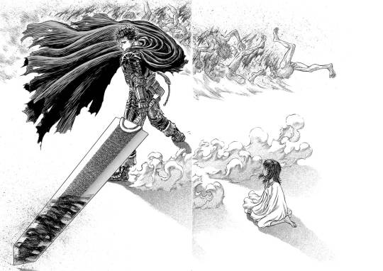
ideally, you use your text, small panels and large panels to create a sense of rhythm. a big splash panel can act as the full stop in a sentence, or a longer take after a series of rapid cuts. negative space is an especially powerful device in the right hands: when you hit a page of Chainsaw Man or Berserk that is almost entirely white after several pages of dense illustration, a character bursting into the void, there's an immediate 'wow' effect before you even process what's happening in the illustration. (i can't seem to find the chainsaw man example i had in mind, so here's one from berserk.)
and on that note, the other thing that comics have that animation doesn't is the impact of being confronted with the whole gestalt page. in the manga I was helping Fall translate when she died, We Are Magical Boys (Bokura wa Mahou Shounen), Fukushima Teppei frequently puts one panel much larger than the others so it dominates the page, usually a close-up or full length character portrait, allowing the cuteness of their unique art style to treasure centre stage. Sandman, which I'm currently rereading, is full of elaborate page compositions, where a drawing might not even be a panel per se, but a visual element. Witch Hat Atelier is full of elaborate borders and clever compositions. just look at this...

how did she come up with that! the absolute madwoman! the right side is relatively standard Atelier (establishing shots, the main cast eagerly stepping out of their panel) but on the left, we have a set of panels falling down from above onto a large splash panel. even though this image is concurrent, the panels invite us to appreciate it in chunks, and the page as a whole has this great visual of the pages of a book, continuing the image of the previous page. (more of this on upcoming post on Atelier)
a character emerging from their panel to overlap others, breaking up the monotony of the grid and adding a sense of depth to the page as a whole, is a reliably appealing motif. also, drawing one panel borderless, so it implicitly continues behind the other panels. large areas of black and white and choices of colour saturation can convey a mood to the page as a whole.
the danger you run is always the loss of clarity. the reader must be able to tell what panels to read in what order without thinking about it. Sandman will sometimes do a double page spread where you're supposed to read across both pages, and this consistently trips me up. Dresden Codak is by an adhd author and her drive to give every page an elaborate layout is very familiar to me, but especially in Hob, it messes with the flow of the comic overall.
so every comic page, every comic, is a fascinating balance of all these factors. how to create a strong, visually interesting composition, control the pacing appropriate to tone, create a thrilling sense of rhythm... all without sacrificing clarity.
not much more to say about this as yet, it's just something I'm thinking about while trying to lay out a page of Ghost Barrier. my tendency is to generally use larger panels, and try to be creative with layouts, but you have to consider not just each page in isolation but how they relate to other pages. so to make the splash panel land, I need to contrast with a denser page immediately beforehand.
the more I make comics the more of a feel I'll get. cool medium!
900 notes
·
View notes
Photo
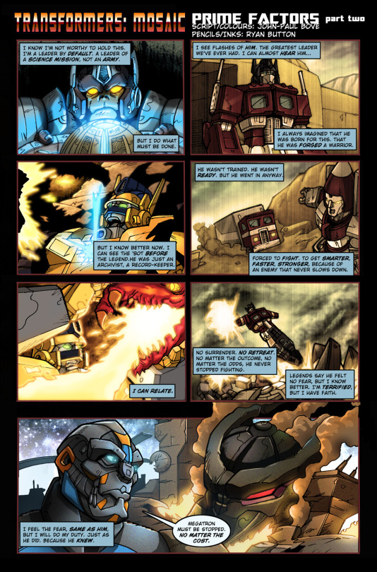
Transformers: Mosaic #581 - "Prime Factors - Part Two"
Originally posted on February 18th, 2011
Story, Colours - John-Paul Bove
Art - Ryan Button
deviantART | Seibertron | TFW2005 | BotTalk
wada sez: As we’ve seen before with Bove’s strips, he uses color to tell a different story using (mostly) the same artwork. We see Primal take Prime’s spark for safekeeping, becoming Optimal Optimus in the process, and later fighting Megatron in his Transmetal 2 form. Weirdly, Bove assigns Prime his Dreamwave origin as an “archivist”, rather than his actual Sunbow cartoon origin as a dock worker. This is all very reminiscent of the much-older Mosaic strip “Symmetry”, something Bove genially chatted about with that strip’s writer in the comments for both parts. To my knowledge, Primal does not, in fact, quote his G1 namesake during the climax of Beast Machines. Clean colors below.
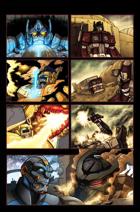
#Transformers#Transformers Mosaic#Maccadam#Beast Wars#Sunbow Transformers#The Transformers: The Movie#John-Paul Bove#Ryan Button#official creator#Optimus Primal#Optimus Prime#Thrust#Megatron#Soundwave#Blitzwing#Ramjet
26 notes
·
View notes
Text
youtube
Diana Navarro
Son art du chant et le sentiment qu'elle transmet sont inégalés.
J'ai été bluffée par la voix, la modulation, l'importation, la résistance, bref TOUT
31 notes
·
View notes
Text
Transmetal Blackarachnia
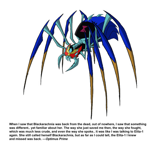
When I was in my late teens, I made this edit of a Blackarachnia if she were not only redeemed, but also has died and then revived via Transmetal, not unlike her Beast Wars counterpart. Last year I made this Allspark Almanac styled-page, with quotes from not just Optimus Prime, but also Primal Major!
Yeah, remember that black hole that Axalon went through that the Almanac says is a timeloop? What if it was a portal that transported Primal and his team to and stranded them on the planet Beast, and it was also a time warp that took them thousands of stellar cycles back into the past, playing into the "past and future" think that the Maximals have going on? Plus it'd be a nice parallel to Team Prime, as they crashed into a technology-oriented Earth in the future, while Team Maximal (that's the name I'm calling Primal's team) crashed into a very primitive Beast in the past. Anyways, that's my hc on the Maximals in Animated, and they encounter a revived Blackarachnia at some point, and she joins their team.
I may explore my version of the Maximals more later. Maybe even make some art of them. For now, here's Transmetal Blackarachnia!
18 notes
·
View notes
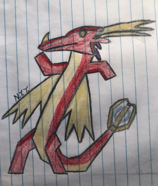
Text
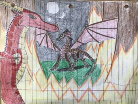
Under Flames and Moonlight
Context for this piece, Dragonbot had abandoned Megatron and Predacons shortly after they had crashed on the planet, as he blamed him for stranding them in a different universe (long story).
Now on his own, Dragonbot settled into the rainforest under the alias Autumn, and made a habit of sabotaging Megatron’s plans whenever they came at the cost of innocent lives.
During this period, Dragonbot had never transformed, preferring to use his newly obtained stealth abilities whenever fighting the Preds, partially due to a fear of being outcasted should any dragon discover that he is a Predacon as well.
This lasted about a few months before Megatron had grown frustrated by this, and decided to smoke Dragonbot out, by setting fire to the rainforest!
This brings us to here, where Dragonbot, with a dragonet he rescued from the flames, is confronted by Megatron himself!
#my art#wings of fire#transformers#transformers beast wars#transmetal ii megatron#transmetal 2 megatron#predacon megatron#beast wars megatron#beast wars dinobot#beast wars#skywing#rainwing#WOF Predacons#WOF Megatron#WOF Dragonbot
9 notes
·
View notes
Last Seen Blogs

samhoustontx
Untitled

maforsman-blog
m_forsman
thoughtnatives
thought
natives

kpmmmmm
Untitled

perfectquote
Perfect Quotes