#this is a mix of traditional media (the linework) and digital media (the colors)
Text

it needed to be done,
#my art#naruto#gai sensei#might gai#might guy#draw your babygirl in this#i would not call him my babygirl but he is. objectively speaking the hottest character in naruto#and i love trying to draw him in a green velvet suit#though i think this looks more like satin because the folds make it appear very lightweight#not bad but its a work in progress#this is a mix of traditional media (the linework) and digital media (the colors)#directly inspired by svindapus and aldynafox's art of yamato and kakashi respectively#image desc in alt text
1K notes
·
View notes
Note
Hello!
(You don't need to answer this if you don't want to)
I was wondering, what's your process of doing a traditional & digital artwork (mix media)?
Because personally I prefer to do my drawings in a traditional base but sometime because of classwork I have to do digital so I was wondering if you could give me some advice.
Have a good day!💚
Hi!
I usually choose my medium depending of what I want as a result. I feel more comfortable doing traditional linework, so most of my work has a traditional base for the line, and a digital coloring.
I used to do a lot of painting (gouache, acrylics, watercolors, yadda yadda) but due to the comics I am working on, I have less time and a digital coloring is less frustrating for me as I can achieve a satisfying result in a shorter span.
But I use a lot of digital when I doodle things, often when I want to be extra fast. It is also comfortable as you know you can erase, resize. If I want to sketch just for myself (of really quick reactions, things I send to friends, some DnD stuff after a session), I use digital.
Hope this little insight was helpful, but truly, every process and desires are personal, feel free to explore every option 💚
Even if I love traditional, I sometimes only want to do digital and that's okay, vice versa.
26 notes
·
View notes
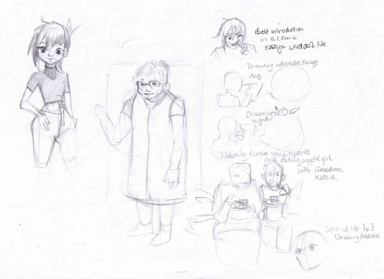
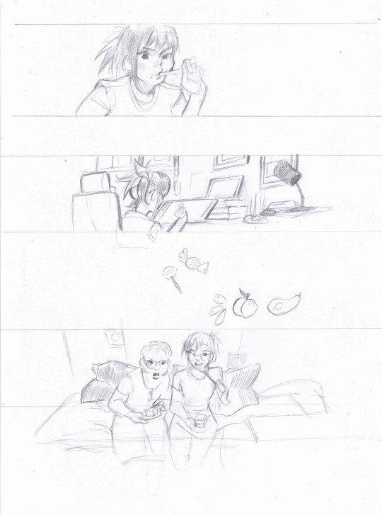
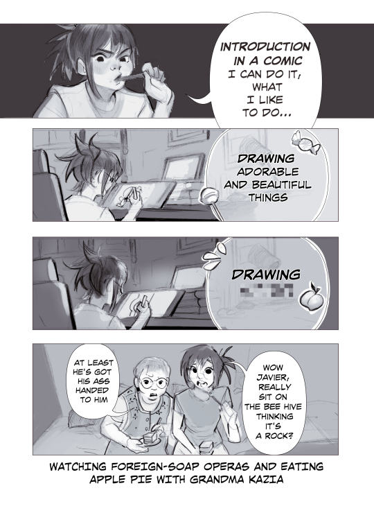
Text

Comic - self introduction; mixed media [traditional pencil + digital color]
sketch exploration + traditional linework
0 notes
Text
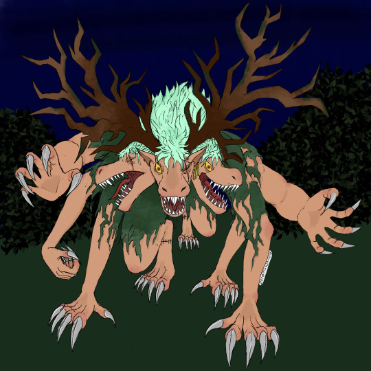


@demonzoro
The result of a collaboration between myself and @436865636b65726564736f756c! I did the line art while they did the color! I am beyond thrilled and satisfied with the job they've done bringing my imagined beast form of Hunt Avatar Zoro to life!
You can find their Instagram at checkered_art!
#one piece#tma#monsters#zoro#mixed media art#(linework is traditional and color is digital)#fanart#my art#friend art#art collaboration#blood tw#body horror
22 notes
·
View notes
Photo
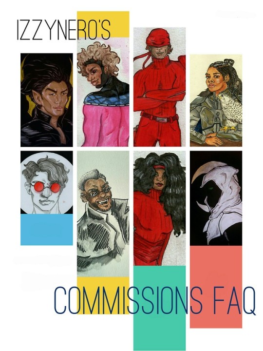
At the moment my work sizing is on 11 x 14 in, 7 x 10 in, and 5.5 x 8.5 in mixed media paper.
Please note, the following prices do not include shipping cost. Since I’m specifically and only doing traditional pieces at the moment I have to ship these so please be aware you’d have to be giving me your address or some kind of address to send these to. I would be using the money I make from these commissions for much needed extra income.
PLAIN INK AND LINEWORK*
5.5 x 8.5/7 x 10 portraits and busts in only ink linework- $15
5.5 x 8.5/7 x 10 full body/action poses in only ink linework- $20
11 x 14 portaits/busts in only ink linework- $25
11x 14 fully body/action poses in only ink and linework- $35
INK AND FULL COLOR GOUACHE/WATERCOLOR*
5.5. x 8.5/7 x10 in portraits/busts in full color - $35
5.5 x 8.5/7 x10 in fully body/action poses in full color- $40+
11 x 14 portraits/busts in full color- $60+
11 x 14 full body/action poses in full color- $100+
*pricing may increase if complicated backgrounds are to be included, if multiple subjects are requested within the piece, or if the gouache/watercolor pieces take me more than 3 hours to complete, this will be clarified in any correspondence we may have concerning what you’d like or in general about the piece.
I reserve the right to refuse any commission for a multitude of reasons, but especially if you’re requesting anything of a morally dubious nature such as incest, pedophilia, etc. If you ask me for that shit, consider yourself blocked AND reported.
I take paypal or venmo and will link you to either when we’ve agreed on what you’d like. Payment will be half upfront and half when finished out of good faith on both our parts on commissions $50 and up. All pieces under require payment up front (plus shipping costs).
Examples of my work can be found on:
This blog
My main (older work)
Instagram
47 notes
·
View notes
Note
How did you learn to paint? Love your style
Hello my dear anon! Thank you for the kind words! I’ve been making artwork ever since I was a little kid, there are wild parrots that live in my backyard and I used to sit out there and draw them and paint them in like shitty acrylic paint made for children lol for hours. And from there, I never really stopped drawing or creating art in some form. I always kept sketchbooks and tried out tons of different media, from charcoal to pastels and watercolor and gouache (never got into oils funny enough).
I went to a communication/broadcast arts program in high school, where I taught myself the Adobe creative cloud and became certified in Photoshop, Illustrator, and Premiere and through teaching/tutoring other students I learned a ton about how the different softwares worked and all the things you can do with Photoshop, including digital painting.
I also took traditional fine arts classes in high school and during my time earning my undergraduate degree, lots of life drawing courses and painting classes and sculpture and mixed media. And then I went to a specifically fine arts school for my animation masters degree program, where I worked with a combination of digital software and traditional media.
So it’s been a constant process of learning, you know? I think that drawing or painting from life, using reference!! and really getting the opportunity to practice practice practice is what teaches us the most. Find artists that you enjoy their art, and ask why you like it -- what specifically about the art resonates with you? Is it the coloring, the linework, the composition, etc., and try to incorporate it into your own work. Don’t copy, simply be inspired by what you see, and allow yourself the opportunity and the freedom for it to be bad or ugly. The only way you grow is by doing!
3 notes
·
View notes
Photo
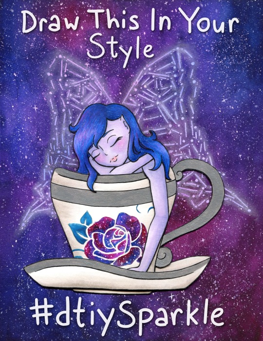
Draw This In Your Style!
Draw/Recreate This In Your Style, post the original art alongside it (on platforms that support it, elsewhere you can just link back to the original instead), and either tag it with #dtiySparkle or tag me, MysticSparkleWings (xxMysticWingsxx on Twitter) directly and I'll retweet/share/etc. it! No deadline, just create at your own pace!
____
You know, I constantly go back and forth on "celebrate milestones!" vs. "don't be that person that won't shut up about how many followers they have and the numbers and etc." Mostly because I usually find it annoying from other artists, even if I don't find the artist themselves annoying. It's complicated. I know it's important and in many cases helps grow a following further, but it also just gets exhausting, you know? Both to see it and to try to do it.
Still, I've been wanting to make a "Draw This In Your Style" (DTIYS) for a while now, but it didn't seem like the kind of thing to just do on a whim. It felt like there should be a reason for at least the first one, provided it went well enough to make me want to do more. I noticed a few weeks ago that I was approaching 1,000 followers on Twitter* and I saw an opportunity, knowing that 1. It would take me a while to finish the artwork (go big or go home, yes?) and 2. It would take a few days for the numbers to stabilize so that I would actually hold steady at 1,000+ and not be 1,000 one minute and 998 the next. (Followers go up and down like a see-saw over there)
*Thanks exclusively to Art Shares. I'm very sure I'd still have less than 100 if it weren't for those--and please don't be fooled by that number. 1,000 isn't teeny tiny, but in-depth interaction from a handful of people will always mean more to me than zero or minimal-at-best interaction from thousands/millions/etc, and frankly, my interaction over on Twitter is basically non-existent compared to the interaction I get here on dA, which precisely is why I prioritize dA over all other social media. It means more to me; it feels infinitely less passive.
But...I kinda didn't want that to be the only reason for the DTIYS. It just seemed...I don't know, cliche? Not right, somehow. Fortunately, the Twitter milestone happens to coincidence with I think I've finally stabilized around 300 followers on Instagram (after being stuck between 250 and 290 for months, consistently going up and down 2-3 people at a time), and I've also garnered over 400 watchers right here on dA.
The Twitter milestone is technically the biggest, but honestly, the dA one means a lot more to me. I thank each and everyone one of you, my fellow deviants, for thinking my art is worth the watch.
And I especially thank those of you--I'm sure you know who you are, I won't name names just in case anyone's not comfortable with that--that consistently fav and/or comment on my work. Your support and encouragement are why I keep doing this, despite the frustrations I may have along the way and aside from an innate need to create.
Speaking of which, if you're a loyal Sparkler I think now I'll get to the part you might know me best for; the long description of the artistic process!
Like I mentioned before, I noticed the milestone stuff a few weeks ago and thought now would be as good a time as any to get started on a DTIYS, so I started trying to brainstorm something that would be both fun for me to make and fun for others to recreate. I was having a little trouble on this front, so I took a trip to Pinterest and re-visited some boards I use to save potential draw ideas/inspiration on.
I was thinking I wanted to include a fairy since I've been wanting to get back into drawing them more regularly and fairies-via-Winx-Club is where I got my start here on dA and indirectly into getting more serious about my art in general. I was also thinking something with galaxies since those are usually fun to make and are a good way to make an otherwise plain or simple piece more interesting. I didn't want this to be too terribly complicated if I expected other people to draw it, but I also didn't want it to be too boring. And, of course, I was hoping for something I could lean into my mixed-media prowess with.
All that turned out to be quite the balancing act, but after some scrolling, I had some ideas and ended up with a sketch of a fairy in a teacup, with place-holder wings and a place-holder rose on the cup. The wings I knew would be easier to do the lines digitally (even if the final art was traditional, which I was planning on), and the rose I wanted to be slightly more sophisticated than my typical stencil-made roses, which I thought would also be easier to experiment with digitally. I was right on that front, thanks to some of the public domain images on PixaBay.
Beyond that, my original idea was fairly different from what you see here; I was thinking black hair, a fairly vampiric look, for the fairy, more typical butterfly wings, a red rose on the cup, and then an abstract galaxy wash, more watercolor-y and less saturated, for the background. And to be fair, that's still an interesting idea that I might return to at some point, but even as I worked on and finished the digital linework (fully planning to print them and then do what I wished with them traditionally, as has become a norm for me) something in the back of my mind told me that vision wasn't the right one; Not for this project, anyway.
Fortunately, I was a busy enough bee in between working on the lines for this that I partially had to step away from it to meet other time constraints and I could afford to step away from it and have some time to ponder what I wanted to do.
In my pondering, I kept coming back to the galaxy/constellation thing I've been experimenting with lately (Exhibits A, B, and C ). I hesitated at first since I knew for sure I didn't want to do the whole drawing that way and I wasn't entirely sure how to decided what to do with what.
Of course, after thinking about it a bit more, I decided I'd take a risk in doing the background and wings in the constellation style, and then somehow do the rest in a more traditional way. I'd have some more time to think about that while I was re-tooling the wings digitally for said constellation style, after having discovered that made life so much easier during my previous experiments with it.
I'd know from the beginning that I wanted to do metallic accents (most likely silver) on the cup and saucer, which in this case meant I'd need to use either watercolor or heavy-duty mixed media paper for them, and I definitely had to use watercolor paper for the wings/background. The mixed media will work for the galaxy technique, but the colors don't blend quite as nicely and I was concerned about how that might affect the overall look here.
Still, I didn't want to watercolor the fairy herself at least, which left me with a choice of alcohol markers or colored pencils. I was thinking pencils for the hair for texture, markers for the skin for the lack thereof. But I typically don't like using alcohol markers on watercolor paper. The additional texture feels too rough on the nib and it's almost like I can feel the paper soaking up extra ink.
I also thought that doing the background and the fairy on the same piece of paper was asking for a very big watercolor-y mess, so between that and the paper concerns, that led me eventually to deciding to split them up.
And somehow in there, the idea occurred to me that I could get a bit adventurous (read: crafty) and actually separate the various parts of the fairy and cup out a bit and not only solve my paper problem, but also makes things a little more interesting.
After yet more pondering (if you can say nothing else about my art, you cannot say it isn't well-pondered by the time it's finished!) I settled on having the layers as follows:
background/wings (watercolor paper)
back part of the saucer (mixed media paper)
the fairy (with her arm and bit of hair carefully plopped over the next layer; mixed media)
the cup (mixed media)
the front of the saucer (mixed media)
Or at least that was the plan, and if I discovered problems in this plan then I could adjust as necessary.
So I got to work on the background, which was fairly straight-forward. I layered on paint and blended to essentially my heart's content, and then let it dry overnight since it was getting late by the time I finished it, or rather the first layer. I came back to it the next day and layered on some more paint to fix some blending issues and darken the whole thing up some more.
While that second layer dried, I got to making the lines for the additional layers and cutting them out--uncolored for the time being, as I figured the layering would need to factor into that a bit--and setting how exactly they'd fit together. The only modifications to my plans I had to make, which I, fortunately, had the foresight to do while I was cutting, was to leave two little bumps at the "bottom" of the fairy (where her body meets the cup) so that she could sit probably as both in the cup but also with her hair and arm hanging over it. The little bumps were a sort of "grounding" behind the cup to hold the rest of her in place while the other pieces were wedged on top.
I hope that makes sense, it's a little hard to explain without seeing it for yourself.
Anyway. I'd also had the foresight to transfer an outline of the fairy and cup lines onto the background before I started painting, which helped with making sure everything was placed...semi-correctly...on the final piece.
I say semi correctly because despite my best efforts when I went to glue everything together it looked right in-person, but the digital scan would later reveal to me that in fact, the layered bits had all shifted slightly to the left and curved inward a bit more, like a right parathesis: ) But I'll come back to that in a minute.
Once I was convinced my layering gambit was going to work out, then I started toying with colors and ideas for the layers themselves. The clearest idea I had out of the gate was to do the rose in a galaxy style too, rather than just plain watercolor like I'd originally planned (teal for the leaf though because green wouldn't have fit with the rest of the palette and blue would've blended too well); either way, I figured it wouldn't pose much of a problem on the mixed media paper since it's such a small area. The biggest challenge would be the stars, but even then you could say the same thing: It's such a small area that star dispersion with a pen really wasn't that big of a challenge to make look convincingly like random star placement.
I went back and forth a bit on the other colors, but I ultimately decided that I liked the idea of soft purple skin and dark(ish) blue hair, maybe soft pink lips and a little blush, for the fairy herself. And I also decided to do a little warm-gray shading on the cup with markers, as opposed to just leaving it white.
The lips turned out so nicely I was tempted to try doing the blush with the same markers, but I have very mixed luck with marker blush (sometimes it blends nicely, other times I get a nice line despite my efforts), and so I decided to play it safe and do it later with pencils instead. Fortunately, the rest of the skin and the cup (both done with Copics specifically as that's where I most easily found the colors I needed) went nice and smoothly, as is the nature of markers on this mixed media paper. (Seriously; Strathmore 400 series Mixed Media works wonders with alcohol markers for layering and blending!!)
The hair was a little more complicated because of the color I was hoping for, but that didn't matter too much because half-way through I decided to change things up a bit and I added little bits of pink and purple into the mix, intentionally following the rest of the galaxy-ness of what I was doing. It's not much, but I think it was the right choice.
While I waited to make sure the cup was good and dry, I went to splatter town on the now-dry background, as was necessary for the galaxy look, and then used my phone to shine some extra light on the paper so I could see my lines and dots for the wings. And after giving the white gel pen a moment to dry, I then went back in with my PanPastel, as is custom, to make the wings glow. I have also now learned that a blending stump/tortillon is good for blending out the pastel in a tight space, while a dry paper towel or tissue works to semi-remove it if it goes on a bit too thick.
Everything, after drying, was then assembled and attached to the background with some handy-dandy tacky glue which was fortunately fairly quick-drying for liquid glue, stuck fairly well without me having to add a whole lot of it, and also not a sloppy glue mess everywhere.
I did have to carefully go back over some of my lines for the cup and hair after everything was assembled because I forgot to do so over the metallic paint and pencil wax before assembly, but it also worked out okay since a couple of corners for the hair got snipped a little short, so I could sort-of fix it by extended the corner on the paper underneath. (In hindsight this works a lot better in-person; on the undoctored scan the placement looks pretty off or incomplete)
And of course, with everything assembled, that brings me back to what I was saying about the scan earlier.
Like mentioned, everything had shifted a bit during placement and gluing, and I could more clearly see the lines I had missed in that process on the scan. Unfortunately for me, while in-person everything looks relativity fine, on the (undoctored) scan this shifting made the balance feel way off, at least to me. The fairy and cup were too far to the left, meanwhile, the ring wing stuck out too far on the bottom.
I fiddled and fiddled and fiddled with the scan, using the content-aware move tool half a dozen different ways before I conceded it just wasn't going to do what I wanted, and then my next-best idea was the extend the background to the left a bit. In doing that, I discovered the warp tool worked to my advantage for that, and so I decided I'd trying fiddling with it and see where it got me.
It's still not perfect, but it's better than it was. In the end, I used the warp tool to tweak the angle of each part of the wings and that made up for some of the balance problems without also compromising any of the lines (which was the biggest reason why the content-aware tool wasn't working; it kept messing up the lines or other parts of the drawing in the process). At the very least, I was able to do enough that it only really bothers me now when I start looking for the off-balance-ness.
I also ended up doing some minor touches, mostly just smoothing out certain lines and small tweaks, but once the balance problem was finally somewhat solved it was pretty much done. (Aside from, of course, me then also adding the words on top so people know what this is at only a moment's glance.)
The end result, both scan and traditional. I'm really happy with. The piece is plenty interesting to look at, but it's also not too complicated, especially when you break down the individual parts that make it up. (Literally and more figuratively.)
Thus, I can only hope others find it interesting-but-not-too-complicated enough to try their hand at recreating it. Even if no one takes me up on my "Draw This In Your Sparkle Style Challenge though, I enjoyed making this all the same and I'm really proud to share the art itself with you guys.
Hopefully though at least a few people will take a stab at it and I can focus on that and not explode from impatience in regards to various not-really-art-related things I'm currently waiting on.
____
Artwork © me, MysticSparkleWings
____
Where to find me & my artwork: My Website | Commission Info + Prices | Ko-Fi | dA Print Shop | RedBubble | Twitter | Tumblr | Instagram
3 notes
·
View notes
Note
is a lot of the art you post done on traditional mediums? or do you draw digitally? i ask because the colors are so vibrant that i would guess digital but youve also got a really cool texture to your art that makes me think watercolor or gouache
Good question! I do tend to work mixed media, but not quite in the way people think. My ideal workflow is:
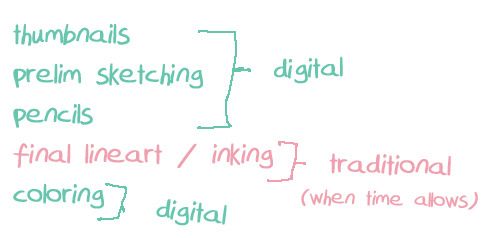
I only color digital these days bc I crave colors as bright and eye-melting as the sun. Near the end I usually throw some sort of paper grain or canvas texture over the whole thing to make it all jive a little more with my linework--which is probs what you’re referring to.
6 notes
·
View notes
Photo
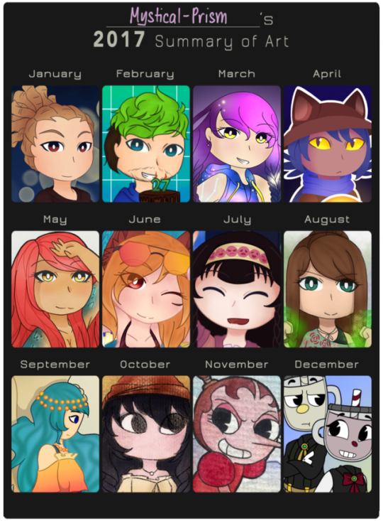
I didn’t plan to do this, but seeing other’s work inspired me. Out of these 12 I’ve posted 5 of these on Tumblr (February, April, May, November, December). I have mixed feelings about 2017 but hey, I’m looking forward to what 2018 will bring.
* Template Credit *
(Click to view in higher resolution)
See under the cut for each month + resolutions for 2018. (Very long read)
January - A drawing of Kidou Yuuto for a close friend of mine for their birthday. It’s a scene from a fic that I also made for them, and this was within the time I had gotten back to Ina11.
February - Again, birthday art but this time for one of my favorite Youtubers. I had a lot of fun drawing this actually.
March - It was an entry to a group on Instagram that submitted monthly works based around a theme, and the theme of this one was a redraw. I redrew the first entry of my OC Alsteria Loretta which I submitted to the group back in May 2016 (so it’s about a 10-month difference).
April - My first OneShot fanart and also my first proper attempt at lineless art. It sticks out like a sore thumb in this art summary—but it aged well.
May - Another entry for the monthly group thing, with the theme of “mermaids” because of MerMay. This was my attempt at mixed media, with the traditional linework and digital coloring.
June - The theme for this one was “Beach” so I drew my OC Elery Moreau with an ocean floor background that was hell to do. Personally, I think I peaked at this point? Then my art went downhill.
July - This was for a contest on Instagram which I won third place for. It’s a drawing of Alluka and Killua Zoldyck taking a selfie but I only put Alluka in the summary up there. The characters themselves looked fine but the background was shit lol
August - The Instagram group was really the only thing that made me do digital/mixed media for a reason (if not school). The theme was “Superpowers”, so I drew three of my elementalist OCs. The one shown is Cheyenne Fleur.
September - In the group there is a collaboration month, and I collabed with mikee_mia on IG for September. The theme was “species swap”, and we swapped the species of their angel OC Carmen and my mermaid OC Kylana (the one featured in the summary). They did the art (which was on paper), and then I lined and colored it.
October - The theme for this month was “Halloween” so I drew my OCs Valera (the one in the summary) and Zacharie trick or treating. For the entirety of October I didn’t do any digital art (I did this on the 31st,,), so I used an soft/oil pastel look which was easy.
November - Cuphead became popular around end of October to November so I did watercolors for Hilda Berg and Cala Maria. I also hadn’t done watercolors in months, but it was really nice to go with a new medium. (And I was very happy with the outcome of both!)
December - The last two OCs I made in 2017: Limoncino and Maraschino, my cupsonas (I’m a little of both). I did a lot of art for December and I could’ve chose others, but I chose this one specifically because I liked how it turned out way better than I imagined.
I know it would’ve been better to post this at New Years Eve but hey, I wasn’t actually planning to do this in the first place. But seeing others’ art summaries inspired me.
2017 wasn’t the best for me in many aspects, including art. After I made the entry for June I just… fell out of art? I lost a lot of my passion and confidence in general. This slump of mine stopped me from doing Inktober 2017 I did the first 3 days before leaving it entirely and it stopped me from doing projects I planned for myself. I hadn’t been enjoying what I was making for a while until late October.
These aren’t first world problems or anything. 2017 still had its good sides (this year I went to a convention after 2 years + cosplayed for the first time) I just thought about it for the past two days, and now I got my resolutions in mind. I’m heading to 2018 with a fresh start, a new found passion, and a strong drive to do my best. I hope to improve as much as I can. It sounds cliche but I do want to be able to make 2018 a great year.
One resolution relating to my art is that I want to keep this blog alive. I’ll post things every other day and maybe a bigger project or two when I can. I do want to prioritize irl things first though so yeah. (I also hope to start talking about my personal projects on here.)
TL;DR: I’m going to do my best for 2018. Hope you guys stick around!
#2017 art summary#fanart#video games#digital#traditional#inazuma eleven#jacksepticeye#oneshot (game)#hunter x hunter#cuphead#my ocs#i talk a lot sorry#if you read it all ilyyy#here's to 2018#edit: THE CUT OFF WAS GONE SORRY IT’S FIXED NOW#iolitesunstoneart
4 notes
·
View notes
Note
1 through 5 and 25 through 30?
1. Do you prefer traditional drawing, or digital?
Actually, that’s a weird answer because I mix the two medias! I love drawing traditionally, I find that I have more life and flow in my thumbnails and sketches, so what I tend to do is thumbnail and line traditionally and then scan it and line it again digitally and color it from there! I’m excited to show how it looks now that I’ve sound a style I like!
2. How long have you been drawing?
AGES. I’ve been drawing since I was 6, I’ve been SERIOUSLY drawing, aiming to be professional, for about four years now.
3. How many classes have you taken?
Skillshare. So many. I love it. Skillshare and youtube are an artists best friends!
4. Do you have a DeviantArt, personal website, or art blog?
I do!! @teacupmosaic and @wilsbasement on instagram!
5. What’s your favorite thing to draw?
Anything dark and moody. I love heavy black areas with pops of color like blood or eyes.
25. Do you like to draw in silence, or with music?
MUSIC. I HAVE to have music.
26. For digital artists: what program(s) do you use?
Paint Tool Sai for just about everything, Adobe Photoshop for additions and special effects. I’m so bad with keyboard shortcuts.
27. For digital artists: how many layers does a typical piece require?
I do one for the under sketch, put the opacity at 10% and then I paint everything on one layer just below it. If it’s for a lined piece, I have 3-10 layers, depending on how many glowy bits I have.
28. For traditional artists: what medium do you like most? (Pencil, charcoals, etc)
Copic Multiliners and Higgins Black Magic for Inking, and then I used ink washes a lot! Winsor and Newton drawing inks, and Sumi Water Soluble for grey scales. It’s a lot like water painting, but I love the vibrancy of it.
29. For traditional artists: How do you usually start on a big piece? (Light sketch, colored lead, sketchpaper, etc)
I start SMALL for big pieces! 2x3 inch thumbnail! Plan your comp out completely, then scan it, blow it up to the final size, and use a light box to refine the sketch, in order to keep the life and not get stiff. Then I scan that, and print out four mini ones and I plan my colors and values there to see if it will work in a large scale. If I’m happy with that, I then use my lightbox to transfer my sketch onto watercolor paper, and I refine the linework how I need. I normally use 140 lb Arches Natural White Cold Press, because I like the texture. I have an embossing heat gun to dry the layers between each one, so that I don’t have to be patient ;) Go from lightest to darkest and work SLOW. I use a LOT of layers traditionally. Each piece takes about 6 hours of just paintings.
30. What inspires you to not just make art, but to be a better artist?
I want my work to mean something. I want to be able to support myself by sharing myself, by letting people see me in every stroke. I don’t need it to be my profession, just something I *am*. I want people to know me as an Artist first, and everything second.
I want to be a better artist, because I have so much more to say, and I need the skills to say it.
1 note
·
View note
Text
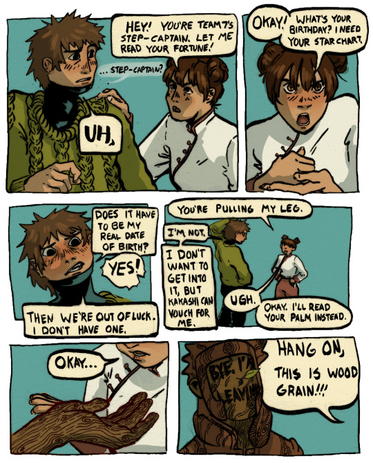
gai's students seem to be just as intense as he is—just...in their own ways.
(image desc in alt text)
#my art#naruto#comics#yamato#yamato tenzo#tenzō#tenten#image desc in alt text#for those who are curious: this is a mix of traditional and digital media-this was originally drawn (lined) on paper and then#i photographed it and then colored it digitally-you can see paper textures here. maybe pencil marks too.#leo offered to help isolate the linework so it would be cleaner but alas id finished this before they did!
1K notes
·
View notes
Photo
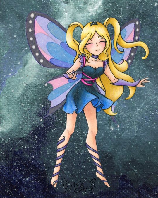
Fairy Enchanting
A bit later than I expected, but here we have the art that I used for the examples on my Commission Sheet!
(Unoriginal title is unoriginal and also a pun based on "very enchanting")
When I started thinking about putting together a commission sheet in the first place (which was something I wanted to do for the new year, as before I was just using a lengthy pricelist), I knew that I wanted to make a piece of art specifically for it and track my progress as I went, so that I would have an example for each stage in the process I take commissions for. And for the art, I more or less wanted to "go all out" since it's supposed to be an example, and I figure the example needs to be as close to top-notch as possible. Admittedly, I probably could've done even more than this, but me being me I procrastinated and ended up having less time to work on this that I initially expected, so...
In deciding what the drawing would be, I also decided to return to my roots a little, and a do fairy as an homage to back when I used to do Winx art all the time. Likewise, as Enchantix to this day is my favorite transformation from the show, I drew heavy inspiration from it, and I'm sure that's so obvious that if you know the show I probably didn't have to point it out to you.
Anyway. I actually didn't start completely from scratch with the sketch; I re-used this pose from a previous sketch I did that never saw a full-finished piece. I liked that other sketch okay, but it didn't feel like a "finish me" project. I did have to alter the feet because the original sketch was made with feet for ballet slippers (bigger heels, more rounded/curved toes, etc.) and much later on in the process I ended up angling the leg on the left more outward, as that felt more natural for the direction I was taking this new sketch in.
In sketching all the bits that make this sketch otherwise unique from the old one, as I mentioned, I was taking heavy inspiration from Enchantix. One of my favorite parts of the transformation has always been the leg-wrap/barefoot sandals, for reasons I can't explain. So those were a must. I also really like how the Enchantix outfits tend to be short dresses that are more form-fitting at the top and more flowy and soft at the bottom. Here, I decided to bring the ribbony look on the leg wraps up into the bodice, and to frame the collar/shoulder area I used a sleeve & choker style similar to what I did for the dress for Ink Dance, which itself was based on a dress I actually own and love to pieces despite never getting a chance to wear it because of how fancy it is. The main difference for both of the drawing versions is that I skipped the lace overlay that connects the sleeves and choker, mostly because both pieces are traditional and drawing lace/mesh traditionally, especially when it's so teeny, is a nightmare I do not want to engage with. And the choker part fits nicely, as in Enchantix each fairy has a necklace (usually a choker) that holds their fairy dust bottle. I'm not sure if this fairy has one or not, but she very well could!
Enchantix usually has long gloves, but I altered these to be shorter and fingerless (more like Magic Winx or Believix gloves) since this fairy is also based partially on myself, and I'd be more likely to wear that kind than the full-length formal gloves. And for the hair, as is maybe obvious, I was primarily inspired by Stella's for her Enchantix, since I've always loved that part of the transformation sequence for her's.
Also, even though it doesn't look that way on my commission sheet, IRL I drew only one wing and left it separate, off to the side, to make positioning and flipping it easier.
Once the sketch was done, I did try inking it traditionally/by hand once, and I just really wasn't happy with how it turned out. And I also realized I had drawn the skirt billowing/ruffling in completely the wrong direction anyway; It was moving to the left when it should've been moving to the right like the hair. So I had to take time out to fix that.
As opposed to wasting more paper trying to ink traditionally after that fiasco, I instead went with what had been my gut instinct anyway; I scanned the sketch in and did the lines in Photoshop.
Well, most of the lines. I was a dumb-dumb and when I did the lines for the wings, 1. it took forever because they're large curves everywhere and 2. I used a slightly bigger brush than for all the other lines, as I had mistakenly thought I was going to be re-sizing them significantly and the lines would be altered to for me when I did that. When I realized that wasn't the case, I did not want to have to redraw most of those curves again and risk not being able to get the right a second time. So I ended up booting a copy of the wings I'd already done into Paint Tool Sai and made use of the linework layers to redo the wings without having to draw the same line fifty times. Then I booted that back into Photoshop and adjusted the wings to be angled/aligned with the rest of the lines as I saw necessary. It was also at this point that I played around with positioning the leg on the left more outward than what it was on the sketch and ended up going with the position you see here.
I could have then gone back and added weight to the lines in some places, but at this stage, I was already thinking that I wanted to print the lines out and use my digital lines to hopefully get cleaner traditional ones, as opposed to just printing the lines off outright. (Mostly because I wanted to use some super thick mixed media paper that I would bet serious money will not go through my printer.) That's what I ended up doing, and I have to say that attempt went a lot more smoothly than me trying to ink from the original sketch. And once I had the initial lines done, then I went back and thickened them in certain places.
And I should probably mention here that the wings were a little tricky to figure out how to handle traditionally, as that's not something I've had to do very often. I ended up using my clear stardust gelly roll when I did the normal inking, and then, later on, I used colored pencils to go back over the outlines before coloring them in.
After doing some tests, I started coloring with markers for the hair and skin, and a little colored pencil for some blush. I tried to get a little more bold with the shading than I usually do, which I'm sure still looks pretty tame compared to most. But I'd rather the shading be too light than too dark.
Originally, I thought I was going to do all or mostly all of the coloring with alcohol markers. (Sidenote: is it just me or does it seem like there’s a lot of alcohol marker related stuff going on in the art world lately??) But then I did some testing with the lines I originally inked and didn’t like, and was reminded why I normally don’t use alcohol markers for gradients like the one on the skirt...frankly, I’m not very good at them...yet. Even though the test went better than expected, I still wasn’t happy with it.
Then I tried a few more tests with watercolor, and that didn’t fare much better. Watercolor would’ve worked if the gradient wasn’t also supposed to be shaded, I think, but trying to shade it without using another supply wasn’t working.
That left me with good ol' tried and true colored pencils. But colored pencils are relatively slow and textured, and I didn't really want that for the skin. The texture would've worked for the hair, but I didn't want to make the time investment for it either. And so I ended up sticking to my mixed media instincts and I used the colored pencil exclusively where I had to (on the dress so I could get the gradient for the skirt right) and then I used alcohol markers everywhere else, shading and all.
With the alcohol marker doing most of the work, then I came back and added additional shading/highlights with the colored pencils as needed to everything except the skin. I added blush, but otherwise, I was quite pleased with how the skin turned out and didn't want to touch it for the risk of ruining it.
The dress is supposed to be black/really dark gray, but I did brighten it up a bit with some of the blues from the skirt gradient as opposed to pulling out specific grays, so it definitely looks/feels more navy in the final product.
Although my relatively dark/saturated color choices for her outfit made figuring out what to then do with the wings more challenging.
I didn't want the wings to be the exact same colors as the rest of the drawing, because then they'd blend in too easily and be too distracting from the rest of the piece. But at the same time, I wanted them to match/look like they belong. (Again, similar to how the wings are in Enchantix)
After some back-and-forth testing and a LOT of color sampling, I decided to color the wings in with alcohol markers in colors that were similar to her clothes but overall lighter/more pastel and outline them and the sections inside the wings again in colored pencil. Most of the colored pencil is slightly darker than the marker colors I picked, but I went with purple for the black/gray rims of the wings because I thought a dark gray or black would be too harsh.
I'd already decided I wanted to do a slightly more complex background digitally, but even with that in mind, the traditional drawing still felt like it was missing one more thing after that. Namely, the wings didn't seem special enough.
I realize that sounds a little weird; I was just talking about how I didn't want the wings to be too distracting, but I think there is a delicate balance to having them be special in the way fairy wings should be while still not overpowering everything else. And I'm not sure I achieved that, but I at least tried to.
Though not a perfect solution, I ended up adding some metallic watercolor on top of the "true" (less purple-y) blue and pink sections on the wings. You can't really tell here on the scan, and what little you can appears to be the wrong color, but in person, both colors now how a lovely pink or blue sheen to them when you move the picture in the light. (The metallic paints, in this case, are very opalescent, so they're almost completely transparent when you see the flat color despite still have a really pretty metallic sheen in the light.)
After that, I felt there wasn't much more I could do traditionally, so I scanned it and moved on to that background.
At this point, I was kinda pressed for time because me being me, I had unintentionally put making my commission sheet off to the last minute. I really wanted to have it finished before the ball dropped on New Years' Eve ("new year, new me" and all that jazz), and I still hadn't finished my example art by sunset time the day of. So I had to keep things moving.
Early on, I'd had the idea to either digitally make a slightly more complex (but not too complex; I wanted to keep at least a little of the sanity I have left) background or perhaps make a special watercolor piece to use as the background. Unfortunately, I just didn't have the time for that anymore if I wanted to have the commission sheet finished by my self-imposed deadline. (And if we're splitting hairs, in theory, I could still go back and change the background if I wanted to, for reasons I'm about to go over, so of all the things to get rush-cut that's really not so bad.)
What I ended up doing instead was taking some of the left side of my Starfall Mountains painting (I was looking for a background-type thing I'd already done/made that would suit this drawing or that I could quickly tailor to make it work, and I'm just as surprised as anyone else that this frustrating tiny painting ended up being the one I liked best of my options) and I blew it up to comfortable cover the background here, flipped it around so the colors would flow a bit better, and used the hue/saturation slider to make it more of teal color for a little more contrast.
But of course, there was still just one more thing missing, even after all that.
After a little tinkering, I decided I didn't like trying to making the wings transparent (I could do it, I just didn't like the way it looked in this case), so I went in and added a touch of sparkles digitally to both tie them more into the piece as a whole and to give them a little more pizzazz.
And finally, blessedly after all of that, the artwork was finished, I was very happy with it, and I could move on to making the actual commission sheet.
I have to say, for as rushed as it was towards the end, I do really like how it turned out. More particularly I like just how blended both digital and traditional art ended up being here. To me, this is the next step beyond what I was able to do for mixing digital and traditional art with my Doodle Moon piece, and if I weren't currently in the middle of a tablet crisis, I'd really want to do more with this concept of going back and forth between the two on one artwork. However because of the tablet situation, the thought of really trying to do that right now kinda fills me with dread, so we're gonna have to wait a little while on that.
I do also really like the anatomy/proportions in this. Which is not something I normally feel comfortable saying.
It's not the best art I've ever made or anything, but looking at it makes me happy. It's good to see it finished and it's good to think of where a lot of the ideas for it came from. (Re: Nostalgia for my life a few years ago)
I'm not sure if I will since it kinda counts but also kinda doesn't(?), but I'm tempted to put this and some of my old Enchantix drawings up on the "Draw This Again" template, just to show how far I've come. I'm still thinking about it, we'll see.
Speaking of "we'll see," I got word that the sketchbooks from the contest I made Designiest Design for back in October are finally in, which means the prize packs should be sent out anytime now! I'm excited to see how the sketchbooks turned out and get my hands on the Powder Pack and see how said powders work! I was admittedly starting to wonder how that was coming along, so that was some good news and a nice surprise I'd really been needing here lately. Rest assured, there will almost definitely be an art piece talking about that stuff once I have it in my hands!
____
Artwork © me, MysticSparkleWings
____
Where to find me & my artwork:
My Website | Commission Info + Prices | Ko-Fi | dA Print Shop | RedBubble | Twitter | Tumblr | Instagram
#fairy#enchanted#enchantix#enchanting#fae#faerie#magical#magical girl#magic#winx#winx club#galaxy#space#mixedmedia#digital art#traditional art#alcohol markers#colored pencil#acrylic#photoshop#photoshopcc
2 notes
·
View notes
Last Seen Blogs
harddelusionninja
MOXLEY GARDENS
spcd
ANG PINAGMULAN
rabbided
karl
nihonchanehorihahori
日本茶ねほりはほり

sylvanlevity
Lumberjackkind Is So Versatile