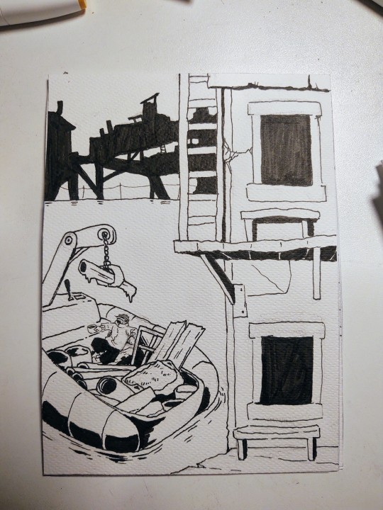
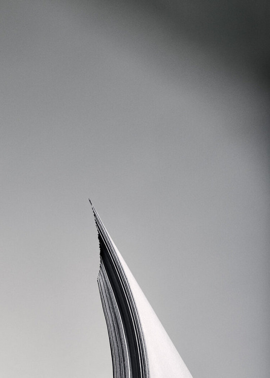
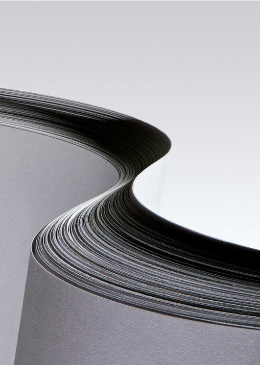
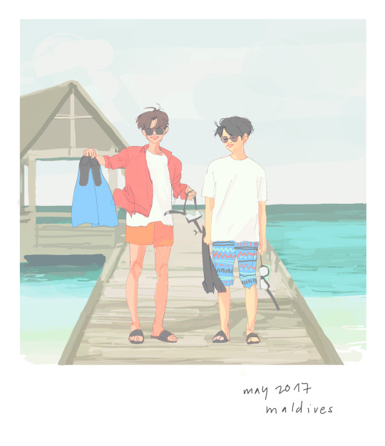
#the way you can add depth simply by looking up multiple papers and colors
Text
Wanted to try something new. Here are some illustrations in normal lighting
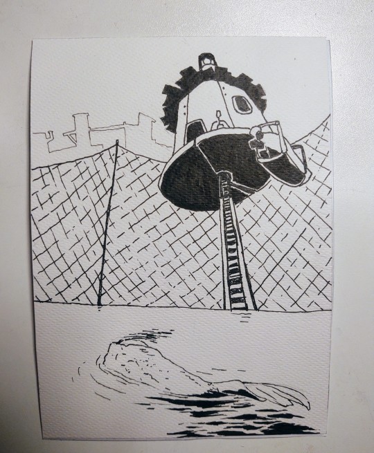

Here they are again, now with backlight
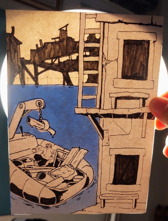
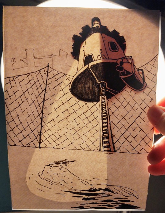


Really pleased with the result! :D
#i hope the guy I'm making this secret Santa gift for will be happy lol#this was so much fun i want to make more illustrations like these#the way you can add depth simply by looking up multiple papers and colors#and keep it hidden in normal lighting!!! the effect is so cool I'm going apeshit#so ye. I'm proud#art#original character
117 notes
·
View notes
Note
hi! i love your gifs and your tutorials, you explain things very well and i was wondering if you could explain how you make a template of gifs that are different sizes but in the same canvas? and then how you make the gifs and put them in each spot to make them all work properly? thank you so much in advance if you're able to do this :)
hey, thank you so much, i appreciate it!!
there are multiple ways to do it, but here's how i make layouts like this from scratch:

a basic knowledge on how to make gifs and layer masks is required, i'll link more resources and tutorials at the end too.
i'm sure there are simpler ways to do it, but it's how i do it lol, unless i'm using someone else's layout. i'm sorry if it's too in-depth! on and i use photoshop cs5 :)
I. FIGURING OUT THE GIF SIZES
first things first, i need to figure out what kind of layout i wanna do. to do so i usually map it out i on paper because i'm super visual and it helps be figure things out. yes, we have to do (simple) match here, but it's nothing bad!
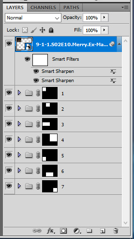
let's take this layout for example:
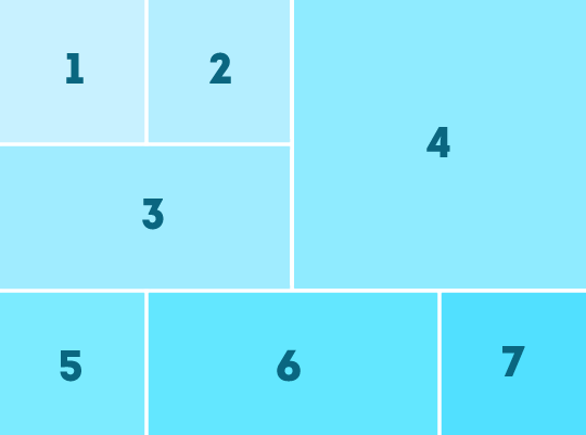
there are 3 different gif sizes to figure out here:
gifs 1, 2, 5, and 7
gifs 3 and 6
gif 4
to do that, you need to figure out which size you want your finished layout gif to have (540 x 540px, 540 x 450px, etc). in this case i chose a size i use all the time: 540px wide by 400px tall.
a very important thing to remember is that tumblr's transparent gutter between gifs is 4px wide, so we need to take that into consideration when we do our little math.
since we know that the gif will be 400px tall, we can right away easily figure out the height of all gifs except gif 4. since there are two 4px lines, let's remove 8 from 400 and we get 392. from there, we just need to divide it by 3: 130.67. we need numbers without decimals, so let's just say gif 1 and 2 will be 130 px tall, and gifs 3, 5, 6, 7 will be 131px tall.
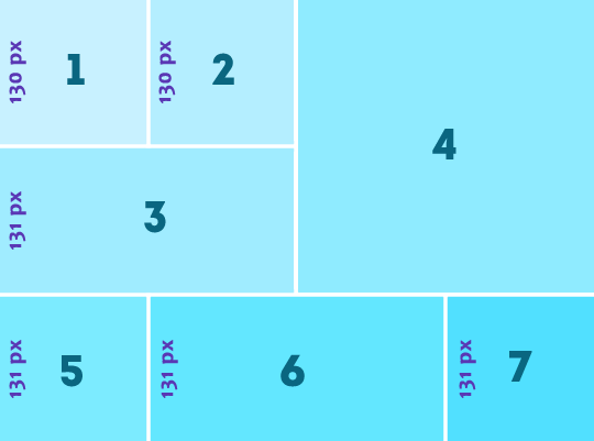
then we can figure out how wide gifs 1, 2, 5, and 7 are because they're square gifs, easy!
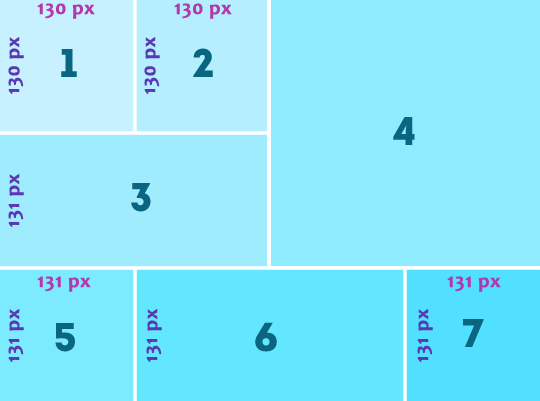
to figure how wide gifs 3 is, we can simply do 130 + 130 + 4 = 264px
for gif 6, let's do: 540 - (131 + 131 + 8) = 270px
then we only have gif 4's size to figure out. just more basic math:
height: 400 - (131 + 4) = 265
width: 540 - (130 + 130 + 8) = 272
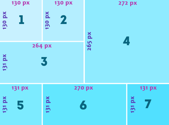
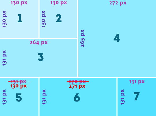
the only issue here is that i want gifs 1, and 5 to line up, so i'm just gonna adjust the sizes so they're the same:
once you have all of your gif's size figured out, you're ready to create the actual layout in photoshop, yay!
II. CREATING THE LAYOUT
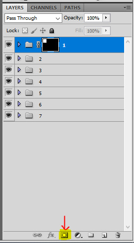
create a new canvas and give it its size (540px width and 400px height), then create one group for each gif you're gonna have (in this case it's 7).

now time to make the shapes. with the marquee tool, change the style to: fixed size and enter gif 1's proportions (130 x 130px)

then click the top corner of the canvas and position the box in the top corner
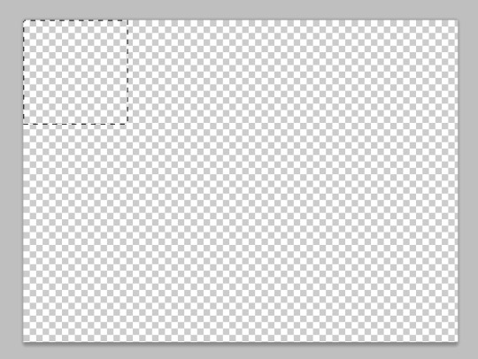
once the box is in the right spot, create a layer mask by selecting the first group and clicking on the layer mask button
then you can do the same for all the shapes: change the marquee tool's size, position the box, and create a layer mask for each group. you just need to make sure they are all 4px apart.
to do that you can select the group itself and just nudge it a bit with your keyboard's arrow key. to make things easier to see, i like to add a color fill layer in each group. once you've done it all, it should look like that:
III. MAKING THE GIFS
for the actual giffing part, what i like to do is to make my gifs as usual and sharpen them (i usually color later at this point).
resize this gif to the desired height to fit the layout (for example 130px for gif 1). make sure your gif is a smart object and then right click the layer > duplicate layer... > and choose your layout canvas.
obviously the gif should be in the group, so just slide it in the right group and delete the color fill.
if you don't like the gif's position, you can select this gif layer and move it around inside of the box by either sliding it around, using your keyboard's keys, or using ctrl + T to open the transform tool. if the gif is too big after duplicating it to the layout canvas, you can also resize it here with ctrl + T. it's usually what I do.


then you can do the exact same for all 6 other gifs

IV. COLORING
the last part, when everything is set, is to color! i prefer doing it at the end because it helps to make everything look cohesive. just make sure coloring layers are contained in each according group and voila!
MORE RESSOURCES
this technique with drawing the layout on paper first and then doing basic maths always work for me. you just gotta remember that the gutter size between gifs is always 4px, and choose a final gif dimension first. i hope i was clear enough, i know it's a lot of numbers 😅
here are more great layout tutorials:
fawad-khan's layout tutorial
payidaresque's layout tutorial
yenvergerberg's clipping mask layout tutorial
usergif's clipping and layer mask tutorial
#alie replies#Anonymous#tutorial#photoshop#*ps help#completeresources#resource#resourcemarket#userpjo#userraffa#tuserheidi#userrobin#usertreena#userzaynab#userrainbow#userdean#userelio#usernik#usersalty
197 notes
·
View notes
Text
DIY Calligraphy T-Shirts: Fashion Meets Art

Unleash your creativity and personalized your wardrobe with stunning DIY Calligraphy T-Shirts that combine fashion and art. With the ability to create one-of-a-kind pieces, you can revolutionize your style and express your individuality. Whether you want to letter your name, state, team, or favorite phrase, this article will provide you with the necessary information and techniques to create unique calligraphy designs on fabric.Key Takeaways:
- DIY Calligraphy T-Shirts allow you to merge fashion and art in personalized pieces
- Unleash your creativity and create stunning calligraphy designs on fabric
- Express your individuality and revolutionize your wardrobe
- Letter your name, state, team, or favorite phrase to make your T-Shirt unique
- Enjoy the art that you can wear!
Lettering on Fabric: A Fun and Satisfying Technique
Hand lettering on fabric using fabric paint is a fun and satisfying technique that allows you to create custom T-shirts. With the right supplies, such as a T-shirt, fabric paint, and a light box, you can easily transfer your lettering designs onto fabric. Whether you want to create a personalized T-shirt for yourself or a unique gift for someone special, this method of lettering on fabric offers endless creative possibilities.When it comes to lettering on fabric, using dimensional fabric paint can add depth and texture to your designs. This type of paint allows you to create raised letters that stand out and provide a tactile element to your T-shirt. Additionally, using a light box can help you accurately transfer your lettering design onto the fabric, ensuring that it is centered and proportionate.One important tip for successful lettering on fabric is to heat set the design once it is dry. This will help to ensure the longevity of the design and prevent it from fading or washing off. To heat set your fabric, simply place a piece of cloth or parchment paper over the design and use a hot iron to press it for a few seconds. This heat setting process will help the paint adhere to the fabric fibers and maintain its vibrancy even after multiple washes.Tips and Tricks for Lettering on Fabric:
- Use dimensional fabric paint for raised lettering
- Transfer your design using a light box for accuracy
- Heat set the design to ensure longevity
- Experiment with different lettering styles and colors
- Practice your lettering technique on scrap fabric before starting on the T-shirt
With these lettering tips and tricks, you can confidently embark on your DIY journey to create custom T-shirts that reflect your personal style and creativity. Hand lettering on fabric is not only a fun and rewarding experience, but it also allows you to wear your own unique works of art. So grab your supplies and get ready to unleash your creativity on fabric!
Supplies:
Benefits:
Fabric paint
Offers a wide range of colors and finishes
T-shirt
Provides a blank canvas for your lettering designs
Light box
Allows for accurate transfer of designs onto fabric
Dimensional fabric paint
Adds texture and depth to your lettering
Heat source (iron)
Helps to set the design and make it washable
Designing Your Own Calligraphy T-Shirt
Designing your own calligraphy T-shirt opens up a world of creative possibilities. Whether you're looking to add a personal touch to your wardrobe or create unique gifts for friends and family, calligraphy on fabric is a perfect way to express your artistic side. With a free template download, you can easily start your calligraphy journey and transform plain T-shirts into stylish and meaningful pieces. Let's explore the key elements of designing your own calligraphy T-shirt:Calligraphy-themed Graphic DesignsWhen designing your calligraphy T-shirt, you have a wide range of calligraphy-themed graphic designs to choose from. From elegant swirls and flourishes to bold and expressive lettering, these designs can add a touch of sophistication or make a powerful statement. Choose a design that resonates with your personal style and aligns with the message you want to convey through your T-shirt.Calligraphy Quotes for T-ShirtsAdding meaningful quotes to your calligraphy T-shirt can make it even more special. Whether you opt for inspirational, motivational, or humorous quotes, let your personality shine through. Select quotes that resonate with you or reflect your values, as they will not only make your T-shirt unique but also serve as a source of inspiration for those who see it.Calligraphy Font Selection for FabricChoosing the right calligraphy font is crucial for creating captivating designs on fabric. Consider the style and mood you want to convey. From classic serif fonts to modern and edgy scripts, there are countless options to explore. Experiment with different fonts and find the one that best complements your calligraphy T-shirt design. Remember to consider legibility and readability when selecting a font that works well on fabric.With these key elements in mind, you can start designing your own calligraphy T-shirt. Let your creativity flow and unleash your inner artist. Express yourself through beautiful calligraphy designs and create personalized pieces that are sure to turn heads.
Printing Methods for Calligraphy Designs
When it comes to transferring calligraphy designs onto T-shirts, there are various printing methods to choose from. Each method offers its own unique benefits and considerations. In this section, we will explore different printing techniques such as iron-on calligraphy transfers, silk screening calligraphy techniques, and the use of stretchable calligraphy inks. We will also discuss the importance of selecting the right T-shirt material and utilizing a heat press for optimal results.Iron-on Calligraphy TransfersIron-on calligraphy transfers provide a convenient and user-friendly way to apply your calligraphy designs onto fabric. Using heat, the transfer adheres to the fabric, creating a long-lasting and professional-looking result. These transfers are available in various calligraphy fonts and designs, allowing you to choose the perfect style for your T-shirts. When using iron-on transfers, it's crucial to follow the instructions carefully to ensure proper application and longevity of the design.Silk Screening Calligraphy TechniquesSilk screening is a popular method for creating complex and detailed calligraphy designs on fabric. This technique involves creating a stencil, known as a screen, which is then used to apply ink onto the fabric. Silk screening allows for precise and vibrant calligraphy designs, making it an excellent choice for intricate lettering and graphics. However, it requires some specialized equipment and knowledge to achieve the desired results.Stretchable Calligraphy InksWhen designing calligraphy on stretchy fabrics like spandex or polyester blends, stretchable calligraphy inks are ideal. These inks are formulated to expand and contract with the fabric, ensuring that the calligraphy design retains its integrity even when stretched. It's important to select inks specifically designed for stretchable fabrics. Additionally, properly heat setting the ink can help enhance its durability and longevity, ensuring that your calligraphy design stays intact even with frequent wear and wash.
Printing Method
Pros
Cons
Iron-on Calligraphy Transfers
- Convenient and easy to use
- Wide variety of designs available
- Long-lasting results
- Can be tricky to apply without wrinkling
- Limited customization options
Silk Screening Calligraphy Techniques
- Allows for intricate and detailed designs
- Vibrant and professional-looking results
- Requires specialized equipment and knowledge
- Time-consuming process
Stretchable Calligraphy Inks
- Ideal for stretchy fabrics
- Ensures the design retains its integrity
- Durable and long-lasting
- Limited color options
- Requires proper heat setting
Selecting the right T-shirt material is crucial when it comes to calligraphy designs. Different materials can affect the way the ink interacts with the fabric and the overall appearance of the design. It's important to consider factors such as the fabric's texture, stretchiness, and breathability. Experimenting with different materials can help you achieve the desired look and feel for your calligraphy T-shirts. Additionally, utilizing a heat press can help ensure that the calligraphy design is properly adhered to the fabric, enhancing its longevity and durability.In the next section, we will explore the various tools and techniques for creating calligraphy on fabric, including fabric calligraphy pens, textile paints, and brush techniques. These tools and techniques will help you achieve professional-looking calligraphy designs on your T-shirts.
Tools and Techniques for Calligraphy on Fabric

When it comes to calligraphy on fabric, having the right tools and techniques can make a significant difference in the outcome of your designs. Whether you're a beginner or an experienced calligrapher, there are several options to consider when working with fabric. Here are some essential tools and techniques to help you achieve professional-looking calligraphy on your T-shirts.Fabric Calligraphy PensOne of the most popular tools for calligraphy on fabric is a fabric calligraphy pen. These pens are specifically designed to work on fabric surfaces and provide smooth and consistent ink flow. They come in various tip sizes, allowing you to create different line widths for your calligraphy designs. With fabric calligraphy pens, you can achieve precise and controlled strokes, resulting in clean and legible lettering.Textile Paints for CalligraphyAnother option for calligraphy on fabric is using textile paints. These paints are specially formulated to adhere to fabric surfaces and offer a wide range of colors to choose from. Textile paints are versatile and can be applied using brushes, sponges, or even stamps, giving you the freedom to explore different painting techniques in your calligraphy designs. They are also washable and durable, ensuring that your calligraphy designs stay vibrant even after multiple washes.Calligraphy Brush Techniques for FabricIf you prefer a more traditional approach to calligraphy, using calligraphy brushes on fabric can create unique and expressive designs. Calligraphy brushes offer a wide range of brush strokes and textures, allowing you to add depth and variation to your lettering. It's essential to choose brushes specifically designed for fabric to ensure that they work well with the fabric's texture. Practice different brush techniques, such as the pressure and angle of your strokes, to achieve the desired effect in your calligraphy designs.Fabric Markers for CalligraphyFor a more convenient and precise option, fabric markers are an excellent choice for calligraphy on fabric. Fabric markers are available in various colors and tip sizes, enabling you to create intricate and detailed lettering on your T-shirts. They are easy to use and offer excellent control over your strokes. Fabric markers are also fade-resistant and waterproof, ensuring that your calligraphy designs remain vibrant and intact, even with regular washing.Table:
Tool/Technique
Description
Fabric Calligraphy Pens
Specially designed pens for fabric that provide smooth and consistent ink flow.
Textile Paints
Paints formulated to adhere to fabric surfaces, offering a wide range of colors.
Calligraphy Brushes
Brushes specifically designed for fabric, allowing for unique brush strokes and textures.
Fabric Markers
Convenient markers that offer excellent control for intricate and detailed lettering on fabric.
Calligraphy Design Software and Resources

Enhance the quality and convenience of your calligraphy T-shirt projects by utilizing calligraphy design software and resources. With dedicated software programs, you can create and customize your own calligraphy designs, bringing your artistic vision to life. These programs offer a range of tools and features, allowing you to experiment with different fonts, layouts, and decorative elements. Whether you are a beginner or an experienced calligrapher, these software programs can take your designs to the next level.In addition to software, there are various calligraphy pattern templates available for T-shirts. These templates provide a starting point for your designs and can be easily customized to suit your preferences. Whether you are looking for elegant scripts, modern lettering styles, or decorative flourishes, you can find a template that aligns with your vision."Calligraphy style guides for fabric are also valuable resources for your T-shirt design journey. These guides offer inspiration and guidance on different calligraphy styles, providing you with a wealth of ideas for your own designs. From traditional calligraphy to contemporary lettering, these style guides can help you explore new techniques and push the boundaries of your creativity."When choosing calligraphy design software and resources, consider your specific needs and preferences. Look for software programs that offer user-friendly interfaces, a wide range of font options, and the ability to export designs in the desired file formats. As for pattern templates and style guides, make sure they align with your artistic style and provide the inspiration you are seeking.
Software
Features
Calligra
Customizable templates, various font options, export designs in multiple file formats
InkScape
Vector-based design, extensive editing tools, compatibility with other design software
Adobe Illustrator
Professional-grade design software, advanced features for precise control, seamless integration with other Adobe products
Table: Calligraphy Design Software OverviewAs you explore the world of calligraphy design software and resources, remember to have fun and experiment with different techniques. Let your creativity flow and create unique calligraphy designs that truly reflect your personal style and vision.
Durable Inks and Care Instructions for Calligraphy T-Shirts
Creating beautiful calligraphy designs on fabric requires not only skill and creativity but also the use of durable inks that can withstand regular wear and washing. By choosing the right inks and following proper care instructions, you can ensure that your calligraphy T-shirts maintain their vibrancy and longevity. Here, we'll explore the best inks for fabric calligraphy, provide care instructions, and even share tips on waterproofing your designs.Choosing Durable Inks for Fabric CalligraphyWhen it comes to calligraphy on fabric, selecting the right ink is crucial. Fabric markers or textile paints specifically designed for calligraphy work well on most fabrics. These inks are usually water-based, quick-drying, and offer excellent color saturation. Look for inks that are labeled as permanent or resistant to fading, as they will withstand multiple washes without losing their vibrancy.Calligraphy T-Shirt Care InstructionsTo keep your calligraphy T-shirts looking their best, it's important to follow proper care instructions. Here are some general guidelines to help you maintain the quality and longevity of your designs:
- Wash your T-shirts inside out to protect the calligraphy design.
- Use cold water and a gentle cycle when machine washing.
- Avoid using harsh detergents or bleach that can fade the ink.
- Avoid rubbing or scrubbing the calligraphy design directly.
- Hang dry your T-shirts instead of using a dryer to prevent shrinking and potential damage to the ink.
Waterproofing Calligraphy on FabricIf you want to add an extra layer of protection to your calligraphy designs, consider waterproofing techniques. Fabric sealants or sprays specifically designed for textiles can help make your calligraphy T-shirts water-resistant and stain-resistant. Before applying any sealant, always test it on a small, inconspicuous area of the fabric to ensure it doesn't alter the color or texture of the ink.By using durable inks, following proper care instructions, and considering waterproofing options, you can ensure that your calligraphy T-shirts remain vibrant and beautiful for years to come. Take care of your creations, and enjoy the art you can wear!
Customization and Personalization Ideas
When it comes to DIY calligraphy T-shirts, the possibilities for customization and personalization are endless. Whether you want to create a unique piece for yourself or design matching shirts for a group, calligraphy can add a special touch. Here are some personalized calligraphy T-shirt ideas to inspire your creativity:Calligraphy-Themed T-Shirt Collections
- Create a collection of calligraphy-themed T-shirts with different quotes or phrases that resonate with you. You can mix and match fonts, colors, and designs to make each shirt stand out.
- Choose a specific theme, such as love, motivation, or empowerment, and incorporate calligraphy designs that reflect that theme. This can be a great way to express your personal style and share positive messages.
Calligraphy for Sports T-ShirtsIf you're a sports enthusiast, why not showcase your love for the game with calligraphy T-shirts? Design shirts with calligraphy lettering of your favorite team's name, players' numbers, or motivational sports quotes. You can even create custom designs for your sports team or fan club.Calligraphy for Couple T-ShirtsMatching couple T-shirts are a popular trend, and calligraphy can add a romantic and personalized touch to these shirts. Design T-shirts with calligraphy of each other's names, special dates, or meaningful quotes. It's a beautiful way to celebrate your love and create a lasting memory.These personalized calligraphy T-shirt ideas are just the beginning. Let your imagination run wild and create T-shirts that reflect your personality, interests, and passions. With calligraphy, you can turn a simple shirt into a wearable work of art.
Learning and Improvement in Calligraphy for Fabric
https://www.youtube.com/watch?v=jt2hE5bNbrIIf
Read the full article
0 notes
Text
Something Told Research
Conceptual still life photography
Tips:
1. Choose Subjects that Speak to You
What you photograph is completely up to you. Have a search around the house to see if you can find something simple but interesting to start with. Please don’t feel like you have to take photos of fruit or flowers just because everyone else does: think outside the box without being overly ambitious.
If when you’re out and about something catches your eye, take it home with you (don’t steal it!) or make a note of it so as to remember to try photographing it in a still life context. Try to avoid reflective surfaces such as glass and metal to begin with, as they will be extremely difficult with regards to lighting. Once you’ve mastered the single object shots, try mixing it up, combine objects of contrasting shape, colour, texture and see what you can come up with.
2. Get Comfortable with Light and Lighting
Lighting doesn’t have to be expensive. I know certainly for me that a set of studio lights aren’t really within my budget, so for still life shoots I need to utilize all the light I can get my hands on, and that often means sunlight.
Remember that you have full control over the shoot, so if you want, find a room in which you can block out all natural light by using shutters or curtains, this way you will have complete control over the light upon your subject.
Using standard table lamps can work extremely well if used effectively. Be sure to try multiple positioning set ups, not all light has to come from the front of the object, side and back lighting will add interest, shadows and depth to the shot. Alternatively, choose a room that is well lit via a window, and use this to your advantage. The natural light from one side will comprehensively light your subject and you can compliment this with a lamp or reflector.
3. Get a Good Tripod and Work Your Angles
Depending on your lighting situation, you may or may not need to use a tripod and shutter release. I would recommend using these as they will allow you to observe and work with your subject matter. This set up will also allow you to use slightly longer shutter speeds than usual to ensure a small aperture allowing the image to be in focus front to back, if you so choose.
However, please don’t let a static camera stifle your creativity, it quickly gets forgotten that your camera has been sat in the same position for the whole shoot. Be sure to vary the angles and heights at which you are shooting. Otherwise, before you know it, you’ll have a whole collection of shots all take from the same point with little or know variation. Mix it up a bit. Try shooting at the level of the subject or try a bird’s eye view, looking down onto the subject, but be careful if you are moving around not to cast any shadows on your subject!
4. Get the Backdrop Right
Having a suitable backdrop for your subject matter will play a crucial role in the overall success of your shots. It’s best to keep it nice and simple, so it doesn’t interfere with your subject. A plain painted wall or a large sheet of white or plain colored paper would be ideal.
Think about how your choice of background contrasts the subject, do you want a neutral background, or are there tones that may work in complimenting the shades within your subject. For smaller objects, you may not need a backdrop as such, but instead require a surface to place the items on, for which something like black velvet is ideal, as it absorbs light and looks like a solid black surface.
5. Compose the Shot
The compositional element of your still life work is an absolutely crucial part of ensuring that your work is engaging and unique. Consider the rule of thirds, how can that be applied to your shoot to create a strong composition. Ensure there are no distractions within the frame, just the subject and the backdrop.
Be sure to vary the composition of the subject matter through the shoot and think outside the box. Where are you leading the eye within the image? Are you utilizing negative space or might it work to try and fill the frame? Engage with the subject, what are its defining features? What is it used for? Are you able to put it into context or does it work as a stand alone subject?
6. Take All Day Over It, If You Need
I often find that my mentality surrounding a shoot is dependent on the reason for the shoot. If I am simply taking photos for pleasure or for myself (as opposed to being assigned work by somebody else), I will be less stringent with ensuring that all the aspects of the shoot are as well executed as they can be. This is obviously a bad habit that am aiming to shed, but when it comes to still life photography, there is no reason not to get it right. You have as much time as you need to do a good job!
Unlike a landscape shoot, the light isn’t rapidly changing and unlike a portrait, you’re subject isn’t going to get bored of keeping still for long periods of time. Take advantage of this, set up your subject, lighting, backdrop and camera, try a few shots, then move things around a bit and have another go. If you get to a point where you feel like things aren’t going quite right, you can just leave everything set up, make yourself a cup of tea and come back to it refreshed later on.
Another advantage is that there’s no excuse not to have clean and sharp images, take time to get the lighting and focus just right. If you can get your hands on one, a macro lens will be ideal for this sort of work, however, if not, try selecting macro mode on your camera to give you the best chance of capturing the close up detail in your subject.
7. Get Inspired by the Masters
If you’re struggling with the lighting, composing or structuring of your shots, then you need to find some inspiration, and where better to look than to the original still life masterpieces of years gone by. Have a search online for renaissance still life artists and observe the elements of the pieces.
Studying these paintings will help you to think about form, shades and how the colors work together and will hopefully give you a few ideas on how you can shape your photography work to form strong and engaging images.
8. Develop Your Eye for Still Life Scenes
Now it’s time for you to have a go yourself. Find a quiet day in your schedule and set aside some time to practice. Try setting up your camera and backdrop by a suitably light spot next to a window and get snapping!
Once you’ve mastered the basics, try getting creative, experiment with camera angles, lighting angles and alternative light sources such as candles and lamps. You could even try getting creative with apertures and use a f/1.8 prime lens to achieve an artistic shallow focus. However, if you take one thing from this tutorial, let it be this: still life photography does not have to be of fruit and flowers! Find some unique and inspiring subject matter that gets you excited and start shooting!
9. Perfect Your Post-Production Process
Working with your pictures after the shoot shouldn't feel like a chore. It should be fun!
Photoshop actions are often touted as a great time-saver, but to my mind the biggest advantage they give you is a highly repeatable workflow. Instead of having to work through all the steps from scratch, and action makes a set of choices for you, then you teak and adjust to make things perfect.
https://photography.tutsplus.com/tutorials/10-tips-to-get-started-with-still-life-photography--photo-8278
Some examples:
Liam J Curtin
Dave Bradley
1 note
·
View note
Text
Top 12 Super Useful Colored Pencil Tips For Beginners
Drawing with Colored Pencils
Colored pencils are an exciting medium. While sometimes overlooked as a professional medium, colored pencils are capable of producing works that resemble paintings. They allow the artist an incredible amount of control over the application, leading to highly detailed and developed imagery.
I’d like to share with you my very best colored pencil tips. Each of them is highlighted in the video below, but details on each tip can be found further down the page.
My Very Best Tips For Drawing with Colored Pencils…#1 — Use Professional Pencils
The quality of the pencil that you use for your drawings is very important and directly influences your success. Using a lower quality pencil will produce lower quality results. In the same way, using a higher quality pencil will increase your chances of success.
Although lower quality pencils are much cheaper, try to avoid them. They just won’t behave in the same manner as higher quality pencils and you’re likely to encounter some frustration.
There are several brands of pencil that are considered “high quality”. While the price is a bit higher, it is well worth the investment.
#2 — Use a Hand-Held Pencil Sharpener
Colored pencils generally are either wax-based or oil-based. (I am excluding watercolor pencils, water-soluble graphite pencils, and Inktense pencils since these pencils aren’t technically “colored pencils”.)
The designation of the pencil (oil or wax) is based on the binder used to hold the pigment. The binder of wax-based or oil-based pencils can destroy a pencil sharpener. The binder builds up in the sharpening mechanism and eventually can cause the sharpener to no longer function.
For this reason, I suggest using a simple hand-held pencil sharpener. It is easy to use, inexpensive, and just gets the job done.
#3 — Consider the Drawing Surface
It’s easy to overlook the importance of the drawing surface. Sometimes we just “can’t wait” to start making marks that we forget to consider how the surface will affect the resulting image.
While there are many different surfaces that will accept colored pencils, there are two main factors to consider — the texture (tooth) and the tone of the paper.
The texture (tooth) of the paper plays a vital role in how your marks will behave on the surface. Smoother surfaces, like Bristol paper, produce smoother applications. While a smoother surface will give you a bit more control over the detail in the image, it also may limit the number of layers of color that can be accepted.
Rougher textures, like watercolor paper or Pastel Paper., may limit the details that you are able to produce initially. But, these papers are more adapt to accepting multiple applications of color. After multiple layers have been added and burnished, details are much easier to achieve.
The tone of the paper is also important and should be considered. By default, most of us go straight to using white paper. It’s what most of us are accustomed to since we live in a world of white paper.
There’s nothing wrong with using white paper. Bristol paper, after all, is white. But white surfaces force us to push the values darker, starting from one extreme end of the value scale. It is more difficult to make comparisons between the values and colors as we add them.
Starting with a toned surface, however, helps us by starting near the middle of the value scale. By starting in the “middle”, we can “push” the values lighter and darker, making comparisons and evaluations a little easier.
#4 — Consider the Pressure Placed on the Pencil
The pressure placed on the pencil can affect the value and the intensity of the color. When layering colors, this plays an important role. You shouldn’t feel that all of your applications should be applied under the same pressure.
Adjusting the pressure when mixing affects the intensity and the resulting color. Experiment as you work to find the right combinations of pressure to produce the colors and values that you need for your particular application.
#5 — Burnish Your Applications
Burnishing is the process of working the material into the tooth of the paper to produce smooth and solid applications of color. This is what transforms a colored pencil drawing into a colored pencil painting. Burnishing naturally happens in a colored pencil drawing when multiple applications are added and a waxy build-up occurs.
This process can be expedited using a few techniques. A light pencil can be applied over the area with heavy pressure. White and Cream work best for this approach. Although the application is burnished effectively, this approach does affect the value of the resulting color, making it a bit lighter.
The Colored Pencil Course
Learn how to use colored pencils like a pro. Learn a variety of techniques and explore several different subjects through concise and “easy to digest” modules.
VIEW COURSE
A colorless blender can also be used to produce a burnished application. Colorless blenders are available as a pencil or marker. I prefer to use the pencil form since it uses the same binder as the wax-based pencil.
Solvents can also be used to burnish applications. Many artists use alcohol or an alternative solvent such as Turpenoid which can be applied over the colored pencil application with a soft brush.
#6 — Layer Your Colors
In most circumstances, you’ll find that applying just one color to a location in a drawing is not enough to produce representational results. Instead, multiple layers of color are required.
Layering colors produces more depth in the color and leads to a more realistic depiction of the scene. Layered colors may be related or similar colors, or they may be complete opposites.
Layering colors of a different value or hue naturally mix on the surface and mixed colors are always more natural in their appearance.
#7 — Mix Your Colors
As colors are layered, they mix. This “mixing” may happen has the binder adheres to pigment applied in a previous application or through optical mixing. And since mixed colors appear more natural, you may look for opportunities to mix colors.
Instead of reaching for that manufactured green, mix your own by layering blue and yellow. You can always go over the application with a manufactured green, but the color should appear more natural as the yellows and blues show through.
#8 — Consider the Direction of the Strokes
Just as brush strokes in a painting can inform the viewer of the form and texture of the subject, the direction of the marks made with the pencil can do the same. This is especially true when changes in value create the perception of lines.
If you’re not sure which direction the strokes should be pulled, just consider the cross contours of the form of the subject. By pulling strokes to align with the cross contours of the form, you can communicate a bit more to the viewer. Pull the strokes in a direction that contradicts the cross contours and you could make your drawing look flat.
#9 — Mix Your Own Black
Black and white are the strongest “colors” available and in the natural world, it’s hard to find an example of a true black or white. Black is so strong that it can make a drawing look flat and synthetic. This is especially true when black is used unmixed in a colored pencil drawing.
To avoid producing a synthetic appearance in your drawing, try mixing your own black. Instead of using that manufactured black, mix a dark brown and a dark blue. This means layering one color over the other and burnishing them to the surface.
I have found that Dark Umber (Prismacolor Premiere) and Indigo Blue (Prismacolor Premiere) produce the best “black”.
Not only does mixing a dark blue and a dark brown produce a natural black, but it also allows the artist to control the temperature of the color that is produced. Want a warmer black? Add more dark brown. Need a cooler black? Add more of the dark blue.
#10 — Build Up to a Heavy Application
Many beginning artists pick up colored pencils and apply them in the same manner as graphite pencils, allowing the “white” of the paper to affect the resulting value. This produces a light drawing that may have color but is far from looking like a polished painting.
But by building up layered applications to appear “heavy”, the look of a solid-colored pencil “painting” starts to emerge. Although applications may be lightly layered, multiple burnished layers will lead to a “heavy” (and solid) look.
#11 — Develop Edges and Details Last
Details can be overwhelming — but only if you let them be. The good news is that details and edges can be developed and defined towards the end of the layering process. Since higher quality pencils can be layered with ease, details can be added right over light to medium applications.
In essence, we can develop the colors and values in a section of the drawing and then refine the details and edges right over the top.
The only exception is in areas where the value is very light or even white. Highlights, for example, should be preserved and planned, since adding them over areas of color is difficult — if not impossible.
#12 — Be Patient and Take Your Time
Perhaps the most important tip to share is simply to be patient. Colored pencils require a slow and meticulous approach. If you go into your drawing with this in mind, then your chances of success are greatly improved.
Many beginning artists make the mistake of believing that results should be quick. They become discouraged and frustrated when they don’t see immediate results.
If you take your time and work through each layer with patience, you’re more likely to find success with your colored pencil drawing.
0 notes
Text
My Study Tips // How I Improved My Grades and Got Straight A’s

This post will consist of study tips and techniques that I have learned throughout university that allowed me to receive straight A’s both semesters my senior year. Long story short, during my final year at university I wanted to improve my GPA and receive good grades in all of my courses. I aimed for an A in all of them and managed to get straight A’s both semesters, as well as end up on the student honors list for having a high semester GPA. I hope that these tips can help improve your grades, but straight A’s are never guaranteed (please keep this in mind). Also, I will be sharing with you all of my study tips (tested for 4 years at university), as well as tips that I learned in my cognitive psychology course about memory and learning. Keep reading if you’re interested in SLAYING this semester!
1. Set GOALS. I have a post already up on how to set SMART goals at the beginning of a new a semester. Click HERE to read it. I also have a guide sharing tips how I prepare for a new semester, click HERE to read it.
2. LECTURES. Attend all lectures, workshops, tutorials, classes, labs, etc. If you’re a full time student, you shouldn’t make excuses to skip lectures. Before lectures, I would skim assigned textbook readings or look through uploaded PowerPoint slides to have a general idea about the topic, what will be taught, what I should pay more attention to, etc. You will already be familiar with the material and this will allow you to ask questions, summarize key information, anticipate what will be featured in the exam.
3. Learn from DAY 1. My biggest tip for studying and surviving university, is that you need to start learning from day 1 and then build up your knowledge throughout the years. The first few lectures of any major are usually the core of that major, so you have to know those subjects and topics well. Then, your knowledge will build on a strong foundation, which will make learning easier. So start learning from day 1, keep up with new material and you will see that as exams approach, you will be less stressed about not knowing anything.
4. HOMEWORK. At my university, we would be frequently assigned a lot of homework, so I always made sure I had everything done. Sure, there were times where I would skim through readings or half-ass assignments, but the key here is to know the importance of each assignment. Sometimes, while doing homework I would get carried away and research the topics to learn more about them, because it would help me understand it better. It really depends on the assignment. Another reason why doing homework is crucial is because often professors throw in homework questions in exams. By practicing trying to solve problems you’re already doing yourself a favor, because practice makes perfect.
5. REVIEW. After lectures, I would review freshly learned materials at home. I would finish taking notes from slides, research what I didn’t understand, as well as look up answers to my questions (if the professor didn’t answer them). I would also study the material. Repetition of studying information over and over again is great for retention, as YOU HAVE TO KNOW THE MATERIALS AND BE ABLE TO APPLY IT. Don’t memorize it, know it! (this is honestly the biggest key to success!)
6. EXAMS. For exams, I would make study guides from chapter readings that cover the necessary information. I would either fill in a pre-made study guide handed out to us by our professors, or I would create one. I would include terms and definitions, key concepts, key research, theories, examples, etc. A quick tip is to make study guides from slides and then add extra information anywhere necessary from the readings. Keep in mind that your study guide’s should include only important information, don’t get carried away! Then I would only study from those study guides, which usually worked well for multiple choice exams. For essay based exams, I would ask professors for topics that we can expect on the exams and write them out at home. I would then learn from those essays. This methods helps you have coherent thoughts, arrange arguments, etc.
7. PROJECTS. I would start working on projects (group presentations, individual presentations, etc.) at least a week in advance, just because I’m a perfectionist and a visual learner, which means that I wanted my slides to be PERFECT. Nice slides can help your earn good grades! I would choose a slide design style, 2-3 fonts (max), 2-3 colors (max) and would stick to them. I would also include funny photos (memes are really popular if they suit the topic!) or gifs. As for information, I would keep it short and summarized on the slides, and if I needed to expand on a certain point, I would be able to do that on my own. Don’t put a lot of text on your slides, nobody likes to read them (Unless it’s a very official presentation, your professor asked you to, etc.). If you have a good sense of humour, you can throw in some jokes during your presentation (in my case sarcasm wasn’t for everyone, but at least my friends found it funny!). Take the time to prepare a nice presentation, practice presenting in your room, because it is an easy way to earn good grades.
8. PAPERS. I would also start working on papers at least a week in advance, this usually depended on the lenght of the paper and the topic. I would research articles that I could include first and make a bibliography list. Then I would read those articles, which could take up 2-3 days if I was busy and had to work on other assignments. Afterwards, I would start writing, one paragraph at a time (this approach worked on harder/longer papers or a boring topic). Sometimes I would word vomit all of my ideas and then read through it and edit the paper. However, if I could, I would always try to choose an interesting topic and I would always discuss them with my professors beforehand, because they could recommend readings or help with generating ideas for arguments, etc.
9. STUDY GROUPS. Studying with friends or a group of students from your class can be different and fun, as well as beneficial for receiving that A. I would utilize study groups before mid-terms and finals, but always make sure to study on your own first and only then attend a study group. Once you know the material well, you can meet up with your friends/peers and teach each other concepts that you still can’t quite grasp. You know you’ve learned a topic well if you can teach it to other people and them being able to understand what you are teaching. Otherwise, study groups can be distracting and a great excuse to procrastinate.
10. PROFESSORS. Your professors are a wonderful resource of knowledge, so use them! Attend their office hours, ask questions, discuss any problems or issues that you’re having in their lecture after class. Don’t be afraid to approach them, because they’re a great ally for your success! They always notice students who go above and beyond to learn and do well at university! Trust me, they talk behind students backs as much as students gossip about professors! They can also offer you amazing opportunities afterwards, when doing research, working on dissertations, etc. I was recently offered a volunteer lab assistant position, to help out one of my professors, even though I already graduated. So network with your professors, they will help you out!
11. LEARNING STYLE. It would be useful for you to know what’s your learning style. Visual, auditory, read & write or kinesthetic. You can read about it more in detail HERE. I’m a visual learner, so I would include graphs, drawings, schemes, etc. in my notes, in order to retain information better. Discovering your learning style could help you improve your studying habits!
COGNITIVE PSYCHOLOGY AND LEARNING. Below you will find the tips for studying that I learned during my cognitive psychology course.
It’s easier to remember information you can interpret in the context of things you already know. You will remember textbook material better if you take the time to scan a chapter first, to get a sense of the major points, before reading the chapter in detail. This is also the reason why professors ask students to read chapters before class, so that the students’ minds are prepared to encode and remember the information presented in the lecture.
The more deeply you analyze information, the more likely you are to remember it later. This is known as depth of processing. Experiments have shown that people remember words better if they’re formed to think about the meaning of words, rather than simply memorizing them.
The best way to prepare for a test is by processing the material in a way that is similar to how you expect to be tested on it: making the study and recall format as similar as possible.
More cues mean better recall. Free recall is when you are simply asked to generate the information from memory. Cued recall is when you are given some kind of a prompt. Recognition is when you pick out the correct answer from a list of possible options. Many students prefer to take exams with questions involving multiple choice (recognition test) rather than essays (free-recall test). Professors know this too, so they design multiple choice questions to include alternative answers that can easily be mistaken for the correct response if the student hasn’t studied the material closely.
I hope you found the information included in this post helpful. If you would like to read more from me, click HERE to see other blog posts! You can also follow my studygram HERE for some inspiration!
ALSO, I found this video that I thought would be useful, so check it out for more advice! Click HERE.
5K notes
·
View notes
Link
0 notes
Text
1000 years by your art

Viola aka @pitypagn aka @faheej is a 16 year old SHINee lover, currently living and studying in Budapest. Being a prolific and extremely talented young artist, she has something yet to draw and say about her ultimate K-pop favourite - 5HINee.
Tell us, please, about SHINee Fanzine project. How did the idea emerge? Who are the participants? How is the process organized? ^▽^
The fanzine started with a tweet by my friend Gib (Twitter @cat__boy ). He wanted to participate in a SHINee themed zine but there wasn’t any around, so he thought of creating one. (By the way, it would be really nice if more zines and artist collabs were organised in the fandom! We haven’t seen many collaboration zines, mostly individual artists’ artbook and older theme collabs by korean shawols that hasnt happened in a while.) I messaged Gib that i would support the idea and so did his friend Flo (Twitter @omjkt_), and we became an admin team of three. For our theme, we went with something I had in my mind since April; a project that celebrates SHINee’s 10th anniversary by making a collection of fanarts themed around their songs. The name ‘10 years by your side’ is also referring to their song '1000年、ずっとそばにいて・・・’ (1000 Years Always By Your Side).
Gib and Flo organised the technical aspects like choosing a printing shop, looking up printing requirements, shipping options, setting up a Tumblr page with all the necessary information, asking a friend to translate to korean and making the actual application form. It’s a big work and involves a lot of discussion, so I’m glad we could work it out; three is a good number for organising a zine, especially for first-timers like us as we can discuss and ask each other things effectively, split up work, point out things that the others forgot and such.
About the participants; we decided to invite some artists and open applications as well. We came up with a list of about 20 people — mostly SHINee fanartists known in the fandom — who we would like to work with and simply invited them through Twitter. It was a really rewarding part of the organisation process as it got me to talk to some of my mutuals i really look up to but we haven’t talked because of language barriers; someone whose art I really adore actually told me I made their day with the invitation and I found out we’re birthday twins with another artist! Also, good language exercise, hehe. While inviting artists, we also promoted our application page, where we received over 120 replies (which is incredible) and ended up choosing 15 artists from them, making our number 36 with admins.
To distribute the songs, we made a document of the list of songs we wanted to include in the zine (so they make a coherent timeline of SHINee’s music and visual concepts through the years) and sent it to artists so they can sign up to the song(s) they would like to draw, or add others that they had in mind. Currently, everyone is working on their pieces and us admins are in the making of the design of the printed zine. We also have a chat with all artists to get to know each other and share work in progress pictures.
For what’s still to be done; after all the designs and artworks are edited into one, we will start printing and selling towards the end of the year. Until then, we will update our social media (@shineefanzine on Twitter and Tumblr) on how things are going and possibly previews of the artworks!
It seems like you are doodling all the time, cause you often publish works done in notebooks, on working sheets of paper. It creates a unique atmosphere of understatement, so what does it say about you, in your opinion? 6v6
Haha that’s actually not correct! It’s true though that my sketchbook is a checked spiral notebook (that’s probably 10+ years old), so I understand why it seems so! I kind of wish I could draw more in school but it’s simply not the best place for me as I’m occupied with other things, and I like to make more focused drawings lately. Which is also why I haven’t really used that sketchbook (and updated my Instagram where I put traditional sketches) in the latest months. I might get back to it again, as I need to make some studies and I can’t continue my summer break drawing work ethic with finished digital pieces almost every day.
Understatement is a really nice way to put it though, I’m glad it seems so! There are multiple reasons for my sketchbook, one is that I feel too pressured having to draw something nice if it’s on some expensive special paper. Also, it’s easier for me to sense depth, proportions and sizes (aka how close i am to the paper) if it has patterns on it, although when the print ink is too strong, it’s not very good for drawing. The notebook I have has a good paper and lightly printed so it’s nice to draw on. This is the technical part, and what I think this says about me…simplicity? Since I started doing digital, traditional art became secondary for me and that’s great in the quality that it provides me more freedom in it, in some way. That it doesn’t matter if I draw something badly in traditional as it’s not as important to me. This is more of an image I would like if people saw when they looked at my Instagram, that it’s carefree, not looking for perfectionism but has its own beauty in sketchiness and stationary tools. Also that the first and most important thing you need for art is, well, doing art, not professional art supplies.

Be it a pencil sketch, or a digital masterpiece, your artworks are professionally done. Do you have plans to follow an artist’s career? ㅍ_ㅍ
Thank you so much!! I do! Since a little less than a year ago, I decided I don’t want to study anything I’m being taught (mistake of going to a school known for its math) and it would be much nicer to occupy and surround myself with art and artsy people. I am planning to start taking art courses later this year or next year, learn to make a portfolio and look up some art colleges. At this point, I would be the happiest to be an illustrator but animating sounds good too, I will have to see yet where I will go!
What role does fashion play in your life? Do you use it as a tool, an artist’s medium? `ㅂ´
I’m probably not fashionable enough to say that, haha. Or rather I’m not satisfied with my own fashion because I don’t have the wardrobe I would like to have, my own personal issues getting in my way. It interests me though, and I do have the nagging feeling to do better, the room to improve, the inspiration. I like simplicity, gray and dull colors, oversized clothes, simple and clean designs that are great in their quietness. I would like to be like that.
Fashion in my drawings is a bit of a different topic I know, but I would like to mention since even though I’m usually preoccupied with people in my drawings, it can be really meditative and nice sometimes to sit down and compose an outfit and fiddle with details. Also high fashion, it can be quite an inspiration for me.

What thing, or maybe person, impressed you most of all recently? ㅎㅅㅎ
Eastern Europe. It has an exciting aesthetic that isn’t celebrated enough, at least from what I could see. I really love the folk wear, and it feels like home. I would like to make illustrations based around it as well as my own country’s historical fashion, it’s beautiful. The other side is the ~dark~ post socialist aesthetic, big blocks of panel houses made of concrete that don’t age well. It has a grim and heavy feeling but it’s also something uniquely here. I don’t know, maybe only the grim feeling might appear in my art style, maybe I will abandon it for lighter aesthetics but it’s interesting nevertheless.
We are thankful to Viola ( @faheej ) for her fabulous creations and the talk. Design by Anna Maria ( @sh5untik ).
38 notes
·
View notes
Text
Best Resources of 2020: Photoshop Text Effects & Layer Styles
Create cool text effects in seconds! Check out this collection of Photoshop layer styles and text effects from Envato Market and Envato Elements.
Create cool text effects in seconds! Check out these amazing layer styles below.
21 Photoshop Text Effects & Layer Styles
Your ideas need great design, so try a quick text effect! With Photoshop layer styles, you get the option of trying out multiple effects to find the best fit. Design impressive web and print graphics with 3D text and more.
Today, we bring you 21 of the best Photoshop Layer Styles from Envato Market and Envato Elements. Create cool, creative effects in less time with these professional styles.
Featuring some of the best-selling items of 2020, these styles are incredible resources you'll want to add to your collection.
Enjoy professionally made templates that are easy to use! Or get quality help from our design experts at Envato Studio.
What Are Layer Styles?
New to Photoshop? Learn how to install and use Photoshop layer styles from this video:
Layer Styles
Photoshop in 60 Seconds: What Are Layer Styles?
Kirk Nelson
Old Movie Title
This old movie style text effect can add a nostalgic vibe to your project. Simply use the included PSD file and smart objects to easily jump right in and start experimenting with your own text.
Underwater Text Logo Effect
What a striking text effect! Check this one out; it simulates underwater text in such a believable and beautiful way! You won't believe how easy it is to jump right in and use this awesome text effect.
3D Text Effects Vol.2
Add some depth to your text with this collection of 3D text effects. This pack has a large variety of different styles to try out. Works with text, vector shapes, and logos!
Chrome & Fire Photoshop Layer Styles
Really grab some attention with these chrome and fire Photoshop layer styles. The smoldering effect is really convincing. Comes with 15 layer styles! Awesome!
Play Dough Type
Check out this fun, playful, playdough-inspired text effect! It comes with a PSD which contains a variety of letters, numbers and special characters which you can customize, mix, match, and experiment with!
Smoke Logo Text Effect
Wow, check out this amazing smoke text effect! It's so detailed and so striking. This effect is super easy to use too; just open up the template and insert your text. It's really that simple!
ShinyPixel's Text Effect
This sweet text effect could add some visual interest to your next project! Check out these fun and stylish results! This effect works with simple text, shapes, or vector logos too!
Liquid Tasty Text Effects
Looking for an oooey, gooey effect for your text? Looking for something fun, different, and memorable? Then this is the text effect for you! It comes in eight different styles, and editing them is a snap!
Neon Christmas Layer Style
Check out this fun and festive neon light text effect! This versatile effect can be applied to any outline shape object, as well as to light to medium fonts.
Good Vibes - Modern Neon Display Font
Check out this cool, stylish aesthetic! It could be a great fit for your music, sports, events, and a whole host of different projects! This stylish Photoshop action also comes with a bonus neon action!
Grunge Layer Styles
Need to add a bit of grit and grunge to your project? Try out these instant grunge layer styles. Change out the colors and customize how the textures are displayed to suit your project's needs.
80s Retro - Photoshop Layer Styles
Love the 80s? Then you're going to love this collection of Photoshop layer styles! There are 22 different styles to mix, match, and enjoy! Try it on text, shapes, and logos, too!
Paper Kingdom Photoshop Layer Styles
How about a hand-crafted paper look? Meet Paper Kingdom, an amazing set of assets with so many possibilities! We're talking over 200 paper styles, over 200 seamless paper textures, and more!
Ink Stamp Photoshop Layer Styles
These lovely, ink stamp inspired Photoshop layer styles are an awesome way to add some texture to your projects! The set includes 12 individual layer styles, as well as instructions to help you get started.
Mad Metal – Text Effects
How about a bold, hard-hitting aesthetic? Check out this text effect! It has nine different layer styles that are super easy to customize and really fun to use!
Sewing & Embroidery Photoshop Kit
Check out this sewing kit pack! Comes with 40 different brushes and 10 fabric layer styles. The pattern styles are seamless, making them versatile to use.
Sport Logo Styles
These sport logo styles are perfect for logos, badges, and more! This set includes nine different styles, examples, and even free fonts to test and try out!
8 Wood Text Effects
These wood effects are super easy to customize and look awesome! Not only that, they also include eight different styles! Simply change the text in the provided PSD files to start creating some wood styled type in a flash.
Fabric Kingdom Photoshop Edition
Fabric Kingdom is a graphic design tool box with a cute fabric motif. Contains 14 different layer styles, 288 stitch brushes, and other goodies. Isn't it the cutest?
Chalk and Charcoal Photoshop Styles Volume 1
Check out these chalkboard styles and patterns. This set comes with 15 chalk and 15 charcoal effects. The layer styles are so quick and easy to use! Give it a try!
Graffiti Text Effects
Looking for graffiti text effects? Check out this pack! It contains ten different styles and includes ten different mockups, ten sets of styles, and extra help files too!
Acrylum - Modern Art Photoshop Action
This modern art Photoshop action lets you turn any photo into a beautiful, painted piece! This one can be used with one simple click, but it also has a variety of customization options!
Realistic Glitter Effect Toolkit
You don't need to get messy to make realistic, glittery text. Try out this pro toolkit, designed to make quality glitter effects so much easier. Make pretty designs with shiny text perfect for weddings and more!
12 Retro Photoshop Text Effects
Get inspired by retro vintage textures with this extraordinary pack of text effects. Choose from 12 different effects to apply to your work. Make amazing typographic compositions with polished effects you'll love!
Real 3D Text Mockups Vol 1
Phenomenal 3D designs are possible in Photoshop. And you can achieve a clean, classic look with this pack of 3D mockups. Choose from six Photoshop files with organized layers and groups. Save time with this download!
The Ultimate 1001 Text Effects
Prep yourself for any scenario with this ultimate collection of 1,001 text effects. Whether you're new to Photoshop or more experienced, these stylish effects are certainly easy to use. Get this collection to enjoy amazing gold and metal effects.
Retro Neon Styles Pack
See your name in lights? Make it happen with this elegant retro styles pack. Any lover of vintage design will appreciate this incredible resource of 18 Photoshop files with over 80 layer styles. Create that wonderful retro diner look with this effect!
Foil Balloon Text Effect for Photoshop
Foil balloons are super popular on Instagram! And you can celebrate all your special achievements with this incredible text effect. Built using smart objects in Photoshop, this text effect requires version CS6 and above.
Retro Text Effects Vol 1
From vintage sports signs to exciting neon lights, this text effect pack includes ten colorful options. It works well at 300 dpi, ensuring that you'll have a high-quality result. Just add your text to the simple-to-use smart objects to enjoy this effect.
3D Gold and Metal Effects
Give your work that professional polish with this set of 18-carat text effects. This suite includes ten Photoshop files with 3D gold and metal text effects to make your titles look awesome. Great for web and print work.
80s Text Effects
Design a new Facebook cover with this awesome 80s text effect. Inspired by the trendy neon colors and sci-fi typefaces of the 80s, this package includes ten Photoshop files that are fully editable. Try it out for a cool result!
Simple 3D Text and Logo Effects
Need a simple effect that's also multipurpose? Try out this phenomenal bundle! This pack includes ten 3D text and logo effects featuring a minimalist design. They're very easy to use, so you'll have no problems changing the colors or textures.
The Snow Text Generator
Get ready for winter with this super creative text effect. Packed with 12 iced snow backgrounds, this package includes many amazing elements for a wintry look. You'll love the selection!
Text Portrait Mockup
Turn your pictures into cool text portraits with this Photoshop mockup. This download includes four Photoshop files with everything you need inside. Create a high-quality effect that will work well on any T-shirt or graphic design.
Salt and Sugar Generator
Spell out your messages with this fun generator. This download includes two Photoshop actions to generate salt and sugar text. The effect is realistic and clean, and features highly detailed textures to inspire phenomenal design. Enjoy it now!
Photoshop Text Effects Vol 25
Apply brilliant metal textures to your designs with the help of these layer styles. This incredible pack includes several inspiring designs featuring grunge and metal designs. They're 100% scalable too, so you can easily insert them into your projects!
17 Awesome Text Effect Tutorials
Want to create these effects yourself? Try one of these Photoshop tutorials to get you started. Design epic typography with 3D effects and more.
Text Effects
How to Create a 'Stranger Things' Inspired Text Effect in Adobe Photoshop
Rose
Halloween
How to Create a Brain Text Effect in Adobe Photoshop
Pavlo Manachyn
Vintage
How to Create a Vintage Rusted Metal Sign in Adobe Photoshop
John Negoita
Text Effects
How to Create a Quick Mirrored Landscape Text Effect in Adobe Photoshop
Rose
Layer Styles
How to Create an Easy Neon Text Effect With Layer Styles in Adobe Photoshop
Pavlo Manachyn
Text Effects
How to Create a Trendy Marble and Rose Gold Text Effect in Adobe Photoshop
Rose
Text Effects
How to Create a Colorful Explosion Text Effect in Adobe Photoshop
Rose
Text Effects
How to Create a Camo Fabric Text Effect in Adobe Photoshop
Anderson Luiz
Photoshop Actions
How to Create a Fur Action Text Effect in Adobe Photoshop
Anderson Luiz
Text Effects
How to Create an Easy Digital Glitch Text Effect in Adobe Photoshop
Rose
Text Effects
How to Create a Retro 'Saved by the Bell' Inspired Text Effect in Adobe Photoshop
Rose
Photoshop Actions
How to Create a Grass Action Text Effect in Adobe Photoshop
Anderson Luiz
Text Effects
How to Create a 3D Colorful Illuminated Text Effect in Adobe Photoshop
Rose
Text Effects
How to Create a Galaxy Text Effect in Adobe Photoshop
Rose
Text Effects
How to Create an inFamous Inspired Text Effect in Adobe Photoshop
Anderson Luiz
Text Effects
How to Create a Grunge Retro Text Effect in Adobe Photoshop
Rose
Text Effects
How to Create a 3D Paper Cut Text Effect in Adobe Photoshop
Rose
Conclusion
This list features exciting resources for the avid designer familiar with Adobe Photoshop. For additional help with your typography needs, enlist the skills of a talented professional by choosing one of the amazing designers from Envato Studio.
And with loads of Photoshop layer styles available at your fingertips, chances are we've missed a few to add to your personal collection. Be sure to browse Envato Market and Envato Elements for more resources, and let us know your favorites in the comments below!
from Envato Tuts+ Design & Illustration https://ift.tt/2jCUDXs via http://www.webmasterforum.ws/rankwyz-discount-code-2015-coupons/
1 note
·
View note
Text
The Making of a Warrior
The act of building and painting models is arguably my favorite aspect of the hobby of tabletop wargaming, and is also the most artistically involved part of it. My skills are still developing, but it's become such a passion that the drive to create outweighs the dissatisfaction with the result. There are a number of ways to improve, from brush techniques to better equipment to a better eye for color. However, even a burgeoning hobbyist like me has a discrete process to follow when unleashing the fiendish artist within.
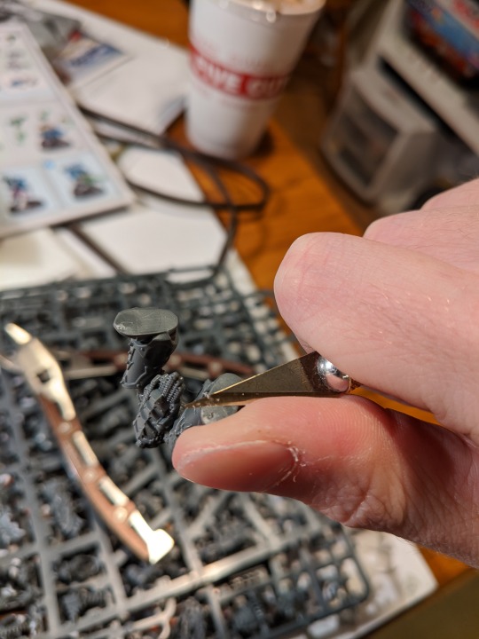
The first thing I do when I want to tackle a hobby project is gather my tools at my usual desk. At bare minimum when assembling models, you'll want a small exacto knife that can fit between your fingers like a pen, a pair of clippers, and a small bottle of superglue. I personally use Loctite, as the brand is sold everywhere and the bottles are very ergonomic and easy to handle. On top of those three tools, I use a pair of sanding instruments with two different levels of granulation, to sand down unwanted details or to smooth out imperfections. Furthermore, I have a special tool called a moldline remover that does exactly what it says on the tin- easily shaves off the unsightly lines left on the model from when it was cast from a mold. When painting, I have four brush sizes to use for inks, basecoating, details, and fine details. This is probably the minimum number of brushes one would want to employ for this sort of artistry, but brushes are very expensive. Also necessary for painting is a cup of water, and a square of cardboard to act as a pallet. I find it's also important to have a nice cup of tea with you, regardless of whether you're painting or building. Hobbying's first and foremost a relaxing, stress-relief activity, and nothing maxes relaxation more complete than a piping hot cup of tea.
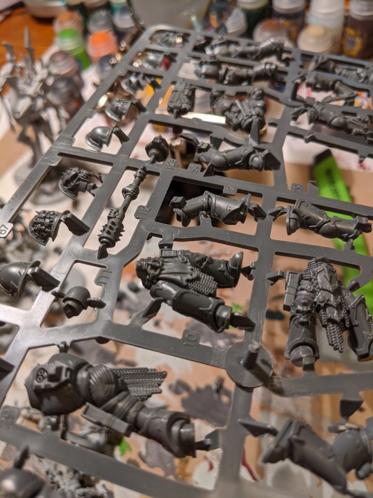
When you first open a miniature kit, you'll notice the parts are all connected to a plastic scaffolding called a sprue. I start modeling by removing a number of parts from the sprue using the clippers, and cleaning them up with the knife. For this showcase, I've removed all the parts necessary to assemble one member of this infantry squad. I'll spend quite a while fussing over each part, making sure I've hidden the places where the parts were connected to the sprue, and shaved down all the moldlines. After a model is glued together, it can be hard to reach some areas with a file, and thus it's much more prudent to handle all the imperfections now. Once all the parts are liberated, I test-fit the interchangeable parts, like different heads or guns, to see what would look the coolest. Once I'm satisfied with equipment and pose, I use the glue to set it all in place. The glue dries completely after about fifteen minutes, but I always wait a day in between building and painting.
Unlike building, which I usually do in peace, I go out of my way to pick out music to listen to while painting that suits the theme I'm going for with the army that model is a part of. The sword-swinging soldier I assembled the other day featured in the photos hails from an evil, brutal band of undead warriors, and so while painting them I listen to a lot of old school rock and metal. For this new model, a more organic looking alien rifleman that is a servant of a vagrant, mysterious alien race, I like to listen to piano solos when painting them. Anything to help me stay in the right mindset.
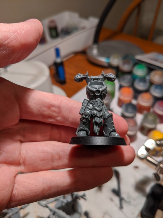

I changed models halfway through the showcase due to the improper temperature for spray painting. Before you can use the brushes, each model must be sprayed with a base coat that helps the traditional paint stick easier, and adds a slight tint to the colors you'll apply. If the temperature is too low, the spray will not dry properly and the model will look ugly.

To begin, I sprayed this model in a light gray, as it will complement the turquoise and gray scheme I'll paint over it. After waiting a few hours, the base coats are applied.- turquoise for the main body, with light gray secondary colors to accent it. The details on the miniature like tubing and gemstones I paint brass, to give the model a bit of metal to catch the eye. I paint the gun casing a darker shade of gray to keep in line with the color scheme, but also to differentiate it as not part of the wielder. Lastly, the cloth is painted a muted green color, to bring a more grounded, military aspect to the alien rifleman, which is called a wraithguard.

The next step in painting is washing. To wash a miniature is to apply a shade, kind of like an ink, into the recesses of a miniature to simulate dramatic lighting. Washes come in many colors,so for this miniature I've selected a black wash for the gray areas, and a reddish brown wash for the brass areas. Black sits on the monochrome scale, and thus is perfect for the secondary armor color. I selected red and brown for the brass to give it a warmer hue, and make it really pop. The turquoise is a special kind of base coat that automatically functions as a wash, allowing me to tackle the main armor color in one swoop. Because the model is very vibrant and bright, I will only apply the shade to the recesses, instead of on the whole model- I don't want to darken all the color down. When applying paint of any kind to a model, it's very important to apply a brushful of the paint you want to use to your pallet, and thin it down with water until the paint becomes slightly runny. Thinning your paints and applying multiple thin coats will always get you better results than fewer thick coats. Thick coats of paint run the risk of congealing into recesses and clogging up the nice details of a model.
It's almost inevitable that one makes mistakes while painting something of this size, and shaky hands can exacerbate this issue. To mitigate mistakes, I set my elbows on the table and bring my hands close together, in a pose the internet likes to refer to as the 'triangle of power.' When I do make mistakes, it's not too difficult to simply go back over them with a few thin coats to correct them. Once the mistakes are fixed, I move on to the last stage of painting the wraithguard itself.
The next step is highlighting- using thin paints in small quantities to brighten the raised areas of a model, picking out important details in such a way as to make it look like the light is catching them. This is mostly applied to raised surfaces and edges. For an example, I apply a lighter gray tone to the outside edges of the alien soldier's eerie faceless mask, to make the armor color stand out. Here I also apply a much lighter brass back onto the metal details to bring some of their sheen back, and a more vibrant green onto the cloth to make that color really attract the eye.

The last step in painting a model after the highlights have been applied and the mistakes fixed is called 'basing.' This process aims to make the model's circular black base much more pleasing to look at, and to simulate the terrain the model may be fighting on. I wanted to continue the theme of eerie, alien majesty for this army, and to that end I wanted to make it look like they were standing on the moon. To accomplish this, I start with a special texture paint, which is a paint that's had granules of sand added in to make it chunky, like mud. I apply the grey mud to the base with a piece of sprue, because doing so with a paintbrush will ruin the brush in short order. Before it fully dries, I add some pools of PVA glue, and set some small pebbles into the mud on top of the glue piles. This will give some definition to the terrain, and make it a bit more hostile. Once the glue and mud dry after about two hours, I wash the pebbles with black wash. The next step is to use a technique called drybrushing to apply more color to the base. Drybrushing involves taking a larger, flat brush, and getting a bit of paint into the bristles. Then, rather than applying it to the pallet and thinning it, I rub the brush forcefully into a paper towel, until most of the paint is off the brush. Then, I lightly feather the brush over the terrain and partially over the model's feet, leaving faint traces of color. I used a darker gray for this, trying to emulate the dark side of the moon. Next, I drybrush a lighter grey over the rocks and the raised areas of the mud. Lastly, I drybrush an almost white color to catch just the edges of the rocks and the absolute most raised areas of the mud. Once the base colors are applies, I apply black to the outside edge of the base to make sure it looks clean and crisp, and the model is complete.
This lengthy process goes into each and every individual in a tabletop army, from soldiers to tanks to fighter jets. There is infinite depth to the craft, and it is a painstaking but very rewarding hobby. Sometimes it can be difficult to get up the motivation to try once again to improve your craft, but inspiration can come from absolutely anywhere. I try to keep my mind as open as possible when working on a hobby project, and I never know where it will take me.
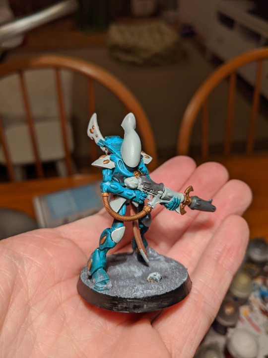
0 notes
Text
Adtwixt - News: Top 17 Napkin Holders
Black Salt & Pepper Napkin Holder
Black Salt & Pepper Napkin Holder - Salt & pepper and napkin holder. Does not come with napkins or salt and pepper shakers. 6″h x 6″w x 475″d. Our designers are so creative, they see art in everything this multifunctional caddy was inspired by a vintage wrought iron gate and lattice fencing perfect for our blackstone salt & pepper shakers.
InterDesign York Houseware, Napkin Holder for Kitchen Countertops, Table – Bronze
InterDesign York Houseware, Napkin Holder for Kitchen Countertops, Table – Bronze - This napkin holder looks great on your dining room table or other areas where a hand towel or napkin would come in handy. York accessories for around the home feature durable construction in a variety of finishes to complement your décor with classic american styling. Features formed wire in stylized shapes. Constructed of durable steel wire.
Pro Chef Kitchen Tools Stainless Steel Modern Napkin Holder – Serviette Dispenser With Dinner Eating Utensil Design On Metal Caddy for Home and Restaurant Kitchens
Pro Chef Kitchen Tools Stainless Steel Modern Napkin Holder – Serviette Dispenser With Dinner Eating Utensil Design On Metal Caddy for Home and Restaurant Kitchens - Napkin holder is a terrific choice thanks to its utility and aesthetically pleasing design this napkin holder will lend your table a sleek modern look its unique design is guaranteed to add sophistication and class to any table setting the borderline design gives you a full and stable support and grips your napkins very well they will not slouch or fall over it also ensures that you stop struggling with unwieldy rolls of kitchen wrap and napkins. Napkin holders are high quality with each corner is processed with meticulous attention to detail stainless steel holder designed with the consumer in mind sure to last a lifetime and leave your hosts with pleasant memories it features a stable base to keep it freestanding and can keep napkins dry and off the table convenient, quick and hygienic this kitchenware provides classic style, practicality and elegance perfect as a gift or wedding party present. Kitchen napkin holder lets you keep your napkins organized and close at hand designed to keep napkins organized on kitchen tables and countertops it is attractive and effective you will love it for its ability to hold the napkins in place and dispense keeps them clean, neat and readily available for when you need them comes in a compact measurement that holds your napkins without problems and carefully pierced to let air through to keep them dry. Serviette holder is a great addition for the dining room, kitchen counter, picnic table, or office provides an appealing visual presence in your dining room table and will bring you lots of compliments it matches your stainless steel salt and pepper shakers well and takes up less space on your table multifunctional holder that can also be used to hold other kitchen accessories the 3 unique cutouts in the holder looks nice and will not tear your serviette. Easy-to-grab, one-at-a-time napkin dispensing high-capacity design and commercial quality that is perfect for restaurant use engineered to provide simple and reliable dispensing rust resistant, sturdy steel construction that continuously keep your napkin in place also great for banquets and formal events this napkin dispenser is a life saver for those tasty meals you’ll be servings up easy to wipe clean and dishwasher safe.
Stainless Steel Serviette Napkin Holder Dispenser – Cocktail Wine Glass Design for Kitchen and Restaurants by Pro Chef Kitchen Tools
Stainless Steel Serviette Napkin Holder Dispenser – Cocktail Wine Glass Design for Kitchen and Restaurants by Pro Chef Kitchen Tools - Put a creative spin on organization by using it as a bill keeper with whimsical charm simply put the bills in order with which they should be paid and never miss a payment again the stainless steel holder centralizes other important documents such as passports, birth certificates, and social security cards on the occasions when they need to be handy and avoid being misplaced they also serve functions like sorting mail or holding file folders. The smooth steel surface of the napkin holder makes it easy to decorate for alternative household uses multiple napkin dispensers can be put to work as a simple kitchen storage solution attach them together to hold kitchen towels, cup lids, magnets, and other miscellaneous items every day items make their way to the kitchen because it is the center of a home with this napkin dispenser holder everything you want to keep track of will be safe. Absolutely love it or we’ll give you a full refund try it today and buy with confidence with our simple, hassle-free, no-questions-asked 100% money back satisfaction guarantee if for any reason you aren’t happy we will immediatly refund your full purchase price tough durable construction and fine workmanship details are confidently backed by the manufacturer’s risk-free lifetime replacement warranty that covers any defects when purchased from authorized resellers. A high quality napkin dispenser is hard to find end the search with a well-crafted elegant stainless steel napkin holder it has a great design, smooth finish, and keeps napkins organized in one centralized location available in different variations, this modern steel holder is designed to fit anywhere the home put it in a kitchen, dining room, on a sideboard, or bar for convenient yet stylish access to napkins anytime one might be needed. The choice of steel cut outs provides an opportunity to add a little bit of flair to a utilitarian and somewhat bland task by holding napkins use it to display colorful, patterned, or textured napkins for your own easy yet fun style statement the napkin holderâ€tms stainless steel exterior will compliment any room in your home while the cut out can serve as a cool accent its durability ensures that it will last for years to come.
Creative Home Natural Marble & Wire Napkin Holder with Copper Finish, White
Creative Home Natural Marble & Wire Napkin Holder with Copper Finish, White - Crafted from genuine natural marble for long-lasting beauty with a dual wrought iron wire napkin holder. Dimensions 7-1/2″ x 4″ x 5-1/8″ h. Hand wash recommended wipe clean with a soft damp cloth. Keeps your napkin neatly stored and within reach. Timeless design complements any home or kitchen decor.
Spectrum Diversified Euro Flat Napkin Holder, Satin Nickel
Spectrum Diversified Euro Flat Napkin Holder, Satin Nickel - 75″l x 75″w x 25″h. Horizontal design allows the napkins to be set inside, so napkins won’t fall out. Sturdy steel construction. Size 2-1/2-inch h by 7-1/2-inch w by 7-1/2-inch d. Neatly stores standard size napkins. Looks great on any countertop or table. Designed to keep napkins dry and organized on kitchen tables and countertops. Satin nickel finish. Raised base keeps napkins dry.
InterDesign Twillo Napkin Holder for Kitchen Countertops, Table – Metallico
InterDesign Twillo Napkin Holder for Kitchen Countertops, Table – Metallico - Great way to keep your cooking supplies, favorite sauces, spreads and seasonings neatly organized and easily accessible. Convenient handle for easy mobility. Perfect for indoor and outdoor entertaining. Holds standard size napkins. Napkin holder for standard paper napkins^classic design complements any home or kitchen décor^great for the dining room, kitchen counter, picnic table, office^made of durable plastic with woven plastic accents^31″ x 55″ x 59″.
Godinger Dublin Standing Napkin Holder
Godinger Dublin Standing Napkin Holder - Crafted of quality crystal material. Famous godinger silver art brand. Manufactured in china.
Spectrum Diversified Twist Flat Napkin Holder, Black
Spectrum Diversified Twist Flat Napkin Holder, Black - Most of spectrum’s products are protected by intellectual property rights including issued design patents and pending design patent applications. 25″w x 3″h. Spectrum products incorporate original designs created by and for the exclusive use of spectrum. Add a great centerpiece to your kitchen or dining room table with the decorative twist flat napkin holder/small bread basket. Measures 8″l x 8. The spacious design is a perfect for holding dozens of six and three quarter inch square napkins. This napkin holder keeps your napkins off the table and easily accessible, while providing you with the versatility of using this piece as a bread basket. Made of sturdy steel, its sleek and simple design will add a contemporary touch to your home. Protection for certain products may be provided and/or augmented by other federal and state proprietary rights including trademark, trade dress and copyright rights in the appearance and design of the products.
Spectrum Diversified Ashley Flat Napkin Holder, Bronze
Spectrum Diversified Ashley Flat Napkin Holder, Bronze - 00″height. Protection for certain products may be provided and/or augmented by other federal and state proprietary rights including trademark, trade dress and copyright rights in the appearance and design of the products. Spectrum products incorporate original designs created by and for the exclusive use of spectrum. Most of spectrum’s products are protected by intellectual property rights including issued design patents and pending design patent applications. Measures 7. 75″width x 3. Designed to coordinate with any decor. Made of sturdy steel. 75″depth x 7. An appealing approach to napkin organization and storage, spectrum’s ashley flat napkin holder is ideal for any tabletop, countertop or napkin worthy location and occasion.
Tropical Nautical Starfish Lunch Napkin Holder
Tropical Nautical Starfish Lunch Napkin Holder - Measures approx 6″ x 5. Napkins not included. Tropical nautical coastal starfish lunch napkin holder. 5″. Made of metal. 5″ x 2.
Godinger Silver Art Copper-plated Round Mesh Napkin Holder Rings, Set of 4
Godinger Silver Art Copper-plated Round Mesh Napkin Holder Rings, Set of 4 - 9 inches wide x 1. Jazz up your table setting with this set of four copper mesh napkin rings. 8 inches high. Material stainless steel, brassseason or holiday all seasonsexact color copperset size set of 4color golddimensions 1. 9 inches long x 1. Great for everyday use or special occasions, the rings are suitable for year-round beauty at your dinner table.
Spectrum Diversified Patrice Napkin Holder, Hammered Bronze
Spectrum Diversified Patrice Napkin Holder, Hammered Bronze - Add a great centerpiece to your kitchen or dining room table with the decorative patrice napkin holder. 75″height. Measures 2. 75″depth x 6. Protection for certain products may be provided and/or augmented by other federal and state proprietary rights including trademark, trade dress and copyright rights in the appearance and design of the products. Made of sturdy steel, its graceful and timeless fleur de lis motif creates an elegant design that adds a touch of sophistication to your home. Spectrum products incorporate original designs created by and for the exclusive use of spectrum. 50″width x 6. Most of spectrum’s products are protected by intellectual property rights including issued design patents and pending design patent applications. This napkin holder keeps your napkins off the table and easily accessible.
Sonoma Grape Hand-Painted Ceramic Kitchen Salt & Pepper Shakers with Napkin Holder Set, 82528-1 by ACK
Sonoma Grape Hand-Painted Ceramic Kitchen Salt & Pepper Shakers with Napkin Holder Set, 82528-1 by ACK - Salt & pepper shaker 4 1/2″h. Napkin holder 4 1/2″h x 4 1/2″w.
Sorbus Utensil Caddy — Silverware, Napkin Holder, and Condiment Organizer — Multi-Purpose Steel Mesh Caddy—Ideal for Kitchen, Dining, Entertaining, Tailgating, Picnics, and much more (Black)
Sorbus Utensil Caddy — Silverware, Napkin Holder, and Condiment Organizer — Multi-Purpose Steel Mesh Caddy—Ideal for Kitchen, Dining, Entertaining, Tailgating, Picnics, and much more (Black) - Convenient & easy mobility- lightweight and portable with convenient handle for easy mobility- quickly transport condiments to an outdoor barbecue or use while tailgating outside the camper/rv. Mesh utensil & condiment caddy(black), serve and display everyday utensils, napkins, and condiments, with a built-in four compartment mesh caddy featuring a convenient carrying handle -keep your favorite sauces, spreads, supplies, and much more organized, upright, and easily accessible. Multi-purpose- versatile and holds a variety of items (not just condiments and utensils), store office supplies, crafting materials, beauty products, toiletries, tech/gadget accessories, and much more. Clever organization- holds plenty to keep items organized and within reach -features 1 large and 3 small compartments-classic black finish complements any theme or décor with a stylish mesh design, durable and made of steel-accommodates standard size napkins and utensils-measures approximately 875″l x 687″w x 487″h. Indoor/outdoor entertaining-ideal for hosting indoor/outdoor dinner parties, events, and holiday gatherings-add multiple caddies if you entertain large groups of people frequently.
Fat Chef Salt Pepper / Napkin Holder
Fat Chef Salt Pepper / Napkin Holder - Material -ceramic. Item -salt and pepper combination. -Material ceramic. 88959 features -fat chef collection. Overall product weight -2 lbs. Style -traditional/novelty. Overall depth, front to back -8″. -Color white and red. 5″. Size -4″, 6″. Dimensions overall height, top to bottom -6. Overall width, side to side -4″. Color -white and red.
Lenox Holiday Napkin Holder
Lenox Holiday Napkin Holder - Best of all, this legendary collection is created by lenox, america’s first name in home entertaining, known around the world for offering a unique combination of design artistry and superior quality for over 125 years. The festive holly and berry design decorates both sides and is accented in 24 karat gold. It makes a beautiful accent for your table or countertop every holiday season. Introduced in 1974, the lenox holiday pattern became an instant classic, growing in popularity to become the #1 seasonal dinnerware in america. Keep napkins close at hand with this holiday porcelain napkin holder. The iconic holly design combines with the legendary quality that only lenox can offer to create a collection that has transcended generations to help make the most special time of year even more memorable. The confidence that lenox has in the unmatched durability of every product they offer is backed by a lifetime breakage replacement policy to guarantee many years of enjoyment to each customer. #Kitchen
Adtwixt - News
source https://adtwixt.com/blogs/news/top-17-napkin-holders
0 notes
Last Seen Blogs

godkvsk
Untitled


little-medusa
Calm Seas & Bright Stars

yxindakodus
Untitled

side-of-honey
Side of Honey