#the soft colours the texture the composition of this means everything to me
Text
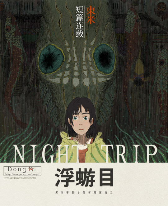
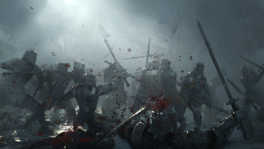
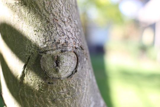
Young Clive playing a small music box for baby Joshua | “The Art of FINAL FANTASY XVI” (art by Kazuya Takahashi)
#the soft colours the texture the composition of this means everything to me#i’m going so crazy over my ffxvi art book finally being here my phone camera roll is full of images from it#final fantasy#final fantasy xvi#ffxvi#final fantasy 16#clive rosfield#joshua rosfield#concept art#kazuya takahashi#my poster book from SE for this game also came and i’m buzzing to put them all up there’s like 40 posters
88 notes
·
View notes
Note
Hi! I’m love anon and to be honest this started as a response to a hate anon but now I’m just thinking everyone deserves love so here I am.
It’s genuinely so amazing that you run (/are apart of not 100% sure) the daily solidarity art tumblr. That is such a cool thing that shows your dedication to a craft (something that is really hard to build and maintain) and shows you have a love for something so simple as one guy. It’s amazing that you care for a content creator and character enough to engage in this show of affection daily.
Your use of pain markers is so cool I love the texture you created with them and the colours are gorgeous. I really love the way the pieces are surrounded by like lines (looking at the phycological defect artwork) it adds huge compositional interest (? Hope that’s the correct term).
I’m not sure what my favourite artwork of yours could be but one that really stood out to me was Pearl underwater. The emotions you captivated there was really impressive and I think the line you chose to caption it with just added to that. I love the soft, cool toned colour pallete that while different from a lot of your other artwork you pulled off extremely well. You really added interest to it with the existence of that pink rock that seems to stand out and I think makes it clear that Pearl is almost stuck in this underwater environment. The fact that that rock sticks out highlights how Pearl fits in. I also love the lighting in that piece and how it comes down in lines from above it looks really cool!
I love the dogwards canary au as well I think it’s a really interesting idea. I really like the way you use what Martyn canonically said in third life to inform his reaction to Jimmy. The way you balance his care for Jimmy and his anger at him is really interesting. I also love the portrayal of Jimmy having mixed feelings on Scott. I really like the moment where Jimmy acknowledges and points out the bandage on him, and then acknowledges that Ren’s touch was soft but immediately goes back to wondering if Scott is alright. I think that’s a really talented portrayal of Jimmy’s feelings around everything.
I think your third writing piece in the saw huge improvement from the other two (the other two were great but I think you were really coming into your own on the third). The way you created the anxiety that Jimmy was feeling was so impressive. And from what I know I think you had an extremely accurate characterisation of Scott. God and the subtle mistake Martyn made is so interesting and realistic. Martyn was trying to help Jimmy and get him out of the way but Jimmy didn’t see that he just saw Scott again. That’s so interesting and a really good portrayal of trauma.
Anyway for anyone else out there please send love your favourite artists, rebloggers, analysts or whatever else. Sadly I can not give love to everyone even though everyone deserves it so if you guys could help that’d be amazing. And keep creating or doing whatever you do!
Dude.... goodness... I thank you so much, its hard to even put in words how much I appreciate it. This is completely not something I was expecting at all. Ive never thought I'd be appreciated in that way and for you to notice those small details in some of my works is truly flattering. This means a lot.
Like gen A LOT.
Thank you so so so so much <3
6 notes
·
View notes
Text
CONCLUSION TO DISRUPT
Incorporation of sustainability in practice-
Started with the broken heel as symbol in cardboard which isn’t my favourite as it wasn’t structurally sound, getting to reuse old cardboard. I then used this inspo for my soft sculpture sign, which was something very new to me and I used old fabric scraps. For the clay pieces, I painted them using old expired makeup pigments and low quality old paint to use it up. For the “I hope this email finds you” painting I got to use some old dried out brushes for texture and I learned a lot from it’s creation.
Workshops completed:
3D cardboard and paper- Nice starting point as a very versatile medium but I don’t love what I produced
Soft sculpture- VERY proud of this workshop- I had never worked with fabric in this way and it opened my eyes to the possibilities
Dog Life Drawing- Not very project relevant but so fun and boosted my drawing skills which helped with the project. One of my favourite workshops.
Drawing with clay 2D and 3D Explorations- Fun experimentation and I made some of my favourite pieces here using different techniques from the workshop
Me & You- Challenging but a fantastic exercise, I hope to use charcoals more again in the future. made some paintings throughout the week but i wish i had maybe worked on a larger scale for some
Publication- bookbinding was challenging but something i would love to incorporate into future projects, learning about riso print was great and i look forward to doing more
Manifesto- collage and riso combination to make posters- very happy with how my work turned out
Evolution of my theme throughout-
Starting out with “corporate disruption”, disrupting rigid symbols of arrows, keyboards, cctv etc. ; Before relating these to burn out, pressure and exhaustion and tying to my own experience of dealing with expectations and trying to find the “reason” for the work you do.
Researched artists and seminars-
James Casebere
Erik Jensen
Bart Vargas
William Betts
seminars -
colour theory, composition, relief print, drawing, 3D studies, exploring ideas, using a cameraphone
Main takeaways-
I had planned to make 3d office inspired by James Casebere but didnt have time. I wanted to take my collages to risograph print and I had the layers done but didn’t have time. I also would’ve liked to glaze my ceramics but I needed to be away from college and used up old materials instead.
While there are some things I’m not happy with, I definitely learned something from everything I created. I’m most proud of the clay keyboards, the watercolour self portrait and the Defy Expectations risograph prints as I believe these capture the emotion and meaning behind the Disrupt project most.
Bye Disrupt project!!!!! cheers :D
0 notes
Text
and all the magic we made (12/20)
a/n: well i had another mental breakdown :/ so here's another sporadic update for you all :) thanks for sticking through with this story!
-
Rebekah runs around, from store to store, touching and feeling every item of clothing that catches her eye.
Sparkles, sequins, furs, silks -
Kol quickly realizes how grave of a mistake this shopping trip with his sister has suddenly become.
The length of his stay in his hometown still remain indefinite - last night was a surprise, seeing his niece and not to mention his brother’s infamous Hayley Marshall was certainly something he wasn’t expecting.
If anything, their interactions serve as inspiration for his next move.
Hence the dress shopping, of course.
“So tell me, brother,” Rebekah hums, fingers grasping at a white dress, holding it against her body as she stares at herself in the mirror. “Why are we here anyway? Are we shopping for a special someone? A girl, perhaps?” She stammers on.
“Bekah,” Kol chides. “Such curiosity will bite you in the arse,” he remarks, snatching the dress away from her and placing it back on the shopping rack.
She rolls her eyes, sighing as she follows him down towards the aisle of more colourful textures and fabrics. “Oh c’mon,” she breathes. “You know how starved I am for some hot gossip.”
He doesn’t answer her until she grabs his sleeve and starts whining.
Tell meeeee!!
“Fine-” Kol huffs, shrugging her hand away.
Then suddenly, the perfect dress catches his attention.
It’s a gorgeous purple gown with a mermaid tail flair at the bottom, the sleeves are adorned with pink pearls and with dark lace details.
“It is for a girl,” he confirms, grabbing a hold of the garment. “I like her, I wanna show her how much she means to me, there, satisfied?” He holds the dress up to show it to his sister.
Rebekah smiles, admiring the beauty of the outfit. “Very much,” she nods.
After that, he takes her through even more stores - a purse, jewelry and shoes is a must for a girl so special.
“Okay,” he sighs, grabbing a matching set of pearl earrings and a necklace. “Now it’s your turn,” he comments. “You and Marcel, is this thing happening again?”
She takes her time, taking a deep breath before proceeding to offer him an answer. “I don’t know,” Rebekah tells him. “I care for him, deeply, I always have. I’m just not sure he feels the same for me.”
The look on his sister’s face brings him no joy - he’s used to teasing her about her crushes, even embarrassing her about them. But, this time, Kol feels sorry for her, she loved so honestly and so carelessly.
It filled him with both admiration and pity.
“So, you’re looking for closure?” He wonders.
She raises a brow, thinking of his words carefully. “I am not sure,” Rebekah admits. “Maybe,” she whispers softly.
Kol doesn’t say anything else for a bit - he picks out a pair of heels, a small clutch to complete the outfit. His sister approves of his every choice, it comes so easily to him, almost as if he didn’t need her guidance anymore.
“If you ask me,” he finally says. “I always thought you deserved much better than a man who is too afraid to love you.”
His sentence hits deeper than she can ever imagine.
She finds herself asking when exactly did her troublesome little brother decide to become all grown up.
-
Hayley’s weekends are often spent alone with her daughter.
Normally, other girls her age are busy studying for college exams, hitting up a club or party, going on dates -
Being with Hope Marshall beats all of that, she thinks.
Even when she wants to hang out with Klaus Mikaelson.
“Ready to go, sweetheart?” He smiles widely as he’s at the door - reaching over to pick up his daughter.
“Yep!” Hope cheers.
Now, her weekends are spent with him. Sandalwood scented cologne, old books in the backseat, a picture of his siblings hanging from the rear view mirror of his car -
“So this gallery,” Hayley says, sitting beside him as he begins to drive them towards their destination. Hope is all settled in her car seat, distracted by her toys. “Is this the type of date the old Klaus would take me out on?” Hayley adds on.
Klaus offers her a confused look. “Old Klaus? A date?” He asks.
She doesn’t offer him much - she simply presses her lips together until they become a thin white line. “C’mon,” she shrugs. “Don’t beat around the bush. Old Klaus did that a lot, I wanna know what this new Klaus is like.”
He hasn’t heard this allegory from her before - he supposes that it’s how she’s rationalizing their whole relationship.
You see, in Hayley’s head, there are two Klaus’.
Old Klaus was aloof, a rule-breaker, the type to get high with her on her couch, to cut class on the school rooftop, to leave without a kiss goodbye in the morning.
And then, there’s new Klaus. New Klaus is…different. He’s more determined, more direct about what he wants.
He’s kind - kinder than she last remembers him.
“Well,” at last, he stops the car, arriving at the gallery. “New Klaus likes to keep you on your toes,” he smirks, leading Hope and Hayley inside the paintings section.
“Ah,” she hums, looking around the large room. “So not much has changed,” she realizes, looking back and seeing the strangest smile on his face.
They both follow Hope into another inter-connected room where only one single portrait is hung up on the wall.
It’s a forest of wolves, tall trees, greenery - and a young Hayley Marshall sitting amongst them.
She stares at it awe, Hope freaks out, screaming and jumping up and down.
Mommy! It’s you! You’re in the painting!!
“New Klaus still likes to surprise you,” he reveals, allowing her to take it all in.
-
By the time Kol finishes his shopping, it’s basically evening.
Rebekah had gone home for a rest while he still continued his way down the street.
The trip there is quiet - his head is filled with thoughts, how he’s gunna see the girl of his dreams again, how she’s probably just eagerly waiting for him.
So eager in fact, that she opens the door for him before he can even knock on it.
“You,” Davina releases, with her hair in a messy bun, bunny pyjamas and slippers still on. “Came back,” she completes.
“That I did, darling,” Kol tells her, smiling. “Just as I had promised you, all those years ago,” he offers.
Davina thought she’d be more upset at him.
Their relationship had been a strange one - meeting per chance at the local occult club, unexpected encounters at the music store, catching each other reading Edgar Allan Poe by the marina -
They started dating soon after, and connected on every single level.
For the longest time, their relationship felt like fate.
Until, that is, Kol Mikaelson, along with all the other Mikaelsons, mysteriously left town.
(Although, granted, he did still keep contact with his lover, unlike the rest of his siblings, who were so far deep in self-hatred that they denied themselves of this).
“What do you have there?” Davina asks, noticing the large shopping bag in Kol’s hands.
He pulls out the gorgeous gown he had gotten. “It’s for you,” he informs her. “A present, if you will,” Kol specifies.
She admires the shimmering fabric, in awe of the very romance of this gesture. “It’s beautiful,” Davina releases. “Thank you,” she smiles, grabbing a hold of the garment.
“Don’t thank me just yet,” he says, as fireworks go up in the sky.
They spell out the words
Will you have this dance with me?
-
The painting itself displays incredible technique - the composition, the brushstrokes, everything is so crisp and clear. Klaus’s talent has always been undeniable but, Hayley’s opinion of it has been…
“What do you think?”
A mystery.
“I’m guessing,” she starts, once she realizes exactly what she’s looking at. “This was made by old Klaus?” She presumes, looking at the date inscribed at the corner of the painting.
She stares at herself, immersed in the perfect image he had created of her.
“So it seems,” Klaus says. “However, new Klaus is the one who is brave enough to put it up in a gallery,” he informs her, taking a step closer so that he is right next to her.
Hayley looks and looks - passed the greenery of the scene, the tracks of dirt he had carefully painted on her arms and legs, big brown eyes burning a stare into her own.
“I always knew your work would go far,” she finally releases, realizing how carefully he had captured her loneliness in this painting.
And almost immediately, Klaus begins to laugh uncontrollably. “You said it was hideous,” he recalls, shaking his head.
She wonders why he made her look so sad in this piece - as if she had lost everything. And maybe, that’s how he saw it all, his betrayal and departure was written all over her face.
It’s the most honest thing she’s ever seen.
“Except this one,” she notes. “This piece is…”
“Nothing,” he intercepts, bravely placing a hand on her shoulder, catching her off guard. “Nothing, compared to the real thing.”
-
The drive home is quiet.
Hope is fast asleep in the backseat, little snores and soft breaths escaping her lips. Hayley looks back with a caring and loving gaze. Her daughter truly is an angel, she thinks.
“So then,” he whispers. “This new Klaus, is he up to your standards, as of yet?”
She pauses, catching his eye from the corner of hers. “Maybe,” Hayley remarks. “He certainly became a better driver, over the passed years,” she smiles.
He doesn’t push her any further, he knows he can get more out of her if he did but, this smile of hers was enough for now. He can deal with it - he can deal with her taking her time.
“Well, you’re home now,” he tells her, pulling over by her apartment complex.
She reaches over to shake Hope awake, she refuses though, still deep in slumber. “Looks like it,” Hayley shrugs, pulling away from her daughter. She strangely feels safer now, having the chance to speak more intimately with Klaus. “What do you think new Klaus would do if I tried to ask him to come upstairs?”
He thought that this moment would never come and, that, if it ever did - he would be in disbelief.
But oddly enough, Klaus isn’t in shock at all.
This is expected - he is, after all, charming as hell.
“I think he’d say,” he starts, and right then, he notices little Hope in the rear view mirror, opening one eye to sneak a peek. “You’ve got a restless little girl still listening in on our conversation,” he smirks.
Hayley turns to catch her daughter spying on them and pretending to go back sleep. “Hope,” she scolds. “C’mon, let’s get you to bed,” she sighs, finally exiting the car and taking her daughter into her arms.
Well, no use acting now, Hope thinks.
“Goodnight, little one,” Klaus tells her, ruffling her hair. “And you too, Hayley,” he lets her know, before he begins to drive off.
She watches him disappear into the night - her heart feels heavy and sinking as she notices how much she longs to see him again.
But, she is a mother first, and as much as the old Hayley would leave all her responsibilities behind and run after that speeding car - she’s not that girl anymore. The new Hayley takes her daughter, and all her old love and passion, and she walks back up to their room.
Of course, right before she enters her home, she notices a carefully placed envelope on her door.
It reads the words - Invitation for Hayley and Hope Marshall.
-
#klayley#kolvina#hope mikaelson#klope#the originals#the vampire diaries#to#klaus mikaelson#munea writes
26 notes
·
View notes
Note
Do you have any art tips or a step by step on how you color??
Please its ok if you wont
sure, i can give a tiny bit of insight on how i colour. Under the readmore:
At this point of my personal understanding, i would say colouring is just two things: 1) making sure your colours look good together, and 2) lighting (if u decide to even do lighting/shadows, that is)
The 1st one you can achieve by doing palette studies based on photographs or other ppls art, or by doing trial and error, or apparently by learning colour theory (im too dumb to understand it) and also applying digital tricks like overlay layers and also fiddling with hue/sat/brightness/contrast until it looks good to you. Below is my latest Audrey drawing without the overlay layer (left) and then with the overlay layer (right).
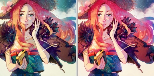
It’s magic, right!? I’m so used to having an overlay layer in every drawing now that these days i just slap one on before i even start colouring lmao. usually 20-50% opacity, usually a saturated orange or pink and then i’ll adjust as i go. mostly i just do trial and error like fitting wooden toy shapes into the right holes - my brain will go “ding!” when the arrow on the hue gauge hits a colour that looks good to my eyes.
The 2nd one, lighting, is more complex. I always say “lighting is everything” because to me it IS...it can control the entire mood of the picture. Where is the light? Is it hard or soft? is there a secondary light? What emotion are u trying to convey? and then how can you execute it? how would light look on THIS object compared to THAT object? A big part of lighting is being able to visualize your drawing in 3D. Once you can do that, you can lay down the light and shadows quite naturally depending on where your light source is. this ties into the way you DRAW things tho (like, u have to already be thinking about 3D while in the drawing stage) so i dont wanna get into it since this post is about colouring.
Lately I’ve been p lazy and doing all my major shadows on a single layer, set to “Shade” on sai (it might be something diff on other programs idk), 42% opacity (for this particular piece), and clipped to my folder of colour layers. So that means almost all my actual colour layers are just flat colours! Here’s my main shadow layer all by itself without any base colours (left), and then shadows + base colours (right):
sometimes i’m already thinking about lighting while im still sketching the picture. sometimes i’m already thinking about lighting before i even start to draw. For this particular pic I ended up with 5 different layers for lighting:
1) all shadows (42% opacity Shade layer);
2) some extra shadow under her hat (72% opacity Shade layer), which then allowed me to create the cool hat texture by simply erasing bits of this layer
3) a soft angelic backglow coming from behind her. this layer goes somewhere above the lineart layer to give the illusion of light spilling in front of her and fading out her edges;
4) secondary blue reflective light coming from the....sky im presuming, but mostly because i just felt like the drawing needed some blue lol;
5) a 55% opacity overlay layer containing a trace amount of vignette in 3 of the corners + an extra glob of light just to the right of her cuz i was experimenting with different instagram filters near the end and found one i rly liked and tried replicating it on sai 😂
Here’s the picture with only my main shadow layer (left) vs the picture with all 5 lighting layers (right):
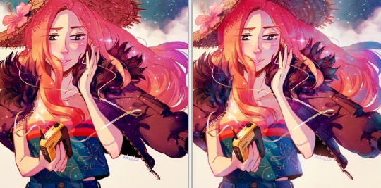
The pic on the right makes her look more like she is Somewhere. I think I could’ve pushed the depth even more but i wasn’t confident enough. And sai doesn’t have blur tool :(
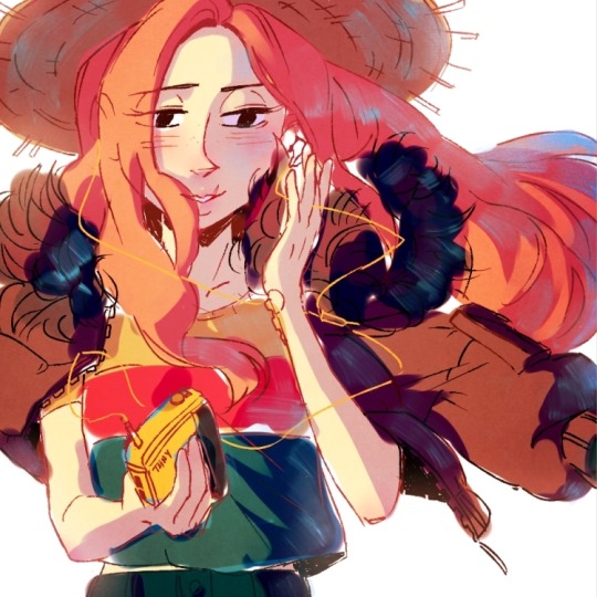
I also always have at least one layer that i name “extra”. The Extra layer goes on top of the colours/shadows/lineart layers, but under the overlay/glow layers. This is for extra details (including extra LIGHTING details) that I wanna add like extra sparkles, extra straw hat strands, hair strands, hair shine, zipper shine, etc all for that “extra” touch of realness. I don’t do all this stuff at the end, though. I have my Extra layer created pretty early on and i go back to it and add to it when I need to. Here’s what it would look like without the Extra layer (left), and with it (right). Try to find all the extra bits i listed:

One last note is i don’t colour one thing at a time. Before I start, I slap on all the base colours and all the shadows super roughly, just to check if my lighting and colour choices look good TOGETHER and make the entire composition look good. no point in spending hours rendering all the lighting and shadows on the character’s hair if in the end u decide there was actually a better lighting design u could’ve gone with. So here’s the rough colouring plan I made for myself before i started rendering for real:
im not sure if this was useful at all but i hope it was interesting at least! if you want to see my actual chronological process for colouring you can watch the gif of wips i compiled here: [link]. You’ll notice that i edit my lines as i colour. I think it’s good to be adaptable, and to be ready to go back and change ur lines to benefit your lighting, colouring, and overall look of the piece.
Also here’s the finished version of the pic: [link]
#Anonymous#miruask#miru art#tutorial#there's a lot more i didnt mention#i didnt mention my texture layers#cuz i felt too ashamed lol im just a sham artist using textures and overlays and texture overlays#textures can absolutely make ur colouring look interesting tho so try some out!#i didnt use a texture for the hat tho i did that all on my own and im proud#i also didnt mention locking ur lineart layer and colouring the lines themselves#but thats such an age old technique that im sure everyone already knows it
31 notes
·
View notes
Photo
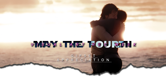
MAY THE FOURTH Visual Art Rec Week
Day 2: Gifset Appreciation
Echoes Of The Shots Ring Out by @thereigning-lorelai
What I love about this fanwork: The colouring and scene choices complement the song lyrics of Meet Me On The Battlefield by SVRCINA beautifully, and all these things combined make my heart clench a bit, not gonna lie. A lovely composition, equal parts hopeful and heart-breaking!
Scatter My Atoms Across The Universe by @thereigning-lorelai
What I love about this fanwork: Once again, poem choice combined with fitting scenes make this an amazing set. In this particular case, I adore the font choice and style, especially the combination of different sizes and weights, it complements the feel and brings attention to the key parts of the poem, making the final piece a really moving one.
I bet you could sometimes find all the mysteries of the universe by @thereigning-lorelai
What I love about this fanwork: Just one word… OVERLAYS ♥ Okay, I have a giant soft spot for gifsets and edits that use overlays, especially when the merging and combinations of scenes packs a punch, which this gorgeous set does. The quote by Benjamín Alire Sáenz is extremely fitting for the characters and the feel of the set, so that may have made my eyes all watery for a moment there.
In The Face Of Terrible Odds by @thereigning-lorelai
What I love about this fanwork: Gorgeous overlay use, font choice and styling, not to mention the animated texture overlay complements the composition nicely, gives it an overall feel of ethereality that melts my heart —more so considering the tragic canon ending of Jyn and Cassian, ethereal is such a special word to describe their love, imho.
Wherever I go by @thereigning-lorelai
What I love about this fanwork: More overlays, more gorgeous colurings, more lovely quotes and beautiful font styling. The whole concept of home being a feeling, not a physical place, is so very fitting for both Jyn and Cassian, and this set pays homage to that theme in a really touching way.
There are two ways of spreading light by @finnreyskywalker
What I love about this fanwork: Listen, there are few novelizations in this world that always bring me to tears no matter how many times I have read it, Matthew Stover’s ROTS’ novelization is definitely one of those, so the fact this set uses part of one of the most gorgeous and meaningful quotes in the entire novel (The dark is generous and it is patient and it always wins – but in the heart of its strength lies its weakness: one lone candle is enough to hold it back.// Love is more than a candle.// Love can ignite the stars.) always gets me very emotional. Aside from that, the design of the gifset is lovely, star overlays on quotes, clever use of shapes and layer effects to convey and match the meaning of the quotes used… a wholesome and gorgeously done set! ♥
You thief, you plunder from me by @finnreyskywalker
What I love about this fanwork: Another concept that I adore in gifsets/sets in general is when creators base their work and/or get their inspiration from non-anglophone sources, I adore the possibilities and worlds of depth and meaning using non native English-speaking material entails. The song used as reference has lovely and deeply moving lyrics, the symbolism of falling in love with your heart being stolen is both beautifully expressed in the song and conveyed in the gifset. The font used is lovely, and I think fits the set and its feel quite nicely!
There may be distances between our limbs but there are no spaces between our hearts by @finnreyskywalker
What I love about this fanwork: A collection of little Jyn and Cassian moments that show the progression of their dynamic and relationship. The caption (“There may be distances between our limbs but there are no spaces between our hearts. We long to be one.”) is certainly moving, especially in an angsty and heartbreaking way, if we consider the canon ending, right?
Trust by @finnreyskywalker
What I love about this fanwork: Gorgeous colouring and use of overlays, bits of scenes that combined are deeply moving and, at least for me, make me wanna cry a little bit —especially considering the use of the beach scene vs the hangar scene, okay? Another thing that I love of this set is the flower blooming animation overlay, it’s an evocative touch for love as a symbol, and how it bloomed unexpectedly between Jyn and Cassian.
Snarky Couple by @jynandor
What I love about this fanwork: Aside from the gorgeous gif and the lovely colouring, this gifset never fails me to make me laugh out loud, that caption is very very fitting. Snarky indeed.
It’s a tragedy by @jynandor
What I love about this fanwork: Listen, this set right here is beautiful and heartbreaking, because indeed Cassian and Jyn’s story is a tragedy, and the fact they couldn’t get at least the solace of being together after everything makes it all the more tear-inducing, imho.
In Peace, may you leave this shore by @thorthorbinks
What I love about this fanwork: A lovely first set! The quote chosen is deeply moving, and has a heart-warming hopeful edge to Jyn and Cassian’s relationship ♥
27 notes
·
View notes
Text
I'm watching the entire series of Game of Thrones for the first time. I've made my way to season 3, making sure to watch as many commentaries as I can. Last night I listened to the Set Design / Costume Design commentary for S3 Ep 4: "And Now His Watch is Ended".
I know most historical costume Enthusiasts / Critics either don't touch, or make exceptions for Fantasy productions and on the whole I agree with that. But something about the Game of Thrones costumes (and how the show's popularity has impacted costume design on productions actually set in the medieval / Renaissance time period) has just really been bothering me.

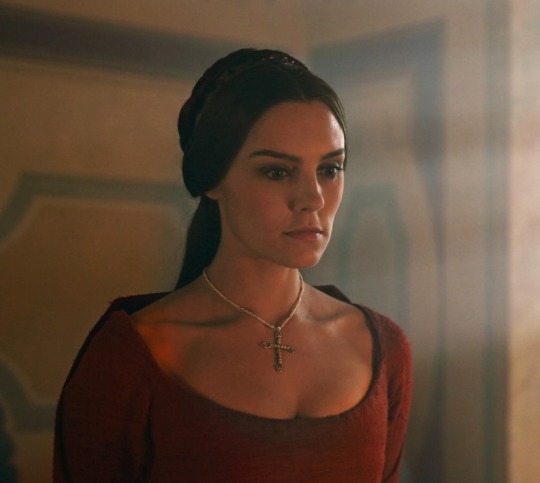
(Perhaps you see what I mean here with Contessina De Bardi in Medici: Master's of Florence and her sneaky mini structured neckline)
It may be a couple of things, but lots of the ... insights from Michele Clapton shed some light on this for me. I have a few questions.
First: North of the Wall, we spend some time in this episode with The Night's Watch at Craster's Keep. Of Craster's wives, Clapton said [Disclaimer this is not an *exact* quote because I couldn't find a transcript anywhere and my sister sent back the Netflix DVD and I do not have an idetic memory - but the important parts of the comment are, in my own estimation, accurate] : "With Craster's wives I got this idea of them just having bits of rabbit, whatever they can get, woven with grass..." this raises in my mind, SO many questions.
Firstly - we ARE north of the Wall, yes? Where, as we have seen, the ground is just about ALWAYS covered in snow, or 90% mud. So where is the grass coming from? And also what they are wearing is so clearly not grass?
This also provides a segue into my second question.
Do sheep exist in Westeros?
Why is it that this show has such an aversion to wool? Every man wearing protective clothing is wearing Leather (or rather I should perhaps say "vegan leather"). Every Hearty Weave (TM) appears to be an attempt at Linen; and every Fine Lady is wearing Silk satin, or if you're Olenna, silk brocade (in obviously hot weather, because naturally elderly ladies benefit from heat stroke).
I've not seen one woollen cloak. Not. One wool... anything really. I ask myself "Why?"
100% natural wool is wondeful. It's naturally flame retardant; it keeps you warm; it breathes well; it's soft in a light weave; it's strong in a heavy one; its water repellent. So what is with this endemic erasure of wool? Even productions like 2018's Mary Queen of Scots have had costume designers like Alexandra Byrne who, when searching for a durable fabric for cold and rainy Scotland, came out with a wardrobe comprised entirely of DENIM. Which, as we all know is the WARMEST AND MOST COMFORTABLE of fabrics when damp. Now we all know Byrne's real reason for using denim is because it's cheap. The problem is Byrne tried to justify it by saying all of that guff about wanting a fabric that wears well in rain (Which, I cannot stress this enough- denim does not) and, of course because denim would be "ReLaTaBLe". But I digress.
All that aside, perhaps the things that bother me most are components and composition. Which is where we get into the wooly (heh) area of me being a person with interest in HISTORICAL costume, critiquing a FANTASY series.
So let's just get this out of the way: I'm not saying that anything that the costume Department did with this series was "Wrong" [with one exception, but we'll get to that when we get to it]. I'm just going to say that I don't like the way it was approached, and my reasons on WHY.
I think I have a modicum of justification for my opinions here because, fantasy is fantasy, yes but the concepts of "Fantasy" and "Medieval" have become so strongly connected that the line between them has become so blurred in the modern mind as to be almost non-existent anymore. We're in a strange cycle here. "Fantasy" was directly inspired by Medieval and over the years took more and more creative wiggle room because, the great thing about fantasy is, you can make it whatever you want it to be aesthetically. But as Fantasy and Medieval have become so intertwined, more and more creative license has been taken with the latter, so that the original inspiration has become beholden to imitate the art it inspired.
But I'll save my pontification on the modern eye and Medieval fashion for another post, and try to keep on track only as far as this affects my feelings on Game of Thrones.
My justification is that GoT is not just inspired by Medieval England/Europe in the broad sense that most Fantasy of the Sword and Sorcery variety is; it was SPECIFICALLY inspired by ONE ERA of English History, The Wars of the Roses [15th century] (with character inspiration from other eras, as recent as the 16th century).
The thing about being interested in Historical Fashion is, once you know it, you can't UN-KNOW it. For example, my understanding of the medieval approach to clothing composition is "Cut as little as you need to because sewing is tedious". You don't want to have to sew more than you have to because what's the point of that? Practically no clothing in the medieval period was tailored because why bother doing that when you can just sinch it with a belt, or lace it up the sides? Is any of that applied here? Nah. Because when we look at Sansa's dresses, look at those obviously machine stitched, perfectly pristine seams. ~whistles~.

I'll never throw shade at a costume department for using sewing machines, but I will shade them for not bothering at all to make clothing for a universe that has no sewing machines look like it was made in a universe that has no sewing machines.
I can agree with not holding Fantasy series to historical standards - to a point. To wit: as long as it's believable IN-UNIVERSE.
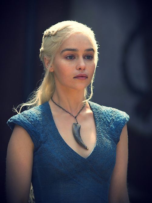
AS FAR AS WE KNOW, the GoT universe doesn't yet have Mechanized looms. Now I know that they make some pretty unreal lace in Myr, but I just can't think of any in-universe justification for the texture of Danny's blue number in season 3.
Another thing that bothers me is the proliferation of corsets and how those corsets are approached.
Here are some historical corset facts.
• the term 'corset' wasn't widely used to refer to structured undergarments outside of France until the late 18th century (1700's). Before tart they were called "stays" (16th-17th century) or "a pair of bodies" (15th-16th century)
• structured undergarments first appeared in the 15th century, as the bodice of under-dresses(kirtles) were lined with reed or Buckram to provide back and breast support and provide a smooth surface for the gown worn over it. It also provided a foundation for multiple layers of petticoats, so the waistbands wouldn't dig into your sides.
• Structured undergarments that existed independent of a kirtle or petticoat aren't in evidence until the 16th century (Elizabethan/Renaissance) and aren't widely used by all classes until the late 17th century.
• Most 16th-17th century boned foundation garments had straps, since they didn't reach down much farther than the natural waist, unless they were designed with a high back.
• Corsets, stays and other structured undergarments were never worn without a shift/chemise/slip underneath because...
• Corsets chafe.
• Corsets are difficult to clean, but shifts are easy to launder. Shifts protect your skin from chafing and protect your very expensive corset from the oils produced by your skin

(Reproduction example of 15th century style kirtle, from Prior Attire. Source video here)

(Sansa's... corset here has this bizarre low back and 18th century style tabs on the bottom? It also seems to lace only down to her navel. Not quite sure what's going on here, it really doesn't seem to be supporting her at all.)
The reason I hate, hate, hate the way Sansa is costumed under her... very suit-like gowns is because she never ever is shown (so far) wearing anything under her corset; her gowns are all long-lined, flowing and loose fitting; and show only wears (usually) one petticoat under them. So in short, I dislike that Sansa wears a corset because Sansa has NO REASON to be wearing one.
◇◇◇◇Another Thing◇◇◇◇
I want to spotlight on a little thing from the commentary that really hits on one of my larger problems with the aesthetic interpretation of this show in general.
During one of the scenes with Stannis and Melisandre, Clapton mentions that they made Melisandre's hair a darker shade of red in season 3 than it was previously. She says the phrase "sort of makes her more earthy".
Yes. Let's make the FIRE priestess more EARTHY. LET'S JUST DO THAT. AS OF THIS SHOW ISN'T "EARTHY" enough.

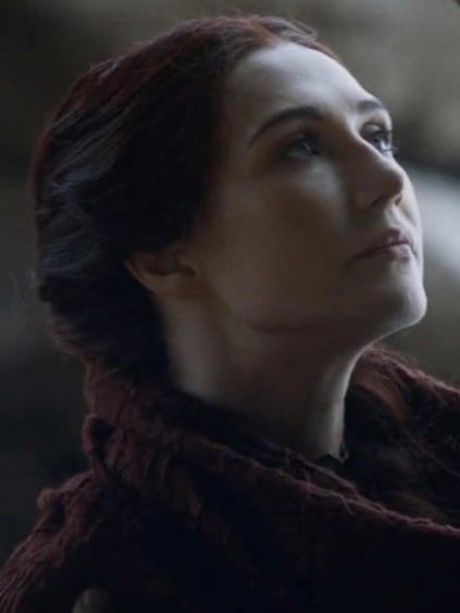
There's this fantastic quote I read somewhere by GRRM about how he loves fantasy because it's colorful, where real life is gray and brown and olive and dull. Melisandre is arguably the most colourful character in the show/series. In the books, EVERYTHING about her is Red. And not just red. She's scarlet and crimson. When she's introduced there's this fantastic description of her wearing flowing robes of scarlet silk with slashes in it revealing a darker, blood red fabric underneath.
That was passed up for a monotone, very simply cut red gown and I can't stop asking myself why a designer would scrap something like that without even trying to pay homage to it.
This show just sort of takes everything colourful in Martin's world and MAKES it gray and dark for the sake of Gritty Realism (TM). I suppose that's part of trying to appeal to a wider audience, but I just find it increadibly visually uninteresting.
◇◇◇◇ONE MORE LITTLE THING◇◇◇◇

Is this the sofa from the Study in Clue?

???
#historical costuming#game of thrones#corset#sophie turner#sansa stark#a song of ice and fire#emilia clarke#danaerys targaryen#danaerys stormborn#melisandre#15th century
7 notes
·
View notes
Note
🌯- What is their favorite food? Is there any significance to it?
Your Faith For Bricks || Accepting
{also @sohelish for asking the same question, ty hun!}
Appetite
Lesser men have made the mistake of coming up behind Melakeni and nearly lost a limb for their impertinence. But then again, that is first entirely on them for thinking to do so, and secondly...there is no chance of ever not recognising Anakin’s presence. Three days into her grave and she would still feel it, the way it flows over her like anointing oil, sweet and slick and able to get into even the smallest parts of her, soothing its way as it goes. She can explain it in no other terms than it feels like a homecoming after a long absence ~and that is very much what it is, physically~ or the immediate comfort of cool sheets and a comfortable bed after a long day’s brutal work under unforgiving sun. It is nothing short of wondrous bliss and for that reason alone she plays along by pretending to be surprised when a single elegant, long-fingered hand covers her eyes, and his breath is a whisper at her ear.
It takes all of her strength not to spin around and wind her arms around his neck, drag him to the floor with a strength and prowess she does not possess, and soak in the warmth of his embrace, the allure of his scent, the comfort of having him back and close, and a hundred other desires that flood through her system like rivers overflowing their banks during the rain seasons, until everything is drowning in Anakin. There will be time enough for that later, in the small hours, where conversation become soft kisses and tender fingers stroking through hair or across skin. Limbs entangled in pooled together pillows and blankets and cloaks to make a nest to cushion his undoubtedly aching bones.
Without a word he urges her to part her lips and while he deprives her of sight ~and the joy of hearing that hazy little echo that sometimes appears in his voice in the way he inflects certain words~ she knows he knows she would never discard any kind of request no matter how silly or how strange it might seem in the moment. Especially when she can feel a ripple of excitement rush through him. Anakin is so very rarely self-pleased, and that makes the times he is important, to be encouraged at all costs. But it is more than that. Unwavering trust between them, an unshakeable belief that neither would see an iota of harm come to the other in any real or lasting way. She doesn’t have that for anyone else. Not even her fathers.
The tip of her tongue darts outward to layer a hint of dampness across her lips, dry again on the intake of breath. She cannot help these signs of anticipation for that is what they are. Her mind crawling with an army of thought-antz as to why and what exactly he’s doing. Gentle prodding through the Force yields no returns and she gets the immediate sense that he’s both amused and disappointed that she tries, though the latter doesn’t seem to last long. Not with how firmly he presses into her back, or perhaps the way they lean into each other, though she doesn’t recall either of them moving an inch. The way their breath has synchronised. How his heartbeat seems to pulse through her vesicles.
“Ani, I-”
“Bite.”
“Beg pardon?”
“Bite.”
Against her lips she can feel something cool, firm. There is a green and bright scent that floods her senses for a moment as she inhales. Beneath his hand her lashes flutter open as recognition of that scent startles her. Eagerly, she does as he asks. Sharp teeth make quick work of the thin, waxy rind. She strains her neck slightly as it bobs and weaves just out of reach. Cheating by using the Force, considering that his other hand very carefully rests on the curve of her hip. She snaps out once, twice, catches it and reaches out for it, using the punctures from her bite to get a finger hold before cracking it in half.
The sounds she makes are one part obscene, one part indelicate as she brings one half back to her mouth and laps at the custard-like flesh now revealed. Savours the sweetness and texture, allowing it to stir memories she had long ago buried under the veneer of their Training. Licks at the nectar clinging to her lip, lets it go unheeded as it slicks her chin.
In her mind’s eye, they stand on one of the balconies instead of a storage closet where she’d been taking inventory, and the sun is brilliant overhead though it filters down shady and grin from the cultivated branches that form the balcony’s roof. Instead of the heavy, suffocating layers of their robes, they wear the gossamer fashions typical of her home-world. Between them both is a low table and a dozen more of these fruit, the warm air, the trilling of birdsong.
An image that scatters when she cannot help but turn in his faint embrace. Dislodging his hand and letting her look him full in the face, dear and beloved to her beyond all things. And for a moment nostalgia makes war adoration, a myriad of emotions flashing in the depths of her gaze as she tries to quite her thoughts enough to produce one at a time.
“Wulha! But...how? They don’t sell Zelosian food anywhere that I know of!”
If there was a place here, she’s sure she would have heard of it. Or have overheard someone talking about Wulha or ...possibly... getting sick from it because she doesn’t trust aliens to understand that the glossy black seeds are poisonous, full of a neurotoxin that causes paralysis and eventual death if cracked open.
The second thought that occurs to her isn’t a thought at all really. She winds her arms around his neck as she’s longed to do, careful to use only her forearms so she doesn’t have to unhand the fruit that he’s conjured for her by some strange, unknowable magic of his, and she struggles to rise on her tiptoes to bestow a kiss that is slightly stick due to the juices lingering on her lips and her tongue.
A kiss that is still as ardent as any she might have shared with him in the past but both in an entirely different way, with an entirely different meaning behind it. She tries to convey the deepest gratitude of this small and to anyone else seemingly inconsequential gift. To Keni though it is anything but that. In the custardy flesh she can feel the rays of her sun, the exact composition of the soil with its rich, dark loam. She can taste the rains that nurtured sprouts up and out of that earth, the sweet and lush aroma of its flowers, and even the hands that tenderly pluck them one by one from the orchards.
She, more than anyone else in the entire galaxy, alone understands too what it is for Anakin to be able to not only procure this rarity but to share it when his first inclination should have been to eat it himself. But he didn’t. From wherever he’d gotten it to the time he returned to the Temple and sought her out, he’s kept this both hidden from others and from her, though he should have blinded her through the Force with his excitement and nerves.
When she steps back after letting him go, her smile is radiant, and half-slitted eyes take him in with avid curiosity colouring all of her own presence with the unspoken questions bubbling under the surface.
“Thank you, Za’lali. For... being you. For knowing. For everything.”
Melakeni holds up the half she hasn’t already started eating, offering it to him.
“Let me tempt you?”
#mahalo!Shady <333#Images of Broken Light|Anakin Skywalker#Pools of Sorrow Waves of Joy|Anikeni#Across the Universe|Star Wars AU#Seeds of the Past|Padawan Chronicles#mynameisanakin
1 note
·
View note
Text
𝕾𝖊𝖊𝖐𝖊𝖗𝖘 | 25/11/19
When I initially heard of the content for this brief, I couldn’t help but get excited. I have a soft spot for illustration and concept art, as well as world building and writing (especially fantasy). After reading through the brief for “Seekers”, I immediately thought of a short story I have been writing for around a year and a half at this point, the plot and context fitting perfectly with the challenge that the brief sets.
During the morning we briefly went through the good things and the things that “need improvement” from the past two briefs;
Good:
Responding to the workshop and technical skills.
This includes how each person within the class have responded to the challenged on a technical level, being really good.
Developing ideas past the workshop activities and building technical skill through repetition and synthesis.
This is purely based upon the development each individual have gone through and made thus far and exploring beyond what the brief asks to do, as well as using more primary reseach at a higher rate.
Understanding technical terms and their use within the specific subject.
This describes how well we do at resiting all the terms thrown at us.
Need improvement:
Drawing & Repetition
Make sure to draw often; ideally every day, but in general just as much as possible.
Drawing from observation- draw from primary research!
We do this a little, but we have to keep at it and stick to it.
Evaluate and conclude
It’s important to make sure to evaluate and conclude at the end of each blog post; “What have I learnt and what will I do?” Also try and be more conclusive and forward with the evaluations. It’s also important that we make sure to keep reflecting upon everything we go through each day that we work.
Visual language
Our research needs to talk more about the visual language; more about what you can see and why this is important to you and the work you have done and will produce.
✄┈┈┈┈┈┈┈┈┈┈┈┈┈┈┈┈┈┈┈┈┈┈┈┈┈┈
𝕾𝖊𝖊𝖐𝖊𝖗𝖘
(2D problem solving)
Aims and objectives
Be able to analyse and research a 2D problem in art & design.
Be able to use an integrated approach to 2D problem-solving in art & design.
Be able to use evaluation to support solutions to problems in 2D in art & design.
Using an integrated approach means to apply what other things we have learnt as well as integrating all the ideas we have, to create a successful concept, story and narrative for this brief.
✄┈┈┈┈┈┈┈┈┈┈┈┈┈┈┈┈┈┈┈┈┈┈┈┈┈┈
What have I learnt, and what will I learn now?
I have learnt:
Rotoscoping
Character turnaround
Model sheet
Frame by Frame = sequence
Illusion of life
Digital programs (photoshop & illustrator)
I will learn:
Character narratives
Fantasy
Frame by Frame animation
Key poses
Primary observation and research
Concept art
✄┈┈┈┈┈┈┈┈┈┈┈┈┈┈┈┈┈┈┈┈┈┈┈┈┈┈
Are there different types of characters?
Protagonist
Antagonist
Sidekick
“Damsel in distress” & “Male hero”- try and subvert to be inclusive and original!
Ice breaker task - Key terms
Find the definition for the following terms (these need to be presented in your production file in your own words to establish the character design part of your project):
Who is the Protagonist?
This is the main character or one of the major characters in a play, film, novel, etc. It is not at all unheard of that the protagonist is a heroic figure for. They make the key decisions and experience the consequences of these decisions and actions. Protagonists usually go through a journey to learn and evolve upon themselves.
Who is the Antagonist?
They are the rival of the protag. A person who actively opposes or is hostile to someone or something; an adversary. They are often portrayed as characters with a dark background; an example of this could be an evil ruler that grew up in an abusive environment or something alike.
What is an Archetype?
This can be defined as a very typical example of a certain person or thing, often very generalising/stereotypes, but this is not how you would define archetypes in storytelling specifically. Archetypes can be defined as for example; the sidekick or comical release character (the jester), the mentor (wise), the innocent, the explorer, the hero, the lover, the ally, the trickster, the guardian, the shadow, the ruler, the friendly beast. Essentially, they are different roles.
The protagonist should:
Be someone the audience can identify with through empathy.
Go through changes/stages during the quest (emotionally or physically)
Break rules and makes mistakes but is always good at heart, putting others before themselves.
Quest:
A quest is a journey that someone takes, in order to achieve a goal or complete an important task. Accordingly, the term comes from the Medieval Latin “Questo”, meaning “search” or “inquire”.
Heroic protagonist (definition given from the brief):
The main character within a story and told a narrative that goes on a dangerous mission against all odds to save a group of people or a society. Sometimes, the hero sets out on a quest to find a symbolic object or person and bring it or them back to his/her/their home. They also have a particularly large presence in Medieval romance, folklore and Greek and Roman mythology, and have been playing an important role in fiction since the earliest examples of English literature.
What does the fantasy hero look like?
Artists to take inspiration from
Good/Hero/Protagonist:
Simon Bisley
Andrew Maclean
Luke Pearson
Bad/Villain/Antagonist:
Frank Frazetta
Pendleton Ward
Jeffrey Alan Love
Task:
Put together 2 similar “slides” in keynote (hero/villain) with 3 visual examples on each. We then printed them out and then answered the following questions in note form around the artists we chose;
Describe the visual language (line, texture, tone, colour, shape, form) using descriptive words & sentences
What does this visual language (the way it looks) communicate about the character/personality?
In your opinion, what visual characteristics of the artwork make the example particularly heroic or villainous?
Good/Hero/Protagonist:
“Hey, you.”
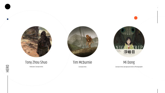
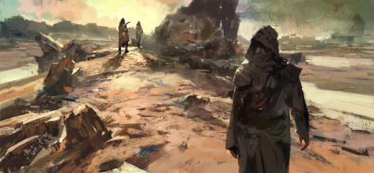
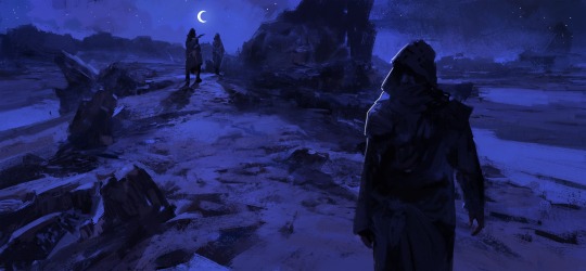
Describe the visual language (line, texture, tone, colour, shape, form) using descriptive words & sentences
Tony Zhou Shuo is a very inspiration artist in my eyes. In the majority of his artwork, he manages to convey shape and readability clearly by using minimal strokes. This is something I have learnt to understand is key for illustrating concept art or general illustrative work for stories. An example, different from the use of shape, is the texture of the brushes he uses. They are rough, creating a feel of sand moving across the rocky desert.
What does this visual language (the way it looks) communicate about the character/personality?
To me, it feels mischievous, but not necessarily in a villainous way; which is what drew me in to this piece in particular when attempting to find some inspiration for my own character/characters. The hooded figure in the foreground is the main subject, looking back towards the sound of the strangers, thinking the hooded person is just the same to them, a stranger. This automatically makes your eyes wander to the figures in the background, that then point back to the hooded figure. It’s a very smart approach for conveying storytelling within a still image. As an illustrator in particular, it is crucial that you can convey the wanted message or meaning without the use of motion or sound; this is much like in film-making or book writing; if you are vague or limited in the way you tell the story, the viewer automatically fills in the blanks.
In your opinion, what visual characteristics of the artwork make the example particularly heroic or villainous?
The fact that the overall mood of the painting is portrayed to be bright and warm gives me a feeling of the character in the foreground not actually being “bad”, just questioned (the title being “Hey, you”) and potentially unwanted. I suppose an example of this could be Assassins Creed. The main characters within this world are feared and unwanted by many since they are assassins sent to kill, yet they are not portrayed as being the villains of the story, but in fact the opposite. It all depends on how you choose to portray the character in a given scenario. It can very easily be altered, which is what I did to prove that this point stands. I did this very quickly by just adding a multiply layer and some stars and highlights (as if the hooded guy now is in the spotlight, caught off guard, now indicating that they are up to nothing good.):
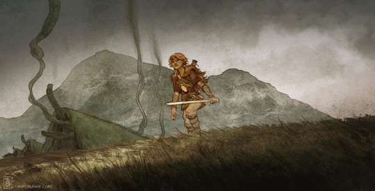
“Viking Boy”
Describe the visual language (line, texture, tone, colour, shape, form) using descriptive words & sentences
I absolutely adore the art style of Tim Mcburnie. It is very stylistic, but it has its own unique flare to it with the use of brushwork and texturing. Primarily this is seen in the landscape. I think he uses different pictures of watercolour and setting the layer mode to something like overlay to create those moody and strong, gritty textures. With the art style being heavily stylised compared to Tony’s work, he uses line very efficiently. Despite the line work being relatively loose and messy, it still manages to make the subject/subjects (the boy and the Viking huts ((village?)) + smoke in the background) stand out without feeling as if they are completely out of place.
What does this visual language (the way it looks) communicate about the character/personality?
The visual language used for this painting in particular, manages to communicate the rough environment that was the Viking age (793–1066 AD). Back then things worked more primitively; death often being brutal and inevitable if either sick or on the wrong side of the border to enemy territory.
In your opinion, what visual characteristics of the artwork make the example particularly heroic or villainous?
The composition I find to be really appealing in this particular piece. The way that the boy feels as if he’s gone from his home in the village behind him to begin a journey. He looks young and his expression resting on his face communicates that he seems nervous and wary of his surroundings. To me, he seems innocent and not a person based upon anything evil; like a hero in the making.
“Night Trip”
Describe the visual language (line, texture, tone, colour, shape, form) using descriptive words & sentences
For context, Night Trip is a short comic story done by the artist Mi Dong. I chose this piece in particular (the cover for the story) for multiple reasons, with the main one being his use of line. The comic itself is only illustrated using line work, which isn’t uncommon in comics, but even the cover itself portrays what you can expect in a very clear way. This is what really drives the interest to this Mi Dong’s work in particular. The use of colour and value for this cover picture has clearly been thought about; For the values, it is easier seen when making the illustration black & white;
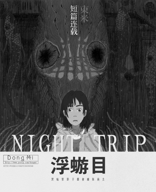
When looking at the desaturated version, the values already speak clearly by themselves, even without the aid of colour. The subjects base value is much brighter than the backgrounds base value. This makes sure that the viewer can differentiate the subject from the background without a struggle. It is also worth mentioning that the choice of line has also been used to create texture, which works very well as a stylistic approach since it matches all the other aspect of this illustration that I have gone over previously.
What does this visual language (the way it looks) communicate about the character/personality?
The overall feeling that I get personally is a mix of “overwhelmed”, “daunting” and “fear”. This I believe is based on the fact that the texture of the line work plays such a big role in making the piece come to life. If there were no texture and only flat colour, it wouldn’t portray emotion as strongly and confidently as it does with the texturing applied. The texturing used in this drawing also indicates some kind of “danger”. This is purely because of the way that Mi Dong has chosen not to use any texture on the main subject; in fact, there has only been used flats for the foreground subject- signalling a sense of purity compared to the looming figure in the background.
In your opinion, what visual characteristics of the artwork make the example particularly heroic or villainous?
I think that with everything mentioned about this piece of artwork, It definitely leans toward the feeling of “heroic” if you focus on the main subject, but I also definitely shares traits of “villainous” characteristics if focusing on the background subject. Without knowing the content of the comic itself, the figure seeming to be looming in the dark and behind the subject, the figure might be a distorted version of the main subjects; indicated by their eye colours being the same; infant, they share all the same colours. Weather that’s nothing but a stylistic choice, or of a deeper meaning, it works quite well, because it lets your mind wonder “What does this mean?”, “Why does the person look so afraid?”, “What are they afraid of?- Why are they looking at me? am I the monster?” That is why this cover is successful. It makes the reader want answers, therefore willingly indulging themselves into the story, narrative and plot-line, on their own quest for answers based upon their curiosity.
Bad/Villain/Antagonist:

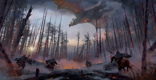
“Dragon hunters”
Describe the visual language (line, texture, tone, colour, shape, form) using descriptive words & sentences
I chose this piece for several different reasons. The obvious being; the dragon. My entire plot is based upon the lore of dragons and how they are hunted down by men, so this was great inspiration! The other reason is how my “villain” is not actually anyone in particular, but instead, it is the society living in the universe I have created. People are the ones killing what isn’t actually there to cause harm, but everyone believes that the dragons are cold-blooded killers. Loosely, this is the basic premise of which I base the plot in reality; We kill the earth in ignorance with pollution and plastics choking life, even in a literal sense. - In my story, mankind does this, but with the dragons. They are in the way, and the quickest way to get rid of them is by eliminating them. The drawing is highly rendered, which is what initially (alongside the use of perspective and scale) drew me into it. This illustration doesn’t need words to explain what is happening. The storytelling is so clear and loud, which is absolute key when portraying story within a limited amount of frames (or often even just by using a single canvas).
What does this visual language (the way it looks) communicate about the character/personality?
This question can be interpreted in different ways depending on who you refer to; the dragon or the hunters. The dragon seems to be fleeing from the hunters, trying to take it down. For some reason, the overall perspective and scenario reminds me of when you go hunting for the air balloons with your parents in the car to see where they land; it almost in itself feels like a quest. In the painting, it can be argued as to who the bad guy is, the dragon or the hunters? This is where, once again, ones imagination comes into play to fill out the “gaps” and attempt to answer all the questions it sparks. “Why is the forest burnt down?”, “Did the dragon do that?” If so, then why did it do that?”, “Is it evil or did the hunters agitate it or scare it?”.
In your opinion, what visual characteristics of the artwork make the example particularly heroic or villainous?
I think that the fight between whether the dragon or the men are the villain in this is what makes it stand out so much. It tells the scenario clearly, but yet there are so many unanswered questions left to be looked into. You could write an entire story just from this premise alone.
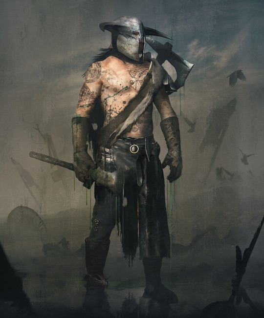
“Dragon Hunter”
Describe the visual language (line, texture, tone, colour, shape, form) using descriptive words & sentences
I chose this piece of artwork done by Julian Calle for several different reasons; one of them being the use of colour and a potential underlying meaning hiding. The colours used in this illustration are all very desaturated, which works well when referring to the content and scenario of what's happening. It gives off a strong and moody feel without the use of a wide arrange of colours. The other reason to why I chose this piece of artwork in particular, is to do with the fact that it most definitely is based on the Viking age (Which my concept is as well). You can tell by the types of weapons, tattoos and the shield in the background, all being very typical for this time period; Even the shoes are common for this time period.
What does this visual language (the way it looks) communicate about the character/personality?
Because it feels so messy despite the fact that it’s highly rendered, it gives off the feeling of the aftermath of a long battle. You can almost imagine the characters chest rising and falling to even out their breathing, with the sound of the crows’ flapping wings, settling around the dead bodies of the battlefield. - What I found to be particularly interesting is how a deeper meaning of “a new beginning” after an “end” might be lurking within the sky; behind all the fog and the dark clouds is a blue sky slightly peaking through. In old folk lore, it is not at all unheard of to have used the idea of death being a new beginning, so I thought this was a really smart detail.
In your opinion, what visual characteristics of the artwork make the example particularly heroic or villainous?
I put this in the “villain” section due to the fact that I personally really like how the hunter almost looks barbaric; fearless and bloodthirsty in battle. This is definitely something I will be considering for the design aspect of a specific army in my concept, thought it could also be interesting to try and translate this very “barbaric” design into something that leans more towards the role of a blacksmith or craftsman.
“Swords”
Describe the visual language (line, texture, tone, colour, shape, form) using descriptive words & sentences
“Swords” by the talented concept artist Max Steksov is a small collection of illustrations that focus on a heated battlefield. I have known this guys work for a while, and I really enjoy looking at his work. His eye for doing composition and making every aspect of a drawing move, despite it actually being still, is impeccable. Each detail has a meaning to it. He uses texture, but compared to the other artists mentioned in this list, the texture he uses is very fine and less saturated. I find this to be a great way of levelling out the clean feel of his style, while still conveying the gritty and harsh reality that battles that shed blood are.
What does this visual language (the way it looks) communicate about the character/personality?
To me, I find it to be very successful in conveying a lot of aspects related to war; how morbid humanity can be over things that, in the bigger picture, seems pointless at times. Since I myself have a war integrated into the plot of my story, I found this incredibly inspiring.
In your opinion, what visual characteristics of the artwork make the example particularly heroic or villainous?
As mentioned: war. Even if it’s portrayed as a heroic thing to do (fight for your pride, land, country or/and freedom), there are also some more villainous underlying factors hidden within this; at the end of the day, all these men battling and killing each other are just like one another; normal men. There are countless stories from WWI and WWII that talk about how soldiers from the enemy have become friends when holding some captive for a little while, to then be forced to murder them a few days later. It’s a dark concept, but that is also just the reality of it.
✄┈┈┈┈┈┈┈┈┈┈┈┈┈┈┈┈┈┈┈┈┈┈┈┈┈┈
Once we had finished the task given, we went over all the different types of creatures and character roles that we could think of, dividing them up into the stereotypical “Good” and “Bad” and “Unsure”, as well as “Accessories” and “Historical inspiration”, all for the benefit of letting ourselves get inspired by the words listed below for our own concept;
𝕸𝖞𝖙𝖍𝖎𝖈𝖆𝖑 𝖈𝖗𝖊𝖆𝖙𝖚𝖗𝖊𝖘:
Good:
Fairies Unicorn Pegasus Dwarf
Sage (wise/medical) Cleric Paladin
Fawn/Faun Genie Gnomes Knight
Blacksmith Druid Monk
Griffin Hyppogriff Mermaid
Berserker Phoenix Whisp
✄┈┈┈┈┈┈┈┈┈┈┈┈┈┈┈┈┈┈┈┈┈┈┈┈┈┈
Bad:
Goblin Kelpie Boggart Minotaur Hydra
Pixie Krampus Medusa Banshee
The headless horseman Orges Orcs Nymph
Cyclops Triclops Cerberus Orthrus
Warlock Kraken Succubus Direwolf
Imp Manticore Cocotrice Gorgon
Basilisk Cthulhu Syrens Zombie
Ghoul Skeleton Wraith Gargoyle
Reaper Chimaera
✄┈┈┈┈┈┈┈┈┈┈┈┈┈┈┈┈┈┈┈┈┈┈┈┈┈┈
Unsure:
Dragon Familiar Witch Demons
Yokai Trolls Yeti Giants
Centaur Kings and Queens Elf Samurai
Gladiator Rogue Prince and princesses
Kaijo Werewolf Vampire/Vampyr
Elemental Jörmungandr
✄┈┈┈┈┈┈┈┈┈┈┈┈┈┈┈┈┈┈┈┈┈┈┈┈┈┈
Accessories:
Sword Dagger Katana Axe Wand
Shield Potion Spellbook
Crystal Cauldron Spear Broomstick
Crystal ball Scroll Flask Crossbow
Bow and arrow Hammer Witches hat/hats
Armour Helmet Jewellery Flail
Bottle Lantern Knife Torch
Cloak Sickle Sai Whip Pick
Scythe Nunchucks Chakram
✄┈┈┈┈┈┈┈┈┈┈┈┈┈┈┈┈┈┈┈┈┈┈┈┈┈┈
Historical research:
Greek mythology Nordic/Norse mythology
Local witch trials Irish folktales
Scandinavian folklore Japanese folklore
Egyptian mythology Biblical references
Roman mythology
2 notes
·
View notes
Text
Composition
The official definition of composition is “the nature of something's ingredients or constituents; the way in which a whole or mixture is made up.” This could refer to many different types of things such as a recipe, piece of music, a piece of art or even the human body. Composition is such a wide topic it’s difficult to give one single definition especially as it can mean something different to everyone. Composition is used to elicit different feelings and the type of composition can alter which feelings. This means you can change composition in order to change the theme or atmosphere of piece. Although there are certain rules that go along with composition, it is equally as important to break the rules in order to achieve a desired effect and the ability to have good composition comes from artistic ability and artistic sight.
In the workshop in order to explore composition we were given key words and 5 minutes to go out and take pictures that represent these key words. The short time frame meant we had to think very quickly to take well composed photos and it was quite a difficult task. After the session, we had the next week to re-visit the key words and take a more developed and thought about photo for each, showing the thought process of the composition.
Line:
The first key word we were given was line and this is the photo I took in 5 minutes. I like the perspective off into the distance and the single line down the middle with nice texture on it but as I didn’t have long to take it, I could definitely do a better job with the composition.

This is the photo I took later on the Canon 6D. It is a much better composed photo still using the perspective but with a lot of symmetry but with a more unified atmosphere and a very nice depth of field. The subtle light through the trees gives the road more interest and texture.
Shape:
This photo was taken very quickly and I do like the use of the corner in it quite close up but I feel it is missing something. I found it really difficult to get the perspective 100% right so the kines didn’t end up perfectly horizontal.

The shapes that make up the sign in this photo are immediately obvious and I really like the bokeh effect of the background. This instantly has a much more interesting composition than my phone photo as the perspective of the sign is a nice touch and it is also slightly grafitied giving it more character and more to look at in the photo.
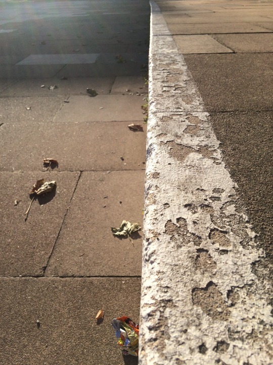
Texture:
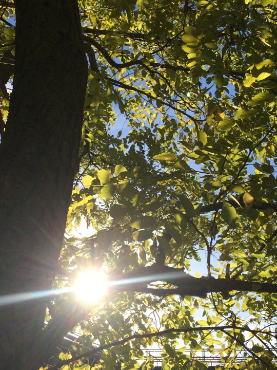
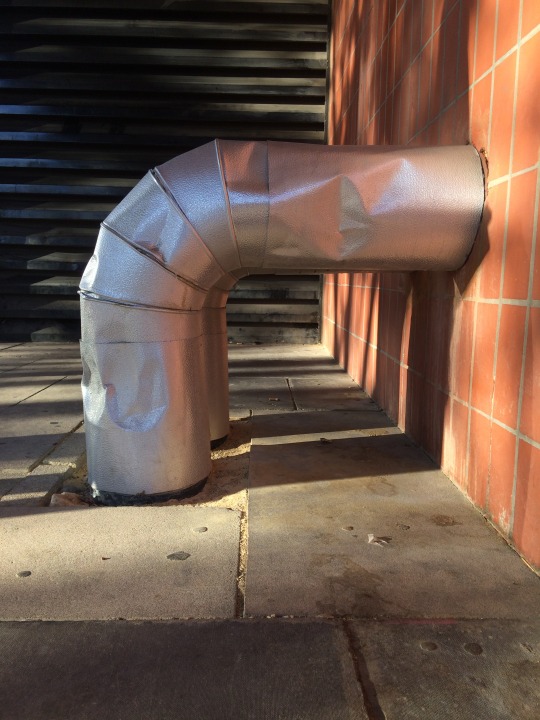
This photo is of some piping coming out of one of the buildings on the campus. I felt the composition with a short focal range gave the texture more prowess in the photo as that was what I was focusing on. The creasing and dirtiness of the pipe makes it more interesting to look at but the whole photo is slightly off tilt making it look odd.
This is the DSLR photo that I too for texture. The very soft background blurred texture has a nice contrast to the focused foreground of the bark on the tree. There is also a lot of detail and inconsistency in the bark making the composition more pleasing to look at. I really like the lighting of this photo with the sunlight projecting onto the tree trunk.
Colour:
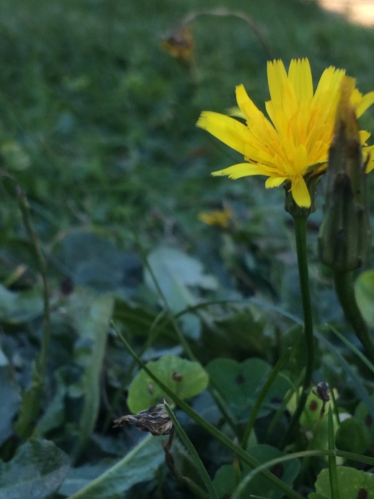
I’m not a massive fan of this photo. The phone camera isn’t good enough to capture the finer details of the leaves and flower. However I really like the contrast of the yellow that makes it stand out and become the focal point of this piece. It is also loosely following the rule of thirds.
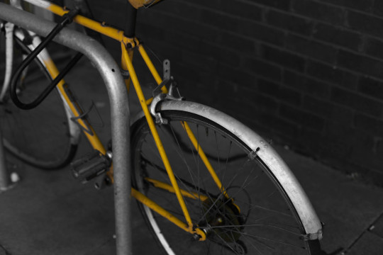
I really like this photograph. I have edited this slightly to dull the background colours slightly and accentuate the yellow in the bike to make it really stand out but it would also work unedited. The vibrancy of the bike is a huge contrast to the dull colours of the brick and path and the complex shapes that the bike creates make a very nice atmosphere and composition in the photo.
Value:
I like the glare in this photo through the leaves and the difference between the brightness of the light and the shadow on the trunk. However, I feel this photo unfortunately lacks detail and is quite boring to look at.
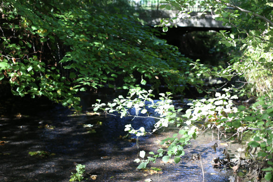
This has a much higher dynamic range and shows a lot of variation in value. The darkness under the trees and bridge makes it more intriguing while the light on the leaves creates nice balance and rounds it off.
Volume:
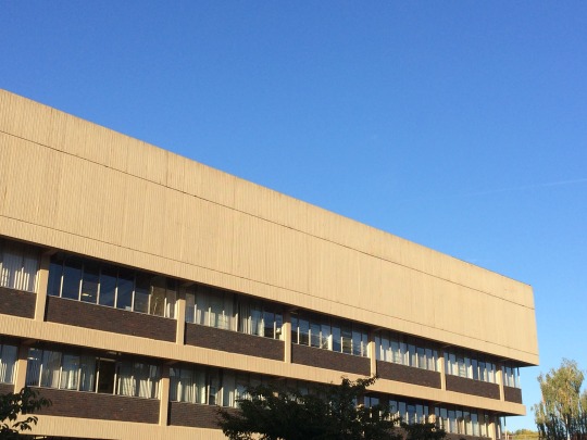
This piece has a lot of volume. the huge building sticks out into the sky and the angle makes it seem enormous. I like the flatness of the blue sky as it makes the photo very simple with the simple building shape against a flat background. However, again this seems very boring with not much artistic flair.

On the opposite end of the scale, this is showing a very small volume. The blurred background makes it seem tiny in comparison to everything else in the scene with the leaves the only place to focus on. The leaves are very mall and detailed while the rest is huge and quite smooth looking.
Space:
This photo represents space because of the space around the object. I think it has a very interesting composition and the empty space around it is key to that. The focal pipe is in the middle of the frame but the most important part if the image is everything that is in the space around it. I think it has a good balance of business.

This image takes that idea further. The sign is extremely prominent and the space around it is almost empty. There are still twigs and branches and leaves in order to give the photo more life but it is mostly there to give the bright yellow sign space and this is important for composition.
Time:

This is to show the age of the bench. The perspective makes the overall composition of it nicer but the key part of this photo is the worn wood that is very clearly old and dilapidated. I like the idea but there is something not quite right with the angle and I found it difficult to get a clean background in order to not take away from the bench.
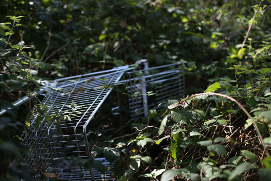
This has a much batter composition than the photo I took on my phone. I think it perfectly represents time with the abandoned shopping trolley tipped over with vines and bushes growing over and through it. The subtle blurring of the background creates more focus on the trolley and further promotes the disused theme.
Motion:
This photo was difficult to take. I had to have a friend spin the wheel of the bike in order for me to get the blurred effect I wanted. It does portray motion very well but the composition of the whole photo isn’t that aesthetic and could be done better.
1 note
·
View note
Text

plan from July:
-Drawabox lessons 4-5 (two weeks each - 2 pages of insects per day) ✗ finished lesson 4 except for the very last insect drawing
-finish 100 heads ✓
-studies for Shepard: textures, hands, draw mass relay, red/blue lighting ✓ (kinda - mostly focussed on hands though)
-study people interacting with everyday objects (hands) ✓
ACTIONABLES: use more references✓, plan out multiple light sources better✓, clean up lineart✗, reference faces/necks/hands in particular✓, figure out a less cartoony way of drawing eyebrows✗, try to define edges on faces more when painting✓, keep going with composition✗, try to do background in two sittings (?), study textures more (ongoing)✓, more figure drawing mannequinising stuff✓
Overview of August:
finished 100 heads challenge, nearly finished lesson 4 of DAB. Drawing all the insects has helped me analyse stuff better and also has improved my sense of 3D->2D space. Redid a few of them until they made more sense, which I think is probably a very important thing to keep doing at this stage of development.
Figure drawing improving. Need to keep trying to mannequinise them instead of falling back on ~the intuitive way~. Path of great resistance but great reward. Gave self permission to focus on interesting bits and not worry about finishing each figure. Thinking about 3D and hip/torso orientation is helping my unreferenced sketches too, which is nice.
Drew a bunch of hands but they were kinda too sketchy to actually help go to something more precise. Quality of hands in my finished art varied WILDLY this month, although they mostly look 'ok'.
Put the stuff I learned about head structure into practice with a painting - was good to actually try out defining nose/eye/lip planes. Need to keep practicing this, though, and not sure how much focus I'll be able to give it. aaaaa
During the painting, I also used lots of references (although my ability to use the information was pretty limited), tried to represent texture and learned how to blend in a more smooth way. Even though I'm not super happy with the way the finished thing turned out, I did get presented with a lot of new information - hopefully I'll retain some of that.
September plan:
finish DAB Lesson 5 (multiple pages per day if possible so I don't lose momentum)
study whatever the next step in the Radiorunner curriculum is
do 30min figure drawing/other studies at least 15/30 days
finish that damn comic
sketch out/thumbnail every prompt fill for October prompt lists
probably a busy month, but I got this!!
notes and improvements from finished stuff:
orochimaru: hands SUPER off and ended up being 'eh, kinda looks like a hand, whatever', forearm connection is kinda fucked, lines too messy/pointy to look graceful, hands don't really look like they're interacting enough
good points: tried several iterations on a difficult pose, arm movement is relatively clear, sense of energy
kylo: values WAY off & look washed out (I THINK because the background has more contrast??), hand is completely fucked up (too wide and lighting doesn't make sense on it), glove doesn't look like leather, mouth too low, cutout effect isn't done well (+ it isn't obvious whether it is a flat graphic effect or a physical sheet in front of him - drawing a thin shadow on his face didn't help here), level of messiness in foreground/background and kylo is uncomfortably different
good points: I really do like the colours (hues) even though the values are messed up, nice sense of energy from brushstrokes, the detail fadeoff in the shadows looks intentional (I mean, it was)
femshep: shadow values went too dark too quickly bc I wasn't sure how to handle multiple light sources, sunk-cost fallacy w/ left eye and/or nose (facial features are in different perspectives), overall shapes not interesting, neck connection to body is wrong, near shoulder looks dislocated even though I took a photo reference (possibly related to the neck being wrong - or maybe the strap going across her chest is oriented wrong too & flattened out), background looks messy, composition is boring, clothing folds aren't realistic, shading is too soft
good points: at least there IS some texture to everything, I LEARNED HOW TO BLEND, facial features are overall painted pretty well, nice transition between lightsources on face, hair texture and placement of texture looks really good, somehow the hand came out looking 3D with minimal effort, tried to do a lot of things I had 0 experience with and learned a lot
ACTIONABLES: CLEAN UP LINEART, reference/learn about neck-body connection & shoulders, mannequinise figures, take own clothing reference photos for exact pose instead of trying to abstract existing images (not skilled enough to do this yet), draw hands, study leather texture in particular (since it's a common material), start drawing in greyscale again
1 note
·
View note
Text
Deanne Cheuk
Cheuk’s reminds me of the gap between nature and humanity and how closely these things can be linked. It reminds me of the galaxy and it makes me feel very at ease/safe due to the warm colours and the way they merge together in a peaceful flow down the canvas. I believe it represents the way humanity is affecting nature and turning nature into something damaged and sucking the life out of the earth. The connection of humanity and nature being black-and-white whereas the background and some of the plants are in colour could be due to the fact that they haven't been corrupted yet.
Contrast of the medias of water colour and the harsh lines of pen and ink communicate the message to me that the human figures are having a harsh affect on something which was previously very soft and innocent, as the water colour flows in a natural and soothing way whereas the lines and contrast of black-and-white in the faces and surrounding area of the faces is jarring.
The compositional choice to have the face and monochrome area be the centre of the painting may have been to convey that humans are at the moment the central driving force and most important thing on our planet, at least from our perspective, as we disregard and disrespect the other creatures and plants which do so much for it.
I believe this art may have been made to convey the harsh affect humans are having on this planet as it is modern art and recently climate change and human's carbon emissions are all very hot topics in the news and things that people are increasingly worried about.


Ryan Tippery
Ryan Tippery's work relates to my theme as it shows humans mangled together which is similar to the way evolution has affected humans in The Time Machine, which is the book that has somewhat informed my work so far. His work differs from Cheuk's as it focuses more on the affect humans have on each other and the way we merge together to become monsters of man. Her work focuses more on the affect humans are having on nature.
It makes me uneasy to see the humans distorted in this way. His work is also much darker and completely monochrome which is different to Cheuk's work, as she includes some soft colour to communicate her message. It also includes many scratchy lines and no soft contours meaning it is harsher and more uncomfortable to view. The hatching technique Tippery has utilised means that the work has a very rough sketchy look to it and reminds me of the drawings you can find done by schizophrenics of what they have perceived their hallucinations to be.
The relationship between the faces and the circles in the 2nd drawing is very interesting as the circles remove the faces in some areas working as breaks in the drawing which portray light and could possibly be representative of the good surrounding all of the bad that is the humans. The scratchy textures are something I implicated into my own work.

Martin Wilner
Martin Wilner’s work makes me feel very entangled and trapped. It reminds me of the tubes in hospitals that would connect people to the machines that keeps them alive. It implies that these people are all connected and existed because of one another; everything follows a certain timeline and if 1 thing changes other things change. The use of black-and-white may be to make these images remind us of the olden days, as these are all historical figures and we commonly associate monochrome with things from the past.
The technique used of stippling could have been to imply the atoms and particles of these people and further emphasise the idea that if one of these particles atoms change the entire time line would change or develop differently.
The way the figures swirl together from one another and connect can communicate and reinforce the message that all of these events and people are connected in some way, even if it is just that they are all significant to the history of the world and have made an impact on how the world is today. There is a balance across the page with not one of the people sticking out more than another, from which I can infer that the artist believes all of these people are as important as one another.
I believe that these pieces of art may have been made for an audience who have strong political beliefs, to start a discussion on the way historical figures and their representation in the media can impact us today, along with the impact that they have already made during their lifetime.
0 notes
Text
Boards of Canada - The Campfire Headphase [Albums I Like]
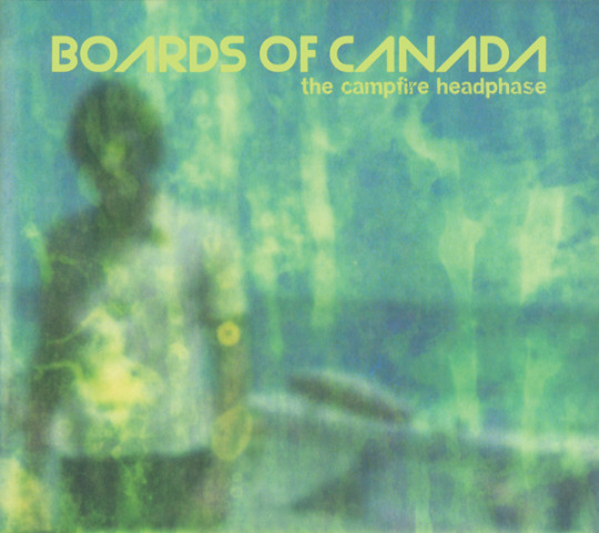
I walk. It's raining. As I move through my home town, the derelict ornateness is overtaken gradually by an infestation of trees and grass. Cars still drive past with an aggressive howl, and planes still rocket overhead, but nature has claimed this land. I find a solitary bench under a tree, the only one not covered with scattered raindrops. I sit down, and Sherbet Head plays.
It took me three years of listening to The Campfire Headphase to realise that no, that's not a forest on the cover, it's a beach. I chalk my mistake up to [a] youth and the lack of attention to detail one has in it, [b] the green tint and smudges, and [c] because this album sounds like a representation of nature in the Western world. Most Western woodland in the 21st century has been claimed and built upon by man - I am surrounded by statues in my green sanctuary, many dedicated to monarchs, while some are war memorials - but has been, and is, treated with respect by most. Even if technology is present, and sculpting much of the present world, there is still beauty we did not sculpt, beauty we could never create or replicate via synthesis.
Boards of Canada are an electronic band that have made electronic music with electronic instruments and techniques. The Campfire Headphase is the only album where they provide a spotlight for quote-on-quote traditional instruments (mainly guitar). It's soft, tender and almost devoid of any human presence, unlike their previous work which featured several spoken word samples and clips of children laughing. That's probably why the comparison is so easy for me to make. The first four songs, excluding Into The Rainbow Vein (a pretty, lo-fi synth that is an example of BOC's short tracks, one of the few of their trademarks they brought over from 2001's Geogaddi), all have lead melodies performed on guitar. Chromakey Dreamcoat's rickety, old-timey intro forms the basis for the entire song, which eventually evolves into a lush synth soundscape as the BOC brothers slowly add layers onto the track until it collapses under its own wait, quickly slowing to a stop.
A red squirrel just jumped past me.
Peacock Tail, one of the album's standouts, hides faint African percussion and handclaps behind soothing, sweeping ambient textures. If the rhythm section wasn't the glue that held BOC together before, it certainly is now. Without the percussion the majority of the tracks feature, they would turn into Eno-esque ambient pieces. While that's no means a bad thing, nor something the duo doesn't do (the last two songs forgo drums), it adds an edge to songs that otherwise would be smooth and restrained. IDM's influence from hip hop was never more apparent than with these guys, and the rhythm section is the last reminder of that on this record. Hey Saturday Sun's melancholy guitars and synth flow over an undercurrent of a sinister bassline that seems to slow down the funkiness of similar riffs on older songs like Aquarius. Slow This Bird Down's glitched drum machine makes it, somehow, sound influenced by trap before it was even a thing.
The record may sound similar when taken as a whole, but BOC's attention to detail - you know, the one I was lacking the three years before I reaaaaally looked at this album's cover - is ever present. They have a reputation for putting stuff in their songs you barely even notice unless you really pay attention; their complexity is subtle in their composition yet very noticeable in their production. '84 Pontiac Dream carries the same chords throughout but introduces a new idea almost every thirty seconds to express that progression. Oscar See Through Red Eye, the most electronic track on the album, again uses the same chord progression throughout but has several different melodies, often being performed at the same time. Try and count how many. I would, but I'm writing a review right now. I love how this album is such a cohesive and consistent sounding record but when you really analyse the songs they're all very different. The unrecognized complexity of these two's music is insane. I wouldn't even be surprised if each album's correspondence to the additive primary colours is intentional.
In the context of Boards' discography this is a strange spot. When juxtaposed with their previous release, Geogaddi (more on that one later), The Campfire Headphase is much less dark and instead looks to optimism. Satellite Anthem Icarus is wistful and yet chooses not to adopt the melancholic nature of the nostalgia it aims to be the soundtrack to. While the album may take the peace and love attitude too far in places - single Dayvan Cowboy is an overrated excursion in stoner soft-rock - it's nice to see that this album is fuelled by light rather than terror, as Geogaddi was.
The Campfire Headphase is a great album. It's easily the most gentle and steady release in the IDM genre, right when its original wave of popularity was fizzling out. Much like Farewell Fire fades into quiet dormancy, BOC put out a companion EP to this album and then...disappeared. For years. Of course, we know now this album was not BOC's final statement, but if it was, it would've been an ending to be proud of, and that's why I like this album.
FAVOURITE TRACKS: SATELLITE ANTHEM ICARUS, PEACOCK TAIL, ‘84 PONTIAC DREAM, OSCAR SEE THROUGH RED EYE
FURTHER LISTENING:
Trans Canada Highway is the obvious choice, seeing as it featured Dayvan Cowboy and is effectively the companion EP to this release. Some really good stuff in this package - everything that isn’t called Dayvan Cowboy is essential BOC listening.
BOC albums had a tradition, until their hiatus, of including exclusive bonus tracks in Japan, and this record is no exception. Macquarie Ridge is little-known outside of diehard fans, and that’s a massive shame. It’s great.
The only track released between this album and their next, the radically different Tomorrow’s Harvest, is Seven Forty Seven. Another fan favourite; it sounds like Campfire being remixed by Kevin Shields.
Next post: the SINGERS review I keep putting off.
Back to the masterpost?
#boards of canada#idm#downtempo#trip hop#autechre#warp#the campfire headphase#geogaddi#music has the right to children
1 note
·
View note
Text
Art Director week
This week we were tasked to be art directors. we were paired up and one had to choose an article for the other and vice versa.
Illustrator’s POV
I was partnered with my friend Amara, and she gave me an article to create an editorial illustration for from The New Yorker Magazine titled “ Returning to Storm King”
The text went as follows:
“Few installations at the Hudson Valley sculpture park are new, but in this pandemic summer the park’s breeze, changing light, and theatre of clouds are novelty enough.
What’s with the metal-band-worthy name of Storm King, the marvellous sculpture park—or, better, landscape with sculptures in it—about fifty miles north of Manhattan, in Cornwall, New York? I’ve just spent some happy hours there, sprung from months of art deprivation, on the occasion of the Storm King Art Center’s reopening to visitors with timed tickets. The setting is thundery enough, under the mighty brow of one of the highest mountains of the Hudson Highlands, in a valley of variegated hills, lawns, meadows, forest, and waters, along with elegant alterations that include arboreal allées and plantings with deference to native flora—some five hundred acres hosting roughly a hundred art works. I hadn’t known, until I was told during my visit, that the park’s name owes its provenance to the Romantic exasperation of a writer who, in 1853, pressed locals to rebrand their principal mountain Storm King from—get ready—Butter Hill. That nineteenth-century embrace of the hyperbolic anticipated the moxie, in 1960, of two art-loving businessmen, Ralph E. Ogden and his son-in-law H. Peter Stern, who gradually acquired much of the valley. They founded the park as a nonprofit entity, made a museum of an existing château on a hilltop, and pondered the ambient possibilities of the terrain.
In 1967, Ogden bought thirteen works from the estate of America’s greatest sculptor, David Smith. Mostly made of welded steel, they deploy a repertoire of shapes, from the surreally animate to the nobly abstract, gracing dancerly postures with lyrical drawings in space. A suite of eight of them, currently installed under cathedralesque oak and black-walnut trees, is modestly scaled. Not so the vista-dominating, gestural arrays of mostly steel elements by a favorite of the collectors since 1968, Mark di Suvero, which at times suggest playground facilities for giants. Nine of those were supplemented last year by a three-year loan of “E=mc²” (1996-97)—a tower, more than ninety-two feet high, whose converging I-beam legs are topped by flaring forms in stainless steel that grab at the sky. Also monumental are two maximum-sized stabiles by art’s foremost bejeweller of air, indoors or out, Alexander Calder. There are major works, as well, by Richard Serra, Andy Goldsworthy, and, most recently, Maya Lin, whose earthwork “Storm King Wavefield” (2007-08) represents a vast expanse of mid-ocean waves, up to fifteen feet high, with grassy undulations.
Sculpture parks proliferated, worldwide, in the second half of the twentieth century, in the wake of an identity crisis for large three-dimensional art. Modernist austerity had stripped sculpture of its traditional architectural and civic functions: there were no more integrated niches and pedestals, few new formal gardens, and an epochal apathy regarding statues—until lately! (We are now practically neo-Victorian in our awakenings—rude, for the most part—to symbolism in statuary.) Never mind the odd plaza-plunked, vaguely humanist Henry Moore. Where could one put outsized works that were almost invariably abstract—modernism’s universalist ideals persisting—to give them a chance of seeming to mean something? In nature! Conjoining the made with the unmade, gratifying both. Sculpture parks emerged as game preserves and laboratories for big art. Storm King’s early concentration of works by relevant artists of the late nineteen-sixties and seventies includes some formulaic banalities, tending to presume a surefire magic in embowered angular geometry, but even there you may savor the zest of a moment when sculpture jumped into nature’s lap. The history is complicated and obscured, in the art world, by the contemporaneous development, in the sixties, of Minimalism, which, by engaging the physical presence of viewers, shrugs off its surroundings. (The park’s chastely white modular piece by Sol LeWitt doesn’t mind a bucolic site one way or another.) As a consequence, Minimalism sidelined poetic potencies that prove their lasting worth at Storm King.
Prior visitors won’t be kept away by learning that few installations in this pandemic summer are new. The park’s changing light, breezes, and theatre of clouds will do for novelty. The best recent addition, on view until November 9th, is “River Light” (2019), a ring of nine high-flying cyan-blue silk flags that Kiki Smith derived from a sun-sparkled film she made on a walk along the East River. Wind stirs the fabric to rippling, soft applause. The ensemble suggests a rallying point for angels. Also new is “A stone that thinks of Enceladus” (2020), a piece by a young New York-based artist, Martha Tuttle, which consists of a mowed field studded with boulders and cairns and rather hectically festooned with carved rocks and molded glass stones. Close by, propped on an island in a pond, is a startling curio, the hull of an America’s Cup-grade racing boat that, in 1994, was prettily decorated with a mermaid motif by Roy Lichtenstein. Its abrupt presence, which you may less look at than gawk at, invokes the metaphysical truth that everything has to be somewhere. Storm King’s prevalent rectitude might serve as a foil for other sorts of interesting shocks, within appropriate limits.”
The images needed to be 1980 x 2560 pixels and my art director wanted me to capture the hudson valley landscape in the image.
I did some research of the sculpture park and sent my roughs in:


The third image was approved.
I tried a new technique with this piece that I have been meaning to try for a while. I used Watercolour and coloured pencils to introduce some textures in my work and I drew the background and foreground seperately so that the image could have a collage-inspired feel to it. The collage style didn’t end up as I was hoping but I think that what it ended up looking like was just as interesting.
I then used photoshop to merge them together (which was a lot more of a hassel than I was expecting as the drawings were bigger than my scanner at home so I had to scan the images in parts and photomerge them together on photoshop). I also added some extra details digitally (the clouds, leaves and ground) to create this final piece:

The art director was very happy with the image and had no major changes.
I was also incredibly happy with this piece. The new medium really worked for me and I really feel as though this piece could be a turning point in my artwork.
Art Directors POV
I found a good article on Country Living magazine that I thought Amara would enjoy illustrating, as I know from her previous work that she enjoys drawing people and animals. For this task I pretended to be an art director for Country Living magazine in an attempt to make my emails as realistic as possible.
The first email was as follows.
Hello,
I am an art dierctor for Country living Magazine, I came across your work and I would like you to create an illustration to accompany an upcoming article for our magazine.
The image would need to be full colour and 1280x720 pixels at 300 dpi
The article is as follows:
Country Living Magazine
Dogs are our oldest and closest companions, new DNA has confirmed
Pups were domesticated before any other known species
We know that dogs are man's best friend, but new DNA has confirmed that they are in fact our oldest and closest companions, too.
The study, which was conducted at London's Crick Institute, found that dogs were domesticated before any other known species. Interestingly, it discovered that humans have had pet dogs for around 11,000 years, showing just how far back our love for them really goes.
Shining light on the "inextricable bond between dogs and humans", the study is based on DNA from 27 ancient canine specimens from around Europe, Siberia and the Near East.
"Dogs are our oldest and closest animal partner. Using DNA from ancient dogs is showing us just how far back our shared history goes and will ultimately help us understand when and where this deep relationship began," Greger Larson, a co-author from the University of Oxford, told BBC News.
Elsewhere in the research, they also found that the genetic patterns of dogs were fairly similar to that of humans. This is because when humans adopted dogs, they took them with them wherever they moved and shifted, strengthening their bond.
Anders Bergström, lead author and post-doctoral researcher at the Crick, also added: "If we look back more than four or five thousand years ago, we can see that Europe was a very diverse place when it came to dogs. Although the European dogs we see today come in such an extraordinary array of shapes and forms, genetically they derive from only a very narrow subset of the diversity that used to exist."
Just another reason to adopt one of your own...
Many thanks,
Hannah Jones
Art director for Country Living Magazine.
The same day, I heard back from her with attatched roughs.
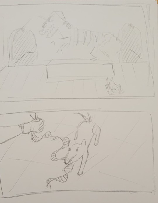
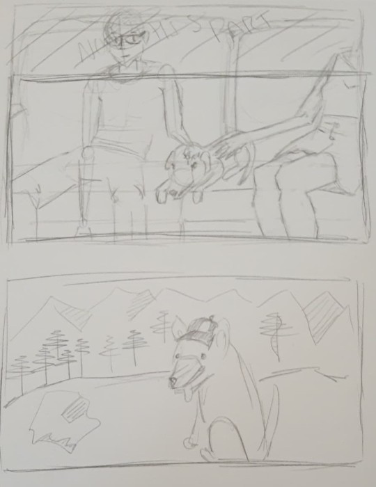
I liked the second one best as the concept was clever and the composition was very nice.
After a short while she came back with two different options of the image.
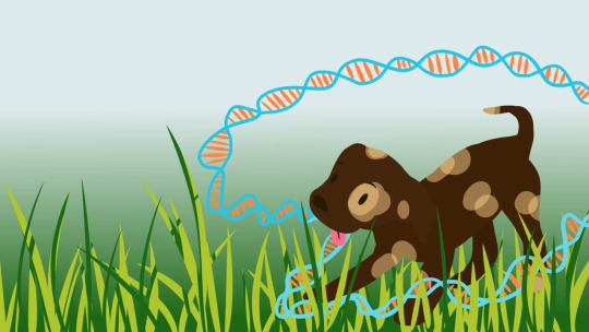
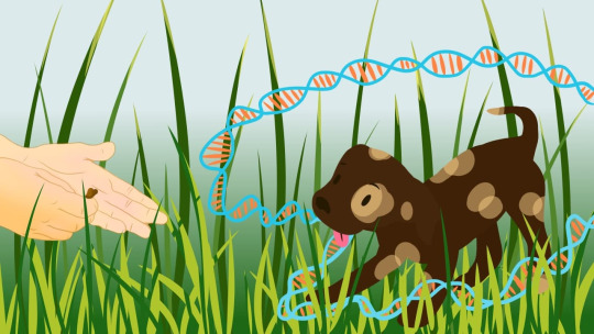
One without hands and one with hands, I prefered the image with hands as it showed the human connection with dogs more, which is what the article is all about.
Overall, I was happy with the finished image so I approved it. I think she did a really good job.
You can follow Amara’s fantastic work at https://www.instagram.com/apiple_art/
1 note
·
View note
Note
My bf and I both chew on stuff a lot, and are thinking about getting some chewelry. Money is tight right now, and I wondered if it would be safe to try chewing on other silicone things like silicone kitchenware to test whether we actually liked the silicone texture? Also if you have any suggestions for more masculine chews/chewelry please let me know. Thank you for all you do here!
Hey, anon. Thank you for the lovely words!
The problem with the silicone kitchenware isn’t one of safety with regards chemical composition in as much as it is one of thickness. If it’s food-grade silicone, it should be okay, but I’d check labels to make sure it lists things like BPA-free, phthalate-free and non-toxic. Additionally, the more it’s designed to be in contact with food or your mouth, the more safe it’ll be on this regard (especially with dyes) - a spatula is more likely designed sans dangerous dyes, but a potholder or trivet might not be, as it’s not actually meant to touch food in as much as hot dishes/pans.
Most kitchenware is nowhere near as thick as a chewable, and I doubt it will give you and your boyfriend any accurate indication as to what a silicone chewable is like to chew. Chances are very high you’ll just chew right through it. Silicone baking dishes, trivets, etc, aren’t all that thick.
If it’s just a matter of smoothness, perhaps, but if you also need to test thickness and springiness/sponginess (both things important to me as a chewer) I can’t see how you’d get this sensory information from most kitchenware items. I actually wandered around K-Mart yesterday handling everything silicone for thickness, and the closest I found to being as thick as a thin chewable was a spatula ($1.50 AUD); nothing else I saw I can honestly recommend as being comparable.
(Safety note: please detach the silicone part of the utensil from the plastic part before using.)
I would recommend seeking out a silicone baby teether instead, if you can find one without too much hassle. In my experience, they’re harder than many chewables, but the thickness is much closer to that of a chewable, and the experience is like to be more useful to you than that of kitchenware.
K-Mart no longer stocks them (here’s mine so you know what I mean), but I’d try local baby stores and department stores. The same places you’d buy affordable silicone kitchenware might also stock silicone baby teethers, and for not much more money. Considering how quickly you’re like to chew through silicone kitchenware, it might work out to be more affordable to spend a couple of dollars more on a teether instead - at least you’ll get a decent amount of time out of it for testing.
As for masculine-leaning chewables - unfortunately, I find most of Stimastic’s stuff to be more feminine-leaning, which is a shame as they’re absolutely the most affordable. You might like to check out the Ch-U Tube ($5.30 USD), the Trapezoid ($5 USD) and the Phoenix ($8.50 USD).
Everything on ARK Therapeutic comes in masculine-leaning colours and three different chew strengths, so while they’re more expensive (prices range from $10-$20 USD, most around $15 USD) there’s absolutely options. I’d check out the Super Star ($11.99 USD), the Chew Tags ($19.99 USD), the Arrowhead ($12.99 USD), the Sabre Tooth ($13.99 USD) and the Bite Saber ($13.99 USD) but much of their catalogue I’d consider masculine-leaning.
Chewigem has the Dog Tags ($19.95 USD), Skulls ($19.95 USD) and Geo Tags ($19.95 USD), all available in masculine-leaning colours.
(Local retailers for Chewigem and ARK Therapeutic can be found by Googling the name of the pendant. I get lots of options coming up for Australia.)
I’ll observe, though, that figuring out your chew strength is likely your first priority over the design and colour of the chewable. Do you chew a lot? On what kinds of things do you like to chew? If you like hard items, like wood or hard plastics, or chew through everything quickly, you’ll need a tougher pendant. If you like soft, springy items, like chewing on fabric, you’ll probably want a softer one. The listings for all of the above have some indication as to the needs they fill, but asking yourself some questions about the sorts of things you already chew on will help direct you towards choosing the best chew pendant for you and your boyfriend.
In my opinion, anon, silicone kitchenware designed for contact with food or your mouth isn’t like to be too unsafe, but I am unsure that it will give you the full testing of chewables that you’re seeking.
- Mod K.A.
#stim toy#stim toys#Stimtastic#ARK#Chewigem#USA#KMart#Australia#chewellery#chewables#category: chewing#ask#text#link#resource list#stim toy safety#informative#anon#mod K.A.#long post#very long post
28 notes
·
View notes
Text
Who Am I? Not Finished with the Blog yet
I have been asking myself this question for as long as I can remember. When I was 6, I began drawing with pen and ink. I took photos when I was young when I was allowed to, but was never allowed a camera of my own. I was always so excited when my mom got the film developed and printed, to see which ones I had taken. When I was 11, I began writing. In my 20s I started a family to which all my time was dedicated. In my 30s, I understood something was missing in my life and I went back to college. I found photography again. When I went into the darkroom for the first time, I found peace. Real peace. The pitch dark filled with the deep red lights sparked something in me I had not felt since the first time I picked up a pen to draw with. I started my own darkroom at home and Boudior Studio for intimate gifts for their spouses. I then bought a digital camera and taught myself how to use Photoshop.
But there is still something . . . missing.
Soon to come are some practice images. Those I thought would work. I love working up to a project. Taking practice shots. It helps the mind gear up. Research should always be a huge part of a project. How else will you spark the ideas?
What is a Triptych?
Most artists and photographers will know the answer to this, however, do they actually know the importance of a triptych? What does, using a triptych format, add to an artwork? Why would one choose to do this? Triptychs have been around since
(Lori McNee & Fine Art Tips, 2019)
Annie Leibovitz
The first photographer I am researching is Annie Leibovitz. I have been a long time fan of Leibovitz. Her lighting styles and creative poses as well as her sets amaze me.
I find this photo just perfect. Here we have Annie Leibovitz in casual dark grey clothing and walking boots. Everything about her screams natural, from her hair to her smile and her pose. She is comfortably resting her hands on her camera. I can only imagine it to be her favourite object. She blends with the backdrop she has chosen for this self-portrait. All the colours, save the beauty light in the background go well together. It’s an even playing field. The beauty light being backlighting her from behind and to the side causes a soft glow on Leibovitz’s hair, face and shoulder closest to it. There is enough contrast in the image to be pleasing to the eye. I do find that my eye is being constantly drawn to the light, but I still like it there. It works somehow. There is an s-curve here. I doubt Annie has much time in her day to day to take a load of self-portraits, this strikes me as a ‘I just sat down for a break and took this’ sort of image. I love the vertical lines in the wood behind her. If they were horizontal, I don't think the image would work so well for me. The light seems soft, but I am now noticing a bit more harsh light pattern on the floor but I am not convinced that is light. It looks more like a stain on the floor. This photo ‘feels’ like a working shot. It ‘feels’ like it was taken in the back of a barn studio. I love it.

Annie with her favourite object. (Phaidon, 2019)
This is such a calm image of Annie. This, to me, looks like a living areas perhaps in a studio? I’m not quite sure, but I don't think it matters. What matters is that this space is comfortable and Annie is at ease here. The contrast is fantastic, and the light feels harsh here. Perhaps a speed light? It is certainly not natural light. The composition seems to flow to the left, which feels strange to me. I like that Annie is not positioned in the centre.
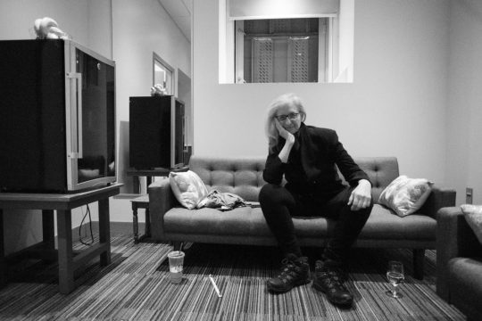
Annie Leibovitz in her space. (Frank, Frank and Nicholas, 2019)
Self-Portrait . . .
Here we have Leibovitz, a fashion photographer, as herself, on a roof-top darting (almost leaping) across in front of her camera, another camera in hand (perhaps in her left hand she holds a trigger. She is dressed all in black wearing comfortable shoes. This self-portrait depicts Leibovitz how she must feel as she moves through her life: always on the move, always working. The landscape image is on a tilt and depicts the city behind her. She is frozen in mid run. Fantastic black and white image.

(Artnet.com, 2019)
David Bailey
Another photographer I admire is David Bailey.
This self-portrait includes David Bailey and a dramatic scarf on a clean white background. The man himself looks straight into the camera. His expression is serious. There is an age of wisdom in his eyes, and a sterness perhaps. He knows what his likes and demands respect in this image.
(Maddocks, 2019)(Dazed, 2019)
David Bailey in studio. How can this not be his favourite place?

(FANTASTIC MAN, 2019)

(WOLFGANG WEBSTER GALLERY, 2019)
Richard Avedon
Richard Avedon, a fahsion photographer, in his studio . . . Richard is leaping in front of the camera. This is an excellent image. We have various studio equipment and a white backdrop. I can only imagine that his is describing what he wants his model to do. They image is stark white in areas, with almost a clean white feel in the background on the white. You can se Avedon’s shadow beneath him on the dirty floor. I love contrast, and this image is not short on that, having the blackest of blacks and several shades of ‘white’. Even the floor and white walls are delineated in the background on the left. The room feels like it is tilting slightly to the right in the direction he is leaping.

(Joeinct.tumblr.com, 2019)
Here we Have Richard Avedon with his favourite object. The film is grainy, his glasses are pushed up onto his forehead and he’s holding his beloved Rollieflex camera. The studio light is close to his face, the light is blown out and it is bouncing on whatever is in front of him as its image is reflected in his glasses. The light here is harsh, but it works. Because the light is blown out on his nose and hand, it seems to balance the light between him and the studio lamp. Where the light is shining, the image is grainy. The image is presented in hight contrast, and is overexposed bottom and bottom left and where the light is.

(billdobbins, 2019)
Again, we have Richard Avedon. This is a self portrait. I adore this, not only for the Clean White look, but also for the high contrast. Avedon is treble exposed here, or so it seems. The photographer is holding up his negative image over half of his fact. Very cool. Then we have a closer 3/4 view of Avedon’s face on the left. I am not sure what the terrycloth looking object is over his forehead. I find it distracting, bit it does add texture.

(Flickr, 2019) I could only find this image here. Will look for it in books.
Irving Penn
Irving Penn is a fashion photographer. The image below is a self-portrait of Penn himself. The mirror is cracked in a couple of places creating jagged horizontal spaces. The image has a dark quality to it, and I don’t just mean the dark contrast, or the slight purple tint. There is a mayhem in his gaze as he looks directly into the lens and this has a cubist style about it.

(Irving Penn: In A Cracked Mirror (Self-Portrait) (A), 2019)
Other Photographer’s work . . .
While the triptych below is not exactly “Who Am I”, it is close to it. In trying to analyse this image, I wondered what it was actually about.

Monica BiancardiIl Palazzo di Atlante (triptych), 2019 Shazar Gallery. (Artsy.net, 2019) “According to the Neapolitan artist, Punti di Vista is a project on light, natural or created by art, which reflects on perspectives that are always different”.
Who Am I?
Well, I’m a tree hugger, I can tell you that. I love walking in the woods and soaking up all the ‘zen’. I can be heard or even seen talking to a tree. I get this feeling off of them and I feel like this one is a male, this one a female. Strange I know. But hey, that’s who I am. I have toyed with 3 different ‘Who’ projects. I am torn actually. There is a place I love to go in Port Glasgow called Finlaystone Country Estate - A large country estate in Renfrewshire near Glasgow, seat of the current Chief of the Clan MacMillan. I always take my camera there. I shy away from too much noise. For me, it’s sensory overload, so I stay away from the more populated areas. For my first ‘Who’ Project, I am thinking of me, in the woods, talking to my favourite tree. Yes, he has a name. I am masculine by nature, even though I realise I come off all ‘woman’ I have always felt masculine. I don’t know why. I digress, there is a place there in the woods, that makes me happy. It’s an old shack full of wonderful old things. I could sit there and look at the window for hours. and for my favourite object, well, the tree of course, but, I’m not sure? Is that tree overload? I will have to toy with perspective. Also, I have a branch that sits in my studio I could use for my favourite objects. Images taken 14th September.

The 2nd ‘Who’ that I am would be showing my other artistic endeavours. I began drawing with a pen when I was 6. My darkroom doubles for my art studio. When I am really struggling, I always return to the roots of my creativity. I feel almost childlike as I sit and draw with nothing but a pencil and pen. Below is me drawing my next masterpiece, (insert laughing emoji here). So this would be my self portrait, my hut, or the woods, as these are linked would be my favourite place, and for my favourite object, in this case, would be my quill and pens and a bottle of ink.
The 3rd ‘Who’ that I am is a photographer. This is my heaven. I haven’t been able to get it entirely up and running yet. I still need the blackout cloth recommended to me. I have ordered chemicals. Waiting is the hard part. I am impatient, although, you would never know it if you saw me drawing above. So, my favourite place in this 3rd ‘Who’ would of course be my darkroom. My favourite object, my Olympus film camera, and my self portrait, perhaps me, being that only camera. I have also considered a self portrait of myself laying in my ‘rinsing tray’.
Below are my initial contact sheets
I took way more images than I am showing here. Some would call me an over-achiever. I call myself thorough; I leave nothing to chance. I would rather have more images than I need, than not enough. NOT ENOUGH=DO IT AGAIN. While I don’t mind, once the briefs begin shooting at us in rapid fire succession, “do it again” is time I might not have. My black and white film professor in America told me that it takes a 100+ photos (this was with actual film!) to get 1 good image. I live by that! The images below were taken 1st September at 8pm-ish.


In the image below, I only have a few items in Actual focus. My thought process is this - that in our lives, there are really important things, primary things, and then there are things of secondary importance, and further still, a tertiary importance. This image says loads about me. First, it is in my private place. No one but me enters here. on the back wall, there is an old calendar of Johnny Depp images, that is because I love Johnny Depp movies. He is of tertiary meaning in my life, so, he is only half there, and in the blurred portion of the image. So, if you put a level of importance on the varying degrees of focus, you, as the viewer begin to realise what is truly important to me on a creative level. I am a lover of high contrast and gloom, even in my images. Thus one would say this image is underexposed. I like extreme contrast in an image. The blacker the better. I would say I don’t know why, but I actually do. I’m just wired that way, and I take after my father. My mother is ‘of the light’, and he is ‘of the dark’.
The image of my two very good friends in the camera frame sitting behind my rinsing tray is actually of more importance than I have portrayed it. When I retake the image, I will move it possibly onto the platform of the enlarger. The troll dolls also. They are of importance to me because of my mom. So they too need to be a bit more forward.

I have many objects in my life that are important to me. I cling to the inanimate. I don’t know why. There is cold comfort perhaps. They never let me down.
There is 4th “Who” that I am. In America, when I was very dark in my thoughts, I would take my camera to a special place that was behind another of my favourite places. The Urbana cemetery. It was a beautiful cemetery with mature trees and ancient stones. I loved walking through an reading names and it gave me a boost because those people’s journeys were over, but mine was still ongoing. I used to say to myself, this too shall pass. Then I would go into the woods and take images of my tree friends. During an art exhibition, I won best of show and at a personal show, a Professor of the University of Illinois purchased my fav image from that time. My show was called, “The Coincidence of Light and Design”.
Below are only some of the images from my personal show.


Below is the image purchased by the University professor. I had printed it on rag paper large banners size. The frame was raw wood in keeping with the theme.


So, in line with these images, I went to the cemetery in Port Glasgow high up on a hill, close to wear my mother-in-law resides, and I took images there. Here are the contact sheets.


For my Who triptych, I’ve decided on a portrait format. It seems somehow right to have them side by side. I’ve never really enjoyed the horizontal/landscape. Even in my pen and ink drawings, the paper is always in portrait.
Below are the images I am thinking, out of all the hundreds I took, that I think would work best.


Now I only need to decide, and put together my triptych. Below I am showing showing my process of choosing images. I open photoshop, create a storyboard of sorts and then start inserting images I am choosing from.

After careful consideration, and after choosing images based on how they flow together, and what each image means to me, I have chosen the 3 below to be in my triptych. I wanted them to have a dreaminess about them, because when I am where I need to be to heal, it indeed feels like a dream.


Lori McNee & Fine Art Tips. (2019). 3 Reasons Why Triptych Art Is Successful. [online] Available at: https://www.finearttips.com/2014/01/3-reasons-why-triptych-art-is-successful/ [Accessed 11 Sep. 2019].
Frank, N., Frank, N. and Nicholas, M. (2019). Photographer Annie Leibovitz: Capturing Both Family and the Famous. [online] Rivard Report. Available at: https://therivardreport.com/photographer-annie-leibovitz-capturing-both-family-and-the-famous/ [Accessed 8 Sep. 2019].
Dazed. (2019). David Bailey on how the internet made everything mediocre. [online] Available at: https://www.dazeddigital.com/photography/article/34108/1/catching-up-with-the-ultimate-enfant-terrible-david-bailey [Accessed 20 Sep. 2019].
Phaidon. (2019). Annie Leibovitz on Hockney, Lennon and Instagram | Photography | Agenda | Phaidon. [online] Available at: https://uk.phaidon.com/agenda/photography/articles/2018/december/13/annie-leibovitz-on-hockney-lennon-and-instagram/ [Accessed 8 Sep. 2019].
Maddocks, F. (2019). David Bailey: Reg Kray said: ‘Ere, Da’. I wish I could have done it legit like you’. [online] the Guardian. Available at: https://www.theguardian.com/artanddesign/2015/jul/05/david-bailey-stardust-exhibition-edinburgh-photographer-interview [Accessed 8 Sep. 2019].
FANTASTIC MAN. (2019). Men: David Bailey. [online] Available at: https://www.fantasticman.com/men/david-bailey [Accessed 8 Sep. 2019].
WOLFGANG WEBSTER GALLERY. (2019). David Bailey 365 — WOLFGANG WEBSTER GALLERY. [online] Available at: https://www.wolfgangwebstergallery.com/david-bailey-365/ [Accessed 8 Sep. 2019].
Joeinct.tumblr.com. (2019). Tumblr. [online] Available at: https://joeinct.tumblr.com/post/179417865777/richard-avedon-in-the-studio-new-york-photo-by [Accessed 9 Sep. 2019].
billdobbins, V. (2019). RICHARD AVEDON: Picturing Models In Motion. [online] Bill Dobbins On Photography. Available at: https://onphotography.me/2017/02/01/samys-camera-looks-at-richard-avedon/ [Accessed 9 Sep. 2019].
Flickr. (2019). Avedon, Richard - self portrait. [online] Available at: https://www.flickr.com/photos/32357038@N08/3206593346 [Accessed 9 Sep. 2019].
Artnet.com. (2019). Self-portrait by AnnieLeibovitz. [online] Available at: http://www.artnet.com/artists/annie-leibovitz/self-portrait-KUndaue0FLDJgWIWr-r1Hw2 [Accessed 9 Sep. 2019].
Artsy.net. (2019). Punti di Vista - Monica Biancardi | Shazar Gallery | Artsy. [online] Available at: https://www.artsy.net/show/shazar-gallery-punti-di-vista-monica-biancardi [Accessed 11 Sep. 2019].
0 notes
Last Seen Blogs

meshgrab3d-blog
Meshgrab 3d

neverlandfaery
lost in neverland

wiqunubinij
Untitled

city-tickles
Tickling in the city
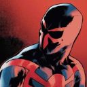
femme-from-hell
︶꒦꒷♡꒷꒦︶