#sub saunders
Text
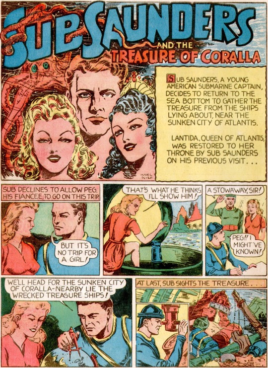


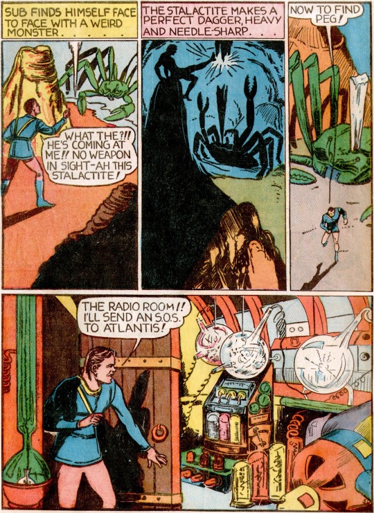

Fantastic Comics (1939) #3
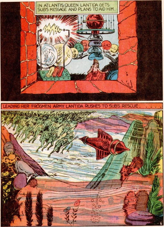
#I absolutely love that second to last page that’s just two big panels#one of Queen Lantida in a type of laboratory through a window#and one of her ship moving through the ocean followed by her army of Frogmen#the depth effect of the shot through the window is so cool#it’s just inherently impactful to give the panel that kind of intense border#and the underwater scenes with the lines to indicate that it’s underwater are always nice#but I really like how it looks when given so much space#I also like that final long thin panel at the very end of the story with everyone going back to Atlantis#it reminds me of those establishing shots at the top of every page of the first Skyrocket Steele story which was drawn by Bill Everett#fox features#sub saunders#my posts#comic panels
2 notes
·
View notes
Text
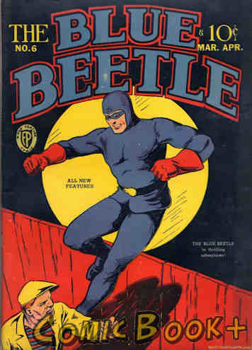
"Yesterday's" Comic> The Blue Beetle #6
BW's "Yesterday's" Comic> The Blue Beetle #6
Even as an adult Tom Sawyer still won’t paint that fence.
The Blue Beetle #6
Fox Publications Inc (March/April, 1941)
Another problem with the anthology, and I do apologize for harping on it, is that it leaves me no credits to pad out the homepage part of the article. Just having the title, company, cover date, and one cover doesn’t grab your attention and draw you into the article. Unfortunately…
View On WordPress
0 notes
Photo
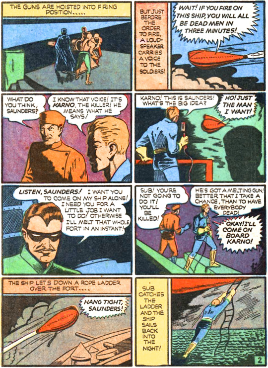


Sub Saunders
Creator(s): Henry Kiefer
Alias(es): Sub Saunders
1st Issue w/Uniform: Fantastic Comics #17
Year/Month of Publication: 1941/03
pdsh.fandom.com/wiki/Sub_Sanders
0 notes
Text
Theme –Escape from Spiderhead analysis #writing
Last week, we talked about emotions and how they drive each scene. On Monday, we talked about points of no return.
So, let’s take a look at theme, the thread that binds emotions and points of no return together. It’s time to take another look at how George Saunders employed themes in his sci-fi masterpiece, Escape from Spiderhead.
In 2015, I took George Saunders’ book, Tenth of December, to…

View On WordPress
0 notes
Text
Shout out to all the people who have randomly let me ramble about Combat! to them recently. Last summer's braincell is trying to beat out the current m*a*s*h vibe now.
#it won't bc i am determined to binge mash and finish it and then cut my hulu sub#but it's very nice to ramble about my other sad soldier boys#ragamusings#combat! tv series#sgt saunders#still owns my heart
1 note
·
View note
Note
hey, i find your posts about historical fiction pretty interesting, do you have any recs?
anon this is the most beautiful and validating ask i have ever received. absolutely of COURSE I have recs. not gonna be a lot of deep cuts on this list but i love all of these books and occasionally books do receive awards and acclaim because they are good. in no particular order:
the cromwell trilogy by hilary mantel. of course i gotta start with the og. it’s 40 million pages on the tudor court and the english reformation and it will fundamentally change you as a person and a reader
(sub rec: the giant, o’brien by hilary mantel. in many ways a much shorter thematic companion to the cromwell trilogy imo. about stories and death and embodiment and the historical record and 18th century ireland. if you loved the trilogy, read this to experience hils playing with her own theories about historical fiction. if you are intimidated by the trilogy, read this first to get a taste of her prose style and her approach to the genre. either way please read all four novels ok thanks)
lincoln in the bardo by george saunders. the book that got me back into historical fiction as an adult. american history as narrated by a bunch of weird ghosts and abraham lincoln. chaotic and lovely and morbid.
the everlasting by katy simpson smith. rome through the ages as seen by a medici princess, a gay death-obsessed monk, and an early christian martyr. really historically grounded writing about religion and power, and also narrated with interjections from god’s ex boyfriend satan. smith is a trained historian and her prose slaps
(sub rec: free men by katy simpson smith. only a sub rec bc i read it a long time ago and my memory of it is imperfect but i loved it in 2017ish. about three men in the woods in the post revolutionary american south and by virtue of being about masculinity is actually about women. smith did her phd in antebellum southern femininity and motherhood iirc so this book is LOCKED IN to those perspectives)
a mercy by toni morrison. explores the dissolution of a household in 17th century new york. very different place and time than a lot of morrison’s bigger novels but just as mean and beautiful
(sub rec: beloved by toni morrison. a sub rec bc im pretty sure everyone has already read beloved but perhaps consider reading it again? histfic ghost story abt how the past is always here and will never go away and loves you and hates you and is trying to kill you)
an artist of the floating world by kazuo ishiguro. my bestie sir kazuo likes to explore the past through characters who, for one reason or another (amnesia, dementia, being a little baby robot who was just born yesterday, etc), are unable to fully comprehend their surroundings. this one is about post-wwii japan as understood by an elderly supporter of the imperial regime
(sub rec: remains of the day by kazuo ishiguro. same conceit as above except this time the elderly collaborator is incapable of reckoning with the slow collapse of the system that sheltered him due to britishness.)
the pull of the stars by emma donoghue. donoghue is a strong researcher and all of her novels are super grounded in their place and time without getting so caught up in it they turn into textbooks. i picked this one bc it is a wwi lesbian love story about childbirth that made me cry so hard i almost threw up on a plane but i recommend all her histfic published after 2010. before that she was still finding her stride.
days without end by sebastian barry. this one is hard to read and to rec bc it is about the us army’s policy of genocide against native americans in the 19th century west as told by an irish cavalry soldier. it is grim and violent and miserable and also so beautiful it makes me cry about every three pages. first time i read it i was genuinely inconsolable for two days afterwards.
this post is long as hell so HONORABLE MENTIONS: the amazing adventures of kavalier & clay by michael chabon, the western wind by samantha harvey, golden hill by frances spufford, barkskins by annie proulx, postcards by annie proulx, most things annie proulx has written but i feel like i talk about her too much, the view from castle rock by alice munro, the name of the rose by umberto eco, tracks by louise erdrich
#honestly will probably be coming back with additions bc this is just based on whats currently on my bookshelf#made this post while staring at the copy of mirror & the light i keep on my desk as some kind of hilary mantalisman#send me your address so i can explain my passions etc etc#histfic
161 notes
·
View notes
Text
10 characters/ 10 fandoms / 10 tags
But I chose to have each fandom just be a different sub-section of DC b/c that's where all my mental energy is.
tagged by @arcann
tagging @babsbadass @zuzuzuko @mollyhats @fatheriimaginedyoutaller @jaccsonhyde @fallenagain @paigeoforacle @candy-dot-net @tuxedosaurus @forever-carlyle
Batfam: Damian Wayne/ Robin
Aquafam: Mera
Wonderfam: Diana / Wonder Woman
Superfam: Lois (She counts)
Flashfam: Linda (she also counts)
Green Lanterns: Simon and Jess (They count together :P Green Lanterns comic perfection)
Titans: Kory / Starfire
Teen Titans: Rose Wilson Worth/ Ravager
JSA: Kendra Saunders/Hawkgirl
Justice League: Mari McCabe/ Vixen
7 notes
·
View notes
Note
4, 5, 22 (if you also have a favourite sub-collection or constellation you're particularly proud of i would love to know), 25
thank you, bee 💚
4. What’s the next book you’re hoping to read?
since i've already replied to this with library books, here are two books i already own and have been meaning to finally read: dictionary of the khazars by milorad pavić ("a lexicon novel") and inka history in knots: reading khipus as primary sources by gary urton
5. Is there a book you own, but aren’t planning on reading?
there were in fact two or three books in this category but i gave them away back when i was moving in december
22. How do you organize your books? (if you also have a favourite sub-collection or constellation you're particularly proud of i would love to know)
mostly by genre/subgenre/style. and well :) my handbound books are currently in their own section and they're easily the books i am proudest of :) i'm also really fond of my "experiments in style and/or form" collection, which includes my print copies of le désert mauve (nicole brossard), insurrecto (gina apostol), house of leaves (mark danielewski), s. (doug dorst and jj abrams), the archive of alternate endings (lindsey drager), h(a)ppy (nicola barker), lincoln in the bardo (george saunders), pale fire (vladimir nabokov), flowers for algernon (daniel keyes), the stone gods (jeanette winterson) and ada palmer's terra ignota series
25. In what condition do you keep your books?
in good condition but i think it's really okay if a paperback spine clearly looks like the book's been read. i only very occasionally write notes in my books or underline parts
7 notes
·
View notes
Text
sweetener
read it on the AO3 at https://ift.tt/j7vEfau
by sevener
Zach gets as far as clicking into the gay version of PornHub, the first time.
Words: 2664, Chapters: 1/1, Language: English
Series: Part 3 of sweetheart
Fandoms: Original Work, Hockey RPF
Rating: Explicit
Warnings: No Archive Warnings Apply
Categories: M/M
Characters: Zach Saunders (OMC), Jamie Schofield (OMC)
Relationships: OMC/OMC
Additional Tags: One Shot, Masturbation, Porn Watching, Internalized Homophobia, Light Dom/sub, Zach's Emotional Conflict TM
read it on the AO3 at https://ift.tt/j7vEfau
0 notes
Text
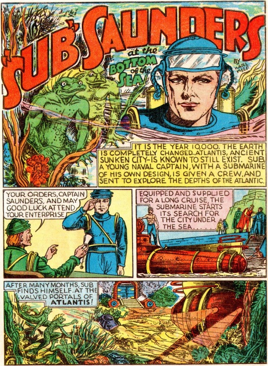


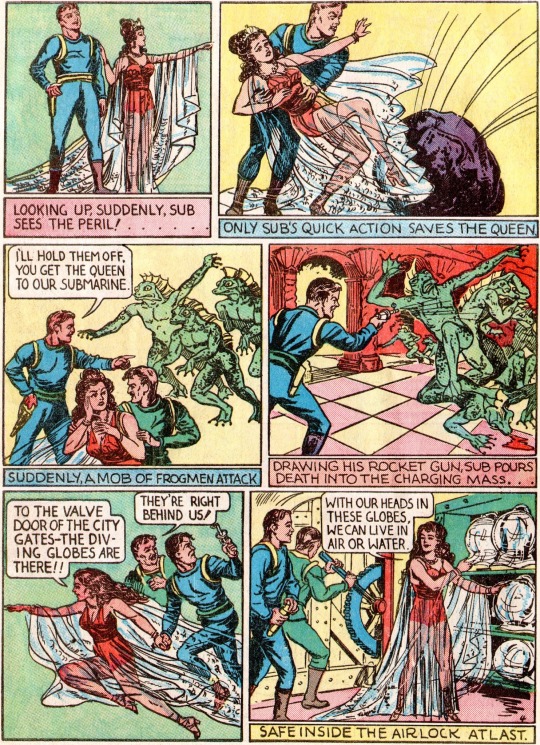


Fantastic Comics (1939) #1
#I chose this to start from my list of many Golden Age characters I want to read#because I was interested in reading through another character in Fantastic Comics#and because I was interested in reading another underwater-themed character#I’m really enjoying this detailed artwork by Henry Kiefer#in particular the lovely backgrounds#though I think he way he draws people and their proportions and clothing is unique too for this era#which I think are usually just a bit more simplified#I’m also impressed by the Frog Men and how the fighting scenes with them don’t shy away from drawing all of them in detail#also I don’t know what this kind of sub-genre is called#where it’s like a regular guy that’s a scientist/soldier/explorer/whatever comes across a fantastical hidden kingdom ruled by a queen#that’s how Camilla started out#also Neptina#also Don Dixon would count too though that’s a boy and a princess#the Grand Comics Database tentatively credits Toni Blum as the writer of this story but there’s no clarification on how confidently#I don’t have much to say on the writing of this so far#fox features#sub saunders#my posts#comic panels
2 notes
·
View notes
Text
Focus music

At the moment, I'm gearing up to play on the spider at Glstonbury on the Arcadia stage and this is giving me so much inspiration right now just being like, finishing loads of tunes I'm playing back to back with Dimensions as well, so we're planning some specials for that. He continued, “I mean, that for me like those sort of shows or big shows that like what completely inspires me like I spend loads of time in the studio just sort of visualizing where the tracks are going to be paid and stuff. I was unveiling a new light show at same time which involves a big moving desk of light and the sort of combination of that and the track just really seems like off on nine.” And the clip kind of went a little bit viral on my socials. In addition, all of our employees have a music background and several are certified and experienced music educators. Enjoy this deep focus music, 4 hours of music for studying, concentration and work with a beautiful compilation of nature landscapes from all around the worl. The Focus On Music staff is comprised of some of the music world's most accomplished educators, performers and lecturers. My second sound kind of works back in November. Focus On Music publishes the Emmy Award Winning Breathing Gym Series, Brass Gym Series, Scale & Rhythm Chunks Series, as well as various solo repertoire, concert band music and percussion ensemble literature. But the track really is kind of took off more when I played it. Sub Focus told Jack Saunders about the song, “It's been kind of like a fan favorite for a while people have been asking me a lot about it online. It was written by Nicolaas Douwma, Poppy Baskcomb and Rug Wilson. This time, he teamed up London-based singer-songwriter Poppy Baskcomb on the track. The song follows up “It's Time” featuring Gene Farris, which was released last month. London-based DJ Nicolaas Douwma, aka Sub Focus premiered a new song “Off The Ground” on BBC Radio 1's Future Artists with Jack Saunders.Sub Focus Premieres New Song “Off The Ground” on BBC Radio 1.Donate to support families affected by the crisis in Ukraine ➔ Add similar songs to the end of the queue. Focus Music is a school where I've enjoyed learning and it will always have a special place in my heart. Deep Focus - Music For Studying, Concentration and Work - YouTube Music. She encourages me to move onward & forwardĪnd together with Jeff, she is always there to cheer me on when I am competing. I also like to give thanks to Fang Laoshi who has seen me grow from zero to what I'm today. My heart-felt gratitude and fervent thanks to Jeff. Besides my weekly class, we now explore and make music together Through the years, Jeff remains my major vocal Laoshi and I enjoyed learning from him without any barrier whatsoever. Via Jeff, I learned better vocal manipulation, I took that brave step and since then, it'd no turning back. I felt trapped but I saw his sincerity in changing me. Welcome to Rainy Mood, the internets most popular rain experience. Jeff observed my vocal capability for some weeks. Also available on Spotify and Apple Music. I joined Focus Music sometime in October 2010 & Jeff Taey became my very first, young vocal instructor. Incorporating Pop music schools, we embrace continuous innovation and excellence. We endeavor to make a difference in the music and entertainment industry in SingaporeĪnd bring it to the next level. On singing lesson, we also provide guitar class and keyboard class to students that are passionate about more then just singing. So with our experienced and dedicated team, with their teaching & guidance will help you achieve a new vocal height. Some of our instructors haveĮven been invited on numerous occasions as judges for singing competition. With this believe, Focus Music was founded in 2002 to provide singing class to anyone who has a desire and passion for music and singing. Incorporating Pop music schools, we embrace continuous innovation andĮveryone has the potential to be great singers. We are dedicated to providing the highest quality instrumental lessons and. Founded in 2002, Focus Music endeavors to make a difference in the music and entertainment industry & bringing it to the next level. Focus Music is a specialist Music Education Company located in the Perth, WA.

0 notes
Photo
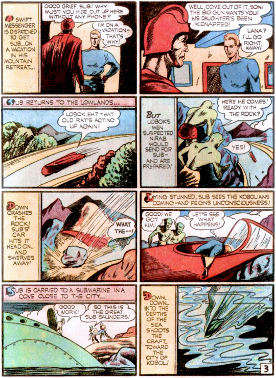
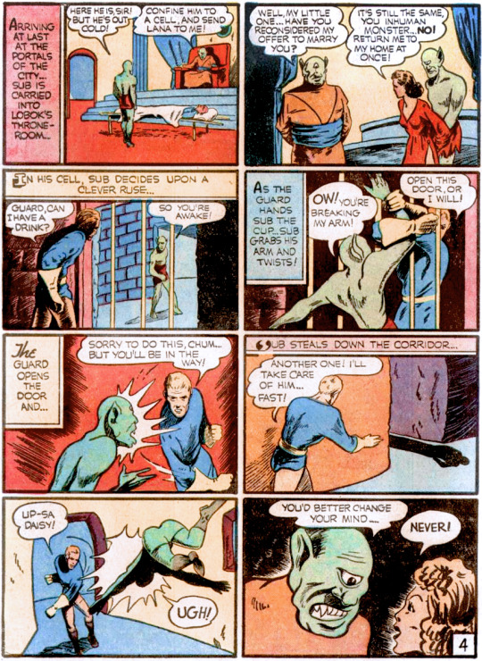
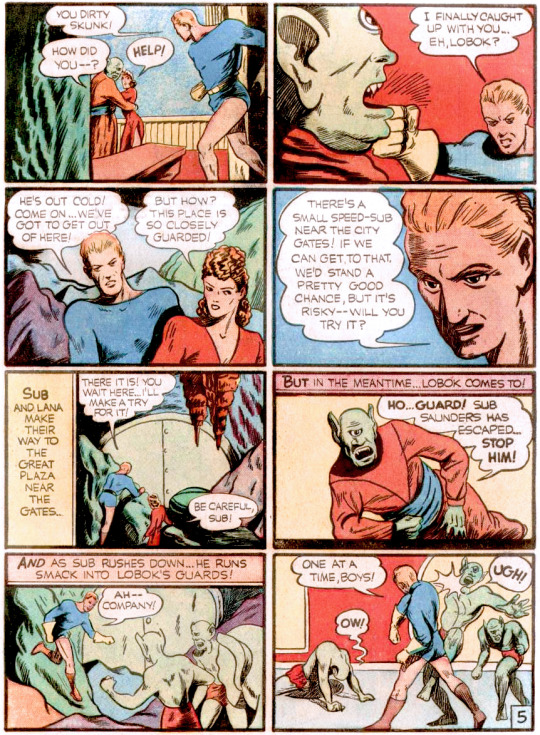
Sub Saunders
Creator(s): Henry Kiefer
Alias(es): Sub Saunders
1st Issue w/Uniform: Fantastic Comics #14
Year/Month of Publication: 1941/01
pdsh.fandom.com/wiki/Sub_Sanders
0 notes
Text
Jssg 2008 pdf writer
JSSG 2008 PDF WRITER >> Download
vk.cc/c7jKeU
JSSG 2008 PDF WRITER >> Leia online
bit.do/fSmfG
ECG interpretação das ondas
Manual de Cardiologia PDF
Manual ECG pdf
Ritmos cardíacos pdf
ECGs para treinar
Ecocardiograma pdfECG interpretação rápida
eixo p/qrs/t normal
2008. COURTINE, Jean Jacques. Análise do Discurso político: o discurso Disponível em: <<scielo.br/pdf/ld/v14n1/02.pdf>>. Postema PG, De Jong JSSG, Van der Bilt IAC, Wilde AAM. Accurate electrocardiographic asses- sment of the QT interval: Teach the tangent. Heart Rhythm. 2008;5(7): JSSG Joint Services Sub-Group. (10). O ensino de línguas estrangeiras Descarregar agora (PDF - 69 páginas - 1.03MB). temas relacionados : Forças ArmadasPDF Pack. People also downloaded these PDFs Rio de Janeiro: Elsevier Saunders; 2008. 4. Postema PG, De Jong JSSG, Van der Bilt IAC, Wilde AAM. tentar converter o bandido á mística do batente: ele quer a grana fácil e é imper- importações de USS 2,008 bi- ihões, o que permite um superávit. Dr. Olavo Pires de Camargo Editor EXPEDIENTE Governo do Estado de São Paulo Governador João Agripino da Costa Doria Junior Secretário da Saúde Jean Carlo
https://www.tumblr.com/jecidamixut/697025065376727040/charles-jacobs-chainsaw-instructions-for-form, https://www.tumblr.com/jecidamixut/697025065376727040/charles-jacobs-chainsaw-instructions-for-form, https://www.tumblr.com/jecidamixut/697025065376727040/charles-jacobs-chainsaw-instructions-for-form, https://www.tumblr.com/jecidamixut/697025065376727040/charles-jacobs-chainsaw-instructions-for-form, https://www.tumblr.com/jecidamixut/697025065376727040/charles-jacobs-chainsaw-instructions-for-form.
0 notes
Text
“She put my name with yellow hearts”💛✨
2 notes
·
View notes
Photo



Typography Tuesday
BEN FRANKLIN’S CASLON
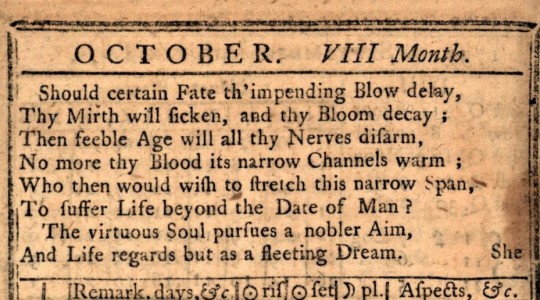
This year marks the 300th anniversary of James Franklin’s truly independent-minded newspaper The New-England Courant, employing his younger brother Benjamin as an apprentice, and to which the 16-year-old Ben clandestinely wrote letters in the persona of "Silence Dogood," a middle-aged widow. These letters also had an independent streak, which did not sit well with James when he discovered it was all a ruse, as he was already in a lot of hot water with the government over his challenging periodical. In 1723, Benjamin ran away to Philadelphia, and a year later traveled to London to continue training as a printer. It was here that Franklin became interested in the art of typefounding. Most types being used at the time in both England and the Colonies were of Dutch origin, as England’s typefounding industry was meager and sub-par, and there were no type founders in America at all.
The great English type designer William Caslon, who would alter Britain’s typographic landscape, was just beginning his career at this time, and Franklin may have been familiar with Caslon’s work, as Franklin’s English employer James Watts partially funded Caslon’s enterprise. Franklin returned to Philadelphia in 1726 to start his own printing house, for which he imported English-made (mainly those from the foundry of Thomas James) and Dutch types. Two years after Franklin launched his Poor Richard’s Almanack, William Caslon published his famous specimen sheet in 1734. In 1737, Franklin introduced Caslon typefaces in his Pennsylvania Gazette, beginning a trend in American printing that established Caslon fonts as the typeface of America.
Throughout his career, Franklin corresponded with the major type designers of his day: Baskerville, Caslon, Fournier, Didot, and Bodoni. He was a great champion of Baskerville and his types, but it was mainly Caslon that Franklin used in his printed works. Type foundries would not be established in America until the late 1760s or early 1770s. Therefore, because of the expense and difficulty of importing type, Franklin and his American contemporaries would continue to print with the European types they already had even after they were worn, chipped, and broken. The popular American conception of Caslon derives from these worn faces, and some modern re-designs of “Caslon Old Style” bear the hallmarks of these overused types. We jokingly call these fonts “Pirate Type.” The P22 Type Foundry of digital type, for example, recently issued Franklin Caslon designed directly from Franklin’s publications, and has a beautifully worn quality about it.
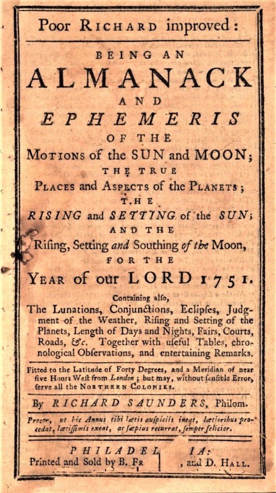
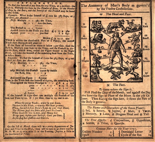
Examples of Benjamin Franklin’s use of Caslon type, as well as some of its wear and spotty printing, can be seen in our copy of Poor Richard’s Almanack for 1751 (the Almanack was published continually from 1732 to 1758), authored under Franklin’s pseudonym "Richard Saunders," and printed and sold in Philadelphia by Franklin and his business partner David Hall in 1750.
View our other Typography Tuesday posts.
#Typography Tuesday#typetuesday#Benjamin Franklin#James Franklin#William Caslon#Caslon type#Poor Richard's Almanack#David Hall#P22 Type Foundry#Franklin Caslon#18th century type#18th century printers
40 notes
·
View notes
Note
Hey for your December of Discussion I was wondering if you could talk a little about uniforms or clothing in general. Especially I was wondering if, apart from colours, there were styles more popular with certain regions, and what the quirks and individualities between them are. Or just go off on that stuff in general I'd be interested either way. Speedy recovery to you!
Hi sorry it took so long, I was a bit too busy and I have to admit that I started with the Witcher III again. Shame on me… i know i’m a bad girl… ;)
So let’s get into what you wanted to know. But first a short outline through time to see how the uniforms have developed, then I will go into more detail about the unofficial uniforms parts.

Admiral Sir Stafford Fairborne, ca. 1708
But let us start from the beginning. Before 1748 there was no uniform in this sense. The officers simply wore upper class clothes with a wig. The colours were mostly dark blue so that the drops of water were not immediately visible, and the gold ornaments to reflect their high social status and the wealth they had. This changed in 1748 when Lord Anson introduced the uniforms. There was a dressed and an undressed coat. The first one was supposed to be presentable while the other was a simple working coat, which was still very richly decorated and had the typical white lapels, anecdotally that is how King George II chose it, based on a riding gown worn by the Duchess of Bedford. While the dressed coat was worn open, the undressed coat could be buttoned to protect the wearer from wind and weather. All officers always wore a white shirt with their coats, vest a dark blue breeches, silk stockings and black buckled shoes. Only the midshipman had an everyday uniform with white cuffs on the sleeves which were divided by a blue cuff with a piece of buttoning. The collar got its typical white patch only in 1758.

left: Admiral Sir Peter Warren in dressed uniform (pattern 1748-1767)
right: Admiral Sir Charles Saunders in undressed uniform (pattern 1748-1767)
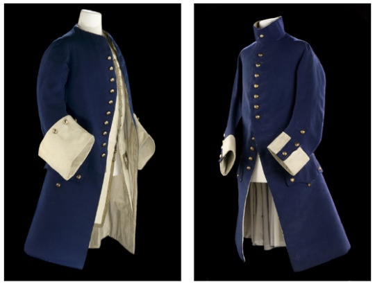
left: Lieutenant’s coat, 1748, right: Midshipman’s coat 1748
From 1767 on there was a change concerning the coats, the previously so richly embroidered dressed coat was replaced by the somewhat simpler undressed coat and a simpler blue coat was introduced as new undressed. And in 1774 the Breeches became white. In 1783 the dressed uniform skirt was again heavily embroidered and the lieutenants wore the uniform with white lapels, introduced in 1787, until 1812. From 1787 onwards there were fundamental changes. The sleeves of all uniforms became smaller and round. For the flag officers the embroidery on the coat and cuffs was replaced by lace. In that year, the Warrant Officers (Masters, Surgeons, Pursers, Boatswains and Carpenters) were also given a standardized, unicolored blue uniform.

left: Admiral’s coat and on the right: Captain’s uniform of the 1770′s
In 1795 epaulettes were introduced for the first time. The aim was to make it easier to distinguish the ranks. What then looked like this according to the National Maritime Museum: “the [officers] wearing the undress uniform wore a plain hat and only occasionally epaulettes. Captains with less than three years of service wore only one epaulette on the right shoulder. Commanders wore a epaulette on the left shoulder.” In 1812, the blue in the lapels and sleeves which was changed 1795 was replaced by white. The breeches were abolished in 1825 and replaced by trousers.
In 1827 the coat was more and more replaced by a double-breasted buttoned tailcoat as it is already worn by the population. This meant that the whole front part up to the hip was cut away and had only two tails. The most important thing was that the coat had to be worn closed from now on. The same was true for the midshipmen and the warrant officers whose coats were completely unchanged until then. In the same year it was also arranged that there was no difference between full dress and undress, the only difference between the two was that the officers were allowed to wear simple blue trousers in the undress. Furthermore, it was also decided that lieutenants should wear an epaulette on their right shoulder.

left: rear-admiral’s coat and on the right a commander’s coat, both showing the pattern of 1812
However, in 1829, officers were allowed to wear a single-breasted frock coat near their ships. This had a sleeve lace to indicate rank: a braid for midshipmen and sailors, two stripes for lieutenants, two stripes for commanders and three stripes for captains. Flag officers should wear their epaulettes with the frock coat. This garment was worn by all officers with plain blue trousers and a peaked cap. Although short-lived (it was abolished in 1833), this frock coat was an important precursor and influence on the later style of the uniform, especially for the undressed one.
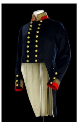
Captain’s coat, pattern 1830
The main change in 1830 was that the cuff and sleeves were now red, following the Windsor colours. The whole thing was abolished in 1843 and replaced by white, but only in the full dressed version. And lieutenants now have to wear two epaulettes.
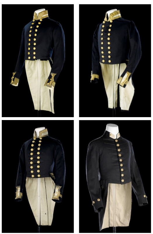
left: Admiral’s coat, right : Commander’s coat, bottom left: Lieutenant’s coat and bottom right a Midshipman’s coat, pattern 1848
The use of sleeve stripes to indicate rank did not appear until 1856. Lieutenants initially had one stripe, commanders had two and captains had three, until the introduction of the sub-lieutenant rank in 1861 meant that everyone received an additional stripe. Lieutenants with more than eight years of service wore half a strip from 1877, which became the formal lieutenant-commander rank from 1914. A further change came in 1877 but this is not interesting for the age of sail anymore.
As for the unofficial parts, there are some. Preferably then sometimes caps were worn or the shoulder belt-plates. There are regional differences except for the bulkheads, which unfortunately can only be seen in pictures. Here you can, even only very, very rarely, see a sailor in a kilt or an officer with a typical Scottish cap. Whether this was really worn or only used in art to emphasize the origin of the person.
All in all that is all I can tell you now and hope that I could help you in some way
329 notes
·
View notes