#sarada timeskip
Text

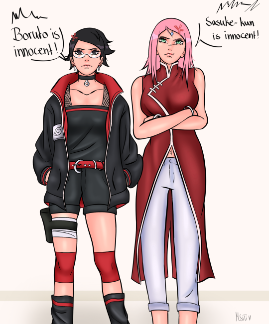
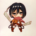
“I leave Sarada to you, Boruto”, Sasuke have spoken to his pupil!
KISHIMOTO REALLY COOKED IT! 🔩🥗😭🔥
#boruto spoilers#boruto manga spoilers#boruto manga#borusara#sasuke uchiha#boruto x sarada#sarada x boruto#boruto uzumaki#boruto two blue vortex#boruto#sarada uchiha#boruto timeskip#sarada timeskip#naruto#Naruto franchise#the world of Naruto#naruto shippuden#masashi kishimoto#manga spoilers#manga series#hug#boruto naruto next generations#Boruto two blue correct Chapter 5
159 notes
·
View notes
Text
251 notes
·
View notes
Text

I��m assuming she’s holding up the team 7 fort just like her mom 😤
#!crysart#sarada uchiha#boruto#boruto two blue vortex#boruto time skip#sarada timeskip#team 7#sasuke uchiha#sakura haruno#sasusaku#girls get it done obvi#I haven’t kept up but I’m just assuming the boys of the team ran off somewhere and she has to hold down the fort#the outfit is growing on me tbh#artist on tumblr#boruto naruto next generations#naruto
349 notes
·
View notes
Text
🫶

#anime#anime and manga#boruto#boruto timeskip#anime fanart#sarada timeskip#sarada uchiha#anime couple#art#anime art#boruto two blue vortex#borusara#boruto the next generation#boruto fanart#boruto x sarada#boruto art
77 notes
·
View notes
Text

kids
#sarada uchiha#sarada fanart#uchiha sarada#boruto#boruto fanart#boruto next generation#boruto two blue vortex#sarada timeskip#boruto anime#boruto and sarada#inoshikacho#inoshikacho boruto#inojin yamanaka#inojin#shikadai and inojin#inojin fanart#shikadai#shikadai nara#shikadai fanart#chouchou#chouchou akimichi#chouchou fanart#inoshikacho fanart#sarada redesign
23 notes
·
View notes
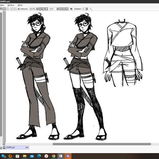
Text
Got really bored so I made a timeskip Sarada redesign (I do redesigns a lot for fun)
I'm also very tired and mentally exhausted so hopefully this doesn't suck


#naruto#boruto#sarada uchiha#sarada fanart#sarada timeskip#redesign#artists on tumblr#digital art#artwork#art#illustration#digital illustration
26 notes
·
View notes
Text

cat 🐱
#sasuke uchiha#sakura haruno#sakura uchiha#sasusaku#naruto#sasuke retsuden#artists on tumblr#my art#digital art#illustration#digital painting#digitalpainting#digitaldrawing#narutoshippuden#digitalartist#digitalart#boruto#sarada#fanart#sarada uchiha#sarada fanart#sarada timeskip#kawaki x sarada#boruto next generation#boruto naruto next generations#boruto two blue vortex
36 notes
·
View notes
Text
Sarada
65 notes
·
View notes
Text
Uchiha Sarada everybody!
#fanart#anime#anime art#manga#manga art#naruto#sarada uchiha#sarada fanart#boruto naruto next generations#boruto next generation#sakura haruno#sasuke uchiha#uchiha fanart#uchiha#boruto two blue vortex#two blue vortex#art#sarada timeskip
57 notes
·
View notes
Text
Extraño aquellos días, aquella era;
antes de saber quién yo era.
#wattpad#anime#fanfic#sarada uchiha#sarada fanart#boruto x sarada#sarada timeskip#uchiha#sasusaku#sasusaku fanart#sasusaku icons#sasusaku gif#sasusaku fanfiction#sakura#sakura haruno#sakura uchiha#sakura hiden#sakura icons#naruto#boruto next generation#borusara#boruto#two blue vortex
38 notes
·
View notes
Text
it looked the same to me
#sarada#sarada uchiha#boruto#sarada boruto#sarada timeskip#boruto time skip#borusara#sarada x boruto#uchiha#sarara timeskip boruto#Naruto
45 notes
·
View notes
Text
Teams 7 e 10 Boruto timeskip mangá


#boruto uzumaki#boruto#b#sarada uchiha#boruto edit manga#boruto two blue vortex#sarada timeskip#chocho akimichi#inojin yamanaka#inojin#shikadai nara#inoshikacho#time 7 boruto#boruto timeskip manga#boruto timeskip mangá#boruto manga edi#time 7 manga boruto#new time 7#new time 7 mangá#sarada manga boruto#mitsuki#mitsuki manga timeskip#team 7 boruto#time 10 boruto#time 10 boruto manga#mangá boruto tbv#boruto tbv
47 notes
·
View notes
Text

259 notes
·
View notes
Text
☀️❤️
#anime#anime and manga#anime art#art#boruto#boruto timeskip#anime fanart#sarada timeskip#sarada uchiha#anime couple#boruto two blue vortex#boruto art#boruto fanart#sarada fanart#boruto x sarada#borusara
88 notes
·
View notes
Text
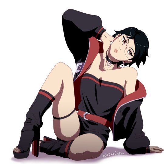
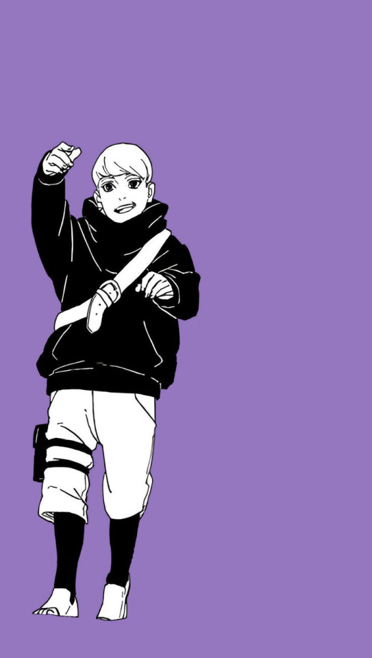
So... Sarada's Timeskip Design

First some positives:
The design works in both Haruno(choker, red) and Uchiha(earrings, black) elements. Even though they are few, I prefer it over the complete absence of both like we got in her last manga design
I like the somewhat unique choice in headband placement
The outfit is pretty fashionable and I can easily picture a teenager wearing it
Her earrings are a nice touch
Her haircut is really cute
Now the negatives(oh god are there negatives). I can't shorten this to simple bullet points so I hope you like the paragraph format. First, the obvious:
It Doesn't Look Practical In The Least
She's wearing big-ass heels, her leg warmers are loose enough to get caught under her feet, her shorts(the bottom half of her romper?) are short enough to give her a wedgie, she has pretty much no leg protection, the shuriken holster attached to her leg without bandages looks uncomfortable, the belt is completely useless, her jacket is baggy and unzipped and begging to fall off, her sleeves look like they'd get in the way during combat, her glasses feel noticeably fragile, and what woman in their right mind would wear a strapless bra into combat? (I can only let the last one slide because it's two men who're working on this manga) If not for the metal plate, shuriken holster, and open-toed shoes, I wouldn't even think she was a ninja(or from the Naruto franchise, for that matter). Lack of practicality doesn't tend to bother me since this is fantasy and every character wearing maximum practicality outfits would get boring, but Sarada looks like they didn't even make an attempt at making her look combat ready. Still, all of this would be fine if not for my next point.
This Doesn't Look Like Something Sarada Would Wear
If impracticality was in character or served a narrative purpose, it would be a point in the designs favor. Except, Sarada isn't the type of character to wear something so impractical. In the manga, she's the character that takes being a ninja the most seriously, she's one of the few with clear goals, and she's the resident team leader and smart one. What part of her design tells us any of that? Yes, manga Sarada is weirdly flirtatious. But that aspect of her personality already contradicts her otherwise disinterest in boys and romance, it doesn't mesh well with her portrayal in the anime(which is also supposed to be canon), it's already an inconsistent part of her personality, and there's already been so many complaints about it(even in Japan from what I can tell) that you'd think that Ikemoto wouldn't continue with it.
Why Does It Invoke So Much Akatsuki?
This might just be me, but I think the design has too many nods to the Akatsuki. The oversized jacket, the fabric around the bottom of her leg, and the black, red, and white/silver color scheme in similar ratios. I'm not saying you'll confuse her for an Akatsuki member by any means and there were certainly more things they could've done to make her resemble the Akatsuki if that was their goal. What I'm saying is that if I were trying to make nods towards the former villain organization in a character's design, I'd use similar design elements.
The worst part is that this was entirely avoidable. Even ignoring that they could've scrapped the more impractical aspects of her design to avoid this, her color palette didn't even have to be this way. Red isn't the only color that can invoke connections to Sakura; shades of pink, light green, and white are also colors of Sakura. Black isn't even the most common color that Uchiha's wear, shades of dark purple and blue are. Purples and blues would've also been a better nod to Sasuke. Maybe they wanted her to wear "Uchiha colors," but, once again, those aren't really Uchiha colors. Black is, but red has only appeared in Madara's armor, the sharingan, and the clan crest and white has also only appeared in the clan crest(I don't even remember an Uchiha that ever wore silver). If you wanna argue that Sarada's color is red, then I ask why wouldn't they just keep red as her primary color instead of making it an accent? Her last manga design had black and white as accents, I don't think keeping her color palette the same would've bothered anyone. I know that Kishimoto added black to Naruto's design to help make him look more mature, but Sarada's design doesn't invoke "mature" anyways and it certainly isn't a more mature version of her last design because, much like the majority of the two blue vortex designs, it looks nothing like her last design. It's even worse than when they started adding too much black to Naruto's design because now it reminds people(or at least me) of an organization that I doubt she's meant to be affiliated with. But who knows? Maybe like the metal plate of her headband being on an easily removeable jacket, this is all foreshadowing to something.
I don't blame anyone for thinking this is a nitpick, but it bothers me and I wanted to express it.
Conclusion
Sarada's design is the worst for the same reasons her last design was the worst plus it looking too much like she took inspiration from the Akatsuki's wardrobe. Forget needing a second draft, this design needs to be scrapped and replaced. Maybe the anime will find a way to fix it, maybe it won't. Only time will tell and it'll hopefully tell us good news.
(Side note: why is she constantly drawn with her feet pointed inwards? it makes her look insecure.)
#sarada uchiha#sarada timeskip#character design#complaining about character design#character design analysis#boruto analysis#naruto analysis#boruto naruto next generations#boruto next generation#boruto two blue vortex#sarada deserved so much better#this might be nitpicking#but what is tumblr for if not nitpicking#rambling#rant#my stooff
28 notes
·
View notes
Last Seen Blogs
ilikeyoubetter
fandomaholic
anachrolady
Anachrolady's Domain
kaeyx
Fine, I'll do it myself
masterkaratefeet
masterteuzk