#no filters used
Text
fun fact: in the 50s the Kent cigarette brand had a type of cig with micronite filters that literally had crocidolite in them, aka BLUE ASBESTOS, literally THE most lethal type of asbestos by a mile. and you could just buy it at the store and huff it
#even tho it was less commonly used than chrysotile or amosite asbestos a lot of sources im seeing say it may have caused more cancer deaths#citation needed on that but it really is much more lethal than the other types despite being a bit less common#it was also used in gas mask filters in like the 30s. though white asbestos seems to more commonly have been in gas masks overall#<- white asbestos is chrysotile
14K notes
·
View notes
Text
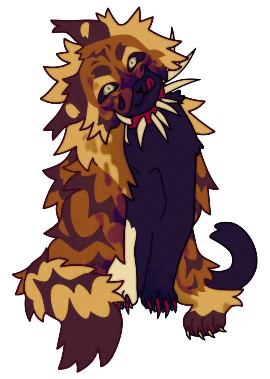
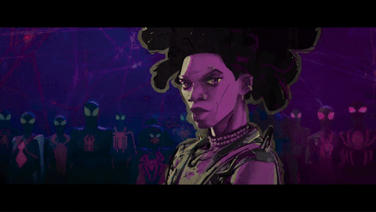
SCOURGE SUNDAY 026/???
real fur coat [thtz cruel]
#scourge wc#warriors#warrior cats#scourge warriors#wc scourge#scourge#scourge warrior cats#bloodclan#scourge sunday#tigerclawstar#I GUESS LMFAO#slapping filterz n texturez on this i may hav gone 2 far but well. idk#i basically alwayz wanna hav this filter on super heavy but it distortz the colorz soo much i alwayz only evr use it at like. 5% LOL#shoudl this hav som kinda warning. i feel like itz not any mnore grusome thn the avaerage scourge so idk
2K notes
·
View notes
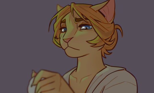
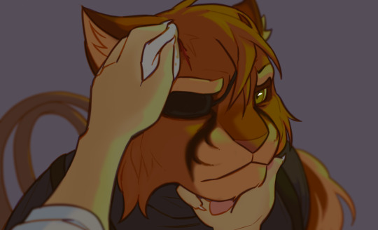
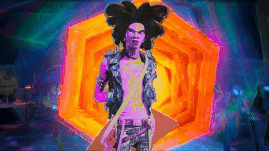
Text
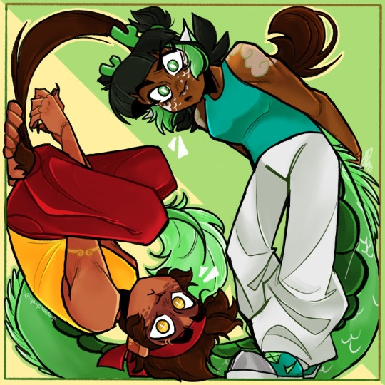
i like these guys a lot (alt ver. with a filter under the cut)
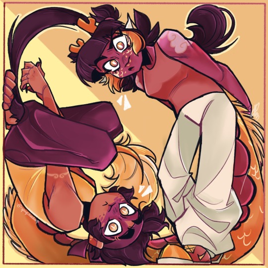
#my art#lmk#lego monkie kid#lego monkie kid fanart#monkie kid#monkie kid fanart#lmk fanart#lmk mk#lmk mei#goldendragon#i use it as their duo name but you can take this as ship art if you want#just personally i dont ship them#goldendragon fanart#couldnt decide if i liked the one w or without the filter better#i like the contrasting colors wo the filter but the filter scratches my brain so good#long xiaojiao#qi xiaotian
5K notes
·
View notes
Text

heh
#doodle#baldur's gate 3#shadowzel#ill use that tag for anyone who wants to filter it out of the main tag i think#shadowheart#lae'zel#srry tweaked it a bit again tumblrs editing feature gives me too much powe
4K notes
·
View notes
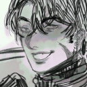
Text
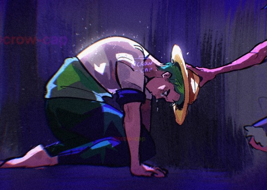
#idk. thinking about zoro being Hatted and what circumstances would need to arise before that could happen#this isn’t finished it’s not that polished I just threw some filters at it and now I’m running away#but the CONCEPT. man I will probably draw more like this#so many ideas. so little time#started reading one piece a month (??) ago and I’ve barely made a dent in it#SO LITTLE TIME#I will become so powerful this summer after exams are over#zolu#(?)#op#one piece#monkey d luffy#crowcraft#zoro#roronoa zoro#luffy#the colours on this one are a bit dark but it was more experimental than anything#I tried out some screen tone brushes and a heavier ink one that I used to use#and the colours aren’t as weird as I usually go for#it was an experiment! these guys are rapidly becoming my new test subjects for drawing ideas#I don’t have a caption for this. I might just leave it blank#does zoro ever get the hat put on him?? I don’t think so but I also know jack diddly about later one piece lore#REGARDLESS#ok bye bye
2K notes
·
View notes
Text
I think 90% of my gripes with how modern anime looks comes down to flat color design/palettes.
Non-cohesive, washed-out color palettes can destroy lineart quality. I see this all the time when comparing an anime's lineart/layout to its colored/post-processed final product and it's heartbreaking. Compare this pre-color vs. final frame from Dungeon Meshi's OP.


So much sharpness and detail and weight gets washed out and flattened by 'meh' color design. I LOVE the flow and thickness and shadows in the fabrics on the left. The white against pastel really brings it out. Check out all the detail in their hair, the highlights in Rin's, the different hues to denote hair color, the blue tint in the clothes' shadows, and how all of that just gets... lost. It works, but it's not particularly good and does a disservice to the line-artist.
I'm using Dungeon Meshi as an example not because it's bad, I'm just especially disappointed because this is Studio Trigger we're talking about. The character animation is fantastic, but the color design is usually much more exciting. We're not seeing Trigger at their full potential, so I'm focusing on them.
Here's a very quick and messy color correct. Not meant to be taken seriously, just to provide comparison to see why colors can feel "washed out." Top is edit, bottom is original.
You can really see how desaturated and "white fluorescent lighting" the original color palettes are.
[Remember: the easiest way to make your colors more lively is to choose a warm or cool tint. From there, you can play around with bringing out complementary colors for a cohesive palette (I warmed Marcille's skintone and hair but made sure to bring out her deep blue clothes). Avoid using too many blend mode layers; hand-picking colors will really help you build your innate color sense and find a color style. Try using saturated colors in unexpected places! If you're coloring a night scene, try using deep blues or greens or magentas. You see these deep colors used all the time in older anime because they couldn't rely on a lightness scale to make colors darker, they had to use darker paints with specific hues. Don't overthink it, simpler is better!]
#not art#dungeon meshi#rant#i'm someone who can get obsessive over colors in my own art#will stare at the screen adjusting hues/saturation for hours#luckily i've gotten faster at color picking#but yeah modern anime's color design is saddening to me. the general trend leans towards white/grey desaturated palettes#simply because they're easier to pick digitally#this is not the colorists fault mind you. the anime industry's problems are also labor problems. artists are severely underpaid#and overworked. colorists literally aren't paid enough to do their best#there isn't a “creative drought” in the anime industry. this trend is widespread across studios purely BECAUSE it's not up to individuals#until work conditions improve anime will unfortunately continue to miss its fullest potential visually#don't even GET ME STARTED ON THE USE OF POST-PROCESSING FILTERS AND LIGHTING IN ANIME THOUGH#SOMEONE HOLD ME BACK. I HATE LENS FLARES I HATE GRADIENT SHADING I HATE CHROMATIC ABBERATION AND BLUR
2K notes
·
View notes
Text
yeah you support trans people but are you normal about trans men who choose to get pregnant
#i'm not a trans guy who evr wants to get pregnant but#the amount of queer ppl and other trans people i see joke around about like#how weird mpreg or men getting pregnant is#and use it as shock value shit#is really disheartening#like damn dude! it's almost like men CAN get pregnant and there IS a lot of men who choose to get pregnant !#they don't deserve any less respect for that#and their existence shouldn't be made into a joke#ik mpreg doesn't have a great history but like#it just weirds me out to see people treat the idea of men getting pregnant as something baffling#idk normalize it. stop treating it as some weird alien thing#my textbox#a little bit upset. sorry#discourse#pregnancy#<- for filtering
2K notes
·
View notes
Text

this pic with fuckass filter 😍
1K notes
·
View notes
Text
bisexual swagger of a new god
#fear and hunger#fear and hunger fanart#cahara#fear and hunger cahara#digital art#funger#guys i finally figured out how to use noise filter omg
949 notes
·
View notes
Text
Doodles of Elsa and Viktor from a little while back that ended up going along with this small animation I did
#I kind of used these as color keys for the animation but then ended up destroying it with filters so you cant really tell#lackadaisy#elsa bastion#viktor vasko#fanart#so like viktor has that bandage on his hand at the end of the flashback in vol2 after it gets cut in the fight at the lodge right#but he also gets a scratch on his head during that scene. are you thinking about it cuz I'm thinking about it#anyway basically it's no wonder he tells her everything about his family and trauma I would have done the same thing bro
3K notes
·
View notes
Text


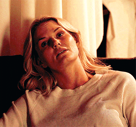
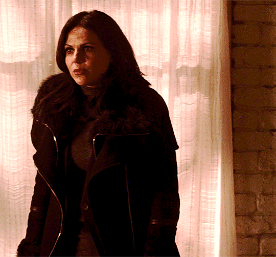
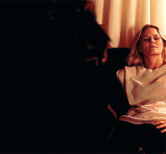
Emma talking to Regina while sitting like *that* -> season 5 deleted scene
#swan queen#once upon a time#ouatedit#sqedit#regina mills#emma swan#tvgif#tvedit#wlwgif#my gifs#*ouatgif#that filter they used in the underworld scenes is why i refuse to gif them#hideous is the word that comes to mind when i think about it#but emma is doing the most with that sitting so i had to break my own rule for this#sorry the coloring is so ugly#i fought the filter and the filter won
1K notes
·
View notes
Text
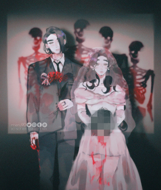
Family Portrait
#ugly phoen filter againn but i like the vibe#also i have a whole ass collection of bflf weddign pics..#fanart#tgcf#heaven official's blessing#tian guan ci fu#he xuan#beefleaf#ming yi#shi qingxuan#tw blood#tw decapitation#im sorry swd I LOVE YOU FR#also ah i put the ring on jo’s middle finger ..well he’s flipping us off or something
1K notes
·
View notes
Text
Every day I’m haunted by the fact the boys happily swim in sewer water
Even if it’s filtered somehow there’s no way it’s not still nasty 😭 Bet they can defeat any of their villains just by accidentally giving them diseases I swear
#rottmnt#rise of the teenage mutant ninja turtles#bless their hearts but they’re nasty#it’s funny because like#each and every one of them has moments#where they’re a typical disgusting teenage boy#and then the next they have STANDARDS#can’t blame Leo for being so determined to go to a spa#even if he nearly licked his own foot that’s prob cleaner than anything else the boys have been up to in years 💀#thank you shelldon for all your hard work cleaning after then 🙏#they’re all gross teenage boys!!!#even Donnie he is NO exception here#bro was DRINKING A BEVERAGE while wading through sewer water he is just as gross as his bros#bro also talks with his mouth full he is no more refined than his equally gross bros fr and I love it#but yeah no way that water isn’t disgusting even filtering it would still leave grime on the walls of the sewer for yearsss#pros of them moving into an abandoned subway system is fixing their sense of smell enough to not be as gross#100% that’s part of why they didn’t mind being so filthy pre shelldon#because I mean they were literally raised in the sewers and they’re teenage boys like that’s a double whammy#THEY ALSO DONT WEAR SHOES#the few times any of them do the shoes are discarded before heading home 💀#I love them tho they are endearing anyhow#April’s immune system must be godlike just being around them fr#honestly no joke Mikey’s probably the cleanest of them all#just by virtue of being a chef#Leo I see as a mixture since he no doubt loves to pamper himself so he’s clean like#a percentage of time before he goes out and ruins his own hard work#Donnie is similar in that he’s just VERY SELECTIVE about what he thinks is too gross#Raph may be more on the stinky end but it’s not his fault he has his stinks and eats things of dubious origin(esp since his bros ate poison)#Donnie and Leo really have the gall to be sick about Raph eating the origami salami but they have no room to talk#all their villains are prob like please stay away from us we have salmonella now
587 notes
·
View notes
Text
Compilation of EVERY single time they changed Hobie's filter in the digital version:
Left: Theatrical release Right: Digital release

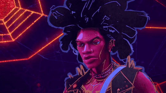


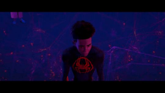
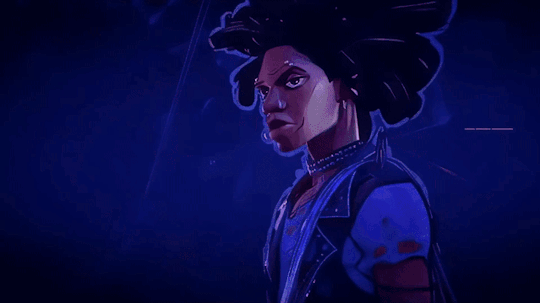
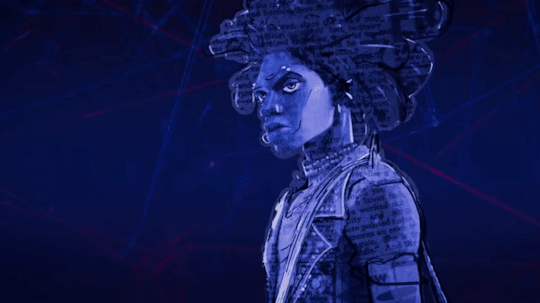

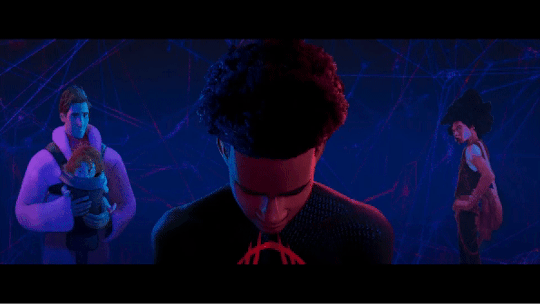
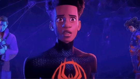
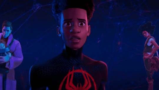

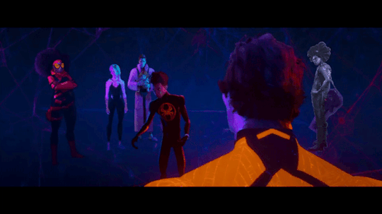

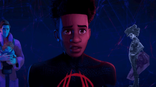
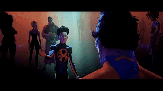
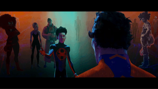
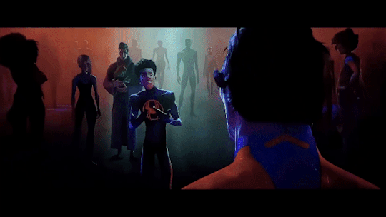
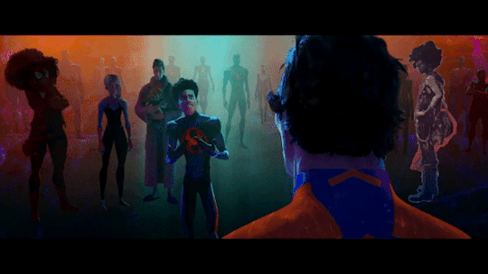

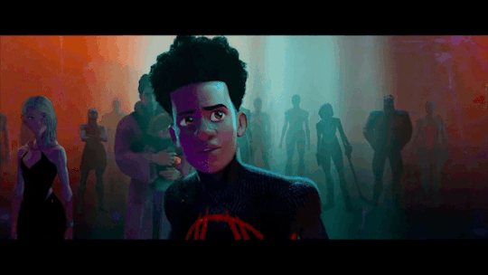
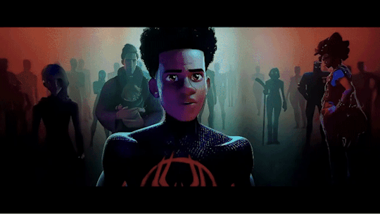
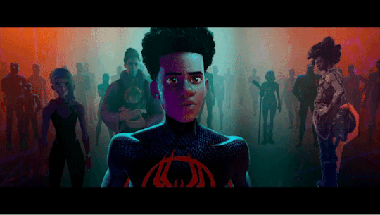
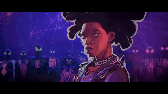

You might have to click on some of them to get a better look at Hobie, sadly I don't have a video editor that allows me to make better edits than these :')
#This took so long to make lol#cause I had to edit every scene with Hobie from both versions so I could watch them right after one another to compare them#I did this with ALL the scenes he's in also the ones where he's on screen as spider-punk#but they only changed his filters in these scenes so it was a waste of time :')#sidenote: no it wasn't it's never a waste of time to look at hobie I just couldn't use it for my GIFset lol#I also made a bouns one but I'm not allowed to post more than 30 GIFs in one post apparently so I guess I just won't add it then...#but Hobie was basically filterless during all these scenes in the theatrical version#I like that they gave him more different filters in the digital version#the only change I don't like is in the first GIFs#cause like that one post pointed out it looks like they removed his lipstick for some reason#also really wish I had a better video editor so we could get a closer look at Hobie but I did my best with what I had#also slowed some of them down to get a better look at them#been having this idea for a while and now I finally finished it!#which means I can go back to working on my fics now#hopefully lol#also lemme know if there are some other scens you guys want me to make comparisons of#cause I have both versions#the theatrical release isn't the highest quality though so if you know where I can get my hands on a better version lemme know ;)#hobie brown#spider punk#miles morales#spider man#peter b parker#jess drew#miguel o'hara#spider man across the spider verse#across the spider verse#across the spiderverse#atsv#theatrical version
1K notes
·
View notes
Last Seen Blogs
thunder1203
A Few Pics

tumbling-through-the-world
Totally Not Count Olaf

av1xtg
Av1xTg
micarxena
dont go in there you'll become one freaky creature