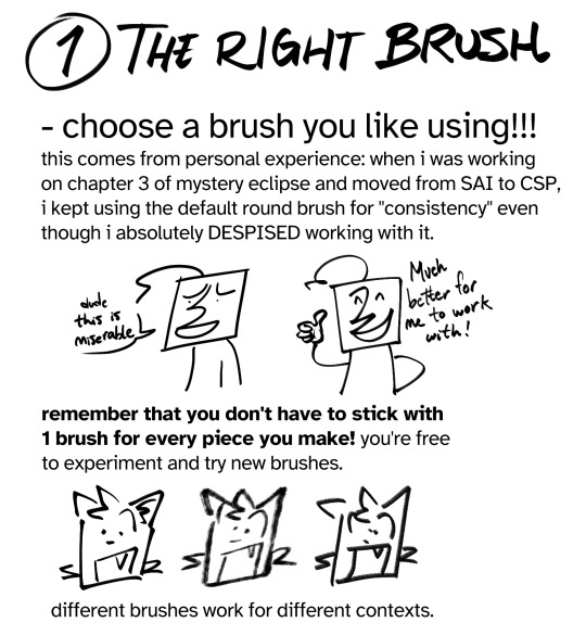
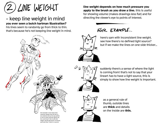
#lineart tutorial
Text


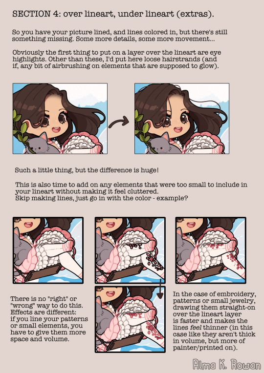
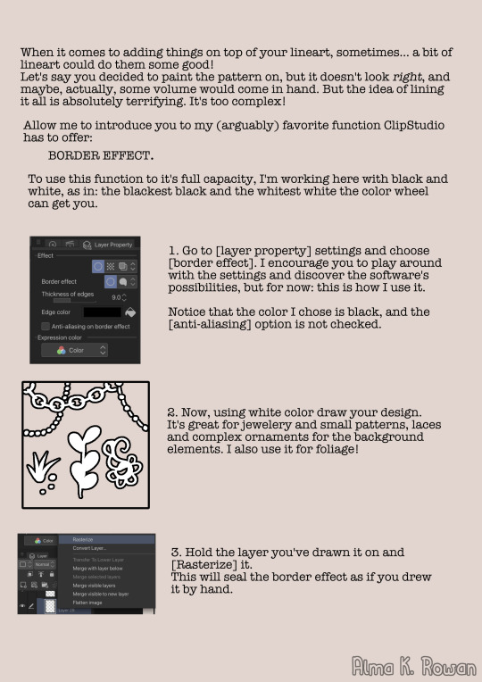


Here you go!!! 🥰 This is my biggest tutorial yet - long and detailed guide attempting to explain how I approach technical aspects of lineart (lines weight and coloring/ color choosing!)
#almakrowantip#tutorial#guide#art tutorial#lineart tutorial#digital art#i hope it comes useful to someone#how to draw
530 notes
·
View notes
Note
I want to see your lineart layer so badly??? How do you make line art work with the color so well? When I draw it feels sometimes like the line art is fighting against the color but when I see your art I get the opposite of that. Your lineart and colors are working together beautifully. How????
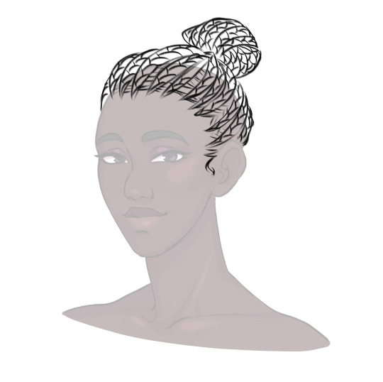
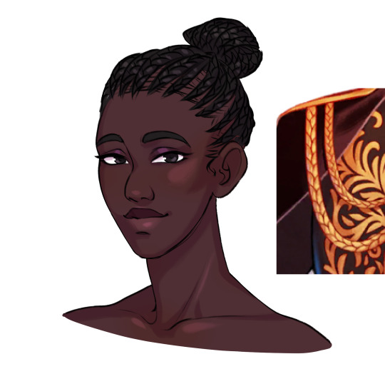
Hii, sorry for the late reply T^T it just took me sometime to organize this lol
I know you only asked to see my lineart layer but I also wanted to show how I color it too.. I hope you don't mind!


Ngl lineart is my less favorite part when I'm drawing, it just takes me so loooong orz it makes the coloring easier tho so I usually do it for commissions!
I don't think my lines are good so I just render above it to make it look better, if I'm drawing to myself I just clean up my sketch and go for the coloring/rendering which are my fav parts.
I'm not a professional or anything so this is the only tip I can give you lol it's what worked for me at least o<< I hope this is helpful..
Link for the auto action: Auto Line Color
#art#my art#illustration#digital art#guide#lineart tutorial#thatlazybones#art tips#I hope this is helpful
70 notes
·
View notes
Note
Hi! Love your art and I have a question—how do you color your lineart? I’ve been working on digital drawing and I can’t seem to get it to look like I want. Are you just changing the layer to a different overlay or do you color your lines or…. Idk 🤷🏻♀️
hi! i'm glad you like my art :) i'm assuming you're talking about this because I don't normally color my lineart. i think colored lineart looks nice, but it's so time consuming...
regardless, my process is under the cut!
So, above is how i normally do my lineart. I color in all black, then copy and paste the layer using an auto action. In Clip Studio Paint, it's called "retro effects" with the content id 1953549. It tends to give it a 90s anime-like glow. This is what I do with about 90% of my drawings. (Although my lineart tends to be thinner than this, so it works a bit better. This isn't really lineart, it's just a sketch i cleaned up.)
If you don't have CSP, i'm pretty sure all it does is change the color, add a gaussian blur, and lower the opacity.
But, for this picture, i tried something new.
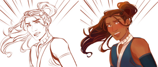
instead of drawing in black, I drew in this reddish brown color. On the right is what it looks like with the flats underneath.

And then, I set the lineart to multiply, and viola! A softer, more natural look. This required a bit of clean up, because I had to drawn under his eyebrows and eyes so that it wasn't weirdly light on his face.
This is something new i was experimenting with. I really like dark black lineart, but it was fun to try. It took me a long time to find the first process, and i tried a bunch of different stuff in between, and am still messing around with different things now. Experiment and find fun things, too!
#comic tutorial#lineart tutorial#asks#thanks for the ask!#also if this is the same person i talked to about the comic tutorial it's coming it's just long lmao
58 notes
·
View notes
Photo
Yay, new shitp0st,
Been playing around with lineart cuz im lazy like that, might aswell share,
“Natural” lineart probs looks the best, but im a busy person.
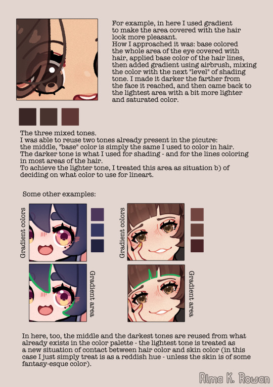
Also i work in CLIP Studio, similar features might exist in photoshop.
Happy pride month everybody <3
292 notes
·
View notes
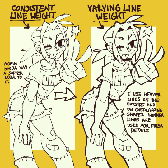
Text
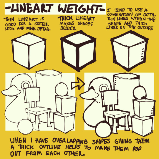
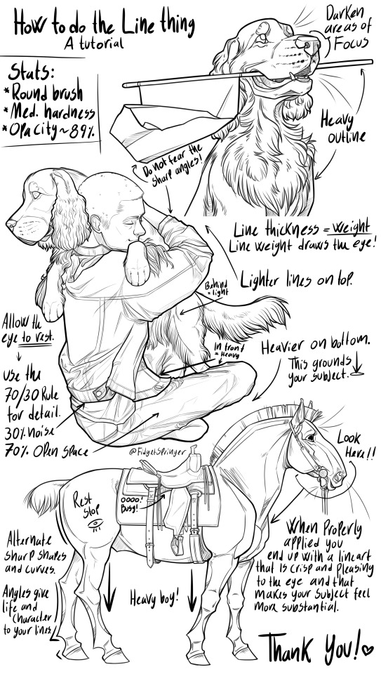
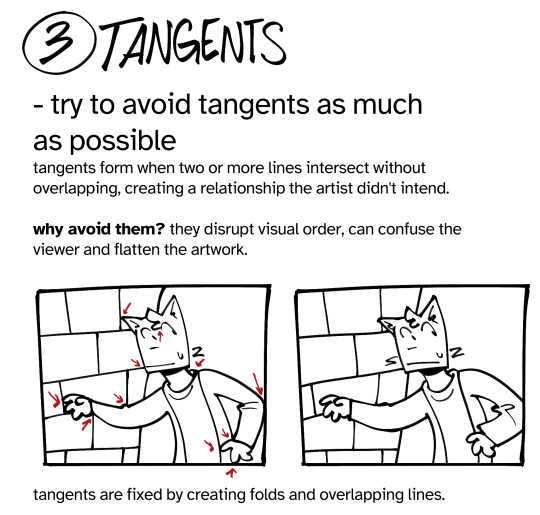
LINE VARIATION TUTORIAL (& THOUGHT PROCESS)
I will be using my character, Marley Solano, to demonstrate my process of doing line art, while explaining the best I can. I will reblog the full chain containing all parts when it is complete.
#lineart#lineart tutorial#art tutorial#tutorials#line variation#line thickness variation#line weight tutorial#Marley Solano#artist on twitter#artist on tumblr#digital art#how to draw#how to draw lineart#line art#TheOutcastedArtist's art
63 notes
·
View notes
Text
Here’s a quick little lineart cheat + tutorial
Sorry for the uh’s and the rambling.
33 notes
·
View notes
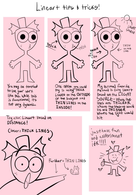
Note
hi! how do you determine where to put thick and where to put thin lines in your drawings? id really like to know :3
here's some pointers I made hope this helps!
17K notes
·
View notes
Text
Very messy and bad lineart tutorial I made a couple days back. I hope this is helpful to someone even if it’s a bit incoherent LMAO
Take my advice with a grain of salt, of course. I wouldn’t want anyone to think that my way of doing art is the only “right way”. There is no right way to do art! Just make art!!! Dingus!!!!! /lovingly
#digital art#commisions open#procreate art#cartoonist#artist#oc stuff#art advice#advice#art tips#begginerartist#begginer artist advice#art style#lineart#lineart advice#art tutorial#tutorial#tips and tricks#tips and advice
2K notes
·
View notes
Text
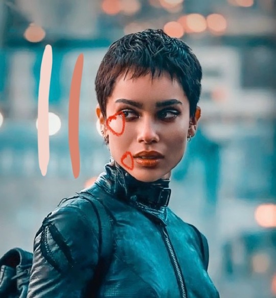
I haven't seen any posts about this yet but l've seen some fan art that makes me feel this needs to be said:
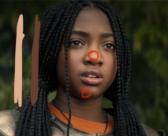
Don't forget Leah Sava Jeffries has darker skin when making Annabeth Chase fan art!
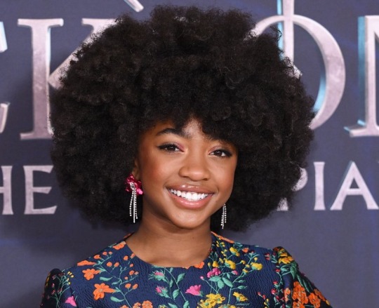
She is much closer to Lupita Nyong'o than Zoe Kravitz when it comes to shading, reflection, and complementary color usage :).
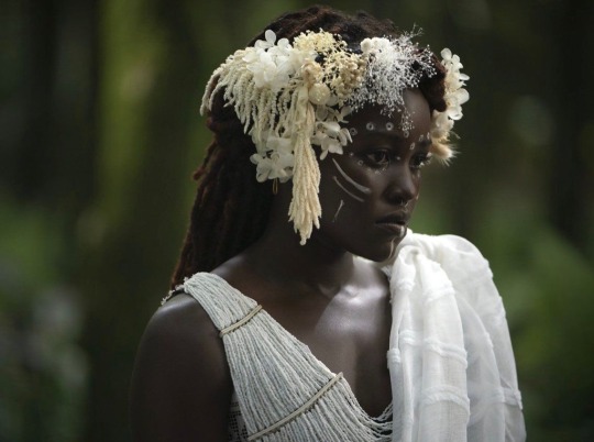
Lighting for dark skin is different on light skin. Light skin gets changed by lighting, and dark skin reflects the lighting. Below is a lovely shot of Nyong'o's character from Wakanda Forever in mourning. The filmmakers emphasize the umber qualities of her skin in contrast to the funereal white and (arguably harsh) light across her shoulder below.
Try to pick spots that aren't directly in or near the light, and try mixing 3 or more! You can put it into a color mixer online, or even color pick, lower the opacity, and lay the shades over each other until you find one that fits. And of course, the more 'realistic' you want to go with shading and lighting, the more shades you're going to want to be able to explore vivaciously :D.
Let's take a look at the same 3 beautiful actresses I mentioned at the beginning, with a bad color picked area and a better-ish color picked area. (Please keep in mind, these are not perfect comparisons, as I was not able to find pictures of all 3 actresses under the same kind of lighting.)
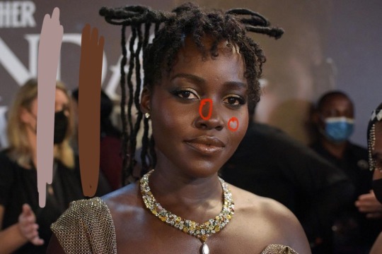
Kravitz's has a clear difference between the two, but they aren't too far apart, in comparison to Nyong’o’s and Jeffries’s. Note the dullness in the poorly picked shades as opposed to the better ones. Also keep in mind that while Kravitz has a rosy undertone (at least in that picture - it’s from The Batman, which has stylized coloring) Nyong’o has a slight cool undertone (I can’t pin down quite what, but the picture is definitely not stylized like Kravitz’s).
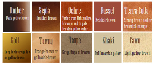
Jeffries runs more ochre or russet, but neither of those are pink. They are more red than terracotta or umber, but to call Jeffries’s face rosy would be wrong. Err more towards the golden when drawing her.
^^saved an image from a writing tutorial long ago, but can’t seem to find it. If someone recognizes it, I’ll link it.
EDIT: it’s from this post. Thanks @autumnrowancollector ! <3
And also, the darker skin gets, the less likely warm undertones are going to appear. Don't be afraid to use blue or purple or even green on occasion!
Additionally, cool lighting on dark skin is always a win imo.
(I was going to use that picture of Jeffries as Annabeth by the lightning bolt, but then I realized the lighting on her face doesn’t quite match up with where it should hit from that angle, and I realized they kind of just turned everything bluer, so screenshot time!)
(Also if you want another really great live action example, check out anything Aldis Hodge is in, like Leverage and Black Adam)(and of course there’s Spiderverse <3 but I want to post pictures of Hodge)
Now, to here’s a list of more experienced people’s advice:
Black facial features & hair
Shading digitally for a (somewhat) monotone Black character
Stylistic choices and places to start looking for inspiration (besides a search engine).
Coloring Black people’s lips
A better coloration tutorial
Also a nice tutorial for Indigenous skin tones, just in case yall want to draw Piper or use this information for other dark skinned characters :).
EDIT: Some actresses who are closer in skintone to use for Annabeth, provided by the lovely @blackfemmecharacterdependency ! If you can’t find a reference for Jeffries in a specific lighting, maybe check out these ladies’ pictures! It’s a reblog, so scroll down.
TLDR: Don’t make Annabeth pink and pale, make her dark and golden.
#Annabeth chase#Percy Jackson#percabeth#leah sava jeffries#pjo#leah jeffries#art tutorial#percy jackon and the olympians#I love superheroes and so of course all of the actors I thought of were from superhero movies lmao#also for the record my advice is mostly from reading others’ tutorials and observation#and I don’t really use it a lot because I stick to lineart a lot lol#like down to mentioning Hodge (love himmmm) as a reference for good lighting on dark skin#there’s another post floating around here that specifically mentions him and Leverage for that#I’m tagging this as an art tutorial but really i want it to be more of a master post#master post so yall can see the tutorials I usually use#but then I ended up writing about Jeffries specifically because I’m dumb#I wanted to go to sleep four hours ago I’m dumb#I really want to draw her and ginger Percy but#irl it’s starting to get busy at school again :/
351 notes
·
View notes
Note
i remember you mentioning before that you don't really do sketches- just get straight to the lineart. the sketching/lineart process takes way more time than everything else, for me, and i was wondering if you have any tips for doing it your way?
Here's a visual example of what the asker means ^
The answer to how I do this might not be what you want to hear: A lot of practice. I've put a frick ton of time into learning to draw fast, because it is a skill like any other with art.
I can share some quick tips on how I practised and my thinking process though, if people still are curious and may wanna give it a shot!
One of the main ways I practiced this was by using permanent pens and markers while doodling in school. I always disliked how pencil smudged so that came kinda naturally to me, but it was a huge help anyway!
When you work directly onto a pristine white canvas with no guideline you're forced to really think about where you put each line, and get over the fear of mistakes. By doing this you can grow a natural understanding of where the next thing you're going to draw should be.
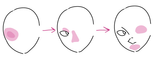
(Sorry if the picture is not a good explanation, I've never been much a teacher. (Also for full disclosure I did use ctrl+z when drawing this example.)) Here I tried to picture how by having the face shape lined, I can use knowledge of anatomy and what looks good to place the eye of the character in. Then with the eye in I can "Unlock" more feature locations!
It also helps being familiar with the character... I've drawn the cast of this comic so many times that these boys just show up when I ask lol.
This approach has a lot of issues, like it can be very hard to keep a character design consistent. Another is that if u get too bogged down on doing the same thing that works you're going to start making some really stale looking art-- It's so important to not just draw what works but to go for ugly perspectives and weird experiments.
Still, I hope this can help someone! It's not a method that works for everyone, but it's a fun one to explore :)
159 notes
·
View notes
Photo
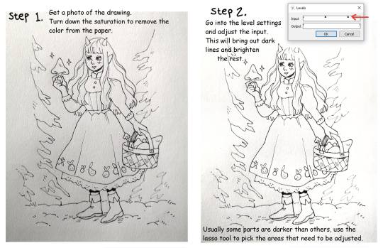

Quick lineart extraction tutorial!
The program used in this example is Firealpaca, but as far as I know these type of settings exist in most basic art programs (firealpaca is like the most basic of all anyway lmao). I dont own a scanner so a lot of the time I simply take a photo of the drawing with my phone, cleaning and extracting the lines still only takes a few minutes! Hope this is helpful :)
#The moment I learned this from a friend I pretty much stopped doing lineart digitally#because its just comfier to draw with actual pencils#but coloring digitally is fun and way faster so combining them is peak for me#art tutorial#lineart#inks
2K notes
·
View notes
Photo
Here’s a messy little guide on how I do the thing with the lines!
#digital art#art tutorial#lineart#art guide#linework#I hope my handwriting isn't too chaotic to make out#ask if you need any help or have any questions!#compression is gonna make this all blurry#so click to view in HD#my art
3K notes
·
View notes
Note
How do you draw Abodes Dreads/Braids? I'm a black creator and still (embarrassingly) struggle with them in the arcana style. (And in general XD) the way you draw her is gorgeous. And I must know the magic you poses.
Nothing to be embarrassed for! Unfortunately there's not much reference for black hair in the Arcana, so we all have to guess. I'd highly recommend looking at @kianamaiart and Simkray's hair brushes for other examples of stylising black hair (if anyone has examples of black hair in angular art styles, please share!!)
Anyway, I hope this helps!

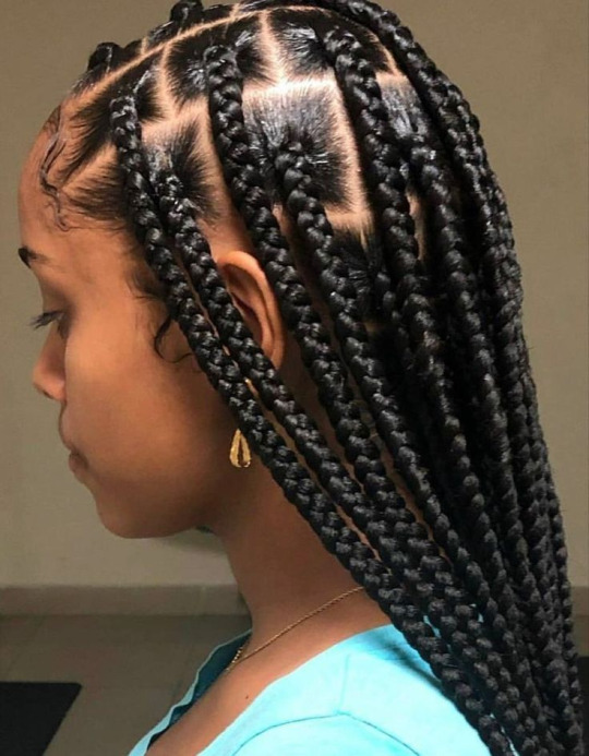
Dreads and braids are both segmented styles which makes their basic construction similar, however dreads are stiffer and hang less than braids, which are quite heavy
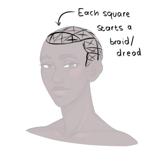
She usually pulls her hair back so I only have to pay attention to the hairline, but I draw each dread as a somewhat stiff tube. Where it connects to the scalp I feather in short, fine lines for the edges/thin hair that's attached to the skin.
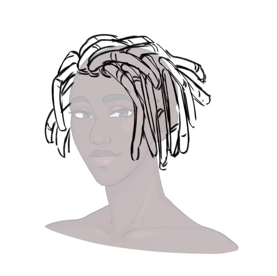
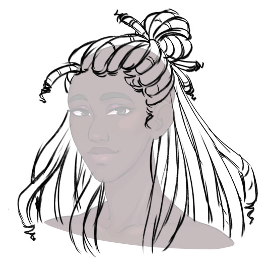
To show the twisted texture of dreads, I add curved lines along each one. For me, this is a good balance of detail for the style (though I can still get tired of lineart -_-)
Then, as a final detail, I give Abosede imperfect ends, topping most dreads off with a thin twist. This is optional as some dreads don't have this.
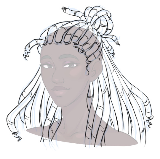
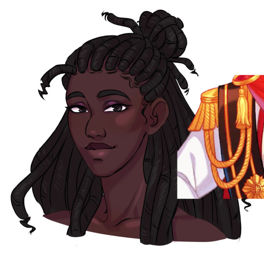
Then finally, for colour. I take reference for how they render ropes and add a series of light lines along each dread. Dreads don't reflect much light, so these are pretty faint.

For some braided hairstyles, you just replace the tubes I use for dreads with a simple plait pattern (as seen in Lucio's masquerade outfit). If you're aiming for cornrows, instead of the segments, draw the tubes along the scalp with sharp ends. Then fill them with a plait pattern. For extra detail, you can hatch lines in between the cornrows where the hair is pulled into the braid.
Braids have stronger highlights than dreads, and I tend to dot them in the centre of each part.
So this is my basic process. If you have more questions, feel free to ask!
#the arcana#the arcana game#hair tutorial#art ref#art tutorial#black hair#afro hair#art#i honestly haven't rendered abosede's hair much#mostly because there's so much lineart involved#for other art i tend to use braid/twist/loc brushes to make it easier#maybe i could try making some for the arcana style
3K notes
·
View notes
Text

one of my friends asked for tips on lineart so i made this simplified guide on some things i keep in mind. learning how to line comes with practice so have fun while you're at it!
#cherryart#fuckin. idk how to tag this#lineart#the first tip is a little corny but i dont caareee <-cares#art tips#tutorial
471 notes
·
View notes
Text
My growth as an artist was heavily stifled by the dogmatism in the online art community I was subjected to as a teen (aka by rhetoric implying or straight up saying art has to be made a certain way to be valuable, which discouraged me from experimenting and developing for my own methods, customising my artistic process felt illegal) and i will forever be mad about it
Anyways if any young artist follows me : the only good art advice is get weird about it and fuck around a lot. Also be honest
#sam speaks#art advice#lol#this isn’t discrediting advice that’s like pls learn the basics and here’s how to get better at anatomy#this is pointed towards those artists that act like lineart is a given in tutorials#thankfully I’ve seen more and more ppl divorce from the lineart industrial complex#also *insert rant about the internet and mainstream culture’s bias towards smooth art#and how it reveals society’s desire to forget the artist#atsv and itsv ? breeze of fresh air BECAUSE it is innovative artistic processes#and places the human feels of strokes at the center
354 notes
·
View notes
Text
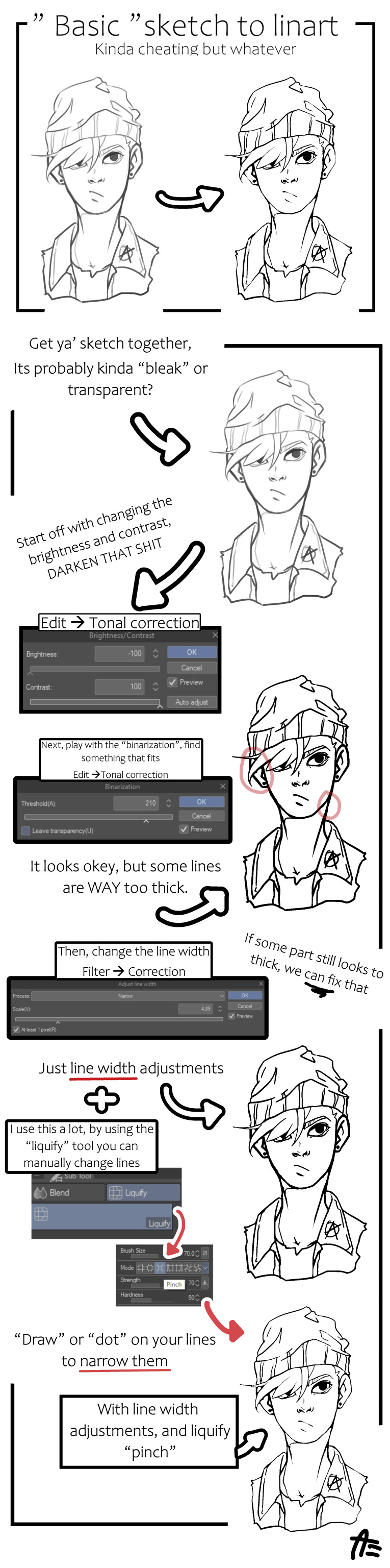
Crisp those Lines!
Or: a small collection of suggestions for a crispy, neat lineart.
SO MANY OF YOU ASKED FOR THIS (it feels absurd to say, yes), so here you go.
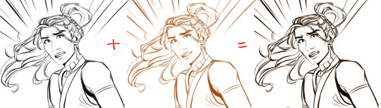
A premise: there's no right or wrong way of inking, and some of the following tips entirely depend on the type of inking I do. Which is neat and clean, with no blacks, and moreover: digitally. More under the cut because it's gonna be long and full of explanatory pictures. Here's an example:
SOFTWARES AND BRUSHES:
Let's address the elephant in the room: Photoshop SUCKS for inking and linework. The stabilisation of the brush there is SHIT. Good for colouring and painting and doing photobashing, but for Lineart you want it to be precise. Do yourself a favour and don't use Photoshop.
I generally use Clip Studio Paint, but i have to say that the best program for it that I've tried keeps being Paint Tool SAI 2. It has few functions, it's true, and I use CSP because it has more instruments. But if you don't want to pay much, SAI is incredible as for brush rendition and stabilisation.
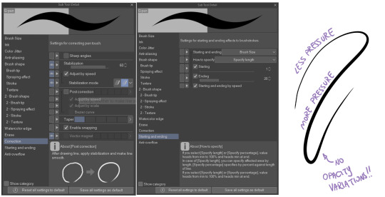
As for the brush: you don't need a fancy brush, anything in your software will go. What I use and what works best tho must have:
Tapered start and end.
High stabilisation (I go from 60 upward, lower it down for trees and grass or anything more natural that needs to be less neat and flowy)
Low tapering.
It must be set so that pressure controls only the dimension. The more you push on your pen, the bigger the line gets. No colour or opaciy variation!
On Clip Studio Paint, I use the G-Pen in the program. It's good as it is, but I think I did some variations as per here:
FILE DIMENSIONS:Better work larger and then resize down. Sizing files up digitally is possible, but it leads to unfocused images.
I generally work on files at 600dpi (300 is fine too, but don't go any lower. Particularly if that's something you want to print later on, any printing wants a minimum of 300dpi). in roughly an A3 format (bigger dimension is 43cm). Most pictures I upload here are 6000x5000 pixel.
A bigger file will give you more possibilities with brush sizes, and it'll be easier. Remember: digitally, sizing down is ok, sizing up is not something you should do.
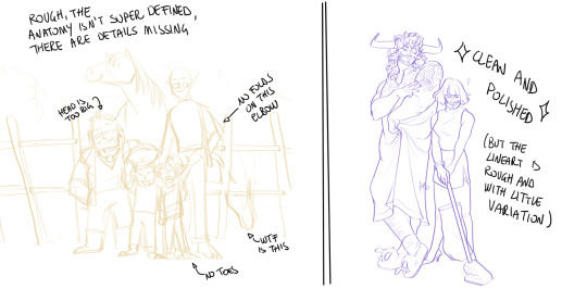
SKETCH:
This is the suggestion I should follow but never do.
Having a clean, polished sketch simplifies your life A LOT. This is because if you don't have to worry about drawing details and fixing the anatomy of your drawing during the lineart, and doing it so GOOD because it's the lineart... You'll go that much slower and your life will be more complicated (it's not impossible, my sketches usually are very rough. I am ok with it, the most I do drawing wise is during the lineart... But I'm lazy, don't do like me. A good sketch will help you out.)
Compare the two sketches below:
Another note about your sketch layer: you know those memes that complains that the sketch looks good but when you hide it the lineart is shitty? That's easily solvable.
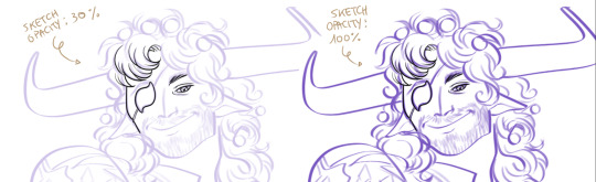
When you're inking, lower the opacity of the sketch layer down, A LOT. I generally go for a 30 or 40% opacity (depending on the colour of the sketch. the yellow sketch will go around 40% because it's less visible, the purple one lower).
When you're inking, you MUST see clearly the lineart you're doing. If the sketch isn't contrasting enough, you won't see clearly what you're doing... It's like trying to sketch with a dim light, not seeing the paper clearly. See the difference:
BEFORE YOU START:
You probably have read it everywhere, but it bears repeating: warm up your hand.
You're using muscles and for more than five minutes. The warmer they are, the firmer your hand is, the easier it gets controlling your lines. It also prevents you from damaging your wrist. Stretching is also great, and grippers are nice to have. Keep your hand fit!
As for warming up: I usually do some calligraphy exercises, practicing on flowy cursives. You want to practice varying the pressure of your lines in a single trait, hence why calligraphy is good. But generally, what you can do is...

PRESSURE VARIATION AND LONG LINES:
So. My main tip and trick is to vary the pressure of your lines. In the same line, and between different details. This will help making the lineart more dynamic and interesting.
A note: this works for semi-realistic styles. If your goal is obtaining a Cartoon Network style: they have generally little to no variation and it works. My suggestion would be to study the kind of style and effect you want to obtain, different styles will work best with different linearts. If you're aiming at hyperrealistic painting, there's no point in spending time over a lineart, for example, I inked the same lineart, but with a brush that doesn't vary it's dimensions with pressure, and not changing the dimension of the brush.
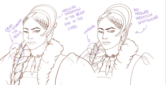
What makes my linearts look "flowy" and "neat" is the fact that I tend to draw less lines and longer, and pay attention when I stop, to start the line where I end it. This will give the impression of one continuous, single line, and make everything more fluid. See above in the french hood: on the right, I left the line rough on purpose, you can see where I stopped and started again. On the left, where I took care of it, you can't.
Generally speaking:
Thick, dark lines communicate that the object is close to the viewer (always keep the viewer in mind!) or in shadow. Lines should be thicker on the outside of your objects, to separate two planes, and in stuff closer to you.
Thin lines are delicate, they should be used in the background, for small details (see the hair, the lips, the small wrinkles around her eyes.)
As for line continuity: in both cases, the line of her face is one single line I drew. This can be obtained with a smooth result, particularly in curved lines, by getting the brush stabilisation on higher settings (80-100): sacrifice speed for accuracy.
MORE IS MORE, WHEN IT COMES TO LEVELS:
Particularly when there are two objects intersecating, or more characters interacting… Instead of inking all on the same level, I always do one level for each object, trace the WHOLE line as if there was nothing above, and then erase where it's not shown. This is a little thing, but pays off. Always in the drawing of above, the feather and the hem of the bodice were on separate layers, and then I erased the bodice under the feather. Take advantage of being inking digitally and not traditionally!

For many characters, here's an example of a vignette of a comic page before cleaning it up and erasing. Every single character and the weapons are on separate layers

For this it's very useful knowing your recurring mistakes. For example, I tend to draw heads bigger than they should. I know I do, so generally I keep the head on its own level, and the body on another, so it's easier to modify and size down just the head without getting crazy selecting only the lines you want with the lazo.
Again, you're inking digitally. It's not easier than traditionally necessarily, take full advantage of your instrument!
OTHER TIPS AND TRICKS:
High brush stabilisation sacrifices speed for accuracy. The line will lag a little from your cursor. Get used to watching the cursor and not the line, and trust that the line will follow.
GO SLOW.
Rotate and flip the canvas. Don't ask me why, but tracing long lines towards me is always easier than not the other way around.
Use the Free Transform, Warp, Distort etc etc and the Liquify to your heart's content if you notice the lineart has something wrong. The only cheating in art is using fucking AI generators (and AI pictures are not art, sorry not sorry)
References are your friends. Study how an artist you like does the lineart. Try and imitate them, and if you can and need to post them: tag them! (don't trace and sell it as your own)
Experiment with brushes, find one that you like for the effect you'd love. You do you, there's no right or wrong way of inking.
Remember to breathe when you trace those lines! (and to drink and do pauses and stretch, you don't want a tendonitis!)
Have fun. Lineart is not evil, lineart is your friend!
I hope this essay is exhaustive enough. I'm tagging ALL THE PEOPLE that requested it (and giving each of you a muffin).
@ndostairlyrium @narina-gnagno @salsedine @whimsyswastry @layalu @n7viper
If you have any questions, don't hesitate in asking!
#tutorials#lineart#inking#digital inking#digital art#tips and tricks#petrel explains#COME LO FECI (cit)#listen if we're mutuals and we chat... ask me to share my screen I don't mind the company when I work if it's not something I can't show#or if it's not too late at night for me#also I unironically like how Alyra inked without variation looks even angrier and more judgemental than normal LOL#also some spoilers for The Last Bacchae if you follow that#“Marmotta” means “Groundhog” in italian#art ref
122 notes
·
View notes
Last Seen Blogs

chocolatemind-blog1
kiwi world

beigesocialclub
BEIGE SOCIAL CLUB

gay-underwear-64
gay français
pansyguitar
Baylee’s 🫧 echo chamber