#lineart my beloved how i missed you
Text

The coolest wine aunt there is
for @gemini-forest's DTIYS
version without the chains so Mikey can be seen in his full glory

#It's been a while since I don't do something like this#lineart my beloved how i missed you#light source was hell on this one#me knowing the consequences of my decisions because I've made the same coment before:#Oh I'm gonna hand-draw the chains so I can do some cool perpective with it:)#me some hours latter: life is pain#i have no regrets because it looks cool af#rottmnt#rottmnt fanart#rottmnt future mikey#rottmnt coin toss au#coin toss au#coin toss dtiys#coin toss mikey#dg art#dg fanart
405 notes
·
View notes
Note
your trademark is PERFECT LINEWORK idk how you do it but your lines are always the perfect smoothness and the perfect angle and the perfect thickness
EDEEEEEEEEN!!!!! I love line art this made me so stupidly happy esp after I much only sketching for like 3 months out of no motivation oml 😭💜💜
#THANKING YOU AND RURU RITE NOW FOR GETTING ME MOTIVATED TO ASD COLOUR N DO LINEART AGAIN REMINDING ME OF HOW MUCH I MISS EM BUT ALSO SOBBING#CRYING GIGGLING#eden 💜#chatting with my beloved moots 💜
1 note
·
View note
Note
(If you're comfortable with this) could you make a tutorial on how you make your creations??? It'd okay if not, thank you for making them :D
WAA i can try!! baby's first tutorial ft. this guy

🐾 first, a picture of your blorbo
i use waifu2x to up the quality, not always neccessary but it makes everything a bit easier and prettier. i use firealpaca to edit but you can use whatever you like, im not your mom
🐾 probably get a reference
yeah i dont always do this. but you should! i should! so google whatever creature you want to turn blorbo into and maybe scroll for a bit to get a feel for what they look like :3
try to find one at a similar angle to your blorbo picture and paste it/open as a layer. look this is close enough ↓
🐾 onto the actual editing! human ear surgery
in case you prefer just one pair of ears. you have to understand the style so you can imitate it.... so look at their hair, maybe theres more colors or gradients than you can see at a glance or something ! i colorpick a bunch of them and put them over their ears, then blend them together with a low opacity watercolor brush
ALSO, notice the.. lighter glowy aura thing around his ear in the og? i try to imitate details like that too, used watercolor for this again
now maybe you wanna make it look like theres something covering that spot, since theres kinda nothing there now. soo if that looks weird to you, (open a new layer and) put some hair over it. i cant tell u how to imitate Any style so just. study it and keep trying
with enstars here the lines are pretty soft, so i go over it with watercolor brush after doing the general shape. with a higher opacity you could probably just use a softer brush from the start, i just like starting with the basic pen
🐾 the lines!!!
nowww i lower the blorbos opacity to around 50%, bring the reference somewhere i can see and just kinda... start sketching. lot of redrawing and transform tooling here sometimes
TIPS 1. you can clean the lines up at the end so dont stress
2. think of your blorbos new ears as a real tangible part of their body and how they fit on their head since you dont wanna make it look too flat !
3. and for the placement i always end up at roughly one human ear length above their og ears if that makes sense. tried to visualize it
as for inner ear fluffs phew i dont know either. draw a circle and start from there? maybe there are actual animal ears in blorbo artstyle out there you could reference
🐾 coloring 🏳️🌈
finally some progress huh. i color the lines in a contrasting color first so i see the lines properly and dont miss anything, then fill it in with the actual color :3 OH and for gradients i just use the airbrush at the ear tips or sides
noww shading! new layer, basic pen brush and try to follow the shapes in the og art. it's best if you pick the colors from the actual picture!!! take notes mentally and just do your best i dont know how to explain this more
taking this as an example, the shading is mostly in pretty simple wider areas, so not a lot of seperate strands in there. and its again pretty soft around the edges of shades and highlights, so i'll go over it with my beloved watercolor. keep things like that in mind so the creaturing blends in well :3
if you like more detail better you can still go with that. or less detail on a complex artstyle. the world is your oyster
🐾 and the rest
what else could there be???? making the lineart more cohesive for example ★ oftentimes it's not one solid color, thicker or thinner than yours, things like that.
for things like piercings or fangs you can just draw them on top i believe in you <3 if its like an intricate earring use the lasso? magic wand? the one that lets you select an area to copy and move on top of your ear layers
+ remember details like shadows, if you put a tail on top of say blorbos leg there's gonna be a shadow under it! put a layer under the tail ones and freehand draw the shadow, OR copy the tail layer, put the copy under the og one and change color/opacity until it fits
30 notes
·
View notes
Text
Rating cows from Medieval manuscripts because I fucking love cows
I love cows and I love Medieval manuscripts. Is there something else I have to say to justify this post? I hope not.
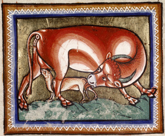
Ashmole Bestiary. England, early 13th century.
This is a cow for sure. I love her soft lineart - the artist knew what he was doing. Her reddish coat is Accurate, but she has curly hair, for some reason. This cow doesn't seem ready for the hardships of motherhood. She looks worried that her calf misses her udder completely, chomping on something that should definitely not be chomped. I empathize with her, to some extent.
9/10
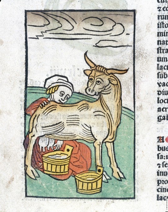
Ortus sanitatis. Germany, 15th century
A very skinny cow. She might be very young. This is probably the first time she's been milked, you can see from her face that she does not know what to expect, but she definitely does not like it. And tbh, I myself would not trust that little, lingering hand. However, I don't like that she's so skinny. Cows should be round, friendly and huggable. Her owners might be Poor, but Grass Is Free, you know? Let her eat something!
6/10 because it's not her fault.
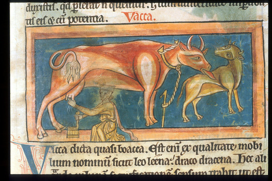
BL Harley 4751, f. 23. England, 13th century.
A very common rendition of a cow. I have seen at least two other illustrations like this one. She is Accurate, but her horns are red too. That was lazy, my dear artist. I love her fluffy tail and her tongue too. Cows have beautiful tongues. However, she does not look soft, but very sleek. I give her an extra point for that 'vacca' in the caption - it makes everything 1000 times better. 'Vacca' is a very funny word in Italian.
8/10
SÁM 66. Iceland, 18th century
This cow is technically not Medieval, but she gets a free pass because I know her personally. Her name is Auðumbla. I usually love Auðumbla, but here she looks like she's pulling a gigantic prank on poor Búri by spilling all her milk all over the universe, and he doesn't seem to appreciate it. Bad Auðumbla. Apart from this, she looks Soft.
6/10
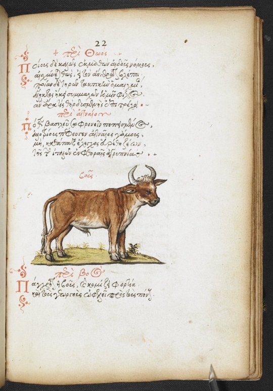
De natura animalium. Italy, 15th century.
If Auðumbla was not Medieval, this bad boy here is not a Cow. He is a Bull. However, if I was driving past a field I would still point at him and scream "Cow!!" to my mum, so he too gets a free pass. I love him. He has kind, expressive eyes. He seems very polite as if he would let you cross the street without honking at you. He also looks squishable but firm. He is probably the most beloved animal on the farm. I love you, Kind Bull.
10/10

Bohun Psalter and Hours. England, 14th century
This cow is literally me if I was a Cow. Wrapped in a blanket, with a book and flowers all around. This cow knows how to read. Cows should not be able to read, but I guess she followed her dreams and never gave up on them. Her eyes are so expressive, and kind. I cannot express the range of emotions this little Scholar Cow evokes in me. She also has a good sense of style. Good job, little Cow!
1000/10
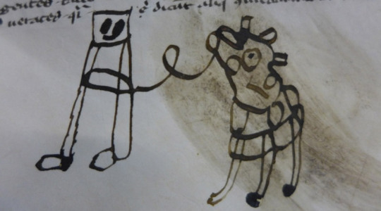
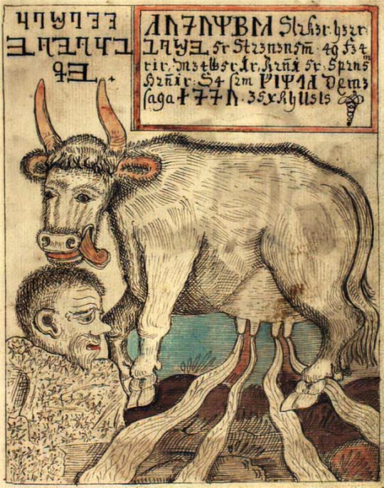
LJS 361. Naples, 14th century
Not sure what this is supposed to be. A cow? A horse? A 'corse'? Anyway, this looks like a little push cart with a stuffed animal on top. Really doesn't look like a cow. And why is she on a leash? Or maybe it is her who's keeping that square-headed creature on a leash? Is it, perhaps, her pet? In that case, we love our independent queen. But I still have to say: I have no idea what this is. Sorry, weird-looking maybe-cow.
1/10
---
This was all for today! I hope you enjoyed my little ranking of the Medieval beauties. Let me know which one of these is your favourite, pls I'd love to know.
To be completely transparent, I was inspired to do this by @cuties-in-codices 's beautiful posts on weird creatures in manuscripts. I love your blog so much.
Ha det bra, my fellow friends!
#manuscripts#medievalism#medieval#medieval history#middle ages#cows#animals#ratings#manuscript#i fucking love cows
76 notes
·
View notes
Note
How does procreate compare to sai for you out of curiosity ?
I’m kind of 50/50 about it.. like once you’re more familiar with the UI and how everything generally works it’s super straightforward which I appreciate! the whole brush customisation aspect is a bit overwhelming for me since im just used to fiddling with a few settings then running with it but now there’s a whole customisation bar so you can get it to exactly what you’re looking for …. which is nice in itself but for me who has like .. virtually no clue on what she’s doing or what any of these means im just ????? 😭 but downloading custom brush packs is so easy too so im not gonna bother with that for now lol
drawing on glass is still a bit tricky for me too it feels like im constantly fighting for grip if that makes sense. I think im still used to how my tablet draws bc the stylus’ nib was a bit sharper compared to the apple pencil’s but it did left scratches on the tablet itself lol. I also like how easy it is to adjust the canvas sizes since you’re just dragging it (compared to sai where you have to type in the exact dimensions) but I also don’t like how they’ll give you less layers the bigger your canvas is 🥲 like I generally work on 3000 x3000 and I’d like more than 100 layers alas
ONE THING that im severely missing is sai’s marker tool though, specifically the marker tool with my own config. like that’s literally my bread and butter and i use that pen in virtually everything - both lineart and colouring. imo that brush gives my prev drawings that soft looking feel (if that makes sense??? idk) but it also doesn’t have that drag that procreate brushes tend to have. like ive been trying to replicate it in procreate or at least find one that feels similar but I haven’t had any luck so far 😭🥲
all in all I do like it better than photoshop or even krita, but I think im just so used to working on sai that I still prefer it, esp since that has the marker brush (my beloved). my opinion will prob change once i do actual illustrations on it though since I haven’t done a fully rendered piece yet and i want to see how I’ll adjust my workflow with the layer constraints. i do like the fact that there’s no colour differences though since the ipad screen is really nice so you don’t have to worry about colours looking different in diff screens
#I also don’t like how you can’t use clipping mask on groups 😭😭#like that’s what made shading easier in sai but now u have to merge everything to be able to do that sigh#i do like the convenience tho!!!! like my ass is really drawing everywheee and it’s SO easy to just boot procreate up and draw#so that’s a win for me specifically lol
15 notes
·
View notes
Text
OK SO EPISODE 11: TRAUMA GOT ME LOSING MY MIND TONIGHT READ BELOW TO SEE MY THOUGHTS
Shou and touichiro seemed pretty much the same except for two things. 1) touichiro's vision of Shou and his wife which was just... So good... The way that the coloring paralleled his vision of his wife in season 2 has me 😭 2) the other one I noticed was the double charge bomb they did together. This could have been in the manga and I just didn't remember it, but I'm pretty sure that's anime original and I am LIVING for it. Shou's trump card which he originally used to try and bring down his dad is now being used in tandem with his dad to help someone. It's so so good. (What's NOT so good is Shou's outfit, why is bones so determined to slander his sense of fashion?? But that's a post for another day lol)
(for an episode titled "trauma" it was rather hopeful in the end. Wonder if that has any sort of thematic meaning)
first, all the changes. I really adored all the build up they gave ritsu. His arrival was a bit abrupt in the manga, and I will forever love bones for not only having ritsu find the crash sight, but also find and take care of Teru. Literally yesterday I was thinking about how sad it is that Teru just gets left naked and hurt in the middle of the road, so that was very very nice.
Back to more Ritsu changes since I'm following the episode's progression of scenes! I really miss the "man this is overkill" line. I know it doesn't fit the tone but it was just really funny ok?
But for some bigger changes, I noticed they took out the rhubarb wire that Ritsu saved a body improvement club member from. Which is interesting, I wonder if that's because of change of setting or censorship concerns.
They also took out a lot of the implications of Ritsu's plan later in the fight. In the anime, he said something along the lines of "a big shock might stop nii-san" whereas in the manga...
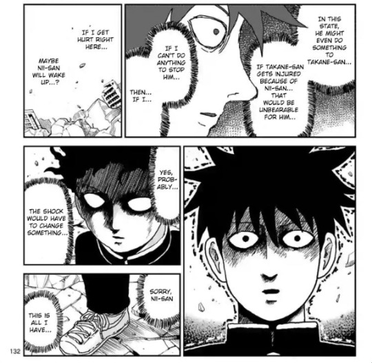
Yeah, he basically flat out says "maybe if I get hurt nii-san will snap out of it" which hoooo boy sure is a line of dialogue.
The final change I noticed was between the two "Mob" and "Shigeo", mainly in the art. I LOVE how they're doing it, with Shigeo being a blank white outline and Mob having blue lineart. It really helps differentiate them and make them pop. Super cool.
Now, do I miss some of the manga content and am I sad to see it go? Yes. But did bones do an utterly incredible job at adapting this? YES!!! so even if i don't like some of the changes, I like some of the other changes, and I love it overall.
As for overall hype:
OH MY GOSH 100% RITSU IVE BEEN WAITING FOR THIS MOMENT AND BOY DID IT DELIVER I AM FROTHING AT THE MOUTH I LOVE THIS I LOVE THIS I LOVE THIS
Also all of the parallels to previous things like having their fight on the bridge where mogami world Ritsu ignored him is spectacular. And the whole "I'm your little brother so let me help you" paralleling mobs "in your older brother, so I have to take care of you". And the music being the same as their original fight in the alleyway. I can't even...
SHOU CONTENT!!!! YES!!!! I CANNOT EVEN BEGIN TO DESCRIBE HOW HYPED I AM TO SEE MY BELOVED
Studio bones really just adores the super five huh? Hatori is still here lol and Joseph too
REIGEN AND SERIZAWA JUST SPRINTING PAST THE POLICE AKFJSKFKR YES THAT WAS SO GOOD
Tsubomi please move out of the way of the active tornado this is not a safe place my girl (and what an interesting character choice for her to wait, Tsubomi is such an enigma in all the best ways)
Oh rip to sakuri and koyama, you did your best. (Side note, imagine your ex CEO falling from the sky to duke it out with a magic middle schooler who just destroyed your workplace. Seasoning city is so wild lol)
Random side characters getting one frame my beloved! Minori moment!! Tokugawa and Shinji moment!!
In conclusion, episode 11 makes me lose my marbles and it was 100% worth the wait!
#mp100#long post#mp100 season 3#mob Psycho 10p#season three#ritsu kageyama#shigeo kageyama#shou suzuki#touichiro suzuki#teruku hanazawa#writing#text post#analysis#shinji kamuro#minori asagiri#tokugawa#no idea what his first name js lol#tsubomi takane#reigen arataka#serizawa katsuya#???#???%#sakurai#koyama#hatori#joseph#mob psycho 100
40 notes
·
View notes
Note
IMMA DO IT Kann: 🖊️🐈💘😞 Enfer: 😖🎮🤍🔺
YEAH YOU WILL!!! Details about OCs ask for our beloved Crimson character just for you!
Also cause I haven't shared any art of them yet and this is my dear co-author coming in with the great asks about characters we've been obsessing over over the weekend.
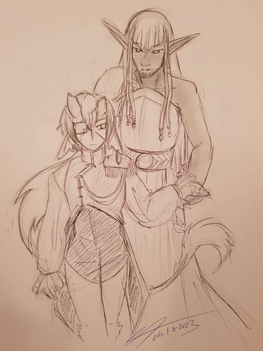
Enfer on the left, Kann on the right.
Kann:
🖊️ BALLPOINT PEN — does your oc have any tattoos? do they want any (more) tattoos?
Under the armour/sleeve of his right arm he has a full sleeve tattoo that is a mix of elven and dwarven stories and how Greater Ekatha came to be. He got it because it reminds him of his roots and what the kingdom stands for. It's not in colour, just a very pretty lineart.
🐈 CAT — does your oc prefer a wide circle of friends or a few close friends?
He has a pretty large network of friends, he’s one of those people others would direct you to cause he’s bound to know someone. He has a couple close friends but in general he is happy to just move from social circle to social circle.
💘 HEART WITH ARROW — what and/or who do(es) your oc consider the most important to them?
The people of Greater Ekatha mean everything to him. Not just those born there, but the people who come from afar to stay for a short time or a long while. Much like the Princess he desires a world where everyone is free to travel and intermingle as they please and celebrate the life they have. While many in Vespera think themselves above the Elvendwarves of Greater Ekatha he considers them all family too and makes fairly regular trips to the sunless kingdom.
Arguably Enfer is one of the most important individuals to him, while he tries not to play favourites, Enfer absolutely gets a lot of special treatment from him. If Enfer desires something he strives to find a solution to not compromise his morals while also meeting the faun’s needs.
😞 DISAPPOINTED FACE — does your oc attract others, or do they tend to be left alone?
Part of the reason Kann ended up being put into a position of power is cause he can befriend pretty much everyone. He’s that friendly neighbour that will bake you some bread and say hope you have a good day as you head out to work. He does thrive in that environment, he loves being around people. He just doesn’t feel cut out to run a kingdom politically but that’s what Enfer is there for lol.
Enfer:
😖 CONFOUNDED FACE — is your oc an introvert, an extrovert, or an ambivert? do they let people in easily, or are they more reserved?
Ambivert! Before he lost his standing as leader of the fauns he let people in much more easily, but after being challenged for the right to lead right before an important council meeting that would hopefully end in treaties signed to prevent war, he became much more reserved and cautious. Being Greater Ekatha tho and aiding Kann politically has made him much more cunning but also the general atmosphere of Greater Ekatha and what it stands for has been bringing him back out of his shell. Mostly he live vicariously through Kann when it comes to social interactions.
🎮 VIDEO GAME CONTROLLER — what are three of your oc’s favorite hobbies?
- He loves experimenting with different tea blends. Between Greater Ekatha and Vespera there are a lot of different flora to try. With the Wildlands close by too it's just a goldmine. He often brings a new blend for Odin and Thane to try when he and Kann travel to Vespera.
- Practicing sword fighting. Not something he needs so much in Greater Ekatha, but it was something he took a lot of pride in when he traveled between the three faun settlements.
- Being on the water. Not swimming necessarily, but he loves just being on the water. Thankfully you can take a gondola from one side of the kingdom to the other. It is something he misses from his time in the settlements was being on the ocean so often. He loves the smell of the sea, the warmth of the sun, the feel of water against his legs.
🤍 WHITE HEART — what are three of your oc’s neutral/questionable traits?
- Enfer plays into the ‘poor damaged faun’ role which wasn’t hard when he showed up to Greater Ekatha hornless, bloodied, face and body gouged. But for 16 years he’s kept up this ruse, letting people believe he has been broken by the experience and Kann keeps him close because he needs that support/is too weak to look after himself.
- Enfer is greedy and bitter, but mostly greedy. While he had the best intentions to keep the fauns politically neutral, he did very much enjoy the power and once he lost that he found a way to get it back by working with Kann. He is also greedy for Kann's attention and is prone to jealousy given Kann is very blatantly a people person and beloved by all.
- in the words of my co-author: gaslighting, gatekeeping, girlboss
🔺 RED TRIANGLE POINTED UP — does your oc know how to use any weapons?
- Like many fauns their horns/antlers are their prime weapons. Horns being stronger but if they break they don't grow back, antlers being weaker but more dramatic and more likely to grow back if broken. Because of this fighting/challenging for leadership often includes weapons too. Enfer is particularly versed with a sword.
2 notes
·
View notes
Note
hello master mctizzles!! 28 & 29 for the artists ask pleae, since i know you do a fair amount of traditional? also 10! (and if u say anything other than HELL YEAH, all caps, i will have many hype words to say at you<3333)
28. For traditional artists: what medium do you like the most?
OHHH INK DIP PENS MY BELOVED
god i miss her, i haven't done an ink peice in so long this is making me yearn
for those of you who are new, i used to primarily use a dip pen and watercolors for my art, you can see a general look at all the materials in this old drawing i did for class

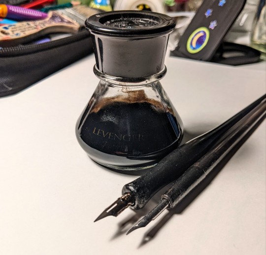
the bottle is way fancier than need be, but i like it so i use it lmao (the ink is winsor & newton india ink and the pens are just the general dip pens you can get at michaels or hobby lobby) the water colors where the masters touch fine art studio watercolor set with 24 colors, they're the pan kind.
also i just generally like using pencil, ik very basic, but nothing will ever beat the feel of using a 6B pencil on drawing paper, immaculate 🤌
29. For traditional artists: How do you usually start on a big piece?
I usually start with a thumbnail in my sketchbook or on a scrap piece of paper to get a general sense of the composition, and do some bigger sketches if i want to map out specific poses that might be difficult later
then I do a light sketch with as much detail as i can on a taped down peice of watercolor paper, then i ink it, erase the sketch, clean up some of the lineart with a white gel pen (sometimes white paint if I bungle it enough) and then go in with watercolor, going from dark to light, then shading over everything after the first layer is dry.
(I KNOW I KNOW, ur supposed to go from lights to darks in watercolor, and I do if I'm doing like a painting, but it's much easier for me to fill in all of chat's black and marinette's hair before i go back in to work on the grey's, and by that point im using less and less pigment the more I paint, as my little puddle of black gets smaller and smaller in my palette.)
I took a lot of process photos when i did traditional but i haven't done it in a while so these are a tad old,,
some examples of thumbnails,,
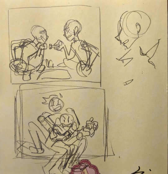
some examples of sketches

and then some lineart photos


(i usually take photos of just the lineart when im scared to start the watercolor, so theres not a lot of them)
10. Are you confident about your art?
aaahha... eh.... i answered this ask in another post, so you'll have to go there to read it,, love you maryssa, hdhdhdhf 💙
thanks for the ask!! these questions are from the artist ask game, send me some and I'll do my best to answer them!
#also speaking of pencils i tend to use either .5 mechanical ones or 4B to 6B wooden pencils#i just like the feel of softer pencils :))#ask#that sure is a lot of photos djdhhf sorry for the long ass post#tizzy talks#artist ask game
88 notes
·
View notes
Text
The Ink Demonth - Day 17. Glass
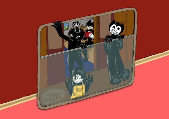
Trains are my favourite means of land transport. As you can see, the triplets also like it. Let me remind you that they were born in the Workshop, where the highest speed they experience is on the carousel at Bertrum's. I guess trains are speeder.
By the way, I took the colours of the train from a picture of how trains looked like around 1970 in America. I don't know how real that was, I don't know much about trains of USA. That's why the interior is taken from a typical Polish train, sorry.
And now... attention, attention, let's locate ourselves on the map...
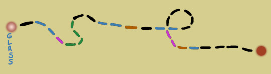
YES! We are finally at the very beginning of our journey! This is the first picture from the Bendy's Family serie of holiday adventures. AT LAST.
Well, Bendy and Sammy's plan was that they would take the train in Los Angeles and go all the way to New York, where they had a ship to Rome. As we already know, they won't succeed very well with these plans - but why? You will find out in the next picture, the only one which is missing from the initial stage of the journey (i.e. Sin).
This picture was done and ready by the end of August. But... my husband pointed out that I forgot to make the top border of the glass - so having new experience with computer drawing and overlapping layers, I fixed this mistake and changed the concept of my signature to a more fun one just now. Plus I made a better shadowing on here.
If anyone is wondering why the book being read by Bendy has no title and no cover credits, I would like to inform you that this is not my mistake. Bendy took his beloved book from the Workshop and he doesn't want it to get damaged, so he did what many people do with their beloved books on the journey - he wrapped it with protective paper. This also has a second advantage - no one will judge you by the title.
While Bendy is reading, Sammy, as you can see, is alert and keeps his eyes on the kids. Sammy doesn't quite trust people and how they deal with nonhumans, so he prefers to keep an eye on Juniors. Will he be equally vigilant throughout the train journey? :] Well... no. Definitely no.
This picture was the first one drawn, so it's much smaller than most. It is also much simpler than the ones I drew later. So is Wait. The degree of complication increases with the journey (but not entirely - because the last picture is also an uncomplicated lineart).
Why are the windows on the train not shiny? Because they are dirty.
Entry to the Ink Demonth 2021 - Day 17. Glass.
#The Ink Demonth#Bendy and the Ink Machine#Bendy#Ink Bendy#Ink Demon#Sammy#Sammy Jr#Henry Jr#Bendy Jr#Samdy Kids#Bendy's Family
18 notes
·
View notes
Text
The 1000 And One GBA SP Special Editions
I was browsing through my issues of Pokèmon World yesterday and noticed that almost every copy published between the years 2003 and 2004 had at least one new Special Edition GBA SP to show. We're not talking about a few instances, either: Pokèmon World was a monthly subscription, so these special editions were indeed prolific.
When the GBA SP was released in February 2003, it was actually a big deal in the history of portable consoles; it was the first Game Boy to feature a rechargeable battery, implying a great energy and economic improvement, the screen was backlit, so it could be played anywhere without concerning about external light sources, and its folding design contributed to screen preservation (plus, I'm pretty sure the design of the DS was based on the SP).
The GBA SP was also the last Nintendo portable console to be actually named Game Boy, as we all know the DS is just called Nintendo DS (seems a bit silly though... I don't find anyhing wrong with the name Game Boy DS).
Personally, I owned both the classic GBA and the GBA SP; when the battery case of my classic GBA broke, I decided to switch to SP and never got back: this little jewel has been with me since probably the year 2004, still works perfectly nowadays, and up to this day I still play both GB and GBA titles on it.
The GBA SP was released at the beginning in three standard colours: Silver (AKA Platinum), Black (AKA Onyx/Graphite) and Dark Violet (AKA Cobalt) (the paints used are all opaque, but translucent with a slight “pearly” texture). The rest listed here are all special editions. I'll also try to be cronologically correct, but one can never tell.
This could be a nice reference guide for further researches, or as a checklist for whoever is rich enough to collect them all. It'll be also subject to updates from time to time because who knows, maybe Pokèmon World actually missed a few of them in the way.
Wikipedia has no complete list of this either, so I guess it's gonna be helpful.
BlastoiseMonster's Guide List For GBA SP Special Editions
- Tribal. Released worldwide as the first special edition of the console, this one is simply a Platinum SP with black, tribal tattoo designs printed on the case.
- Pearl Blue. A worldwide special edition release sporting a light, sky blue case. A later edition got released with an even brighter backlit screen.
- Pearl Pink. Primarly aimed at the female audience, this special edition is pearly pink. It’s the SP I have! Looking at it in real life, the pink is actually very subtle and leaning more to a silverish tone, which is a good thing. xP A later edition got released with an even brighter backlit screen.
- Pearl Green. Special worldwide edition with a subtle, light green tone. A later version got released with an even brighter backlit screen.
- Dual Tone Platinum/Onyx. One of the many variants that took advantage of the SP’s foldable design, this one has a black case for the screen and a silver one for the buttons.
- Mario VS Donkey Kong. This one got released in bundle with the Mario VS Donkey Kong game: it’s red on the top, silver at the bottom and the upper case has Mario’s “M” logo printed on!
- All Blacks. This one is a variant released in New Zealand only! It’s... well, all black, and the front case bears the All Blacks football team logo printed in white.
- Classic NES. Aaah, the nostalgia! This cute American and European special edition is painted all over to look like a Nintendo Entertainment System. Its buttons are colored to emulate a NES controller, too!
- Famicom (Ver.1). A japanese-only counterpart of Classic Nes edition, painted in white and crimson to emulate the good old Famicom colours, of course. Version 1 is mostly white with the bottom part (battery side) in dark red, with the buttons and screen border of the same colour.
- Famicom (Ver.2). An updated version of the japanese Famicom special edition sports a white top and a dark red bottom, painted in gold on the button side to emulate a Fami controller. It war released in honour of the 20th anniversary of the beloved console.
- Final Fantasy Tactics. This special edition was bundled with a Final Fantasy game and is of a milky, pearly white colour all over.
- Gold. This golden special edition with a brighter screen was exclusively sold in “Toys R Us” stores of both Japan and North America.
- China Dragon (iQue). When the GBA SP got released, China had very strict restrictions for game importing, so Nintendo had to release its games throughout the “iQue” brand: this special edition is available only through that brand and in fact bears such a logo on the front instead of the Nintendo one. It’s red coloured on the front, black on the back and sports a very nice black dragon design printed at the top!
- Kingdom Hearts Deep Silver. This special variation bundled with a Kingdom Hearts game is silver on the outside cover and dark grey on the inside; it also bears a logo printed at the top and two graphics near the buttons.
- Lime Green. Released in North America only, this SP was bundled with Donkey Kong Country (again? how many ports does this game have?) and has a very bright, acid green colour all over.
- Naruto. Probably bundled with a Naruto game, this SP is bright orange all over with blue buttons and a white printed logo coming from the anime/manga.
- Pokèmon Emerald: Rayquaza. Let’s start with the Pokèmon themed editions! This one is to celebrate the release of Pokèmon Emerald in Japan, and Pokèmon Center stores were the only ones to sell it: it’s emerald green with a silhouette of Rayquaza at the top.
- Pokèmon Ruby: Groudon. Of course, Pokèmon Center had to celebrate each third gen Pokèmon release with a new SP! Ruby version is dark red with a close up of Groudon at the top, its eye stands out as it’s printed in yellow. Only 1000 were made!
- Pokèmon Sapphire: Kyogre. Pokèmon center exlusive for Pokèmon Sapphire, it’s dark blue with a close up of Kyogre at the top, its eye stands out as it’s printed in yellow. Only 1000 were made!
- Pokèmon Fire Red: Charizard. Luckily, some Pokèmon themed special editions got released worldwide, too, like this one for Pokèmon Fire Red: it’s in bright, light red (almost orange) with a white lineart of Charizard on the front and inside.
- Pokèmon Leaf Green: Venusaur. Of course, even Leaf Green got it special edition. It’s in bright green (leading towards teal on the inside) with a white lineart of Venusaur on the front and inside.
- Pikachu. This very fun worldwide special edition is completely in matte yellow plastic and has Pikachu’s muzzle printed on the top! The buttons are brown and a dark yellow silhouette of the electric mouse can be seen on the inside.
- Torchic. Orange is Japan’s national colour, and to celebrate the 5th anniversary of Pokèmon Center, the japanese store chain released a bright, pearly orange SP with the silhouette of Torchic on the top. It’s hard to see in pictures, but the graphic is etched on the case rather than printed.
- Rip Curl. A silvery white American and Japanese variant printed all over with the Rip Curl logo, both on the top and in the inside.
- Rockman EXE. A japanese exclusive bundled with a Rockman (or, as we call it, Megaman!) game: it’s in bright electrric blue with sky blue buttons and yellow rubber protections above the screen.
- Gundam G Generation. Another japanese exclusive, bundled with a Gundam game in bright red with a yellow logo printed on the top.
- Swiss Gamer. A Switzerland exclusive! It’s crimson red with a white cross on the top, making it look like Switzerland’s national flag!
- Sword Of Mana. This japanese exclusive bundled with the Sword Of Mana game is of a pearly, aqua blue shade.
- Who Are YOU? This street art special variant got released in North America: it’s black all over and has a white logo on the front.
- Zelda Edition. Probably one of the most famous and beautiful special editions after the Pokèmon ones, this worldwide-released SP is obviously made to celebrate the Legend Of Zelda franchise, bundled with the Minish Cap game; it’s gold painted (a far richer golden hue than the Toys R Us version, I must say!) and has a triforce logo printed at the top. 30 of these units were autographed by Shigeru Miyamoto and given away randomly as a secret prize for the lucky ones who decided to preorder the game!
- Samus Satin. The players in Europe, North America or Japan who wanted a special refurbish for their SP could send their own units to the Nintendo headquarters to get it back with this variation; basically, Club Nintendo subscribers could pay 600 points and have their console completely renewed in bright red at the top and orange at the bottom, just like Samus’ space armor.
There’s 34 editions in total, which is indeed an impressive amount! And seeing them all together is quite a show!
0 notes
Last Seen Blogs
subtlesilvertongue
Mara, Multidae
oranges8hands
more cookie time

upchar-org
upchar-org

perfectimpulses
STAND ALONE

largando
Untitled