#its slightly easier to tell with the gradient background
Text
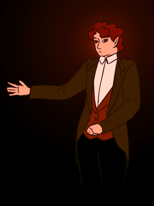
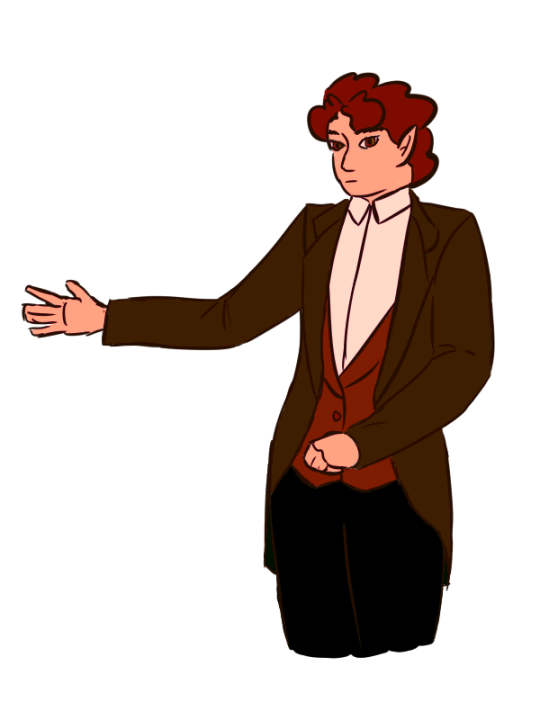
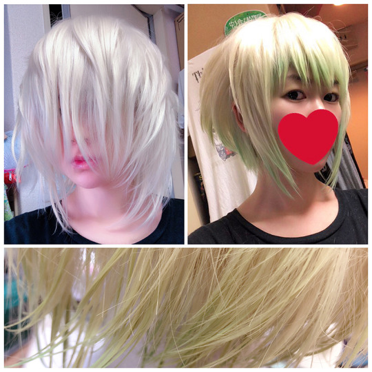
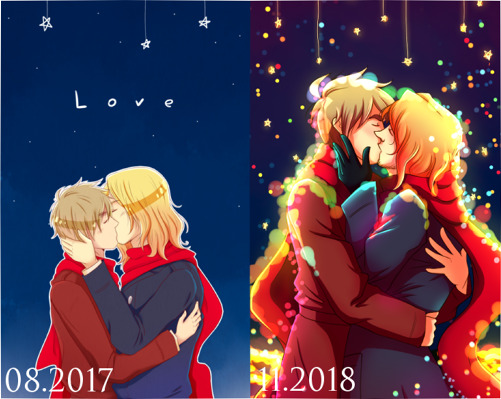
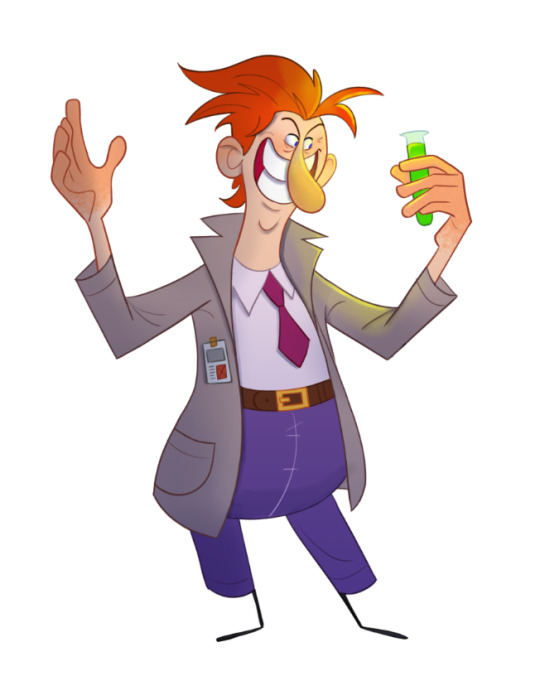
Finally updated my laptop profile photo. Also love the somewhat historically inaccurate victorian style coats.
#crazy coconuts#sona#hehe#actually I put a bit more thought into the lines of this than I normally do#the button up is 'missing' its buttons bc usually theyre either white or clear to hide them#you can't see the sleeves under the coat because it was something a few of the photos I was looking at had and i thought it was fun#the coat itself was originally green. but i do love pushing all the colors of a piece red#its slightly easier to tell with the gradient background#also there's two bg variations of this that I decided looked bad and redid#although the discord got one lol#oh and#tw eye contact#tw scopophobia#i love eyes in art but I know some dont and thats chill#alright im done.#you're receiving this on friday but i did it saturday night. and scheduled it yesterday lol
15 notes
·
View notes
Note
I'm wanting to get into making icons and playing around with editing photos, do you have any tips you might wanna give a newbie?
omg of course! a caveat that i am also still fumbling my way around with icons but my meagre advice!
photoshop has 100% made my life easier with icon making but if you don't have photoshop there's a website called photopea which is totally free and works pretty much exactly like photoshop!
usually i do a 500x500 canvas size which is quite big for an icon but i just like to see what im doing with more pixels and then if it exceeds the size limit i'll size it down to like 100x100 or 50x50
i generally try steer clear of pictures/icons with a lot of wispy flyaway hair just because masking around them is a bitch (which is why as much as i love curly buck his lil gelmet is v handy)
also (not always but sometimes) i try and match any colours in the icon to the background, like a shirt/item of clothing/etc matching the background. this is jut to make it look kewl
for me personally i love textured backgrounds!! with the latest crop of buck icons i used this texture
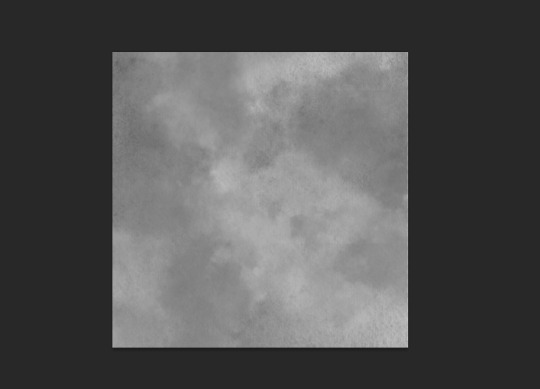
that i then grey-scaled, brightened and then applied various purple overlays (i kinda futz between overlay and multiply for blending mode). i found this one just by typing watercolour texture on google!
(a lot of times i will use gradient overlays for the colours! for example for my current buck icon i did a slightly darker yellow gradient into a lighter yellow! so this was my yellow overlay)

(im aware its literally impossible to tell so maybe i am just neurotic and im the only one who notices but i think it just adds some #texture)
if ur using photopea/photoshop i defo recommend the pen tool for cropping out the person in the icon, its kinda a pain to learn but once u get the hang of it it is SO handy and u can do pretty much anything with it (except flyaways grrr)
i colour-correct the icon the way i do with most my gifs, so i add a sharpening layer (my settings are smart sharpen > amount 250, radius 0.3, and then again smart sharpen > amount 10, radius 10) and then i add a curves layer just to brighten it up and create shadow, a brightness/contrast layer to further brighten, selective colour (this depends on if there are any colours that you really want to pop and i just accentuate them more/change them to fit with my background if need be) and then a little bit of hue/saturation because i like my colours to be super vibrant.
anyway i hope that helped!!! i feel like i was very vague and rambly but pls feel free to ask any more questions!!
9 notes
·
View notes
Text
More Dragon Killer excerpt
Aerin’s hand falls back to her side, limp, and all she does for a bit is stare at the spot where Maur had been. The tremble returns to her limbs, and suddenly her legs are giving out from under her and she does a slow collapse to the ground, ending with her kneeling and staring blankly at the floor. She’s still holding the sword, but the flames have now vanished, leaving it a relatively normal (if blue) looking blade.
She is still for some time, what feels like ages but is likely less than a minute The silence makes the time seem to stretch longer, pulling it like a piece of soft taffy.
Aerin knows this feeling. She can relate entirely. It’s that moment when the battle is over and the fighting has ended, but the mind won’t fully register it and is refusing to believe that it’s alright to stop, to rest, to find loved ones and check on them, make sure all are well, or as well as can be. It’s a certain blankness, a staticky fog that covers makes it hard to think and lets only a few thoughts rise to the surface and circle around and around and around.
It’s not a particularly enjoyable sense. She’s glad she’s not the one currently experiencing it, and that the one who is is only putting on a performance of it, and not actually having to go through it.
The odd background is solidifying some, no longer the mess of indistinct shapes it had been. Now it’s becoming a simple darkness, all one tone with slight gradients, with no blurred edges or oil slick colours hiding within it. It’s also gotten closer to Aerin’s actress, making it even more obvious how alone she is. Her face is starkly shadowed from the single bright spotlight that shines directly down on her, making her the one light spot before a sea of darkness.
Then there is a shuffling sound off to one side, and she turns her head towards it, just a little. “Aerin?” calls Luthe’s voice, strangely muffled, as if he were at a great difference. “You are safe now, Aerin. You can rest.”
For a moment, it seems as if Aerin won’t answer. Then: “Who are you,” she asks, voice flat and weary. Her face has not lost the blankness, but she does look just a bit more tired.
There are more shuffling sounds, and then Luthe steps out of the darkness. One of his hands is raised, holding a softly glowing ball of light. He stops a few feet from Aerin, and holds out a hand to her. “I am Luthe, and I have been watching for you for some time” he tells her, “but I can answer your questions when you have awoken.”
The writer has truly put in effort to his speech, in making sure all his lines in the old dialect mode are correct while still being readily understandable. It’s nice, certainly, but Aerin’s still going to laugh about it to the actual Luthe, later.
“Maur is defeated,” he continues, moving a bit closer, “and for now, you are safe. Please, it is alright to rest now.”
He’s close enough that, even on the ground as she is, Aerin’ actress could reach out and take his outstretched hand if she wanted to, while still being far enough back that he’s not too close for comfort. And, going by the way Aerin’s actress is looking him, it’s clear she’s deciding on whether or not she wants to trust him.
Eventually she takes a deep breathe and sighs, tension flowing out of her as she slumps. With the hand not holding her sword she reaches out to take Luthe’s hand, and he bends slightly to make it easier for her. He releases the light in his other hand so as to help her stand when her knees wobble, though the darkness does not grow any greater for the extra light’s absence. He helps keep her upright when it becomes clear she cannot stand unassisted, then offers her a soft, reassuring smile once she’s steadied. “All will be well, Aerin Dragon Killer,” he tells her. “You yourself have seen to that, though I will not deny I was able to give you some small aid. But it is time to leave this place, now that it has served its purpose; it is not somewhere to linger. Let us return to ourselves, and walk here no longer.”
——-
Takes place after Aerin battles Maur in the centre of the mind, as it were. I don’t want to share any of that yet because I’m quite pleased with it and want to wait for people to read it until I’m publishing the whole thing, but I did want to put something up. I’ve officially got over 10 000 words in this now; it’s become my longest one shot, and it’s not even finished yet (’:
#silver writes fanfic#dragon killer: the musical#it is currently 2:12am. I meant to go brush my teeth an hour ago.#...whoops#long post#silvered words#aerin#damar#the hero and the crown#hm#not quite sure about luthe using aerin's dragon killer title there#ah well#that's what editing before publishing is for#specifically#editing before publishing the whole thing#it can wait for now.#i'm going to bed now. goodnight#luthe
5 notes
·
View notes
Text
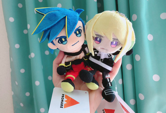
🔥PROMARE🔥
Get ready, this is going to be a long post.
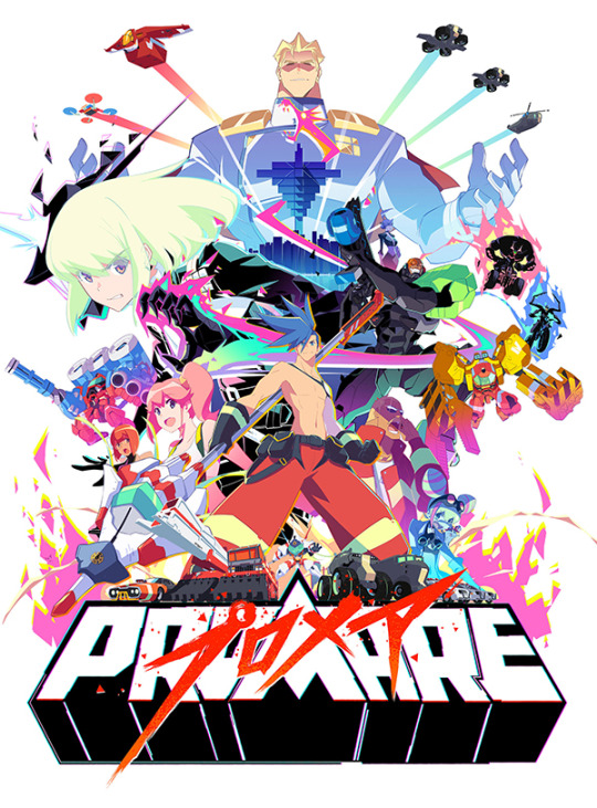
So starting at the end of last September, Mabs and I fell in love with a movie called “Promare”, and we went to see it in the theater 4 times.
This movie actually came out in May of 2019, and we missed it the first time it was in theaters, but it was so popular that theaters started showing it again in the fall. It was made by Studio Trigger, which also made some of my other favorite anime, Kiznaiver and Little Witch Academia. (and BNA which Mabs and I are watching right now!)
So what is Promare about, and was it really worth watching in the theater 4 times?
I feel like these titles of articles about it sum it up pretty well:


Promare is set in a future where some people, referred to as “Burnish”, spontaneously develop fire powers. The Burnish start off as normal humans and have no control over over their powers at first, which leads to them accidentally burning down buildings or injuring other people, so they are feared and shunned by human society.
The main character Galo is a member of a firefighting team called Burning Rescue, while the other main character Lio is the head of Mad Burnish, a notorious group of Burnish arsonists.
Here’s a trailer:
youtube
It’s colorful, crazy, and over-the-top in true Studio Trigger style, so action-packed that you can’t look away for a single second, and it is one of the most visually amazing movies I have ever seen. (The only thing that is even sort of comparable to this vibrant 2D + 3D animation style would be “Spider-Man: Into the Spiderverse”) The color palettes in every single scene of this movie are just incredible.
It’s technically a mecha anime with giant fighting robots, but its story deals with themes of discrimination, and it even has a bit of gay romance mixed in, which is a huge step forward for a Japanese movie aimed at a mainstream audience.
All of the characters are wonderful, but especially the main duo Galo and Lio.
It’s great to watch as they come to understand one another and work together. They’re both enthusiastic idiots who are the same type of crazy, which to me is both “relationship goals”, as well as the sort of relationship that I am lucky enough to be in.
It also has great voice acting, with the actor who played Sanada Yukimura in the Taiga Drama “SanadaMaru” as the mayor of the town, Kray Foresight (what a name), and the kabuki actor who played Ranbei in the movie “Dokurojo no Shichinin” (which is a super underrated, but another personal favorite ) as Lio.
And the MUSIC. This movie has the most amazing soundtrack, and it’s usage throughout the film is just perfect.
In particular, the scene featuring Lio’s theme “Kakusei” (”Awakening”) includes a volcano and a dragon and is just so INTENSE. In fact, the chorus of this song is not Japanese or English, but entirely made-up words, so that it would be able to convey feeling but not have the words distract viewers from the action.
youtube
“Inferno”, the opening track of the movie which is written from Galo’s perspective, is another very memorable song.
youtube
Also “Nexus” and “Gallant Ones” and aaa, just so much good music on this soundtrack. (The song lyrics from Lio’s and Galo’s perspectives also tell a bit more of their story)
Search “Promare ost” on YouTube to find a full playlist of all of the music if you want to hear more!
===== ===== ===== ===== =====
And now it’s time for the story of how I’ve seen this movie 6 times now, 4 of which were in theaters.
The first time Mabs and I went to see Promare was after school one day.
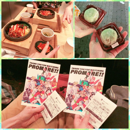
We got bibimbap and zunda daifuku for dinner first, and when we went to the theater, they were giving out these cool postcards!
----- ----- -----
The second time was on the first day of Halloween Month, so we got some Halloween donuts to celebrate before watching the movie!

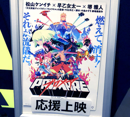
This was right before Promare was going to stop showing in the theaters again, but we really wanted to see it one more time (there is so much going on in this movie, you have to watch it more than once), and the only showing that worked with both of our schedules was one that was marked “応援上映”, which I didn’t think too much about and just assumed that it was an extra showing to promote the movie.
But we knew that something was different when the person sitting next to us started pulling colored lights out of her bag. It turns out that an “ouen jyouei” is special interactive showing of a movie in which fans are encouraged to wave colored lights, yell out their favorite lines, and sing along with the songs. We were definitely not expecting that!
It’s interesting too because “ouen jyouei” clearly have their own sort of culture. It wasn’t just like people were yelling out whatever they were thinking, there were set phrases and responses that fans would say at certain times. These responses were probably developed over a long period of lots of fans watching the movie over and over again; I wonder how many times the other people in that theater had seen Promare already.
----- ----- -----
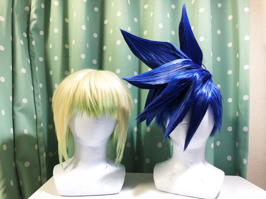
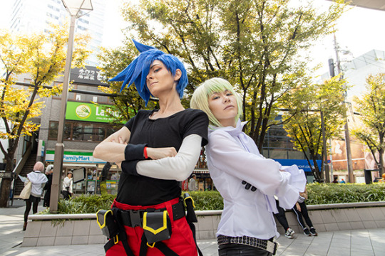
It was around this time that Mabs and I found out that there was going to be a cosplay event conveniently close to Osaka Station at the end of October. We were both very in need of a change of pace, so we decided to go and cosplay Galo and Lio!
To make things faster, we divided up the work, Mabs sewed the outfits and I made the wigs. (We also decided to share the cosplays because we both like both characters!)
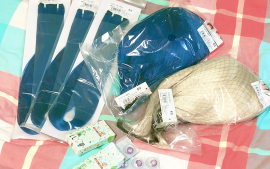
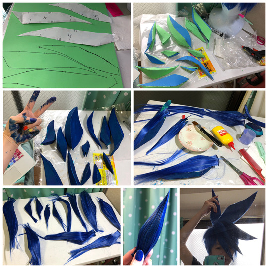
Galo’s wig was a big challenge because I had never made a wig with a foam base before.
First I patterned out the spikes with paper.

Then I cut them out of eva foam, assembled them and painted them blue, and glued layers of wig wefts over the top of them. After the glue dried, I trimmed off the excess hair and hairsprayed them into perfect (slightly dangerous) points, and used hot glue to attach the spikes to the wig base. I don’t know how much time this took, but definitely over 30 hours!
Lio’s wig was so much easier. The wig I got worked great as a base, and I just had to trim it, fluff it up, and add a couple different shades of green hair chalk to get the gradient that Lio has going on.
I am really happy with how they turned out!
----- ----- -----
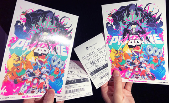
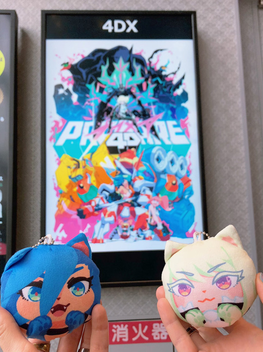
After that it was almost time for the cosplay event, but a few days before, Promare came back to theaters, this time in 4D! It was our first time ever seeing a 4D movie and it was an experience! The seats moved all around and shot out blasts of air and mist, and the lights in the theater flashed to go with the movie.
Promare with all of its crazy action was absolutely perfect as a 4D movie, and it was so much fun!!
They also gave us this super cool postcard to celebrate the 4D release. I think this is probably my favorite piece of official Promare art.
----- ----- -----
And then it was time for the cosplay event!

We had such a fun day, and Mabs looked great as Galo!
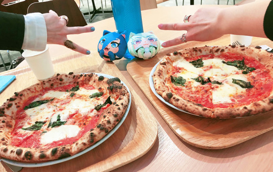
We ate pizza of course, since the characters eat pizza in the movie.
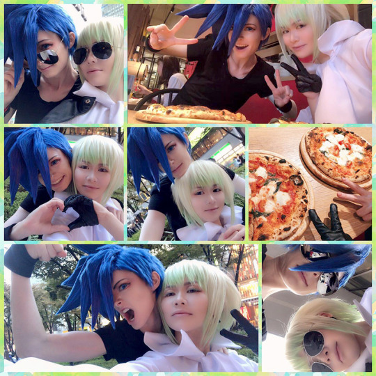
I was really happy with how I looked as Lio!
Here’s a selfie, and a bonus ~fashion~ selfie with my favorite sunglasses.

We met a few new cameramen who took photos for us!

I love that Mabs is strong enough to pick me up for photos! This picture turned out cute!
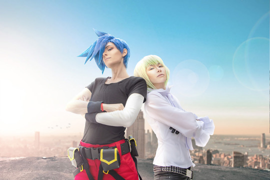
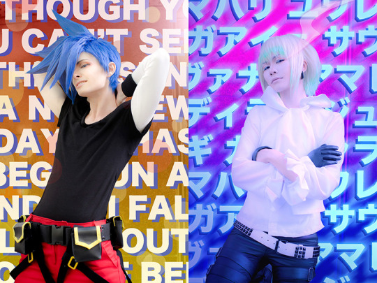
And I had a lot of fun doing photo edits with flames and lots of crazy colors, since that is very Promare!

Before and After🔥

Before... (I liked the pose but not the background)
... After! (I had fun trying to get this one to look like a scene from the movie!
Using the song lyrics as backgrounds
And of course we took some silly offshots as well! These were my favorites!

Since we made the cosplays to share, next time we get a chance to wear them, I’ll be Galo and Mabs will be Lio! I can’t wait to see how we’ll look!
----- ----- -----
The movie came out on DVD and Blu-ray at the beginning of February, and Mabs had pre-ordered the special box set! (I wish I had a photo of the box and all of the extra stuff! So cool!)
We had a fun time watching it at home and eating pizza!
This movie drastically increased our pizza consumption. Particularly margherita pizza since that’s what the characters eat. I had always thought that it looked boring compared to pepperoni or deluxe, but I now understand the wonders of margherita pizza.
(Also look at the cute Galo and Lio cat ear plushies! Mabs got me a set for Christmas and they are adorable!)

----- ----- -----
Promare got put back in theaters in 4D AGAIN, on Valentine’s Day!!
Of course we thought that sounded like the perfect V-day date idea, so we decided to go see it one more time, even though we already had it on Blu-ray!
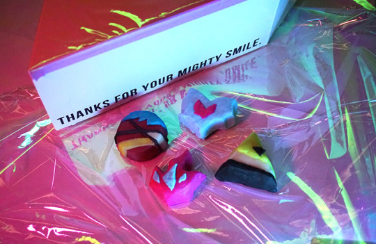
So this year I made Mabs Promare-themed chocolates for Valentine’s Day!
Yes, these are real, edible chocolates! (I had fun doing a little photoshoot of them before I gave them to her)
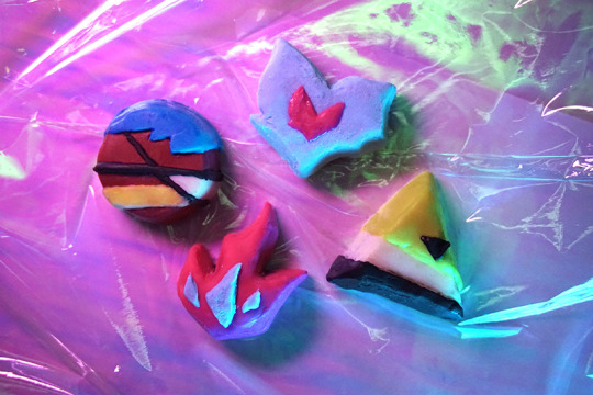
I found this wonderful triangular Engrish box at the 100 yen shop and customized it a bit with some shiny pink cellophane.

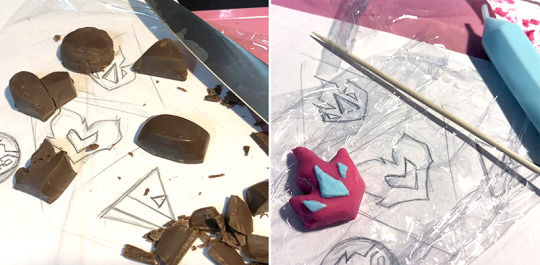
I made the chocolates by first drawing out the designs I wanted, and cutting up some regular chocolates into the right shapes to use as a base. Then I used colorful chocolate pens to cover the base layer and add the designs!
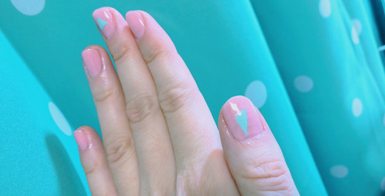
Before our date, I tried to do Promare-inspired nail polish too.
This is one of my new favorite photos of us! We had such a nice V-day date!

So glad that we got to see Promare AGAIN!
And 4D is just the best way to see it! This time we saw it at a different theater than the first time we saw it in 4D, and the movement of the seats was programmed a little differently, which was interesting! This time we could also distinctly smell the rose fragrance when Galo sees Lio for the first time.
Absolutely the perfect Valentine’s Day movie.
As Mabs put it, what could be more romantic than overthrowing the government, saving the environment, and setting the entire world on fire together?
And we had pizza for dinner that day, of course!
----- ----- -----
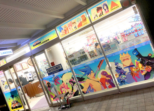
Also in February, the Lawson near my school did a special Promare collaboration! It looked so cool, and they had a bunch of posters up all over the inside too!
----- ----- -----
And a bit after that, some special Promare merch that had gone out of stock before I even watched Promare the first time got restocked! I needed some new shirts anyway so I couldn’t resist, and Mabs and I placed an order.
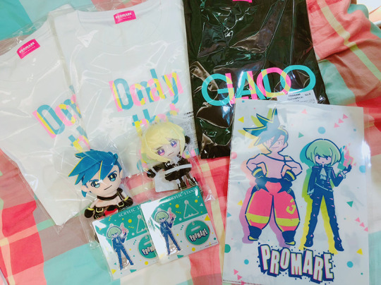
I love these plushies so much! They are so cute with their little noodle arms and legs!
----- ----- -----
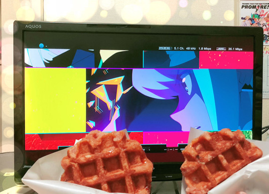
Now that I think about it more, I can’t figure out if we’ve watched Promare 6 times or 7 times. But the most recent time was with strawberry waffles (our food obsession changed from pizza to strawberry waffles after playing Tales of Zestiria, lol)
----- ----- -----
Promare will be released on DVD in English in the US on May 19th!
I’ve heard that the English dub is really well done, so I can’t wait to see it that way too!
I HIGHLY recommend this movie to anyone and everyone!
It’s worth watching for the color palettes alone, but the animation, characters, and music make it one of my all-time favorite movies!
10 notes
·
View notes
Photo

Something of a Story String
romping through rose rows
the rouge holds roamers ransom
re-writing their wrongs
out yonder, they yawn
yearning for youth yanked from them
you yearn for them, too
grave group, so it goes
much greatness gone to the grass,
a goodbye garden
but the "byes" come back
they blow in on brisk breezes
blooming in balance
____
What's this? It's not Inktober yet, what are the mini-magnets doing out and about?
Over on deviantArt, I was encouraged by AlinaLeeArts to enter the String Me a Haiku Contest! hosted by HaikuWriMo, and while I have only basic knowledge and understanding of Haikus, I've been really wanting to play with the mini-magnets lately after reorganizing them into some new tins, and it sounded like fun. (And like a good way to fill out my upload schedule since the bigger projects I'm working on still aren't quite finished yet. )
So I decided I'd take a stab at, or at least see if I could come up with a concept I was happy with and take it from there.
The contest rules state that an entry has to be made up of a string of at least four haikus, a Haiku for the uninformed being, according to Google, "a Japanese poem of seventeen syllables, in three lines of five, seven, and five, traditionally evoking images of the natural world." And that the haikus should use heavy alliteration, which also for the uninformed is, "the occurrence of the same letter or sound at the beginning of adjacent or closely connected words."
This would pose a unique challenge for me because, as I said, I'm not very familiar with writing Haikus. I've read plenty of them, sure, and I think I had to write one at least once or twice back in K-12 school for English class or something, but other than that, if I've ever constructed one, it's been completely by accident. That said, I used two different syllable counters to check each of these before I ever arranged the magnets, so hopefully, they do indeed follow the 5-7-5 pattern properly, if nothing else!
Alliteration is also not something I intentionally use super often, and that combined with the limited syllables and structure I think makes for a unique challenge even for someone more familiar with the haiku form. Something I learned very quickly while trying to do this: Every syllable counts, you don't want to waste a single one!
Before I could get to actually writing the haikus, though, me being me, I needed a concept/theme to work off of. How would I pick letters to alliterate? What would the haikus be about? Since I want to use the mini-magnets (as is more or less my standard for short-form poetry) what should the background(s) look like? Will all four tell a continuous story or four short stories that go together? I have to have at least four haikus, but am I just going to do four, or will I maybe do a few more than that?
I decided the easy way to break it down would be to have each haiku dedicated to a specific letter for alliteration, then make a poem based off of whatever I could come up with within that letter alliteration, as I worked I could go back and forth between the separate haikus to develop more of a story, and then once they were done or mostly done, I could decide on what I would do for the background(s) based on the poems themselves.
This process did change a little bit, as I started off using a haiku generator to help me get more in a haiku-writing mindset. I did through that pick up one line, "seeing a balance," that obviously got translated a bit differently into the final version ("blooming in balance"), but other than that I really was still largely on my own. I'd toyed with a few other concepts, but none of them felt right or were really sticking with me.
Then I got the idea to pick each letter for the haikus based on an acronym; a well-known combination of letters. That would also potentially give me a theme to work off of.
Initially, I thought of ROYGBIV, the acronym for the basic seven colors of the rainbow. And I actually started working on trying to make my haikus based on that, but the letter "O" stopped me pretty short because once I had the letters, my idea was to do word-association like I normally do for the Inktober prompts; I'd list out some potential words to use that I felt somehow connected with the color and started with the same letter as the color. Frankly, there just aren't a lot of letter-O words that I could also connect back to the color, and the few I did come up with just didn't seem like they had a super compelling story hidden within them.
But I did really like the idea of the colors because that gave me a good launching point for the backgrounds; I could just use the same color the haiku was based on within the background for it. It sounded like fun, even. So I didn't want to just totally ditch it.
After giving it some thought, I figured the best thing to do would be to try using the four main colors everybody knows: Red, Yellow, Green, and Blue. If I still couldn't come up with my haikus based on those four letters, then it was time to pick a new acronym.
Fortunately, even though I had my concerns about the Y in particular, I had a much easier time after that. (I mean, I already had most of the one for "Red," from the ROYGBIV stage, but still.)
It's funny though, I thought "Blue" was going to be the easiest, based on my knowledge of "B" words, but that one was actually the one I ended up tweaking and re-writing the most. Probably because it was also the last one I did, and I had started to develop a vague story about yearning for life and visiting a grave in a cemetery, so I had to work within that theme. Though, that said, I think "Green" is actually the weakest of the four, as far as impact goes, despite it being the one that kinda hammers home the life/death theme the most. It was the most difficult one to balance my syllables appropriately because of the words I really wanted to use.
Obviously, this "story" developed as I worked, so it's a bit more on the abstract side, but this is how I see what these four haikus say together; They're talking about someone, probably a young someone (I picked a girl for the background, but the poems could go either way), walking through a field of flowers and stumbling upon a nursing home, maybe with a couple of residents on the porch, and a cemetery nearby. Maybe connected to the home, maybe not. And the young someone stops and reflects on life, and how even once someone passes away, oftentimes we can be reminded of them, or almost feel as if they're still here, in the small things and little fleeting moments here there, like the petals of a flower or the whispers of a seasonal breeze in the air. They come back in those small ways, completing the circle of life, that essential balance of the universe.
Of course, that's just one way to interpret it, and even then there are still small details that could be changed while still keeping the sentiment the same. Personally, that's one of the things I enjoy the most about poetry and the mini magnets--you don't always know what you're going to end up saying until someone else reads it and tells you what it says to them.
As for those backgrounds, they're all fairly simple watercolor paintings. Once I had the poems and this vague idea of a story, it was fairly easy to come up with a background concept for each one to make them a little more interesting. Normally, I'd use sponged-ink backgrounds during Inktober, but I've been toying with the watercolor idea in the back of mind and this seemed like a good time to experiment since I was already pushing the envelope in various other ways.
You can see pretty much exactly what I had in mind for each one, though I will clarify the green one is supposed to be a tombstone in the grass since it's the only one that I think might not be super clear right away. It could just as easily be a rock.
For each of them, my process was very simple; I just picked 1-3 shades to make a gradient from the appropriate color, alternating each one slightly depending on what I wanted for the sky, and then I added the grass and silhouettes on top using a combination of watercolor and black pen. And then the very last one, "blue," got the added moon, stars, and some fireflies using gel pens (and a little bit of pastel for glow). It was the most complex, but "yellow," was actually the trickiest because I have not yet mastered the ability to free-hand a human silhouette. I had to sketch it out separately and then use my lightbox to transfer the outline and fill it in.
And, funnily enough, the backgrounds you see here were actually meant to be smaller test-runs before making bigger ones and actually physically setting the mini-magnets on them to photograph. But I was so happy with how these small test ones turned out, I honestly didn't feel like I needed to make the bigger ones.
So I pivoted a bit; I formed each mini-magnet poem on a plain blue piece of paper (a "blue screen" if you will to make it easier to separate the words) and photographed them, then used Photoshop to get each haiku onto its respective background.
This ended up working to my advantage, as I could just focus on arranging the words to make the words properly and not working around the paintings underneath, and then once I had everything in photoshop I could move things around as necessary much more easily.
I'm not super sure about the haiku part, but I'm really pleased with how the overall result looks, and especially happy with 3 out of the four backgrounds. So much so, I will be posted a wordless version of just the backgrounds to go along with this one for your viewing pleasure! fav.me/ddrqj28
I don't think I'll be placing in the contest (I could be wrong, but I'm aware I'm a little out-of-my-element here ), but I enjoyed the process and the end result, so it was still worth it in my eyes. It was really nice to have the mini-magnets out and put them to use again, especially since I've been having a craving to do so lately. And having them all freshly re-organized made using them all the more enjoyable.
Though I'm still not quite sure in what form it'll be, I am very much thinking of doing more non-Inktober stuff like this with the mini-magnets going forward. I have so many of them and I enjoy using them, even when it's a daily challenge and running me a bit ragged. You might say I'm a bit of an addict.
____
Artwork © me, MysticSparkleWings
____
Where to find me & my artwork:
My Website | Commission Info + Prices | Ko-Fi | dA Print Shop | RedBubble | Twitter | Tumblr | Instagram
3 notes
·
View notes
Text
Shading and colouring tips
So I’ve been asked to do a tutorial for shading and working with colours, and here’s where I have to disappoint you, I am not the right person.
To understand how to shade and colour you need to understand shapes, forms, anatomy, texture and colour theory. I will not explain it to you, because:
a. I’m shit at explaining stuff and
b. I don’t understand them fully myself.
So before we start I need to ask you to go and watch some tutorials on youtube, just make sure they are made by PROFESSIONALS (e.g. Proko) and not just self-taught young hobbyists like myself. Sure, we can give you some tips, but you need somebody with years of experience to fully explain the basics to you. I just don’t want to hurt you by teaching you to do something in a terrible way.
What I can do is to tell you a few tips I’ve learned that seem to work really well for me. Please remember, this is not a tutorial, these are just tips on how to make your artwork more colourful and shiny.
Having said that, let’s just jump right into it
1. Using colours
If desaturated colours are your thing, that’s fine, but don’t be afraid to use bright colours as well. You don’t have to go to town and use neons in every piece like I do, but think about using a brighter colour as an accent. For example, if you’re using blues and purples try throwing in some yellow, it will give your artwork some life, variety and will catch the eye of the viewer, so you can draw their attention where you want it to be.
If you have problems with figuring out which colours work the best with each other try using colour palettes, you can find plenty of blogs that post them on tumblr, or use a website that will create one for you (e.g. https://color.adobe.com)
Also, colour theory, go and learn colour theory.
2. Contrast
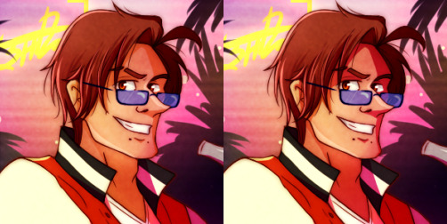
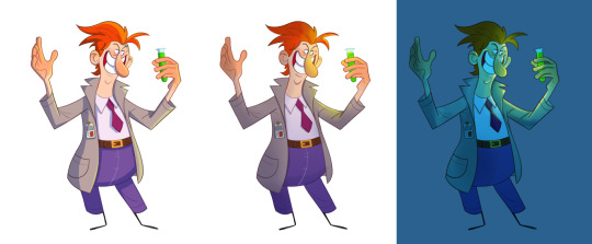
In my opinion, contrast is the most important aspect of your artwork (except for composition maybe), it doesn’t matter if your using greyscale or colours, without strong contrast your art will look dull, flat and boring.
Here’s the quick comparison I made of one of my older pieces. On the left side, there’s an original version I painted, but then I decided it didn’t look appealing, so I kicked the contrast up a notch, which you can see on the right side.
If you’re not sure if the contrast is right, change your file to greyscale, it’s much easier to see it that way. You can also pick the darkest and lightest colour from your work and put them side by side, as you can see below.
3. Shading
To shade something properly you need to know what its form and texture are, a lot of time I struggle with it myself, so you need to find a better tutorial for this.
What I can tell you though, is how to use colour in your shading. Beginners often use black to shade, well, don’t do that. It will make your image look uninteresting and, a lot of times, dirty.
Instead, use colours, the easiest way is to use the same colour with multiply effect or darker shade (left side), but it would look even better if you’d use a slightly different hue (right side)
(btw I only change the shading on his face, hair and jacket are the same)
(oh and I still used multiply on the right side, it’s on full opacity but you may want to turn it down a bit, depends on what you need)
Recently I started colouring shades with the airbrush to get subtle gradients and interesting differences in colours.
4. Lightning
As you may or may not notice, I like my light shiny. My secret is using very bright colours with effects: luminosity, overlay and screen. Now, you need to be careful with this, it’s easy to make it too bright, that’s why it’s important to make sure everything has the right contrast.
For lightning, most of the time, I use yellow, cyan and magenta. Often I make a layer on top with overlay effect and gently add colour with the airbrush.
Just remember to experiment and see what works the best for you!
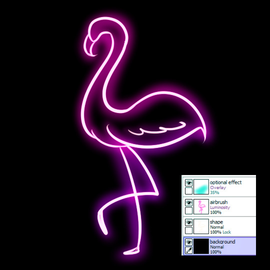
5. 👏bonus👏neon👏
-dark background
-a very light, almost white shape
-the same shape but now with airbrush and colour
-optional overlay layer with different colour, just to be extra
#long post#oh boy that took a while#is the person who requested this still here?#i'm sorry it took me so long#but it was scary#everytime I thought about writing this I just got stressed#and now that it's finished I feel like I haven't explain much#but hey#I warned you#I'm shit at explaining#tutorial#??#more like#just some#tips#I mean#I can still answer questions if you have any#but don't expect another post like this#sorry
14 notes
·
View notes
Text
Colour with Dan Kelby.
This was the second lecture we did with Dan on colour where he talked to us about lighting and shade using photoshop and let me tell you- A LIFE SAVER. I’ve been baffled for so long about this on Photoshop as the majority of modern 2D illustrators use Procreate- as much as it’s the same basic set of principles, its difficult to apply in a very different software.
The first example, (I apologise for the quality, I’m not totally sure why its so grainy) used a very graphic style of shadows and highlights that was my standard technique. Its a very methodical and precise style of shading and highlighting which is successful, especially for application in animation as its easier to keep consistent, but a little 2 dimensional.
The second used a gradient from bottom to top and then several multiply layer of different opacity for highlights. I love this approach and it looks very technical despite actually being very very simple. It used the lasso tool to highlight sections you want to colour and a large airbrush to fill and take away using clipping masks. It’s a much more organic way to shade and highlight as you have to do it by eye of what looks right rather than worry about balance and neatness as with the above technique. It’s slightly more complex but with practice is just as applicable and very successful visually.
THIS however blew my mind. I’ve never attempted this kind of thing, as I know it typically requires a lot of colour theory. I’ve seen a lot of people setting their background a certain colour and using it as a basis for the colour pallet of a drawing which can be very basic but still look super dynamic and coordinated. This is slightly different and is just a case of a blue layer! Crazy. I love how much it changed the mood and with the above technique applied it’s so much more dynamic and dramatic to look at! I had a lot of fun with this as you can get away with much more bold highlights and utilise some of the other layer types available. For this I used soft light and colour fry.
0 notes
Text

Aaron Draplin is a graphic designer and author that runs his own design business called draplin design co and he was born in Michigan on October 15 in 1973. He has worked with big clients like ford and is well known for minimalism and more of a retro style.
After watching videos about his design process and analyzing some of his designs I took some notes about how he works and what he is interested in.
Uses simple shapes
Tries to create logos that are timeless
Enjoys vintage things and simplicity
He brings letter forms back to basics
Enjoys minimalism
Starts by sketching
Makes notes on texture and color
Makes sure a design will look good on things like websites and items
works with negative space
creates lots of duplication to help his idea generation and outcome of his product
Makes sure his designs work in all sizes
Experiments with shapes gradients and text
Experiments with different layout variations
3 examples of his work and my thoughts and options on them
Assembly.
This logo is a clean sleek geometric logo. You can see how he has created the icon for this as the letter A completely made out of triangles. Its clever because all of it is essentially triangles making it seem complex but really the shapes and design is minimal and the color pallet consists of different shades of blue with the bass of the design being dark shades of blue then gradienting to a lighter shade at the top. Underneath There is a nice sans serif font that’s not too bold but the weight and thickness of it is just right so you can clearly read it in a small and large size.
Peak Oil.
This logo is very minimal so it is simply a black and white logo. He has created the shape of the logo out of some sort of droplet to represent oil. He has used some techniques to add depth to this logo for example on one half of the droplet lines are taken out of it showing this negative space and it almost works as a shading affect. Another thing that he had done to make the type pop is put it in a black circle so its not lost in the shapes and negative space. For the text he has used a clean geometric sans serif font and used hierarchy with the work peak being larger than the word oil.
Nike.
His Nike logo is very text based and it look like a label. I really like this because it has a very vintage old school look to it. once again the general shapes are very basic and geometric but the lay out of all the different lines makes this logo look very strong and quick. Once again using hierarchy with his text as you can see in a more vintage looking serif nike logo at the top so you know which brand the design is for and about. One thing that I really like is the small iconic nike swoosh at the bottom which just makes a nice composition with the two nike logos being the bass and the top and then the rest of the type being centered in the middle of the box created by the geometric lines. This logo has a very simple color scheme as it just uses a nice bright teal cyan color and relies on negative space to create the back drop.


Saul bass
Saul Bass was born on may 8th in 1920 in the Bronx, New York were he was brought up by his Jewish parents. Saul Bass had a passion for art and he graduated from James Monroe High School in the Bronx and studied part-time at the Art Students League in Manhattan, He then went on to attending night classes with the painter György Kepes at Brooklyn College.
He started working in Hollywood in the 1940s were he worked making advertisements for print for films like Death of a salesman and The moon is Blue. A stepping stone in his career was when the director of The moon is blue asked Saul to design a film poster for the film Carmen Jones in 1954, The director called Preminger was so impressed with his work he asked him to produce the title sequence as well. After creating the title sequence he loved it and realised how it can positively enhance the film to the audience. He then went on to create many Posters and advertisements but also lots of film title sequences too.
Saul Bass enjoyed many elements of design and is mainly known for his posters and advertisements but he also did work creating logos for brands like AT&T Corporation (1969 and 1983) and Frontier Airlines (1978).
It was not just advertisements and logos he was a filmmaker for a while during the 1960s were he was asked by directors and producers to produce not only title sequences for their films, but also to visualize and storyboard key scenes and sequences within them.
I would say he is most well known for his film posters and he created some of his best known posters for films directed by Otto Preminger, Alfred Hitchcock, Billy Wilder, and Stanley Kubrick and more. His last commissioned film poster was created for Steven Spielberg's Schindler's List in 1993 but it was never distributed.
Saul Bass won awards such as Academy Award, Best Documentary, Short Subjects and Why Man Creates. He then died in 1986.

I really like this poster by saul boss, I really like the rough shapes and I think the use of three plain colors could seem a little boring but I think the simplicity of the color scheme and shapes actually work well and looks good I also like how the background colors are not a fully saturated and are a little faded or softer making it easier on the eyes and it also allows the wording within the negative space of the body to pop. I enjoy how the poster looks like it has been cut out of bits of colored paper and then put together. One of the reasons a lot of his work is a little more simplistic is because the printing back then was not as advanced as it is today and this also applies to other elements of design like there was not digital software or it was not as advanced as it is today but I think the simplistic look comes across as a bit modern with minimalism being very popular. I think the large text in the body looks great because It stands out which makes sense because the tittle is very important, I don't like how the text is all messy and wonky but this might have been done so it fits the atmosphere of the poster with its rough cut out look.
It shows that Arron draplin takes inspiration from saul bass in his work in the way that he also works with simple shapes, colors and minimalism to help make things like logos live longer and work in all different sizes on different things.
Stefan Kanchev
Stefan was born on the 6th of august in 1915 in kalofer Bulgaria. He studied mural printing in the national art academy from 1940 to 1945. He worked in all areas of art from book covers to trade marks, advertisements and more. Kanchev participated in many galleries and exhibitions both locally and abroad from Budapest, Berlin, Moscow and much more. His work is said to be well know for his clear composition and his “fellicitiouse relation between fonts and shapes”
His work and dedication to galleries popularized his work and style which led him to wining many competitions for typefaces, posters, trademarks, postcards, telegram forms, book designs etc, and his work became famous and could be viewed in the major applied arts encyclopedias. He then went on to win the “cyril and methodius” 1st calss in 1956, 1963 and 1969 for playing a big part in the development of Bulgarian culture. He proceeded with his work and won the Bulgarian state title of national artist in 1971.
Kanchev grew up around his father that was a info graphic artist which inspired him to do art. He has progressed to become a well known artist and draws all of his logos and work free hand it is said that his last moments were spent drawing and working before he got taken to hospital where he died in on august the 22nd in 2001 aged 86.
“Sadala” — Burgas
(Factory for underwater fishing equipment)

This logo is a simple black and white logo. It uses negative space and when you look at it there are only two shapes which are black and then when you add a background color which allows you too see the pattern in the negative it still only looks like there are maybe four shapes. This is a logo for something to do with fishing equipment and you can see how this is represented in the logo by the simple fish created out of negative space. The fish is surrounded by a black oval shape which creates a nice boarder which I think will help this design stand out. I Think from looking at this design you can tell that it is related to fish. I also think because of the simplicity of it with essentially just two black shapes and negative space I think this design would work very well on many things because of its simplicity it could be scaled down and still look good, one thing that I am not a huge fan of is the boarder of the fish is not a round circle its slightly stretched vertically and it might look more pleasing to the eye if it was an exact circle.
Hotel “Shipka”
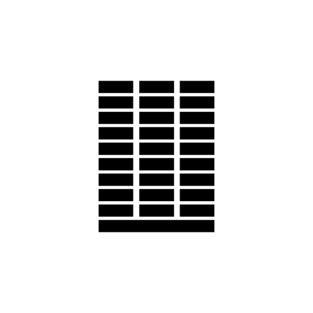
This design is for a hotel. the design only consists of black rectangles with the layout being one long rectangle at the bottom and then on top of it three rows of rectangles each row consists of 9 rectangles which are individually space out by columns and rows. If you look at the design as a whole its like one large rectangle made out of rectangles. The design is meant to represent the hotel and after looking at pictures of the hotel it has a very geometric shape to it and looks like one big rectangle and then rows of rectangles making up the window. This is a very simple design using a very very limited amount of shapes and black as the only color. I think When you know what this design is for it makes total sense but on its own it might be a bit hard to see its a hotel as it could be a block of flats a chocolate bar or a calculator so I think this design could be too minimal.
“Slavyanka”
(Port with fishing center)

This is a design for a fishing port. This design Uses thick line work with a circular border with lines coming off it colliding with other lines creating two fish which can be distinguished by the two small circles for eyes. Once again this design is just black but the shapes and pattern is a little more complex. I really like the flow of the pattern and the thickness of the lines as I feel if the lines were thinner it would be harder to see and if the lines were thicker and heavier the fish wouldn't look right. Just like all three designs this one also uses negative space. I think this design would work in many sizes just like the others as it uses just black and clean sharp line work with smooth curves. I think all three designs use good negative space and are able to express and represent imagery using minimal colors and shapes. But I think without any context it is tricky to understand what these designs are for.
I think his work is enjoyed and works well within the design industry because in most cases its simple but effective. The fact that its so minimal allows it to work on so many different platforms and materials, you could scale it down and enlarge it and it would still hold its form and you would still be able to recognize and identify the imagery and illustration he has created. The best type of design is a design that’s timeless, now its very tricky to create something timeless as the design industry is constantly changing but as of today I feel like his work would still work as simplicity and strong composition and structure is heavily used so I think that his work may become outdated in the future but as of now it would work fine meaning his style of design has already lasted a long time.
I think both designers share certain things in common and one of the two things that they both heavily focus on is simplicity and composition and they are both good at creating design focusing heavily on these two things because when your making a minimal design if you have bad composition or something is slightly off its very noticeable because in some cases there are not a lot of elements/parts to the design. You can definatly see similarities in there styles and work and arron draplin talks about how he loves old things and believes that design is timeless and does not need to be complex and crowded which is something that Stefan Kanchev does very well so he could possibly be taking some inspiration from Stefan Kanchev.
0 notes
Text
How-To: United States of Craigslist, Chalkboard Style!
Ah the trusty old, well-worn, United States of [Thiessen Polygon] Map. But at least I was a relatively early adopter (the original version was made in…yikes!…2011). Sure, this post will show you how to make these boundaries, but more interestingly, it will show you how to make a chalkboard-style map! Now pay attention or teacher will rap your knuckles with a ruler.
There are only a couple key tricks to getting the chalkboard style rolling. The first is using a nice seamless chalkboard texture. The second is in hacking that stippled chalky line style. Here are some resources to get us going…
Data & Resources
A Geocoded table of Craigslist Sites (an Excel file of places, site URLs, and their coordinates)
More than meets the eye. Tons of Craigslist sites are combinations of named places (“saginaw-midland-baycity”), generic places that imply specific places (“mendocino county”), and geographically broad generic places (“northeast SD”). So there was lots of manual placing, and heaps of site-duplication to represent the shotgun pattern of multi-city sites.
The United States of Craigslist (link to polygon shapefile download page)
You are welcome! This represents lots of dissolving (for multi-location sites), and manual crafting (so orphaned peninsulas actually get assigned to the most drive-able site). I’ll show you how it was made, but in the meantime just cheat and download the results.
Chalkboard Image Assets (a zip with two PNG images)
This is the green chalkboard texture used for the background. It’s not easy making a texture image that repeats without obvious edge patterns. This will save you lots of time! Also included is the over-the-top-skeuomorphic image overlay with cute little pieces of chalk and dusty corners, etc. Just adorable.
Ok, time to start dragging our fingernails down this map…
How These States Got Their Shapes
If you’ve ever read this book, or watched this show, you are keenly aware that the United States were carved out in a surprisingly arbitrary, and sometimes accidental, fashion. Let’s take a crack at generating some new states, based on pragmatic economic zones.
I went to Craigslist’s sites page, and copied all the sites for the United States, dropped them into an Excel table (splitting up all the multi-city sites) and geocoded them. While Craigslist shows their own point-map of sites, we need to be more specific, since we’re turning them into polygons.
I added them to ArcGIS as XY events. I marvel at the goodness of visualization every time a table is accribitzed into a map. Fortunately for me, a cartographer, this means I marvel a lot.
Now for some whiz-bang polygon generation! I used the “generate Thiessen polygons” tool. Thiessen (or “Voronoi” to non-map people) polygons divvy up areas that are considered the closest to a seed point, before getting closer to another seed point. In real life, there are lots of practical conditions that would alter these, like natural barriers or road network conditions, etc. But they’ll do for now.
Speaking of natural barriers, the Thiessen polygons stretch out into the oceans. Let’s pull in a shape of the US land and have a look.
Using a “clip” tool, we can chop off the parts of the polygons that don’t intersect land. Like a cookie cutter. Don’t worry, Alaskans and Hawaiians, I’ve included you too, you just don’t play well for screen-captures.
Remember those pesky sites that had multiple places in their name (akron/canton, dallas/ftworth, etc.)? So far, we have a zone for each named place in a craigslist site. The orange lines represent the within-site divisions that we’ll have to dissolve.
Running a “dissolve by attribute” merges the geometry of same-named sites. Now we have some slightly weird, but more truthy, polygons.
Chalkboard Styling
Let’s style this sucker up! Did you know that you don’t have to use a solid color to fill polygons? You can use a hatched pattern (fun), a gradient (use judiciously), or a picture. Since I want the map to look as much like a chalkboard as possible, a simple black or slate colored background won’t cut it. I’ve made a chalkboard texture image to fill my background shapes. Beware, lots of green from here on.
I have a shapefile of continents, and a shapefile of oceans, which happen to combine to fill the screen. You can use whatever file you want, as long as it covers your whole view. Using the chalky image as the picture fill for these polygons gives us a nice chalkboard-looking “basemap.”
In the Layout, you could alternatively just add a rectangle and use this image as a picture fill. Whatever’s easier for you.
Now, to bring in the Craigslist states. But how to make them look like they were drawn with chalk? To me, chalk lines have a chunky, stippled, look from one material being scraped over another material.
If I give the stroke a dashed effect, then randomize the dash-iness (a series of numbers telling the map how many pixels to draw and skip and draw and skip), it has a sort of chalk-like feel. Then if I do the same thing for a second version of the lines, but with a thicker and more transparent stroke, they combine into something that looks pretty good!
Here’s what I used (but, it’s like, random, so feel free to type out your own set of numbers):
Thin Line
2pt, #FFFFFF, 40% transparent
Dash template: 4 3 1 6 1 4 8 1 2 3
Thick line
5pt, #FFFFFF, 80% transparent
Dash template: 3 2 4 5 2 3 2 5 4
Here’s a closer look at my hack chalk lines…
Time for some United States of Craigslist labeling. I’m using the site name. I chose one of the chalky outline layers, and I turned labeling on. You can monkey with specific details like letter spacing, placement properties, arcing along latitudes, etc. But here the chalk-specific things: Font, color, and effect.
I spent about three minutes looking at script-style fonts on my machine and found MV Boli to be fine. It looks an awful lot like Comic Sans, which I find to be cheeky, but it’s not, so I’m shielded from specific scorn by a technicality. Anyway, it looks reasonably hand-scrawled (I pushed it to all caps).
A pastel color (lighter than you may be thinking) helps convey chalk. I used #BEFFE8 with a transparency of 30%. Then I applied the same color as an outline but with a 70% transparency. This helps with that fuzzy irregular edgedness of chalk.
Since I’m proposing a radical, blood-soaked, re-thinking of states and re-drawing of their borders, it is helpful to draw in the current state boundaries for some context. I picked a similarly pastel-ish chalk color of #FFBEBE. Like my other lines, I applied a somewhat random dash pattern and made a version that is thinner and slightly transparent, and a version that is thicker and more transparent. There. States.
Craigslist states, and real states.
Chalkboard Layout
Ok, time to fine-tune some of the layout and design elements of this thing. I’ve inserted a new layout and added my map. I also made an Alaska version and a Hawaii version in separate map views (just copy/paste the layers) so I can add them to the layout as insets.
Whew. All that geography stuff out of the way. Now it’s time to lob delicious skeuomorphic clutter all over this thing!
In a graphic design tool, I made an image overlay to fit on top of my layout so that its full chalkboard potential could be realized. It includes some vignetting, leftover chalk dust in the corner that never gets fully erased, and of course a fine wooden tray to hold the chalk and eraser.
Yes!
Always sign your work.
Then I dropped in a title image, and we have it! A chalkboard map of the United States of Craigslist. Good times.
Happy Chalkboard Mapping! John
from ArcGIS Blog http://ift.tt/2tPU4kQ
0 notes
Last Seen Blogs

pabloshouses
PABLO´S HOUSES

leaveharmony
Cat butts?

learningcourses
Untitled

naturallymiracle-blog
NaturallyMiracle

clarasofiarosenberg
Clara Sofia Rosenberg