
Last Seen Blogs
hgirl7768
Heartbeats And More

taeheaders-blog
T A E H E A D E R S

burnmyloveaway
Nobody's son, nobody's daughter.

killazeynep
zeynep

kyoni
secret diary
Text
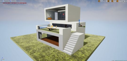
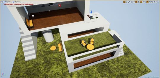
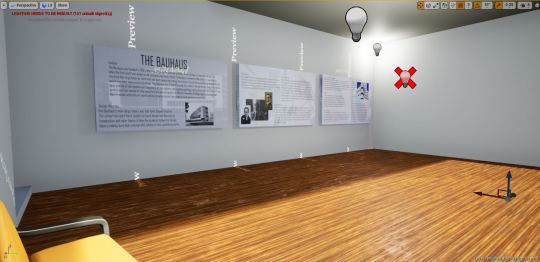
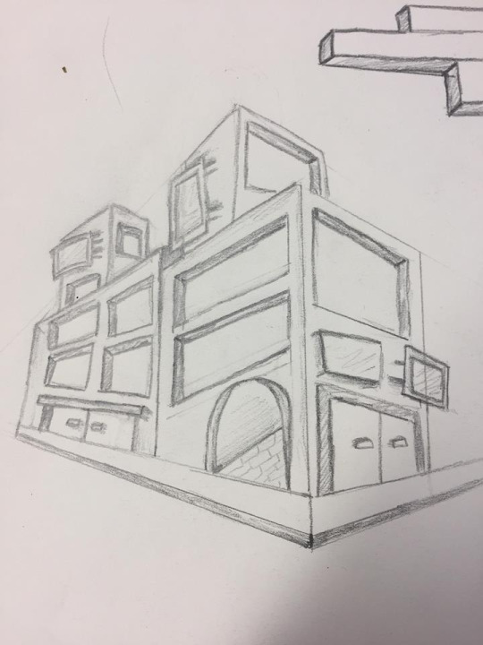
After researching on the art movements I built a museum in unity to display the research. Using the research to influence my design I started creating my building. I had never used unity before so I was very new to the software but I soon got used to it. Here is my museum.


Evaluation
Form, how did your Museum reflect the shapes and 3d form explored in modernist architecture.
When you look at modernist architecture it uses simple geometric shapes like rectangles and circles within the building especially if you look at the Bauhaus they use lots of simple shapes and it doesn't look visually complex but it looks sleek and clean. I tried to express this use of basic geometries within my work by having a main building having lots of sharp edges and making the museum look like rectangles layered on top of each other.
What materials did you use in Unreal to texture your building and how did this reflect the materials used in modernist architecture exteriors and interiors.
For my building I gave my floors a wooden texture and all of the walls a simple white texture, and then I added grass to the balcony. I used a Small amount of textures because modernist architecture can often be very minimal and whole buildings are constructed out of large amounts of concrete and large glass windows. U can also see that in modern architecture turf and grass is also used more on roof tops and some people use fake turf. I also used a glass texture on some of my geometries to create large windows for my museum to relate to the large amount of glass that is often used in modern architecture.
How well did you translate your research and idea generation into 3D interactive ideas?
I think my museum represents modern architecture with its simple form and shape and use of traditional geometries. I think going to London and looking at new builds like central saint martins university really helped me see how many materials and colors were being incorporated into the build and it was very minimal with large concrete walls and a huge class sealing and I wanted to do something similar in my museum so I have a few very large windows, I didn't want to have lots of windows because I was also trying to keep things minimal. Researching into the art movements helped me and gave me a better understanding of form and function.
How could you have improved on these points.
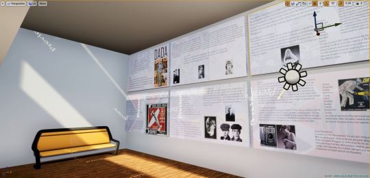
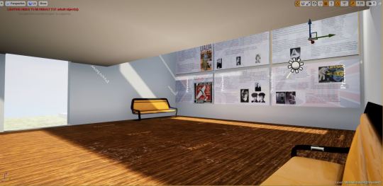
I think I could of maybe added some more glass in the sealing or make the balcony floor glass. I tried to keep it minimal and not use lots of textures but I think I could of maybe made an accent wall with a different texture on it to make the interior a little nicer. Another thing is that because I didn't really have a lot of time I could of planned out the placement of the research information better because I just used a rectangle and then stamped them on the wall but If I had more time I could of made some frames or displayed it in a more interesting way.
0 notes
Text
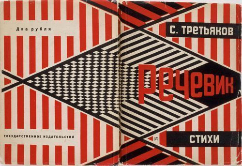
Russian Constructivism
context.
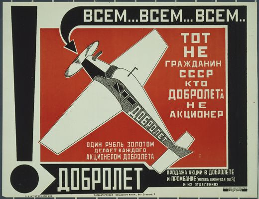
Russian Constructivism was a art movement that was around in 1913 to 1940. This art movement was committed to abstract art with an intent to be modern and new. Constructivism was an artistic and architectural philosophy that originated in Russia beginning in 1913 by Vladimir Tatlin and was a step away from traditional art as the movement tried to create modernist work with the new technologies of its time. The movement strives towards social change and the works created within the movement are more functional rather than decorative.
Design theories.
Originally the movement was meant to promote and spread and show political messages but the visual style transitioned to some more commercial outlets like advertisements, posters and book covers. Lots of the works from the movement use strong bold lines, large text, bold tones like reds blues and black and imagery of hands and developing technology like planes. This made the art eye catching but also strong and formal in a sense.
Key individuals.
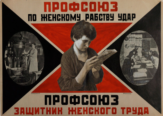
Alexander rodchenko
Alexander Rodchenko was a Russian artist that was born on December the fith in 1891 and he died in 1956 aged 64. He started off as a artist and painter but he got very involved in Russian politics were he dropped painting and fine art and started creating posters and advertisements for the Russian revolution. through out his carrier he used lots of different mediums most of them traditional like painting and sculpting but he also did graphic design and some photography in his career but he spent his early career using paints and pencils but further on he spent most of his time working with print making posters and book covers.
Stenberg Brothers.
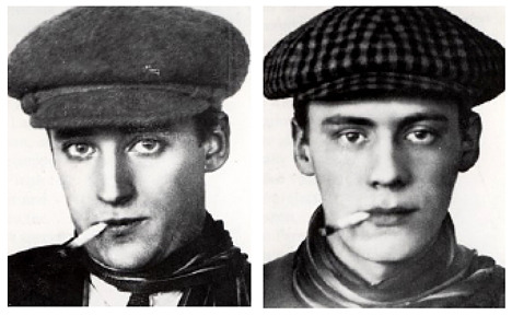
The Stenberg Brothers who were Vladimir Stenberg and Georgii Stenberg were Russian artists and designers, they practiced a wide variety of mediums from sculpting and set design to posters and advertisements and there movie posters. Vladimir Stenberg was born in 1899 and died in 1982 and Goergii Stenberg was born in 1900 and died in 1933. There poster design involves bright sections of color and the main element of there posters are commonly faces or people which makes sense because a large amount of there work where of movie posters.
Vladimir Yevgraphovich
Vladimir Yevgraphovich was a Russian painter and architect associated with the Russian constructavism movement. He was born in Moscow Russia on the 28th of December in 1885 and died in 1953. Originally trained as a traditional painter he became more experimental and abstract and focused more on the possibilities of different materials and how he could interpret mixed mediums into his art. He is well known for his paintings and 3d work that could be said to be both sculpture or architectural pieces.
Production.
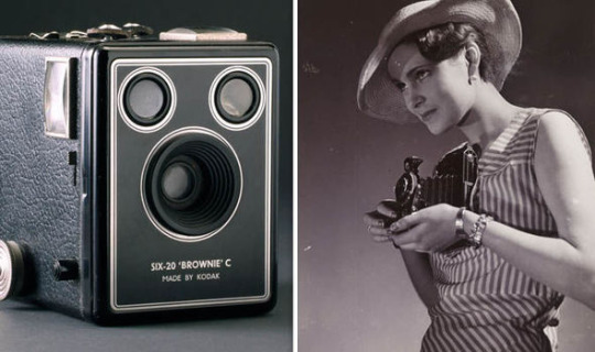
Within this movement there was metal work and ceramics with clay and other sculpting tools. Because lots of posters and advertisements were being made. The printing technology was not as advanced as it is today and to create things like posters techniques like silk screen printing were used and in 1938 Xerography was invented so printers had the ability to cut and print in bulk printing things like self adhesive labels and book covers. Photography was also a big part of art and poster design with film cameras being made by the company Kodak and cameras like the Kodak box camera were being used. To create the posters simple techniques like cutting and sticking typography and photography down on to paper to experiment with layout and to help final development were still being used.
Use of science and technologies.
Technology is always advancing and things like Kodachrome was coming out advancing color film technology. Cold gluing began to take off in the late 30s making book binding easier. There was lots of technological advancements within Russia like refueling planes mid flight and the single lift rotor helicopter. In terms of technology that potentially helped developed art are the Russian fed cameras that were in being developed and heavily manufactured from 1934 to 1996.
Influence.
Photography
Painting
Architecture
Printing
Cubism
Minimalism
Geometry
Futurism
Abstract form
Function.
Lots of the art was heavily influenced around war and the constructivists believed art should directly reflect the modern industrial world. This art form was less for the artist and more for the people as lots of art explored social change and governmental change.
Design Characteristics
If you look at art from the movement, It is very bold, strong and eye catching. When you look at graphic design at the time and poster design there are some themes that appear throughout the works of art like the use of minimal colors mainly consisting of red blue, white and black, simplistic geometry of circles and triangles, bold typography all in a similar sans serif style and the use of photography bringing faces and people were put into the posters.
1 note
·
View note
Text
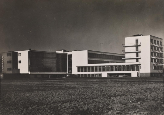
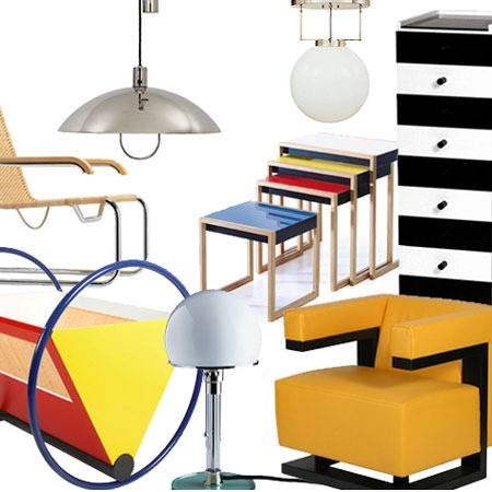
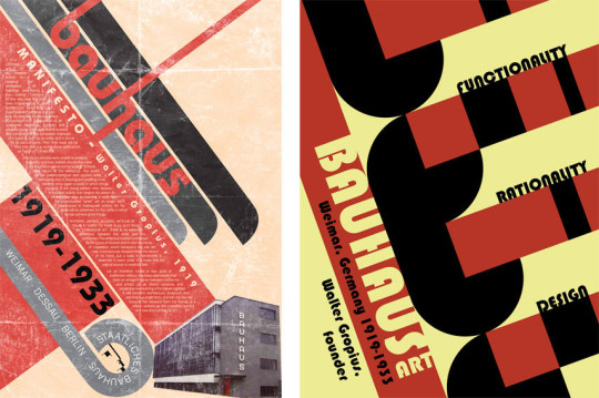
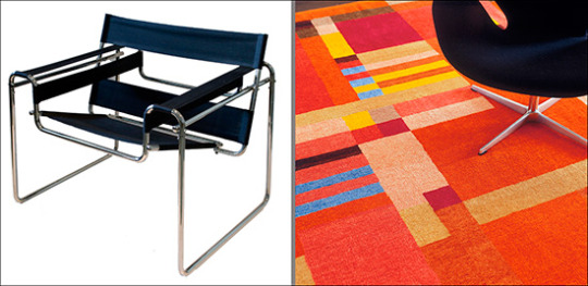
The Bauhaus
context
The Bauhaus was founded in 1919 in the city of Weimar by German architect Walter Gropius. It was around this time when the first world war ended so the economy was being rebuilt. Technology is always on the rise but it was around this time that large factories were built and were appearing making the process to build things quicker as large factories would now start mass producing things. The Bauhaus was created because the creators though art and design was fading away and one of the reasons was because of all this industry mass producing things making things less personal and more generic and they wanted to step away from this and merge lots of different elements of design together to bring back more freedom within the art world and less mass produced items making more personal pieces of art.
Design theories.
the Bauhaus's main deign theory was that form follows function. The school educated there student on basic design and focused on composition and color theory to help the students follow this design theory making sure that a design also relates to how something works.
Key Individuals
Walter Gropius

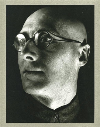
Walter Adolph Georg Gropius was a German architect and founder of the Bauhaus School and is regarded as one of the pioneers of the modernist architecture movement. He has worked on other buildings like the fagus factory and Gropius house and has won awards such as AIA gold medal and The Goethe Prize. He was born on the 18th of may 1883 and died on the 5th of July 1969.
Wassily Kandinsky
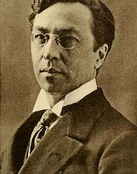
Wassily Kandinsky was a Russian painter and art theorist, he was born in Moscow on the 16th of December in 1886 and is known as one of the first main abstract artists. In 1896, Kandinsky stayed in Munich, studying first at Anton Ažbe's private school and then at the Academy of Fine Arts where he practiced lots of life-drawing, sketching and anatomy. After his education he built an art career for himself with his abstract new look on the art wold, later on in his career he lived in Germany in 1920 and taught at the Bauhaus school until it got shut down by the Nazis.
Oskar Schlemmer
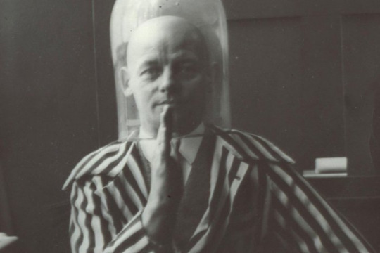
Oskar Schlemmer was born on September the 4th in 1888 in Stuttgart Germany. Oskar Schlemmer studied at the Kunstgewerbeschule School of Applied Arts in Stuttgart and won a scholarship to attend the Akademie der Bildenden Künste. After his education he did lots of sculpting and got noticed at an exhibition by Paul Klee and Willi Baumeister who were apart of the Bauhaus, from this in 1923, he was hired as Master of Form at the Bauhaus theater workshop, after working at the workshop of sculpture. Oskar is said to be one of the most influential teachers at this school because of his complex ideas and passion for design.
Production.
One of the reasons the Bauhaus was such a influential school was because they taught so many different things and tried to merge as much as possible together. Students of the Bauhaus were creating all sorts of art pieces from large installations made out of metal and clay or posters and advertisements using more traditional techniques like paint and different types of papers and fabrics to create textures. Because computers were not around everything was mainly hands on.
use of science and new technologies.
When the Bauhaus opened in 1919 art technology was very basic and most techniques and procedures were very traditional so like a said in terms of materials a lot of it was collage work/Photo montage pieces which were created by using fine blades and scalpels, papers and inks. Lots more technologies were being improved on like bottle making and Pyrex and clothing technology was advancing like the use of zippers on clothing items so there was lots of metal work, glass work and fabric being used to create.
Influence:
Photography
Graphic Design
Product Design
Architectural
Fine art
ceramics
metal work
interior design
fashion
sculpting
Function:
The Bauhaus wanted to open up a variety of subjects and different mediums to students and this is why they didn't keep everything on one subject they gave students the opportunity to dabble in a variety of subjects and materials which is why it was so revolutionary with large amounts of work being produced that would change and inspire the design industry. The Bauhaus is well know for teaching with the concept of form over function meaning that what every look and design something is it should relate back to the form or function of the object or building. Looks are important but if one is not put with the other you could have bad design that is why you need to think how a look or design will affect the purpose of an item like a kettle for example.
Design Characteristics.
If you look at the Bauhaus and how it influenced architecture, art and design you can see recurring themes and styles. You can see a heavy use of geometry in furniture, buildings and art. composition and layout was heavily thought about as students made collages and posters. If you look at buildings that were possibly inspired by the movement you could possibly see sharp edges and geometric shapes like rectangles and oval elements within the construction and a large amount of glass from big windows and lots of smaller rectangular ones.

0 notes
Text
context
Dada was an art movement formed during the First World War in Zurich Switzerland in a bad reaction to the destruction and devastation of the war. Dada first appeared in Zurich on the 5th of February in 1916. Dada was an art movement with such a large amount of work which looked very different so there wasn't a specific style and no one really knew what Dada is but its more of a statement than a style. The Dada movement wanted to step away from common traditional art at the time and create a new type of art that didn't follow the norm at that time.
Theories
Dada was a way for artists to create something that was out of the comfort zone of the common art world and make something that was bold and not necessarily pleasing to the eye. Work from the movement was created in the hope that it could start difficult questions about society, artists and how the art world was and worked at the time as a whole.
Key Individuals
Hugo Ball
Hugo was a huge part of the Dada movement as he was the leader and co founder of the Dada movement. He was a German author and poet and was born on 22nd of February in 1886 in a town called pirmasens in Germany. In his early days he gave his opinion of the war and said “men have been confused with machines” which made him hated so he moved to Zurich Switzerland where he proceeded to push his thoughts on the art word and political opinions that build the Dada movement. Hugo died on the 14th of September in 1927 aged 41.
Francis Picabia
Francis was a french painter, poet and typographer. Francis is known for his abstract work which he involves cubism and rich contrasting colors. He was born on 22nd of January 1879, pairs France and died 30 November 1953, Paris, France.
Hannah Hoch
Hannah hoch was a artist within the Dada movement, she is most commonly known for her photo montage work and is said to be one of the leading artist within the photo montage craze. She would cut up photos and layer them on top of each other, she would usually pick images and things that didn't relate at all to each other to create more startling/unusual pieces of art. She was born on November 1 in 1889 Gotha, Germany and died in May 31 in 1978 Berlin, Germany. She studied and practiced other art forms other than photography and photo montage she also did sculpting. Hannah hoch created lots of work within the Dada time period and pushed the idea that women should work creatively more generally in society.
Production.
The production of lots of the art is similar to the Bauhaus so it was mainly things like painting and using fabrics and sculpting with clay and wire and kilns. Because photo montage was one of the main artistic forms within the Dada period photography was heavily used and simple techniques like cutting things out and layering photos on top of each other to create abstract work was heavily used to create these photo montage pieces.
use of science and new technologies.
At this period of time the technology that was advancing was heavily to do with the war as large factories were making guns and bombs for the war, so the technology that was advancing was inventions like tanks, But photography was a very heavily used median in the Dada movement so camera technology and film photography was advancing with the Brownie camera from Kodak being heavily used and developed but was also very expensive.
Influence
Photography
Graphic Design
Sculpting
Painting
Metal work
Wood Work
Function
The Dada movement didn't really have rules like the Bauhaus and was more random and open to anything. The Works of art that came out of the movement were bits of everything, some were political some were hard to look at and some were more ordinary and traditional like paintings. The Dada movement is seen as something that is random and almost a little out of control but it was a way for artists to step away from traditional methods and get creative and create what they wanted to create.
Design Characteristics
Dada was a movement which was all about things that didn't make sense. It was a movement were experimenting and exploring to create weird and wonderful things was excepted. The work created within the movement was experimental and abstract as artist were creating all sorts of creative pieces that could be what ever they wanted from political to completely imaginative and with this mentality of freedom lots of funny, bold, and even worrying pieces came out of the movement. There were specific styles that were more heavily used and are more heavily associated with the movement like collage and the use of photography. Lots of the work is really nonsense with no meaning just straight experimenting and creating, stepping away from traditional styles and techniques and trying to make something random and new that was way out of the box.
0 notes
Text
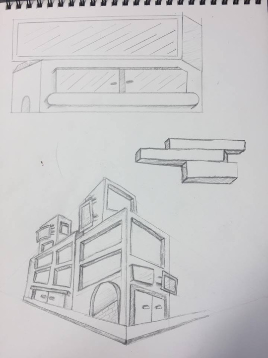
After doing some research in class on modern architecture I did some small simple sketches of building ideas and shapes. After looking at lots of buildings I tried to use heavy geomatry so you can see lots of squares with sharp corners in my sketches. also after looking at reasearch large amounts of glass and huge windows are used in modern bildings so I tried to make some longer rectangles windows on my buildings. I also expseriemented with layers and levels as lots of buildings look like shapes placed or ballaeced on top of one another.


0 notes
Text
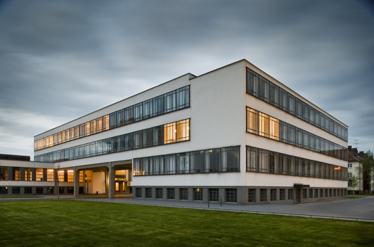
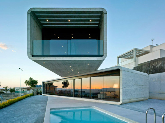
What is modernist architecture?
modernist architecture came around when the techknology in material advaced for construction so more industrial materials came back and were used in sleek simplistic building designs. Materials That were heavelly used were glass, steal and concreate. The main concept is that form should follow function and minamilism was modernism. The general building design within modernist architecture uses strong geometric shapes like squares and ovals and comonly use lots of glass like large windows and balconies, There general look of a building can look sleak and slimplistic as large elements of structures are made of rectangles and squares. This style of architecture came around in the first half of the 20th centuary and is now heavily used for large buildings for banks and office buildings.
What are the key design elements of modernist architecture that will help you design your Museum.
If you look at buildings around places in london like kingscross or liverpool street were there is lotss of banks you can see theres lots of examples of modernist architecture. The use of glass is heavily used as buildings have large widows either in separate square but you also see very big large strips of glass that are windows which can wrap around buildings. Concrete is heavilly used in buildings within this style and you will sometimes see large concreate rectangles layerd on top of each other for floors or levels to a house. Its also about whats inside the building in terms of decoration, now this is going a little more into interior design but modern interior design follows the same priciples and uses large abouts of geometry and minimal collour pallet in furniture and wall paintings.
Mood Board

I went to london and looked at some universaties and the buildings. One was in elephant and castle and the other was saint martins which is located very close to kings cross and everything around that area is very new and modernist.
elephant and castle london college of cumunications.
This is the building that the college is in. I wouldnt say it looked too modern I think on the outside it looks a little dated. There is a strong use of geometry and concrete as it is simple a large concrete square with lots of glass/windows.
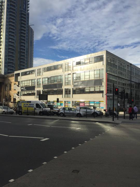
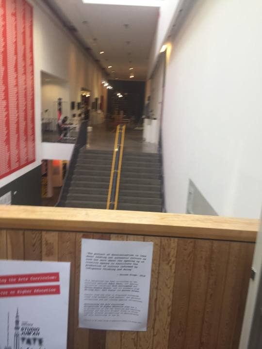
The inside Of the univercity looks a little more modern as the interior is lots of plants and geometric stands and tables. There is large geometric square doorways with sharp edges and lots of there main rooms are mainly all white with axcent colours like the yellow railing in this photo.

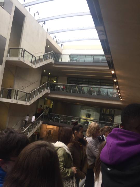
central Saint martins University of the arts.
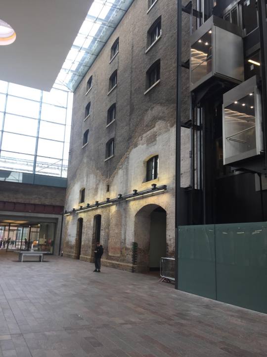
I think central saint martins is a bit more of a newer building and shows more elements of modernist archetecture. There was lots of large concrete and brick walls like this one and I think this is a wall from old sections of the train station/old building as large parts of the building are completely new so it is nice to see that they are merging some older parts of the building with the newer built sections.
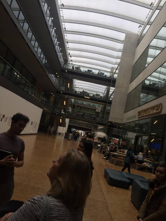
If you look here you can see A heavy use of glass ass the hole building roof is made of large curved sheets of glass and there is also large glass windows to the room and on the balconies. Where the walls are not made of glass it is made of a smooth sandy looking concreate and as you can see in this image there are lots of rectangles and sharp corners which are elements of modern design.
0 notes
Text
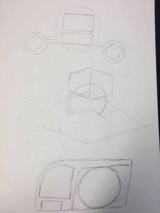
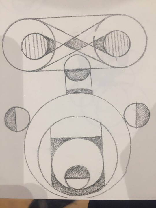
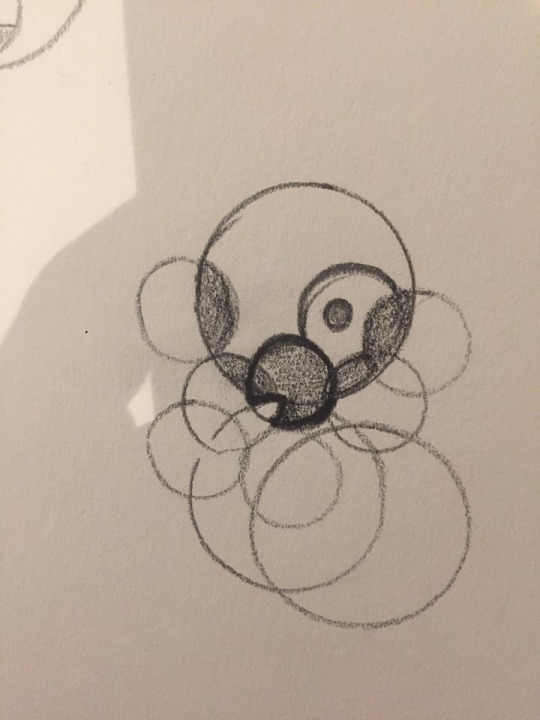
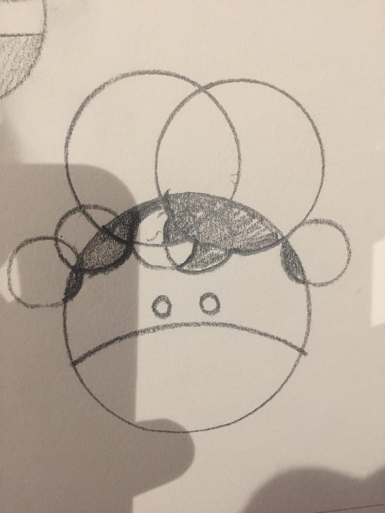
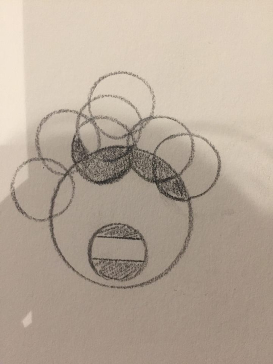
geomatry is very important within graphic design as shapes can create patterns and images and geomatry is heavily used in aspects of design like logo design. it is comon for logogs to be made out of lots of circles as it is said to help create somethiong that has good simatry and is pleasing to the eye so we were given the task to use things like pencils rullers and shape gides to try and exsperiment with shapes and see what we could create.

Here are some of my drawings.


One thing that I did was draw lots of circles at random and see if I could create faces different fair styles.

0 notes
Text
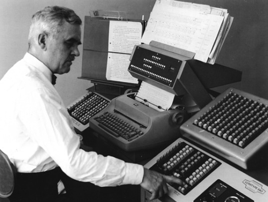
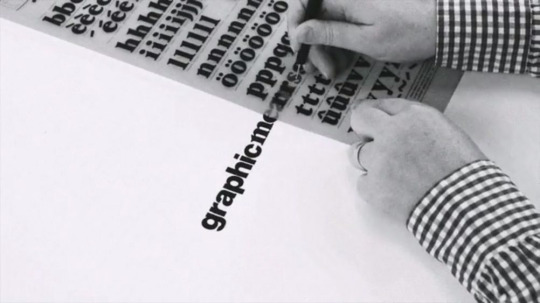
what tools and techneaques were used in graphic design before cumputers took over. today graphic design is mainly done on computers in software like photoshop and illustraightor were it is easier to create faster but befor computers became hevily used in the deisgn industry everything was a bit more hands on art bassed for example very early on if you wanted to make a poster you would create by hand using thinks like pens, rubbers, paints, rulers, and much more. For example posters from the early design days were colarges of text and drawn or printed images so poeple would use scissors and knives to cut every thing up into different sections allowing them to arange all the elements of the peice of art in different ways and variations assentially exsperiment with compasition and layout.
one of the main techneaques used very hevilly which is still used today and still prgressing is print. Print really started in design where people would make letter forms and create wooden stamps so you could put ink on the stamp and press a letter onto something which was print. before computers really kicked off designers would haft to go a typsetter were the designer would ask for the size and phont they would like and the words, the designer would then reseave the print and would manually cut and paste it onto what ever they were creating. The technolodgy advanced and phototypesetting machines came along which allowed you to put words onto photographic papper which could then be manually cut and pasted onto a design.
Essentially lots of design for posters and advertisements were just diferent cut outs of words and images that were put together and then once you had your design it was coverd with some sort of transparent paper like glassline paper to keep everything in place then simple a photo on the design would be taken and it would be printed.
now printing was and still is heavily used in the design industry and there is lots of different ways from early methods like pressing ink onto papper using stamps to screen printing and these methods are still used today.
essentailly before computers really took over graphic design tools were things you would find in an art shop from exacto knives to textured paper, fabrics and more.
0 notes
Text
mwhere was the bauhause based and how long did it oporate for?
the bauhause was an art school located in weimar germany, it ran for around 34 years from 1919 to 1933.
what kind of changes to art education was bauhause credited for.
Before the bauhouse are the different subjects and crafts were very seporate and didnt really murge or branch of into other things, what the bauhuase did was murge a veriaty of subjects and mediums together which would help students learn about multiple crafts and skills which helped build the next genoration of design students to have a brauder outlook and more skills to use when doing art and desgin. Fine art and craft were brought together with the goal of problem solving for a modern industrial society.
what are some of the main design principals of this school and desgin movements credeited for pioneering in graphic design.
the creation of the bauhouse was thought about for a long time and they reason it was created because the art and design was fading away in there eyes so bauhouse was made to push art and design and they did this by envolving lots of different elements and mediums like woodwork and archatecture. They wanted to create something new and moddern and not stick too the old ways. They still focused on history and theory of art and design but they wanted it to be about involving lots of skills and crafts into there school.
The work that came out of the bauhouse really kicked off a new way of design. if you look at work before the bauhouse the layout looks messy with small words and small illustraitions what the bauhouse did was create work that really focused on layout and composition which allowed the work to be clean and sharp with good spacing and strugture and geometric shapes and great layout with words using hiygherache.
but there main pricipals are, form follows function, strong use of geometry, strong use of typography, clean layout and compasition.
3 bauhause designers.
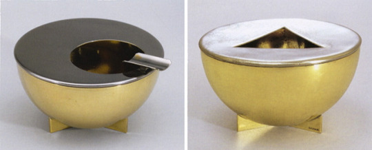
marianne brandt

marianne brandt worked with metal and created things like lamps and kettles and house hold items but she created them in a knew sharp way. As you can see this kettle does not look like your avarge kettle you can see lots of simple shapes and geomatry in there like half circles and cyilander shapes. I really like how it looks my only thought is it looks a little hard to pick up and you might burn your hands on the metal but there pricapels are from over function which is whats happened here with the design looking modern and geometric but the function might not be too great.
Johannes Itten
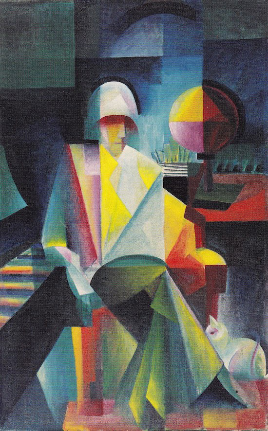
This peice by Johannes Itten is very colourfull and geometric. THe image shows somone siting down with a cat, piano and globe. I think the use of all the diferent shaped and colour gradents really makes this peice rather pleasing to the eye and even woth the strong use of geometric shapes you can tell what the image is, the shapes and colours reminded me of some of pocasos work. I can see he is following bauhauses principals of geomatry theory and composition.
László Moholy-Nagy
this peice of work shows strong lines and different images fading into each other almost like a double exsposure effect. there is strong typography and averything is layed out so theres charp alngles from the lines in the background to the text at an angle. This peice hevially focuses of typography too as you can see the text uses large amouts of geomatry wihth its very sharp point and shapes to crate and text.
0 notes
Text
Bauhaus
the bauhaus was a arts school in a place called weimar in germany
0 notes
Text

Aaron Draplin is a graphic designer and author that runs his own design business called draplin design co and he was born in Michigan on October 15 in 1973. He has worked with big clients like ford and is well known for minimalism and more of a retro style.
After watching videos about his design process and analyzing some of his designs I took some notes about how he works and what he is interested in.
Uses simple shapes
Tries to create logos that are timeless
Enjoys vintage things and simplicity
He brings letter forms back to basics
Enjoys minimalism
Starts by sketching
Makes notes on texture and color
Makes sure a design will look good on things like websites and items
works with negative space
creates lots of duplication to help his idea generation and outcome of his product
Makes sure his designs work in all sizes
Experiments with shapes gradients and text
Experiments with different layout variations
3 examples of his work and my thoughts and options on them
Assembly.
This logo is a clean sleek geometric logo. You can see how he has created the icon for this as the letter A completely made out of triangles. Its clever because all of it is essentially triangles making it seem complex but really the shapes and design is minimal and the color pallet consists of different shades of blue with the bass of the design being dark shades of blue then gradienting to a lighter shade at the top. Underneath There is a nice sans serif font that’s not too bold but the weight and thickness of it is just right so you can clearly read it in a small and large size.
Peak Oil.
This logo is very minimal so it is simply a black and white logo. He has created the shape of the logo out of some sort of droplet to represent oil. He has used some techniques to add depth to this logo for example on one half of the droplet lines are taken out of it showing this negative space and it almost works as a shading affect. Another thing that he had done to make the type pop is put it in a black circle so its not lost in the shapes and negative space. For the text he has used a clean geometric sans serif font and used hierarchy with the work peak being larger than the word oil.
Nike.
His Nike logo is very text based and it look like a label. I really like this because it has a very vintage old school look to it. once again the general shapes are very basic and geometric but the lay out of all the different lines makes this logo look very strong and quick. Once again using hierarchy with his text as you can see in a more vintage looking serif nike logo at the top so you know which brand the design is for and about. One thing that I really like is the small iconic nike swoosh at the bottom which just makes a nice composition with the two nike logos being the bass and the top and then the rest of the type being centered in the middle of the box created by the geometric lines. This logo has a very simple color scheme as it just uses a nice bright teal cyan color and relies on negative space to create the back drop.


Saul bass
Saul Bass was born on may 8th in 1920 in the Bronx, New York were he was brought up by his Jewish parents. Saul Bass had a passion for art and he graduated from James Monroe High School in the Bronx and studied part-time at the Art Students League in Manhattan, He then went on to attending night classes with the painter György Kepes at Brooklyn College.
He started working in Hollywood in the 1940s were he worked making advertisements for print for films like Death of a salesman and The moon is Blue. A stepping stone in his career was when the director of The moon is blue asked Saul to design a film poster for the film Carmen Jones in 1954, The director called Preminger was so impressed with his work he asked him to produce the title sequence as well. After creating the title sequence he loved it and realised how it can positively enhance the film to the audience. He then went on to create many Posters and advertisements but also lots of film title sequences too.
Saul Bass enjoyed many elements of design and is mainly known for his posters and advertisements but he also did work creating logos for brands like AT&T Corporation (1969 and 1983) and Frontier Airlines (1978).
It was not just advertisements and logos he was a filmmaker for a while during the 1960s were he was asked by directors and producers to produce not only title sequences for their films, but also to visualize and storyboard key scenes and sequences within them.
I would say he is most well known for his film posters and he created some of his best known posters for films directed by Otto Preminger, Alfred Hitchcock, Billy Wilder, and Stanley Kubrick and more. His last commissioned film poster was created for Steven Spielberg's Schindler's List in 1993 but it was never distributed.
Saul Bass won awards such as Academy Award, Best Documentary, Short Subjects and Why Man Creates. He then died in 1986.
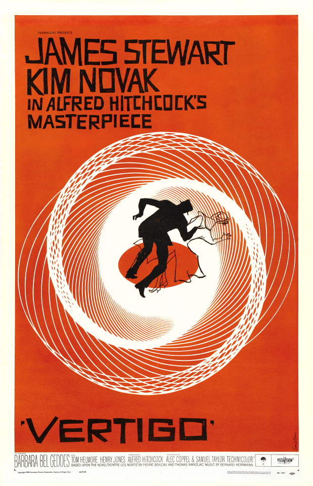

I really like this poster by saul boss, I really like the rough shapes and I think the use of three plain colors could seem a little boring but I think the simplicity of the color scheme and shapes actually work well and looks good I also like how the background colors are not a fully saturated and are a little faded or softer making it easier on the eyes and it also allows the wording within the negative space of the body to pop. I enjoy how the poster looks like it has been cut out of bits of colored paper and then put together. One of the reasons a lot of his work is a little more simplistic is because the printing back then was not as advanced as it is today and this also applies to other elements of design like there was not digital software or it was not as advanced as it is today but I think the simplistic look comes across as a bit modern with minimalism being very popular. I think the large text in the body looks great because It stands out which makes sense because the tittle is very important, I don't like how the text is all messy and wonky but this might have been done so it fits the atmosphere of the poster with its rough cut out look.
It shows that Arron draplin takes inspiration from saul bass in his work in the way that he also works with simple shapes, colors and minimalism to help make things like logos live longer and work in all different sizes on different things.
Stefan Kanchev
Stefan was born on the 6th of august in 1915 in kalofer Bulgaria. He studied mural printing in the national art academy from 1940 to 1945. He worked in all areas of art from book covers to trade marks, advertisements and more. Kanchev participated in many galleries and exhibitions both locally and abroad from Budapest, Berlin, Moscow and much more. His work is said to be well know for his clear composition and his “fellicitiouse relation between fonts and shapes”
His work and dedication to galleries popularized his work and style which led him to wining many competitions for typefaces, posters, trademarks, postcards, telegram forms, book designs etc, and his work became famous and could be viewed in the major applied arts encyclopedias. He then went on to win the “cyril and methodius” 1st calss in 1956, 1963 and 1969 for playing a big part in the development of Bulgarian culture. He proceeded with his work and won the Bulgarian state title of national artist in 1971.
Kanchev grew up around his father that was a info graphic artist which inspired him to do art. He has progressed to become a well known artist and draws all of his logos and work free hand it is said that his last moments were spent drawing and working before he got taken to hospital where he died in on august the 22nd in 2001 aged 86.
“Sadala” — Burgas
(Factory for underwater fishing equipment)

This logo is a simple black and white logo. It uses negative space and when you look at it there are only two shapes which are black and then when you add a background color which allows you too see the pattern in the negative it still only looks like there are maybe four shapes. This is a logo for something to do with fishing equipment and you can see how this is represented in the logo by the simple fish created out of negative space. The fish is surrounded by a black oval shape which creates a nice boarder which I think will help this design stand out. I Think from looking at this design you can tell that it is related to fish. I also think because of the simplicity of it with essentially just two black shapes and negative space I think this design would work very well on many things because of its simplicity it could be scaled down and still look good, one thing that I am not a huge fan of is the boarder of the fish is not a round circle its slightly stretched vertically and it might look more pleasing to the eye if it was an exact circle.
Hotel “Shipka”

This design is for a hotel. the design only consists of black rectangles with the layout being one long rectangle at the bottom and then on top of it three rows of rectangles each row consists of 9 rectangles which are individually space out by columns and rows. If you look at the design as a whole its like one large rectangle made out of rectangles. The design is meant to represent the hotel and after looking at pictures of the hotel it has a very geometric shape to it and looks like one big rectangle and then rows of rectangles making up the window. This is a very simple design using a very very limited amount of shapes and black as the only color. I think When you know what this design is for it makes total sense but on its own it might be a bit hard to see its a hotel as it could be a block of flats a chocolate bar or a calculator so I think this design could be too minimal.
“Slavyanka”
(Port with fishing center)

This is a design for a fishing port. This design Uses thick line work with a circular border with lines coming off it colliding with other lines creating two fish which can be distinguished by the two small circles for eyes. Once again this design is just black but the shapes and pattern is a little more complex. I really like the flow of the pattern and the thickness of the lines as I feel if the lines were thinner it would be harder to see and if the lines were thicker and heavier the fish wouldn't look right. Just like all three designs this one also uses negative space. I think this design would work in many sizes just like the others as it uses just black and clean sharp line work with smooth curves. I think all three designs use good negative space and are able to express and represent imagery using minimal colors and shapes. But I think without any context it is tricky to understand what these designs are for.
I think his work is enjoyed and works well within the design industry because in most cases its simple but effective. The fact that its so minimal allows it to work on so many different platforms and materials, you could scale it down and enlarge it and it would still hold its form and you would still be able to recognize and identify the imagery and illustration he has created. The best type of design is a design that’s timeless, now its very tricky to create something timeless as the design industry is constantly changing but as of today I feel like his work would still work as simplicity and strong composition and structure is heavily used so I think that his work may become outdated in the future but as of now it would work fine meaning his style of design has already lasted a long time.
I think both designers share certain things in common and one of the two things that they both heavily focus on is simplicity and composition and they are both good at creating design focusing heavily on these two things because when your making a minimal design if you have bad composition or something is slightly off its very noticeable because in some cases there are not a lot of elements/parts to the design. You can definatly see similarities in there styles and work and arron draplin talks about how he loves old things and believes that design is timeless and does not need to be complex and crowded which is something that Stefan Kanchev does very well so he could possibly be taking some inspiration from Stefan Kanchev.
0 notes
Text
Alexander rodchenko
Alexander Rodchenko was a Russian artist that was born on December the fith in 1891 and he died in 1956 aged 64. He started off as a artist and painter but he got very involved in Russian politics were he dropped painting and fine art and started creating posters and advertisements for the Russian revolution. through out his carrier he used lots of different mediums most of them traditional like painting and sculpting but he also did graphic design and some photography in his career but he spent his early career using paints and pencils but further on he spent most of his time working with print making posters and book covers.
sheperd fairy
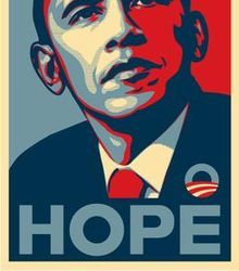
sheperd fairy was born on February the 15th in 1970 in america. He is a street artist, graphics designer, illustrator and activist and is know for his clothing brand that he founded called Obay which emerged from the skateboarding scene. he came widely known when he created one of his most famous pieces which is about the us election in 2008 and its a poster of Barack Obama created out of a simple color palate with the tag line hope in bold at the bottom.
how long have these artist been working
Alexander rodchenko worked mainly in the 20s to the late 50s until he died in the 60s.
sheperd fairy has been working in the 90s and most likely still to this day with his company obay.
what kind of mediums these artists wotk with
Alexander Rodchenko works with a lot of traditional methods like paints and so does sheperd fairy with his background in street art were he made stickers and stencils. they both also have a background in graphic design were i’m sure lots of sheperd fairy's work is very software based whilst Alexander Rodchenko was working with early printing methods which also sheperd fairy would of used to created posters and street art.
What visual themes are similar between these artists.

both artist use a very minimal color palate, as you can see in these two pieces there are only around three colors and the artworks look very similar. for example when looking at these two pieces you can see that there is lots of almost leading lines and everything is very geometric. The type is also very similar as it is sans serif and bold with high saturated colors. Now both artist have work which does not involve simple shapes and a small color palate but a lot of both artists work does look very similar.
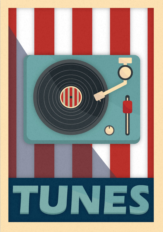
I made a piece of work trying to use similar techniques and styles as the two artists. My piece of work is a poster of a record player in the center of the page and at the bottom the word tunes in bold. The general page layout is based on sheperd fairy's work this is why I have the main item in the poster large in the middle of the page and then a thick border which can be seen in his work. His work is commonly known for a section at the bottom that holds a bold word like obay or hope so I copied that idea and created a large box and put the word tunes to relate to my theme of the record player and music. In terms of the color scheme I tried to pic three/four main colors because Alexander rodchenko used a very small color pallet which helps the colors that he does use really pop out for example you see lots of highly saturated reds on black and white backgrounds which allow it to really pop so I tried to do the same by adding some red on white stripes. The reason I have used red and white stripes is because I think it represents both artists because Alexander rodchenko uses lots of strong bold lines in his work and sheperd fairy uses an american influenced color pallet like the american flag red white and blue. So the color scheme of my work is trying to represent america to relate back to some of sheperd fairy's work like the art he made around the us election. I think a difference that I spotted between the two artists is that even tho there work is similar Alexander rodchenkos work looks a little more busy and complex even tho lots of it is using simple shapes and colors at a first glance some of his art looks very busy when on the other hand sheperd fairy has a very simple layout and not a lot going on so I have taken to his layout a little more in my piece of work. One thing that I did was add light shadows to things like the record player and stripes to add more depth too the image just because I thought it looked better than it being a flat design but both artist usually do not use a lot of shadows and there work is very flat. I also added a very light grainy image as a texture and turned the opacity of it down to around 2% so its very light but I used a more noise/grain texture to fit with the vintage/retro theme of the record player. Another thing that I did that dose not relate to the artist too much is Instead of using a small set of colors I used main colors but then took different tones of that color to add some more depth so there is lots of reds and blues but the main colors of the piece are Red Blue Grey and Vanilla.

0 notes