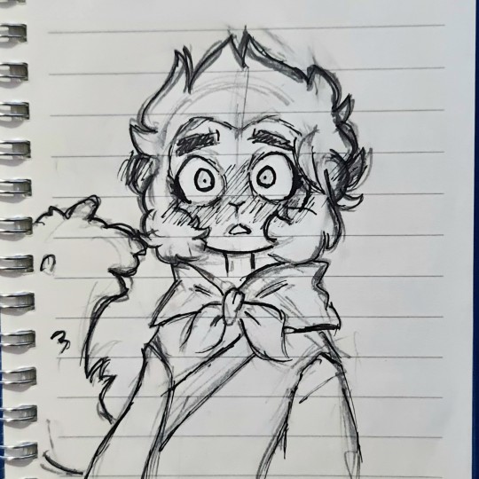
#its more of a storyboard than animatic but i still think it looks nice so far!
Text
Making a Stolitz animatic using the song "Look my Way" by Paranoid DJ. Hopefully I'll actually get it done at some point
#first animatic so i apologize for quality#its more of a storyboard than animatic but i still think it looks nice so far!#stolitz#stolas goetia#stolas goetia helluva boss#helluva boss#helluva boss stolas#helluva boss blitzo#blitz#blitzø#helluva boss blitz#helluva boss animatic#animatic#artist#small artist#artist on tumblr#artwork#art#digital art#digital artwork#digital artist#my art#animatics#storyboard#first animatic#animation
31 notes
·
View notes
Text
Helloo~ I was bored in class one day so I thought "why not do an art study of the artists I like" except it incredibly scuffed and I really just looked at a bunch of art on their page and i tried my best to replicate one of em
So these are the 2 'studies' i did that day
1st:
My ver:
(Art by @izuke-the-zombie )
ref pic:
What I noticed first while sketching is ofc the super gorgeous cute style. Though not long into the sketching phase noticed her lines are quite sharp and pronouced, for most of her works she keeps her sketch lines making it seem more mmm hazy is the right word? Or effortless, but with every sharp line a rounded(?) line contrasts it, giving it that signature fluffiness. I absolutely adore how well this all mixes together, i dunno just sonethin bout her lines bro
I love the expression, really gives off absolutely love sick, I didn't capture the eyes quite well (I blame my chonk pen because all good artists blames their materials/j) Macaque looks more scared than breath taken and I put the eyes too far apart. I basically deprived the eyes of its soul lmao note for next time I do a study.
Ok this part has not much to do with the ref pic but her art in general and that includes her writing. I adore the cute HCs and little stories/AUs she would post, just so much creativity and its always so comforting to read as theyre so wholesome and cute. Im so sure one of my first posts here were a drawing of one of her HCs LIKE SRSLY SO CREATIVE. I was also surprised as I saw in some artworks she's able to draw structures and environments that draws your into the scene, its fits the universe so well, just adding to that little wonderment of awe. Shes amazing at coloring too, real soft, but still makes the characters pop, i'd say more but my brain is short-circuiting from all this analyzing. Shes just all round incredibly talented and creative honestly. Her style is exactly what i wanted to have as a kid and what im striving to have now. So cuteee
So far 11/10 art style, love the chibiness, cuteness, expressions, the pure and pastel feel and colors, and details. Just love her in general<3 check out her page lol
2nd:
My ver:
(Art by @clatteringbats )
ref pic:

Ok so immediately off the bat I knew I was gonna have some trouble here since I've been drawing chibis from the very start.
Just from observing her art I alr saw it has a lot of movement in em, lots of dynamic poses, and LOTS of embraces, really just pouring with that fluff/angst energy. At first I tried the anime body guidelines and boom instant error. Though not all that noticable the heads have sum chonk in em, especially the cheeks, giving that cute factor despite not being a chibi style. Im all for it. The lines are very soft, not a lot of sharp edges and if there are theyre placed in a very subtle way. The expressions are wonderful: from a subtle hopeless smile from an overwhelming roar of grief and anger, she's mastered the the art of slight details that give these effects their magic. Her lines are sketchy but not messy (does that make sense) they clump together neatly, giving the illustration clarity.
AND OMG HAVE YOU SEEN HER ANIMATICS? THE MOVEMENT, THE PACING, THE SMOOTHNESS, THE INTERACTIONS, THE EMOTIONS, THE EVERYTHING. THEYRE SO AAAA ITS LIKE A PROFESSIONAL STORYBOARD FOR A TV SHOW.
The way she uses color too— just o h m y g o d .
Her colors are so bright and clear, so nicely blended together, so bold, but not in the way that burns your eyes, she keeps them neutral in a way, that envokes that sense of harmony; like a sunset. (I legit have one of her colored artworks as my wallpaper) I have lots more to observe, but so far this is all I have to say. The skill of overflowing
Anways, back to the task at hand. I made the heads bigger than i shoulda , cause well chibi artist ehe. Again, I blame my chonk pencil. I didn't get the embrace quite right, but Ion think I could level with the queen of LITERALLY DRAWING TEARJERKING HUGS LIKE? I tried with the hands, I swear. I knew they were a little small but only now am I realizing its that way cause I made the heads too big. I wanna try drawing more in her style as its really just full of movement and flowiness, I wanna try mastering the way she draws perspectives too. I noticed for perspective shots theres this grid for the sky and ground (which is genius) will try that out when I actually pick up digital art again.
Check out her page, theres lots to see shes amazing 11/10 artstyle<3
#lego monkie kid#lmk#monkie kid#macaque#six eared macaque#lego monkie king#liu er mihou#shadowpeach#sun wukong#lmk swk#sketch#art study#art analysis#lmk fanart#fanart#SUPPORT THESE ARTISTS#shadowpeach fluff#monkey king#wukong#doodle#ink
395 notes
·
View notes
Note
animatic ideas :0 (ramble away, i would love to hear them!!)
mk thank you for enabling me, i will now be yelling
anyway
this is gonna be so obnoxiously long i am so sorry
can you add read more's on asks? eeeekkkk because this got so damn long lmao
mild dsmp spoilers obviously
this is the playlist, by the way
-im sorry boris (wilbur soot)
i think it would work really well with mmm slightly post lmanburg niki. andby slightly i mean. well when she leaves (that is the whole thing of the song gdfjkhgsdf) also side note at like 1 minute 11 on that song theres a discord notification really subtly in the background and it makes me paranoid every time i hear it. anyway god its such a nice song. even for just like. the end of lmanburg. not necesarily paired with a character, just the sense of leaving a place that was so highly populated before it got blown up twice and was like. the main part of the smp. yeah. anyway also the lines "they'll knock down the pubs before helping you...they'll let you jump under trains before helping you" yeah those four lines have big niki vibes but also i think the song could work well with exile tommy or actually even with the finale when tubbo is about to sacrifice himself? mmmmm yeah
-this is home (cavetown)
mmmm got exile tommy vibes innit. a lot of these have exile tommy vibes tbf i just like sad songs and also exile tommy. plus the song has a lot of like. the message is sort of like. changing yourself to appeal to others? like with "ill cut my hair to make you stare" but also the repeated thing of "ill figure out a way to get us out of here" which is clearly the main character of the song trying to help everyone when they are clearly not in a good way themself. yeah thats got big tommy vibes in general tbh but more like. pre finale tommy. i think he got a bit more independant after that.
-soldier poet king (the oh hellos)
ok this is self explanatory and has been done to death already but d a m n its kinda funky. anyway i had thoughts and actually started this but then lost motivation and deleted it all lmaooo. the only proof of its existance is a shitty storyboard in my draw which will hopefully never see the light of day again (unless anyone wants to see it :eyes:) anyway i had the thought of like. sbi? so soldier techno poet wilbur and king tommy. but tbf tommy and techno are kinda interchangeable with that, cos while techno is obviously the better fighter, tommy is used a lot, especially in lmanberg era and also i think he probably will be now that wilburs back
-pyjama pants (cavetown)
ok so i honestly dont remember why this is on the playlist but tbf this could go well with a bunch of characters. thinking like. phil and wilbur? or wil and tommy, or tubbo and ranboo are two that like. i know for a fact that i did not put the song on the playlist specifically for them but god thinking about it now it works so well with them
-boys will be bugs (cavetown)
OH BOY THERES A LOT OF CAVETOWN ON HERE HUH (i feel like that probably says something about me but shhhhhh we dont need to talk about that) ANYWAY
I think this could probably work really well with tommy? because of the whole like. trying really hard to come across as not caring about others, but really being like. very vunerable. but at the same time it could go really well with wilbur for the same reasons. also the song fucks ok cant deny it. to be fair i think it works better with tommy, because he's younger and also he really likes bugs (unless i am mistaken) which is just a cool coincidence but still)
-brother (kodaline)
FUCKKKKKKKKKKK THIS WORKS SO WELL WITH SO MANY CHARACTERS AND IS ALSO ***SO ANGSTY*** WHAT
anyway
i added it because of tommy and tubbo because holy shit, but also it could work very very well with wilbur and tommy, techno and wilbur, probably techno and tommy, and oh my god i just thought of this but this would work so well with phil and techno!!!! but yeah i originally thought tommy and tubbo because i thought it was a funny coincidence with exile tommy waking up underwater, and theres a line that says "if you were drowned at sea, id give you my lungs so you could breathe" and like. just thinking about the compasses especially. me gusta.
-feel better (penelope scott)
fundy. that is all.
no ok this works well with fundy but also probably karl sapnap and quackity, and also very much wilbur, like it works well with both. just mainly fundy idk why its got big fundy vibes tho. very poggers.
-as the world caves in (matt maltese)
ok but like this goes very very well with the explosions of lamberg. either of them. i think probably the first one is better, but i think it goes well with both. probably the first one, because it was way more emotional i think? cos it was the first time that their homes had been destroyed and everything, but also because it was so personal, because wilbur was the one who did it. i think that also it would work well if it was set during the explosion but also focussed on different facets? so like. one bit about wilburs perspective, one bit about tommys, one about phils, one about fundys maybe? idk just a bunch of lmaburg citizens' povs for this. its good. as the world caves in is a song that can be so gender tbh.
-do you hear the people sing? (les mis)
obvious obvious obvious...... but like..... also tbh it goes well with a bunch of things. like, mmmmm wilbur in pogtopia. the butcher army. lmaburg independance war (obviously ghdskj) but yeah. also this song just goes so hard like b r u h
-wolf in sheeps clothing (set it off, william beckett)
SO MANY OF THESE ARE LIKE. PRETTY OBVIOUS IF YOUVE HEARD THE SONG
but yeah. it would go so well with like. well any betrayal basically. so eret, from tommys pov maybe, or about wilbur from nikis pov, or wilbur from anyone pov tbf, or quackity from charlie/purpled/foolish/sams pov, or sam from tommys pov, really it works well with so many people which says a lot about the characters tbh but shhhhhhhhhhhh
-need you here (idkhow)
OH MY GOD OH MY GOD OH MY GOD OH MY GOD
mk mk mk mk FUNDY AND WILBUR THO
like b r u h that works so well with them
also i started this one as well but didnt like it, theres a story board in my draw as well for it because like. oh my god its such a good idea i just am shit at animating and don't have a decent enough program :')
also also
the line "daddy has to go, and that makes me sad, but daddy will always come back, he promised" fuckkkkkk that works so well with like. say for example, idk, when they're celebrating schlatts death and wilbur leaves to press the button? the sheer fucking angst of that is enough to kill any one person istg that is in fact the entire reason why i started the animatic in the first place. just that line. also all the lines sung by the child voice. fuckin angsty as hell. also ust generally a banging song, as is every idkhow song
-green (cavetown)
another cavetown song huh. ok sure.
mk so wilbur and sally and fundy. like. for a start, the imagry of a fish at the start? boom sally.
anyway the lines "you looked so good in green, i hope you're well, and you look so good with him, (schlatt ig?) and I'm proud of you still (wilburrrr and fundyyyy) i miss your perfect teeth, i was too blunt, i hope you feel happy, that's all I want"
FUCKKKK
the whole song is about missing someone you used to love and only hoping the best for them!!!! and wishing that they are happy and safe!!!!!!!!!!! and hoping they still think about you!!!!! but even if they dont its fine because all you want is for them to be happy!!!!!!!!!!!!!!!!!!!!!!!!!!!!!!!! AAAAAAAAAAAAAAAAAAAAAAAAAAAAAAAAAAAAAAAAAAAAAAAAAAA
-achilles come down (gang of youths)
OK I THOUGHT IT COULDNT GET ANGSTIER
so like. tw suicide but thats what the entire song is about and bing bang boom i just think it works so so so so so so so well with not only exile tommy (who obviously did try to kill himself) but also wilbur in a slightly more metaphorical way? so like. his self destructive habits leading him to a point where he had no choice other than to kill himself and to take his country down with him. and its all about other characters trying to help them and persuade them not to but also near the end there is a second voice trying to persuade them to go along with it, which im thinking like. if its wilbur, either dream or maybe just himself. his own brain persuading him to continue down the path that would inevitably lead to his and his countries destruction. also it works well with schlatt for the same reasons, except he doesnt want to die. maybe (since the song is so goddamn long) like. one verse for tommy one for wilbur and one for schlatt? dead gang poggg but also like. the verses cover fairly different things which work with one character but not so much the others, for example the first verse would be tommy because its mainly about persuading the person to not kill themself (which tommy did himself but shhh) the second for schlatt because its literally about drinking and smoking away your problems, and the third for wilbur since its more of a fight between the "good" and the "bad" sides, which is obviously what wilbur was experiencing. also obviously i have a soft spot for this song because its string instruments and french, basically my favourite combination ever (also i like his voice idfk lmao)
ANYWAY THATS ALL THE SONGS ON THERE SO FAR
i literally thought of another song while i was in the shower today but i dont remember which it was but a n y w a y the playlist will most definitely be getting longer, especially since there are so many more songs that are good for this but i just havent added them yet lmao. anyway ive been writing this for like an hour gsdfjhgdhfsg but still oh my god this was fun to write
#long post#tw suicide#only a mention at the end but still gotta be safe :)#dsmp#dreamsmp#dsmp animatics#robin talks#ask#thank you so much for the ask tho cos like. i dont wanna be annoying or anything? but also like. i really wanted to talk about this gsdfkjg#god i hope the read more worked or this is gonna be annoying to everyone ever#its fine probably maybe not really
3 notes
·
View notes
Text
Koha blog posts
Week 7.1
Unfortunately due to a family event I was unable to attend the first lecture in the pit and class because I was still in Auckland. To utilise my time well before next class I looked at the resources on stream and tried to catch up as best I could. I understood the new brief, that being that we had to create a trans media campaign creating a poster, website and motion graphic video. I also listened to the Warren Maxwell songs and read through the lyrics as a class mate had mentioned this would be important for next class. Missing the lecture from Warren Maxwell was disappointing as it would have aided in my process however I am confident I will be able to establish a good work flow regardless.
Week 7.2
This was my first class back for the Koha brief and it was a bit hectic. In the previous class people had paired up for an exercise and these pairs were now doing the trans media campaign together, due to being away I wasn’t in a pair. I was quickly paired up with Courtney which was a relief however Courtney had also missed the first class. This meant starting our project came to a bit of a halt whilst we got to grips with the brief and what was being asked. Myself and Courtney analysed the lyrics to 3 of Warren’s songs, writing up word lists, thumbnail drawings, key themes and potential storylines. We also took this opportunity to have a one on one with Andre about what we missed in the previous class and how we could further ourselves. Towards the end of class we decided to continue with a physical workbook and on top of this set up our Trello website for our project management. For homework we decided it was best that both of us continue to analyse and establish potential storylines for our motion graphic.
Week 8.1
This weeks lecture in the pit focussed on the motion graphic aspect of the campaign and explored techniques to make the process of starting the motion graphic easier. By this point our pair had established a storyline combining key themes from 3 of Warren’s songs; Peaceful Man, Nature of Man and Home Land and Sea. We split up the work of looking as visual precedents and aI focussed on creating a moodpboard for the illustration style for our animatic. This mood board was a good first step to visualising how the animatic would look. In this class I learnt the importance of storyboarding and how quick sketches can really help aid in the process of creating a motion graphic. I sketched out a few images from the storyline we created and looked at how they could be put together to create a storyline for the “plays”. We also completed an in class exercise using a key frame from “A some for Europa” and looked at how the image could change meaning and context depending on what word we paired with the image. This was interesting and taught me that anything is subject to change when people are looking at something a certain way feeling a certain emotion.
Week 8.2
This week’s lecture taught me the importance of user experience. How creating a visual system targeted at a specific audience will help to portray my ideas. We began the class by brainstorming in our pairs, thinking back to the Warren Maxwell songs we chose and the key themes in these. We then focussed on the imagery related to these key themes and how we could begin to portray these images in a storyboard. We had an introduction to storyboarding by Jason which was super helpful for me because it’s not a skill I practice often. Once we had a few initial sketches I began to research types of animation style as well as illustration style and how our own skills and ideas could fit in to what we were researching. Myself and Courtney both found an animation we really liked, it was the simplicity of the motion graphic that drew our attention.
https://www.behance.net/gallery/69437287/SELFRIDGES?tracking_source=curated_galleries_list
We chose to delegate the illustrations to Courtney because we wanted our body of work to look cohesive so having one person dedicated to this would help. The Lab this week was after effects, Courtney attended and brushed up on some after effects skills, I was unable to attend however I had some knowledge of after effects from first year.
Week 9.1
This class was our interim presentation, I completed wireframe sketches of our initial idea of a mobile website with organic shapes, as well as some initial illustrated key frames from our story board, we also had a printed moodpboard which I put together. During the time I was putting together the interim presentation work I learnt that communication is key when working in a pair, I ended up doing most of this presentation by myself which is no reflection on my partner just on the fact I like to take control and do things myself. However when working in a group or pair I have learnt that delegation is a really useful skill to have in order to get work done faster and smarter. The feedback we got from our interim presentation was good, Lee really liked our storyline and the initial semiotics I had illustrated of the coins and flowers. We are headed in a good direction and the moodpboard we printed is a good starting point for the visual aesthetic we want to achieve for our animation, poster and website. Going forward I will be further defining our storyboard for the motion graphic while Courtney works on illustrating. I will definitely be looking at how I can help to divide the work between us to make sure we get everything done.
Week 9.2
This week in class I looked at the timeline of the motion graphic and how the Warren Maxwell songs can work as a soundtrack for the motion graphic. I decided I would take on the role of creating the animation/motion graphic as Courtney has no prior experience with after effects, even though my own knowledge is limited.
Week 10.1
The illustrations for our motion graphic were taking longer than expected so personally I used this time to create a website. Usually some of the illustrations we already had I created a mobile website with a few different iterations as a start. The website started to come together really nicely and I was quite happy with how it looked. I also worked on our bookwork as well as beginning the animation with the key frame illustrations that were complete. During this week I learnt that learning a new skill such as after effects or even remembering and brushing up on the skill takes time, it took a long time and quite a few tries before I got to grips with the software.
Week 10.2
This class was just working towards Monday’s interim presentation, we tiled our poster, and our website is pretty much navigable. Our animation is also partly done but I’m not too happy with how it’s looking at the moment. Jason mentioned everyone’s motion graphics are looking almost like a stage - everything entering and exiting from the sides, I’m thinking of how we could develop our motion graphic to look less like this. Courtney has developed quite a few poster iterations now which are looking good. This week I’ve been brushing up on after effects and trying to learn some better skills which is proving harder than I thought. After effects is definitely teaching me patience.
Week 11.1
We presented our interim work for the class and tutors, having interim presentations is always really helpful for me personally, if I have been struggling to feel motivated to get the work done I’m always keen for feedback so the interim is a good opportunity for me to collate my work and get feedback. We got some really helpful feedback, the animation was feeling weak so I decided to reassess what I wanted to achieve from the animation and think logistically about what I could get done in the timeframe. Like always bad feedback is kind of disheartening however it’s something I have learnt to take in my stride and it will really help our project in the long run. We decided to re-establish the style for my motion graphic, cutting the time down and keeping it even more simple.
The poster we presented had really good feedback and we’re pretty much ready to print with a few minor touches. The website is also coming along really well and just needs a few final touches. This week I learnt that its all about the process and thinking of target audience, instagram ad transmedia, don’t want to watch a long video, short snappy but effective.
Week 11.2
This class was about continuing my work with the motion graphic and getting back up to speed. By this point we were ready to submit our poster to toy store and put our final touches on the website adding in a merchandise section and a link to more Warren Maxwell information. We are super on track at the moment with work only really needing to be done on the animation. We were told about the due dates being early for the animation and website, this shouldn’t really affect us too much because we are on track. I’m feeling quite good at the moment about our project and I am proud of the progress we have made.
Week 12.1
Today’s class was our last opportunity for feedback before hand in. We showed the tutors our motion graphic and website, both of which are now done. Was really good to get some positive feedback. We have submitted the poster to toy store and will only need to mount the poster. We need to create the website walkthrough after putting some final touches on the website. Our animation is due tomorrow night so I will need to put some final touches on that too. We are really on track which is such a good feeling. This project has been really interesting working in a pair and establishing a routine of communication and delegation of jobs.
Week 12.2
We submitted our animation on Tuesday and mounted our poster. This morning was an interesting opportunity to see everyone’s different style of animation. The trans media campaign has been super interesting really thinking on a deeper level about how your design will interact with the target audience.
1 note
·
View note
Text
Kind of a summary of everything so far and revisiting on research
My research:
My research has included A LOT, and perhaps a bit to much. But I felt that researching into every possible outcome or things that interested me was really important regardless whether it made a big impact on my final animation or not all of my research has had some sort of impact to my thinking process EG looking into bathes five codes, voglers and propps heroes journey and character archetypes, researching different aesops fables, kurt vonneguts 8 rules for writing fiction, sigmund freuds ‘the uncanny’ and looking into how a story in general is structured hasn’t necessarily continued into my research, but helped shaped my ideas for my animation and made my thinking process different, rather then just focusing solely on the animation style and the art side of this project.
What its also shown me is, whilst the character design is important, looking into writers such as vogler, propp and kurt vonnegut the way that character IS rather than just how they look is just as important. Whilst my animation won’t be long enough to build up a detailed character like an hour long film can, the short amount of time I do have I have to make sure to express the character clearly enough along with the environment to make sure the story and the characters personality is shown clearly to the viewer.
Also looking into literature and how to create a story with a strong storyline so that I can present the moral of my fable as clearly and strongly to the viewer as possible as I feel that whilst an animation style or art style can be strong, a story can be easily lost within the animation as so much of the attention can be put into just the art and not the story.
youtube
I think a great example of what I’m trying to explain is ‘its such a beautiful day’ by Don Hertzfeldt. It follows the story of the main character Bill who goes about his everyday life but also suffers from a problematic memory disorder. We see the craziness of Bills life through multiple split-screen windows.
Its a really interesting film just following this guy named Bill. It has a really good narrative and strong story plot which makes the film so interesting and what has made it been received so well.
However, the animation style is so incredibly simple! I think its so fitting with the narrative and the dark comedy humour of the film that it doesn't need to be anymore. To me, the animation is just a way of expressing the strong narrative and story that it doesn't need to be a Disney level kind of animation, the narrator does such a good job of telling the story that it only really needs to be accompanied by a simple animation.
The character design is also very very simple, but again as said it works really well with the story! The character doesn't have to be detailed because all the detail is in the narrative and this is something I will definitely take away with me also when working on my animation.
What I have also learned from my research that I didn’t touch upon much but when researched I found really helpful in keeping in my mind when continuing this project is when I talked about the gruffalo and the comparison between the novel and the animation.
I think it also intertwines really nicely with what I have just talked about as its about that link between literature and animation and how to take a literature piece and transform it into an animation and bringing it to life as you have the challenge when literally taking a piece of literature and the text within it, then incorporating it into a moving piece where you have to re imagine how to tell the exact narrative as the book does but with audio and movement. It’s really interesting to look into and also helps me when looking back on it finding that balance between telling a story that’s from my own perspective, my own story but through the medium of animation.
Art style and character design have been very prominent through my research, particularly looking into the art style of the scenery for my animation and character design because I wanted to avoid going for an overly detailed style like I had done in my previous years at uni and go for something thats more easy to animate and something that I think expresses myself more, however trying to find a new style from scratch was difficult- I had many attempts with the human character design, taking in different art styles and trying to work with them, but they just looked ‘copied’ rather than my own.
But looking furthur into children's animation and illustrations such as illustrator Anita Jeram who’s simplistic yet charming style I loved and really wanted to incorporate, I had also looked into the book she illustrated ‘guess how much I love you’ and the animated series to see how the interpreted the book into an animation and whilst it looked like it was animated with after effects, it still shows me that this style can be animated with- its just about finding out whether this translates when animated in TV paint.
vimeo
youtube
Actually referring back to researching on the guess how much I love you book and animation comparisons and talking about how to incorporate Anita Jerams style into TV paint, I remembered about the short film ‘we’re going on a bear hunt’ that is very similar (I think) to the style of Anita’s illustrations, but as A TV paint animation.
Originally we’re going on a bear hunt was also a a book, but they went down the digital 2D path to tell the story and for me I really love this style of animation much more then the after effects animation of guess how much I love you.
This was something I also discussed ealier, talking about animating with TV paint for the characters because of the expressiveness of Aaron Blaises animation and after effects because of the loose and expressive movement you can get from digital 2D compared to after effects that gives a much more floaty effect of animation which would be great for my background.
I feel that this is the exact same when you compare the ‘we’re going on a bear hunt’ and guess ‘how much I love you’ animations and having these two comparisons really solidifies that I want to create my character animation with TV paint and the background with after effects.
youtube
However for the background, as researched a lot recently, I want to give it a collage effect on after effects rather than hand drawn as I really like the idea of having contrasting animation styles- a 2D character digital animation and a realistic after effects animated background. I think having the actual buildings as well in the animation will show what they actually are much more than what I could draw... as I’m not great at drawing buildings!
I also started on my animatic and whilst it isn’t completely finished yet and still has some tweaks needed, overall I feel its going ok and looking back at my storyboard and thinking about my research on telling a story and a narrative- there have been changes from my original idea so that each part of my animation is relevant to the moral story which is about Ipswich.
The beignning of my animatic was actually inspired by this shot of the Marfa animation, I just loved the simplicity of the art style and thought it was really cute! But I haven’t give much thought on whether or not I will actually make this into a collage as well... I feel that I will try to hand draw it like this shot from Marfa because I just really like it! I can also make the viewer think they are just watching a 2D digital animation but then surprise them when so much more comes up.... Kind of like Ipswich, when you first see it its a shit hole... and it will always kind of be a shit hole, but it comes with many fantastic stories and interesting people.

I’ve also got my photos done which I feel is a huge relief as they will be such a big part of my animation so feels like one of the most important parts of my project has been done! I just now have to take them to photoshop to cut them out and also think about some scenes such as Christchurch park and the entrance of the park to figure out what I will do with these.
Whilst this post was about summarising what I have done so far, I actually found it really helpful to use it as a way to look back at previous research because I’ve looked into so much and refresh myself on what I’ve looked at and how this can help me progress when starting my animation and doing more research.
I’ve also had my memory jogged about other animations I had seen in the past that are relevant to parts of my research I have already done and expands upon them, however because its so difficult going back to find each post to edit and read them, I’ve found it really helpful starting this new post, talking about the previous post then adding points to it on this new one as well as being reminded about what research was on that post and briefly explaining it so that I don’t completely forget, however if I need more detailed notes about a certain subject, I can look back on my blog to find the post.
Also, I wanted to come back to this and remention my brief look into the uncanny valley. Whilst at the time I didn’t have much to say about it because I was still just posting to have references to look back on for deciding my final idea. I think the uncanny valley so far has been quite prominent in my ideas in the sense that I want to evoke an emotional response in people about the inanimate land marks of Ipswich and also the same with my animated character.
0 notes
Text
Moving Pictures Evaluation
Out of all of the projects, this RSA, Moving Pictures brief was definitely the most challenging of them all. This is due to the fact that it was an animation brief, something that I am not too confident in creating. Obviously, I didn’t need to pick the animation styled brief, however I want to challenge myself and boost my experience in After Effects. I also chose this project because I felt it would complement my style of illustration a lot better as opposed to the other briefs. Upon deciding my project, I had to choose which particular audio file I wanted to actually animate. After giving both audio files a listen to I decided on the Mike Berners Lee talk on promoting sustainable living, titled ‘What Can I Do to Make a Difference?’
To begin my project, I thought I would analyse and dissect the transcript provided by the RSA group for the animation so that I could get a better understanding of what Mike Berners Lee was discussing. As I was going through the transcript, I had a bunch of ideas generating, so I ended up drawing out an initial storyboard which I then developed further until I was happy with it. Amongst the idea generation I also did a lot of artist research that helped with thinking of my animation. The two major animators / artists that I focussed on the most were Edern van Hille and Alex Goddard. The inspiration that I pulled from Edern van Hille was that I wanted to also limit my colour palette to two colours, as I really liked the way Hille managed to get so much detail within his work with the yellow contrasted with the blue, the IKEA colours, which is what his work is based on. From Goddard I really wanted to experiment with using some real-world photography mixed with illustration, however unfortunately I didn’t do this as I ended up going down a different route for my project.
I really liked my first experimentation as I felt I created something that was on topic to the audio file and was the exact style I wanted to go with for the visual. However, there were a few points that I didn’t really like with the outcome. First of all, it wasn’t complete, second was that the visuals themselves were way too literal, as in I created a hook for when Berners-Lee said “off the hook” or when he says “beating ourselves up” I drew someone getting beaten up which doesn’t exactly represent sustainability very well. The third reason was the two colour limitation, I really didn’t think it was working very well, I’m not sure if that due to the fact that the two colours I chose were just different tones of each other or the fact that it doesn’t look right in general, which is unfortunate as I really wanted to try and achieve this. With this I went back to the drawing board and decided to draw up some more storyboards that were different from one another.
To help me with my fresh start I decided to do some research into some past RSA animations which helped a lot. I found that with most, if not all, of the animations they had a narrator style character that would follow the story with the viewer, some would actually be the narrator of the audio file and some would just be a character that would fit with their chosen theme. The RSA animation that stood out to me the best for this narrator idea was Brene Brown on Blame, created by Katy Davis AKA Gobblynne back in 2015. In this animation the so-called narrator is designed after Brene Brown, the person speaking in the audio. I really liked this idea and ended up doing a similar thing for my own by creating Mike Berners Lee as my character. Another inspiration for my design was a previous animator that I researched into prior to my re-design, named Jonathan Rosen. I really liked Rosen’s ‘Back in the Brain’ for its simple animation style mixed with a minimal amount of vivid colour as I felt it worked extremely well together and gave the animation a very nice characteristic. With this new research I drew up a few more storyboards until I made one that I was happy with, utilising some of the old assets from the first experiment, which turns out that I ended up changing a lot so I only used one from the old animation.
As stated earlier I wanted to have a narrator that would tell the story and make it easier as a viewer to track the narrative. To combat this drew Mike Berners Lee in a bee costume, a homage to an old illustration I created for my ‘Why?’ project. Mike would then travel through the minimalistic world that I had created, informing the audience of the story. Mike Berners Lee is the only character in my animation because I didn’t want to confuse the audience of who’s supposed to be who plus I really didn’t want to clog up each frame with loads of different characters. There is one exception to this, in the end scene with the bald figure, I’m not too sure why I didn’t recreate this character to match with constant Mike’s, however the character still fits well with my animation, so I left them in. I made an animatic that helped with laying out the scenes and timing the audio file for the project, which I changed a lot throughout the development stage because I wasn’t happy with some of the outcomes and plus I didn’t think that some of the designs really fitted well with the theme. After numerous amounts of chopping and changing, I finally had the animation that I was happy with. I then went searching for audio just to tie the whole project together. I wasn’t happy with the audio I found on the internet so I created my own with random objects I found around the house, for example; rattling keys as a school bell, scissors for the snip of the rope, and my own vocals for the buzz and various other noises.
To summarise I am pleased with the research, development and finalised animation that I have completed for the RSA Moving Pictures brief. I believe that my final animation best portrays the points that Mike Berners Lee is trying to push about influencing sustainable living and sustainability as a whole. I think the strengths in my animation are evident in the illustrations, the colours used and the story telling aspect. I feel like the illustrations and the vibrant, summer colours go hand-in-hand with each other and portray an effective approach to a serious topic whilst still maintaining a comedic sense to them. I also think the use of Mike in a bee costume being suspended with ‘string’ really works as a theatrical yet successful approach to the animation. Despite these positives, there are a few weaknesses that I unfortunately didn’t get round to adjusting, for example; some of the timing when I exported the animation look a lot more delayed than when I was creating on After Effects, this is evident in the first chalk board scenes where Mike is walking towards the chalk board. I also think, even though I like them, the sounds I created were not exactly what I wanted, there is still so much white noise in the background to them even though I’ve turned them down so that it’s not as noticeable. If I had more time, I don’t think I would change many of the scenes apart from the school scene where we see Mike without the bee costume teaching the viewer different ways to live more sustainable. Maybe I’ll change this if I submit my animation for the RSA website.
0 notes
Text
Weekly Summary
10/12/18 - 14/12/18
This week has been a little rocky with the modern fables. I’ve done a series of animation tests that came out good, for a first time, however weren’t what I was aiming for. I found that there weren’t as many examples on the internet as I thought there would be going into this, but also, my character design was a little too difficult to animate in such a way in such a short amount of time. I talked to Jon this week about what I should try do next or what I could take away from my animation that I could maybe use, and surprisingly he liked the first few tests I did using the camera layer in AE. He said that was almost really 3D in a way that it would be just as dynamic as my previous attempts. So we came up with the idea that I could still go with the same concept, just not have my character fully turn. I could do the head movement as if she’s already been sucked into this digital vortex and have her look around (keep the parallax background) and have the pixels move up her body, and overcome her. I did have a similar idea to this before thinking of the 3D spin, so I was on board! Luckily, i kept the previous rig, which meant i didn't have to re-do one, and it stays close to my character design. I’m happy i’m still able to stick to my original idea a bit, considering the amount of work i was doing, but i am a bit upset at not being able to achieve what i originally planned as i liked the idea better. However, I have come out with a few positives from this, I’ve learnt more about AE that i now feel confident enough to do more animations using it, i developed skills in movement and timing, and i pushed myself to go further rather than usually, to go try more challenging ideas.
Collaboration is going well too! We had presentations this week, to show any improvements we’ve added. It was a little worrying as I don’t like to present, but I’m glad people liked the idea and we got some good feedback from Peter! Over the weekend I really focused on time, as I had half a storyboard and concept art to finish for Isa’s project and extra concept designs for Jamie. I was spreading myself a bit thin, but I got it done to the best of my ability. For Isa’s project - doing most of the pre- production stage has made me realise how much I do enjoy character design. It’s something I’m constantly doing, so I think its shown in my projects. I think it’s something I would like to concentrate on for my specialised skills too. The group has been coming together nicely, and we’ve all been helping each other out, and giving feedback on our work, so I’m looking forward to animating! I think collectively, we work well as a group, as we’re quite far ahead with our planning. Next is to sort out the animatic, and then we’ll be done for that project. For Jamie’s project I’ve done some more designs of Mickey. After the presentations, and getting feedback, Jamie and I talked about some ways i could change the appearance of Mickey Mouse, and we thought maybe changing the colours around and having it look more like a mouse than a rat would be better. The class seemed to like it was a rat though, as it changed the personality of the character, but I didn’t feel to keen nor did Jamie. My main focus for his part of the project is to get some more designs done before Christmas Day. But so far, he’s liked the designs and he’s given me good feedback to work with, so i think it’s going well.
0 notes
Text
Home Entertainment Consumer Guide: November 8, 2018
10 NEW TO NETFLIX
"Bram Stoker's Dracula"
"Cape Fear"
"Close Encounters of the Third Kind"
"Eternal Sunshine of the Spotless Mind"
"Filmworker"
"Ghostbusters"
"Morris From America"
"National Lampoon's Animal House"
"The Raid: Redemption"
"United 93"
6 NEW TO BLU-RAY/DVD
"12 Monkeys" (Arrow)
Terry Gilliam emerged from the world of Monty Python and became one of the most fascinating director of the '80s and '90s, directing masterpieces like "Brazil" and "The Fisher King," both available in the Criterion Collection. To be honest, I remembered liking his Oscar-nominated 1996 loose adaptation of "La Jetee" but kind of put it on Gilliam's second tier. It's closer to the first, as evidenced in this gorgeous new Blu-ray release from Arrow Home Video. First of all, the 4K restoration is mindblowing, one of the best HD transfers of the year. Gilliam's world has depth and nuance in ways that it never has before, enhancing the overlal experience of the film. Second, the film's themes of responsibility and that form of insanity when it feels like you're the only person who really knows what's going on in the world still resonate. I still have some performance issues (Stowe, an actress I usually like, is bland) but this is the kind of visual feast that's perfect for a company that loves movies like Arrow. It gets me even more excited for next year's "The Man Who Killed Don Quixote."
Buy it here
Special Features
Brand new restoration from a 4K scan of the original negative by Arrow Films, approved by director Terry Gilliam
Optional DTS 5.1 Master Audio and 2.0 stereo soundtracks
Optional English subtitles for the deaf and hard-of-hearing
Audio commentary by Terry Gilliam and producer Charles Roven
The Hamster Factor and Other Tales of Twelve Monkeys, feature-length making-of documentary by Keith Fulton and Louis Pepe (Lost in La Mancha)
The Film Exchange with Terry Gilliam, a 1996 interview with Gilliam and critic Jonathan Romney, recorded at the London Film Festival
Brand-new appreciation by Ian Christie, author of Gilliam on Gilliam
The Twelve Monkeys Archives
Theatrical trailer
Reversible sleeve featuring original and newly commissioned artwork by Gary Pullin
"BlacKkKlansman"
Speaking of filmmakers who meant the world to me in the '80s and '90s, one of my favorite film stories of 2018 has to be the critical adoration for Spike Lee's latest film, one of his most searing and impressive in his recent filmography. I don't go in for the "Return to Form" stories around this flick though because Lee never really dropped as much as people think ("Chi-raq" is great) and I also think this movie is a tier just below his career best films like "Malcolm X," "Do the Right Thing," and "25th Hour." However, I'd be fine if it overperformed during awards season just to make up for the dozen or so times that Spike Lee was taken for granted this time of year. It's passionate, fascinating, funny, and moving, with great performances and more ideas for viewers to dissect and discuss than a dozen other films combined. It's an essential film of 2018.
Buy it here
Special Features
A Spike Lee Joint - Ron Stallworth, Jordan Peele, and the cast discuss working with the iconic director
BlacKkKlansman Extended Trailer Featuring Prince's "Mary Don't You Weep"
"The Incredibles 2"
Does Pixar know something we don't? For years, everyone clamored for a sequel to "The Incredibles," to the point that it looked like it might never happen or people might not care when it eventually did. Of course, it did happen and it was GIGANTIC. It's the highest grosssing film in the history of Pixar, bringing in over $600 million domestically and over a billion worldwide. It is the ninth highest grossing film OF ALL TIME, and the highest grossing animated film of all time. Oh, and it's gonna win an Oscar for Best Animated Film unless there's voter tampering. And, of course, Disney/Pixar has delivered for fans with a gorgeous Blu-ray that includes a great transfers and extensive special features. One thing that's particularly nice is the inclusion of the short film that played with it, "Bao." Pixar often shuttles their shorts off to special releases, but it's nice to have "Bao" where it belongs, as well as a new short film called "Auntie Edna."
Buy it here
Special Features
All-New "Auntie Edna" Mini-Movie
10 Deleted Scenes With Introductions
Super Stuff
Heroes & Villains
Ralph Eggleston: Production Designer
Strong Coffee: A Lesson in Animation with Brad Bird
Paths to Pixar: Everyday Heroes
SuperBaby
Commentary
Theatrical Short: "Bao"
Making "Bao"
Outtakes & Stories
Character Theme Songs, Vintage Toy Commercial TV Spots, Toolkit Montage and Global "Incredibles 2" Trailers
"Mandy"
Little was more fun this Fall than watching the buzz that I heard at Sundance about Panos Cosmatos' "Mandy" filter down from the mountains and out to the rest of the world. A movie that RLJ basically tried to shunt off to the video market was too batshit crazy to stay there, resulting in sold out screenings at places like the Music Box here in Chicago. Movies like "Mandy" don't make over a $1 million domestically, but that's a threshold that this wonderfully strange movie crossed. And it still feels like it's just getting started. I've already lent my copy to a friend. I'm sure other people are doing the same. "Mandy" ain't going anywhere, and strikes me as one of the films from 2018 that people will still be watching in 2028.
Buy it here
Special Features
Behind the Scenes - Featurette
Deleted & Extended Scenes
"The Princess Bride" (Criterion)
Speaking of movies that persist, there may be no film released in more special edition DVD and Blu-ray sets than "The Princess Bride," which has gotten Special/Anniversary/Limited editions since the DVD was invented. It's hard to believe anyone who's had a DVD player for any amount of time doesn't own it by now, but the Criterion release offers ample reason to upgrade. Of course, it will always be about the movie itself, which has never looked this good, courtesy of a 4K restoration. Believe it or not, Criterion also found a way to produce new special features, including two about William Goldman's beloved screenplay, and an interview with the film's art director. The set also includes tons of archival material that was on previous DVDs and Blu-rays. This really is the ultimate release for one of the most beloved films of its generation. It's a great idea for a holiday gift for the movie lover on your list.
Buy it here
Special Features
New 4K digital restoration, with 5.1 surround DTS-HD Master Audio soundtrack on the Blu-ray
Audio commentary from 1996 featuring director Rob Reiner, screenwriter William Goldman, producer Andrew Scheinman, and actors Billy Crystal and Peter Falk
Edited 1987 audiobook reading of Goldman’s novel The Princess Bride by Reiner
New program about Goldman’s screenplay
New program about Goldman’s tapestry based on his novel
Archival interviews with Reiner, Goldman, and actors Crystal, Cary Elwes, Christopher Guest, Mandy Patinkin, Chris Sarandon, Fred Savage, and Robin Wright
New interview with art director Richard Holland
Programs about makeup, fencing, and fairy tales
On-set video diary filmed and narrated by Elwes
Five behind-the-scenes videos with commentaries from 1996 by Reiner, Scheinman, and Crystal
Trailer
PLUS: An essay by author Sloane Crosley and, for the Blu-ray edition, Goldman’s introduction to his Princess Bride script from his collection Four Screenplays, in a lavishly illustrated, clothbound book
"Teen Titans Go! To the Movies"
The film adaptation of the Cartoon Network hit kind of flopped at the box office, opening in 5th place (although it's worth noting that it only cost $10 million and made five times that worldwide). I hope more people catch up with it at home as it's a surprisingly funny, smart movie that deserves a bigger audience than, say, "The Grinch." In a week year for animation, it's a standout, offering jokes that work for both kids and adults.
Buy it here
Special Features
Lil Yachty Music Video: "Teen Titans GO! Rap"
Sing-a-long with Silkie "DC Super Hero Girls: The Late Batsby" Mini-Movie
Red Carpet Mayhem
Teen Titans GO! To the Movies: WB Lot Shenanigans
"Everything is Fake": Exclusive song not in the movie
"Teen Titans GO!: Translated"
Storyboard Animatics: Time Cycles
The Final Battle
from All Content https://ift.tt/2SWSq9Z
0 notes
Text
Basic UIView Animation Tutorial: Getting Started
Update note: Ehab Amer updated this tutorial for Xcode 10 and iOS 12. Bjørn Ruud wrote the original.
One of the coolest things about iOS apps is how animated they are. Views can nimbly fly across the screen, gracefully fade in and out, cleverly rotate around and rescale, and much, much more! UIView animation is everywhere in iOS, and it’s a big part of what makes iOS apps so much fun.
Thoughtfully chosen animations look great, and they can really bring your own iOS app to life. Better still, they’re also a great way to draw a user’s attention any time new or additional information becomes available in your app.
But maybe the best part about UIView animation is that it’s incredibly easy to implement. All it takes is a few lines of code, and you’re up and running!
In this tutorial, you’ll get a chance to go hands-on with UIView animation! You’ll create a simple app with a picnic theme: You’ll use animation to open the picnic basket, animate an interloping bug that’s snuck into the basket, then take decisive action, so your tasty picnic goodies stay bug-free!
As you’re doing this, you’ll learn to use the basic UIView animation APIs and to chain animations together for even more satisfying effects.
So grab your picnic basket; it’s time to get started!
Swift loves an animated picnic!
What UIView Animation Does For You
To help you appreciate how nice and easy native UIView animation is, first review some of the steps you’d need to take if iOS didn’t provide built-in animation tools and you wanted to animate a view moving across the screen on your own:
Schedule a method to be called in your app, once for every frame drawn.
Determine the number of frames your animation should run based on its duration and then, for each frame:
Calculate the new position of the view based on the view’s beginning and desired final destination, the time your animation will run, and how long it’s run so far.
Update the view’s position, either by directly setting it or by updating the AutoLayout constraints that determine its position.
When your animation has completed, or if it’s interrupted, clean up and make sure the final state of the view is correct.
That’s all possible to do, but you’d likely think hard before implementing even a simple animation this way. And homegrown animations like this would get more complex as you added animations of different types, durations, and delays. Your code would become more complicated still as animations interacted. You’d end up micro-managing animation implementation details rather than working on meaningful code.
Let iOS sweat the animation details for you!
The great news is that UIView animations are extremely easy to use. Many view properties, such as a view’s frame (its size and position), its alpha (transparency), and its transform (scale, rotation, etc.), have built-in animation support. And best of all, instead of having to sweat all the frame-by-frame steps listed, using UIView animation, all you do is:
Call one of the UIView animation methods and tell it how long your animation should run, along with some other simple parameters.
Set up an animation block where you let UIKit know the final values of any properties you’d like to animate.
There is no Step 3! :]
Once you’ve completed these 2 simple steps, UIView animation will manage all the fine details and complexities to deliver silky smooth animations on your behalf. Time to dive right in and see how to make this magic happen in code!
Getting Started
Use the Download Materials button at the top or bottom of this tutorial to download the starter project. Unzip the downloaded project, open the starter project, and take a look around: You’ll see that the starter project contains a view controller and a main storyboard pre-populated with the elements you’ll need. The outlets for each elements are already connected, so you can get right to work on the good stuff. You might also notice a sound file, which you’ll use for some extra fun at the end of this tutorial!
Picnic Starter Project
Open Main.storyboard, and check that the Document Outline is visible and expanded as shown below. If you don’t see this, either click the Show Document outline button, or choose Editor ▸ Show Document Outline to display it.
In the Document Outline, you’ll see the views you’ll be animating: The doors of your fancy picnic basket, a spiffy set of fabric napkins, a plate of tasty cheese, and a sneaky, picnic-crashing bug.
Build and run your app. After a moment, you’ll see the starter project showing your picnic basket with its lid closed:
Opening the Picnic Basket
Note: You’ll learn to animate objects both with and without Auto Layout constraints. The basket views have constraints anchoring them to their parent view, while the fabric views are directly positioned. If you’d like to learn more about how to use Auto Layout and constraints on your own, check out Auto Layout Tutorial: Getting Started.
You’re going to teach your picnic basket to open up in a nifty animated way. You’ll do this in two steps:
Open up the picnic basket’s doors.
Move aside the fabric napkins inside the picnic box. :]
Open ViewController.swift. After viewDidAppear(_:), add stubs for the methods you’ll use to perform these two steps:
func openBasket() { } func openNapkins() { }
And then call both methods inside viewDidAppear(_:):
openBasket() openNapkins()
Next, you’ll flesh out these methods, starting with the napkins. You’ll start here because it’s a bit simpler to animate views without constraints.
Open Main.storyboard and select the Basket Top and Basket Bottom views. Open the Attribute inspector and, in the Drawing section, tick the Hidden attribute checkbox. This will temporarily hide basket’s doors so they won’t block your view of the animating napkins.
Build and run your app once again. This time, you’ll see the fabric napkins inside the basket.
Now, open ViewController.swift again and add this code to openNapkins():
UIView.animate(withDuration: 1.0, delay: 1.2, options: .curveEaseOut, animations: { var fabricTopFrame = self.fabricTop.frame fabricTopFrame.origin.y -= fabricTopFrame.size.height var fabricBottomFrame = self.fabricBottom.frame fabricBottomFrame.origin.y += fabricBottomFrame.size.height self.fabricTop.frame = fabricTopFrame self.fabricBottom.frame = fabricBottomFrame }, completion: { finished in print("Napkins opened!") })
Here’s what this does:
animate(withDuration:delay:options:animations:completion:) defines an animation with a duration of 1 second, beginning after a delay of 1.2 seconds. You selected an “ease out” option, which produces an animation that progresses linearly through each frame until it approaches completion, at which point it slows down to give a more natural, less jarring effect. In other words, the napkins don’t “slam” open.
You use the animation block to specify which views and properties to animate. Notice that instead of having to deal with any details of how this animation will be rendered frame-by-frame, you simply declare the final value each animatable property will have when your animation is complete. Armed with these high-level instructions, UIView animation takes charge of all the low-level implementation details on your behalf: It handles all the frame-by-frame calculations, applies any easing, and even handles any interruptions that might occur. Hooray!
Finally, the completion block runs after the animation either completes naturally or is interrupted, giving you a chance to do any final clean up that might be needed. The completion block receives a boolean parameter, finished, that tells you whether the animation completed or not.
Before moving on, take a quick look at the different easing options UIView animation provides out of the box:
curveEaseInOut: Property changes are slow at the beginning and at the end of the animation.
curveEaseIn: Property changes are slow at the beginning of the animation only.
curveEaseOut: Property changes are slow at the end of the animation only.
curveLinear: Property changes are equal during the whole animation.
Build and run again:
Sweet! Now when your app launches, the napkins animate to reveal the yummy picnic goodies in your basket (well, that plus an unwanted buggy… for now).
Well-chosen easing takes your animations to Ninja level.
Open the Flood Gates! (Er, I mean, the Picnic Gates)
Next, you’ll animate opening the picnic basket doors. Because the picnic basket’s doors have Auto Layout constraints anchoring them to their superview, you’ll use a different technique to animate them. Rather than setting the doors’ positions, you’ll change the constraints that hold the doors in place, then let UIKit animate this change for you. Here’s how this type of animation works:
Whenever UIKit needs to calculate the position of constrained views, it uses the view’s Auto Layout constraints to calculate 4 core values of the frame: origin.x, origin.y, size.width and size.height. When you add a leading constraint to a view in relation to its superview, its origin.x is set to equal the x position of its superview, plus the constraint constant (which defaults to 0) times the constraint multiplier (this defaults to 1).
Note: To learn more about Auto Layout and constraints, check out Auto Layout Tutorial: Getting Started.
There’s an important catch when animating constraints: If you only set new constraint values, UIView animation doesn’t update the view’s frame. After you update a constraint, you also must instruct either the view itself, or its superview, to reset its layout. This lets UIKit know that it should visually update the frame property of this view. Since you want to animate your constraint change, you need to place the instruction to reset the layout inside the animation block. It doesn’t actually matter whether you set the new constraint values inside or outside the animation block, so long as you put your layout reset instruction within this block.
Open Main.storyboard, select the Basket Top and Basket Bottom views, and uncheck the Hidden property you enabled earlier.
Now open ViewController.swift and replace openBasket() with the following:
func openBasket() { basketTopConstraint.constant -= basketTop.frame.size.height basketBottomConstraint.constant -= basketBottom.frame.size.height UIView.animate(withDuration: 0.7, delay: 1.0, options: .curveEaseOut, animations: { self.view.layoutIfNeeded() }, completion: { finished in print("Basket doors opened!") }) }
This is very similar to openNapkins() in how it works. The only difference is that it adjusts the Auto Layout contraints instead of the directly modifying the frames.
Build and run to see your animation.
Cool! Now the basket doors and the napkins both animate out, each with different phasing and offsets. Technically, you’ve just combined two different animation techniques, and UIView animation has made it all look smooth and effortless. By the way: If you’d animated the constrained basket doors by directly setting their position, they would indeed animate. But as soon as these views or their superview recalculated their layouts, their constraints would suddenly slam them back to their original positions. Animating the constraints instead ensures that once your doors open, they’ll stay that way.
How To Chain Animations
Your basket now opens nicely, but there’s a bug in your project — a literal one, instead of the code variety! You’ll soon e-squish this buggy (this is a humane tutorial, so no actual bugs get harmed). First, though, you’ll teach your bug to move back and forth, so it has a sporting chance. :]
Open ViewController.swift, and add these four methods to ViewController, right after openNapkins():
func moveBugLeft() { UIView.animate(withDuration: 1.0, delay: 2.0, options: [.curveEaseInOut , .allowUserInteraction], animations: { self.bug.center = CGPoint(x: 75, y: 200) }, completion: { finished in print("Bug moved left!") }) } func faceBugRight() { UIView.animate(withDuration: 1.0, delay: 0.0, options: [.curveEaseInOut , .allowUserInteraction], animations: { self.bug.transform = CGAffineTransform(rotationAngle: .pi) }, completion: { finished in print("Bug faced right!") }) } func moveBugRight() { UIView.animate(withDuration: 1.0, delay: 2.0, options: [.curveEaseInOut , .allowUserInteraction], animations: { self.bug.center = CGPoint(x: self.view.frame.width - 75, y: 250) }, completion: { finished in print("Bug moved right!") }) } func faceBugLeft() { UIView.animate(withDuration: 1.0, delay: 0.0, options: [.curveEaseInOut , .allowUserInteraction], animations: { self.bug.transform = CGAffineTransform(rotationAngle: 0.0) }, completion: { finished in print("Bug faced left!") }) }
Each of these new methods is an animation step. When chained together, they make up the complete motion of the bug. Your bug starts out facing left, and the first step is to move it in that direction. Next, you’ll turn it around to face right, then move it back in that direction. Last, you’ll bring the buggy full circle, turning it back around to face left, as it did initially.
To chain these individual steps in a sequence, you’ll just call the next step you’d like to execute in the completion block of each step. It’s as simple as that.
In the completion block of moveBugLeft(), right after the print() statement, add:
self.faceBugRight()
Then, in the completion block of faceBugRight(), add:
self.moveBugRight()
Next, in the completion block of moveBugRight(), add:
self.faceBugLeft()
And last, to make the sequence a repeated one, in the completion block of faceBugLeft(), add:
self.moveBugLeft()
Great! Now you just need to set all this in motion. At the end of viewDidAppear(_:), add a call to trigger the first step in your “buggy” animation sequence. :]
moveBugLeft()
Build and run. You should see the bug moving from right to left in a repeating loop — exactly what you wanted (well, for the moment). Huzzah!
Bug Off, Bug!
The moment you’ve been waiting for has arrived: It’s time to squish that bug!
In ViewController.swift, add two new properties to ViewController, right after the @IBOutlet declarations:
var isBugDead = false var tap: UITapGestureRecognizer!
Now, add this line of code at the top of each of the four bug animation methods you added in the previous section. Make sure to place this above each method’s call to animate(withDuration:delay:options:animations:completion:):
if isBugDead { return }
This makes sure that when you squish that bug, it will stop crawling around. Now it’s time to set up a UITapGestureRecognizer so you can do some serious power squashing. :]
Add the following method at the bottom of ViewController.swift
@objc func handleTap(_ gesture: UITapGestureRecognizer) { let tapLocation = gesture.location(in: bug.superview) if (bug.layer.presentation()?.frame.contains(tapLocation))! { print("Bug tapped!") } else { print("Bug not tapped!") } }
Here’s what this code does:
When responding to a tap, you need to check whether the user actually tapped on your bug. Typically, you’d simply compare the tapLocation to the bug view’s frame. But here, you’re using the view’s presentation layer frame, bug.layer.presentation().frame, instead. What gives?
This is an important distinction and a very common source of confusion. UIView animation updates a view’s “presentation layer”, which represents what will be displayed on screen at any given moment. This contrasts with the view’s underlying frame itself, which does not change during animations. As your bug scoots back and forth, its underlying frame has already moved to its final position for that animation. All the in-between animation orientation and positioning details are handled in the presentation layer. This means that when you’re checking if a user has tapped on your bug, what you really want to know is whether that tap was within the presentation layer’s frame.
Now where is that picnic bug hiding?
OK! It’s time to get squishy! In ViewController.swift, find init(coder:), and immediately below the line super.init(coder: aDecoder) add:
tap = UITapGestureRecognizer(target: self, action: #selector(ViewController.handleTap(_:)))
This creates a gesture recognizer to detect your taps on the screen. Next, add this to the end of viewDidAppear(_:) to add the gesture recognizer to the view:
view.addGestureRecognizer(tap)
Build and run. Wait for the bug to start moving around and then tap on the screen. Depending on whether you tapped on the bug or not, you’ll either see “Bug tapped!” or “Bug not tapped!” in the Xcode console.
That’s good, but how about adding some squishy satisfaction. Locate handleTap() and add the following code inside its if block:
if isBugDead { return } view.removeGestureRecognizer(tap) isBugDead = true UIView.animate(withDuration: 0.7, delay: 0.0, options: [.curveEaseOut , .beginFromCurrentState], animations: { self.bug.transform = CGAffineTransform(scaleX: 1.25, y: 0.75) }, completion: { finished in UIView.animate(withDuration: 2.0, delay: 2.0, options: [], animations: { self.bug.alpha = 0.0 }, completion: { finished in self.bug.removeFromSuperview() }) })
Here’s what this does:
Once the bug is tapped, you first set isBugDead to true so the animation chain will stop.
Next, you remove the tap gesture recognizer from the view so that no more interaction can happen.
Then, you start a new chain of animations:
The bug gets flattened by applying a scale transform.
It fades to nothingness by setting its alpha to 0 after a delay.
Finally, you remove the bug from the superview.
Build and run: This time when you squish your bug, it gets well and truly squished!
Buggy be squished!
Gratuitous Sound Effect
To round things out, you’ll add a satisfying bug-squashing sound effect. It’s completely unnecessary but totally fun! You’ll use the sound file already in the project to do this.
Back in ViewController.swift, add the following at the top of the file:
import AVFoundation
Next, add a property to the class declaration to hold an audio player instance with your sound file:
let squishPlayer: AVAudioPlayer
Now, add the following in init(coder:), before super.init(coder: aDecoder), so that your AVAudioPlayer instance is set up before you initialize the view controller. Swift requires this in order to satisfy its initialization rules.
let squishURL = Bundle.main.url(forResource: "squish", withExtension: "caf")! squishPlayer = try! AVAudioPlayer(contentsOf: squishURL) squishPlayer.prepareToPlay()
Finally, add the following line to handleTap() after you set isBugDead to true:
squishPlayer.play()
This plays the sound at just the right moment. And that’s it! Build and run your code. Crank up the volume, tap on that bug, and bask in satisfaction as your bug squishes in glorious, gratuitously stereophonic sound!
Where to Go From Here?
You can download the completed version of the project using the Download Materials button at the top or bottom of this tutorial.
You can probably think of more animations to apply to this projec, based on what you’ve just learned. You might like to close the picnic basket after you’ve squashed the bug. Or you might prefer that the picnic basket doors and napkins don’t open once the app launches and open them instead with a tap. Give it a try!
Throughout this tutorial, you’ve used animate(withDuration:delay:options:animations:completion:). UIView animation also offers several more highly useful methods:
animate(withDuration:animations:)
animate(withDuration:animations:completion:)
animateKeyframes(withDuration:delay:options:animations:completion:)
performSystemAnimation(animation:onViews:options:animations:completion:)
animate(withDuration:delay:usingSpringWithDamping:initialSpringVelocity:options:animations:completion)
The first two methods in this list are siblings of the animation method you used in this tutorial, minus the delay and options parameters. The third method provides keyframe-based animation, giving you the ability to orchestrate highly complex animation sequences with fine-grained control. The fourth method runs system-provided animations. The last method creates an animation using a spring-based motion curve. In other words, the animated view bounces back and forth around its destination as if it’s on a spring.
If you’d like to take a deeper dive into the full power of iOS animations, you might enjoy iOS Animations by Tutorials.
How do you use UIView animation or Core Animation in your projects? I’d love to hear from you in the forum discussion below!
The post Basic UIView Animation Tutorial: Getting Started appeared first on Ray Wenderlich.
Basic UIView Animation Tutorial: Getting Started published first on https://medium.com/@koresol
0 notes
Text
Weeky Summaries
Week 1:
This week, we started ba1b. the 2nd part of this unit. We got to choose what to create it in, i chose CG, as i am better at cg than i am with stop motion, and much prefer the specific nature of cg animation. We had to design a robot character, and then make a physical clay model of them. While im happy with my characters design, i wasn't happy with the clay model. I’m exceedingly disappointed with how it turned out.
Week 2:
This week we focused on creating reference material for our mystery box animation. Creating video acting reference, storyboards, and animatics. I’m not really happy with how they turned out. The video reference is for a human, and the proportions and capabilities for my robot are different, so its not too helpful.The storyboard and animatic just turned out bad too.
Week 3:
This week, we had several tutorial sessions, learning how to model, rig and texture. I’m completely overwhelmed. While i still prefer CG, it’s extremely confusing. I forgot most things taught soon after leaving the session. I think i’m going to ask for a lot of help when making my model.
Week 4:
While i ignored work at first, i decided this week to start modelling. While struggling at first, i sought help and quickly found myself enjoying the whole process. I created my design with modelling in mind, not creating anything wildly complicated that’d ruin the modelling process. I feel like i got a good start.
Week 5:
Rigging my model was extremely difficult, due to the fact my character has cartoonish large boots, and bendy arms. With a lot of help from my lecturers though, i got a basic rig down. Getting to see my character be easily poseable was nice.
Week 6:
While most people are texturing their models with basic mental ray materials, I wanted to draw textures in photoshop for my model, to give them a cartoony feel, as well as to show parts of their design. I decided not to model things like the camera on their head, or the zip of their jacket, as it would be much easier to draw it on flat. I plan to have the face animate throughout my animation, by having the texture on the screen change through different 2 frame animations.
Week 7: ran into some rigging problems while creating a test walk animation. Got it sorted out by re-rigging the lower half of the body
Week 8: been missing out on animating due to outside sources.
Week 9: animated the mystery box sequence.
Final Summary:
Looking back on my mystery box project, while i have a mix of feelings towards it, I feel mostly positive about the project as a whole. It was certainly the project i enjoyed the most this year. There are some places i feel like i slipped, such as the storyboard/animatic process. I wanted to try hard with this project, and make it the best thing I've done so far, but when faced with drawing, i couldn't draw what i intended, so i ended up rushing the process, creating an awful looking animatic. I was excited we got to make our own character, as i had a character design i had been thinking of already. I enjoyed thinking out their design and how it would translate into a 3d model to animate. I was very happy with the results, I enjoyed the process of making a 3d model greatly. While it was harder and less 'fun' to rig and texture, i had a lot of help, and really liked the outcome. The process of sculpting the model was the most memorable part of the year for me, and has led me to think of modelling things in my own time, and improving over time. However, i spent much more time on my models creation than i did on the actual animating. While the model looked nice, there was a serious lack of movement in the legs, and i had trouble showing a strong emotion from my characters reaction to the box. I wish i had spent more time on the animating.
0 notes
Last Seen Blogs
mezzomorendo
not gone yet
joshuathecowboy
Joshua Sean Cody

hickstaylorus
Taylor Hicks
persephoneflowerpetals
Bride of Hades