#it's filled with inconsistencies and contradictory elements
Text
I love Teen Wolf and the creativity of the fandom. But the showrunners and writers did the series no favors. The continuity is among the worst of any show I've ever seen. How old are the characters? Depends on which episode you go from. What are the characters motivations and drives? Who are the villains and who are the heroes? We don't actually know, because the show changes its mind about that constantly. It's such a hot mess that I'm never surprised that can gather ten fans and ask their opinion on a scene or episode and get ten very different takes all with specific evidence to support their claims.
My personal take is that because the show is a hot mess it makes for a rich sandbox to play in. And I enjoy that. Find people who have similar takes and enjoyment and cultivate those friendships and block anyone who tries to police your enjoyment or tell you how you must perceive the show. Ain't no one got time for that.
#teen wolf#fandom wank#the show is a hot mess#seriously#the canon continuity is impossible to plot out#it's filled with inconsistencies and contradictory elements#and don't get me started on the age issues#this is why show bibles are a good thing JD#so many great ideas#such shitty execution
146 notes
·
View notes
Text
A Vague Soul Eater Timeline Estimate:
TyI feel confused a lot when I see the characters listed as being 13 since a lot of elements don’t line up. Things like Soul riding a Harley (which are notoriously large and likely hard for a boy at the start of puberty to ride), Tsumugi (canonically 14) calling Maka senpai, and of course, the likelihood that the soul eater characters aren’t the same age. I saw a half finished draft pointing out some of these things but it began to become just a lengthy timeline. So as someone who’s obsessively documented this series for over 10 years, I thought I’d just explain the general time frames in Soul Eater.
Warning: Long and full of spoilers.
First off, I always pictured the characters to start the series around 15 for various reasons I’ll get into later but in doing some extra fact checking, the wiki even cited Ohkubo saying Soul is 13-15. My viewing of their age is proto Maka and Soul in the pilot chapter look significantly younger than their standard design. While I doubt years passed between the Blair incident and Meeting Tsumugi on the stairs, I view their proto designs as 13 and their standard look as them at 15. Although admittedly there is a lot of information that can be contradictory as we will see.
Black Star is often headcanoned as the youngest but he is actually roughly a year older than Maka. He was brought to DWMA on the day she was born. The wiki says he was one year old but seeing as he was still unable to walk or talk, I’d guess it was closer between 6-10 months.
Liz supposedly said in chapter 74 that she is two or three years older than BS making her around 17-19 at the beginning. I’m going to estimate low and put her at 17 for reasons. At some point I hope to find the original japanese text to see for myself just to verify if that’s what she said or if it was an embellished translation. Since Tsubaki has a similar figure to her, I would put her at the same age.
Patty is a little confusing. She’s called a Twin gun along with her sister and Japan still uses Onee/imouto even for twins based on who was born first, however Twin seems to more mean matching that literal twins in this use. Patty is probably anywhere between 14-16 but I’m going to stick with 16 because her doppleganger from B.ichi, Mana is 16 (Patty is also a bit taller than Maka which could suggest she is older.)
Death the Kidd has also been confirmed by Ohkubo to be 13-15 (which again I’m gonna place as 15).
So final thoughts before timeline listing, Soul Eater not is one of the most reliable pieces of info on the early Soul Eater timeline. Death City is in a monoseasonal climate which made it hard to identify how much time was passing but Tsumugi’s arrival fills in a LOT of details. She is 14 (a japanese middle schooler), arrives in Spring (Most likely April), Soul is still wearing a Gakuran(Boy’s middle school uniform) ONLY in the first episode (suggesting he was at the end of being middle school aged), Sid is still alive and Medusa is still around at the start but Stein shows up midway through the series, and her series ends on Halloween. I will push back the main kids’ ages back slightly for SEN. To also note, DWMA seems to most commonly take in students middle school aged an above unless there is a unique circumstance in cases like Black Star, PoT, PoF, and Angela. And finally, becoming a Death Weapon is rare and the info of Soul and Maka’s second time collecting 100 souls will suggest the minimum time progression from their first meeting to the Blair incident.
So without further ado:
At 12/13 years old, Maka and Soul meet and pair up as a Meister Weapon pair. Both regularly wore a gakuran and the same sailor suit as tsumugi. Maka introduces Soul to Black Star who is a childhood friend and both meet his new partner Tsubaki.
Roughly one year before Tsumugi arrives, Spirit and Maka’s Mother (Who we will call Kami; her fan name from a misinterpretation) decide to get divorced. US divorces take about a year to go through and theirs finalized at the start of the first SE arc.
It was likely at this point Maka moved into an apartment with Soul since her mum left and the two seemed to have lived together for a while by SE not.
During the winter, Death offers Liz and Patty to become his weapons. Liz accepts wanting to provide Patty a better life.
Soul and Maka begin to to transition out of their middle school style uniforms as by a japanese standard, they would be considered high school aged now.
Soul Eater Not Starts
Age Estimates(Young-Oldest): SEN trio 14, Maka: 14 3/4, Soul 15, Dtk 15, BS 15.5, Patty 15.5, Liz 17, Tsubaki 17
Tsumugi discovers she is a weapon and moves to Death City in April. She meets her senpai Maka who is in the advanced class and who later gives a demonstration with Soul who is still wearing a Gakuran. Neither seem upset as they would have if they had recently encountered Blair.
Between April and May, they loose the 100 souls they collected and Blair moves into their apartment. (SEN 4 references SE 4) A few days later, Black Star fights Mifune for the first time (Based on the Anime’s Prologues which better connect the stories).
Late April: Kim and Jackie become a Meister Weapon pair after Jackie learns Kim is a witch; they are possibly younger than the other main cast as they still wear sailor suits in the main series.
Mid-May: Eternal Feather is possessed by Shaula and is nearly killed but Stein stiches her back up. The main SE cast are likely not aware of Stein as Sid is still alive.
October: Shaula kills Sid.
October 31: Shaula attack Death City but SEN Trio kills her.
Timeline Inconsistency: There is a timeskip at the end of SEN showing DtK, Liz and Patty becoming partners in Spring however they should already be a working team before the other’s remedial lesson. Specifically in the 2008 anime, Black Star and Soul notice someone (DTK) took a high level mission and ask a still alive Sid for information.
Kim and Jackie are moved up to EAT class.
Soul Eater Starts (Post prologues)
Age changes: Maka: 15; BS, Patty: 16. 6 months have elapsed since SEN.
November: Stein reanimates Stein. Soul, Maka, BS, and Tsubaki meet Stein during their remedial test who thereafter becomes their class teacher. BS and Soul attempt to fight DTK who is starting classes at DWMA.
Maka and Soul fight Crona. Soul gets badly wounded and infected with Black Blood. Medusa who is unknowingly the witch creating black blood watches his progress in secret. While Soul is recovering Dtk and BS find Excalibur.
Winter: Tsubaki defeats her brother giving her a new power that BS needs to train to use leading to Maka wanting to also become stronger for Soul. Medusa briefly battles Eruka who becomes her unwilling servant. She sends Eruka to Free....Free. Maka, Soul, BS, and Tsubaki battle Free and defeat him after Maka and Soul overcome their issues and slightly awaken the black blood. Maka now is also infected with BB.
March: Year end exams more or less. Given the importance of the exam, it matches up with Japan’s placement exams.
Kid fights Crona while suspicion grows on Medusa.
March 31st: Shibusen founders party. Medusa ambushes them with only our 4 meister weapon pairs escaping. Crona is willingly captured after Maka befriends them and Medusa is ‘killed’, but the Kishin is ultimately revived and Stein is infected with Medusa??. Due to some confusing wording, a lot of people including myself mistake Shibusen’s foundation being around xmas. Realizing the actual date is the end of March, the timeline since Nov is a became a little more vague.
Age Changes: Soul, Dtk: 16; Liz Tsubaki; 18; 12mo since SEN; 6mo since SE
April: The death weapons convene in Death City. Crona starts school at DWMA.
Crona joins Maka and Soul on a mission to the Czech Republic where Arachne is reformed after 800 years. Giriko is also there and apparently just kept body stealing his kids for all that time.
Maka comes back temporarily paralyzed and BS fights Mifune a second time while seeking revenge. (We will diverge from the Anime now)
Joe comes to Death City for internal investigation.
A girl is possessed by Medusa. Crona becomes used to DWMA and Dtk puts on a part for them. Midway through the party, they are called on a mission. Kid is conflicted at finding Death’s name alongside the wizard Brew’s and Crona gets a visit from Medusa after leaving the party. Medusa tells Crona to spy and further worsen Stein’s condition. The Wiki points out that it’s May 21st based on a comment by Azusa.
May 22nd: DtK fails to find the Book of Eibon.
May 23rd: Crona poisins Marie.
June: The 3 meister renaissance is formed.
The battle for Brew Occurs.
Maka finds out Crona is working with Medusa but doesn’t know what to do, Black Star fights Kid, and Justin Law, the shibusen traitor, kills Joe.
Stein and Marie leave to track Joe’s Killer, BS and Tsubaki take a break from shibusen to go to Tsubaki’s home, and Crona leave Death City for good.
Maka, Soul, DtK, Liz, Patty, and Blair fight some of the Kishin’s clown agents in Russia.
Medusa returns and bargains with Shibusen with her child host as hostage and giving the names of witches in Death City, including Kim who runs away to join Arachnaphobia. Arachnaphobia uses a brew tool to manipulate them.
An alliance between Medusa and Shibusen is formed to fight Arachnaphobia.
I want to make the guess that summer has passed and it is August/September by the Baba Yaga fight. 1. Because it seems like enough events have happened that 3months would have passed and 2. this would make the time skip start in spring which fits thematically (new arc, new team, etc).
The battle against Arachne occurs. Kim and Jackie are saved. BS kills Mifune in their final battle. Arachne is killed by Soul and Maka becoming their witch soul to make Soul a death scythe. Medusa transfers herself to her sister’s corpse and flees leaving behind a free Rachel. Death is captured by Noah.
Angela is taken in by Shibusen who plan to try and guide her away from the sway of destruction natural in witches.
6 month timeskip, the main cast heals, Spartoi is formed, Justin is formally know as the traitor acquitting Stein of the murder, and Soul and Maka recollect 100 kishin souls thus officially turning Soul into a death scythe.
Spartoi Arc Starts
Time Passed since SEN: 2 years; Since SE: 1year 5 months
Ages: Maka 16 3/4, Soul/DtK 17, BS/Patty 17 1/2, Liz/Tsubaki:19
Maka and Soul train with Kim and Jackie to utilize Maka’s grigori soul properties for flying. At the same time, Gopher, Noah’s devot peon, attacks intending to assassinate Maka. Maka ofc wins.
Killik is sent to do reconnaissance on Medusa with Liz and Patty in addition to his Shamanic weapons. There he faces off against Medusa’s madness experimentations.
At the same time, BS and Tsubaki’s recon leads them to a memory erased Crona who they battle with. Eruka and Mizune come to retrieve Crona but Eruka is caught by BS in the end.
Also at the same time, Medusa who was overseeing both events through a crystal ball ends up in a three way battle with Justin and Tezca, the South American death scythe.
Maka and Soul who are still at school discuss how Soul has been getting even more partner requests lately. Only Maka seems aware that an underclassmen has been following them as well.
Soul and Maka witness Blair and the Chupa witches make their way to meet with Shinigami-sama about rescuing Kid followed by BS breaking in behind them to show off the captured Eruka.
Spartoi and Blair enter the book intending to save Kid. While I won’t go over it in its entirety, it’s worthwhile to point out that Giriko describes Maka as looking 15 or so (Something the fandom used often as Maka’s age). However, when he also believed she was new henchman, he said she was 7/10 years too young to be working there suggesting he perceives her as younger than she is.
DtK gets consumed by madness and has a duel with BS.
Crona starts spreading madness zones in Russia. Maka and Soul journey with Stein, Kim and Jackie but Soul is briefly taken over by madness.
Kid starts pursuing for answers on Eibon.
Crona kills Medusa.
Spartoi is given the order to kill Crona if found. Maka does a soul perception search but instead comes across the kishin on the moon.
Shibusen prepares for the battle on the moon while Maka and Soul continue to look for Crona. Very little time passes during the kid salvage arc and it seems to be summer when preparations are finished. I would presume since an airship was needed to be built, the final battle takes place around August.
As Kid and the Death Scythes begin the battle on the moon, Spartoi joins Maka in finding Crona in Italy. Maka fails to talk Crona down who then heads to the moon with the intent to consume the Kishin.
Having no interest in killing Crona, the kids somewhat defect from Spartoi and head to the moon to aid in the fight. However, some of the fighters from the moon, including kid, return after struggling in their mission. Kid decides to gather allies with the witches in order to defeat Asura.
Crona consumes the kishin and battles Maka while stripping her friends and partner. Maka uses Spirit instead and Crona becomes frustrated at being unable to disharmonize the two. Spirit explains their parent/child connection is too strong to be unsynced causes them to freak out and be overtaken by the kishin.
The meister weapon pair trio battles Asura, Kid reaches godhood, Maka and Soul go inside the Kishin to find Crona, work with them, and kill the Kishin as they rip through him. The witches protect the humans from the flood of madness that spills out and a new era of Shibusen/Witch alliance forms.
Chrona deadass infects the world with boob madness.
A funeral for Shinigami-sama is held the following week.
Kid’s coronation occurs where he announces the end to the war between Shibusen and Witches. We know enough time has passed that people became used to the black moon and BS has decently healed despite literally breaking every bone in his body but Marie hasn’t gotten her baby bump yet which comes in during the third month of pregnancy meaning probably only 2 months at most have passed. October makes sense for where the story ends.
Final main 7 ages (vague ideas):
Maka: 17
Soul: 17.5
Black Star: 18
Tsubaki: 19-20
Death the Kid: 17.5
Liz:19-20
Patty:18
Total time since SEN started: 2.5 years
Total time since post prologue SE: ~2 years
Final thoughts:
Well, that took two long nights to write down. I tried not to give a tedious play by play and only put down the most essential of story details to help give an idea on time passage. It got progressively harder to detail time as sources started to dwindle from the manga timeline. I love the Spartoi arc so at some point I might go through that part again to reexamine some details. Japanese high school is only three years long so the idea of their story starting at Japan’s freshman age and ending around HS graduation seems fitting. One of the things that also occurred to me with the timeline write up was that Justin in concretely 17 when Crona briefly joins Shibusen, giving us someone to contrast against our cast. In this lovely breakdown we can see the growth spurt the main 3 guys go through but if you also look at their artwork in the later chapters, they also share similar slimmed features to Justin’s design. I will say, early on I was surprised how many time frame details I was able to pull out from the material. Soul Eater was always vague with the fine details but clearly some of us managed to pull out a lot from it.
In terms of the soul collection, the second 100 souls required 2 years to get(1 soul/mission a week). Soul collection would theoretically get easier over time and experience but its hard to figure out with all the variables we saw like a major injury, an attack on the city, and the kishin revival. Then there’s also questioning how long it took Maka and Soul to sync up. While Tsumugi’s case is unusual, it took her 6 months to even partner up (though then they also flawlessly killed a witch sooo). Going by the middle + high school model for Shibusen, Maka’s efficiency and a less big world issues could possibly validate the idea they could get that far in 3 years. Applying that much time for the idea Maka/Soul are 13 would mean they started their partnership at around 9-10 years old which seems unlikely to me. Then again, Justin became a death scythe AT 13 so who knows.
My last little thought is completely inconsequential but I see Maka as having an end of August birthday. The 23rd game to mind but I didn’t realize that was the switchover date from Leo to Virgo. Based on what google searches say about those signs, it feels fitting imo.
Well, congrats for making it all the way and thanks for hearing out my ramblings!
32 notes
·
View notes
Note
So first, sorry about my last sent ask; it was a mess of many ideas and not enough text space to properly explain. But I do have a more involved question this time: how do you get into the feel of the characters (and have them rebel in your writing)? I wanted to write fanfiction, but I could never really "get" that realistic sense of the character I'd be writing about like you do. Well, anyways, good luck with the writing! (Also I had a mental image of Homura doing the Getsuga Tenshou help).
No worries! I was just too tired to answer before.
Hmmmm. There are several facets to that.
CUTTING BECAUSE LONG ANSWER IS LONG
AND HAS PICTURES
The shortest answer is “attention to detail, character analysis, obsession, and pseudo-roleplaying.”
PMMM is short enough that I was able to do my ideal thing and re-watch or re-read several times, each time focusing on only one character and figuring out why they would react/behave like they do. I try to put myself in their shoes and consider only what they know. I pay attention not just to dialogue and major actions, but small cues like patterns of speech, tone of voice, body language, and facial expressions. Sometimes things are plain and sometimes you have to extrapolate.
For example, early on, I got a lot of people objecting that Homura no longer cared about any magical girl besides Madoka. However, when I watched the anime and focused closely on only her, I found these:
Homura’s reaction to Mami, her former mentor, telling her she’s done talking and the next time they meet she’ll fight her:

pain

Homura’s reaction to Madoka throwing Sayaka’s Soul Gem off a bridge:

horror

She could have allowed Sayaka’s Gem to be lost and not have to deal with her while being absolved of blame for offing Sayaka, but she sprinted down a highway and climbed a truck to retrieve it.
Homura’s reaction to Kyoko getting curbstomped by Oktavia and preparing a suicide attack:
using her given name, voice soft and worried

looking mournful during Kyoko’s monologue

regret/grief
Plus how she acts furious but can’t keep it up and breaks down with Madoka

And that doesn’t even consider Homura’s perfect world in Rebellion, which included the other girls AND gave them better, happier lives. She didn’t have to do that, yet she apparently wanted to do that.
So I characterize her as having a cold mask and warm fluffy inside. Her softness has been wounded so many times that the coldness developed into a desperate shield. Having a “shield” personality thematically matches her soul’s weapon. I view her as trying to limit her heartbreak by trying to make herself believe she doesn’t care, but cracking and getting hurt anyway. I also think that while we don’t see her have breakdowns after scenes with Mami and Sayaka, they probably happened off-screen, perhaps in frozen time where she can scream privately. Moemura isn’t dead, she’s buried in trauma and armor. She tries to become the mask but fails because she still cares too damn much.
Now.
Sayaka is an example of extrapolating a lot. We know very little about her aside from her crush on Kyosuke, love of music, teasing nature, tendency to hero-worship, and trying to call attention/admiration to herself. In a drama CD, she says she’s petit bourgeoisie. We don’t know anything about her family. The only potential view we have of her parents is this one, where I presume they took her to the orchestra when she was little.
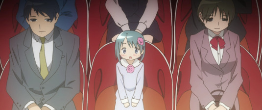
IF those are her parents. Who else would she be sitting by?
That seems to be how she met Kyosuke. But what was she doing there in the first place?
Writing Sayaka was hard because there were a lot of gaps to fill in with extrapolation. I had to do more working backwards for her. I needed causes for the notable aspects of her behavior. Especially for her pinning all her desperate need for attention on one person, becoming infatuated, and crashing when her One Person Who Might Totally Understand Her paid attention to someone else. That made me think she’s starved for attention.
Which would imply she doesn’t get enough of it-- or enough of the right kind of it-- at home. So I knew I wanted to make her parents distant/disengaged. Which meant I needed something for them to be focusing on instead of their kid. At which point I looked at the above cap and noticed that the mom(?) is wearing a business dress to the orchestra. So I constructed a kinda headcanon involving Sayaka having also been a child musician of some kind and her parents taking her to try out at an orchestra or something in one of those gambits parents trying to be successful through their kids do.
Then Sayaka’s Magia Record transformation came out and I settled on her having been a pianist. It just hasn’t come up in the story.

If she knew the joy of making music, that would drive her empathy for Kyosuke’s situation off the charts.
That concoction gave me a neat scaffolding for Sayaka to feel pressured to be awesome, feel like she would only get the attention of those whose attention she wants if she’s awesome, and feel worthless if she’s not needed. I filled in more and more details. I needed her to be "whole.”
So.
Then I take the profile and filter canon events through “if I was her, how would I feel about x?” It’s a bid to take the actions and extrapolate the emotions.
There’s a factor there that enhances my immersion in that mindset: I am an intensive maladaptive daydreamer. Have you ever read “The Secret Life of Walter Mitty”? Dat me. I don’t know how much of a factor it is to writers in general, but for me I obsess over basically roleplaying a scene in my head on infinite repeat, adding more detail with each iteration. In daily life, it’s a very Mitty-like thing; mundane scenery like the bus and my office and my garden spark a “what if” and suddenly fifteen minutes have passed as I build a story around it with me as the main character.
“Me as the main character” is the important part.
When I do the re-watch/re-read focusing on a character, it is to view the events through their eyes. When I was first about to write Sayaka, I jumped to scenes with her in them and ignored everything else. “How would I feel if x?”
If something doesn’t make sense, I think what missing detail would make it make sense.
Once I’ve poked at canon that way, I can switch tracks and apply the persona to non-canon events. I’ve trained myself to think like the character. When I’m figuring out and writing a scene, I am actively pretending I’m that character. The scene is a form of roleplay. I just don’t write it in first-person POV.
I think the source of “character rebellion” is that obsessive knowing of the characters and that even when I’m focused on a different one, some corner of my mind is still running the “how would I feel if x?” program for every other character. When something contradictory pops up, my “sense” of the character shrieks its rejection as refusing to do the thing and suggesting an alternative. If you remove the fiction/creative writing element, it’s basically a pattern recognition system flagging inconsistencies. And once I actually acknowledge them, not heeding them is extremely difficult and can result in a thing I had happen maybe three times: character strike, where my “muse” for that character just shuts down completely because what I’m trying to force it to do is “wrong.”
It’s a really hard mental state to describe.
My advice would be to start small with something featuring only one or two characters you know really well. Study them even more; read their fandom wiki articles and stuff, research the things they like.
Oh no now I’m imagining Homura slinging a Getsuga Tensho off her shield like a frisbeeeeeeeee XD
#As N Approaches Infinity#fanfiction#fanfic#my writing#writing#character writing#character analysis#character rebellion#in which I probably take fandom way too seriously#maladaptive daydreaming: skill or curse?#Madoka Magica#PMMM
42 notes
·
View notes
Text
Covid 19 Positive Impact on Electronic Prescription Industry 2020
The Center for Medicare and Medicaid Services (CMS) describes e-prescribing as the transfer, either directly or by an intermediary, including an e-prescribing network, of prescription or prescription-related data via electronic media from a prescriber, dispenser, pharmacy benefit manager, or health plan. E-prescribing requires but is not limited to two-way transfers between the point of treatment and the dispenser.
The manner patients, prescribers and pharmacists communicate has been altered by e-prescribing. The doctor's handwritten note that was once unreadable or lost in transit is now a safe, automated transaction that automatically arrives at the pharmacies. But the possibility for contradictory records, inconsistencies, or misinterpretation, with 40 separate data elements in each electronic prescription, ensures that human supervision is always required to ensure that the pharmacy dispenses the right drug expected by the prescriber. As a result of these limitations, prescribers and pharmacists are required many times during the day to abandon their routine to make phone calls, struggle with fax machines, and make manual medication clarifications. And these distractions easily add up and can cause the patient not to take the drug required as expected. Non-adherence to prescription causes up to USD 300 billion per year in avoidable healthcare costs in the United States.
The introduction of electronic prescribing in the 2003 Medicare Modernization Act (MMA) brought impetus to the trend, and significant attention was given to the July 2006 Institute of Medicine study on the role of e-prescribing in limiting prescription errors, helping to increase awareness of the role of e-prescribing in improving healthcare. The Centre for Medicare and Medicaid Services (CMS) announced benefits for doctors who implement and use this technology, and USD 19 billion for health information technology (HIT) was authorized under the 2009 American Recovery and Reinvestment Act. Moreover, in the steps for identifying physician practices as medical homes, the National Committee for Quality Assurance requires e-prescribing.
E-Prescribing has been shown to reduce pharmaceutical prescription-related adverse drug outcomes and filling error rates have decreased from 42.5 per 100 prescriptions to just 6.6 per 200 prescriptions. In contrast to human error, e-prescribing systems exist at a much more effective and accurate rate. Aside from technological challenges, doctors may use E-prescribing to monitor how many doses of controlled drugs a patient has got. This decreases over-prescription and increases the likelihood of patient care. E-Prescribing also helps doctors to instruct patients about drug treatment if they can fail to pick up a prescription or file it. Providers gain insight into the pace at which prescriptions for controlled drugs are filled by patients, making it easier to detect future opioid misuse.
Today in the United States, inadequate compliance to drug treatment is a major and expensive problem. As many as 50% of patients do not stick entirely to their drug care, the World Health Organization reports. In the context of elevated hospitalizations and expensive complications, this non-adherence leads to 125,000 early deaths yearly as well as to other patient safety issues that cost the healthcare system an estimated USD 290 billion annually.
It is a world that drives people to exchange data more easily, safely, and effectively. The federal government drafted new regulations on communication blocking and interoperability as part of the 21st Century Cures Act. Only 46% of U.S. hospitals and 10% of office-based doctors can identify, send, obtain, and incorporate patient health records online from outside sources, the new report from the Office of the National Coordinator for Health Information Technology reveals.
The impacts of government regulations associated with this vertical can be studied using Global Market Database. The dynamic cloud-based, B2B market research platform ranges across 600 different markets and 12 different industries. The domain is cost-effective as compared to a typical market research report. It provides a wide arena of information at a comparable price. The forum is the future of market intelligence. Global Market Database allows access to 5 different markets, free of cost on registration.
The pandemic of COVID-19 has altered lives and changed expectations across the world, and the core of the sudden burst is healthcare. The federal government has released a law requiring that Medicare Part D initiatives implement real-time prescription benefit tools by 2021. Patients and prescribers, too, demand transparency in drug rates. With more details at their hands, specifically, price and coverage data, 4 in 10 providers claim prescribing would be more effective. In the meantime, 61% of patients claim they will be able to devote more time, effort, or money to have informed prescription price discussions with their doctors, one indication that consumerism is gradually taking place in the United States healthcare.
Furthermore, for all prescriptions, some states and large drug chains in the United States also mandate that doctors use electronic prescriptions. Although laws vary from state to state, patients in Medicare Part D would be expected to use e-prescribing for prescribing controlled drugs by January 1, 2021. Surescripts is the biggest prescribing database network in the United States. It promotes the flow of the data among pharmaceutical manufacturers and suppliers by maintaining databases that are accessible from most clinical applications offering e-prescribing capabilities. There are detailed listings of this software on their website, including EHRs and standalone e-prescribing products, and those that endorse regulated prescriptions (EPCS). In all fifty states, including Washington, D.C., EPCS is now allowed. The EPCS laws are separate from electronic prescriptions of non-controlled pharmaceuticals. EPCS help is also provided by Surescripts.
0 notes
Text
How Frontend Developers Can Empower Designer’s Work
How Frontend Developers Can Empower Designer’s Work
Sandrina Pereira
2019-10-16T12:30:59+02:002019-10-17T08:06:08+00:00
This article is mostly directed at you, dear Frontend Developer, who enjoys implementing user interfaces but struggles in aligning expectations with designers you work with. Perhaps you are referred to as the “UI Developer” or “UX Engineer.” Regardless of the title that you carry around, your job (and as well as mine) consists of more than breathing life into design files. We are also responsible for filling the gap between the design and development workflows. However, when crossing that bridge, we are faced with multiple challenges.
Today, I’d like to share with you practical tips that have helped me to collaborate more efficiently with designers in the past years.
I believe it’s our job, as UI Developers, to not only help designers in their journey to learn how the web works, but also to get to know their reality and learn their language.
Understanding UX Designers’ Background
Most of the UX designers (also referred to as Web Designers or Product Designers) out there took their first steps in the design world through tools like Photoshop and Illustrator. Perhaps they were Graphic Designers: their main goal was to create logos and brand identities and to design layouts for magazines. They could also have been Marketing Designers: printing billboards, designing banners and creating infographics.
This means that most UX designers spent their early days designing for print, which is a totally different paradigm from their current medium, the screen. That was their first big challenge. When dealing with print, designers cared about pixel alignment, but on a fixed area (paper). They didn’t have to contend with a dynamic layout (screens). Thinking about text breaking or states of interactions was simply not part of their job either. Designers also had complete freedom over colors, images, and typography without performance constraints.
Fortunately, there have been many efforts from the self-taught UX designers community, to teach development fundamentals, discuss whether designers should learn to code and understand how to best perform hand-off to developers. The same held true for the development side as well (more about that in a minute.) However, there is still friction happening between the two fields.
On the one hand, designers complaining each time an implementation doesn’t match their designs or feeling misunderstood when those are rejected by the developers without a clear explanation. On the other hand, developers might take for granted that designers know something technical when that might not be true. I believe we can all do better than that.
Embracing A New Way Of Thinking
The websites and apps that we are building will be displayed on a wide range of screen sizes. Each person will use them on multiple devices. Our common goal is to create a familiar experience across their journeys.
When we, as developers, think that designers are being picky about pixel alignments, we need to understand why that is. We need to recognize that it’s beyond fidelity and consistency. It’s about the sum of all the parts working together. It’s cohesion. We have to embrace it and do our best to accomplish it. Learning the fundamentals of design principles is a good starting point. Understand the importance of selecting the right colors, how the hierarchy works, and why white space matters.
Note: There’s an online course known as “Design for Developers” and a book called “Refactoring UI” — both are great to get you started. With these, you’ll be able to implement user interfaces with a sharp eye for detail and gain significant leverage when communicating with designers.
Magnifying Your Designers’ Awareness
You might take for granted that designers know the web as much as you do. Well, they might not. Actually, they don’t have to! It’s our responsibility, as developers, to keep them updated with the current state of the web.
I’ve worked with the two sides of this spectrum: Designers who think that anything can be built (such as complex filters, new scroll behaviors or custom form inputs) without giving browser compatibility a thought. Then, there are designers with assumptions about the “low limitations of the web” and just assume by themselves that something is impossible to implement. We need to show them the true possibilities of web design and not let the limitations hold back their skills.
Teach Them Code, Not How To Code
This seems contradictory but bear with me: knowing how to code is at the core of a developer’s job. We work in a fast-paced industry with new stuff popping up every day. It would be a hypocritical request from us to demand designers to learn how to code. However, we can help them to understand code.
Sit next to the designer you work with for 15 minutes and teach them how they can see for themselves whether the specs of an element are correct and how to change them. I find Firefox Page Inspector remarkably user-friendly for this.
Nowadays, it’s a joy to visualize layouts, debug CSS animations and tweak typography. Show them a ready-to-use code playground like Codepen for them to explore. They don’t need to know all CSS specs to understand how the layout paradigm works. However, they need to know how elements are created and behave in order to empower their daily work.
Include Designers In The Development Process
Invite designers to join you in the stand-up meeting, to be part of the QA process and to sit down with you while you refine visual details in your implementations. This will make them understand the constraints of the web and, soon enough, they’ll recognize why a feature takes time to implement.
Ask Designers To Include You In Their Design Process
You’ll realize that they do much more than “make things pretty”. You’ll learn more about the research process and how user testing is done. You’ll discover that for each design proposal they show to you, several other studies were previously dropped. When designers request a change, ask the reason behind it, so you can learn more about the decisions being made. Ultimately, you’ll start to understand why they are picky about white space and alignments, and hopefully, soon you’ll be too!
I find it crucial to treat frontend development as a core part of the design process, and design as a core part of the development process. Advocating a mindset where everyone gets the chance to be involved in the design and development cycle will help us all to better understand each other’s challenges and to create great experiences as well.
We May Use Different Tools, But We Must Speak The Same Language
Now that we are starting to understand each other’s workflow a little better, it’s time for the next step: to speak the same language.
Looking Beyond The Code Editor
Once you start to pay attention to your surroundings, you’ll be better equipped to tackle problems. Get to know the business better and be willing to listen to what designers have to say. That will make you a team member with richer contributions to the project. Collaborating in areas beyond our expertise is the key to creating meaningful conversations and mutual trust.
Using UI Systems As A Contract
Ask designers to share their design system with you (and if they don’t use one, it’s never too late to start). That will save you the bother of handpicking the colors used, figuring out margins or guessing a text style. Make sure you are familiar with the UI System as much as they are.
You might already be familiar with the component-based concept. However, some designers might not perceive it in the same way as you do. Show them how components can help you to build user interfaces more efficiently. Spread that mindset and also say bye-bye to similar-but-not-equal-names: header vs hero, pricing info vs price selector. When a piece of the user interface (a.k.a ‘a component’) is built, stride to use the same names so they can be reflected in both design and code files. Then, when someone says, “We need to tweak the proposal invitation widget,” everyone knows exactly what is being talked about.
Acknowledging The Real Source Of Truth
Despite the fact that the user interface is first created in the design files, the real source of truth is on the development side. At the end of the day, it is what people actually see, right? When a design is updated, it’s a good idea to leave a side note about its development status, especially in projects where a large number of people are involved. This trick helps to keep the communication smooth, so nobody (including you) wonders: “This is different from the live version. Is it a bug or hasn’t so-and-so been implemented just yet?”
Keeping The Debt Under Control
So, you know all about technical debt — it happens when the cost to implement something new is high because of a shortcut we took in the past to meet a deadline. The same can happen on the design side too and we call it design debt.
You can think about it like this: The higher the UX & UI inconsistency, the higher the debt (technical and design). One of the most common inconsistencies is in having different elements to represent the same action. This is why bad design is usually reflected in bad code. It’s up to all of us, both as designers and developers, to treat our design debt seriously.
Being Accessible Doesn’t Mean It Has To Be Ugly
I’m really pleased to see that both we, as developers and designers, are finally starting to bring accessibility into our work. However, a lot of us still think that designing accessible products is hard or limits our skills and creativity.
Let me remind you that we are not creating a product just for ourselves. We are creating a product to be used by all the people, including those who use the product in different ways from you. Take into account how individual elements can be more accessible while keeping the current userflows clear and coherent.
For example, if a designer really believes that creating an enhanced select input is necessary, stand by their side and work together to design and implement it in an accessible way to be used by a wide range of people with diverse abilities.
Giving Valuable Feedback To Designers
It’s unavoidable that questions will pop up when going through the designs. However, that’s not a reason for you to start complaining about the designers’ mistakes or about their ambitious ideas. The designers are not there to drive you mental, they just don’t always intuitively know what you need to do your job. The truth is that, in the past, you didn’t know about this stuff either, so be patient and embrace collaboration as a way of learning.
The Earlier The Feedback, The Better
The timing for feedback is crucial. The feedback workflow depends a lot on the project structure, so there isn’t a one-size-fits-all solution for it. However, when possible, I believe we should aim for a workflow of periodic feedback — starting in the early stages. Having this mindset of open collaboration is the way to reduce the possibility of unexpected big re-iterations later in the road. Keep in mind that the later you give the designer your first feedback, the higher will be the cost for them to explore a new approach if needed.
Explain Abstract Ideas In Simple Terms
Remember when I said that performance was not a concern of the designers’ previous jobs? Don’t freak out when they are not aware of how to create optimized SVGs for the web. When faced with a design that requires a lot of different fonts to be loaded, explain to them why we should minimize the number of requests, perhaps even take advantage of Variable Fonts. Asides from loading faster, it also provides a more consistent user experience. Unless designers are keen to learn, avoid using too many technical terms when explaining something. You can see this as an opportunity of improving your communication skills and clarifying your thoughts.
Don’t Let Assumptions Turn Into Decisions
Some questions about a design spec only show up when we get our hands dirty in the code. To speed things up, we might feel tempted to make decisions based on our assumptions. Please, don’t. Each time you turn an assumption into a decision, you are risking the trust that the design team puts on you to implement the UI. Whenever in doubt, reach out and clarify your doubts. This will show them that you care about the final result as much as they do.
Don’t Do Workarounds By Yourself
When you are asked to implement a design that is too hard, don’t say “It’s impossible” or start to implement a cheap alternative version of it by yourself. This immediately causes friction with the design team when they see their designs were not implemented as expected. They might react angrily, or not say anything but feel defeated or frustrated. That can all be avoided if we explain to them why something it’s not possible, in simple terms and suggest alternative approaches. Avoid dogmatic behaviors and be open to collaborating on a new solution.
Let them know about the Graceful Degradation and Progressive Enhancement techniques and build together an ideal solution and a fallback solution. For example, we can enhance a layout from flexbox to CSS Grid. This allows us to respect the core purpose of a feature and at the same time make the best use of web technologies.
When it comes to animations, let’s be real: deep down you are as thrilled to implement the next wow animation as much as the designers are to create it. The difference between us and them is that we are more aware of the web’s constraints. However, don’t let that limit your own skills! The web evolves fast, so we must use that in our favor.
The next time you are asked to bring a prototype to life, try not to reject it upfront or do it all by yourself. See it as an opportunity to push yourself. Animations are one of the pickiest parts of web development, so make sure to refine each keyframe with your designer — in person or by sharing a private synced link.
Think Beyond The Ideal State — Together
Here’s the thing: it’s not all about you. One of the designers’ challenges is to really understand their users and present the designs in the most attractive way to sell to the Product Manager. Sometimes they forget about what’s beyond the ideal state and developers forget it too.
In order to help avoid these gaps from happening, align with designers the scenario requirements:
The worst-case scenario
A scenario where the worst possibilities are happening. This helps designers to say no to fixed content and let it be fluid. What happens if the title has more than 60 characters or if the list is too long? The same applies to the opposite, the empty scenario. What should the user do when the list is empty?
Interaction states
The browser is more than hovering and clicking around. There are a bunch of states: default, hover, focus, active, disable, error… and some of them can happen at the same time. Let’s give them the proper attention.
The loading state
When building stuff locally, we might use mocks and forget that things actually take time to load. Let designers know about that possibility too and show them that are ways to make people perceive that things don’t take that long to load.
Taking into consideration all these scenarios will save you a lot of time going back and forth during the development phase.
Note: There’s a great article by Scott Hurff about how to fix bad user interfaces that will take us a step closer to an accessible product.
Embrace Change Requests
Developers are known for not being too happy about someone finding a bug in their code — especially when it’s a design bug reported by a designer. There are a lot of memes around it, but have you ever reflected how those bugs can compoundingly rot both the quality of the experience as well as your relationship when these design bugs are casually dismissed? It happens slowly, almost like falling asleep. Bit by bit, then all at once. Designers might start out saying, “It’s just a tiny little detail,” until the indifference and resentment builds up and nothing is said. The damage has then already been done.
This situation is two-fold: both to your peers and to your work. Don’t let that happen. Work on what’s coloring your reaction. A designer being ‘picky’ can be inconvenient, but it can also be an engineer’s shallow interpretation of attentiveness and enthusiasm. When someone tells you that your implementation is not perfect (yet), put your ego aside and show them how you recognize their hard work in refining the final result.
Go Off The Record Once In A While
We all have tasks to deliver and roadmaps to finish. However, some of the best work happens off the record. It won’t be logged into the TO DO board and that’s okay. If you find a designer you have a rapport with, go sneak into their workspace and explore together new experiments. You never know what can come from there!
Conclusion
When you are willing to learn from the design team, you are also learning different ways of thinking. You’ll evolve your mindset of collaboration with other areas out of your experience while refining your eye for creating new experiences. Be there to help and be open to learning, because sharing is what makes us better.
This article wouldn’t be possible without the feedback of many great people. I want to gratefully thank to the designers Jasmine Meijer and Margarida Botelho for helping me to share a balanced perspective about the misunderstandings between designers and developers.
Related Reading on SmashingMag:
“Design For Developers” by Mason Gentry
“Working Together: How Designers And Developers Can Communicate To Create Better Projects” by Rachel Andrew
“How Frontend Developers Can Help To Bridge The Gap Between Designers And Developers” by Stefan Kaltenegger
“Which Podcasts Should Web Designers And Developers Be Listening To?” by Ricky Onsman

(ra, yk, il)
0 notes
Text
How Frontend Developers Can Empower Designer’s Work
How Frontend Developers Can Empower Designer’s Work
Sandrina Pereira
2019-10-16T12:30:59+02:002019-10-16T10:36:17+00:00
This article is mostly directed at you, dear Frontend Developer, who enjoys implementing user interfaces but struggles in aligning expectations with designers you work with. Perhaps you are referred to as the “UI Developer” or “UX Engineer.” Regardless of the title that you carry around, your job (and as well as mine) consists of more than breathing life into design files. We are also responsible for filling the gap between the design and development workflows. However, when crossing that bridge, we are faced with multiple challenges.
Today, I’d like to share with you practical tips that have helped me to collaborate more efficiently with designers in the past years.
I believe it’s our job, as UI Developers, to not only help designers in their journey to learn how the web works, but also to get to know their reality and learn their language.
Understanding UX Designers’ Background
Most of the UX designers (also referred to as Web Designers or Product Designers) out there took their first steps in the design world through tools like Photoshop and Illustrator. Perhaps they were Graphic Designers: their main goal was to create logos and brand identities and to design layouts for magazines. They could also have been Marketing Designers: printing billboards, designing banners and creating infographics.
This means that most UX designers spent their early days designing for print, which is a totally different paradigm from their current medium, the screen. That was their first big challenge. When dealing with print, designers cared about pixel alignment, but on a fixed area (paper). They didn’t have to contend with a dynamic layout (screens). Thinking about text breaking or states of interactions was simply not part of their job either. Designers also had complete freedom over colors, images, and typography without performance constraints.
Fortunately, there have been many efforts from the self-taught UX designers community, to teach development fundamentals, discuss whether designers should learn to code and understand how to best perform hand-off to developers. The same held true for the development side as well (more about that in a minute.) However, there is still friction happening between the two fields.
On the one hand, designers complaining each time an implementation doesn’t match their designs or feeling misunderstood when those are rejected by the developers without a clear explanation. On the other hand, developers might take for granted that designers know something technical when that might not be true. I believe we can all do better than that.
Embracing A New Way Of Thinking
The websites and apps that we are building will be displayed on a wide range of screen sizes. Each person will use them on multiple devices. Our common goal is to create a familiar experience across their journeys.
When we, as developers, think that designers are being picky about pixel alignments, we need to understand why that is. We need to recognize that it’s beyond fidelity and consistency. It’s about the sum of all the parts working together. It’s cohesion. We have to embrace it and do our best to accomplish it. Learning the fundamentals of design principles is a good starting point. Understand the importance of selecting the right colors, how the hierarchy works, and why white space matters.
Note: There’s an online course known as “Design for Developers” and a book called “Refactoring UI” — both are great to get you started. With these, you’ll be able to implement user interfaces with a sharp eye for detail and gain significant leverage when communicating with designers.
Magnifying Your Designers’ Awareness
You might take for granted that designers know the web as much as you do. Well, they might not. Actually, they don’t have to! It’s our responsibility, as developers, to keep them updated with the current state of the web.
I’ve worked with the two sides of this spectrum: Designers who think that anything can be built (such as complex filters, new scroll behaviors or custom form inputs) without giving browser compatibility a thought. Then, there are designers with assumptions about the “low limitations of the web” and just assume by themselves that something is impossible to implement. We need to show them the true possibilities of web design and not let the limitations hold back their skills.
Teach Them Code, Not How To Code
This seems contradictory but bear with me: knowing how to code is at the core of a developer’s job. We work in a fast-paced industry with new stuff popping up every day. It would be a hypocritical request from us to demand designers to learn how to code. However, we can help them to understand code.
Sit next to the designer you work with for 15 minutes and teach them how they can see for themselves whether the specs of an element are correct and how to change them. I find Firefox Page Inspector remarkably user-friendly for this.
Nowadays, it’s a joy to visualize layouts, debug CSS animations and tweak typography. Show them a ready-to-use code playground like Codepen for them to explore. They don’t need to know all CSS specs to understand how the layout paradigm works. However, they need to know how elements are created and behave in order to empower their daily work.
Include Designers In The Development Process
Invite designers to join you in the stand-up meeting, to be part of the QA process and to sit down with you while you refine visual details in your implementations. This will make them understand the constraints of the web and, soon enough, they’ll recognize why a feature takes time to implement.
Ask Designers To Include You In Their Design Process
You’ll realize that they do much more than “make things pretty”. You’ll learn more about the research process and how user testing is done. You’ll discover that for each design proposal they show to you, several other studies were previously dropped. When designers request a change, ask the reason behind it, so you can learn more about the decisions being made. Ultimately, you’ll start to understand why they are picky about white space and alignments, and hopefully, soon you’ll be too!
I find it crucial to treat frontend development as a core part of the design process, and design as a core part of the development process. Advocating a mindset where everyone gets the chance to be involved in the design and development cycle will help us all to better understand each other’s challenges and to create great experiences as well.
We May Use Different Tools, But We Must Speak The Same Language
Now that we are starting to understand each other’s workflow a little better, it’s time for the next step: to speak the same language.
Looking Beyond The Code Editor
Once you start to pay attention to your surroundings, you’ll be better equipped to tackle problems. Get to know the business better and be willing to listen to what designers have to say. That will make you a team member with richer contributions to the project. Collaborating in areas beyond our expertise is the key to creating meaningful conversations and mutual trust.
Using UI Systems As A Contract
Ask designers to share their design system with you (and if they don’t use one, it’s never too late to start). That will save you the bother of handpicking the colors used, figuring out margins or guessing a text style. Make sure you are familiar with the UI System as much as they are.
You might already be familiar with the component-based concept. However, some designers might not perceive it in the same way as you do. Show them how components can help you to build user interfaces more efficiently. Spread that mindset and also say bye-bye to similar-but-not-equal-names: header vs hero, pricing info vs price selector. When a piece of the user interface (a.k.a ‘a component’) is built, stride to use the same names so they can be reflected in both design and code files. Then, when someone says, “We need to tweak the proposal invitation widget,” everyone knows exactly what is being talked about.
Acknowledging The Real Source Of Truth
Despite the fact that the user interface is first created in the design files, the real source of truth is on the development side. At the end of the day, it is what people actually see, right? When a design is updated, it’s a good idea to leave a side note about its development status, especially in projects where a large number of people are involved. This trick helps to keep the communication smooth, so nobody (including you) wonders: “This is different from the live version. Is it a bug or hasn’t so-and-so been implemented just yet?”
Keeping The Debt Under Control
So, you know all about technical debt — it happens when the cost to implement something new is high because of a shortcut we took in the past to meet a deadline. The same can happen on the design side too and we call it design debt.
You can think about it like this: The higher the UX & UI inconsistency, the higher the debt (technical and design). One of the most common inconsistencies is in having different elements to represent the same action. This is why bad design is usually reflected in bad code. It’s up to all of us, both as designers and developers, to treat our design debt seriously.
Being Accessible Doesn’t Mean It Has To Be Ugly
I’m really pleased to see that both we, as developers and designers, are finally starting to bring accessibility into our work. However, a lot of us still think that designing accessible products is hard or limits our skills and creativity.
Let me remind you that we are not creating a product just for ourselves. We are creating a product to be used by all the people, including those who use the product in different ways from you. Take into account how individual elements can be more accessible while keeping the current userflows clear and coherent.
For example, if a designer really believes that creating an enhanced select input is necessary, stand by their side and work together to design and implement it in an accessible way to be used by a wide range of people with diverse abilities.
Giving Valuable Feedback To Designers
It’s unavoidable that questions will pop up when going through the designs. However, that’s not a reason for you to start complaining about the designers’ mistakes or about their ambitious ideas. The designers are not there to drive you mental, they just don’t always intuitively know what you need to do your job. The truth is that, in the past, you didn’t know about this stuff either, so be patient and embrace collaboration as a way of learning.
The Earlier The Feedback, The Better
The timing for feedback is crucial. The feedback workflow depends a lot on the project structure, so there isn’t a one-size-fits-all solution for it. However, when possible, I believe we should aim for a workflow of periodic feedback — starting in the early stages. Having this mindset of open collaboration is the way to reduce the possibility of unexpected big re-iterations later in the road. Keep in mind that the later you give the designer your first feedback, the higher will be the cost for them to explore a new approach if needed.
Explain Abstract Ideas In Simple Terms
Remember when I said that performance was not a concern of the designers’ previous jobs? Don’t freak out when they are not aware of how to create optimized SVGs for the web. When faced with a design that requires a lot of different fonts to be loaded, explain to them why we should minimize the number of requests, perhaps even take advantage of Variable Fonts. Asides from loading faster, it also provides a more consistent user experience. Unless designers are keen to learn, avoid using too many technical terms when explaining something. You can see this as an opportunity of improving your communication skills and clarifying your thoughts.
Don’t Let Assumptions Turn Into Decisions
Some questions about a design spec only show up when we get our hands dirty in the code. To speed things up, we might feel tempted to make decisions based on our assumptions. Please, don’t. Each time you turn an assumption into a decision, you are risking the trust that the design team puts on you to implement the UI. Whenever in doubt, reach out and clarify your doubts. This will show them that you care about the final result as much as they do.
Don’t Do Workarounds By Yourself
When you are asked to implement a design that is too hard, don’t say “It’s impossible” or start to implement a cheap alternative version of it by yourself. This immediately causes friction with the design team when they see their designs were not implemented as expected. They might react angrily, or not say anything but feel defeated or frustrated. That can all be avoided if we explain to them why something it’s not possible, in simple terms and suggest alternative approaches. Avoid dogmatic behaviors and be open to collaborating on a new solution.
Let them know about the Graceful Degradation and Progressive Enhancement techniques and build together an ideal solution and a fallback solution. For example, we can enhance a layout from flexbox to CSS Grid. This allows us to respect the core purpose of a feature and at the same time make the best use of web technologies.
When it comes to animations, let’s be real: deep down you are as thrilled to implement the next wow animation as much as the designers are to create it. The difference between us and them is that we are more aware of the web’s constraints. However, don’t let that limit your own skills! The web evolves fast, so we must use that in our favor.
The next time you are asked to bring a prototype to life, try not to reject it upfront or do it all by yourself. See it as an opportunity to push yourself. Animations are one of the pickiest parts of web development, so make sure to refine each keyframe with your designer — in person or by sharing a private synced link.
Think Beyond The Ideal State — Together
Here’s the thing: it’s not all about you. One of the designers’ challenges is to really understand their users and present the designs in the most attractive way to sell to the Product Manager. Sometimes they forget about what’s beyond the ideal state and developers forget it too.
In order to help avoid these gaps from happening, align with designers the scenario requirements:
The worst-case scenario
A scenario where the worst possibilities are happening. This helps designers to say no to fixed content and let it be fluid. What happens if the title has more than 60 characters or if the list is too long? The same applies to the opposite, the empty scenario. What should the user do when the list is empty?
Interaction states
The browser is more than hovering and clicking around. There are a bunch of states: default, hover, focus, active, disable, error… and some of them can happen at the same time. Let’s give them the proper attention.
The loading state
When building stuff locally, we might use mocks and forget that things actually take time to load. Let designers know about that possibility too and show them that are ways to make people perceive that things don’t take that long to load.
Taking into consideration all these scenarios will save you a lot of time going back and forth during the development phase.
Note: There’s a great article by Scott Hurff about how to fix bad user interfaces that will take us a step closer to an accessible product.
Embrace Change Requests
Developers are known for not being too happy about someone finding a bug in their code — especially when it’s a design bug reported by a designer. There are a lot of memes around it, but have you ever reflected how those bugs can compoundingly rot both the quality of the experience as well as your relationship when these design bugs are casually dismissed? It happens slowly, almost like falling asleep. Bit by bit, then all at once. Designers might start out saying, “It’s just a tiny little detail,” until the indifference and resentment builds up and nothing is said. The damage has then already been done.
This situation is two-fold: both to your peers and to your work. Don’t let that happen. Work on what’s coloring your reaction. A designer being ‘picky’ can be inconvenient, but it can also be an engineer’s shallow interpretation of attentiveness and enthusiasm. When someone tells you that your implementation is not perfect (yet), put your ego aside and show them how you recognize their hard work in refining the final result.
Go Off The Record Once In A While
We all have tasks to deliver and roadmaps to finish. However, some of the best work happens off the record. It won’t be logged into the TO DO board and that’s okay. If you find a designer you have a rapport with, go sneak into their workspace and explore together new experiments. You never know what can come from there!
Conclusion
When you are willing to learn from the design team, you are also learning different ways of thinking. You’ll evolve your mindset of collaboration with other areas out of your experience while refining your eye for creating new experiences. Be there to help and be open to learning, because sharing is what makes us better.
This article wouldn’t be possible without the feedback of many great people. I want to gratefully thank to the designers Jasmine Meijer and Margarida Botelho for helping me to share a balanced perspective about the misunderstandings between designers and developers.
Related Reading on SmashingMag:
“Design For Developers” by Mason Gentry
“Working Together: How Designers And Developers Can Communicate To Create Better Projects” by Rachel Andrew
“How Frontend Developers Can Help To Bridge The Gap Between Designers And Developers” by Stefan Kaltenegger
“Which Podcasts Should Web Designers And Developers Be Listening To?” by Ricky Onsman

(ra, yk, il)
0 notes
Text
The Big Bang May Have Never Happened According to Quantum Equations
Did the Big Bang really happen?
Probably not, according to two physicists who wish to revive one of the most popular arguments of the twentieth century. What these guys think is completely different from what cosmologists thought about the universe.
Where did the Big Bang theory come from?
The words “Big Bang theory” came from the mind of astrophysicist Fred Hoyle as a joke. In actuality, Hoyle did not believe in the theory, but believed that everything existed just because it once existed before. This may seem confusing, but it simply means that the universe, according to Hoyle, was an endless loop – no beginning/no end.
Contradictory evidence suggests that the Big Bang did happen. Traces of radiation seem to prove the universe originated from a single point in time. Although there are so many questions and loose ends, scientists, for the most part, see this theory as the best possible explanation for the universe.
It is basically the most popular viewpoint and could be just as plausible as any other idea.
Inconsistencies
University of Egypt’s Dr. Ahmed Farag follows inconsistencies in the Big Bang theory. He points out the fact that the theories of relativity break down at the point of singularity. Together with Saurya Das, professor at the University of Lethbridge, Canada, Farag created equations that follow Hoyle’s theory.
These equations suggest that the universe had no beginning or end. These findings were published in Physics letters B, and another paper by Das together with Rajat Bhaduri of Manchester University in Canada is awaiting publication.
The idea of the studies was not to discredit the work of David Bauhm and Amal Kumar Raychauduri, who followed the Big Bang theory; it was to unite the ideas. These collaborations connected relativity with quantum mechanics. Although studies were not conclusively for or against the Big Bang theory, equations focused on the universe being much smaller at some point in time.
Resulting from the studies, scientists embark upon quests to unite the two great theories. Quantum gravity has been the subject of exploration and study for some time now, along with gravitons or quantum fluid.
What are Gravitons?
Gravitons have no mass but transmit gravity. It is suggested in an additional study by Ali and Das that gravitons were present in the earlier universe, creating macroscopic quantum phenomena. This phenomenon may have been the very thing that, in turn, created dark energy.
Ali and Das have constructed a partial theory of quantum gravity that would be compatible with future ideas. Only time will tell if these theories will run into bigger inconsistencies and problems. The universe, it seems, continues to unfold and reveal layers upon layers of answers.
The universe may have existed forever, according to a new model that applies quantum correction terms to complement Einstein's theory of general relativity. The model may also account for dark matter and dark energy, resolving multiple problems at once.
The widely accepted age of the universe, as estimated by general relativity, is 13.8 billion years. In the beginning, everything in existence is thought to have occupied a single infinitely dense point, or singularity. Only after this point began to expand in a "Big Bang" did the universe officially begin.
Although the Big Bang singularity arises directly and unavoidably from the mathematics of general relativity, some scientists see it as problematic because the math can explain only what happened immediately after—not at or before—the singularity.
"The Big Bang singularity is the most serious problem of general relativity because the laws of physics appear to break down there," Ahmed Farag Ali at Benha University and the Zewail City of Science and Technology, both in Egypt, told Phys.org.
Ali and coauthor Saurya Das at the University of Lethbridge in Alberta, Canada, have shown in a paper published in Physics Letters B that the Big Bang singularity can be resolved by their new model in which the universe has no beginning and no end.
Old ideas revisited
The physicists emphasize that their quantum correction terms are not applied ad hoc in an attempt to specifically eliminate the Big Bang singularity. Their work is based on ideas by the theoretical physicist David Bohm, who is also known for his contributions to the philosophy of physics. Starting in the 1950s, Bohm explored replacing classical geodesics (the shortest path between two points on a curved surface) with quantum trajectories.
In their paper, Ali and Das applied these Bohmian trajectories to an equation developed in the 1950s by physicist Amal Kumar Raychaudhuri at Presidency University in Kolkata, India. Raychaudhuri was also Das's teacher when he was an undergraduate student of that institution in the '90s.
Using the quantum-corrected Raychaudhuri equation, Ali and Das derived quantum-corrected Friedmann equations, which describe the expansion and evolution of universe (including the Big Bang) within the context of general relativity. Although it's not a true theory of quantum gravity, the model does contain elements from both quantum theory and general relativity. Ali and Das also expect their results to hold even if and when a full theory of quantum gravity is formulated.
No singularities nor dark stuff
In addition to not predicting a Big Bang singularity, the new model does not predict a "big crunch" singularity, either. In general relativity, one possible fate of the universe is that it starts to shrink until it collapses in on itself in a big crunch and becomes an infinitely dense point once again.
Ali and Das explain in their paper that their model avoids singularities because of a key difference between classical geodesics and Bohmian trajectories. Classical geodesics eventually cross each other, and the points at which they converge are singularities. In contrast, Bohmian trajectories never cross each other, so singularities do not appear in the equations.
In cosmological terms, the scientists explain that the quantum corrections can be thought of as a cosmological constant term (without the need for dark energy) and a radiation term. These terms keep the universe at a finite size, and therefore give it an infinite age. The terms also make predictions that agree closely with current observations of the cosmological constant and density of the universe.
New gravity particle
In physical terms, the model describes the universe as being filled with a quantum fluid. The scientists propose that this fluid might be composed of gravitons—hypothetical massless particles that mediate the force of gravity. If they exist, gravitons are thought to play a key role in a theory of quantum gravity.
In a related paper, Das and another collaborator, Rajat Bhaduri of McMaster University, Canada, have lent further credence to this model. They show that gravitons can form a Bose-Einstein condensate (named after Einstein and another Indian physicist, Satyendranath Bose) at temperatures that were present in the universe at all epochs.
Motivated by the model's potential to resolve the Big Bang singularity and account for dark matter and dark energy, the physicists plan to analyze their model more rigorously in the future. Their future work includes redoing their study while taking into account small inhomogeneous and anisotropic perturbations, but they do not expect small perturbations to significantly affect the results.
"It is satisfying to note that such straightforward corrections can potentially resolve so many issues at once," Das said.
0 notes
Photo

8½ (1963, Italy)
As a bored and depressed teenager and before I ever delved into classic movies, I looked online for lists of the best films ever made. Certain titles from more reputable websites kept appearing – one of those frequently-mentioned titles was Federico Fellini’s 8½. Soon after, I began actively seeking out these films. I was fifteen years old when I first encountered 8½, and I remember thinking to myself that there was something about Fellini’s film I could not quite grasp at the time. I stopped, barely a third into the movie, made no judgments, and did not finish it. Nine or ten years have passed (this was one of the first movies in my classic movie adventure so I know how old I was; I just don’t remember which year I saw it in), and upon this revisit to 8½ and completing the film, it is the greatest artwork about artist’s block I have ever seen. The film comments on the torment surrounding artistic creation, and how an individual’s personality – their ego, ability to examine themselves, and attitudes towards others – make that struggle unique to that artist. At times a bawdy comedy, 8½ – referring to the fact that Fellini had directed six feature-length films and three short films before this production, equaling 7½ – is also a dramatic surrealist fantasia filled with behavioral inconsistencies and fanciful sequences entangling dreams and reality.
And so by 1963, Federico Fellini, who gleamed off the Italian neorealist master Roberto Rossellini (1945′s Rome, Open City and 1948′s Germany Year Zero), and directed neorealist-inspired films in I Vitelloni (1953), La Strada (1954), and Nights of Cabiria (1957), was beginning to dip into the fantastical. These later fantastical films, however, were primarily steeped in modernity – demanding much from the audience, as Fellini uses impossible images to express ideas and states of mind that would become uncinematic if explained by dialogue.
In the midst of starting production on his next movie while resting at a Roman spa, acclaimed director Guido Anselmi (Marcello Mastroianni) is struggling over how to approach the autobiographical elements he is integrating into a science fiction piece. Late in pre-production, Guido is having tensions with (and not just limited to) his mistress, Carla (Sandra Milo); wife, Luisa (Anouk Aimée); and producer, Pace (Guido Alberti). His friends, Rossella (Rossella Falk) and Mario (Mario Pisu), are unsure how to help him, as he drifts day-to-day between his loud, bickering-heavy reality and his fantasies. Those fantasies are not always clearly indicated by 8½’s editing by Leo Catozzo – the movie begins with a suffocating traffic jam, progresses to images of Guido’s childhood in a seaside village, his Catholic school days where he was punished for dancing with a prostitute (Eddra Gale), and features a handful of sexual fantasies that include the film’s darkly uproarious harem scene involving all the women from Guido’s past and present life (the movie is suggestive, not explicit, with sex – the former always more difficult to film). Claudia Cardinale stars as Guido’s fantastical Ideal Woman and as Claudia, an actress who appears briefly, but notices something about Guido’s idea and his persona that pierces his psychological armor.
Fantasy and reality, in competition across 8½, are harmonious in the closing minutes. Whether or not the ending is a statement of Guido’s (and, by the fact this film is at least somewhat biographical, Fellini himself) impeccable artistry, comic relief, or both is perhaps the most vexing question I continue to wrestle with. At twenty-five years old, I find myself giving tentative answers to the film’s questions; this write-up might read much differently if written at a later stage in my life.
The screenplay by Fellini, Ennio Flaiano, Tullio Pinelli, and Brunello Rondi (Flaiano, Pinelli, and Rondi being frequent Fellini collaborators) models Guido as Fellini’s alter ego. Marcello Mastroianni, as Guido, inhabits the role with a physical fatigue similar to his role of Mario in Le Notti Bianche (1957). But if Mario was less tragic and more fashionable, he would be Guido. Mastroianni is excellent in displaying his character’s brokenness due to constant rumination over his noncommittal habits, inability to express his feelings, and his search for sexual gratification compounding his emotional and social emptiness. All of this will affect his artistry. The moment Guido walks outside his hotel room, he is besieged by the film’s crew and actors who have not even been officially cast. What do you want for this scene? When will we start shooting? I can’t wait to appear in your film! The barrage (those were paraphrases) lasts all morning until the moment late at night Guido slams his hotel door shut, readying himself to be with a woman he only seems to care for. His creative side is so exhausted that not even Mastroianni’s dialogue delivery changes tone when producer Pace fumes at the excessive production delays – no sarcasm, not even a nonplussed shoulder shrug. Mastroianni, debatably the greatest Italian actor of all time, exemplifies incredible discipline in this role.
With an unsustainable, ridiculous situation unfolding, 8½ partly becomes a tragicomedy – if the film weren’t so absurd and racy, it would be more difficult to watch. In this movie about an Italian, Felliniesque director unable to make a movie, Fellini has crafted a movie teeming with introspection and visual splendor. Guido’s sexuality seems inspired by Rubens’ portraits; his relations to everyone (but especially women – who, to him, are either maternal figures or harlots) predicated on what they can do for him. He might not fit the stereotype of the tyrannical director, but his self-worth has become defined by the most external: his professional accomplishments and his romantic conquests that seem to be without indications of abusive behavior. As the viewer intuits Guido’s character, his biographical flashbacks are understood as less reliable, more subjective. To what extent are those flashbacks colored, censored by nostalgia for a childhood or adolescence that Guido chooses to remember? There are no answers to that question in 8½. The film’s aforementioned introspection falls to the viewer. Guido, expending so much time thinking about his upcoming production, leads a life unexamined.
At this point in his life he arrives at what appears to be a spiritual dead end. That just so happens to contribute to his director’s block. Hearing from the others working on Guido’s film, we hear their concerns about the structure of the movie and nobody understanding what it is saying. To the crew, it is a jumbled patchwork of philosophical avant garde for the sake of being philosophical avant garde.
In outdoor scenes, cinematographer Gianni Di Venanzo (1962′s L’Eclisse, 1965′s Juliet of the Spirits) has his camera motion side-to-side in the direction of character movements, suggesting restlessness. When characters are shown with a shallow foreground, one feels Guido’s anxiety considering the demands and hopes of others. In moments where there are fewer characters and when they are placed further away from the camera, the camera moves more dramatically, as if floating in air. It contributes to the dreamlike quality of several scenes – including Claudia Cardinale’s introduction in the movie – even when Guido has no space to fantasize. The production design and costume design by Piero Gherardi (La Dolce Vita and Juliet of the Spirits) showcases ‘60s elegance, with Rome’s rich mingling at the spa Guido is staying. Here, 1960s Italy clashes with what appears to be Ancient Roman and Renaissance-era architecture (free-to-read English-language literature on the film does not specify if these outdoor sets were constructed for 8½ or are actual attractions, but the film was shot entirely around Rome and the Lazio administrative region – where Rome is located). The aesthetic differences in architecture at the spa are reflections of the contradictory and unsettled statuses Guido’s imagination and soul.
So too is Nino Rota’s celebratory, yet mysterious and varied score. Like his work on La Strada, Rota has a main theme influenced by circus and carnival music. Where in La Strada (that film partly inspired by Fellini’s memories of circuses and clowns) that decision made literal sense because the characters are traveling circus performers. Here, it is to echo the madness of Guido not knowing what to do and being surrounded by a gaggle of irate businessmen, sycophantic actors looking for a job, and confused craftspersons having to alter their work due to their ineffectual director. For 8½ – a fragmented story where Guido’s bitter life is intercut with his daydreams – the score lacks stylistic cohesion. Interspersed with the circus and carnival music is Rota’s take on jazz, mid-century popular music, and brief quotations of classical music. In another film about a different subject, this Rota’s score would be bothersome. Because of the protagonist’s nature and unpredictable editing (at least, for first-time viewers), these frequent and rapid musical transitions fit the film.
youtube
Fellini also faced his own writer’s block while figuring out the screenplay to 8½. At some point during writing, Fellini resolved that the protagonist – originally a writer – would be changed to a movie director (read: Fellini himself). Bear with me on this one: everything that Guido says within the film about the film he is making can also be said about 8½. And yet 8½ never descends into self-conscious or self-referential meta humor taking the viewer out of one of the most rapturous pieces of cinema. That is because it paints a tapestry of individuals living among our troubled protagonist: rich and poor; vulgar and refined; conciliatory and uncompromising; vacuous and perceptive; and so forth. The film poses existential questions about how Guido’s self-perception is impacting how he treats others and his artistic abilities. And though you might not sympathize with Guido given his misadventures, you will wonder how similar you are to him. Reaching the answer, do you flinch at what you have found?
8½ dispenses with conventional cinematic form. Compared to films of the French New Wave – ongoing during 8½’s release and more intent on breaking norms – Fellini’s film, despite being inundated with autobiographical meta, achieves an intense thoughtfulness without ever taking itself too seriously. Fellini, himself in artistic transition, makes a stunning statement by obscuring the separation between his neorealist origins and reverie. The answers to Fellini’s questions, as well as Guido’s and ours, are found in both.
My rating: 10/10
^ Based on my personal imdb rating. 8½ is the one hundred and forty-seventh film I have rated a ten on imdb.
#8½#8 1/2#Federico Fellini#Marcello Mastroianni#Claudia Cardinale#Anouk Aimée#Sandra Milo#Rossella Falk#Barbara Steele#Jean Rougeul#Ennio Flaiano#Tullio Pinelli#Brunello Rondi#Gianni Di Venanzo#Leo Catozzo#Piero Gherardi#Nino Rota#TCM#My Movie Odyssey
0 notes
Text
Mortasheen Ectosaurian Generator
A player race Generator I thought up to go along with @bogleech ‘s Ectosaurs for his mortasheen project, Co-Created by @titleknown (thanks for helping me out!)
Ectosaurians are a mysterious race of Paraliving beings with the some of the same properties as the ectosaurs of their namesake. Born from a single female individual who arose around the time ectosaurs were first rediscovered as tiny, tadpole-like larvae who live as unnoticeable, invisible and intangible parasites who are forced into adulthood only by a traumatic event to its host. they are capable of intangibility, levitation and all ectosaurians’ slime has a slight sedative effect on the ectosaurs themselves.
The Generator:
(if you roll duplicate or contradictory traits, feel free to choose one or neither and re-roll)
Roll 1D4 for amount of rolls, then 1D20 for Body stuffs:
1- Salamander-like body
2- Trilobite carapace somewhere on person
3- Dunkleosteous Head
4- fleshy pterosaur wings
5- Large, lidless, fish like eyes
6- Pale, almost blind looking eyes
7- no eyes
8- many crustacean like legs and small claws
9- segmented body
10- large, paddle like flippers
11- Whirling Chameleon eyes
12- a long, tube-like snout
13- stalked eyes
14- body gives the appearance of an external skeleton
15- bipedal sauropod
16- squat tetropod
17- external lungs acting like hot air balloons or ballasts
18- long, scalpel like fingers
19- huge, yawning, frog-like maw
20- tentacular limbs
roll 1D10 for Major colors:
1- Red
2- Green
3- Blue
4- purple
5- yellow
6- orange
7- black
8- grey
9- pink
10- brown
Roll 1D10 for Quirks:
1- Long, prehensile, chameleon like tongue
2- Octopodian camouflage
3- Electric shock abilities
4- Can Hypnotize at a glance
5- Eyes are located inside mouth
6- Front limbs Fold out of mouth
7- fully prehensile tail
8- Has a turtle shell
9- spines form modified sails or wings
10- stupidly large or tiny head, flip a coin or pick your favorite
Roll 1D10 for Slime:
1- no effect
2- extremely elastic and gooey, can be used as adhesive
3- Dries and flakes extremely quickly and is very irritating to mucus membranes
4- Attracts arthropods and invertebrates from far and wide and throws them in a frenzy
5- Extremely slick and highly efficient lubricant
6- Hardens as it dries into a tough, resin-like material
7- Causes intense itching to the point of all other neural input being useless
8- "GhostForge" slime, can make tiny Pseudospirits of slime from the personalities of consumed prey
9- Slime proficiency is funneled into its natural Ecto-sedative properites
10- This Ectosaurian is actually an oozosaurian! and can make weak, temporary slime ghouls from some creatures
aesthetic charts:
Roll a 1D8 for the amount of times you roll, then Roll again for which aesthetic tables you roll traits from.
1- Elements
2- B-movie monsters
3- Aliens
4- Cartoons
5-artificial
6- Haunt abilities
7- toys
8- Kinks
Elements table:
1- psiconic tic that subconsciously pulls water to it's presence, the longer it sticks around the more damp it may become, sometimes to the point of flooding
2- produces extreme amounts of sweltering, humid heat
3- Saps all the heat from its immediate area, causing condensation and frost
4- Psiconic tic that subconsciously creates strong whirlwinds and gales around it constantly
5- unique form of intangibility that allows fluid manipulation/melding with solid rock and earth
6- Paratissues absorb large amounts of light in its environment, darkening the immediate area even as itself glows
7- Completely neutral to all elements, Psiconic tic subconsciously neutralizes most environments to become immediately favorable
8- Psiconic tic subconsciously manipulates reality in a subtle way; things dont react to contact immediately, its body moves faster than it should possibly go, statistical/mathematical/physical inconsistencies
B-Movie Monsters table:
1- Radioactive
2- mental tic to kidnap those they find attractive
3- blood sucker
4- Paratissues are more like dense foam than rubber and are significantly heavier, moves awkwardly and in slow motion
5- may possess a secondary, more dexterous body within it’s primary one
6- all vocalizations sound like half efforts and insincere
7- putty-like paratissues flow in the direction that the individual is heading, giving the appearance of stop motion animation
8- mental waves may cause weaker willed creatures to stand in place and scream in terror for extended periods of time
Aliens table:
1- Constantly throwing off radio waves that interferes with technology
2- eyes fused together into a long Visor-like band
3- Bobbley, spring-like antennae
4- eyes are enormous and take up most of the face
5- extremely intelligent, may or may not show up as an external brain
6- Tripodal stance
7- Can focus beams of Psychic energy from it's eyes into a heat ray of sorts (If no eyes are present, re-roll)
8- Healing touch, manifesting as glowing finger tips
Cartoons Table:
1- big, swollen, glove-like hands
2- Giggles constantly with a big dumb grin on its face
3- completely and totally silent, not by choice
4- all colors are muted and its paratissues cause it to appear to flicker like an old TV
5- Extremely elastic
6- Large, swollen clown shoe-like feet
7- Makes a sound like farting rubber when squished or compressed
8- extremely snarky
"Artificial" Table:
1- Limbs may congregate together in wheel-like organic Whorls
2- calcified chutes accumulate as air passage ways
3- their head may have formed inside a bubble with a ribbed base, appearing as a helmet
4- their body is segmented and divided in such a way that it appears like a spring
5- Limbs may manifest as segmented, artificial tubes
6- one limb swells into a large empty bulb with a hollow tube, fills with slime and can contract to squirt slime for long distance sliming
7- compulsively covers their body in pots, pans, and other kitchen utensils
8- always has a unicycle. Always.
Haunt habits Table:
1- Residual slime begins reproducing itself independent of the ectosaurian, slowly taking on a metallic red hue
2- telekinetic tic, randomly flings objects without intention
3- psiconic ability to project light and sound at a distance to create illusions
4- Can mimic most any voice heard
5- Slime leaves an extremely sulfurous smell when dried
6- Overwhelming and nearly uncontrollable urge to slime things
7- Mental tic, if they see someone sleeping, theyre overwhelmed with the urge to switch their pillow from their head to their feet
8- Psiconic tic, subconsciously pulls electrical storms to its area
toy table:
1- Compulsively absorbs all water it comes in contact with like a sponge
2- large, flattened hands at the end of long, whip-like arms or tail
3- eyes are lazy and the external surface of the eyes are covered in a plastic like substance
4- Paratissues are barely stable, making the ectosauring extremely goopy, to the point of almost being slime themselves
5- Paratissues are extremely hardened, taking on a plastic like feel
6- Constantly dribbles copious amounts of slime from every orifice
7- Pressure points manifest as large plates that cause reflexive actions upon applying pressure
8- Can combine with other ectosaurians with this trait in order to create a single larger and more exponentially more powerful ectosaur!
Kink table As suggested by @titleknown (Optional, if you feel uncomfortable using anything from this table feel free to Re-roll aesthetic):
1- Body is Highly Elastic and craves large, live prey
2- Polymorphic body allows for extreme flexibility and short term transformation
3- Huge Body, bloated with slime and or gasses
4- Large, cumbersome and mostly useless mammaries (present even if male)
5- Constantly producing offspring in body, and it shows (Applies even if male)
6- Putty-like paratissues allow for melding and separating with other sentient beings at will with varying degrees of control
7- Mental tic, Impulsively consumes all morsels of food in sight without control
8- Pleasure is pleasure and pain is orgasmic pleasure. Its just pleasurable all around. you lucky dog
22 notes
·
View notes
Text
The Data That Turned the World Upside Down
Full Story Here
Motherboard
Hannes Grassegger and Mikael Krogerus
Jan 28 2017, 9:15am

Anyone who has not spent the last five years living on another planet will be familiar with the term Big Data. Big Data means, in essence, that everything we do, both on and offline, leaves digital traces. Every purchase we make with our cards, every search we type into Google, every movement we make when our mobile phone is in our pocket, every "like" is stored. Especially every "like." For a long time, it was not entirely clear what use this data could have—except, perhaps, that we might find ads for high blood pressure remedies just after we've Googled "reduce blood pressure."
On November 9 and the results of the election certain, it became clear that maybe much more is possible. The company behind Trump's online campaign—the same company that had worked for Leave.EU in the very early stages of its "Brexit" campaign—was a Big Data company: Cambridge Analytica.
To understand the outcome of the election—and how political communication might work in the future—we need to begin with a strange incident at Cambridge University in 2014, at Kosinski's Psychometrics Center.
Psychometrics, sometimes also called psychographics, focuses on measuring psychological traits, such as personality. In the 1980s, two teams of psychologists developed a model that sought to assess human beings based on five personality traits, known as the "Big Five." These are: openness (how open you are to new experiences?), conscientiousness (how much of a perfectionist are you?), extroversion (how sociable are you?), agreeableness (how considerate and cooperative you are?) and neuroticism (are you easily upset?). Based on these dimensions—they are also known as OCEAN, an acronym for openness, conscientiousness, extroversion, agreeableness, neuroticism—we can make a relatively accurate assessment of the kind of person in front of us. This includes their needs and fears, and how they are likely to behave. The "Big Five" has become the standard technique of psychometrics. But for a long time, the problem with this approach was data collection, because it involved filling out a complicated, highly personal questionnaire. Then came the Internet. And Facebook. And Kosinski.
In 2012, Kosinski proved that on the basis of an average of 68 Facebook "likes" by a user, it was possible to predict their skin color (with 95 percent accuracy), their sexual orientation (88 percent accuracy), and their affiliation to the Democratic or Republican party (85 percent). But it didn't stop there. Intelligence, religious affiliation, as well as alcohol, cigarette and drug use, could all be determined. From the data it was even possible to deduce whether someone's parents were divorced.

Above, Michal Kosinski
The strength of their modeling was illustrated by how well it could predict a subject's answers. Kosinski continued to work on the models incessantly: before long, he was able to evaluate a person better than the average work colleague, merely on the basis of ten Facebook "likes." Seventy "likes" were enough to outdo what a person's friends knew, 150 what their parents knew, and 300 "likes" what their partner knew. More "likes" could even surpass what a person thought they knew about themselves. On the day that Kosinski published these findings, he received two phone calls. The threat of a lawsuit and a job offer. Both from Facebook.
But it was not just about "likes" or even Facebook: Kosinski and his team could now ascribe Big Five values based purely on how many profile pictures a person has on Facebook, or how many contacts they have (a good indicator of extraversion). But we also reveal something about ourselves even when we're not online. For example, the motion sensor on our phone reveals how quickly we move and how far we travel (this correlates with emotional instability). Our smartphone, Kosinski concluded, is a vast psychological questionnaire that we are constantly filling out, both consciously and unconsciously.
Above all, however—and this is key—it also works in reverse: not only can psychological profiles be created from your data, but your data can also be used the other way round to search for specific profiles: all anxious fathers, all angry introverts, for example—or maybe even all undecided Democrats? Essentially, what Kosinski had invented was sort of a people search engine. He started to recognize the potential—but also the inherent danger—of his work.
To him, the internet had always seemed like a gift from heaven. What he really wanted was to give something back, to share. Data can be copied, so why shouldn't everyone benefit from it? It was the spirit of a whole generation, the beginning of a new era that transcended the limitations of the physical world. But what would happen, wondered Kosinski, if someone abused his people search engine to manipulate people? He began to add warnings to most of his scientific work. His approach, he warned, "could pose a threat to an individual's well-being, freedom, or even life." But no one seemed to grasp what he meant.
Around this time, in early 2014, Kosinski was approached by a young assistant professor in the psychology department called Aleksandr Kogan. He said he was inquiring on behalf of a company that was interested in Kosinski's method, and wanted to access the MyPersonality database. Kogan wasn't at liberty to reveal for what purpose; he was bound to secrecy.
At first, Kosinski and his team considered this offer, as it would mean a great deal of money for the institute, but then he hesitated. Finally, Kosinski remembers, Kogan revealed the name of the company: SCL, or Strategic Communication Laboratories. Kosinski Googled the company: "[We are] the premier election management agency," says the company's website. SCL provides marketing based on psychological modeling. One of its core focuses: Influencing elections. Influencing elections? Perturbed, Kosinski clicked through the pages. What kind of company was this? And what were these people planning?
What Kosinski did not know at the time: SCL is the parent of a group of companies. Who exactly owns SCL and its diverse branches is unclear, thanks to a convoluted corporate structure.
On further investigation, he discovered that Aleksandr Kogan had secretly registered a company doing business with SCL. According to a December 2015 report in The Guardian and to internal company documents given to Das Magazin, it emerges that SCL learned about Kosinski's method from Kogan.
Kosinski came to suspect that Kogan's company might have reproduced the Facebook "Likes"-based Big Five measurement tool in order to sell it to this election-influencing firm.
Kosinski came to suspect that Kogan's company might have reproduced the Facebook "Likes"-based Big Five measurement tool in order to sell it to this election-influencing firm.

Above, Alexander Nix
All was quiet for about a year. Then, in November 2015, the more radical of the two Brexit campaigns, "Leave.EU," supported by Nigel Farage, announced that it had commissioned a Big Data company to support its online campaign: Cambridge Analytica. The company's core strength: innovative political marketing—microtargeting—by measuring people's personality from their digital footprints, based on the OCEAN model.
After Brexit, and the results achieved by Cambridge Analytica, Trump hires the firm to be his digital campaign company. (Cambridge Analytica counts among its clients the U.S. State Department, and has been reported to have communicated with British Prime Minister Theresa May. Steve Bannon is a board member.) Up to this point, Trump's digital campaign had consisted of more or less one person: Brad Parscale, a marketing entrepreneur and failed start-up founder who created a rudimentary website for Trump for $1,500. The 70-year-old Trump is not digitally savvy—there isn't even a computer on his office desk. Trump doesn't do emails, his personal assistant once revealed. She herself talked him into having a smartphone, from which he now tweets incessantly.
Alexander Nix, chief executive officer of Cambridge Analytica, explains how it all works. "At Cambridge," he said, "we were able to form a model to predict the personality of every single adult in the United States of America." According to Nix, the success of Cambridge Analytica's marketing is based on a combination of three elements: behavioral science using the OCEAN Model, Big Data analysis, and ad targeting. Ad targeting is personalized advertising, aligned as accurately as possible to the personality of an individual consumer.
Nix candidly explains how his company does this. First, Cambridge Analytica buys personal data from a range of different sources, like land registries, automotive data, shopping data, bonus cards, club memberships, what magazines you read, what churches you attend. Nix displays the logos of globally active data brokers like Acxiom and Experian—in the US, almost all personal data is for sale. For example, if you want to know where Jewish women live, you can simply buy this information, phone numbers included. Now Cambridge Analytica aggregates this data with the electoral rolls of the Republican party and online data and calculates a Big Five personality profile. Digital footprints suddenly become real people with fears, needs, interests, and residential addresses.
The methodology looks quite similar to the one that Michal Kosinski once developed. Cambridge Analytica also uses, Nix told us, "surveys on social media" and Facebook data. And the company does exactly what Kosinski warned of: "We have profiled the personality of every adult in the United States of America—220 million people," Nix boasts.
Trump's striking inconsistencies, his much-criticized fickleness, and the resulting array of contradictory messages, suddenly turned out to be his great asset: a different message for every voter. The notion that Trump acted like a perfectly opportunistic algorithm following audience reactions is something the mathematician Cathy O'Neil observed in August 2016.
"Pretty much every message that Trump put out was data-driven," Alexander Nix remembers. On the day of the third presidential debate between Trump and Clinton, Trump's team tested 175,000 different ad variations for his arguments, in order to find the right versions above all via Facebook. The messages differed for the most part only in microscopic details, in order to target the recipients in the optimal psychological way: different headings, colors, captions, with a photo or video. This fine-tuning reaches all the way down to the smallest groups, Nix explained in an interview with us. "We can address villages or apartment blocks in a targeted way. Even individuals."
In the Miami district of Little Haiti, for instance, Trump's campaign provided inhabitants with news about the failure of the Clinton Foundation following the earthquake in Haiti, in order to keep them from voting for Hillary Clinton. This was one of the goals: to keep potential Clinton voters (which include wavering left-wingers, African-Americans, and young women) away from the ballot box, to "suppress" their vote, as one senior campaign official told Bloomberg in the weeks before the election. These "dark posts"—sponsored news-feed-style ads in Facebook timelines that can only be seen by users with specific profiles—included videos aimed at African-Americans in which Hillary Clinton refers to black men as predators, for example.

Just how precisely the American population was being targeted by Trump's digital troops at that moment was not visible, because they attacked less on mainstream TV and more with personalized messages on social media or digital TV. And while the Clinton team thought it was in the lead, based on demographic projections, Bloomberg journalist Sasha Issenberg was surprised to note on a visit to San Antonio—where Trump's digital campaign was based—that a "second headquarters" was being created. The embedded Cambridge Analytica team, apparently only a dozen people, received $100,000 from Trump in July, $250,000 in August, and $5 million in September. According to Nix, the company earned over $15 million overall. (The company is incorporated in the US, where laws regarding the release of personal data are more lax than in European Union countries. Whereas European privacy laws require a person to "opt in" to a release of data, those in the US permit data to be released unless a user "opts out.")
The measures were radical: From July 2016, Trump's canvassers were provided with an app with which they could identify the political views and personality types of the inhabitants of a house. It was the same app provider used by Brexit campaigners. Trump's people only rang at the doors of houses that the app rated as receptive to his messages. The canvassers came prepared with guidelines for conversations tailored to the personality type of the resident. In turn, the canvassers fed the reactions into the app, and the new data flowed back to the dashboards of the Trump campaign.
Full Story Here
1 note
·
View note
Last Seen Blogs

daisukye
Rubs

shiomijunction
シオミジャンクション

doctoronmyteam
Untitled

zaianara
listens without judgement

ironxtark
britcedes enthusiastic