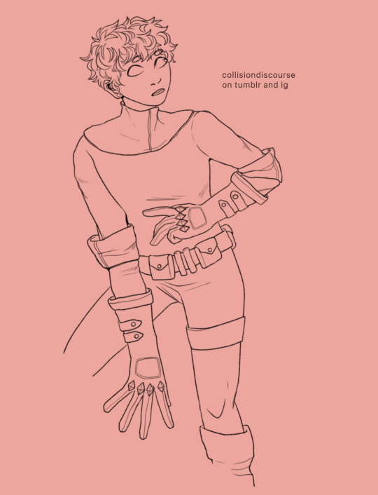
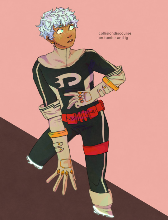
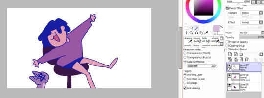
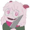
#i dont rlly like the colors but the lineart was fun
Text
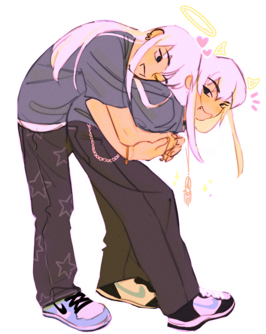
evil twinnnn
#my best friends#i dont rlly like the colors but the lineart was fun#yugioh#duel monsters#ygo#bakura ryou#yami bakura#sketches#my art
341 notes
·
View notes
Note
Hello! How are you today? I have two quick questions for you 😁
What is your least favorite part of the drawing process? An example would be sketching, or line art. I personally HATE line art. The way I do it takes forever 😭
The second question is, what is your favorite part of the drawing process? (Mine is coloring)
hi there!!! i'm doing alright, some health things came up alongside schoolwork so i've been occupied with that... eager to get back to drawing!
i have answers!
What is your least favorite part of the drawing process?
lineart... easily the lineart... I usually just use my sketch and clean it up as the lineart because I hate doing lineart that much. If I didn't choose lineart, I'd say shading... i'm not the best at it and it's just not fun for me!
What is your favorite part of the drawing process?
likewise, I love coloring, although sketching is also rlly enjoyable! that's why I usually just default to coloring sketches haha... i dont know how to explain WHY i like coloring and sketching so much but it's easily my favorite!
10 notes
·
View notes
Note
What materials do you use when drawing?
Oh god my traditional art tends to be these like. Mixed media monstrosities using every single type of paint I own so this will inevitably get sort of long BUT generally:
- for lineart: waterproof ink if i want very clean, professional looking lineart, ballpoint pen (i have one of these 4-in-1 ones that i rlly love) if i want messier, "angry" lineart
- for light colors (like here): watercolor, let it dry & do multiple layers to get more depth into the shadows, i also like to add some texture with watercolor pencil
- for solid, vibrant colors (like here): gouache, i LOVE gouache its rlly intuitive and fun 2 paint with, my one tip is to mix it until it gets a little foamy before starting to paint, otherwise it will look kind of uneven (though that can be charming in itself i think)
- like i said i also mix them a lot! i almost always do skin in watercolor cause you can get it to look rlly fun and splotchy but use other paints for the rest of the drawing
- i also sometimes use china ink (more vibrant than watercolor but less opaque than gouache, good if you want this very even sort of ductus that almost looks printed) and acrylic (WEIRD AS HELL and pretty much impossible to paint over in anything that isn't also acrylic, i only use it for highlights + on surfaces that my other paints dont stick to e.g. leaf metal)
- lastly: I do a LOT of digital trickery after I scan my finished paintings, not only do i make the colors more vibrant and fuck around a lot with overlays, I also sometimes make the background a different color from the white of my sketchbook (did this for pretty much all of these). Blend mode: multiply is your friend!!
Hope this helps! 👍
15 notes
·
View notes
Photo
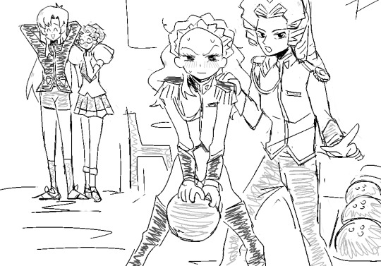
#revolutionary girl utena#nanami kiryuu#my art#about 2 cause an international bowling incident#i forgot how fun it is to draw this loosely#i feel like constantly doing commissions has made me like obsessesed with geting the lineart clean first which comes at the detriment of the#shapes/colors etc etc#its difficult because like.i dont rlly have any idea what the commissioners' expectations are when it comes to how rough the final drawings#could be so i usually just play it safe i guess?#idk.i shall check out revue now
705 notes
·
View notes
Note
Hii, hello. I saw your tower of god fashion post and really liked it. I do agree with you about Rachel, like she wears mainly baggy clothes for now. But I wonder what type of clothes do u think Rachel would wear if she wasnt as insecure as she is right now in the story? I think it might be somewhere a clash between preppy and vintage or so.
well thank u anon <3 i talked in jest there but i rlly do think styling rachel in different ways could show us more about her!! the same with all the other characters. i think their clothes rlly dont go as far as they should, which is a shame imho
now hm. if rachel would be more confident in herself and her looks how would she dress, is an intresting question. i do agree that she'd probably dress in a more preppy or vintage clothes, though i think she'd probably also dress in a cottagecore or light academia style.
now, i did come up with a few what-if designs for her. firstly, i went back and looked at her icarus avatar for color inspo. in here, i didnt go with styling her like icarus, purelly cus i feel like those clothes wouldnt be flattering on her. i adored how that red dress looked on her, so i tried to keep red elements and the general siluette of it instead of the form fitting clothes icarus had. the red dress was the only thing i had to work with, so i rlly was trying to invent the wheel here😔
i didnt go with any pants design cus i couldnt imagine her wearing them, tho its simply my opinion. i wanted her to have a long dress and only went off model on vers 4 and 3. and even then, i think she'd be wearing long socks or shoes

i like the ver 1 the most when it comes to colors, even if the camera washes them out. i do think the flowers would be too difficult to replicate in the comic and draw them many times, but this is just generally for an illustration. i like 3 when it comes to the top, but i dont like the skirt the more i think abt it. its not horrid, but not sumthing i think she'd actually wear. 2 is,,, okay? i think. not bad, not a fave. 4 is simply a doodle, and i like the skirt colors but thats it. idk wjat i was doin with the top colors. this is a simple concept i did for fun so i didnt include any shading or even lineart and my other work looks vry different but yk.
all references i used are in this pinterest board🌸
my art acc🌸 @a-chaotic-fae
11 notes
·
View notes
Note
hiiiiii i love ur art<3 i was wondering if you could talk about how you color your work? like the declan let's grease the wheels one or this commission !! i just think it's neat <3 have a nice day !!!!
thank uuuuu! honestly do not know how helpful this will be but i will try my best
generally for colors i just pick from these 2 palettes i made forever ago ALTHOUGH i am much more fond of the top one (probably because i actually organized it)

AS FOR PROCESS i just fill in the lineart w/ a single color base before using a clipping mask to add color on top. (dont need to do this but i like it. i also think it’s more fun to do it when u make the single base rlly textured like in these drawings or this one and then add a clipping mask w/ color on top of that) anyway then i add shadows and highlights using different layer styles.


BRUSHES…. uhm i think i used a modified version of the dry ink one on procreate, 6b pencil, and then this gouach-ish brush i downloaded online
hope this helps even a little bit :-*
#is this even coherent at all…. idk#anyway my process changes all da time i am literally just fucking around#asks
91 notes
·
View notes
Text
my art process: a simple(ish) guide to how i (kinda) do things
okay!! so, i said i was gonna post my art process after i finished doing the danny phantom piece so... here it is! the drawing i used for a step by step process explanation is actually... simpler? less clunky than how i usually do things. i must preface this entire post by saying that i am fully self-taught for anything to do with art so if there are some things here that are exceeding no-nos... very sorry OOPS
The drawing took an estimated 4 hours total and for software I used FireAlpaca. My tablet is One by Wacom (aka the tiny ass red one). Without further ado... here’s my narrated guide on how i kind of do art!
1. Sketch Layers
sketches, are ofc, one of the fundamental steps in art. Some artists do them differently, whether they do color blocking/splotches first or silhouettes or your standard messy-lineart-before-the-actual-lineart
i personally do 2-3 different lineart/sketch layers, each layer specializing in different aspects. i took this technique from julia lepetit, a host from the drawfee show--a channel that i really recommend watching if youre an artist, like art, or just generally like having fun background noise while you work on something because... untreated adhd lol
this is the first sketch layer! i color coded them for reference and i use the yellow sketch layer to figure out poses. i use this gesture sketch layer to figure out where i want limbs to go and how i want the body to twist.

after i figure out the posing, i move on to my second sketch layer. the green layer is my refined sketch layer where i figure out the form and anatomy of the sketch. this is also where i start planning how expressions, special costume bits, and hands work!!
the red layer is my last and final sketch layer. technically, the red layer sometimes also doubles as my final lineart! the reason why i do this final step instead of doing the final lineart simply is so i can work on details of the costume. i end up refining certain portions, or even stretching/free transforming the whole body.
The red helps with the refinement of the drawing bc the ink being a color that isnt black kinda,,,, tricks my brain into not believing that its all permanent. its easier for me to go back and erase/change some parts when my brain doesnt think that everythings final. when im finished, i simply go back and change the color of the lineart to black with the protect alpha function.
this is how the final lineart looks! be sure to close the lineart (aka make sure that everythings connected) so that the bucket tool can work and make your life 2000% easier.
2. Coloring
my coloring process is kind of... a mess LMAO its super dependent on how i feel like coloring on that day, but this is the usual method i use when im not thinking too much about it.
first are the flats! i use the magic wand tool to select all the areas around the lineart and reverse the selection so that all the areas inside your lineart is selected. color it with a base color, turn on protect alpha, and begin chunking in all the colors.
all of the flats excluding the pupils, background, ectoplasm rings, and danny phantom logo are on one layer. once that is done, we move on to shading!

for shading, i use a combination of the normal pen tool and the airbrush tool to smooth out the edges of the cell shading. since all the flats are on one layer, i simply set this one to clipping mask so that i dont have to worry about coloring within the lines. I only use one color really for shading (here, i used purple) and then protect alpha and add splotches of other colors (pink, orange) in relevant areas.
once i finish doing that, i set the layer to multiply and adjust the opacity so that it looks softer and more attuned to the colors of the actual piece
its at this point that i fiddle with the hue/saturation/brightness settings on the flat color layers to my taste, seeing what works and what doesnt.
i then lightly go over the piece with a bright color (very very very light cyan) and put focus on the areas i think should glow like his freckles, eyes, and ectoplasm rings from where he’s coming out of a wall.
i rlly rlly love layer effects, so i set that one to add and again adjust the opacity to how i want it to look.
3. Finishing Touches
...yeah i know it looks like a hot mess but hear me out.
on a new layer, make a CRAP TON OF GEOMETRIC SHAPES. ALL OF THEM IN NEON OR PASTEL. i get comments about my coloring methods sometimes and honestly im pretty sure its all due to this step. i make all these goddamn weird shapes, colored according to levels of lighting (yellow in lighter areas, turquoise in areas affected by the glow, purple in shaded areas etc. etc.) and also clip this layer.
i then set the layer effect to either hue, overlay, or add and set its opacity really low to make it unobvious and cleaner to look at. this is a method that i learned from tumblr user zephyrine-gale who is... exceedingly talented and pulls this off way better than i can WKSDJSKKS
after that... ur basically done!! i add a few more layers like the noise layer for extra texture and sometimes some very light gradients (usually yellow to purple bc of something something color theory)--but after that, the piece is basically finished!
thanks for sticking around and reading this monstrous thing!! i might do more posts like this in the future, so who knows?
if you enjoyed this tutorial, want to support me and my art, or just wish for a way to pay for me to shut up... you can tip me 3 dollars or commission me here at ko-fi
(also reblogs are much appreciated. thanks <3)
35 notes
·
View notes
Note
you’re a big inspiration to me! I idolize both your line art and shape language in your characters. If it’s not too much to ask, what’s your process for constructing/drawing a character? shapes n stuff? your style is very simple yet conveys forms with fluidity!
thank u so much omg !!!! ;u;
uhhh my process is kind a like... like using Fast Pen Strokes and Shape as a main thing kinda? like one sec lemme show u a step by step drawing of tommy n that basically encapsulates how draw stuff.
step 1: shapes!!! u kno em u see em!
ok get a shape in ur mind and sketch it out REAL fast its ok if its messy as long as its the shape u want it to be ur GOOD i draw tommy w long head long face syndrome so i sketched out ths bean shape. one of the things i learned from taking Drawing Naked People Class is that getting the basic sketch OUT super fast, disregarding messiness and mistakes, is th best way 2 keep ur art lookin dynamic n shit. its all about the movement babey!!!! im still struggling w that tho but m getting there! drawing tommy def helps tho hes like a tall noodle boy. but yeah like stay loose w ur drawing in those first steps bc u can get some realy nice fluidity there.
step 2: details n other shit
ok yeah self explanatory add details remember being messy being fast is a-ok bc being fast means ur getting all those good less controlled shapes that make drawing FUN remember: loosey goosey arms babey!!! u dont gotta be super restricted to these details if u dont want to be, this is like a Vague Concept of where u want to put the things. sometimes i’ll start this EXACT process again on different parts of the drawing just to get it right. its all trial n error n stuf.
step 3: LINEART or at least a version of lineart i like 2 do like sketch lineart idk

so w this instead of drawing onto another layer i actually erased all the messy lines to create like, a nice messy lineart kinda look where its solid enough that its lineart but because it wasnt drawn on another layer, tracing over ur super fast shape concept, the drawing stil retains the shape it had in the sketch process and retains its fluidity. if u do this and the lines art still too light for ur liking just copy the layer and put the opacity at any percent u like so then u end up w the same lines but darker ig.
an example of cleaner lineart would look kinda like this

which, YES the lines are cleaner and thicker which is good for certain times of drawings but i find it looks a lot more flat and its not exactly my preferred go to kinda thing (altho it is sometimes easier!)
i dont typically LIKE doing actual lineart w a separate later bc it RLLY stiffens up my style, BUT i like to do it for like comics or Specific Illustrations or, in one case, th animatic, bc its just a lot cleaner of a Look.
w both versions i basically fixed a couple things wrong with the basic sketch, added more detail, slapped on some color for aesthetic purposes and added everyones favorite iconic tommy quote from hlvrai act 5 icarly edition: )
ANYWAY YEA thats like essentially it! im gonna do another art stream this saturday (and since im not working on animatic it’l actually be fun to watch and epic!!! requests n stuff maybe!!) nd u can seehow i make cartoons REAL!!! anyway ya thank u hope this isnt completely nonsensical n make sense n stuff!!!!
167 notes
·
View notes
Text
Honestly i was very on and off with being happy about my art for a long time because i really wanted to constrict myself to a specific style that i thought looked more professional ie bold straight lines and quite a bit of rendering and it was such an unenjoyable experience honestly. I thought it would look better if i ever wanted to become an animator or professional artist in general. All the time i would see these animators and comic artists with messy lines and no shading and i would just be like. God i wish i could do that. And then i started to realize, why can’t i? In order for me to make my art more enjoyable for me to do i needed to stop trying to force it into a box. I needed to amplify what i enjoyed about making art and lessen/drop what i didnt. I thought i wouldn’t be able to do it, having always been a rlly heavy perfectionist with my art but.. the moment i started to let myself stop caring so much, the moment it got way better. Shit like... i love doing lineart! But i always did it to be straight, bold lines, and it was honestly physically straining and it made it unenjoyable. So i went back to what i use to do when i was 13 and get messy with the lineart. And i love it! Its so fun to do and honestly if youre having fun then thats the biggest improvement you could ever make. I really disliked the shading/rendering process, so now i barely do it/do it in minimal amounts. Theres no right or wrong to art theres no real rules and it gets so much better for you when you just do what makes you happy... dont connect your lines draw too many lines color outside the lines use the fill tool render the hell out of it dont do lines at all its just like !!! Genuinely whatever is going to make you happy to make art and happy with your results will ALWAYS be a better improvement then trying to figure out what its Supposed to be
#sorry for the random long ramble im just thinking about how ive been improving mentally lately and how art has actually become an enjoyable#process for me because ive finally allowed myself to do what makes me happy#i think every artist deserves that feeling
2 notes
·
View notes
Note
Hello! I'm very sorry to be bothering you,but I have a question. I want to start doing manga colorings and I really like your Tanjiro edit! I was wondering if you have any tips? As in what program you use etc. I also love how warm the colors are! Do you also have any tips on that? Thank you for your time.
hi hi !! you arent a bother at all, dont worry…im no art expert or whatever but . here u go!! if u have any more questions, id be happy to answer them
first thing, i use ibispaint !! its a mobile app since i dont have a tablet. or a mouse. laptop touchpad is rlly shitty when it comes to art gfiuhiu……..but im sure you can p much replicate everything using a different program !! i also use ps to add finishing touches
ok first thing first……..the lineart……….what i usually do is. extract the lines from the original manga cap, so its easier to color!! it makes it so that u paint ‘under the lines’ (aka it pretty much removes the bg and leaves u w/ lineart only). i dont rlly remember how to do it in ps but u surely can find a tutorial online ! i also like to color the lineart once im done w/ everything. it just adds onto the general feel !
next. go bonkers !! go absolutely wild w/ colors !! do whatever u want !! use those funky hues !! theres no rules when it comes to this. the ‘secret’ to my warmer colors is the pink undertone. aka u just add pink onto everything n then fuck around with layer modes. it also works well w/ red n orange ig
thats it ???? idk i dont think abt any of this when i color. just do your own thing n have fun !!
#* 𝒐𝒏𝒆 𝒃𝒓𝒂𝒊𝒏𝒄𝒆𝒍𝒍 𝒈𝒂𝒏𝒈. / out of character.#idk if any of this makes sense..........#its not rlly a long post but#just to be sure
3 notes
·
View notes
Text
(almost) every anon ask since fall 2016
if u havent noticed i am BAD at answering asks so here’s a Big Dump of most of the asks i’ve gotten in the past few months
ps; i’ve excluded pokemon suggestions bc i plan on getting to them at some point
Hihihi!!! What brushes do you use in fire alpaca??
i dont do much in firealpaca (esp not lately lol) but when i did use it a lot i just used the fill bucket and the standard/default brush to fill in gaps n such lol! i dont really draw in it, i used flash/adobe animate for the lineart and just fill in color in firealpaca :3
when did you start animating?
uhh when i was around 11 or 12 when i started digital art i guess? i just used photoshop for the longest time then got flash when i was like 15 or so
How did you get flash? i got the creative cloud dealie, its technically required for my school :—-0
hello!! what are you majoring in in vcu?? im thinking about going there for college
im in communication arts! omg cool lmk if u come here ill tell u where to get the best bubble tea
how many fps do you use for your wiggly animations?
i work at 24 fps in flash on twos but just end up using photoshop’s 0 second frame delay/ “no delay”?
Hey love your animations! What do you animate with?
adobe animate 2017! (previously flash)
You mentioned a YouTube channel but I can’t seem to find a link to it? Do you post processes on there? https://www.youtube.com/channel/UCovvoZxlQjFaIA7A3w_94Zw theres not much atm but i plan on posting a lot more, including process/speedpaints!
i really like your art style gosh darn!!! everythings so fluid and stylized and nice aaa (also ur animations are goals) do u have any tips for someone still developing their artstyle????
WAH TYSM!!!!! compile art you already like and incorporate aspects from their styles into yours, BUT dont limit urself to one style! if u like something then try it out! do straight up copies (as PRACTICE, DONT CLAIM IT as your own ofc) of stuff you like to see how they work and what you’re clicking with. spending time on fundamentals is MEGA helpful so keep going back to that too! USE REFERENCES!!! draw …from ur soul…what makes u ..FEEL good
how do you make that burn effect on your lineart? it makes it your pieces look sharper and even more interesting, it’s super cool!!
when i used to use flash for lineart and firealpaca for coloring a lot, setting the lineart layer on BURN with the coloring layer seeping a lil past the lineart would get this effect automatically
(like on the whiskers. u can see it gets a brighter brown(?) and the warmer yellow on the ears)
but since then i’ve been using sai+photoshop more so i just do it manually! i’ll use this funny pic of me and my cat as an example lol
^i select the lineart/everything i want the funky color around

^slam that INCREMENT button a couple times
^make a new layer under the lineart

^fill that puppo with ur preferred color! something brighter works best, or even straight up white
that’ll give you something like this
then i open it in photoshop

and i mess with the pink line layer’s blending mode..color burn usually does the trick but depending on the Look you’re going for, saturation, multiply and overlay have some similar effects that look cool.
i also usually get rid of the outermost edge of pink line that’s visible around the lineart, just so it looks a little cleaner? to do that you just select around your lineart, increment/expand selection, and delete/erase in the selection of the pink line layer
uhh yeah! lmk if anyone needs clarification on this, i have some other #TIPS on makin ur art look crusty and funky so…lemme know if you’re interested :—3
What do you use to animate? And, a more specific question, how do you make transparent animated gifs? adobe animate 2017! (previously flash) i export my animation from flash as a png sequence then open it in photoshop, where the background will be transparent and save it as a gif from there nyaaa
if anyone needs more clarification lmk and i’ll make a proper walkthrough :-0
Hello!! Ur art is rlly pretty and so inspirational and nice to look at!! 💗💗 I was wonderin’ if ya had any tips on choosing shapes for characters? Like, when you draw shapes for a certain character, it looks rlly like it fits with the character’s personality n stuff!! ( e.g: Your Love Live! drawings!! The characters look so good in your style.) I’ve always admired how u did that n was hoping for some tips maybe?? Anyways, have a good day!!💛💖💟💜💝💞💖
HOOGA!! TYSM!!! and YEA you basically guessed it, i mainly just think about the character’s personality and translate that into a shape or Pheeling…
especially for anime characters i look at the Very Subtle differences in the character’s original design..or possibly canon implications…for example kotori has slightly different eyes (it also says on her wiki page she has soft droopy eyes!) so i make sure to incorporate that Detãile

anime wiki pages that have details like that is nice, for love live they have cute lil “charm points” which is really cool n helpful! listening to how a character is described in their world can give clues to what differentiates them which you can make more clear in your design
taking into account each characters context is good too, what they do/hobby/personality and how that could affect their appearance/posture/attitude
YEAH its really fun to figure out certain characteristics and make it evident in their appearance! or. idk thats just what i do lol. hopefully this helps!
Have you ever seen the anime jojos bizarre adventure?
alas i have not..i have some friends whom are into it so i’ll prob end up watching it sometime lol
sorry if this is obvious but!! are you the creator of Fork and Knife: Food Fighters?? your gif of fork is super cute btw!!
yes i am!! wah tysm!!
Hey my little sister found your animation on an online art gallery and she really loved it!
omg cool, thanks so much!!
Your style is so lovely!!
OHG thanks!
your blog is so precious i love it a lot! your art is so cute too ^u^
waa thanks!!
Your art and animations art really cool! Keep up the good work! You are amazing!!
aahg thank you!! :’333
your art is fuckening amazing hh
broe…tysm
Oh my gee, I used to follow you on Deviant Art, and now here I am, finding you on accident. You’re still as talented as ever. =w= b
hUIOpugh deviantart, my homeland..my origin.. thank you!!!
- O mg I love your art! 💕💕💕
thank you!! heart emojis!!! 💖💖💖
- your art and animations give me so much inspiration, thank you! everything about your style is so fun and it cheers me up
omg this validates my top tier goal in life, im so glad!! thank you SO much!
Your style is so charming and adorable ;__;
thank you!!
ur art is so gross in the best way possible
this is the biggest compliment ive gotten thank u so much. i love making gross squishy awful drawings
IM SO HAPPY I FOUND YOU!!!! IVE BEEN LOOKING FOR YOU FOR AGES!!!!!!!!! I LIVE FOR YOUR BEAUTIFUL ART!!!!!!!!! THANK YOU!!!!!!!!!!!!!
BHOLY CRAP THANK YOU!!!
your art style is very cute ! 🌱
oohg thanks!! thanks for the little sprout emoji, i love her
GOOD ART!!!! good art good art good art EVERYWHERE I LOVE IT!!!!!!!!!!!!!
OHHGG THANK YUO
how do ya draw such cutely its driving me nuts Nuts NUTS !!!
I LOVE SPARKLES AND BRIGHT COLORS AND FUNNY ANIMALS..its my lifeblood..thank u..
You’re a really rad artist! I’m Glad there’s some cool artists that are local! Have a good time at VCU!
oh wow thanks!!
Ur shapes r so good
thanks i LOVE a nice wholesome shape!
I rlly like ur art style my dude
thanks!!
hi! just wanted to let u know that you’re wonderful and i wish u well in everything u do
this is making me bVERY HAPPY THANK YOU SO MUCH!!
Im love You!!
IM L OVE YIOU
that meowth boy is so good. i love him as he is my son
THANK YUO i too, love meowth a Lot
I love how your art is basically lines and curves, it’s very cute
oo thanks!
i love your art style so much!! it’s so zesty? i cant think of a better word to describe but its like. zesty & refreshing & rly rly cool !!!
THATS A BEAUTIFUL ADJECTIVE I LOVE IT thank u so much!!!
You seem like you would watch Osomatsu-san. I could see you drawin dem bois in you hella rad art style.
osomatsu was the wildest ride of my life. tho i dont think i could physically be able to sit down and draw them seriously ever…

Pls make more angry cat comics theyr so halarious plllls
👀 more are on the way!!!!!!
Have you done a meet the artist
i sketched one when the meme was still poppin..is it too late lol? maybe i’ll still do it
110 notes
·
View notes
Note
5 & 27 :]
5. What's your favorite thing to draw?
honestly when i have the time to sit down to do it, i do like doing backgrounds lolll its kinda relaxing despite it taking a long time to do but aside from that hands r rlly fun
27. For digital artists: how many layers does a typical piece require?
depending on how lazy i am lolll usually i just have like. 5-10 (2 for lineart, 1 for base colors, 1 multiply / shading layer, a bunch of color correcting layers, 1-2 layers for simple backgrounds) for like sketchy requests
for big pieces i also have just like. 5-10 lol i do a lot of one layer painting so usually i just have one layer per character and then one big one for the background and surprise, a lot of color correcting / sfx layers
properly lined pieces can be over 30+, 2 layers for lineart, and an individual layer for different base colors (amount varies from piece to piece) which i then just shade on the same base layer and my color correcting / sfx layers as per usual
for certain types of backgrounds (that i dont post on here lol) i can have upwards of 80-100+ layers because i separate into different faces (like 3 sides of a cube) and bc theres a lot of parts in the background.... it can get up there pretty quickly
ask me an artist question!
3 notes
·
View notes
Note
Can I ask what drawing programme /what brushes you use??? Your style of colouring is so awesome :^)
of course!!! ;; thank you so much!!
i use paint tool sai! i sometimes use photoshop if i wanna play with overlays and stuff but a lot of times i just stick to sai! these are the brushes i use:
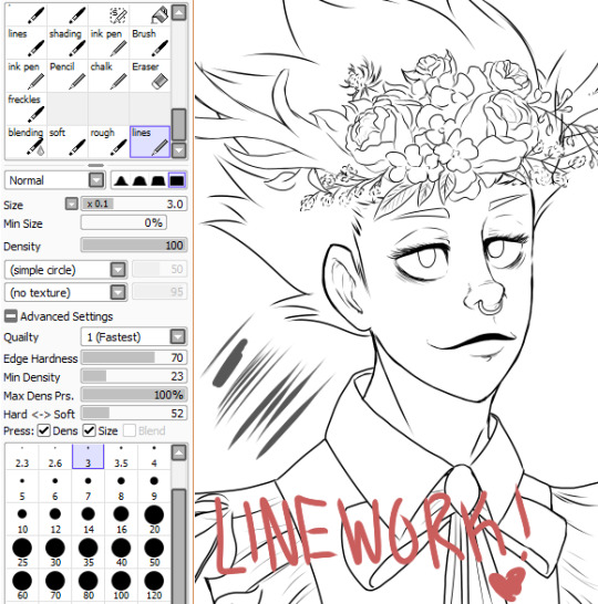
this is my typical lineart brush, i use it constantly, it works great but its probably a lot like any other lineart brush you can find, haha

i dont use this one THAT much but its a nice brush! blends well and its good for laying down additional color when i decide i need More Eyebags lmao. the cavas texture is nice too

i use this one probably too much for highlighting! i like things looking Shiny lmao, so this is what i use if i want more of that look
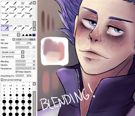
this is my most used brush while coloring! i love this brush so much, it changed my life lmao. literally its perfect for blending colors and adding colors and idk its just a rlly versatile brush,,

AND OF COURSE,,,, this is my current go to for freckles, lmao. i looked high and low for a good brush bc all the ones i was finding just werent working for me but THIS ONE.... i like this one.
if this isnt helpful just lmk!! im not good at explaining things but i think if you wanna take these brushes and play with them, theyre a lot of fun!
15 notes
·
View notes
Last Seen Blogs
suisui123
suisui tumblr
directorofwulin
Head of The Qiu Sect
yandereralsei
Stay.

way-2-bored
WAY-2-BORED
1eatboys
Ilya