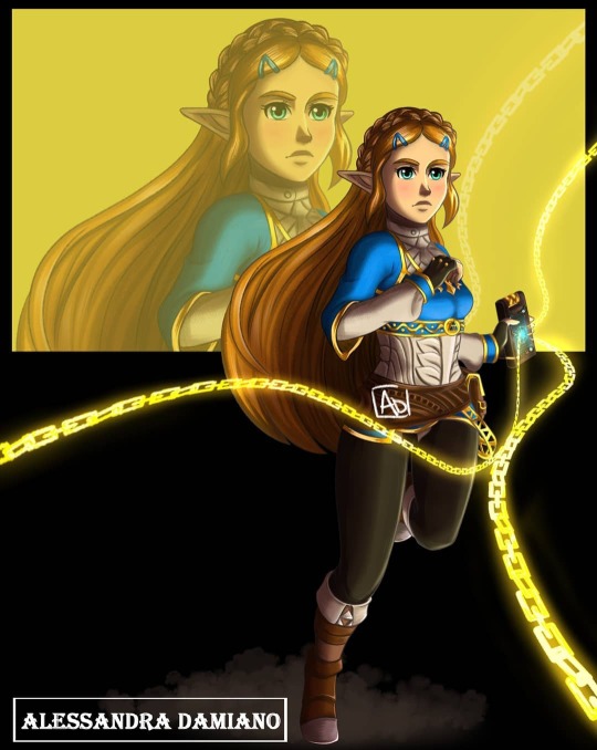
#hyrule warriors impa
Text
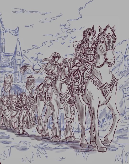
Pumpkin carving with the Hyrule Warriors gang.
They’re a bit confused, but they’ve got the spirit.
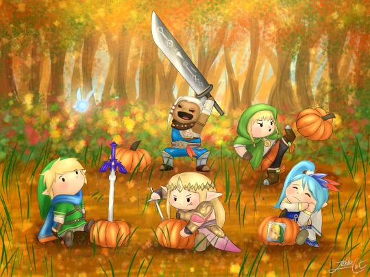
🍂
#hyrule warriors#hyrule warriors link#hyrule warriors zelda#hyrule warriors lana#hyrule warriors impa#hyrule warriors linkle#legend of zelda#zelda
85 notes
·
View notes
Text
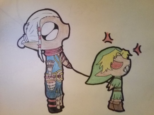
Someone out of frame: GET YO LINK!
Impa: He don't bite
Young Link: GRRRR
Someone out of frame: YES, HE DO!
(Young Link is having a bad day and someone set him off. Impa was actually taking him to smash pots get a treat and relax before this happened)
#taddy drew a thing#legend of zelda#loz#loz hw#legend of zelda hyrule warriors#hyrule warriors#hyrule warriors impa#hyrule warriors young link#hw young link#hw impa
21 notes
·
View notes
Text
Analysis of the Hyrule Warriors Designs Pt.1
I’m doing a whole thing with redesigning Hyrule Warriors atm so I’m doing this post as a way to keep all of my thoughts and design ideas in one place. Just gonna go character by character and give my thoughts.
I’m not taking games like BotW into account when doing this because the game hadn’t been released yet when HW was in development/released. I’ll also not talk about characters who’s designs had been minimally changed to fit the new style - if changed at all. Just going to talk about the main characters, antagonists, and a few DLC characters I have a few thoughts about. All images and information is from the Zelda Wiki along with gameplay on YouTube, so not all this information may be 100% accurate since I don’t own the game myself.
In this part is Link, Zelda, Impa, Lana, and Cia.
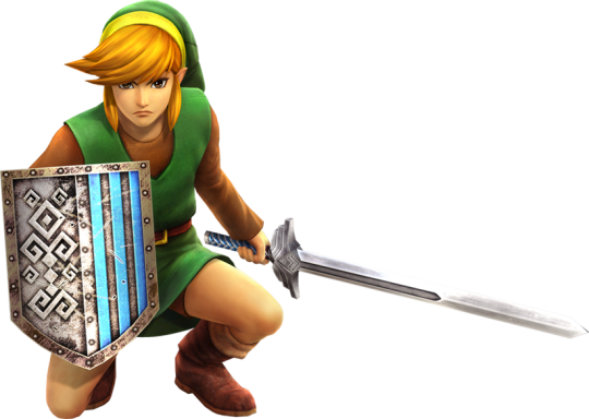
Link
Starting off with the main man himself! Obviously up to this point, Link has generally had a very set design; the green tunic and hat (which is actually talked about many times both in this game and the series), so I didn’t expect them to come up with anything different. It’s recognisable, it’s a classic. Though, Hyrule Warriors does something very small but very significant:
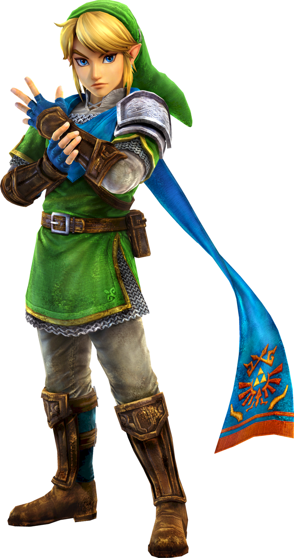
He’s given this scarf as a way to distinguish him from other Zelda titles. I think this is especially needed, considering the fact that most Zelda games use their styles to distinguish each other. But now, in a gaming market where models with such high quality like this are the norm, there needs to be a way to make this Link recognisable. I personally think they did an amazing job with it too.
Not only that, but the way he’s dressed in context of the situation makes sense. He’s a soldier of war so he wears pauldrons, bracers, shin guards, and chainmail, but being a hero is meant to be something shown off, to heighten moral with the troops and intimidate their enemies, so he doesn’t wear the typical chestplate that would conceal the green tunic.
Personally, there’s nothing I would do to redesign this character. The design team did an incredible job putting a spin on a design that’s so set in stone at that point in time. Even why the blue fabric is so saturated makes sense from a game design perspective, where it would be hard to see Link’s character model in the swarms of enemies.
And I know these don’t tie into canon since these are merely costumes, but I adore the way they changed Link’s character model for the other Link’s tunics (specifically Adult OOT Link, SS Link, TP Link, and Zelda 1 and 2 Link). Apologies for the sizes of the images, I’m pulling them straight off of the wiki.
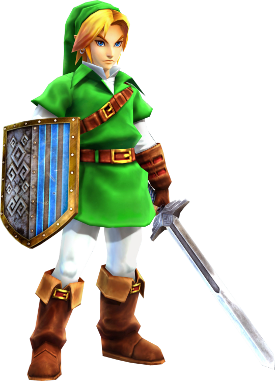


The fact that they changed the entire style for a single model is some dedication, already knowing what an absolute task it is to complete this game. While I’m not entirely sure if the OOT costume is meant to be so angular as a nod to the graphic of the original game or if the render on the wiki isn’t the correct quality, I’m going to assume that it is, and congratulate them on that too. They all have different qualities to the models; OOT is very angular, SS has softer shapes and colours, TP is very realistic with desaturated colour scheme (props to whoever modelled his hair), and Classic is much simpler and has much warmer undertones.
It’s off topic, but I thought I should give it a mention.
Zelda
Next up is our favourite princess, Zelda. This is a design I have quite a few problems with. I’d like to say up front that this design is gorgeous, as well as the modelling, however this is about the factors in the character design and not the vibes.

My first and biggest problem with this design is the armour and it’s context within the game. For those unaware, this is the first ever game (not including the CD-i games) that Zelda has been a playable character, which means she is able to fight in the war. The big issues is the lack of appropriate armour and coverings. Starting with the armour, Zelda has the entirety of the neck, top of her chest, stomach, legs, and arms open for attack, which when your THE princess of Hyrule, is not a great thing. It’s a wonder why she’s even allowed to fight because of her status, but that’s a conversation about the plot holes for another time.
The lack of clothing covering her is astonishing. Not only is the design not very practical (the shorts instead of pants, the giant slit in the skirt down the middle, the entire chest, upper arms, and armpits exposed etc), it should be considered dangerous in universe to put Zelda in. The pieces of armour at her hip is quite impractical since it’s not protecting anything vital. I’d also like to know how her boots work with the entire boot looking so stiff and as if the shoe is unable to move at the ankle. Not only that but the detailing in the armour makes her top half look very cluttered.
Another gripe I have is her hairstyle. Yes, I get that most of Zeldas are platinum blonde and have their hair tied back, but I feel like the team that remixed Link’s design about 7 times in different styles should have experimented more. In my opinion, the most recognisable Zeldas are those which stray from the norm. For example, TP Zelda very clearly is a brunette, which makes her stand out from the rest. SS Zelda’s design is recognisable as Zelda, whilst not being in a fancy princess-y garb. The Toon Zeldas’ designs are used over and over again for a reason; they’re highly recognisable for their sailor-like dresses. I’m also gonna argue that her crown (circlet? tiara?) seems too jagged and sharp for a design decorated with flowing lines and curves. I will give the design some credit - the decorations hanging from the tips of the hair are somewhat unique and I do quite like them.
I’m also gonna give props to the modellers for once again remixing the styles for the different costumes. I am also confused as to why Zelda got a costume for Illia, but I love the girl so I’m not complaining.


Again, apologies for the image sizes.
Now, there’s a lot to fix with this design, from the armour, to the clothing, to the hair, so I present to you my own personal redesign of HW Princess Zelda:

I can’t say I came up with the idea for her more Greek-goddess styled clothing myself - it actually came from her title in the Linked Universe fandom; ‘Athena’ or ‘Artemis’ (I’ve heard both but I personally prefer Athena). I decided to stick with the idea due to Athena being the Greek Goddess of War, Wisdom, and Strategy, which I think fits Zelda pretty well.
Main changes are mostly to giving her a proper chestplate in place of the armour at her hips, giving her more layers and changing the style of dress to something slightly more toga-like, and her hair and crown. I did want to keep her hair up but decided that the way I styled it was unique enough to be recognisable.
At the point of writing, I’m suffering through a heatwave and my laptop is on borrowed time before it overheats, so it’s quite messy. For a better quality image of my idea: my better illustration of Zelda.
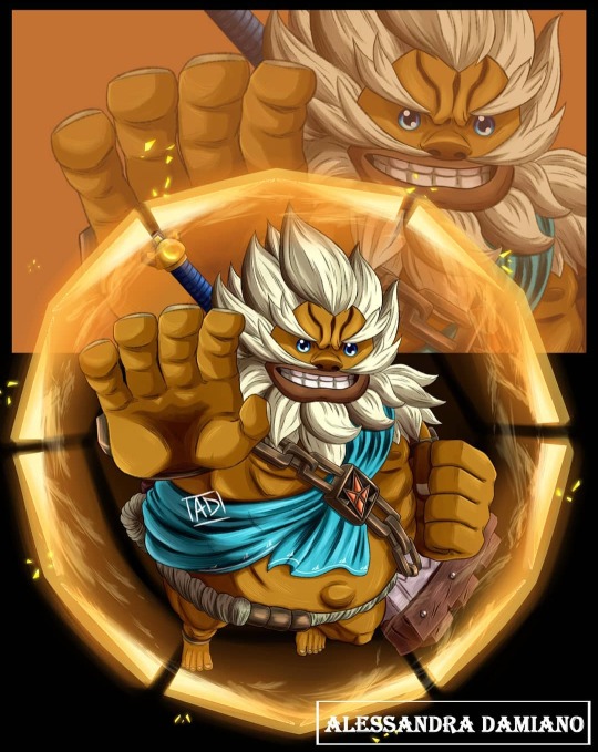
Impa
Impa’s design is a bit of a mixed bag for me personally. Her top half is very interesting and speaks to a lot of her inspirations. But the bottom half of her design is quite bland. While there is a Sheikah crest on her chest plate, if you take it away, it’s a little harder to tell that she’s a Sheikah.
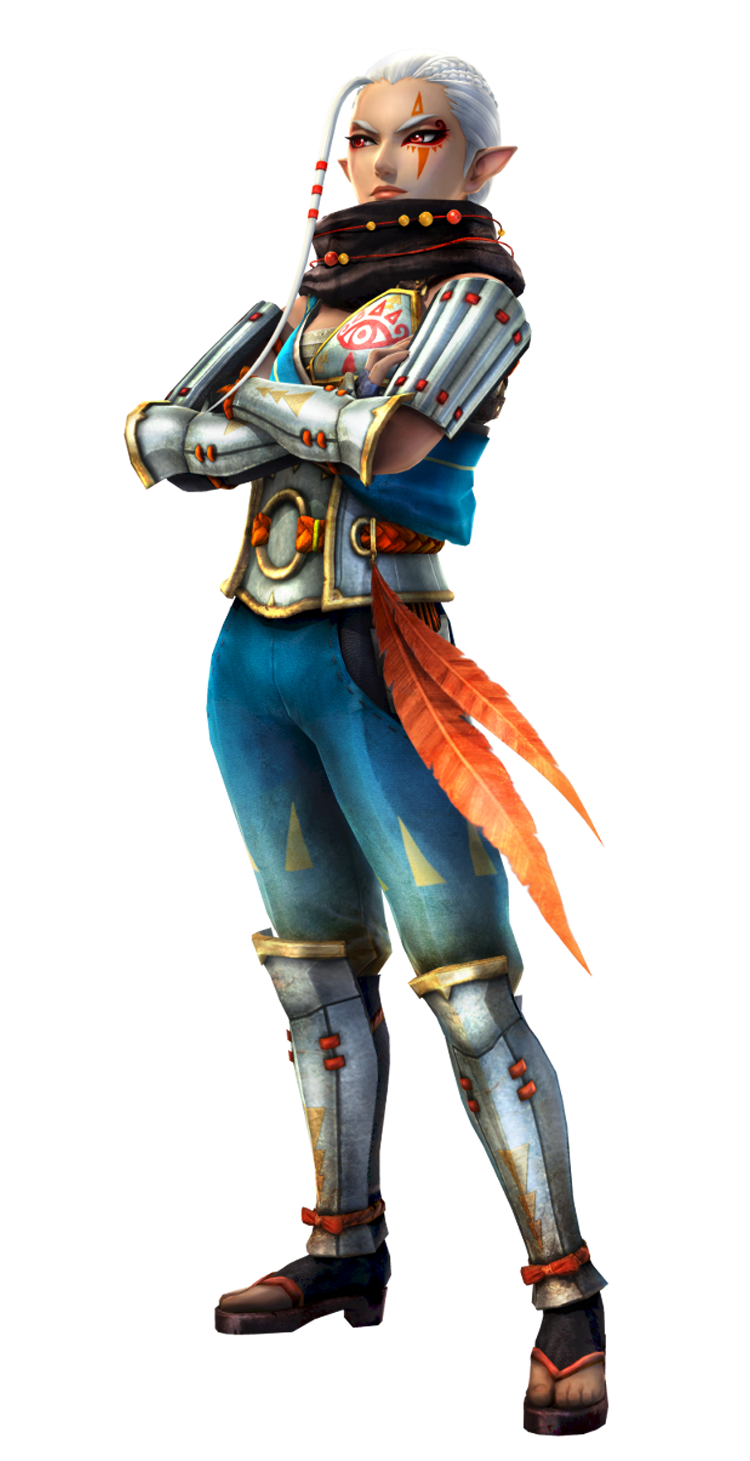
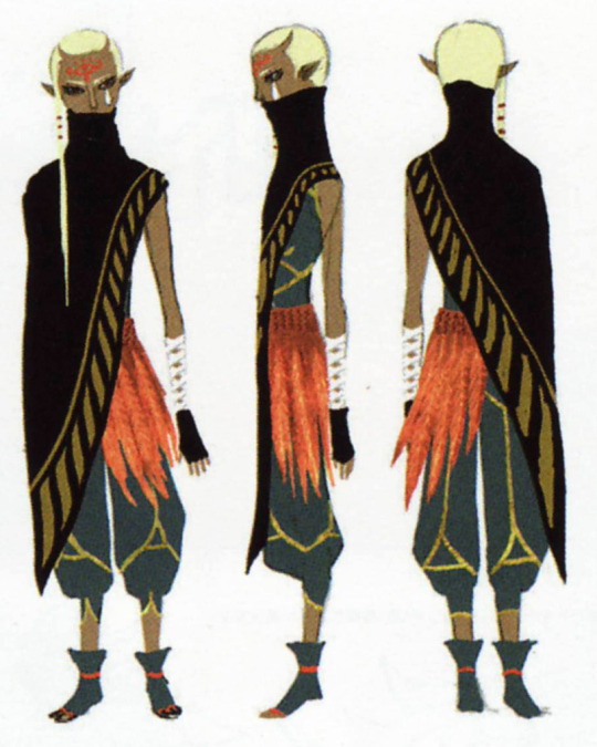
It’s quite clear that the concept design team’s biggest inspiration were previous Impas, specifically SS and OOT. The issue is that it feels like it took too much inspiration from Skyward Sword, with the scarf, belt and feathers, and hair. To illustrate my point:
It’s understandable why Impa looks so different in SS compared to other modern games in the franchise - the Sheikah tribe hasn’t been established yet. However, in HW, it’s stated that Impa is the leader of the Sheikah Tribe, and yet she looks out of place beside Sheik (which is a whole other sack of snakes to do with the plot).
Additionally, her chest is quite open for attack with her chestplate covering a single part of her chest. And also, she doesn’t have anything on beneath her arm guards, which also leaves the backs of her arms open.
Really, these are quite minor grievances I have - I actually like this take on Impa, if my reaction is a bit mixed. As I’ve said the top half of her design is my favourite, she’s obviously inspired by feudal Japanese samurai, with the opening of her shirt (which looks to be based on a yukata though I’m not entirely sure) and the armour beneath the cut-out in her pants.
I think the reason I’m a little put off by the bottom half is because of the way her pants were modelled. They look almost denim jean-like, and it’s generally resolved in the concept art where Impa looks to have quite baggy trousers on.
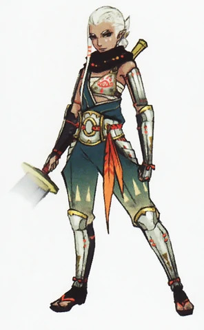
Her outfit looks almost like some kind of romper/jumpsuit in this artwork, which I think looks quite good. I have a bit of an issue again with the lack of chest and arm coverage, but I think the big thing is that the model’s slight differences add up. For example, the brighter blue with the tighter pants is the thing that makes her trousers look like jeans. The makeup around Impa’s eye also adds a nice touch to an otherwise bland face.
How I would change this design is larger to do with leaning into more of her different influences - namely the idea of a war general in Feudal Japan. I’d also change her hair to keep it further away from SS Impa (though I do love the style), as well as changing her armour to be slightly closer to how it’d be made in Feudal Japan - iron, scale-like plates tied together - just to tie it closer into the theme. I think that the scarf feels a little strange as you can’t see the end, so I propose to turn it into a cape pinned to Impa’s shoulders via a brooch (kinda similar to soldier in Ancient Greece to tie a bit into Zelda). Also, I like playing with the idea that she has a small collection of weaponry attached to her such as tanto, washizashi, tessen/war fans etc.
Some personal ideas:

Overall, Impa’s design looks quite nice, though some few issues make it hard to enjoy what would be a great design!
Lana and Cia
Okay now here’s the designs I have the most issues with. I have a personal vendetta against these designs. I’m lumping them together because they have many of the same critiques.
(*EDIT: As of now on, I have updated Cia’s redesign. See here to take a look.)
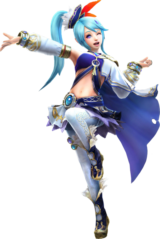
Lana. Love her or hate her, you have to agree that her design does not belong in the Zelda franchise. With the series being set so firmly in Medieval times (possibly England), most of the active human characters in the story wear practical clothing which would be some variation of tunic and appropriate leg-wear. The only difference are nobles like Zelda who wear the appropriate gowns and garb. Lana’s design in the meanwhile, is very modern, and looks almost akin to a character from a magical girl show. It would not be farfetched to show her to someone who has never seen Madoka Magica and tell them that she is Sayaka.
I get what they were going for with her design; Lana and Cia are sorceresses from beyond time and space, they should wear non-traditional clothing to signify this. The idea is great in theory, but it doesn’t work when you put them next to the other characters. They look like they’re from completely different games. I’m thinking it’s the Dynasty Warriors influence creeping into her design since both Hyrule Warriors and Dynasty Warriors are Musuo games.
Here’s a short list of a few of my biggest gripes with Lana’s design:
1. All of that skin exposed. Just because Lana is a sorceress, doesn’t mean that she wouldn’t get absolutely obliterated by an actual weapon to the gut. I’m fine with her not having armour since you could argue that she is fast and agile, but the fabric covering her is either none-existent or extremely thin.
2. Her outfit is extremely impractical. Not only is the one-sided cloak just not useful at all for keeping in heat and protecting the body from the elements, but her tiny skirt and sleeves would make it hard to walk around without flashing someone and hold normal objects respectively. You also see her walking around with a giant tome, but you never see on her design where she puts it or gets it from.
3. Doesn’t fit with the franchise’s established setting. I’ve already talked about this.
4. Her hair is quite odd for someone supposedly from a random clan in Hyrule. Everyone in Hyrule has naturally occurring hair colours (browns, blondes, blacks, and white for the Sheikah), yet Lana has bright cyan hair. It makes her look quite out of place with the cast who all have relatively normal hair. Not only that, but her hair piece makes her stick out from a crowd.

As with Lana, Cia shares many of these gripes. Personally, hers is a little less on the annoying side as Cia is doing most of the fighting behind the scenes through magic, so she doesn’t need a lot of the practicality the other character’s outfits should have.
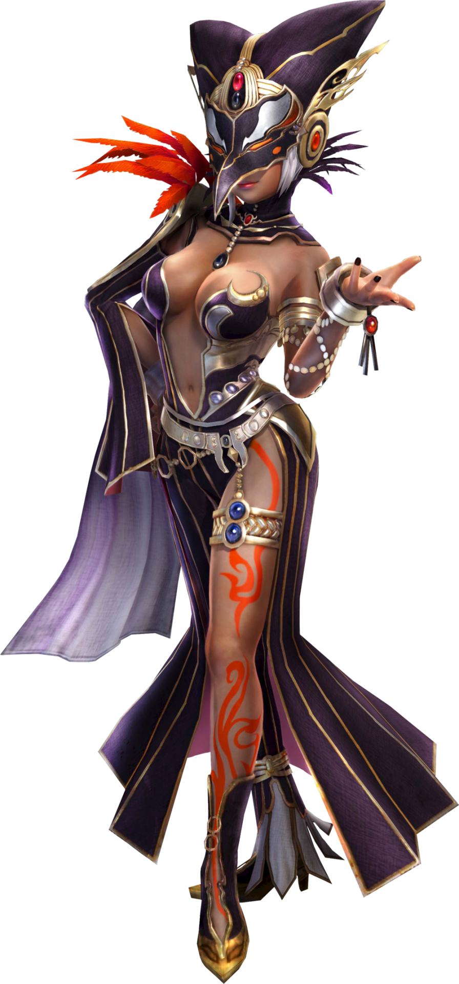
So I’m not constantly bitching about the designs, I will say that Cia’s design looks quite nice. The colour scheme works very well together, especially the bright pops of red. The bird-like mask and hat is also very recognisable and does a similar thing to her silhouette as Link’s. I also love how they brought the red down the leg to create more continuity between the top and bottom halves. I quite like the short white hair she has when she’s unmasked and how you can see her ties with Lana quite easily without it.
That being said, my biggest issue with Cia’s design again falls on practicality. I won’t drag Cia’s design too hard with the setting since many antagonist designs are meant to be over-the-top and somewhat fantastical, especially when they aren’t mortal. I mean just look at Ghirahim. I accept that while Lana is trying to fit in with Hyrulean society somewhat to establish herself as someone who is fighting against Cia and since Cia doesn’t to do that, her design is more out-of-the-box. Cia looks out of place next to Link, Zelda, and other pre-established characters, and I think it fits quite well since she’s meant to look out of place. I guess it’s the issue of making them look too out-of-place so they don’t look like they’re from the same franchise.
With Cia, she may be a sorceress, but she started a war ffs. She knows there’s people out to kill her and yet she’s dressed in an outfit that exposes the entirety of her torso, stomach, and limbs. One swing from a sword in the right spot, and it’s over for her. Now I’m absolutely not against characters having more ‘sexy’ designs, I love when characters wear revealing clothing, but only when within logical reason. Cia’s design might fit in a game where the entire country wasn’t after her and was just Link and/or Zelda.
And since both Lana and Cia have their own unique plot-relevant costumes, I might as well talk about them too.

Both of these depict them in their ‘Guardian of Time’ costumes, which shows what the Guardian of Time Cia looked before her split into both Cia and Lana. First, I love the different detail changes in each other’s costumes with the switching between purples and blues and the length of the dress changing, I think it’s quite cute. I do also like that the feather motif is continued from Cia’s design, which makes me wish that Lana had more of a feather or bird motif to her outfit. I think the dress looks quite nice and I love the detailing, but I personally don’t like the split off front panel. I just think it makes the legs look quite awkward.
Quick side note because it can’t be me, but I’m sure they made Cia paler for this outfit, which doesn’t happen for any other costume. If anything, her skin tone gets darker. It feels almost off due to the fact that these are the characters in costumes, not as the unsplit Guardian of Time. It’s very quick, but I thought I’d talk about that observation.
Because I’ve rambled on long enough, I present my ideas for redesigns of Lana and Cia:
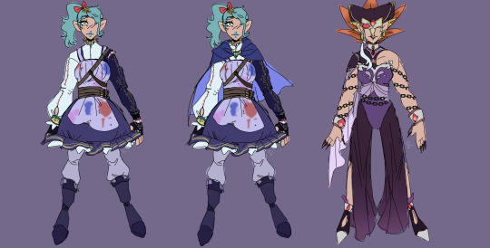
I’m personally still on the nose about the pants on Cia’s design, but I think it might fit. I’ve changed it so most of the practicality and setting issues are checked off, while also adding symbolism. I’ve always seen Lana and Cia whole thing as being admiration vs obsession, so some of Lana’s design elements take inspiration from previous Links, namely the sleeve from TP, and the boot cuffs most noticeably from OOT. This is while Cia’s design takes directly from designs of his companions as if she’s jealous of them (the sleeve being similar to Fi’s arm-sleeve-thing for example). In addition, Cia also has chains instead of her coin-fringe-like cuff, as if she’s bound to a deal or under the control of Ganondorf.
~~~~~~~~~~~~~~~~~~~~~~~~~~~~~~~~~~~~~~~~~~~~~~~~~~~~~
TL;DR
While I’ll give my overall thoughts in the final post, from these five characters, my general thoughts are:
Link: They did an amazing job at distinguishing him from the previous Links. The scarf adds a lovely touch of colour to a usually muted green colour palette. One of the best spins on a LoZ character in the game.
Zelda: It’s not very practical and the flowing lines don’t match up with the sharper parts of her design. The dress is good at distinguishing her from other Zeldas due to the front slit and armour despite this.
Impa: A mixed bag of a design. The concept art displays the design quite well, though the model’s pants seem too tight and saturated, to the point they look like denim jeans. It takes a lot of inspiration from Skyward Sword to the point it’s very noticeable, but the top half of Impa’s design makes her very interesting to look at.
Lana: One of my least favourite designs. Her clothing feels very out of place for a Zelda character in this setting, almost as if she were from a modern magical girl show. Her design is very impractical seeing as she’s fighting directly in a war.
Cia: Shares a few issues with Lana. Her design is very revealing, which though can be good for some characters, goes against her as she has an entire country fighting against her in a war. Despite this, the idea that she looks out of place and fantastical works somewhat well due to being an antagonist who isn’t trying to fit in or was raised in medieval society. The issue is that it feels a bit too out of place.
#legend of zelda#loz#zelda#hyrule warriors#hyrule warriors zelda#hyrule warriors link#hyrule warriors lana#hyrule warriors impa#hyrule warriors cia#loz hw#hyrule warriors redesign#character redesign#a bit of a long rant
24 notes
·
View notes
Text
I love Hyrule Warriors' Impa, Zelda and Link so much actually. Their vibes go "our relationship is strictly for business only" and you see them frolicking in a flower field to setting a fire in the princess' chambers.
They're just really neat. I love them.
#hyrule warriors#hyrule warriors link#hyrule warriors zelda#hyrule warriors impa#link#zelda#impa#literallink
10 notes
·
View notes
Text

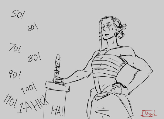

they are very competitive. they will cry about their arms hurting later.
2K notes
·
View notes
Text

I'm a lazy and irresponsible artist.
I started drawing this artwork a year ago and didn’t finish it.
Inspired by the game Hyrule Warriors Age of Calamity. Especially the characters Impa, Pura and Robbie. They are so adorable. I immediately wanted to draw them. And then job, lack of time… as usual. I'm effective enough only for quick sketches, and not for large works :(
#zelda#legend of zelda#tloz#tloz fanart#princess zelda#zelda and link#link zelda#aoc impa#aoc purah#aoc robbie#botw#hw aoc#hyrule warriors#zelink#loz#loz fanart#loz botw
1K notes
·
View notes
Text

the hyrule warriors design stays 🔛🔝
#i hc hw link as a himbo btw#but like in the best way possible#hw zelink is like the truest iteration of barbie and ken in the zelda universe#my art#tloz#loz#the legend of zelda#link#zelda#tloz fanart#hyrule warriors#the legend of zelda: hyrule warriors#tloz hw#zelink#link fanart#zelda fanart#impa#tloz impa
2K notes
·
View notes
Text
Some wips that are probably going to take me a while to finish
#why did I make them both so complicated???#loz#legend of zelda#hyrule warriors#hw link#hw zelda#hw impa#totk#tears of the kingdom#totk link#my art
1K notes
·
View notes
Text

This is a scene from chapter 6 of my fic (it's all fun and games until someone catches the plague)
I don't know if much context is needed. It's basically just Warriors worrying over Wind's future. I tried to fit as many characters as possible into his picto, but HW sure has a lot of them silly guys
doing comics is HARD. did I really do one of my own fic……. uggghhh
Close up of the picto:
#linked universe#hyrule warriors#lu warriors#lu wind#do i really tag ALL of these characters#hw link#lu mask#hw impa#hw lana#darunia#hw sheik#loz midna#loz ravio#loz fi#loz tetra#loz tingle#linked universe fanart#my art
409 notes
·
View notes
Text
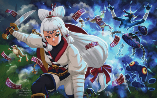
While replaying Age of Calamity I realized I never posted this artwork here
It was one of the first illustrations with many characters that I made the year the game came out
I'll also leave you the characters too ☺️


Hope you like them! 💖
#ageofcalamity#age of calamity#botw#botw art#breathofthewild#link aoc#aoc impa#loz aoc#hyrule warriors#zelda#tloz fandom#fanart#hw aoc#revali#daruk#urbosa#impa#terrako
271 notes
·
View notes
Text

I came up with this idea for an AU and it's been occupying my mind for way too long lol My brain kind of already created a main trio for it too-
Anyway, here's all the main characters ig

The designs are definetly still a work in progress. Also I completely forgot about Lana-
#idk how to explain what it's#yk actually about#well#ig it's hw#but the timetraveling is replaced by#... worldtraveling?#something like that#instead of oot tp and ss#it's lorule the twilight realm and koholint#does that make sense?#hyrule warriors#alternate universe#the legend of zelda#link#zelda#impa#midna#ravio#marin#linkle#they all look like they're holding hands🥺#it's kind of a height chart btw#a bit inaccurate#but it goes from tallest to shortest#they're also reincarnations#eg midna is not the one from tp#same goes for ravio and marin#art#fanart
2K notes
·
View notes
Text
BotW/AoC characters as strawberries
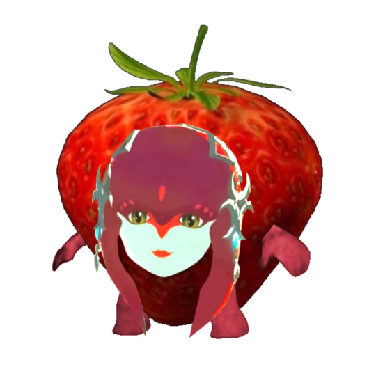
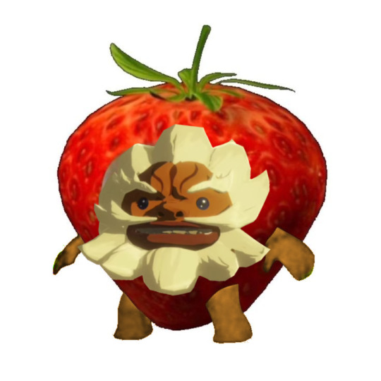
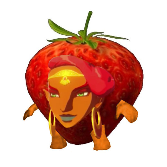
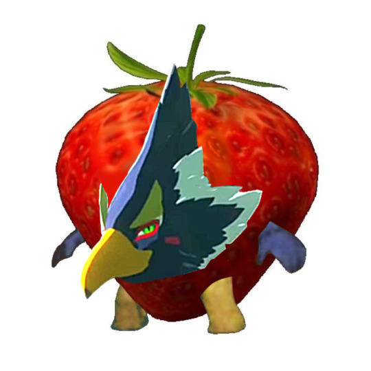
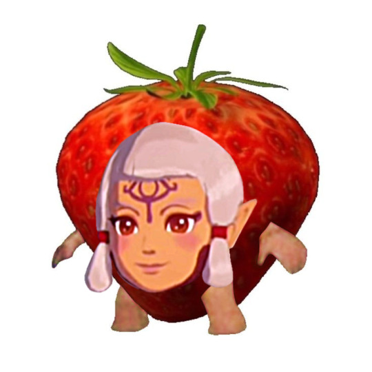
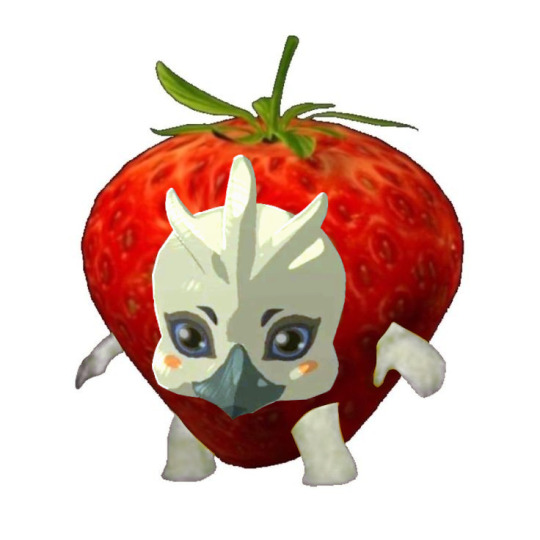
(Also, Age of Calamity is very underrated, it needs more attention)
#zelda#the legend of zelda#tloz#loz#breath of the wild#botw#tloz botw#age of calamity#tloz aoc#hyrule warriors aoc#Botw champions#champions#Mipha#Daruk#Urbosa#Revali#Impa#Tulin#mine
357 notes
·
View notes
Text
This post is a little gory, reader discretion is advised.
Sky: Would you help me hide a body?
Hyrule: No I am not helping you! I want nothing to do with this!
Hyrule: [curious] ...But why? Is hiding bodies a fad in society now? Dang I'm really out of touch.
Sky: In what Hyrule is that a fad?!
Wild: [coughs]
—
Time: [sighing] I'm always cleaning up after you boys.
Sky: Wait Old man it was just—
Time: [pulling a trash bag from his adventure pouch] Where is it?
—
Wild: Hide...a body? O-Okay sure, I'll help you...
Wild: [muttering] Oh but not all of it I'm sure I could find uses for at least a few of the body parts...
—
Wind: [thumb up] Yeah of course! We'll just toss it into the ocean.
Sky: Ok but what if the Hyrule was landlocked...?
Wind: What if what? I'm a pirate.
Sky: Is that really how it works?!
—
Warriors: [polishing his sword] Huh? Dispose of a body? I can do that.
Sky: You...can?
Warriors: [glancing at his reflection] Eliminating traitors is a bit sporadic with its state funding so, I've had to get my hands dirty.
Sky: ...oh buddy.
—
Legend: Whose body is it? Under what circumstance? Who did the killing?
Legend: Sorry, I need to know if I should do it with enthusiasm or not.
Sky: [voice crack] Ledge...
Legend: Well I'm sorry, you keep telling me to find joys in life. I am trying!
—
Twilight: A-A body?! W-Why would you want me to...?!
Twilight: Wait, this one of Wild's pranks? Is he in that bush with his Sheikah Slate?
—
Four: [deadpan] Here's a list of ten efficient ways to dispose of a body.
Four: [very deadpan] It was my best self study project when I was a kid.
Four: [we all know this is Vio talking] The example body wasn't human, but that can't be too different.
Sky: [disturbed] ...No you can have it back. That question was just...
Warriors: [dutiful in improving his craft] Great can I have it?
—
Sky: Ok this is the last hypothetical! Between Wind's magic box thought experiment, Four's out of context question and this?! We're clearly really bad at these.
Twilight: Not sure what kind of responses you were expecting with that one to be honest.
Sky: ...You're right this one's on me.
~~~
Thanks for reading! Based off this
Sky got the fun hypothetical question from a friendly bar patron.
Wild coughed in that first one because with the restoration of his Hyrule ground in Hyrule field is being built on and, well, they are unearthing a lot of 100 year old skeletons. Not exactly hiding bodies, but...
Masterlist
#the rest of the colours are screaming for four to stop talking#Warriors' Hyrule doesn't have a shadowy organisation to do that#only he Impa and a select few can be trusted#linked universe#lu#linkeduniverse#lu wild#lu twilight#lu four#lu time#lu warriors#lu wind#lu hyrule#lu sky#lu legend#lu headcanons#lu incorrect quotes#linked universe headcanon#linked universe headcanons#linked universe incorrect quotes#lu memes#lu meme#lu angst#lu fic ideas#lu fic idea
164 notes
·
View notes
Photo
💥
#legend of zelda#hyrule warriors#hyrule warriors age of calamity#age of calamity#impa#breath of the wild#fan art#2023#fully-rendered#illustration
1K notes
·
View notes
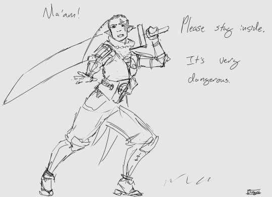
Photo
impa rkgk :))
1K notes
·
View notes
Text


the old lady is going to lose her shit when the teeny demises show up
1K notes
·
View notes
Last Seen Blogs
superqueenythings
Super Queeny Things
untilspringdays
I'm the One

sorbetowl
Here there be no thoughts
diyeoracha
destiny

healingheartdogs
DIY Dog