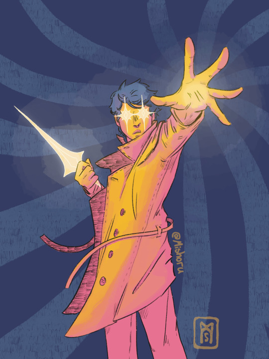
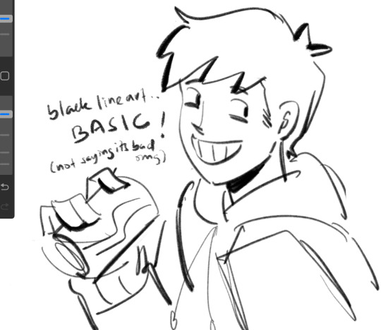
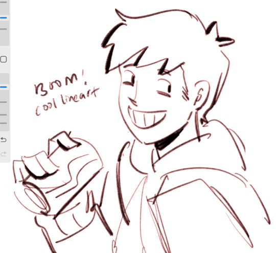
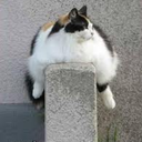
#gradient mapping fun on procreate
Text


25.12.2022
Shifty
#artists on tumblr#daily tiger#digital media#illustration#procreate app#tiger#tiger art#iPad art#semi abstract#gradient mapping fun on procreate#god I wish for the grace to accept when my post fails to upload for the fifth time#the strength to try and upload my post for a fifth time#and the wisdom to try switching my wifi on and off instead of throwing my phone out the window when uploading my post for the 6th time
43 notes
·
View notes
Text


#gradient map fun :D#illustration#art#supernatural#procreate#spn#supernatural family#supernatural art#supernatural fanart#fanart#castiel
788 notes
·
View notes
Note
Sixteenth Day Event Prompt:
George sees Dream through a thick fog
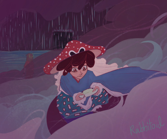
The whole world used to be theirs, now only a shed of memories remains.
(The scene that Popped into my head from the prompt is like. One of those dramatic confrontations. Accusations, tears, yelling, a heartbreaking last word from Dream. George left standing there, Dream’s old broken mask in hand. The two of them know this won’t ever leave the fog)
My lil thing for the @sixteenth-day-event 💕 just a tinyyyyyy bit late
#sixteenthdayevent#georgenotfound fanart#mushroom george#dream smp#dreamnotfound#YEAH I GOT DNF FOR PROMPT ITS AWESOME#I should not had procrastinated and be faced with Moving Day lmao#this has major 2021 rabbit vibes lmao#major shout out to procreate gradient map you carry this thank you for existing#also to elmhat for putting everything together this is fun!!#my art
62 notes
·
View notes
Text

Yukihiro Takahashi’s “What? Me Worry?” but with the RDJ meme pose 😅
28 notes
·
View notes
Text
Omfgg..tina kitten 🤯 ?

#foun d out abt gradient maps on procreate MIND BLOWNN...this is awesome now❣️#Tbh our more realistic art always flops hard but i love this oneeeSo fawking fun srs^__^#art tag#tinakitten#tinakitten fanart
48 notes
·
View notes
Text


Gradient map and slutty demon man my beloveds
#the gradient map tool is absurdly fun to dick around with#Vito Romano#currently the only idea I have for this dude name wise#she is still without a name however#art#original art#digital art#original character#procreate#demon oc#demon character#queer artist
12 notes
·
View notes
Text
there's a demon in my heart, and i named her linda ✨️
#what is this??? a background???? so wild so wacky#anyways im a big fan of jetty bones and im having a good time just drawing my favorite musicians so here we are#i learned abt gradient maps recently and i think they are sooooo sexy how come ive been using procreate for over 2 yrs and no one told me#i had so much fun w this one like it started as a pose study of this one photo and then i just kinda went for it i love how it turned out#also yall listened to push back??? yall heard that album?? its been out since feb 2021 and im still processing it#jetty bones#art#kelc galluzzo
10 notes
·
View notes
Photo


WIPs of some of my drawings where i made a full little painting for the sketch to nail colours or values first. i thought it would be fun to do a Behind The Scenes and also show u how some drawings changed, what i kept and what i discarded and at what point i just started adding unplanned details
all these were done using a mixture of sai and procreate
more comments on The Process under the cut
eye of the otherworld is inspired by a real photo i took two weeks ago!

i soooo wanted to draw water that looked like this, weeds and all, so the original colours of that sketch were picked direct from the photo. but i wasn’t satisfied with it so i changed it using a gradient map (you can see it’s crunchy on the borders between colours). for the final, i re-painted everything again using the sketch colours as a guide so that i would not end up with the crunchy edges a gradient map will give u, and so that i could add in extra contrast over the top. the black swirl pattern in the final was an ad lib lol but i’m really happy with how it gives the impression of water or liquid even if it’s not realistic... i will try again to recreate something like this photo tho because i am obsessed. the birds were originally swans but the necks were driving me crazy i needed a bird with a shorter neck and grebes are associated with this location in canon so it was perfect. they have very funny feet. the last detail i added to this was the white flashes in their primary flight feathers (which do not occur in nature btw)
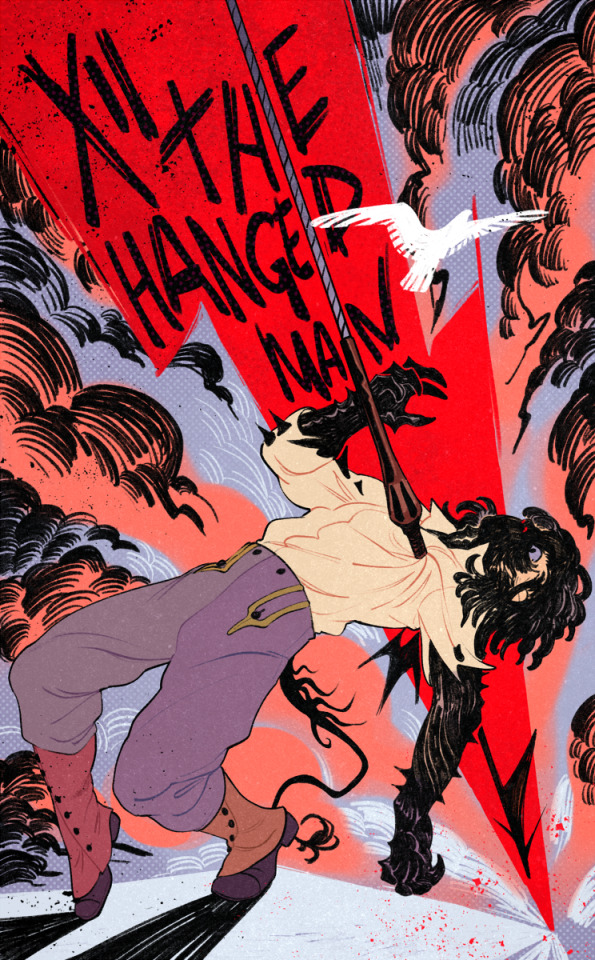
hanged man was an interesting one because it’s based on a sketch i made in 2020 when i first wrote this fun impalement scene
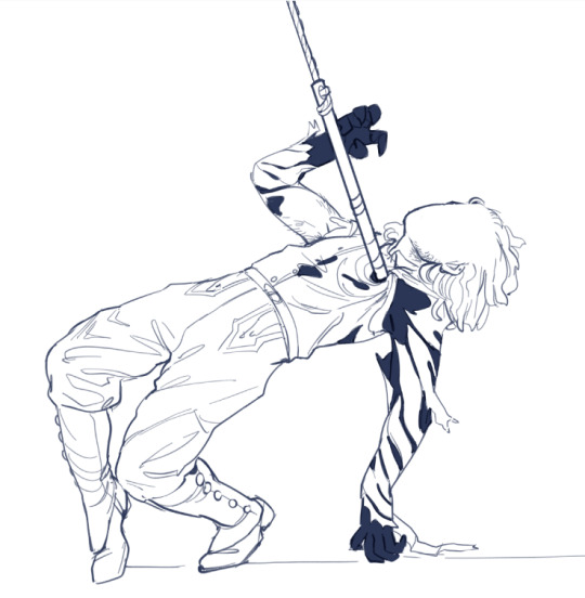
here is félix being impaled for the first time in 2020 by a rusted harpoon that essentially rips his human disguise off to reveal the black carapace underneath
for the coloured sketch in the photoset i re-lined this exact sketch in sai to update it to match my current lineart style, but as you can see i realised the pose itself needed work and not just a re-line so i completely redid it in procreate to exaggerate the pose and gestures. i went into this one already knowing exactly what bg colours i wanted so that was no issue but the hardest part was weirdly figuring out what he was going to be standing on. in canon he is standing on top of a very high wall and leaning back over a fatal drop. the black pencil lines in the clouds and the bird were ad libbed but i liked the idea of throwing the bird in as some extra symbol of freedom the likes of which you will not experience if you have been shot with a harpoon. the green was not working at all so the swap out to more purpley pink tones was last minute. i unified the different colours by using a colour-shifting brush (you’ll see that his gaiters are different colours - i didn’t hand pick those, the colour jitter did)
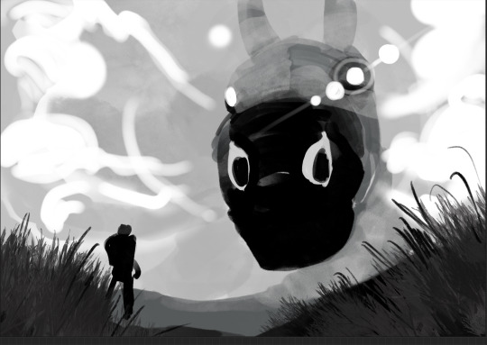
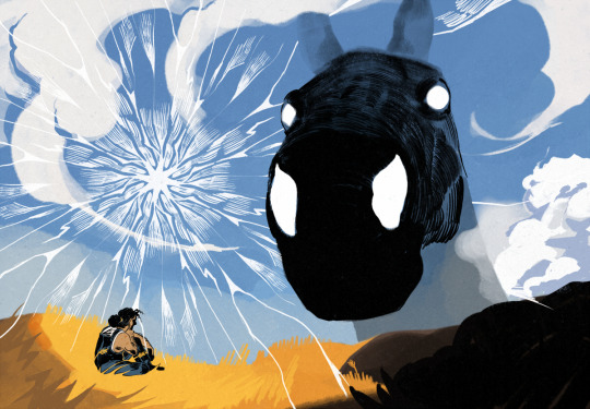
for Big Pascal... originally it was going to be a confrontation between the guy on the ground and pascal but i wasn’t feeling the standing pose and it ended up being... if not restful then at least maybe a little more benevolent than the shadow of colossus shit it was before. the white cracks in the sky were originally going to be black but it just didn’t work. a lot of people tag this one as some form of cowboy aesthetic which is funny to me. there’s no cowboys here
i do like the lens flare effect in the b&w thumbnail tbh and i think i kind of lost the low camera angle effect in the final
i drew a bonus comic of the two characters interacting during this scene (mostly the lil guy just trying to ignore what’s happening in the sky)
4K notes
·
View notes
Text


Playing with the gradient maps on procreate is way too much fun...
#flight rising#fr art#frfanart#coatl#jem draws#making examples for a new commission type#also i just really wanted to draw wings#Lav deserved some love too
1K notes
·
View notes
Text

Some salecrow sketches but I tried using the gradient mapping on procreate after some black n white shading, its really fun!! :D
#digital art#art#dc universe#gotham rogues#dc cómics#dc scarecrow#the scarecrow#scarecrow#salecrow#dc salecrow#dc fanart#is his hair to short w/o mask?#idk
45 notes
·
View notes
Photo


Marble / Oil Slick Texture Tutorial
Notes: I made this in Procreate but it should be easily replicated in other software like CSP and PS (in fact both of those have more layer style options, and PS has a Fill slider that should be fun to play with for this tutorial)
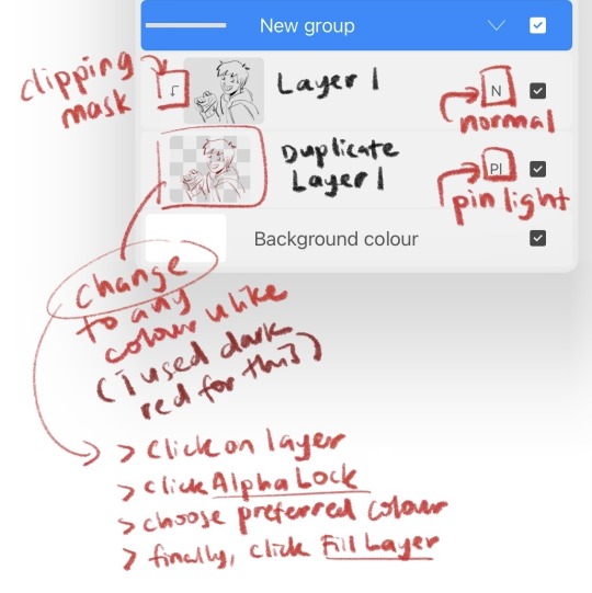
This tutorial was made with beginners in mind, hence all the visuals, but you will need a basic understanding of clipping masks to effectively replicate these results.
You can also download this as a .pdf from my ko-fi store for free, it’s linked in my bio! Hope this is helpful, text is typed out below the cut!
Step 0: Basic coloring under linework using the clipping mask function
Step 1: On a separate layer create grayscale bands of varying width
Step 2: Liquify. Create a marble effect using Twirl Left and Twirl Right. Adjust the size of the brush as needed. On Twirl Right, set Distortion to 0. On Twirl Left, change the Distortion number as needed
Step 3: Change the Marble layer to Darken, and the layer opacity to ~40% Note: I erased the marble layer from areas with different textures and shadow
Step 4: Duplicate the Marble layer and set it to Difference at ~30% layer opacity
Step 5: Apply a gradient map with bright colors at 100% to the Marble layer set to Darken
Note: You can get very cool color effects playing with the hues and values of this layer
Step 6: Duplicate your Base Values layer, apply a holographic gradient map to the layer, move it above the Marble layers, and set it to Divide at 25% layer opacity.
Note: I erased the horns on the Divide layer as I wanted this material to feel separate from the other metal face pieces
Step 7: Here I applied more of my favorite gradient maps to the whole image, added highlight details and a noise filter (noise > billows @ 4%)
#procreate#procreate art#art tutorial#digital art tutorial#destiny 2 art#gonna shove it in that tag for any exo lovers who want to do cool stuff with their exo's face paint <3#forgot to post this here i've had it up on my twitter for ages now a;sldfkj#doodles.
241 notes
·
View notes
Text

23.05.2022
more design ideas for the teal tiger
#The turquoise tiger#daily tiger#gradient mapping fun on Procreate#this colour palette is particularly nice :))#Digital media#iPad art#Procreate#running tiger#water#artists on tumblr#illustrators on tumblr#Drawn on public transport#I feel teal tiger sounds better but turquoise is more accurate
83 notes
·
View notes
Note
hi, your art style is so cool!! i love it
as a beginner artist, i was wondering if you had any helpful tips for procreate or anything? the art world is kinda daunting lol😅
thank u so much!! ive been feeling down ab my art so seeing this in my inbox was like a sweet treat LMAOO 🎀
so back to the q…. im afraid i dont have any mind blowing tips. its normal to feel overwhelmed as a beginner, but everyone starts somewhere! i say familiarize urself with basic procreate shortcuts (loads of tutorials online) and always play around with their settings! it should be helpful for the learning process along the way.
for eg ermm i used to abuse the gradient maps settings to pretend i know shit ab colouring 😭💀 i still do tbh, except now i understand how it actually works and i can easily get the colours that i want.
some of the things i learned:
1. cool lineart (i always use this as a part of my render process)
2. art is subjective, pick any that you think suits your preference/is fun to use
for brush, do you prefer it round or textured? lots of pressure sensitivity or none? i like my brushes textured and with a good amount of pressure sensitivity. for blending, do you prefer the transition colour to appear smooth or textured/messy? i sometimes mix between both to give a sense of harmony, but i like it textured more. it all comes down to what feels right to you. pick a few artyles that you like and incorporate it into ur own! pretty basic tip but thats the best way that i know. just pretend ur a mad scientist trying to find cure for like cancer or sumn
3. personal opinion: brush type matters
dont listen when someone says the type of brush u use doesnt matter. yes you can draw with any brush. yes all brushes work the same way 🤯🤯🤯. but theres gotta be that ONE brush that just hits the spot for you, as if its made specially for Your Hands….. unfortunately theres no shortcut to finding Your Brush. it took me 4 years of endless experimenting to find mine.
if ur curious on what brushes i use, i have it listed in my carrd. however i still experiment a lot and dont rly bother to update it, but those should be what i use the most/my top favs !
★ ★ ★ ★ ★ ★
i dont think this covers everything, but this is all i could think of from the top of my head. just lots of trials and errors really, and dont be afraid to make a mess!!! i hope this answers ur question :33 all the best!
8 notes
·
View notes
Note
Howdy! I’ve been following you for 2 or 3 years (started on Instagram then moved here) and your art is always so crisp and clean. Have any secrets to share on how to post pieces at such high quality? I use procreate too but you’ve seemed to mastered it.
THATS SO LONG OMG HIIII ty ty for all the support 😭🙏💕💕 you must be one of the OGs!
and oh boy what a compliment haha, I’ve definitely learned a thing of two over the years but I swear I am still learning new tricks everyday 😵💫😵💫😵💫
happy to help 😤💪✨first and foremost, I think the most important part of getting your art to look less pixelated boils down to what canvas size you’re using! I do my best to finish my canvases off at 1400x1400 at the very minimum! The larger it is, the more smooth the piece looks—but as of course the larger it is, the less layers you’re able to add :/ I do wish procreate allowed for a greater range but oh well, do your best to keep those layers organized so you can mash em down later✨
I almost always start off each piece using the built-in Screen Size canvas option when starting a new piece (I don’t even toggle with the DPI, which if I remember correctly, is just set to 150 for that canvas) and then I adjust the sizing as needed
here’s a few finishing touches I like to give my pieces to make them look more crisp!

Another thing to note! Take advantage of the noise brush and the noise effect Procreate has! (Noise effect is found under the Magic Wand tool and I believe that the brush lives originally in the pre-set Materials brush pack) Just a bit of noise added to your background can often help the characters stand out from it as well 👍✨
Also! I’ve recently started shading things like the soft curves of muscle or rounded parts of metal using the noise brush to erase to make things look more blended/add some variation to my cel shading
There’s still tons of things I want to try out on procreate as well! I think that for as cheap of an app as it is, there’s a lot of potential to be unlocked and it’s just a matter of finding the right people to show you some tricks
I’ll link a few tiktoks as well that could help out or just add some fun tricks to the art process oml they’re sm better at explaining/showing than I ever could!!
Double Compliments coloring
Art Window Effect
Procreate Gradient Maps in Action
Procreate Perspective Grids
#I’m still working on collecting tons of tutorials from tiktok and one day I wanna make a big ol link post#SPREAD THE KNOWLEDGE 😤💪✨✨#I hope some of this helps!! haha noise effects/brush are my best friends I swear#asks#tutorial#helpful
142 notes
·
View notes
Text
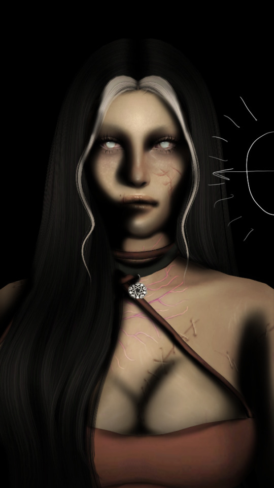
shading and lighting tutorial!
this was requested by an anon. a little before we start! i use procreate on my ipad pro with an apple pencil. unfortunately procreate is the only program i know but i imagine similar features exist in other programs as well. i feel like i need to say that i am in no way an expert on shading and i know it's not always accurate. also if you end up using this tutorial in some of your edits please feel free to tag me, i would love to see it! if i've missed something or if i explained something badly don't be afraid to ask me about it. okay long post ahead!
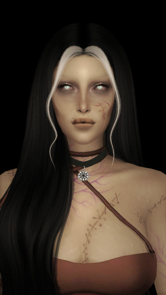
so i'm going to just make a little simple edit of my girl. this is a screenshot taken from cas that has the sunscreen filter on it from the built in windows photo editor on 20% intensity.
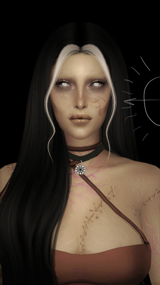
now i've added my normal little touch ups that i usually do, eyelashes, catch lights and highlights as well as touching up her scars. everything is painted with the soft airbrush except for some highlights that are painted with the 2B compressed charcoal brush. before adding highlights however you should figure out where you want the light to come from. i've drawn a little ugly sun for you to see where i've placed my light.
now i use the soft airbrush and paint with black where the shadows would be. if i would have fixed up the hair (which i didn't for this one because it's my least favorite part and i didn't have the energy) i would have made sure to make the shadow layer behind the hair ones since i think it looks better if the hair isn't shaded the way the face is. then i blend all of the black out with the smudge tool with the soft airbrush so it looks a little softer.
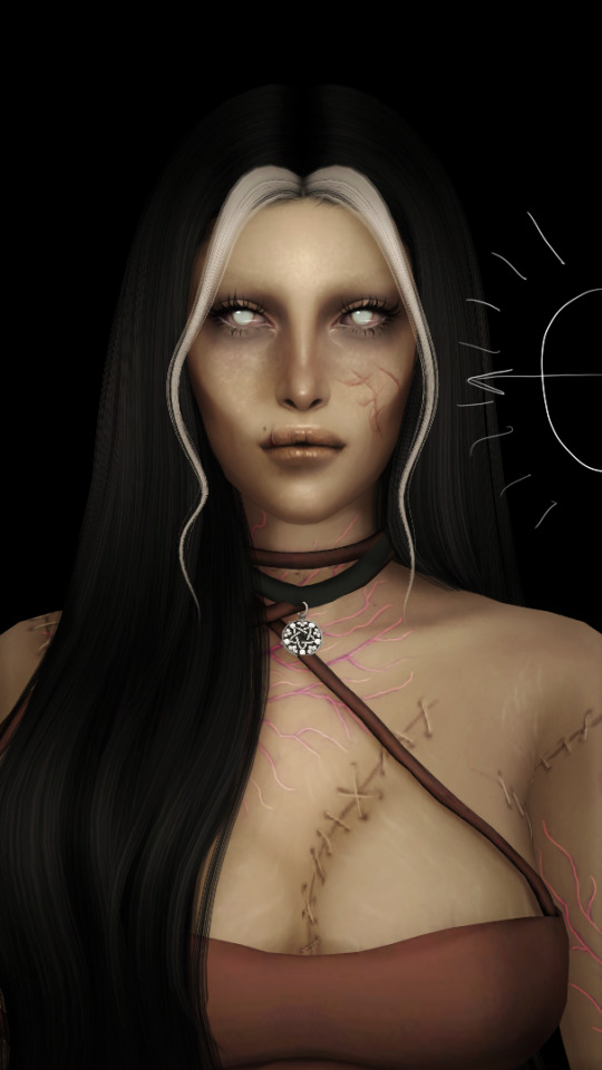
then change the layer to soft light and change the opacity to 60% and voilà! you have soft shadows! if some shadows still look to harsh for your liking just go back in with the smudge tool a little more.


now do a layer on top of everything and kind of circle the part you want lit up the most with black again, smudge it and set the layer to soft light at 60% opacity.


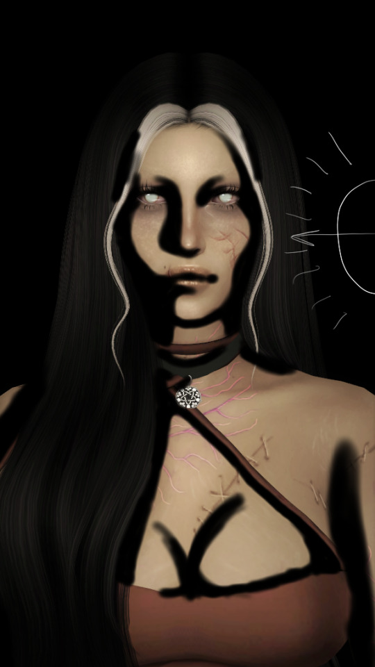
this step is not a must, i don't do it very often anymore but if you want some extra color or light you can do this. choose a color you want your light source to be. i tend to feel like intense colors look the best. paint it where you want the light to come from, then use the gaussian blur tool until your satisfied.
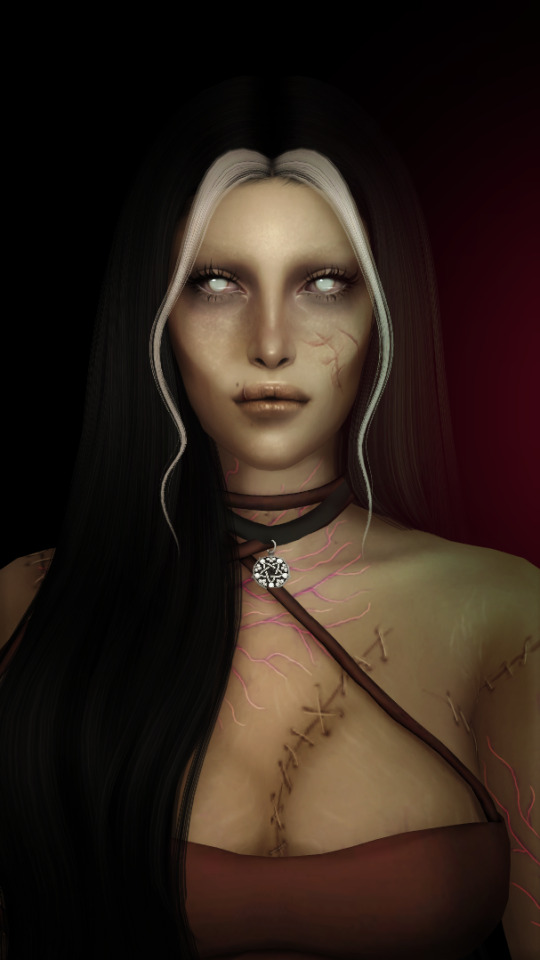
now you can leave it in the normal layer setting or play around a bit with different ones until you find something that you feel fits. for this one i decided on using the difference layer setting on 70% opacity.


a step i always almost forget is shading the eyes! to do that you just repeat the normal shadow process. paint it black, smudge and put the layer to soft light on 60% opacity. it adds so much, i highly recommend this step! now you're done with the first part. now save it as an image and start a new canvas with that image.


if you want to use gaussian, motion or perspective blur now would be the time. i didn't for this one but i almost always do. this next step is also totally optional. we are going to use chromatic aberration in the displace setting on 90% opacity and slightly pull it to the side. then use the normal chromatic aberration between 5-10%. it just adds a lot of fun and weird color that i just love and makes the edit look so much more alive. then use sharpen, i usually do 10-15%. and after that use bloom. my edits are almost always dark so i use a lot of it. i think i did 35% for this one to give it a little glow. then use noise. my go to is 3% on max octaves. then go into hue, saturation, brightness and change the saturation to 55% (you can do however much you want but these are my go to's) and brightness to 49%.

now go into curves and play around. i always make the gamma brighter but the colors i play around with so much.

completely optional again but i've recently started to add a gradient map, especially instant or noir. for this one i used noir on 20%. and that's it, we are done!
before/after.
hopefully this is understandable and helpful. have fun!!
128 notes
·
View notes
Text

Yes, I’m a wolfmon shill
I’m sorry you had to find out like this
Anyway procreate is way too fun I just messed around with gradient maps and the add feature and light pen for five minutes
#danganronpa project eden's garden#danganronpa#damon maitsu#project eden's garden#drpeg#fangan#fanganronpa#project: eden's garden#wolfmon#akiretsu#wolfgang akire#Wolfgang x Damon#this is what we like to see#this is what we deserve
57 notes
·
View notes
Last Seen Blogs
quek-a-sketch
Only then can you slay pussy like you slay gods
vachick
Talk Anything
yosoyfans
"Soy fans, así en plural"

footballandshit
footie trash one stop centre

samstavros
Untitled