#fauxstalgia
Text
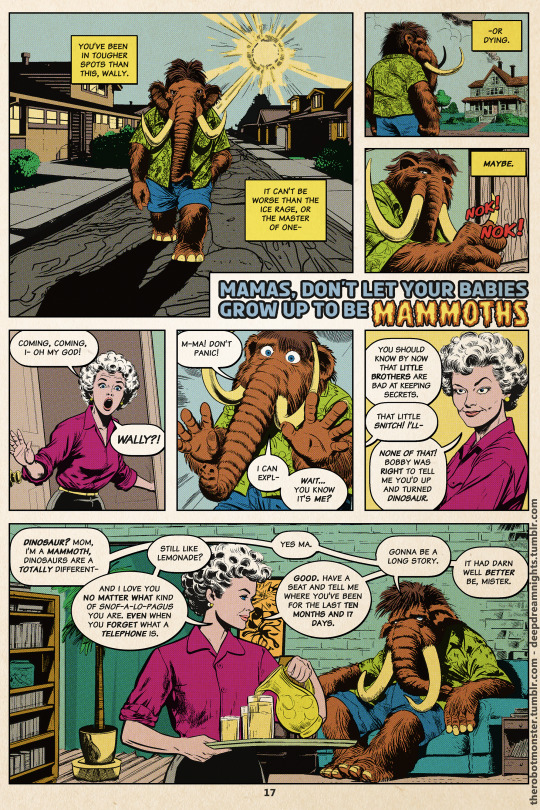
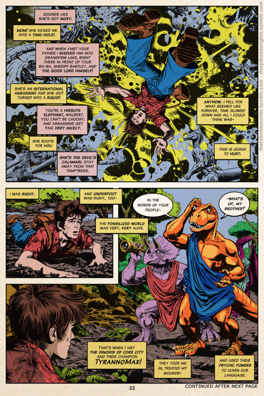
The Secret Origin of Wally ManMoth
Scans from TyrannoMax #26
Cocytus was one of the better-performing comic companies outside the big 2 in the 1970s before the whole company was bought out by Buzby-Spurlock Animation in the early 80s.
TyrannoMax was its biggest title, so almost everyone in the character stable teamed up with the Dinoids eventually.
Process under the fold.
TyrannMax is created via use of Dall-E 3 and Midjourney as pencilers, and me doing essentially everything else (writing, editing, inking, lettering, layout, etc.) DE is on most of the character art, MJ on backgrounds and select characters.
Each panel utilizes anywhere from one gen/prompt (for a handful of very simple head-shots) to around 20 for stuff like the DinoHydra action shot or the hero/villain showcase panels.
Once I know what I want for a page I lay out the rough dialog and panels, then start generating pics. Basic prompt format and a few examples:
, , , , comic panel by 1968, in the style of 1968
A portly 50 year old man, resembles Alan Hale Jr, jolly smile, wearing a tweed jacket, slacks, sandals, a fedora, sweatervest and a loosened ascot, full body character design, comic panel by Jack Kirby and Alex Toth 1968, in the style of 1968 Marvel comics
a mad scientist mid-transformation into a green anthro-tyrannosaurus, asymmetrical transformation, boils and growths, screaming/roaring, bald, portly, with round glasses. wearing a tattered lab coat, vest, slacks, tie. Comic panel by jack kirby and alex toth, 1968, in the style of vintage horror comics
Then I take the pics into PS, arrange and composite them, and then remove all the color. I don't tend to prompt for my final colors on characters and instead choose light tones I can easily extract. Why not just do B&W prompts? Style impact.
Then I start to re-ink over errors and details that don't match the mood I want, match line thicknesses over various elements, etc. Through this process I adjust dialog placement and panel arrangements, and do generally the things and editor and letterer would be up to.
Once I have the inks, flat colors, and the text on various layers, I do the weathering and compositing to simulate scans of a 1970s comic book. This is also where the deliberate flaws in coloring and print alignment are added for authenticity.
#tyrannomax#wally manmoth#unreality#cocytus comics#AI assisted artwork#AI edits#Midjourney V5#Dall-E 3#bing image generator#generative art#graphic design#comic books#vintage comics#farrah fyendlyne#tilly tepesh#dr. underfang#fauxstalgia
214 notes
·
View notes
Text
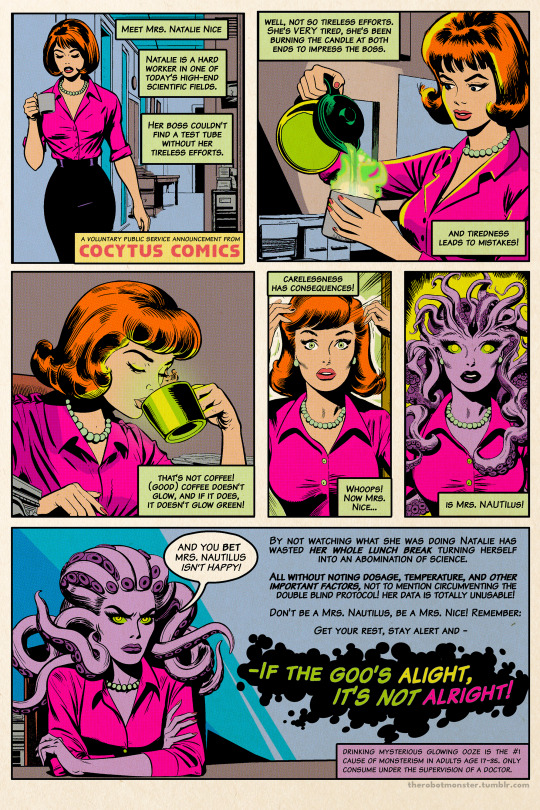
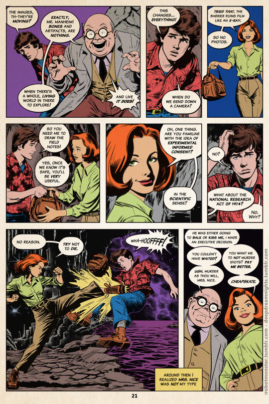
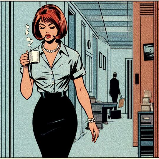
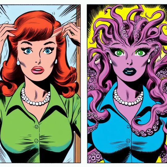
The Secret Origin of Mrs. Nautilus / "If The Goo's Alight, It's Not Alright!"
Originally printed in TyrannoMax #25, October 1977.
Updated from this, details under the fold.
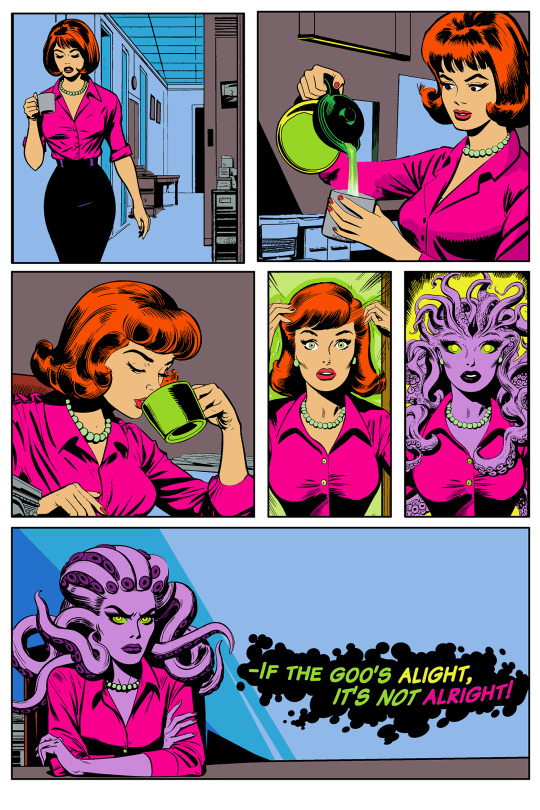


I already have mostly-unmodded versions of the images on the first version, but even those involved minor color fixes and cleanup of major flaws.
For a full comic page, though, I wanted passable consistency. The original colors had to be removed and converted into "inks", those inks then modified to keep clothing, hair length, and other features relatively consistent, areas outside the frame have to be drawn in, the image recolored, and then given aging and halftoning.
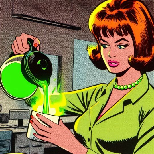
Each pic used a different prompt around the basic format of:
Secretary with a bob-haircut, redhead, green blouse and pearls,(action),(emotion descriptors), comic panel by Jack Kirby and Alex Toth, 1968, in the style of 60s Marvel
a secretary with lavender skin, tentacles for hair, (action),(emotion descriptors) comic panel by jack kirby and alex toth, 1968, in the style of 60s marvel
#Tyrannomax#Mrs. Nice#Mrs. Nautilus#comic page#unreality#generative art#ai assisted art#ai paintover#dall-e 3#bing image generator#comics#fauxstalgia#1970s#transformation#nautilus
191 notes
·
View notes
Text
makes up a word for an experience :D
the word already exists D:
it's used to describe the same experience I was thinking of :D
#anyway I like fauxstalgia#nostalgia for smthn you've never experienced#that's kinda my whole life tbh not to traumadump but I don't really have many things I feel actual nostalgia for#shoddy childhood n all that. so when I get into nostalgia stuff it's less reminiscing more...#actually experiencing these things for the first time. & loving them a whole lot
0 notes
Text
it's funny to witness how my brain interacts to the feeling of nostalgia. in my mind, i've already made a deal with aliens to abduct the mankind when i was 7. nostalgia? more like fauxstalgia.
4 notes
·
View notes
Text
Is there a word for a nostalgia that was never really there? I don’t mean something cutesy like no-stalgia or fauxstalgia. I’m talking about romanticizing about things in your past that never happened but you keep daydreaming it because it’s what your peers or others experienced
5 notes
·
View notes
Text

"Fauxstalgia"
1 note
·
View note
Text
something about beyond belief: fact or fiction always gives me the biggest fauxstalgia, I don't know why. I've never watched a single episode outside of the question/props compilations, but the set & lighting is very comforting to me, like I Should have been watching this in the late/evening night growing up
#I think it's hitting the part of my brain that recognises mystery hunters#same sort of era and intensity. similar atmospheric dim lighting
1 note
·
View note
Text
watching the 90s moomin anime is So weird bc it gives me the biggest fauxstalgia, you know?
I didn’t grow up on it, but it’s so something I would’ve loved if I’d ever caught it, and the animation style, voice-acting, and soundtrack are so like other things I Did watch as a kid, that it feels like a missing part of my childhood.
#misc#like I hadn't heard snufkin's theme until 2 weeks ago#but the sparkly 90s synth and flute is used in so many other cartoons at the time that it feels familiar hjkh
4 notes
·
View notes
Video
youtube
It’s hard to believe it’s been less than half a year since we’ve been on the receiving end of some moving new music from Matt Woods. It’s felt much longer than that. Maybe we’ve gotten used to having Matt Woods in our lives, which must have something to do with how incredibly smooth his falsettos are, and how immensely affecting his electro-soul always is. Prepare to melt into the floor as the UK artist serenades us with that impeccable voice on his new single and in his first official video, Rearview. “The track is built around this idea that as you put more and more distance between you and somebody else they appear smaller and smaller, but no matter how far you drive away from them, they never fully disappear” explains Woods as he documents a saga of chance meetings across the globe with a love interest that led to a whirlwind relationship, doomed from the beginning by the distance they would put between each other while traveling. That anguish is more than palpable on his creamy molten lament, a sleekly rippling song that draws back from the heady electronic production of Woods’ prior “future soul” offerings. Rearview is lifted from Matt Woods’ forthcoming EP, tentatively titled Fauxstalgia. It’s mauve video is inspired by hours spent playing video games at the arcades when Matt was growing up in Newquay, when his dad owned most of the arcades in Cornwall. Catch Matt Woods on tour in Europe this March, tickets can be found, here. Prepare for a stunning treat. Matt Woods is phenomenal live.
#Matt Woods#Rearview#music video#R&B soul#RNB soul#electro soul#electronic soul#electronic R&B#electro R&B#electronic RNB#music#song#soul#R&B#singer songwriter
2 notes
·
View notes
Text
Moonshine’s XXX Labels Denote Precision, Not Poison
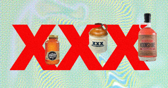
Moonshine holds a special place in Americans’ hearts. Tales of pot stills hidden deep in Appalachian forests, Mob-driven rum-runners racing through the night, and occasional blindness (and even death) ignite an odd combination of fauxstalgia, patriotism, and fear.
Misconceptions around moonshine, a once-illicit liquor that’s still made legally and illegally today, proliferate on the internet. Part of the misconception around the liquid’s health risks revolves around the famous “XXX” label, and why it’s even there in the first place. Its explanation is simple enough — and has nothing to do with signifying it may be poison, as cartoons might have you believe — but whether anyone can prove its definition is up for debate.
“The XXX symbol was historically used by ‘shiners to signify that their hooch had been run through the still three times, signaling to buyers that it was pure and strong alcohol,” Brendan McAlpine, owner of Dutch’s Spirits, writes VinePair in an email.
“Lacking sophisticated distilling equipment, the result of a first distillation was lower in alcohol and not terribly good tasting. The second and third runs were used to purify the spirit, increasing its purity and strength,” he says.
McAlpine and many others have made this assertion. Spirits websites and blogs, including Liquor.com, Moonshine Heritage, The Goods, and Spoon University, have also attributed the XXX to triple-distilled.
But Laura Fields, event organizer at Delaware Valley Fields Foundation, who has written on the topic for the blog Dram Devotee, believes it’s impossible to know for sure where the XXX originally stems from. “It is likely a bit more legend than fact,” she says.
“There were no jars or bottles to use for whiskey until after the 1860s, so whiskey was dispensed from barrels at the bars/pubs into stoneware jugs,” Fields writes VinePair in an email. “Marks on jugs could have been etched into the clay when they were made, which would indicate the maker.” She adds that African potters used Xs in their makers marks as well.
Fields and many others tend to agree, though, that the XXX “was a quick and easy way to show the drinker of the whiskey that it was three-times distilled, and of higher quality (stronger and purer) than the other guy’s whiskey,” she writes.
Among these neatly packaged explanations, however, none point to factual evidence of the XXX label. Photographs of moonshine production and raids depict clear glass jugs and Mason jars with no markings at all.
Then, there are other common associations with XXX, spanning pornography to straight-edge hardcore subculture. In the Netherlands, XXX is the mark of the Amsterdam flag. And in various cases, it’s seen on beer labels, too.
Ballantine Ale, produced by Pabst Brewing, has XXX on its label. Chris Middleton, a whiskey history enthusiast and commenter on BourbonVeach.com, believes the symbol finds its roots in 18th-century Britain, where “X” denoted a strong beer that cost 10 shillings. By the mid-1800s, he writes, the X was adapted to simply mean “ale,” while XXX meant “porter,” and XXXX meant “stout,” each increasing with intensity.
“Some English colonists may have marked their whiskey the way they marked their beer, to show strength,” Fields writes. In Belgium, “There’s the enkle, dubbel, tripel Trappist monk theory. In all honesty, it could be all of the above or none of the above. American lore tends to marry lots of ideas together.”
Perhaps, unlike moonshine itself, we’ll never have enough proof.
Felicia LaLomia contributed to this article.
The article Moonshine’s XXX Labels Denote Precision, Not Poison appeared first on VinePair.
source https://vinepair.com/articles/what-moonshine-xxx-label-mean/
0 notes
Text

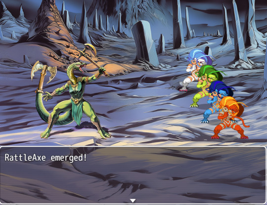
RattleAxe
Marauding Mistress of Venom
Welcome to Planet Feyr, Pariah Planet of the Eternal Galaxy. It doesn't matter how you got here, or why you came. Feyr is power. Feyr is opportunity. Feyr is eternal.
And Feyr is inescapable.
I am tinkering with RPG Maker, but instead of leaning into the retro-JRPG pixel art thing, I'm instead looking at the aesthetics of 80s toy tie-in kids books and box paintings. She's a an early stab at it.
Process and text transcript under the fold
Whatever and whoever RATTLEAXE once was, it was FEYR that made her the monster she is today. No lost soul or banished prisoner, RATTLEAXE gave herself to the pariah planet willingly, surrendering her freedom for a chance at PLANET FEYR’s true power.
A flick of RattleAxe’s tail shatters stone and scatters foes. Even the slightest nick of her fangs or blades brings sleep, paralysis, madness or worse thanks to the many toxins the Mistress of Venom ‘s fangs brew at her command.
Despite being a coward, liar, and marauder, RattleAxe cannot bring herself to attack a foe without announcing her presence with a rattle of her bladed tail.
-
I started with the name. I'd been using lizardfolk to test different prompts for style, and the pun popped into my head.
A snake-girl with a battleaxe tail isn't something you can just prompt for, so RattleAxe is a multi-prompt composite. I wound up making several rough photoshop composites to use as image and style prompts to get the exact kind of vibe I wanted, somewhere between Norem and Frazetta, with a healthy dollop of 80s MOTU & D&D knockoff.
I'm real early into the in-game integration (the Felicias are placeholders to help me work out character size and such.) I'm thinking this rough size will work (I'd go bigger but there's going to be large-scale monsters and guys on steeds), but I'll probably need to get in the weeds of things to get protagonists of a similar size that don't block each other.
I really wish RPGMaker MV it would just let you place the protagonists for each fight like you do the baddies. It would make things so much easier.
#eternal galaxy#rattleaxe#AI assisted art#character design#toyetic#RPGmaker#fauxstalgia#serpent-woman#scalie#fursona#MOTU#fantasy#rattlesnake#puns#midjourney edit#ai assisted art
58 notes
·
View notes
Text

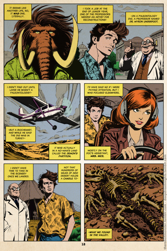
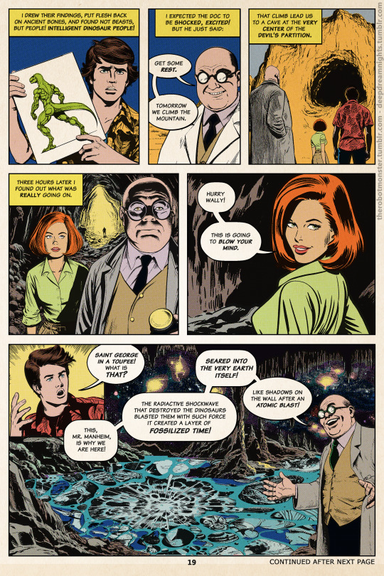
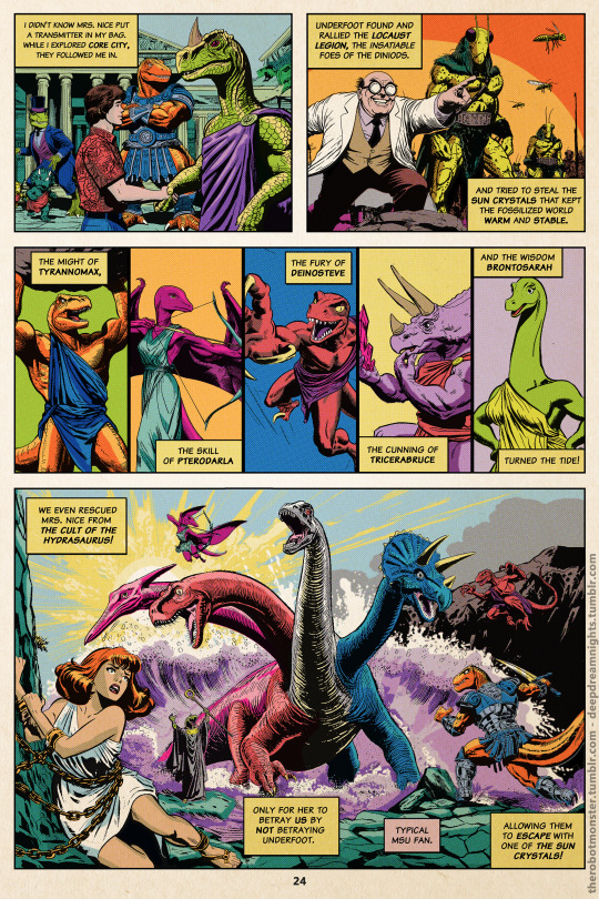
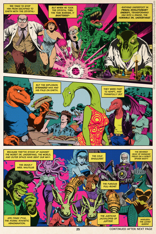
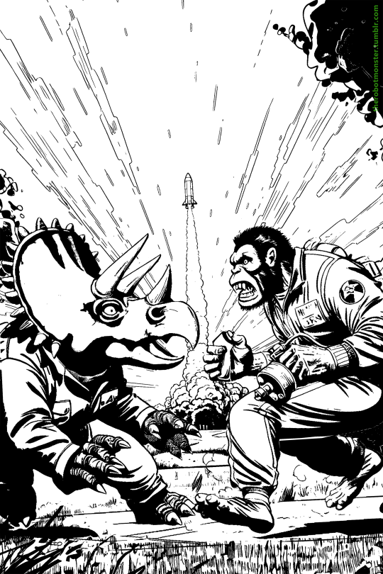
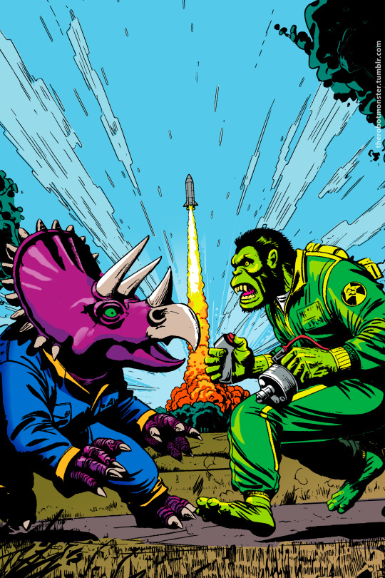
TryannoMax, Issue 25, October 1977
Cocytus Comics Group, Story by Barry McDermit, lines by Midge Joulet & Dale Ethree, Colors and Letters by H. Haddaway.
Issue #25. It's a quiet day so the Core team gets some R&R. TryannoMax hunts down Dr. Underfang for a long-overdue confrontation, DeinoSteve and PteroDarla finally have that date, and Wally Manmoth visits home.
So when Ape-Tomic Pyle returns from the grave to exact his revenge, only TriceraBruce remains to stand in his way. One wounded dinoid against a living nuclear ape-pocalypse, with the populace of Wisconsin in the balance.
Running for an astounding 80 issues, TyrannoMax was the headline comic from Cocytus in the 1970s, and was the primary motivator behind Buzby-Spurlock buying out Cocytus in '83.
While the comic series is considered the root of the empire that would create the animated series and live action movie, the concept was first introduced in short story "Humanity, My Young Cousin" in the pulp-sci-fi magazine Stunning True-Life Tales of Science Fiction, a few years earlier.
May be posting interior pages soon.
Full details under the fold.

TyrannoMax is my AI dinosaur test kitchen, where I see how ideas work out before trying them on more serious projects.
Here, I've used Dall-E 3 through Bing and Midjourney to create comic assets, which I then de-color and rework into inks in a similar fashion to my AI-comic reworkings like Robots Ruined the Internet and Let's Gib About Ib, or any of my other fake comic covers. TriceraBruce and Ape-Tomic Pyle were generated with Dall-E 3, and the background was made in Midjourney.
This makes the basic inks, from there I correct anatomical problems, cleanup AI wonk, and generally re-ink where things are needed.
Once I have the "inks" its then a matter of doing the coloring and graphic design work the old fashioned way. I used my recreation of the 1981 DC comics palette for my colors, used post-processing to get the printed look, and there you go.
My prompt format for the characters is:
A -anthro wearing , long tail (if a dinosaur) , comic panel by 1968, in the style of 1960s Marvel comics
Because all weights are averaged a bit, to get a 1970s comic look, you have to prompt for late 60s, ortherwise it looks late 80s.
Background prompt was:
a distant city, a rocket launches from its center, flying toward the sky, comic illustration by jack kirby, inked lines, flat color, blue sky, green grass, orange rocket, from 1968
#ai assisted art#digital collage#graphic design#dall-e 3#midjourney v5#tyrannomax#dinosaurs#tricerabruce#triceratops#ape-tomic pyle#retro comics#comic book#comic covers#fauxstalgia#unreality#generative art
42 notes
·
View notes
Link
Fauxstalgia: the yearning for a time in the past, even though you may never have experienced that time directly yourself... Great Friday read
www.informedinnovationinc.com
0 notes
Photo

Beyond Nostalgia: How Brands Can Leverage the Powers of 'Fauxstalgia' and 'Newstalgia' Millennials are the last age cohort to remember life with CDs and without digital technology. No wonder they look back fondly at the past. http://amp.gs/VZH7
0 notes
Text
thinking of writing ideas
...
Cute musician gal from the 60s-80s
“Yes. Yes.”
0 notes
Last Seen Blogs

friendsafariswap-blog
FC/FS Swap

malicelegrow
MarshmallowMangoMeadow

hallucinateddd
manifest

cyborgchere
nicos haunted hideaway

luckywonderlandnacho-blog
Jamies Documentary Blog