#fandom shoutout day
Text

Hello Everyone!
First, I want to say thank you to everyone because... we still have a fandom! When I participated in this event in 2021, many wondered if we'd still be here in 2022. Then, in 2022, I really didn't think we'd make it to 2023, but look at us! We may be small and imperfect, but I am happy to still have each of you to share my crazy hyperfixations with!
I always get stressed out with these events because I'm sure I'll leave someone out, and it's not my intent (I just have wicked ADHD!) I will have more shoutouts to make after work later today, but I didn't want to go to bed tonight without sharing a little love for some of my supporters throughout this past year. You have no idea how much I appreciate you taking the time to read, comment, and give feedback on my silly fics.
Some of us may talk more than others, but trust me, you're always seen and always appreciated. There are so many of you, but thanks to @differenttyphoonwerewolf, @onikalover, @tessa-liam, @sophxwithers, @kingliam2019, @custaroonie, @headoverheelsforramsey, @parisa-kh, @youlookappropriate, @kyra75, @delmissesryanandcassi, @renvconta19, @peonierose @trappedinfanfiction, @kyra75 your ongoing support means more than you know!
@quixoticdreamer16 - my baseball buddy and one of the most supportive people, I'm so glad you're here! So glad you're a friend!
@secretaryunpaid - thank you for your unbelievable support from day one. The way you go out of your way to comment and create beautiful gifs for me and others is a testament to how thoughtful you are. But as much as I appreciate your support, I appreciate your friendship and the laughs we've shared 1000 more (and the lusting over Jesse, but that's another story!) You're one in a million, and I'm so glad this place brought us together.
To @liaromancewriter, @potionsprefect, @coffeeheartaddict2, @cariantha @genevievemd @lucy-268 and @jamespotterthefirst... the OH DIEHARDS MAN lol Thank you for your friendship, for always showing love - to me and so many others. I'm so glad you're still here (even though some of you are a little less), and we're still on this crazy journey in this whacky place together. And, considering y'all are Ethan girlies, I feel like I need to promise to wrap 2 series up before year-end for ya! lol
@inlocusmads You bring something special to this place, and I hope you know that. Thank you for your support - I love that you love my crazy Tobias and Casey - and when I started writing CoP this year, your feedback and encouragement meant the world to me. You are the OG CoP master! I remember when you were convincing me I could handle reading it, and I should have listened to you sooner! Oh, and thank you for loving my Casey and Jessica! I know they are beyond unpopular, but I love them, and having someone else who does too is just...asdfddf! I have your ask, and I'll have that done by the week's end - thanks so much, Mads!
Speaking of CoP, it was a real gamble when I decided to write for the incomparable Trystan Thorne this year. Given that our fandom is not always... nice... it was so scary. But some of you provided such kind feedback. It really encouraged me to keep going, and I'm so glad I did. I love the story, and I love us sharing it together. Thank you @starsarewithinme @moominofthevalley @aces-and-angels @brycesgirl @ao719 and @shadyinternetblizzard , and OMG, I know I'm forgetting someone here, and when it's not 1:20 AM and I'm not exhausted I'll remember correct that! lol, But seriously, thank you!
To @missameliep - I miss you, my cappy friend - but thank you for always geeking out with me over WTD. I know you're not on much these days, but you're still appreciated, and I'll never see a capybara and not think of you! lol
To @mydemonsdrivealimo, OMG, the way you've inspired me with T/C this year. You have no idea. I appreciate your support for them and Casey and Jess so much. I hope you know that! Casey could not possibly have better besties - and I cannot wait to explore more with all of our little idiots - that ice skating thing MUST happen soon!
To @storyofmychoices and @lilyoffandoms, I have much more to say to you later, but for now, I just want to thank you for loving T&C and for the crazy little world we've created with our little nut jobs. Lily, when you wrote that first drabble, who knew it would lead to kidnapping my girl! lol But I'm so glad it did! I know Tobias wasn't even an LI (as many an anon has pointed out! lol), and it was never a popular pairing, that makes your love for those guys mean even more to me. THANK YOU!
OK now I do have a lot more love I want to give - and I will later today - because right now, if I don't show my pillow some love, my boss will have it out for me later! lol
Love to you all!
Elsa
@choicesfandomappreciation
#choices fandom appreciation#fandom shoutout day#fandom appreciation#fandom appreciation 2023#thank you!!!!#❤️❤️❤️
60 notes
·
View notes
Text

We wanted to take a moment to send our love and appreciation out to the entire Choices Fandom community!
To the fanfic writers and artists who bring their varied and beautiful visions to life and selflessly share them with us.
To the readers and supporters who have no idea how much their kind words or even a simple ❤️can mean.
To people who take time to build others up, to check in on friends, or welcome new people to our community.
To those who chat aimlessly about their beloved blorbos and never once pass judgment.
To those who host amazing events like this! @choicesfandomappreciation This is one of our favorite events of the year! Thank YOU for continuing to do your part to spread love, community, and positivity within the fandom. We are blessed to have you!
To our followers and readers, thank you for letting us know our blog is still worth having - that our fandom still matters. But even more, thanks for continuing to support our talented creators because that's what it is all about.
Sending you all a big hug and lots of love!
@jerzwriter and @cfwcmod-lucy ❤️❤️❤️
#choices fandom appreciation#fandom shoutout day#pixelberry choices#playchoices#choices stories you play
34 notes
·
View notes
Text
why Aurora's art is genius
It's break for me, and I've been meaning to sit down and read the Aurora webcomic (https://comicaurora.com/, @comicaurora on Tumblr) for quite a bit. So I did that over the last few days.
And… y'know. I can't actually say "I should've read this earlier," because otherwise I would've been up at 2:30-3am when I had responsibilities in the morning and I couldn't have properly enjoyed it, but. Holy shit guys THIS COMIC.
I intended to just do a generalized "hello this is all the things I love about this story," and I wrote a paragraph or two about art style. …and then another. And another. And I realized I needed to actually reference things so I would stop being too vague. I was reading the comic on my tablet or phone, because I wanted to stay curled up in my chair, but I type at a big monitor and so I saw more details… aaaaaand it turned into its own giant-ass post.
SO. Enjoy a few thousand words of me nerding out about this insanely cool art style and how fucking gorgeous this comic is? (There are screenshots, I promise it isn't just a wall of text.) In my defense, I just spent two semesters in graphic design classes focusing on the Adobe Suite, so… I get to be a nerd about pretty things…???
All positive feedback btw! No downers here. <3
---
I cannot emphasize enough how much I love the beautiful, simple stylistic method of drawing characters and figures. It is absolutely stunning and effortless and utterly graceful—it is so hard to capture the sheer beauty and fluidity of the human form in such a fashion. Even a simple outline of a character feels dynamic! It's gorgeous!
Though I do have a love-hate relationship with this, because my artistic side looks at that lovely simplicity, goes "I CAN DO THAT!" and then I sit down and go to the paper and realize that no, in fact, I cannot do that yet, because that simplicity is born of a hell of a lot of practice and understanding of bodies and actually is really hard to do. It's a very developed style that only looks simple because the artist knows what they're doing. The human body is hard to pull off, and this comic does so beautifully and makes it look effortless.
Also: line weight line weight line weight. It's especially important in simplified shapes and figures like this, and hoo boy is it used excellently. It's especially apparent the newer the pages get—I love watching that improvement over time—but with simpler figures and lines, you get nice light lines to emphasize both smaller details, like in the draping of clothing and the curls of hair—which, hello, yes—and thicker lines to emphasize bigger and more important details and silhouettes. It's the sort of thing that's essential to most illustrations, but I wanted to make a note of it because it's so vital to this art style.
THE USE OF LAYER BLENDING MODES OH MY GODS. (...uhhh, apologies to the people who don't know what that means, it's a digital art program thing? This article explains it for beginners.)
Bear with me, I just finished my second Photoshop course, I spent months and months working on projects with this shit so I see the genius use of Screen and/or its siblings (of which there are many—if I say "Screen" here, assume I mean the entire umbrella of Screen blending modes and possibly Overlay) and go nuts, but seriously it's so clever and also fucking gorgeous:
Firstly: the use of screened-on sound effect words over an action? A "CRACK" written over a branch and then put on Screen in glowy green so that it's subtle enough that it doesn't disrupt the visual flow, but still sticks out enough to make itself heard? Little "scritches" that are transparent where they're laid on without outlines to emphasize the sound without disrupting the underlying image? FUCK YES. I haven't seen this done literally anywhere else—granted, I haven't read a massive amount of comics, but I've read enough—and it is so clever and I adore it. Examples:


Secondly: The beautiful lighting effects. The curling leaves, all the magic, the various glowing eyes, the fog, the way it's all so vividly colored but doesn't burn your eyeballs out—a balance that's way harder to achieve than you'd think—and the soft glows around them, eeeee it's so pretty so pretty SO PRETTY. Not sure if some of these are Outer/Inner Glow/Shadow layer effects or if it's entirely hand-drawn, but major kudos either way; I can see the beautiful use of blending modes and I SALUTE YOUR GENIUS.
I keep looking at some of this stuff and go "is that a layer effect or is it done by hand?" Because you can make some similar things with the Satin layer effect in Photoshop (I don't know if other programs have this? I'm gonna have to find out since I won't have access to PS for much longer ;-;) that resembles some of the swirly inner bits on some of the lit effects, but I'm not sure if it is that or not. Or you could mask over textures? There's... many ways to do it.
If done by hand: oh my gods the patience, how. If done with layer effects: really clever work that knows how to stop said effects from looking wonky, because ugh those things get temperamental. If done with a layer of texture that's been masked over: very, very good masking work. No matter the method, pretty shimmers and swirly bits inside the bigger pretty swirls!
Next: The way color contrast is used! I will never be over the glowy green-on-black Primordial Life vibes when Alinua gets dropped into that… unconscious space?? with Life, for example, and the sharp contrast of vines and crack and branches and leaves against pitch black is just visually stunning. The way the roots sink into the ground and the three-dimensional sensation of it is particularly badass here:

Friggin. How does this imply depth like that. HOW. IT'S SO FREAKING COOL.
A huge point here is also color language and use! Everybody has their own particular shade, generally matching their eyes, magic, and personality, and I adore how this is used to make it clear who's talking or who's doing an action. That was especially apparent to me with Dainix and Falst in the caves—their colors are both fairly warm, but quite distinct, and I love how this clarifies who's doing what in panels with a lot of action from both of them. There is a particular bit that stuck out to me, so I dug up the panels (see this page and the following one https://comicaurora.com/aurora/1-20-30/):

(Gods it looks even prettier now that I put it against a plain background. Also, appreciation to Falst for managing a bridal-carry midair, damn.)
The way that their colors MERGE here! And the immense attention to detail in doing so—Dainix is higher up than Falst is in the first panel, so Dainix's orange fades into Falst's orange at the base. The next panel has gold up top and orange on bottom; we can't really tell in that panel where each of them are, but that's carried over to the next panel—

—where we now see that Falst's position is raised above Dainix's due to the way he's carrying him. (Points for continuity!) And, of course, we see the little "huffs" flowing from orange to yellow over their heads (where Dainix's head is higher than Falst's) to merge the sound of their breathing, which is absurdly clever because it emphasizes to the viewer how we hear two sets of huffing overlaying each other, not one. Absolutely brilliant.
(A few other notes of appreciation to that panel: beautiful glows around them, the sparks, the jagged silhouette of the spider legs, the lovely colors that have no right to make the area around a spider corpse that pretty, the excellent texturing on the cave walls plus perspective, the way Falst's movements imply Dainix's hefty weight, the natural posing of the characters, their on-point expressions that convey exactly how fuckin terrifying everything is right now, the slight glows to their eyes, and also they're just handsome boys <3)
Next up: Rain!!!! So well done! It's subtle enough that it never ever disrupts the impact of the focal point, but evident enough you can tell! And more importantly: THE MIST OFF THE CHARACTERS. Rain does this irl, it has that little vapor that comes off you and makes that little misty effect that plays with lighting, it's so cool-looking and here it's used to such pretty effect!
One of the panel captions says something about it blurring out all the injuries on the characters but like THAT AIN'T TOO BIG OF A PROBLEM when it gets across the environmental vibes, and also that'd be how it would look in real life too so like… outside viewer's angle is the same as the characters', mostly? my point is: that's the environment!!! that's the vibes, that's the feel! It gets it across and it does so in the most pretty way possible!
And another thing re: rain, the use of it to establish perspective, particularly in panels like this—

—where we can tell we're looking down at Tynan due to the perspective on the rain and where it's pointing. Excellent. (Also, kudos for looking down and emphasizing how Tynan's losing his advantage—lovely use of visual storytelling.)
Additionally, the misting here:

We see it most heavily in the leftmost panel, where it's quite foggy as you would expect in a rainstorm, especially in an environment with a lot of heat, but it's also lightly powdered on in the following two panels and tends to follow light sources, which makes complete sense given how light bounces off particles in the air.
A major point of strength in these too is a thorough understanding of lighting, like rim lighting, the various hues and shades, and an intricate understanding of how light bounces off surfaces even when they're in shadow (we'll see a faint glow in spots where characters are half in shadow, but that's how it would work in real life, because of how light bounces around).
Bringing some of these points together: the fluidity of the lines in magic, and the way simple glowing lines are used to emphasize motion and the magic itself, is deeply clever. I'm basically pulling at random from panels and there's definitely even better examples, but here's one (see this page https://comicaurora.com/aurora/1-16-33/):

First panel, listed in numbers because these build on each other:
The tension of the lines in Tess's magic here. This works on a couple levels: first, the way she's holding her fists, as if she's pulling a rope taut.
The way there's one primary line, emphasizing the rope feeling, accompanied by smaller ones.
The additional lines starbursting around her hands, to indicate the energy crackling in her hands and how she's doing a good bit more than just holding it. (That combined with the fists suggests some tension to the magic, too.) Also the variations in brightness, a feature you'll find in actual lightning. :D Additional kudos for how the lightning sparks and breaks off the metal of the sword.
A handful of miscellaneous notes on the second panel:
The reflection of the flames in Erin's typically dark blue eyes (which bears a remarkable resemblance to Dainix, incidentally—almost a thematic sort of parallel given Erin's using the same magic Dainix specializes in?)
The flowing of fabric in the wind and associated variation in the lineart
The way Erin's tattoos interact with the fire he's pulling to his hand
The way the rain overlays some of the fainter areas of fire (attention! to! detail! hell yeah!)
I could go on. I won't because this is a lot of writing already.
Third panel gets paragraphs, not bullets:
Erin's giant-ass "FWOOM" of fire there, and the way the outline of the word is puffy-edged and gradated to feel almost three-dimensional, plus once again using Screen or a variation on it so that the stars show up in the background. All this against that stunning plume of fire, which ripples and sparks so gorgeously, and the ending "om" of the onomatopoeia is emphasized incredibly brightly against that, adding to the punch of it and making the plume feel even brighter.
Also, once again, rain helping establish perspective, especially in how it's very angular in the left side of the panel and then slowly becomes more like a point to the right to indicate it's falling directly down on the viewer. Add in the bright, beautiful glow effects, fainter but no less important black lines beneath them to emphasize the sky and smoke and the like, and the stunningly beautiful lighting and gradated glows surrounding Erin plus the lightning jagging up at him from below, and you get one hell of an impactful panel right there. (And there is definitely more in there I could break down, this is just a lot already.)
And in general: The colors in this? Incredible. The blues and purples and oranges and golds compliment so well, and it's all so rich.
Like, seriously, just throughout the whole comic, the use of gradients, blending modes, color balance and hues, all the things, all the things, it makes for the most beautiful effects and glows and such a rich environment. There's a very distinct style to this comic in its simplified backgrounds (which I recognize are done partly because it's way easier and also backgrounds are so time-consuming dear gods but lemme say this) and vivid, smoothly drawn characters; the simplicity lets them come to the front and gives room for those beautiful, richly saturated focal points, letting the stylized designs of the magic and characters shine. The use of distinct silhouettes is insanely good. Honestly, complex backgrounds might run the risk of making everything too visually busy in this case. It's just, augh, so GORGEOUS.
Another bit, take a look at this page (https://comicaurora.com/aurora/1-15-28/):

It's not quite as evident here as it is in the next page, but this one does some other fun things so I'm grabbing it. Points:
Once again, using different colors to represent different character actions. The "WHAM" of Kendal hitting the ground is caused by Dainix's force, so it's orange (and kudos for doubling the word over to add a shake effect). But we see blue layered underneath, which could be an environmental choice, but might also be because it's Kendal, whose color is blue.
And speaking off, take a look at the right-most panel on top, where Kendal grabs the spear: his motion is, again, illustrated in bright blue, versus the atmospheric screened-on orange lines that point toward him around the whole panel (I'm sure these have a name, I think they might be more of a manga thing though and the only experience I have in manga is reading a bit of Fullmetal Alchemist). Those lines emphasize the weight of the spear being shoved at him, and their color tells us Dainix is responsible for it.
One of my all-time favorite effects in this comic is the way cracks manifest across Dainix's body to represent when he starts to lose control; it is utterly gorgeous and wonderfully thematic. These are more evident in the page before and after this one, but you get a decent idea here. I love the way they glow softly, the way the fire juuuust flickers through at the start and then becomes more evident over time, and the cracks feel so realistic, like his skin is made of pottery. Additional points for how fire begins to creep into his hair.
A small detail that's generally consistent across the comic, but which I want to make note of here because you can see it pretty well: Kendal's eyes glow about the same as the jewel in his sword, mirroring his connection to said sword and calling back to how the jewel became Vash's eye temporarily and thus was once Kendal's eye. You can always see this connection (though there might be some spots where this also changes in a symbolic manner; I went through it quickly on the first time around, so I'll pay more attention when I inevitably reread this), where Kendal's always got that little shine of blue in his eyes the same as the jewel. It's a beautiful visual parallel that encourages the reader to subconsciously link them together, especially since the lines used to illustrate character movements typically mirror their eye color. It's an extension of Kendal.
Did I mention how ABSOLUTELY BEAUTIFUL the colors in this are?
Also, the mythological/legend-type scenes are illustrated in familiar style often used for that type of story, a simple and heavily symbolic two-dimensional cave-painting-like look. They are absolutely beautiful on many levels, employing simple, lovely gradients, slightly rougher and thicker lineart that is nonetheless smoothly beautiful, and working with clear silhouettes (a major strength of this art style, but also a strength in the comic overall). But in particular, I wanted to call attention to a particular thing (see this page https://comicaurora.com/aurora/1-12-4/):

The flowing symbolic lineart surrounding each character. This is actually quite consistent across characters—see also Life's typical lines and how they curl:

What's particularly interesting here is how these symbols are often similar, but not the same. Vash's lines are always smooth, clean curls, often playing off each other and echoing one another like ripples in a pond. You'd think they'd look too similar to Life's—but they don't. Life's curl like vines, and they remain connected; where one curve might echo another but exist entirely detached from each other in Vash's, Life's lines still remain wound together, because vines are continuous and don't float around. :P
Tahraim's are less continuous, often breaking up with significantly smaller bits and pieces floating around like—of course—sparks, and come to sharper points. These are also constants: we see the vines repeated over and over in Alinua's dreams of Life, and the echoing ripples of Vash are consistent wherever we encounter him. Kendal's dream of the ghost citizens of the city of Vash in the last few chapters is filled with these rippling, echoing patterns, to beautiful effect (https://comicaurora.com/aurora/1-20-14/):

They ripple and spiral, often in long, sinuous curves, with smooth elegance. It reminds me a great deal of images of space and sine waves and the like. This establishes a definite feel to these different characters and their magic. And the thing is, that's not something that had to be done—the colors are good at emphasizing who's who. But it was done, and it adds a whole other dimension to the story. Whenever you're in a deity's domain, you know whose it is no matter the color.
Regarding that shape language, I wanted to make another note, too—Vash is sometimes described as chaotic and doing what he likes, which is interesting to me, because smooth, elegant curves and the color blue aren't generally associated with chaos. So while Vash might behave like that on the surface, I'm guessing he's got a lot more going on underneath; he's probably much more intentional in his actions than you'd think at a glance, and he is certainly quite caring with his city. The other thing is that this suits Kendal perfectly. He's a paragon character; he is kind, virtuous, and self-sacrificing, and often we see him aiming to calm others and keep them safe. Blue is such a good color for him. There is… probably more to this, but I'm not deep enough in yet to say.
And here's the thing: I'm only scratching the surface. There is so much more here I'm not covering (color palettes! outfits! character design! environment! the deities! so much more!) and a lot more I can't cover, because I don't have the experience; this is me as a hobbyist artist who happened to take a couple design classes because I wanted to. The art style to this comic is so clever and creative and beautiful, though, I just had to go off about it. <3
...brownie points for getting all the way down here? Have a cookie.
#aurora comic#aurora webcomic#comicaurora#art analysis#...I hope those are the right tags???#new fandom new tagging practices to learn ig#much thanks for something to read while I try to rest my wrists. carpal tunnel BAD. (ignore that I wrote this I've got braces ok it's fine)#anyway! I HAVE. MANY MORE THOUGHTS. ON THE STORY ITSELF. THIS LOVELY STORY#also a collection of reactions to a chunk of the comic before I hit the point where I was too busy reading to write anything down#idk how to format those tho#...yeet them into one post...???#eh I usually don't go off this much these days but this seems like a smaller tight-knit fandom so... might as well help build it?#and I have a little more time thanks to break so#oh yes also shoutout to my insanely awesome professor for teaching me all the technical stuff from this he is LOVELY#made an incredibly complex program into something comprehensible <3#synapse talks
749 notes
·
View notes
Text
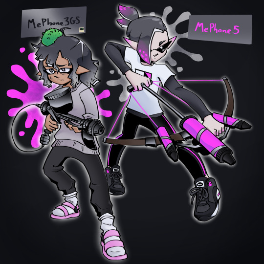

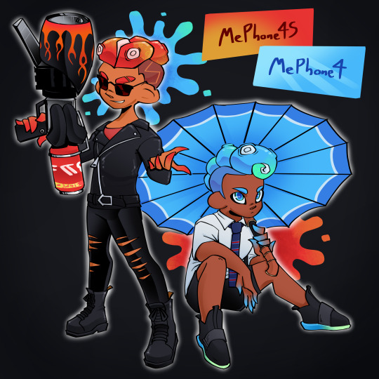

*splatoons your iphones (and ipad)*
#inanimate insanity#ii mephone3gs#ii mecintosh#ii mephone5#ii mephone5s#ii mephone5c#ii mephone4s#ii mephone4#ii mepad#my art#splatoon#<- feeling brave w that tag. i've spent multiple days on this i think the squid fandom can see my cringe#mecintosh is the sea cucumber on 3GS's head. btw#and mepad is based on a bentfin devil ray#ALSO SHOUTOUT TO THE MEPHONE3GS INKLING I SAW ONCE IN SPLATSVILLE U WERE THE INSPO FOR HIS DESIGN HERE o7
365 notes
·
View notes
Text
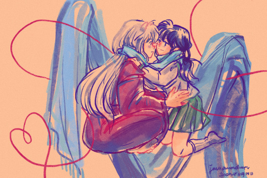
For @inuvember Day 30, the prompt is for the Fandom. This community has given me a lot through my years, from the time I was a young teenager and up to now. The little community that remain on tumblr after all this time is still very dear to me. Thank you to all the creators and fans who fill that community up!
With all that in mind, this is dedicated to a very special creator, @mustardyellowsunshine aka Robin. An unbelievable writer of fanfic and meta. A Kagome stan. An InuKag lover. Thank you for all you’ve contributed! I want to especially thank you for the manga caps/edits. Seeing scenes of my favorite manga series of all time being uploaded in such gorgeous quality… it makes me fall in love all over again and deeper than before.
Here’s a fanart inspired by Robin’s wonderful fic, What I Hold on Ao3. Please check out her writing and other works!
#shoutout to inumasha for helping this idea come to light#mustardyellowsunshine#inuyasha#inukag#kagome higurashi#inuvember#day 30 fandom#jelly art#justafewsmallsteps#fic rec
259 notes
·
View notes
Note
I just wanted to say that I love your monk OCs and would love to learn more about them! Is there anywhere online that you've posted stories/comics about them besides Tumblr?
Thank u so much!!! I post on insta too but nothing important that isn't already here... You can have some more doodles if you like them though ^_^
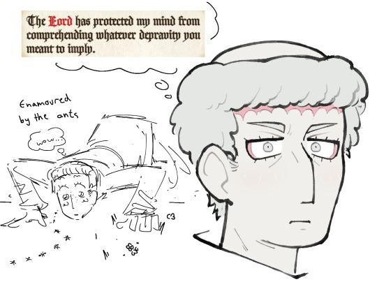


#if you have any specific questions I'm always happy to answer those#I'm not too precious about my art of them doing well since it's more of a personal oc passion project than something I'm making for others#like fandom art#but i know there are some monk likers here and there and it makes me happy when you guys enjoy my ocs#monkposting#oc posting#medieval monks#as per#also shoutout pentiment for the text in the first pic i think about that line every day#rodolf#gregor#anselm
118 notes
·
View notes
Text


my ren shrine + bday celebration!! <3
i think it turned out super cute, tho i wasn't able to figure out a way to include all my deco in time for their bday... but i replayed the game up to the current update and it was overall a super sweet experience (TwT)♡
#devotion.exe#14dwy#14 days with you#selfship#love tht you can tell the cake fell apart so i delayered it lol (my og cake was a Fail so i had to buy one and add the cream & berries 😭)#i can't wait to make more diy stuff! don't get me wrong i LOVE fanmerch but im broke and tbh feel liek a poser 😔 (<- imposter syn moment)#but hopefully i can find a satisfying way to include my deco & add more to the shrine! im also planning to make badge rosettes~ 🤗🖤💜🩷#lil shoutout to dom and shalls for spoiling the fandom w near constant fan merch btw?? i feel so well fed on all the rendacted merch 😭💕
62 notes
·
View notes
Text
writing [love]; dream, a writer.
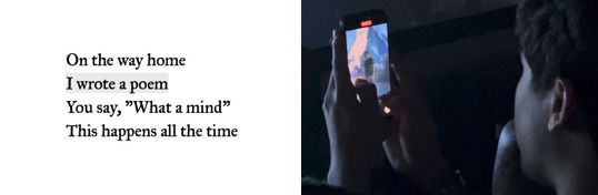
Dream: I like writing. I like writing poems; I like writing songs; I like writing everything. I like storytelling—I just like storytelling. Storytelling in general is fun. I do a lot of storytelling through, like, my videos, through my video editing ... that's my favourite part of writing.


Dream: So, it's [love is] special, you know? You can't really explain it. Um, you know, with your mum, your dad, your—your sisters, your brothers, your cousins, your—your friends that you've known since you were a kid. Your friends that you just met a year ago that you are absolutely in love with as a person.


Dream: 'Have you written stories as well as songs lately?' Yeah—I mean, well ... I feel like songwriting is very—it's like, you just take stories—like 'Roadtrip' was, like, essentially a poem, and a story, that was turned into a song. And I feel like that's with a lot of stuff. 'Mask' is the same; 'Mask' was a poem turned into a song.
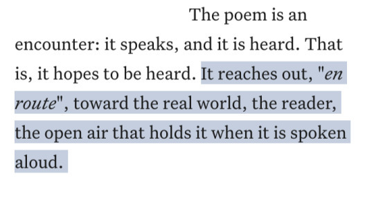
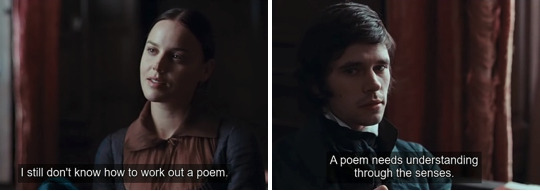


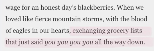
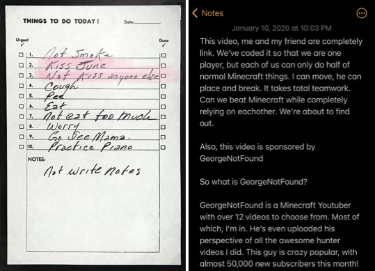
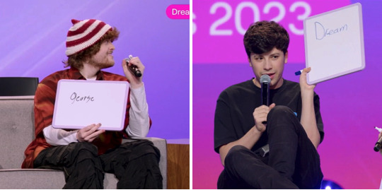
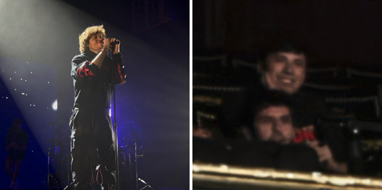
Bird by Bird, Anne Lamott | Dream Subscriber Twitter Space April 30th, @/dreamwastaken | It's Been A Long Day, Spacey Jane | Dream's Tiktok 'love is scary', @/dreamwastakenwastaken | Photograph in the studio from Dream's Instagram post, @/dreamwastaken | The Story of Mary MacLane, Mary MacLane | Our Beautiful Life When It's Filled With Shrieks, Christopher Citro | Johnny Cash’s handwritten to-do list, 1969 | Tweeted screenshot from Dream's notes app, @/dreamwastaken | Anne Carson interview, 2016 | Dream and George on the Dream Panel at TwitchCon Las Vegas 2023, TwitchCon VOD | Tweeted screenshot from Dream's notes app, @/dreamwastaken | On Writing, Stephen King | A fan's Tiktok of Dream and George at emo nite, @/angstboycam | Dream explaining 'Spotlight' in the 'to whoever wants to hear' lyric booklet, Dream | Your Song, Elton John | Fan photos of Dream and George at Dream's tour
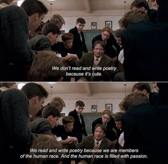
Dream's 'Kind Of Love' speech LA concert night two, @/milktea_grn | The Power Of Love, Frankie Goes To Hollywood | Fan photos of Dream and George at Dream's tour | You Are In Love (Taylor's Version), Taylor Swift | Dream explaining 'Paranoid' in the 'to whoever wants to hear' lyric booklet, Dream | Dream and George on the Dream Panel at TwitchCon Las Vegas 2023, TwitchCon VOD | Words, Gregory Alan Isakov | Dead Poets Society, dir. | Dream Subscriber Twitter Space April 30th, @/dreamwastaken | Sweet Nothing, Taylor Swift
Fan photo of George recording Dream at his concert | Addressable Thou, Chase Berggrun | Bright Star, dir. Jane Campion | George smiling at Dream in IRL DREAM TEAM IN MADRID, Sapnap VOD | Endymion, John Keats | Dream and George on set: Everest – Dream & Yung Gravy BEHIND THE SCENES, Dream Music | [brIght], E. E. Cummings | George and Dream in IRL DREAM TEAM IN MADRID, Sapnap VOD | Sand and Foam, Kahlil Gibran
#WOOOOO WRITING !!!!!! i love it so much !!!!!!! and dream does too !!!!!!#shoutout to all the writers artists creators in this fandom u are So incredible especially my friends i love u forever <33333#imsotireduerhogou whywas i up till 4am last night doing this n then hadnt been doing the refernecbes the whole time#so just did them tonight. it is now One am. i will proceed to pass out n sleep for Ten Hours#i really like this one i am proud of it :') ive had a dream + writing compilation in my head for Ages so i am glad ifinally got to do it :D#to those who love words as much as i (and dream) do ....... to whoever wants to hear ......... <3#heres som comfort after a pretty shitty second half of the day for us all and dream </3 Hugs#my webs#web weaving#dreamie#dnf#georgie#dreamnotfound#poetry#words#writing talk#compilations#imfine goonigh Zzzzzz ..... snorkshoo mimimimimim
94 notes
·
View notes
Text
god. sometimes i think about rebirth kon and how incredibly fucked up his entire situation is. and sometimes i want to play in that space and explore it but the thing is like... its pretty much impossible to actually resolve any of his tragedy there unless its just entirely a story about grief and i ... listen stories about grief absolutely have their place but i'm a softie and i like hurt/comfort and angst with happy endings. i can't do it.
like, genuinely. how fucked up would it be to spend most of your life suicidal until you actually die, and then a scant few years later - after you've been ripped away from everyone you know and love, and you haven't been able to go home but you've been aching for them, enough to persuade a woman to name her unborn child for your grandmother - you find out that they all forgot you. not voluntarily, but they did. and now they do remember you, but they also remember a timeline where you simply never existed. your most formative baseline thought patterns have always been ones where you're okay with killing yourself, and now you know everyone you've been yearning to return to remembers you, but also remembers a time when you simply did not exist, when they never knew you, when you weren't even an afterthought because you were never there.
would that not be completely and utterly horrific?
you know how kon has always been one giant existential crisis after another? haha yeah wow that sure has NOT changed. the only difference as far as i can tell is that so far, nothing in rebirth is acknowledging it. (possible exception to superboy man of tomorrow - at least the setup includes him outright stating he's not doing great and feels unnecessary, but we'll see where it goes!)
#shoutout to the one issue of yj19 where konbart talk about how fucked up this all is at least a bit#but its sooo fucked up and evil that pretty much all the fandom talks about wrt kon in rebirth era is just OOH HES JEALOUS ABT TIM/BER.#like. i know why (Those Batfam Fans™ who dont recognize kon as a character rather than an accessory to tim) but STILL#girl he has bigger fish to fry lmao#its just tragic bc *i* dont want to write anything about this it makes me SAD and idk how to resolve any of it#but sometimes i Do want to see a really good aching bittersweet character study#but no one has written that for me. sad. fucked up :/#rimi talks#kon#ive just been thinkin abt this sooo much since smot1 dropped the toher day. augh
212 notes
·
View notes
Text
Lotty! <3
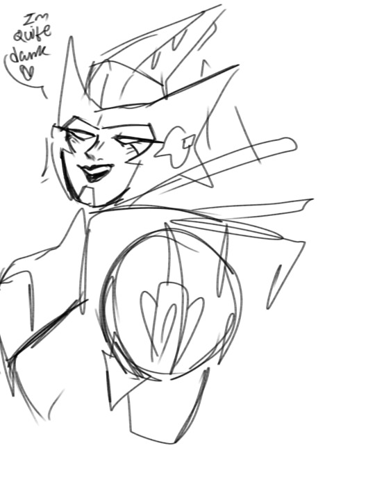

I have such a crush on her oh my god
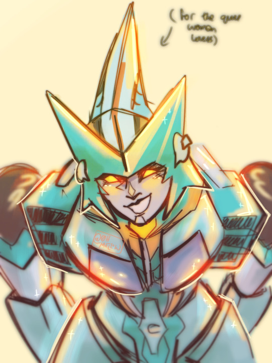
#sorry boys she's not for you#MORE DOODLES UNDER THE CUT!!#HAPPY LATE WOMEN'S DAY#bcuz i missed it shoutout to my fem and girl homies ily u all <3#as soon as i find links to resources ill repost em#my heart goes out to all the women children afab people reporters doctors etc#and everyone say BOOO BECAUSE THE MISOGYNY IN THIS FANDOM IS SO DUMB!!!#BOOOO MISOGYNY!!#because its everywhere!! not just bayverse fans!! the comics arent safe either#do yourself a favour 2nite and spend some time appreciating some female transformers!!#itsnotcurious on twt and tiktok is a great place to start!!#and on a different note#my heart goes out to all the women children afab reporters doctors mothers in Palestine#and all the people who have family and friends or ties to Palestine itself#ill add links and resources to my blog as soon as a find them#make sure to support other artists who are donating to Palestine!! there are some where all proceeds are donated#ok tag time#transformers#mtmte#more than meets the eye#lost light#velocity mtmte#mtmte velocity#Rodimus Prime#Rodimus#megatron#maccadam#maccadams#ohmellow#transformers idw
47 notes
·
View notes
Text

The hottest guy at the party just put his arm around you wyd
#kny#rengiyuu#modern au#your low quality fandom art hero has returned#why can’t I stop bringing these two to parties lol#this was meant to be a part of a bigger sketch page but I got distracted by writing for kiss the Devil#shoutout to all my moots in the rengiyuu tag today and all days#hope you enjoy this stupidity
60 notes
·
View notes
Text
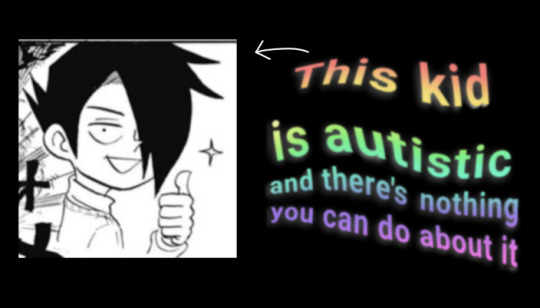
ray tpn is autistic and i'm gonna tell you why now
ray is one of the most heavily autistic-coded characters i can think of, and i've been wanting to write up a post going over as many of his autistic mannerisms as i can because there is a lot. this will probably be long because i am also autistic and i am especially autistic about ray, so please enjoy while i psychoanalyze this anime boy with way more scrutiny than anyone would consider healthy <3
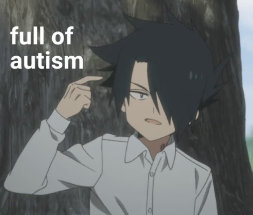
body language
perhaps one of the strongest arguments for ray's autism can be made by looking at his body language. ray tries to keep a stoic, neutral expression and voice the majority of the time (though he's often quite. bad at that too) but he is always extremely expressive through his movements and gestures, the most noticeable of which being the use of his hands. pretty much every character uses hand gestures, but ray is ridiculously excessive. it'd take frankly way too long to compile every instance of this (or even half) throughout the manga, so here's a small collection of gestures from s1 of the anime to give an idea:
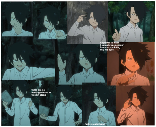

note that this is not even close to all of them and that he's exactly like this in the manga as well, though the animation and its use of snappy, exaggerated movements does help to make these much more noticeable.
moving away from his hands there's also just a lot of really expressive full-body language as well, such as this friendly chokehold:

this dramatic shrug:

and this even more dramatic flop:

just to name a few. basically, ray has a thing for grand unnecessary movements and no one is surprised.
poor emotional regulation and masking
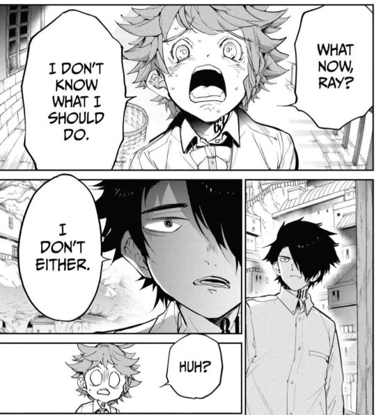
as i mentioned before, ray tries really really hard to bottle up his emotions and keep a sort of stoic persona during his time at gracefield. he's also really really bad at doing this. not terrible, as he was able to keep up a believable enough front that none of the other kids saw anything odd about his behavior for 6 years, but that's also because he deals with so much more stress once the events of the escape arc actually get going. there is a stark difference between his quiet and detached demeanor while emma and norman are still in the dark about the house, and him nearly having a meltdown every time something strays from his meticulously crafted plans while they actually begin making their preparations to escape over the course of the arc.
just a few examples of this include him nearly having a breakdown when emma insists on taking everyone:
or one of my favorite anime exclusive moments where he strains his voice while yelling at isabella to the point he breaks into a coughing fit:

and it's not just big flashy meltdowns, but little bursts of anger as well. shoutout to this moment in particular where he launches this bucket with enough force to tear up a bit of the damn ground:

this emotional instability can be seen after the escape as well, the most glaring example being how he interacts with yuugo:
their dynamic in general really does a good job of showing ray’s mental state after the escape, because pre-goldy pond yuugo is An Asshole. and ray is so, so easy to piss off and quite frankly tired from bottling up his emotions for so long that every interaction with said asshole is a massive struggle to keep himself from physically attacking him.
as for the topic of masking, that’s what ray’s attempts to hide his emotions feel like to me. ray is constantly in danger of losing isabella’s trust, whether that be by revealing he may be a little more attached to the other kids than he lets on or by showing too much emotion that the other kids start to wonder what the hell’s going on. ray has to constantly hide and cover up his emotions with more palatable ones for others out of fear of looking out of place or being seriously hurt, and well if that doesn’t just describe autistic masking to a tee i don’t know what does.
maybe one of the things that gets me the most about that is that he's essentially been masking for about half of his life, and doing that for any extended period of time is extremely draining. ray has been drained to the point that he will have full meltdowns when put under any sort of stress and when you take into account the fact that he already has pretty severe anger issues as a result of his trauma, it's really no wonder he has such a short fuse.
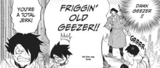
lack of a filter when speaking
ray is a very blunt person. he speaks matter-of-factly and he wastes no time in getting straight to his point, sometimes with only a single sentence:

the way he talks is also pretty significant, as he generally has a more monotone way of speaking. he really only yells when he gets really worked up which like i said, happens a lot, but there’s almost no inbetween for him. pre-escape, he tries to show as little emotion in his voice as possible outside of his outbursts.
as for post-escape ray, he does seem to show much more emotion in the way he speaks. its a bit harder to judge, as nothing past the escape arc was ever adapted into the anime (s2 isnt real it cant hurt you) but his facial expressions become much more varied and it’s easy to say his vocal inflections likely do as well. however, what we can say for sure is that he remains just as blunt as ever:
no matter how comfortable he becomes with expressing himself, this aspect of his speech never seems to change.
while we’re on the topic of his speaking mannerisms please also direct your attention to these panels:

these need no explanation.
sensory issues. so many sensory issues
briefly moving back to the subject of ray’s hands, i couldn’t help but notice during my countless s1 rewatches that they are almost never just resting at his sides. if he's not using his hands for unnecessary gestures they are either shoved into his pockets, or he's crossing his arms. it's very likely his arms default to these positions because they offer a sort of sense of security, the former keeping his hands covered and the latter keeping him more closed off, almost like he's constantly hugging himself. basically, ray is a 'likes to feel covered and secure' autistic and if he was buried in weighted blankets he'd probably love it.
also tying into the ‘likes to feel covered’ aspect of ray’s autism is this scarf he acquires sometime during the volume 12 timeskip:
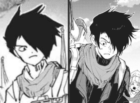
it’s a well known autistic thing to get attached to articles of clothing and wear them as much as possible, and boy does ray get attached to this scarf. i can count 2 post-timeskip scenes off the top of my head that have him not wearing this scarf, and the image on the right takes place a full 2 years after the left one in canon. he has no explicitly stated emotional attachment to this scarf and we don’t even know how he got it, just that he almost never takes it off. it could easily be seen as a comfort item, maybe he just likes the way the fabric feels or the extra coverage it offers him. there is post-canon content that depicts him without it, but the fact that he wore it almost nonstop for at least 2 years straight is still pretty significant.
another sensory thing i feel is worth mentioning is that ray seems to have a very specific tolerance threshold for physical contact. he seems fine initiating touch himself, and touches from emma and norman are generally alright, likely because they are the only people he has openly allowed himself to be close with his entire life. sudden touches from others however, are a different story. the one that immediately comes to mind is this interaction with don:
don in particular is someone ray becomes pretty close to, and i would say that besides the obvious growth with emma and norman, don is likely the person we see the most development with with in terms of their relationship. him having this reaction to a hug from someone he’s so close to seems indicative of some issues with unexpected contact.
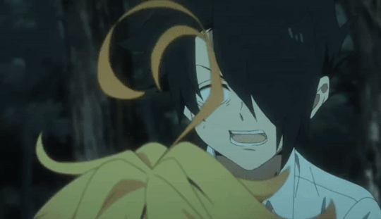
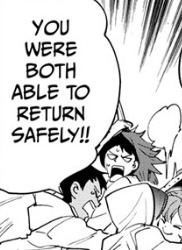
and finally one of my absolute favorite things the anime added, which is ray experiencing what looks a lot like sensory overload:

this takes place right after the argument with isabella, which ended with him being knocked to the floor and locked up in a room by himself, so its needless to say that he’s pretty shaken up. he gets so overwhelmed that all he can do is yell and desperately reach for any sort of stimulation to keep him grounded, curling in on himself and aggressively ruffling up his hair. i genuinely cannot think of an allistic explanation for this scene.
and basically, he is just so autistic
all in all, theres some pretty damn solid evidence for ray being autistic and whether it was intentional or not, the sheer amount of autism-coding present in ray’s writing is almost impossible to ignore. i love some good projection but i don’t even need to do that much, hes just doing this all on his own. in conclusion:
#skye's ramblings#WELL. IT TOOK ABT AN ENTIRE DAY BUT HERE IT IS. READ MY ESSAY BOY#thank god for tublrs extended image limit am i right. had to switch to my laptop a third of the way through so it would let me add more <3#and small shoutout to @fullscoreshenanigans for telling me how to make the gifs HGFGKJD#anywyay i had fun w this ray is so dear to me didyou know i love ray. ray#i am going to do something wild (putting a non-art post in the main tags) so hi tpn fandom i talk a lot. here's autism#the promised neverland#tpn#yakusoku no neverland#tpn ray
203 notes
·
View notes
Text
man the only fan spaces i will ever be in these days are the ones full of people with fucked up nasty reprehensible ships and fondness for the worst characters EVER. everywhere else is a god damn minefield but those bitches? yeah baby this is the freak zone and we are all freaks here
#joining the war on immoral fictional content on the side of the immoral fictional content#all the negative qualifiers are said with FULL affection and respect btw#standard modern fanspace (full of antis): nooo you can't ship them they're LITERALLY SIBLINGS (they are not related biologically. or at all#average day in my groupchat: the sickos meme at all times#but like.... seriously especially in popular series? i literally only trust the villain fans#the actual villain fans not the ones who make him (it's always a him) innocent of everything#no! give him back his atrocities! they're enrichment! and also they're hot!!!#tumblr users will joke about their faves being war criminals and then actively ignore the actual crimes they do in favor of woobifying them#i have so many fandoms this could apply to but i'd like to make a special shoutout to the antis in the asoiaf fandom. like????#this is for freaks ONLY go away#discourse tag#ac says things#oh in case my position was not abundantly clear#proship
32 notes
·
View notes
Text
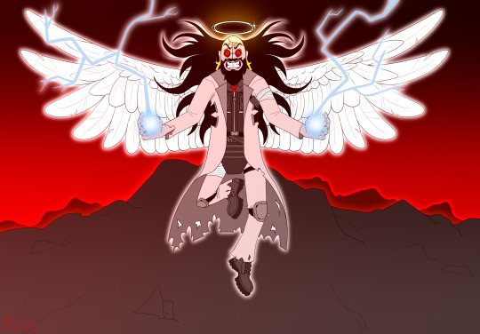
"I shall be the instrument of Armageddon."
#My art#Madness Combat#Madness Day 2023#Madness Day#Jebus#Jebediah Christoff#Jeb#HAPPY MADNESS DAY YALL#I've been in the fandom since 2021 but I finally am participating for Madness Day this year!!!! :D#This fandom is such a tight knit community and I love being in it#I also made some great friends (u kno who u are ^^)#(Who have also been huge inspirations to improve my art skills tremendously)#Like seriously I wouldn't be where I'm at now without all these awesome art peeps#I never got so involved in a franchise before this one...I love this fandom SO MUCH#(shoutout to beemer - azazel - shroomoid - sienna - norskasai distressedwalnut - greeny - pestgremlin)#(SURGE - Dottie - Jackie Draws - TinyCatOwl - Doc - EVERYONE ON FRIENDS SERVER YALL KNOW THE ONE!!!)#(MORE SHOUTOUTS - 2bhankfan - Forest-wolfie - sealed-valkyria - outcast-shadow - aokicyber - ur-m0nster - zepumpkineater and krinkels!!!)#(and everyone in the MPN team/voice actors/etc!!!)#YALL ARE SO FUCKING COOL!!!#Ok I'm done now enjoy Jebus being a fucking badass
69 notes
·
View notes
Text

Y'all I look away for 2 days and I come back and everything's on fire
asldkjlsgs
Are you guys okay??
#Sammy8D says#I have a vague idea about what's going on in the AvA fandom at the moment#shoutout to one of my close mutuals for informing me#Something something stick figure ages something something#My brain is too fried from working to comprehend anything#but death of the author and all that jazz#As a young adult I feel more comfortable writing and creating content for characters that are also adults (18+ years old)#Plus I already have my own headcanons on how Stick Figure Ages work that I spent days thinking about logisitically#You think I'm gonna give that up just because Alan said something off the top of his head?#Sammy8D Stick Stuff
61 notes
·
View notes
Text
so hard being a patbob girl in a squidbob world..
#patbob#spongeblabbles#girl* (gender neutral)#no offense to squidbob tho i love them too#just crazy how i still find patbob hate in the tag when its nearly 2024#like i thought we were over this childish behavior of unnecessary ship hate?#was gonna go on a super long rant abt how ppl are hypocritical with pointing out all the flaws with patbob yet not doing the same 4 squidbob#and how normalized squidbob is both in and out of the fandom yet ppl will look at u sideways for shipping patbob#but its really late and i dont have the energy for all of that so enough of the negativity#shoutout to like the 5 other active patbob fans on here in this day and age. love yall you guys are some real ones 💯💪🔥
22 notes
·
View notes
Last Seen Blogs

largando
Untitled

nihansh1
Untitled

ficojasulan
Untitled

techno102
Untitled

youlookkindadead
miaow. [zie/that thing]