#evanbukley
Note
Get attacked!! ✨🌈SEND THIS TO OTHER BLOGGERS YOU THINK ARE WONDERFUL. KEEP THE GAME GOING🌈
Hi!
Awww, this is so sweet, thank you so much! Boop! :') 💖
7 notes
·
View notes
Note
🐾🐾🐾🐾🐾🐾🐾🐾🐾🐾 consider this a super boop please (i'm only on mobile and think it doesn't work on it) 🐾🐾🐾🐾🐾🐾🐾🐾🐾🐾
🐾 thanks babe 🐾

4 notes
·
View notes
Note
alie 💖 you know you're only making me fall more in love with your evan gifs, right??!! 😍
hehehehe tysm nelly, i'm so glad you love them <3

4 notes
·
View notes
Note
max, i love your new header and icon!! hope you are doing well!! xx
oh thank you nelly!!! 🥺
and i'm hanging in there haha how are you doing?? ❤❤
5 notes
·
View notes
Note
i miss 2016 luke a lot sometimes 🥺🥰
hi babe! i wasn’t a fan back then so maybe i have a slightly different perspective, but i do respectfully disagree
not criticising you of course 🥰 i totally understand the concept of missing something you really loved and having nostalgia for that, especially when it’s someone like luke, but this is a point of view that i sort have a sticking point with. i feel like it makes more sense and is just nicer to feel celebratory of the clear growth and improvement luke has made for himself and his life since then, and as a fan of him that’s the outlook i prefer to take rather than missing the past
everyone of course can be a fan in their own way! but i personally think putting younger versions of any of the band on a pedestal isn’t the nicest way of being a fan, when they’ve clearly worked hard to better themselves since then, in lots of different ways from music to personal growth
i just feel like everything current luke is and has achieved is worth way more than missing past versions of him 💞
#i have talked a little about this before#i know not everyone agrees with this and they don’t have to! and this isn’t supposed to be an attack on how you feel#i feel the same way about the ‘nothing hits like yb luke’ comments#evanbukley#ask#just some thoughts you are of course free to appreciate him how you wish 🫶🏻
14 notes
·
View notes
Note
first of all, thank you for using my header!! and if you start to watch 911, you're welcome!! hehe ☺️💖💜💙
Actual footage of me debating whether the adorable bi disaster is gonna have me binging 7 seasons of this show
2 notes
·
View notes
Note
i LOVE all of your resources!! thank you SO much for making them!! i put some of them into my queue!! please make more!! i checked some of your older ones but they aren't up to download anymore. like your gradient texture set f.e. just to let you know. have a lovely weekend!! oh and also!! THANK YOU for featuring me in your favorite resource makers list!! OMG i feel honored!! *sigh* <3
Awee thank you so much, I truly appreciate that. I will go back and try to fix them later, thanks for letting me know 💜. And nothing to thanks, your content is amazing overall. Thank you for sharing.
3 notes
·
View notes
Note
ashley, your editing game is out of this world!! i'm obsessed!!
thank you so much!! i think these past few weeks have been the most fun i've ever had as an editor 😀
2 notes
·
View notes
Note
✨ #edit* please 💖 congrats on 2k!! xx
thank you nelly!!! i appreciate you so much <3
in no particular order bc i love all your creations:
this 6x10 edit hello this is so good?!? the colouring, the textures, the rain and lightning and flashing lights, everything about this makes me so insane PLUS you chose the most painful shots that will haunt me until the end of time
buck in 4x14 the colouring here is so soft and pretty and i love the typography!! obsessed with the sparkly overlay too
buck in 6x02 again i love your colouring here so much, this was such a good episode for buck scenes and you chose such good ones
buck icons i'm reccing all your icon sets actually because they're so pretty and you chose the nicest colours, i especially loveee the shades of purple/pink/blue you use in your icons
another buck in 6x10 set again you chose the nicest colours and i loveee these shots so much, they're so haunting and you made it look so pretty at the same time with the colours
thanks for sending!!
join my 2k celebration!
3 notes
·
View notes
Note
omg!! a book buying ban is so needed in my house too!! i have around 90 unread books on my shelf!! i will be close to a bookstore tomorrow though and it's my birthday month sooo...guess i should better not get near the store!! 🫢😮💨
I went through and counted mine last year and I had a similar amount 🫣🫣 but there should absolutely be an exception for birthday months those are just the rules 😌 I'm late answering this so now I have to ask did you get anything??
3 notes
·
View notes
Note
🙊 🧛 🍟
🙊 - What fictional character would you ship me with?
🧛♀️ - Would I sparkle or burn in the sun?
🍟 - Would you share your fries with me?
Ooooooo. Hi Nelly! 🥰
I have to ship you with Buck. It's not my fault! It's who I associate you with because of your icon and url choice! asdfasdfasdfasda
Also, you'd totally burn. Idk why. It's the vibes. 😂 I get "hisses at the sun" vibes from you already, and you're not even a vampire. So... 🤣
I would absolutely share my fries with you though! 🥰🍟😂
Three Emoji Challenge 😎💃
2 notes
·
View notes
Note
we just watched monday and seb looked amazing in i but now...i'm a bit confused 🤦🏼♀️🤔🤭
Hi!
He looked fantastic indeed! Did the story confuse you? Here, this might help! :)
28 notes
·
View notes
Note
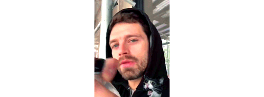
hi babe!! could you PLEASE make icons of EVAN 🥹 in the latest episode?? esp. in the blue shirt and the lafd jacket and the tank top?? 🫦 but like...ALL of his outfits looked so good on him!! no rush as always and for colours...you know my favorite ones don't you?? 🥰 thank you darling, love you lots!!
hi babe ! yeah, i can absolutely do this ! he looked so good ✨ the wardrobe department really spoiled us.
1 note
·
View note
Note
Would you ever share your colouring or make a tutorial about it? It looks amazing!
hi nelly!! thank you so much 🥺💙
i don't really have any colourings to share because i don't save them 99% of the time (unless i know i'll color the same scene again soon), i usually color each gif from scratch. but i can give you the usual steps i do to color 911. first i do my sharpen settings (i have made different actions that i'll use accordingly to the scene, and then i have an action i call "coloring lineup" lol, that brings out all the layers i use in the right order. the layer order i use is almost always like this:
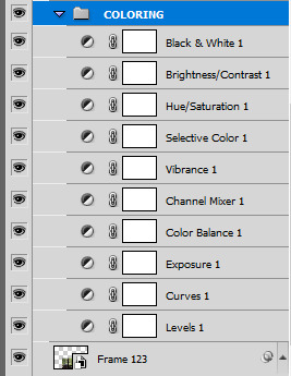
i don't always use all of them, but it's the ones i use the more, in usually this order. more details under the cut, i apologize if this is hard to follow, i'm not really good at tutorials haha. oh and i use photoshop cs5 (so old, i know haha, i'm still stuck in 2011 apparently)
Levels
i usually use levels to brighten the scene if needed, by using the white point dropper icon to select the brighter part of the image (or sometimes just a bright spot, not necessary just the brightest will work). this will usually brighten the image and sometimes balance colors. you can also do this with the black point dropper with the darkest part of the image (the dropper on the top).

sometimes when needed i drag the middle slider to the left to make things brighter, and the black slider to the right just a little so things don't look too washed out.(just beware of this with skintones):

Curves
you can do pretty much the same thing as levels with the a curves layer (i know a lot of people do!), but i usually use the curves layer only when i need to add more brightness. i prefer using levels and color balance to balance the colors in the image (i'm just more used to it), and an exposure layer to bring more light.
Exposure
if the image needs more light, i usually up the exposure just a little. usually between +0.10 and +.50

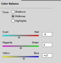
Color Balance
color balance is where i usually spend more time. i do prefer a cold tone to gifsets so i tend to push the yellow out by bringing the color cursors into blue and cyan, if needed. i usually do this for both midtones and highlights. sometimes for shadows too, if it's a particularly dark scene. i'll make sure it's not too magenta or green too. of course it depends on the image, but the sliders often look similar to that:

Channel Mixer
now channel mixer is a miracle worker sometimes! especially if you need to kill out yellow hues, or green, magenta, etc. this tutorial here is really helpful, and much better than anything i would say haha. i usually only use it if i can't correct the colors the way i want to with color balance.
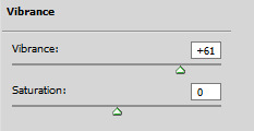
Vibrance
i always add vibrance to my gifs, usually between +20 and +80 on the vibrance slider, and maybe some saturation if the image is particularly bland, but i prefer to add saturation with other layers.
Selective Color
selective color, my beloved!! it's my favorite adjustment layer and what brings the whole thing together. i spend most of my time coloring a gif here. first i will fix the skintones because it's usually too red or yellow or magenta, or even too bland or too bright.
with the Reds i mostly play around to get the skintone to the right shade, with usually the cyan, magenta and yellow sliders.

in Yellows i fix the skintone if needed. it's sometimes too yellow, so i bring the yellow hue down with the yellow slider, and sometimes the cyan slider as well.
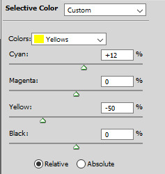
if there's still too much magenta left in the skintone, then playing with Magentas to remove it usually does the trick
Neutrals is good the darken or brighten things up a bit with the Black slider, but beware with gifs with poc especially so it doesn't wash them out
i also always have the black slider in Blacks up 10-20%

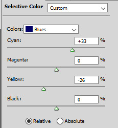
once the skintones are good, i usually add another selective color layer to play with the other colors that need altering in my opinion. i like to focus on the blues, so i often play with the Cyans and Blues

I usually make greens lush and greener with Greens and Yellows, and even Cyans sometimes, but be sure it doesn't affect the skintones. you can even mask the layer out with a smart mask, i do this often.
Hue/Saturation
this layer is very useful if there's still too much red in skintones especially. i usually go to the reds and bring down the saturation and lightness a bit as needed.
if you want to bring more saturation to a color in particular, you can pick it with the dropper and then play with the saturation or hue levels there. you can even change the range of color the picker selected with the bottom color sliders. it's useful if you want to edit a larger range of colors altogether.

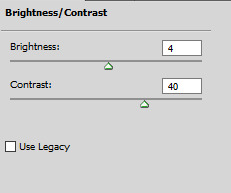
Brightness/Contrast
i always add a bit of brightness/contrast on top of everything. usually the brightness slider is between 0 and 25, and the Contrast slider between 20 and 50.
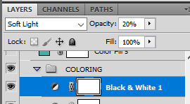
Black & White
i always put a black & white layer on top of everything, set to Soft Light, at around 10-40% opacity. it adds a bit more crispness and black to the blacks in the image and i don't know, i just like what it adds lol.
and that's it! that's how it goes usually. i've been making gifs for over 10 years and i've used this method for at least half of that lol. of course every show and every gif is different so every layers will have different settings everytime. this is why i prefer coloring from scratch, i find psds don't usually work well on most scenes, because every scene needs different settings.
other tutorials that are really good and use similar methods to mine:
coloring yellow tinted shots
queen becca's coloring tutorial
how to properly color poc
another great coloring tutorial
how to change the background color (i use this technique very often)
i hope this helped a bit!
84 notes
·
View notes
Note
very excited about your buck + tinder set over here!! ☺️
aah thank you nelly!! i'm excited to post it, i'm hoping on monday!
1 note
·
View note
Note
If you receive this, you make somebody happy! Go on anon and send this to ten of your followers who make you happy or somebody you think needs cheering up. If you get one back, even better! 💖
Thank you Nelly!!!
2 notes
·
View notes
Last Seen Blogs

lovepleasantalpacastudent-blog
Senza titolo
hamburgrr
Rotating Turtles In My Brain
the-depths-of-vesuvia
The Depths of Vesuvia
farizal
farizal.com

thecashbackcouple
The Cash Back Couple