#doc harvey
Photo

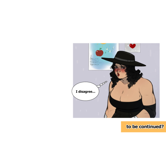
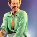
Poor man, little does he know what he awaits... hehe
Yes, I know I've been missing a bit, but here I am! and I still send this wonderful man , but now with a very hot and muscular farmer >:3
#sdv#sdv oc#sdv harvey#doc harvey#stardew valley#stardew valley harvey#sdv farmer#sdv x farmer#muscular girl
284 notes
·
View notes
Text
New chapter of Duty of Care is up!
#harvey#sdv harvey#stardew valley harvey#stardew harvey#doctor harvey#harvey stardew#harvey sdv#harvey stardew valley#harvey and jerusha#harvey and farmer#jerusha howard#sv harvey#doc harvey
0 notes
Text
A few doodles of my lil goobers I could manage-

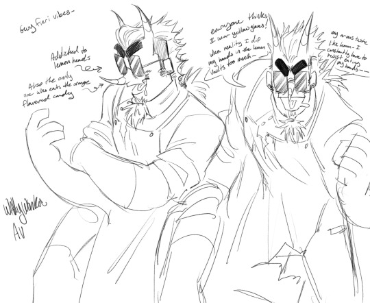
I criminally don’t draw Dusty as much as I feel I should be smhhhhh- (Robbie on da brain 24/7)
#Welcome home#welcome home oc#lovelie robs#Robbie robs#dusty bunny#dr stone face#harvey bazaar#5 lil goobers right there m8#Funfact#dr stone out of all of the weirdos-#-would get along the most with Dusty#Mostly since Dusty is a very gentle quiet mans-#And doc doesn’t understand Dusty’s speech (just thinks they are agreeing with him)
1K notes
·
View notes
Text
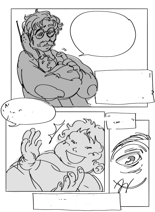
first page of a very self indulgent sdv comic i drew at 3am
#our daughters name is cheese burger#doc draws#stardew valley#stardew valley harvey#sdv harvey#sdv fanart#stardew valley fanart
179 notes
·
View notes
Text

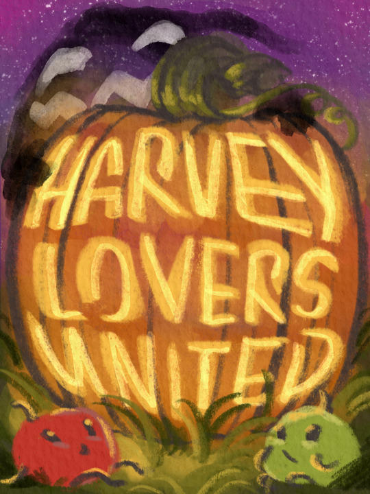

A few pieces I completed for our discord server's first event, thanks to @runawayface ! Every week, we had a new puzzle to solve courtesy of the mysterious wizard Rasmodius with an even more mysteries prize at the end of the month 👀
The first piece was a collab with my beloved @doctor-aceus-art . It's for a jigsaw puzzle! The second and third pieces were both for a memory card game-- there were lots of people who submitted awesome artwork of the rarecrows!!
Overall, HLU's first event has been a massive success! 👌
#tbh doc killed it with the coloring#as always#he never misses#I'm very proud of the pumpkin carving on the memory card piece#i did those letters by hand#then i remembered i could have just stretched the letters into shape#stardew valley#sdv#sdv harvey#stardew harvey#sdv fanart#my art#harvey stardew valley#harvey sdv#stardew Elliott#stardew Leah#stardew Shane#stardew Emily#stardew Sandy#stardew Sam#stardew krobus#stardew sebastian
358 notes
·
View notes
Text
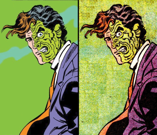
✨️Fanart✨️ vs the actual character

Original pic under the cut
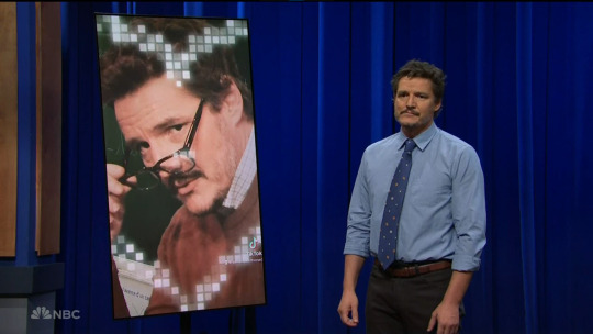
#stardew valley#harvey sdv#sdv harvey#sdv#art#i love him#my art#pedro pascal#this is just a perfect meme format okay#i will probably redraw this with other charas as well xD#one with doc ock is in work already#love the history teacher look for our boy pedro#stardew valley meme
658 notes
·
View notes
Text

a tipsy, Velma moment 😌
#tw: alcohol#stardew valley#sdv#stardew#stardew valley fanart#harvey stardew valley#dr harvey#sdv harvey#harvey sdv#stardew harvey#just a lil tipsy doc 💞
491 notes
·
View notes
Text


yeah i’m chill w this
39 notes
·
View notes
Text
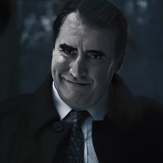
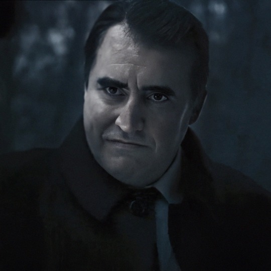
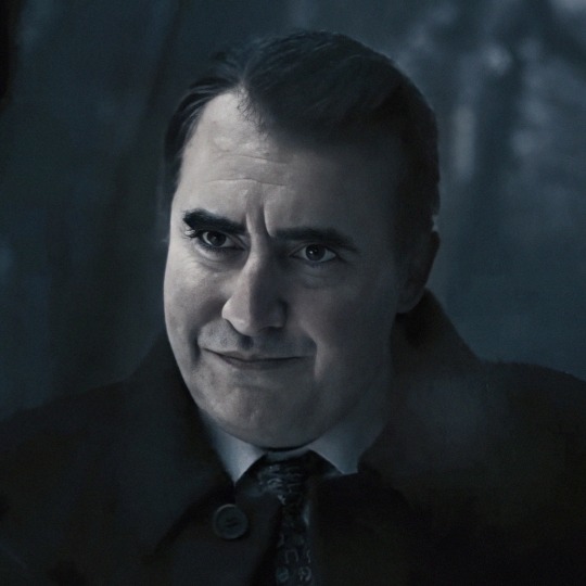
batman: the animated series S2E01
[VD: an exterior shot of a house in Gotham City at night. One side is pristine, with crisp white paint and clean windows. The other side is decrepit, the windows bordered up as the building itself looks rusty and like it's falling apart. Inside, Bruce Wayne is shown in his Matches Malone disguise and is unconscious on the floor after being electrocuted for sneaking in through a window. In the foreground we can see a man's shoes as he sarcastically announces, “It appears we have a prowler!” His voice is low and growled as his henchman flips Bruce over so he's laying on his back.
Bruce groans lowly as the goon slaps him twice to wake him up. He's hoisted up on his feet and then is roughly turnt around to face the shadows, where the mystery man is standing with his arms crossed. He asks, “Who are you? What are you doing here?” Bruce stutters his explanation in a fake voice as he rubs his head, “I'm Matches Malone. Heard bout a new mob. Thought I could make some more dough…” The man steps closer and jeers, “Is that so?” He walks away as Bruce watches him. The man flips a coin once with one hand as he continues, “Well, you heard right. In fact, you can double your take on the jobs we’re pulling... Assuming I let you live to join my gang!” He dramatically steps out of the shadows, revealing to only Bruce's surprise that it's Harvey Dent!
Bruce gasps slightly and stares at Harvey in shock as Two-Face steps closer to him. He sneers, “Matches Malone, huh? Never heard of ya. But theres something about you that I don't like.” He jabs his finger against Bruce's chest as he goads, “Nothing that I can put my finger on but I trust my hunches. Kinda like a second sight, y'know?” He pulls out his coin and states the stakes, “Good heads you live, bad heads you don't. Simple, huh?” Behind Bruce, the goon cocks his gun as Harvey flips his coin. Bruce stares wide-eyed as Harvey looks at him with an impassive expression. The coin lands in Harvey's palm—the scarred side facing up. Bruce looks down at it with that same appalled expression before looking over his shoulder—where the gun is already being raised to bluntly hit his head with the muzzle of it. We hear Bruce's pained grunt as the scene cuts back to the exterior. END VD]
#like sorry but i think bruce deserves to get his shit rocked by a man that sounds like he ate glass and smoked 5 packs of cigarettes#LITERALLY WENT THROUGH SO MUCH HASSLE TO UPLOAD THIS BECAUSE!!!!! GOD!!!!#ALSO THE CONTRAST TO HOW HARVEYS VOICE WAS ORIGINALLY....#BTAS MY BELOVED#twomatches#<- my fic..... that ‘appears we have a prrowwelllerrr’ has me about to act up in my google docs....#BUT AHHH THIS IS WHAT I MEANT BY HE STILL PRESENTS HIMSELF. COMPARING THIS TO THAT LAST POST AND HOW 2F IS ADDRESSING BRUCE...!!!!#JUST !!!! GOD I LOVE BTAS SOOOO MUCH AND THE DIFFERENT NUANCES ALL THE VOICE ACTORS GAVE THEIR CHARACTERS#posts from the crypt#crypt's clips#bruce wayne#matches malone#harvey dent#two face#btas
66 notes
·
View notes
Text


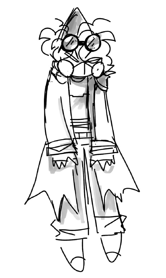
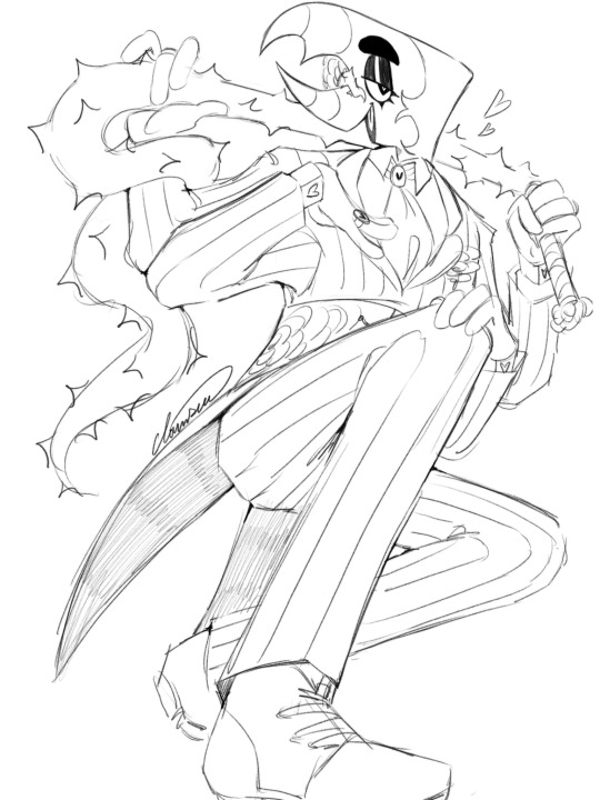
a couple of harveys since i've been working on redesigning him! i really want to have him look more put together, and i feel like i've definitely made progress!
harvey octavius is my spidersona/oc who ALSO doubles as his dimensions doc ock (though i haven't gotten around to redesigning his mechanical arms)!
16 notes
·
View notes
Text

Now I see why some of y'all fancast him as The Penguin. He really would be a good (and sexy as hell) version of the character. 🥵
#i wish i could see that#i mean he has voice acted as many dc characters#but i guess he's too recognizable as doc ock#to play another live action villain#oh well#a girl can dream#harvey torriti#the company (2007)#my sweet alfredo#my heart#❤️❤️❤️❤️#alfred molina
102 notes
·
View notes
Text
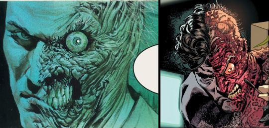
August is the 80th anniversary of Two-Face and what better day to celebrate than the 22nd? Here's some visions of the Divided Devil by some DC Legends!

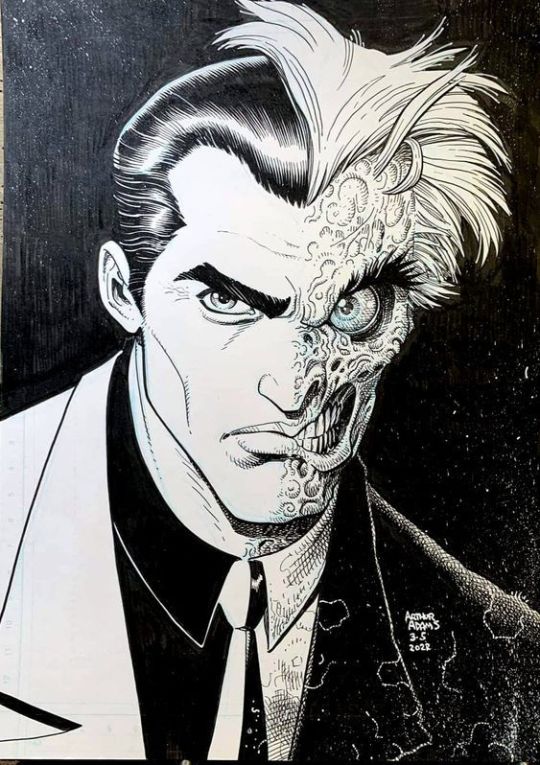
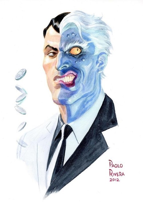

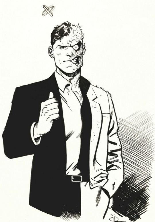
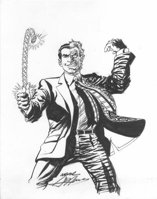


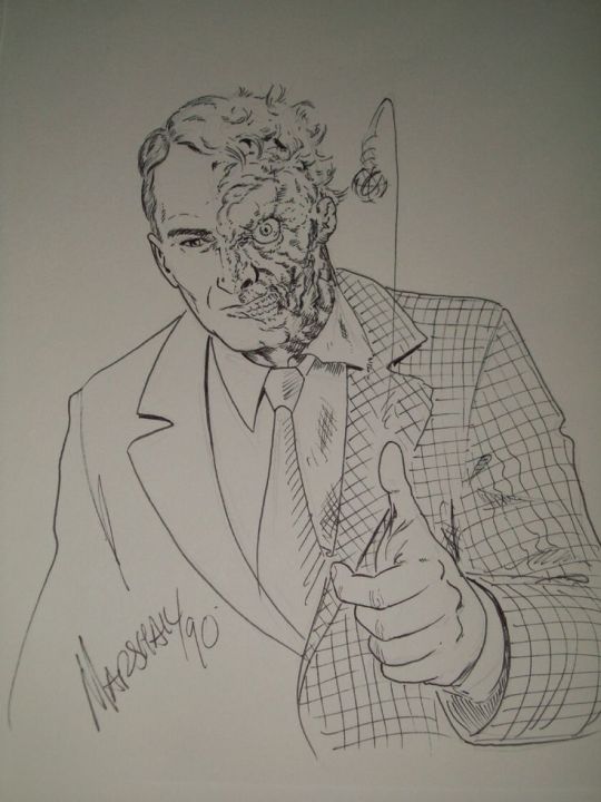

#dc comics#two face#harvey dent#john byrne#dick sprang#marshall rogers#michael golden#jim lee#neal adams#paolo rivera#art adams#paul smith#evan doc shaner
98 notes
·
View notes
Note
So which Twoface scarred design do you like based on anesthetics the most? And any theories about the variety of colors, like do any play into color theory or any meaning, or are just limited to printed color limitations/artist sole interpretation?
This would have been a much shorter answer if you hadn’t added the second part. But I’m glad you did, because I love talking about this shit!
While I do have certain… shall we say, opinionated preferences for my ideal design for the scarring, my taste is dependent on SO many different factors. Since you brought up color limitations, let’s start there, because that speaks to a certain aesthetic of Two-Face that I love.
First, let’s talk about the basic design, the gold standard of the Golden Age. The very first appearance of Two-Face has served as the model for how the scarring's looked ever since. The iconic features include a permanent snarl, a bulging eye, a wilder hairstyle with differently colored hair, and different coloring from his unscarred flesh. Every version of Two-Face since has either followed or subverted this original depiction.

(Note: I could also go on a whole tangent about how this design MAY have been based on a poster for the 1941 film adaptation of Dr. Jekyll and Mr. Hyde, which I’ve recently had reason to suspect may be bogus for reasons related to the complicated history of Batman’s supposed “creator” Bob Kane, but that’s several other essays worth a material. And that’s not even taking into account who actually drew this original comic, whether it was the credited Kane, or Jerry Robinson and/or George Roussos. The history of Golden Age comics is rife with controversy, plagiarism, and bullshit, with Batman being no exception.)
For roughly 50 years, this was, more or less, the standard version of Two-Face. Even as DC evolved through different eras of “House Styles” where all art had to maintain a certain consistency, this design underwent very little variation over five decades. While his scarring would occasionally be depicted as gray or off-purple or even flesh toned, it usually stuck to the original choice of green.
Why green? Why would a man who suffered an acid attack have green scarring? Putting aside questions of realism (which have little place in the world of comics), the reasoning was tied to those specific issues you raised about printed color limitations. The history of comic book coloring is absolutely fascinating, when companies had to rely on printers to produce the cheapest possible product on a regular deadline.
These printers (supposedly backed by organized crime) published comics on newsprint with the four-color CYMK color model, and comic artists had to work within these limitations. This led to some interesting color-coding for heroes and villains in superhero books, with the heroes depicted in primary colors like red, yellow, and blue, and the villains being depicted in secondary colors like orange, purple, and green. As you’ll note, Harvey’s design uses all three of those secondary colors, appropriately enough for a man obsessed with twos.
To this day, these colors are what are used for classic, “retro” depictions of Two-Face, which you can still see on merchandise today. As such, I have great affection for this basic design with these colors, especially when they appear on newsprint with the visible newsprint dots.Over the past couple decades, we’ve seen comics companies reprint these classic stories with cleaned-up, “remastered” artwork. As time has gone by, I’ve come to dislike this treatment of older comics, which were specifically drawn for a period where coloring and printing options were strictly limited. Removing those limitations with computer coloring only seems to make the linework appear more dated, at least to my eye.
For example, take one of my personal favorites, the third chapter of “A Lonely Place of Dying.” On the left is the current, cleaned-up version, while the other is a scan from a long-defunct tumblr user jthener-comics-vault who emphasized the newsprint dots and yellowed newspaper.
Some may prefer the version on the left, but I strongly prefer the version on the right. There’s just so much more aesthetic appeal with the second version to my eye. The version on the right looks dated, while the version on the left looks timeless because of how it embraced a certain retro aesthetic. Your mileage may vary, but that’s where I’m at with my taste preferences.
(See also: the recent revival of interest in CRT TV screens with classic video games, discussed in this popular post about how games were designed for the limitations of older TVs, and how current pixel graphics don’t look right in comparison. Given how there’s now a whole Reddit community dedicated to CRT TV pixel graphics, I’d love to see people embrace classic comics in the same way. But alas, the people who care about such things are literally a dying breed, as most comics fans seemingly don’t have much interest in anything beyond the past decade or so.)
So if you’re talking purely aesthetics within the classic limitations of comics, I consider the version on the left to be my platonic ideal for a perfect Two-Face. It’s not because the linework of the scarring is anything special (as much as I worship the late, great Jim Aparo, his Two-Face scarring looks like Harvey dipped himself into some creamed spinach), but because the scarring fits the overall aesthetic of the printing techniques of a bygone era.
So that would be ONE example of my preferred take on the scarring, with a specific version that emphasizes his classic newsprint roots. But it’s not the only one, because those limitations were soon expanded by the 1990’s, with advances in printing quality and coloring techniques. On top of that, DC started hiring artists for stories far outside their usual “House Style,” which led to all manner of weird and varied interpretations of characters like Two-Face, depending on the story. In fact, his appearance–along with his personality, motivations, and even his own backstory–would change drastically from one appearance to the next. His scarring alone could be green, pink, red, blue, purple, or some variation of the above! And that’s not even taking into account the pen-and-ink linework choices!
This finally brings me to your original question of which version of the scarring I prefer. While I still love the classic retro take on the character as well as stylized “dark deco” versions like his appearance in Batman: The Animated Series, there are certain traits I look for in modern depictions of Two-Face. These preferences were undoubtedly informed by the fact that I saw Sam Raimi’s Darkman as a young teen and fell in love with the prosthetic makeup effects by Chet Zar and Toni Gardner, who created a viscerally horrifying template for what I wanted to see used for Harvey Dent ever since.
So these days, when it comes to what I really want to see in the scarring? At this risk of being too graphic, I like the flesh to be stretched and warped, the lips and eyelids peeled back and exposed. I also STRONGLY prefer there be no clear line down the middle between the scarred and unscarred sides. There should be some sense of integration between the sides, rather than two separate faces–one realistic and one cartoonish–slapped together. Some of my favorite examples include Alex Ross and Doug Braithwhaite’s Harvey cameo from Justice #2 and Brad Walker and Doug Hennessey’s from “Ugly Heart.”
Basically, I prefer a style that’s evocative of movie-style body horror, adding realism without being realistic.He should appear shocking while simultaneously looking like someone who has suffered, and continues to do so. It should compliment (but NOT play up) the good/evil dichotomy, without veering into cartoonishness. Doing that leads to him being treated as more of a gimmick crook rather than a three-dimensional character.
Again, we’re talking my own personal preference here. As a character, Two-Face represents different things to different people. When creating the story Batman: Faces, artist Matt Wagner wanted Harvey’s scarring to be red because it emphasized the “devil inside” motif. For many people, Two-Face is a character who conveys the evil within normalcy. Fair enough.
But for me, I like red because it looks like exposed flesh and tissue, emphasizing the raw pain Harvey has and must endure. I prefer when the scarring emphasizes tones of flesh and blood, like reds, pinks, and purples. I loved the blue scarring of Batman: The Animated Series on its own merits, but it only works within that specifically stylized “dark deco” context.
And when it comes purely to linework design, I think my ideal model would be the work of sculptor Andy Bergholtz, who not only designed a bust I will never afford despite dearly wanting, but who also created an incredible pumpkin carving of Two-Face which, weirdly enough, endures as one of my favorite depictions of the character.

Notice how Bergholtz doesn’t draw a distinct line between the two sides, but instead shows how the flesh stretches and warps from one side to the next. It looks painful, while also being perfectly integrated with the rest of the head. Hell, even the choice to go with the classic green coloring works, because of how it looks sickly and gangrenous! It still looks fleshy, even with the comic-book-y coloring choice!
These sculptures are my baseline for how Harvey’s scarring should ideally look. But at the end of the day, the scarring is only one factor I look for when it comes to depictions of Two-Face. It’s how the scarring looks with his unscarred side, especially if the artist actually chooses to DO something interesting with Harvey’s face rather than just depict him as a Bland White Dude or Generic Gangster. It’s also how both sides of his face look in whatever he’s wearing, how they’re drawn in the linework, how they’re colored and depicted on paper and/or online scans. So many factors go into making/breaking Two-Face, just as they do with pretty much every other comic character who has existed for decades at this point.
But ultimately, none of that matters to me as much as the writing. Harvey could look absolutely terrible in the artwork, and I wouldn’t care so long as the writing treats him with empathy and compassion. Still, I appreciate you giving me this opportunity to reacquaint myself with his aesthetics, which I’ve too long disregarded because–for many–that’s all they see when they think about Two-Face. Not as a three-dimensional character, but as a walking pile of aesthetics. But it's nice to revisit those aesthetics as a reminder of why he's continued to endure as an iconic character for eight decades.
#harvey dent#twoface#two face#ask hefner#long post#what the hell are those links under my images now#why does copy pasting a draft from google docs do that now?#that didn't used to happen last year
65 notes
·
View notes
Note
fine, no fishing mini game, but when will we be able to unlock skull cavern? I need some iridium to gift to Yvette.
Okay but which Stardew Valley love interest would all the Signal Hill characters be? 🤔
#i don't think there's a good answer to that question LMAO wildly different vibes#i mean. doc is harvey. for one#ask#anonymous
15 notes
·
View notes
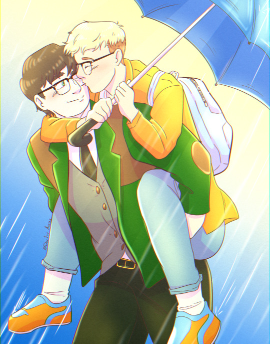
Text
HEYHO!
So here is the deal: I have two active storylines going that mostly the lovely @stardew-atlantis is writing for me, because i'm more of an artist than a writer.
So if you are interested in some more lore than is present in my art check out:
Stardew Valley (Jay/Harvey)
https://archiveofourown.org/collections/SourCherryFarm


Spiderman AU (Jay/Otto)
https://archiveofourown.org/works/42379488
Update:
I opend a lil Kofi page if you guys want to support my work. Don't feel pressures if you can't or don't want to, sharing and liking my work is more than enough.
Thank you for being here
#my art#stardew valley#farmer oc#farmer jay#harvey stardew valley#harvey sdv#stardew oc#fanart#jay basham#doc ock#doctor octopus#otto octavius#spiderman#spidersona
42 notes
·
View notes
Photo

when you remember you have a type
#its men with mustaches btw#dorian harvey doc#all mustache#2/3 are doctors#the last one is a necromancer so like same???
22 notes
·
View notes
Last Seen Blogs

thecentennials
The Centennials

peecoso
Untitled
youflowerr-youfeast
little freak, jezebel.
risingsunresistance
The Sun Will Rise Again! ✦