#clean linework is my enemy
Text
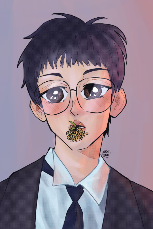
anime girl wonu
#wonwoo#jeon wonwoo#seventeen#svt#svt fanart#seventeen fanart#kpop#kpop fanart#my art#this was for a wonwoo bday cupsleeve<3#clean linework is my enemy
4 notes
·
View notes
Text
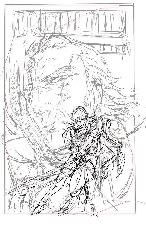
YRMR cover progress for the curious!
before drawing, there were a few things i knew that the cover had to have/show:
critically, had to have vibes of an enemies-to-lovers dynamic in the sense of ... the power tilt? even though that's not "technically" the true nature of their dynamic. gunter's not a nice guy in this fic, even aside from the possession, and i also didn't want anybody to run into this unsuspecting the darker parts to the fic. him more looming/threatening than you'd expect in base game, etc.
wanted to emulate kozaki's style through the whole cover in line qualitty, coloring, and composition. thankfully he gives a few tips over on his twitter. it's both a neat little nod at the source material, and also as a style experiment.
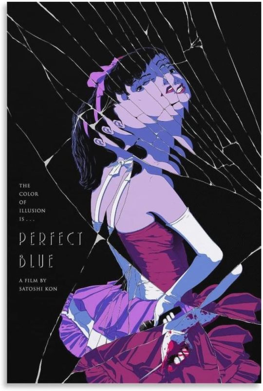
a big theme in this fic is gunter being made of so many masks/shells (there's a perfect blue cover, see below, that specifically made me think this composition could work.)
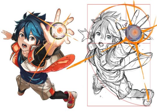
learning that kozaki hews pretty close to grids + the golden ratio was another big lightbulb moment, here's a drawing yoinked from his twitter where he shows it himself.
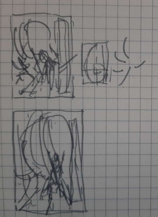
after scraping/studying from kozaki's twitter, i made one or two thumbnail doodles below. you can see the solid one had a golden ratio + general line dynamic check squiggled to the side. there's room for the title, the focus is on corrin, it'll work both in a horizontal and vertical crop, looking good so far.

you can see how pretty tightly to the thumbnail i kept, other than moving the vertical text to the top since i didn't have as much room there. i'm a little worried about the different line quality between how big the face is vs corrin but we'll see.
something i also realized i like about the composition is corrin "could" look like she's attacking the viewer, but she also looks like she could be guarding him with her back to him, which.... heh. comes up in some interesting ways in the last third of the fic (possession wise).
bunch of cleaning up.
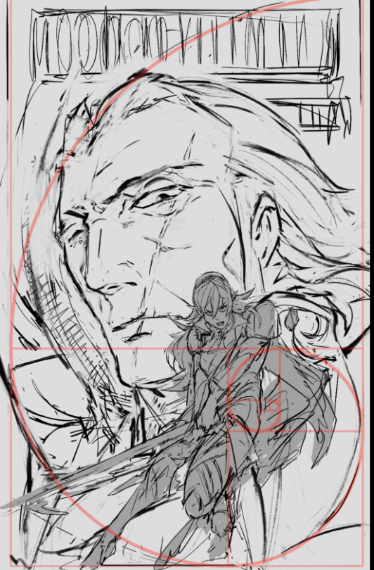

as I suspected since this is 11x17in (much bigger than what i normally draw) i had to grab a different brush for gunter since thin lines were not going to work as they did for corrin. i think kozaki's real genius is how he treats texture with his linework; where he does thin lines, where he puts the thick ones, etc.
corrin's coming along great but there's a spirit to the first face on the left i think i'm missing now, so i'll probably re-insert that. (also decided to at least draw in his face there even though the masks/slices will distort that). i think what also helps is gunter's face is very low contrast and needs to remain low contrast, to help corrin pop out in front.
then i started thinking about typography. a lot of the fonts i had were either way too masculine/bland/modern, or way too feminine/curvy. this title needs a hint of masculinity to nod at FE's general action-adventure RPG roots, but it's also very distinctly the kind of erotica that doesn't easily lend itself to a genre. it's tender horror, it's daddy kink, it's vicious romance, it's ... a lot of things.
here's another thing: when thinking about title typography, another consideration is genre. briefly i considered something like lovecraftian covers; my doujin circle and i had been sharing pictures of old pulp covers. i also noticed a lot of my favorite JP erotic horror doujin have very spiky titles. this title also needs to be scrunched up in a tight space so it's not like we got a sprawl of acreage here either.
what doesn't help is enemies to lovers doesn't really have a visual language in mainstream media.
it's a staple of Ao3 (written) genres, but the closest you'd get otherwise would be romantic horror (kind of says a lot about who makes what huh?). for example, the shape of water (movie) isn't a 1:1, but it's pretty damn close -- unfortunately that poster dodged the question by using an art deco-inspired font typeface that was more about the setting than the genre.
and then i had an epiphany. maybe i was approaching this from the wrong direction: it's the knight/liege romance that's the heartbeat to YRMR.
think more old dragonlance novels. old medieval/fantasy pulp novels; plenty of kinky sex and ass in there, and still close enough to FE. remember everyone and their mamma having a bi ass crush for bad boy raistlin? that's the vibe i want.

this kind of glorious deranged shit. you're not gonna be surprised at possessed grandpa whip kink if you read these on the regular.
after ~*arcane designer magic*~ (I do this for a living) bolton and magiona display were the two fonts that were gonna work just fine together.
god that looks so much better. this looks believable now.

the thin/thick line weight contrast in magiona display is going to accentuate the lineart in a way that might be tricky with other fonts that work better on painted covers. bolton's "squished" vertically enough it doesn't compete with the other one, and makes for a good secondary/tertiary font.
few other things happened.
i shrunk gunter's face because not being able to see his jawline (sex appeal u see) was bothering me from a composition standpoint. it's the same reason frank frazetta didn't censor his glorious asses.
(said seriously, by the way. so many people don't give their lust in art enough credit.)
i also needed more room for the title to show, and the line quality/scale difference between his face was also bugging me. does this mess up the golden ratio composition? sure, temporarily, but his armor's weirdly flexible that we can adapt it pretty easily.
it's about this time i'm also looking through my hydrus network stash of favorite covers for what color palette and contrast to use. kozaki tends to skew purple/cooler hues for nohr characters, and that'd go well with these two.
purple/green hues that play well with light purple and the yellow from those old covers i love so much, low contrast midground, and something that'd contrast well with text above. dark/black background for the gothic vibes, and the text will probably need to be white or some sort of light-warm hue for that "pop".
doing color tests is more of a leap of faith and intuition than an exact science, but damn it is it satisfying when you nail it in one go and go 'holy shit i want to read this. :D

(green/gold for the hint of anankos' mask, also matching the yato and her warmer skin tone. purple flames for him, but the high contrast armor to separate her from his larger shapes. we've got the dragonstone and the yato as flexibility for lighting and emphasizing contrast with her. )
i kind of like how i accidentally made the mask shards reflect(?) a bit of his own face. hell yeah throw it in. this is something that's more likely to work than not. this is something that has that mix of id and horror i've been going after.
here's another version with references to the side and the golden ratio laid on again.


honestly a lot of it at this step is going 'dude you know what would be SO DOPE.... PURPLE FIRE...' 'dude..... fuck yes....' 'what about some sick ass sword effects?' 'YEAH....' and saving a bunch of backups in case of the idea didn't work out.
(am i going so much harder on a literal gilf porn fanfic cover than i need to? hell yeah. gunterfuckers deserve better. :D )
anyway here is when i start questioning everything, so i'll take a break from the colors to tighten up the lineart. now that the composition's settling in much tighter, i'm also thinking about how the two shapes interact with each other and if there's any potential issues with tangent points (where two lines intersect each other in a way that makes an optical illusion.)

that said i love how his jawline "points" at her face, that kind of line you want.
grinding away on corrin's lineart. also double checking that the shapes/colors/forms for her "make sense" both standalone and with the composition too. what's nice is she's at the point where i can just turn off my brain and polish up.

naturally couldn't resist poking at it more and this is when the rest of it clicked after figuring out which bit was anankos' mask, which bit was possessed!gunter vs himself (polished up the armor a bit too. at this point i'm pretty confident that it'll stay "set"; the biggest thing i'm likely to change is the blue silohuette to the dragonstone side for corrin.

here's the last true screenshot before cleaning up the last 2% of the lines. added the pulp cover texture around the border, switched the colors of the text so the cream would stand out more, cleaned up gunter's face and also increased the darkness of corrin's body so it'd contrast more with him behind.
thanks for reading. :D
39 notes
·
View notes
Text
Sonic Redraw challenge or practice

I’ve been seeing this post everywhere on Twitter and want to give it a try because I’ve been on a sonic kicks a lot lately and also I’ve been practicing on my linework, which I’m starting to like. Coloring on the other hand, wellllllll….. I still got work to do. For me, I think color I can be overwhelmed or lost or what to do so sometimes with some drawing it may look muddy or not as polish or not to my liking. (I know I can be my worst enemy) So I need to find materials to read to understand coloring more. So this was a practice run before I draw anything serious.
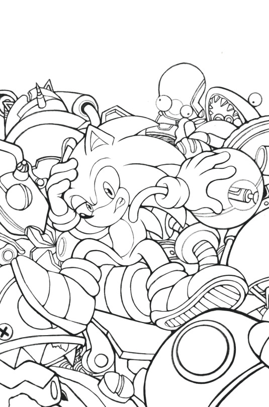
I have been reading the IdW sonic scrapnik island and I really like it a lot. It just a fun horror esc story of eggman scrap robot on a mysterious island. I like how sonic is more valuable and tails is geeky out. ( he is sooo flipping adorable 🥰) so I drew Min Ho Kim cover art, I like there’s a lot going on. I thought it would be a good challenge to practice.
I actually start drawing this before the sonic above. I was more focused on the linework here because I’m starting to not like the flat clean style of linework on some of my work. so I’ve been just using the hb pencil on my procreate instead which honestly I like it more. It somehow give it more dimension or something instead of looking stiff. Maybe it just look like I can control the lineweight easier eventhough I am technically using the same method as before. Where I just line and erase if it’s too thick or add more weight by overlapping it.
I kind of want any critique or opinion on these. Again these were more of a practice run. I am drawing a quick sonic sketch I had in mind because of a little silly joke lol 😂 but I do want to get back to something more serious soon, so maybe something with this linework? Who knows?
#Sonic#sonic the hedgehog#sonic fanart#sonic the hedghog fanart#sega#lineart#fanart#practice run#I technically don’t want to call it my art#scrapnik island#idw sonic#redraw challenge#sonic redraw
16 notes
·
View notes
Text
Irenic. (Ch. 29, Tobirama x OC)
Sometimes life is decided in a mere second.
A decision Akiko Uchiha, younger sister of Madara Uchiha, believes in with all her heart - and yet one that seemingly cost her everything. But for as long as she could remember, she had one dream: peace. And for this dream, she is forced to give up everything indeed. Yet sometimes the brightest things are born of the deepest tragedies and thus, when Akiko Uchiha took up her arms and ran, she had no idea what fortune had in store for her.
Warnings: Grapic violence, (canon) character death, canon violence, enemies to friends to lovers, slow burn, hurt/comfort
Length (this chapter): 5,3k. Chapter twenty-nine of Akiko’s story. On the verge of death.
Thank you so much for bolstering my confidence and beta’ing, @kuramakakashi 💖💖 I cringed a lot about this chapter, for a multitude of reasons. I guess I still do.
Read here on AO3!
Excerpt below:
The room was silent save for the low hum of the energy and the strained breathing sounds Akiko - no, Tomoe forced Akiko to do. Tobirama had often witnessed his brother's marvellous skills. But never before had he been nearly overcome by the urge to simultaneously buckle over, cry, shout, pull at his hair and simply grasp Akiko's cheeks and tell her it'd be fine, it just needs to be done. So much so he simply froze in place, overcome by the very unknown onslaught of emotion - and took consolation in the faint hope the woman had heard - and understood - his brother.
The water was turning black. Slowly, Hashirama lifted the sphere back up from Akiko's chest to dispose of it in a separate bowl.
Tobirama thought he heard Akiko gasp.
The seal. He must do the seal now.
He placed the small pot of ink next to Akiko's exposed arm, scrutinising the mangled limb. Considering Hashirama's order was to seal her arm off, Tobirama decided that left no wiggle room as to where to place the seal: right underneath her deltoid, he drew the first suppression line after having dipped the tip of his index finger into the ink. He disliked drawing without a brush - the linework inevitably was shakier like this; thicker than with a fine brush and not nearly as intricate.
Akiko's skin was cold to the touch. No hum of chakra greeted the ink he was infusing with his own chakra to structure the boundaries of the seal. It was unsurprising; she was exhausted and Hashirama was recruiting what little was left of her reserves to weave into his healing, but Tobirama would not cease to feel gutted over how weak Akiko was.
A single moment had done this. And now everything was hanging by a thread.
His arm shook slightly. He rubbed the side of his face over his fur collar in an effort to clean off sweat - blood.
Sealing a limb - anything - off was a relatively simple task for him. The seal needed two components: a barrier to cut off the chakra network into the appendage as well as markings to reroute the flow of the network towards it; lest it would weaken the seal by frayed chakra network ends lapping at the seal constantly.
And, of course, such a sloppy seal would mean pain and discomfort for the bearer.
Even if time was of the essence, Tobirama would deliver no less than perfection.
Of course, the seal mustn't affect blood flow to not risk infarction or compartment of the muscles within the arm, therefore under no circumstances must the barrier get beyond a chakra or nerval level; so either way, after this, the arm will be entirely limp for Akiko.
4 notes
·
View notes
Note
8, 9 or 17 for the art ask meme!
I know this has been sitting in my inbox for a while, sorry! It takes me ages to organize my own thoughts and even more to actually express them, but I'm finally doing it!
I loved all of these and couldn't pick one so I'm gonna answer all of them, hope that's okay.
8. What do you like most about your own work?
Maybe this makes me sound vain but I'm very proud of my own work and it's difficult to choose one single thing I like. I'm aware that there's a lot of room for improvement but I love how smooth and clean my linework is and I'm very proud of my use of color. And if we're talking about what my art conveys rather than how it looks like, I think I'm very good at portraying the most tender aspects of relationships and intimacy and it's something I really like about my work.
9. What are you currently trying to improve?
BACKGROUNDS. They're my sworn enemy but I made a promise to myself last year. I told myself that I would draw at least one piece with a decent background per month this year and so far I'm actually doing it.
I'm also trying to learn more about perspective because my self-taught ass has been doing everything by instinct all this time and last year was the year I realized I can't bullshit my way through everything and sometimes I do need to sit down and actually learn the basics.
17. What inspires you?
Many things! Music, other artists' works, my own experiences, a need of catharsis... Though I think what inspires me to keep creating at the end of day is that art is a way for me to connect with other people. It's a way for me to reach the hearts of others and to let them see a piece of me and get a piece of them in return, and that's the most fulfilling experience ever for me.
3 notes
·
View notes
Note
clean linework is my worst enemy :(
I like clean linework owo
1 note
·
View note
Note
clean linework is my worst enemy
same bestie
Sometimes it works super great, sometimes it doesn't at all and I honestly cant tell why.
By now I've just reverted to using the sketch as lineart. I copy the layer and clean it up a bit and then thats it. Am I lazy? Yes, yes I 100% am
2 notes
·
View notes
Text
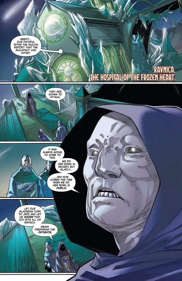
Magic #7
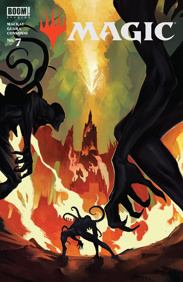
Magic #7
BOOM! Studios 2021
Written by Jed MacKay
Illustrated by IG Guara
Coloured by Arianna Consonni
Lettered by Ed Dukeshire
The Guilds of Ravnica, now aligned against a foe that threatens the entire Multiverse, must defend Ravnica united! Fortunately, the warriors of the Guilds have the legendary Planeswalker, Jaya Ballard, by their side to repel the mutant horrors of her ancient enemy. Will Jaya and our cabal of Planeswalkers be able to reach Jace Beleren before the herald of 'REDACTED' does?
With each issue I'm more and more impressed by what Jed does with this series. That we are seven issues into the run and we’re still following the same arc is for me utterly amazing. It is playing itself out in what feels like a natural progression as the story dictates it be told instead of being forced into what we would think of as trade arcs. So in my humble opinion this is the way the story should be being told. Also the bond that these three have been forging since the get go has been increasing exponentially with each new issue and this is another aspect to the story that I really like seeing.
Needless to say I am a huge fan of the way that this is being told. The story & plot development that we see through how the sequence of events unfold as well as how the reader learns information is presented exceptionally well. The character development that we see through the dialogue, the character interaction as well as how we see them act and react to the situations and circumstances which they encounter keeps their ever changing & evolving personalities at the forefront. How we see everything working together to create the story’s ebb & flow as well as how it moves the story forward is exceptionally well achieved.
I greatly appreciate how we see this being structured as well as how the layers within the story continue to emerge, grow, evolve and strengthen. The way that these layers open up new avenues to be explored, while exploring those that have already been opened all add this great depth, dimension and complexity to the story. That we finally get to see Jace again and that he may, may mind you, become more involved makes me a happy camper. How we see everything working together to create the story's ebb & flow as well as how it moves the story forward is impeccably achieved.
Guara’s people are really rather beautifully rendered, yes i’d like to see our resident medusa more frightening in nature but the faces and facial expressions we do see further the characterisation extremely well. The linework is clean, crisp and sharp and with their varying weights and techniques being utilised to create the detail within the work that we see is amazing. The one thing I would like to see more of are backgrounds. Though how we see the composition within the panels bringing out the depth perception, sense of scale and the overall sense of size and scope to the story is well rendered. The utilisation of the page layouts and how we see the angles and perspective in the panels show a remarkably talented eye for storytelling. The various hues and tones within the colours being utilised to create the shading, highlights and shadow work shows an excellent understanding of how colour works.
I know that this is based off the card game but in all reality the way that Jed tells this holds many similarities to any superhero book on stands right now. A group of individuals who possess great power come together to thwart a villain. In this case said villain just happens to be some godlike being who has been banished and yet is gathering enough power to once again return to claim what she feels is rightfully hers. It doesn’t get more classic a superhero story than this folks so we need to get out of the mindset that these types of books aren’t for you. I mean this is impeccably written with excellent characterisation and some dynamic interiors that can’t be tamed.
1 note
·
View note
Note
clean linework is my worst enemy :(
fuck linework
all my homies paint over sketch
0 notes
Text
so heres the long super paper mario post
strap in for why super paper mario is fucking bizarre and why that’s pretty much awesome
gonna be a good amounts of spoilers, so if you’re on desktop then hit that read more, and if your on mobile, then here’s your punishment for using this god awful app
super paper mario is a game that is incredibly difficult to put into words, but it leaves such a powerful, lasting impression on me and i can’t come to say anything first other than I love it so much, and if you havent played the game, please just go do it now, even if you have to pirate or emulate or something, just let yourself play this game. It’s one of those games that I really feel I can just recommend to anybody
it’s difficult to think of where to start with dissecting this thing so i’ll just start with the art since lookin at things is pretty easy
ART/WORLD DESIGN
every world in SPM is completely unique, not just in what type of environment, but it’s art style, and this is premised with the fact that none of these worlds are capable of existing together and are completely separate, and NOT part of a cohesive universe (LOOKIN AT YOU ODYSSEY I STILL THINK YOU LOOK STUPID)
The hub and the first 2 worlds are mostly just slight variants on the same general style of simplistic shapes and colors, with world 1 delving into more linework type aesthetics, and 2 focusing more on impressions and silhouettes,
world 3 changes this completely with what is obviously an 8 bit kind of style, but instead of jarring over sized pixels, the world is composed of detailed tiles arranged to look like pixel art that imply a more real world, and not a gamey one,
world 4 focuses on patterns and big patches of color to give the impression of the vast emptiness of both space and the surface of a barren planet, before giving you the “Whoa Zone”, with a striking mix of wire frame and futuristic UI style to it
world 5 takes the idea of nature being crude and simplistic and humanity being sharp, angular, and extreme and flips that on its head, with humanity and the space they occupy being these absolute memes with no sense of depth, and the plant life existing in a system of clean cut caves with futuristic technology and elegant historic values
world 6 simplifies a kind of colored Japanese painting aesthetic, down to the funny cylindrical cloud clusters and brushstroke trees
world 7 depicts what is essentially hell (yes there’s hell in this game keep your pants on) as a squarish blur of bright greens and warm reds and purples, and depicts heaven as fluffy land of clouds and Greek temples
and lastly, world 8 is inverted greyscale, where light is black and darkness is white, its simplistic and striking and i couldn’t think of a better style for the final area of a game so focused on the concept of light and dark
MUSIC
I’ll just try and keep it simple, the musics fucking cash money
The game makes great use of motifs when it needs to, where specific themes and instruments are used in other songs to suggest relationships and put battles and travels into perspective
And when it ISNT doing that, it’s just fucking funky stuff, with a weird trend of BOING and PLOP and SPLISH noises in the percussion because fuck you i guess
There’s a lot of good songs that do lots of interesting things, any of the like 5 final battle songs are great things to point to, but i’ll just go ahead and say the main theme of world 8 “Castle Bleck” is one of my favorites that isn’t super highly rated. It brings in the types of instruments that have been associated with the villain the entire game, but also throws in 2 very important things; a sudden triumphant burst of almost JRPG styled chiptune that pushes away the constantly building tension, which is then followed by the sound of a clock ticking, which is a musical motif only present in the songs “Memory” and “Promise” which is played whenever the memories of the player’s little guide thing and the main villain’s past lives together are alluded to. This one song holds a lot of weight, as well as simply being a fucking cool song.
GAMEPLAY
This is, sadly, the one place I’ll not mince any words and say the gameplay is not amazing by any standard, it’s pretty much a classic mario game if it had RPG stats, items, and random abilities granted through the character and partner systems. The 3D flipping mechanic is nothing astounding, though it is very interesting to see how worlds are constructed
One of the biggest flaws people will mark the game for in its gameplay is that it’s tedious, and while I have to agree, that’s because I’ve already played the game before, and the tedium only comes from not being completely invested in the experience anymore. I’ll get some specific examples in a bit, but there’s a few cases of “tedium” that i believe are 100% intentional and drive the story in an interesting way
STORY/WRITING/GAME DESIGN
Thats a fuckin broad section, but its pretty much everything else i have to say on the game, and where the most spoilers and random praise is gonna be
I’m not actually gonna talk about the whole story, more just the strong parts of it, under the assumption you’ve already played it or understand a story as simple as “villain wants to destroy world, hero wants that to not happen”
The writing and characters are just flawless, everyone is fun to be around, especially the bad guys, who you see more antics of than your own party. There’s goofy running plotlines about O’chunks and mimi essentially getting grounded and being forced to write essays about why they fucked up at beating mario, and big stinky brother dimentio teasting and bullying them and sneaking them out to do his bidding when The big Count Bleck is away
The game is full of referential humor to not just mario itself but all kinds of games, there’s skeletons in hell who are clearly just Marios from the mainline games who died in stupid ways, there’s an actual dragon quest turn based boss battle in hell too, and chapter 3 has an otaku villain who tried to get with peach in a simulated visual novel
but the humor exists not just in references, but in simple good scenarios, with things like “Having a game show in a bathroom when everyone's life is at stake” and “locating an ancient manuscript to use as toilet paper” or “flying through black holes to find a convenience store” and things of that nature
It also interacts with the players emotions in many interesting ways, one of the more lauded being chapter 2-3, where mario is forced into working off a massive debt of fictional money, and is required to do hard, boring labor. There isn’t anyway to avoid doing both the hitting a block 100 times and the running on a treadmill for a few minutes thing, but the constant feeling of “there has to be a faster way to do this” drives the player to prod around, find the secrets, and slowly discover how to break the system wide open and get to the end, and i love it for that
This entire game is some sort of bait and switch, to put it simply, while it’s already a bit of a departure from both mario itself and the paper series, the first 5 worlds are pretty fucking tame stuff, other than the void, which is a giant black and purple spot that sits in the sky, always, every single world has the void growing in its sky, and it does grow, every chapter it gets bigger and bigger and takes up the sky, but where this truly culminates into the “switch” part is chapter 6, which starts itself by presenting you with the most TEDIUS sounding chapter possible, fight 100 enemies in a row, and nothing else, and for 25 straight fights, that is all it is, so you’ve locked yourself into it at this point, you know whats up, but the void in the background begins to grow to the point of being the entire fucking background, and every enemy you face speaks as if they know they’re all going to die, and by the 30th fight, one of the villains comes to stall for time as the void completely swallows the world, and the party is sent back to the hub. When they decide to go back in to world 6, its empty, the entire world is a white void with a single black line making up the ground, and colorless destroyed structures occasionally peaking out of the ground.
and you walk on this white void for so long and you just feel nothing but regret and fear and no matter how fast you make yourself go you feel like you’ll never find anything, but you do eventually get your plot item and escape
then, Dimentio, one of the villains you’ve seen the least of, appears in the hub world, the safest place in the universe, and kills mario
he just fucking kills him
he puts mario in a box and fills the box with explosions and mario fucking dies and goes to hell because fuck you mario
then you go through all of chapter 7 just to escape hell (called the Underwhere cus how could we possibly be allowed to take hell seriously) and join up with your full party before confronting the final world, which i’ve already stated i just love the design off
the game just takes the comfortable ride you’re on and throws it into the fucking sun and burns you alive and i love it so much, even the very end of the game doesnt let up, where the main villain is overtaken by that absolute madman Dimentio (Whose name is a play on both Dimension and dementia), who clearly was powerful enough to have done the whole “ending of the world” himself, but did it this way for the theatrics of it
there’s a lot i could still say about the game, but this post is absolute rambling and its 2 in the morning but as usual, i just wanted to shit my thoughts onto the internet to people could maybe learn somethin about either the game or me and how i think and look at and respond to stuff, and as always, anybody who read this whole thing is cool and i love you a whole heck of a lot
86 notes
·
View notes
Photo

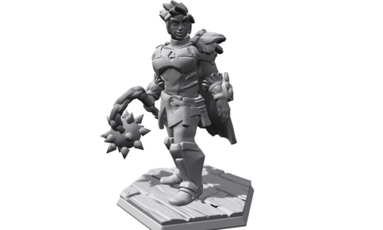
How to: Character portraits from Hero Forge designs
Here’s a quick look at how to make an avatar or color character sheet portrait from a Hero Forge design. You could also use this process to
design enemies
generate NPC portraits
come up with general character illustrations
If you don’t want to use Hero Forge, any grayscale 3D rendering will work. I may do a more in-depth pictorial guide later.
Steps
Get the source image - Use Hero Forge’s built-in screenshot tool to get a grayscale image with no background. If the lighting is wrong, try flipping it horizontally in the “pose” menu; you can flip it back in photoshop. Just be careful not to save it flipped.
Set up the outline - Open it in photoshop. Create a duplicate layer with 4px stroke and 0% fill to outline the image. This will always be frontmost.
Prepare for flatting - Do 4px linework to separate the regions of color. Shadows and highlights don’t need to be isolated because they’ll come back in from the mode overlay in a later step. I use two copies of this; one will be final linework, and one will be the basis for flat color layers.
Do flat colors - Fill the outlined areas with flat color. Be sure to extend your selection by 2px, so that final linework will overlay it completely. Depending on the lighting of the mini, you may need to use different levels of saturation for the colors. This may take a while, as you work through colorways for your character.
Reintroduce 3D - Set up the original grayscale screenshot as an overlay of the color layer.
Add texture - Add masked texture overlay layers to areas that would be textural IRL, or those which seem flat. In this example, I used images of brass to overlay parts of the armor.
Add detail - Add any illustrative details, like eyes, hair coloration, freckles, and fur texture.
Add shadows - Set up a threshold of the screenshot for deep blacks, and color it sun-shadow blue. Play with the blending until it feels right.
Add highlights - In particular, specular highlights and subsurface reflections will need attention. Most simple shadows will be handled by #4. I approach this as if I were working with an eraser, or a white conte crayon/colored pencil.
Clean up colors - The overlays slightly distort them, and while they may or may not be accurate, they may not communicate well. Her face is still a little too red and doesn’t read as brown as I’d like. (Ruth Negga was the skin color reference model)
Clean up lines - Remove unnecessary lines from the flat and linework layers. Clean up lines that are too uniform or jagged. I don’t have a drawing tablet anymore, so I was pretty lazy about this.
I made this character for a new fourth edition (4e) Zeitgeist campaign. I really liked the mini design. I won’t receive it in the mail for a few weeks, but I wanted to use a similar image for my character sheet. I’m sure many of you are better illustrators than I, but the process is solid.
I don’t work for Hero Forge and they have not endorsed this post. Still, they offer great tools for free, so do them a solid and buy a mini or two.
7 notes
·
View notes
Text
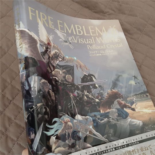
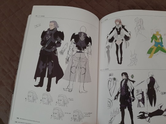
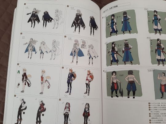
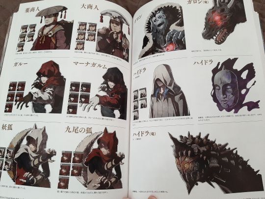
@/damoselcastel was kind enough to show me a bunch of the FE:Fates visual works artbook pages the other day!
and because i am continuing to be .... brain rotted (lol) ... grabbed a copy since there was more than a few relevant pages/official artworks, and wanted to have a high res/color corrected version of these pages for art refs to slap on my reference boards! if i'm looking at them every day now for the past three months they better be accurate!!!
anyway! it came TODAY!!! :D :D pakidge
IT WASN'T EVEN SUPPOSED TO COME UNTIL THE END OF THE MONTH AAAAA
god dang this thing is THICK, now this is what i call a proper artbook! a little hard to see here but you can see by both the front and the spine that it's a chonker -- the two tellius artbooks combined are thicker but they're also a bit smaller elsewhere.
rest is under the cut b/c it's me promptly going feral :P
(and seeing who's on the spine ahhh!!! honestly that's really cool and super appropriate given his subtle plot/character relevance?! super fucking cool to keep seeing nintendo nod at him in symbolically relevant places, but not too overtly )
SPEAKING OF I SHIT YOU NOT GUESS WHICH SPREAD THIS THING FELL TO FIRST
I SHIT
YOU
NOT--
stone cold, swear to you, straight up didn't intend that but this was literally me irl then:

:')))))))))
(also HE GETS A WHOLE SPREAD???? and a turnaround?!!!!!! even freaking corrin's nohr noble design gets like an EIGHTH of the page
gunter gets treated SO WELL in this artbook i'm on the floor trying not to sob like i'm sixteen again and begging for any zihark scraps
also this is so much more high res than what's on my reference board the nitpicky artist in me is literally crying for joy about FINALLY HAVING A HIGH RES REFERENCEEEEEEEEEEE
also what the fuck the architecture is so cool???????????
THE WORLDBUILDING I AM WILDING
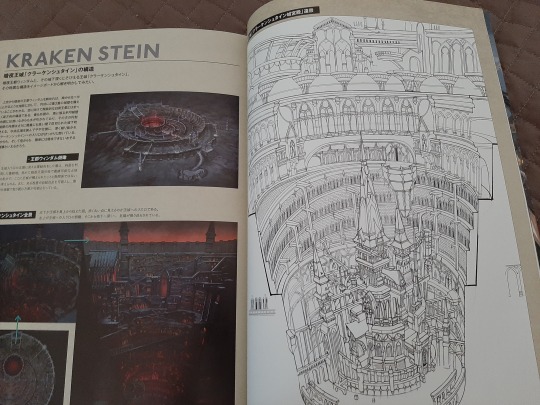
for real tho i remember my first conquest playthrough my jaw was on the FLOOR being genuinely amazed at how cool the worldbuilding was especially on the nohrian side with the gothic vibe and y'all don't know how useful this is going to be to replicate nohrian motifs in all of my drawings/probable comics/doujinshi/etc.
[foams at mouth]
this artbook also covers EVERYTHING
like there's a healthy amount of character work , but there's also enemy designs (always thought fate's enemy designs were unusually kickass, like some of these folks could be outright characters themselves), the architecture stuff above....
my room lines....
OH MY GOD THIS MEANS I HAVE A THIRD SET OF TRANSLATIONS I CAN CROSS REFERENCE TO FUCK YES
sorry for shitty blurriness it's just me vibrating in excitement lmao i'll upload it in the high res chunk
.....
hellooooo sir~~~~
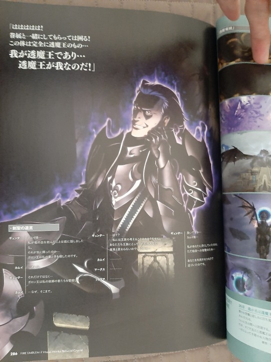
(you knew i was going to be posting that shot >:D )
his possession CGI gets a full fucking page too ajlsjsjkskjhhjshjg
HE GETS TREATED SO GOOD HERE Y'ALL, SO MANY FULL PAGES???????????? is this what it's like to be brain rotted over a major character i will never know the feeling lul
(there's actually at least two other gunter fullbody artworks in here, those have already been scanned/uploaded properly by others so i won't post 'em here unless y'all want em!
and then lastly!
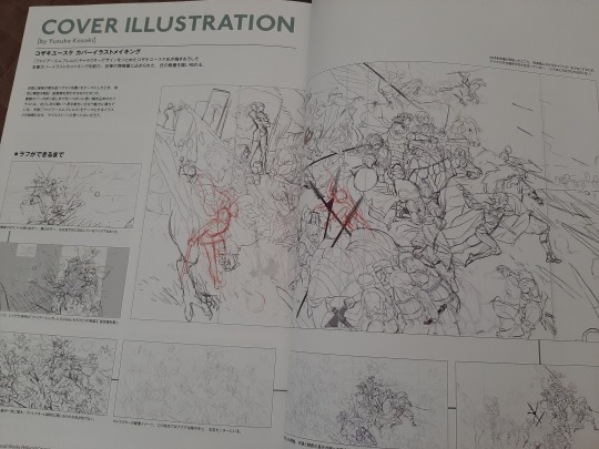
to finish it off, god this cover progress is so cool, kozaki knows what he's doing.
and i'm pretty sure gunter's linework gets changed halfway through, his expression's somewhat different than on the final! and i'll be posting that along with the other high res/cleaned up scans! just need to figure out if my scanner's gonna do a better job than my phone or vice versa.
[tries to stay composed] [fails]
aaaaaaaaaaaaaaaaaaaaaaaaaaaaaaaaaaaaaaaaaaaaaaaaaaaaaaaaaaaaaaaaaaaaaaaaaaaaaaa
15 notes
·
View notes
Photo
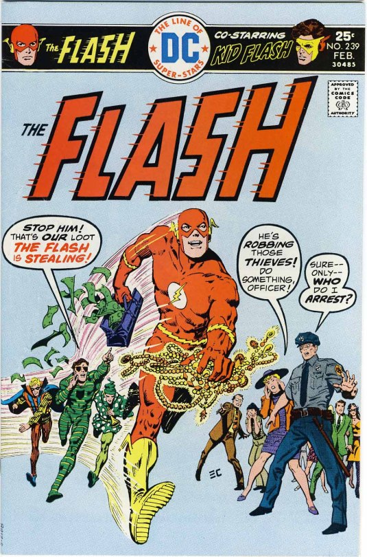
Came the mail, and another delivery of a folded-in-half issue of THE FLASH, always a welcome surprise when it turned up. It has a cover that I really don’t like. The concept and composition is good, but the reproduction of the linework is again shaky, with finer lines breaking up throughout the piece. The baby blue background is also a strange color for a super hero comic book cover. And the balloons oversell the situation, belaboring the point a bit.
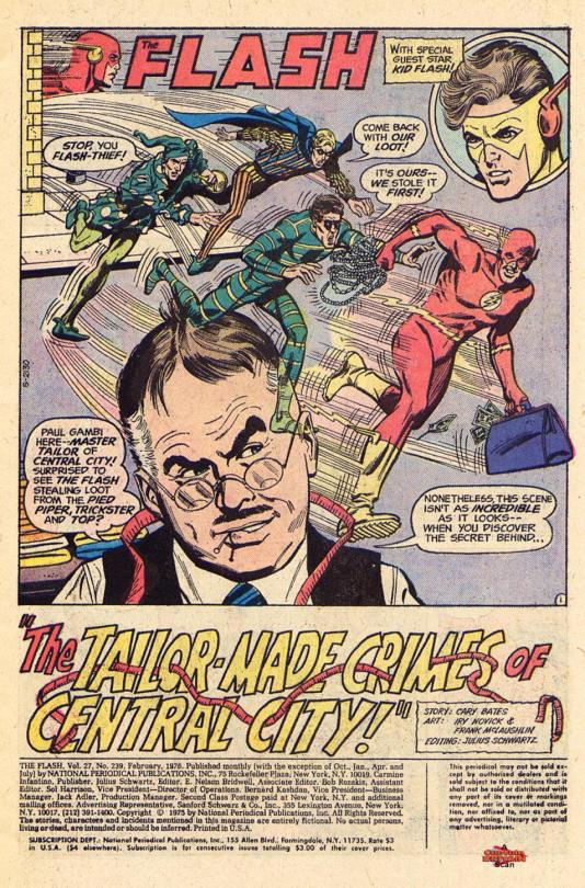
On the inside, the artwork was once again solid and clean, the work of FLASH mainstay Irv Novick. Novick is one of those workhorses who doesn’t get a lot of notice (and when he does, it tends to be for his BATMAN stuff.) And, in fairness, his super heroes often have the same kind of graceless awkwardness that was found in Dick Dillin’s JLA as well. But he was the artist of FLASH all throughout my youth, and I love his work despite any shortcomings it may have. Novick had a carer that stretched back tot eh earliest days of the Golden Age, where he worked on The Shield and Steel Sterling for MLJ (which later became Archie.)
In the story, writer Cary Bates brings back an obscure part of the Flash legend: tailor Paul Gambi, who creates (or created, as he is now reformed) the colorful costumes worn by Flash’s enemies. Gambi was originally devised and named as a tribute to regular FLASH correspondent Paul Gambaccini by editor Julie Schwartz, but here whad had been done as a single throw-away appearance became a running bit. Gambi’s brother Peter would later turn up in the BLACK LIGHTNING series.
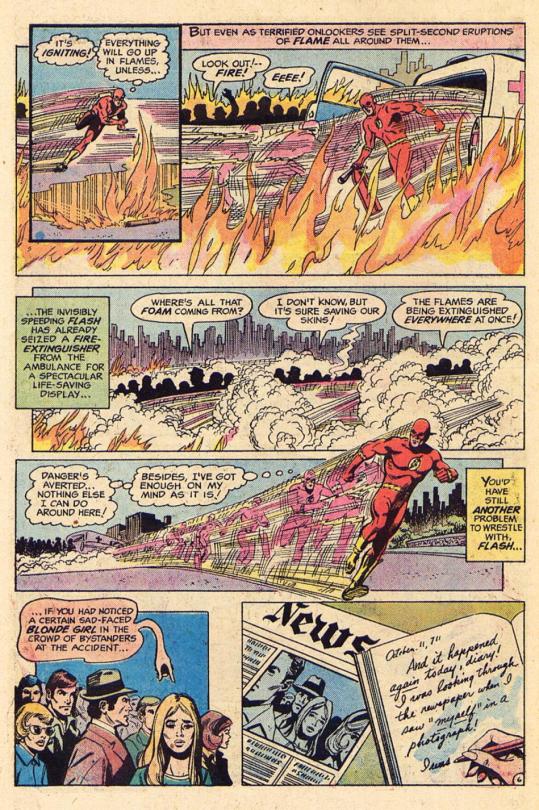
The issue opens on the Pied Piper robbing a payroll delivery, a heist which is foiled by the Scarlet Speedster. But despite wrapping the Piper up for the cops, the actual payroll itself mysteriously disappears. After leaving Police Headquarters, Flash runs straight into an auto accident, and prevents the cars from catching fire and exploding. Among the onlookers is a girl who looks like the Allens’ tenant Stacy Conwell, but Stacy herself has no recollection of being there. A mystery for another time!
Elsewhere, Newly-released ex-con Paul Gambi watches a news report of Flash’s exploits with pride. As thanks for Flash helping him to achieve parole, the now-reformed tailor-to-the-Rogues crafted a new costume for the Flash, a suggestion of Gambi’s cellmate Sam. But Gambi reveals that, despite Sam’s expectations, he didn’t booby-trap the costume in any way--he has legitimately gone straight.
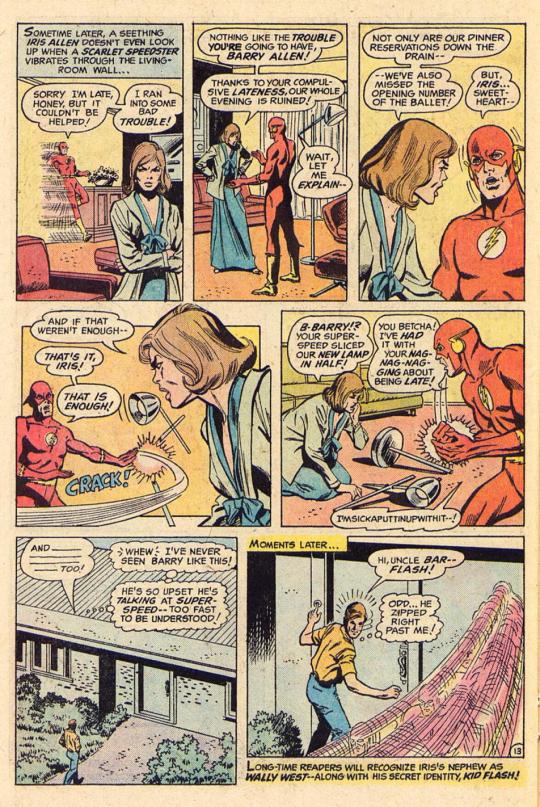
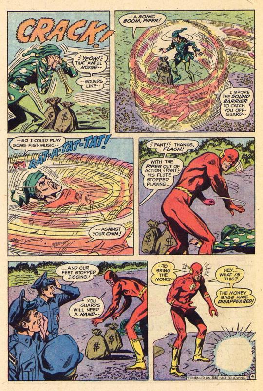
Later, Barry is on his way to keep a date with his wife Iris when he comes across the Trickster fleeing from a heist. He swiftly takes down the high-flying criminal, but again the loot disappears after he’s done so--this time between when he arrived at Police Headquarters with it and when he goes to hand it over to teh desk sergeant. A flummoxed Flash returns home, where Iris is irate about him missing their appointment. Flash reacts with uncharacteristic anger, snapping a standing lamp in half before storming out.
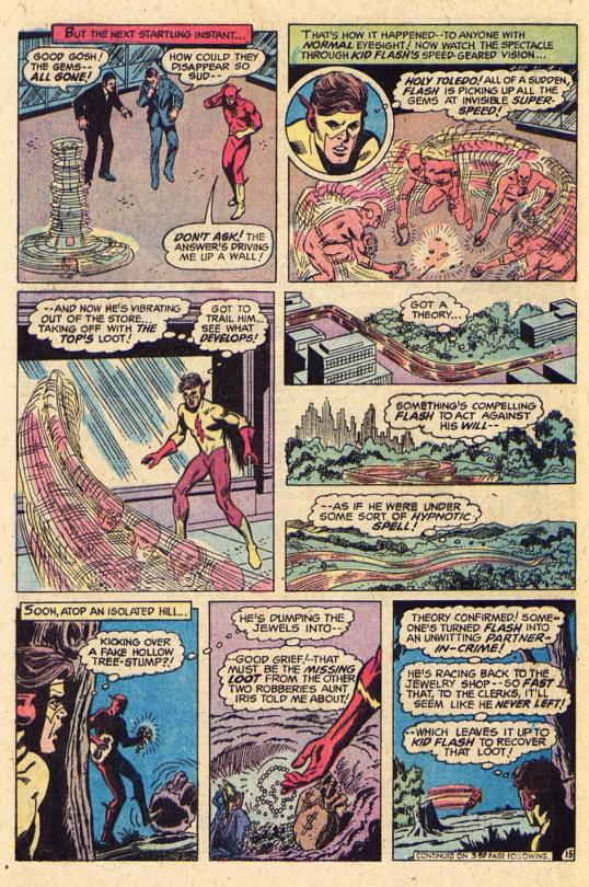
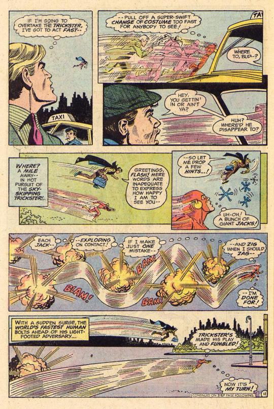
In doing so, he misses the arrival of Wally West, whom Iris has called in the hopes he can help with sussing out Stacy’s strange behavior of late. But the problem with Flash takes precedence, so Wally becomes Kid Flash and races after his mentor, finding him in battle with another Rogue, the Top. Flash wins easily, and Wally’s speed-geared vision sees what everybody else cannot: it is Flash himself who is stealing the loot, depositing it in a dead drop some miles distant. (The cover gives this plot point, and really the whole story, away, another reason I’m not wild about it.)
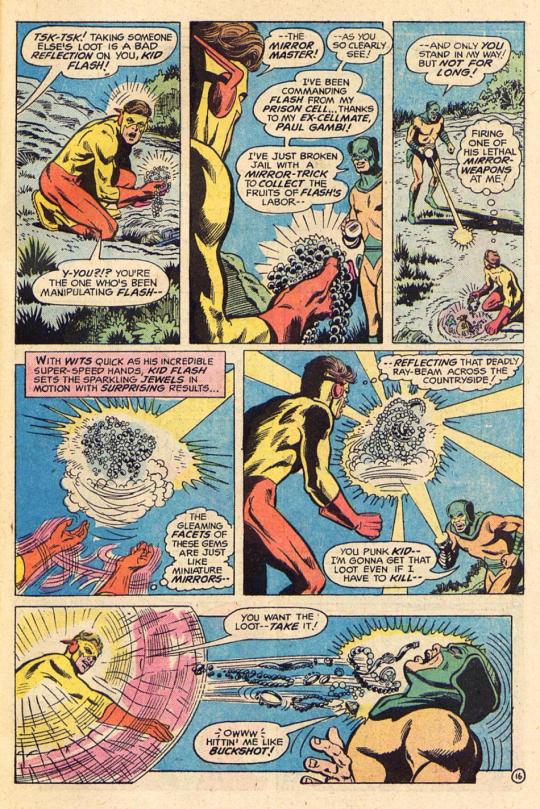
The culpret, of course, is Sam--Sam Scudder, the Mirror Master, who has concealed a device in Gambi’s Flash costume that mesmerizes the hero into swiping the loot for him. Mirror Master confronts Kid Flash, but that’s a bad move, as Wally takes him out without great effort. The missing money is recovered, the device is removes from Gambi’s uniform (and Gambi himself cleared of any wrong-doing) and everything is wrapped up neatly. Except for Stacy Conwell, whom Wally goes off to speak with. Stacy, meanwhile, discovers more pages ripped out of her diary, and comes to the scary conclusion that the culprit behind all of these events has to be the ghost of her twin sister, many years dead and gone! To be continued...
#Flash#Irv Novick#Cary Bates#Dick Dillin#Paul Gambi#Paul Gambaccini#Julie Schwartz#Mirror Master#Top#Pied Piper#DC
15 notes
·
View notes
Text
Short Takes: Levius/est, No Guns Life, and Ryuko
This month’s Short Takes column looks at three series: Levius/est, a sequel to Haruhisa Nakata’s steampunk spectacular Levius; No Guns Life, a sci-fi thriller whose principled hero sounds like Sam Spade but looks like an ill-advised gun safety mascot; and Ryuko, a two-volume series about a yakuza assassin who’s hell-bent on avenging her mother’s kidnapping.
Levius/est, Vol. 1
Story and Art by Haruhisa Nakata
Translation by John Werry; Adaptation by Jason A. Hurley
VIZ Media, 206 pp.
Rated T+ (Older Teens)
Reading Levius/est is a bit like joining a cocktail conversation midstream: you might follow the basic contours of the discussion, but you lack sufficient understanding to participate. Part of the problem lies with Levius/est’s publication history; as the slightly odd title suggests, Levius/est is a sequel. Since it jumped from one publication to another, however, artist Haruhisa Nakata felt compelled to retell the main character’s origin story, albeit in a somewhat abbreviated form. The first twenty-five pages—in which we witness the events that transformed Levius from ordinary teen to cybernetic warrior—are a model of visual storytelling, showing the reader just enough for us to grasp the most salient points of his journey. What follows is a muddled, confusing interlude that abruptly introduces new characters in such a manner that it feels like key panels have been unwittingly left on the drafting table; I frequently had to flip back a few pages to make sense of each plot development.
The other problem is that Nakata’s imagination sometimes outstrips his ability to show, rather than tell. After the bumpy introduction, the narrative lurches in and out of exposition mode, with characters delivering didactic summaries of How Stuff Works in the Era of Rebirth (Nakata’s term for his steampunk version of nineteenth-century Europe). To some extent, these explanations are necessary, but they rely so much on text that the illustrations sometimes feel a bit superfluous—a shame, since Nakata is a superb draftsman. His linework is clean and precise, and his character designs lithe, emphasizing his warriors’ youthful agility and potential vulnerability in the fighting ring. Even more striking is just how much white space there is on every page; Nakata’s command of line, shape, and perspective reduce his dependence on screentone to create life-like volume and movement.
As much as I admire Nakata’s artwork, I found Levius/est a chore to read, offering little reward for soldiering through its more labored passages. Readers who love tournament or steampunk manga, however, may find it more to their liking. Your mileage will vary.
Viz Media provided a review copy. Click here to read a preview.
No Guns Life, Vol. 2
Story and Art by Tasuku Karasuma
Translation by Joe Yamazaki; Adaptation by Stan!
VIZ Media, 224 pp.
Rated T+ (Older Teens)
After a decent, if predictable first volume, Tasuku Karasuma finds his groove in volume two of No Guns Life, maintaining a brisk pace while allowing his characters’ personalities to emerge more fully. In particular, the rapport between Juzo and his Gal Friday feels like a more organic element of the story; their exchanges register as repartee rather than a string of lame insults. (Kudos to Joe Yamazaki and Stan! for their artful adaptation of Karasuma’s script.) Though the action occasionally pauses for the characters to expand on important plot developments, these talking points are less of a drag on the story than they were in volume one; here, they add badly needed layers of nuance and complexity to a familiar noir plot line. Better still, Karasuma introduces several new characters who push the narrative in a more interesting direction, hinting at the power and secrecy of the Berühen Corporation, as well as the general public’s mixed feelings about living alongside cybernetically enhanced warriors. If Karasuma engages in a little too much fanservice, or relies too heavily on speedlines and sound effects to enliven his fight scenes, No Guns Life is still entertaining enough to make all but the most discriminating reader root for Juzo to succeed. Recommended.
VIZ Media provided a review copy. Click here to read my review of volume one.
Ryuko, Vol. 2
Story and Art by Eldo Yoshimizu
Translation by Motoko Tamamuro and Jonathan Clements
Titan Comics, 226 pp.
No rating (Best suited for older teen and adult readers)
Paging the exposition police! The second volume of Ryuko has all the swagger of the first, but leans more heavily into Talking Points Conversation to help expedite its resolution. In some respects, these on-the-nose exchanges are a welcome development, as they more clearly delineate the various factions’ interest in the Golden Seal, an object whose significance was glossed over in volume one. These exchanges also help the reader untangle the complex web of relationships among the characters, making it easier to grasp why Ryuko forges an alliance with an avowed enemy, and why US military forces are manipulating the yakuza to achieve sinister geopolitical goals. These conversations would feel less forced if the pacing were more even, but the two-volume format is too compressed for such an ambitious, labyrinthine plot to unfold at a reader-friendly pace.
Volume two’s chief attraction is the same as volume one’s: the artwork. Eldo Yoshimizu has a flair for staging car chases, fist fights, gun battles, and dramatic escapes, immersing the reader in the action with his creative use of perspective and fastidious attention to detail; Ryuko’s leopard-print catsuit is practically a character in its own right. In less capable hands, this maximalist approach might be overwhelming, but Yoshimizu’s layouts have a strong narrative pull that leads the eye across the page at the speed of the action, creating an almost cinematic experience. The final confrontation between Ryuko and evil American operatives is a show-stopper involving a motorcycle stunt so outrageous that even Jackie Chan would be impressed with its audacity. None of the story makes much sense, but Yoshimizu’s energetic, bold, and—yes—sexy artwork is cool enough to carry the day. Recommended.
Click here to read my review of volume one.
By: Katherine Dacey
0 notes
Text
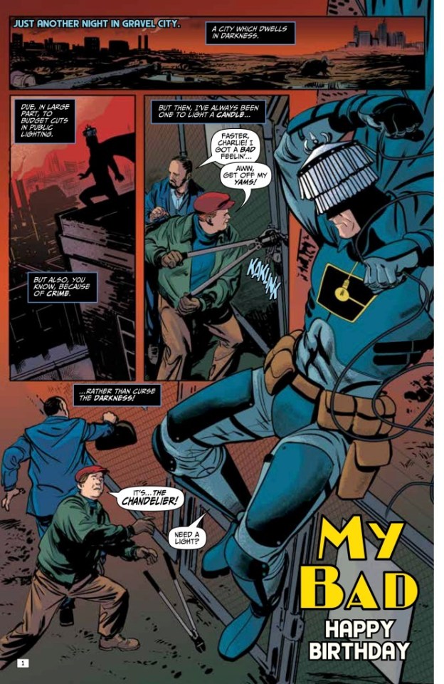
My Bad #1
My Bad #01
Ahoy Comics 2021
Written by Mark Russell & Bryce Ingman
Illustrated by Peter Krause, Mark Russel & Joe Orsak
Coloured by Kelly Fitzpatrick & Paul Little
Lettered by Rob Steen
A sharp super-hero spoof from a stellar team that includes co-creators of Irredeemable and Second Coming! In Gravel City, the super-villain Emperor King has devised not only a sadistic death trap for his arch-enemy, The Accelerator, but also the means to penetrate the top secrets of his other arch-enemy, The Chandelier! Important new comic book universe begins here, we say sarcastically!
This is a crazy silly book. When they say this is a spoof we’re talking Robot Chicken kind of spoof it is just that ridiculous and sensationally funny. I know these guys had to have had a blast not only coming up with the names and outfits for these characters but just being able to create these over the top personalities. I don’t know what’s worse, the fact that this is a spoof or that I want to see it taken on as a real story. I mean the character is your atypical crime fighter who inherits a family fortune and as a bored playboy takes up a life of crime fighting. The over the top moments aside the idea is tried and true and this is so out there that I kinda wanna see how far this can be taken.
While there are multiple stories happening here they all kind of blend together to create something greater than their parts. This helps with how much I am enjoying the way that this is being told. The story & plot development that we see through how the sequence of events unfold as well as how the reader learns information is presented exceptionally well. The character development that we see through the dialogue, the character interaction as well as how we see them act and react to the situations and circumstances which they encounter does a magnificent job in establishing their personalities. The pacing is sensational and as it takes us through the pages introducing the characters, the stories, and this world they live in leaves us hysterically wanting oh so much more.
I have to admit I really like how we see this book being structured and how the layers within them begin to emerge, grow and evolve. The layers open up these great avenues to be explored and this adds some wonderful depth, dimension and complexity to the story. How we see everything working together to create the story’s ebb & flow as well as how it moves the story forward is exceptionally well achieved.
The interiors here are absolutely fantastic! The linework is clean, crisp and strong and how we see the varying weights and techniques being utilised to create the detail we see within the work is fantastic. That we see backgrounds as much as we do is sensational as they really enhance and expand the moments. They also work within the composition of the panels to bring out the depth perception, sense of scale and the overall sense of size and scope to the story. The utilisation of the page layouts and how we see the angles and perspective in the panels show some remarkable eyes for storytelling. The various hues and tones within the colours being utilised to create the shading, highlights and shadow work really shows a great understanding of how colour works.
Fun, irreverent and all kinds of tongue-in-cheek moments that will make you laugh out loud are strewn throughout the entire book here. Mark has this habit of taking what we know and taking this to the absurd but in doing so he also manages to charm the readers’ socks off and make us want to see more. I think this is so much amazing than they thought it would be and honestly I’m excited at the prospect of seeing more adventures featuring these characters.
0 notes
Text
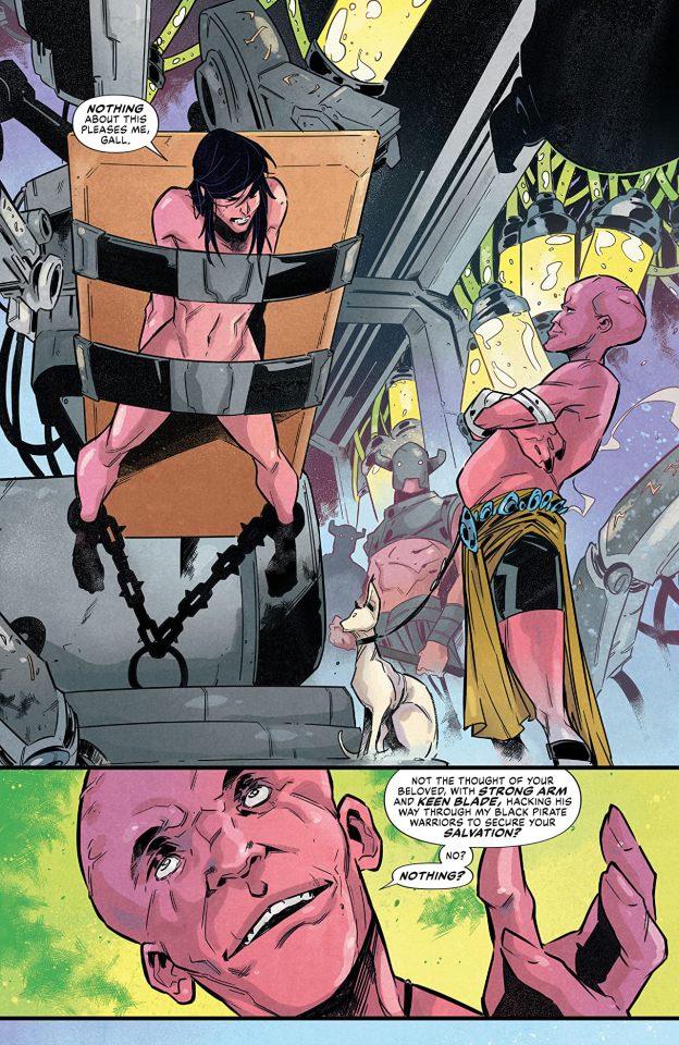
Dejah Thoris versus John Carter of Mars #03
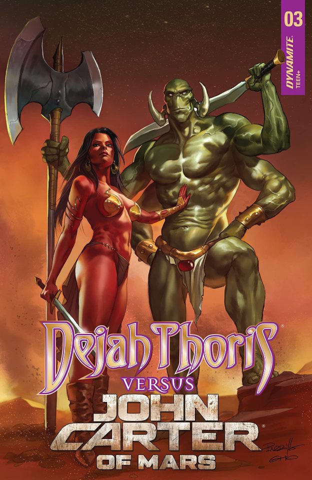
Dejah Thoris versus John Carter of Mars #03
Dynamite Entertainment 2021
Written by Dan Abnett
Illustrated by Alessandro Miracolo
Coloured by Dearbhla Kelly
Lettered by Simon Bowland
John and Dejah are captured! Despite this, Dejah is delighted that John cared enough for her to attempt a rescue…perhaps their love is not lost! But John, headstrong as ever, has handed their enemies exactly what they want…
It is books like this one that make me wish I had read these novels as a kid or at least in school. I was just never introduced to them and never really knew they existed so I missed out on a lot during my early and late teen years. This for me not only embodies the idea of who John Carter is but it also creates this amazing dynamic with Dejah and Gall that shows how a once great civilisation has fallen to times that remind me of the middle ages on Earth. Sure the names have changed and the species are different but the world needed to be reunited and language needed to be restored and it just all has such a historically epic feel to the story. This is the kind of story that thrills fans of the series and can make new fans of those who thought that this isn’t up their alley, provided they give it a good solid chance.
I am a massive fan of the way that this is being told. The story & plot development that we see through how the sequence of events unfold as well as how the reader learns information is presented exceptionally well. The character development that we see through the dialogue, the character interaction as well as how we see them act and react to the situations and circumstances which they encounter keeps their personalities evolving and growing. The pacing is excellent and as it takes us through the pages revealing more of the story the more intriguing and exciting things become.
I really appreciate how we see this being structured and how the layers within the story continue to emerge, grow, evolve and strengthen. The layers within the story open up different avenues to be explored and while some will be and some won’t be, they all do the same thing and that adds such great depth, dimension and complexity to the story. The way we see everything working together to create the story’s ebb & flow as well as how it moves the story forward is impeccably achieved.
The interiors here are fantastic. The linework is clean, crisp and strong and how we see the varying weights and techniques being utilised to create the detail within the work is both subtle and in-your-face bold. The creativity and imagination that we see is phenomenal and it really expands this world and its universe. I’d like to see more backgrounds because when we do they expand and enhance the moments beautifully. They also work within the composition of the panels to bring out the depth perception, sense of scale and the overall sense of size and scope to the story. The utilisation of the page layouts and how we see the angles and perspective in the panels show a remarkably talented eye for storytelling. The various hues and tones within the colours being utilised to create the shading, highlights and shadow work show a solid eye for how colour works.
There is so much craziness that is going on here that it is absolutely delicious and very much reminds me of Dynasty in how it plays out. Sure it’s a superhero style story at its core but the politics, manipulation and sheer hatred of one another play out in ways that would make the most seasoned villain envious. With some spectacular writing and crazy good characterisation alongside these really interesting interiors make Barsoom thrive.
0 notes
Last Seen Blogs
b0ggart
All vegetation in the settled world is stirring

valveplug
Welcome To My Twisted Ass
loving-and-dreaming
just a dreamer

californiadreaminghq
California Dreaming

valiantcanary
canary