#bog art
Text
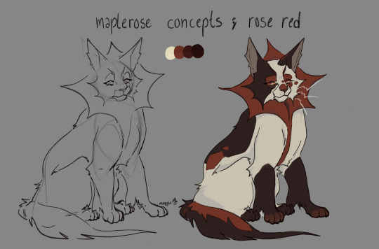
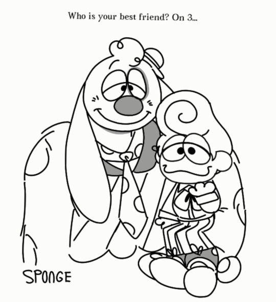
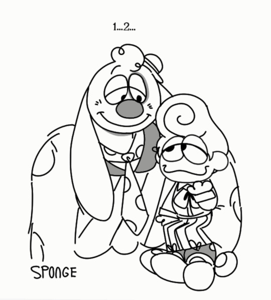
hello warrior cats community. hello gay little people. hello obscure musical fandom. i gather you all here to bestow upon you…
maplerose. a combination of wc and ‘ghost quartet,’ the song cycle written by dave malloy !
tag for this will be #maplerose au, just #maplerose will likely be used for miss rose red herself <3 rb with design notes !
#bogwhisker#bog art#maplerose#maplerose au#mapleshade#ghost quartet#malloysicals#dave malloy#brittain ashford#gelsey bell#brent arnold#warriors au#I LOVE GHOST QUARTET SO MUCH. I THINK ABOUT THIS MUSICAL EVERY DAY AND HAVE SINCE I WAS 13 I AM 19 FUCJING YEARS OLD NOW#dave malloy is the worm in my brain#waca#waca art#wc au#warrior cats design#wc designs#crookedstar is here as well and his design mirrors maple’s. also crookedstar and goosefeather are trans because fvck you transfem goose now#check the rb
117 notes
·
View notes
Photo

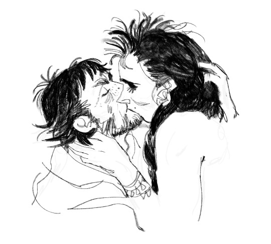
e/r from some pinterest reference. april or may 2022. did this on a plane, got some comments, very gratifying. i think of this one as loosely canon-era.
#enjoltaire#les miserables#enjolras#grantaire#canon era in the same way that shakespeare plays are costumed#bog art
53 notes
·
View notes
Text

dragon kind of day
18 notes
·
View notes
Photo
it’s sanji brainrot hours
2 notes
·
View notes
Text


they hate each other
5K notes
·
View notes
Text
Finally. Page one complete, enjoy the stuff I stole

0 notes
Text
Hit wife???? NO
#I haven’t started next week’s art cuz I’ve been bogged down by university mandated ocs#lesbians. btw HAHAHAHAH ofc#also the urge to draw them in the blue palette was too strong so here we are#art#mxtx#svsss#genderbend#bingqiu#lesbingqiu#冰秋#人渣反派自救系统
1K notes
·
View notes
Photo

tumblr my beloved I have neglected you, here’s a mad old bog man to make up for it.
6K notes
·
View notes
Text


Betrayal!
#In my heart they are still besties#But I have a suspicion that their friendship is one sided#Only time will tell if that is right! but that has been my theory!#Edit: Haha just realised Bog had this exact theory too! I am not alone haha#welcome home#welcome home arg#my art#doodles#wally darling#barnaby b beagle#welcome home wally#welcome home barnaby
767 notes
·
View notes
Text

keep forgetting i can actually post things on my tumblr account. have a mulch
#bogwhisker#bog art#the kin#warrior cats#warriors oc#mulchnest#wildcat#warrior cats ocs#warrior cats oc#waca#waca ocs#waca map#cat art
11 notes
·
View notes
Text
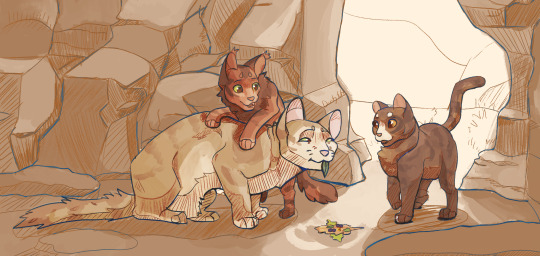
Leafkit and Squirrelkit make "travelling herbs" for Sandstorm before she goes for a walk. They're delicious, she assures the kits, through tears in her eyes. They run away proudly, she rushes out of camp for the nearest creek to wash her mouth in. Nasty, she mouths, but she'll eat whatever they make. The kits' smiles make it worth a wet face.
~~~
Had a ton of fun with this one but don't wanna bog down the main post. A lot of unrelated-to-wc process talk below the cut!
So this was a bit of experimentation with a new brush which turned into exploration into gradient maps.
The original idea was simply to modify csp's mechanical pencil brush into something that felt a bit more natural. It started with simply turning on a bit of tilt-controlled thickness and setting my colour to about 80% grey, rather than black. It didn't quite feel right, but setting the brush to blend with the subcolour on each tip, setting the subcolour to the 80% grey and the main colour to the canvas' colour, then setting the brush's blend mode to darken gave me a brush that felt like it had FAR finer line control.
The lines themselves look like this (on a more saturated bg to show how the values layer/fade in and out with pressure and tilt):
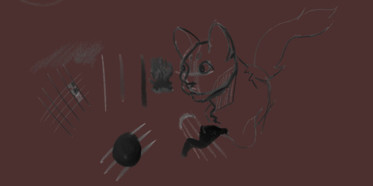
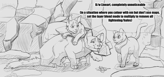
(edit to pic: completely unnoticeable when on the intended base colour*)
This is where the gradient maps come in. The way I usually change my linearts' colours is to make a new layer, mask over it, and manually paint. It gives a lot of control to your end result, but it's time consuming and often takes many adjustments to make it feel like it has enough contrast to make the drawing actually *readable.* If I wanted to add a gradient map to the lineart, it would be unable to read the transparency and would pick from the single value that the lineart is (usually black), then the transparency would take over. This gives me a dull result.
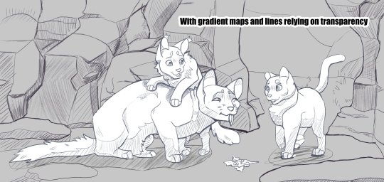
With the "transparency" being an actual colour, that gives it an actual value for the gradient map to read. So instead of having your lines fade from black to the colour behind it (often desaturating as it goes), it'll go from something like dark blue -> reddish-grey -> orange -> yellow. It adds a little something i think, and while I absolutely don't have this down pat, it could be something interesting to explore!
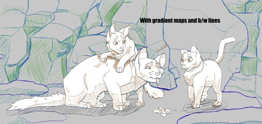
I also wanted to go further with this piece, namely painting it rather than a shading layer set on overlay with the aforementioned gradient maps all over it but ... it wasnt happening. The art skills clocked out for the day. That said, I definitely want to explore how this would look if I coloured everything for realsies rather than doing the fallback method. Could be where they really shine!
#warriors#warrior cats#squirrelflight#leafpool#sandstorm wc#btw. the post did get bogged. i talked a lot but damn it was fun to doodle around with !! give it a shot if u want!#2023 art
1K notes
·
View notes
Text
i wear my scary mask when i'm afraid i don't belong
you can't read my brain until it's off, not coming off
what if chameleon... but inscryption. basically.
#digital art#mag art#wof#wings of fire#chameleon#shapeshifter#cirrus#bog#soar#rainwing#nightwing#icewing#mudwing#skywing#honestly i think my brain version of chameleon is so much more interesting than in canon#but that's a diatribe for a different post
511 notes
·
View notes
Text
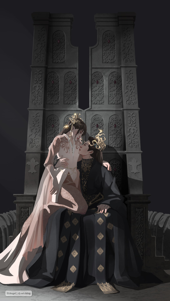
Equal and worthy of each other | Their Majesty Yue Zun Dongfang Qingcang and his Yue Zhu Xiaolanhua
#“I need to stylize all stylize!” I said and got bogged down in drawing details (again)#I absolutely adore all his outfits#but I have a certain top 3 of my favorites and this one is not included in the top#but for some reason I stuck on it and draw for the 3rd time.#ribbons with an ornament on his skirt hem drives me crazy...Adore!#cang lan jue#clj fan art#clj#苍兰诀#love between fairy and devil#moon supreme#xlh#dfqc#lbfad#canglan#art#illustration#dongfang qingcang#clj-art-blog#my 14th CLJ art
1K notes
·
View notes
Text

Don't play with me, you impudent heathen!
Huno's and Bogna's first meeting 🌈🌸
Bogna belongs to my gf @grozat
More context here.
2K notes
·
View notes
Text
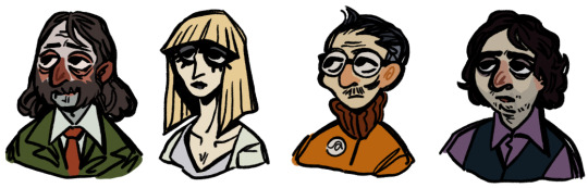
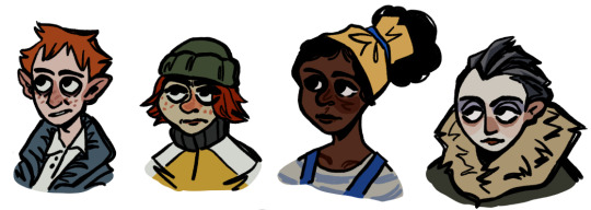
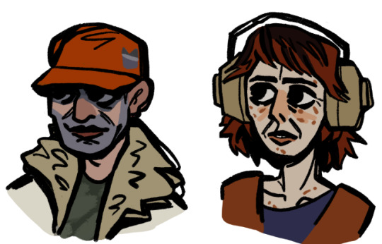
top 10 reasons you should NEVER visit revachol
#gah i tried to draw them more small and bitsy so i could focus more on vibe and shape instead of getting bogged down in the little#details of their faces. i did get pretty bogged at some points but i still like how these came out#ok i wanted to draw the faction leaders and the cops and maybe the churchpeople too but i just dont. feel like it rn#so maybe ill do a part two some day#disco elysium#my art#extravagances#harry du bois#kim kitsuragi#cuno#ruby the instigator#klaasje amandou#elizabeth beaufort#ikk rubys hair is supposed to just be red but it just looks nicer with brown in it </3
518 notes
·
View notes
Photo
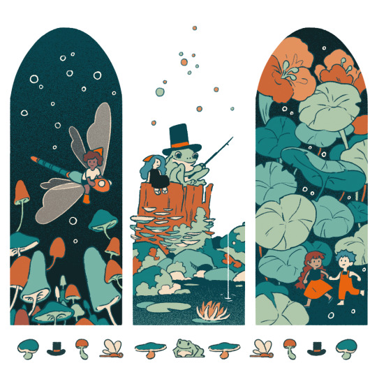
Bogpeople and very polite frogs 🐸
8K notes
·
View notes
Last Seen Blogs

nymph0cyte
Filthmonger

blu3boy-blog
Wonderful Mind
themostpowerfulmagicofall
Love is hope. It fuels our dreams...

aklv808
Leviathan Photography
powerlineprincess
St. Lux