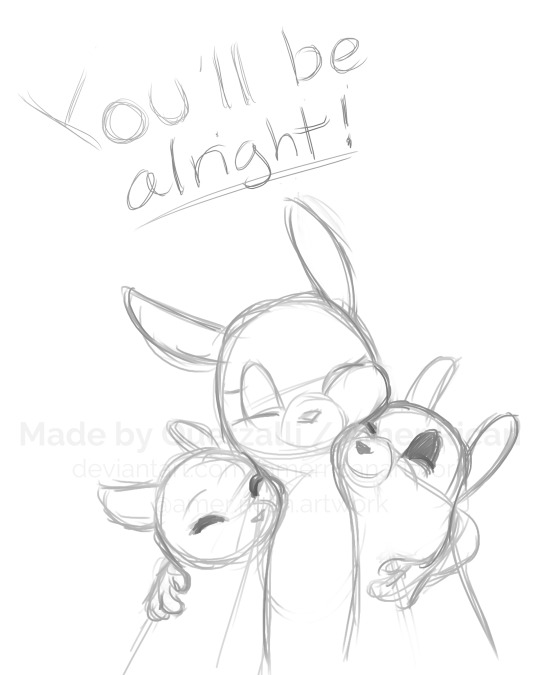
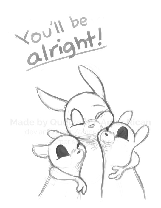
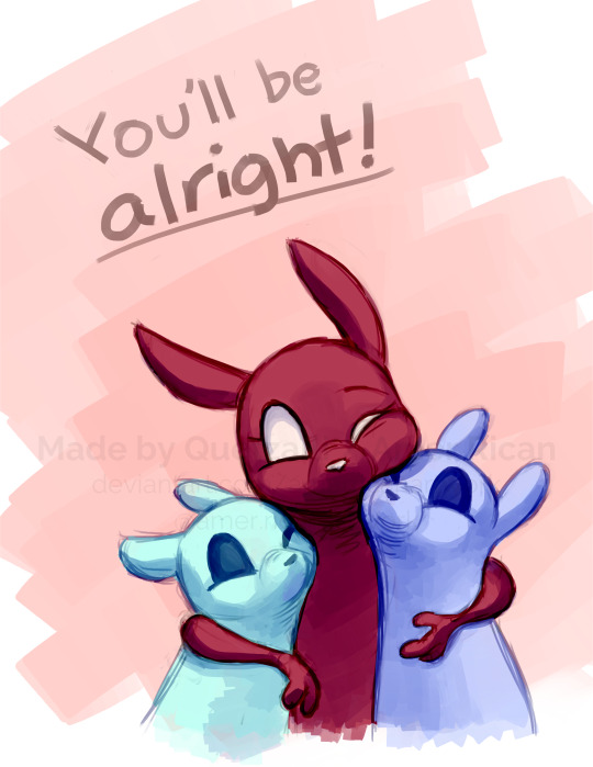
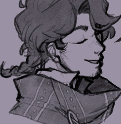
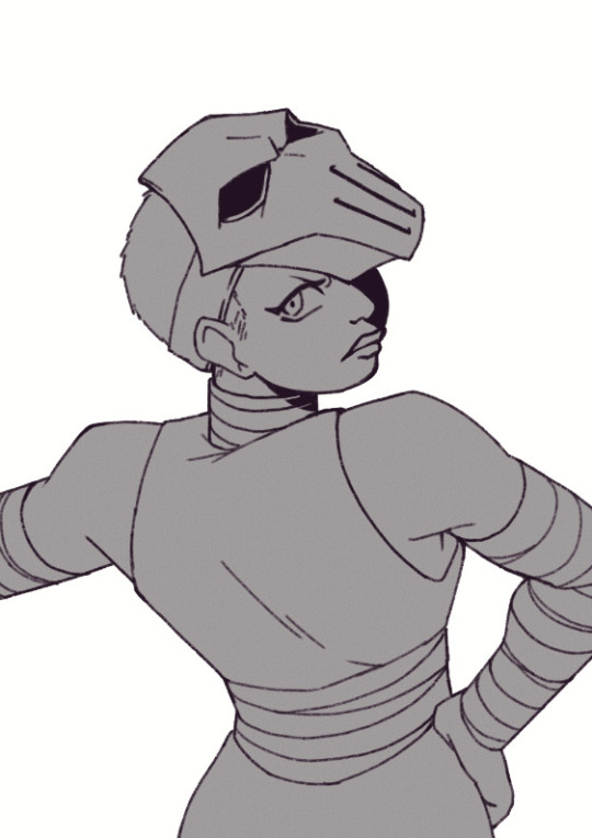
#as well as practicing a more effective method of shading
Text

Rewatched The Amazing Digital Circus
#my art#Kinger#tadc kinger#kinger digital circus#kinger tadc#the amazing digital circus#kinger isnt even my favorite cjaracter i just felt like drawing Kinger#as well as practicing a more effective method of shading
42 notes
·
View notes
Text
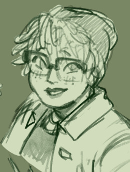
Current digital art process!
Acting on @shkika 's request because making my redraw for this post actually ended up giving me more confidence in my digital art process! As such, I'm gonna use it as a reference. And if this walkthrough of sorts turns out nice, I might do it again as my process evolves!
I started off with a quick sketch of sorts, trying to focus both on movement and volume, and get the general idea of where each element is located. I edit the image dimensions and placement of things a lot in this phase, as my ideas often tend to change once I actually begin drawing them. In this case, as I got it down, I decided I wanted it to look like some cheesy animal motivational poster, so that influenced where the text was.
From there, I began to clean and sometimes edit the sketch, mainly by thickening the lines to make the shapes more definite, and erasing what wasn't necessary and interfered with other parts. Volume is one of my biggest focuses in my drawings, so I try my best to get the volume of each character at least hinted at with the lines. This is something that will probably remain in my process for a while, as I quite dislike doing separate lineart and like the messy, sketchy feel anyway.

I also wanna mention, in addition to having references and such in other windows, I've recently begun having a second mini window of my current drawing off to the side so I can see what it looks like overall more easily, regardless of how much I zoom in on and flip the main window. It's quite helpful!
For reference, this is what the final sketch looked like:
Then, I went on to add the flat colors. Another tip: I almost always set my sketch layer to "Lumi & Shade" because I think it makes the line colors a lot richer, but since it's based on what colors are underneath, it colors the lines a lot more individually than changing the sketch color as a whole. Here's some comparison to a version without the effect (left):

Then, I add some shading using a (really nice) marker brush. This is honestly one of my favorite parts of the process, just trying to carve out all the volumes, especially since I usually use a pretty blue color for shadows!
Sometimes, I honestly just leave drawings finished at this step, because I adore the sketchy look so much, and because I really don't like the tediousness of more realistic rendering in the painting process; from what I've seen/experienced, it often involves having to basically paint the entire image over again, which I've realized I find REALLY boring (and is also why I clean the sketch instead of making a new lineart layer). As such, one of my hopes is to reach a point where I could almost completely avoid having to clean up the image in a traditional painting method, instead being able to lay down lines and colors so well that they convey nearly all the volume necessary on their own, still have that sketchy appeal, yet also look finished and professional.
Alas, I did do a bit of clean up on this image, but I think it still turned out alright!

Here's the finished drawing! I'll have to practice with this process a bit more to truly solidify it as my digital go-to, but nonetheless, I think this came out adorable! Thanks again shkika for the ask, and thanks to @mintscampi for the sweet prompt! I hope you guys like it!
#art#artwork#artists on tumbr#digital#digital art#digital artwork#painting#digital painting#process#painting process#art process#tutorial#fanart#rain world#slugcat#rw slugcat#slugpup#artificer#rw artificer#quetzalli draws#quetzalli's notes
90 notes
·
View notes
Text
aid’s collection of neat art tricks
aka I wanted to compile all the neat things I’ve learned and picked up over the years across various sources; I wish I knew some of these, but they’re scattered across a variety of social medias and some from conversations.
of course, these are not a must and just have helped me! I just wanted to put them all in one place in hopes that maybe it’ll click something in someone like it has for me. c: I’m not the best at explaining, but I hope it makes sense!
some may use Clip Studio assets but can be replicated through other methods (or done by hand in the case of how I do my lineart colouring), but do keep in mind all of these are written with CSP in mind.
this is pretty heavy in images and gifs, and is quite long.
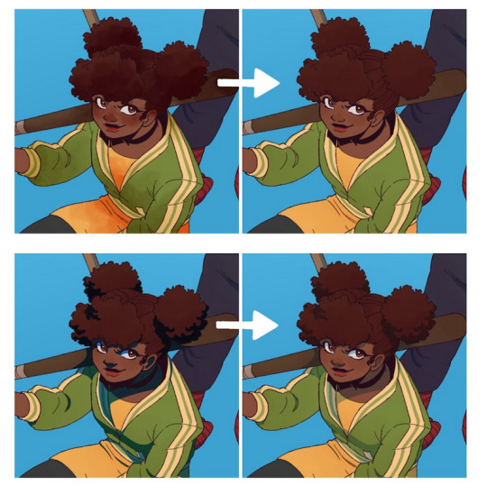
how to quickly fill your outlines (CSP tool)
this is a CSP specific method, but this tool has been my absolute saviour for making colouring so much easier for me (even if sometimes it still does require me to manually fill in some holes or erase sections). the bulk of how it works is explained in the tool as well, but I’m going to show a gif example for myself!

you have to make sure your lineart is set as the reference layer to ensure this tool does work; with messy outlines (like my own) you may need to manually fill in holes as can be seen in the gif above; with cleaner outlines, you don’t need to worry as much, but you may have some bleeding out of the lines for places that are a bit too close together (as you can see below, those areas would need to be erased).
the tool can also help to close ‘gaps’ between colours!

I usually tend to have a ‘base’ colour that I just clip a folder of flat colours to, so it doesn’t bleed outside of it, but I’m also a nested folder freak to make sure everything is cleanly separated and doesn’t get ‘destroyed’ while I work on it. this tool just makes it so much easier to get that base down and just jump right into adding flats.
adding a little pop of depth
this one is thanks to a clip studio article itself where I saw it from, and I’ve been using it in practically all my drawings so far; all it is, is a simple blue-ish overlay layer with some muted yellow/red shading to give it a bit of a “3D” effect, for me I enjoy more that it adds a bit more colour variation underneath (usually lowered to 20-50% opacity, depends on the drawing)
the article definitely explains it a bit more nicely, but this is an example of having it at 50% opacity over one of my drawings
making your lineart feel less ... boring?
of course, boring is subjective from person to person, but I’ve always found my lineart to be too boring by itself

like this is fine, but it’s missing some kind of oomph. there are two tricks I use when it comes to sprucing up my lineart: using the watercolour edge effect in CSP, and a combo of coloured outlines + black outlines
first things first, the watercolour edge option: by default it’s a bit too strong, so I usually find the sweet spot to be at 1 range and with an opacity of ~20


this can be replicated through duplicating your lineart, and if the option is available, using gaussian blur on the duplicated lineart to achieve around a similar effect.
coloured outlines!
when it comes to colouring my lineart, truth be told I do use a wonderful auto action for it which can be found here, and there is this alternative one as well (which i’ll be trying now!!!).

it is a little different since it uses the flats, vs the one i use which just requires you to have the lineart selected, but as you can see it is a very quick way to colour your lineart ... this isn’t perfect by itself and will require you to have your flats finished.
this is my process: outlines done, autoaction, cleaning up by adding black outlines where they’re required and fixing up sections where the colours don’t quite make sense (like the sleeve area).

as you can see with the last drawing, I also tend to add a black outline around the outside of the piece, I personally found I really enjoy the contrast of the dark outside and coloured interior lines, as you can see in this little sample; it just adds a bit more visual interest for me!

unfortunately, outside of manually doing it, I cannot think of alternatives for this specific action (perhaps duplicating + flattening all your colours and placing it on top of the lineart may be a start)
crunchy textures and pretty colours ...
the texture i use on top of my drawings can be found in this CSP asset pack (though the marker brushes themselves are very lovely, and I’ve used them myself). this can be replicated through adding perlin noise, but I just find this texture to tickle the good spots in my brain, and it’s why I use it on pretty much all my drawings for some additional visual goodies.
yes, i am also a person who uses gradient maps. I usually tend to use them as finishers and more subtle ways to add more colours and variations to keep my shading from looking too flat, but they do have to be handled with care lest they become overwhelming. vampbyte does a wonderful introductory thread on gradient maps, how they function, and how they can be used.
they can be found through layer > new correction layer > gradient map -- or at least that’s how i usually access mine!
i often place mine at 20% opacity on the colour mode, though soft light and overlay also do their own fancy things! really depends on which you like most and works with your piece.
an example of my chibi w/o texture and colour gradients vs the texture + colour gradient ... as you can see it does change the colours quite a bit, so usually it does take me a bit of playing around to find a colour gradient I like (I’m a gremlin who has downloaded a lot of them) and to play with opacity values.
and to top it off, here’s the combination of all of these vs one with them all off.

how i personally shade (multiply layers)
i usually tend to either go for multiply shading over the whole drawing using one colour (and a few lil tricks to add more depth) for smaller pieces, or hard light shading for bigger and more complex pieces since it has more value depth.
my multiply layers are usually just one or two layers using around the same off-purple shade (though i shuffle it around pending on how it looks on the drawing

the second layer is a duplicate of the first, and i usually use an airbrush to either erase or expand areas to give it a softer shade (as you can see in the gif, the second layer is definitely missing chunks), or to add a different colour to the shading that isn’t the off-purple
how i personally shade (hard light mode)
this one’s a bit more of a mouthful, and thanks to a friend who introduced me to it! my second method is hard light shading, which, at its simplest, is greyscale shading and feels like it leans more into ‘painting’ your shades (as it works best with a brush that blends colours).

although I’m obliterating my own art here, it’s to show that most of your work will be in the greyscale/muted colours! it is inherently a non-destructive method of shading, so any changes to the colours underneath will maintain the shading regardless. normally I do have to duplicate the layer a second time since I don’t go too close to black shades, and it gives me a bit more control over how ‘hard’ I want my shading to be.

the middle is your ‘neutral’ shade, aka what you want to fill your entire hard light layer with, then your lighter greys will be your highlights, and darker greys your shading!
alternatively, you’re looking for this when you want to find your ‘neutral’ shade.
once you got your hard light layer filled with your base/neutral shade, grab your favourite painting/blending brush and go ham!
as a heads up: when it comes to skin or warm colours in general, you may need to get out of the greyscale range otherwise it will look too desaturated and grey, as you can see below. for any other tones, the greys usually work well.

as of the moment, I think that’s all the little tricks I use when doing art, I hope it helps you guys!
(unless I somehow remember something else, but these are usually my default tricks I use for everything)
#art tutorial#clip studio paint tutorial#digital art tutorial#clip studio paint#tutorial#art tricks#mine.txt#10#20#50#100#200
222 notes
·
View notes
Note
Your art is so cool!! Can you share you digital art process sometime?
Ask and ye shall receive:
(Also thank you!!😭)
Aight so I have A Few digital art processes due to me being inconsistent and not being able to commit to one thing (I prefer calling it ✨having a creative and curious mind✨ but eh) so my processes are subject to change, but here are my more recent methods of drawing digitally.
First of all, my art software of choice in the last couple of years has been Procreate, with some of my most commonly used brushes being these:

Spectra is my brush of choice when it comes to sketching, I really like the texture and it has a nice feel when it comes to both size and opacity based on pressure.
Next up is lineart, what brushes I use in this stage goes hand in hand with what type of colouring process I'll use. When it comes to drawings with more flat shading (such as cellshading) I'll usually use Narinder Pencil. Again, nice texture, and I like it for situations where I want thinner lines with less variety in line-thickness.

When I use a colouring and shading process that's more complex/fully rendered of whatever tf you call it, I tend to use the Niko Rull or Eaglehawk (first drawing is the Niko Rull, second is Eaglehawk)


They are also the brushes I use for the actual rendering process of this particular colouring style (yeah guess we're going into to colouring stage now)
I have no idea how to describe my actual process on how I render my drawings lmao sorry I guess?? I kinda just improvise and hope it ends up looking decent haha. As you might be able to guess though, I am HEAVILY inspired by Arcane's art style (that show Awakened something in my istg) so uhhhhh go watch other people's tutorials on how to emulate the Arcane art style or smthn I dunno.
I will say though, the rendering process and the final look of the piece ends up being slightly different depending on which brush I use.
Niko Rull is rectangular as a base shape, and it doesn't really shade that easily on it's own. Because of that it takes a while to make the shading look good (trust the process!!) but I really like the end result (textureeeeee)
Eaglehawk is easier to blend and shade with (as in it takes a shorter amount of time) which leads to the end result being more smooth
Back to the drawings that use mainly flat shading! Here I will often use Eaglehawk to add that sweet sweet texture I keep going on about, basically I will just colour the areas that are either darker and/or more saturated (for example the cheeks, nose and ears in the latter case) with what is usually a warmer tone on a layer set to multiply, then I adjust the opacity to my liking.
Then I'll just cellshade using the Medium Hard Airbrush. I like using a cooler tone like blue often (like I did here in this example) but that changes a lot depending on what I think'll fit the art piece. Draw that on a layer set to multiply and again adjust the opacity to whatever looks good.
In the final stages of the drawing process I'll just add a bunch of filters until it looks good lmao. I am Bad At Colour Theory™, even though I KNOW the theory part of it, I have such a hard time actually using it practically. Basically, making the colour palette look good is HARD so I'll just CHEAT by using layers that's filled with a colour (whatever fits) and set it to like multiply or overlay or something like that and lower the opacity a bunch and BOOM people will think I know what I'm doing. One of my favorite is covering the entire drawing with a layer filled with a light blue colour, set that layer to Difference and lower the opacity to like 5%. The effect is subtle, but I like it.
Also, MORE TEXTURE!! Static texture!! Well, in procreate it's called "Noise" but it basically adds this static like texture to your selected layer. Use it on a layer that's filled with gray, set it to overlay lower the opacity a bunch and it gives this really nice grainy feel to your art. The colour filters I tend to use on all my coloured drawings, but the noise texture I mostly use the art with flat shading.
So yeah, sketching - lineart - colour flats - shading/rendering - add a bunch of filters - finished art piece, nothing really unusual there.
And lastly, some extra things I do:
In the lineart stage, I'll colour the sketch like red or something to differentiate between the sketch and lineart more easily.
I'll also lower the opacity of the sketch layer to help avoid accidentally drawing the lines on the same layer as the sketch (iykyk)
When filling in the flats, I'll first use a deep, saturated red or blue, and when I'm done filling in a section then I'll change the colour in that area to what it's actually supposed to be. This makes it easier to notice if there's a spot you missed to fill in because it'll contrast more!
I tend to prefer lineart that isn't pure black in my illustrations. With thinner lines I'll colour them a dark brown, blue, green etc, while with thicker lines I'll do the same but also lower the opacity slightly so that the colour underneath effects the lines colour as well.
You know how some people draw everything on like 1-3 layers? Yeah I'm the opposite, ONE MILLION LAYERS BABEYYYY you can never have too many!! (actually you can there's a limit but eh)
Sometimes, when I need to come up with a pose, I'll try posing in different ways myself to get ideas. I wont take any reference pics of myself tho because yikes
That's all I can think of for now! There's quite a lot to go into when it comes to art processes and I'm not great at explaining things, so if anyone has any questions just ask! :,)
21 notes
·
View notes
Text
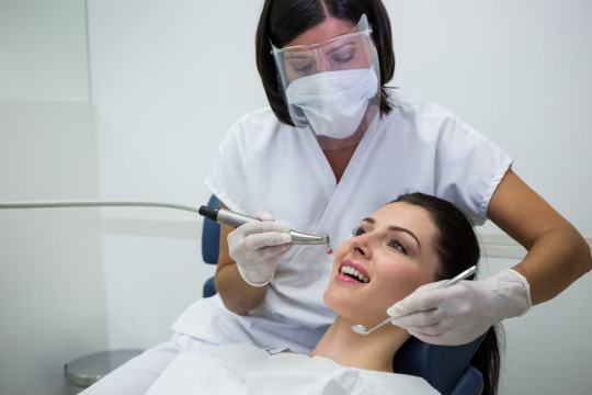
Achieving a Brighter Smile: Exploring Teeth Whitening Services in Las Cruces

In the realm of cosmetic dentistry, achieving a radiant smile is often a top priority for individuals seeking to enhance their appearance and boost their confidence. Among the array of services offered by dental professionals, teeth whitening stands out as a popular choice for its ability to rejuvenate smiles quickly and effectively. In Las Cruces, residents have access to cutting-edge dental practices like University Family Dental, where a range of cosmetic treatments, including teeth whitening services, are offered to cater to diverse patient needs.
Teeth whitening, also known as dental bleaching, is a non-invasive procedure designed to lighten the color of teeth and remove stains or discoloration. While over-the-counter whitening products are available, professional whitening services provided by experienced dentists offer superior results with personalized treatment plans tailored to each patient's unique dental characteristics.
University Family Dental in Las Cruces specializes in cosmetic dentistry, offering advanced teeth whitening solutions to help patients achieve brighter, more radiant smiles. Utilizing state-of-the-art technology and professional-grade whitening agents, their team of skilled dental professionals ensures safe and effective treatment outcomes.
One of the key advantages of seeking professional teeth whitening services is the customized approach to treatment. During an initial consultation, the dentist evaluates the patient's dental health, discusses their aesthetic goals, and recommends the most suitable whitening option. University Family Dental offers both in-office and take-home whitening solutions, allowing patients to choose the method that best fits their lifestyle and preferences.
In-office whitening procedures involve the application of a powerful whitening gel to the teeth, activated by a special light or laser to accelerate the bleaching process. This method typically yields immediate results, with teeth appearing several shades whiter after just one session. On the other hand, take-home whitening kits provide patients with custom-fitted trays and professional-grade whitening gel to use at their convenience. While results may take longer to achieve compared to in-office treatment, take-home kits offer flexibility and convenience for those with busy schedules.
Regardless of the chosen method, patients can trust University Family Dental to prioritize their safety and comfort throughout the whitening process. With years of experience in cosmetic dentistry and a commitment to delivering exceptional care, their team ensures that each patient receives personalized attention and achieves the desired outcome.
In addition to teeth whitening, University Family Dental offers a comprehensive range of cosmetic and restorative dental services to address various oral health concerns. From dental implant surgery to porcelain veneers and orthodontic treatments, their practice is equipped to enhance smiles and improve overall dental wellness.
In conclusion, achieving a brighter, more confident smile is within reach for residents of Las Cruces, thanks to the professional teeth whitening services offered by University Family Dental. With personalized treatment plans, advanced technology, and a skilled team of dental professionals, patients can trust in the expertise and dedication of this reputable practice. Say goodbye to stained or discolored teeth and hello to a radiant smile that exudes confidence and charm.
3 notes
·
View notes
Text


National Don’t Fry Day
National Don’t Fry Day is celebrated on the Friday before Memorial Day (last Monday of May), which falls on May 24 this year. And yes, the pun is intended. It has been designated by the National Council on Skin Cancer Prevention as a reminder for everyone to protect their skin as they usher in the summer and prepare to enjoy the great outdoors. It is also to raise awareness about sun- safety methods and all the harmful effects that overexposure can have. According to the organization, the motto for National Don’t Fry Day is ‘Slip, slop, slap and wrap’ — slip on a shirt, slop on sunscreen with the appropriate SPF (30 +), slap on a wide-brimmed hat, and wrap some cool shades on those eyes!
History of National Don’t Fry Day
National Don’t Fry Day falls on the Friday before Memorial Day because the long weekend is usually a time when people like to celebrate the outdoors by taking trips to the beach or enjoying other outdoor activities in the sun. It was first founded in 2008 by the National Council on Skin Cancer Prevention, along with partner organizations, to raise awareness about the risks of UV-ray exposure in correlation with high incidences of skin cancer. Its purpose is to educate the public about practicing sun-safe methods while still being able to enjoy the summer sunshine and to help reduce the rate of skin cancer.
Apparently, some statistics say that every hour, someone in America dies of skin cancer, therefore we cannot afford to take it lightly. There are several types of skin cancer, with melanoma being the deadliest, and basal cell carcinoma being the most common. The good news is that early detection of skin cancer can help cure it, so following protective measures and keeping an eye on your skin is more than enough to keep the risk at bay.
There are those who may be worried that having to take these precautions may turn them into vampires, but they need not fear. Something as simple as checking the UV index before going outdoors and avoiding the sun at midday (when it’s at its peak), are steps that do not hamper most activities. It’s also important to allow your body to naturally produce vitamin D by soaking up pure sunshine for about 10–15 minutes a day. When it comes to sunscreens, the best way to go is organic — but do not rely only on sunscreen to protect you. It needs to be thickly reapplied, every two hours, and don’t forget to also invest in some SPF chapstick to protect your lips.
National Don’t Fry Day timeline
1801UV Rays are Discovered
German chemist Johann Wilhelm Ritter discovers ultraviolet light and its part in sunburn.
1804Melanoma is Discovered
Melanoma is discovered by the inventor of the stethoscope, French physician René-Théophile-Hyacinthe Laënnec.
1837First Melanoma Documented in America
Dr. Isaac Parish documents the first case of melanoma in North America, in a 43-year-old widow in Philadelphia.
1936L’oreal Markets the First Sunscreen
French pharmacist Eugène Schueller, founder of L'Oréal, releases the first commercial sunscreen.
How to Observe National Don’t Fry Day
Get creative and spread awareness
Support parks and rec organizations
Grow some aloe vera
Why not create your own fun version of ‘Slip, slop, slap and wrap’ on Tik Tok or Instagram to remind people about sun safety measures, as well as to spread awareness about the risks of UV ray exposure. Follow important pages or accounts on skin cancer prevention and help get the message out. Technology can really be our friend sometimes.
Become a member of the National Council on Skin Cancer Awareness and recognize National Don’t Fry Day by purchasing an automatic sunscreen dispenser to help parks and outdoor recreational centers dispense free sunscreen to their visitors. Help the movement grow.
We cannot praise this humble succulent enough, which has innumerable benefits for the skin and the body in general. Not only is it easy to grow indoors and out, but it’s also a natural air purifier and is great for soothing skin that may be a little too sun-kissed. Don’t just take our word for it, try it yourself!
5 Simple Steps To Keep You Sun Wise And Protected
Avoid tanning
Be generous with sunscreen
Seek shade
Get Vitamin D safely
Protect your body
Many tanning beds and sunbeds use harmful UV rays, and the damage outweighs the aesthetic appeal.
There’s a reason the word slather is frequently used with sunscreen — apply it even on cloudy days.
Don’t throw shade, but do seek it, especially between 10 A.M. to 4 P.M.
Vitamin D can be gained through alternate means, like supplements and foods that are rich in it.
Protective clothing and accessories can also be very chic, and less is NOT more in this case.
Why National Don’t Fry Day Is Important
It builds awareness about skin cancer
It encourages preventative action
It holds product companies accountable
Despite the rather light-hearted name given to this day, it addresses a serious topic that is relevant to people of all skin tones and ethnicities. National Don’t Fry Day is an important step in the right direction towards educating people about the very real risk of skin cancer, and it can help with prevention too.
Through the efforts of organizations like the National Council on Skin Cancer Prevention to spread awareness and tips for staying sun-safe, people can take control and lower the risk of cancer in their own lives and the lives of their loved ones.
Through its reach on social media platforms and other avenues, National Don’t Fry Day can help hold cosmetic and pharmaceutical companies accountable for the sun-protection products they sell, thereby having a beneficial impact on these industries as well.
Source
National Heat Awareness Day
National Heat Awareness Day is observed annually on the last Friday of May, which falls on May 27 this year. National Heat Awareness Day is an effort by the Occupational Safety and Health Administration (OSHA) and the National Weather Service to alert workers, employers, and the public at large about the (preventable) health dangers related to heat, in order to reduce the overall rate of illnesses and deaths caused by it. This day was specially founded as a reminder that many outdoor workers or laborers are at risk of serious heat-induced conditions like heat exhaustion, dehydration, heatstroke, and even death. We bring you tips on how spreading awareness about these conditions and their prevention can help mitigate such unnecessary medical emergencies.
History of National Heat Awareness Day
National Heat Awareness Day was founded by the Occupational Safety and Health Administration and the National Weather Service, an agency of the U.S. Federal Government. While there is no record of its first observance, the importance of this day and what it stands for is why we are including it.
The reality is that every year, in the U.S. alone, people suffer and die from heat-induced illnesses, which could easily have been prevented with the right protective measures and intervention. Groups that are especially vulnerable to heat are outdoor workers (like farmers and manual laborers), young children, elderly adults, people with chronic medical conditions, and pregnant women. Heatwaves have been on the rise over the past few decades, with a definite correlation to climate change and the crisis of global warming. In the U.S. itself, recent history shows the shocking death toll due to heatwaves. While various measures are being taken to adapt to rising temperatures and humidity, there is a need for awareness to be spread in order to mitigate the losses.
Therefore, this day was created in order to spread awareness to overcome the high-temperature-related issues. This day is also observed to encourage the consumption of water to avoid heat-related illness. Americans seem to still underestimate the health risks related to conditions of extreme heat or temperatures, even though it’s the deadliest weather condition in the country. With factors like pollution causing temperatures to rise earlier each year, the onslaught of the heat of summer is coming faster every year. For this reason, it is imperative that the nation at large begins to sit up and take notice of the fact that there are many groups in need of protection from an unexpected killer.
National Heat Awareness Day timeline
1600s The Term ‘Heatwave’ is Born
The term heatwave originates in America.
1980 Heatwaves Turn Deadly
A heatwave kills 1,250 in the U.S.
1995 Chicago’s Killer Heatwave
A heatwave in Chicago kills 700 people.
2003 Worst Heatwave in Europe
A heatwave across Europe becomes responsible for over 50,000 deaths.
How to Observe National Heat Awareness Day
Chug, chug, chug that H2O
Commit to protecting the vulnerable
Get the word out
Dehydration is one of the most preventable things, which, if left ignored, can lead to more serious health issues. Therefore it is recommended by experts everywhere that eight glasses of water a day is a good standard to maintain. Not only does your body stay hydrated, but water also helps flush toxins out of the body.
There are many online campaigns and grassroots petitions being signed to support the need for outdoor workers to have adequate laws to protect them from heat and other work- environment-related health hazards. Read up and get involved, because every voice does matter!
With powerful tools like social media at our disposal, we can rally our communities (both virtual and real) to spread awareness about the very real risks of heat-related medical conditions that could affect anyone at any time. Train yourself and someone you know to recognize the signs and take action — a little bit can go a long way.
5 Tips On Beating The Heat This Summer
Stay hydrated
Keep your fashion light and breezy
Slather on sunscreen
Avoid going outdoors in peak times
Limit your activity
The manifold benefits of drinking enough water and fluids cannot be stressed enough.
Wear loose-fitting and lightweight clothing, made with breathable fabrics like cotton.
The importance of sunscreen as protection against the sun is never going to get old.
Avoid stepping out into the sun during its peak hours, especially without protection.
Leave the intense workouts for early mornings or nights, and take it easy during the midday heat.
Why National Heat Awareness Day Is Important
Lobbies to protect the vulnerable
It educates us on prevention methods
It resonates with people everywhere
Several years ago, OSHA began a Heat Illness Prevention Campaign to spread awareness about the dangers of working in conditions of extreme heat. Their petition for change could be boiled down to three simple demands for workers — shade, rest, and water. The onus falls on employers to ensure that their workers are receiving these basic requirements and are being protected from extreme heat and other hazardous conditions.
By reinforcing such basic preventative measures, National Heat Awareness Day brings the reality of things we take for granted (like water) to the forefront and makes us more mindful of our own health.
Heatwaves and heat-related health issues are on the rise all over the world, thanks to climate change. Therefore the message of National Heat Awareness Day is relevant to people across the globe, especially as many nations do not even have access to resources like drinking water and electricity. It opens one’s eyes to the larger realities of social injustice and climate change.
Source
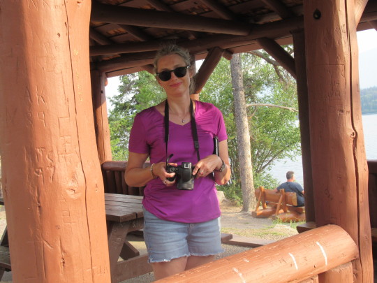
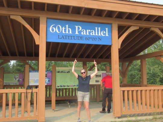
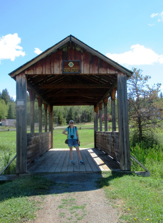
#National Don’t Fry Day#Friday before Memorial Day#24 May 2024#National Heat Awareness Day#NationalHeatAwarenessSafetyDay#DontFryDay#shade#drinking#travel#original photography#vacation#tourist attraction#landscape#cityscape#USA#Canada#summer 2023#2022#landmark#architecture
2 notes
·
View notes
Text

Iiiiiit's that time agaaaiiiin, time to look back at the art I've done over the year hehe :3 I was so desperate to get that Taion pic done tonight so I could include it cuz I really like how the Mondo turned out o:
January - BIG SHOT | I'm gonna go over these and try to remember why I put them in here, so here's the first one. Uhhh, I think I was just really proud of how Spamton Neo came out, 'specially for my first attempt at drawing either form of Spamton seriously, as well as...whatever that technique's called where something in the front (ie. the Fun Gang/Sh-- Squad/Lancer Fan Club here) gets blurred to keep your focus on the Main Subject, that turned out well too c:
February - On Wings of Golden Skies | I'm not the best at drawing complex birds, especially big complex birds, so Ho-oh looking as good as they do makes me happy considering my second main-series game was Gold, even if I was more of a Crystal player eventually. That and Bell Tower looks nice too :D
March - Wave o' Babies | Oh boy. For something semi-serious made off the back of a dumb method of attacking one of the titular Teen Girl Squad gals, this was fuuuuunnn and cathartic.
April - Winter Delight | Had some fun figuring out how to shade snow with my insistence on keeping my brush use more varied now :3 Also, was good practice for drawing black people with more realistic black features, just the lips here as lightened palms are kind of hard to see underneath mittens hehe.
May - Frigid Coffin | Ice effects. 'Nuff said. Also Lief is cool, no pun intended c:
June - Macaroni and Bees | Love how the honey turned out! Both in this art and in real life! Please try honey in your macaroni, it's Nice, also barbecue sauce but maybe not at the same time until you've figured out whether or not you like both.
July - In Pursuit of Power | I'll be honest, I included this one solely because of the art theft fiasco, all to give said thief one last symbolic middle finger >:3c
August - I Shall Not Bow | Textless version featured in this review preview, this one was chosen both due to how important the message was to me and also how I was pretty proud of how yahweh's stupid face turned out.
September - Overcoming the Odds | Backgrounds, man. I keep improving with backgrounds and this one's a good example in my eyes.
October - Team Snakemouth | I just like them okay!! :D
November - If only I could hug you back | ...idk, I really don't remember why I picked this one, selfshipping ahoy? XD
December - Hazy Figure | Taion best lad. Also, like I said at the start, I just REALLY like how the Mondo look here. Yeah, it's copy-paste of a single piece and motion blur, but it works so well!!
All characters featured belong to their respective creators, more information in the links above.
All artwork featured © PuppyLuver Studios
3 notes
·
View notes
Text
Pearl Perfection: The Ultimate Guide to Teeth Whitening Dentistry
Introduction:
A bright and radiant smile is often considered one of the most attractive features, contributing significantly to an individual's confidence and self-esteem. Teeth whitening dentistry has emerged as a popular solution to achieve that coveted pearl-white smile. In this comprehensive guide, titled "Pearl Perfection," we will delve into the world of teeth whitening dentistry, exploring various methods, understanding the underlying principles, and highlighting the benefits of seeking the expertise of a teeth whitening dentist.
The Significance of a White Smile:
A white and dazzling smile has the power to make a lasting impression, conveying a sense of vitality, youthfulness, and good oral health. However, various factors, including lifestyle choices, aging, and certain foods and beverages, can contribute to tooth discoloration over time. Teeth whitening dentist addresses these concerns, providing individuals with an effective and safe means to restore the natural brightness of their smiles.
Understanding Teeth Discoloration:
Before delving into teeth whitening procedures, it's crucial to understand the common causes of tooth discoloration:
Staining from Foods and Beverages:
Dark-colored beverages like coffee, tea, and red wine, as well as certain foods such as berries and soy sauce, can stain teeth over time.
Tobacco Use:
Smoking and the use of tobacco products can lead to stubborn stains on teeth, contributing to a yellow or brownish appearance.
Poor Oral Hygiene:
Inadequate oral hygiene practices can result in the buildup of plaque and tartar, leading to discoloration and stains on the teeth.
Aging:
As individuals age, the enamel on the teeth naturally wears down, revealing the yellowish dentin underneath. This intrinsic discoloration is a common factor in the aging process.
Medications:
Certain medications, such as tetracycline antibiotics, can cause intrinsic stains on teeth when taken during tooth development.
Teeth Whitening Dentistry Methods:
Teeth whitening dentistry employs various methods to brighten and whiten teeth, catering to the unique needs and preferences of individuals. Let's explore some of the most common teeth whitening procedures:
In-Office Teeth Whitening:
In-office teeth whitening, also known as professional or chairside whitening, is a highly effective and fast-acting procedure performed by a teeth whitening dentist. It involves the application of a high-concentration whitening gel on the teeth, activated by a special light or laser. This method can visibly lighten teeth by several shades in a single session.
Take-Home Whitening Kits:
Take-home whitening kits provide a more gradual but still effective approach to teeth whitening. These kits typically include custom-made trays and a professional-strength whitening gel. Individuals wear the trays for a specified period each day, achieving noticeable results over the course of a few weeks.
Over-the-Counter Whitening Products:
Over-the-counter whitening products, such as whitening toothpaste, strips, and gels, are widely available for at-home use. While these products may offer some improvement, they generally contain lower concentrations of whitening agents compared to professional treatments.
Whitening Rinses:
Whitening mouth rinses are another over-the-counter option that can help reduce surface stains. However, their effectiveness may be limited compared to professional treatments.
Natural Remedies:
Some individuals explore natural remedies like oil pulling with coconut oil or using baking soda to whiten teeth. While these methods may have mild effects on surface stains, they are not as reliable or proven as professional treatments.
The Role of a Teeth Whitening Dentist:
Choosing a qualified and experienced teeth whitening dentist is pivotal in ensuring safe and effective whitening results. Here's how a dentist plays a crucial role in the teeth whitening process:
Customized Treatment Plans:
A teeth whitening dentist evaluates the individual needs and considerations of each patient, creating a customized treatment plan that addresses specific discoloration issues and aligns with the patient's goals.
Professional Assessment:
Before recommending a whitening procedure, a dentist conducts a thorough examination to identify the cause of tooth discoloration. This assessment helps determine the most suitable whitening method and ensures that underlying dental issues are addressed.
Safe and Controlled Application:
In-office whitening procedures performed by a dentist involve the application of high-concentration whitening agents. The dentist ensures that the process is controlled, safe, and tailored to minimize potential side effects like tooth sensitivity.
Monitoring and Adjustment:
During in-office treatments, a teeth whitening dentist monitors the progress closely and makes adjustments as needed to achieve optimal results. This level of supervision is not possible with over-the-counter products.
Expert Advice and Aftercare:
A teeth whitening dentist provides expert advice on maintaining the results and offers guidance on oral care practices. This includes recommendations on dietary choices, oral hygiene routines, and the use of touch-up treatments if necessary.
Benefits of Professional Teeth Whitening:
Efficiency and Speed:
In-office teeth whitening performed by a dentist delivers rapid and noticeable results in just one session, making it an ideal choice for individuals seeking immediate improvements.
Customized and Precise:
Professional teeth whitening allows for a customized and precise approach to address specific discoloration concerns. The dentist tailors the treatment to achieve natural-looking and harmonious results.
Safe and Controlled Environment:
Having teeth whitening performed by a dentist ensures that the process occurs in a safe and controlled environment. The dentist can manage any potential side effects and adjust the treatment as needed to maximize effectiveness.
Long-Lasting Results:
Professional teeth whitening tends to provide longer-lasting results compared to over-the-counter products. The expertise of a dentist contributes to achieving a more enduring and satisfying outcome.
Conclusion:
In the pursuit of pearl perfection, teeth whitening dentistry stands as a transformative solution that goes beyond surface aesthetics. By understanding the causes of tooth discoloration and exploring various whitening methods, individuals can make informed decisions to enhance their smiles.
The role of a teeth whitening dentist is indispensable in achieving safe, efficient, and customized results. From in-office treatments for immediate impact to take-home kits for gradual improvements, the guidance and expertise of a dentist contribute to a positive and satisfying teeth whitening experience.
Embracing professional teeth whitening not only restores the natural brightness of the smile but also uplifts confidence, leaving individuals with a radiant and beaming grin. As the ultimate guide to teeth whitening dentistry, "Pearl Perfection" invites everyone to explore the possibilities of a brighter and more vibrant smile, facilitated by the expertise of a qualified teeth whitening dentist.
2 notes
·
View notes
Text
so about that petplay hubworld au
“I have a new client coming to visit in a few days. Are you good with that?”
“Oh.” Simon said, quietly. He laced his fingers and examined the cuffs of his sweater for lint, something Betty recognized as a nervous behavior similar to a housecat grooming itself. He ultimately had no say in what happened, but he could tell her how he felt about it and she would comfort him appropriately, or even take mercy on him and work with the other Simon in one of her outbuildings. Once she made another Betty come and take her Ice King back after only one day because he’d scared her own Simon so badly with his behavioral problems. In short, Simon felt somewhat resigned, but optimistic nonetheless. “What… kind of Simon is he?”
She sighed and patted her lap, which her husband eagerly took as invitation to snuggle up against her with his head nestled in her arms. She began to softly stroke his hair, following its slight curl. “That’s what I want to talk to you about, actually. So. He still has his crown.” She immediately felt Simon’s muscles stiffen and his heartrate speed up and felt a pang of guilt. As a Betty Grof variant, one of the reasons she was so desirable as a therapist and trainer was the fact that she’d managed to restore her Simon through… largely humane methods. Still, he wasn’t entirely back to his old self. His mind was intact, and she knew that was all either of them really cared about, but she couldn’t help but wonder if she had waited longer, that maybe she could have done things perfectly.
The crown had left marks on him, even if they weren’t on his memories or the outside of his body. He had trouble processing his sensory input, issues with sleeping, he was certainly a little more emotionally fragile, or perhaps that was just the effects of trauma. He was incredibly uncomfortable with magic, moreso than usual for a mortal Simon, and hardly ever left the house. She decorated a cozy little study for him as a place where he could feel safe, and it immediately became his favorite place when it wasn’t practical to be at her side. One one side of the room was a wide, low slung daybed piled with cushions, soft blankets, and an impressive collection of flightless bird plushies. A shallow, tasteful wicker chest filled with his personal stims and chews peeked out from under the bed frame, hidden securely from the sight of any untrustworthy fellow Simons. The other side was dedicated to a wall of bookshelves and a large desk that could be used for exciting things such as cleaning stones or practicing calligraphy.
“Well… as long as he isn’t too aggressive…”
“I’ll be honest, I am going to be treating him for some… interpersonal challenges. But he’s not a regular Ice King. He’s called Winter King and it seems like he can be really friendly. Look, I have a video his Betty sent me. You can watch if you want.”
She retrieved a gold and tortoiseshell ringed tablet from the pocket of her coat, and Simon brought himself up to a crouch and nuzzled into the side of her neck to watch. Someone was filming a slender, lithe ice elemental in what looked like a Victorian nightgown flailing excitedly on a red velvet sofa, at one point flopping upside down over the edge and addressing the camera with a cheerful, carefully articulated “Hi, Stranger Betty! I’m making an official diplomatic journey to your universe on behalf of the Winter Kingdom and it’s going to be super rad because I’m so much fun and people will actually tell you that!” He did a few dramatic scissor kicks with his bare legs, after which Betty abruptly paused the video and shut the screen off, but not in time to prevent a single, blurry frame from another clip from playing, an erratically posed figure in the same shade of turquoise. Simon was not entirely convinced, but of course, he had no real authority in the situation.
3 notes
·
View notes
Note
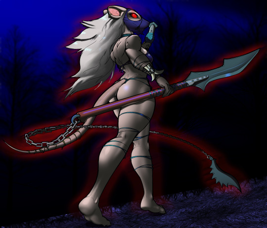
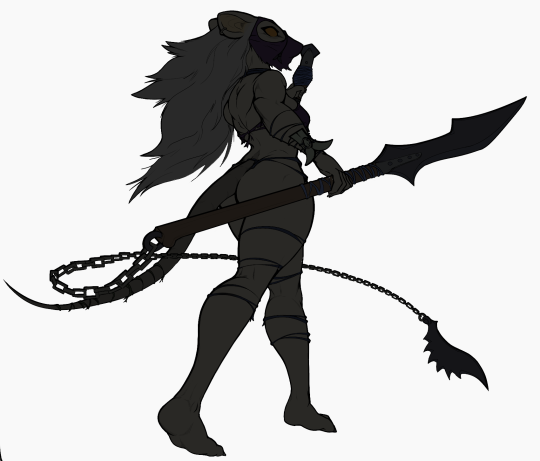
OKAY OKAY GET READY FOR A LONG ASK
THIS IS ASTRAL!! THIS IS HER DESIGN SO FAR, BUT I'LL PROBABLY REDRAW IT AND TWEAK SOME THINGS SOME TIME IN THE FUTURE. (got lazy and didn't shade, mb)


SHE'S HALF IMP/DEMON OR WHATEVER AND HALF HUMAN! I HOPE YOU LIKE HER!
Astral always had an interest in dark magic and the twisted minds behind it.
Imps were typically stereotyped and shunned while she was growing up, so she never really head a drive to stay away from lesser accepted magic.
She mingled among the darker side, learning, until one day she unexpectedly made a breakthrough in any aspect of time magic (you can choose if you'd like!) while messing around; a form of magic rarely practiced and preformed with an incredible amount of precaution due to the dangerous capabilities of it. Astral quickly became high ranking in the community and published a few powerful studies after this despite her mild age gap between her (now) peers. She had been lucky to "rise to power" at a time when higher-ups were getting a little younger.
Originally, she was a jack of all trades, but began to hone in on certain crafts and become generally skillful. Astral was generally revered (apart from critisism on her former immaturity and how she "got too powerful too early" because she wasn't very skilled yet), and had amazing access to everything that she wanted to learn thanks to her position in the community.
However, she realised later on that she did not have insight into normal magic's culture. Astral never really showed face in the normal magic communities until around when WxS started getting well-known. She needed to face society to properly reach the level of her peers, but regardless, she took it more like a fun, new adventure.
Because of her connections, some prestiged magicians that knew the witch from the dark magic scene and took her in, allowing her into high-ranking events to learn the culture.
A few keen eyes grew suspicious at first, as Astral had been very bashful about her integration. She had a substantial amount of knowledge, yes, but no known studies despite being at these gatherings.
Well, that's the first time her breakthrough came in handy. Someone was saved from a wrench in time due to her research, and felt indebted to her. Before they were lost for a few years, they meant to publish their studies on necromancy (the accepted, normal practices of it), but heard of Astral's escapades and felt they needed to help her.
So, now Astral is a mid-ranking normal, high-ranking dark magician that has hosted many influential dark magic experiments, being interested in the psychology of the twisted people behind the less ethical region of dark magic, and introducing more effective and ethical methods. Can't say she's the most moral herself though.
(I'll send how she's connected to the RPG AU in my next ask! I haven't fully thought it out yet and I'm a little busy, so I don't know how long that'll be.. but thx sm for letting me ramble!)
Little witchy girl!!! Awww sooo cute

For the time magic part, maybe a sort of possibility roulette? Minor enough in time magic as a whole but still decent enough to make an impact as even Rui isn't completely sure how he managed to reset a whole timeline just yet XD. She can sort of get the future possibilities people can take and influence them and as she gets upgraded has a higher chance for the influence to work in a possibility she wants
The WxS side quest possibilities as they meet her even though to her, she's on her own major quest! WxS are certainly not ones to shy away from other communities they think could need help.... or a big shake up
I'll be eagerly awaiting more :D
6 notes
·
View notes
Text
Danonymous' Ink-Eyes - redux
Still lingering around Tumbr - and sometimes I have something I can actually post without the Tumblr-gods striking me down with great fury and vengeance. Latest coloring of another Danonymous Ink-Eyes. Here not just her eyes are giving off evil red evilness too.
Real reason I wanted to post this is I did the shading in a radically different way than I usually do. Is it better? Worse? Shrug. It's different. That's all I can say for sure. You "real" artists already know this method I'm sure, but I've not really used it before.
So I started with Danonymous' original of course. (he actually had it as black lines on a dark grey background - but judicious use of Photoshop's Exposure adjustments fixed that right up!)

Next, standard flat-colors (I just copied from my original Danonymous Ink-eyes that I still have the .psd file for) Also ignore the mask color towards the bottom. I screwed up but it looked good so I ended up keeping the screwup.

Now here's where things start to deviate from my normal method. At this point I copied this flat-color layer, shifted all the colors towards blue and darkened them. As the color-gurus say, shadows tend more towards blue, so I just moved everything towards blue.
Now, it wasn't originally that radical. I mean, that's practically an almost-black on black lines. Originally it was just a LITTLE bit darker and bluer than the first flat-colors layer. But as I continued working on it, when I came up with the background it kept looking better DARKER, so I ended up much darker for this second layer than originally planned. So what's the deal with these two layers?

Layer mask.
I've long been aware of layer masks. I just haven't USED them much. But now I understand better why they are the preferred method. So this is the layer mask attached to the darker, "shadow" layer. And that layer is over the top of the normal flat layer. This is NOT the "shadow" layer - it's the layer mask FOR the "shadow" layer. Why is that important?
Well, if you just made a flat, normal grey layer and stuck it over the top of the flat layer, you COULD just erase parts of the flat grey layer with a soft eraser and then naturally see the flat colors underneath. It would effectively do the same thing. BUT... what if you later wanted to put back some of what you'd removed? (important when doing those little muscle areas btw!). You can't just "paint" it back in if it's actually colored. Well, you might be able to, but it would be a huge headache.
Instead, a Layer Mask let's you vary the transparency of the top "shadow" layer so you can let part of the underlaying layer show through - but it's non-destructive to the "shadow" and underlaying layer. You can "play" with the transparency. Anything you color black in the Layer Mask will be 100% transparent showing the underlying layer. Anything you color white will be completely opaque, showing none of the underlaying layer. And grey, of course... let's some through.
The important point though is you haven't touched either color layers! You just changed the transparency of the top layer. You can put it back (color the layer mask black). Or make it a little more/less transparent (color darker or lighter grey in the layer mask).
It's not a magic bullet, but I understand now why it's useful. Because of the non-destructiveness to the top and bottom layers! And that's cool!
That's most of all I wanted to say here. But I might as well show the rest of the progress. With flat color layer under the "shadow" layer and the layer-mask on the "shadow" layer applied, I get this:

Not sure I'll keep using this method, but it does work well and I bet most all pro artists use it basically like this.
So I decided I'd do another moonlit Ink-Eyes with dark background...
The rest was pretty standard stuff really. "Shine" layers set to Color Dodge for shiny butt, shiny hair, shiny spear handle etc. A highlight layer over everything for that eye dot (I find color dodge shine layer doesn't work well for highly saturated colors so I literally paint over them directly.) The red was an Outer Glow on the flat color layer, but then I separated the Outer Glow into a Rasterized layer of it's own and then applied Motion Blur over it. Gave a pretty cool effect. A %30 transparent layer for reflections (on spear handle reflecting her legs, on bikini top giving some reflections too, though primary purpose there is just to not let her boob-edge get lost in the dark background.)
So I still am learning new methods. Why did it take me years to "discover" layer masks? Frankly because I didn't need them. But I do like how this came out so I might use them more than "painting" shadows in.
5 notes
·
View notes
Text
For the Warlock character Idea I had
I'm using this as a character in a DnD game my friend at Uni will be running. This is from DM's with my DM for the game btw
-1 Strength
+0 dex
+2 con
+1 int
+2 wis
+5 charisma
Enwyun 'Bad Lot' Lott
Imma write his backstory here so you can tell me whats not allowed faster, rather than struggle with my handwriting
[13:49]
Enwyun 'Bad Lot' Lott was born during the dark hours of winter, in a bloated town, it's population practically pouring over the town decaying walls. His parents were Elves, who had emmigrated to the city under hard times, which did not improve maketedly. Enwyun, at a young age, was facinated with medicine and healing. If slightly to the concern of others, mostly attributed to a greater interest in bloody than anyone his age should have. Though it was only for curiosity of biology, at his own insistance. When he was around 12 he struck out on his own, allowed by his parents likely due to their desire to have one less mouth too feed, and one less child whose… strange actions they had to apologise for.
[13:53]
Enwyun himself attempted to find apprenticeship with clerics and other healers, his confidence, and charisma, somehow managing to convince them to let him in. But, he had little talent for it. Often finding the 'Right' methods leading to failure. So he attempted his own ways, which sometimes worked well, others less than optimal. The odd explosion or odd effect did him a fair number of injures, or the subjects themselves made time to inflict them, making him more sturdy than before. This led to him getting a rather diskind nickname, 'Bad Lot', for the misfortune of his patients who got him as their doctor. (edited)
[13:56]
The nickname followed him from place to place. As did his misfortunes, not that it overtly bothered him. He ended up often having to free lance his skills, even to monsters such as Goblins or others, one example being where his patient recovered from a stab wound with some salves, and he received one of his false fangs in return for payment. Another a ring, and some beads.
[14:01]
But, he was not well respected in the general community of medicine, even if he ferreted out successes and results, his failures were far too present for the higher races(Humans, Elves, Dwarfs, Half orcs etc.) So, he often was out of work, and had to find other ways of making money, often not the most savory. Doctors are needed for everyone after all.
[14:07]
But then, something interesting happened, he was travelling though a birch tree valley, odd for the spiral patterns that the bark of the tress made. He made camp for himslef under one of the trees, used to sleeping quickly and rough from his childhood. Then he awoke, or at least seemed to. He was in a odd place, things moving with no right order, almost madly. Then he saw, both above, below, beside and behind him, something he knew he should not comprehend.
[14:11]
It spoke to him in scattered words that came at him from every side, like a brigade shouting out to him, their mangled words somehow forming into speech. Sultry and pleasent speech that pulled him forward. It offered him the ability to heal and to help on a scale that he, as of yet, had not been able to acomplish. It simply asked him to heal and to care, as it would in the end to serve both of their ends. He would make the 'Bad Lot' that everyone saw his champion. All he had to do, was Step ForwardBackLeftRightUpDown… And he did. (edited)
[14:13]
For this, he became an Aasimar, a fact he hurriedly tried to hide, or brush off as a failed experiment, not wanting to attract too much bad attention, and a warlock. But the last thing he recived, as if it was a deep brand in a lighter shade on his back, was the mark of his patron.
For flavour, he is a purple skinned elf, male, 35, 6'3" with silver blue hair, I might post the charecter desricption later as I cant draw for shit, but it is had written so may be slow
@agarespicero
@irumeanie
@irumaismybaby
@pursonsoisooi
@jemimacatclover
13 notes
·
View notes
Text
i have yelled at length on discord about stepverse interactions and yet
cut for length and rambling good god but this is going out there because i refuse to be a chicken shit on my own blog
i never thought either miguel or miriam would particularly like any of the other steps. (wrong on miriam’s end--tbf she doesn’t like anyone to begin with, ever, but she truly isn’t that hard to win over, despite her best efforts. absolutely dead correct for miguel--although he is by far more stubborn and less avoidant than i had previously pictured him.)
but they absolutely do not like each other. i thought maybe perhaps a grudging respect (which is miguel @ elmo weirdly enough) but no. they both think the other one is like--a massive loser lmao.
for one thing, mob boss vs hero hunter: miguel thinks miriam is short-sighted and violent (yes). miri think miguel is cowardly and dependent (also yes). vastly different methods of approach that put both of them off of the other: miguel resents how miriam uhhh just shamelessly rips things up. kicks the shit out of the least important person in the room and leaves. like what in the self-centred shit--? but miri thinks that miguel is just as bad as the people he’s coming after--replacing one with another does nothing. there’s no net improvement, no accountability, just power changing hands as it has for literally forever. how’s that for self-centred?
both of them are pursuing their own little side plots that are just... running adjacent to the actual issue but by god will neither admit that those are side plots. what a waste of talent, they’ll complain to their respective partners, if they weren’t such a (miri: stuck up asshole/miguel: cruel idiot) i think i would be able to turn them around.
(it’s worse too because miriam’s not. shy. or polite. when she doesn’t like someone. she’s a wetwork agent, an assassin--fighting is her job and she’s her own best tool. the faster she can get things clear the more effective she is. whereas miguel has shades of social anxiety and is relentlessly, strenuously polite, especially if he doesn’t like somebody. you get around in his world by making friends, and he’s not that good at making contacts to begin with. so he settles for being a powerful asset, and easy to work with--make it hard for people to dislike you, and maybe they’ll keep you around. miguel would have allowed himself to be won over if miriam would just condescend to civility but he makes her skin crawl, not knowing where she stands with him but knowing he’s hiding something.)
also, miri is very willing to die in whatever form it takes. all of the walls she’s been keeping up between the three selves are collapsing. there is physically no way she can keep all of those plates in the air and get a good emotional ending: she has to drop at least two of the lives. tbh if she lost all three, it might be a relief. and this would not jive well with miguel at all--whose dearest wish is to feel like he belongs to his life. like, not even ask for a better one: he can learn to love the one he has. he wants to feel entirely at home in this body that he’s forged himself. to stop feeling like the world is just a globe on a desk, a ship in a bottle. as a fate step he feels like he’s trying to pull a plane out of a nosedive while accepting that this is just slowing the inevitable crash--trying to fall with a little style. in his eyes, miri’s trying to crash a car that would otherwise have driven straight--on its own even!
and i think--at the core of it, they’d be soooo so so fuckin envious of each other. like that’s all it is. miguel sees miriam’s drive and independence and intensity of feeling and wonders what that would be like. he loves the crew, but imagine that. being able to go off on your own and trust that it would be fine. imagine believing in something unconstrained by practicality or reason--you’ll make it happen. imagine being swallowed up in someone else’s love or anger or what-have-you, able to be there in that moment instead of somewhere before or after. and then miri’s just. furious with this guy who acts like he can steer anyone around--but can’t he? she says has the strings, and she knows what to do and where to go. but does she? if miriam feels like she’s face down in the puddle of her own life, miguel might as well be walking on water. more than that, all of her kindness is wedged behind some--block or whatever: there’s no time or space for gentleness even if she wanted to, even for the people she loves. she watches miguel deftly fit himself into any team he wants and realizes that he never works alone because he never has to.
if they were in the same universe, they’d be staring at the unholy mess the other one is making of the the life they dream of, asking each other and asking themselves:
why the fuck are you unhappy?
#tw sui#brief discussion anyway: the tag is part of miriam and something i staunchly will not give to miguel.#i haven't figured out how to write characters that aren't mine yet so why not practice on my personal blorbos#love that they're both juliamancers--miri is a julia main and miguel has a chentega vee route even though he's mostly w chen#what can i say jules has the Range#they are profoundly estranged siblings! they are the rival smart kids who had a fistfight in the parking lot the night before graduation#they are cats looking at themselves in the mirror#miriam basri#miguel serrano#apropos of me realizing their tags bleed together a little
2 notes
·
View notes
Note
It just occurred to me that Omega!Silco must have had a hard time giving up smoking and drinking during all of his pregnancies while living at The Drop (A place filled with drinking and smoking patrons) with Vander 😂
Did Silco develop somekind of hobby (eg knitting) to keep his fingers and mouth busy ?
Also did Silco's water ever broke in the most inconvenient time? (eg: At his stay in Piltover or during a negotiation? Or even during an argument with Benzo, lol)
Oh yeah, the thing I keep not including in any of my fics because I'm VERY aware of the effects of drinking and smoking on pregnancy and around young children despite not being 100% sure the characters do. I say that Silco stops drinking and smoking at least for the pregnancy for my peace of mind.
Also Random Pregnancy Culture Fun Fact: Guinness (the beer) was suggested to pregnant and nursing women to help boost their iron levels and help boost ones milk supply until basically we got modern iron supplements (and like most traditions it still lingers in some families), comes from the UK I believe. I actually know people who were given a pint (well glass IDK if it was an actual pint glass) of Guinness by family/partner to drink right after they gave birth. And while I'm aware you shouldn't drink alcohol while nursing I feel like that later tradition fits a bit too well here I kind of have to include it (and one glass of relatively low strength beer is pretty negligible).
(for Zaun Family) Viktor's the easiest at least on the drinking front because Silco isn't literally living in a bar. But he's probably been smoking since he was like at the oldest 12 himself so that habit is ingrained and going to be hard to break even for the length of a pregnancy (minus the time it took him to realise). And the poor bastard can't even have a celebratory drink when they do open the Last Drop because he's already pregnant with Claggor.
In basically every other verse and the other pregnancies in Zaun Family Oh yeah it's hard. But, you know, he's already putting in all the other effort to make the kid, so what's 9 months of no smokes or alcohol going to do to ensure they're as healthy and well off as possible? (Be even more of the reason he gets pregnancy insomnia thanks to withdrawals).
I do think Vander probably tries not to drink or smoke around him in some level of solidarity.
The obvious habit Silco might develop is nail biting (satisfies the hands and the mouth) and possibly drives him to keep his nails super short so he can't bite them. Food's probably another thing he can turn to (which you know he is eating for two). I could see him getting into the habit of sucking on the ends of pens because he does it without even thinking. I don't think he goes out looking for a hobby though, just gets extra habits.
Oh yeah I haven't told you guys about the idea with the fourth pregnancy while he's Zaun Representative offshoot of him giving birth in his office in PIltover have I?
Claggor's one where his waters break once he's already in active labour so is already well aware of what's going on and set himself up in his nest with the midwife by that time. And Mylo IDK for some reason I think he rides out the early part of that labour in their bathtub so his waters break while there if it's not also after he's been moved back to the bedroom and is in a bit more of the active labour phase (although it could be funny while he's making plans with like teenaged Sevika who already was kind of team 'not having kids' and is now EVEN MORE SET on that life decision despite Silco taking it in his stride).
... it's with Viktor isn't it? The one that came a bit earlier than predicted where he still hasn't fully learned the different between practice contractions and early labour. I mean it was a very effective method to get Benzo to shut up and back down even if it also made him turn a shade of green.
#Zaun Family#mpreg#Arcane mpreg#Silco Arcane#omegaverse#Arcane omegaverse#Ramblings of the Goddess#Q and A with the Goddess#Anon question#I mean I also know people who did drink and smoke#through their full pregnancies (different to the Guinness people)#(note I do not like these people partially for that reason)#but you know Silco is a Good Parent#and will just handle his personal suffering for the good of his kid#I do however think he possibly used booze to settle his babies#once they were born#either drinking it before nursing to pass it on to them#or rubbed whisky along their gums to help with teething#Which is still Not Great but somehow#I'm a little more comfortable with it (only a little)#Probably because they don't cause Fetal Alcohol Syndrom#And you yourself have to probably be shitfaced#to have a massive effect on them#but still don't do it any alcohol bad for babies#but these are not real babies they are fictional ones#and it's not like they have access to teething gel#so... ehhhhhh
24 notes
·
View notes
Text
Week 5 - Sketching
This week was all about improving our ability to sketch quickly and effectively as well as leading into digital sketching. In order to help us warm up our sketching abilities we first did a series of sketching drills. After this we did a progression of drawing detailed concepts for our own redesigns of an okay moisturiser bottle.
Warm-up task:
The first exercise was simply drawing straight lines as best we could on a folded A3 page. The left side shows my first go and the right is my second. I was glad to see noticeable improvement as I figured out what was most comfortable to achieve straighter lines.
The second warm-up was making 20 dots randomly on a page and then connecting them. As was suggested, by looking at where you want the line to end I found it easier to create straight and accurate lines.
Thirdly was drawing circles consistently and adding ellipses to add form. Circles are something I'll just need to practice more however the bottom line does appear to be fairly neat and even so it was nice to see the warming up working a bit.
Studio tutorial:
Part 1:
The first task was to create 12 box's at a 1:2 scale which will be used as a guide for the concept sketches.
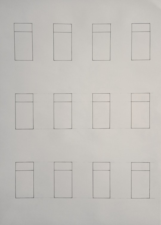
The 12 box's shown above were initially sketched in pencil, then traced in thick pen. This would be used under a fresh page which I taped together at the corners and used to make consistently sized concept sketches.
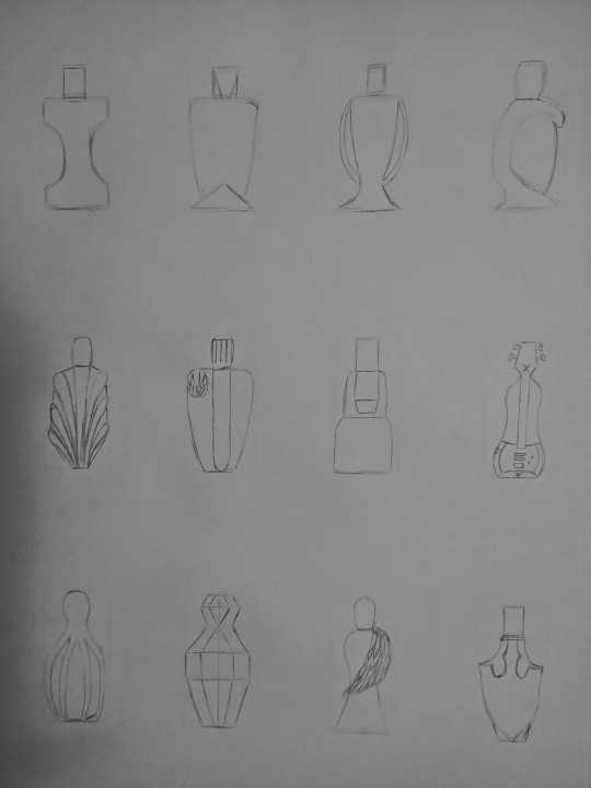
I started the sketches with simple a 2D view. They're pretty bland atm but it was useful for me to play around a little bit and simplify the ideas in my head which would be developed further later.
When the tone/shading was added, it brought a lot more life to the bottles. I experimented with 3 different ways to show off the depth and lighting. Personally I think the 3rd rows method is best suited for this task as it looks very clean but still very conceptual.
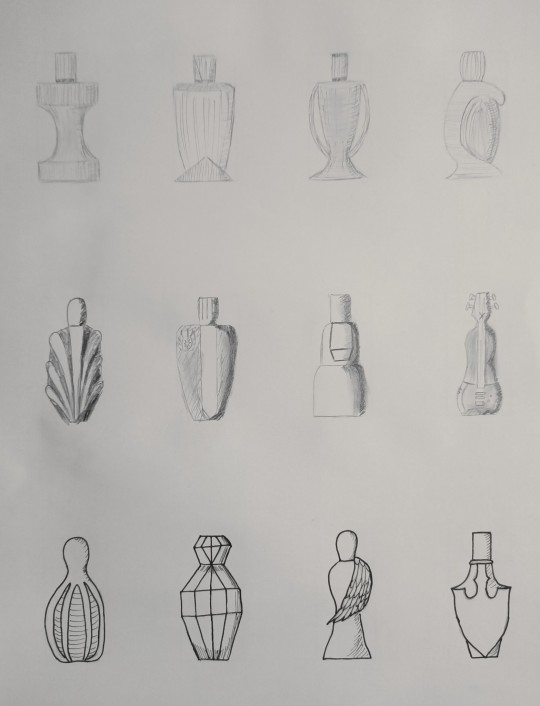
Part 2:
Next was sketching our bottles in a perspective view while still trying to be as accurate as possible.
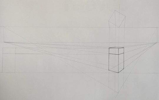
I used the same method for 2 point perspective that we learnt in week 4. I used a thick pen to outline the box which would be used under a fresh page as my reference. I reused the same box for each of my perspective sketches unlike in the previous part as a) I'm not too worried about spacing the 3 perspective drawings apart perfectly and b) it would be an inefficient use of time.
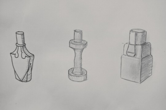
I continued my experiment with the different tone/shading methods and this time I like the method I used for the third bottle more. The third bottle has a nicer looking gradient and shading, adding the most to the overall form out of the 3 methods. Overall I'm happy with how the perspectives worked out other than the first bottles cap being slightly slanted. Was fun playing with some different concepts and then seeing them progress into more detailed sketches. I also found the experimenting to be helpful and I'm curious about what other people prefer out of my sketches as well as useful tips for improving them.
8 notes
·
View notes
Text
Mini motorways tips and tricks

A freeway will certainly give them a straight shot to the structure. That is rapidly piling up with markers due to the fact that every one of your blue locals get on the opposite side of the city. Claim you have a blue building on one end of the city. Highways are basically complimentary, unblocked roadways that can go anywhere, with only the entryway as well as departure requiring to be linked to a road.ĭue to their adaptability, a very carefully put freeway can conserve your city if you are having poor web traffic. When you are selecting a weekly reward, if you ever have the alternative to obtain a freeway, it is most likely the most effective selection. Placing roads down in the empty space will protect against homes and also buildings from being built there. Claim for instance you have a hectic crossway as well as there is some room around that you intend to stay totally free. The reason being is that the video game will certainly generate new structures and also homes in arbitrary locations, yet it will prevent places that are already taken by roads and also various other frameworks.ĭue to this, you can type of game the system by placing down roadways on purpose in areas where you intend to be kept open. If you have left over roadways when you are done expanding your city, it could be a good suggestion to lay down those roads anyways even if you do not have a destination for them currently. You will also get one more incentive which can be more roads, bridges, highways, traffic lights, and also more. When a week of in-game time has passed, you will certainly be awarded with more roads that you can utilize to expand your city. You are going to insane a very severe traffic jam that will most likely lead to a video game over if left uncontrolled. If you have an active junction with different colors entering and also out. Second, do not let greater than 2 colors onto the same road. Maintain this structure approach in mind as you begin the degree, and also you ought to be able to keep constructing the city following it. To begin with, it aids a whole lot to start early. We understand that is not always a practical way of doing points, so we have a number of tips. It is ALRIGHT to have 2 various shades on the very same road, but also for maximum efficiency it is best to maintain the shades different to the very best of your capability. This is really easy to ignore, so make sure you keep an eye on your connections to ensure the shades do not blend. One of the simplest methods to allow web traffic develop is allowing autos of different colors onto the same road. You can return to the game as normal or you can pause the game momentarily. Throughout the game, you can tap on the clock at the top right edge of the screen to fall the clock functions. Mini Motorways Tips and Tricks Time Out Time to Strategy This will certainly lead to traffic congestion down the line, as well as it is best to maintain forking your roadways regarding not guide web traffic to one main area. So you require to make certain to continuously be including brand-new roads to guarantee whatever is connected.Ī basic rule of thumb to remember is to avoid attaching a lot of roadways to one “central” roadway. You never ever know where brand-new residences or buildings are going to appear. In other words, you can touch any vacant square to get in structure mode. The tutorial teaches you the basics controls as well as technicians, so ensure to play via it. In Mini Motorways, your major objective is to make sure that every car that generate in your city can reach their destination within a reasonable time.
2 notes
·
View notes
Last Seen Blogs

bagelwinter31
The Journaling of Karlsson 904
pokemon-kittens
Poke-Cats
mildcrow
pecks u [affectionate]

chellsiememmel
rebeca andrade supremacy 💙

notsou
🧣