#clip studio paint tutorial
Note
Hi there! Your pieces often have this hazy, glowy quality and it’s beautiful! Do you use any overlays? I love your art!!
Oh yes I actually use a filter!
So here is how I add that slight glow to my drawings:
(This is for Clip studio paint users)
Easy version: Have your art as a png. Duplicate your only layer so you'll have two layers (the two same pictures). Select the upper layer
Go to:
Filter > Blur > Gaussian blur
Choose how much blur you want (not too much) and....BOOM!
You have a nice glow!
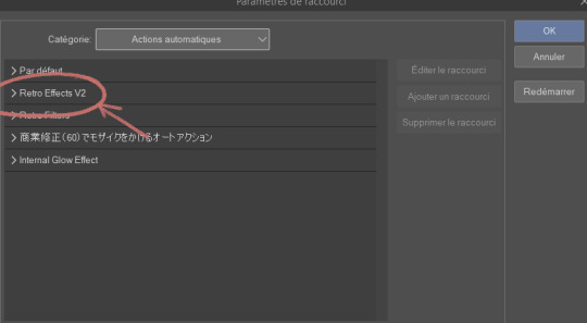
For CSP folks who know about Auto actions and want to be able to do it in one simple shortcut (with other cool effects):
So first you need to download the auto action retro effect v2:
(bear with me because everything is in french for me so I'm roughly guessing what it must be in english)
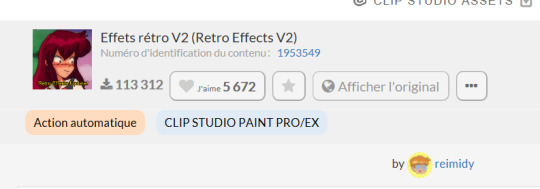
(Number: 1953549)
Then you are going to check your downloaded assets for that effect and click on this small thing at the bottom of your screen
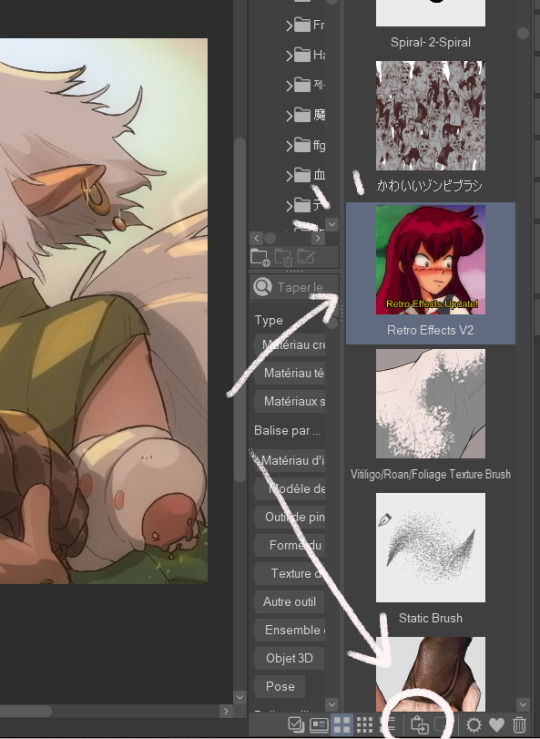
This will add your effect into your automatic actions. To reach it, you need to click: File > shortcuts settings > Auto action
(this is for any auto action you might download so remember to do that each time)
This will open and you'll have your effect:
You'll have several actions available (which I invite you to test), but the one that's important is retro blur with a little bit of the others (sometimes I only use that blur)
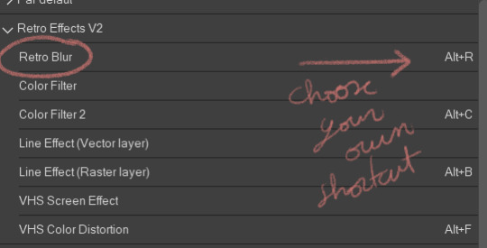
Choose a shortcut of your choice (click on it and just tap it down) then click on "ok".
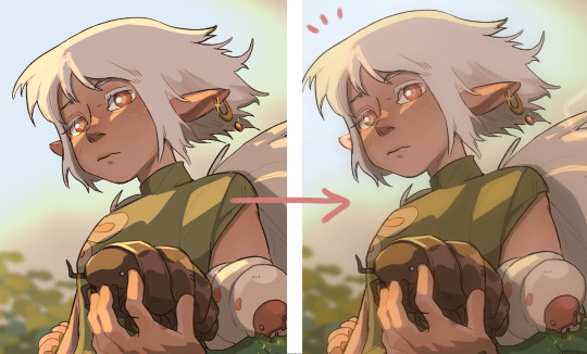
NOW you should have the blur effect. What I advise you is that once you finish a drawing, you make it into a png, jpeg, whatever file you want to post and use the effect on it (that way all the drawing is affected)
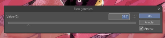
This will appear and you can play with it if you want more or less blur. If you don't want to hurt your eyes too much I would advise not put too much of blur. I also add a little bit of overlay (pink or purple, very little opacity)
And here you go!
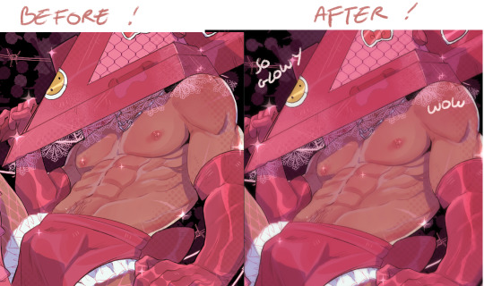
Hope this helps ∠( ᐛ 」∠)_
1K notes
·
View notes
Text
how to center things in clip studio paint
a guide
ok so clip studio doesnt have a center feature which is genuinely insane but there is a way to center your stuff and its actually pretty easy

alright so this is your drawing. first, press ctrl+t

awesome. now go to the tool properties window. it should look like this:

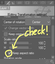
all of the centering magic happens in this window. so first, you have to check the box that says "keep aspect ratio", like this:
then, you go to the "adjust position" label and switch from "free position" to "canvas"
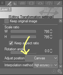
your drawing should now fill up the canvas while retaining its original proportions:

so big! last step: change the scale ratio to 100:


and voila! your layer has been centered. hope this helps!
260 notes
·
View notes
Text
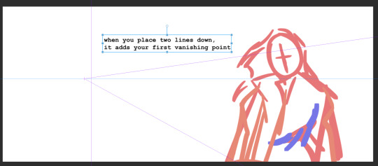
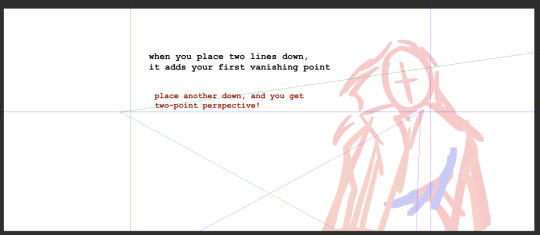
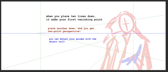
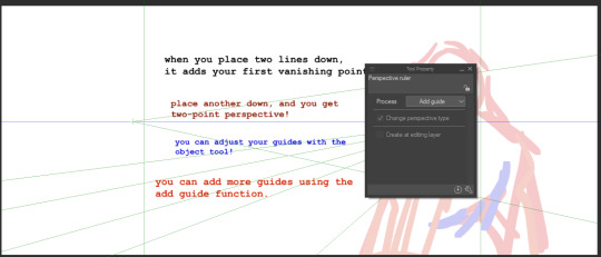
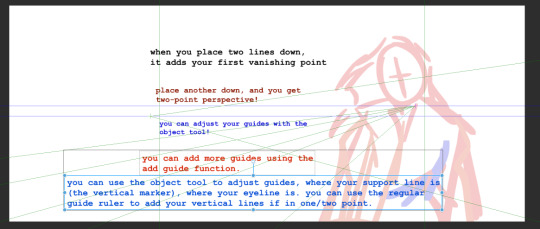

i made a brief tutorial on how to use the perspective tool (that i just figured out) in clip studio paint for anyone else like me who is so confused
also - when drawing with the ruler, all lines automatically go back to the vanishing point. happy perspectiving
101 notes
·
View notes
Text
aid’s collection of neat art tricks
aka I wanted to compile all the neat things I’ve learned and picked up over the years across various sources; I wish I knew some of these, but they’re scattered across a variety of social medias and some from conversations.
of course, these are not a must and just have helped me! I just wanted to put them all in one place in hopes that maybe it’ll click something in someone like it has for me. c: I’m not the best at explaining, but I hope it makes sense!
some may use Clip Studio assets but can be replicated through other methods (or done by hand in the case of how I do my lineart colouring), but do keep in mind all of these are written with CSP in mind.
this is pretty heavy in images and gifs, and is quite long.
how to quickly fill your outlines (CSP tool)
this is a CSP specific method, but this tool has been my absolute saviour for making colouring so much easier for me (even if sometimes it still does require me to manually fill in some holes or erase sections). the bulk of how it works is explained in the tool as well, but I’m going to show a gif example for myself!

you have to make sure your lineart is set as the reference layer to ensure this tool does work; with messy outlines (like my own) you may need to manually fill in holes as can be seen in the gif above; with cleaner outlines, you don’t need to worry as much, but you may have some bleeding out of the lines for places that are a bit too close together (as you can see below, those areas would need to be erased).
the tool can also help to close ‘gaps’ between colours!

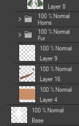
I usually tend to have a ‘base’ colour that I just clip a folder of flat colours to, so it doesn’t bleed outside of it, but I’m also a nested folder freak to make sure everything is cleanly separated and doesn’t get ‘destroyed’ while I work on it. this tool just makes it so much easier to get that base down and just jump right into adding flats.
adding a little pop of depth
this one is thanks to a clip studio article itself where I saw it from, and I’ve been using it in practically all my drawings so far; all it is, is a simple blue-ish overlay layer with some muted yellow/red shading to give it a bit of a “3D” effect, for me I enjoy more that it adds a bit more colour variation underneath (usually lowered to 20-50% opacity, depends on the drawing)
the article definitely explains it a bit more nicely, but this is an example of having it at 50% opacity over one of my drawings
making your lineart feel less ... boring?
of course, boring is subjective from person to person, but I’ve always found my lineart to be too boring by itself

like this is fine, but it’s missing some kind of oomph. there are two tricks I use when it comes to sprucing up my lineart: using the watercolour edge effect in CSP, and a combo of coloured outlines + black outlines
first things first, the watercolour edge option: by default it’s a bit too strong, so I usually find the sweet spot to be at 1 range and with an opacity of ~20


this can be replicated through duplicating your lineart, and if the option is available, using gaussian blur on the duplicated lineart to achieve around a similar effect.
coloured outlines!
when it comes to colouring my lineart, truth be told I do use a wonderful auto action for it which can be found here, and there is this alternative one as well (which i’ll be trying now!!!).

it is a little different since it uses the flats, vs the one i use which just requires you to have the lineart selected, but as you can see it is a very quick way to colour your lineart ... this isn’t perfect by itself and will require you to have your flats finished.
this is my process: outlines done, autoaction, cleaning up by adding black outlines where they’re required and fixing up sections where the colours don’t quite make sense (like the sleeve area).

as you can see with the last drawing, I also tend to add a black outline around the outside of the piece, I personally found I really enjoy the contrast of the dark outside and coloured interior lines, as you can see in this little sample; it just adds a bit more visual interest for me!

unfortunately, outside of manually doing it, I cannot think of alternatives for this specific action (perhaps duplicating + flattening all your colours and placing it on top of the lineart may be a start)
crunchy textures and pretty colours ...
the texture i use on top of my drawings can be found in this CSP asset pack (though the marker brushes themselves are very lovely, and I’ve used them myself). this can be replicated through adding perlin noise, but I just find this texture to tickle the good spots in my brain, and it’s why I use it on pretty much all my drawings for some additional visual goodies.
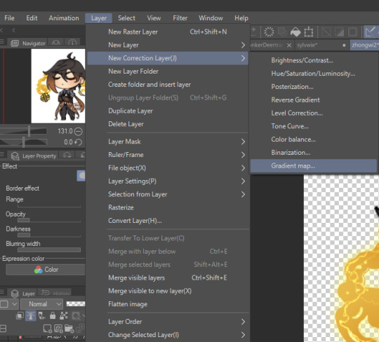
yes, i am also a person who uses gradient maps. I usually tend to use them as finishers and more subtle ways to add more colours and variations to keep my shading from looking too flat, but they do have to be handled with care lest they become overwhelming. vampbyte does a wonderful introductory thread on gradient maps, how they function, and how they can be used.
they can be found through layer > new correction layer > gradient map -- or at least that’s how i usually access mine!
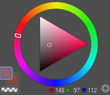
i often place mine at 20% opacity on the colour mode, though soft light and overlay also do their own fancy things! really depends on which you like most and works with your piece.

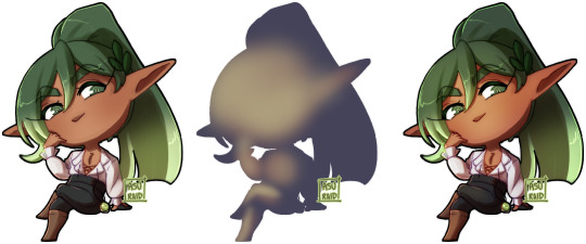
an example of my chibi w/o texture and colour gradients vs the texture + colour gradient ... as you can see it does change the colours quite a bit, so usually it does take me a bit of playing around to find a colour gradient I like (I’m a gremlin who has downloaded a lot of them) and to play with opacity values.
and to top it off, here’s the combination of all of these vs one with them all off.

how i personally shade (multiply layers)
i usually tend to either go for multiply shading over the whole drawing using one colour (and a few lil tricks to add more depth) for smaller pieces, or hard light shading for bigger and more complex pieces since it has more value depth.
my multiply layers are usually just one or two layers using around the same off-purple shade (though i shuffle it around pending on how it looks on the drawing

the second layer is a duplicate of the first, and i usually use an airbrush to either erase or expand areas to give it a softer shade (as you can see in the gif, the second layer is definitely missing chunks), or to add a different colour to the shading that isn’t the off-purple
how i personally shade (hard light mode)
this one’s a bit more of a mouthful, and thanks to a friend who introduced me to it! my second method is hard light shading, which, at its simplest, is greyscale shading and feels like it leans more into ‘painting’ your shades (as it works best with a brush that blends colours).

although I’m obliterating my own art here, it’s to show that most of your work will be in the greyscale/muted colours! it is inherently a non-destructive method of shading, so any changes to the colours underneath will maintain the shading regardless. normally I do have to duplicate the layer a second time since I don’t go too close to black shades, and it gives me a bit more control over how ‘hard’ I want my shading to be.

the middle is your ‘neutral’ shade, aka what you want to fill your entire hard light layer with, then your lighter greys will be your highlights, and darker greys your shading!
alternatively, you’re looking for this when you want to find your ‘neutral’ shade.
once you got your hard light layer filled with your base/neutral shade, grab your favourite painting/blending brush and go ham!
as a heads up: when it comes to skin or warm colours in general, you may need to get out of the greyscale range otherwise it will look too desaturated and grey, as you can see below. for any other tones, the greys usually work well.

as of the moment, I think that’s all the little tricks I use when doing art, I hope it helps you guys!
(unless I somehow remember something else, but these are usually my default tricks I use for everything)
#art tutorial#clip studio paint tutorial#digital art tutorial#clip studio paint#tutorial#art tricks#mine.txt#10#20#50#100#200
221 notes
·
View notes
Text
Check out my CSP Vector Tools Tutorial here!
#sum doodles#vector tools#clip studio paint#vector tools tutorial#clip studio paint tutorial#persona#sona#debrashell#in harmony
10 notes
·
View notes
Link
A combination tutorial for character design stylization and digital coloring by tokyolondon
#art#art tutorial#tokyolondon#clip studio paint tutorial#digital coloring tutorial#character design tutorial#how to make an OC
104 notes
·
View notes
Text
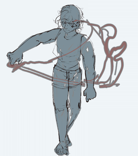
gotta post something. i found out its real easy to block out body parts with a border-effect layer on clip studio paint.

these r the settings i have for it, but it really depends on what you're comfy with/ want !!
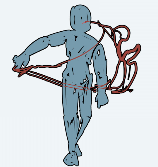
just the blobs/just the sketch lines :)

11 notes
·
View notes
Video
youtube
How to Draw a Guy in a Suit | Timelapse menswear step-by-step tutorial i...
#Clip Studio Paint#clip studio art#clip studio paint tutorial#suit tutorial#kpop#idol#jinyoung#got7#how to draw a suit#step by step#timelapse
20 notes
·
View notes
Text

Some of you who use Clip might find this helpful. Program sucks for handling airbrushes and of course the closest tool I get to emulate soft gradient fall offs, isn't with an airbrush at all. Anyway, here's this. Just an additional note, if you want a more painterly and wetter look just add color mixing to this from the brush settings menu at the bottom right. Though that kinda defeats the purpose, since it's the softer dryer gradient fall offs that CLIP sucks at.
#clip studio paint#clip studio paint brush settings#clip studio paint tutorial#clip studio paint brushes#jaeharuart
9 notes
·
View notes
Text
felt like making a random csp obscure tips post here we go
1. a huge feature a lot of people don’t use is modifier keys!
you can find modifier key settings by right clicking on a brush/tool
you actually do use this feature, but most people don’t customize them. a lot of the more obscure shortcuts are actually modifier keys, such as Alt being the eyedropper

if you want your brushes/tools to do something specific when you press a key.. theres a good chance you can set it up like that! the different shortcuts are allowed to only do certain things but its still pretty powerful, like you can make ctrl alt switch your pencil brush to a lineart brush, but that shortcut wouldn’t work on other brushes
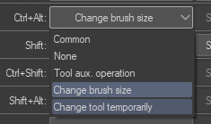
a REALLY helpful use for modifier keys i figured out recently is making shortcuts to switch to different selection modes on my lasso tool instead of having to click the buttons to change them every time

2. you can make custom brush groups and organize your brushes on that toolbar really easily. brushes are insanely customizable actually
Something important to understand is that CSP treats all brushes and tools as Sub Tools, and Sub Tools can go into Sub Tool Groups, and then those groups can have their Own sub tool groups.
This is how you make groups within groups (I’m calling them mini groups for clarity from now on)

However you can drag these mini groups into the tool bar to make your own sub tool groups
You can also drag individual sub tools into the side bar to make a new sub tool group, if you drag them over one of the divider lines it will make its own section

3. You can set shortcuts for any sub tool group
If you go into shortcut settings, there’s options for your custom sub tool groups on the toolbar

#clip studio paint#csp#art tutorial#clip studio paint tutorial#digital art tips#long post#btw i dont keep my toolbar at the right i moved it for visibility in the gifs#soap talks
63 notes
·
View notes
Text
Layer Blending in Clip Studio Paint
I started mucking around with the layer blending options in Clip Studio Paint, and realised I knew almost nothing about them.
Even with the modes I and other artists use regularly (like overlay, add and screen), I had no idea how they actually worked.
So I decided to experiment with them all and posted it up as a tutorial of sorts on DeviantArt (I am NOT cutting the thing into 22 pieces just so I can post it with a semi-decent quality to Tumblr).
If you want to have a look, you can check it out here!
*Also features Aziraphale and snake!Crowley, because those two are the best characters to do this with :D
#csp#clip studio paint#clip studio illustration#clip studio paint tutorial#digital art#art#digital art tutorial#blending layers tutorial#tutorial
4 notes
·
View notes
Text
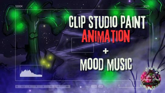
Clip Studio Paint Animated Tree Mood Music #clipstudio #filmora
Clip Studio Paint Animated Glowing Tree Mood Music #clipstudio #clipstudiopaint #filmora A new clip studio paint animation created today using filmora. The scene is a glowing tree with some playful fairies staged in a magical environment concept.
My Books Concept Art Idea Book (2017) – https://www.amazon.com/dp/B074PFSG31
Concept…
View On WordPress
#3d animation#3d animation blender#3d animation tutorial#animation#art#art lesson#art process#art school#art tutorial#artist#battle droid#capcut#Clip Studio Paint#clip studio paint tutorial#clip studiopaint#clipstudio paint#concept art#digital art#digital art for beginners#digital art tips#digital art tutorial#digital artist#Digital Painting#digital painting tutorial#digitalart#droid#how to draw
3 notes
·
View notes
Text

⚡️FREE Vtuber ASSET DROP!!! ⚡️
Bep Bep Beautiful NEW Spoopy season witch hats!
Tag me in your posts use cuz I wanna see your wonderful cookie creations~
Happy Vtubing, Tasty Cookies!
Here are the links to our lil studio shops <3
Gumroad: https://bepin.gumroad.com/l/hatW?layout=profile…
Kofi: https://ko-fi.com/s/22fd2ab272
Hope you love LOVE the new creation UwU
~Bepïn~chan (iiiSekai Vbloger)~
#VTuberAssets #VtuberUprisings
#VTuberAssets#Vtuber#vtuberhat#freeVTuberAssets#live2D#vtuber art#clip studio paint#live2d#live2d cubism#live2d rigging#live 2d tutorial#clip studio ex#clip studio paint tutorial#clip studio paint brushes#csp digital art#vtuber assets#vtuber cutting#live2D 5#patreon#gumroad#ko fi#ko fi link#artist on kofi#buy me a kofi#vartist#iiisekai friends#skeb#vtubr#vtubesona#vtuber uprising
4 notes
·
View notes
Video
youtube
A quick little clip studio tutorial! How to add borders around your art like a cool sexy person
16 notes
·
View notes
Photo

https://www.youtube.com/watch?v=q_KMx5VkHp4&ab_channel=AntaresTheTall
2 notes
·
View notes
Text
Clip Studio Paint Tutorial Masterlist
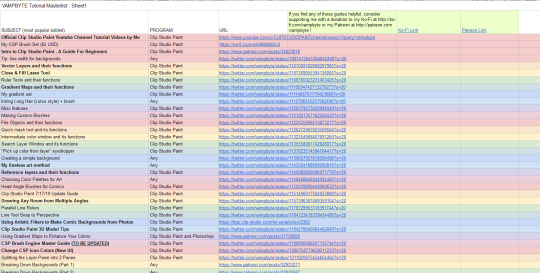
for those of you who don't know, i have a masterlist of CSP tutorials and guides available to read for free! all of the guides are made by me in the past couple years. most are twitter thread links, but eventually i plan to convert them all to tumblr posts when if find the time.
read here!
9K notes
·
View notes
Last Seen Blogs
lotsofpiercings
piercings

gingerbreedreads
The GingerBreed Man Reads

skrttt69
Untitled

steddiebuckley
evan buckley owns my ass