#anyway i wanted another funky color palette so
Text
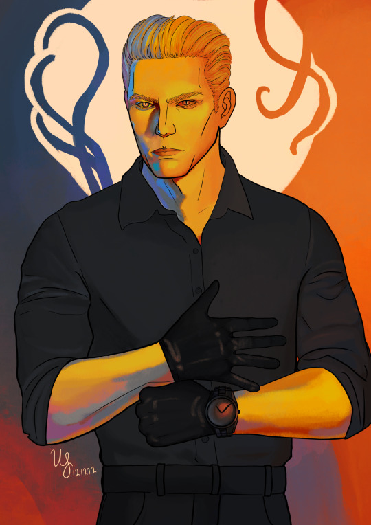
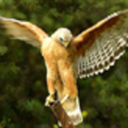
Albert Wesker
commission for @twoturtlesinabathtub !!
#ulysses art#my art#resident evil#albert wesker#wesker#commission#re5#right?#idk man heres the Vibes#anyway i wanted another funky color palette so#heres that weird guy#id write more in the tags but i can feel him monologuing over me
370 notes
·
View notes
Text
Aaaanyways, I wanna put on my comic-art-nerd hat and talk about panel-to-panel action in that Supergirl: Woman of Tomorrow preview because yes, I have been staring at it for days, and yes, I will continue to do so until it is released next month! XD
LET’S GO:
I apologize in advance for the funky formatting, there’s an art to tumblr text posts and I...have not mastered it. XD
It’ll go image, then analysis.
Also, just to be clear: I’m not doing this so much to be like, ‘WOW THIS IS GROUNDBREAKING, STUNNING, NEVER-BEEN-DONE!’ In fact, many comics do the things I’m gonna highlight/geek out over! Rather, it’s more about, like. Appreciating the construction of the pages, panels, etc.
Okay, so! Page 1, the SPLASH PAGE

Okay, so, admittedly, I don’t have a ton to say about this opening image, largely because it is one single illustration as opposed to a series of panels. But even then! It quickly establishes that we’re not on earth--the foliage, rock formations, and GIANT WOOLY FRIEND(?) give that away. Also! Said rock formations and wooly friend’s horns frame our new character RIGHT IN THE MIDDLE OF THE PAGE, letting you know that even though she is tiny, she is important. And, I will just say, I love the dust effects on the ground. The repeated semi-circle shapes evoke the feeling of rhythmic, galloping hoof beats, even without actual movement or sound. Lovely.
And now, PAGE 2!

So, I’ve highlighted panel 3, but before I get there! Panels 1 & 2 do such a nice job of giving us an idea as to the actual, physical size of these two characters, as well as the power dynamic at play. This random dude takes up the WHOLE DANG PANEL with his bulging muscles and is framed in an up-shot; in panel 2, Ruthye is not only shown from above--we’re literally looking down at her--she is also relegated to the bottom half of the panel. Additionally, it’s a great way to show the action of her turning to pull the sword from her belt, obscuring it from both our view and his, to bring out the ‘big reveal’ in the next panel.
Speaking of! Panel 3! Our establishing shot! We’re introduced to the full interior of this tavern. We see where everything is placed--walls, furniture, and perhaps most importantly, the various patrons!
Establishing shots are so important to have in visual media because they help us, the reader/viewer, to orient all of the various components within a sequence or scene.
It’s also helpful for the artists because then they can better maintain things like screen direction and continuity.
If we don’t have a shot like this, then subsequent action can become confusing to the point of distraction.
YOU WOULD BE SURPRISED how often this is neglected or forgotten in comics! Scenes will change abruptly and it’s like, ‘wait, wait, where are we?’
ADDITIONALLY, the establishing shot not only gives us basic spatial information, it ~sets the mood~ XD Setting! Atmosphere! Genre! It’s all here.
I mentioned this in my prior post, that the art gives off some intense fantasy vibes, what with the organic shapes, rough textures, and color palette.
Folks who’ve read advanced copies have described the book as a fantasy/western; that extends even to the series title design! The designer revealed that the western look of the text is deliberate.
So A+ to the art team for NAILING IT!
Okay, on to page 3!

Not a ton of notes on this one, but that’s only because the prior page has done such a solid job of laying out the space, as well as the relationship between these two characters WITH JUST WITH THE ART. (Okay, okay, the words help too. XD) Once more, we see this big brute tower over Ruthye, panel- to-panel; he’s always ‘large and in charge’ regardless of the angle. Even in that final panel! Ruthye is the largest element because she’s closer to us, but the guy is still positioned ‘above’ her, literally talking down to Ruthye from over his shoulder.
(And HMMMM. That unassuming stranger in the back there, underneath the lanterns that seem to act as an arrow pointing right at her...could she be...important?)
(Her tiny size would seem to imply that she isn’t...AND YET...)
PAGE 4!
MMMM them FRAMES within FRAMES!
Okay, but before I get into that, I do wanna briefly mention panel size and shape.
All of these pages (save for 1 and 7, which are full-page illustrations) pretty much stick to a very traditional panel structure. Each panel is completely enclosed, and there is zero variety in terms of shape. It’s all rectangles.
BUT. The size and orientation change--take, for instance, that ‘skinny’ horizontal panel up top, the way it perfectly suits the ‘shape’ of the elements/action being shown. It’s a close on Kara’s wrist/hand, reaching out for the sword in the guy’s belt.
I mention this because often, writers don’t dictate stuff like panel layout in a script. They will give the artist the number of panels, and what needs to be included in each one, but the actual, overall organization of the page? Totally up to the artist.
So! Really knowing what you want to highlight and convey is key, because you can use the panels’ size/shape/relation to other panels to ENHANCE those images, like that sword grabbing up top!
AND! Another thing I love about that panel in particular is the way that Kara’s hand and the sword make a tiny frame for Ruthye! Who is, again, VERY TINY!
I keep mentioning the size thing because it’s a nice bit of economical visual storytelling; the child character is going to be smaller than the adult characters anyway, but by calling attention to it repeatedly, we as the viewer are constantly reminded that this kid is small! She needs help! She needs to be protected! Which is like, the whole premise of the inciting incident. XD Good stuff!
(Also more dot eyes in comics that aren’t humor comics, please.)
There’s another frame down in panel 3 as well! Evely uses this device several times throughout this sequence; it’s such a great use of the multiple swords in the scene, AND shows that she can really pack all of the characters in there without cutting any of them off/obscuring them behind various objects.
And like, NO TANGENTS, which takes some serious skillz.
ESPECIALLY when you consider all that beautiful linework. LOOK AT THEM INKS.
...In particular, look at them inks in panel 5! The shading on the booth is done in such a manner that the ‘grain’ of the ink defines the perspective. We’re looking down at Kara, from above. This is a helpful little bit of orientation, as there’s not a ton of room around Kara to have any other perspective lines to help sell the angle.
ALSO, NOTE THE POSITION OF MR. BRUTE IN PANEL 4, AND THEN KARA’S EYELINE IN PANEL 5. It will be important in...
PAGE 5!

Allow me to explain:
In panel four on page 4, we see the guy reach for his sword, his body language revealing that he’s intent on moving towards Kara.
In panel 5 on the same page, we get that lovely down shot of Kara looking right up at us, the viewer. But also, the implication is that she’s ACTUALLY looking at Tough Guy, because in the next page, we see that he’s positioned himself right above her to swing that sword down!
(My apologies for the poor attempts at drawn annotations.)
There’s no action lines cluttering up the beautiful art; Not-Conan’s hair, rather, acts as the action line/guiding ‘arc’ so that we can better follow the movement.
Kara, likewise, doesn’t have any action lines on her, but her posture and hair act as visual cues to tell us that she slides over in the booth, out of the way of the sword.
In particular, the way her right shoulder/arm draws closer to her body, and the way her left hand comes up to offset the way she’s now positioned, really sells the ‘slide’.
More beautiful indicators of movement in panel 2; the hair, the action line on the sword, the torn fabric of Kara’s shirt.
Panel 3 brings more FRAMES WITHIN FRAMES! And, actually, as I’m looking at it? I think it could be argued that we actually have a FRAME within a FRAME within a FRAME!
First frame: Panel border, natch.
Second frame: Goofus’ sword, arm, and face frame Kara.
Third frame: Kara’s arm and sword work with Goofus’ head again to frame tiny Krypto.
LAYERS.
And now, a note about colors!
I said before that I love the palette at play. The earthy tones give the entire setting an organic feel--this is not a high-tech locale! We’re dealing with natural materials here.
BUT THEN THOSE BLUES!
Not only do we get that nice split complementary thing happening with the yellow, but it also signals the blue of Kara’s costume, a little hint of which is revealed in the final page.
And, like. It’s night time. XD
(I just gotta say, love the cold blue outside the window next to Kara’s table, contrasted with the warm yellow of the interior. Even though this is a bar, there’s still that element of like. Coziness.)
Also! Even though the overall palette is heavy on the yellows, Kara’s hair is more saturated and leans towards a warmer yellow, while the rest of the yellows in the scene are cooler. Thus! We have CONTRAST! Our eyes are drawn right to her.
And I know--I KNOW--that SG comics twitter already hates King because Kara’s DRINKING and personally I want more of the story/context before I pass any judgement but I must admit, the shapes? In panel 5? With Kara drinking in the foreground?
I kinda love it.
Also mmmm-MMMM, more of them SOFT BLUES.
Okay. PAGE 6!

Now THIS PAGE is what inspired this whole endeavor.
Because, okay. If I’ve not made it clear by now: I read a lot of comics.
And I generally enjoy all of the comics I read!
But, what I’ve found lately, is that if I don’t enjoy a comic, it’s because I, as a reader, find myself confused by the art.
Confused as in, the art is hard to follow.
That can be because the color design/ink work doesn’t have enough contrast, or the composition is muddled, but most frequently?
It’s poor panel-to-panel action.
When there’s no flow/connection between what’s happening in one panel vs. another, suddenly it’s on you, as the reader, to do a lot more of the work as you go through the scene. And sometimes! We don’t even have enough visual information to DO that work!
So when I read this, I was like, ‘ah, thank you, an easy flow of action for my brain to appreciate.’ XD
AND SO. Panel 1! Same stuff we’ve been seeing! The ink work, hair, clothing details, etc. all work to show us which direction each character is moving. Kara’s arm and jacket all point to her slamming that mug in the dude’s face; dude’s sword serves as a GIANT ARROW illustrating the path of his stab.
Not much to say on panels 2 and 3 other than: FACIAL EXPRESSIONS! And also, HAIR!!!
PANEL FOOOOUR!!!!
Love. This. Panel.
Again, I really love that there are no action lines slapped on top of this gorgeous art, all of the movement is conveyed in the inks, body language, clothes, and so on.
Like. There’s a conscious decision, here, to not have Kara’s hair obscuring the dude’s torso, and that’s good! Because his belt/uhh...kilt? Skirt? Is showing us the speed and direction of his jab; if Kara’s hair were in the way, it would break up the flow.
BUT THEN HOW TO SHOW THAT KARA’S DIPPING FORWARD???
Note the ties on her cuff, and the inks on her jacket!
There’s nothing special happening with Krypto, BTW. I just circled him because he’s a Good Boy who deserves to be noticed.
Panel 5, more of the same, the inks telling us how these characters are moving through space. ALSO, the length of the lines conveys speed without needing to add something distracting/obscure the art with a ‘blur’ effect.
Final panel! I. LOVE. THIS.
Particularly the movement in Kara’s hair, just. Beautiful shape language.
But in addition! You’ve got that LOVELY line of action in Kara’s spine as she flips him over, the sword likewise curved in the direction of the throw.
And of course, the dude is crumpling in the appropriate direction, bent in the middle as he collides with the table to--quite literally--complete the circle.
Also, just. The characterization here, is PHENOMENAL.
People (read: irate fans on twitter) have expressed concern (read: complained) about Kara having a sword. Some have even gone so far as to suggest that Kara’s basically a murderer now, because she’s using a weapon.
Never mind the fact that in an episode of JLU, Supergirl used both a sword AND a gun to defend herself while in Skartaris because she had no powers.
Except we see here that Kara DOESN’T USE THE SWORD to take the guy out, she uses his own force against him. She only uses the swords in the FINAL PAGE in a type of ‘yield’ fashion.
(This particular ‘fight’ sequence reminded me of Brainy’s fighting style in the show so of course that added to my overall enjoyment.)
Like, Kara’s got no powers here, she very well could have used the sword to defend herself, and would...kinda be justified.
But she didn’t!
Like. Even drunk and therefore out of it, Kara 1.) Steps in to help that kid and 2.) doesn’t use superpowered lethal force on the guy. (I mean, she can’t use her super powers anyway, what with the red sun, but you get the idea.)
And like, the flourish there, of the arms, the way the jacket swirls around her, like a gymnast sticking the landing, GAAAAAHHHH I just love it. It’s great.
Okay, FINAL PAGE, #7:

I mean. What more can I say? EVELY AND LOPES, MAN.
Just some top notch art.
(Also get it guys, it’s a LITERAL shirt rip! XD)
(And look! There’s that tiny bit of blue!)
But anyways, if you’ve made it this far, I applaud you, and thank you for indulging my desire to just. Geek out over one of my favorite comic artists drawing one of my favorite comic characters.
And just to like, reiterate, I’m not suggesting that this comic is THE BEST EVER or that it’s going to redefine the medium, or anything. XD Everything I’ve mentioned here is...pretty basic storytelling mechanics. Watch any movie, and you’ll see all this same stuff at work.
RATHER, this whole post is more about...admiring two artists who clearly know what they’re doing.
And they’re doing it so well! :D
TL;DR: I’m so excited that the Supergirl book has Evely and Lopes, guys. So. Excited.
#stranger speaks#long post#supergirl: woman of tomorrow#art analysis#comic art analysis#edit: whoops forgot content warning tags#cw: alcohol#cw: blood
10 notes
·
View notes
Photo

*******FAKE INJURIES*******
The final look 😁 if you want to know how I did this one keep reading! I had asked if you wanted to see kind of a step by step version of creating an open wound, didn’t get any responses though so I did it anyways 😂

First, you’re going to want to start off by lightly tracing out how big you want the injury to be, I was going to use the pipe in the background going “through” my leg so I used an eyebrow pencil to trace the shape of the pipe.

Next up is taking a bit of liquid latex, I used a little plastic bowl to put it in, you don’t use quite as much as you might think, then grab yourself a little triangular makeup sponge for the latex and start unrolling a cotton ball. and what you’re going to do is lay down a layer of latex with your sponge along your outline and place the unrolled cotton on top and sort of sandwich the cotton with more latex which makes the cotton moldable and you’ll want to stretch the latex soaked cotton up to where it looks like its been torn, straight edges are your enemy, you want it to look rough.

When you’re done moulding the cotton and latex it should look something like this. Before it dries completely though you will need to blend the outside edges of the cotton into your skin, otherwise its going to look pretty funky and not nearly as realistic.

And just as a personal preference I like to fill in the inside area of the wound with a thinner, uneven layer of just latex in order to A) create a bit of texture and B) to make removal a little bit easier that way it comes off in one big piece, although as a warning sometimes it works, sometimes not so use this advice at your own risk 😂
Next part is the most boring part: waiting for the latex to dry, latex when wet is an off-white color and once it is dried it takes on a yellow color.

You will need to wait for it to dry completely before painting because the wet latex WILL RUIN your brushes. When it is dry you can start painting, I love using the skin illustrator alcohol activated paint palettes. You’ll want to use a light wash of a brown color on all of the cotton and latex parts to even out the “skin” tone before you apply foundation to have it match your skin. For the inside you’ll want to use different red tones and even some blacks and browns to add depth, make sure you don’t forget to paint the inside of the skin flaps red as well.

This is something like what it should look like after painting.

Now one of my favorite parts: bruising, because come on you got a gaping hole in your leg, there is definitely going to be some bruising. I used another wedge makeup sponge and took the larger end a literally tore little bits off of it to give a randomized texture, again straight edges are your enemy and then using the same alcohol palette I used mostly purple and red since it is a fresh wound with a little bit of green and yellow around the outermost edges and just the tiniest hint of blue and for each of those you’ll just want to stipple the color around the edges until its as dark as you want it. Randomness is your friend with bruising, bruises are never perfectly one shape and you never bruise evenly.

Next up is blood, now applying blood can be tricky because you want to see it obviously, but you don’t want to cover up all the hard work you just did painting it, so you gotta be careful with it. So with this you can see the texture and wetness the blood gave it but you can also still see where I had painted in the texture inside the wound. Just to make it look less clean and a little more traumatic you can take the same textured sponge you used for the bruising and dip it into the blood a little and stipple it around the opening, definitely don’t do too much of this because you will end up covering up any of the bruising you just did.
Now, you can leave it at that or you can make it, in my opinion, better by adding some drips from where the blood would be running over the edge of the wound.
🎃🎃🎃🎃PSA: You can use these techniques anywhere for any type of injury although if you do anything near your eyes DO NOT use the alcohol activated paints use a water activated paint, or other products that are eye safe.🎃🎃🎃🎃
4 notes
·
View notes
Photo

A Monster Trap
Happy Halloween! :D
I hadn't originally planned on making a piece specifically for Halloween, or at least nothing more so than my Spoopy Kitty I did back in September. But one night a few nights ago, I was feeling artistically inclined but with no solid/good ideas to run with.
After scrolling through some photos on my phone I'd taken or saved specifically for inspiration, I came across one I'd taken about a year ago, of a Halloween decoration one of my friends got from Michaels. A pretty gnarly plastic Venus Flytrap that I think very few of us would be eager to encounter if it was real and alive.
That night I was just having a really hard time trying to draw much of anything--the want to make art was there, but evidently, something integral to the process was not, or was just very very off--so I struggled through a few preliminary sketches before managing to tackle one that I felt was half-decent. Still, but the time I got that far, it was late and I was tired, so I let the sketches rest for the night.
I came back to them later, naturally. I'd had plans to draw this thing for so long and I had finally sort-of started; maybe something could be salvaged and turned into a final piece. Fortunately, upon coming back to it something had shifted back into place and I had a much easier time finishing up the sketch and decided what to do and where to take it afterward.
Recently, I acquired some 400 series watercolor paper by Strathmore, which has seemed to be a little divisive among watercolor artists I watch/follow. Some use it as their standard, go-to watercolor paper, others say it's eh, okay but not great or their first choice and others swear it off entirely because it's not 100% cotton. I don't think I've ever seen one specific paper have so many wildly differing opinions among upper-tier artists. This is largely why I wanted to get some; I wanted to see what it was like for myself. And in general, I've been trying out different walks of watercolor paper to see what the best buying option for me is.
I'm not going to do a super in-depth review like you might expect when I come home with some new pencils or markers or whatever, as I don't feel like I have enough knowledge of paper to do that, but I am here to tell you that I liked the paper just fine. In a way, I think it lands somewhere between the 100% cotton paper that I've tried (Canson L'Aquarelle Heritage) and the Canson XL that's usually "artists' first watercolor paper" because it's so accessible and cheap. It doesn't behave quite like the cotton paper--the paint dries a little more quickly and flows a bit differently--but I think it's close enough for my taste that it'll work just fine when I run out of my current cotton stash and am too frugal to spend $20+ on some more. (My current stash consists of lucky clearance finds that were like $5 each, for reference.)
That is coming from someone that isn't a professional at watercolor and hasn't grown attached to using 100% cotton paper, though. So maybe take my thoughts with a grain of salt, depending on your situation?
This was also my first time since I was a very small child in using a Micron pen (I don't know why I had one in my possession to use back then; I didn't even know what it was at the time, I just remember that distinct beige barrel and the various markings on the outside of the pen that define it as what it is). Hard to believe, right? Microns are such an artist staple! I've just had other options in my possession that work just fine for me before. But the same day I picked up the watercolor paper, I had coupons to use and decided to pick one up and finally try them out. And no complaints there; it didn't move at all once I started in with the water and paint, which is all I could really ask for. The real test is going to be seeing how it resists smudging with alcohol markers, but that's for another day.
Anyway. Point is, I chose to try out that paper for the first time here since I didn't think what I wanted to do with this piece would be a good fit for alcohol markers and I didn't feel like investing the time it would take to do it in colored pencils, either. I wanted something that was looser and quicker, which led me to watercolor.
Well, sort of. Watercolor can be quick for me depending on what I'm doing. For certain projects, it's more time and hassle than I'm willing to put up with. And it also depends on which paints I'm reaching for too.
This time I decided to revisit my Viviva watercolor sheets since I haven't used them much lately but by their very nature, they're one of the quick'n'easiest sets I have. I used them for the entirety of the plant/creature, including his pot. The colors aren't quite as they are in my reference photo, but I knew that wouldn't be the case going in. The colors might also be a little funky/shaded strangely because I didn't feel like dragging out a mixing palette, so I just used the colors straight off the sheets and any mixing was done on-the-fly. And by fly I mean paper. Which created some interesting things inside the mouth that I rather like. The hardest part was getting the red on the leaves without the colors turning to mud, but even that turned out pretty alright.
And after that, the plan was to be done. But it felt...empty. It needed more.
Once I gave it some thought, I picked out a black, gray, and a metallic (though that part doesn't show up on the scan) pale spring green color in my Faber Castell Gelatos and scribbled in a few places in the background, then uses my watercolor brush to spread the color around and blend things together a little. Then I went back and forth on that process for a bit to get it all just right.
I went with the gelatos because I wanted the flat, bright colors of my plant monster thing to still stand out, but I didn't think the soft look of adding some PanPastel in the background would suit the tone here. Additionally, this was a test of new watercolor paper, and I thought using the water-soluble gelatos for some texture might be a good way to push its limits a little more.
And yet even after that, it was still missing something.
I'm not sure where the idea came from, but eventually, it came upon me to do a faux-blood-splatter, primarily stemming from the bottom right corner. For this, I ended up using one of my Jane Davenport Mermaid Markers, since I tried an Inktense pencil and it wasn't doing much of anything, and I didn't feel like dragging out a more involved form of watercolor to do it. It took some patience and trial and error (and a paper mask so I wouldn't get any on Mr. Flytrap), but I did manage to get pretty much what I wanted out of it in the end.
And...I guess that's pretty much the end of the story of my monstrous venus flytrap (Which is where the title came from; he's one monster of a venus flytrap!)
He's not terribly complicated, but I like him. And it's something a little less conventional for a Halloween piece, which makes me happy.
My plans for today/tonight so far don't go beyond posting this and dropping by Krispy Kreme (because tonight if you go in-costume you get a free donut), but that's more than I had planned for last year, so I'll take it. Do you guys have anything fun planned for All Hallows this Eve?
____
Artwork © me, MysticSparkleWings
____
Where to find me & my artwork:
My Website | Commission Info + Prices | Ko-Fi | dA Print Shop | RedBubble | Twitter | Tumblr | Instagram
3 notes
·
View notes
Text
Ask Pileup
It’s finally here! The asks that have been collecting dust in my inbox! Doing them in one post just because it would be hella spammy if I did them all individually.
Don’t see your question here? It’s probably because it’s a 100BC ask that I’ve either answered before or is already clarified in the rules.
@simvanglade: I love your sims medieval posts! I've never put that much effort into it before but you make me want to!
Aw thank you! I assume you mean the ones I was posting in the Sims Community Facebook group? I don’t think I’ve posted a lot of Sims Medieval to my tumblr, but I’m super happy you love them so much! I’ve wanted to do a Sims Medieval story for a long time on this simblr. Remind me when I finish one of my current stories. ;)
@consultingpolymath: I have a question about the 100 baby challenge!! When my matriarch is an elder and ready to move out, is it ok at that point to make her immortal, or is it still against the rules? Even if she's not in the house anymore, I wish she could live to see some of her grandchildren, instead of just dying of old age after a week.
So I don’t typically answer a lot of 100BC questions anymore but this is kind of an interesting question that I don’t actually think I ever thought to address??? Yeah, it’s fine. You can basically do whatever you want with moved out kids and elderly matriarchs as long as it doesn’t break any rules that would in any way affect your active household. Moved out kids and matriarchs aren’t technically part of the challenge anymore.
@darkgrungemusic: Hiya I just saw your answer to the ask of your text color on your blog and I wanted to let you know on Mod the Sims there's a mod to change the load screen and the main menu so its like normal, and there's one that lets you pick the colors instead. Just letting you know in case you didn't. Love you and your blog! Have an amazing day!
Thank you so much! I’m so happy you love my blog! I knew about the mod but since I knew a darker load screen was coming soon, anyway, I didn’t really want to bother with another mod that I’d just end up uninstalling again in a couple weeks, anyway. I appreciate the help, though!
@hotcocomash: [i swear this isnt a 100baby ask] I found you from the buzzfeed 100 baby videos and got hooked on your not so berry story! ive kinda been reading it backwards cause of how mobile works but im still loving it. when i have time im gonna sit down and read everything chronologically. thank you for making so much interesting and fun content!
Lol I don’t actually mind answering 100BC asks. I just don’t like repeating myself. I’m so happy you found me through Buzzfeed (which is kind of surreal, wow) and I’m even happier you like my Not So Berry Challenge so much! I hope to get back to the Sweet family soon! They’re lots of fun.
@tekimimotaku: So I've only just found you. By looking up the only challenge I knew: the 100 Baby Challenge. But I'm looking through your blog and I'm captivated by the other challenges so far. Some aren't to my taste, but I can still appreciate the thought put into them and that others will enjoy them. Had I not already made my matriarch, I'd say F it and do a different challenge of yours. I can't wait til I'm done with this one so that I can start on the others! I wish I could think things through like that!
Aw thanks so much! I hope you’re having fun with the 100BC and it’s totally fine that not all my challenges appeal to you. :) I try to create different challenges that appeal to a wide variety of players so for most people, some of my challenges won’t be all that fun for them, but there could be others that they love so much, they just want to play over and over. That’s always sort of my intention when making a new challenge; trying to engage a different group of Simmers.
@mmfinch: I know that you're completely tired of the 100 baby challenge questions. I went back and read your Midford series as an apology of sorts and thoroughly enjoyed it. Your creativity in storytelling is amazing. I read through all the Q&A but this hasn't been asked. Is show hidden objects allowed to get a birth certificate for non hospital births? The have baby option was clicked by accident and couldn't be cancelled. Show hidden objects is a cheat, but the object is decoration only.
I’m so happy you love The Midford Legacy! As for your 100BC question, there are definitely a LOT of objects in the debug menu that I would consider cheating and not allowed, but the decorative birth certificate isn’t one of those things. Go ahead and buy it if you like. :)
@bipolarrrbearrr: Hey! I know you’re not super into this page right now, but I’ve been keeping up with your not so berry story and I love it. I haven’t been able to go past peppermint because I’m on safari and can’t get the app right now. I wish you could have streamed or recorded it because that would have made the story so much better! You’re awesome 😎
I have kind of a personal loathing for the YouTube/Twitch scene for... many, many reasons, some of them valid and some of them petty, lol, so I don’t think I’ll ever take up YouTubing again. I like the written word too much and the freedom of being able to stage my shots, but I appreciate the sentiment! I hope you get to read the rest of the challenge soon!
@sim-sizzlin: I did originally follow you cause you are the 100 baby (and many other cool challenges) OP writer, but it's really cool to see an active simblr making sims medieval posts it makes me want to reinstall my old copy it was YEARS AND YEARS ago ty
Aw, thank you! Yeah my Sims Medieval content is surprisingly popular. I think I need to make one of my next storytelling projects a Sims Medieval one. Thanks so much for the feedback!
@yennibelle: Hello there, I have an inquire about your unnatural genetics for children and toddlers in the sims 4. I just re-downloaded it, due to this months patch and was wondering if you have added Island Living hairs? Or did I miss them? And if you have not, will you? Either way, I appreciate your mod/CC :)
Hi there! I’m so sorry, but I haven’t updated the hair for Island Living, yet! All my files and palettes I used for those hairs is on my old laptop and I haven’t gotten around to transferring everything I need onto my new one, yet, but thank you for reminding me that’s something I need to do. :) In the meantime, all the hair should still work fine in your game. You just won’t have funky varieties of the IL hair (yet). I’ll be sure to post when I take this on but it may not be for a while, yet.
5 notes
·
View notes
Photo
Beach Nights (Gelatos Test)
Here we have another, slightly stranger, art supply that's been on my wishlist to try for a while: the Faber Castell Gelatos! Which, for those that don't know, are one of many options available on the market for water-soluble/watercolor crayons/pigment sticks/etc.
I grabbed up every unique color my local Michael's had when I went in one day and they were on clearance for $0.97 each. They retail for usually around $3 a pop if you buy them individually like this, and so I jumped on the opportunity. I ended up with a total of 35 colors to pick from.
They do come in sets--some smaller ones of 4, a few that have 15 colors each, and there are a couple of bigger gift sets with around 30 each, as well as other specialty sets that come with a few gelatos and some other things for specific projects. As of yet, I can't comment on the arrangement of any of these sets, but I do like these well enough that I would like to end up with the full range of 80 colors eventually, so I've already worked out a few sets I'd need to purchase going forward to make that process as inexpensive and quick as possible. So perhaps I'll update this to comment on that at a later date, we'll see.
Even so, I felt like I ended up with a pretty good range to pick from, just missing a couple of colors here and there that I didn't get simply because they weren't there at the time. I even ended up with a handful of metallic colors, which are pretty interesting, though I didn't use any of them here and when scanning artwork, metallic colors consistently fall flat anyway. Though I was pleasantly surprised that in swatching the metallics they don't lose hardly any of their metallic sheens after being hit with water. (As metallics in water-soluble colored pencils tend to become not-metallic anymore when that happens.)
At first, I wasn't sure what to draw to test these things out. They come in little lipstick/chapstick/lip balm/whatever tubes, where you twist the bottom to get more product to come out, but are mostly flat on the end and so they're a little too big and super creamy to get super precise lines, unless you were to take a wet brush to them to pick up the color or be so bold as to cut chunks off to make them into a finer point/crisper edge, and even then I'm not sure how long said finer edge would last with how soft they are. My first thought was a galaxy, but that seemed a little too easy/obvious, and I had a feeling my gel pens would give me a fit over the top of these, based on how they don't like a lot of wax and they aggressively don't like watercolors.
Eventually, I decided to try replicating one of the pictures I'd taken when we went on vacation to the beach recently since that would be broad enough and not require such fine detail other than the silhouetted buildings, which I had no intention of trying to do with the gelatos from the very start. Although I had made this artwork at a much larger size, that may have been a somewhat viable option. But I like relatively small art pieces. (Though this doesn't look exactly like my reference partly because of the unpredictability of art and partly because my eyes got confused while I was figuring out so of the powerline details, as well as I added the visible moon and stars and birds for some more visual interest).
The one other thing about the gelatos I'm not crazy about is that some colors, mostly the pastels and some brights, melt almost seamlessly when hit with water, while others, mostly certain darker colors, either take more work and water to melt nicely or in some cases just won't fully dissolve the lines/texture marks. At least not on the cold-press watercolor paper I was using; I suspect some colors may have faired a little bit better on smoother hot-press paper, but I've yet to test that out.
This has its advantages and disadvantages. It can work and give you some interesting textures, as you can see peeking through in a couple of places here. But if you want a super smooth, seamless look then you'll have to be careful and pick which colors you use accordingly.
I tried a couple of different methods of applying the gelatos, mostly just to see what would happen. The most obvious thing to do is to apply the dry gelato to dry paper and then come back in with a brush to melt them down. But I also tried wetting the paper and applying the gelato straight to the wet surface, which was interesting and in most cases seemed to prevent harsher lines and textures being left behind, probably because the colors were already "floating" on top of the page without settling into the fibers. And because of that, I ended up inadvertently trying a wet gelato on dry paper. That was okay, but not much different from the other methods I'd already tried.
I also tried mixing two gelato colors--Boysenberry and Fig--on a plastic palette by scribbling a bit of each right on the palette and then adding a couple of drops of water, and then I applied my new custom color to the drawing with a brush. This was interesting, and likewise, I think those that prefer more traditional watercolor techniques would probably like this method best. But I also like this method as it gives you a way to make a few more colors if, like me, you just don't have what you want/need and don't want to risk trying to blend/mix the gelatos straight on the paper. (Which I did try and is very much an option, as is blending two colors by using just water on the paper).
And just as a side note that the edges of my scene here may not be perfectly blended or applied consistently because I lightly drew a rounded rectangle as "this is the size and roughly the area where I want the color to go" since I knew the gelatos were too imprecise to try and get right up the edges, and I was using a slightly larger piece of paper than usual. And I didn't use any tape to isolate the area, which in hindsight was probably a better idea, but oh well. Same thing with the funky outline; I defined the area with a glitter marker and tried to cover any gelato that was too far outside the guideline I'd given myself, but there were a few spots I had to cover up a bit with a white gel pen.
Speaking of which...
I was very right about my pens not liking whatever this gelato stuff is. The white gel pen did okay, but it wasn't as vibrant as I'd hoped and it did get clogged pretty easily, but I had a struggle with black pens similar to my Wire Sunset piece. Except for this time, after trying three pens I saw the light at the end of the tunnel instead of continuing to struggle with more. After a bit of thought, I ended up going with my black "Shark's Eye" Jane Davenport Mermaid Marker, since those use a dye-based ink that behaves similarly to watercolor, but not identically. That way I knew the color would go on top of the gelatos but as long as I was careful and only used so much, wouldn't reactivate any of the colors underneath and leave me panicking with a big mess.
And in the end, even if some lines are bit wobbly/imprecise and I had a few smudge accidents, I think the mermaid marker ended up being for the better because the buildings weren't pitch-black in my reference, but I was really not into the idea of trying to draw enough detail to convey that, and yet because the mermaid marker ink is similar to watercolor, the pigmentation was just inconsistent enough that I think it implies that by accident. In a good way.
Overall, I'm pretty happy with how the piece turned out and this certainly convinced me I want to try collecting all the gelatos so I can use them for backgrounds more often, despite some of the difficulties I had with them. They're a unique tool that takes some getting used to.
And this does make me want to try some other brands of water-soluble crayons, but I'm not sure if I'll follow through with that just because I feel like these are really good enough on their own for me unless I find some unique colors in other sets I'd just really like to have that I can't get in the gelatos. Time will tell, I suppose.
____
Artwork © me, MysticSparkleWings
____
Where to find me & my artwork:
My Website | Commission Info + Prices | Ko-Fi | dA Print Shop | RedBubble | Twitter | Tumblr | Instagram
1 note
·
View note
Last Seen Blogs

sheerdarwinism
A Lamarck After My Own Heart
goodbeel
Bee
merhawk
The Aerie

proletariatpal
Compost The Rich

gaxyxx
Stuff I Find Hot