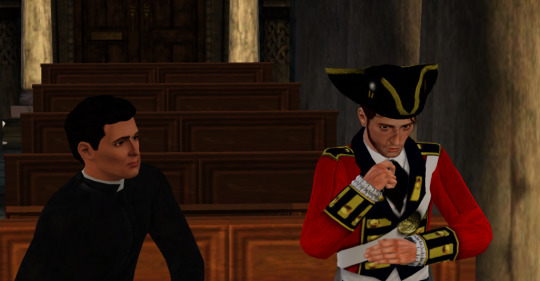
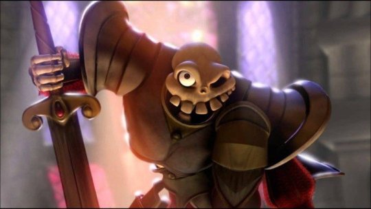
#also i changed the dialogue and placement+pose of the characters because i can
Text

i have been wanting to do this meme for a while LMAOOOO
(cape kid belongs to @malfunctioning-mantis )
#ahit ocs#ahit oc#cape kid#cassidy the magpie#cassidy#doodle#also i changed the dialogue and placement+pose of the characters because i can#and also ik the og meme is supposed to be comfort characters but i also don't care about the rulezzzzzzzzzzzzz wjcejcjcsjvsjv#jkjkjkjjk there's no rules but LOL
15 notes
·
View notes
Note
Heyo! So it seems like you've watched a bunch of K-dramas and I was wondering if you have any recommendations for a first one to watch for someone who's never watched any Korean shows, let alone many dramas either? I know this is vague and of course tastes vary, but does anything come to mind? Not sure if it's a common sub-genre, but bonus if they aren't super dark and grim. Thanks so much, love your writing!
i love foreign dramas! most of what i watch is from korea and china, but i've watched a few really good ones from thailand and japan too
some of these exist multiple places, but if it's possible to watch it on viki, that's my recommendation. their translations tend to be the best
business proposal (korea, netflix) is a really good intro to kdramas and covers a lot of common tropes, plus the main and secondary couples have FANTASTIC chemistry, which can be rare. a woman pretends to be her rich friend on a blind date, but it ends up being with the ceo of her company and identity shenanigans and hijinks ensue. if you like this one, you'll also really like what's wrong with secretary kim? (korea, viki) but i'd watch this one first because it's a little bit less wacky
the romance of tiger and rose (china, viki) is extremely cute and stars zhao lusi, who i love. a scriptwriter gets trapped in her own alternate historical drama script as a character that she kills off in episode three and has to try and change the story to ensure her own survival and falls in love along the way. it's meta enough that it gives you a good sense for the vibe of historical/fantasy chinese dramas. the acting can be a little meh from some characters in this one, but the leads are all great and respective emotional support characters for the male and female lead are hysterical
word of honor (china, viki) is i think a digestible-ish intro to the wuxia genre, but honestly you just kind of have to jump into wuxia and trust you'll figure out the tropes and world basics as you go. a dying former leader of an assassination organization gets stalked by an unhinged serial killer who's also an excellent cook. they fall in love an adopt a son. the ending here isn't fully happy as some beloved characters die
mr. queen (korea, viki) is one of my absolute favorites and straightforward enough that i don't think the politics are too confusing for someone going in with no background in historical korean culture and politics. a male chef drowns and ends up in the body of queen cheorin, the main wife of the king from the late 1800s, and is determined to return home and NOT fall in love with the king. it's unintentionally very queer and the acting and plot is really a plus here.
bad buddy (thailand, youtube) is a bl drama that is about the sons of neighbors who hate each other going from eternal rivals to boyfriends. it's cute and the chemistry pops off. thai dramas are top tier for non censored queer content, but be prepared for some awkward dialogue and a lot of product placement. the chemistry of the leads tends to make up for this. a tale of 1000 stars (thailand, youtube) is one of the worst offenders of this, but the leads carried that show on the power of their vibes and sexual tension alone. kinnporsche (thailand, dramacool) is the best thai drama i've watched, but i would not describe it as light.
crash landing on you (korea, netflix) is another favorite, but you do need to just disassociate a bit from the fact that it takes place in north korea. a successful girlboss ceo is paragliding, gets caught in a storm, and ends up north korea. a military official finds her and after some light threatening agrees to try and get her back to korea instead of turning her in or killing her, but to pull this off she has to pose as his fiance. the relationships in this one are so good, and it's a happy ending for our main, but it takes some trials and our secondary couple does NOT end happily ever after.
i'm currently going feral over love like the galaxy (china, viki), but i think it's better appreciated after consuming another historical chinese dramas so you have socio-political-trope context for what's happening
goblin (korea, viki), untamed (china, viki), and nirvana in fire (china, viki) are some of my ABSOLUTE FAVORITE shows but i think opening with them would be a mistake and you'll miss a lot nuance going in cold
302 notes
·
View notes
Text
SWTOR: New player help: Contending with bugs
It's not a bug, it's a feature! It's working as intended! As you play SWTOR, you will notice that...things don't always go as expected. Here are some helpful tips for new players (and more long term players too) to try to help handle some of the most common bugs you will find in the game.
First thing: report the bugs you encounter. If nobody knows something's going wrong, it can't be fixed.
Everyone including free to play players can now use the in-game bug reporting system. How?
1. Go into your chat box (usually at the upper left of your screen and type /bug)
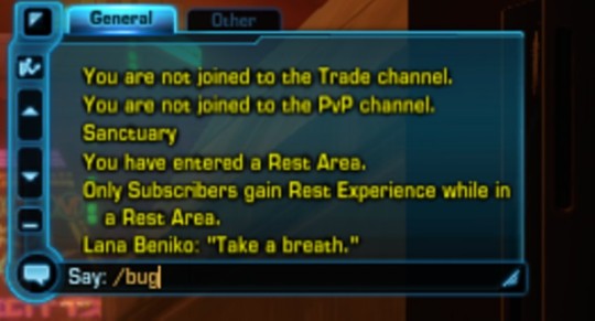
2. This should open a window that will allow you to type a short description of the bug you are seeing. Describe the bug. Make sure you mention 1) exactly what you were doing and 2) what was not working. For example:
"During the introduction scene for the flashpoint "This is Way Too Long," the character "I Don't Like You" does not have a head."
3. Press ' submit.'
Keep in mind that you will not get a response or any direct help from a bug report. This is to let the developers know what is not working in the game, so they can hopefully fix it.
2. Wait a little while after there's a new patch or game update
When there's a new game update or patch (you will know because you have new files that will automatically download when you launch the game), don't jump right into the new content with your favorite best character. Wait. It's hard, I know, but wait. The general trend over the past few years has been that new patches and updates always have bugs, and sometimes they're doozies.
It helps to have a "me first" character or two - perhaps a clone of your main - to wade into new content on the first day or week if you really want to see it. That way you can see the new content without being completely angry that it's messed something up for your characters or isn't running quite right.
3. Keep an eye on the Bug Reports section of SWTOR.com and the SWTOR Twitter account.
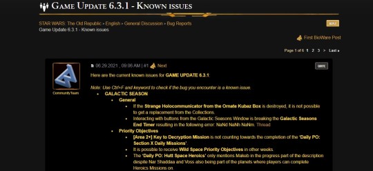
Even if you are not a subscriber you can still read the Bug Reports forum (I would not recommend the rest of the forums, though). There's usually a running list of known bugs for each patch listed at the top of the page. Also keep an eye on the SWTOR Twitter account. You can read it without being a registered Twitter user, and it will let you know when the game is going down for maintenance or an update.
4. If you are facing a bug that is making it impossible to complete a quest you need for story progression, you can reach out to SWTOR customer service for assistance. If you are a subscriber, press the little gears icon at the top of your screen, choose "customer service" and then "request help." If you are not subscriber, you can reach support at [email protected].
SPECIFIC STRATEGIES FOR COMMON BUGS
1. Help! My abilities bar got unlocked and I cannot get it to lock again!
When this happens, all your abilities will 'float' or move from their placements, which understandably makes it hard to fight. How to get around this:
1. When you are NOT IN COMBAT, press CTRL+U. All of your abilities bars/maps/etc. will vanish. Don't panic. This is the way.
2. Press CTRL+U again. Everything should come back. It may take a moment. Wait.
2. Oh no! My character's stuck in a rock!
Or on a cliff, or under a box, or up a tree. We've all been there. Go to your chat box (upper left, usually).
1. Write /stuck in the chat. This will either move your character to a place where they aren't stuck, or it will kill them and put them back at the nearest medical base.
2. What's that? Stuck isn't working, or you just used it and it needs to cool down? You can try using Quick Travel to travel to a nearby medical base.
3. Still nothing? Try porting to a stronghold, your ship or the Fleet.
4. Try logging out and logging back in.
3. What? I can't click the blue thing.
This bug has shown up all over the place, where an objective will be lit blue, but unclickable. I've found a few places where nothing I do makes this work.
1. Try changing instances.
2. Try logging out and back in.
4. This is a great cut scene...why is it freezing?!
Several years ago this bug was so severe in the Sith Warrior and Imperial Agent stories that only customer service could resolve it. It seems better now, but here are some ideas.
1. ESC out of the scene. Now try to start the scene again by clicking on the NPC /objective/whatever is the scene starter.
2. Can you guess? Log out and back in.
3. Close the game and try re-launching.
4. Try lowering your graphics settings in the game. Don't know why this works, but it did sometimes.
5. My character is frozen in a weird pose.
Just laugh at it, take a screenshot and share it with your friends so they can laugh. Typically this will not affect actual combat and will go away on its own eventually.
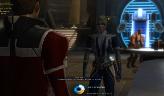
6. I want to romance Lana Beniko, Koth Vortena or Theron Shan in KOTFE...but I've heard things about the romance vanishing.
There are two general ways the romances in KOTFE get borked:
1. A patch happens before the romance is locked in (chapter 9) and all the player's flirts from chapters 3-8 are reset. The game thus forgets you were trying to romance Lana and you don't get the romance dialogue option in chapter 9. I've also heard of Koth and Theron romances vanishing, but not as often. The solution is to NOT play through chapters 3-9 of KOTFE when there's a patch happening. My general tactic is to play those chapters straight through, and not stop until I get to chapter 10, to make sure the romance is locked and won't be interrupted by a patch.
2. The player misunderstands the really poorly framed dialogue wheel in chapter 9. There's a moment, pictured below, where the camera faces Theron Shan, and there are choices that say "I need to see one of you" and "I need to see one of you" [flirt]. IT IS NOT JUST REFERRING TO THERON. If you are flirting with Lana or Koth and want to lock in their romance, DO NOT CLICK ON THE FIRST CHOICE (which is helpfully lit up here for your reference). YOU NEED TO CHOOSE THE [FLIRT] HERE, as well as the [flirt] in the conversation when you are alone with your companion of choice.
When your actions or conversation choice will start or end a romance, from KOTFE onward, you will receive a pop up warning that looks something like this.
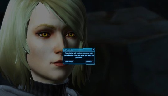
Caption:
This choice will begin a romance with Lana Beniko. Are you sure you wish to proceed?
CONTINUE - CANCEL
Once you have this scene, MAKE SURE you finish chapter 9 entirely so your choices don't get wiped out in a future patch!
7. My companion is stuck in place and won't move.
There you go, charging into the fray...there's your companion, lingering awkwardly at the threshold and not participating. Oops. You can usually wake them up by sending them away and then bringing them back. Easy ways to do this include:
1) Send them to sell junk (press N. Go to your companion who is with you. Press the little icon near their name to get them to sell the junk. Depending on the legacy perks you have purchased they will be gone for between 5 and 30 seconds)
2) Summon another companion, any of them, and then summon back the one you want.
3) It didn't work? Sometimes companions do seem to go on strike and you will probably just want to summon another to continue playing. This is a good reason to remember to have more than one companion at high influence, if you can, so you can switch as needed.
8. My companion keeps falling over.
Sternly tell your companion it's not time for a nap. Kidding. They really don't care. Any time is nap time. The steps in #7 should work to wake them up again.
9. I'm trying to loot something and it's telling me "out of range."
First, are you sure it's your loot and not some other player's? If it's yours, you can sometimes pick it up by walking away and then returning. Other times, look for someone else nearby to loot. I've on occasion found things unlootable, which is frustrating.
16 notes
·
View notes
Text
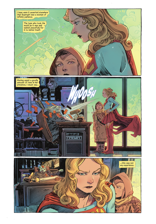
Back at it again with my self-indulgent comic posts. This time! It’s Supergirl: Woman of Tomorrow #3, perhaps the most tonally-distinct entry yet, with shades of The Twilight Zone.
Spoilers!
So, as mentioned, this issue is the most deliberate in terms of both its pacing and its tone, IMO.
What is that tone, you ask?
To quote Alex Danvers, from “Midvale”: Hello, darkness.
THE STORY:
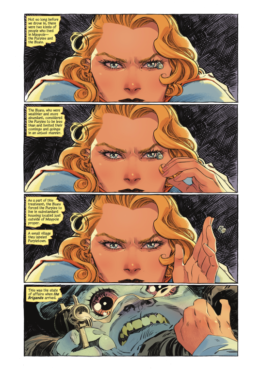
Kara and Ruthye are still looking for Krem Clues in the alien town of Maypole.
(Which is actually just Small Town, USA, complete with vintage 50s aesthetics.)
But the locals are clearly hiding something! So Kara and Ruthye continue to investigate, and they eventually discover what it was that the residents of Maypole were so keen to keep hidden.
Genocide, basically.
As I said, this issue struck me as very Twilight Zone; a genre story involving the build-up to a dark twist, all set against the backdrop of an idyllic small town. (Think, like, “The Monsters are Due on Maple Street” but instead of focusing on the Red Scare, it’s classism and racism.)
The wealthier blue aliens kicked all of the purple aliens out of town, and when space pirates showed up to pillage and plunder, the blue aliens made a deal with them: the lives of the purple aliens in exchange for their safety.
Which is where the episodic story connects to the larger mission; it was Krem who suggested the trade, and then joined up with the Brigands (space pirates) when he was freed by the blue aliens.
The issue ends with no tidy resolution to the terrible things Kara and Ruthye discovered, but they do have a lead on where to find Krem, now, as well as Barbond’s Brigands.
KARA-CTERIZATION:
Ironically, it’s here, in the darkest chapter yet, that we get the closest to what might be considered ‘classic’ Kara.
Which I think comes down to that aforementioned deliberate pace--this issue is a little slower, a little quieter. It gives the characters some room to breathe.
That’s not to say Crusty Kara is gone. Oh no. She is still very much Crusty. XD
But anyways. A list! Of Kara moments I loved!
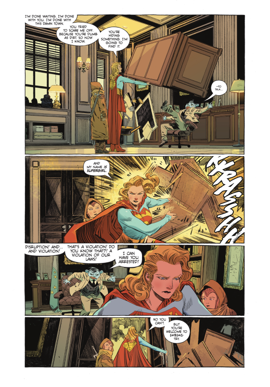
I mentioned a few of these in a prior post when the preview pages came out: I like the moment where Kara blows down the guy’s house of cards, and I like that the action is echoed later in the issue when she grabs the mayor’s desk and tosses it aside. A nice visual representation of the escalation of Kara being, like. Done with these creeps. (Creeps is an understatement but you get the idea.)
Another one from the preview pages: Kara explains to Ruthye that her super hearing won’t necessarily help her detect a lie, especially if she’s dealing with an alien species she’s not familiar with.
It not only reveals her level of competence and understanding of her super powers, it also shows that, you know. She’s a thinker. She’s smart.
Amazing! Showing, rather than telling us, that Kara is smart! Without mentioning the science guild at all wow hey wow.
(Sorry, pointed criticism of the SG show fandom.)
Anyways.
I dig the PJs!
And Kara catching the bullet! Not only are the poses and character acting great, it’s also a neat bit of panel composition:

We start with Ruthye’s POV, and then move to the wide shot of the room. The panel where Kara actually catches the bullet is down and to the side of the wide shot panel--we move our eyes the way her body/arm would have to move to intercept the bullet. Physicality in static, 2D images!
Also, like. It’s a very tense moment, life-or-death, but. Ruthye’s wide-eyed surprise at the bullet in Kara’s hand? Kind of adorable.
I was pretty much prepared for the page of Kara shielding Ruthye from the gunfire to be the highlight--it was one of the first pages King shared and I was like, ‘yeah, YEAH.’ But, shockingly? The TRUE highlight of the issue?
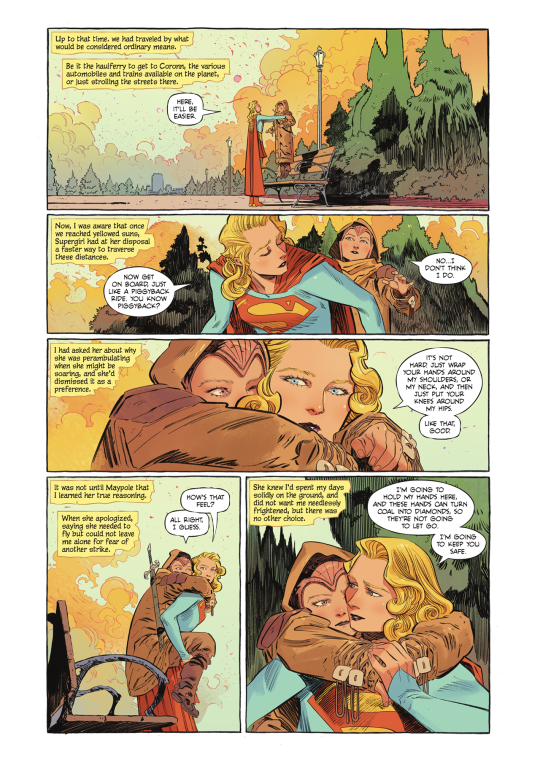

Where do I BEGIN?!?!
EVERYTHING. About this moment. Is lovely.
From Kara holding Ruthye above the bench to explaining the concept of a piggyback ride, to telling her:
“I’m going to hold my hands here, and these hands can turn coal into diamonds, so they’re not going to let go. I’m going to keep you safe.”
HNNNNNNNNNNNG.
Ruthye’s narration--about how Kara had avoided flying as she was concerned it would freak Ruthye out--just adds a whole additional layer of YES, GOOD, YES, and her line on that splash page is great: “You see, all that time, she was worried about me.”
HNNNNNNNNNNNG. AGAIN.
To say nothing of the STELLAR ARTWORK.
And SPEAKING of that stellar artwork, Evely and Lopes continue to knock it out of the park. Each issue is distinct and beautifully crafted, a true joy to look at.
Before I jump into more of the art, a few final notes of character stuff in general.
Ruthye is the one most affected by the experience in Maypole, as she can’t comprehend how a society of people that look so nice and gentle and peaceful could have been party to such a horrible act.
One of the big criticisms of the book thus far is that Supergirl is not the main character, and I guess I can agree with that observation. Typically, in Western media, the main character is the one who goes through the most change in the story.
And, yeah. That’s Ruthye.
As I was reading the end, where Ruthye sits on the curb and Kara hugs her, I was imagining how the scene would’ve played, had King stuck with the original idea for the series: Kara as the one learning to be tough/experiencing all of this for the first time, and while I think that could certainly work...
I continue to appreciate that King literally flipped the script; that Kara, especially in this issue, is like, ‘I’ve seen this, I know this,’ as opposed to being the one going through a loss of innocence.
*Marge Simpson voice* I just think it’s neat!
Because Kara’s been a teen in DC comics for so long--ever since she was reintroduced to the main DCU continuity, actually--so this is all brand new territory, here. Having an older Kara who’s SEEN SOME STUFF.
(Alsoooooo, since Bendis made the destruction of Krypton not just inaction and climate disaster, but rather, genocide, and the subtext of a Kryptonian diaspora text, the waitress’ derogatory comment regarding the the destruction of Kryton, as well as Kara picking up the bad vibes the entire time, suggests not just a broad commentary on discrimination in all its forms, but specifically allegorical anti-Semitism. The purple aliens being forced out of their homes and into substandard living conditions, then the blue aliens--their neighbors and once-fellow residents--essentially allowing the space pirates to kill them, making them literal scapegoats, Kara discovering the remains of the purple aliens, and Ruthye’s horror at the ‘banality of evil’...yes. A case could be made, I think.)
(Which would probably require a post unto itself and a lot more in-depth discussion, nuance, and cited sources.)
(Should mention that King has brought up that both he and Orlando--the other Supergirl writer he talked to--are Jewish, and for him personally, that shaped his views on Kara’s origin story.)
I guess my point is that this issue is perhaps not as out-of-left-field as some might think, and just because there isn’t as obvious an arc for Kara, doesn’t mean there isn’t some sharp character work at play.
(I could be WAY OFF, of course, and I’m not suggesting it’s a clear 1:1 comparison. I’d actually really love to hear King talk about this issue in particular.)
Anyways.
Here’s the final page, which I think works, because as I mentioned before, there is no easy answer/quick wrap-up to the story of Maypole:

THE ART:
I mean. How many times can I just shout ‘ART! AAAARRRRRRRRRRRTTTT!’ before it gets old?
I dunno, but I guess we’re gonna FIND OUT.
There are some panels in this issue that I just. Like ‘em! From a purely artistic standpoint! Because they’re so good!

Like, I just really love the way Kara is drawn in that top panel. Her troubled, confused expression, the colors of the fading light, the HAIR.
Evely draws the best hair. I know I’ve said this before. I don’t care. I will continue to say it, because it continues to be true.
The issue I find myself running up against when I make these posts is that I really don’t want to post whole pages, as that’s generally frowned upon (re: pirating etc.) but with something like this, you just can’t appreciate it in panel-by-panel snippets.
(Guided View on digital reading platforms is a BANE and a POX I say!)
Anyways.
LOVE the implied movement of the cape settling as Kara speeds in and stops.
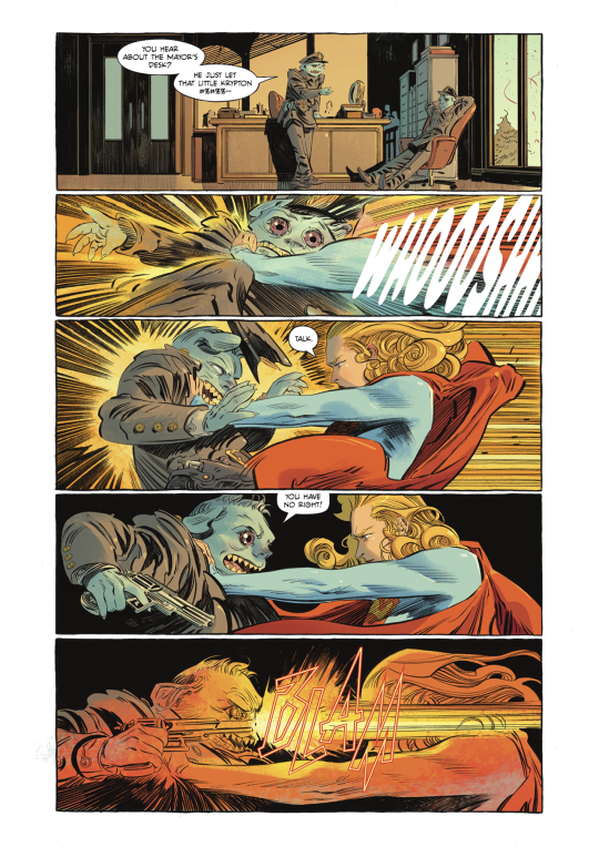
And, obviously, Kara flicking the bullet away is just. A+.
And the EYES, man. LOPES’ COLORS ON THE EYES???!?! BEAUTIFUL.
Also, should note the lettering! The more rounded letters for the ‘WOOSH’ of Kara’s speed (and, earlier, the super breath) work nicely, and contrast with the angular, violent BLAMS of the gunshots.
And, I gotta say, the editor is doing a really great job of not cluttering up the artwork with all the caption boxes. Which is no small task.
(I assume the editor is placing them, as editors usually handle word balloon/caption box placement, but I suppose it could be Evely? Sometimes the artist handles it. Either way, whoever’s taking care of all the text, EXCELLENT WORK! BRAVO!)
Okay I think that’s everything.
Ah, nope, wait.
MISC.
Just a funny observation, more than anything else: Superman: Red and Blue dropped this week, and King had a story in there, “The Special” (which was very good, btw.) Both Lois and the waitress swear a lot so I’m beginning to think that this is just how King writes dialogue for any adult character who isn’t Clark. XD
This is absolutely a personal preference but when Kara was like, “And my name IS Supergirl,” I was like nooooo. I know King is trying to simplify all of the conflicting origin stories and lore but I LIKE KARA DANVERS, SIR. XD
It’s almost assuredly a cash-grab/an attempt for DC to get all the money it can out of a book they don’t have much confidence in, but I like the cardstock covers! Very classy, much Strange Adventures.
(OH my gosh, can you imagine that issue 1 cover with spot gloss???? Basically the only way you could possibly improve on it.)
Okay NOW I’m done. For real. XD NEXT TIME: Kara and Ruthye go after Krem and the Brigands!
#supergirl: woman of tomorrow#long post#dc comics#supergirl: woman of tomorrow spoilers#kara zor el#comic thoughts#comic opinions#just occurred to me I should be crediting the creative team in these things#I think thus far I've included every title page?#still#will try to be better about that going forward
11 notes
·
View notes
Text
Story Process Challenge
I was tagged by @danjaley and @treason-and-plot (in alphabetical order, not tagging order). Thank you both so much!
Summary: My process makes sense to myself alone and it’s very much a work in progress! Also, I’m very boring and don’t do gifs or videos, so you’ll just have to look at my screenshots. Sorry!
This is behind the jump for length.
1. Your writing process - show us a part of your script or explain how you write your scenes. Do you write in screenplay format or novel format? Etc, etc.

I write in novel format if it’s a wholly-posed story, mostly because that’s easier for me than a script. I feel like it really helps build the ~aesthetic~ of a scene that way. For my attempts at partially-posed/gameplay stories, I’ve gone for screenplay format, but it’s very new to me and I feel much more comfortable with the novel format. I usually write in Google Docs, since that can go with me everywhere and I can write on my lunch hour/waiting for my mom to get out of the pharmacy/etc, but sometimes I will write in Notepad.
(Yes, this IS a flashback to Alasdair and Ma. Yolanda meeting; they were perfect teenage hellions causing chaos at a society party, don’t worry.)
2. Scene building - show us you in the middle of scene building through pictures, gifs, or a video. Explain what is the best thing about scene building and what is the worst!
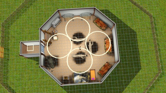
I’m still learning how to make a very good scene build; this is where being a historical player kind of hurts. It’s hard to get a good sense of what a 1810s Spanish drawing room or a 1600s merchant’s house in Amsterdam really looked like without abusing my library privileges! (Images from Wikipedia and historical sites only go so far.) The best thing about scene-building is when the vision of the room in my head matches the room that’s in-game, which is pretty difficult. The worst thing about scene building is that I’m very perfectionistic and a control freak, which does not help, and frequently I do get lost in the details and can’t see the forest for the trees.
(This isn’t a scene, it’s that Iron Age Roundhouse, but it’s a good example of how I do things--all the lights on, everything bright white paint or the $0 floor until I am happy with the shape and placement, and then I decorate.)
3. CC/Pose Making - do you make your own cc/poses for your scene? If so, what is your process like to create? Do you just go off the top of your head? Do you use reference photos?
I’d love to be able to make my own CC and poses specifically for scenes! I’m still very new at CC-making--see my hats collection--and again, I’m very much a control freak. I use a lot of reference photos, especially historical costuming sites and books, because it gives me a lot of pride to have the clothing and accessories look just right.
The creation process is usually: gosh, I need a crispinette/gable hood/palla/whatever for this character, let me see if there’s a mesh from TS2 or TS4 that I can wrangle into submission if I can’t repurpose an existing mesh, and then a prolonged period of fighting with Milkshape and TSRW and other programs until it looks serviceable and works. I’m not very technically skilled yet.
I don’t make my own poses--I’d love to, I have a hand-spinning poseset idea living rent-free in my mind at all times, complete with a drop spindle accessory, but I’m not very confident with Blender or hand accessories, etc. When I pose my Sims, I do use reference photos if I haven’t already planned out how they’re moving around in the scene. (Well, reference paintings, usually, although sometimes I’m lucky enough to find reenactment photos!)
4. Getting in the zone - What do you do to get in the zone to work on a scene? Examples include: show us your playlist you use when working on a scene, what’s your go-to scene snack/drink, etc.
I don’t know if I get into a zone as much as I just carve out time to work on things as I can. I don’t have playlists for my characters. (Not a Deaf thing; I just haven’t really...had the urge to do that. I’m worried I’m a neglectful Simmer now, ha ha.) I don’t have a go-to writing snack or drink. I just...try to relax a bit, usually, and sometimes I will look at my past chapters to see what we were doing last time.
5. Screenshot folder - give us a look into your screenshot folder to show us just how much goes into ONE scene for your story. (Scrapped pictures encouraged!!!)
Do you REALLY want to see this? Really? I’m an AWFUL packrat. I try to organize it and I can’t. (Sorry. I’m very messy.)
6. Captions - are you a caption on the picture kind of storyteller or captions in text box type of storyteller? Why? Do you do both?
Captions and text go in the text box.
I’d love to be able to put dialogue in speech bubbles, because it seems cool, but I talk too much! (This is the same reason why I kind of go back and forth with Netflix-style captions. I don’t know when to shut up.) I also worry that the captions wouldn’t be visible in scenes with low lighting or overly-bright lighting.
7. Editing!!!!! - explain and show us your process editing a scene through a video, gif, or picture. A Before and after will suffice if you aren’t in the middle of editing a scene as you answer this.

Philomena, before...
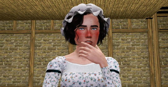
Philomena, after. (This is one of those images where I just threw up my hands at the hair editing. I wish TS3 had hat chops like TS4 did.)
I’m really not confident with editing--I want to have my pictures look aesthetically pleasing, consistent with the other images in the chapter, and “nice” in general. It doesn’t help that while I’m 95% Maxis-match, my aesthetic inspiration for scenes changes with the wind. I use pooklet’s lighting actions, and then from there I tend to use the Holy Colors, Batman actions. But I’m trying to find my own way of doing things--reliant on others’ actions, yes, but more consistently done and somehow conveying that it’s “of my workshop.”
8. Throwback- show us an ANCIENT story scene you did in the past and explain how you would do the scene differently today!
First: I think I’d choose a different pose for Vicar Max here. (It doesn’t quite fit; why would he be staring at Alasdair like that? It’s more of a mid-conversation pose.) I liked how it looked like Alasdair was genuflecting as he sat in the pew, but again, the pose needs to be changed. I might just go for neutral sitting-and-talking-looking-straight-ahead poses.
This was one of those pictures taken when I was trying to understand Reshade, so I’d obviously skip that. I’d also add Pooklet’s lighting actions, of course.
It’s definitely not lit well in the back--I’m not sure how I’d change that. I didn’t want to lose the “quiet chapel” feel, but there has to be a balance, not letting the characters look like they’re spotlit.
The angle also looks weird, but I’m horrible at angles; I have a lot to learn still. I’d either close-up on the faces or I’d zoom out more. (I think I was having issues with Alasdair on the OMSP, for some reason.)
I tag whoever would like to do this!
10 notes
·
View notes
Text
Us (movie) Analysis/Theory pt 1 :
MEGA SPOILER ALERT!
Holy mackerel. I watched the movie Us finally, with a notebook and index cards to analyze everything I saw. Below I have amalgamated that information & I hope it satisfies you.
🎞 We all perceive the film differently, so this is my personal perception + analyses of symbolism. All themes play into the movie universe. At the end I will try and communicate what Jordan Peele may be trying to say externally for my “conspiracy” (truth) theorist.
🚨 Under constant edit.
✂️✂️✂️✂️✂️✂️✂️✂️✂️✂️✂️✂️✂️✂️✂️
DUALITY is basically THE theme of the movie. Everything has a double meaning & can be tied to something else. Even the dialogue features mention of double and triple. I’m going to name the ones with 3 as well.
•Above world & the underground - 2 worlds
•Humans & their Clones - Double People
• 11:11 - Double 1’s & palindromic ** (I’m going to do a whole section on 11)
•I got 5 on it - Means going half for some dank.
•Black flag shirt in 1986 & On twin in present day
•Hands across America happened during the Gemini season. The zodiac representing twins.
•Mirrors & reflections everywhere
•2 large ambulances with the number 2 on them - One carrying life / The other carrying death
*3rd ambulance was between two those worlds.
•Lots of Black & white color placement
*Red is a third color seen a lot
•Generator & Back up generator - Power
•Jason wearing a Mask
•Big spider & Little spider on coffee table
•The white girl twins
*They say the same things all the way to triple jinx
•The story of the princess and her shadow
• Night & Day / Sun & Storm
•Jason & Pluto’s hand gestures are opposite of each other as they are walking backwards.
•The painting on the wall has a little girl inside of a deranged looking older woman
*Theres also a painting with 3 people in it
•Jason’s drawing is an over the shoulder drawing, which means 2 people in the picture
•The shadows on the beach create the illusion of a shadow family.
•The little girls hairballs are different colors in the therapy office
•The meaning of Hands Across America changes
•• One I thought of: Lighthouses are suppose to guide you to safety, but it did the opposite for young Adelaide.


Plot necessary Easter Eggs & Prop placement
•A shirt can be seen with “Fragile” on it
Nods to the underground
•A fact at the beginning of the movie brings up the underground and abandoned mine shafts.
•The game of Whack-A-Mole at the carnival - The game of keeping things underground.
•When they first arrive to the summer home, Adelaide is laying down on the couch. We see a spider on the coffee table with a little spider coming from under it.
•Jason digging tunnels at the beach
Classic movies & games
The movies are seen in the beginning next to the old style TV.
•C.H.U.D - An old movie, the title means “Cannibal human underground dwellers” I believe. Speaks for itself.
•The Man With Two Brains - Movie about a man who has a connection with a brain in a jar (Lol that is very vague, pls just search it.)
•The Goonies - Movie about kids going underground
•The Lost Boys is being filmed at the carnival during 1986. The title speaks for itself.
•Guess Who, Magic, and Candyland can be seen in the closet with Jason & Pluto
•Rock, paper, scissors is seen being played multiple times. Scissors is an obvious reference to the scissors, but I haven’t deciphered the others.
•Jason is wearing a Jaws shirt, a movie about a creature coming from below aaaaalso at a beach.
•Jason’s name is like Jason Voorheis who also wears a mask.
•The name of the House of mirrors goes from “Shaman’s quest” to “Merlin’s forest”
Elements
I’m glad I’ve seen other people notice this, but the elements, as there are 4 primary ones, are depicted within the 4 characters. I always look for this in movies with 4 main people.
Adelaide is Earth - Earth represents foundation. She was taken from her home & put in a completely opposite one. She has seen above & below ground. Values her family.
Gabe is Water - Loves his boat, wants to go to beach, kills his quarry on the pier.
Jason is Fire - Loves the magic trick, was in a fire previously. His double is a pyromaniac. The double also sits directly in front of the fire.
Zora is Wind - Is a runner & quick thinker. Her double is extremely fast.
Patterns & Colors
White - Adelaide is wearing white for most of the movie until it is stained red
Black - Used in the stairs to the underground, the power outages, the Thriller shirt,
Black & White - Jason’s bow tie shirt
Red - Name of Adelaide’s double, color of blood, color of pending danger. It’s also the color of the lamp over Jason’s bed & the color of the flare gun. Represents the color of the Tethered.
Checkboard - A Masonic print used in places for rituals
Stripes - I noticed them but haven’t figured it out! I shall though!
The Rabbit
•Seen in the underground
•Zora’s shirts - One is green with a rabbit on it, the other says “Thó” which is Vietnamese for rabbit.
•Adelaide is playing with a rabbit in the sandbox at the therapy office
•Adelaide has a toy rabbit in a box at the summer home
•Jason has a toy rabbit
*He keeps a rabbit at the end
THE NUMBER 11
In numerology, double numbers possess good meaning and usually mean change, transformation, growth, etc.
Here’s all the times I saw it.
•Jeremiah 11:11
•Channel 11 @ 11
• “I want number 11” Addy says at the carnival
• 11:11 on Jason’s clock
•Sports team score is 11/11 - Channel 11
•Black Flag T-shirt - 4 straight lines could be 1111
Random Key Things I Noticed
•If Red is the real Adelaide, and Adelaide is the clone; that means the clone gave birth to the children. Making the children half-tethered.
•Adelaide & Jason snap off beat, but Zora and dad sing on beat.
•Jason & Pluto have a very strong connection, because they are half-tethered. The twins even call Jason weird on the beach.
Which he is, because he’s digging tunnels. He’s also obsessed with masks, communicates strangely, and chooses the weirdest times to display emotion. Which could probably be a result of being half-tethered.
•The Thriller shirt. Not only do the lyrics go with what’s happening metaphorically, but Michael Jackson happens to go crazy with the duality in Thriller. He’s half man-half werewolf & also half alive-half dead. This plays directly into the movies theme.
•In the Bible verse mentioned, if you continue reading, it makes mention of Baal. How God knew the people were burning incense to Baal. Baal is baphomet, The goat demon. A principle associated with him is the “As above, so below”.
*There is a pentagram on the frisbee thrown at the beach.
*When Red holds the scissors towards the end of the movie, it is in the pose of Baphomet.
Class system?
•The people above ground have access to much more than those below. Like the class system seen in America.
•The white family friends had a backup generator, representing the amount of “Power” they had.
•Gabe asks “What are you?” not “Who are you?” Showing that he viewed the tethered as inhuman.
•The tethered do not speak, just like the lower classes have no social economic voice.
133 notes
·
View notes
Photo

So, just for the record, I wanted to see how much I've improved with comics and digital art in general. The first image is one of the first digital pieces I did and one of my earliest comic pages. Obviously the second image is one I finished today.
I wanted to share some things I've learned about comics with you, because these are things I had to figure out myself that I wish I had been told going in.
TEN [10] COMIC DRAWING TIPS:
[Keep in mind this refers to comic books and spreads, not 4-panel comics or Sunday-funnies/humor comics.]
1. Look at page references, please. Comics are like any other art- in order to make them look better, it’s nice to have some references. Reference manga you like, internet web comics, and doujinshi artists. I’ve been spending a lot of time lately printing out pages of doujin I like and writing comments about the page layout and flow that the artist used, so I can use it for reference later.
2. Start with single panel flows. What I’m talking about is ask-blog style, panel by panel storytelling. It’s simple, it’s easy, there’s no page-paneling involved. This is how you can get a better idea of character movement and speech bubble placement. I’ve been doing this for ages.
3. Panels don’t have to be square. Normally panels on comic pages are square/rectangular because they fit together on the page easily that way, and there is less wasted negative space; however, it is also very common to add oddly-shaped panels in every once in a while for interest. I use triangles a lot to turn big rectangles into more panels.

4. Panels are allowed to touch. In addition to using different panel shapes, you can overlap panels to make the page more interesting. Try not to crowd the page with panels though, because that will make it hard to read. Sometimes classic rectangles work just fine.
5. Make sure you keep the flow. This is the most basic piece of page layout information I can give you. If doesn’t matter if you decide to draw a comic left-to-right or right-to-left, the pages still need to be readable, and in order to be readable, the panels need to flow together. When you look at the page, starting at the appropriate top corner, the panels and speech bubbles need to follow naturally. If you were a reader of your comic who has never seen it before, you don’t want to have to reread or do a double-take in order to figure out in what order the dialogue is happening. The easiest way to do this is to stack panels from side to side, and then top to bottom. Divide your page into 1 to about 4 ‘rows’ of panels. Start with the appropriate top corner and fill the first ‘row’ before moving to the second. Your brain wants to read horizontally before it reads vertically, so let it go in that direction before you lead it down the page. Same concept with speech bubbles. The ones on the top of the page are going to catch the eye first, and then downwards.
6. Angles are important. No one wants to read a page of character heads talking for a whole comic, that’s boring. If you want to draw comics, you have to be able to draw a variety of character angles. As the comic artist, you’re like the cameraman. No one wants to watch a movie where the camera never moves or changes angles. Take the same concept into your pages. Use full body shots to make it dramatic or introduce a character, Use close ups for thinking or speaking. Use sweeping shots to display the scene/background. The angles you use determine your panel placement.
7. The scene’s energy matters. Panels can be used to slow down or speed up a scene. The reader is only going to look at the panels for a split second each, or as long as it takes to read the text in them. You have to use this in order for force their brain to slow down or speed up. Small, closely packed panels will make the scene speed up. This is good for quick movements or fight scenes, saving the bigger panels for dramatic whacks or cool poses. Long panels that span the width of the page, and big page spreads will pause the reader and cause them to slow down a little. This is good for emotional scenes or romantic scenes. You can use the combinations of these to pace your story. For example, I’m going to use wide panels as my characters lean in for a kiss, but use short, small, vertical panels for a close up on their lips as the moment speeds up like their heartbeats... you get the idea.
8. Speech bubbles convey emotion, not just words. Ovals work, but they’re plain. Unless it fits with your art style, making every speech bubble the same shape is a little boring. I take a lot of inspiration from Japanese manga and the elongated, unique, free-hand speech bubbles that it uses. They don’t have to be ovals- they can be slightly square, with rounded corners, or a little bit more angled. Changing the speech bubbles changes how your brain reads the text too. Thought bubbles are obviously read like thoughts, since they’re bubbly and seem internal. Hard angles or spasms in the lines of the bubble might indicate a harsh tone, anger, or sudden speech/surprise. Double-lined speech bubbles tend to be the other end of a phone call. Speech bubbles with dotted lines instead of solid make it seem like a whisper. Squares are usually a narration. No bubble at all may be a mumble under the character’s breath. This also can apply to slight text changes and fonts that you use for your words too.
9. Break the fourth wall. Why stay constricted and confined to those stupid square-shaped panels when you can utterly destroy all the work you put into drawing those straight lines? Break out of the panels. Hell, break a little out of the page itself. Panel edges are annoyingly straight and that’s not going to work with your pastel-aesthetic-lesbian Steven Universe fan-comic. Instead, let small parts of the characters come off of the panels. Let their head poke out of the top of the box and overlap the other panel. Put a whole body shot down the side of the page and draw your panels around it. We wanted to look at your handsome superhero OC for the whole page anyways. You can also let panels hit the side of the page to keep the page looking open and less crowded. Speech bubbles can break the fourth wall too, but they don’t always have too. Sometimes nice squares with everything neatly inside is just what the scene needs.
10. Finishing touches bring a page together. Now that you’ve drawn all your panels and bubbles and drawn in all the characters, you can add screen tones. Well, I’ve never used screen tones specifically, but shading does look very nice in grey-scale. Also, don’t be afraid of adding a black panel background to make it dark, or a panel with hyper-realistic shading for drama. You can add speed lines [very cool by the way], sound effects, or sparkles, bubbles, and blush. These details bring the page alive and make it appealing to look at. You can also draw your comic in color, but just remember that color takes a lot of time, so when you’re starting out and trying to get the hang of things, I wouldn’t worry about color.
Anyways, I hope this can help some of you who have wanted to draw comics or are doing so and need some advice. I’m not an expert or a professional, but I’m happy to try and answer any questions you might have, just ask.
Happy drawing!
110 notes
·
View notes
Text
Top 10 Lamest Game Protagonists
I’ve already taken a good look at the coolest main characters in games, but now it’s time for the flipside; the most lovably bumbling main characters in game history. Those heroes you can still sympathise with, but it’s difficult to get over just how incurably lame they are. Big note, this isn’t an insult to the characters I list, most of them are perfect little eggs. Hope you agree with these characters I’m about to roast!
Spoilers ahead!

10. Sir Daniel Fortesque (MediEvil series)
To be fair to poor Sir Dan, he spends most of his time trying to make up for how medicore he turned out to be in life. Daniel Fortesque went down in history for leading the charge in the Battle of Gallowmere and felling the evil sorcerer Zarok, when in reality he was hit by the first stray arrow while cowering at the back of the horde. But when Zarok came back and started raising the dead, Sir Dan found himself up and walking also, except now he’s a skeleton and he’s missing an eye and a jaw. He can only talk in muffled noises and has to endure the majority of the characters in the game ripping into him for his prior cowardice. So yeah, unfortunately pretty lame, but his low placement is due to his redemption by the end of his story.
9. Frisk (Undertale)

I know what you might be thinking, ‘But Frisk silent the whole time, it’s all the other monsters that are big ol’ lame eggs’, but no, Frisk is just as much. While they’re silent for most of the game, the very few conversation options you’re given as Frisk tell you just how much of a dork they are as they haplessly befriend everyone they come across in the underground, provided you aren’t doing the genocide route (but why would you?). And while you aren’t given too much detail as to who Frisk is and why they chose to climb Mt. Ebott in the first place, it’s clear from the get go that you aren’t playing the strong, silent protagonist in Undertale. Rather the strong, silent dork type.
8. Pathfinder Ryder (Mass Effect Andromeda)
You may be thinking this is an odd choice, but compared to Commander Shepard from the previous Mass Effect titles, Ryder stands as as a cheesy, bumbling mild idiot of a character. Not to say that he’s particularly badly written, it’s just the fact that he tends to blunder through the majority of his dialogue, and the slightly wonky facial animation present in Andromeda doesn’t help his case too well either. Poor old Ryder, he tried his best, but he just turned out a bit too Flash Gordon.
7. Shulk (Xenoblade Chronicles)
I want to make it clear that I love Shulk with every fiber of my being, and having an over the top JRPG protagonist with a strong English accent was honestly a masterstroke. But who, honestly, can take this man seriously? All you have to do is listen to him scream out the name of the attack he’s performing in unabashed enthusiasm or shouting out random meaningless phrases like ‘I’M REALLY FEELING IT’ to get a good impression of just how much of a total dweeb Shulk really is. But hey, I love him for it, so keep doing you Shulk.
6. Rhys / Fiona (Tales from the Borderlands)

Tying in the sixth spot on my list is the dual vault hunters from Telltale’s spinoff of the Borderlands series. And yeah, they’re both completely lovable losers. On a first glance, it would seem like the hapless, slightly incompetent Rhys is the only lame one, with his terrible flirting and endless supply of awful puns. But no, Fiona is just as lame, it’s just that her lameness is so deeply ingrained in her character she hides it quite well beneath her quips and gunplay. The both of them quibble and argue pretty much constantly throughout the game, but what becomes extremely obvious by the end is that they’re both as bad as each other, and Sasha is the only cool one.
5. Chris (Until Dawn)
The funniest thing about Chris as a whole is how the game tries to establish him as the funny one, but in reality, his jokes are bordering on the terrible and he’s a tiny bit of a laughing stock. To his credit, of the eight teenagers trapped on a snowy mountain being hunted by monsters, Chris is surprisingly one of the most capable survivors, as well as being one of the easiest characters to save. But each time you get round to his parts of the story, you’re reminded of just how noticeably lame he is compared to pretty much everyone else. But you can’t fault him for it, it’s good enough for Ashley! Or, you know, Josh.
4. Pit (Kid Icarus Uprising)

Pit is a big ball of positivity and puts up with quite a lot considering his age and his status as a fledgling angel, but that doesn’t change the facts. Pit is arguably the lamest Nintendo protagonist, even beating out Kirby purely because at least Kirby can wield a cool sword if he succs the right enemy. But Pit is a brash, reckless and tiny angel who can’t fly without Palutena’s help. If there’s ever a Kid Icarus sequel, maybe he’ll finally find his feet and manage to get himself off the ground without his favourite goddess, but until then, he stays pretty firmly on this list. At least until his voice drops.
3. Max Caulfield (Life Is Strange)
I’ll admit right now that the vast majority of photography student Max Caulfield’s lame factor is probably down to the writing. Her careless use of words like ‘bizarro’ and the sentence I never wanted to hear ‘Ready for the mosh pit, shakabrah’ establish fairly quickly that Max is a veritable goldmine of lame. She’s a walking edgy art film stereotype, complete with her ‘quirky’ personality and avant garde interests, topping it all off with a polaroid camera, the edgiest accessory ever conceived. Max has a good heart, using her never properly explained, newfound powers to help people wherever she can, whether that be preventing a suicide or saving the life of her future girlfriend Chloe Price, so Max remains a lovable and brilliant character. But oh boy, is she lame.
2. Sora (Kingdom Hearts)

As the protagonist of a franchise that nobody really knows why it exists, Sora acts as the tenuous bridge between the colourful, family-friendly Disney and the edgy, complicated and wonderful mess that is the Final Fantasy series. But Sora, with his intoxicating positivity, overly-dramatic poses and massive clown shoes, defines lame. God I love him, but there is nothing at all about this character that doesn’t make you sigh a bit inwardly, especially when you consider his constant company of Donald and Goofy. The odd blend of Disney and Final Fantasy in the needlessly epic plot spanning 15 years and many games only serve to accentuate how ridiculous Sora is as a character, so that’s why he’s this high. Plus, he’s far too extra to use a sword, he’s gotta wield a massive key instead. I love this spiky boy.
Before I imprint my face into a desk while talking about my top pick, here’s a few that almost made into the Hall of Lame (haha get it I’m funny):
PaRappa the Rapper (PaRappa the Rapper series)
Kid Dracula (Castlevania series)
Diddy Kong (Donkey Kong series)
Olimar (Pikmin series)
You (Duck Hunt)
1. Sonic the Hedgehog (Sonic the Hedgehog series)

During his inception in the early 90s, Sonic didn’t start out as incredibly lame as he is these days, but what puts him at the top spot is his steady decline into lame territory, which started right about when they started putting him in 3D. Sonic was designed to appeal to the kids of the 1990s and hasn’t evolved at all since, holding the same overly enthusiastic, outdated persona that people either love or hate, in games of varying quality. Everything from his weird anthropomorphic body, his massive eyes, constant shit-eating grin, his strained voice that sounds a bit like he’s always in pain, it all comes together to make this epitome of lame the character hasn’t been able to escape since Sonic Adventure. And it only looks like it’s set to get worse over the horizon with the announcement of a Sonic movie. Most of my love of Sonic comes out of a place of irony, but it’s love nonetheless. May Sega keep milking him until they run out of totally out of place environments to throw him into.
There’s my list! Just to reiterate, this isn’t a post hating these characters, it’s mostly just pointing out aspects of their personality that for one reason or another, put them on the lame radar. Hope you enjoyed, stay hydrated!
#nintendo#gaming#donkey kong#playstation#medievil#undertale#mass effect#xenoblade chronicles#tales from the borderlands#borderlands#until dawn#kid icarus#life is strange#kingdom hearts#sonic the hedgehog#sonic
22 notes
·
View notes
Text
Blogs
Methodology - 11/12/19
Dear Blog,
As a part time student at the beginning of a three-year journey of a qualifying degree and as placement won’t begin until January 2020 I thought I’d take the opportunity to embark on this adventure by looking into what spurs my curiosity and interest along the way, letting my intuition, reading and teaching guide my methodology and inform my self-growth:
My main approach was visual, searching for art exhibitions at galleries that really spoke to me and I felt very drawn to, this includes one film that was heavily based on the mental ill health of a fictional character. This method allowed me to experience, be influenced by the visuals as well as view the artist or subject through an art therapy lens - looking and thinking like a trainee art therapist. The most important part of this approach was supplementing my reflections with qualitative scientific input from art therapy literature and from peer-reviewed articles in related fields giving elements of validity and reliability whilst enhancing my learning as I explored different areas and possible meanings under the concept of art therapy.
Having come from a musical background and understanding the influence sonic environments have had on me, one blog is of experimental thinking - again approached scientifically, as I am interested in exploring the idea of using sound in an art therapy setting. My research has shown that this is still a developing area in the context of art therapy even though some professional writing has been contributed here. I feel this approach would have been more complete for me had I made some response art to an environmental soundscape.
Two blogs are purely experiential, based on the process of making my own piece of art and experiencing working with different art materials. I felt I had to document important realisations that shaped my understanding and learning of the art making experience for myself and also what it could be like for clients in therapy.
I also felt it was important to include some reflexivity in my methodology as this is key in developing practice and I hope this is reflected in a number of my blog posts. Because of this, I believe that a reflection on personal therapy could have been a good addition here.
Back to School! - 01/10/19
Dear Blog!
I have just come home from the ‘official’ first day at uni. Going back to academia makes me a little anxious… Will I quickly remember how to be a student again? How will I juggle work, study and life? I’m a little nervous about the journey the MA Art Therapy will take me on. Even though I have a cloud of thoughts above me, it was great seeing familiar faces from the Foundation course – we bonded and shared experiences so feeling that sense of safety was comforting… The Foundation taught me that Art Therapy is a creative route to better self-understanding but its unpredictable process is a little bit of a scary thought. I guess all these emotions will be coming into play at some point, this is an MA in Art Therapy after all.
Today was very exciting. In fact, as soon as our lecture on Research and Enquiry began I couldn’t wait to get started! This emotion continued throughout the taught lessons. I'm already thinking of areas in Art Therapy I want to explore; sound/music in art therapy, the intrinsic properties of art materials, gender in art therapy, art and psychoanalysis, art therapy and the criminal mind. So here I am, my mind travelling at 100 miles per hour after having a plethora of information thrown at us. Although I'm loving that we can navigate our way through the course, I do have to slow down as I know that my starting point is research, research, research!
I found it quite intriguing today that I started doodling during our Research & Enquiry class as I realised that I was doodling the same shapes I drew on the first day of the Foundation. Although the patterns were identical there were differences in size, in colour and they were positioned on different parts of the page in my notebooks. This was very interesting to me... (Interesting…a word I’m sure I’ll be using a lot…). I do wonder what the role of an intuitive image is? (Case & Daley, 2013: 124). While doodling has been associated with being disinterested in a primary task, recent research shows that the act of doodling releases mental stress, which in turn improves focus and helps memory and recall performance (Gupta, 2016: 17). Dr Robert Burns relies on doodling to reveal what is going on in the unconscious, claiming that the way that EEG leads transmit brain activity to a piece of paper, one’s hand also does (cited in Pillay, 2016). Even though I believe I could try to make sense of my doodling, I’m certain that art therapy theory, psychoanalytic theory and neuroscience could shed a lot more light here...
Word count: 434

(Doodling in first lesson Sep 2019)

(Doodling in first lesson September 2018)
References
Case, C. Dalley, T. (2013) ‘The Art Therapy Handbook’, London & New York: Routledge Taylor & Francis Group.
Gupta, S. (2016) ‘Doodling: The Artistry of the Roving Metaphysical Mind’, Journal of Mental Health and Human Behaviour, Vol 21 (1), pp.16-19. doi: 10.4103/0971-8990.182097. (peer reviewed)
Pillay, S. (2016) “The Thinking Benefits of Doodling”, Harvard Health Publishing, https://www.health.harvard.edu/blog/the-thinking-benefits-of-doodling-2016121510844 – Accessed on 02/10/19 at 19:15.
If ‘Joker’ (fictional character, 2019) was in Art Therapy… - Reflections 07/10/19
Dear Blog,
Last night I went to the movies to see Joker, a psychological thriller focusing on the main character’s mental illness. This film emphasized that what we are at birth and what we become and why, are very different identities. Everybody has a story...
The film makes it known that Joker was never really in a nurturing environment, loved or cared for and that he had a very dark upbringing. It was a memoir of the criminal before he became destructive to the world around him. Joker is a fragmented individual and sees a therapist who didn’t succeed in developing a therapeutic relationship between them. The irony is that Joker seemed to be collaborative during their sessions by opening up about his emotions but she wasn’t very interested in understanding him or responsive to his needs.
It made me think about the significance of the art therapist, the art therapy process and its multitude layers of containment through the different therapeutic relationships within art therapy. In his therapy journal he wrote “The worst part about being human is mental illness”, which striked me in particular as he was aware of his disturbances but was really struggling to deal with them. I guess he was trying to fight his demons alone. Mental illness is like being in a prison you can’t free yourself from and no one can understand the suffering if they haven’t experienced it. His sense of powerlessness lead to him making use of a gun - he used it for physical, emotional and psychological protection. It became his shield, forbidding anyone to upset him. It really saddened me that the therapist failed to create that “holding environment” and that she in fact discouraged emotional nourishment (Murphy cited in Liebmann, 1994: 16). What if he missed his last chance for positive change because the professional was incompetent?
Perhaps the art therapy setting and process would have been more suited to Joker as he is a very visual individual, constantly daydreaming and painting a clown’s face on his. His imagination made him creative but he was only able to be this expressive alone. It felt like he was self-soothing himself through his creativity but even his creativity was imprisoned in his own sense of self. Art therapy allows one to be free and creative through play in what Winnicott calls the “potential space - an environment which can tolerate the successes and failures of experimentation, but which is ultimately reliable” (cited in Liebmann, 1994: 16). We can’t release on humans the pain and aggression we can release in the art therapy room... His creativity could have been his way out.
Word count: 434
References
Murphy, J. (1994) ‘Mists in the Dark’, in Liebmann, M. ‘Art Therapy with Offenders’. London: Jessica Kingsley Publishers.
Joker (2019), [Motion Picture], Todd Phillips, USA: Warner Bros. Pictures – Viewed 07/10/19.
Sound in Art Therapy - Reflections 15/10/19
Dear Blog,
Yesterday in our Introduction to Art Therapy lecture we talked about how to approach our first art therapy session as trainees. How we could prompt a client if he or she is struggling to engage in art making was a question posed and this triggered a thought I have a lot of faith in... Although usually the visual sense for humans is perhaps the more dominant, we are nevertheless multi-sensory and senses can stimulate subjective experiences. Art Therapy is a creative way in to the psyche just as much as externalizing what is part of the psyche is – therefore, exploring creativity when utilizing art therapy is very important. “Sound can be an invasive phenomenon of everyday experience in that it assists our engagement with, immersion in and commentaries with the environment in which we live” (Taylor & Fernstrom, 2017: 4). I am very interested in non-musical sounds evoking memory and emotion as there seems to be a lot less written about it in comparison to great work on memory and music.
Sound has the capacity to mark time, place and narrative “making the past psychologically present or problematized, creating a dialogue between the present and the past” (Bao, 2013: 208) and we fathom sound in terms of phenomenology, memory, imagery, associations and even phantasy. As sound is tied to different experiences, the use of sonic prompts can elicit memories and involuntary memories. “Our ability to interpret the world around us crucially depends on how the brain organizes meaningful auditory information in memory” (Hendrickson, Walenski, Friend, Love, 2017: 2). This could strongly suggest that sound has potential to aid a client into and through the complex process of art therapy sessions. So, it can very much be considered to be a stimulant... Referring to good and safe practice, could it be risky for some clients to be played recorded sounds during an art therapy session? Perhaps it could be, but the acousmatic approach creates an illusion for the client, it allows the client to be connected and disconnected with the sound at the same time as the actual source of it would be unknown. Sound is also ephemeral and what could be triggered in the art therapy room when sound is played can be contained by the therapist, by being in the art therapy room and maybe even in the artwork itself. Furthermore, there seems to be a particular interest in the natural soundscape as a therapeutic resource and it being used as a calming agent (Franco, Shanahan, Fuller, 2017: 1). Of course, this is all very subjective but more research is without doubt needed here as I am a firm believer that nature can be a healer in many different ways...
The effect of sonic elicitation is multisensory as sound evokes visual, tactile and olfactory as well as auditory memories (Harris, 2015: 22) and this fits in to art therapy very well as art therapy is a whole body experience. It has been stated that multimodal sensory input can drive positive mental states such as tranquility, unlike monotony, which is a cause of stress (Franco, Shanahan, Fuller, 2017: 2). Allowing sound to play an active role in the triangular relationship (therapist-client-artwork), to prompt and be part of a therapeutic relationship seems to be a creative avenue to explore... And creativity is not just a non-threatening way to access and express memories and emotions but has the power to create a corrective experience in the brain (Perryman, Blisard & Moss, 2019: 80).
Word count: 563
References
Bao, Y. (2013) “Remembering the Invisible: Soundscape and Memory of 1989”, Journal of Chinese Cinemas, Vol 7 (3), pp. 207-224. doi: 10.1386/jcc.7.3.207_1. (peer reviewed)
Franco, Lara S. Shanahan, Danielle F. Fuller, Richard A. (2017) “A Review of the Benefits of Nature Experiences: More Than Meets the Eye”, International Journal of Environmental Research and Public Health, Vol 14 (8), pp. 1-29. doi: 10.3390/ijerph14080864. (peer reviewed)
Harris, A. (2015) “Eliciting Sound Memories”, The Public Historian, Vol 37 (4), pp.14-31. doi: 10.1525/tph.2015.37.4.14. (peer reviewed)
Hendrickson, K. Walenski, M. Friend, M. Love, T. (2015) “The Organization of Words and Environmental Sounds in Memory”, Neuropsychologia, Vol 69, pp. 67-76. doi:10.1016/j.neuropsychologia.2015.01.035. (peer reviewed)
Perryman, K. Blisard, P. Moss, R. (2019) “Using Creative Arts in Trauma Therapy: The Neuroscience of Healing”, Journal of Mental Health Counselling, Vol 41 (1), pp. 80-94. doi: 10.17744/mehc.41.1.07. (peer reviewed)
Taylor, S. Fernstrom, M. (2017) “Acouscenic Listening and Creative Soundwalks: Evoking memory and Narratives Through Soundscape Exploration”, Leonardo Music Journal, Vol 27 (27), pp.3-6. doi: 10.1162/LMJ_a_00999. (peer reviewed)
‘Protreptic’ (2018) - Reflections 26/10/19
Dear Blog,
I recently came across artist Despina Zaxaropoulou and her eight hour a day, three-week long performance Protreptic in Bangkok and became fascinated with the power in endurance art... I decided to watch a clip of the performance and view images taken from it without reading its short descriptive summary to have a more authentic response to it... Dressed in an almost completely transparent dressing gown, Zaxaropoulou lies silently and moves around on a wooden transporting container inviting audiences to interact with her... Her purpose was instantly and unmistakably made clear to me, it was that effective and meaningful... It pushes the artist’s physical and mental strength to the maximum, makes the power relations between artist and audience prominent and tests boundaries. She embodied herself and her inner reality into her artwork, becoming the image under the gaze and available to be physically handled by many different individuals. It was very interesting to see different reactions to Zaxaropoulou’s loss of autonomy and even though her body language seemed sorrowful... she was still objectified and touched in a sexual way by some. From a trainee art therapist point of view my immediate response was to want to create a safe space for her and hold that space for her... my mind couldn’t stop thinking about the significance of complete respect for the client’s intrapersonal meanings...
From an artist’s point of view I really admire her bravery in her performance. It made me question my own art practice and how stepping out of my comfort zone is something perhaps I should attempt more often as my artwork consists of only my own personal experiences, emotions, memories and fantasies. Although I felt very uncomfortable and bothered by the performance – Zaxaropoulou being exposed, vulnerable and receptive to many different interpersonal experiences, reminded me that “creative work has been associated with ‘a-ha’ moments of self-realization... that stimulate personal growth” (Hinz, 2017: 143). Being experiential is often about taking risks and experimenting with different environments, materials and exploring the psychodynamics. Sitting with uncomfortable feelings and being reflective as well as being reflexive is necessary for my own creative practice and development as an artist and as a trainee art therapist. These different thought processes have shifted my perception of me as an artist and have made me eager to transcend my boundaries and embrace challenge and uncertainty. They have spurred further curiosity for learning and I feel I need to honour those interests.
Word Count: 407
Reference
Hinz, L. D (2017) “The Ethics of Art Therapy: Promoting Creativity as a Force for Positive Change”, Journal of the American Art Therapy Association, Volume 34 (3), pp. 142-145. doi:10.1080/07421656.2017.1343073. (peer reviewed)
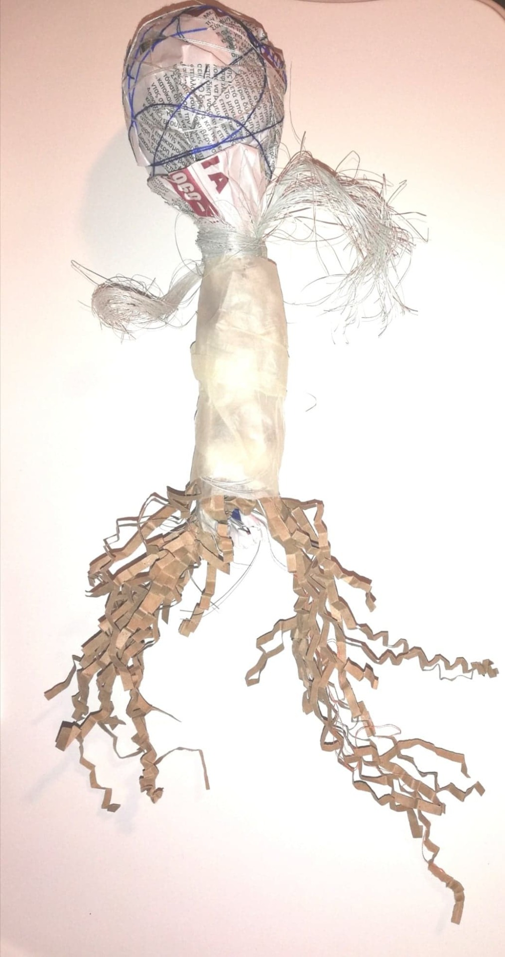
First Art Making Session in MA! - 29/10/2019
Dear Blog!
Today we finally made some art work at uni! And it was really, really, REALLY liberating. Since we started I haven’t had the chance to sit down and take my time to make art and today’s session just proved to me how long overdue it was to do so, especially being on this course...
We were told to bring wool and newspaper to today’s class last week, but we were only told today that we would each be making a person and I really enjoyed having that direction. I enjoyed working in silence in a quiet room, getting lost in the moment without any distractions as I was able to tune in with myself. Usually, I instantly get a visual response to an exercise but this time I hadn’t, so I knew I would go by my method of “what feels right” to make art. This is how I selected my materials and then let the process take its course. From the selection in front of me I ended up using only the earthy materials such as string, crinkled shredded paper, tissue paper, curly moss and stuck to earthy colours. It was interesting to me that I didn’t end up using every material I chose in the beginning, even though I tried to incorporate them, certain materials and colours didn’t feel suited.
I realised I was spending a lot of time on the legs and was feeling irritated trying to get them looking and feeling the way I wanted them to. When I became conscious of this, I started asking myself why the legs were so important to me...
I then worked on the arms, needing them to take a slightly firmer form but I still needed them flexible so I used curly moss. I wrapped the body in white tissue paper to give it a lighter, transparent feel visually. Finally, the head I felt needed “consolidating” so I sewed all around the newspaper with navy and beige string – as if I was bringing my thoughts together, sewing and securing them all in one place. Interestingly enough, I didn’t want to hide the newspaper effect and was picky only using parts of it that had no images but I only thought about how fussy I was after I had finished making my piece. At the time I only wondered why I chose those two shades of colour of string...
I instantly felt at ease with my creation and connected to the entire product. As I had some time left to reflect on it I thought about my emotional journey when making it; the time it took to get the legs looking springy and unrestricted – flexible and ready to run, made me think about how much I love freedom and spontaneity, it made me question if I am struggling with that part at the moment. The body felt as light as a feather, the arms were spread out and bendable... perhaps because I feel like I am on a new adventure. It wasn’t long before I realised that the head seemed to be the only solid and heavy part of the body... maybe because I have much to think about and organise at the moment... I felt I identified with my piece and my object became real to me, it had its own existence in the space and its positioning became an important decision. Today’s session seemed to have mirrored my invisible reality, it was enlightening and educational and even though not in a therapy session, felt the concept of the triangular relationship come alive.
Word count: 596
‘Same Bed, Different Dreams’ (2018) by Song Dong and Psychoanalytic Thinking - Reflections 02/11/19
Dear Blog!
I came across the works of Chinese artist’s Song Dong today in London’s Pace Gallery and was captivated by his art work Same Bed, Different Dreams (2018), which represents the expansion of Asian cities and their modernization that has not only changed the face of the cities but the citizens lives with it. His concept and artwork resonated with me on a metaphoric and symbolic level, and its title seemed to meet my intuitive feeling towards it quite well: that his artwork was dream related... It made me question if the title was a conscious or unconscious attempt to be ambiguous.

In Freud’s Interpretation of Dreams (cited in Strachey, 2010: 338-339) the unconscious surfaces when the censor is frail, which occurs during sleep and the repressed comes out in a dream-form... a dream is a thing that is pictorial and is capable of being represented. This to me was Dong’s unconscious sitting within the physical space – or should I say his psychical space – in concrete form.
A very large beautifully crafted, multi-coloured and polished dream-like case made out of many different windows in the centre of a pale room makes itself known. In it were household objects including crockery, pendant lights and decorative knick-knacks... objects that carry history, memory, emotion. Dong having constructed it by using rubbles from old Beijing confirmed to me that its every detail was meaningful and left me feeling that past and present were undefined here. According to Reiser (cited in Fonagy et al., 2012: 78), the manifest dream draws out past and current life issues and conflicts, in hope to resolve them. Perhaps these raw materials and objects inside are more raw than they seem… Dreams disguise impulses and substitute them with symbols – an operation accomplished by primary processes of the unconscious where the repressed return in confusing ways through visual imagery (Rocha, 2012: 20). Both, dreams and artwork have their own dimensional measurements and in Dong’s artwork, the dream could be preserved in the large dream-like case. The pendant lights dangling in it are lit up, which could suggest psychic activity. Lacan wrote that “dream is a phenomenon of psychic activity” because the unconscious is always at work and never sleeps... so perhaps this is what is being presented by Dong unconsciously (cited in Rocha, 2012: 17). Although the dream-like case is completely closed, one can still see through it, some windows are more transparent than others giving an indication that the hidden parts of the psyche are reachable through dreams. I have always been fascinated with how personal, mysterious, enchanting and unfathomable dreams are. I hope to inform my practice with psychoanalytic literature but I know that it could take me a lifetime trying to understand some of it. Even though exploring psychoanalysis feels like stepping into a whole other world, I believe it is a study that sheds light on the bigger, deeper and most complex parts of the psyche. Dong’s political artwork displays the relationship between his life and his art... And I can’t help but wonder if he was to bring this to an analytic setting, what would come up?
Word count: 510

References
Fonagy, P. Kachele, H. Leuzinger-Bohleber, M & Taylor, D. (2012) ‘The Significance of Dreams: Bridging Clinical and Extraclinical Research in Psychoanalysis’, London: Routledge.
Freud, S. & Strachey, J. (2010) ‘The Interpretation of Dreams: The Complete and Definitive Text’, New York: Basic Books.
Rocha, G. M. (2012) “The Unconscious: Ideal Worker?” International Forum of Psychoanalysis, Vol. 21 (1), pp. 17-21, doi: 10.1080/0803706X.2011.624546. (peer reviewed)
‘The Anthony Gormley Experience’ - Reflections 07/11/19
Dear Blog,
Today I finally managed to go and see Anthony Gormley’s exhibition and what an interesting one it was. I had booked my ticket last night for this morning as I wanted to go in with a fresh and clear mind to simply experience it. The focus was the body: we all have a body but the world within it, is unique every time. As I was walking around each room my responses to his different artworks were authentic and instant to what was happening in that present moment: What I was feeling, what I was thinking, what I remembered, what I imagined, what it made me question, what it made me want to do… it all came to consciousness. Seven rooms really spoke to me:
Clearing VII (2019)
Approximately 8 kilometres of aluminium tube coiled against the space, restricted by the walls, ceilings and floor to bounce and expand. I felt I was in a child’s scribble and wanted to play in it – it activated a physical impulse and I felt I was part of the artwork.
Subject II (2019)
A single life-size male body form made of steel bars became my complete focus and it was his posture that really captured me – he seemed sorrowful and I felt the impact of that emotion. Perhaps the heaviness of the material that he was made out of played a part in the intensity of that emotion making it more prominent that he was alone and seeming lonely in the space...
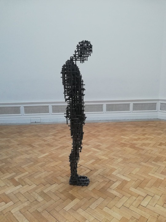
Matrix III (2019)
An enormous cloud made out of steel mesh, its density increasing as you walk towards its centre and looking up at it whilst walking beneath it triggered a memory. I remembered swimming in deep water unable to see the world above it and swimming towards the surface – remembering the feelings of fear and relief that came with that experience, essentially reliving it.

Lost Horizon I (2018)
Many identical male figures made out of cast iron, positioned in many different ways across the ceiling, walls and floor. Walking amongst these figures, I noticed that the male figure was Gormley. It made me think about him and his life experiences, every figure felt like it had a different story to tell about him. I became very aware of these presences in the room, I realized I couldn’t pinpoint exactly what I was feeling with each one but their presence was intense – making me think even more.

Cave (2019)
A steel sculpture on an architectural scale imitates a hollow human form. Going through this hollow body I felt my visual, auditory and tactile senses heighten as it got completely dark; using my eyes to spot anything possible, my ears to hear what I could and touch to navigate myself though the darkness. At the same time I felt like I was walking into the unknown as sensations were very present but not obvious. This artwork stimulated and activated my body and mind together, and led to a combination of observations on the self, experiencing my own body as an entity – externally as well as internally.
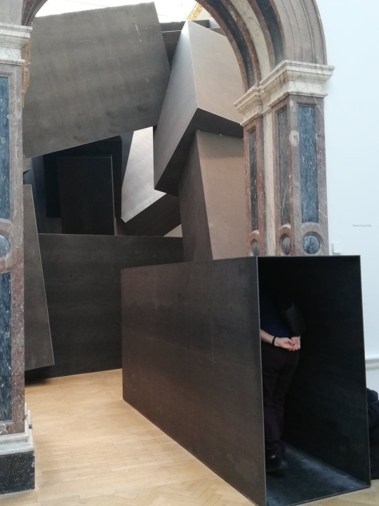
Drawings II
Exiting the Cave led to a room with more basic and natural material artworks. Gormley used his own blood to make drawings representing the interior of the human body, which I found very uncomfortable to look at making me want to turn away. I was quite surprised to have felt quite nauseous at the sight of that and it made me realise just how disturbing I found it. There was something about his blood, its varying texture in the artwork and being displayed for many years now that didn’t sit well with me at all and made me question why. Why was I affected this much?

Host (2019)
Gormleys final room was kept separate by a single solid piece of stone, a room consisting of earth, water and air where water covered the whole ground. This room is the only room left uninterrupted by visitors. Still, it offered me an incredibly soothing experience by gazing at it and smelling the humidity that was produced – I was so drawn and nourished by it, I wanted to sit there. I realised this was the only room I felt so relaxed by as it made me imagine that I was looking out of a window to natural landscape, envisioning forests and being by the beach. It was the perfect note to end on as I felt safe near it... bringing to the surface my strong connection and love for natural surroundings… It also made me think about the counter-transference in therapy, the feelings a therapist feels in response to the client or the clients artwork as Gormley’s exhibition certainly did that...

This exhibition was all experiential reminding me of Hakomi Psychotherapy: based on mindfulness, Hakomi is body orientated psychotherapy accentuating somatic awareness (Rothaus, 2013: 208). The body is a powerful resource as it stores influential information and can guide us to deeper places in the psyche. It seemed as if Gormley took the role of the therapist using his artworks as experiments to evoke experiences for the visitors… gently accessing unconscious material and bringing it to conscious awareness so that it can be processed. Having gone first thing in the morning allowed me to be relaxed, and being calm helped me to be more open and receptive to new experiences when engaging with the artworks. This is a vital part of mindful self-study as it allows you to focus on body-mind connection in the here and now and “the quality of mindfulness heightens mental imagery”, which in turn could increase degree of healing (Morgan cited in Rothaus, 2013: 212). In an Art Therapy setting I could have externalized my body-mind experience, have the process and my artwork contained before safely reflecting on it… A really rich combination of approaches to consider…
Word count: 977
Reference
Rothaus, M. E. (2013) ‘Hakomi and Art Therapy’ in Rappaport, L. ‘Mindfulness and the Arts Therapies: Theory and Practice’, London & Philadelphia: Jessica Kingsley Publishers.
‘Other Spaces: Vanishing Point & Our Time’, Psychosis & Realizations - Reflections 10/11/19
Dear Blog,
I have always had a very strong interest in Psychosis and having studied music even composed an electronic piece based on my understanding of an episode of Psychosis. My purpose of composing music like this was to try to interpret psychological disorders guided by my readings so that I can raise awareness on how difficult it is to be on the other side and to help me understand sufferers state on a deeper level. By doing this I felt I would be able to relate and connect better with these individuals. Vanishing Point and Our Time are exhibitions I visited that played with one’s visual perception. Both in dark rooms Vanishing Point used laser lights and projected beams of light to a vanishing point, and Our Time used smoke and a kinetic light installation that swung back and forth – both playing with reality and illusion.
Psychosis is the severe distortion or even erosion of the normal functions of perception, thinking and feeling and of the capacity to communicate (Sass cited in Killick & Schaverien, 1997:134). For me the visual nature of this exhibition resembled a hallucinatory experience placing me in the mind of a psychotic client. From a trainee art therapist point of view, this exhibition made me panic slightly at the thought of some tricky but vital questions… How could I contain a severely psychotic client? How would I approach this? Where would I begin? I took a moment to consolidate my thoughts and reverted to our core learnings so far… I have to create a safe and facilitating environment for the client, which means being resilient and being able to tolerate different behaviours, by providing safe art materials and a place where artwork could be stored, by having a regularity of sessions in that same space. With all clients and especially clients suffering with severe mental health problems, getting them to experience a level of relatedness to the art therapist through repetition is essential. According to Killick “containment can be mediated through the experience of continuity” (Killick & Schaverien, 1997: 50). And what if there is no artwork?! I remembered my tutors words: “It’s still art therapy!”.
I am also a very firm believer in body language as it is penetrative and a universal form of communication. Searle focused on the therapist’s facial expressions being fundamental for the symbiotic relationship between the psychotic client and the therapist stating that through the therapist the psychotic client can recognise their aliveness (cited in Killick & Schaverien, 1997: 219-220).
I am beginning to understand the complexities that come into play with the different clients and the importance of not being reactive to alarming thoughts but responsive – remaining patient and having faith in the process. This exhibition and the readings that followed highlighted that as a trainee art therapist I have to learn the language of each of my clients and adapt my way of working to their needs in order to get them to connect with me and engage in art making. Although I am trying to prepare myself for my upcoming placement as much as possible, I understand that I can’t know fully what to expect… The responsibility for improving the mental well-being of another and thoughts on what my counter-transference will be in the process, are thoughts that make me a little... or a bit more than a little nervous…
Word count: 552
Reference
Killick, K. & Schaverien, J. (1997) ‘Art, Psychotherapy and Psychosis’, New York: Routledge.
Charlotte Salomon’s ‘Life? Or Theatre?’, Looking at Her Paintings - Reflections 16/11/19
Dear Blog,
What an exhibition... I am so captivated by how deep and penetrating it was...
“The war raged on and I sat by the sea and saw deep into the heart of humankind”, she said and she really did (Salomon cited in Felstiner, 2009).
Salomon, a German Jew in Berlin lost her mother at the delicate age of 9 and grew up living in fear witnessing the heartache and devastation the Nazis spread when they came into power in 1933. Her father eventually remarried opera singer Paula Salomon-Linberg and Salomon fell madly in love with someone her step-mother worked with, Alfred Wolfson, only to be sent to stay in southern France with her maternal grandparents due to dangerous circumstances. After witnessing her grandmother hang herself, her grandfather brutally let her in on what was being kept from her all these years – that their seven family losses where suicides, including her mother’s.
“I will create a story so as not to lose my mind” (Salomon cited in Felstiner, 2009).
Salomon created a series of autobiographical paintings attaching tracing paper, writing words and melodies, adding a narrator and introducing characters giving them a theatrical effect... I thought about why she chose to paint the way she did...
Her paintings presented her internal and external reality in a very defined and cohesive manner. She used paint, a medium that could be messy and which can be daunting when there are issues regarding control (Robbins, 1987: 109). Everything happening in her life was beyond her control but her choice to use paint, for me, was a sign of wanting that power over how her life story was illustrated – a valuable challenge of tolerating all the toxic feelings depicting her struggle through life. This left me with an incredible impression of her inner strength and her being well-balanced. Perhaps her faith in religion gave her that power... “Dear God, just let me not go mad” (Salomon cited in Felstiner, 2009).

Her paintings shift from bright to dark colours and her writing from witty to grim as her story proceeds. They start becoming colourless and dull as she began feeling fed up with feeling fed up and she contemplated committing suicide herself. Colour communicates the felt experience and makes a visual statement about a person’s current state of being (Robbins, 1987: 107-109). Their flatness could metaphorically represent her lifeless life. But Salomon’s paintings were all of notebook size and of a repetitive style of painting completely limiting her body movement, which according to Robbins are signs of offering herself containment and of protecting herself (1987: 113).
Salomon seems to have had experienced cumulative trauma having lost her mother, being away from her father and her lover, being in the midst of war, not being able to communicate with her loved ones... Emotionally and psychologically exhausted by it all she fought to live every day. Her efforts at art therapy saved her, she confronted her harsh reality and realised that death can’t be worse than what she was she was mirroring in her images, which made her want to live... “I will live for them all” (Salomon cited in Felstiner, 2009). Research has linked psychopathology with avoiding thoughts, emotions and memories but Salomon engaged with her process over and over again...769 times before being killed by the Nazis (Skeffington & Browne, 2014: 116).
“Keep this safe, it is my whole life” (Salomon cited in Felstiner, 2009). Salomon’s artworks are incredibly inspirational and influential as they document honorable aspects about her and make it evident that she was her own art therapist. In an audio-visual recording at the exhibition, it was said that Salomon was an introvert. Externalizing her mental images the way she did, may have been a conscious wish to be able to communicate them to someone other than herself (Schaverien, 1992: 83-84). This was her life but I think it was her desire for it to be unreal, for it to be theatre...
I walked out of the museum feeling so moved and emotional over Salomon’s life story... her pain, her fear, her struggle. I was astonished at her outlook on life, how she relied on her creativity to regenerate strength and ignite hope in a dark hole. I felt very grounded by the way she made me think about the way I see my own life and how she made me look at it from the outside, as if that too were theatre...
Word count: 715
References
Felstiner, M. L., (2009) “Charlotte Salomon: 1917-1943", Jewish Women’s Archive. https://jwa.org/encyclopedia/article/salomon-charlotte – Accessed 16/11/2019 at 17:15.
Robbins, A. (1987) ‘The Artist as Therapist’, New York: Human Sciences Press.
Schaverien, J. (1992) ‘The Revealing Image: Analytical Art Psychotherapy in Theory and Practice’, London & Philadelphia: Jessica Kingsley Publishers.
Skeffington, P. M. & Browne, M. (2014) “Art Therapy, Trauma and Substance Misuse: Using Imagery to Explore a Difficult Past with a Complex Client” International Journal of Art Therapy, Vol. 19 (3), pp. 114-121, doi: 10.1080/17454832.2014.910816. (peer reviewed)
‘Leonardo: Experience a Masterpiece’ (2019) - Reflections 17/11/2019
Dear Blog,
I visited the National Gallery today to see Leonardo: Experience a Masterpiece (2019). As well as being one the world's most famous painters, Da Vinci is known for having extensive knowledge in scientific subjects that fed into his artwork such as architecture, science, mathematics, engineering, anatomy, geology, astronomy, botany, palaeontology, cartography and the list goes on. This exhibition focused on Da Vinci's the Virgin of the Rocks (1508) by introducing unknown truths in four different rooms that allowed me to reacquaint myself with his famous painting ultimately making me see it in a new light.
Entering the Mind of Leonardo as he begins his journey of creating the Virgin of the Rocks, his thoughts are text written backwards and reflected on mirror surfaces so that they could be read easier. "He who is only good at painting figures seems to be a poor master" (cited at the exhibition). I wondered how he meant this.. I wondered how he meant "figures"… Could he have been insinuating that one can only master figures if his soul invests in it? Was he insinuating that a true artist should master how to depict elements of divinity in his figures? His connection to religion perhaps? An unclear yet powerful statement, where I felt he meant both... This mirror effect was done against a backdrop of the Italian Alps and it stated at the exhibition that many of Da Vinci’s geological sketches and observations were situated there so he must have felt something special about this location. According to Andric he was constantly striving for the heights, which could reflect his desire to elevate the spirit (2016: 7). This led me to think that he wanted viewers to experience the search for meaning in what is around us, to search for mystery that exists in the world and is to be sought and to acknowledge that we are part of this mystical and miraculous creation. According to Gal (cited in Vladislav, 2004: 53) searching is a method by which we implement and connect with faith, and is kin to art.

With this in mind I left that room to move on to the next looking for the bigger picture and tuning in with what was around me - a circular hall that connected all rooms in the shape of a cross. This reinforced the feeling that his own spirituality played a bigger part in this painting than I had thought...
The Studio. "The figure that does not sufficiently express with action the passions of its soul is not worthy of praise" (cited at the exhibition). Da Vinci refers to the "figure" again and its "soul". This seemed to imply spiritual art, which is dependent on the artist's capacity to understand spirituality and on the experience of the knowledge of God in order to achieve "art in spirit", otherwise known as iconography. (Vladislav, 2004: 58-60). Scientific investigation that was carried out on this painting using infrared reflectography and hyperspectral imaging revealed lost content beneath the Virgin of the Rocks we know today. So if we are to think of Da Vinci as an iconographer, this piece of work would not be one of self-expression or scientific precision but rather a method and practice towards transfiguration of his nature through his experience of the revelation of the holy by which he would be able touch upon the mystery of incarnation of the Divine (Vladislav, 2004: 56-59). His first attempt can't have been definitive enough in what he was trying to portray and it seemed Da Vinci was trying to transcend his painting methods and touch elements of divinity in his work, as if he was aiming for perfection.

How he achieved that was by mastering two techniques that were introduced in the third room - The Light & Shadow Experiment. "Your tongue will be paralyzed by thirst and your body by sleep and hunger before you can show with words what the painter shows in an instant" (cited at the exhibition). Da Vinci paid great attention to Chiaroscuro and Sfumato, skillfully shading and blending in colours. Translucent layers of paint are at once seen as ethereal and the light radiating is from within the figures outward, "enlivening the action of uncreated grace” – Da Vinci not only worked towards making an instant impression that he was depicting sanctity but also that he was able to do that, he had stated that "perfect faith is perfect knowledge" (cited in Andric, 2016: 9). It is through the artist's ascending journey looking for Truth that he begins to see that "good art" is done in a more human way and "spiritual art" is reflecting what he practices within (Vladislav, 2004: 62, 65).

The Imagined Chapel. The Virgin of the Rocks was to be an altarpiece for a chapel in the church of San Francesco in Milan but the church was demolished. Only artworks that have an adequate symbol of holiness used for uniting the invisible and the visible, where the artist contemplates the image of God within his own soul mirroring his glory, are able to have a permanent place in the church – works of art that are a shared activity of the Creator and the created (Vladislav, 2004: 62-63, 66).

I feel his in-depth knowledge into the order of the world made him search for the beyond, made him search for God. That this painting wasn’t about what Da Vinci is much known for – his scientific precisions in art and science, but much much greater than that.
Going to this exhibition reminded me of our lecture on Supervision. It made me realise that total objectivity when seeing a client's artwork is quite impossible as we all have our biases. It highlighted the importance of having a supervisor to see what I can't or to put me in different thought processes. Even though it takes some pressure off knowing that I am able to share clients artwork with another, it also made me feel that much more responsible to be open to seeing that there is more than just one way of viewing artwork and that it is important to try to look for those different ways and those details on my own before relying on supervision. Every different way of viewing artwork could lead to a real depth of one’s psyche just as the way I viewed Da Vinci’s Virgin of the Rocks. Moreover, my experience and reflection on this exhibition directed me into thinking about spirituality and religion in art therapy as it often is a big part of who we are and it can be a big part of our everyday life and lifestyle, which is an extremely interesting area to explore. It also made me think about art therapy in palliative care as end of life gives rise to the feeling of spirituality whether one has a faith or is agnostic or atheist. However, palliative care is an area I’m not ready to go into...
Word count: 1,134
References
Andric, N. (2016) “Religious - Philosophical Aspects of the Novel ‘The Romance of Leonardo Da Vinci’ by Dmitrij Merezkovskij”, Russian Literature, Vol. 86, pp.1-20, doi: 10.1016/j.ruslit.2016.11.001. (peer reviewed)
Vladislav, A. (2004) “Art and Religion: Creativity and the Meaning of Religion of ‘Image’ from the perspective of the Orthodox Icon”, Theology Today, Vol. 61 (1), pp.53-56. (peer reviewed)
Experiential Workshops: Material Realizations - 02/12/19
Dear Blog,
We have now started our experiential workshops after having been given the foundations on art therapy theory and art therapy practice. I am gradually feeling teaching beginning to merge together - what feels like - "the separate pieces" of the first year of the course and I can now understand the direction in which it is going. (Now that I mention separate pieces I'm remembering my doodling on the first day of uni, how that too was separate pieces floating around in a section of my notebook page, maybe there's an emerging meaning...).
(Doodling in first lesson Sep 2019)
These workshops are familiarizing us with different art materials... Our first workshop was working with dry materials: marker pens, pencils, coal on sticks, chalk and pastels. The second workshop was working with wet materials: paint, water colour and ink, where different sized, shaped and type of paper were used in the first two workshops. The final workshop was with clay and plastecine. This was really great as it put me in a position to ask myself why I work with certain material and why I don't work with other, why I like some and why not other. It made me wonder to what extent is the use of certain material subjective and to what objective? Being restricted to a group of materials each time, allowed me to explore the intrinsic properties and to reacquaint myself with those I seldom choose when art making, but in this blog I will discuss material experiences that stood out for me.
I was instantly drawn to certain material: coal as I associate it with historical times and keeping warm in the cold, the mysterious effect chalk can have when it is smudged and its sharp dusty lines when it isn’t, ink reminds me of sentimental writers and poets of a previous era such as William Shakespeare, Edgar Alan Poe, William Blake and Ralph Waldo Emerson that I love to read, clay being 3D really brings emotions and thoughts to life in an organic way and requires a lot of physical handling that arouses the senses. I became aware that there were symbolic and metaphorical meanings behind the use of these materials that I identified with and this was confirmed to me during the art making and also in the way I used the material. As we were only allowed to use coal tied to a natural tree branch from a distance, I believe drawing a tree with it was from an unconscious driven force related to that. This generated further questions... What if coal wasn’t attached to a tree branch or natural object? What if it was attached to something else or not attached at all? How would this affect my art making instincts and decisions? Knowing how much I love nature, would I have felt disconnected to the art making process and art product if the medium in between wasn’t natural? Is this what it could feel like for a client with a disability?... Although I like using water colour with brush effects and layering different colours, I really struggled to use anything more than a single colour to do this as I found that the size and shape of the paper really influenced my working with this material. In a similar manner with regards to paint, although I tend to mix different colours to get blends as well as create thicker and looser blends, the workshop only had certain colours available that I couldn’t make use of in a satisfying way so having a limitation in colours became very frustrating... Why are certain blends so important to me?
(From left to right: paint, paint, ink, water colour)
(Coal)
Pencils and marker pens have never been a preferred medium for me even having rubbers provided in the workshop I found pencils were too definitive needing a lot of control to create something representative of me and marker pens rather aggressive and unforgiving, which in turn made me feel uncomfortable... But I questioned now if this is can be absolute as what is emerging in these workshops are the different material associations and the different experiences of their materiality in the structured workshops. It was intriguing to me that I actually ended up reacquainting myself with most of the materials through the different processes and my usual ways of creating art with certain material often changed. This stirred new emotions and I thought about how these processes made me feel... Ultimately, the material processes became unpredictable. At the beginning of this blog I wrote about the workshops familiarizing us with different art materials but I think it is wise to add, that they are familiarizing us with different art materials through different personal interactions. As an artist I am so use to having a variety of materials to choose from with no limitations where having directive workshops urged me to consider art making in another way as they tapped into something specific within me, perhaps contacting other areas of my psyche that I knew not about but thought I had, that are completely unconscious...

(From left to right: chalk, pencil, marker pen)

(Clay container)
Most importantly, these workshops have now started to make me think in more complex ways when considering clients and different settings... What are certain client groups in need of and how could I meet their needs? What could be helpful and what could be harming?...
Word count: 900
1 note
·
View note
Note
Uneven Evan was released what r ur thoughts
(First of all I'm really sorry for responding like a day late, I had so much I wanted to type XD)
Whoo boi, I really enjoyed it! I've got a whole lotta things I want to say about it and so here's my analysis (is that the correct word?) on Uneven Evan!
(Why did I do this I've never analysed anything in my life—)
STORY
Pros
The story was simple and I think it's a really nice way of demonstrating the struggles of keeping balance in our lives.
The story and dialogue were well written. The dialogue between Evan and Drew didn't feel awkward or anything. It all seemed natural and it really helped to establish what kind of personality they have.
What I really liked was the bartender scene. She actually looked concerned for Evan and even offered him a job which was really nice. I'm glad you guys didn't make her throw him out of the bar or something. It's just really nice.
Also, I found the use of fire and ice pretty clever since the characters mention the words "burnout" and "chill" a lot.
The dialouge and the events in the story felt very realistic. The way the characters acted and how the events in the story moved together was just really great and I enjoyed it a lot.
Cons
There's only one thing that really confuses me. The bartender tells Evan that it's a Wednesday afternoon but when he goes out onto the street, it's dark and the lampposts are on.
Though, he could've stayed for quite a while in the bar (in which case, props to the bartender for being so nice to him) and then went out later in the day. I don't know.
VISUALS
Pros
First things first, the animation is really smooth. Just like II, it doesn’t feel like a bunch of assets put together with different poses. The characters and their enviornment feel alive.
The transitions have to be one of the smoothest ones I've seen. The Dr. Fizz can being slammed against the desk and transitioning to the title card was a really nice effect. The transitions in the montage were also really great too. The transition from him running to playing video games is INCREDIBLY smooth and I don't know how Adam did it.
I really love the small touches they added in every animation Adam makes because it makes everything feel alive. The most obvious ones were the separate, small bounces in the character's hair whenever they move and the movement of the jaw whenever they talk (mainly because those were seen in Adam's stream).
My personal favourite touches have to be the fact that Evan was drooling right before he woke up & the juice going out of the strawberry when he cuts it during the montage.
It amazes me how much attention to detail there is in each of Adam's works. I mean—in the shot where he tries to purchase the video game they actually added details about it. A short description of the game's there and the makers of the game are "Icy Hot Gaming". It fits with Evan's struggle to find the balance between work and play.

You can also notice at the start that there's a gaming controller, cook book, martini glass, and running shoes on the shelf. Later in the montage, Evan goes on a run, plays video games, goes out to a bar and bakes a cake.

I also really like the use of colours in the animation. It in my opinion helps highlight each extreme & just helps tell the story really well. I also noticed that natural lighting from Evan's lights or the sun affect the lineart while the highlights from the extremes don't. Idk, just seemed like a fun thing I noticed.

The character designs are good as well. Each character stands out in their own way & you can pretty much tell who it is by their silhouette (something I believe Adam has mentioned a couple times when giving tips on making characters).
The expressions were also really good, they conveyed the emotions clearly and it was very entertaining to see all the goofy expressions Evan had.
It's also really nice that although it's really different, to me at least it feels nostalgic. I guess it could be the cans of Dr. Fizz littered around the film but I'd like to think that it was thanks to the visuals overall. The animation definitely has Adam's style of course, but I didn't realise why it felt like I knew that universe even though I had only seen a glimpse of it.
I eventually realised that the people who worked on the visuals for the film also do the visuals for Inanimate Insanity. And, I realised that when watching this, you aren’t really going into a completely new universe alone. There’s some sense of familiarity that doesn’t make it feel out of place. It's just a great addition to the channel despite the fact it's very different from II.
Cons
I noticed a lot of minor errors in Uneven Evan's visuals. I'll list them the order I found them.
The screen constantly switches between being filled with notifications to only having two.
Magic disappearing rug and door handle.

Magic disappearing bread.

The shelf is empty in every shot except the one with the controller, martini glass, etc.
The cracks in Evan's eyes disappeared in this one shot.
The chair that Evan was sitting on at the beginning of the flim disappeared.

The trashcan magically becomes less filled and gains a lid & the placement of the trash keeps changing.

The crack in the wall is also seen once & never appears again. The couch's cushion also magically teleports beside it.
The glass of water on the table disappears.

Also, a chunk of the top part of the sofa is missing in the beginning but in other shots the top part of the sofa is fine.
But, the errors are minor. They don't really take away from the story and most aren't even that noticeable. All of these are the types of mistakes even high budget cartoons make XD. The visuals are still really clean and work together with the audio to produce the story Uneven Evan aims to tell.
AUDIO
Pros
Speaking of audio, I really enjoyed the voice acting, sound effects, and music in Uneven Evan.
The voice acting was really good. I don't believe I've heard the voice actors of Uneven Evan before this??? (besides the bartender) Either way, they did an incredibly great job. The voices fit the characters very well and the amount of emotion they convey in their voices is just really good.
The sound effects and music were also very fitting and overall just helped the film become alive.
The sound effects for the Dr. Fizz can and the keyboard are really well done. I had to do a double take because the keyboard sounds actually feel like they match what Evan's typing (even though they don't).
The music was really good. I loved the music for the outro and credits.
Cons
This is me being picky but the only thing that really bugs me with the sound is that (at least to me) it sounds like Evan is getting the coin earlier than he actually is. Aside from that, all the audio is clear and everything each character says is easy to understand.
Overall, Uneven Evan is a really good watch. I showed it to my family and they really enjoyed it (something Inanimate Insanity failed to do for some reason). The story is really good and something everyone can relate to. Plus, it's actually very realistic considering the fact that Evan chilling out started off as something good then went to the extreme.
(Plus I really love the fact that it's called Uneven Evan & the entire short was Evan finding balance between work and play)
Uneven Evan was extremely well made and it makes me excited for what Adam & the others come up with next whether it be Inanimate Insanity episode 14 or something totally new.
Props to everyone who worked on it! :D
4 notes
·
View notes
Text
Illustration Article 03: Newspaper Comics (Winsor McCay)
I never thought of newspaper comics as a fulfilling career path in illustration. Rather, I thought that newspaper comic artists relied on a different set of skills—focusing on the story, characters, and dialogue more so than the art. The high quantity, low panel amount, and small scale make it difficult to make detailed or dramatic artwork. But I’ve found one artist that was given the opportunity I’m not talking about Garfield, alluring as it may be.
Until I researched him, I didn’t know that Winsor McCay created Little Nemo in Slumberland (1905-1914). However, I do know McCay from his work in animation. Films such as Gertie the Dinosaur (1914) was groundbreaking at the time, and just as laborious despite its simple appearance. Traditional animation typically includes “cels”, where different elements (such as characters, objects, and backgrounds) can be layered on top of one another. But Gertie was made before cel animation, so McCay had to draw each frame in its entirety on one page/layer—character, object, and background!
Granted, with Little Nemo, McCay was given some greater boundaries than what I had described earlier. He was given an entire page (16” x 21”) to create his comic, which allowed him to fill in more panels and flesh out the story and art. This comic format makes for a relatively simple story—a boy who goes on adventures in his dreams. But the art, at least to me, is surprisingly mind-boggling, especially considering the variety of characters and environments he had to create on a weekly basis.

In this first example, the character art does its job—it is simple and clear, but not exceptionally detailed; then again, these drawings were made on a small scale. Some may also think that the text bubbles clutter up the page sometimes; this can be semi-justified, since the story all had to be explained in one page. These smaller elements provide the context and perspective for the larger, more detailed elements. Because the backgrounds are simple and plain, this yields the opportunity to create many variations in the animals’ colors, shapes, and textures. At first glance, this colorful and cartoony appearance gives a light-hearted, whimsical feel. But after reading the small text, you can tell that infer that the captured animals are in various states of lethargy, stress, or pain.

The second example shows how the paneling, while interesting, can be a bit confusing at times. This is accounted for by the use of numbered text boxes. I like the subtle change in environment: starting in his bed, and then being slowly detached into a surreal space of solid color, slowly bringing the reader into the world of dreams/nightmares. The “moon” zooming into the frame is simultaneously humorous and unnerving.
In the middle section, you can see the bed flying at different angles, showing use of perspective and rigidity against the empty background. Another thing to note is McCay’s end transition from dream to reality; Nemo goes from flying around the room, to falling from his bed. The narration and dialogue help to contextualize the dramatic shift in environment.

The third example has most of the story in the same environment (a glass cave), but interest is derived the posing, scale, and appearance of the characters. Nemo and two other foreground characters are of realistic proportions, but the giant jester character towers over them; he not only stands out from his striped outfit, but his height is noted by his crouching/leaning over the smaller characters. The row of bizarre-looking guards starts off with identical appearances and poses. But they gradually become more differentiated and animated once the tension rises. The only changes in the environment occur when the guards shatter apart, revealing the stalactites below.
…And I don’t know if Nemo learns from this experience, but he seems pretty traumatized from killing the glass people.
McCay’s eye for detail, perspective and composition really shines in this final example. The last panel, especially, shows a deep space of ornate architecture and a bed of giant roses. The upper panels feature overlapping shapes and various colors, but the main characters still stand out through their placement in simpler backgrounds. Some comic formats were meant to be read through quickly, but McCay’s work requires zooming in, to understand the bizarre combinations of familiar and unfamiliar imagery.
#umassdillustrationclub#winsor mccay#little nemo#newspaper#newspaper comics#illustration#illustrator#little nemo in slumberland#dreams#glass#animals#creatures#fantasy world#whimsical
4 notes
·
View notes
Text
A Conversation with TURN Gallery Artist Mason Saltarrelli

TURN Gallery’s Mason Saltarrelli is an abstract artist, illustrator and painter born and bred in the city of New Orleans. His work is imbued by the improvisation of jazz, abstract animal silhouettes and color, the last being what Mason calls a “co-author” in his work. Mason will be Ace Hotel New York’s gallery artist for November and has a series of curtain paintings hanging in the lobby of Ace Hotel New Orleans. Here he chats with artist and friend, Joseph Hart of Deep Color, about to-do lists, Black Jaw the alligator and how abstraction can be a “beginning of seeing.”
Joseph Hart: Bridging in and out of painting and jazz music is the notion of improvisation. Can you talk a little bit about how improvising and intuition act as creative tools in here while you're working? When I say “in here,” we're sitting in your studio.
Mason Saltarrelli: I seldom arrive with a plan. More, I have a cast of characters. I'll call on one of the characters to come into the scene, but I don't know what their lines are and I’m not sure what costume they are wearing. Often the plan or story is only fully clear to me after the work is done. A work’s construction is realized through calling on a player and seeing where it wants to go in order to explore. Chance of shape and colors’ influence assist in determining the voyage.

JH: I see a figure here that almost looks like a doll. The image of an alligator pops up quite a bit. Is there anything else in your memory bank that you pull from?
MS: Yes. There’s a dog and a hairdo.
JH: What's the hairdo?
MS: It's a way of making a portrait without being literal. That's where there is a crossover with jazz and my work. In traditional jazz, there is a melody for each song and then the band members improvise solos. My characters offer me the function of melody and adjusting their forms and colors is my solo allowing me to create.
When a musician plays “Sweet Lorraine” or “Tiger Rag,” they know which melody to play. But when it’s time for the solo, they are free to forge a new idea based off of a set construct. The improvisation is where the real fun comes in.
JH: Yeah, that's where the surprise happens during those solos perhaps. When do surprises happen in your studio? When you collide these characters together, or put down a color or a gesture in relation to them and something happens that you didn't expect —what type of surprises happen?
MS: Color definitely plays a big role in surprises. The paper and canvas piece that will be in the show at the Ace New York has gone through many adjustments. By changing the green from blue next to the gray, it starts to push and pull and layers begin to appear. Structures move to the surface and in turn other colors recede based on placement. This creates layers within the piece. Color is a co-author in my work. The importance of the parts that make up the whole of the figures is greatly determined by coloring.
JH: You get a little depth in there. One thing that I've always observed about your work is an extraordinary flatness in how you're applying the paint and you're getting a nice graphic shape often that's opaque. Some of your paint is washed out, but at the same time with some of the tinted canvases and overlapping you really achieve a sense of depth.
MS: Depth is important to me. Each layer, whether it's a work on wood, paper or canvas, is like writing a sentence and those sentences stack on top of one another. Eventually as the sentences build up they create a paragraph. The paintings are paragraphs that are building up to relay a story.
JH: Another consistency in your work as I've known it over the years is a love for drawing. There's a lot of drawing in your painting. I know you have a history with works on paper and making drawings on hand tinted paper. Can you talk about how drawing is important in your studio practice and in your art making?
MS: I often paint through drawing. It’s a method of placing ideas. The ideas then pose questions. Without trying to fully render a figure and utilizing the idea of what something is I define what it becomes.
JH: The stakes are often lower with drawing too. I mean it's historically a preliminary action. I know you don't do sketches for these, but when we think of drawing, we think of small sketches. We think of a preparatory drawing for something larger. When your drawing is part of how you move your arm through the canvas and with a brush with paint on it, I think we carry that low pressure, emotional, psychological space with us. For me, I'll argue that it makes painting more fun, more interesting, more engaging.
MS: Yeah, I do try and keep things fun and then I start working and then I start taking it very seriously. Problem solving becomes important. Using drawing to open things up to see where they can go poses many questions with an infinite number of answers. If I start creating a form that is part of the alligator, for instance, the back of the head, and then all of I sudden decide, okay, it's time to switch into a hairdo or a doll or a dog, I have initiated a story that should be resolved if I want to share it.
Things just open up through drawing, there's no forced intention.

JH: As an exercise, I like to ask myself, if my paintings were to make a to do list, what would be on it. So I want to pose the question to you. If these paintings were to make a to-do list for the viewer, for yourself, what are a few things that would be on that list?
MS: The three paintings that hang in the Ace Hotel in New Orleans for Doc Cheatham, Lionel Ferbos and Percy Humphrey are on hemp. They're curtain paintings in that they're not stretched, but hang freely. The to-do list for the New Orleans paintings was to reflect both personal and musical aspects of each of the three traditional jazz trumpet players through abstraction.
My show at Ace New York this November will include two pieces. In the New York hemp painting, my goal was to successfully combine separate aspects of how I depicted Doc, Lionel and Percy. My intention was simple, revisit three paintings two years later in one new piece.
In the other work, my goal was to fuse my paper and canvas practices and see if I could get them to function uniformly. This piece includes canvas that has gone through a similar patina process as my paper. For this work the to-do list was basically to get the canvas and paper to have a cohesive conversation, to get them to enhance each other simultaneously.

JH: Yeah, it's working. It's a nice little installation. It reminds me of a gift. Maybe this was the wrap for the painting on top of it unfolded. There are all sorts of surprises in there.
MS: I think that paper could actually fold over and hide it.
JH: Yeah, the aspect ratio. It looks like you could wrap it right up. Let's talk about audience. When we're in our studios, there's an audience of one unless you have a friend or visitor over. But when the work leaves the studio, then there's an audience. I'm curious if you feel differently about your work when it's in front of an audience? Is your relationship to it here in your studio different than when these paintings are going to be in the Ace Hotel?
MS: I definitely consider audience. At the same time I don't have control over how they're going to perceive my work. Especially when viewing abstraction, people put their own life experiences into what they see.

JH: Yeah, that's their job.
MS: It is. Deborah Buck, an artist, came over the other day and pointed out that in the smaller canvas piece she sees a person hugging another person. I keep seeing it now because I never noticed that and I've never visualized that idea in my work before. She said it looks like a male figure protecting a child.
To me it's a doll inside of a woman's hairdo. That's one of the amazing things about abstraction, it's not over when the last mark is made. When somebody else starts looking at it it's just beginning for them, and sometimes can actually be a beginning of seeing for me.
JH: Yeah, it's great. I think the audience, when it's in a public space, like you said, brings their own experience and finds their own meaning. It's nice to hear when a viewer shares that meaning with the artist. When you describe Deborah coming in and seeing something that you didn't see, that's a new layer for you and compounds whatever you had going for it on your own. I think that's a great thing. It's a dialogue. That's the dialogue you're looking for with a viewer.
MS: Right. It becomes a type of gift in a way if you allow it to be. When you let someone else take the reins and tell you what you’ve done, and you get to hear their vision. It's nice. It's a way of sharing, it's very personal.

JH: I want to talk a little bit more about the alligator motif that pops up a lot in your work. At first glance when I came in here, looking at this long horizontal painting that's going to be here in New York, I saw architecture, I saw landscape, I saw a street scene, I saw buildings. But then I quickly shed that as soon as I recognized the contours of this alligator head. Am I seeing the same thing?
MS: Yes.
JH: Is this the profile of one of your alligators?
MS: This time it’s the profile of multiple alligators, possibly the same particular one in different incarnations.
JH: It's abstracted, it's not overt, but that sort of elongated alligator. I know you’ve talked about alligators being outside of New Orleans in the swamps. It seems like an important character from your image bank. I imagine it's a fun shape to draw too.
MS: Yeah, that's part of the reason why I use it over and over. It can be a way of loosening up. I remember when I saw a specific alligator in Honey Island Swamp in Louisiana. Its name is Black Jaw. It’s obviously in the present but also you see and feel another time. Certain areas of New Orleans are the same way. It touches on looking and experiencing a different era, a different life, but within this one.
In this particular painting, I started layering alligators and maybe it became not just Black Jaw. Or if it is Black Jaw, it's him being reincarnated a few times and going through a few different swamps rather than just Honey Island.
JH: Right. It's abbreviated too. I mean I think your forms are rounded off and simplified in a way typically. It's not like a rendered alligator head, it's an elongated rectangle with a bulbous end. Then the tell, the show, is usually the teeth, which are triangles throughout.
You're using these geometric shapes to describe this head often. Again, it's going back to the flatness, you're painting in a flat way.
MS: Yes. By simplifying the forms I’m giving color more influence in the work.
JH: The alligator is a starting point, as a form, as a shape, as an idea and you just unfold it from there. It turns into a few other things, sort of holds on to its identity as an alligator. I love that. Is this an alligator too? This one is a front view maybe.
MS: That's a doll with a hairdo above a profiled alligator whose teeth have left its mouth and even become a little hat. The paper behind it is space. There’s a foot behind the canvas drawn on the paper. It’s a hidden self-portrait.

JH: Do you remember the last piece of culture that you experienced? Maybe it was a book you read or a film you saw or an artwork or a piece of music that shook your bones?
MS: Definitely. This past August I was in residency at the Macedonia Institute in upstate New York. That’s where I painted the hemp painting for the Ace New York show. During that time I read Chief of Chiefs: Robert Nathaniel Lee and the Mardi Gras Indians of New Orleans, 1915-2001 by Al Kennedy. Chief Robbe was the first and only person to be named "chief of chiefs" by the Mardi Gras Indian Council. I would read and then paint. I enjoyed the book so much I read it in small increments so it would take longer to finish.
MS: I remember being a kid and seeing Mardi Gras Indians for the first time. I was in the car with my dad. We were leaving the St. Charles Mardi Gras parades driving back through neighborhoods to get home, and then all of a sudden we saw Mardi Gras Indians masking. They resembled human fireworks. It was amazing. Reading Al’s book was inspiring because it’s such a wonderful story of being called to an art form and how tough yet rewarding it is to be dedicated to a practice that you love. Chief Robbe’s story reminded me of how fortunate I am to have grown up in New Orleans and experienced such a unique culture.
#mason salterrelli#joseph hart#abstract art#interview#ace hotel new york#turn gallery#yes#ace new york#new york
2 notes
·
View notes
Note
kinda do not like how the skits are playing out tho
Also do not like how the enemy's mystic arte isn't cinematic now.
ganabelt's MA is the only one that isn't avoidable lmao
i was okay with the change bc of how much other damage i was taking, especially with limited resources at the beginning. the MAs wouldn't kill me but literally everything else could o(-<
they still look really cool though
and i have a lot of things to say about the skits, but i mostly feel like they were relying too heavily on model placement and camera angles
they also recycle poses from the standard cutscenes, so the skits never end up being too inventive or funny tbh
the voice acting salvages it the best it can imo, because the dialogue still HAS all the flair of the classic skits. it's just not visually presented well for the aforementioned reasons
basically the new skits are the same as the 2d ones in that only the mouths are animated and the character poses change (and the dialogue is entertaining). they ARE expressive, they're just bound to the character models so you never get the extreme stylized expressions that most people love
personally i think the 3d skits have potential! they tried something new and when you shake up the formula for the first time ever it's gonna be really hard to satisfy long-time fans. so i'm not surprised that the 3d skits aren't quite as good as the traditional 2d ones, but if they keep this 3d style for the next game i'd love to see it improved
#anonymous#i like to give things a chance#i get that people are divided on the 3d skits but#taking into consideration that this is their first time drastically changing skits i don't think it's fair to immediately write them off#but some people may never get used to it and that's okay#i just don't like seeing people say mean and inaccurate things about it just because they personally hate that it isn't 2d#(also this is about comments i've seen not you anon)#it's usually the series veterans though
0 notes
Text
The Danish Girl Review

“I love you, because you are the only person who made sense of me. And made me possible.”
Partially based on the lives of artists Lili Elbe and Gerda Wegener, The Danish Girl explores the relationship between a married couple as one begins their journey into gender transitioning.
Eddie Redmayne plays artist Einar Wegener who, after his wife requests he pose as a female model for a portrait, realises how much more comfortable he feels as ‘Lili’. Redmayne pours a lot into the physical aspect of this performance, slowly adding more feminine traits to the way he moves, sits, and holds himself. Through body language alone, it’s clear that the character Redmayne portrays at the end is worlds away from the person at the start. His mannerisms, however well-studied, may begin to grate some viewers towards the latter half of the film, as he affects the same toothy smile and coquettish upward glance again and again. Yet the repetitive nature of the performance only makes it that much more convincing. Just as an actor learns how to inhabit a new role, Einar must learn how to ‘perform’ Lili.
Surprisingly, the focus on Redmayne’s adoption of feminine traits allows for an open observation of male body language. As the viewer charts the progression of Lili throughout the film, picking up on the subtle changes and slow adaption, so too can they examine the body language of the other characters as a contrast. The bold, assertive movements used by the male characters are polaric to the delicate and slight habits picked up by Lili. Most noticeable is when a male character is blocking Gerda on a staircase, not allowing her to pass due to the placement of his leg. In another film, this would have gone unnoticed. Yet with such an emphasis on physicality, the almost aggressive placing of the character makes for an interesting comparison. Also of prominence in the film is the idea of the male gaze. Gerda is aware of how uncomfortable she makes men when she paints them, as they are so unused to being openly observed. So too must Lili get used to the fact that she does not receive the same public privacy that she experienced before she began presenting as female.
While the physical acting in the film was spectacular, less importance was given to the emotional development of Lili. Redmayne seemed to devote all character development to adopting mannerisms, while paying less heed to emotional progression. Director Tom Hooper does attempt to address this with many closeups of teary faces, yet after so many the effect becomes hollow. Far more emphasis is given to the character development of Gerda. Alicia Vikander gives a rich and nuanced performance, and elicits much of the emotional tension in the film. In many ways, it is she who is the main character of The Danish Girl. Yet therein lies the problem. As a film depicting the life of one of the first transgender people to receive gender reassignment surgery, and a true pioneer in many ways, it’s almost insulting to position Gerda as the emotional core to the film.
The script also can occasionally run into the cheesy and overly-sentimental. The two leads are certainly strong enough to pull much of the dialogue off, and present very genuine and real characters. On the strength of the performances alone, much of the weakness in the script is easy to overlook, and some scenes can be extremely touching. Yet, especially towards the end of the film, the saccharine nature of the dialogue becomes more apparent. One noticeable example of this occurs when a scarf blows away from Gerda, and instead of catching it she would rather “Let it fly”. With the addition of the over-powering score, not even Vikander could quite pull this off with sincerity.
While the script may be lacking, the cinematography and visuals certainly are not. The costume design is exquisite, and fans of vintage clothing will delight in every outfit change. The cinematography is gorgeous, with landscape shots captured with crisp clarity. Delicate colours and soft lighting are used throughout, with only hospital scenes employing harsher visuals. Urban scenes (be they in the home, city, or at parties) often give the sense of being paintings themselves, as though the two artists had painted their own film.
The acting prowess in The Danish Girl is undeniable, with Eddie Redmayne pulling off a stunning physical performance and Alicia Vikander providing an underrated emotional heart. Though it could have been crafted less conservatively so as to allow for a braver and more honest telling, the story The Danish Girl presents is still one of importance.
3.5/5
#the danish girl#the danish girl review#film review#movie review#biography#alicia vikander#lili elbe
16 notes
·
View notes
Text
Module - Performance & Character
Link to Video: Maya Ghosting Test
During a recent lecture, we learned about Ghosting in Maya, essentially onion-skinning for a 3-D program. This can be applied to a selected model and, with the menu switched from Modelling to Animation, can be selected from the Visualise menu. We were also given an example of how auto-spline can ruin key-frames when miss used. A piece of good advice we received for 2-D design work, mainly that solid line drawing isn’t often the best way to tackle designing characters, with many people drawing quick rough lines when drawing a character, before cleaning up the design with the final line work. The process of roughing and cleaning up designs creates better looking, more defined finished looking characters. We also watched a documentary about Buster Keaton, and his methods for visual storytelling, which was vital to him as a silent movie star. Conveying emotions and character without dialogue was important, and the characters he depicted were as a result very exaggerated and animated. Something else that was carefully considered during the making of his films was framing, with camera placement and what we see playing a role in how we connect with the characters depicted. When working on my climbing animation I found that, when adding inbetweens to my blocked poses, this tool helped a lot. I imagine the character in this animation looking similar to the Keith rig, although I didn’t want to animate with that rig.

Link to Vimeo: Climbing Animation Run Blocking
My first step towards making the final version of this animation was to block through the running segment of the animation. I focused on making the key-frames for the run first, before I began moving on to the next segment. I experimented with different timings for the foot movements, moving from about 12/13 frames per step to 7 as suggested in the Animator’s Survival Kit, but I quickly found that this was too fast for what I wanted. I was hoping to make the character move more slowly than a full run, more of a light build-up jog than anything, so I stuck to the pacing I chose when blocking.
Link to Vimeo: Climbing Animation 1st Attempt
It was at this point I added a polygon plane for the floor and stretched out a cube in order to create a rectangular wall with some depth to it. From here I began blocking through my climbing animation, before then adding in a few in-betweens too. I had to make the wall thicker part way through, in order to allow the character my room to scramble onto the wall. I then had the character pull up his legs, and sit on the other end of the wall, sighing from exhaustion at the top. I then made the character jump down to pick up the ball, I spent some time trying to work out the timing for this leap and where they would land, not creating the ball and placing it until I knew where I wanted the character to land. I then had the character look over their shoulder and then throw the ball over the fence from behind. I initially had the character look back then immediately look forward again but decided to shift the frames so that I could have a half second hold in the middle, giving the character some thinking time. I then went back and added in the in-betweens, mainly for the run which had none. I think the run would look better if I could somehow create a shadow for the character, which I think I could do by adding some lighting effects.
The way the character throws their legs over the wall is too quick and snappy in my opinion, and the sigh I tried to add afterwards doesn’t fit with the character I depicted here. Since I recorded reference footage using an out-of-shape person and a person who’s in decent health, I had a conflict of fitness capabilities in my reference work. While ultimately, I change the wall climbing to be more in-line with the run, so a person who’s in decent shape, I tried to make the character sigh from exhaustion at the top of the wall, which I don’t think works very well (Not to mention it looks more like a yawn anyway). I think if I were to move the shoulders more, it would like a sigh, I think it’d be better to just make the character blink instead, as I think having the character pause for a second before continuing to move is still a good idea. I should also move the shoulders more when the character looks back, then forward.
Link to Vimeo: Climbing Animation 2nd Attempt
The improvements I made for this version of this animation mainly revolve around the second half of the animation, as I felt that changing the Lighting from all to a specific type of light, one that tries to cover the entire model, made the running portion at the start look much better, mainly because I was able to add shadows that made it easier to tell when the feet were contacting the ground, and therefore making the run appear to have more weight to it than before. I made the character’s eyes look up just over the wall as they approached the wall, before then looking down where his hands are as he clambers onto the wall. I thought the way the character threw his legs over the wall when he goes to sit on it was a bit too snappy, so I extended the amount of time it took him to do so, while also making sure his foot didn’t clip through the wall as it did before. Delaying this foot movement has also desynced it from his right foot, which originally fell down at the same time as his left. The next significant change, probably the most significant, was removing the character’s sigh, instead having them blink, and then look down at the ball on the ground, opening his mouth as he realises it’s right there. Although his mouth movements are hard to see during this part given the angle he’s being shot from, as well as the lighting I applied. I made his feet point down more has he falls, in order to try and emphasise the way he drops down. I added an extra detail in which the character’s eyes move as he turns his head to look behind himself. While I’m quite happy with how this expression turned out, I find that given the camera angle this can be rather difficult to spot, though if I had extended the time in which he looks back, which I think is still a bit too quick, then it would probably be more noticeable even if you can’t see his expression. I also made the character close his eyes as he throws the ball, which I changed the colour of. By applying a gradient to the ball, I was able to add colour to it, making it more basketball coloured than it original was.

I recently received feedback on this animation, pointing out a number of different aspects I could change or improve. To begin with, the movements of the legs and arms are symmetrical, creating a problem with twinning. The camera angle used could be changed when reaching the over side of the wall, as it comes too close to crossing the line, and the camera would show more action if it were placed at 1/3rds. When the character clambers over the wall, the knee breaks. Another problem I face, this time with the ball, is trying to keep the ball’s velocity consistent, as it may move too slow compared to when it was being lifted up, not to mention the consistency of the ball’s weight. A ball bounce could also be included.
0 notes
Text
Brand Integration Strategy For Today’s TV
It’s been a while since I’ve seen an article proclaiming, “TV is dead”, thankfully. But the options available to consumers in how they consume TV content continues to evolve and change. Given the popularity of streaming and OTT (Over The Top) services like Netflix and Hulu, brands are having to be more creative in reaching those who have either ‘cut the cord’ or prefer to consume some content in ways that allow them to side-step broadcast commercials.
At least that’s what they’d tell you.
But if you watched Hulu’s Four Weddings and a Funeral, you definitely saw an ad for Hotels.com. You see, the folks at Hotels.com have launched a very clever social promotion and tie-in with the show. About two months ago, Hotels.com launched a new contest to help newlyweds cover the cost of their honeymoon expense. Couples that incorporate Hotels.com into their wedding vows, film it, and share online with a special hashtag are entered to win $15,000 towards their honeymoon.
The contest piggybacks the brand integration with Hulu’s new Four Weddings show. In an episode where a faux reality TV show sponsors a wedding between two characters, millennials Craig and Zara have their wedding sponsored by Hotels.com, Zara’s veil is emblazoned with the brand’s logo, and even the Hotels.com mascot makes a guest appearance as the wedding DJ.
Brand Integration Must Bring Your Brand To Life
Speaking to Ad Age, Mike Wolfe, head of global creative, sponsorships and partnerships for Hotels.com says, “We’re always looking for new, creative ways to connect Hotels.com to what’s happening in pop culture and media in the lives of Millennial travelers. Our integration with ‘Four Weddings and a Funeral’ brings our brand to life on screen in a unique, irreverent way that really shows off the Hotels.com personality.”
And this is just one of nearly a half dozen integrations worked into the show. They demonstrate Hulu’s hands-on approach to going after brand partnerships and product placement opportunities. As quoted in AdWeek, Nicole Sabatini, Hulu’s VP and head of integrated marketing says, “When a show is greenlit, my team immediately talks to the producers and the studio of that particular show to have a general conversation around having brand stories woven [in]. Simultaneously, we’re having ongoing conversations with advertisers. It’s an ever-evolving collaboration.”
While Hulu seems to have the most buttoned-up playbook, brands are also looking to other streaming services. Again, as AdWeek reports, “Routing brand integrations through content producers works on Amazon Prime Video, too. Branded Entertainment Network (BEN), which helps brands strategize and execute product placements, recently arranged deals directly with producers to place Cheerios in Amazon Prime Video original series The Marvelous Mrs. Maisel along with two Netflix originals, said Erin Schmidt, BEN’s chief strategy and client service officer.”
Those that pay a premium for streaming services often miss ads. And ad blocking technologies pose additional problems to online advertisers. Brand integrations are attractive to brands because they offer a chance to insulate from these new challenges. But we need to be careful. When you scale this trend out by a few factors to bordering on absurd, you’ll end up in a “Truman Show” kind of parody where brands and products are so specifically identified and woven into storylines that the content ends up turning people off. While I applaud the innovative thinking on the part of Hulu and the Hotels.com team, the actual show has yet to receive favorable reviews.
As Mark Ritson said over 10 years ago, as he bemoaned the brand sponsorship overreach in that year’s James Bond movie, “Heineken is currently spending millions to try to create a global consistency in which its beer appears wherever Bond goes, but the real 007 would find that insufferable. His tastes change with his location. In Kentucky he drinks bourbon, in Athens it’s ouzo, in Belgrade slivovitz. Rather than conform to dreary global branding, he enjoys the intricate pleasures of local cultures and products.”
What is clear though is how imperative it is that brands continue to challenge accepted forms of connecting with customers. Creative product placements need to go beyond simple time on camera or being worked into a dialogue. They need to connect to the reality we live in, across channels and tactics, in ways that are subtle enough not to distract, but impactful enough that they get noticed.
The Blake Project Can Help: Looking for an expert speaker on branding? We can help.
Branding Strategy Insider is a service of The Blake Project: A strategic brand consultancy specializing in Brand Research, Brand Strategy, Brand Growth and Brand Education
FREE Publications And Resources For Marketers
from WordPress https://glenmenlow.wordpress.com/2019/10/09/brand-integration-strategy-for-todays-tv/
via IFTTT
0 notes
Last Seen Blogs

sodoren
首都人 SODOREN+

capichaman
Sin título

treepost99
Untitled

su-suri
suri-loc:]
tiredtiresias
Eggshell Demolition Specialists Co.